J. Goldcrown at workWhen I first spotted this collection at Sephora I thought it was another collaboration with Curtis Kulig.  Surprise, there's actually another street artist who has made grungy, graffiti-style hearts and love the main themes of his work.  UK-born J. (James) Goldcrown spends his time shuttling between New York and L.A. making colorful, heart-filled murals to liven up city streets and spread a message of hope and positivity.  I'm not sure how the partnership with Sephora came about, but I do know that the business-savvy Goldcrown is no stranger to these sorts of deals (more on that later.)

The collection included several makeup bags, a brush set and a quadruplet of heart-shaped makeup sponges.  I picked up the last two since I thought they were the best representation of his work.


J. Goldcrown for Sephora

I love how the sponges are meant to resemble chocolates, both in the heart designs on the box and the paper liners to hold each one.

J. Goldcrown for Sephora

The rainbow of overlapping hearts that Goldcrown is so famous for were a sort of happy accident. "‘Bleeding hearts’ kind of started as a mistake. I was aware I was doing it, but at the same time, I wasn’t doing it for anyone. I was actually testing the pressure of spray cans because I mixed spray paint with my multimedia and fashion photography work. To get the right pressure from the cans, I sprayed hearts on this door in my studio. Eventually, the door was full of hearts. When a client came in to pick up a piece I made for him, he ended up buying the door as well—he loved the hearts. Soon after I went to Art Basel and showed a wide spectrum of my projects. Two of them were bleeding hearts and they sold immediately. It ended up being a sell-out show, but I realized that what the people were ordering were the bleeding hearts." 

J. Goldcrown for Sephora

J. Goldcrown for Sephora

J. Goldcrown for Sephora

Born in West London and entirely self-taught, Goldcrown started out as a fashion photographer.  After taking a brief break from fashion to make an award-winning documentary on the AIDS/HIV epidemic in Africa, he founded a communal New York studio in 2014.  In November of that year a local eatery approached Goldcrown for a mural.  Ambivalent at first, he eventually took the plunge: "[Lasso] asked me if I’d like to do a mural, but they were booked until February, and that was in like November,  so I had time, and then I was -had no idea what to do, I’d never done a mural in my life, I’d never done anything in the streets apart as a kid – I’d never done anything legally or being asked to do it and paid for it! One of my friends was like 'why don’t you just do the hearts?'  but I thought it was too obvious — again – being told what to do. I was like “NO” and as it came I was like, 'Shit yeah, I should really do the hearts, it’s valentines there’s a lot of logic behind it.'  And then I did it without any kind of understanding where I was and the power of – and people just genuinely come here to photograph street art and then I think four days later I was in a paper and it was just like people just using it as a backdrop and it just went viral." 

J Goldcrown - Lasso

J Goldcrown - Lasso

Indeed, Goldcrown's success is due not only to the quality of his work but also being in the right place at the right time.  After Lucky magazine founder Eva Chen posted a photo of her posing in front of the wall, Goldcrown gained roughly 4,000 Instagram followers.  And #lovewall has over 1 billion tags on the platform.  As more fashion bloggers started to expand their social media presence to Instagram, "wall-scouting" has become a veritable art form in and of itself over the past several years; Goldcrown's work hit just as fashionistas were searching for the latest and greatest backdrops as a tactic to boost their IG numbers. “It’s really just some hearts layered up, in bright colours. I can see the appeal to a fashionable eye – the colours are bound to match something. But it’s also fun. People like that, to liven up their social media presence. Maybe people are looking for more in their Instagrams,” Goldcrown muses.  In addition to his painting style, I'd wager that his experience in the fashion industry gives him a natural eye for what will photograph well, an ability that definitely helps skyrocket one to Instagram fame.  It's also this background that allows him to carefully select the collaborations he feels are in line with his professional goals.  "I want to kind of stay the level of the people I’m working with, the brands like Rag and Bone and Toms, because it’s very important like I’ve done a lot of work as well cause I feel it’s not the right fit for me."  I can see those two companies, but Maybelline doesn't seem like a "right fit".  However, the draw for Goldcrown was that he would be creating the packaging for their number 1 best-selling item worldwide, Baby Lips lip balm.  I don't think I'd pass up that opportunity either.  And I guess after having completed one successful cosmetic collaboration, teaming up with Sephora seemed a natural next step.

J. Goldcrown for Maybelline

J. Goldcrown for Maybelline

I think it's worth pointing out that for Goldcrown, it's less about selling products and more about contributing to the brand by creating actual art that can be enjoyed by people passing by the business, no purchase necessary.  With the exception of Sephora and Maybelline collections, I find the products bearing his work to be generally downplayed.  For example, while Goldcrown did create a line of shoes for Toms, the emphasis was more on the art he made for the storefronts. 

J. Goldcrown - Toms store in Soho

Or this wall for Space NK in Nolita.  As far as I know there weren't any products to be sold at Space NK with his work, just good old fashioned art.

J Goldcrown - Space NK

I also had the pleasure of seeing one of Goldcrown's pieces firsthand when I was in NYC a few weeks ago to see this exhibition.  We regularly stay at the NoMo Soho and I was positively tickled to see these panels in the dining area.  I managed to snap a few pictures before we left.

J Goldcrown - NoMo Soho

J Goldcrown - NoMo Soho

Of course, because I'm a moron, I failed to look up and witness the ceiling portion…I only discovered it at Goldcrown's website a few days ago.

J Goldcrown - NoMo Soho

One of my favorite anecdotes is how he turned down the opportunity to partner with Apple. Just a few years prior, while selling his art outside of an Apple store, he was told by an employee to move across the street.  Who knew that years later they'd be knocking at his door?  While Apple would seem like a plum job (see what I did there), Goldcrown maintains that such a seemingly big opportunity actually would have eliminated future possibilities and diluted his brand.  Like Murakami, the artist understands the importance of turning one's art into a marketable label.  "I just think when you work with brands that big, you lose your identity and I’ve learn from that as well that it’s really important do work for brands that my name has to be included, not like an artist thing like reason and everything, it’s more because that’s the brand identity and it’s like important, it’s like if you have a t-shirt and it doesn’t have a label that says where it’s from, it’s like they lose their identity and no one knows where to get it." 

However, if you still think Goldcrown is only doin' it for the 'gram, lately his work has taken on a more political stance.  In November 2016 the artist completed several window murals of the Henri Bendel department store in NYC, directly across from the Trump Tower.  (There was a line of purses as well, but I barely even read about those.  Again, the focus seems to be on Goldcrown's art rather than the product).

J Goldcrown - Henri Bendel

In an interview held shortly after the presidential election, Goldcrown explained how the "Love Wall" is moving beyond serving merely as a pretty Instagram backdrop and is helping to spread a positive message of tolerance and unity, notions that lie in stark contrast to the hatred and vitriol emblematic of the Trump era.  It's also a literal opposition to the idea of Trump's proposed wall along the Mexican border.  "Going forward, I definitely would like to use the wall to make more of a politically-charged message. I feel a huge responsibility for the message this [artwork] puts out into the world. With the current political forecast, it’s more important than ever to make a statement with my artwork. Love Wall started off as a sort of an Instagram backdrop for beautiful photos. However, now it definitely has taken on a powerful political message…I think that having my artwork across from Trump Tower is some sort of parallel universe meant to be thing. I hope seeing the contrast here on Fifth Avenue gives people hope and faith…the past few days [after the election], it’s been crazy the things that have been coming out of the woodwork. Even kids in middle school chanting 'build a wall,' and saying racial slurs to their peers. It angers me that this country has now taken several steps back with this presidential-elect. He allows people to amplify their racist voices. I hope the Love Wall helps people take a stand against that hatred."  Lately Goldcrown has expanded his oeuvre to include text mingled with the hearts to emphasize the message.

J Goldcrown

J. Goldcrown(images from jgoldcrown.com and instagram)

I greatly admire the style and positivity of Goldcrown's work.  Hearts are not a new motif, and using them to spread any sort of "inspirational" message would normally make me gag.  But rendered in an edgier graffiti style in vibrant colors removes the saccharine factor and makes them much more palatable.  Plus, the urban setting and grand scale make all the difference.  I don't think the bleeding heart pattern has the same impact when reduced in size to accommodate shoes or makeup or bags, but when it appears on a gritty wall in the middle of a bustling city it feels overwhelmingly comforting and peaceful.  It's a reminder that while the world can be a terrible place at times, there's still beauty and love.  And it's just nice to be going about your daily business and be confronted with something positive – I'd rather see a bunch of hearts than graffiti telling me to fuck off (even though initially it would probably make me laugh).1  Finally, hearts are a universally understood symbol that has the capacity to unify people.  As Goldcrown says, "Love Wall has become a universal language. Just like soccer is played across the world and everyone knows the same rules, you don’t need to talk to each other about what hearts represent. They speak for themselves. I truly believe that seeing these walls all over the world brings peace to people’s minds." Along those lines, I wish Goldcrown would lend his talents to Baltimore.  I'm not going to pretend a mural would magically solve the out-of-control murder rate and homeless epidemic, but the city could really use some good vibes in the form of public art.

As for the Sephora collection, I definitely would have preferred to see actual makeup instead of just accessories with Goldcrown's art.  Could you imagine a highlighter or eye shadow palette with all those different colored hearts?!  Additionally, I do think his work is more powerful on a larger scale given the heart motif and underlying message.  Reproducing street art on makeup products can be tricky; sometimes it translates nicely, sometimes, not so much.  Having said all that, even though I think more could have been done with this collection, I always appreciate an artist being brought to my attention via beauty products and having a little piece of their work in makeup form.  

What do you think?  Do you heart Goldcrown's work?  😉

1.  It reminds me a little bit of John Lennon's reaction to Yoko Ono's Yes Painting:  "It looked like a black canvas with a chain with a spyglass hanging on the end of it. This was near the door when you went in. I climbed the ladder, you look through the spyglass and in tiny little letters it says 'yes'. So it was positive. I felt relieved. It's a great relief when you get up the ladder and you look through the spyglass and it doesn't say 'no' or 'fuck you' or something, it said 'yes'."

2.  The poor guy would probably get mugged while painting, but hey, it's worth a shot, right?

Save

Save

Save

Save

Save

Save

Save

Save

Save

Save

Save

Save

Save

Save

Save

Save

Save

Save

Save

Save

Save

Save

Save

Save

It was quite the quest to get this collection into my grabby paws, but with the help of my phone's alarm and my lovely mother-in-law, I was able to nab this highly coveted collaboration between Moschino and Sephora. 

Moschino x Sephora

As soon as I laid eyes on it in July I knew I had to have it for the Museum, especially considering that one of the Museum's interns is a sweet little cubby who would be very happy to see it.

Moschino x Sephora

Moschino x Sephora

I don't think I'm getting these back from him.

Moschino x Sephora

Moschino x Sephora lip gloss set

Not only did my MIL go out of her way to get to Sephora (and early – she got there at 9:10 and there were already 2 people waiting!), she picked up the shopping bag palette for me in addition to the eye shadow palette.  And also refused to accept reimbursement for either item.  I'm a very lucky girl, yes?

Moschino x Sephora shopping bag palette

Moschino x Sephora shopping bag palette

And here we are!  The star of the collection, the most coveted and hard to get.  My MIL reported that the store only got 6 in stock.  The two women ahead of her got theirs (1 each, thankfully), my MIL got one for me, and then she said the guy behind her bought the last 3, the jerk.

Moschino x Sephora eye shadow palette

Moschino x Sephora eye shadow palette

Babo Bear insisted on doing a little more modeling.

Moschino x Sephora eye mask

Let's explore a little bit of the fashion behind the teddy bear and shopping bag motifs.  Franco Moschino (1950-1994) began his irreverent line in 1983, poking fun at the world of couture despite (or perhaps because of?) being totally immersed in it.  I'm ill-equipped to fully explain his style since I am not a fashion historian, but I found some good articles here, here and here if you're so inclined.  I was flabbergasted to learn that both the bears and bags seen on the runways the past few seasons were inspired by Moschino's original designs – I had mistakenly believed that both were new concepts dreamed up by the ever-wacky Jeremy Scott, Moschino's current creative director.  Little did I know that Moschino had a sense of humor about high fashion long before it was, well, fashionable.  Scott is doing an excellent job of carrying that torch by putting his own spin on Moschino's original aesthetic and adding some new motifs (I adore this "capsule" collection, controversial though it was), but the teddy bears and shopping bags are not actually his brainchild.  This was the famous dress and hat from Moschino's 1988 fall collection that put the bear motif on the fashion map.

Moschino teddy bear dress, 1988

Moschino teddy bear dress, 1988
(images from pinterest and betrendymyfriend.com)

The shopping bag dress had debuted a year prior.

Moschino 1987(image from pinterest)

Under Rossella Jardini, Moschino's director from the designer's untimely death in 1994 until 2013, both of these iconic pieces were resurrected for the house's 30th anniversary.

Moschino spring 2014(images from vogue.com)

Scott took over in October 2013, and wasted no time building on the teddy bear empire by releasing the Toy fragrance roughly a year after his appointment.  This was not unexpected, seeing as how before his post at Moschino, Scott had designed these teddy bear sneakers for Adidas in 2011.

Jeremy Scott Adidas sneakers
(image from sneakernews.com) 

I love the Surrealist-esque "This is not a Moschino toy" on the bear's shirt, since it's one of my favorite art movements, but also because Franco Moschino was also inspired by both Surrealism and Dada so it fits perfectly with his original vision.  I'm less crazy about the fact that you have to remove the bear's head to apply the perfume, however.  (See last year's Halloween post for similar creepy items). 

Moschino Toy perfume(images from vogue.co.uk)

Scott also continuously works in new iterations of teddy bear fashion.  I'm truly impressed by how he's able to reinvent one of Moschino's stand-out pieces while remaining true to the original designer's vision as well as his own – the iconography is similar but has been modernized to reflect contemporary culture, taking on a slightly different meaning now.  This article explains it better than I can:  "For Scott, the teddy bear motif has been a career theme of symbolic materialistic significance similar to how Jean Charles de Castelbajac famously used it, but in the context of the American designer's new era at Moschino, the teddy bear's connotations are something else.  When fangirl mania was at its height circa early-mid 90s and teen idols like Take That were climbing a never-ending fame ladder, their hordes of fans would bring teddy bears to concerts and outside hotels, throwing them at the bad as tokens of their support. With the teddy bear as their mascot, this generation of ultimate fangirls displayed the innocent, childlike obsession that lies at the root of fandom in pop culture, and portrayed the spirit of materialism and unapologetic commercial opportunism it generates. Franco Moschino created his house in a time when the foundation of this kind of excessive 90s fandom was being built – courtesy mainly of Michael Jackson and Madonna – and while his work dealt more with the consumerism of the time, brand idolisation was a huge part of Moschino's genetics."

Moschino fall 2015

Moschino fall 2016

Moschino spring 2017

Ditto for the shopping bag, incidentally.

Moschino resort 2016(images from vogue.com)

Getting back to the Sephora collection, obviously the packaging is a natural extension of the Toy fragrance.  I think Franco Moschino would be pleased not only by Scott's fashion but by the Sephora collection as well.  The packaging is slightly absurd and therefore lends a tiny bit of Dada flavor (especially so with the brush set), and I personally think the shiny gold finish is poking gentle fun at our cultural obsession with status symbols and "bling".   And since the collection was in collaboration with a higher-end makeup store, there's the trademark Moschino mix of humor and quality.  As for Scott, I think he had fun with the collection as well, noting that he "loves the power of makeup and the way it can transform your mood."  He also points out that a makeup line from a couture house allows accessibility for those who can't afford the fashion, which I'm always in favor of.   "I learned very early on how much young people love my work, and sometimes they don’t have the means to get it. This is another way for me to do Moschino and not sacrifice quality. It’s a lot more accessible. I love to be able to put my arms around more people and have them be a part of the Moschino family in some capacity."  However, the irony of this was how difficult the collection was to procure, and many people didn't get theirs.  It's a long story and I don't want to tell it, but I will say that the collection's release and sale was an example of how NOT to sell a highly anticipated collection with so little stock.  I think Sephora really screwed the pooch and I feel bad for those who couldn't get their hands on it, especially when you have unscrupulous ebayers selling the goods for over twice retail.  How's that for affordable?  I wish Sephora would do what MAC did when Selena sold out immediately:  make more for another run, and also release it worldwide (as far as I know the Moschino collection was only available in the U.S. and Canada).  It would be silly not to from a profit perspective – obviously lots of folks really wanted this collection so Sephora could stand to make even more money if they re-released it.

What do you think of the Sephora collection and Moschino?  After reading more about the history of Moschino and Scott's current creations I'm pretty enamored of the line and wouldn't mind owning a few pieces. It's kitschy, offbeat, clever but also well-made.

UPDATE: In December 2017 Sephora re-released the collection with zero fanfare.  I guess they didn't want to draw attention to the debacle with the previous release but also wanted to cash in.

Save

Here's another spring collection that I'm just catching up on now.  The Craig & Karl Sephora collection may ring a few bells, as this design duo was also behind one of Kiehl's holiday 2014 collections (which I failed to write about as I was suffering from the stomach flu to end all stomach flus last December).  Craig Redman, based in NYC and Karl Maier, based in London, somehow manage to make cohesive designs that showcase each of their strengths despite the geographic distance between them.  Together they "create bold work that is filled with simple messages executed in a thoughtful and humorous way."  Looking at the collection they came up with, I'd say that's an apt description.

In total it's a rather large collection, but I think some items weren't offered in the States.  I don't recall seeing the bath and body and nail products at the U.S. Sephora website, but they did appear in France and Australia.

Craig & Karl for Sephora

Craig & Karl for Sephora

Craig & Karl for Sephora

Craig & Karl for Sephora

Craig & Karl for Sephora

Craig & Karl for Sephora

Craig & Karl for Sephora

Craig & Karl for Sephora
(images from thedieline.com, musingsofamuse.com, and packagingoftheworld.com)

Not much background information was given as to why Sephora chose Craig & Karl, but the company was quite pleased with the outcome.  As a rep told Cosmetics Business News, "For summer, we were looking for a fresh, pop and coloured collaboration…Craig & Karl are two unique and very talented designers that truly share our brand image and brand values. The collection is full of joy, happiness and, of course, colour…It was a true pleasure to work with them, so we’d of course be open to working with them again down the road.  We like surprising our consumers, so if we were to collaborate again then it would be something completely different…we have built a very interesting partnership with them in order to deliver the best quality and translate to the suppliers what they had in mind at the beginning of the project. The colour expertise of Craig & Karl mixed with our packaging and industrial knowledge produced an awesome result that we couldn’t be happier with.” 

That's a nice bit of PR, but does collection really reflect Craig & Karl's aesthetic?  A quick visit to their website told me that yes, it's totally spot on.  Compare the dots, stripes and criss-crossed lines on the Sephora packaging to the patterns on this Washington Post ad.

Craig & Karl Washington Post

Or the eye and lip motifs on the duo's work for MCM.

Craig & Karl for MCM

I especially enjoyed the spread they did for Vogue Japan.  It takes the idea of Craig & Karl makeup quite literally – it's not the packaging that bears their signature patterns and colors but the models themselves.

Craig & Karl - Vogue Japan

Craig & Karl - Vogue Japan

Craig & Karl - Vogue Japan

Craig & Karl - Vogue Japan
(images from craigandkarl.com)

Full of Craig & Karl's exuberant colors and playful motifs, the Sephora packaging is a great representation of who they are as designers.

So why didn't I buy anything?  To be blunt, I'm not a big fan of their work.  I respect what they're doing and I think they're very talented, but it doesn't appeal to me personally.   I just can't bring myself to spend money on something I find so, well, ugly.  Additionally, the items from the collaboration aren't things I see as a necessary acquisition for the Museum.  Remember that I wasn't all that taken with Antonio Lopez's work but I still bought many pieces from the MAC collaboration because I feel that it was something a makeup museum should own and display.  Craig & Karl, however…it may be shortsighted, but I don't think this is really a must-have from a collecting standpoint, nor can I see it being used in an exhibition.

What do you think?

Via Beautezine, a few months ago I discovered that Sephora Canada was holding a nationwide contest for its makeup artists to create illustrations for Lancôme using only their products around the theme of their holiday collection, called Parisian Lights.  The winning image would adorn the packaging of three Canada Sephora-exclusive limited edition holiday sets, and the artist behind it would receive a trip to Paris.  I thought this was a great concept.  While makeup artists are accustomed to using one's face as their canvas, it's very interesting to see how their skills would translate to a traditional 2D surface. 

Sephora Presents to Paris with Lancôme was announced in June and the 10 finalists were chosen in July.  Here are their drawings, all created with Lancôme makeup (mouse over the image to see the artists' names, where available – there were 10 finalists and now there only seem to be 8, so I don't have the names of 2 of the artists.)

Sephora Presents to Paris with Lancôme

Sephora Presents to Paris with Lancôme:  Alyssa Steinhubl, Kingsway store in Edmonton

Sephora Presents to Paris with Lancôme:  Ashley Creed, Upper Canada Mall

Sephora Presents to Paris with Lancôme:  Chrizta Tetangco, Bloor store

Sephora Presents to Paris with Lancôme:  Kaylyn Pshyk, Bloor store

Sephora Presents to Paris with Lancôme: Sarah Ebisuzaki, Eaton Centre store

Sephora Presents to Paris with Lancôme:  Sandra Huynh, Markville store:

Sephora Presents to Paris with Lancôme finalist

Sephora Presents to Paris with Lancôme:  Sharon Rodrigues, Sherway Gardens store in Toronto

Sephora Presents to Paris with Lancôme: Whitney Herman, Mapleview Mall store
(images from beautezine.com)

While I thought some of these were really amazing, only one could be chosen as the winner.  Alyssa Steinhubl's drawing of a woman in a ball gown and gloves, hair back in a chic low chignon, gazing at a starry sky over the Eiffel Tower was the winning image.  This one was definitely one of my top three of the finalists so I was pleased with the outcome, although I'd love to know exactly which products she used.  Steinhubl's illustration appeared in 3 color variations on the Lancôme sets, which were revealed in October. 

Lancome Sephora Presents to Paris sets 2014
(image from beautezine.com)

After hearing about this contest I knew I had to get my hands on one of these sets, especially since the illustration fit so well within the holiday exhibition theme.  However, there were none available from my usual source (Ebay) and Sephora Canada won't ship to the States.  Fortunately, the husband has an old college friend who now resides in Toronto, and she very kindly agreed to pick up a set and mail it to me.  How awesome is that?!  Not only did she go out of her way to get this for me, she also refused to accept payment for the item or for mailing it, so it was truly a generous donation to the Museum.  I chose the Starry Eyes set since the blue coloring and starry title were perfect for the holiday exhibition.

Lancome Starry Eyes makeup set 2014

Lancome Starry Eyes makeup set 2014

(I didn't take pictures of the products inside, since they consisted of makeup remover, mascara and eye cream.)  Overall, I loved the idea of having a makeup artist create an illustration using cosmetics and putting it on the packaging.  I think Sephora and Lancôme should do another one of these contests in the States!

Which of the finalists was your favorite?  What do you think of the winning illustration?

Tanaami-Sephora

Sephora is, I believe, my favorite store ever.  I was pleased to see them celebrating their 15th anniversary earlier this summer.  So I was mystified as to how I completely overlooked a great collaboration with Japanese artist Keiichi Tanaami in honor of this milestone. 

Sephora-sweet-15
(images from theglossy.sephora.com)

Keiichi Tanaami (b. 1936) studied at Musashino Art School.  In 1968 he visited the U.S. for the first time and made the acquaintance of an artist who would greatly influence him:  Andy Warhol.  Most of his work was for advertising and record covers.  In 1975 he became the art director of Playboy in Japan, where he revolutionized the large-format magazine.  Hallucinogenic images of odd creatures and use of vibrant color served as the hallmarks of his work and were derived from a variety of sources, including his childhood in Japan and American pop culture.  He recalls in an interview, “Japan went to war with the US when I was about seven. During those years no one had the time, the luxury, or the interest in cultural activities. So I don’t remember being taken to museums and there weren’t many books being published. It was a time of crisis, war time, not the time to enjoy culture. In that sense, my core influence is the comic books I enjoyed as a kid, because there was nothing else…I went through various styles, depending on what I was interested at the moment, my past styles simply mark my changing interests. Still, I came to embrace the pop-induced style, I work with now, later in my career. Earlier, I played with more abstract, simplified forms of expression. I remember being shocked by my visit to the US in the 60s, not only by Warhol and American Pop Art, but also by Robert Crumb, the comics, the whole sub-cultural scene. I found the latter much more interesting than the so-called Fine Art and was deeply affected by it. In the end I decided to follow my original affection towards sub-culture and Pop.”

Tanaami’s strange images were further fueled by a bout of pleurisy in 1981.  While hospitalized, he had a high fever and experienced vivid hallucinations from the drugs used to treat him.  “I saw some surreal images, which I couldn’t understand if it was a dream or a hallucination – they were projected on a white wall in the room. At the same time, a crooked pine tree outside the window was growing up in the sky, just like the painting from Dali…I wrote all these down on 8 notebooks in the end, and from these, many ideas and images came up.”  This prolific output was captured in exhibitions and several books over the years, including Spiral and Daydream.  Nowadays, at age 77, Tanaami continues to team up with various companies and still does album covers

Sephora VP Lina Kutsovskaya describes the collaboration thusly:  “Keiichi Tanaami-San is a very important figure in the pop art world and we were honored to be working with him on this animation for Sephora…he was fascinated with the beauty products and how to interpret them for this thematical birthday.”  Ultimately, the idea was to instill a celebratory, carnival-like feel within the designs.   

In addition to the above graphics, Tanaami came up with 15 creatures for Sephora, each representing a different beauty product.  (I doubt he was the one who named them, however – the monikers definitely sound like the work of someone in Sephora’s marketing department.)  These were made available as avatars to members of BeautyTalk, Sephora’s online community.  In an interview with Ariella Gogol, Senior Writer at Sephora, Tanaami states that his characters “are inspired by my dreams and memories, by the monster encyclopedia, and by movies and comic stories. They have secrets surrounding their births, and they play together. By combining multiple patterns, I tried to animate Sephora-like elegance, enchantment, glamour, beauty, and eros, but in a tense atmosphere…I created almost all of the characters without any outside influences, with the exception of some patterns that I reworked from a Japanese painter in the Edo period (18th Century). Also I love the cover art of this science fiction book that was popular in the 1920s; I was significantly affected by it. I don’t give names to the characters, but I have considerable feeling for every pattern. They all may be my other self.”

I can’t tell whether these are cute or creepy…both?

Tanaami-sephora-characters

Tanaami-Sephora-characters2

Tanaami-sephora-characters3
(images from pinterest.com/sephora)

Here are the last three that for some reason didn’t get quite the same design treatment as the others.

Electric-eleanor-olga-gail
(images from community.sephora.com)

Even though I find them to be a little scary, I like these monster girls – psychedelic and colorful and incredibly bizarre.  But I think the coup de grace of this collaboration is the gigantic sculpture that was recently placed at Sephora’s 9th Avenue location in New York City. 

Tanaami-sculpture-sephora
(image from refinery29.com)

Named the “Kannon of Beauty”, the sculpture is influenced by Kannon Bosatsu, or the “God of Mercy” in Japanese Buddhism.  Tanaami explains, “It is said that Kannon Bosatsu has 1,000 arms, extending mercy to 1,000 people. I have chosen to use only six hands, with each functioning as a magical device to enhance beauty.”  Additionally, the sculpture ties into the theme of beauty and Tanaami’s underlying vision for the collaboration:   “The work is based on the story of a girl living in a monochrome world; she is sucked into a monster’s eye that leads her to fall into the underworld. After her dazzling adventures in the vividly colored alien land, she discovers a castle made of cosmetics. Numerous lipstick-butterflies are astonished at her and start dancing,” he says.  Three of these “lipstick butterflies” are perched towards the bottom of the sculpture.  I’m very impressed by how well his work translates into 3D; then again, Tanaami is known for being able to move seamlessly between print, animation, sculpture, photography and film.  (Side note:  I’m wondering what will happen to the sculpture next year when it’s taken out of the store…it would make such an excellent piece for the Makeup Museum!)

While normally I don’t like it when an artist recycles his or her work for a cosmetics collaboration, I make an exception for Tanaami.  “Gabby Gail” is the same maniacally grinning ball you see at the top of left of this print:

Tanaami-01
(image from butdoesitfloat.com)

And “Out-There Olga” is the same creature as the dotty, spiky-haired girl seen at the bottom of in CO2 (2009):

Tanaami_C02-2009
(image from illustrative.de)

The black and white ocean at the bottom of the Sephora graphics also appear frequently in his work, as in Lost and Wandering Bridge Series 3 (2011):

Tanaami-wandering-2011
(image from azito-art.com)

The Sephora sculpture reflects his fascination with Japanese Buddhist statues and is similar to this  2009 sculpture, Kannooon

Tanaami_kannooon
(image from azito-art.com)

It doesn’t bother me that he re-uses the same characters that appeared in previous work.  I feel as though they’ve been with him for such a long time, it would be odd for him to suddenly come up with brand-new characters just for one collaboration – they’re “his” creatures.  They function as a sort of signature and capture his identity as an artist. 

Anyway, I really loved this collaboration and I wish there were products available for purchase!  However, I think the lack of sellable products is partially why this collaboration is remarkable.  Companies team up with artists for a limited-edition piece or collection, but I don’t think they’ve ever collaborated just for promotional purposes, i.e. create artwork to celebrate a milestone rather than put it on merchandise to sell.  Plus, Tanaami’s work is just so…weird, I can’t help but like it. 

What do you think? 

As a collector, I'm forever trying to fill the gaps in the Makeup Museum's holdings.  Most of the time I look to E-bay to find long-lost products and vintage items.  So I thought I'd share two good recent finds today.

The first is the Seoul cleansing oil by Tsuyoshi Hirano for Shu.  I was initially sad that all three cleansing oils weren't going to be available in the U.S., then two of them were, but I was still bummed about the third one lacking in my collection.  Well, lo and behold it popped up on E-bay so I pounced.

Hirano-shu-seoul-oil

Hirano-seoul-oil-shu

Something I'm always on the hunt for are old Sephora catalogs.  I found this set of five from 2004 in excellent condition.  I'm still looking for any from 2005 and any from 2003 and earlier.

Sephora-catalogs-2004

It was fun to go through and see what brands they had back then.  Remember Dessert by Jessica Simpson?

Sephora-catalog-dessert

While I wasn't sad to see that brand disintegrate, I was a little disappointed when Sephora stopped selling Paula Dorf (it still exists, but Sephora dropped them ages ago.)  While it never knocked my socks off, for the most part this is a quality line.

Sephora-catalog-paula-dorf

And then we have this lovely Paul & Joe lipstick – too bad I wasn't collecting back then!

Sephora-fall-2004-pj

What's also fun is to see old trends and how much they get recycled.  For example, this is the cover of the fall 2004 catalog, and I feel like houndstooth is EVERYWHERE for fall 2013.

Sephora-catalog-fall2004

"Rich, warm cabernet" nails are always in for fall as far as I'm concerned.  It didn't photograph well but this shade, which was new back in 2004, isn't so different from all the oxblood we saw last fall.

Sephora-fall2004-nails

Do you hunt for makeup on E-bay?  You do have to watch out for fakes, but I think it's pretty fun seeing what pops up.  

I have pumpkin fever (I went on a dessert rampage during Hurricane Sandy that included pumpkin cheesecake, pumpkin cookies, pumpkin cupcakes and pumpkin ice cream) so I thought I'd take a look at two collaborations with Disney, both based on Cinderella.  Mmm, pumpkin carriage…oh wait, that's not edible.

Sephora's Cinderella collection is vast, but I want to look at just a few highlights.  First up is the Midnight Hour Eye Shadow Palette.   "Reenact the drama and flash these whimsical shadows as the clock strikes twelve.  Original artwork created by Disney brings the magic to life with an elegant screen print of the legendary countdown."  I must say I like this image.

Sephora-disney-palette

Then there are the Storylook Eyeshadow Palettes, which are dotted with Swarovski crystals and once again feature "original artwork created by Disney".  The colors in each are also based on the actual Pantone colors from the movie.

Sephora-disney-crystal-palette

Finally, we have the compact mirror which shows an aqua and gold filigreed clock.  Strangely enough, this seemed to be the hit of the collection – it's sold out online and in every Sephora store I've looked.

Sephora-disney-mirror
(images from sephora.com)

The other Cinderella collection is from Japanese brand Lissage, which will be released for the holiday season in mid-November.  Actually it's not so much a collection as a single, albeit large, makeup kit.

Lissage

It's hard to tell from the picture whether the pumpkin carriage design is a plastic covering or imprinted onto the makeup.  My instinct tells me it's just on the plastic.

Lissage-Cinderella-palette
(images from lissage.jp)

Disney is really cleaning up on these collaborations (see previous collections from Pixi, MAC, E.L.F., Urban Decay, and Paul & Joe).   And I'm still grappling with why these are being marketed to grown women and whether this is a form of infantilization.  For both collections, while the entire concept is to make women temporarily feel like princesses in a fairytale (i.e., pretty and privileged), Cinderella is rendered only in tiny, silhouette form.  Are the images an attempt to downplay the more childish feel of a Disney collection and make it seem more a harmless escape from the drudgeries of real adult life?  I'm not sure, but I do know that the designs for both collections could have been way worse – they could have used a lot of pink and more cartoony images of Cinderella.  But while the understated, shadowy images of the fabled princess signal these collections are meant for adults, I still find it just a little strange to be marketing Disney-themed makeup to grownups.

Anyone want to weigh in on the Disney makeup phenomenon?

Sephora introduced their Prisma Chrome eye shadows a couple months ago, and today MAC's In Extra Dimension collection dropped.  In honor of the fact that the deisgns on both are comparable I decided to have them square off in the ole Makeup Museum ring.

Mac.vs.sephora.3dsmackdown

Woohoo!!!  Let's get ready to rrrrrummblllllle!!  *ding ding*

In the first corner we have Sephora's Prisma Chrome eye shadows.  Available in eight shades, these limited-edition shadows feature a wavy pattern that actually dips down in the middle.  Trippy!

Sephora_collection

Sephora.prisma.chrome
(images from sephora.com)

According to the website, "Prisma Chrome brings together the best features of baked, powder, and cream shadows. Its revolutionary effect captures light perfectly, delivering a prismatic effect with an unbelievably smooth and true color finish…Pure pigments deliver the truest color imaginable and a highly polished finish. Its unique mica technology provides intense luminosity and a velvety texture that glides over the skin."  That scrumptious description is a strong start for this underdog brand.

In the other corner we have heavyweight MAC's In Extra Dimension collection, which boasts not just eye shadows (10 of them) but three highlighting powders known as Skinfinishes.  The design also features a wavy pattern like Sephora's but one that ends somewhat awkwardly in a point halfway up the compact. Can the addition of the brand's logo repeating above the wave make up for that flaw?

MAC-Extra-Dimension-
(image from bellasugar.com.au)

Also like Sephora's Prisma Chrome shadows, MAC In Extra Dimension brings a "new liquid-powder formula with prismatic reflections that sculpts, highlights and models the face" to the fore.  So not only the design but the formulas themselves are similar between these two foes.  They are truly neck-and-neck!

But someone has to win.  Ungainly wave aside, does the brute strength of MAC's larger collection and brand recognition have the upper hand?  Or does Sephora's oh-so-tantalizing product description and multi-dimensional center dip clinch the battle?   Tell me in the comments!

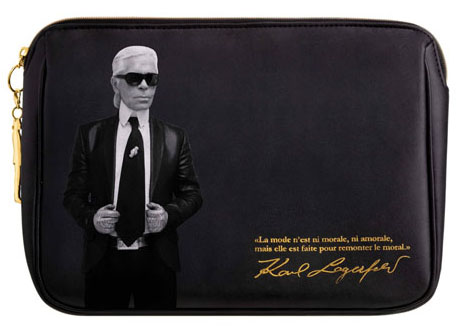
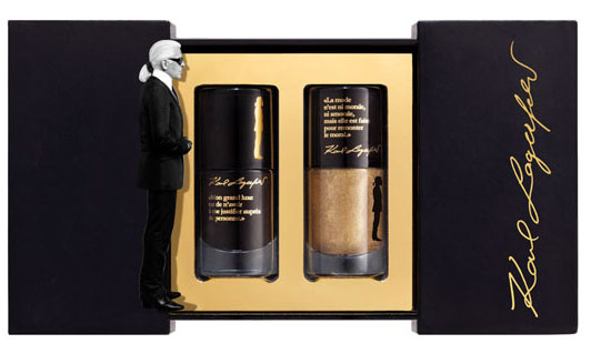
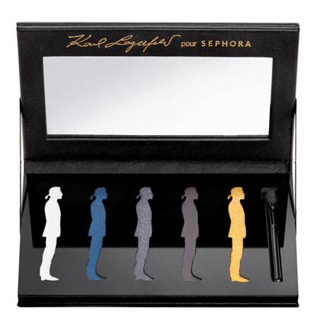
Holy ego, Batman!  Karl Lagerfeld (head designer and creative director for Chanel, in case you've been living under a rock) lent his famous persona to Sephora for a capsule collection.

It includes a palette – love that the shadows are in the shape of his silhouette:

Lagerfeld palette

A makeup bag:

Lagerfeld bag

Nail polish set:

Lagerfeld polish
(images from bellasugar.com)

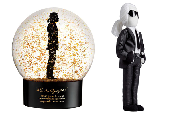
And even (gasp!) a snow globe and doll!  The quote on the snow globe translates to "My great luxury is not having to justify myself to anyone".

Karl-lagerfeld
(image from refinery29.com)

I'm not exactly sure why, but this collection makes me giggle.  Perhaps it's because Karl seems to be such an intimidating figure in real life, but here he's rather harmless.  I'd probably pick up the palette and the doll, but unfortunately the collection is only available in Europe and Singapore, and I don't think I'm going to go through the trouble of trying to buy through E-bay. 
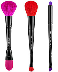
Sephora brushes Hooray, another brush set that's branching out from the usual black or neutral-colored bristles!  Earlier this year Sonia Kashuk brought us lovely coral-inspired brushes and Lancôme introduced a sleek set of blue-bristled brushes as part of their Declaring Indigo collection.  Now Sephora is following suit with these.  It's the dawning of a new brush era!

(photos from sephora.com)