You may not know this, but the Curator has quite the affinity for any object with a skull on it or that is shaped like one. (Hence, why this store is my favorite). Skulls' morbid nature and appropriation by punk culture speak to me a on a very deep level. While I don't like skulls and crossbones as much as a plain skull motif, I still appreciate them since they are synonymous with pirate lore, for which I also have a weakness. And this is why I had no choice but to pick up both of Anna Sui's summer palettes from the pirate-inspired Beach Adventures collection.
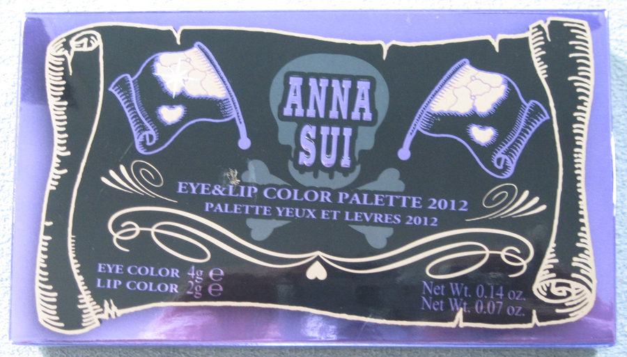
The outer box shows a worn scroll (treasure map?) featuring a skull and crossbones flanked by flags.
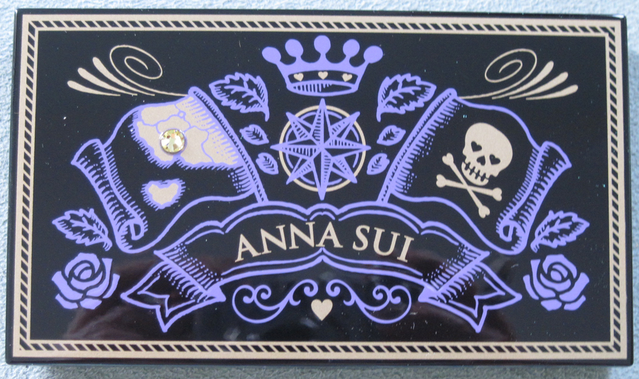
The outer case of the palette has a mishmash of motifs – a flag with a small rhinestone on the left and one with a skull and crossbones on the right, with a crown atop a compass design in the middle. Sui's name and signature roses appear at the bottom.
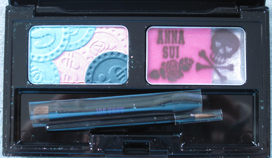
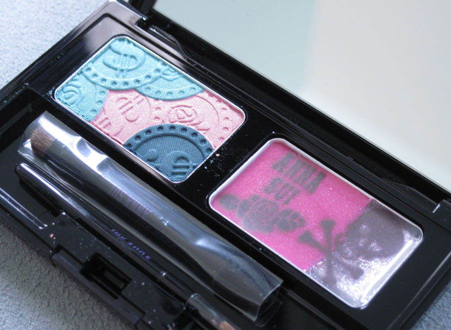
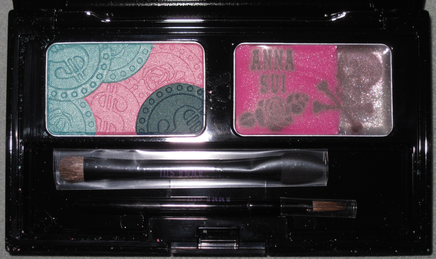
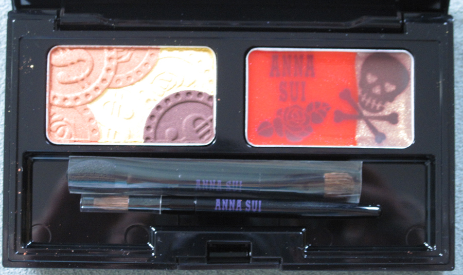
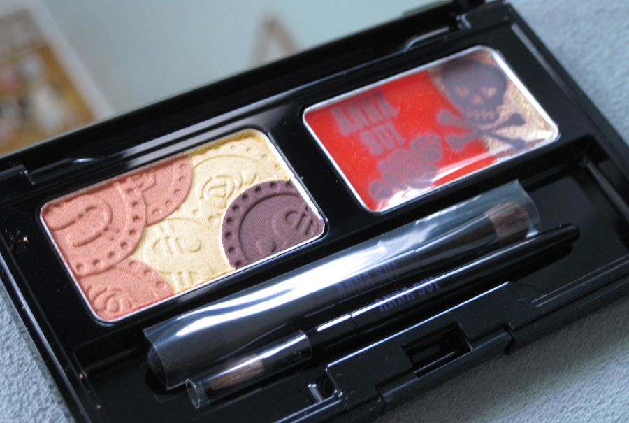
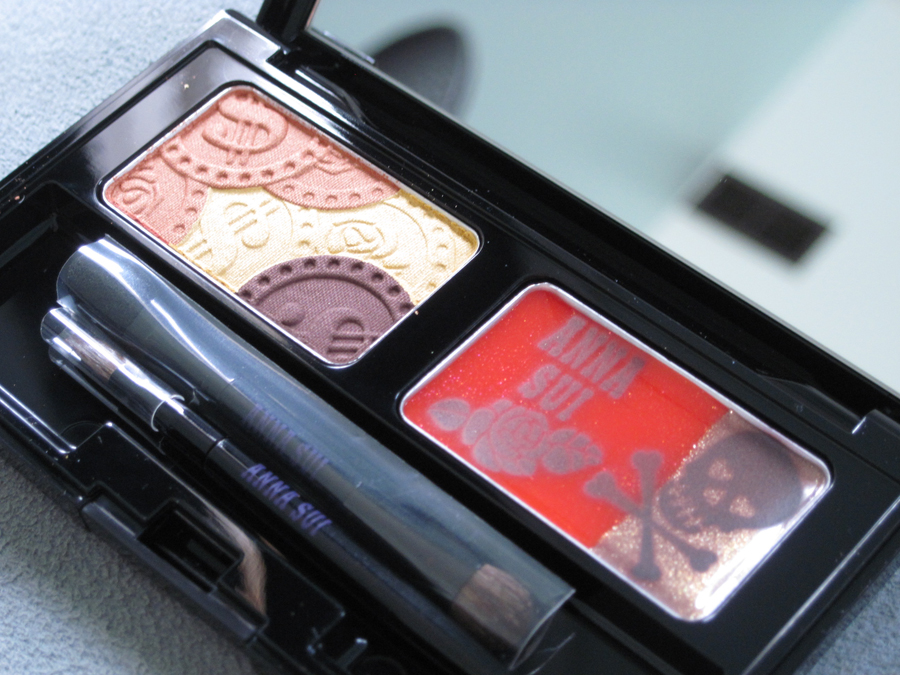
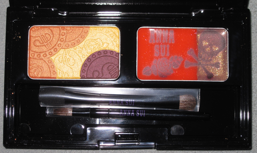
The palettes themselves have a trio of eye shadows in the shape of coins and a lip gloss with the skull and crossbones design layered on top. Here's palette no. 1 (Ocean):
With flash:
And No. 2 (Sunset):
With flash:
Looking at these got me wondering how the skull and crossbones became a symbol for pirates. I didn't think it had much basis in reality – I believed the skull and crossbone flag (along with the wearing of eye patches, having a parrot as a companion, the swilling of rum, saying "aaarrr", etc.) was just something Hollywood dreamed up, or at least made it appear as common knowledge that all pirates flew one. But I discovered that the skull and crossbones did, in fact, adorn many pirate flags throughout Western history. The exact origins of the skull and crossbones and its use on pirate flags aren't clear, but the first recorded use of the design on a pirate flag was in 1687.
There were many variations of the skull and crossbones. I picked out my four favorites (you can read more about each one here). The one on the upper right was allegedly flown by "Calico Jack" Rackham and was used in the Pirates of the Caribbean franchise – I knew it looked familiar!
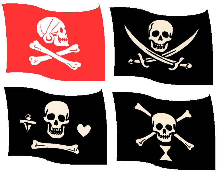
(images from pirates.hegewisch.net)
I have to admit that reading more about the history forced me to think about pirates as actual people who existed, which almost ruins the fun. Ever since the aforementioned Pirates of the Caribbean movies were released I perceived pirates as relatively harmless figures who partied a lot. But this little bit of research reminded me that true pirates were quite nasty and that the Jolly Roger flag was indeed threatening – it was not a symbol to be taken lightly. Flying the skull and crossbones was a warning to those that may try to resist the pirates' conquest, signaling that the pirates would offer no mercy if those they wanted to capture tried to fight back. Yikes.
However, I'm not one to let reality intrude too much, so I will continue to enjoy the skull and crossbones in the context of makeup and silly movies. :)
What do you think of these palettes? And do you like pirate paraphernalia?
