Um, wow. I was pretty excited for the latest NARS collaboration with fashion photographer Guy Bourdin…until I actually started looking at his portfolio. As a feminist I found it troubling, to say the least. As someone who enjoys art and fashion, I can appreciate how groundbreaking Bourdin was in terms of fashion photography. And I understand why Francois Nars chose him as inspiration for this collection, as it was Bourdin's work that inspired Nars to become a makeup artist – the way he captured the rich, saturated hues in many of his photos was truly genius. I recognize that the collection isn't meant to glamourize violence against women but rather to celebrate the bold colors in Bourdin's work.
HOWEVER.
I'd say about half of the Bourdin photos I've seen portray violence against women, and another sizeable portion seem to signify that women are nothing more than blow-up dolls to be used and discarded. I could even consider overlooking these disturbing images if they were part of a larger body of work that didn't glorify dead/objectified women, but I found nearly all of his photos to be fairly repugnant. I could also perhaps consider separating the images from Bourdin himself – just because his photos dehumanize women doesn't necessarily mean he is a misogynist. Unfortunately, that's not the case on that front either. He was just as anti-woman as you would suspect from his photos. Maybe it's because I'm from a different generation. In the '70s these images would have been considered "daring" and "pushing the envelope". In 2013, using offensive pictures to sell something isn't a novel idea. The "edginess" of showing a woman stuffed headfirst into a trashcan has long worn off; this image and others like it are solely abhorrent.
In my cursory research on the matter I found that I'm not alone in my dismissal of this collaboration. These bloggers said it better than I could, so rather than write any more about this I encourage you to read their thoughts on the topic: Temptalia and InTruBeauty.
What do you think? Will you be passing on this collection?
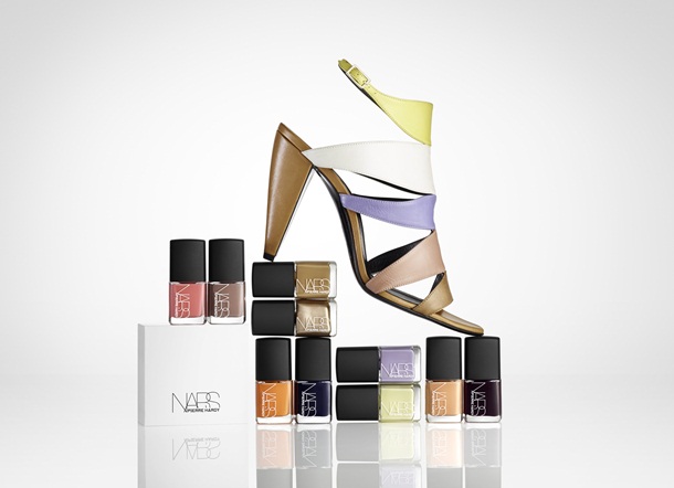
This was a nice little surprise for spring – a collaboration between high-end French shoe designer Pierre Hardy and NARS. In my shoe-buying fantasies I'm more of a Louboutin/Prada girl, but I do appreciate the architectural, geometric quality of Hardy's work (more on that later).
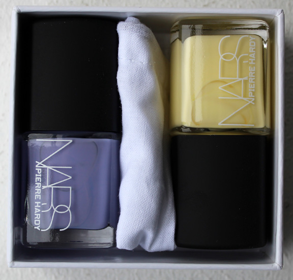
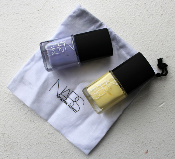
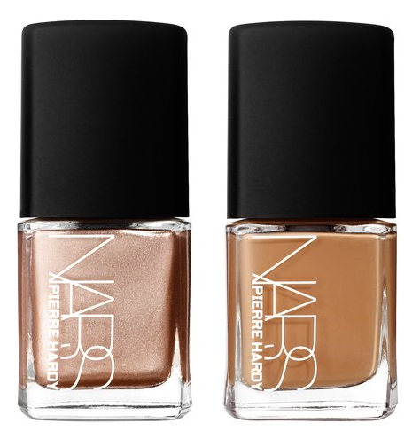
The collection consists of 6 nail polish duos and two blushes. I picked up the duo in Sharks because of the beautiful lemon yellow. I actually would not have bought it though if it hadn't been for the very clever packaging.

Once I saw that the nail polishes were arranged on opposite ends and that they came with their own tiny dust bag (just like shoes!), I was smitten.


I was too lazy to swatch these but you can find swatches here.
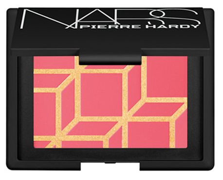
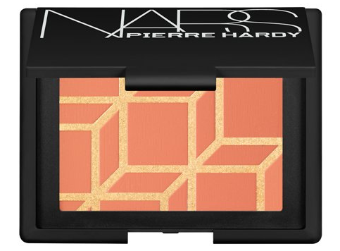
Here are the two blushes in Boys Don't Cry and Rotonde:


(images from narscosmetics.com)
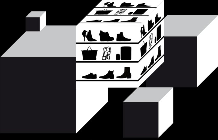
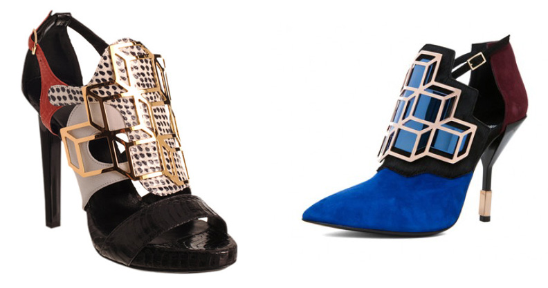
So what's up with the 3D cube pattern? Simply put, this cube motif has become Hardy's signature in both his fall 2012 and spring 2013 collections. From the landing page at his website…

(image from pierrehardy.com)
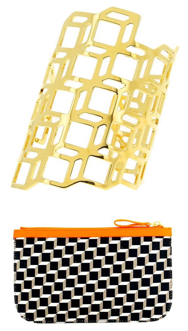
…to jewelry and bags (why yes, I will take that cuff bracelet in silver and/or rose gold, thank you!)

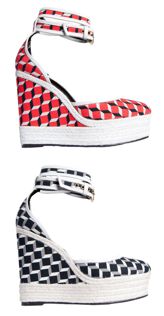
And, of course, shoes:

(images from barneys.com)
 (images from barneys.com and fashandfurn.com)
I'm still on the fence about the blushes. On the one hand, I like that NARS didn't go too literal and just put the cube pattern on the blush rather than embossing one of Hardy's actual pieces, like a shoe or a bag on it. On the other hand, that might have been pretty cool! The cube pattern is great, but by itself on a blush there's nothing that denotes it as being distinctly Pierre Hardy.
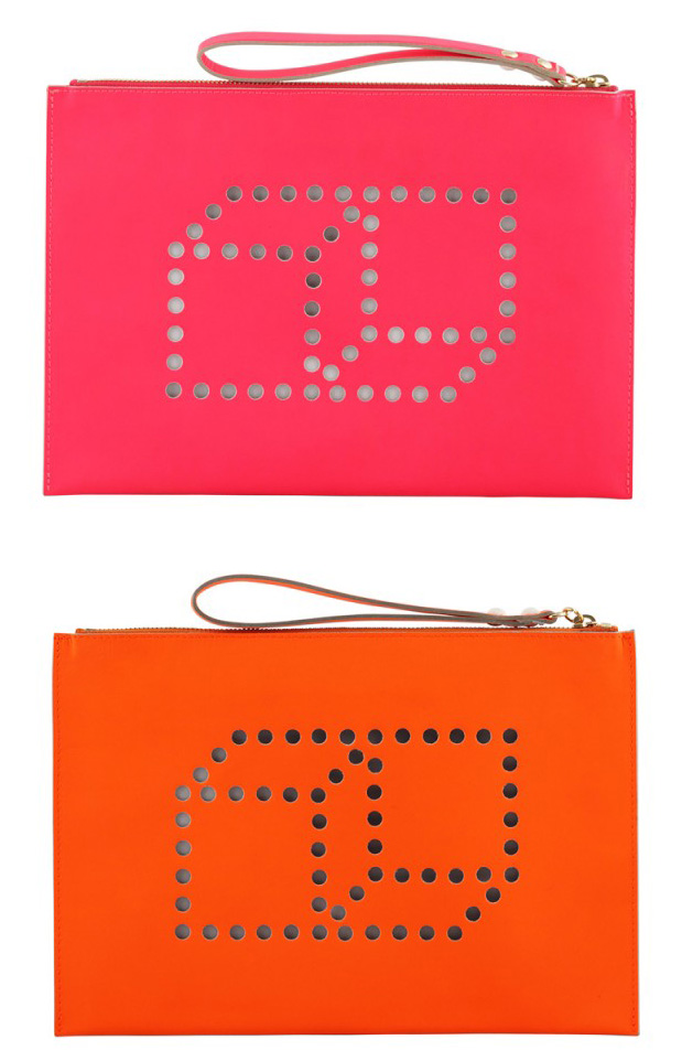
In any case, I was extremely impressed by how the colors in NARS collection so closely aligned with those in Hardy's spring 2013 lineup. The blush colors are similar to these bags:

The lavender and lemon yellow from the Sharks duo is borrowed from several pairs of shoes, including the ones in the promo image:

(image from myfacehunter.com)
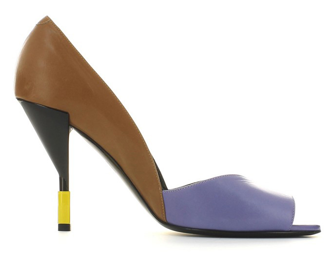
And this low-heeled pump, which to my eye also looks like it contains the tan color from the Easy Walking duo:

(image from pierrehardy.com)

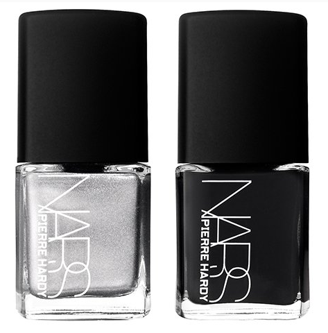
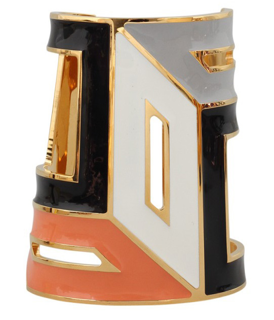
The duo in Venemous takes its cue from the grey and black in another cuff bracelet:

(images from narscosmetics.com)

(image from pierrehardy.com)
All in all, a well-done capsule collection. Did you pick up anything from it?
