I haven't been able to get my hands on Manish Arora which was officially released today (as a Curator who's no stranger to limited-edition products, I wasn't sure why I thought this wouldn't sell out right away when it was posted at the MAC website two days ago), so I thought I'd catch up on another MAC collection that was released last week. MAC teamed up with Emmanuel Ungaro to create a limited-edition collection representing designer Esteban Cortazar's vision for his fall 2008 fashions. "Dreamy, softly impressionistic, reverential…Softly shaded to match the understated mood of the collection" is how the look is described at the MAC website, and I think the promotional picture represents it well, especially when compared to the models' makeup and soft, slightly messy updos at the fall show.

(photo from maccosmetics.com)
 (photos from style.com)
While the colors themselves are definitely wearable and a nice extension of those seen on the runway, the packaging could have used a little oomph. Repeating the Ungaro logo doesn't seem "understated" to me but rather, well, repetitive and unimaginative.
 (photos from maccosmetics.com)
The Museum's Advisory Committee voted unanimously not to accession any of the Ungaro items and instead use the budget towards Manish Arora. ;) It's a shame that the packaging wasn't more interesting, but at least the colors were the same as those used to create the fall 2008 Ungaro fashion. In that sense the collection is a success.
For a great interview with Cortazar and MAC makeup artist Sharon Dowsett check out this Spoiled Pretty blog post.
Just wanted to share the dirt on some really cool items that are coming out soon! According to Specktra, MAC is partnering with Indian designer Manish Arora to create a limited edition collection, which will be released on October 9th. Specktra has posted some pictures of the goods already and they look totally amazing to this collector's eye.
And, word on the street (or rather alley, as in Makeup Alley), is that Chantecaille will be releasing two palettes for the holidays, one for eyes and one for cheeks. They will be similar to the summer 2008 Protected Paradise palettes, but will have a "Save the Bengal Tiger" theme, and, as you might have guessed, some beautiful tigers embossed on them. I am officially on the prowl for these and will pounce on my prey as soon as they are released.
So I will sit and try to wait patiently to add these to the collection, but it will be hard!
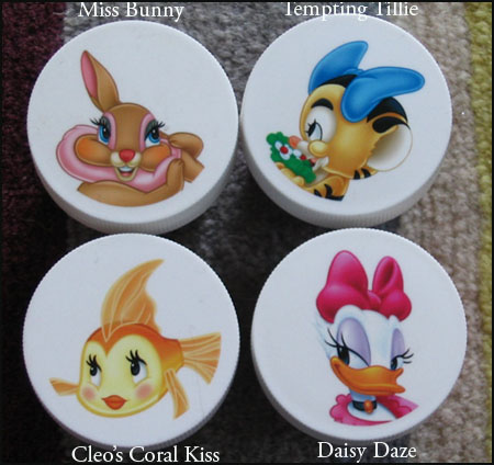
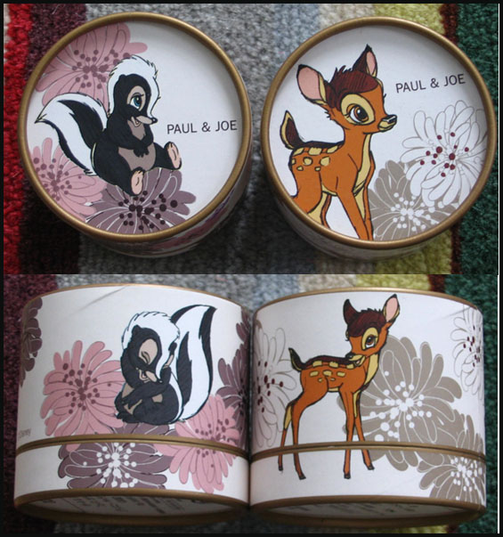
For Friday Fun today I'll be looking at two makeup companies that partnered with Disney to develop a collection of limited-edition items featuring Disney characters. The first one is MAC's "Tint Toons" collection released in December 2005, consisting of five Tinted Lip Conditioners. The other is Paul & Joe's Japan-exclusive collection launched in February 2008, which included two face powders, a hand cream and a lip balm.
I have four out of the five MAC Tint Toons. I found the characters to be a bit unfamiliar, but then again I'm not a Disney expert! The only ones I recognized immediately were Cleo (the goldfish from Pinocchio) and Daisy Duck. The others are Tillie Tiger, Clarice (she's with Chip & Dale) and Miss Bunny (from what I can gather she's Thumper's better half.) I'm wondering why MAC and Paul & Joe chose these animal characters rather than the usual Disney heroines – Cinderella, Ariel, Sleeping Beauty, etc. – perhaps because they couldn't get the rights to the images? Or maybe because they thought animals would be cuter?

The one I am missing is Coquettish Clarice. (Note to self: scour e-bay for this.)
I managed to get my hands on the face powders and lip balm from Paul & Joe…still, I'd love to complete the collection with the hand cream!
First, the face powders, featuring Flower and Bambi:

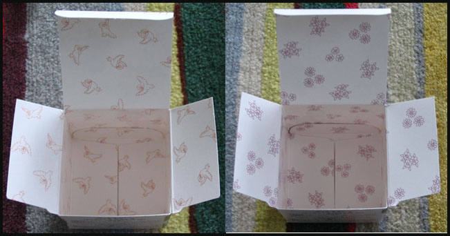
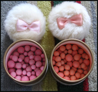
Even the interior of the boxes has a design, and the powders themselves are lightly scented and come with an ultra-girly puff complete with a color-coordinated bow:


Here's the lip balm featuring Marie from the AristoCats:

Finally, the hand cream with Lady: (Note to self: scour E-bay for this as well.)

(photo from Paul & Joe Japan)
It's fascinating to think of these somewhat juvenile items being marketed to grown women, and what's astonishing is the demand for them. In Japan the Paul & Joe collection sold out literally within 20 minutes, and the items then sold for double retail on Yahoo! Japan auctions. Since the MAC collection wasn't limited to one country, it didn't go quite as fast, but still sold out within a few weeks of its release. I'm guessing the bulk of the customers wasn't children either – these were being sold in department stores, not toy stores, and clearly meant for adult consumption. So why did adults clamor for these Disney-themed cosmetics? I feel the packaging is definitely cute without being saccharine or too childlike – I, for one, never feel silly or embarrassed taking out my Cleo's Coral Kiss balm to touch up, and cosmetics with fun packaging are always big sellers (the sustainability and growth of Benefit is proof of this.) The most compelling reason I think women bought these hook, line and sinker though is my theory is that sometimes we want to be comforted by childhood memories, and are drawn to things that allow us to reminisce about a happy childhood. I apply the same theory to the fact that Philosophy's Cinnamon Buns and Chocolate Chip Cookies shower gels are best-sellers – it seems odd that grown-ups would want to smell like a bakery. But these scents evoke pleasant and happy thoughts of growing up, of the freedom and lack of responsibility. So too with these Disney products.
Today I thought I'd do a review of a product whose name is right up my alley: MAC Museum Bronze pigment from the newly-released Overrich collection.
Natural light on the left, with flash on the right:

I was worried this would be too warm for my pale skin, and applied sheerly and dry it's a bit orange. But if I pack it on with a damp brush it becomes much bronzier/browner and wearable for me. I pair it with lighter golds on the inner half of the lid (Stila Sparkle is great) but I think it would be pretty with light peaches too. Texturewise this is a great pigment – sometimes MAC's pigments can be a bit gritty, but this goes on smoothly and provides a lovely metallic finish. Even though it's not as versatile as I would like, it's a pretty shade that would be especially flattering on medium and dark skintones.
So…does the color resemble a true "museum" bronze? Here's a pic of one of the most famous ancient Greek bronze statues, the Artemision Zeus (or Poseidon.)

(photo from the National Archaeological Museum, Athens)
I'd say it's pretty darn close! What was most likely a name thoughtlessly made up by a marketing intern at MAC is actually very appropriate.
For more of my reviews, check out the pages to the right of the blog. 🙂
I received this e-mail from MAC recently and was struck by the artist name-dropping.

The website continues: “The endorsement of Make up as a medium that mimics Art. The references; calligraphic brush strokes of colour, street art doodlings, the golden gilding of Gustav Klimt, the underage naïfs of artist Egon Shiele. Despite their differences, all are art.”
Klimt-style gilding? Vermeer shading? Pointillism? Egon Schiele? It’s great that MAC is trying to make the art of makeup application as literal as possible, but the artists and techniques mentioned, for the most part, don’t have much to do with the looks MAC has come up with.
First, compare the shading in this Vermeer with any of the looks in the MAC e-mail. The lighting and shadows are much more subtle. As much as MAC tried, the colors used in those looks don’t have the softness of a Vermeer.
 (photo from essentialvermeer.com)
I don’t see any of the gold used in a Klimt painting, like this one:
 (photo from wikiepedia)
Georges Seurat, painter of A Sunday on La Grande Jatte (you might recognize this painting from the 1986 comedy “Ferris Bueller’s Day Off”), would be very curious to see how MAC interpreted his pointillist technique for their applications. Compare a closeup of his work to the MAC looks:
 (photo from webexhibits.org)
There’s nothing remotely resembling pointillism. Bits of eye shadow dotted on the lid would not have the same optical effect as dots on a canvas. Surely MAC knows this so I’m not sure why they would bring up pointillism.
Finally, I’m guessing that the “Colourwash” look is supposed to be the reference to Egon Schiele‘s “underage naïfs”. But red lips by themselves don’t necessarily evoke Schiele.
 (Schiele photo from ibiblio.org)
MAC is wonderful for making a connection between makeup application and high art, but their execution could have been a little better. For example, I see a bit of Franz Marc in the “Flora and Fauna” eye look. The similarity lies in the large swaths of bright color and a darker color for depth – yellow all over the lid and dark greenish brown in the crease in MAC’s look, yellow for the horses’ bodies and dark green for their manes in the Marc painting.
 (Marc image from soho-art.com)
Perhaps they should retain an art historian (me!) on staff to consult on any promotions mentioning famous artists. 😉
 (photos from style.com)
 (photos from maccosmetics.com)
