 I didn't think that interior designer Marcel Wanders' collection for MAC was all that interesting until I read this National Post article. Sure, it was design-y and sleek and more or less what I'd expect, but was there any real thought put into it? As it turns out, there did indeed seem to be a concept, at least for the colors involved and why Wanders wanted to foray into makeup design. He was inspired by the works of Vermeer.
“'I was looking at a painting by Vermeer,” Wanders says. “The colours and the textures and the light, and the women. I thought of Vermeer’s brushes, I thought that he is painting the picture the way that women are painting themselves with makeup. I thought it was a very beautiful idea, and I wanted to explore that.' Though Wanders didn’t design the actual cosmetics, he directed their creation and the M.A.C & Marcel Wanders collection takes colour cues from Vermeer. Powders are pale, like the women in the Flemish master’s paintings; lipsticks are either pearlescent or dark, reflecting both the ladies’ complexions and their charcoal-suffused surroundings. The cases he created are the same dark shade as the background of Vermeer’s Girl with a Pearl Earring. Gesina, Catharina, Gertruyd — he named pieces of the collection after women from Vermeer’s world."
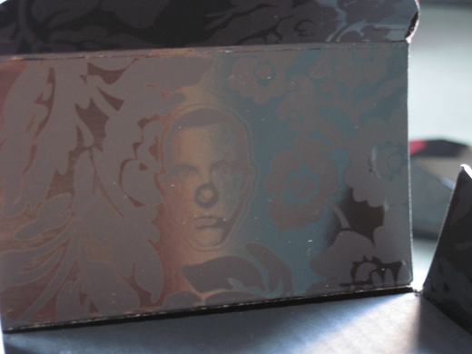
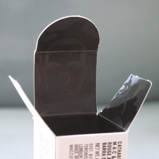
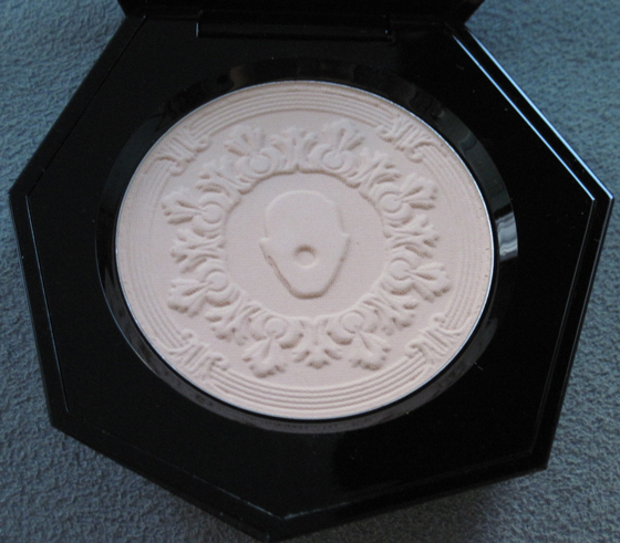
Nicely done. We have the inspiration of not one but two Dutch artists in this collection! What really struck me about the collection was that Wanders really knew how to brand it and make these HIS pieces. It was supposed to be a collaboration with MAC, but I feel like his imprint was much stronger than when MAC teamed up with other designers. Case in point: his visage, complete with iconic gold clown nose, on the inner packaging:


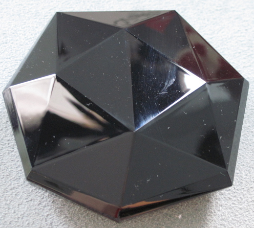
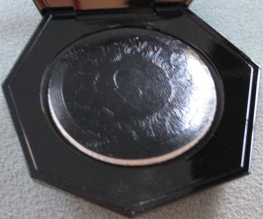
Here's the so-called "mystery powder." The real mystery about this, in my humble opinion, is why a black shiny plastic was chosen for a face compact. It's just going to get all finger-printy! Not the smartest move considering this was conceived by a world-class designer.

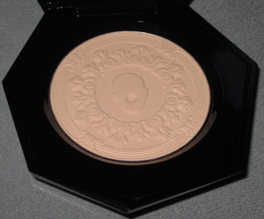
Again, the same clown-face imprint on both the puff and the powder itself:


With flash:

Incidentally, the refill powder that came with the compact also has the same imprint. I was glad MAC didn't cheap out on that. 🙂
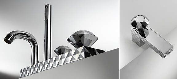
I didn't really see a lot of influence from his other work in this compact. The closest thing I found was the "Bonomi" series of bathroom fixtures:

However, the flowery scrollwork is definitely in keeping with his designs:

(images from marcelwanders.com)
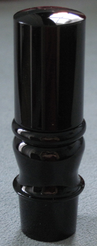
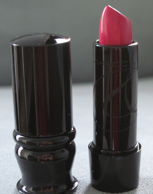
Now for the lipstick – I got Catharina.


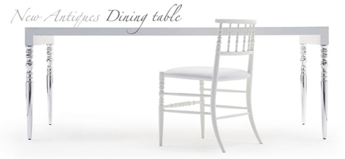
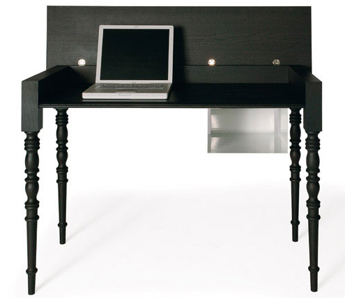
I love how the shape mimics the legs of many of Wanders' furniture.

New Antiques Low Chair:

Two-Tops table:

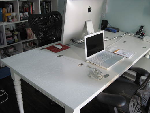
Finally, a funny side note: I was staring at the above table at Wanders' website thinking about how familiar it looked, and not because the table legs look just like the MAC lipsticks. I felt like I had seen that table a million times. I asked my designer husband if he knew anything about Marcel Wanders because the table at the website looked so familiar…and he had a good laugh explaining that the reason it looks so familiar is that we OWN said table.

It's in our home office and has been there for years. It's where I blog, for crying out loud! How did I not realize it was the same table?! My descent into senility continues. 😛
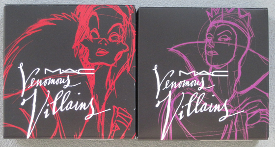
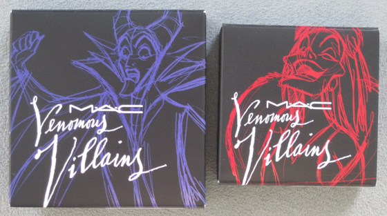
This is not the first time MAC has teamed up with Disney, but the Venemous Villains collection is far more vast than 2005's Tint Toons. I liked that there was actually a tidbit of info about the design and colors. From Nitrolicious: “'Disney gave us the colors used when these characters were drawn throughout their history,' said Jennifer Balbier, vice president of product development for MAC, noting that Cruella and the Evil Queen share more “real woman” shades, such as red lips and peachy blush. Maleficent is 'pure fantasy,' said Balbier, noting that offbeat purples, blackened shades and pearlized nails were used." It's great that MAC was able to use the same colors used for the characters. There's also a video about the collection's inspiration, courtesy of Temptalia.
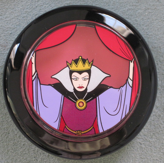
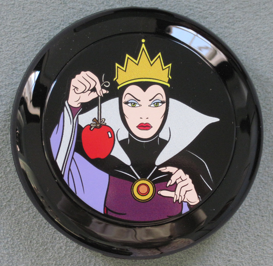
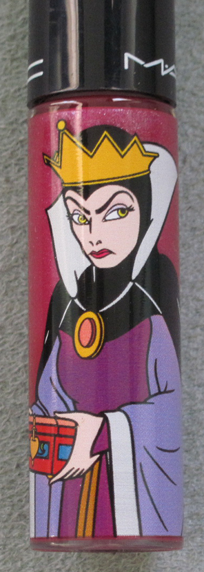
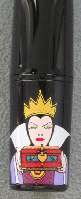
I'll start with the Evil Queen from Snow White.
Bite of an Apple blush (I didn't take any pictures of the items opened – there are tons elsewhere and I'm lazy. :P)

Oh So Fair powder:

Hot House lip gloss:

Sinister lipstick:

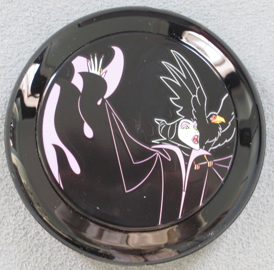
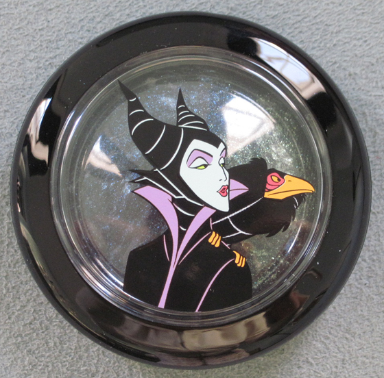
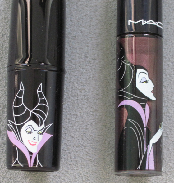
Here are some things from the Malificent collection. (Funny side note – my mother told me that when I was little I was absolutely petrified of Malificent – something about those horns scared the bejesus out of me. I don't remember this but it seems plausible.)
Briar Rose powder…I'm bummed mine has a big old scratch smack dab in the middle. I'm a collector, MAC, my items need to be in pristine condition! Meh.

She Who Dares eye shadow:

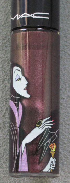
Dark Deed lipstick and Wrong Spell lip gloss:


Finally, some Cruella items. I didn't get anything with Dr. Facilier, since I was mad at MAC for including him. He's not a "classic" villain and we all know Ursula from The Little Mermaid would have made a much better character for this collection!
Darkly My Dear blush:

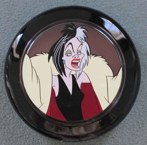
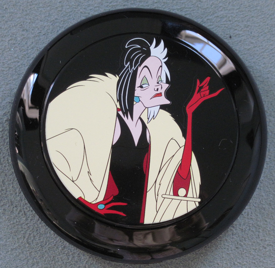
Her Own Devices beauty powder:

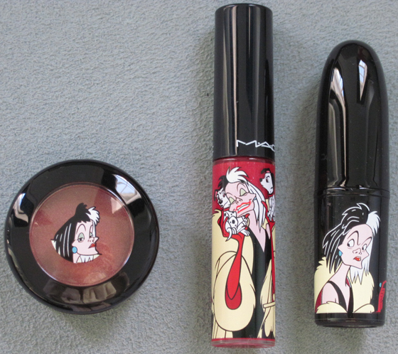
De-Vil eye shadow, Wicked Ways lip gloss, and Heartless lipstick:

Personally, I think it would have been interesting to have the sketches appear on the products themselves than the outer packaging.


Overall, a nice collection but a bit predicatable and literal. Something more abstract (like the sketches) may have elevated this to a more sophisticated collection, but still fun and Disney-based.
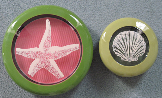
I had been anxiously awaiting MAC's To the Beach collection for months and was so excited to finally buy it. I think these pieces will really add to the Museum's summer exhibitions. Now for some pics!
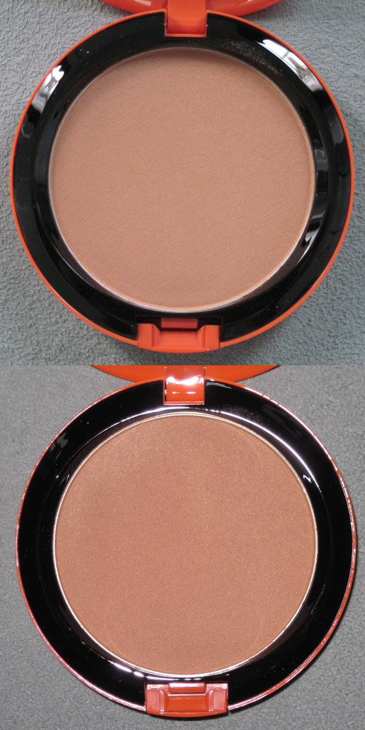
Golden bronzer:

In natural light and with flash:

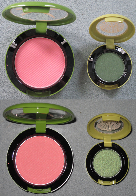
Hipness blush and Humid eye shadow:


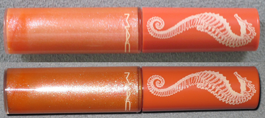
Beachbound lipstick and Splashing lip glass:

Flurry of Fun lip glass, the only item I intend on using from the collection:

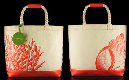
In terms of collectibles there was also a tote bag but I thought $50 was a bit steep for a canvas bag, sturdy though it may be, so I passed on it.

(image from maccosmetics.com)
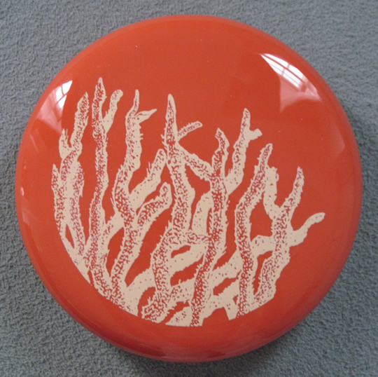
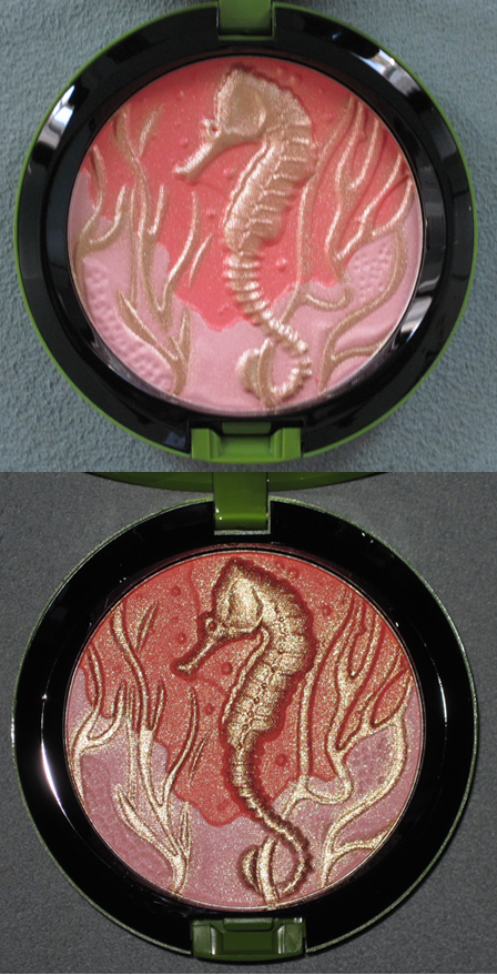
And here's the biggie from the collection, the one that sold out immediately from MAC's and Nordstrom's sites as well as pretty much everywhere else, Marine Life:

It was sold out entirely everywhere near me so I had to once again dispatch my mother to pick it up for me at her local counter, as she did with the Lancome Coral Flirt blush. Thanks Mom!
So what do you think of this collection? While the illustrations were simple, I thought they perfectly captured a fun sunny day at the beach. :)
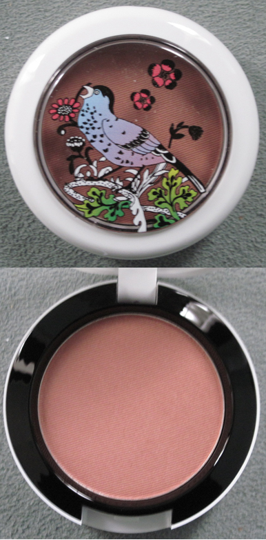
Woohoo, it's here! The long-awaited MAC Liberty of London collection, that is. I was very excited for this as I adored London when I visited and Liberty was my favorite department store (sorry, Harrod's and Selfridge's!) Well, let's delve into what I procured for the Museum.
Powder in Shell Pearl:

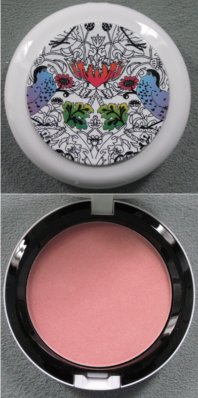
Blush in Prim and Proper:

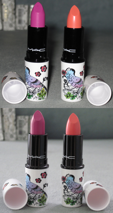
Lipsticks in Petals 'n' Peacocks and Ever Hip (with and without flash):

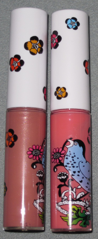
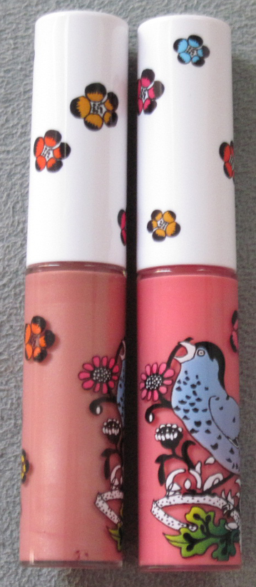
Lipglosses in Frankly Fresh and Perennial High Style (with and without flash):


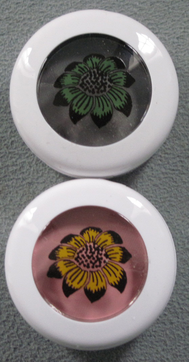
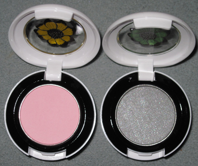
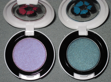
Eyeshadows in Bough Grey and Give Me Liberty of London:


And in Birds and Berries and Dame's Desire:


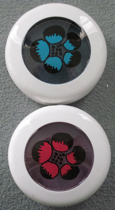
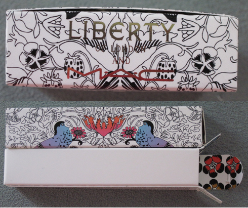
I love that the boxes have the Liberty name in gold, and the flower print is contained inside:

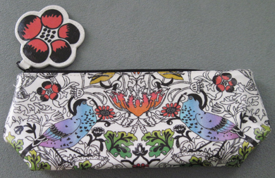
Finally, the small makeup bag:

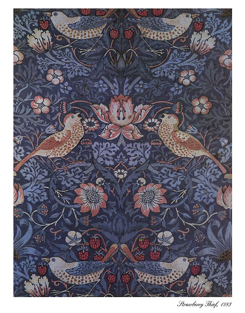
I love the shades in this collection (I'm actually going to use Ever Hip and Frankly Fresh rather than keeping them as collectibles!) but obviously the packaging and concept are my favorite things about it. Temptalia has a wonderful summary of how the print was created and what the collection's vibe is meant to be. The print is based on William Morris' "Strawberry Thief" print which goes back to 1883, but was reworked to fit the MAC collection and to make it exclusively theirs. "James Gager, Senior Vice President and Creative Director for MAC Cosmetics, says, 'I’m
particularly proud of the packaging… White [packaging] speaks to a
reawakening of everyone’s sensibilities for spring. [It] has a
remarkably fresh, springy look to it. Even if you don’t know what
Liberty is, you want to own these pieces because they are so unique and
special. It’s evident that something original has taken place here in
terms of the collaboration.'" Naturally I had to search for the original Strawberry Thief print, and indeed, the MAC print is definitely a great modern take on it, although they did take the strawberry completely out of the equation:

(image from artsycrafty.com)
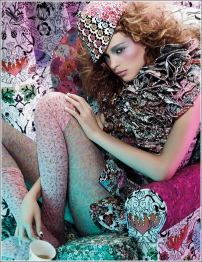
More from Temptalia: "Gager says, 'The inspiration was all Liberty and all London.' Miles Aldridge, photographer, shot the visuals in London, with
Charlotte Tilbury, makeup artist, created the look. (Both Aldridge and
Tilbury are English!) Gager goes on to say, “The idea was to
capture the spirit of the famous Brit wit, bohemian chic girl. Katy
England, another famous Brit, styled the shoot. She also designed the
outfit worn by the model, using many Liberty prints and turning them
into an over-the-top ruffled dress. With the MAC Give Me Liberty of
London collection, we aspired to capture the spirit of this dreadfully
chic, cool English girl, sitting on a chair, decked out in all the
British regalia. She’s a Liberty freak and a MAC addict; she can’t get
enough of either brand.'" I can definitely see their vision in the promo ad:

Anyway, I wish I were able to get my hands on the scarf, but at $95 I thought a better use of Museum funds would be to get lots of items for the same amount! I also kind of wish MAC came out with a shirt or another non-makeup collectible – Helly Kitty had tons of stuff and Fafi had adorable little dolls and a tee. But overall I thought they did a great job with this. What are your thoughts and what, if anything did you buy?
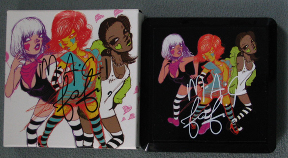
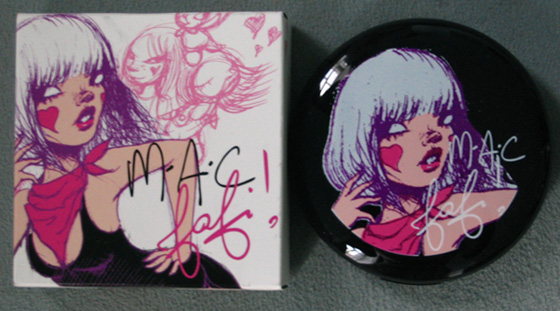
All the latest buzz is focused on MAC's big Liberty of London collection, and I will be posting about that as soon as I finish taking pictures of my massive haul, but for now I thought I'd warm up with another big spring MAC collection – Fafi! Fafi is a French graffiti artist who collaborated with MAC in 2008 to create makeup featuring her unique drawings of women.
Here's what I got.
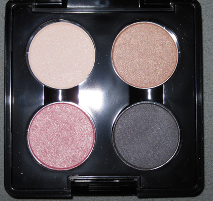
Fafi Eyes 1:

Quad open:

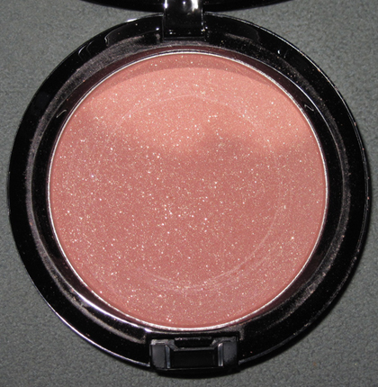
Blush:

Here is the blush open:

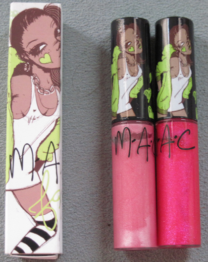
Lip glosses in Cult Fave and Totally It:

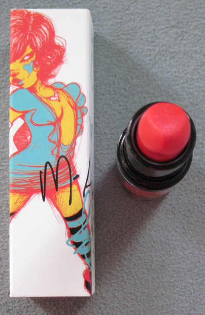
Lipstick in Flash 'n' Dash:

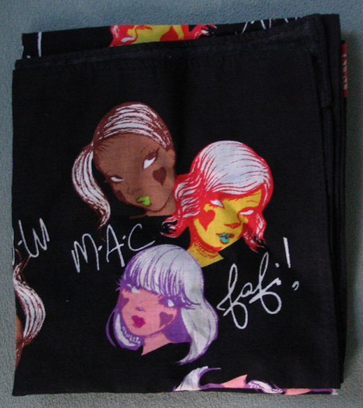
Scarf (which retailed at $15 – a steal compared to the $95 scarf for the Liberty of London collection!)

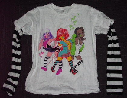
Shirt:

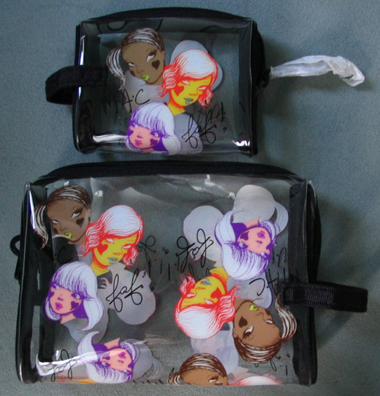
Makeup bags:

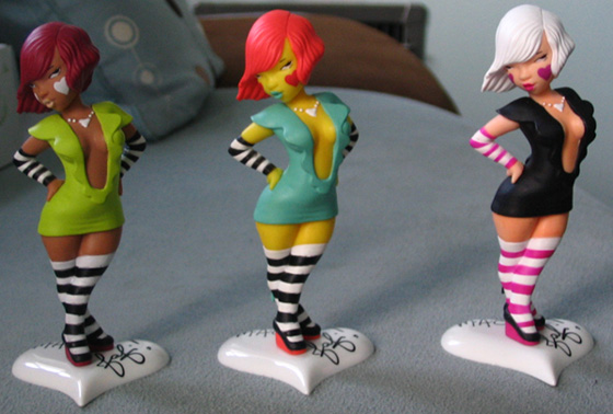
And my favorite part of the collection, little figurines of the Fafinettes. From left to right their names are Monoka, Eriko and Ermine. I loved that the artist came up with backstories for each of them. You can read them all here.

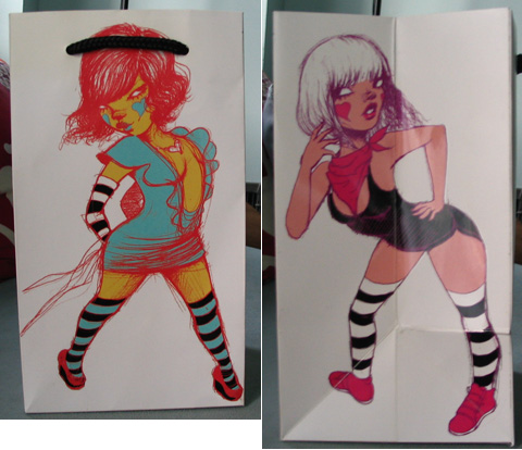
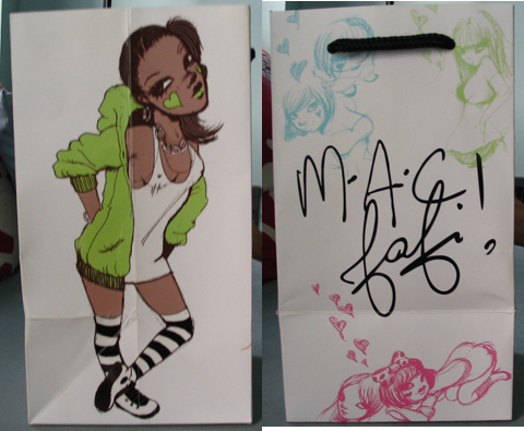
Even the shopping bag had a cute "Fafinette" on it:


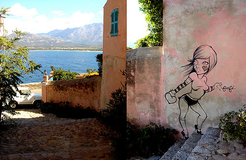
According to her website, Fafi's work "explores femininity through stereotypes" and her women are "sexy, funny, and occasionally aggressive." Here is one of her works in situ:

(image from mimifroufrou.com)
For a great review and analysis of Fafi's work as it relates to MAC, check out this blog entry. While I think MAC is a great line for Fafi's work, I could also see her working for Urban Decay, as both lines are considered edgy and youth-oriented.
I have to say I was a bit surprised to hear that MAC was doing a collection with preppy Palm Beach resort designer Lilly Pulitzer. MAC's other fashion collaborations have been with designers who are, ahem, much more youth-oriented and cutting-edge (Heatherette, DSquared, Ungaro) so I could see Lilly Pulitzer working with, say, Elizabeth Arden but not so much MAC. Lest I be accused of ageism (I'm not ageist, I'm an old lady myself!), I will say that I like the blush and eye shadow that was offered in this collection – springy colors and a fun print provide an antidote to the winter blues.
Here's the Pearlmatte blush, with and without flash in natural light:

And Pearlmatte eyeshadow trio:

I think these (and the rest of the colors in the collection) are definitely a good reflection of Lilly Pulitzer style. I like that the eye shadow was in her signature colors, bright pink and green:

As evidenced below, floral patterns abound in Lilly Pulitzer so it's no surprise they were incorporated into the design of the MAC collection.

(images from lillypulitzer.com)
Personally I find the floral prints to work better on makeup than on clothes. ;)
 The name of this collection immediately got my attention, although upon delving into it I was a bit disappointed. "Dramatic, daring Lashes have been a chic and urbane part of the modern
Artist’s persona since Edie and friends made it all happen Downtown, on
block-print canvas or grainy 16-millimetre film. Multi-media,
counter-culture, the ultimate cool. In The Studio is the epitome of the
look updated, featuring new Studio Fix Lash in Black Fix or Studio
Brown…Go for the bold stroke, as they do In The Studio." I'm not really sure the ad copy makes any sense – they tie big lashes to Edie Sedgwick, which I can sort of understand, but how are they a "chic and urbane part of the modern artist's persona"? I think mostly MAC was grasping at straws and trying to make their most basic products (mascara and foundation) seem more hip and interesting. Nitpicking of their advertising aside, In the Studio reminds me of a very common theme depicted in painting: the artist at work in his/her atelier. The new exhibitions at the Museum of Contemporary Art and School of the Institute of Art (both in Chicago) prove that the depiction of the artist's work space is still just as relevant as it was back in 1855, when Gustave Courbet painted his famous The Artist's Studio (L'Atelier du peintre): A Real Allegory of a Seven Year Phase in my Artistic and Moral Life :

(image from smarthistory.org)
The Musée D'Orsay has an excellent summary of the painting's significance. Looking at this I think MAC could have done a better job in advertisting (even the ad doesn't really show the artist/model at work, per se) and in crafting a more interesting collection, but nevertheless I like that they at least attempted to connect makeup to art.
MAC's latest collection, Baroque Boudoir, features a pretty damask design "etched like the fine filigree of a French
baroque settee" according to the website. French baroque settee?! Let's see if the pattern resembles French Baroque style at all.
Lip gloss and lipstick:

And the compact:

(images from maccosmetics.com)
French Baroque is most often associated with Louis XIV (1643-1714), who was responsible for the construction of Versailles. Here's a pic from the King's bedroom in the famous palace – check out the wallpaper!

(image from essential-architecture.com)
And here's a sofa:

(image from chestofbooks.com)
While the design is nice and similar to actual French Baroque, I don't think it's quite MM-worthy so I'll be saving my pennies for the spring collections. ;)
I would be remiss in my curatorial duties if I did not cover the major fall 2009 trends. Even though I'm a bit tardy and the holiday collections are landing at counters, here is my fall trend roundup. As opposed to last year where the standout was super-dark lip color, this year I feel there were 2 major trends that demanded attention instead of just one. Enjoy!
(Note: I am in the midst of planning my nuptials and collages depicting
the color scheme and/or style of a wedding, called "inspiration boards" in
the wedding blogosphere, have been my obsession as of late. That explains the wacky collage I came up with for each trend.)
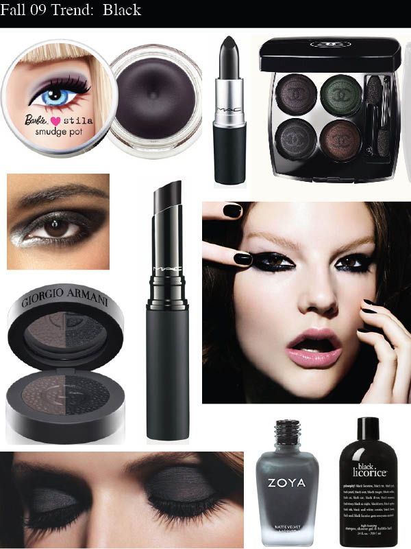
1. Black, black and more black. This fall, black is the new…well, you know. This shade is meant to be worn on eyes (more so than lips, which was the case last year) and is even the inspiration for an entire MAC collection. While dark smoky eyes are always the rage in the autumn months, this year the look is especially heavy with more of an edgy, early-80s punk aesthetic rather than uptown glamorous. Adding to this style is the new matte finish for dark nail polish. Chanel Black Satin? It might have been considered a little rebellious in 2006, but today the truly edgy way to wear black nail polish (or any dark vampy shade) is with a shine-free finish.

Images: Stila Little Black Dress smudge pot, MAC lipstick in Black Knight, Chanel Les Folies Noirs eye shadow palette, Sephora catalog promo, Armani Manta Ray eye shadow, MAC Mattene lipstick in Midnight Media, MAC Style Black collection ad, Chanel Noirs Obscurs ad, Zoya Dovima nail polish, Philosophy Black Licorice shower gel
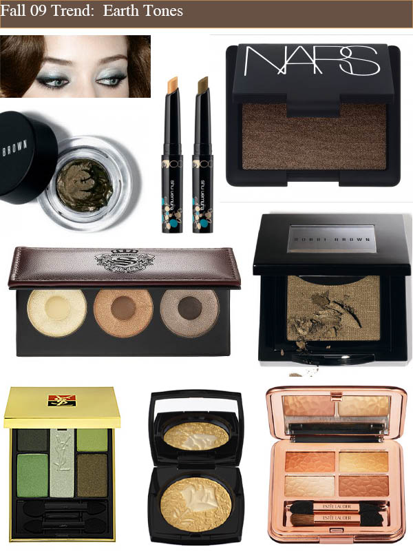
2. Garden of earthly delights. Gold, bronze and green eye shadows are always hot for fall, but 2009 ushered in a new era of super-pigmented, bolder-than-bold earth tones.

Images: YSL promo ad, Shu Primitribe eye color sticks, Nars Mekong eye shadow, Bobbi Brown gel eye liner in Forest Shimmer, Smashbox Reign palette, Bobbi Brown Autumn Leaf eye shadow, YSL Bronze Gold eye shadow palette, Lancôme Rose Liberté powder, Estee Lauder Sensuous Gold palette
Which trend was your favorite? Personally I'm torn. The punk in me loves the matte black eye shadow and nails combo, but greens and gold are really flattering on my eyes, so both are winners for me!
This MAC collection is right up the Curator's alley! The company collaborated with three artists – Richard Phillips, Marilyn Minter and Maira Kalman – to create products inspired by their art. Here are the images each came up with for their collections.


(photos from maccosmetics.com)
I like that there was actual substance behind this collection. All three artists were interviewed by MAC to find out what their inspiration was and how they came up with the colors they did. Of course, I'm sure they were tweaked by the company to make sure they sold well, but it's nice to know that artists seemed to think carefully about how they wanted to express their work through cosmetics. I also liked that the names for the products (like In the Gallery, Private Viewing and On Display) fit too. Now if only they had come up with some nifty packaging with an image from the artist!
 I didn't think that interior designer Marcel Wanders' collection for MAC was all that interesting until I read this National Post article. Sure, it was design-y and sleek and more or less what I'd expect, but was there any real thought put into it? As it turns out, there did indeed seem to be a concept, at least for the colors involved and why Wanders wanted to foray into makeup design. He was inspired by the works of Vermeer.