The MAC x Harris Reed collection was released in February this year, but I wanted to wait until June to write about it in honor of Pride Month. For brevity's sake – I read through dozens upon dozens of interviews with Reed – and because I'm not a gender studies or fashion expert I will try to keep this as brief as possible.
The collection was manageable, consisting of an eyeshadow palette, a gold kohl pencil, Cream Color Base compact and a palette of three lip colors. I juts picked up the eyeshadow palette and the Cream Color Base as the packaging for that one was the same for that of the lip palette.
Who is Harris Reed? Unless you've been living under a rock, you'll recognize them as the 25-year old wonder who's been taking the fashion world by storm. Reed came to my attention when Harry Styles wore several of their fabulous flouncy frocks in the December 2020 issue of Vogue.
(images from vogue.com)
Committed to gender-fluid fashion, Reed creates clothing that makes a statement yet doesn't take itself too seriously. "I don’t just make clothes. If you want pretty clothes, you need to go to someone else. I fight for the beauty of fluidity. I fight for a more opulent and accepting world. That is really important to me…there always has to be a message. I wouldn’t pretend that doing some crazy avant-garde outfit is going to change the world, but I like to think that it could start a conversation."
Reed's aesthetic is heavily influenced by the free-spirited atmosphere of the '70s, particularly the androgyny of glam rock and Studio 54's dazzling evenings. The wide pants legs and lapels, bold patterns and extensive use of embellishments (feathers, sequins, etc). reference the era but are modernized so as not to veer into full-on costume territory. Reed explains their fascination with glam rock to Fashionista: "I've always loved glam rock. I’ve always said we need more people like David Bowie. At a time like right now, a lot of things can either look very the same, or brands are doing things—or musicians are doing things—that sometimes don't feel authentic. I love glam rock because there’s a level of grit and more importantly a level of authenticity that I think shines through all the glitter and the glam and the flares and the ruffles. I look at all those things, the flares, the ruffles, as points of reference of someone expressing themselves at the most heightened, most authentic, most outrageous part of themselves. So I think for me, glam rock, it's almost like fluidity. Obviously it’s different, but they go hand in hand because it's your most extreme version of yourself. You are expressing who you are in the most heightened, over the top, fabulous way…I really try to be modern in my designs, but I still try to keep that nuance and push it to the limit. Be the person who doesn't fit the mold. Be the person that doesn't fit the box. That’s where I see glam rock coming back into what we do and our daily lives and within fashion—being referenced more as a way of being than just a specific style."
I can't say Reed's designs are wearable for the average person (or at least, not an entire ensemble), and they acknowledge that their latest collection is more about artistic vision than whether it would sell. I'd also argue that their clothes were made with a certain body type in mind, i.e. skinny and tall – I see zero diversity in terms of size. But Reed's dedication to creating flamboyant yet expertly tailored clothing for all genders is definitely something we can all support. Their statement about breaking free of slogans and logomania represents a thoroughly Gen Z outlook and is a refreshing new direction in fashion. "I’m ambiguous about my gender and have never understood why something is made for a man or made for a woman. I think if a piece makes someone feel invincible or unstoppable, that’s all that matters. At the centre of my work is a drive to break down any preconceived idea of what gender is. I love that fashion has an obligation to trigger debate. But at the same time, it has to be in the most fun, playful way. It’s not about slogans, it’s about fantasy, and letting someone live that fantasy through clothes. Fashion is about self-expression – dressing in a way that makes you feel the happiest you’ve ever felt. Life’s too short to try and box yourself in to something normal, so why not have as much fun as possible with what you’re wearing? For me, that means flares and flouncy blouses – the more performative, the better. I’d describe my style as glam-rock Victoriana."
Anywhere is fair game for frills and ruffles; whether they adorn the front of a blouse, the end of a sleeve or a skirt hem, they add an exuberance and joy not regularly seen in high fashion. In looking at their work, I would posit that Reed is an aficionado of the late '60s as well. Take, for example, a blouse from the showy "peacock revolution" ushered in by Michael Fish next to one Reed designed for Harry Styles.
Reed also cites "old-world" classic European art as inspiration, especially the Rococo movement. Again, while there are some literal references to that period, the clothing exudes the overall vibe of the era: dramatic, over-the-top and ornate.
Though born in Los Angeles, Reed traveled extensively growing up. "My mom is very much a free spirit and artist. She was a model in the '80s, she would go to Studio 54, she is just an incredibly creative and soulful woman and then she became a candle maker and a perfumer. With my father being in Entertainment, Los Angeles, he remained there and me, my mom and my sister went off gallivanting around America, moving to different cities and different places," they tell Purple. Reed came out as gay to their parents at the age of 9, and was grateful to have their full acceptance – they encouraged his creativity and stood up for their son when teachers called to say some parents didn't want their children in class with a gay kid. "I was bullied for being gay and for being different…my mother would often find me dancing in bedsheets and shower curtains – and she and my father nurtured and supported that side of me." (I'm relieved to hear that Reed's parents supported them, but still aghast at how recent this was. Reed is so young – when they were 9 it was 2005. I honestly did not think that kind of casual, blatant bigotry was still happening to children in the 21st century.)
Reed was a creative child, but fashion design didn't occur to them until later. It was clothing's transformative power and ability to express a different aspects of one's personality that captured their imagination as a teenager. "Fashion wasn’t part of my background. I think creativity and this yearning for creating was a part of my background – I think for me there was always this idea of creation but it wasn’t until I was in my teens that I realised that clothing was more the artistic venture that I wanted to embark on. Clothing had this intense ability to transcend peoples’ emotions and for people to see each other in different perspectives and through a different lens. Once I took all this creation as a child and used and harnessed it, it was about applying it. I found it through dressing up and experiencing this playful carefree sense of trying on different identities until I found the right one. From there it was even more about building on the identity I already had and making it special to make it shine."
Reed's arrival in London to attend Central Saint Martins – the legendary design school that educated the likes of Alexander McQueen and Stella McCartney – marked another turning point. "I never really sewed a proper piece together until I started at Central Saint Martins – a lot of people don’t know that. Before CSM I was mostly duct-taping, pinning, draping, literally using anything and everything I could get my hands on to create clothes without actually putting a machine to the fabric. As a child, as someone who was very much picked on and who was not someone who fit in whatsoever, I look to Central Saint Martins as the shining beacon of escape. When you looked at McQueen and Galliano and look at Ricardo Tisci, you could see what came out of there and I just remember watching old documentaries and you could see this sense of camaraderie with everyone communally coming together with shaved hair and crazy colours and crazy clothes and it just felt like my version of what outer-space would look like."
Reed was only in their 2nd year at Central Saint Martins when their "white show" outfit caught the attention of noted stylist Harry Lambert, who in turn introduced Reed's work to celebrities like Solange and Harry Styles. Reed explains: "It all took off with the first show of the BA fashion course, in which students have to make one piece in white. I’d always known who I was, but I didn’t quite know how to express that in terms of clothing and character. Then the White Show happened. There was so much I wanted to articulate in the piece I made – the experience of being bullied, my childhood fantasies, my commitment to making clothes that weren’t just pretty but also sparked conversation. And so I based my piece on those made-up characters from my childhood, this time a boy aristocrat who was kicked out by his parents for being gay and took refuge in an old opera house, putting on white powder every day until all his clothes become white. I made a giant, wide-brimmed, white felt Little-Bo-Peep hat, with a low-cut ruffled bustier jacket with huge puffed sleeves and dramatic white flares. It was neither menswear nor womenswear but genderless. And within about 30 seconds of my posting it on Instagram, Harry Lambert requested the piece for a shoot. Next thing I know, Solange is being photographed by Peter Lindbergh wearing it."
"The outfit was, in a way, parallel to my own story. This character was like me coming to London and finding my salvation,” they say. “It was quite emotional because it was the first time that I put myself completely out there in London, my first kind of big full look."
Reed cites the support of their classmates as well as more seasoned designers such as Alessandro Michele, head of Gucci, for whom they interned. "I think first of all collaboration is everything, as someone who is still in school I value the collaboration of my classmates more than anything…If you just sit with something in your own mind, the outcome you have will not be nearly as good as the outcome you have when you have four friends there helping, pushing, challenging you and criticising you to come up with something better…the support of emerging designers is crucial. The world is run by huge companies and we have to support young talent. That’s why brands like Gucci are so extraordinary because I think that’s why Alessandro Michele truly can pick young talent, nurture and collaborate with them. The collaborations he does with young artists, with illustrators, designers, singers, musicians, I think more brands need to be doing things along those lines. Alessandro opened my eyes up to a world that was more colourful, vivacious and more surreal than anything I thought it could be. Those nine months in Rome were the most incredible nine months of my life. It truly gave me a whole new perception on the way that I looked at fashion. He opened my eyes up to the power of texture and colour and embroidery. His narrative lies so deeply within his veins, so deeply within his soul that I think it just pushed me to a deeper level of understanding of creation. It’s massively affecting my work now because I think everything I do has so many more layers to it within the narrative as well as the design. Now there’s a hand-painted print, with embroidery on top, finished with hand-diamanté. Everything becomes so much more multi-faceted and Alessandro instilled that within me. I think he’s a genius." Reed, in a very fitting collaboration with their mom, has since designed a collection of candles for the brand.
Their designs for their 2020 graduate collection hit a new peak for creativity. With the pandemic making in-person shows all but impossible, Reed and their fellow classmates had to figure out how to exhibit their collections remotely. Reed, with typical flair, teamed up with illustrator and 2020 RISD graduate Lukas Palumbo to make elaborate theater sets for their designs. The finished product is absolutely astonishing – one would never know it was photographed against a green screen in Reed's living room. Reed, of course, modeled their own designs, having previously walked for Gucci. Standing at a very lean 6'4", modeling is certainly another career option for them.
And this is where we start to talk about the makeup! Terry Barber, Director of Makeup Artistry for MAC, was in charge of makeup direction for the show. Barber provided makeup tutorials so Reed could wear the look for the final photo shoot. The summation of the style, according to Barber: "angelic but sordid." Speaking with Dazed Beauty, Reed elaborates. "The looks were quite dramatic and over the top. Terry Barber being a complete and utter beauty genius he was really able to transport and positively move what I was doing in a better direction. I was originally like ‘more gold!’ or even getting a bit more costume-y and Terry just so seamlessly brought it to a place where it was opulent, it was fluid and it was quite majestic. The influence for the make-up really came from the starting points of people like Henry Paget and this idea of theatre make-up. This idea of rosy kissed lips that are slightly smeared because you're trying to hide a secret while you’re wiping your mouth and this gold on your eyes that’s gleaming and shimmering but in a way that’s a bit fucked up because you just woke up with it on from the night before. This idea of stage make-up but then you were just at an amazing party at Studio 54 and you woke up and you slapped it back on to go greet your day and this kind of alter ego fluid manifesto of yourself…We were really just trying to find a good balance between Henry Paget and the New York Dolls. They went heavy with the stage make-up and they went quite crazy but it was that love of theatricality and this idea of men wearing make-up for the performance of it. I love the idea of everyday is the performance. The face, the skin, the lips were very Henry Paget but then the eyes were so New York Dolls to me because even though I wasn’t doing the black intense eyes they were doing, I was using that technique of smudging with my finger, getting in the creases, getting in the cracks really going for this fucked up glam rock vision…It’s a fluid romantic opulent, stable kiss fantasy. it's quite in your face, it's quite loud but then it's almost smeared. This kind of kiss-behind-the-stables, hidden Renaissance."
Adds Barber, "I had worked with Harris a few times before and we’d already connected on things that we loved in beauty like a smacked-on cheek, a rubbed in lip and finger-painted eyeshadow. The idea just came from the story of a slightly surreal, aristocratic, faded glamour, rather than anything too technical. A suggestion rather than a major statement…Harris has collected so many references along the way which not only relate to designing a collection, but also to the story of being gender fluid and how that might manifest itself in terms of styling. Many of those references lent themselves really well to creating a beauty which is at the same time romantic and subversive. We discussed foppish boys in 16th century Flemish paintings, Victorian am-dram, Fellini caricatures, Tilda Swinton in Orlando, and Bowie in his Diamond Dogs period. It was essentially about creating a character rather than a specific design."
Given the success of the Barber and Reed partnership, a MAC collection wasn't unexpected. MAC was also a natural choice for Reed as the brand was part of the designer's early makeup memories – they remember going to a MAC store and seeing the artists applying makeup on boys. "My first experiences with make-up were with my friends at a MAC store getting ready for prom and it was the brand that I first saw putting make-up on ‘boys’…for [MAC] to even trust me, and take on my strong-ass message of fighting for fluidity, I have to say, has just felt like the most beautiful partnership…M.A.C has an amazing heritage of fighting for self-expression and inclusivity, so they were so on board and supportive of that vision."
(image from maccosmetics.com)
All of the product and shade names are personal for Reed. The monikers in the collection are iterations of their mantras, with the name of the copper shade in the eyeshadow palette being a favorite. "I always just say, 'Yeah, yeah, yeah,' when there's someone in the street saying something homophobic or mean to me," Reed tells Teen Vogue. "If someone doesn’t understand what I’m trying to say or doesn’t get who I am, [that phrase] lets me brush it off, peel it away, and step forward into the light."
"Every single name in the collection is based on daily affirmations I tell myself," Reed says. "Whether it's 'embrace your duality' or 'spark conversation,' I want men, women, non-binary people, and you to be able to pull it out and to put on the best version of themselves. They're putting on an affirmation; they're putting on something that it's really helping them enhance and showcase who they are."
The shades and concept for the MAC collection are more or less an extension of the ones used in Reed's 2020 graduate collection. "The colors tell this soft, poetic story but, at the same time, I wanted to include emerald and black to be able to quickly shift to something more rock ‘n’ roll and messed up…Reference points come from anywhere from Studio 54, the ‘70s—a time of complete androgyny and glam rock and decadence and fabulousness. And then also, looking still within that theme, a completely different world [of] Rococo, more of this idea of androgyny back then. In paintings, it's so effortless and just kind of had this beautiful blending. So very much pulling in this old world, Rococo, men in makeup, really kind of lounge-y fabulousness, and then juxtaposing but also sitting beautifully within Studio 54 and the ‘70s."
The entire collection, of course, is based on Reed's boundary-less approach to fashion and makeup. The goal was to create something that could be worn by anyone for any purpose. "I want anyone and everyone to be able to wear this. This was two years in the making, and when I was creating this, my family was in the room and everyone including my dad, mom and sister agreed they’d try and wear the products I was working on. We don’t just want to normalising the wearing of make-up, but to make it accessible and acceptable to everyone by breaking any preconceived boundaries that people may have with such beauty products." No products are in a tube, and the palettes lack brushes, encouraging users to adopt a more playful, carefree application rather than precision. "The collection for me really embodies this idea of not only fluidity, but complete and utter self-expression. Nothing is in a tube and nothing has a brush. It's really all very much like an artist palette; it's meant for your fingers, it's meant for men, women, non-binary, every individual to feel completely comfortable to be able to play with…What I love about make-up is it doesn't get more hands-on or personal then you putting something on yourself. That's why for me, I'm not really a make-up brush person. You should play, touch, smudge, feel and love with your fingers on your face."
Accessibility also came in the form of the products themselves. Much like Reed's fashion, they're multi-purpose and are intended to create a variety of looks to suit any mood. "Everything and anything goes," Reed tells Allure. "It's just like my approach to fashion. One thing isn't meant to be for a top. This fabric can be for boots, it can be for a hat. This eyeshadow is not for your eyes. This eyeshadow is for your collarbones; this eyeshadow is put up into your hairline and almost making a gold halo around your face." Reed demonstrated the gold halo look at the British Fashion Awards in 2019.
Additionally, gold was chosen as a prominent shade not only to align with the sparkly glam-rock/Renaissance aesthetic but because it's flattering on every skin tone. "I want this line to be showcased on people of different genders, races, ethnicities, and gold is such a universal color because it works for everyone," says Reed.
Reed makes the same point I do about artist and fashion collabs with makeup brands, which is that one may not be able to afford an original work by an artist or a couture garment, but they can afford makeup. "Make-up is also incredible because, you know, when I was younger I didn't have the money to have the clothes. But I could go to the drugstore store and buy a great lipstick and that lipstick could be a blush, it could be an eyeshadow, it could be for your lips, it could be for your ears, you could put it in your hairline. Make-up is accessible and it's fun. I think people get scared of it but you have to just own it and use it as a weapon to be who you are. It's such a cheap and inexpensive way to get a message across…we can’t all have a giant gown in our wardrobe but we all can have that one lipstick that changes how we feel about ourselves. And for me, that accessibility is crucial because it lets anyone have a dream, lets anyone feel like they have the power to change and evolve as a human being. This is what I truly love about make-up…I’ve been so incredibly lucky that millions of people have seen the things I’ve worked on and have been a part of, but have maybe until now they’ve not been able to buy into it. This is now something that anyone can get their hands on and be a part of. It doesn’t feel real, it feels crazy."
Makeup is also a handier way of accessorizing for one's mood, with the ability to change any time. "What I love about makeup is the fact that I can't change my clothes throughout the day, but I can change my makeup look with the touch of a finger," Reed says. "It really allows me to almost have different looks, different personas within the day, all literally through something that fits in your pocket…I can start the day with one mood, but change and amplify it by lunchtime. Then, by the evening it’s a full-blown party."
We all wear makeup (or don't) for different reasons, most of which are fairly mundane. But for some, makeup can be a tool for transformation. Reed discusses how their first experience with lipstick made a lasting impression of the power of makeup. “I picked up a random red drugstore lipstick with my mom when I was eight or nine, put it on, and thought, "'Fuck, this is amazing,'” Reed recalls. "Actually, I was young, so I probably didn’t say the F-word, but I remember being so blown away by the transformative power of makeup…this small thing in your hand had [the power] to really show different sides of yourself, show different aspects of your personality, your individuality," Reed tells Allure. "That relationship with makeup is still my approach today with everything I do. It's this idea of putting something on that enhances and brings out a side of yourself. You're not becoming someone else, you're not trying to be someone else, you're literally pulling from within."
Along those lines, Reed is very much a proponent of makeup for self-expression and play rather than as a way to meet conventional beauty standards, and this belief was what they were trying to convey with the MAC collection. "My interpretation of gender fluid make-up is really being what makeup should be—a tool to help not only enhance but communicate a story. Makeup is so beautifully able to transport someone and the way people see that person simply by what you put on your face. It’s similar to how clothing almost serves as armour walking into a daily battle, fighting for what you believe in and being who you are. And makeup goes so beautifully hand in hand with that. Putting on a fabulous red lip on or adding pops of sparkle and glitter to your face is like claiming your identity, facing the world with authenticity and claiming your space…[The collection] is very much about a playfulness and the joy of make-up. As I have pushed this idea of a more fluid space in a more fluid world, I’ve really loved that make-up can always be that gorgeous icing on top. It doesn’t only complete the look but, it also completes the message, acting as that extra ounce of light to help radiate what I stand for. Try and not think of make-up as something that makes you look ‘pretty’ and try and not look at it as something that you use to make yourself better, but to explore and enhance something within you. Use make-up as a tool to be your most authentic self…I really hope this collection is something that can help me break down conventional ideas of what make-up looks like. I hope in 2021 and going forward that ‘glamour’ is going to be about something more than just copying a set-in-stone look from a tutorial. It's about asking 'how does that work for my face, my features and my personality?'"
Now let's take a peek at the gorgeous packaging. As soon as I saw it I knew it was Museum-worthy. We'll get to the illustrations in a hot second, but first I want to highlight the use of pink, which Reed is reclaiming from its overtly feminine connotations by combining it with a regal gold to give it an "old-world" feel. "I love the color pink. I like to be a bit tongue in cheek with it, I think that's the English side of me. I like to take something that is so specific and gender-specific and just take it and make it my own. I was like, we're gonna choose the color pink and really just make it this color that is universal and mix that with the old world charm. I've always been so deeply fascinated by history. I think if I didn’t do fashion, besides being a queer activist I'd really maybe be a historian. I think we've learned from the past, we learn from history, and when I was developing the packaging, I wanted to really represent this old world nuance."
The artwork for the packaging was created by Lukas Palumbo, an illustrator and collaborator of Reed's. A 2020 graduate of RISD, Palumbo began working with Reed in 2020, when he designed the sets for their graduate collection.
How jaw-dropping are these at full-size as a backdrop for Reed's designs?
I wasn't able to find much information on the individual designs, but this one (with mermaids!) had a tiny bit. "This garden was inspired by a collection of 17th century engravings of a garden that once existed in Belgium. You can also probably tell that on paper, this piece exists only as half of a landscape, as the right half is a digital mirror of the left half. This trick was a necessity in making so much work in so little time, and I found it worked especially well for theatre backdrops," explains Palumbo. And perhaps the double-tailed mermaids were influenced by those in the Fountain of Neptune in Bologna.
According to his website, Palumbo is inspired by etchings from the 16th-18th centuries. (I tried to get an interview with him but received no reply to my request, alas.) To my eye, his style also brings to mind both medieval manuscripts and Neoclassical landscapes.
Some of his illustrations remind me a little of the ones Pamela Colman Smith created for the famous Rider-Waite tarot deck.
For the MAC collection Palumbo created more of his signature otherworldly dreamscapes. The illustration on the eyeshadow palette shows a pearl with a human face resting in an open seashell, which is held up by two red-headed figures standing at a rocky riverside (seaside?) as if an offering. Rays of sunlight radiate from the shell, while the sharp stakes emanating from the pearl are wrapped by serpents or pierce through crowns and hearts.
The artwork on the Cream Color Base and lipstick palette depict king and queen figures wielding scepters atop a seashell overflowing with water, their heads silhouetted against a bright sun. Says Reed, "It shows a woman and a man combining into one fluid being." The long, flowing robes are one of Reed's creations.
Overall, I think Reed did a great job and accomplished what they set out to do: create a makeup line that could be used by everyone for any purpose, complete with visually appealing packaging. While the designer doesn't see themselves as being the first to release a gender-fluid makeup line, they acknowledge the MAC collection is helping lead the way to normalizing makeup's use for all genders. "It’s amazing that so many brands are jumping on the idea that people don’t have to be so gender-specific but we have a long way to go. I don’t look at myself as the first pioneer, but I’m hopefully one of many to be coming, wanting to stir things up… a lot. This collection is not for men. It’s not for women. It’s for every single person." Hear hear! I really hope we see more makeup from Reed. Perhaps a collab with Gucci Beauty is in order. ;) As for the designer as a person, I can honestly say they seem very nice and genuine. Despite growing up in an artistic household, attending one of the most prestigious design schools in the world, meeting great success at a young age, AND being good-looking, factors that seem like a recipe for pretension and self-aggrandizement, Reed comes across as humble and kind. I think you can get a sense of that in all the interview snippets I've included here. And after following them for a little while on social media, I can safely say this is someone I would love to have a makeup playdate with.
What do you think of this line and gender-fluid makeup in general? I think everyone should approach all makeup as gender-free and not feel as though they can't use it because they're not the "right" gender, but it seems society at large still has a problem with that. Fortunately it seems that more companies, in addition to MAC, are shifting towards collections and products that speak to everyone, regardless of gender, by using gender-neutral language and including gender-fluid models in their advertising (or at the very least, starting to include people who present as men instead of only women models). Now if we could just get more fat models and people over the age of 30 to be represented, we'd really be moving in the right direction.
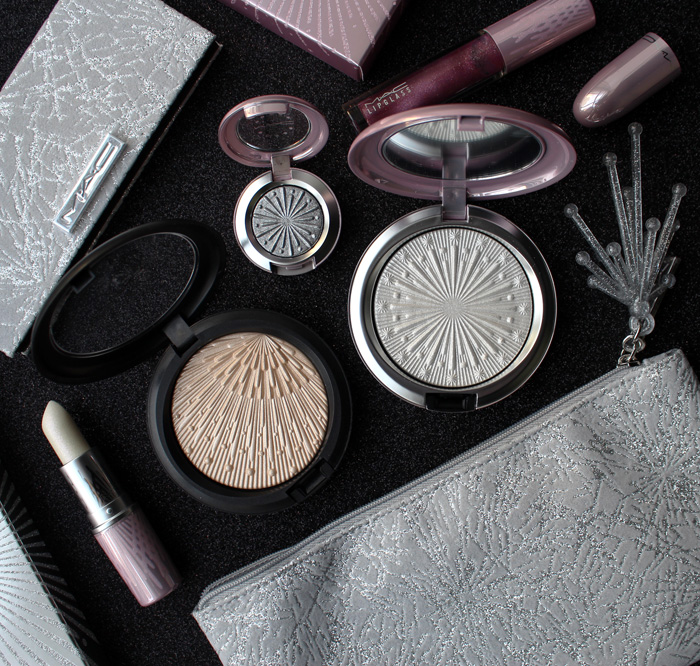
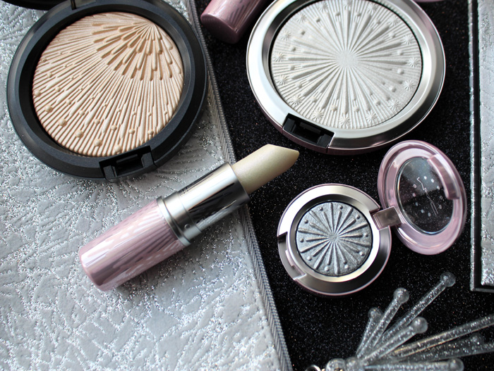
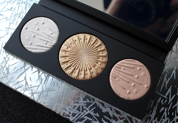
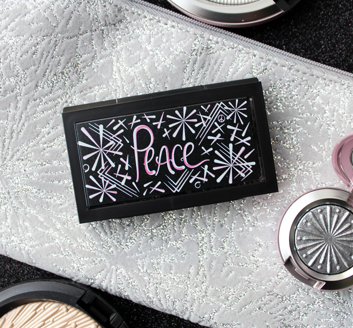
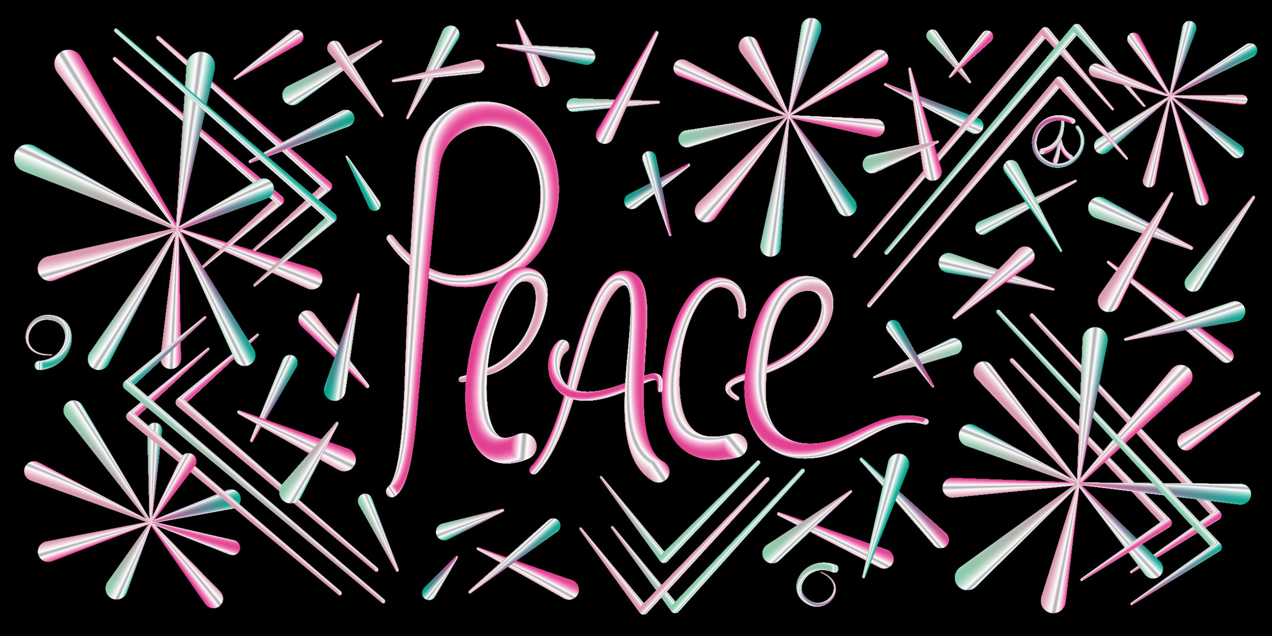
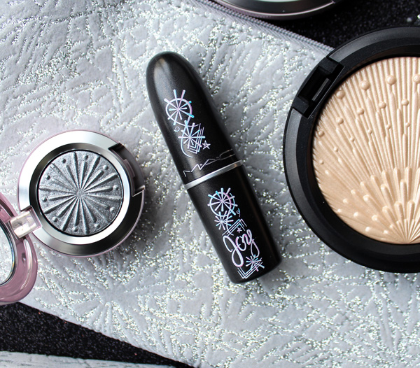
MAC's Frosted Fireworks was already a fun collection, but they managed to sneak in an artist collab in their holiday lineup too. And amazingly, the artist actually responded to my interview request and kindly answered my questions! We'll get to that in a minute, but to see how Bob Jordan's beautiful designs fit in to MAC's holiday collection, we'll take a quick peek at those objects first.
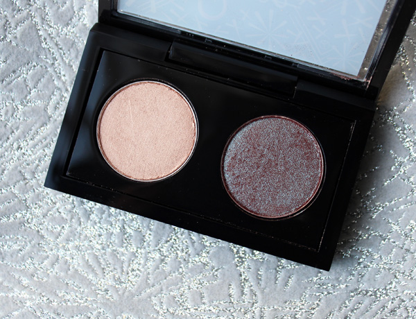
I picked up the eyeshadow in Silver Bells, highlighter in Let It Glow, highlighting palette, lipstick in Once Bitten, Ice Shy, lip gloss in Set Me Off and the Firelit Kit. Maybe it's because I always have the '90s on the brain, but Frosted Fireworks seemed straight out of 1996 or thereabouts to my eye – both the finishes and retro star patterns are reminiscent of the second half of the decade's obsession with frost and penchant for kitschy takes on MCM designs.
And now for something very special! Here's my interview with Brooklyn-based graphic designer and artist Bob Jordan, who created the bright and exuberant designs for MAC. Bob has a B.F.A. in Graphic Design from Maine College of Art. He founded his design firm, Factory 808 Designs, in 2014. While he had never made cosmetics packaging before, I think he absolutely nailed the MAC collection. I'm so pleased to have some of his work in the Museum and hope to see more makeup creations from him.
MM: Tell me a little bit about your background. Were you always interested in art? How did you end up in graphic design?
Bob: I grew up in my grandfather’s woodshop helping him out. He taught me how to solve problems and think creatively. When I was a teenager, I realized I could draw. Those two things became the foundation for everything I do now. I got into design because it allowed me to be multi-disciplinary in my creative approach. There are a lot of mediums I like to work with and I use them all in my projects. Most importantly, I get to draw. It doesn’t matter what I’m working, everything starts with a pencil and paper.
MM: Who or what influences your work? What other artists and designers do you admire?
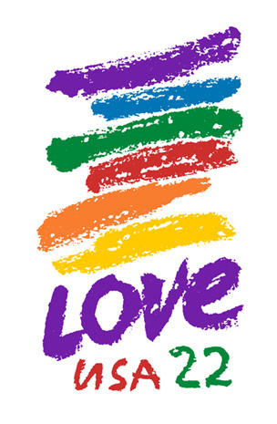
Bob: My first influence -and still favorite- is Chuck Close. I’ve always loved his use of color and shape in his compositions. I admire his resilience and his determination to continue to create his art even as a quadriplegic. I have a lot of respect for his process. I also love Sister Corita Kent. She was a pop art nun who fought for social justice causes and was also a teacher at Immaculate Heart College in Los Angeles. Most people would know her as the LOVE stamp designer from the 1980’s. Her 10 rules for Students and Teachers is timeless.
(image from cbsnews.com)
My other major influence is my home and community in Brooklyn. I am inspired daily just by simply walking outside. You get to see both known and unknown artists' work here. There’s a particular energy that resonates with me. Obviously it's tough to look into the future, but I know that it will always be a huge influence on my work.
MM: How did the collaboration with MAC happen? Did you approach them or vice versa?
Bob: The collaboration with MAC was very organic in its development. The head of digital at MAC as she is constantly on the hunt for collaborating with local NY designers on product and packaging design. Discussions began before COVID and went in the summer. It was some thing that we waited for the right time to do.
MM: What was the process like? Did they give you free reign or any sort of direction?
Bob: This process was a pretty open. There was a some seasonal themes and color ways that it needed to adhere to but there was a considerable amount of freedom. I’ve always found these types projects to be very difficult but the most rewarding.
MM: What inspired you to create the designs you did? What was your vision for the collection?
I was someone would had left the city during COVID and spent 9 months in the woods. It was a humbling experience and it allowed me to focus on some other projects but I was also missing the vibrance of the city. I had to come back and just walk around and soak up all the colors and energy. I would walk around during the day and then draw at night. I did that over and over til I found where I needed to be.
MM: How was the experience designing makeup packaging different than other projects you've worked on?
Bob: Designing for makeup packaging is not that different from some of my other work. I design a lot of packaging for cannabis products and there are many similarities. A lot of it is actually makeup packaging that is used so I’m used to working on small products. This was actually a lot easier because I just had to focus on the art and didn’t have to worry about any state regulations.
MM: Would you work with a cosmetics company again?
Bob: This was actually my first experience working with one, the opportunity to work with one just hadn’t come up in the past. I would definitely consider working with a cosmetics company again, but as with any project, I would need to make sure it's the right fit.
MM: Please share any thoughts you might have on makeup packaging or cosmetics in general.
Bob: I really hope that makeup packaging becomes more sustainable and minimalistic. I feel that way about all packaging. Working on cannabis packaging has really opened my eyes about how much packaging waste there is. I love designing packaging and I want to make sure that I’m doing my part. I would love to connect with cosmetics and any other companies whose mission it is to create sustainable products. That's the future. It has to be.
Bob, thank you so much for talking with the Makeup Museum! This was certainly enlightening and so interesting to hear the details behind this collection. And for Museum visitors, which piece is your favorite? I love both but I think the Peace design is my preference.
This was another one of those "buy first, ask questions later" type of purchases. As soon as I saw the images I knew this collection belonged in the Museum, even though I had no idea who or what Nicopanda was. Turns out, Nicopanda is a streetwear line founded by designer Nicola Formichetti in 2011. I'll talk more about the brand in a bit, but first, let's feast our eyes on the positively adorable packaging.
In keeping with the brand's spirit, I picked up what I thought were the most fun lip colors.
Even the boxes are precious. You know how much I appreciate patterns on both the inside and outside!
I normally would have gone for a palette rather than face stickers, but these were apparently Formichetti's favorite item in the collection, and when I thought about it a little bit, it occurred to me that they were the most representative of Nicopanda's vibe.
The panda design on the MAC collection, obviously, is a replica of the panda mascot in the Nicopanda clothing line. Formichetti notes that it was imperative to incorporate the panda motif in a big way – as with the Jeremy Scott collection, custom molds for the packaging were required, and Formichetti sees the final designs "almost like a collectible". As we'll see shortly, the the Nicopanda symbol holds a lot of meaning for the designer. "Ultimately, the panda was a big part of this inspiration. I originally created this character to represent something that is a symbol of creativity and diversity. It was very important to bring the panda into the design and creative process. The packaging is clearly inspired by the panda, which is custom made and the first time MAC has launched something like this. It’s visually so exciting, elegant, fun, unisex, and everything we wanted to accomplish."
Now that we've seen a bit of the MAC collection, let's get down to the what, how and why. The Nicopanda brand began as a pop-up store in 2011. as a side project of Nicola Formichetti and his brother Andrea. Nicola was working as a stylist to the ever-eccentric Lady Gaga at the time (and became creative director for Diesel a few years later), and due to its overwhelming popularity the line expanded to become a full-time endeavor by 2015. As for the panda moniker, Formichetti explains: "My friends used to call me Nico Panda because I’m half Asian, I had this long beard back then; and was a little chubby, so I looked like a bear—an Asian bear. So people started calling me Nico Panda on Twitter, and then once Gaga did that panda makeup, I created this character for the store."
Nicopanda was born out of Formichetti's desire to both explore his Japanese roots and create a unique, light-hearted streetwear line that's also genderless. "It's our job to provide as many options as possible for people to choose from so they can be whatever and whoever they want to be," he stated. "We should have unisex garments.1 But, we also have to have more feminine and more masculine clothing because there are times when you'll want dress more masculine, more girly or in between." As you can see from recent collections, Nicopanda definitely appears to be a pioneer in genderless dressing. Not only is the clothing intended for all genders, the casting of androgynous models furthers the notion of a future without gender labels. I have to say I like the concept of readily accessible clothing that's not intended for men or women. Wouldn't it be fun to go into a store, see an item you like and buy it without worrying it's the "wrong" gender for you? I mean, if I like a piece of menswear I'll buy it, but there's a great sense of freedom in buying non-gender specific clothing.
Another way Formichetti is turning the notion of gendered clothing on its head is the use of traditional markers of femininity – pink, ruffles, skirt silhouettes – on ostensibly male models. The point Formichetti seems to make isn't men embracing their feminine side, but rather wanting to create styles that anyone would feel comfortable wearing if they chose.
Obviously, the topic of genderless clothing is far beyond the scope of this post, but I want to look at how Nicopanda applied the concept to makeup. In the video below, he stresses that the MAC collection is for everyone: "I made this collection for everybody – girls, boys, and then everyone in between…I think it's very genderless and freestyle…diversity and inclusivity are part of everything I do and Nicopanda does."
Indeed, most of the models in the ads defy gender and even race. Diversity and playing with opposites were central to Formichetti's vision for the MAC collection, since they are also tenets of the Nicopanda brand. "The inspiration for me was to create something that was new and different and focuses on creativity and diversity all while being playful and fun. That’s kind of the inspiration for everything I do. I wanted to create something that was personal to my brand and something that was special to celebrate my longstanding relationship with MAC. Together, we desired to develop something fresh, new, and contemporary for this new generation of makeup users. I’m half Asian and half European so it was important to me that this collection delivered a little bit of east and a little west. There’s a touch of street culture and high fashion. The theme was diversity. To create something that was very feminine but also masculine. For the packaging, we wanted this to show polar opposite colors that worked together just like a panda. I love bringing together opposites – you can even see that in the packaging – contrasting the white and black. Nicopanda brings together high-fashion and streetwear just like this make-up collaboration."
As for the makeup in the ads, it seems Formichetti's insistence on creativity may not have resonated with everyone. Many expressed the opinion that the application resembled a toddler's finger paint (you MUST check out Karen's hilarious take on this over at Makeup and Beauty Blog), while some were genuinely confused.
While I personally admire the very avant-garde application, I'm inclined to say that these sorts of looks aren't as wearable as Formichetti intended. He says that there is something for everyone, and that non-traditional shades are in fact versatile: "With the actual products, I desired to create something that could go from day to night. Something that was fun and funky for the person who wants to take their makeup to the next level, but something that also works for someone who wears minimal makeup. The mix of colors is so couture. I wanted to use non-traditional colors that are really popular with my Nicopanda crew – all the colour palettes for lips, eyes, and cheeks are very wearable and absolutely fabulous." I don't know about you, but I'm definitely not seeing this in the ads or even in the makeup itself. For the most part the colors skew bright – there's nary a neutral to be found, save, perhaps, for the face powder. Again, I have no issue with this, as my love for so-called weird colors and non-traditional application knows no bounds, but it seems rather disingenuous to claim the collection is easily wearable when at the same time promoting solely unusual looks. Traditional application is entirely left out of the official ads; MAC encourages customers to "let out your inner weirdo" and "never stop breaking the rules".
I feel as though Formichetti can't disguise his penchant for "crazy" makeup colors and application, and he shouldn't have brought up the issue of wearability with the MAC collection. I would have expected nothing less than totally out-there makeup, given previous looks from his runway shows. The MAC collection is absolutely an extension of the Nicopanda aesthetic, and I don't think Formichetti should have tried to promote versatility as a selling point because that's clearly not what he's about. As my mother would say, a leopard can't change its spots.
There is also the issue of claiming diversity when there's not a single model over the age of 25. Perhaps in terms of gender and race Formichetti nailed diversity, but let's be honest, he clearly wasn't making face stickers with people my age in mind. In explaining how the MAC collaboration came to be, Formichetti notes that a more youthful demographic is the key focus for Nicopanda. "Nicopanda is about youth — the new generation. The brand is always about trying new things, sharing and creating new ideas, so I wanted to tackle the beauty world with Nicopanda. A cosmetics collaboration with MAC is a natural partnership…I’ve been collaborating with MAC for a long time, working on their campaigns and projects for years…it was a natural progression to create product together with Nicopanda. They are like family, and we really trust each other." In the earlier video interview, he states that his vision and MAC's are similar due to their interest in spurring creativity, but also because of their "work with young talent." While MAC and Nicopanda are a great match for the most part, Formichetti seems to have left out the "all ages" part of MAC's 3-phrase tagline. Once again, I wouldn't mind so much if he didn't claim otherwise – if you want to make a collection for the teens and 20-something crowd, that's fine, but don't insinuate that it's the epitome of diversity because it's not. Formichetti maintains he's talking about the "young at heart" when discussing his customers. "The Nicopanda customer for me is someone who wants to play and isn’t scared of trying new things. I desired to give them the materials to inspire their creativity and encourage that playfulness. My consumers don’t take things too seriously and are super young-spirited. Not necessarily in age, but they exude a young energy. This collection is so in sync with that; sophisticated yet light-hearted." I still say the ads tell a slightly different story.
Overall, I applaud Formichetti for breaking gender barriers in fashion, and making it affordable to boot. I love the concept of Nicopanda and MAC was an excellent match for a cosmetics line. I only wish Formichetti would have insisted on including a few older faces and some more traditional looks for the campaign, or left diversity out of the conversation all together. The models in the ads were certainly varied in race and gender and the makeup looks felt fresh and modern, but the lack of models in their 30s and up, along with the presentation of solely non-traditional makeup application, directly contradicts Formichetti's stance that this was a collection meant for everyone and could be worn in more traditional ways. Nevertheless I'm willing to overlook it in this case because that panda packaging is simply too cute and unique.
I was supposed to write a post rounding up all the delectable Chinese New Year goodies, but not all of the ones I ordered arrived. I didn't want to write it without having everything in hand so instead, I thought I'd celebrate the packaging design mastery that is the MAC Jeremy Scott collection. You might remember Scott's teddy bear-themed Moschino/Sephora collab from last year, but the MAC collection is under the designer's own name, and dare I say, even more amazing design-wise than the "beary" cute goodness served up by the Sephora collection. This is especially true for those of us who grew up with mix tapes and CDs – as a child of the '80s and a teen/young adult in the '90s, the nostalgia is quite strong with this collection.
Scott wanted it to look like "something you'd buy at Best Buy" and that's exactly what it resembles. Every last detail on each of the three pieces (CD, cassette tape and boom box) make them look like the real deal. As a matter of fact, I left them sitting on the kitchen counter for a couple days before taking photos and every time I walked by they threw me for a loop. I couldn't remember whether I was supposed to be making a mix tape or CD for someone, or thought maybe the husband is making one for me, as he did early on in our courtship. It was sort of like being in a time warp.
The collection is obviously inspired by music and the fact that Scott remains one of the top designers for the world's leading pop stars. It also reflects his perspective on the similarities between music and makeup . He explains to British Vogue: "Music plays a huge part in getting me into the mood, whether that be music from certain time period, or something aggressive or something that sounds ethereal – it envelops me and gets my mind in a certain frame for creating. Often when I’m designing clothes for my girls like Katy Perry, Rihanna, Miley Cyrus, either for a tour or for a red carpet event, I will play their songs and channel their spirit. Or when I miss them, I play their music and they’re with me, they’re chatting in their room. Music carries the essence of somebody. That’s why we fall in love so hard with musicians, they’re connecting with our hearts on such a visceral level…I’m fascinated by music and how you can change the mood of a whole room just by changing the song. Music fills the air and wraps itself around you. To me, that’s a similar quality to what make-up can do – both have such a transformative quality. You can wear a plain white T-shirt and scruffy jeans, but put on a bold lip and there’s a whole different feeling. Make-up can overpower the apparel. I wanted this collection imagery to show different inspiring moments in music, including a boom box, cassette players and CDs, and really play on the frivolity of a night out as well as make-up and music’s transformative power."
MAC originally approached Scott two years ago for a collaboration, since they've been doing the makeup for his runway shows for years. The reason it took so long for it to come to fruition was in fact the design aspect. I can absolutely believe it would take years to create makeup packaging that 100% mimics the technology we used back in the day to listen to music. Scott notes the importance of the packaging to him and his hopes that one would display it. "Any time you have special molds for compacts and cases, that takes a super long time. I wanted the compacts to be a living thing — maybe after you’ve used all of the makeup, you still want to keep it because it’s an object. I think it can be repurposed and sit on your shelf."
The coup de grace in the collection (and the most divisive among makeup enthusiasts, as we'll see shortly) is the boom box eye shadow palette containing 29 shades. It's simply filled with breath-taking details, from the box to the outer case to the interior of the palette. I'm wondering whether MAC did all of these in-house or worked with an outside design firm. Either way, the collection is beyond creative and unique, and I hope whoever came up with the designs gets an award.
While many shared my favorableopinion of this collection, there was a handful of detractors who outright abhorred the eye shadow palette. Some commenters claimed that the overall gigantic size of the palette made it clunky and inelegant, but it was the inside that seemed to make people the most hostile. Many took issue with the "waste of space" necessary to achieve the equalizer effect. Here are a few rather harshcomments:
"That wasted space is making me sick."
"All I can think about is the other eyeshadows that could of been in that palette…"
"What a complete over production of excess packaging. Poor Earth."
"It looks like they forgot to add the rest of the shadows in the palette. I mean I get the concept but it shouldn't be for makeup…don't these companies realize consumers don't care about that stuff we care about cost effectiveness and getting as much as you can for your money when you're purchasing these products."
"Why are we being sold half empty products? The packaging is a joke."
My OCD is kicking in full force."
"What incredibly wasteful packaging. Plastic destroys our environment people. At least HALF of the packaging on a couple of these products could have been done without. It’s a shame how complacent people are about environmental destruction… and all for what? Eyeshadow."
The collection also seemed to dredge up the age-old discussion of buying makeup just for the packaging. I'm cringing from this Reddit post: "So the New eyeshadow palette is half empty because of the equalizer design/Sound waves. And I saw someone on IG saying that she bought it, was never going to use it, But just had to buy it because of the packaging. This palette costs 75$! I hear so many on youtube talking about packaging and how they are gonna buy something just because it looks cute/beautiful/whatever, and I don't understand how that can be enough of a reasoning. Makeup is (in my eyes) not decor But something to be used. So my question is, can anyone explain Why packaging is enough of a reason to buy something, What you do with the makeup that you don't use But is pretty or just give your overall thoughts on gimmicky packaging and limited edition “collectors items”? 🙂 I'm sorry if I Sound super judgy, I just dont get Why you would buy something only for the packaging, name, brand or theme if you know you don't like the colours or wont/cant use it."
It seems my decade-long attempt to get people to understand that collecting makeup with interesting/beautiful packaging is just fine, and even worthwhile from a historical perspective, has gone unnoticed. It's disheartening to say the least, as many respondents chimed in with how they appreciate nice packaging but would never buy makeup just for the packaging alone and not use it; apparently it's "mindlessly consumerist" and "dumb". One of the positive things in that Reddit post is that the OP noted that she sees "so many" on YouTube purchasing makeup just because it's pretty, without any intent of using it. So maybe more people are getting into the notion that appreciating makeup as an art object in and of itself is an acceptable pursuit. Still, I'm tired of people being judgmental about collecting makeup. (I'm also sick of these same people claiming not be judgmental by adding drivel such as "to each their own" or "whatever, it's not my money" to their disparaging comment, as if that makes their statement non-judgmental. Please. It's like someone texting "fuck you" with a smiley face emoji – doesn't make it any less obnoxious). I mean, no one's forcing them to buy things just for the packaging, so what do they care if other people do? There's no harm in companies making whimsical packaging or in people buying it. I don't want to continue rehashing my stance on makeup collectibles and why they are museum-worthy, but you can read it here. In the case of the Jeremy Scott collection and the issue of waste, it's annoying to see people complain about what they perceive to be excessive packaging. I guess if you only look at makeup solely as a utilitarian item, you're narrow minded and have no imagination that's fine, but I don't think it's right to be holier-than-thou and pontificate about the environmental impact of certain items when they were designed to be collector's pieces. I wonder whether these people complain as much about this for other objects or only makeup. I'm also betting that the vast majority of people who bought the collection aren't necessarily going to throw the items in a landfill when they're done using them – as Scott suggested, they are more than likely to keep them as display pieces. Finally, I think in the case of this particular palette, it's actually a decent value – at $75 for 29 colors, it comes out to about $2.60 per shadow. (Alas, the quality was dismal, but that's not what I'm focusing on, obviously).
The other packaging-related thought I have rattling about in my head that is that the collection still has not sold out. On the release date (February 8), I woke myself up around every half hour starting at midnight so that I could have a chance of nabbing the collection before it sold out, which I was sure it would do in seconds. Instead, over 2 weeks later all three pieces are still widely available at various retailers. I'm wondering whether it has something to do with the packaging – not because wasted space issue, but because it's not appealing to a younger crowd. You would think the bright colors would be a natural draw for a youthful demographic, but CDs, tapes and boom boxes probably don't have the same nostalgic impact on, I'd say, anyone under 25, so the packaging might have missed the mark with a good portion of MAC's target audience. I'm having this vision of a group of teens/early 20-somethings walking by the MAC counter and being genuinely confused as to what they're looking at ("What's THAT supposed to be?"), since they were raised in the digital age where music largely doesn't exist in these sorts of physical formats anymore. Indeed, I'm notthe only one who thinks this might be the reason behind the non-sellout status of the collection. I also think one commenter's musing that the collection might have been more palatable to the youth if it had included a record-shaped compact is hilarious – maybe those teenage hipsters who listen to records would have bought it.
"Love it!! Only people who grew up with this stuff will get it."
"i need this!!! as an 80s 90s lover i must have this"
"i was born 79..i'm so happy all you guys don't want it..that means it will be around for 2 weeks. i thought it would sell out..but i forgot a lot of these people are so young the probably never had a real boom box. Maybe if the palette was a record the kids would be more interested in it."
"Such beautiful collectors items. Millennials born in the 80's can appreciate this I think. The new generation Z peeps… Not so much."
"The packaging is everything and calling me. #90sgirl"
Final thoughts: it might be the nostalgia talking, but obviously I think the collection was worth every penny due to the incredible packaging. The design is also a perfect reflection of Jeremy Scott since it's just as fun and over-the-top as he is. Even without his name on every piece you could most likely tell it was his collection. While I'm dismayed at how some people criticized the packaging of the eye shadow palette with no legitimate reason, I'm heartened by my fellow xennials who recognized and appreciated just how faithfully every detail of the music technology we grew up with was replicated. The only thing I would have done differently is add a Walkman palette to the mix – I was positively glued to mine in the '90s and still miss it to this day.
What do you think?
It's nice to see a makeup brand continue the long-standing tradition of collaborating with jewelry designers. The most recent partnership was between MAC and Robert Lee Morris, whose name I admittedly hadn't heard of until now.
Says Morris, “I am thrilled to be working with MAC, as I believe this partnership exhibits a true coming together of beauty, art and design…The collaboration is an exciting moment for both brands, as we are both leaders in cutting edge imagery and enhance one another. I have always been fascinated by the personal ritual we all experience while grooming and getting dressed each day; and the tools we hold should be as luxurious as possible. My pure and iconic aesthetic seamlessly translates to the shapes and forms created for MAC, and I have designed the collection with an ultra-modern focus; sleek, architectural lines and dynamic, like my jewelry.” I'd say that's a fair description of what he came up with for MAC, particularly with the lipstick case, as it looks reminiscent of a modern skyscraper. The compact looks simultaneously futuristic and organic, sort of like a UFO crossed with an egg. I know that's a less-than-eloquent description, but arguably accurate.
The shape and finish on this mirror reminds me of a smooth pebble you'd find in a serene yet opulent koi pond.
If you purchased the mirror, know that it swivels open – I nearly broke mine trying to open it like a regular compact. #curatingfail
I'd prefer not attempting to trace Morris's entire career since he is quite prolific, but here's the condensed version. Born in Nuremberg, Germany in 1947, Morris was exposed to a variety of cultures on account of living in many different countries for his father's military career. Entirely self-taught, after graduating from Beloit College in Wisconsin in 1969, Morris began making jewelry on an artist commune he established with some friends. “Everyone on the farm made something different—pottery, sweaters, macramé…I decided to make jewelry. I got a book called How to Make Jewelry by Thomas Gentile, which was easy to follow with lots of pictures. I said to myself, I need a hammer and some wire, and I built a workshop in a tool shed. I would listen to Led Zeppelin’s first album and worked until two or three o’clock in the morning in total ecstasy.” Unfortunately, the farm burned down, and Morris moved to Vermont. He didn't have to wait long to be discovered, however, as in 1971 a gallery owner who wanted to display jewelry-as-art at her space, aptly named Sculpture to Wear, asked to showcase and sell his jewelry. By 1977 Morris had opened his own store in New York, and during the '80s became a favorite with both fashion designers (Calvin Klein, Michael Kors) and celebrities (Madonna, Jodie Foster) alike. Among his most memorable pieces were the result of his work with Donna Karan, whose black knitwear soon seemed incomplete without one of Morris' signature gold baubles.
I'll let Morris describe his style in his own words: "My original idea was to create a body of work for an imaginary futuristic society that was post-apocalyptic and that the pieces would be a combination of savagery with high-tech gadgetry. Today, I'm probably in the exact same place, but I'm also thinking about what kind of jewelry people would wear who aren't from this planet. What would you wear on deck in a spaceship? What would you wear with your Mylar spacesuit? And seeing how all beauty is based on sacred geometry, I'm fascinated with taking jumbled, tribal pieces and finding the sacred geometry that's there." Obviously I'm raising an eyebrow at the words "tribal" and "savagery", but they are apt in that Morris's earlier pieces definitely embody a romanticized notion of so-called "primitive" societies.
Indeed, one news article describes his work as a "mix of ancient/primitive with Flash Gordon" and notes that Morris enjoys traveling to "exotic outposts such as Peru and Kenya, where he draws inspiration from ancient cultures". Oy vey. I don't think it's inspiration so much as cultural appropriation, but fortunately Morris seems to have outgrown that style. Modern and sculptural with an organic quality to them, Morris's work nowadays seems to be more inspired by natural forms rather than appropriation of native peoples' body adornments. These pieces in particular resemble the more futuristic/architectural items from the MAC collection (the compact, lipstick and mirror, respectively).
I have no idea why MAC decided to join forces with Morris now, but I do know it's not his first rodeo designing makeup: he created a refillable compact and lipstick case for Elizabeth Arden in 1992. Called Rituals of Color, the collection reflects Morris' fascination with spiritual rituals and how beauty routines can be elevated to their own sort of ritual through beautiful packaging. As this article shows, Morris was partially influenced by his mother's makeup routine and the importance of "presentation".
Indeed, the Elizabeth Arden collection provides a lot more context for the MAC lineup as the concept is essentially the same, just executed differently. "What women wear day in and day out becomes their statement of who they are, an extension of their identity. Designing both [jewelry and cosmetics] is a very intensively intimate process," he noted in October 1992, explaining further: "'I'm a symbolist," the designer says. "'I believe packaging is very much a part of the ceremony we all go through in the morning to put ourselves together. People need to form an environment to heighten the experience of the ritual. Those who want to treat themselves better need the product and packaging to be very much a part of their beauty psyche.'" The first two pieces in the line are a lipstick case and compact, designed 'to look and feel organic, with a natural-looking shell for what's inside, like a clam or mollusk's shell.'" Another article points out that he actually came up with the design in 1976: "Taking two discs, I noticed they sandwiched as a clam."
Both pieces are so fantastically '90s – as modern as they seemed back then, they look pretty dated now. Then again, I definitely appreciate a fashion relic from my favorite decade, and I'm enjoying the luxuriousness and nod to natural elements in both pieces. The compact does indeed look like a golden shell, while the lipstick case resembles a rather elegant bamboo twig.
The idea of elevating a mundane task such as applying makeup through the design of the makeup itself – especially when that design is created by a jeweler – isn't new, but it's always fascinating to see what various jewelry artists come up with. In the case of Morris, it's particularly interesting since he's done two makeup collections spaced 25 years apart, so you can really see how his style has evolved. His approach is the same, but the pieces are quite different stylistically. I appreciate the Elizabeth Arden collection for being so representative of early '90s style, but I also like the more futuristic vibe and burnished gold finish of the items in the MAC collection.
Which iteration of Robert Lee Morris makeup do you prefer? And had you heard of him before now?
Save
Save
Save
Save
Save
Save
Save
Save
Save
Save
Save
Save
Save
Save
Save
Save
Save
Save
Before I delve into the summer collections, I thought I'd look at one last release from the spring. MAC teamed up with Chinese fashion designer Min Liu (a.k.a. Ms. Min) for a small collection featuring Min's signature modern twist on traditional Chinese style. I picked up the standout from the collection, a blush/highlighter palette embossed with a truly gorgeous wave pattern.
I didn't have to search very hard to find the inspiration behind the colors Min chose, along with the wave design. In an interview with online magazine Buro 24/7, she explains, "There are actually four main colors in this collection which are China red, lush peony pink, shimmering platinum, and bold ink black. Each colour is rich in meaning and contains a distinct energy in traditional colour theory. Red promises loyalty and bravery. Pink is a metaphor of beauty. Silver introduces the gods and spirits. Black brings honesty and integrity…The philosophy behind my collaboration with MAC is that everything is about how energy flows, casting a distinct aura, vitalising all forms of life — humans, water, mountains, earth, oceans, clouds. That no matter how it shifts and changes over time, the world maintains an eternal rhythm. It's also inspired by the ancient masterpiece Shang Hai Jing (The Guideways through Mountains and Seas), which is about Chinese mythology culture, spirituality, and folklore…[It's] an allegory for the energy that flows between mountains and oceans and across vast landscapes, spanning time and space. To open this compact is like feeling the universe in your hand. Somehow it reminds me that there is a universe out there."
I personally think the design resembles the waves from this 1597 illustration of the Guideways Through Mountains and Seas. (It also reminds me of Hokusai's The Great Wave, but that's a completely different cultural reference.)
So it's pretty, but what does the makeup have to do with Min's fashion? Well, the designer created a beautiful capsule collection to coordinate with the makeup, which was unveiled at Shanghai's fashion week in a rather dramatic runway show. (There's probably a lot more information in this WWD article, but of course it's behind a paywall and my library doesn't have the April issue available yet. Sigh.)
The clothing was simply stunning and the makeup was spot-on. I can't imagine a more harmonious collection. I can also definitely see the traditional-meets-contemporary vibe of the clothing, which is better described by Min: "The style of Ms MIN has always been inspired a lot by tradition, culture and spirituality. There's been this conversation between modernity and tradition, Yin and Yang, contrary and balance and ultimately, discovering the harmony of all elements together. Anything relative to beauty reminds us and inspires us: beauty of life, beauty of energy, beauty of this world, and beauty inside of ourselves." And as for her general perspective on makeup, Min emphasizes owning your look. "I'm wearing the makeup, the makeup is not wearing me," she says. It's a good reminder not to wear anything that makes you uncomfortable; otherwise it will indeed look like the makeup is wearing you and not the other way around.
Obviously the clothing was also used in the MAC campaign ads – here's a slightly better glimpse of it.
Overall, I can't say I'd wear any of Min's clothing, but I appreciate her aesthetic. And I think the MAC palette totally captures it by updating a motif inspired by an ancient Chinese text, along with the color scheme – the shades chosen have certain traditional meanings in Chinese culture, but combining them into one palette, along with how they were used on the runway and campaign, gives them a modern feel.
What do you think?
As soon as I saw the word "tetrachromat" in the various descriptions of MAC's Liptensity lipsticks, I knew I'd have to investigate. MAC's new range was created in partnership with a tetrachromat, someone with the very unique genetic ability to see up to 100 million different colors (us boring old trichromats can only see 1 million, boo). Working with a tetrachromat allowed the company to produce "the most technologically advanced lip product to date" using "high-frequency tetrachromatic pigments technology" or at least, that's what MAC's telling us. The bigwigs weigh in: “It’s a tech story; it’s not a fun, frivolous collection were doing,” James Gager, senior vice president and group creative director of M.A.C., said. “It is super, super saturated, undeniable color load in this lipstick.” Adds Jennifer Balbier, senior vice president, global product development at MAC Cosmetics, “Liptensity contains pre-saturated pigment combined with a clear base — unlike most lipstick bases that are more opaque or 'muddier' — to give a 'true' color. When people say that the ‘color stays true,’ it’s not always true because it acts with your own chemistry.” Sounds impressive, but is it for real? Let's look into this a little further to see whether the world's first makeup based on tetrachromacy is really all that superior to what's currently out there or if it's just the emperor's new clothes.
First though, what causes tetrachromacy and how exactly does it work? According to this article, a tetrachromat has 4 different types of cone cells, i.e., the receptor cells that recognize color. The 3 usual cones that most humans have are attuned to wavelengths of red, green and blue (almost like a TV), while the special 4th cone detects yellow. Not only that, scientists have discovered that to be a true tetrachromat, one not only requires the extra 4th cone, but their brains must also be able to distinguish it from the other cones. In other words, some people have 4 types of cones but since their brains are wired like trichromats, it doesn't register any additional colors. It's possible that by retraining the neural pathways to detect more colors, people with 4 cones may eventually achieve true tetrachromacy. As vision scientist Jay Nietz told Discover Magazine, 'Most of the things that we see as colored are manufactured by people who are trying to make colors that work for trichromats…It could be that our whole world is tuned to the world of the trichromat.' Furthermore, "[Nietz] also suspects the natural world may not have enough variation in color for the brain to learn to use a fourth cone. Tetrachromats might never need to draw on their full capacity. They may be trapped in a world tailored to creatures with lesser powers. Perhaps if these women regularly visited a lab where they had to learn—really learn—to tell extremely subtle shades apart, they would awaken in themselves the latent abilities of their fourth cone. Then they could begin to see things they had never tried to see before, a kaleidoscope of colors beyond our imagining." Anyway, in addition to genetic testing, in 2012 a reliable color test was developed to determine if someone was a true tetrachromat.
Another incredibly interesting tidbit: to date, only people with 2 X chromosomes have been found to have this unique genetic trait. As Popular Science explains: "For years, researchers weren’t sure tetrachromacy existed. If it did, they stipulated, it could only be found in people with two X chromosomes. This is because of the genes behind color vision. People who have regular color vision have three cones, tuned to the wavelengths of red, green, and blue. These are connected to the X chromosome— most men have only one, but most women have two. Mutations in the X chromosome cause a person to perceive more or less color, which is why men more commonly have congenital colorblindness than women (if their one X chromosome has a mutation). But the theory stood that if a person received two mutated X chromosomes, she could have four cones instead of the usual three."
Now that we've got the medical explanation for tetrachromatic ability, let's think about what this means in terms of perception. How do they see colors as compared to us boring old trichromats? As expected, it's exceedingly difficult for a tetrachromat to explain what they see. Fortunately, tetrachromats who have artistic ability in addition to their super human vision can help us understand it a little. Take, for example, Concetta Amico (already smitten with her since she has the same first name as my mom!) whose paintings reflect a range of color nuances. In this interview (which you should really read in its entirety – SO fascinating), she explains it this way: "I see colors in other colors. For example, I’m looking at some light right now that’s peeking through the door in my house. Other people might just see white light, but I see orange and yellow and pink and green and some magenta and a little bit of blue. So white is not white; white is all varieties of white. You know when you look at a pantone and you see all the whites separated out? It’s like that for me, but they are more intense. I see all those whites in white but I resolve all these colors in the white, so it’s almost like a mosaic. They are all next to each other but connected. As I look at it, I can differentiate different colors. I could never say that’s just a white door, instead I see blue, white, yellow-blue, gray." Another intriguing snippet is her view on makeup: "I’ve leaned toward makeup as a way of leveling out all that color in my skin that other people wouldn’t worry about. I feel like I have to put concealer and powder on my face because every vein and blemish is so visible. I guess the fact that I see more color in skin is why I’ve never liked going out without makeup on. People ask why I always wear makeup. They say I look good without it, but I can see in all the veins the red and the blue. I see too much."
This seems like a radically different approach to makeup and color than that of the MAC collection, so it could explain why the company chose to partner with another tetrachromat, Maureen Seaberg. In 2013, Seaberg recognized the similarities between her experience and another tetrachromat who was being interviewed on Radiolab. Via a DNA test doctors were able to confirm that she is a tetrachromat.* No stranger to makeup (she'd mix colors herself if she couldn't find the perfect shade), Seaberg pitched a collaboration to MAC. "The company I most admired for its diversity, philanthropy and having the most expertise with color was M.A.C. I composed an email to legendary creative director James Gager, who has said that all of his collaborators 'are like strange aunts and uncles coming home.' I hoped I was strange enough."
What did Seaberg actually bring to the table, though? As somebloggers worried, a tetrachromat's shades might have nuances that would be completely lost on the rest of us. No worries though, for Seaberg wasn't trying to make trichromats struggle to see something only she can. "I see colors that other people cannot, but I was not trying to skew the products in invisible directions," she tells Buro 24/7. She explains further, "It wouldn’t serve the consumer if I were sitting there playing with color in a way that would skew it in a way that people couldn’t really discern or enjoy it. So, we used my eyesight instead to spot these undertones and overtones and send them back to the canvas to say that a Bordeaux had too much orange… or if a pink had too much yellow in it and needed to cool off, we might remove the yellow and add blue to the mix… I was more trying to center the colors and make them as true to themselves as I possibly could." For Seaberg, collaborating with MAC wasn't about creating colors that only made sense to her; in fact, she was doing a huge service for making them as pure and true as possible, and in doing so, made them work for a wider number of people. She tells The Cut, "I had 24 shades that I started with. It was my job to tweak them and make them the most beautiful. I used my vision to look very closely at them and see if there were undertones or overtones that could be cleared up. We wanted to make them as pure and clear as possible…I had a feeling that if we could take out the things not true to the color we were going for, it would be more beautiful on more faces. They would behave more like neutrals. Doe in M.A.C Liptensity was used in every model on the Balmain autumn/winter 2016 runway, on models of every skin tone. It worked on every one. Whereas if there were orange tones, for example, it wouldn’t look right on some girls." While the average person might not be able to appreciate how true the colors are since they're not a tetrachromat, it's really cool to know that someone with super human ability to detect color was behind them.
My photos don't really reflect the pigmentation and purity of the colors, but so far so good: I'm wearing Dionysus today (the aptly named wine/plum color) and it looks exactly the same on my lips as it does in the tube, and has stayed the same color all day without fading. I have yet to try Blue Beat and Stallion but when I swatched them at the store I was impressed.
However, I'm not totally convinced by the hype. Yes, these lipsticks are highly pigmented with a great texture (not heavy, with a satin finish that's neither matte nor glossy), but I do wonder whether I'd be able to tell them apart from other lipsticks – I'm not sure if consulting with a tetrachromat was truly necessary to create these shades, beautiful though they are. Then again, I lack that pesky 4th cone so maybe I'm really just not seeing it. I also want to know more about the particular technology that aided in the development of the formula – is there really a such thing as "high-frequency tetrachromatic pigment technology" and if so, how exactly does it work? I couldn't find any information about patenting, and MAC didn't give many details besides divulging that the pigment was mixed into a clear base. All this aside, Liptensity has opened my eyes to a color phenomenon I had no idea about previously, and a rather intriguing one at that. And it was genius of MAC to harness the power of a tetrachromat to come up with these colors, even if it does turn out to be just marketing; the idea of a color Superwoman creating makeup is simply irresistible to me. I'm curious to see if MAC will expand the "high-frequency pigment technology" to other products, like eye shadow, nail polish, etc. Or if a company will work with a tetrachromat to program some sort of machine that could automatically calibrate 100% color-accurate pigments. The implications for cosmetics are positively huge.
As for me, well, I'm pretty sad I'm not a tetrachromat given my love of color and comparing shades – I would be beyond delighted to enjoy that many more unique hues – but makeup can help refine my color detecting skills even if it's not anywhere near the level of a tetrachromat. As Seaberg points out, "One of the leading researchers in this field says that one of the necessary components in 'functional' tetrachromacy is a lifelong exposure to color. Conceivably, paying close attention to your lipstick shades could train you as a super-seer! I urge everyone to do just that. As someone once said — color is a mystery we all swim in, yet it is so ubiquitous it becomes invisible. Don't let color be invisible to you. Stop. Look. Enjoy." I know I will!
What do you think? Is this just all a bunch of hullabaloo or do you think there's something genuinely groundbreaking here?
*The only accurate test for tetrachromacy is DNA, combined with other color tests administered by professionals – those online ones are complete crap. Also, I was really struck by how Seaberg's perception of color is nearly identical to Amico's. Both prefer colors found in nature, and yellow can be quite the visual onslaught. "The grocery store and the mall are a color assault, there’s too much of everything and too much that is not naturally beautiful. Too many harsh colors and candy-colored marketing style 'plastics' for my liking. I find red and yellow too much. Yellow stresses me out," says Amico, while Seaberg states, "I do notice a difference in the number of colors in the natural world versus those in manufactured, human-made things….yellow is overstimulating — it’s a little too much for my eyes. Like, an NYC taxicab is too much. It’s almost like when you look at bright sunlight for a little bit and you recoil." Additionally, both agreed with scientists' claim that one must be immersed in color for most of their lives to be a true tetrochromat. Seaberg notes that "the perfect storm for tetrachromacy is having it in your genetics and a lifelong exposure to color," and Amico states, "The reason they say I am a functioning tetrachromat is because I’m a practicing artist. If I hadn’t been immersed in art and if I hadn’t been an art teacher for the last 30 years I wouldn’t necessarily have the level of color definition that they are finding. So while I have this genetic gift of a fourth receptor in my eyes the fact that I apply it on a daily basis improves my color recognition. Think of someone who has superior muscles but never learned to run. You can have the potential but it’s only realized if you use it."
Save
Save
Save
Save
Save
Save
Save
Save
Save
Save
Save
Save
Save
Save
Save
Save
Save
Save
Save
Save
Save
Save
Save
Initially I was confused as to why MAC chose troll dolls as a collection theme. Yes, a resurgence of all things '90s is upon us, but it still seemed strange to resurrect the troll doll fad. It only made sense when I got wind of the new Trolls movie, which releases this November.
Naturally I love how obnoxiously bright the packaging is.
The image on the boxes is the signature crazy troll hair.
I don't think I've ever seen makeup with a troll silhouette imprinted!
Glitter caps!
Now for a little history. The original troll doll was created by a Danish woodcutter named Thomas Dam in 1959. Too poor to afford a Christmas gift for his daughter, he carved her a troll figure out of wood instead. Pretty soon the doll was the talk of the town, and the Dam Things company began producing trolls made of plastic in the early '60s under the name Good Luck Trolls. In the U.S. the troll doll craze hit peak popularity from 1963-65 and came around again in the '90s. Being the '90s buff that I am, I felt the need to do a little more research on the renewed interest in trolls. I found a very useful entry on the topic here – while no longer active, this blog is great for anyone needing a dose of '90s nostalgia. While regular trolls were popular, there were also dolls known as Treasure Trolls that sported jewels in their bellybuttons, and you would rub the belly gem for good luck. You might remember the billikens I looked at earlier this year – one would rub their bellies for good luck, and one of the compacts I included showed a billiken with a jewel in his navel. So maybe the Treasure Trolls were drawing on this tradition? In any case, I just had to include these early '90s commercials for the Treasure Trolls.
I was hoping to find more about why trolls experienced such a renaissance in the '90s. Alas, I didn't turn up much. This article seems to think it was the general '90s obsession with anything retro, but that's about all I found.
Anyway, as a collector I was also curious to see if there were any folks out there who had amazing troll stashes, or even museums. Behold, the Troll Hole Museum in Alliance, Ohio! Run by Sherry Groom, the museum boasts a Guinness World Record collection consisting of over 10,000 troll dolls, figurines and other troll memorabilia. It's the largest troll collection in the whole world.
And up until recently, there was a Troll Museum in New York City's Lower East Side. The collection is considerably smaller; however, it was home to possibly the most diverse collection of trolls, including a very rare two-headed troll from the '60s. Unfortunately proprietor/artist Jen Miller, better known as Reverend Jen, was evicted earlier this summer. Due to health issues she was unable to work and pay the rent. It breaks my heart to think of her collection, so lovingly amassed over 20 years, to be sold or given away. Not only that, since the museum was actually her apartment (tours were given by appointment only) she has nowhere to live now.
While the Troll Hole may be much bigger, I definitely gravitate more towards Reverend Jen's collection. We seem to be kindred spirits in our approach to having museums in our homes, and also our "Board of Directors" – she clearly has a sense of humor about it the way I do with my museum staff.
I do hope Reverend Jen is able to get back on her feet. If nothing else, I wish I had known she was getting thrown out of her apartment – maybe I could have at least stored part of her collection somewhere until she was able to find another home.
Getting back to MAC, I thought it was well done. If I was going to design a troll doll-themed collection this is what I would have come up with. Yes, it's a little juvenile but still loads of fun for those of us who remember the troll fad.
What do you think of the collection? And do you own any troll dolls?
Save
With this post I'm attempting to forget about MAC's previous misstep. Fortunately, their collaboration with quirky designer Chris Chang is doing the trick. After earning her degree at Parsons and an 8-year stint for Prada Taiwan, Chang launched her own line called Poesia. Reflecting the designer's "fascination with the symbols and icons of her childhood dreams," the line seeks to embody the idea that "clothes should be easy and wearable without burdening women with unnecessary discomfort in structure and silhouette." It seems fairly straightforward, but when you actually look at Chang's creations, there's a lot more going on than that description implies. So let's take a peek at some of the MAC collection.
Naturally I adore the bold shades chosen for both the packaging and the products themselves. In a press release for the collection, Chang notes, "Color is the integral fuel of my imagination and the spirit MAC and I share. This collaboration is a dream come true for the maximalists of the world." I would definitely agree that this is the polar opposite of minimal makeup!
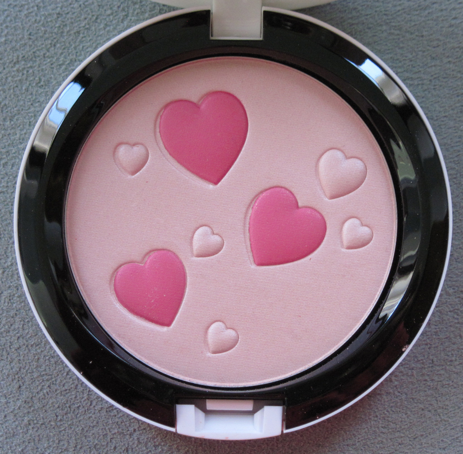
The packaging features a silk screen print Chang designed specifically for MAC, containing a mishmash of motifs from her previous collections.
Unfortunately I couldn't place every detail, but here's an attempt anyway (plus it gives me an opportunity to present some of Chang's fashion). The vase on the left of the powder case may be inspired by those seen on some pieces from the spring 2016 collection.
The butterflies are borrowed from the spring 2015 collection.
The birds and goldfish appear on the wallpaper at Chang's website…
…but could also be nods to the spring 2015 and 2016 collections.
Overall I think the print on the powder most closely resembles one from the spring 2012 collection.
The images on the outer boxes reference Chang's original concept for the MAC collaboration, which was "Kunqu madness". She explains to Allure: "The theme is Kunqu Madness. Kunqu is one of the oldest performance arts from China that combines singing, poetry, acrobatics, and dance—and a lot of hand gestures. And Kunqu has a very specific, avant-garde look. The makeup and costumes are exaggerated, so when I was asked to collaborate it took me five minutes to decide that this is going to be around Kunqu. In the collection there are all of the colors you see in the costumes." For Chang, I'm guessing a big part of the appeal of modernizing Kunqu is the "maximal" nature of it. She tells Pop Sugar, "When I was going to [Parsons School of Design] in the '80s, people were always talking about minimalism: 'when you’re done with your design, take that one last thing away.' I felt so awkward in this whole teaching method. I thought, 'minimalism?… I’m definitely maxi.' There’s something about Kunqu that’s also very maximalistic and extreme — the makeup, the singing — and also, it’s very poetic."
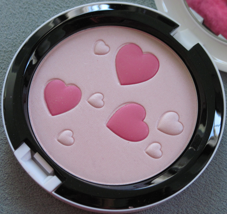
Here are some photos of Kunqu performances – I think Chang's idea of "Kunqu madness" is perfectly executed.
As a follow up on Chang's views on color, she also told Allure, "[T]here's no color that you can't wear—it's only a matter of how you wear it and how you apply it. It's 2016, and a woman is about to become the president. All of those rules are so outdated, but that's actually a big part of the Asian mentality. Thinking things like 'I can't wear green' or 'I can't wear orange' because it's not becoming against sallow, Asian skin. I say throw that out the door. It's a different time now, you know?…These colors should be used as war paint. Even if it's something just on the lid, it should be worn as paint, really. And I think that's where the direction for makeup is going. It should be worn like abstract art." Indeed, at a special fashion show held in Shanghai just for the MAC collection, models had the collection's colors applied in a rather avant-garde style.
Chang herself also got in on the war paint action. She looks pretty fierce!
This aligns with the designer's outlook on makeup and fashion: "I've never dressed or designed thinking, Is this appealing to men? Would men find this sexy? That mentality opens a lot of doors for me, for both how I can dress and how makeup should be worn. It's so satisfying for women to enjoy fashion and makeup. Who cares about men?" She then elaborates, "Women are strong. We’re equal, if not even better. Makeup and clothes are definitely to please a woman and not to please a man. I hate that [phrase], 'man repellent', so we should dress for ourselves. Love and relationships are such a small part of what a woman can do."
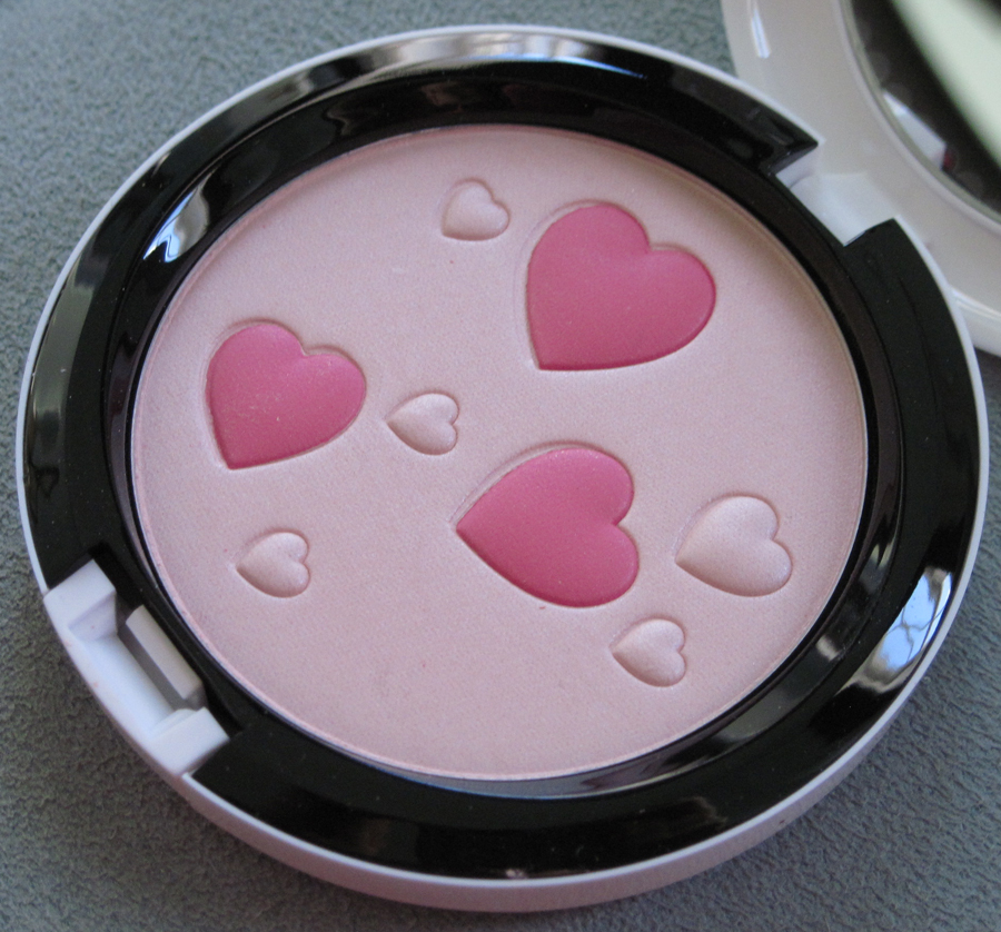
Chang definitely has it all for me – an appreciation for cultural practices that are thousands of years old, the ability to honor those practices through giving them a thoroughly unique, futuristic take, and a love of crazy bold colors that are worn without giving a damn as to what people find flattering or attractive. I've never been afraid to wear color, especially on my eyes, but Chang's perspective makes me want to flaunt it in a less traditional fashion (like trying out blue or green lipstick instead of hot pink or grey, which is about as colorful as I get for lips). I have purchased some pretty out-there lip shades but have yet to find the courage to wear them.
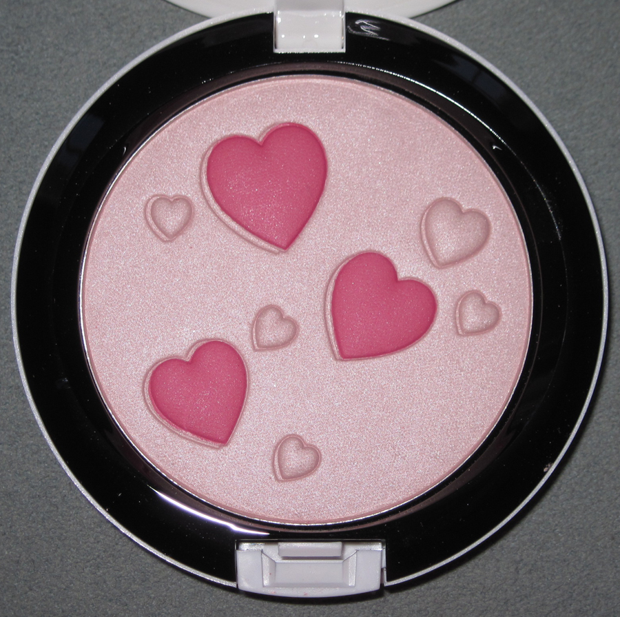
What do you think? Did you pick up anything from this collection? And are you a "maximalist" when it comes to makeup shades?
I hate to open this can of worms, especially since I can't add much original thought to the controversy surrounding MAC's new Vibe Tribe collection, but I thought it was at least worth summarizing the points and counterpoints. MAC's latest lineup urges us to "join the tribe" and "feel the vibe." Which tribe, exactly? Who are these women in the promo with feathers in their hair and derivative amalgams of vaguely Native American prints? I don't think they belong to any particular tribe, at least not any that MAC is willing to admit to. The company maintains that "the collection, including the visuals, product lineup, and naming, is inspired by art, outdoor music festivals, and the colors of the desert…[it] has absolutely no connection to nor was it inspired by the Native American cultures."
I have issues with this defense for several reasons. One is that in both the promo and the pattern on the packaging there is an undeniable Native American influence, what with product names like "Arrowhead" and "Adobe Brick", but MAC refuses to acknowledge this. As Nylon magazine explains, "It’s hard to believe the company could be this naive when the very patterns used on the product packaging appear to be Chinle and Ganado designs—traditional Navajo weaving patterns—rooted in generations of history.The word 'tribe' is also closely linked to Native American culture, making the collection seem iffy even by first glance, never mind when MAC’s refute is taken into equation. Additionally, the names of some of the products themselves also raise eyebrows—naming a lipstick shade 'Arrowhead,' for instance, is cringeworthy at best, especially when you deny there being any link."
Two, even if the collection is solely inspired by "outdoor music festivals", that's problematic since such festivals have historically been ground zero for cultural appropriation, with several festivals going so far as to ban headdresses. As one Reddit user says, "[The] problem with that is the patterns and textiles and designs they're referencing from Coachella, Burning Man, and other festivals are the same patterns/textiles/designs that were appropriated from indigenous peoples. Just because it festivals and festival-goers did it first doesn't mean it's not appropriation. If anything, that makes it worse, because they're attributing our designs and patterns to Coachella and Burning Man and other festivals – as though they were not ours for thousands of years before these festivals."
Third, this isn't the first time MAC has done this – check out my post on cultural appropriation in cosmetics for proof. One Twitter user also noticed this and took a screen shot of my post (didn't include a link to my post in his tweet, which I would have appreciated but what can you do.) You think MAC would have learned.
But is it really so bad? Many have argued that MAC is simply celebrating Native American culture and the pattern is merely a Southwestern motif, nothing more. Another argument is that "it's only makeup" and that there are more pressing things to take issue with, a.k.a. the old it's-just-uppity-people-looking-for-things-to-be-offended-by argument. I'm going to go ahead and counter their counter-arguments. First, when you proceed to lump distinct Native American tribes together, that's not appreciating them, it's appropriating. And Southwestern motifs aren't in and of themselves bad, but when you add words like "tribe" and show images of women with feathers in their hair and "tribal" tattoos, it's clearly referencing a Native American stereotype rather than "Santa Fe style". Second, just because there are bigger injustices doesn't diminish the topic at hand. We can be concerned about, say, the higher-than-average rate of sexual assault among Native American women and this MAC collection simultaneously – they're not mutually exclusive. Finally, the "it's only makeup" thing really gets under my skin. Obviously I'm biased since I think makeup important enough to belong in a museum and in academia, but when you also realize that color cosmetics is projected to be a nearly $8 billion industry by 2020, you can't deny the significant impact it has on culture.
As a final thought, as Christine at Temptalia so astutely points out, MAC had a great opportunity to partner with an actual Native American artist to create a one-of-a-kind design and use the proceeds to go to their specific tribe. A similar example would be Shu's 2016 Chinese New Year cleansing oils, where they collaborated with one of China's leading kite artists to bring attention to the dying craft of traditional kite making. They didn't just slap on some generic Chinese kites that you can find anywhere; rather, they partnered with an artist who created a unique pattern for the packaging. In this way they honored Chinese kite-making heritage instead of appropriating it. What MAC did with Vibe Tribe was quite different. At worst, it was cultural appropriation; at best, it was incredibly thoughtless and uninspired. As one Instagram user pleads, "Release me from this 80's Tucson gas station hell."
I can't say I've ever been to a gas station in Tucson but that comparison seems pretty apt.
What do you think? And to those of you who don't find the collection problematic, do you see any difference between what MAC did and the example by Shu Uemura I provided?