As I noted yesterday, I am defenseless in the face of glittering, glimmering makeup items come holiday season. Well, to be honest I can’t resist sparkly makeup at any time of the year, but the holidays make me even weaker. So when I saw what Lancôme had up their sleeve for their collection I pounced on the two collectible items in it: The Rose Étincelle Highlighter and the Swarovski-encrusted Rouge Absolu lipstick.

Inspired by the “magic of a snowy winter scene”, the highlighting powder features Lancôme’s signature rose surrounded by star-like snowflakes, making it look as though it’s “captured in crystalline frost.” I’d say given the highly shimmery surface, with its miniscule glitter particles, the description is apt.


This lipstick shade is a reissue of a “heritage” shade from 1955. While I was frustrated at not being able to find much on this vintage color, I loved the use of tiny silver beaded crystals on the cap.

I also liked the relatively restrained use of the crystals. Instead of covering the entire cap, Lancôme left the middle portion unadorned, leaving the sleek black of the case to shine through.


I really could not find anything regarding the Étincelle shade or heritage collection from 1955, other than this French ad. Sadly it’s in black and white so we can’t even see the color to compare to today’s version.
If anyone can provide any insight on the original Étincelle, I’d love to hear it!
What do you think? Will you be picking up anything from Lancôme’s holiday lineup?
I bought this despite the fact that it's not so special from a collecting standpoint. But the glitter on the outer compact and the metallic mesh-like pattern that evokes a fancy party dress on the inside – both perfect for a holiday exhibiton – drew me in.


With flash:

To me the pattern almost resembles puzzle pieces or jewelry more than fabric, but the overall sparkliness makes me completely overlook it. I also liked that it was blingy and festive without the haphazard use of Swarovski crystals.
“The glittering lights of the Eiffel Tower dazzle in the distance. A gentle, magical breeze kisses your neck. An electric, captivating energy envelops you. This is Paris at dusk. Lancôme invites you and your readers to be swept away by the mystical aura of Paris at midnight with Midnight Roses, the hypnotizing fall collection that evokes the twilight hours when a woman’s beauty comes into full bloom.” To make one feel as though she is a part of this magical scene, Lancôme introduced Moonlit Rose, a pink highlighting powder that takes the shape of (surprise – not!) a rose. I haven’t been able to get my hands on it because I don’t think it was released in the U.S. However, I’m intrigued by the combination of textures – the petals have a perfectly smooth, satin-like finish while the background resembles whisper-thin gossamer threads.

(image from flare.com)
What I enjoy most, though, is the interplay of positive and negative space. Although the petals and background are the same color, the rose shape is easily visible due to the petals’ raised surface.
It reminded me a little of this work by Brazilian artist Vik Muniz. His White Rose (2003, from the Monads series) utilizes a similar concept, only reversed – the negative white space is the rose, formed by thousands of plastic toy bugs. The series “consist[s] of small objects which tell a story by themselves, linked, simultaneously, to the larger story of the whole image they form part of…In White Rose, Muniz composes the image of a pure white rose out
of various insects and animals which, in a certain way, contribute to the birth, life and death of the rose.” (source)
There is also the idea that things are not what they seem. At first glance we can tell the shape is a rose, but it takes a few seconds of looking at the photo to see what is comprising the outlines. In this way the artist “honors, questions and subverts the
traditions of representational art, treading the line between reality and illusion, representation and abstraction, idea and image, means and ends.”
You can read more about him at his website.
I have so many rose palettes, but I think this one also belongs in the Museum. The design is simultaneously simple and complex, and it is the perfect shade of pink – not overly girly or shimmery.
What do you think?
Lancôme's spring 2012 collection definitely has the most decadent-sounding copy ever.
"The sheer joy of a blissful afternoon spent in a rose garden in full bloom. Voluptuous pleasure, freshness, spontaneity… the very essence of joie de vivre. Savouring nature’s beauty. Luxuriating in sun-dappled shade. Lounging, eyes skyward, on a delicate-as-lace filigree bench in the heart of the rose garden… The breeze is tinged with the irresistible scent of lightness. A remarkable garden punctuated with thousands of roses in the most delectable shades imaginable, an array of tempting treats: macaroons, éclairs, cupcakes, candies and seasonal fruits… Time to indulge in delicious delicacies. Suffused with all of the pleasures of a radiant afternoon, 'Roseraie Des Délices' marries sensual pleasure with joie de vivre, and coquettish allure with playful fantasy…
Shades infused with guilty pleasures
Spring fruits, macaroons, barley sugars… A trio of delectable shades sets the tone for this collection: candy pink, tangerine and soft green exist in pastel or tangy incarnations, evoking a basket of sweet delights as well as a blossoming rose garden. As sheer as watercolours, radiantly capturing the light of spring… the 'Roseraie Des Délices' shades illuminate the face with infinite softness. Set against an enhanced complexion, lips are adorned with translucent pink, orange or fuchsia, inspired by the most vibrant flowers, whilst eyes are illuminated with subtle shades of pink or green. As for nails, the hues of choice are tangerine, powder pink and almond green, as if playfully dipping hands into candy."
Candy and cupcakes and pretty flowers – not only decadent but incredibly girly. And Lancôme didn't hold back in creating a very feminine palette as the centerpiece for the collection. La Roseraie ("bed of roses") higlighting blush features a large, lush rose with shimmering stripes bursting out of it, alternating between two hues of pale pink.


With flash:

According to the company's blog, "One of the places most cherished by Nelly, the wife of the Lancôme founder, was her rose garden, a unique hideaway created by Armand Petitjean. There, they would enjoy the mild days of spring surrounded by the blossoms of their favourite flower, which also became Lancôme’s emblem." So that's the inspiration for the palette. I just wish Lancome would have included a picture of the garden at their website (I am unable to find one).
I think 2010's Coral Flirt palette, which was also a variation on Lancôme's famous rose, was more interesting than this but it's pretty nonetheless. What say you?
Whoops, I managed to make it through the entire month of July without posting. It's summer time and the livin's easy though, right? Anyway, I'm going to try to gather up the last few summer items before my acquisitions for fall begin, so today will focus on Lancôme's summer bronzer.
I'm not really sure what this was supposed to be. Obviously a riff on Lancôme's trademark rose, but how exactly is it a "desert" rose? Maybe the spiky-ness is reminiscent of a cactus? The pink and peach hues look like a desert sunset?

(image from nordstrom.com)
Meh. I'm not all that impressed with the design – it could have looked, well, more desert-like, like Armani's Sienna Minerals bronzer from a few summers ago. Oh well. I've got an idea of what Lancôme has up their sleeve for fall and I'm not disappointed!
Lancôme has released its fall collection: “Inspired by the rich colors of India, from the raw earth
browns to the intensely vibrant reds, plums and oranges reminiscent of Indian
dyes, Maharani Jewels brings back artistry to Lancôme collections.” The star of the lineup is the Sun of India bronzing powder, a golden shimmery powder embossed with a rearing elephant wearing a brilliant red cover on its back.

With the pose and red saddle, it reminds me a tiny bit of this ca. 1812 painting by Théodore Géricault:
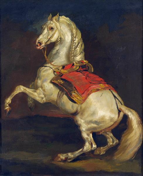
(image from commons.wikimedia.org; image is public domain within the U.S.)
Of course, 19th-century French Romanticism doesn’t have anything to do with a 21st-century bronzer, but I find it interesting that Lancôme chose to have the elephant standing on two legs rather than four, since the placement and stance of the elephant doesn’t affect the application of the product. In any case, I’m thoroughly enjoying the sumptuousness and richness of the colors as well as the detailing surrounding the elephant. Hopefully Lancôme will delve more fully into elaborate palette designs.