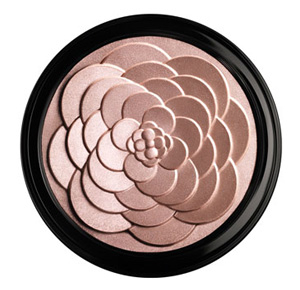
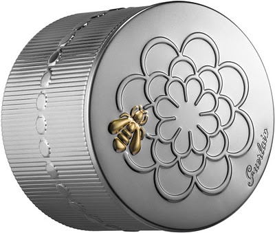
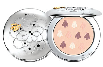
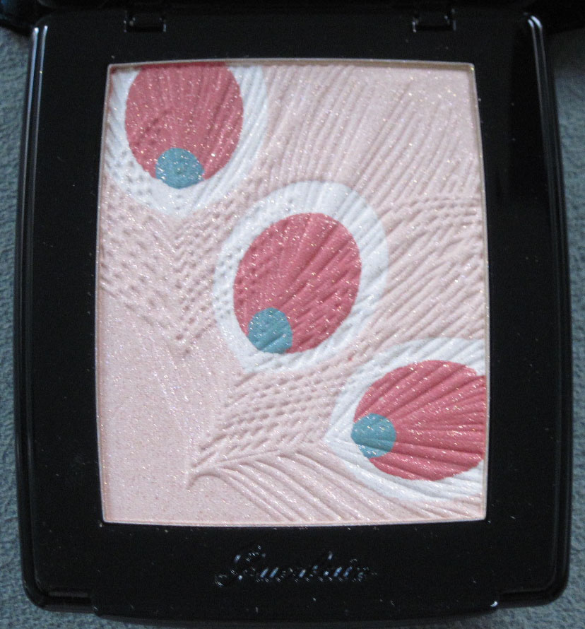
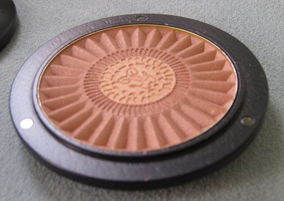
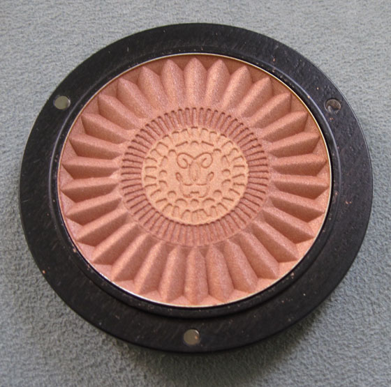
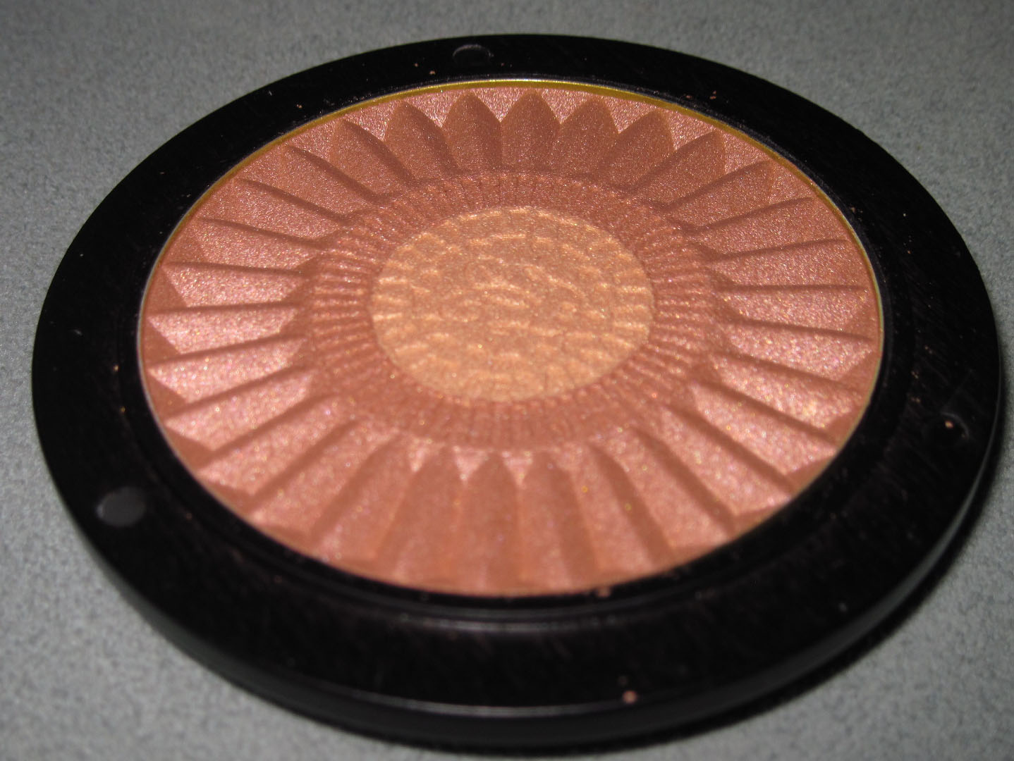
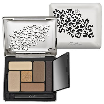
Just a quick post to point out how similar Guerlain's spring Cruel Gardenia highlighting powder is to Laura Mercier's Rose Rendezvous palette from the holidays. What's going on here? How did these two items with a nearly identical design manage to get released?

(image from neimanmarcus.com)
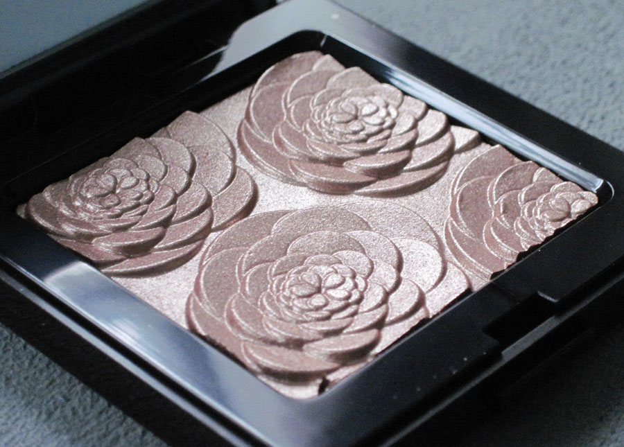
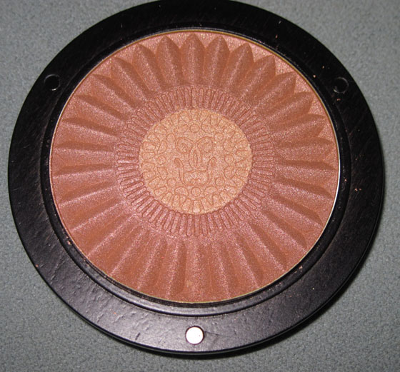
Compare to Rose Rendezvous:

Really, the only difference are the petals in the center: Guerlain's are more clustered while those in the Rose Rendezvous palette features a star-like pattern. (Although I find it funny that one calls it a rose and the other a gardenia when it's the same floral design!) These two are virtually twins so they weren't even worth a classic Makeup Museum smackdown, sniff. But don't worry, one is coming tomorrow. 😉
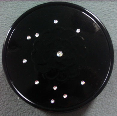
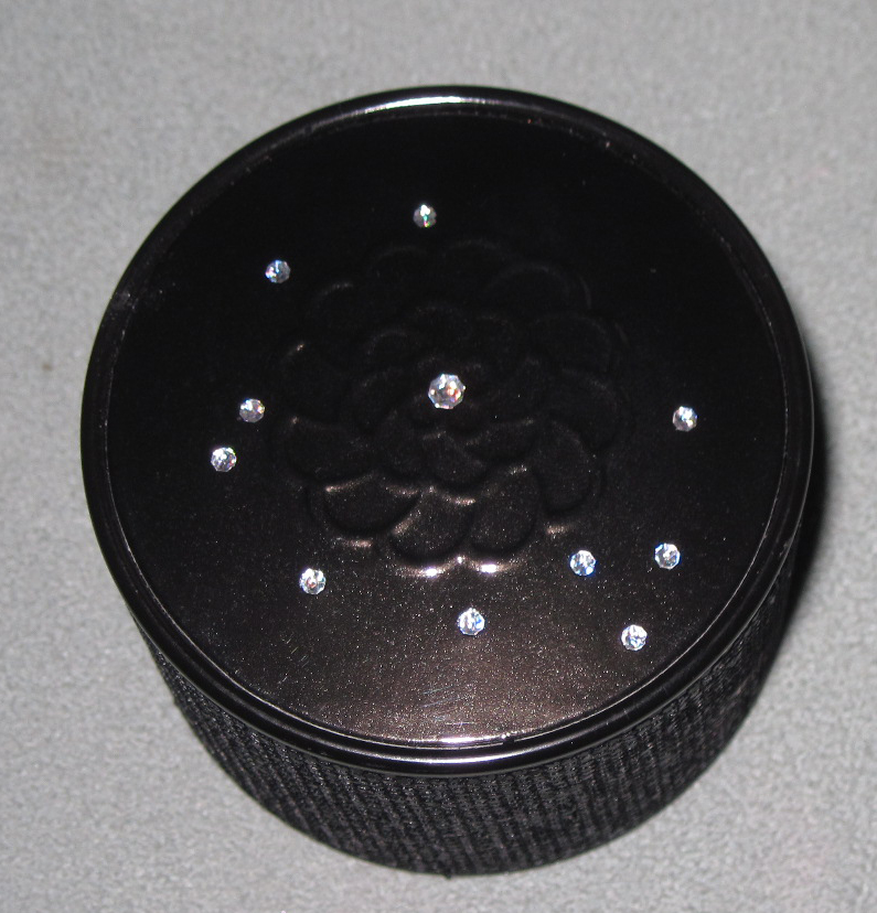
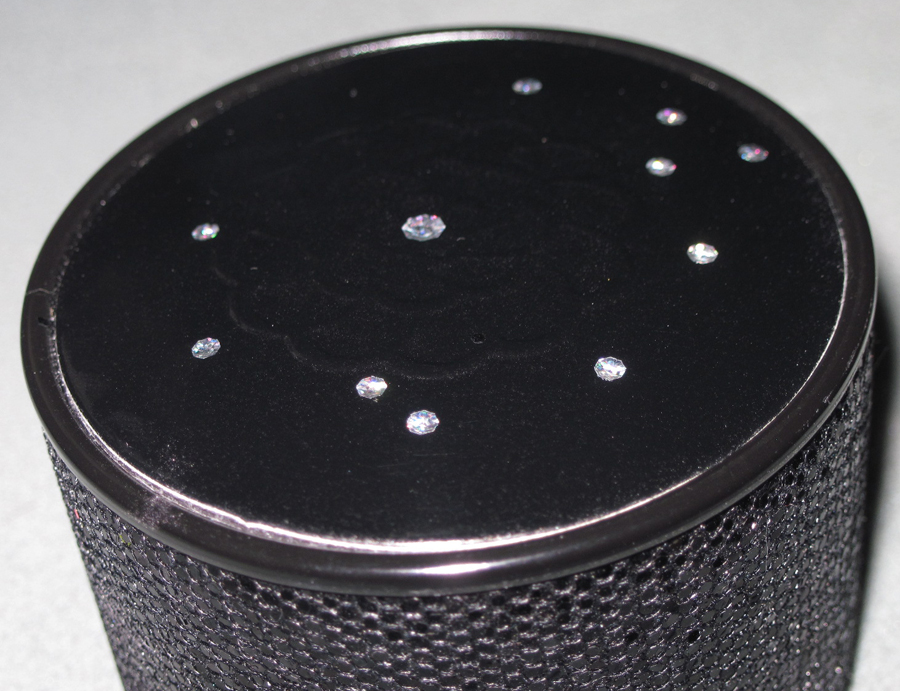
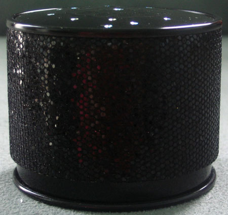
For the 2009 holiday season Guerlain Creative Director Olivier Échaudemaison wanted to create a collection that signified royalty but was still relevant to the modern woman. The star of the collection is the Météorites Perles Impériales, which houses their signature small clusters of highlighting powder in a glittering, marcasite-like cylinder case topped with clear rhinestones.


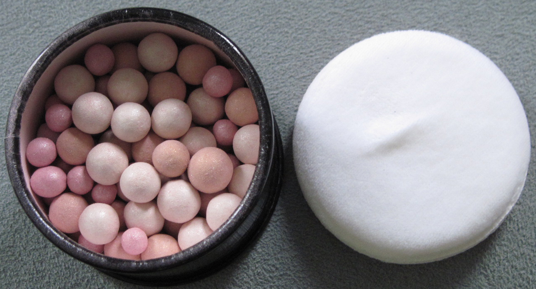
Inside:

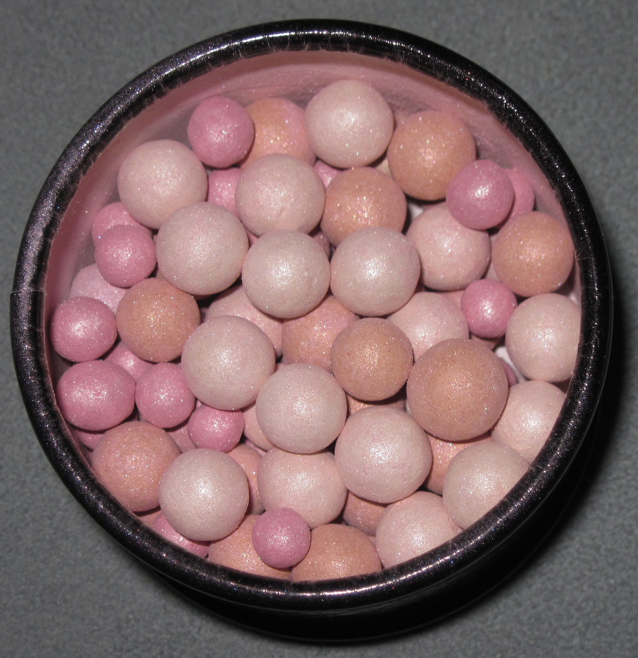
With flash:

Here is Échaudemaison's vision: "A new story and a new Christmas tale, illustrated – as before – by Princess Natalia. This time, she was proclaimed Empress!
A tribute to the femme-enfant, so wonderfully interpreted by Romy Schneider in Sissi: The Young Empress. A tribute also to history: Guerlain fondly remembers being distinguished as the very official and exclusive “Her Majesty Empress Eugenia’s patented Perfumer” in 1853. Seems like only yesterday!
In the 21st century, inspiration from the past and from all things exotic is the fuel of creation. We continue to like opulence, but in a more balanced way. Splendour is underlined with humour: while jewels bedazzle with their brilliance, the cascading rivers of diamonds may not come from Place Vendôme!
The nobility of precious stones and fabrics is enhanced with the elegance of luminous, delicately scintillating makeup. The ingredients used to achieve it are at the leading edge of sophistication, combining shades of gold with the finest powders and easy-to-apply textures, for the best possible results. Our Empress may thus apply her own makeup, without the help of a maid or… a makeup artist. A dreamy modern beauty who plays with makeup to feel sublime, an evening, a night… for a lifetime."
That's all well and good, but I think the theme of royalty was better expressed in the Les Ors collection of 2010. Still, this is a nice piece and laid the groundwork for that collection, so I can't complain too much. 🙂
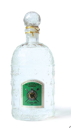
Guerlain's Les Ors collection for the 2010 holiday season is an elegant ode to their signature bee motif. In 1853 Pierre-Francois-Pascal Guerlain created a citrus scent for Napoleon III's wife, the Empress Eugénie. Eau de Cologne Impériale was housed in a bottle decorated with 69 gilded bees, the emblem of the family's coat of arms and the Napoleonic empire. The bee then became the symbol for the Guerlain brand and is still used on their perfume bottles today.

(image from neimanmarcus.com)
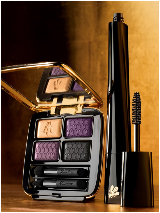
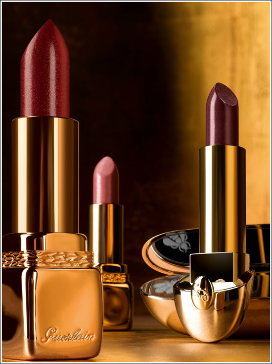
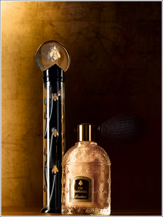
This collection was a vast hive of golden bees – they appeared on every single piece, even the mascara.


Midnight Star and Or Impérial Sublime Radiant Powder Face & Body:

Météorites Perles d'Or:

(image from dbeautyjunkie.com)
My favorite piece, the Météorites Voyage Poudre d'Or. This gorgeous bee-patterned powder is encased in a silver compact featuring a gold bee hovering amidst black Swarovski crystals.

(image from nordstrom.com)
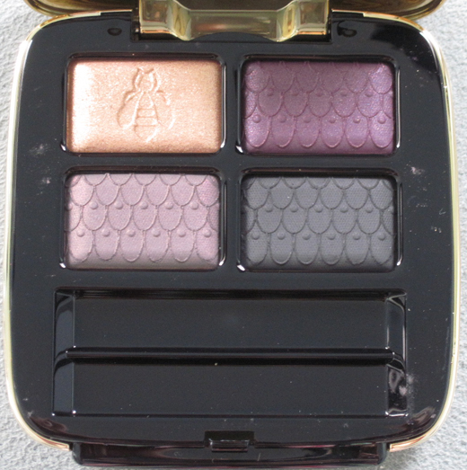
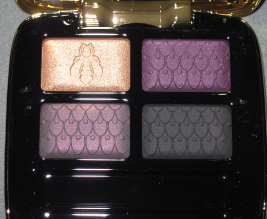
I could only afford one item at the time (and not the beautiful compact above, which is what I really wanted but it retailed for $170), so I settled for the eye shadow quad.


With flash:

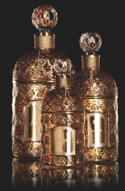
The honeycomb pattern on the shadows can be seen a little better on these exquisite, hand-painted bottles from Bergdorf Goodman:

(image from blog.bergdorfgoodman.com)
Overall I thought this was a pretty amazing collection – an expression of the brand's history (the bee symbol) combined with the gold theme, which pays homage to and updates the use of gold on the original perfume bottle, makes for museum-worthy pieces.
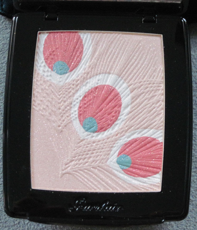
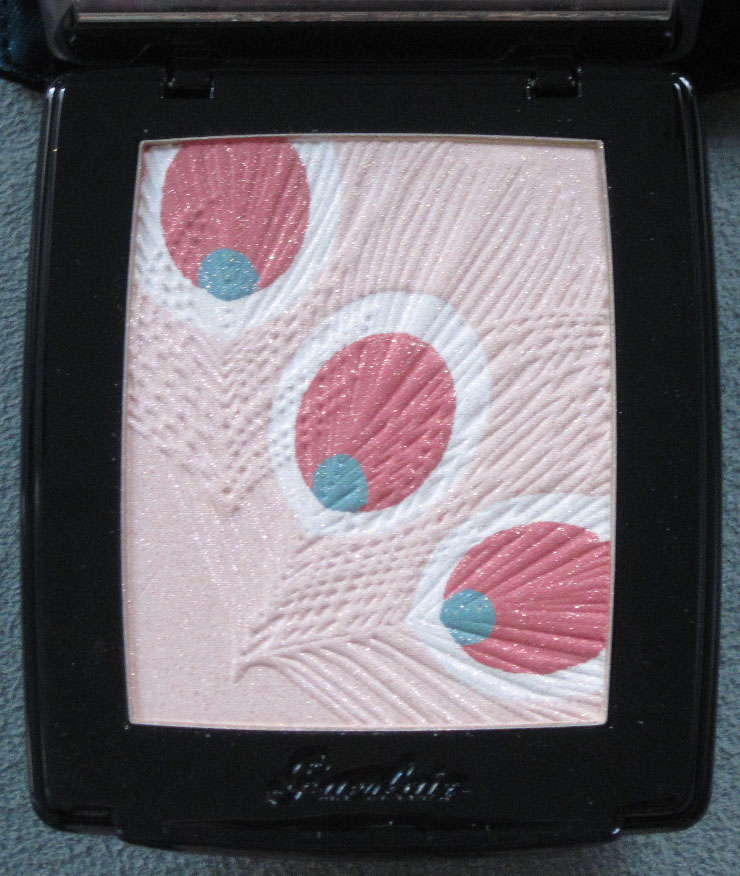
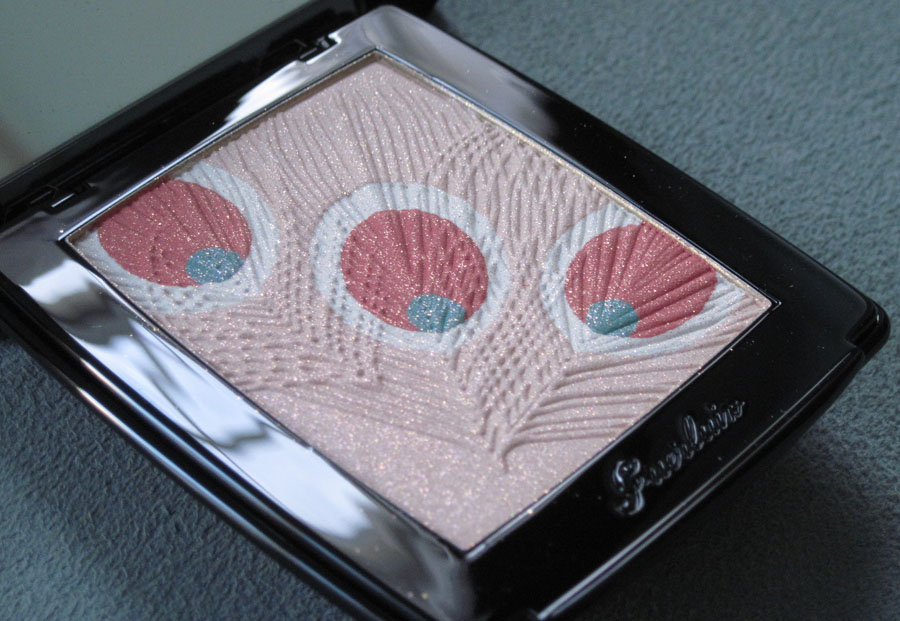
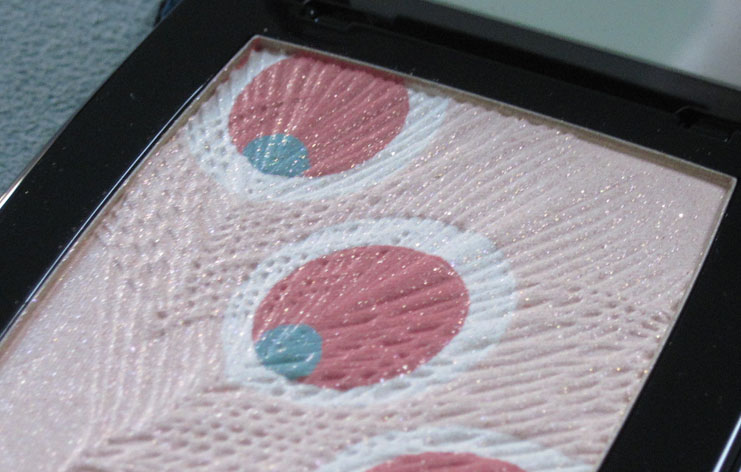
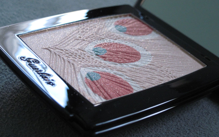
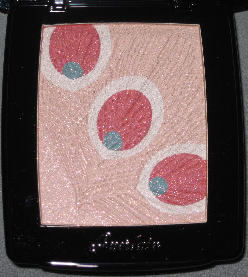
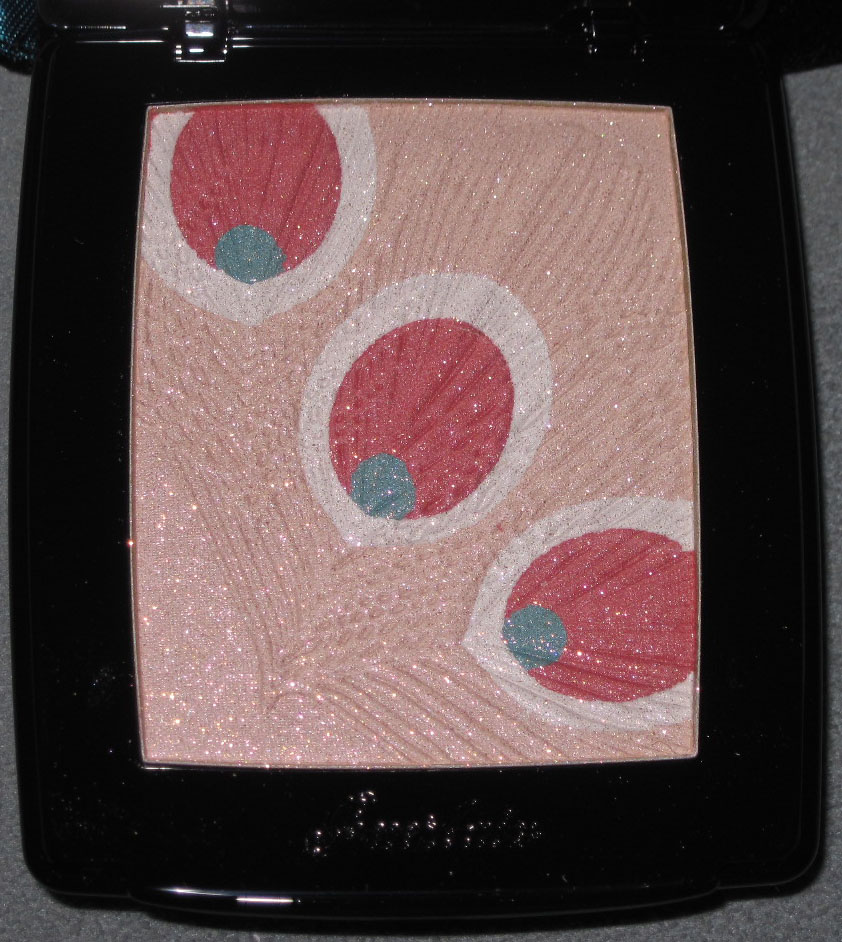
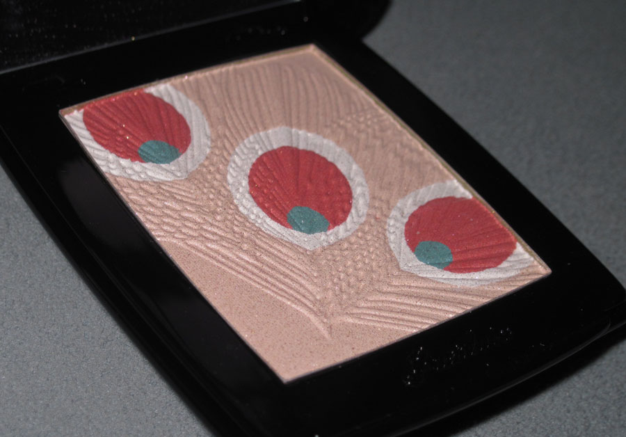
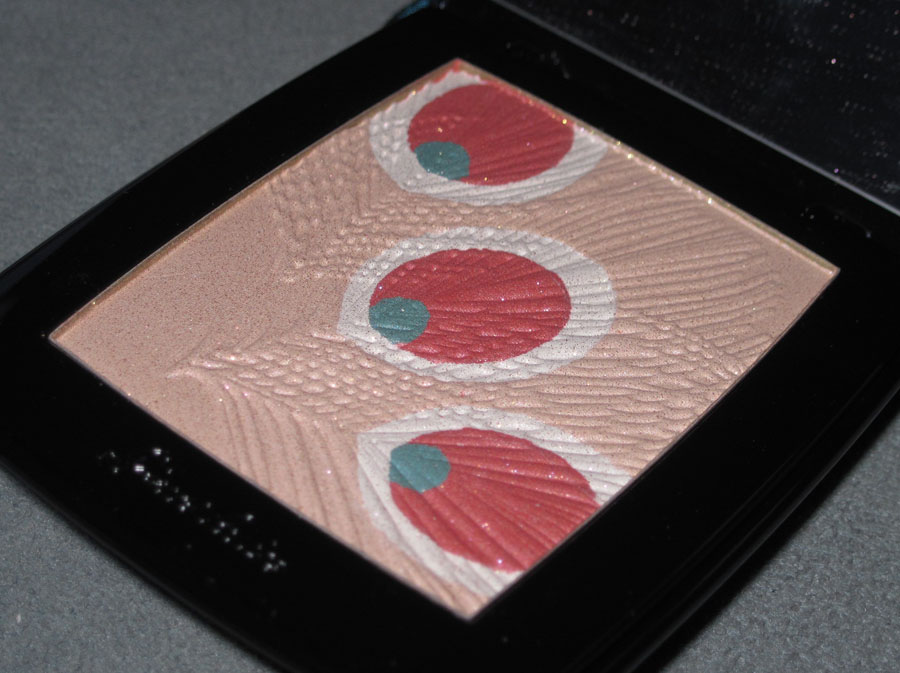
Guerlain released this highlighting powder, Parure de Nuit, as the crown jewel of their holiday collection. The wispy, delicate striations of cascading feathers and the soft pink, coral and blue tones make me think this might be more appropriate for a spring collection, but it's pretty nevertheless.


With flash:


But why feathers? The description from the press release provides the missing piece of the puzzle.
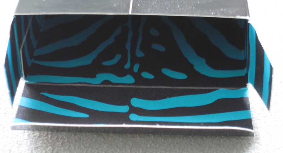
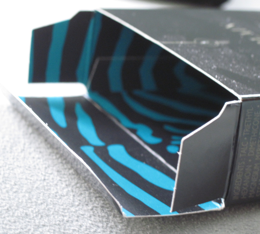
"For Guerlain’s Holiday 2011 make-up collection Belle de Nuit, Creative Director Oliver Échaudemaison takes his inspiration from the legendary fragrance, Vol de Nuit (Night Flight). Evoking the changing shades of the night sky, he created daring tones that are both dark and dramatic with mesmerizing iridescent accents. With lacquered and blue-green details, the products are encased within boxes that reveal the blue and black zebra motif found on the original Vol de Nuit box design. Belle de Nuit is a sophisticated and enchanting limited edition collection that is as fleeting as nightfall."
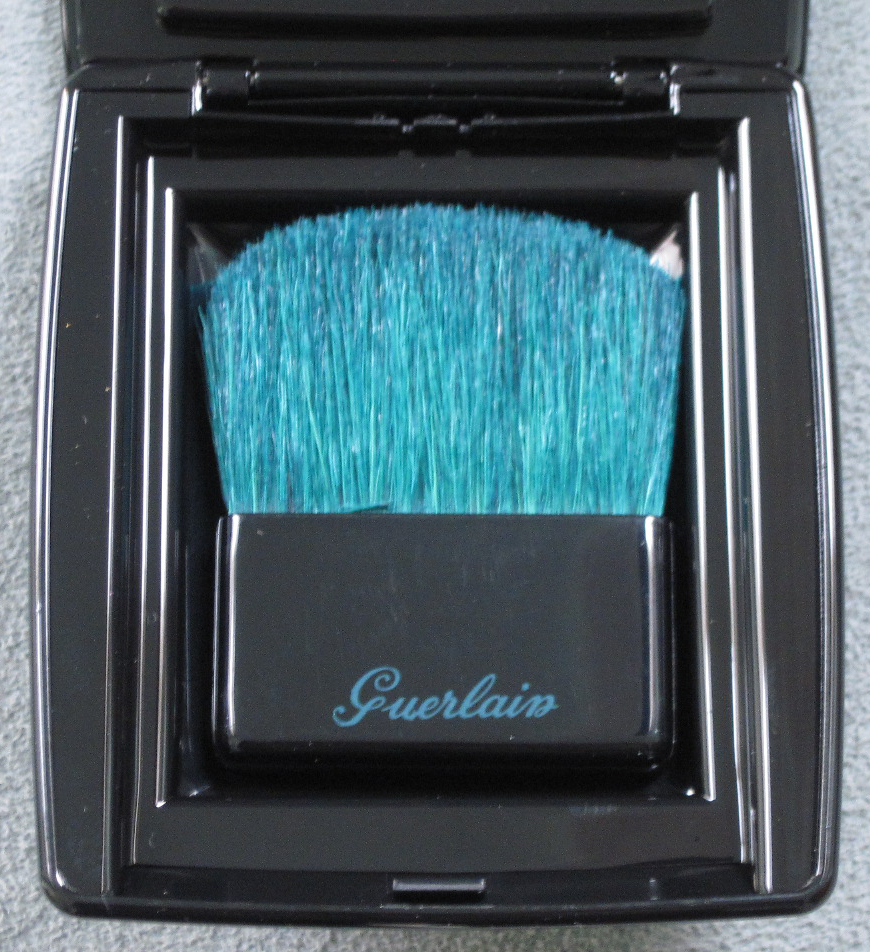
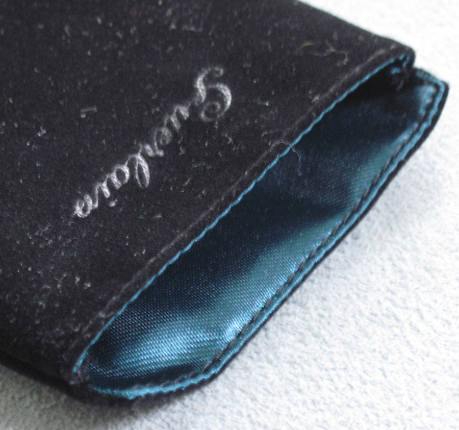
Besides the gorgeous feather pattern, Guerlain did indeed add some very nice blue-green details.
The teal brush, cleverly tucked away inside the compact:

Teal-lined velvet pouch:

The interior of the box:


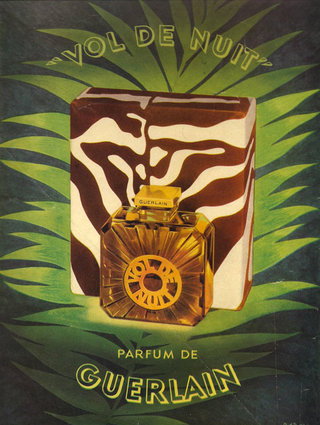
Here's a vintage ad for the perfume, for comparison of the pattern:

yesterdaysperfume.typepad.com
I like that Guerlain didn't make this powder quite so literal. Rather than repeating the propeller-inspired design of the Vol de Nuit bottle (which was also used for the perfumed shimmer powder for this 2011 collection), or using an illustration of an actual bird, the use of feathers merely suggest the idea of taking flight. Nice job, Guerlain.
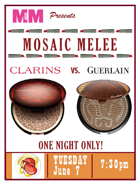
Oooh, two makeup brands coming out with mosaic-inspired bronzers. You know what that means!! Ding ding! Time for an old-fashioned makeup design SMACKDOWN! Awwww yeah, it's ON! (We are way overdue – the last MM battle took place in 2009!)

In the first corner we have Clarins Mosaique bronzing powder. As the item still hasn't appeared on the Clarins website, I was fortunate to have found the description at Addictedtolipstick.
"Mosaic, a timeless decorative motif, has crossed the ages to reach us in all its beautiful splendour. As an ornament of Roman baths, frescoes in the elegant homes of ancient Pompeii or the sumptuous decoration of Byzantine basilicas… the mosaic has been a major, refined art in all Western civilizations. This summer, Clarins has taken its inspiration from the rich forms and colours in the mosaic universe to offer a vibrant make-up collection full of sun and vitality."
Wow. Clarins certainly talks a big game, but can it deliver?
In the other corner, weighing in at a whopping .98 oz and measuring nearly 5 inches across (since it's meant for both face and body) we have Guerlain Terracotta Mosaic bronzer. This one is so confident in its design it doesn't even have a detailed description like Clarins. However, it also lacks a connection to the previous Guerlain summer release (the Inca collection) – I'm not sure why they would come out with a mosaic bronzer which has basically nothing to do with the rest of the summer collection.
Now, since budget constraints precluded me from buying these two items, you can look at the stock photos in my oh-so-cool poster above (I know you're all jealous of my mad design skillz), or you can check out real-life pics of Clarins here and Guerlain here. Go ahead, I'll wait.
So…who wins the Mosaic Melee?? Is it our fearless Guerlain, who has a lot more experience with limited editions and whose sheer gigantic size obliterates all other bronzers? Or is it the quiet underdog Clarins, who makes up for its small stature with a prettier, more detailed outer case? Let me know in the comments section!
While I majored in art history in college, the only non-European and U.S. art I studied was African – ancient South American art wasn't offered. For shame! Investigating this Guerlain collection was a lot of fun and now I have books on Incan art on my already-huge Amazon wishlist.
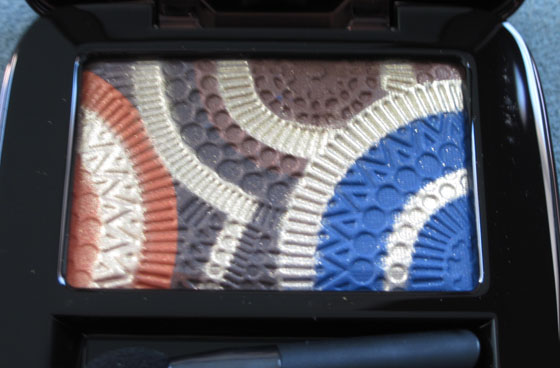
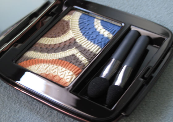
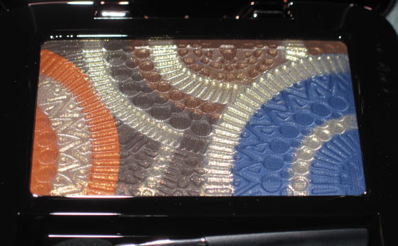
Here is the Terra Indigo eye shadow palette. For some reason the pics came out blur-tacular, not sure why. Hmmph.


With flash:

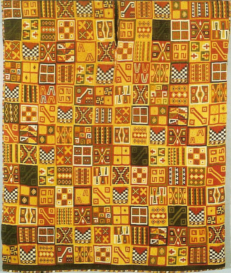
"Like colorful Incan qompi fabrics woven from shadows and pigments, the Terre Indigo eyeshadow unites all of their tones into a single palette," says the product description. Hmm, what are qompi fabrics? A quick Google search reveals that they were fine, high-threadcount cloths reserved for the most important community figures. The geometric patterns adorning them were called tocapus. The amount and intricacy of patterns corresponded to the rank of the person wearing them. (This is really the basic info in a nutshell – it was a very complex system and the Incas put great importance on the clothing they made. You can read more here and here.) Anyway, here's an example of a tocapu:

image from https://www.geocities.com/denniskriz/tocapu03-complex.html
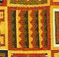
I cropped one of the triangular patterns that seems to be the most similar to the one on the palette. I'm still not sure where Guerlain is getting the circles though – in all the pics I came across of the tocapus I noticed there was a lack of circular shapes.

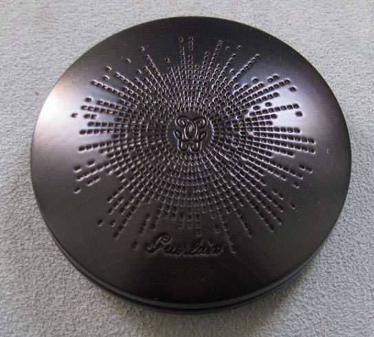
Onto the bronzer. According to the ad copy at Sephora, it was "inspired by the design of extra-large wooden bangles, a trend of the season", but I thought the outer looked more like a partial Incan quipu – a set of knotted cords woven together to record numerical information.

Here's a quipu, for comparison:

(image from nytimes.com)
Pretty cool, eh?
Here's the inside. I'm not sure what this was supposed to be – it sort of reminded me of a sundial, but I couldn't find any pictures of similar-looking Incan sundials to support this theory.


With flash:


While I think overall this collection could have been a little more authentic-looking, it seems that some thought did go into the design, and the inspiration was very clear. It definitely inspired me – now I want to pop down to Dumbarton Oaks in DC to check out their Pre-Columbian collection. 🙂
 When I first saw this palette (or rather, all 6 of them, each named for a Guerlain boutique in Paris) I didn't think much of it. It's a pretty cut-out pattern, but nothing spectacular or all that interesting. After doing some investigation, however, I discovered that Guerlain had collaborated with Paris-based designer India Mahdavi, and that she had put a rather unique spin on a typical makeup case. According to this interview, she wanted to create an object that "had weight, both visually and physically," and the cut-out design was actually a mashrabiya, to capture the idea that one could "observe without being seen." It's nice to find out than rather just a pretty pattern, the cut-out had a a traditional Middle-Eastern architectural concept behind it. And now that I know all this, I'm beginning to think this palette may be museum-worthy!
(image from sephora.com)
Guerlain takes us from the cold recesses of Russia for their fall lineup to warm up in the Far East with their spring collection, Cherry Blossom. Meant to evoke "'La Vie En Rose' with an Asian twist" the stand-outs clearly are the blush, which has "shades reminiscent of Japanese cherry trees in bloom" and eye shadow palette, which was "inspired by the rays of sunlight
reflecting on the surface of a lake, while the violet and mauve evoke
oriental flowers playing with shadows in a garden at dusk." Both feature delicate, abstract fan patterns.
Blush, with and without flash:

The eye shadow palette:

Why Guerlain didn't do an actual cherry blossom design is beyond me, but these are gorgeous nonetheless – pale pinks and purples always nice to see for spring, and while I wish the pattern were a bit closer to the theme, it's fairly creative as far as makeup designs go. I also like this collection since it reminds me a tiny bit of the European fascination with Japanese textiles and art in the late 19th-century: Japonisme. While this term really refers to the techniques used (particularly for wood-block prints called ukio-e) rather than the subject matter, some Japanese objects can be seen in paintings from this time. Among the most famous is Claude Monet's 1875 portrait of his wife in a kimono and holding a fan:

(image from artistandart.org)
And while Van Gogh is famous for his sunflowers and irises, he too got swept up in the craze for anything Japanese and painted almond blossoms:

(image from blog.stillriverstudios.com)
I sort of feel like Guerlain creative director Olivier Echaudemaison (quite a name, non?) was channeling Japonisme1 in this collection – a distinctly Western take on a part of Japanese culture.
1For more on Japonisme, check out Japonisme: The Japanese Influence on Western Art Since 1858 by Siegfried Wichmann or Japonisme in Western Painting from Whistler to Matisse by Klaus Berger.
I've been really enjoying these Guerlain eye shadow compacts that have patterns on each of the four shadows. Their latest features a fairly abstract interpretation of leaves you might find growing deep within the jungle.
This palette definitely reminds me more of a jungle rather than desert island palm trees, and that in turn reminded me of one of my favorite artists. Henri Rousseau (1844-1910) was a self-taught French artist who didn't begin painting until he was in his early 40s, and depicted many jungle scenes even though he had never left France.

(Tropical Forest with Monkeys, 1910, National Gallery of Art; picture from nga.gov)And now for some personal/art history/makeup museum-related insight. Rousseau is one of my favorites because I see much of myself in him and his life. The Curator is always rooting for the underdog, and Rousseau is the epitome of an underdog. He had always desperately wanted a career in art but, lacking the
financial advantages that would allow him to pursue it full-time, he held various administrative jobs that stifled him, a story the Curator knows all too well. When biographer
Cornelia Stabenow1 writes, "The only escape route lay in art…in spite
of the continual risk of mockery, he exploited every opportunity to
rise out of anonymity," she may as well be describing me – just change
"he" to "she" and it's dead on. Anyway, Rousseau persevered even though his work was often made fun of by critics, who regarded him as having
no more artistic skill than a child – his work "caused many viewers
to laugh till they cried."2
But he kept painting and painting, and towards the end of his life he began receiving serious critical recognition for his work, and now his paintings hang in the likes of MoMA and the National Gallery of Art. Needless to say I find great inspiration in him. He was the little toll collector that could, and I'm the little museum that could. It might take me till I'm 80 – it truly is a jungle out there – but someday I will have a real Makeup Museum! (Oh, and get that Ph.D. I've been hankering after since I was 8.)
1 Cornelia Stabenow, Rousseau (London: Taschen, 2001) 10.
2 Cornelia Stabenow, Rousseau (London: Taschen, 2001) 7.
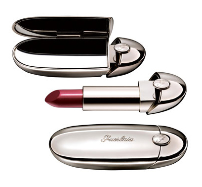
Since the outer casing looks so architectural, I found it a little hard to believe that the new Rouge G by Guerlain was designed by jeweler Lorenz Baumer. It reminds me of some futuristic space capsule, or an oval-shaped skyscraper.

$45 is a bit steep for lipstick, but you're not only paying for the packaging – apparently the lipstick also has a "precious ruby powder" that "interacts with daylight to reveal spectacular radiance." I don't know if I buy that, but the design is pretty interesting – it's always good to see a company branch out and collaborate with other designers.
