Rejuvenique mask at the Museum of Failure. The golf club is an unrelated but equally ridiculous product.
I had way too much fun at the traveling Museum of Failure pop-up, which is currently in Washington, D.C. until November 30. It's exactly what it sounds like: a monument to all the seemingly good ideas humans have had over the years that for one reason or another failed spectacularly. There wasn't too much information readily available – that required downloading the museum's app – and at times the scant label copy was presented far too flippantly for inventions that seriously injured or even killed people. Then there were the "inspirational" quotes from less than savory characters and a disproportionate amount of space devoted to debating whether Elon Musk is a genius (spoiler: he's not. But he is a fascist.) Despite these critiques I enjoyed the show. Plus, it inspired me to briefly discuss some of the biggest makeup fails of the modern era. While there are tons of failures across all beauty categories such as skincare, haircare, fragrance, bath and body products, etc., literally thousands of defunct brands, and a history of toxic ingredients that goes back to antiquity, I narrowed it down to just a handful of what I think are the most notable modern cosmetic fails. Here's the makeup edition of the Museum of Failure!
Kurlash Eyelash Curler ca. 1923
It's fairly obvious why the first patented eyelash curler did not stick around long. Known as the "bear trap," Kurlash's instrument does not resemble anything one would want to get near their eyes. While it's actually not dangerous per se, as Lucy Jane Santos notes, the lack of cushioning meant an increased risk of tearing out the lashes, or at the very least resulted in a sharp right angle to the lashes instead of a soft upward curve. A new model was produced less than a year after the initial design and became the standard.
In 2014 a group of 4 students from North Carolina State University proposed a nail polish that would change color upon detecting date rape drugs such as rohypnol in beverages. I'm not even sure where to start in terms of the many points on which this idea failed. The technology wasn't even available, yet the polish, named Undercover Colors, was touted as something that was ready to be put into production. It wasn't until 2018 the group ceded that the technology would not be available any time soon and presented instead the Sip Chip, a coin-sized disk that can detect certain drugs with 99.93% accuracy with just a couple drops of liquid. Still, the myth of the polish persists. Perhaps the biggest misstep is that, as usual, it placed the burden of prevention on the would-be victim. As a sort of epilogue to Undercover Colors, in 2022 a company named Esoes (pronounced S.O.S.) announced a drug detecting lipstick. Clearly undaunted by the backlash surrounding Undercover Colors, the company forged ahead with a liquid lipstick containing drug test strips hidden in the cap and equipped with a Bluetooth connection to call 911. Sigh.
As we'll see later, lipstick, like mascara, is a fairly straightforward cosmetic to apply. A contraption like this applicator is exceedingly unnecessary and only complicates things. Users were instructed to put a coat of lipstick to the applicator – I'm guessing that was a rather messy process – and then press the applicator to the lips for a perfectly defined pout. I can't locate the one in the Museum's collection at the moment so here are photos from one on Etsy.
It's baffling that this company believed it could hoodwink women into thinking smearing lipstick on a piece of metal first was somehow easier than applying straight from the tube, or even using a lip pencil to line and/or a brush, especially as both lip pencils and brushes were readily available at the time. Heck, Tussy offered a product called the Stylip, a pen-like device which was obviously much less cumbersome to use. Then again, there is nothing businesses won't do if they think it'll make money.
Honorable mention: this (presumably) earlier version, which worked similarly.
Lipstick applicator tutorial, St. Louis Globe Democrat, June 8, 1941
Calvin Klein Cosmetics 1978-1985 2000-2003 2007-2009(?) 2012-2015(?)
Since the 1920s, nearly every fashion house expands into beauty at some point as a relatively low-effort additional revenue stream. While most fashion designers are able to maintain their grip on fragrances, many struggle to keep a color cosmetics line afloat. The popularity of both fashion and celebrity-fronted makeup lines exploded in the '70s and '80s and many of them, including Halston, Diane von Furstenberg and Ralph Lauren, did not survive. However, I want to highlight Calvin Klein cosmetics, whose failure is interesting because the company tried not once, not twice, not thrice, but FOUR times to sell a color cosmetics line.
It's a long and muddled saga for which I hope to give the details someday, but in a nutshell, it seems the repeated failures were largely due to poor management rather than bad products. The cosmetics arm was sold numerous times and had a revolving door of executives. Without stable leadership and a clear, consistent vision for marketing and distribution, it's virtually impossible for any brand to last. Maybe 5th time's the charm?
Lash Lure Eyelash and Eyebrow Dye 1933-1934
The story of Lash Lure is a rather gory one so consider yourself warned. In 1933 a company named the Cosmetic Manufacturing Co. released an lash and brow dye that contained paraphenylenediamine (PPD), a chemical that can cause acute allergic reactions when used around the eyes due to the skin being thinner in those areas. Between 1933 and 1934 the Journal of the American Medical Association reported the cases of 5 women who went blind after using Lash Lure and one more who developed abscesses after using the product, contracted a severe bacterial infection and subsequently died. In 1938 the Food, Drug and Cosmetic Act was finally passed, and the first product it removed from shelves was Lash Lure.
The FDA prohibited PPD from being used in cosmetics in the U.S., but it's still widely used in hair dyes; however, the risk of death is considerably lower than in the '30s. The scalp is thicker than the skin around the eyes and less prone to irritation, and if severe reactions like abscesses and infections did occur, there are treatments available. In the early 1930s allergy remedies and most antibiotics hadn't been invented. Having said that, PPD is derived from coal tar, which doesn't seem like a good thing to put near one's eyes in any case.
Automatic Lipsticks 1930s-2015(?)
In doing the research for the presentation I made for the Art Deco Society UK back in March of this year, I came across many fascinating so-called "automatic" lipsticks. They expressed the design proclivities of the time in that they were intended to be streamlined, cutting-edge devices that only took a fraction of a second to open for the busy modern woman. No need to use both hands turning a slow-moving swivel tube or one with a traditional cap – the new automatic lipstick was here to save the day!
I was hoping to get to an in-depth discussion of automatic lipsticks for National Lipstick Day back in July, but obviously that didn't happen. Maybe in 2024.
Anyway, I think there's a reason the swivel remains the most common lipstick mechanism. This is purely anecdotal based on the automatic lipsticks I've added to the Makeup Museum's collection, but they tend to get stuck easily. I noticed that vintage swivel lipsticks still work pretty well despite their age. The automatic ones, not so much; many of the ones available for sale are broken. Additionally, even when they do work as they should, they were really no quicker or easier – for the Coty Periscope and its copycats (Constance Bennett Flipstick and the So-Fis-Tik), for example, I found two hands were still necessary.
My appreciable nearsightedness greatly impedes my ability to apply makeup – a big reason for switching to contacts 30 years ago. Back in the 1960s, however, contacts were not as commonplace. So what was the gal with glasses to do? Enter Revlon's flip-up magnifying glasses, which were intended specifically for wearing during makeup application. Rest assured I have tried them out, along with magnifying mirrors and such, and nothing works quite like getting about 1-2 inches away from a regular mirror and applying with short-handled brushes and mini-sized pencils (regular sized products prevent you from getting close enough to see what you're doing as the handles keep poking the mirror.) Other companies make similar versions of these glasses today, so I guess maybe they're not a total fail, but trust me when I say there are much more efficient ways for nearsighted folks to apply makeup.
Lipstick Tissues 1930s-1960s
You can check out my post from 2017 for the full scoop on lipstick tissues, but suffice it to say they failed because they were largely useless. To pull in more dollars, in 1937 Kleenex, building on previous patents, invented a solution to a completely fictional problem: the social crime of leaving lipstick traces on linens and towels, or heaven forbid, a woman's (male) significant other. As I noted in my post, there was no reason why one couldn't use regular facial blotting sheets for lipstick as they work just as well – separate lipstick tissues were wholly unnecessary.
I'm a bit hypocritical, however, since I think it might be fun to bring them back. I even had the husband make a little mockup of Makeup Museum branded lipstick tissues. Would you buy these if you saw them in the museum's gift shop?
Sounds like Estee was just trying to save face. What really happened is that customers saw through their pathetic attempt at being "edgy" to court a younger demographic. Frankly, the Edit reeked of desperation to revamp Estee Lauder as a youth-oriented brand, and customers could smell it a mile away. Devoid of any real innovation or inspiration, the Edit was also out of touch with the needs and wants of Millennials – the whole shebang was basically this classic scene from 30 Rock.
Lipstick Matches 1920s-1950s
As the makeup industry grew exponentially in the early 1920s, companies explored many different designs and packaging. The Parisian firm Fracy introduced "allumettes" lipstick matches around 1924. These single-use items were advertised as being more sanitary than regular tube lipsticks and portable due to their miniature stature. And, like lipstick tissues, they made great hostess gifts or customer freebies for businesses. But were they superior to regular lipsticks? Probably not. Water or saliva was needed to get the dry pigment to adhere so the formula probably wasn't the most comfortable, and the packs sold without a fancy mirrored case negated the "on-the-go" aspect. (I don't know about you, but I find it impossible to apply lip color without a mirror.)
Fracy salesperson kit with sample lipstick matchbooks, ca. late 1920s-early '30s
By the 1950s, companies shifted to advertising lipstick matches not as more sanitary, but a fun way to try new lipstick shades without committing to a full tube.
Still, mini versions of products with the same or similar packaging as their full-sized counterparts proved much more popular for sampling makeup, and they were easier to produce. With all angles of promoting matchbook makeup as better than other designs exhausted, it quietly faded from the market.
Mainstream Men's Makeup Brands ca. 2000-2008
I'm not going into a whole history of men's makeup here – it's another topic the Makeup Museum will tackle eventually – but I did want to highlight the failure of men's makeup to become as ubiquitous as that for women. Makeup has been worn by all genders for millennia, but you would never know it looking at most 20th century cosmetics. Makeup was advertised as being strictly the domain of women. While it was acceptable for men to wear makeup for the stage and screen, it was largely frowned upon for the average cis-het man. Cosmetic companies managed to profit from men by introducing toiletries such as after-shave, hair gel and cologne and developed entire grooming brands exclusively for men, but color cosmetics were still a no-go. However, much like makeup for Black customers, some of the larger companies launched men's makeup to tap into what they thought could be an additional cash cow. For the most part, unlike other grooming products, big brands' attempts at makeup for men consistently failed. It's not clear when the first men's makeup brand on the commercial market was introduced; there were some individual products such as concealers to cover beard stubble and "after-shave talc" used as face powder as far back as the 1930s, and some brands added one-off men's makeup items to their regular lines – for example, Aramis Bronzing Stick and Mary Quant's Colouring Box in the '70s and Guerlain's Terracotta Pour Homme in the '80s. And there were companies like Biba and Manic Panic and later, MAC, that intended their products to be genderless.
But it seems the first complete lines of makeup for men by a mainstream, non-niche company did not appear until the 2000s in the U.S.* And neither of these are still around. Aramis released Surface in 2000, which contained "correctors" (concealers), a bronzing gel and mattifying gel, followed by Jean Paul Gaultier's Le Male Tout Beau in 2003. Tout Beau was discontinued and relaunched as Monsieur in 2008.
Gaultier Le Male Tout Beau lip balm and concealer/eyeliner pen
Indie brands that were started around the same time such as 4Voo somehow managed to outlast their big league competitors. With so many more resources than small companies, why did Aramis and Le Male/Monsieur fail? I think the industry shot itself in the foot, so to speak. Perhaps if it hadn't spent roughly 100 years and billions of dollars enforcing makeup usage along a rigid binary and making it socially acceptable only for women, more mainstream brands for men would be successful. The modern industry really entrenched the ancient notion of everyday makeup as solely a feminine pursuit, and it's going to take a long time to undo that sort of brainwashing on a mass scale.
So that's just the tip of the makeup failure iceberg. These were interesting, but it's equally fascinating to see what has actually stuck around.
What do you think? And did you ever experience a makeup fail?
*Japan's Kose had introduced a line in Tokyo in 1985, and this hunky gentleman prepared to launch a small brand in 1993, which never came to fruition. Other niche brands included Male Man Unlimited (1980), Marcos for Men (1996), Menaji (1997) and Hard Candy's short-lived nail polish line for men called Candy Man (1997).
I'm delighted to share a guest post by new Makeup Museum volunteer Shannon Mendola, who will be discussing the licensing deal trend in makeup. These sorts of collaborations are different than other partnerships in that they are usually the result of brands purchasing a license from any brand that offers one. Unlike collabs with certain artists or brands who work together directly on a special, one-off collection, this makeup is simply another consumer good – along with things like mugs, apparel, and stationery – that a franchise or brand has sold their license to, leading to a rather impersonal and uninspired yet still oddly compelling product.
Now that the difference has been noted, let's take a peek at the seemingly infinite number of collabs that have flooded the market as of late. Thank you, Shannon, for your fantastic insight on this trend!
Colourpop x High School Musical! Hipdot x Cup Noodles! Wet N Wild x Peanuts! Urban Decay x She-Hulk! When did the makeup industry become collab after collab? Lately, it feels like all we are seeing is another brand collaborating with Disney or some other TV show, movie, food item, etc. But why? I’m not necessarily complaining, I have even purchased these makeup collections!
Is it to get people buzzing? There seemed to be a lot of interest in the Glamlite x Scooby Doo collection. To keep the brand relevant? I kind of forgot Spectrum Collections existed until I saw their collection with the TV show Emily in Paris. Some of these brands don’t seem to be releasing anything else but these licensing deal collaborations. What is a brand if it is always relying on other brands to help it stay afloat? These deals must be working though if brands like Hipdot and Makeup Revolution seem to only be doing just that.
While not new – Lip Smacker partnered with Dr. Pepper nearly 50 years ago – licensing deals have exploded recently. There are many reasons collaborations are such a trend. First, companies are leveraging consumers' feelings of uncertainty brought on by the pandemic. Nostalgia always sells, but in the face of an ongoing global health crisis and all the anxiety and dread that accompanied it, we're finding even more comfort in our favorite TV shows and childhood favorites. These collaborations are made in hopes you will remember how much you loved Playdoh, Looney Tunes, Candyland and Cocoa Krispies and have to snag it all as a sort of coping mechanism.
Secondly, licensing deals allow for a built-in theme, making it easier for companies to create collections. Collaborating with another brand opens the door for new types of products and advertising. For example, the Lottie London x Vampire Diaries collection featured a Blood Drip Lip Tint. Making a brand new lip gloss with no given theme is harder to sell and requires a more creative marketing strategy. When Colourpop used the Hocus Pocus films for multiple collections, the brand had instant ideas for the color story, shade names, and packaging. Comments from a spokesperson for Ulta confirm this: "Our recent Ulta Beauty Collection collaborations, including Gilmore Girls and Disney and Pixar, were like love letters to fans of those franchises. We wanted to evoke a nostalgic feeling with throwbacks that are beloved…we [also] want to ensure the colors from the artwork are season-appropriate, trend-forward, and that they can be translated to the packaging or shade options seamlessly."
Speaking of packaging, licensing deals also inspire companies to experiment with design.. When I saw the Hipdot CareBears EyeCon Sculpted Pigments Collection, I immediately bought it. Typically, I am one to think about my purchases before spending, but I saw this, got excited, and bought it in a matter of a few minutes. Why was I so impulsive? I loved CareBears as a kid. It had the nostalgic aspect, but it also was little eyeshadow sculptured pigments, which I had never seen done before. So it was unique and fresh in the very saturated makeup market.
As an article at PopInsider states, packaging details do indeed help licensed collections stand out: "HipDot’s licensing partners have included Nickelodeon for SpongeBob SquarePants and Rugrats, Reese’s, Hasbro Games, Tapatio and more. And some of those storytelling details that make the collections extra special? A coffin-shaped collector’s box for its Addams Family collection, a peanut-butter scent in the Reese’s lip balms, and even a special ingredient in the Tapatio collection to create a lip-tingling effect."
Thirdly, licensing deals are effective because they expand the brand’s target market to new categories of consumers. Consider Makeup Revolution’s fall 2022 Clueless collection. The collection was not only for makeup lovers and fans of Makeup Revolution, but also for Clueless fans and those who cherish the '90s. Hipdot recently released eyeshadow palettes shaped like CDs as a result of partnering with musicians Korn and Evanescence. It wasn’t only Hipdot customers and eyeshadow enthusiasts who purchased these; given that both sold out quickly, it’s clear that fans of the bands and rock/metal aficionados were drawn to the products as well. Says one brand management director, “Many beauty brands have capitalized on [the industry’s] growth through collaborations that broaden their reach and find new consumers in places they may not be able to access on their own."
Along those lines, these collaboration products are even being purchased as collectors' items. Using the above example, Korn and Evanescence fans may not even use or open the products. This means non-makeup users are buying makeup when they never would have otherwise. With the CareBear Pigments, I honestly forgot if it was Hipdot or Spectrum Collections who came out with them prior to writing this article. That demonstrates that there was no brand loyalty or even brand knowledge in my purchase. Thus, in some cases, customers aren’t even caring who is selling it or what it's for – as long as it represents their particular area of fandom, they are sold.
Thinking about licensing deals solely in terms of makeup customers, they also draw people to the brand that may become new customers down the line. I purchased the Sigma Beauty x Cinderella eyeshadow palette because I am a big Disney fan and I couldn’t resist the cute packaging and pretty jewel-toned shades. It turned out to be a nice formula and I am considering buying more from Sigma Beauty soon. I probably never would have purchased from this brand if not for this collaboration, so it made me take the chance of trying a new brand. If you like the collaborator, the launch will top all other new releases for you. It gets your attention in the sea of new products. Even if a collab gets attention in a more negative way, such as Winky Lux Applebee's wing sauce-inspired lip glosses or Seoul Mamas Skincare Oscar Mayer Bologna sheet mask, any buzz is good PR. The strange collaborations may do better than one would expect just because customers are curious or find them humorous. These are all examples of marketing strategies whose primary goal is turning heads. In recent years, with the boom of social media and emergence of apps like TikTok, our collective attention spans are getting smaller and smaller. These eye-catching collabs demand our attention and stop us from scrolling past. With unconventional products or collaborations, Instagram and TikTok users will be doing the marketing because the collaboration is so wild, they just have to repost it and share it with everyone they know. It's genius really. Perhaps, the more unexpected the collaboration partner, the better it is from a marketing/buzz creating standpoint.
Lastly, licensing deals aren’t just for the cosmetics industry; others are also shifting their focus to these sorts of collections. The fashion industry has increased the number of collaborations in the past few years (LOEWE x Studio Ghibli, Forever 21 x Barbie, Givenchy x Disney, Pacsun x Strawberry Shortcake, etc.) Crocs even worked with Kentucky Fried Chicken to make a unique shoe. The food industry also participates. Star Wars Igloo Coolers, Kellogg and Nickelodeon’s Apple Jacks Slime cereal, and Hello Fresh with help of Warner Media created the spaghetti dish from the famous holiday movie Elf. In looking at these, it seems as though the licensed partnerships for makeup brands are part of a greater trend that spans multiple industries, perhaps due to mostly two simple reasons: an increase in the number of available licenses, and the fact that the more nonsensical the partnership is, the better it will sell.
Given how lucrative licensing deals are and the fact that the resulting products are less labor-intensive to create as compared to original items, companies will continue hunting down any license they can get their hands on and make a collection out of it. But is this actually leading to consumer fatigue? On Revolution Beauty’s website, the 'Collabs' tab is before any of their other makeup and skincare items. It seems as though some of these brands have used every available license under the sun. At what point does a brand cease to have an identity outside of collaborating? Hipdot, Makeup Revolution and Colourpop could all be the same brand, as they have become best known for their collaborations. Case in point: the recently defunct brand Kailav, whose entire basis was famous paintings. That wasn’t necessarily a bad thing, but customers are fickle. Initially, seeing Van Gogh's Starry Starry Night or Monet's Water Lilies on a palette and the eyeshadows inspired by the paintings was fun and novel, but subsequent releases featuring other artists proved repetitive to consumers. The same can be said for Rock n’ Roll Beauty, a brand owned by Makeup Revolution that launched in early 2022. Their whole product lineup consists of licensing deals made with various musicians or their estates. While it hasn't folded yet, the brand was met with a lukewarm reception at best. Without any original products that are not based off of a particular theme, brands that make their identity from collabs are destined to struggle long-term as customers grow weary of only seeing partnerships with other brands. Also, when many different makeup companies use the same license, it causes the novelty to wear off quickly. I've seen many Mickey and Minnie Mouse collections from various brands (Dose of Colors, Makeup Revolution, Anna Sui, L’Oreal Paris, etc.), so that one feels old to me. Other examples include Hello Kitty and Barbie, of which there have been no fewer than 15 and 10 makeup collections, respectively. It dilutes the feeling of uniqueness provided by the first, original collaboration. Then again, as mentioned earlier, while this may be an issue for makeup aficionados, fans of the various franchises or themes don’t seem to mind seeing their favorites over and over from different or even the same brands. States License Global, "Diehards of the classic '90s sitcom Friends may already own dozens of eyeshadow palettes, but three separate drops from Revolution based on the show proves that fan demand keeps them coming back for more…these launches continue to roll out – and sell out…the reason that the licensing industry continues to grow is because of the love fans have for the properties and the brands behind them."
I think these collabs are fun to see and I enjoy the creativity that can go with it; however, I don’t think it should be to the point of brands being solely that. I think no one is going to feel loyalty to any one brand that only does these licensing deals. They will just purchase from them if they like whoever they are collaborating with at that time. Variety is great, especially in the makeup industry and it truly means there is something for everyone. But I don’t want the formulas to suffer or the products to be lacking just because the brand was more focused on the funky packaging or the money to be made.
You may think the Colourpop x Bambi collection is gimmicky or you might have to have it for your makeup collection or your Disney collection. Something I love about makeup is how everyone has different preferences. People wear makeup for a variety of reasons, but the big ones are that it's fun, free from rules and washes off easily. In the case of licensing deals, maybe that new collab from Makeup Revolution will bring us joy when we look at it on our shelf. It will remind us of a simpler time or a great memory. That makes it worth it, for both the brand and us.
Have you purchased any of these makeup collaborations or other ones on the market? What are your thoughts on how often we are seeing these collabs and how wild they sometimes get? Some tend to feel like cash grabs, but others, when done thoughtfully, can be exciting! What collab hasn’t been done yet that you would love to see?
Get ready for some cute overload this Easter! I'm pleased to finally highlight 5 bunny-themed collections, 3 of which were released in spring 2019 (when I was preoccupied with other things) one from 2018 and one from 2016. Interestingly, all 5 are from K-beauty brands.
First up is Colorgram's Miffy collaboration. Miffy is a character created in the '50s by Dutch illustrator Dick Bruna (1927-2017) and is quite well known outside the U.S. I have to admit I had never heard of her until Colorgram launched this collection. It was a pretty massive lineup – while it looks like I bought all of it, I think the Museum ended up with less than half of what was released.
The character was inspired by bedtime stories Bruna told his son while on vacation in the summer of 1955. "Sitting on a rug near the shore, the family spotted a rabbit skipping around in the sand dunes. Bruna’s son Sierk, who had his own little woolen rabbit, was delighted, and Bruna was reminded of his own love of rabbits as a child. Later that evening, Bruna would tell Sierk a bedtime story featuring Nijntje, a shortening of the Dutch word konijntje, meaning ‘little rabbit’…This bunny became the inspiration for Miffy. Later, when Dick began sketching Miffy, he decided he would prefer to draw the bunny in a little dress, rather than a pair of trousers, and so Miffy became a little girl bunny." Coincidentally, Bruna was born in the year of the rabbit.
Miffy is nearly at Hello Kitty levels of merchandizing, which, again, why I was surprised I had never heard of her. Miffy's likeness is sold on everything from cookie cutters and baking dishes to chalkboards and book ends, and has appeared in a slew of non-makeup collaborations. And in addition to the Rijksmuseum's collection of over 100 original Miffy prints and several temporaryexhibitions, the character has her own children's museum.
I am so sad I missed the Miffy Chinti and Parker collection! I stumbled across this brand a few years ago while hunting for a mermaid sweater and fell in love. Currently I'm waiting for the Care Bears lineup to go on sale.
Next up is Lilybyred's and IPKN's Esther Bunny collections. Esther Bunny was created by Korean American artist Esther Kim. Kim has a lifelong love of drawing and originally started in fashion illustration, but kept including bunnies in her drawings. Eventually she decided she wanted to focus more on them. The bunny character is Kim's alter-ego of sorts, expressing the feelings of isolation and foreignness that resulted from growing up in several different countries. "I wasn’t conscious of it when I was drawing it, but the bunny really represents me as a person. My parents took me [from LA] to Japan when I was a teenager, so I’m just really used to living in other people’s cultures and always being self aware and sensitive about that…I had so many cultures: Korean, American, Japanese. In any one situation I could react many different ways. It stressed me out. I was like, ‘Should I be American right now? Or Korean? Or Japanese?’ That’s why my bunny is so aware of other people." The big ears and sideways glances show Kim's introverted, sensitive and highly observant nature. "I think I can be very outgoing but I also have a very quiet reserved side that I think my bunnies capture. They are always looking sideways and their mouths are not really open or moving. They are quietly watching the situation, peeking. In some sense a big part of my identity is being an outsider or foreigner always a bit different so I’m watching the situation. It’s hard for me to have a strong opinion sometimes because I can imagine the situation from many perspectives so I take a long time to process my thoughts."
Esther Bunny seems like a cheerful little rabbit at first glance, but a closer look reveals how she captures the artist's own struggles. "Esther bunny looks cute on the surface, but underneath that, I think there’s a lot of sadness and loneliness that I’ve experienced in my life. I have a parent who has been very sick for over 10 years. I worked on my own trying to be an artist for over 10 years. I didn’t have any help. My bunny looks very soft on the outside but she’s been through a lot," says Kim.
Still, Kim concludes that the creation of Esther Bunny was therapeutic for her and led to a new audience. "I'm so happy that I came upon Esther Bunny. A lot of people identify with it. I’m really happy that I’ve made this character that can be so universal… I'm very grateful to my art; it's taken me so long to make it my career, but it’s given me a place in this world."
Like the Miffy collaboration, both the Lilybyred and IPKN collections were huge.
I am really kicking myself for not getting more of the IPKN lineup. I wasn't aware when it launched and ended up with just one palette that was still available several years after the initial release.
Especially this additional summer collection – she looks so adorable in her little pool float and bikini!
Esther Bunny has become a brand in her own right with many successful collaborations under her belt.
This next collection by Innis Free was released in spring 2019 to celebrate the 13th anniversary of their No Sebum Mineral Powder. The company partnered with Korean illustrator Gyung-seon Gu, who created 13 cushion compact designs featuring her rabbit character, Benny. Like Esther Bunny, Benny is a sort of alter ego for the artist, but in a different way. A fever caused Gu to become deaf at the age of 2. She continued to draw throughout her childhood and was eventually inspired to draw a bunny with long, pointy ears so that it could hear on her behalf. In 2007 Benny was officially born. As one article explains: "[Gu] looked for a spokesperson who would carefully listen to every sound in the world. From the animal encyclopedia, she learned that one of the animals with the best hearing ability is the rabbit. On the spot, she chose the rabbit as her character without a hint of hesitation. This marks the birth of Benny and of her career an illustrator, as she illustrates Benny as a very own representation of herself." Benny is also meant to be a symbol of comfort and encouragement in the face of adversity. The 13 designs are titled Follow Your Dreams, No Pain No Gain, Do What You Love, Ace Your Grades, Best Friends Forever, Seize the Day, Crazy Rich Bunny, Upward Facing Bunny, YOLO, Cheering For You, Way To Go, There For You, and LOVE, Bunny (you can guess which are which).
While Benny may not have been in as many collaborations as Miffy and Esther Bunny, they're a popular emoticon in the Korean messaging app Kakao Talk. Gu also had a solo exhibition in 2017 featuring over 120 original illustrations of Benny, which were later published as books, as well as a fragrance. In 2013, Gu was again struck with bad health news. This time she was diagnosed with a rare retinal disease that causes a gradual loss of vision, and the possibility of total blindness at any given time. But Gu refused to worry about her condition, choosing instead to celebrate the sensory abilities she has retained. "[Gu] set her sights on what she still has, not on what she may lose. With her olfactory sense intact, she embarked on assigning a signature aroma to her Benny."
Finally, there's The Saem's Over Action Little Rabbit collection. Like Benny, Over Action Little Rabbit quickly became a popular character on Kakao Talk as well as LINE. I'm not sure if there was a specific artist behind Little Rabbit, but apparently the "over action" refers to the character's exaggerated reactions to, well, everything.
This was another huge collection, with two smaller Valentine's Day and summer launches.
While Over Action Little Rabbit has garnered several other collaborations and a pop-up cafe in Japan, the character's popularity seems to have peaked in 2018.
Overall, I'm kind of in awe of how many bunny characters there are and pleased that K-beauty brands seized the opportunity to put them on their packaging. I'm suffering from collab fatigue at the moment – several American companies have been recycling the same old licensed characters/brands ad nauseum – so looking back at previously released ones that haven't appeared on the packaging of at least 4 different makeup brands was refreshing. Plus, it was great to learn about cultural touchstones outside of the U.S. such as Miffy and Kakao Talk stamps. Speaking of which, stay tuned for makeup collabs featuring Kakao Friends, LINE Friends and BT21. 😉
What do you think? Which little bunny is your favorite? As precious as these are, I would love to see a Velveteen Rabbit themed collection. (Incidentally, the book just turned 100!)
I distinctly remember ordering this Paul & Joe collection in April of 2019, as my dad was still in the ICU and I felt guilty for taking a few minutes to place an order before visiting him. But I knew the collection would sell out immediately so I had to go for it. Adorable though it is, I kept putting writing about it until this year, and then when I finally got around to doing some research I discovered this little guy's birthday is September 3, 2112 so I waited a bit more (although obviously I couldn't hold off for another 92 years unless cryogenics actually worked.) Please give a warm welcome to Doraemon, a robotic cat from the future!
Doraemon is a manga series created by a duo of Japanese writers Hiroshi Fujimoto and Motoo Abiko, better known by their pen name, Fujiko Fujio, in 1969. Fujimoto was inspired by three specific events: his wish for a machine that would come up with ideas for his writing, his daughter's toy that caused him to trip, and the sound of some neighborhood cats fighting. The story chronicles the misadventures of Nobita Nobi, a preteen boy who is described as goodhearted and kind yet lazy. He gets bad grades due to his laziness and is frequently bullied.
Doraemon is sent back from the future by Nobita's great great grandson, Sewashi Nobi, to help Nobita grow up to be successful and alter history so that his descendants will be more prosperous. However, since Nobita's misfortunes continue as an adult which affects his future offspring, Sewashi is poor, so he can only afford a mediocre and not particularly helpful robot.
That premise sounds interesting in and of itself, but there's more. Doraemon has a special four-dimensional pouch on his tummy where he stores various futuristic gadgets intended to help Nobita. Some examples, according to the Doraemon Wiki page: "Bamboo-Copter, a small piece of headgear that can allow its users to fly; the Anywhere Door, a pink-colored door that allows people to travel according to the thoughts of the person who turns the knob; Time Kerchief, a handkerchief that can turn an object new or old or a person young or old; Translator Tool, a cuboid jelly that can allow people to converse in any language across the universe; Designer Camera, a camera that produces dresses." These sound like fantastic ideas, but you can see where they're heading. While the devices were supposed to make Nobita more successful, the series focuses on the hijinks that ensue as he uses them incorrectly or for the wrong purposes.
As for Paul & Joe, they spared no details. All of the products are covered in a delightful floral print featuring Doraemon in a variety of poses.
The lipstick caps as well as the lipsticks themselves are engraved with Doraemon's face. These lipsticks, you might recall, use a technique known as kintaro-ame.
How cute is the embossing?! And the bell on the pouch recalls the one Doraemon wears around his neck.
This is perhaps my favorite piece of the whole collection. Not only is the outline precious, the balm is scented like dorayaki, pancakes filled with a sweet red bean paste that are Doraemon's favorite snack.
Doraemon's cultural impact cannot be overstated. After 1,465 stories in the original manga and 2,372 episodes between two TV series to date, in his native country the character became as iconic as Mickey Mouse is in the U.S. The popularity of the Doraemon series in Japan can be attributed to several factors, such as the dawn of a new technological age in the late 1960s and economic prosperity starting in the late '70s (the first animated Doraemon show premiered in 1979). And while it was intended for children, it's also relatable for Japanese adults, whose workaholic culture perhaps makes them envious of Nobita's lackadaisical style. However, Doraemon's appeal is universal. Despite varied receptions in different countries, people from all over the globe generally identify with Nobita's struggles and Doraemon's attempts to help. As Caitlin Casiello, a Yale Ph.D. candidate in Japanese and film and media studies, explains to the Japan Times, "A lot of the appeal of 'Doraemon' is actually that Nobita is so familiar and relatable — he’s average, goofy, lazy, a bit uncool, but still a good kid — so we recognize him. Therefore, Doraemon would be our friend, too. This contrast between a normal boy and time-traveling robot cat makes us feel connected to Doraemon, like participants in their adventures."
As with Sanrio characters, there are literally thousands of Doraemon-branded products and collaborations, which raked in $5.6 billion in sales as of 2016. Even Takashi Murakami got in on the Doraemon action.
Naturally I checked to see if there was a Doraemon museum since Japan seems to have one for everything, and lo! There is a Doraemon museum a mere 30 minutes outside Tokyo. The museum is technically named the Fujiko Fujio Museum after Doraemon's creators. The displays run the gamut of original sketches and a recreation of Hiroshi Fujimoto's study to a life-size Anywhere Door.
Speaking of collabs, if you think Paul & Joe's collection is the first makeup brand to feature Doraemon, you would be mistaken. In the fall of 2015 Korean brand A'Pieu unveiled a Doraemon collection. The Paul & Joe one is different not just in terms of packaging but in the product lineup. A'Pieu offered eyeshadow palettes, cushion compacts and lip gloss and also incorporated Doraemon's younger sister Dorami in the packaging.
To sum up, the Doraemon collection is absolutely on brand for Paul & Joe, given their previous dalliances in cartooncollaborations, the founder's love of cats, and the fact that Paul & Joe makeup is produced by Japanese company Albion. Still, I'd love to know more about how the partnership came about and why in 2019, as Doraemon's other "birthday" is 1970 when the manga made its official debut. In any case, it's adorable and I'm glad I was able to learn about an important Japanese cultural icon from this collection. And if you missed it, don't despair – word on the street is that a second Paul & Joe Doraemon collection is coming for the holidays. So maybe that will be more appropriate for the series' 50th birthday.
What do you think of this collection? Had you heard of Doraemon previously? I obviously had not! I watched a few clips from the TV series and while he's cute, he did not capture my heart the way another Japanese character did.
Forgive the reference to a terrible '90s band in the title of this post, but I wanted to get a quick blurb up on Shu Uemura's spring/summer 2020 collection, a collaboration with influential Japanese sneaker brand Onitsuka Tiger. Despite being the world's least athletic woman, Tigers hold a special place in my heart. Plus, the bold, opaque colors spoke more to an '80s aesthetic rather than the "athleisure" trend of which I'm not a fan. As Kakuyasu Uchiide, Shu's international artistic director explained, "When this collaboration started, what came up in my mind is the healthy and active women wearing bright color makeup back in the 1980s." I for one was relieved to see a collaboration with a sportswear company that eschewed the minimal, no-makeup look usually associated with athletic-inspired makeup in favor of a more vibrant palette.
The lip colors were definitely my shades.
Yellow is my favorite color and the color of my own pair of Tigers so naturally I had to opt for this palette over the white one.
I picked up the cleansing oil to add to the tower. I mentioned this previously, but I'd like to reiterate my disappointment at the fact that Shu no longer prints the designs directly onto the bottles for the cleansing oil, only on a plastic perforated outer label that is meant to be removed. It just looks so cheap. And what's the point of buying the limited edition version if you don't even have a pretty bottle to hang onto and refill?
There were some other items in the collection including a bright yellow version of Shu's famous brow pencil – I mean, the shade itself wasn't actually yellow (although that would be fun!), just the outer casing. I liked the eyelash curler but I sort of wish it came with the little tiger head logo rather than the sneakers.
(image from shuuemurausa.com)
But I guess Shu wanted to draw attention to the fact that a special pair of sneakers, available exclusively at Onitsuka Tiger stores in Asia, were produced in honor of the collab. The shoes, dubbed "Delegation Ex", were inspired by a model worn by the Japanese team at the 1964 Olympics in Tokyo. The overall design resembles orthopedic shoes in my admittedly harsh opinion, but I do appreciate the glossy details on the sides, a nod to the high-shine finish of Shu's Rouge Unlimited Lacquer Shine lipstick.
Onitsuka Tiger has a fascinating history. New Zealand menswear store Barkers has a detailed profile and I encourage you to check it out in full along with this article, but here's a brief summary. The brand was created by Kihachiro Onitsuka in 1949 as a way to unite post-war Japan, which at that point had become enamored of American sports. The goal was to create a cutting-edge performance shoe for athletes and in the process, lift the country's morale and promote both mental and physical health through sports. After several failed attempts, Onitsuka gained new inspiration upon eating an octopus salad, noticing that the suckers tenaciously held onto the side of the bowl. He realized this same mechanism could be applied to shoes for basketball players, who up until that point did not have any footwear that facilitated the constant stopping, pivoting and re-starting motions. Onitsuka named the shoe the Tiger, which went on to become the number one choice for high school basketball players. (Basketball was among the most popular youth sports in Japan at the time since it required little equipment). By 1961 marathon runners were wearing Onitsuka shoes, and 1964 marked the first time Olympic athletes competed in the footwear at the Tokyo-hosted games. During the '70s Onitsuka merged with several other companies to become ASICS, an acronym for "Anima Sana in Corpore Sano" – Latin for "healthy body, healthy mind". Other ASICS products besides Onitsuka Tiger footwear took center stage throughout the '80s and '90s, but the early 2000s witnessed a resurgence in the line.
In 2003 Uma Thurman donned a pair of yellow Mexico 66 sneakers for her role as Beatrix Kiddo in Quentin Tarantino's Kill Bill. Referencing the Bruce Lee film Game of Death, the scene in Kill Bill led to a spike in demand for Tiger sneakers, particularly the Mexico 66.
Originally known as the "LIMBUR", this model was designed for the 1966 pre-Olympic trials in preparation for the 1968 games in Mexico, hence the name change to the Mexico 66. The style is also notable for being the first Onitsuka Tiger design to incorporate the now famous stripes. Between this history and not one but two legendary actors wearing them in significant movie roles, the Mexico 66 became the most recognizable model in the Onitsuka line. The shoes' popularity in the early-mid 2000s also solidified Onitsuka Tiger's place as a leading sportswear brand.
Now here's a personal anecdote: Upon seeing the Kill Bill fight sequence, I knew I needed a pair of yellow Tigers in my life. Four years after the movie's release, the husband and I took our first international trip together with London as our destination. I was still obsessed with those sneakers so at the top of our itinerary was visiting the Onitsuka Tiger boutique where I finally purchased a pair of my very own. Granted, I ended up with the California 78 style with blue stripes instead of black, since when I laid eyes on them in person I actually preferred the design of them over the Mexico 66, but they were yellow Tigers and that's all that mattered to me. 🙂
As for collabs, previously Onitsuka Tiger partnered with high-end fashion houses like Valentino and Givenchy, and recruited both Will Smith and his daughter Willow as brand ambassadors in 2019 and 2020, respectively.
It's still not clear why or how the collab with Shu came about. They're both historic Japanese companies that boast an enormous global impact, but beyond that I'm not sure how the decision to partner was arrived at. Both brands use the same PR firm, but that's all I was able to gather. Overall, I thought this was a fun collab that didn't fall into a predictable athleisure trap. The color choices were perfect for the packaging and the makeup in that they honored Onitsuka Tiger's history, reflected the energy displayed by athletes and channeled '80s makeup styles at the same time. And while cosmetics and sneakers don't seem to be the most harmonious combination, the two came together nicely, particularly in the painterly manner in which Tiger's iconic stripes are rendered - a direct reference the art of makeup.
What do you think of this one? Do you own a pair of Tigers?
Normally I'd wait a whole year and do a Ghosts of Christmas Makeup Past post to be more seasonally appropriate, but I simply couldn't in the case of the amazing (mer-mazing?) Mikimoto holiday collection. As with the 2018 collection, the historic Japanese pearl and jewelry purveyor teamed up with an artist to create some incredibly whimsical underwater-themed packaging. Belgian artist and illustrator Brecht Evens had the honor of being Mikimoto's second artist collaboration. I must admit I think I like his concept even more than the one by Emmanuel Pierre in 2018. If imagery of celebratory mermaids and assorted mer-critters having the ultimate holiday party doesn't do anything for you, I question your humanity.
We'll start with the palettes. The details on everything are staggeringly clever. And while the mishmash of characters and objects may initially seem haphazard, Evens' messiness is actually entirely intentional. "When I draw the jumble of the city or I draw nature…errors, spots and little incongruities make it more realistic. Because when you're in a space and you start to look around, you don't take in the whole. You can't. You don't see the world around you like you see a postcard; it's not organized that way. We're moving, others are moving, and the eye makes constant choices, it decides what to interpret and what to identify. So at any given moment, there's a lot of mess in there and, for me, this kind of mess has to stay in. It's controlled; it's never like I'm creating randomness. It's just that incongruities seem to catch the eye better. They're more natural and they latch onto the eye more realistically. Maybe I do play with a lot of stuff. But I only do it when it serves my narrative. It's all part of calibrating things. When I use a lot of detail, it's very calculated – I'm making sure it doesn't obstruct anything essential." The dozens of scenes may still be overwhelming for some, but I personally enjoyed picking apart all the individual vignettes and then seeing how they came together as a whole.
This is a particularly amusing exchange between two mer-folk and a nosy little fish. The addition of text is representative of Evens' background in illustrated books and comics. The humor reminds me a little bit of Danny Sangra, the artist who designed Burberry's spring 2018 palette.
I'm obsessed with this mer-kitty.
The scenes for the eyeshadow palette are equally spectacular. Sting rays take mer-children for a ride, while a sea elf peeks out from some seaweed to admire a blue-haired mermaid.
On the outer box a school of fish help another mermaid primp for a holiday party. She checks out her reflection in a seashell mirror held by two crabs.
I think the imagery on the sides of the skincare set was my favorite.
The set includes what appears to be a very fancy moisturizer (I didn't want to open the sealed plastic) and what I believe are packets of face serum. Each one tells a snippet of the "First Snow of Pearls" tale. Unfortunately I couldn't seem to locate the story at the Mikimoto website as I did last year, so I'm not really sure what it's supposed to be about.
I love that the images are totally bizarre but also make perfect sense. The concept of a sea-dwelling Santa is absurd, but if one exists, of course his sleigh team would be seahorses instead of reindeer and his bag of presents shaped like a seashell. Ditto for the mermaid taking a ride on the jellyfish "bus", pulling on its tentacles to signal her stop. While the underwater realm Evens created for Mikimoto is entirely imaginary, the usual rules still apply. As he puts it: "I do think I use visuals that might be dreamlike, or psychedelic, but I don’t think I use dream logic…you have to believe in the world you're creating."
There was also a lip gloss, the box for which shared the same illustrations as the skincare set.
Some lovely extras were included as gifts, like this silver toned box topped with a manta ray, a gold seashell cardholder and two cosmetic pouches. I noticed the powder brush was a bit scratchy, but 1. it was free and 2. I don't intend on using it anyway.
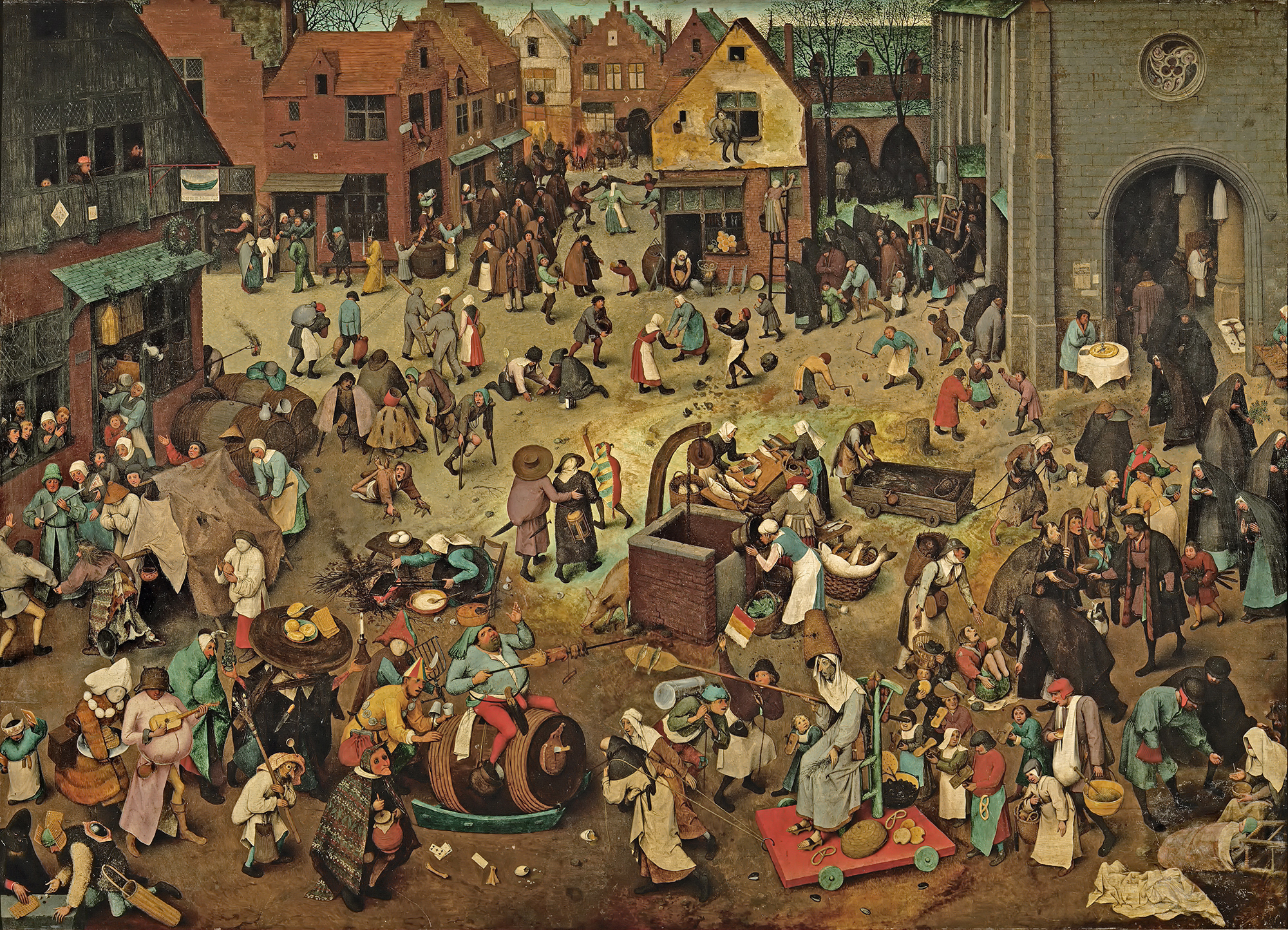
Stylistically, Evens is influenced by his mentors, illustrator Goele Dewanckel and cartoonist Randall Casaer. You can also see glimpses of Pieter Bruegel the Elder, M.C. Escher and Picasso. Take, for example, the resemblance between the artwork Evens created for French publisher Actes Sud and Bruegel's Battle Between Carnival and Lent. Both utilize a bird's eye perspective and include dozens of different vignettes.
While Evens published several award-winning books early in his career, he is best known for more recent works Panther (2014) and The City of Belgium (Dutch and French versions released 2018; forthcoming editions in English in 2020). In terms of content, most of Evens' narratives tend to be a little dark. Panther is about a young girl named Christine whose cat dies. Her mother also threatens suicide, drives away and never comes back. Panther arrives seemingly to be Christine's friend and help her cope, but ends up being far more malicious than he appears. One reader called it a "apologism of pedophilia, zoophilia and incest". Yikes.
The City of Belgium (titled Les Rigoles for its French audience and Het Amusement for Belgium) is actually part of the same universe as Evens's 2009 work The Wrong Place, and the various versions of the book are meant to be connected. "I wanted something like a paperback copy of Balzac, a whole world that would be portable. But, instead of just one city, I wanted to make it a kind of European amalgam…the fun result would be for everyone to think it's their city."
The City of Belgium also reflects Evens' struggle with bi-polar disorder and gradual recovery from a particularly bad episode. While not as unsettling as Panther, the book follows three characters having parallel urban adventures throughout a single evening, one of whom suffers from depression. Evens discusses how the book came to be and acknowledges the "heavy" themes alongside the humor. "The germ was just me coming back to life. A state of depression never carries any potential or interest. Then, once the interest starts returning – bit by bit – it's like you're back at zero. At that point, it's just lines in old sketchbooks, dreams you have, something you happen to see sitting on a terrace. Because it's so surprising to have ideas again, you notice every little thought and you get them down in a sketchbook…[in 2013 and 2014] things were so messed up; I couldn't ever have considered such a massive project. The book is a product of peace having descended…the themes may be heavy, but I hope the treatment is light. Don't forget to mention it's full of gags and jokes!"
Evens appropriately chose a more lighthearted story for the Mikimoto collection while maintaining the concept of connected times and spaces. The characters and scenes appear disparate at first, but as you look more closely you can see that they're all part of the same underwater universe – preparing for the holiday season and the First Snow of Pearls. If anyone is going to create a fanciful mermaid-laden paracosm or "expanded reality" as one reviewer put it, Evens is the perfect choice, as he had been making these sorts of "imaginary worlds" since he was a child. "Practically all I did was try to make imaginary worlds come to life, which meant: visible to other people, in comics, designs for buildings, fantasy world maps, board and card games, cassette tapes… No teaching, no explaining, no argument, just a portable world, bound together, with maybe a dust jacket around it or even some leather," he says. He also did a fantastic job incorporating the pearls, which appear throughout all the scenes. My favorites are the fish helping construct a pearl garland and telling the lazy sea dog to wake up because it's snowing pearls.
The illustrations were incredibly fun on their own, but the addition of Evens' signature text provided another layer of humor.
"A lot of people, when they write dialogue, just go 'A, B', 'A, B', 'A, B.' They'll have the characters neatly wait their turn. Whereas I don't think our brains really work that way. In reality, it's more of a constant traffic jam – even when we like each other and we're interacting well. When we're interacting less well, it's more extreme," he says. You can see the more realistic dialogue (at least, as "realistic" as this mermaid world can be) Evens was aiming for in this scene depicting crabs and fish wrapping holiday presents.
I have no information on how the Mikimoto collaboration came about. I summoned my courage and emailed Evens to see if he could shed any light. He politely declined to be interviewed, but I'm guessing that Mikimoto approached him as he indicated he does not know much about cosmetics. I believe these are new illustrations Evens created especially for the brand, but I find it odd he hasn't included the collab on his website or IG page. I'm also assuming they were done using his usual handmade techniques. For The City of Belgium, he explains: "All the drawings were done on paper and I write by hand. So the creative parts are all computer-less. Where the computer comes in is for research; when I want things to be 'right' or inspired by actual stuff, then I'll look something up… Ecoline [ink] dominates, but I use a mix. Now I have some different inks and, with the same brush, I'll also pick up gouache to make it what I want. Or, I'll mix it with real aquarelle. It all depends on what I'm searching for, what opacity or transparency I need to have. There will also be some pastels and, often, markers." In looking closely at the lines and the way the colors overlap, it appears Evens did indeed draw everything by hand using a mix of markers and pastels on white paper.
So that about wraps it up. What do you think about this collection? What's your favorite scene or character? I'd party any time with these mer-folks!
As with Gudetama, I wasn't sure what I was looking at when I first laid eyes on Holika Holika's collection featuring a character named Peko, but was definitely intrigued. Japan is known for its adorable mascots and this little gal is one of the earliest ones. Peko-chan, as she's affectionately known around the world, is the official mascot for Milky, a chewy, sweetened milk-flavored candy introduced by the Fujiya company in 1951. Naturally I had to try it for myself…plus I figured the candies would be good for photos. 🙂
Fujiya's fascinating history goes even further back, having been established in 1910, but obviously it's Peko I want to focus on. I limited myself to 3 items from the enormous Holika Holika collection. I love Peko's little pigtails and slightly stuck-out tongue, and her cheeks remind me of those from the Utz girl. (I'm not the only one who sees the similarity in these two mascots).
There is a foundation cushion compact inside this milk container, but obviously I couldn't bring myself to open it.
Who is Peko, exactly? There wasn't a definitive history that I could find, but this brief article states that Peko is an eternally 6 year old girl who was born in the "land of dreams somewhere on earth" in 1950. She stands at 100cm (about 39 inches, so just over 3 feet tall) and weighs 15kg (33 lbs – obviously neither measurement is meant to represent your average 6 year old). Her hobbies include baseball and pogo stick jumping, called "hopping" in Japanese, and her favorite animals are puppies. Her name is inspired by "beko", the northern Japanese dialect for "cow". In 1951 her boyfriend Poko was born, who is also forever a child, just a year older than Peko. Poko comes from the word for "boy" ("boko"). (I bought the hand cream especially for Poko.) Both characters were originally introduced as papier-mache dolls, but proved so popular that they expanded into all sorts of materials as well as outfits and costumes.
From the candy's earliest days, Peko and Poko statues were almost always found outside Fujiya stores, sporting a variety of outfits depending on the season or in honor of special holidays. This tradition continues today (and, sadly, these figures are stolen quite frequently).
Somewhere along the line, in an effort to make sure the character was recognizable despite all her different outfits, Fujiya created a set of rules for company designers to follow. According to this blog: "To standardize the look of Peko, the company created a rulebook on Peko, regulating facial expressions and poses of Peko. The rulebook is considered an important secret document of the company." So while Peko has a seemingly infinite wardrobe and continues to evolve ever so slightly, you can always tell it's her.
I love these mini figurines, they remind me of the ones I had as a child. (I'm dating myself here but does anyone remember Charmkins and Strawberry Shortcake figurines? They were both scented, incidentally…my obsession with things that shouldn't necessary have fragrance obviously began at a young age.) If I were a kid now I'd set out to collect each and every one.
In 1995, Fujiya introduced "Dog" to join Peko and Poko. I'm not quite sure what the point of this rather unimaginative character is. Reminds me a bit of the addition of Poochie to Itchy and Scratchy in The Simpsons.
Anyway, like Gudetama, Peko-chan is the star of a staggering amount of merchandise. You can find just about anything – from phone cases and pens to socks and poker chips – featuring Peko-chan. There are also the wildly popular Nendoroid and Bearbrick figurines.
It's not surprising how much merch Peko appears on, given that she's as widely recognized in Japan as Ronald McDonald is in the U.S. There was even a whole pop-up museum devoted to the character in late 2010 to celebrate her 50th anniversary.
However, some claim there is a rather dark side to this seemingly harmless character. Apparently there's an urban legend that's circulated for years claiming that Fujiya based Peko on a real-life child…who was also a cannibal. Those cute little dots on Peko's cheeks? They're not the innocent blush of childhood but her mother's blood. As the story goes, during WWII there was a massive food shortage in Japan, and a mother and young daughter living in a small village (the father was off fighting the war) were literally starving. The selfless mother cuts off a piece of flesh from her arm to feed her little girl. And then: "When Peko took her first bite of human flesh, she was amazed of how sweet the flesh tasted. She proceeded to kill her mother and eat her entire body. Peko continued her life as a cannibal. They say that the reason why her tongue is always out is because she's licking her mother's blood off her cheeks. The name of the candy is 'Milky', but when you rearrange the sounds, it becomes 'Kill Me', which were her mother's final words. That's why the slogan of the company, when translated from Japanese is, 'Milky tastes like Mama'". Um, that's pretty disturbing. Unfortunately Poko is also part of this very macabre tale. "After devouring her mother, Peko-chan was still hungry. She attacked Poko, breaking open his skull in order to eat his brain. Poco was in such pain that he committed suicide by biting off his own tongue and swallowing it. They say that the reason why Poco-chan never has his tongue out in the pictures is because he doesn't have one, and the reason why he always wears a blue hat is to hide his broken skull and exposed brain." Yikes.
In looking at this collection again, I think I'm going to put the Holika Holika stuff in our off-site storage space because right now I'm a little freaked out and kind of don't want it in the house. I don't really believe this story is the basis for Fujiya's Milky mascots – I maintain they were meant to be totally innocuous and cute characters for children, and the gruesome tale is just one of those stupid fake stories from the internet's nascent days – but it's creepy nevertheless, especially when some of the early versions of Peko and Poko were downright terrifying. I'm wondering if, over the years, Fujiya made a deliberate attempt to show Poko without his hat to defuse these rumors.
Anyway, scary urban legends aside, I'm pleased to see such a well-loved mascot on a makeup collection. As with Gudetama, I'm still scratching my head as to why a Korean brand is presenting this collaboration rather than a Japanese company, but I guess it's good there's a makeup representation at all. I just wish there were more versions of Peko as there were with the Gudetama collection. While the Peko collection was huge, it didn't reflect many variations of the character. I would have loved to see (non-creepy) vintage iterations or a depiction of Peko and Poko playing with makeup. It's basically the exact same packaging as the candy, which is cute, but they could have done a little more. Then again, I might have ended up buying almost all of it the way I did with Gudetama, which is not great for the Museum's budget.
What do you think of Peko? Had you heard of her before? And do you think she's really a ravenous cannibal?
As video games are not my forte, this will be a short post. I did however want to briefly share what I got from the Super Mario collection from Shu Uemura. I couldn't find much information as to why they decided to collaborate and why this year – Super Mario debuted in 1985 so it's not a major anniversary of the game. Of course, I was unable to access the full article in WWD because my local library STILL doesn't have that particular issue available, but I was able to cobble together a few WWD quotes from Shu's artistic director regarding the collection. Kakuyasu Uchiide told the publication, "This collection is not so much about creating, but it is about playing. I want people to be able to play with their individual style. I really want to show what is our spirit, our DNA, our creativity. That's the only way to realize what Mr. Uemura wanted to do, which was to strive to link art with cosmetics, to link art with beauty…This time we got inspiration from culture. Super Mario Bros. is one cultural aspect that is representative of Japan. It’s also really, really popular overseas." I have a feeling the full article might be able to shed more light as to how the collaboration with Nintendo came about, but as the company has teamed up with many other brands and designers (and also licensed a children's shampoo – Shu's collection is not the first one to have Super Mario themed haircare) I guess it's not that unexpected that they partnered with a Japanese makeup brand.
Some of the items weren't sold in the U.S. and the palette was completely sold out, so I had to go to my trusty personal shopper in Japan to get my grubby paws on them.
The packaging design is taken from the game's original 1985 look.
The basic premise of the game: "Super Mario Bros. takes place in the Mushroom Kingdom. The game begins when a tribe of a turtle-like race known as the Koopa Troopas invade the kingdom and uses the magic of its king, Bowser, to turn its inhabitants into inanimate objects such as bricks. Bowser and his army also kidnap Princess Toadstool, the daughter of the Mushroom King and the only one with the ability to reverse Bowser's spell. After hearing the news, Mario sets out to save the princess and free the kingdom from Bowser. After traveling through various parts of the kingdom and fighting Bowser's forces along the way, Mario finally reaches Bowser's final stronghold, where he is able to defeat him and send him falling into a pool of lava, allowing the princess to be freed and the Mushroom Kingdom saved." The princess was always known as Princess Peach in Japan, but was changed to Princess Toadstool in the English version.
The flying turtles (Koopa Paratroopas) and little mushrooms (Goombas) are the most commonly appearing enemies of Mario. He can, however, usually defeat them by tossing a fire flower their way, the motif that decorates the cushion blush compact.
I always appreciate a pattern on the interior of boxes – such a nice little detail.
This was the only disappointment packaging-wise for me. Unlike other Shu cleansing oils, the pattern isn't printed directly on the bottle, only on the plastic wrapping. The reason I know this (and was able to avoid mistakenly taking off the outer wrapping) was because I purchased the smaller Mario cleansing oil to actually use, as I thought it would look cute in my bathroom. I went to peel off the wrap and realized the print was on there and that the bottle itself was plain. I have no idea why Shu decided to did that, as the patterns are printed directly onto the bottle with all my other limited edition oils.
The palette was the standout of the collection, which sold out in a flash in the U.S. It's easy to see why – it has most of the main characters from the game complete with gold foil details, and the blushes on the inside are embossed with more motifs from the game.
Here's just a short history of Super Mario Bros. In the early '80s Nintendo was struggling to keep afloat in the American market. The CEO ended up tapping a graphic designer who had never designed a game in his life, Shigeru Miyamoto, to come up with a compelling story and accompanying game. Loosely based on Popeye characters, Donkey Kong debuted in 1981 and introduced "Jumpman", who would become Mario two years later. Nintendo knew their audience wouldn't really respond to Jumpman – a proper name was needed. Mario ended up being the chosen moniker, named after a landlord who, during a meeting, stormed in and demanded the overdue rent for the warehouse Nintendo was occupying at the time. While Mario Bros. was relatively popular, it wasn't until 1985 when Super Mario Bros. debuted that the game really took off.
Some other fun facts about Super Mario, courtesy of The Guardian:
Mario was originally a carpenter, not a plumber.
The Super Mario bros series is in the Guinness Book of Records as the most successful gaming franchise of all time. As of 2010, it boasted global sales of over 240 million units.
The character Mario has appeared in over 200 separate video games.
What do you think of this collection? Do you like video games? While I played Super Mario a few times as a kid, I probably would have been more into video games if I wasn't so uncoordinated. 😛
Save
Save
Save
Save
Save
Save
Save
Save
Save
Save
Save
Save
Save
Let me start off by saying that I am not a dog person. It might have something to do with having a truly nice cat for 18 years (always wanted to cuddle and never hissed once!), or regularly being exposed to my aunt's slobbering, hyper, incredibly smelly canines, or the fact that I was bit by a black Labrador when I was a teenager…there's nothing like a trip to the ER for stitches and a tetanus shot after some off-leash beast sinks its teeth into your leg at the exact moment the idiot owner is saying "Don't worry, he won't bite!" (Insert eyeroll emoji here). Whatever it is, I've always gravitated towards felines. Having said all that, Pai Pai's latest collection, created by Pinut Brein, proved too cute for me to pass up.
I love that they all have names and in some cases have little descriptions and/or are based on real dogs. Miau is the chihuahua, but I don't seem to have any other info on him. The bichon frise is named Tiara, and she's adamant about making people know she's NOT a poodle. Djoko, the Pomeranian, is actually a dog belonging to a Mexico City fashion and lifestyle blogger.
The French bulldog is a princess named Petunia. She enjoys walks in the park, regardless of the fact that she doesn't have a boyfriend to stroll with. 😀
Despite not liking dogs I've taken quite a shine to pugs over the past couple of years. I think it's not only because of their adorable smooshed faces, floppy ears and little curly tails, but also because I suspect they're essentially Babos in dog form – I hear they're not very bright, but one of the sweetest and most loving breeds. And they're lazy too, which describes most of our plushies to a T. I don't think I've formally introduced Barney here at the blog or assigned him any Museum work, but he joined us last year. I managed to get him to pose with the Pai Pai lipsticks, which he then tried to eat. He definitely fits in with the rest of Museum staff, right?
Now for some information on the artist. Pinut Brein is a brand created by Mexico City based artist Maria…well, I'm not sure of her last name.* So I'll just refer to her first name. Inspired by the work of her architect parents, Maria always enjoyed sketching and doodling. She kept her passion for drawing under wraps while studying audio engineering and working briefly as a sound/video editor. But after meeting several other illustrators in her native town of Xalapa in 2012 and participating in their artist collaborative Malacara, Maria decided to strike out on her own and establish Pinut Brein in 2015. (It's a play on "peanut brain" [cerebro de cacahuate"], a nickname teasingly bestowed upon Maria by her older sister). I find her style utterly charming without being saccharine. The illustrations work equally well as prints for one's living room as they would for nursery walls, i.e., not too mature for children but not too juvenile for adults. And though they're stylistically pretty different, the ability of Pinut Brein's drawings to work on a range of items intended for different audiences is similar to that of Poni Lab.
Her favorite animals are dogs and horses, and she dreams of owning a pony some day.
As for her artistic process, Maria tries to infuse each animal she creates with their own personality and assign human characteristics, such as a cat leading a punk band or a bear who's also a sailor. At least, that's what I gathered from this quote: "Desde hace mucho me ha gustado dibujar y crear personajes, la temática principal es el reflejo de distintas personalidades humanas en animales; por ejemplo, un gato y su banda de punk, o un oso marinero." Some are her own unique creation, while some are based on people she knows, hence the dogs of the Pai Pai collection having names or borrowed from real people. I absolutely love this concept, as our plushies, though generally lazy and not very smart, each have their own distinct personalities. The idea of giving animals individual character traits demonstrates the artist's genuine fondness for animals; you can tell there's a real love for creatures great and small, they're not just cute motifs to her. I also admire the fact that Maria sketches with an actual pencil and paper first, then transfers the concept to a digital format and adds color and other finishing touches that way. Don't get me wrong, digital illustration requires just as much skill, but I'm old-school and will always appreciate paper more than screens. 😉
Here's one of her illustrations for Nylon Español. I love the name of this cat-unicorn in Spanish: un "gaticornio". So precious!!
In addition to the Pai Pai lipstick cases, the recent earthquake in Mexico spurred Pinut Brein to create illustrations of some of the rescue dogs who saved dozens of people trapped in the rubble: Frida, Eco, Akasha and Titan.
Pai Pai chose Frida and Eco to appear on some cosmetic bags, with all of the bags' sale proceeds being donated to earthquake relief.
Unfortunately with all the holiday releases I haven't gotten around to order these and it looks like Frida is sold out, but perhaps I will treat myself to Eco. :) And I can always buy this wonderful kit with stickers of all four doggies, since the proceeds from this also go to earthquake recovery efforts.
So, despite my general preference for cats, this latest collection was definitely irresistible. Pinut Brein must be very talented to make a non-dog person like me become smitten with these canines. Which perrito was your favorite?
*The site I linked to lists "Maria del Mar Flores Ibarra"…but it seems kind of long to me, so I don't know whether it's just Del Mar or the whole thing.
Save
Save
Save
It was quite the quest to get this collection into my grabby paws, but with the help of my phone's alarm and my lovely mother-in-law, I was able to nab this highly coveted collaboration between Moschino and Sephora.
As soon as I laid eyes on it in July I knew I had to have it for the Museum, especially considering that one of the Museum's interns is a sweet little cubby who would be very happy to see it.
I don't think I'm getting these back from him.
Not only did my MIL go out of her way to get to Sephora (and early – she got there at 9:10 and there were already 2 people waiting!), she picked up the shopping bag palette for me in addition to the eye shadow palette. And also refused to accept reimbursement for either item. I'm a very lucky girl, yes?
And here we are! The star of the collection, the most coveted and hard to get. My MIL reported that the store only got 6 in stock. The two women ahead of her got theirs (1 each, thankfully), my MIL got one for me, and then she said the guy behind her bought the last 3, the jerk.
Babo Bear insisted on doing a little more modeling.
Let's explore a little bit of the fashion behind the teddy bear and shopping bag motifs. Franco Moschino (1950-1994) began his irreverent line in 1983, poking fun at the world of couture despite (or perhaps because of?) being totally immersed in it. I'm ill-equipped to fully explain his style since I am not a fashion historian, but I found some good articles here, here and here if you're so inclined. I was flabbergasted to learn that both the bears and bags seen on the runways the past few seasons were inspired by Moschino's original designs – I had mistakenly believed that both were new concepts dreamed up by the ever-wacky Jeremy Scott, Moschino's current creative director. Little did I know that Moschino had a sense of humor about high fashion long before it was, well, fashionable. Scott is doing an excellent job of carrying that torch by putting his own spin on Moschino's original aesthetic and adding some new motifs (I adore this "capsule" collection, controversial though it was), but the teddy bears and shopping bags are not actually his brainchild. This was the famous dress and hat from Moschino's 1988 fall collection that put the bear motif on the fashion map.
Under Rossella Jardini, Moschino's director from the designer's untimely death in 1994 until 2013, both of these iconic pieces were resurrected for the house's 30th anniversary.
Scott took over in October 2013, and wasted no time building on the teddy bear empire by releasing the Toy fragrance roughly a year after his appointment. This was not unexpected, seeing as how before his post at Moschino, Scott had designed these teddy bear sneakers for Adidas in 2011.
I love the Surrealist-esque "This is not a Moschino toy" on the bear's shirt, since it's one of my favorite art movements, but also because Franco Moschino was also inspired by both Surrealism and Dada so it fits perfectly with his original vision. I'm less crazy about the fact that you have to remove the bear's head to apply the perfume, however. (See last year's Halloween post for similar creepy items).
Scott also continuously works in new iterations of teddy bear fashion. I'm truly impressed by how he's able to reinvent one of Moschino's stand-out pieces while remaining true to the original designer's vision as well as his own – the iconography is similar but has been modernized to reflect contemporary culture, taking on a slightly different meaning now. This article explains it better than I can: "For Scott, the teddy bear motif has been a career theme of symbolic materialistic significance similar to how Jean Charles de Castelbajac famously used it, but in the context of the American designer's new era at Moschino, the teddy bear's connotations are something else. When fangirl mania was at its height circa early-mid 90s and teen idols like Take That were climbing a never-ending fame ladder, their hordes of fans would bring teddy bears to concerts and outside hotels, throwing them at the bad as tokens of their support. With the teddy bear as their mascot, this generation of ultimate fangirls displayed the innocent, childlike obsession that lies at the root of fandom in pop culture, and portrayed the spirit of materialism and unapologetic commercial opportunism it generates. Franco Moschino created his house in a time when the foundation of this kind of excessive 90s fandom was being built – courtesy mainly of Michael Jackson and Madonna – and while his work dealt more with the consumerism of the time, brand idolisation was a huge part of Moschino's genetics."
Getting back to the Sephora collection, obviously the packaging is a natural extension of the Toy fragrance. I think Franco Moschino would be pleased not only by Scott's fashion but by the Sephora collection as well. The packaging is slightly absurd and therefore lends a tiny bit of Dada flavor (especially so with the brush set), and I personally think the shiny gold finish is poking gentle fun at our cultural obsession with status symbols and "bling". And since the collection was in collaboration with a higher-end makeup store, there's the trademark Moschino mix of humor and quality. As for Scott, I think he had fun with the collection as well, noting that he "loves the power of makeup and the way it can transform your mood." He also points out that a makeup line from a couture house allows accessibility for those who can't afford the fashion, which I'm always in favor of. "I learned very early on how much young people love my work, and sometimes they don’t have the means to get it. This is another way for me to do Moschino and not sacrifice quality. It’s a lot more accessible. I love to be able to put my arms around more people and have them be a part of the Moschino family in some capacity." However, the irony of this was how difficult the collection was to procure, and many people didn't get theirs. It's a long story and I don't want to tell it, but I will say that the collection's release and sale was an example of how NOT to sell a highly anticipated collection with so little stock. I think Sephora really screwed the pooch and I feel bad for those who couldn't get their hands on it, especially when you have unscrupulous ebayers selling the goods for over twice retail. How's that for affordable? I wish Sephora would do what MAC did when Selena sold out immediately: make more for another run, and also release it worldwide (as far as I know the Moschino collection was only available in the U.S. and Canada). It would be silly not to from a profit perspective – obviously lots of folks really wanted this collection so Sephora could stand to make even more money if they re-released it.
What do you think of the Sephora collection and Moschino? After reading more about the history of Moschino and Scott's current creations I'm pretty enamored of the line and wouldn't mind owning a few pieces. It's kitschy, offbeat, clever but also well-made.
UPDATE: In December 2017 Sephora re-released the collection with zero fanfare. I guess they didn't want to draw attention to the debacle with the previous release but also wanted to cash in.