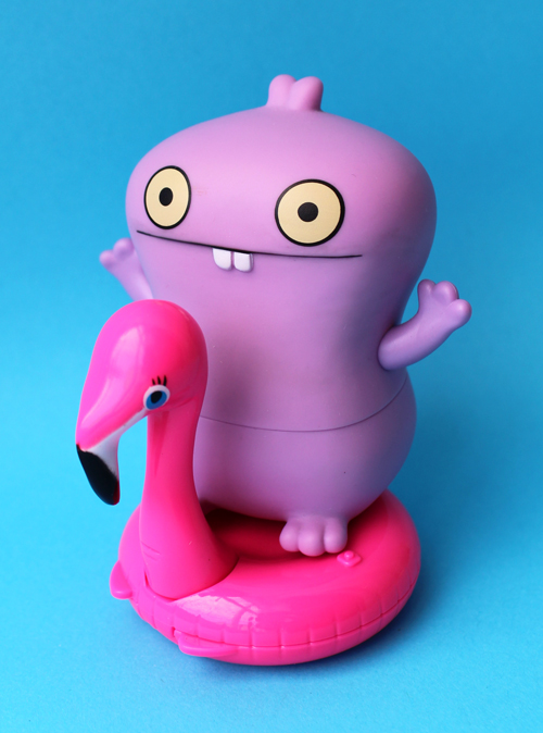
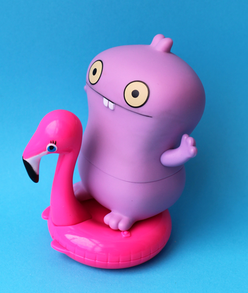
Let me preface this post by saying that I haven't forgotten about the bigger issues regarding racism. Skin color is literally a matter of life and death in this country and has been for hundreds of years. But I want to address the lack of diversity, particularly Black representation, in current and vintage makeup, at the Museum. I also want to look at how, or even if, it can be remedied. That racism exists within the beauty industry both now and in the past is indisputable, and as both a feminist and makeup historian I considered myself well aware of these issues. But awareness isn't enough. Before I dive in I also want to note that it's Pride Month, and all of these ideas are applicable to the LGBTQIA+ community – more marginalized people that have not been adequately represented at the Museum.
Currently the Museum has only a handful of vintage items that came from Black-owned companies. There are about 200 makeup ads in the collection, roughly 150 of which feature models, and of those only 3 depict Black models. And of all the artist collaborations that have been featured over the years, only 3 of them (!) were with Black artists. In short, the Museum's collection is overwhelmingly white and serves as a direct reflection of white supremacy. A key reason is obviously that Black-owned beauty companies or products for Black customers are few and far between; historically there simply weren't as many beauty brands or products geared towards Black people and advertising primarily featured white models, both problems that still persist today due to institutional racism and implicit bias. It was much more difficult for a Black person to obtain a business loan to start their company, especially in beauty, as they've been told time and again the lie that there is no market for cosmetics that would actually suit the vast range of Black skin tones. However, while these are valid points, my own blind spots definitely play a role in the lack of representation in the Museum's collection and content. Information on Black beauty brands and campaigns is without question difficult to find, but that doesn't mean it doesn't exist or that I couldn't do a more thorough job researching. Here are the explanations for not actively working towards including more Black makeup products and histories. These are just that – explanations, NOT excuses. I understand that I need to make more of an effort to diversify and that I am not totally helpless. These explanations really just boil down to white fragility, albeit a different flavor in my case. I don't get defensive or angry when I acknowledge my privilege or when I've made a mistake (remember the Felicia the Flamingo debacle?), but boy am I fearful of doing the wrong thing. Not to mention I'm harboring a ton of white guilt.
It felt trite and tokenizing to be sharing the same Black beauty icons, the same few brands, the same few ads that we've seen before. Especially during Black History or Pride months – I seriously hate when companies post a quote from MLK in February or turn their logo into a rainbow in June and call it a day. The histories and contributions of Black people and the LGBQTIA+ communities should be recognized year-round. Anyway, I thought it wasn't helpful to anyone to feature long-standing Black-owned brands that everyone knows about like Posner or Fashion Fair, or yet another history of Madam C. J. Walker. For example, would it be interesting or eye-opening at all to keep seeing the same 3 Black models when discussing '90s makeup ads/looks? (Halle Berry for Revlon, Tyra Banks for Cover Girl and Naomi Campbell basically for everything else.) Nope. So I thought, well, I'll dig deeper, I know there's more information out there on Black makeup history that hasn't been fully covered or unearthed yet. And there is! I found some pieces of Black makeup history that I haven't seen a million times and am finding more now that I'm looking more closely.
But I still feel these are not my stories to tell or analyze. As noted previously I've never had to struggle to find a foundation match or flattering colors. And as a white person it makes me very uncomfortable to tell the story of a vintage Black-owned brand or ad campaign, that white-splaining would ultimately do more harm than good. Why is a white person sharing their unsolicited opinion on Black makeup brands or trying to cover Black history? Don't we need more Black voices? Then I thought that I could ask Black historians to write guest posts on Black makeup history, or co-curate a whole exhibition. And for more current topics, I could invite Black people to share their stories that I could then compile into an online, downloadable publication and have print copies on demand, with all proceeds going to charity. But could they be considered contributions to makeup history or yet more work for Black people? Some white lady asking for the experiences of Black people sounds awfully demanding and possibly patronizing.
Along these lines, I am fearful of appropriating Black culture. Cultural appropriation is a topic I'm sensitive to, and I worry that it's offensive for a white person to be including brands intended mostly for Black customers. Fenty and Pat McGrath are acceptable because while they are Black-founded and owned, they seem to cater to everyone. Smaller indie brands like Uoma and Juvia's Place, on the other hand, appear to be primarily intended to meet the needs of Black customers. I loved the packaging for Uoma's Carnival collection and wanted to add it to the Museum. I wanted to interview Uoma's founder about the inspiration behind the collection and the packaging design. I understand everyone's money is green, but I was afraid that adding these products to the Museum's collection would somehow come off as appropriative.
To be honest, I feel odd sharing that I like any aspect of Black culture. White people have been appropriating it and exploiting it for years, can't Black people just have something we wouldn't take from them? And so I felt like buying the Uoma collection would be wrong, that it wasn't intended for white people to have. The same goes for some amazing powder boxes made by tribes in Africa such as the Kuba people of the Congo, especially as the cosmetics they hold were sometimes used in rituals. On the one hand it's necessary to share and promote Black-owned brands and various African cultures; on the other I question whether it's appropriate for white people to do so.
So this leads to to a discussion of future Museum content and collection planning. Something as innocuous as round-ups of certain themes may actually be offensive, considering that many of them don't feature anything but white-owned brands, ads with white models, etc. I think these sorts of round-ups are important for makeup history and I want to keep incorporating them. Ditto for objects that don't come from Black-owned brands and artist collaborations. I purchase items for the collection based on their artistic, design or historical value; just because an object doesn't come from a Black-owned company doesn't necessarily negate its importance. But the lack of representation is really troubling, and I just don't know what to do. Some examples: I was going to post a picture on IG of all orchid-themed products, but quickly realized that not one of them came from a Black-owned brand, and every single vintage ad featured white models exclusively. I was going to post the Too-Faced Quickie Chronicles on IG too – matching the pin-up artists to the Too-Faced palettes was a fun series to write…until I remembered that Too-Faced is white-owned, and all the vintage pin-up girls featured and the artists who created them are white. A post I had planned for the blog was an artist collaboration that I didn't have a chance to cover last year when it was released, Connor Tingley for NARS. Guess what, both Mr. Nars and the artist he hand-picked for the collab are white dudes. Do I not share any of these, then? I don't think all the whiteness can be balanced by the Black makeup history I'm able to access. So maybe I wouldn't write about them, but I still think they're important and need to be shared. Especially artist collabs, as they were one of the main reasons for the Museum's existence.
I don't know what the answers are. I firmly believe makeup and its history is for everyone, but that sentiment is not being reflected in the Museum currently, and I don't know how to change that given that there are still so many barriers to racial and gender equality. I can do absolutely do a better job researching and have already come up with some ideas for future posts focused on Black makeup history, and I have many more books on my list about museums and diversity in general to educate myself further. Whether this will be enough, or even appropriate, remains to be seen. Thoughts in the meantime? (I think Disqus may be acting up so please feel free to email me if you can't leave a comment, or DM me on Twitter or IG.)
Update, 6/3/2020: There is an excellent website that rounds up key resources – it's far superior to what I tried to do a few days ago so please check it out!
As for me, I'm still processing the enormous amount of ever-changing information, but wanted to take at least a few steps in the right direction. Helping dismantle racism is a marathon, not a sprint, and I intend on working on it basically forever. So while it's not much, I've taken in a lot of information and a few actions to start with. In the last 72 hours I have devoured countless online articles and IG posts, followed at least 30 IG and Twitter accounts run by black women, ordered 2 of the 4 books noted in the first list below (purchased from black-owned bookstores), and donated to the Black Visions Collective. All of these are not enough and should have been done far sooner, and I'm certainly not broadcasting these things to be self-congratulatory or to receive a pat on the back. I'm merely trying to demonstrate that I'm starting to put thought into tangible action and that you can too. Try not to be overwhelmed with all the information being distributed or the steps you can take. It's a lifelong process and you don't have to do it all at once…but doing something tiny is better than nothing.
I'm also working on a plan or a statement of some kind about how the Museum can better represent and support black people. I had long been intending to unveil a plan on diversity and inclusiveness for the Museum as part of MM Musings and actually had it scheduled for July, but I think given the current situation I am going to address the issue sooner with a focus on racism. It won't be complete since I still don't have the resources I wanted to incorporate, but it will be some thoughts. Stay tuned.
Original post, 5/30/2020
You know I try to keep the Museum a happy place, somewhere people can look at pretty makeup and learn about cosmetics history. I like to think of it as providing a much-needed escape from scary times. But right now, as I was with the Freddie Gray protests here in Baltimore, I am too distracted to write about makeup. I subscribe to the #museumsarenotneutral stance so with that, I wanted to share some resources that might be helpful to non-black people who are trying to be allies. I feel very useless as well as overwhelmed by the volume of information being circulated across various social media platforms and I suspect you do too, so by getting some key sources in one place I'm hoping you can feel like you're taking some small amount of action. This just the tip of the iceberg and by no means intended to be an exhaustive list, but it's a starting point.
1. The basics: Understanding what allyship and privilege really mean and how white people in particular have benefited from a racist system. This is a great allyship beginner's guide and an article explaining white privilege, plus an allyship primer on Twitter.
2. If you can afford to, even if it's just a couple dollars, donate. Here are the individual donation pages for Ahmaud Arbery and George Floyd, as well as the donation page for the Minnesota Freedom Fund, the Black Visions Collective, and a complete list of bail funds. And of course, there's always the ACLU. More donation sites can be found here. This list also includes organizations that provide mental health resources to black people, if you'd rather divert your money to places that help in a more direct way.
3. Continue educating yourself…and not by badgering black people. They do not exist to teach you; it's up to you to do the work. There are so many resources out there. In the interest of being totally transparent I haven't read these books yet, but these are the ones that I keep seeing on every list of recommended reading. Lots more books here and here.
4. Support black artists, writers and other creatives and businesses. Follow, share, retweet etc. to help get their voices heard. This is something I admittedly don't do much of because I was always afraid of it coming off as disingenuous – just a move to make the Museum look like it actually cares about diversity while not actually doing anything of value. I've also always been hesitant to attempt to write about black beauty history or brands because I was afraid of white-splaining, or that it's not my story to tell. And honestly, I still feel like it would be wrong of me to, for example, detail the history of shade ranges since I've never experienced not being able to find a foundation match. I feel as though it's better left to a black person who has had to deal with it first-hand, especially since, again, we need to help make sure their voices are heard. I'm still trying to figure it all out, but I think following and sharing the work of black people is a start.
5. Do the work in real life. Online support is great, but real-life interactions are necessary for change. Here's a preparation checklist for protesting (if you're able). The most important thing is having conversations with your friends, family, co-workers, etc. and taking action in your community. Here are 75 ways to you can do the work, plus another good general guide outside of protesting.
This situation is so odd because I don't want to be silent but at the same time I don't want to just be paying lip service either, and I know this post is going to come off as performative, absolution-seeking, virtual-signaling and/or white-knighting. I also know that it won't solve or undo hundreds of years of racism. But I thought it certainly couldn't hurt, and compiling these resources will also clarify what to do. Finally, please know I'm also constantly thinking about how the Museum can be a more inclusive and diverse space, acknowledging that there's still a ton of work to be done on my part, and focusing on keeping the conversation going and not just when police brutality and other violence towards black people are dominating the headlines.
If there are any other key resources you think need to be here, please let me know.
There's a reason you haven't seen much of Pai Pai at the Museum as of late: unfortunately, the company wasn't doing enough business in the U.S. so they ceased their short-lived shipping here. But the good news is that a fellow collector sussed out another Mexico-based store that carries the line and will send it to the States. After missing out on several really cool collaborations I was finally able to resume adding Pai Pai to the Museum's collection. Without further ado, I introduce their latest release, a collaboration with Ana Leovy.
I had hoped to get the exclusive scoop on the collection and emailed the artist for an interview. Much to my disappointment she did not respond. (And you wonder why I'm continually discouraged – this is the second artist in a row to turn me down). Nevertheless I was able to cobble together some information on Leovy's work. For the Pai Pai collection, it appears she created four different paintings to be used on four lipstick cases. To my knowledge they are untitled.
Here are the colors in case you're not a crazy collector and actually want to use them!
Ana Leovy is a young Mexico City-based artist whose vibrant, woman-centric paintings have garnered the attention from everyone from the likes of Man Repeller to Elle Mexico. Originally trained as a graphic designer, Leovy reignited her love of painting after earning her Master degree in illustration at a university in Barcelona. Upon completion of her degree she moved back to Mexico to pursue painting full-time. She states in an interview, "Although I love graphic design, being an artist gives me so much more creative freedom. People come to me now because they like my style and they trust what I will create for them, whereas from my experience working with design clients, they were a bit harder to please – and I was stressed all the time. Art doesn’t feel like a job at all, it brings me lots of joy and peace, especially when seeing the reaction of people who have bought my work, it’s the best feeling ever!"
Thematically, Leovy's work consists mostly of the female form. Their bodies are often asymmetrical, out of proportion and show a range of colors, reflecting Leovy's commitment to depicting diversity in body shapes, sizes and skin tones. "We all come in different shapes and colors, I think that is so interesting and awesome. We should learn to embrace our uniqueness. I like playing with distorted bodies in order to avoid falling into any specific beauty category. I think it’s important to encourage diversity; my work isn’t about creating beautiful people, but trying to send a message of self-love and empowerment. Perfection is not necessarily beautiful; to me different is more exciting. We already have perfection in photography…I want everyone to be able to relate to my work regardless of their skin color or body shape." While this may seem disingenuous coming from someone as gorgeous as Leovy – I tend to roll my eyes at beautiful, thin women (especially models and actresses) who preach "loving your body" – I believe she is sincere. The proof is in her work; you will not find skinny, conventionally beautiful model types in any of Leovy's paintings. This is a refreshing change from other illustrators, especially the more fashion-based ones. Leovy's women are modern and yes, well-dressed (the artist loves fashion, citing Mara Hoffman and Elie Saab among her favorite designers), but without the reinforcement of beauty and fashion stereotypes. This makes her work seem much less intimidating and achieves her goal of being relatable to the average woman.
Another reason Leovy's work seems more welcoming than other depictions of women we see so frequently in beauty collabs is the overwhelming spirit of camaraderie and sisterhood. “All my life women around me have been nothing but inspiration. I love being able to confide in them," she says. I particularly love this scene of women having a picnic in a lush garden, clearly enjoying each other's company (along with some wine and Vogue magazines!)
I also enjoy the feminist bend in Leovy's work, which shows an awareness of the inequality faced by women. She states: “Sadly we are still a very chauvinist community where you get blamed for being out too late or the way you dress…It has never been my intention to become too political, however I think now more than ever it is important to stand up and support what you believe in. It is amazing to see so many movements all around the world demanding what should be natural; equality, love and acceptance. So after seeing all this it is impossible not to feel vulnerable, getting involved in such topics are a small way of showing support.”
Depicting women by themselves, enjoying their time alone is another way Leovy expresses a more feminist angle. "[Mexico] is a country where most women are raised to be married and have children, nothing else. Even though this has been a year of very feminist-oriented social media, I believe we’re still lacking the day-to-day actions that go in hand with these movements, to really practice what we preach,” she says. Showing women without a male partner, and even happy without a male presence, emphasizes the notion of women's independence as well as a rejection of the societal expectations of marriage and procreation. It's rare that you see women living "happily ever after" totally on their own; single women are generally still viewed as defective, or at the very least, lonely spinsters. That's why I love seeing Leovy's paintings of women in a room by themselves, reading, watching TV in their sweats or simply having a moment with their thoughts, as these pieces fight back against the stigma single women endure. (And even if you're partnered, it's important to have some time alone on occasion to maintain your sense of self.)
Now that we've covered the main themes in Leovy's oeuvre, I want to talk a little about her style, particularly her use of color. The landscape and textiles of her native Mexico as well as the tropical environment of the Caribbean, where she lived for several years, shaped her preference for vibrant colors. The unexpected combinations reflect Leovy's "no rules" approach. "When it comes to color in my work I believe the more the merrier, it's the part of the creation process I enjoy the most, I follow no rule or guideline whatsoever and I love it…Choosing the color palette is my favorite part, I love letting myself flow and see what comes out. I think the colors I choose are sort of a personal journal of my mood swings."
While Leovy's style is uniquely her own, I can't help but notice a striking resemblance to Matisse. Another article points out the similarity between Leovy and Matisse in terms of color, but I'd also argue that the use of a somewhat flattened perspective, background patterns, and overall composition are reminiscent of Matisse's interiors. Some examples, alternating between the two artists and starting with Matisse:
In terms of format, Leovy enjoys both large and small scale. “Every format has its good and bad side, big canvases might feel intimidating at first but once you get started they are so much fun, love a big white space to intervene. However, tiny pieces are the cutest and I also enjoy doing them. So I guess I love them all, I like being able to change formats and not being stuck with only one, I think I would find that boring,” she says. For the Pai Pai collection, I thought for sure the works she created would be large, but they actually look tiny.
So that brings us full circle to the Pai Pai collection. Overall I really enjoy Leovy's work, as it's a change of pace from the fashion illustrations we've seen in various other collabs, and obviously I love the feminist vibe. I also like how Pai Pai switches it up for each collection by choosing artists with wildly varied styles. Leovy's paintings are totally different from, say, the work of Jorge Serrano and illustrations of Pinut Brein. Pai Pai always keeps me guessing and it's another aspect I love about the brand – they never stick to one type of artist. I just wish I could have gotten some information about how the partnership with Pai Pai came about, what Leovy's approach to makeup is (if any – she looks rather au naturel!) and whether anything in particular inspired her paintings used for the collection.
What do you think of this collection and Leovy's work? Which image is your favorite?
Around this time 2 years ago I got my first tattoos. In honor of that momentous occasion, I thought I'd take a look at a vintage brand that featured some truly wild advertising. I had come across Tattoo years ago, as well as its sister line Savage, and was immediately struck by the images used in their ads and on the products themselves. I managed to snag two of the ads, as well as the lipstick case and rouge container. Given their tropical feel I had originally intended on including them in the summer exhibition, but upon closer inspection I decided against it. Let's see why, shall we?
Sadly I was unable to make out the name of the illustrator who created the imagery on this one. It's something with an R, but beyond that I'm completely lost.
This one is by John LaGatta (1894-1977), and as you can tell by the publication name and spelling of "colour", appeared in a British magazine.
As with Po-go Rouge, the compact is teeny compared to today's blushes.
The puff is imprinted with the same design.
There was another compact with "U.S.A." inscribed beneath the Tattoo name. (Of course, I totally forgot I had this one and ended up with two…I could be wrong, but I don't think the "U.S.A." imprint presents any real significance; I believe it's just a slight change in production.)
There was also a difference in the bottoms of the compacts. The one with U.S.A. on the front doesn't have any inscription on the back. Again, I don't think there's any real significance to this, just a negligible difference in the manufacturing.
What IS an interesting difference, however, is an alternate design on the lipstick and rouge. It appears these were sold around the same time as the more commonly seen design. It may have been a mini version, but I'm not sure.
This is the only ad I found in which the alternate design appeared. It's from 1947, so maybe it only showed up towards the end of Tattoo's reign (the latest newspaper ad for Tattoo was from September 1949).
I also own a Savage powder box, which you might remember from this post and then its later appearance in the 2015 summer exhibition. I deeply regret including it now.
I don't have the complete story of Tattoo/Savage, but thanks to Collecting Vintage Compacts and what I was able to cobble together from old newspaper ads, the lines were introduced in the early 1930s by James Leslie Younghusband, a Canadian military/stunt pilot turned Chicago-based businessman. Younghusband was the brains behind another "indelible" lipstick line called Kissproof, which he invented in 1923. Despite its poisonous ingredients, the lipstick was sold until the early 1940s. I'm not sure why Younghusband felt compelled to develop not one but two "permanent" lipstick brands while Kissproof was still being sold, since I've compared the copy from the Tattoo and Savage ads to the Kissproof ones and all touted them as long-wearing lipsticks that were also comfortable to wear – formula-wise, there doesn't seem to be much difference. The author of Collecting Vintage Compacts has promised a second installment about Younghusband and the launch of Tattoo and Savage so I'll update this post with additional information, but in the meantime I wanted to share some thoughts and other questions I have about these lines.
First, I'm not going to dance around the obvious here: there's no way any company could get away with this sort of fetishizing of "exotic" people and cultures today. The ads and product design certainly are eye-catching – who wouldn't want to wear colors inspired by a tropical paradise? - but when you look closely and read the ad copy, you realize how racist they are. Tattoo and Savage represent the pinnacle of white men's fantasies about "native" women's sexuality, which in their minds is completely untamed and animal-like. By wearing lipstick shades appropriated from these "uncivilized" cultures, white ladies can show off their racy side while still adhering to traditional American/European standards of female decorum. Take, for example, the copy in this ad. "From South Sea maidens, whom you know as the most glamorous women on earth, comes the secret of making and keeping lips excitingly lovely and everlastingly youthful. In that land where romance is really real, you'll naturally find no coated, pasty lips. Instead, you'll find them gorgeously tattooed! Not with a needle, but with a sweet, exotic red stain made from the berries of the passion-fruit…Tattoo is the civilized version of this marvelous idea." Yes, it's so very uncivilized to wear a lip stain made of crushed berries – only cavewomen do that!1
Savage is even more blatantly racist, highlighting the fact that their colors were inspired by "primitive, savage love".
And their reds are "paganly appealing hues that stir the senses…rapturous, primitive reds, each as certainly seductive as a jungle rhythm." Bonus points for this ad linking "wickedness" to indigenous cultures.
The Tattoo ads (including the two I own) feature a variety of tan-skinned women catering to pale white women, imagery that dates back at least to the Renaissance and is still used today in an effort to make a scene appear "historically accurate." You'll notice that these particular women are depicted in stereotypical garb that existed solely in white people's imaginations, i.e. hula skirts and flower necklaces. And just to further the idea of their supposedly insatiable lust, they are also shown topless. Women of color are reduced to othered, highly sexualized props whose only purpose is to serve white women. (Somewhat unrelated, but if you want to take a gander at the lipstick display shown in this ad, you can see it here. I remember one popped up on ebay a couple years ago with an starting bid of a mere $199.99.)
More proof: the ideal "Tattoo girl" was white and blond.
Savage also threw in a nod to colonization with the use of "conquer".
All of this begs the question of what Younghusband was trying to accomplish with these lines.* Indelible lipstick was all the rage in the '20s and '30s; no doubt Younghusband's company faced stiff competition from the likes of Tangee and others. Perhaps he felt that this manner of cultural appropriation, i.e. creating what was probably the decade's most risqué and raciest makeup line by portraying the indigenous people of the South Pacific as feral and completely unfettered by "civilized" society's code of conduct, and then offering white women a socially acceptable way to channel that imagined freedom via lipstick, was the best way to stand out in a crowded market. The ads repeat words like "thrilling", "maddening", and suggests that the color will last through late-night activity. Sounds very exciting, yes?
The other possible reason Younghusband looked towards the South Pacific was the rise of tourism to Hawaii and other islands during the 1930s. As the blog author of Witness to Fashion astutely points out in a post on Tattoo, the increased tourism heralded a cultural love affair with anything tropical. "Tourism to Hawaii, via luxurious cruise ships, increased in the 1930s. The “white ships” of the Matson Line sailed from San Francisco to Hawaii and the South Seas. Quite a few movies with a tropical setting were made in the thirties, including Mutiny on the Bounty (1935), The Hurricane (1937) and Her Jungle Love (1938) — both starring queen-of-the-sarong Dorothy Lamour, Charlie Chan in Honolulu (1938), and Honolulu (1939). Bing Crosby and his movie Waikiki Wedding (1937) popularized the song 'Sweet Leilani,' written in 1934." Sounds plausible.
Getting back to my other questions, I'm unclear on the difference between the Tattoo and Savage lines, or why Younghusband would launch both nearly simultaneously. As I noted previously, there doesn't seem to be an appreciable difference between the two, and they were released at approximately the same time – around 1933 for Tattoo and 1934 for Savage. Tattoo lasted till about 1949, while the last newspaper ad I found for Savage dates to October 1941. At first I thought perhaps Savage was a drugstore line, whereas Tattoo was sold only in department stores, since their respective prices were 20 cents and one dollar. This 1939 Gimbel's ad for Savage, however, kills that theory.
Finally, and you may be wondering this as well, why on earth did I knowingly purchase such racist items for the Museum and then choose to blog about them? Unfortunately I can't really answer that myself. It's not like I wasn't familiar with these lines or thought they were okay and then realized they weren't, which has happenedbefore. I also like to consider myself at least somewhat conscious about racial and cultural appropriation issues within the beauty industry. I guess I thought that, distasteful though they are, they're important from a historical perspective. I wanted to have tangible reminders of what was acceptable back then. Items like this also help me remember to be a little more mindful when purchasing contemporary pieces. So while I've made the decision not to feature such items in exhibitions, since it dawned on me that I prefer exhibitions to have more of a celebratory spirit and racist beauty products aren't things I necessarily want to champion, I think a cosmetics museum should have these types of items and open a dialogue about the ugly side of the beauty industry and its history. My main goal for the Museum is for it to serve as a happy, magical place full of wonderful and beautiful things, but sometimes it's necessary to take a good hard look at some of the problematic issues within the world of cosmetics.
Well, that's enough of my blather, except to say that I'm sorry I don't have more concrete information on these lines – hopefully Collecting Vintage Compacts will shed further light on them. Thoughts?
1 While I was poking about at newspapers.com I came across an article from 1934 that serves as historical evidence of how indigenous people were viewed by Americans/Europeans in the '30s. This one tells the tale of one young woman "explorer" (read: colonizer) who attempted to "civilize" the "ferocious Amazonians" in South America by bringing them cosmetics. I literally can't even with this.
2I do really wonder what the hell was wrong with Younghusband. In the news articles I found, his first wife passed away in 1927, and he went on to remarry 4 different women in the span of 13 years, all of whom accused him of adultery. The rough timeline is that he divorced the 2nd wife in 1931, married his third in April 1933 and divorced her in 1935. I'm not sure about the 4th wife, but in November of 1937 he married his fifth. A 1950 article regarding the divorce of his 5th wife states that he went so far as to "spend thousands of dollars on detectives, photographers, wire tappers and gigolos in attempt to frame [his wife] in an embarrassing position in a Florida hotel so he could gather divorce evidence." What a psycho. The same article also claims that during the wedding, Younghusband hit a police reporter in the head after inviting him to cover the wedding. So yeah, something wasn't right with this guy, and it's not just the rampant racism in his company's lipstick lines.
Save
Save
"It never dawned on me not to do something because I was a woman…I thought nothing of approaching men like Vincent Bendix, the airplane manufacturer for whom the transcontinental air race was named, to explain my position: 'I can fly as well as any man entered in that race.' I didn't see it as being boastful so much as speaking the truth. I learned through hard work and hard living that if I didn't speak the truth about myself, no one else would fill in the missing pieces." – Jacqueline Cochran
As with Tommy Lewis and Richard Hudnut, I found a very interesting piece of makeup history completely by chance. I was thinking how cool it would be to see some mid-century modern designers' work on makeup packaging, i.e. Alexander Girard, Charley Harper and Paul Rand. On a whim I typed in "Paul Rand makeup" into Google (I think I was under the impression that I could somehow will makeup packaging with his work into being if I just believed hard enough) and lo and behold, a bunch of ads he had designed for a brand called Jacqueline Cochran Cosmetics popped up. I had never heard of it so I searched for just Cochran's name…and was mighty confused by the results.
Jacqueline Cochran (1906?-1980) was a pioneer of aviation in the 20th century, a.k.a. an aviatrix (don't you just love that word?! So bad-ass!) A contemporary of Amelia Earhart, Cochran set world records for flying from the '30s through the '60s, including:
The first woman to enter the famous Bendrix race in 1935, and the first to win in 1938
The first woman to fly a bomber across the Atlantic in 1941
The first woman civilian to earn the Distinguished Service Medal for serving as the director of the Women's Air Force Service Pilots (WASPs) and training women pilots in WWII
The first woman to break the sound barrier in 1953
The first living woman to be inducted into the Aviation Hall of Fame in 1971
Further along in my search I discovered that this amazing woman was, in fact, the same Jacqueline Cochran as the one behind the cosmetics line. While I don't wish to diminish her accomplishments as a pilot, obviously I'm more interested in telling the story of her makeup company. As we'll see, Cochran may never have gotten into flying if it wasn't for her interest in cosmetics.
It seems like I'm sharing too much of Cochran's early life, but I promise it's relevant! Jackie Cochran (original name Bessie Lee Pittman1) was born an orphan around 1906 in Florida. The exact year is unknown because she didn't have a birth certificate. Adopted by an impoverished foster family, Cochran worked throughout basically her entire childhood. When I say "impoverished" I don't mean the family couldn't afford multiple cars; I mean they literally didn't know when or if their next meal would come, and the children's clothing consisted of flour sacks stitched together. In 1914 the family relocated to Columbus, Georgia to work at a cotton mill, children included. At the age of 14 she experienced her first foray into the beauty industry by taking on the role of "beauty operator" at a local salon, learning how to operate the perming machines and dyeing clients' hair. A traveling salesman for a perm machine knocked on the door one day and offered her a job as an operator in Montgomery, Alabama, and off she went. (I can't even imagine going to a strange town with not a penny in my pocket and knowing nearly zero people, especially at 15.) One of her regular customers suggested she go to nursing school despite the fact that Cochran only had a third-grade education. After deciding nursing wasn't the career for her, Cochran moved to New York and landed a job at Antoine's, a high-end salon located within Saks department store. I'm astonished at how hard Cochran had to work just to survive, and though sheer grit and fierce will to succeed, she was able to make a slightly better life for herself as a teenager than as a child. (You really need to read her autobiography, which is where I'm getting most of this information2 – the courage and determination she had were mind-blowing, yet she presents it in a very matter-of-fact manner, not in any sort of bragging or "woe is me" way. When a group of school girls asked why she was so ambitious, she straightforwardly replied, "poverty and hunger").
It was at a party in 1932 where she met her future husband, millionaire lawyer and businessman Floyd Odlum. Cochran was completely unaware of his background (and wealth) at the time, but was immediately attracted to him. The party's host introduced them, and during their chat, Cochran mentioned her desire to get out of the salon. "I've been thinking about leaving Antoine's to go on the road selling cosmetics for a manufacturer…the shop can be so confining and the customers so frustrating and what I really love to do is travel. I want to be out in the air." To which Odlum replied, "If you're going to cover the kind of territory you need to cover in order to make money in this kind of economic climate, you'll need wings. Get your pilot's license" (p. 57). And with that, Cochran took flying lessons and earned her pilot's license in a mere 3 weeks – setting records right from the start of her aviation career. In 1935 she officially established her eponymous line, which was meant for a more active woman who wanted to have adventures but also look polished while doing so. (Not that women need to look polished, or even require makeup to look polished, of course.) The brand's use of "wings to beauty" and claim that a full beauty routine takes just a few minutes a day suggest that it was a brand intended for the busy go-getter, perhaps even an early version of athleisure beauty. Indeed, both the ads and Cochran's own words in a 1938 interview demonstrate a no-nonsense, time-saving approach to beauty – ever practical, she skipped blush while flying. Says the article, "Mandarin fingernails and artificial eyelashes are ceiling zero to [Cochran]. 'You get pale at high altitudes,' she explains. So rouge just stands out in one big spot.' Likes an eye cream to 'keep my eyelids from drying'. There's a foundation cream with an oil base. 'Your skin gets dry in high altitudes.' Then lipstick and powder. That's all. In summer, she likes a grease make-up – foundation cream that makes you look all bright and shiny and is worn without any powder. 'Just a touch of paste rouge and your lipstick. It's young-looking and very attractive with sports clothes.'" I think Cochran definitely would be a fan of athleisure makeup today, as she seemed to prefer a minimal, fresh-faced look.
Some more of her musings on makeup: "I'm feminine but I can't say that I was ever a feminist…I refused to get out of the plane [after a crash in Bucharest] until I had removed my flying suit and used my cosmetics kit. That was feminine and it was natural for me. It gave me the pick-me-up I needed and I wasn't ashamed to do it. I didn't want to be a man. I just wanted to fly" (p. 20). Though she says otherwise, Cochran's actions most definitely paint a feminist picture. I'm seeing her reapplication of makeup following a crash as more of a coping technique and less "I need to look pretty". As we'll see, however, later advertising for the brand took a decidedly ageist turn.3
The brand was also a reflection of Cochran's unstoppable determination and desire to innovate. "I wanted no part of other people's products because I was crazy enough then to think I could do better…when I first set about to develop a greaseless night cream, I was told that a greaseless lubricant was clearly impossible. I knew they were wrong and I never recognized the word impossible. My most successful cream, Flowing Velvet, is the result of my stubbornness" (p. 119). Flowing Velvet was possibly the first moisturizer on the market intended to replenish the skin in high altitudes and extreme travel distances – i.e. long flights. It was introduced around 1942 and the line expanded in the '50s to include face powder and lipstick. Sadly, the advertising greatly contradicts Cochran's own words, as it seems to be geared towards ancient ladies over the age of 20 (!) trying to regain their youthful glow.
I couldn't locate a jar of the famous cream, but I did scrounge up a powder refill from the early '60s.
One of the most unique products Cochran came up with was the "perk-up stick", which contained 5 beauty products in a tiny cylinder for on-the-go usage. "I was proud of what we used to the Jacqueline Cochran 'Perk-Up' cylinder. I would take one on all my trips, on all my races. It was a three-and-a-half inch stick that came apart into five separate compartments for weekends or trips. It would fit anywhere and it had everything" (p. 119).
I was fortunate enough to snag one of these for the Museum.
I've taken most of it apart so you can see what it looks like. I couldn't get some of the compartments open and didn't want to break it, but all of the ones I did open still had product left.
At one point it had a sifter for the powder so that it didn't spill out when you opened the compartment.
The Perk-Up Stick also came with a little spatula so you could refill it as needed and hygienically apply everything. While the concept seems genius (seriously, why aren't companies now coming up with things like this?!) one must remember that products in the first half of the 20th century were generally smaller and more streamlined – no big huge honkin' palettes back then. And refillable packaging was way more common. In thinking about the lovely compacts I've collected over the years, I'm remembering that people didn't throw them out, they just popped in a refill. Still, the Perk-Up stick is unlike anything I've seen, contemporary or vintage. As the author of Blue Velvet Vintage notes, the closest thing we have today to the Perk-Up Stick are stackable jars.
I also purchased one more piece from the early '60s. However, the photo below is not mine, for you see, I bought not one but TWO of these compacts, yet ended up with none. I bought one in late February, only for USPS to claim it had been delivered when it had not…and then a few weeks later when it still didn't resurface, I found another floating around on Ebay and bought it to replace the lost one. Despite being from a totally different seller in a completely different part of the country, somehow USPS lost the replacement as well. How they managed to do that I have no idea – perhaps this compact is cursed. There are others available for sale but they're not in as good condition as the ones I purchased, and at this point I'm not willing to invest any more money into it. Nevertheless it would have been a nice piece to have in the collection.
As for the Paul Rand ads, despite reading almost as much as I could find on Cochran, I'm still not clear on how the partnership with Rand started. I do know that I'm in love with the ads.
As this exhibition catalogue shows, I'm missing a few more of his ads, alas.
One observation I had in looking at these was that as heavily as the Chromoblend powder was marketed throughout the '40s – given the abundance of ads I'm imagining this was one of the pillars of the line in addition to Flowing Velvet – I couldn't find any jars to actually buy. I'm wondering if custom blend face powder king Charles of the Ritz was too stiff a competition. Did Cochran launch her own custom face powder as a way of thumbing her nose at his company and trying to prove that, once and for all, her product was superior? While it's unclear which Charles she was referring to, Cochran recalls her meeting with him less than fondly. "What an irritating snob of a man Mr. Charles was. I made the interview worse by insisting outright that I was an expert at everything. He didn't believe me. I didn't look old enough to be expert at anything, he said. We were two big egos out to prove who is bigger, better. In fact, I told Charles of the Ritz that not only was I good, I was probably better than he was. That amused him for a minute, but he was not so amused when I wanted fifty percent commission on every customer I had in his salon…it makes me smile to think that the cosmetics company I would found several years later, Jacqueline Cochran Cosmetics, still competes with Charles of the Ritz" (p. 55).
The overall concept of going to a counter and having custom face powder blended is remarkably similar.
The use of the spatula in this ad and the idea of making custom powder "while you wait and watch" is also nearly identical to Charles of the Ritz's ads.
So what happened to Jacqueline Cochran Cosmetics after its heyday in the '40s and '50s? Cochran sold the company in 1963 to American Cyanamid Co. It was then formally acquired by Shulton, a subsidiary of American Cyanamid, in 1965. Unfortunately the ageism continued to run rampant in ads throughout the '60s.
At least they were still touting a speedy beauty routine for women who don't have much time to devote to skincare. Then again, sitting around and drinking tea doesn't exactly scream "busy". Like, they couldn't have shown a woman on her way to work or engaged in a sport of some kind?
But making women terrified of aging must have been effective, since the Flowing Velvet line was popular enough to continue expanding to include eye makeup and lip gloss.
Unfortunately I'm not really sure of the brand's trajectory after the '60s. The timeline below suggests that Jacqueline Cochran Cosmetics is long gone, but also was part of a recent re-branding effort. So maybe there are plans to revive the line?
In any case, while the later advertising left something to be desired, you had to give Cochran credit for setting world flying records while simultaneously managing a multi-million dollar cosmetics company that at one point had over 700 employees. She also made good on the originally intended purpose of her pilot's license: after the war ended, Cochran flew an average of 90,000 miles a year to sell her line in various locales. For Cochran, the beauty industry allowed her to both get out of poverty and provide women with a sense of well-being (ageist advertising aside). "In a beauty shop the customers always came in looking for a lift. And unless I really screwed up, they left with that lift. I could give them that. I could give them hope along with a new hairdo. My skills as a beautician had bought me a one-way ticket out of poverty, and I'd never forgotten it. I was always proud of my profession" (pp. 46 and 57).
Had you ever heard of Jacqueline Cochran? What do you think of her and her line? It was pretty eye-opening for me – I think I should Google the other mid-century artists I mentioned and see what rabbit holes I can fall into. 🙂
1 Interestingly, Cochran's autobiography completely leaves out how her got her surname. Apparently she married Robert Cochran in 1920 at the age of 14, had a son a year later (who died at the age of 4 in 1925), and divorced Cochran in 1927. She selected the name Jacqueline on a whim while working at Antoine's. In the book there is no mention of her first husband; instead, she claims she chose the name from a phone book. "I went to the first phone book I could find, ran my finger down a list of names, and decided on Cochran. It had the right ring to it. It sounded like me. My foster family's name wasn't really mine anyway…I wanted to break from them in name. I had my own life, a new one. What better way to begin than with my own name. Cochran. Why the hell not?" (p. 49)
2 In addition to the staggering amount of information online, there are also several officialbiographies of Cochran. I chose the autobiography because I wanted to hear her story in her own words and get a sense of her personality.
3 It seems highly unlikely that Cochran was directing the ad copy for her line, so I can't fault her too much for that, as distasteful as it is. However, a bit of gossip that appeared in a 1951 newspaper article makes me think that Cochran wasn't the feminist hero we'd like her to be. I've included a few excerpts in which Cochran basically says "no fatties allowed" in the Air Force's women's pilot program. Yikes.
Save
Save
Save
Save
Save
Save
Save
Save
Save
Save
Save
Save
Save
Welcome to the first of many, many, many artist collaborations this holiday season! I'm kicking them off with an unexpected collaboration between Urban Decay and artist Patrick Nagel. If you were an '80s child and/or had an older sibling who was into Duran Duran, Nagel's work might look familiar.
Here they are individually with their original artwork and open, in case you're not a crazy collector like me and want to actually use the palettes. 🙂
Patrick Nagel (1945-1984) was born in Dayton, Ohio and raised in Orange County, California. I'll just let his official website provide the rest of his bio: "After returning from his tour in Viet Nam, he studied fine art at Chouinard Art Institute and California State University, Fullerton where he received his BA in 1969 in painting and graphic design. He then taught at Art Center College of Design while simultaneously establishing himself as a freelance designer and illustrator with memorable ads for Ballantine Scotch, IBM and covers for Harper’s magazine. In the mid-70’s he began illustrating stories for Playboy magazine, bringing instant exposure and a large appreciative audience to his work. His years working with Playboy established him as the heir apparent to 50’s pin-up artist Alberto Vargas and gave Nagel the subject matter that he would continue to use to illustrate the newly liberated woman." And this is where I start rambling about Nagel's depictions of women so you're in a for a long, possibly boring ride. I simply don't think I can look at his work without debating some critics' premise that Nagel loved women.
To get better informed on the matter, I purchased The Artist Who Loved Women by Rob Frankel, in which he uses Nagel's personal life to come to the conclusion that the women he painted were strong, fierce, powerful ladies in their own right. However, there are A LOT of details from Nagel's biography that lead to me to believe otherwise.1 The sticky notes in the photo below demonstrate all the instances where I found Nagel to be less than the champion of women he's perceived as in this book, along with where I take issue with Frankel's stance.
Why are Nagel's images of women so striking? Well, according to the author, their beauty is only important as it relates to the male gaze; their power comes from whether they're perceived as attractive by men. "There is one special moment in every man's life…it's that heart-stopping moment when he first beholds an incredibly special woman…her hair flows, her eyes sparkle, and she moves with liquid grace. She is everything he imagined his perfect woman to be…it wasn't the woman in the piece [of Nagel's art that the author purchased.] It was Patrick Nagel's ability to convey that special moment every man experiences – or hopes to experience – about the woman of his dreams. The Nagel Woman has no distractions; she is fully and completely dedicated to fulfilling her role as Nagel's ideal woman." (p. 15-16; 101). I mean, really? So apparently Nagel's depictions of women aren't actually about them at all, only (heterosexual) men's reaction to them. With this stance, it seems Nagel believed that women weren't worth painting unless they were able to capture his and other men's imagination – a female viewer doesn't fit into the equation at all, making it seem as though his images are merely eye candy for straight men rather than a representation of women who are beautiful and interesting in their own right.
Secondly, I question whether anyone who contributes to Playboy in any capacity – Hugh Hefner (who, incidentally, held the largest private collection of Nagel's art and who also claimed to "love women") can rot in hell as far as I'm concerned – truly believes women are human beings and not objects whose value is determined by their ability to attract men.2 Insists Nagel's friend and assistant Barry Haun, "Often he would get out and buy the models outfits, usually bringing in makeup and hair stylists, too. The sessions were always very professional. You could tell that he loved women, being drawn more to their sensual qualities rather than to their overt sexuality." Uh-huh. I'll just leave these Playboy images here.
I don't see any "overt sexuality". Nope, not at all. *eyeroll*
Based on another quote shared by Nagel's rather unscrupulous manager, Karl Bornstein3, I'm inclined to think the artist may even have been a bit judgmental of the women he drew. "The mystery of women was very important to him, and he held women in the highest esteem. But he said once, 'I don't think I want to know these women too well. They never come out in the sunlight. They just stay up late and smoke and drink a lot.'" This is rich coming from a man for whom cigarettes, candy, coffee, Pepsi, aversion to exercise and staying up all night summed up his lifestyle.4
Having said all this, while Nagel's images for Playboy aren't screaming feminism to me, others from the '80s do seem to be more positive in the depiction of women. Perhaps the above quote could be construed as Nagel almost being intimidated by these fierce and fashionable ladies. And if we can separate the Playboy pieces along with Nagel's personal relationships and perception of women from the rest of his oeuvre, perhaps these women can be viewed in a very different light. Elena G. Millie, former curator of the poster collection at the Library of Congress, has this to say about Nagel's women: "She is elegant and sophisticated, exuding an air of mysterious enticement. She is capable, alluring and graceful, but also aloof and distant. You will never know this woman, though she stares out of the Nagel frame straight at you, compelling you to become involved, challenging you to an intense confrontation…His women of the seventies are shown as softer, more pliable, and more innocent than his stronger, harsher, more self-assured women of the eighties." Adds the author of the blog '80s Autopsy, "They didn’t need your approval — you needed theirs. Regardless of how long you stared at them, they remained unknowable – and unattainable." I'm inclined to side more with these interpretations than Frankel's.5
No matter what side you take regarding Nagel's women, it's undeniable that his work both captured and defined '80s style. While Nagel's work is totally different visually from that of his contemporary Antonio Lopez, both artists contributed enormously to the overall look we associate with the decade. As for Nagel's own artistic style, two distinct elements came into play: Japanese woodblock prints and posters from the late 1800s/early 1900s. (Remember that Nagel studied both art history and graphic design, and also did commercial posters for clients more PG than Playboy.) Millie explains, "Like some of the old print masters (Toulouse-Lautrec and Bonnard, for example), Nagel was influenced by the Japanese woodblock print, with figures silhouetted against a neutral background, with strong areas of black and white, and with bold line and unusual angels of view. He handled colors with rare originality and freedom; he forced perspective from flat, two-dimensional images; and he kept simplifying, working to get more across with fewer elements. His simple and precise imagery is also reminiscent of the art-deco style of the 1920s and 1930s- its sharp linear treatment, geometric simplicity, and stylization of form yield images that are formal yet decorative." I've chosen a couple images where I think the ukiyo-e, poster and Art Deco influences are strongest.
In terms of process, Nagel first made drawings from photos he selected, then created paintings from those. "His preliminary drawings for these designs are the exact antithesis of the final paintings. They are light, airy, ragged, and free. They are composed by line, but not confined by line. He would submit images for the client to choose from, subtly suggesting the product in the artwork. After the choice had been made, Nagel would then work up the finished painting, choosing the colors and lettering himself. He sometimes used as many as twenty-two colors per image…He felt that his drawings took him as far as he had to go with a design, yet his finished paintings are amazingly powerful images, rich with color and artfully imaginative. Finally, he would give the finished painting, along with a black line drawing, to the silk-screen printer for execution."
Now that I've done my due diligence in examining the content, style and process behind Nagel's work, let's get back to the Urban Decay collab. I really have no idea why the company decided to put this artist on their lipstick palettes. Obviously the licensing wasn't difficult to come by, as using Nagel's work for commercial purposes was, I'm guessing, another side effect of the mismanagement of his estate.6 This leads to the age-old question of whether a deceased artist would approve of their work being used to sell everything from makeup to t-shirts. Even though it's a question that can never be answered, I always like to explore this issue. It's hard to say in Nagel's case. On the one hand I think he would have been flattered to collaborate with Urban Decay, a brand which always prided itself on catering to badass women everywhere. If we interpret Nagel's art as being depictions of strong, powerful, DGAF women, the Urban Decay brand is a perfect fit. But based on what I read in his biography, I'm wondering whether Nagel might have been opposed to his art appearing on items marketed mostly to women – I get the sense that he would have approved his images for more traditionally masculine pursuits, like beer packaging or car advertising, since, as his biographer claims, the beauty of the women Nagel painted were solely for men's enjoyment. Along those lines, I bet Nagel wouldn't have been happy to see unlicensed prints and knock-offs being used at many a cheesy '80s beauty salon.
Anyway, while we can't answer that question or why Urban Decay chose to partner with Nagel, it's still an interesting collaboration. My enthusiasm was a little deflated upon reading Nagel's biography, but I'm choosing to go with my gut reaction upon first laying eyes on these palettes (i.e. before I knew anything about Nagel) which was that they represent some of the most quintessentially '80s art and were simply a celebration of fashionable women. Ignorance is bliss.
What do you think?
1Other salient points to consider:
Early in his career, Nagel abandoned his wife of 10 years and their infant daughter to pursue a more "glamorous" lifestyle in L.A., where he then married a fashion model several years younger. As she grew up, Nagel allowed his daughter a 2 week-long visit to his home in L.A. every summer, but never permitted her to call him "dad". Sounds like a real peach. There's nothing wrong with not wanting a traditional lifestyle with kids, but maybe you should figure that out before you marry someone you're not happy with and, you know, have kids with that person.
There's one particular anecdote about Nagel, that, if true, made my skin crawl – apparently he was chatting up a young lady at a party and proceeded to balance 2 full martini glasses on her cleavage. The author, of course, thinks this is both funny and charming – heck, the Nagel quote that Frankel chose for the book's introduction was "Martinis are like breasts. More than two is too many." Like, you couldn't have found a quote about Nagel's thoughts on art? Ugh.
Frankel notes that Nagel would never accept anything less than what he perceived to be the "ideal" woman (and actually defends the artist): "To his few confidantes, Nagel related that he had no desire, no personal capability to be with anyone other than a 'perfect woman'. He openly – some would say cruelly – admitted that he could never stay with a woman who suffered any kind of debilitating disease, such as breast cancer. Like all men, Nagel had an idealized notion of what women meant to him which some might casually dismiss as objectification. In Nagel's case, however, it would be more accurately described as deification. To Patrick, women were divine and divinity tolerated no imperfection" (p.100). LOL, nope.
Frankel also notes that there are "no women, living or dead" who mentioned Nagel sexually harassed them (p. 96). Throughout the book Frankel relentlessly points out that Nagel was, by all accounts, very courteous and professional. So great. Just because no one has come forward doesn't mean Nagel didn't harass them, and even if he really wasn't a creep, why does the author insist on giving him a cookie for it?
2 Just to be clear, I have no issue with female nudity or expressions of women's sexuality…but I do take issue when rampant exploitation of women is involved, which is the case with Playboy.
3 Bornstein was painted in a particularly negative light in Nagel's biography. I'm not sure how much of it is true, but apparently he was quite the "womanizer" (read: sexual predator) and exceptionally money-hungry, the latter of which caused him to colossally mis-manage Nagel's work after his untimely death.
4 At the age of 38, Nagel died suddenly of a massive heart attack after participating in an "aerobics-thon" at a charity event for one of his models. The autopsy showed that Nagel had a congenital heart defect which was the official cause, but I'm guessing his attempt at exercise after shunning it for his entire life may have been a trigger.
5 Frankel peppered Nagel's biography with remarks that were not exactly women-friendly, so I'm really trying not to agree with his point of view on Nagel's women. Frankly, both he and Nagel come off as tremendous douches. Among Frankel's greatest hits: "Party girls are not known for their financial acumen" (p. 108) – um, ever hear of Paris Hilton or the Kardashians? These "party girls" know exactly what they're doing when it comes to business; people who don't approve of Playboy are "prudes and shut-ins" (p. 244); and the last straw was Frankel's "where are they now" conclusion in which he gives a one-sentence follow up on those who figured prominently in Nagel's life. Surprise surprise, he saved what I'm assuming he thinks is the best for last: "Hugh Hefner is, was, and will forever be Hugh Hefner" (p. 279). Barf.
6 About the only useful thing in the biography were the last few chapters, which describe in detail the unraveling of Nagel's legacy due to both the greed of his manager and the fact that he did not have a will. There was a lot of legal and business jargon, but the gist is that Bornstein was chiefly responsible for the eventual devaluing and unlicensed reproductions of Nagel's work. This was aggravated by the lack of a will for Nagel, which most likely would have stipulated trademark and copyright guidelines – without those, it was essentially a free-for-all for anyone wanting to make money off his work. Things didn't go through the proper channels, and most of Nagel's art ended up being illegally reproduced.
Save
Save
Save
Save
The life of a makeup museum curator is insanely glamorous. For example, a lot of people go out on Friday nights, but not me – I have way more thrilling plans. I usually browse for vintage makeup at Ebay and Etsy on my phone while in bed and am completely passed out by 8pm. EXCITING. It was during one of these Friday night escapades that I came across a fabulous box of vintage lipstick pads and naturally, that sent me down quite the rabbit hole. Today I'm discussing a cosmetics accessory that has gone the way of the dodo: lipstick tissues. This is by no means a comprehensive history, but I've put together a few interesting findings. I just wish I had access to more than my local library (which doesn't have much), a free trial subscription to newspapers.com and the general interwebz, as anyone could do that meager level of "research". I would love to be able to dig deeper and have more specific information, but in lieu of that, I do hope you enjoy what I was able to throw together.
The earliest mention of lipstick tissues that I found was January 1932. It makes sense, as several patents were filed for the same design that year.
While they might have existed in the 1920s, I'm guessing lipstick tissues didn't become mainstream until the early 30s, as this December 1932 clipping refers to them as new, while another columnist in December 1932 says she just recently discovered them (and they are so mind-blowing they were clearly invented by a woman, since "no mere man could be so ingenious".)
In addition to the tear-off, matchbook-like packages, lipstick tissues also came rolled in a slim case.
This lovely Art Deco design by Richard Hudnut debuted in 1932 and was in production at least up until 1934. I couldn't resist buying it.
By 1935, restaurants and hotels had gotten wind of lipstick tissues' practicality for their businesses, while beauty and etiquette columnists sang their praises. Indeed, using linens or towels to remove one's lipstick was quickly becoming quite the social blunder by the late 30s.
Kleenex was invented in 1924, but it wasn't until 1937, when the company had the grand idea to insert tissues specifically for lipstick removal into a matchbook like package, that these little wonders really took off. You might remember these from my post on the Smithsonian's collection of beauty and hygiene items. The warrior/huntress design was used throughout 1937 and 1938.
Kleenex started upping the ante by 1938, selling special cases for their lipstick tissues and launching campaigns like these "true confessions", which appeared in Life magazine (and which I'm sure were neither true nor confessions.) With these ads, Kleenex built upon the existing notion that using towels/linens to remove lipstick was the ultimate etiquette faux pas, and one that could only be avoided by using their lipstick tissues.
These ads really gave the hard sell, making it seem as though one was clearly raised by wolves if they didn't use lipstick tissues. Or any tissues, for that matter. Heaven forbid – you'll be a social pariah!
Look, you can even use these tissues to cheat on your girlfriend! (insert eyeroll here)
Not only that, Kleenex saw the opportunity to collaborate with a range of companies as a way to advertise both the companies' own goods/services and the tissues themselves. By the early '40s it was difficult to find a business that didn't offer these gratis with purchase, or at least, according to this 1945 article, "national manufacturers of goods women buy." And by 1946, it was predicted that women would be expecting free tissue packets to accompany most of their purchases.
Needless to say, most of them consisted of food (lots of baked goods, since apparently women were tethered to their ovens), and other domestic-related items and services, like hosiery, hangers and dry cleaning.
Naturally I had to buy a few of these examples for the Museum's collection. Generally speaking, they're pretty inexpensive and plentiful. The only one I shelled out more than $5 for was the Hudnut package since that one was a little more rare and in such excellent condition. Interestingly, these have a very different texture than what we know today as tissues. Using contemporary Kleenex to blot lipstick only results in getting little fuzzy bits stuck to your lips, but these vintage tissues have more of a blotting paper feel, perhaps just a touch thicker and ever so slightly less papery. It could be due to old age – paper's texture definitely changes over time – but I think these were designed differently than regular tissues you'd use for a cold.
Anyway, Museum staff encouraged me to buy the cookie one. 😉
I took this picture so you could get a sense of the size. It seems the official Kleenex ones were a little bigger than their predecessors.
Wouldn't it be cool to go to a restaurant and see one of these at the table? It would definitely make the experience seem more luxurious. I certainly wouldn't feel pressure to use them for fear of committing a social sin, I just think it would be fun.
I figured having a restaurant/hotel tissue packet would be a worthy addition to the Museum's collection, since it's another good representation of the types of businesses that offered them. I'd love to see a hotel offer these as free souvenirs.
Here's an example that doesn't fit neatly into the baked goods/cleaning/hotel categories.
This one is also interesting. Encouraging women to be fiscally responsible is obviously more progressive than advertising dry cleaning and corn nut muffins, but it's important to remember that at the time these were being offered by Bank of America (ca. 1963), a woman could have checking and savings accounts yet still was unable to take out a loan or credit card in her own name. One step forward, 5 steps back.
I was very close to buying these given how cute the graphics are, but didn't want to spend $20. (I think they're now reduced to $12.99, if you'd like to treat yourself.)
Plus, I already have these DuBarry tissues in the collection.
Funny side note: I actually found a newspaper ad for these very same tissues! It was dated July 27, 1948, which means the approximate dates I included in my DuBarry post were accurate.
By the late '40s, lipstick tissues had transcended handbags and became popular favors for various social occasions, appearing at country club dinner tables to weddings and everything in between. I'm guessing this is due to the fact that custom colors and monogramming were now available to individual customers rather than being limited to businesses.
"Bride-elect"? Seriously?
While the matchbook-sized lipstick tissues are certainly quaint, if you wanted something even fancier to remove your lipstick, lipstick pads were the way to go. These are much larger and thicker than Kleenex and came imprinted with lovely designs and sturdy outer box. This was the item that made me investigate lipstick tissues. I mean, look at those letters! I was powerless against their charm.
I couldn't find anything on House of Dickinson, but boy did they make some luxe lipstick pads.
This design is so wonderful, I'd almost feel bad using these. If I were alive back then I'd probably go digging through my purse to find the standard Kleenex ones.
I also couldn't really date these too well. There's a nearly identical box by House of Dickinson on Ebay and the description for that dates them to the '60s, which makes sense given the illustration of the woman's face and the rounded lipstick bullet – both look early '60s to my eye.
However, the use of "Milady" and the beveled shape of the lipstick bullet, both of which were more common in the '30s and '40s, make me think the ones I have are earlier.
By the mid-late '60s, it seems lipstick tissues had gone out of favor. The latest reference I found in newspapers dates to November 1963, and incidentally, in cartoon form.
I'm not sure what caused lipstick tissues to fall by the wayside. It could be that there were more lightweight lipstick formulas on the market at that point, which may not have stained linens and towels as easily as their "indelible" predecessors – these lipsticks managed to easily transfer from the lips but still remained difficult to remove from cloth. Along those lines, the downfall of lipstick tissues could also be attributed to the rise of sheer, shiny lip glosses that didn't leave much pigment behind.
While these make the most sense, some deeper, more political and economic reasons may be considered as well. Perhaps lipstick tissues came to be viewed as too stuffy and hoity-toity for most and started to lose their appeal. My mother pointed out that lipstick tissues seemed to be a rich people's (or at least, an upper-middle class) thing – the type of woman who needed to carry these in her handbag on the reg was clearly attending a lot of fancy soirees, posh restaurants and country club dinners. This priceless clipping from 1940 also hints at the idea of lipstick tissues as a sort of wealth indicator, what with the mention of antique table tops and maids.
Lipstick tissues were possibly directed mostly at older, well-to-do "ladies who lunch", and a younger generation couldn't afford to or simply wasn't interested in engaging in such formal social practices as removing one's lipstick on special tissues. Plus, I'm guessing the companies that used lipstick tissues to advertise labored under the impression that most women were able to stay home and not work. With a husband to provide financially, women could devote their full attention to the household so advertising bread recipes and dry cleaning made sense. This train of thought leads me, naturally, to feminism: as with the waning popularity of ornate lipstick holders, perhaps the liberated woman perceived lipstick tissues as too fussy – a working woman needed to pare down her beauty routine and maybe didn't even wear lipstick at all. Lipstick tissues are objectively superfluous no matter what brainwashing Kleenex was attempting to achieve through their marketing, so streamlining one's makeup regimen meant skipping items like lipstick tissues. Similarly, after reading Betty Friedan's 1963 landmark feminist screed The Feminine Mystique, perhaps many women stopped buying lipstick tissues when they realized they had bigger fish to fry than worrying about ruining their linens. Then again, one could be concerned about women's role in society AND be mindful of lipstick stains; the two aren't mutually exclusive. And the beauty industry continued to flourish throughout feminism's second wave and is still thriving today, lipstick tissues or not, so I guess feminism was not a key reason behind the end of the tissues' reign. I really don't have a good answer as to why lipstick tissues disappeared while equally needless beauty items stuck around or continue to be invented (looking at you, brush cleansers). And I'm not sure how extra lipstick tissues really are, as many makeup artists still recommend blotting one's lipstick to remove any excess to help it last longer and prevent feathering or transferring to your teeth.
In any case, I kind of wish lipstick tissue booklets were still produced, especially if they came in pretty designs. Sure, makeup remover wipes get the job done, but they're so…inelegant compared to what we've seen. One hack is to use regular facial blotting sheets, since texture-wise they're better for blotting than tissues and some even have nice packaging, so they're sort of comparable to old-school lipstick tissues. Still, there's something very appealing about using a highly specific, if unnecessary cosmetics accessory. I'm not saying we should bring back advertising tie-ins to domestic chores or the social stigma attached to not "properly" removing one's lipstick on tissues, but I do like the idea of sheets made just for blotting lipstick, solely for the enjoyment of it. I view it like I do scented setting sprays – while I don't think they do much for my makeup's longevity, there's something very pleasing about something, like, say, MAC Fruity Juicy spray, which is coconut scented and comes in a bottle decorated with a cheerful tropical fruit arrangement. As I always say, it's the little things. They might be frivolous and short-lived, but any makeup-related item that gives me even a little bit of joy is worth it. I could see a company like Lipstick Queen or Bite Beauty partnering with an artist to create interesting lipstick tissue packets. Indeed, this post has left me wondering why no companies are seizing on this opportunity for profit.
Should lipstick tissues be revived or should they stay in the past? Why do you think they're not made anymore? Would you use them? I mean just for fun, of course – completely ignore the outdated notion that one is a boorish degenerate with no manners if they choose to wipe their lips on a towel, as those Kleenex ads would have you believe. 😉
Save
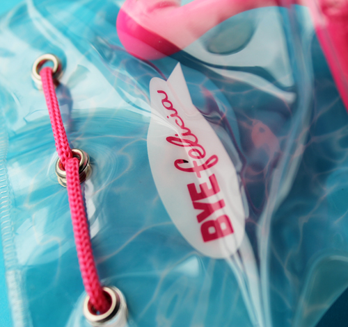
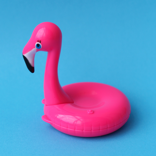
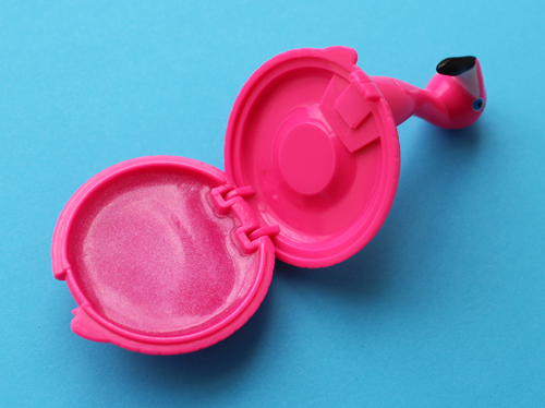
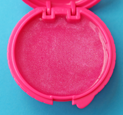
As soon as I saw this adorable lip balm at various blogs I ordered it immediately from Sephora. It doesn't really get any cuter than this – a sparkly pink strawberry-scented lip balm in the shape of a flamingo pool float, plus a reference to one of the greatest films of the '90s?! Yes please.
Another precious detail is the flamingo-shaped "F" in Felicia.
Our mini Babo loved it and asked if I could fill the bathtub so he could take it for a proper spin.
That seems okay, until you realize that the "Bye Felicia" meme Taste Beauty is referencing with their lip balm may actually be a form of cultural appropriation in and of itself. Let's take a look at the original clip, which, if I'm being honest, still makes me laugh. (I also love Smokey's "remember it, write it down, take a picture, I don't give a fuck!" Classic.)
Impeccably delivered, it's a funny line that wasn't even in the script (apparently Ice Cube's son came up with it)…but as it turns out, Felisha is a crackhead. To a clueless white person such as myself, I thought she was simply an annoying, mooching neighbor. For "bye Felisha" to take off as a meme, I guess there were other people who accidentally (or perhaps intentionally) overlooked that aspect of Felisha's character. Or worse, many people using the meme were totally oblivious to the original source. As this article on white people's inappropriate use of black slang notes, "What’s amazing though is that over the last year [2015] or so, so many white people and non-black people have used [Bye Felicia] (as a sassy dismissal) without actually knowing where it’s from." Also, the spelling of Felisha's name morphed into "Felicia", I'm assuming to make it more palatable to white people. As Fayola Perry writes in XPress Magazine, "Cultural appropriation sanitizes and spreads lies about people's culture. It takes away the story of Felisha, the addict who represents and symbolizes so many black and brown women's struggle with drug addiction in that era and makes her a passing internet trend. This lack of attention to detail can perpetuate racist stereotypes. Someone may think they are paying homage to someone's culture and the person whose culture they're paying homage to is completely offended at the misrepresentation. Fear not, you can enjoy a great burrito if you are not Latino and do yoga if you're not Indian, but be thoughtful, check your privilege and be considerate of context and history. Everyone has some type of privilege, people of colour appropriate each other's cultures as well. We must all be mindful of our lens, other people's perspectives, the legacy of oppression and try our best to make sure that we are not continuing it. At the very least, know where the appropriated element came from and at the very, very least, spell her name right. It's Felisha, not Felicia."
So while I was overjoyed to see the phrase take off as a meme given how much I love Friday, turns out I should have been aware that it was a form of whitewashing, since it seems that the vast majority of people using it don't know where it originated. Or in my case, had no clue about the more serious implications of Felisha's character and her dismissal. In reading more about the history of the film and that scene in particular, I don't think anyone involved with Friday intended the phrase to be perceived as anything other than comic relief, but now I can see how it can be viewed as a microcosm of the bigger issue of black women's needs continually being ignored.
In turn, if we're arguing that the meme itself is a form of cultural appropriation, then the lip balm is as well, since it's directly referencing the meme and obviously not the original source. I mean, Felisha didn't wear makeup1, and flamingo-shaped pool floats didn't make an appearance in the film as far as I know – this lip balm really has nothing to do with Friday. A succinct reaction comes from this Twitter user: "It's time for black brands to start monetizing our shit. But we're not corny enough to slap bye Felicia on some lip balm all outta context." Blogger Aprill Colemanexplains further: "Felisha was an accurate representation of black culture in the early 90s on the heels of the crack epidemic. Taste Beauty’s use is completely out of context. Felisha is an African American, crack-addicted character that did not wear makeup, whereas Felicia is a brightly colored flamingo shaped like a pool float. A tiny part of my black American culture was appropriated, reinvented, and packaged into a strawberry scented balm for profit." Coleman also astutely points out that two of the three Taste Beauty founders are white men, so it's possible that the company, like so many others, wasn't fully aware of the phrase's origins; they just saw the meme and thought an alliterative novelty lip balm with the same name would be marketable. And if Taste Beauty did know where it came from and still wanted to go ahead with the product despite the potential for offensiveness, perhaps they could have donated a portion of the sales to Angie's Kids. This is a nonprofit founded by Angela Means, the actress who played Felisha, that focuses on health and early childhood development. (Side note: I would seriously love to get her thoughts on this. She seems okay with the phrase's popularity but I'm not sure about the lip balm.)
So where does that leave us? Well, on a personal level I feel like a jerk for buying it and also for not understanding, quite literally for the past 3 years, that the "Bye Felicia" meme was actually white people appropriating yet another piece of black culture – I honestly thought it was a widespread, '90s-nostalgia-fueled, long-overdue tribute to Ice Cube's legendary diss. As someone who sees herself as a feminist, which means being aware of the struggles of WOC, my ignorance is rather troubling.2 As for the item's inclusion in the Museum's collection, I will likely not display it unless I'm doing a more educational exhibition on cultural appropriation in cosmetics. In addition to the ads explored in my 2013 post on the topic, sadly there are tons more examplessince then that could be provided.
What do you think about all this? Have you seen Friday and if so, do you find the "bye Felisha" scene funny?
1 Interestingly, the actress who played Felisha cites the makeup artist on set as the one responsible for helping her fully inhabit Felisha's character. The somewhat haggard look was entirely intentional. She notes in an interview: "What was funny was when I got on set the makeup artist looked at me and she was like, ‘O.K.,’ and she kind of went with my look and when we got to the set (“Friday” director) F. Gary Gray looked at me and was like, ‘Whoa, whoa, wait, wait. She’s not a beauty queen.’ I give the makeup artist so much credit for helping me create Felisha…So when I got in the makeup artist’s chair, once Gary said, 'No, she’s a hoodrat,' we went back to the drawing board and I fell asleep. But when I woke up and saw myself, it clicked. It helped me go there."
2 Equally problematic is that I've been rewatching the clip and still think it's hilarious – proof that white privilege is real. I'm able to ignore the broader issue of dismissing black women and perceive "bye Felisha" as comedy. Save
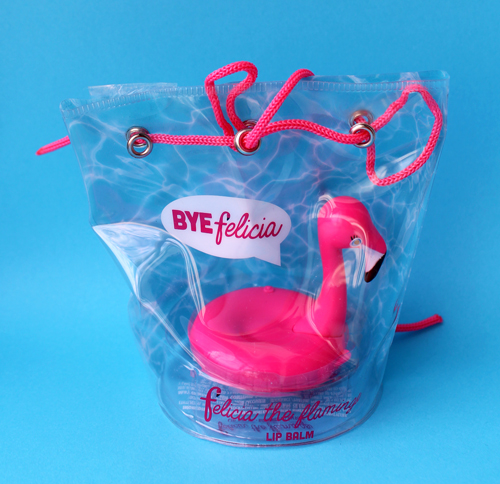
Save
image from anothermag.com
I thought for sure Addiction's spring 2017 compacts featuring the work of Swedish artist Hilma af Klint (1862-1944) would be unattainable, as they were only available as a gift with purchase in Japan. Fortunately a seller I frequent was able to get both for me! I had heard of af Klint before and was intrigued by her work since I have a soft spot for colorful abstraction, but this collection made me admire it even more. I really have no idea how the collaboration came about as the description at Addiction's website is pretty vague: "We learned that a woman had painted these magnificent paintings at the beginning of the 20th century and wanted to know more about her." In any case I really enjoyed learning about af Klint and I hope you do too.
Much has been written about the artist, although that's a recent development due partially to the fact that af Klint stipulated that a group of her most significant paintings not be revealed to the public until 20 years after her death, fearing that they wouldn't be understood. In fact, it took even longer for her work to be recognized; it wasn't until a major exhibition in 1986 that her name was on the art history map, so to speak, and I'm guessing this was also due to the patriarchy at work. I don't want to spend much time reviewing her entire oeuvre, since I am not an expert and also because af Klint was a prolific artist, producing over 1,000 works (!) in her lifetime. I'll provide a brief bio and then focus on the paintings reproduced on the Addiction compacts. (Sources are linked throughout.)
Af Klint was born in 1862 and entered the Royal Academy of Fine Arts in Stockholm in 1882. This was a rarity for the time, as the art schools in most European countries allowed only men. While producing the usual landscapes, botanical and animal drawings – af Klint was a vegetarian and animal-lover who worked as a draughtswoman at a local veterinary school – she had started experimenting with abstract designs before she graduated in 1887. Af Klint, along with her contemporary Edward Munch (who, incidentally, once had a show in a gallery in the same building as her studio) were inspired by recent scientific developments involving phenomena unable to be perceived with the naked eye. Hettie Judah at The Independent explains: "This was a period in which the 'unseen' world exerted a growing fascination – not only the emotional, experiential world of the human spirit explored by Munch, but the discovery of physical forces and elementary particles that formed the known world on a microscopic level. In the late 1880s Heinrich Hertz proved the existence of electromagnetic waves: in 1895 Wilhelm Roentgen discovered X-rays. A vision of the world pulsing with forces and transmissions invisible to the naked eye was emerging." Af Klint's interest in abstraction was also influenced by her spirituality – having attended seances since the age of 17, she was greatly intrigued by the spiritual realm, and the death of her 10-year-old sister in 1880 only intensified her interest in the occult. In 1896 she formed a group with 4 other like-minded women artists and together called themselves The Five. Roughly 30 years before the Surrealists, these women tried their hand at automatic drawing and writing. Talk about being ahead of the times! During one session in either 1904 1905 af Klint was "commissioned" by Amaliel, one of several spirits she claimed communicated with her, to create an extensive collection that would become known as The Paintings for the Temple. In af Klint's words, the spirit guided her to "execute paintings on the astral plane" to represent the "immortal aspects of man." Completed between 1906 and 1915, the collection of 193 large-scale paintings were divided into several thematic series that "convey[ed] the unity of all existence beyond the fractured duality of the modern world. Different series within The Paintings for the Temple relate to the creation, man’s progress through life, evolution, and the human soul as divided into masculine and feminine halves striving for unity." It was this collection that af Klint stipulated could not be shown until 20 years after her death, a decision influenced by the opinion of a prominent Swiss philosopher who visited af Klint in 1908 and speculated it would be at least another 50 years until people understood her art.
Anyway, The Ten Largest is the second series in the collection and was completed between August and December of 1907, quite a feat given their enormous size (10 feet tall) and af Klint's petite stature (5 feet). The Ten Largest traces the human life cycle in 4 stages – childhood, youth, adulthood, old age – and the two paintings chosen for the compacts are No. 1, Childhood, Group IV and No. 5, Adulthood, Group IV. Why Addiction selected these two in particular I don't know, but they do look lovely on the compacts.
Interestingly, af Klint noted that she wasn't all that aware of what she was painting, taking on the role of a receiver or medium. She explained, "The pictures were painted directly through me, without any preliminary drawings and with great force. I had no idea what the paintings were supposed to depict; nevertheless, I worked swiftly and surely, without changing a single brushstroke."
There's something so beautifully organic about these – they appear to be idealized representations of cells, flowers and other natural elements. I'll let the Royal Academy Magazine give a much better description: "Snail-shell spirals, concentric circles and zygote-like forms nestle amongst coiled fronds and splayed petals (she also produced intricate botanical drawings), all dancing against radiant tempera backgrounds from terracotta orange to faded lilac. Forms bulge, overlap, conjoin in what an eye informed by contemporary science might liken to celestial bodies or cell mitosis; they are extraordinary pictures, immense and ecstatic." The 26,000 pages (holy crap) of notebooks af Klint kept provide some clues as to the meaning of various colors and motifs. Blue and lilies symbolized femininity, yellow and roses stood for masculinity, and green was a universal color. The letter "U" designated the spiritual realm, while "W" denoted physical matter, and spirals symbolized evolution. This underscores that there was nothing passive about her process; in fact, she essentially studied her own work over the years, an example of which is a 1,200 page notebook that further analyzed the meaning of the images she had painted.
Here's the original so you can see how it's actually oriented – Addiction re-situated the paintings horizontally to better fit on the compacts.
Here are some of the eyeshadows. I have 4 of them but couldn't bear to take the plastic off, so I hope you'll forgive me for the tiny stock photos. I can absolutely see how the colors are inspired by af Klint. I guess they couldn't use the real names of the paintings, so some of them, like Flower Evolution, are merely reminiscent of af Klint's themes.
I'm really glad Addiction is helping to bring af Klint to a wider audience because for so long she didn't get the recognition she deserved. Five years before Kandinsky declared to have painted the first abstract work, af Klint was completing Primordial Chaos, the first collection in her monumental series. Some art critics claim that af Klint's paintings were merely diagrams of the spiritual world or depictions of scientific concepts we can't see, not true abstraction (or at least, a different form of the genre). That sounds plausible, but given that in 1970 the then-Director of Sweden's Moderna Museet turned down the offer of af Klint's entire estate because of her relationship to spiritualism and a more recent incident at MoMA in which af Klint's work was left out of an exhibition on early abstraction per the argument that it wasn't actually art, I'd say there's definitely sexism at work here. When you consider that Kandinsky, Mondrian, Malevich, etc. all drew inspiration from spiritualism and are heralded as the pioneers of abstraction, leaving af Klint out of the conversation seems blatantly sexist. When male artists borrowed spiritualist principles they were geniuses but when a woman did she was written off as a kook – not a real artist, just some crazy lady who happened to draw and paint a lot. Perhaps there's also an unconscious bias over the fact that af Klint subscribed to theosophy, an area of spiritualist belief that was founded by a woman and is notable for being the first European religious organization that actively welcomed women and allowed them to have senior positions. Additionally, the lack of renown could be the result of societal conditioning; women simply weren't encouraged to be at the forefront of art. Af Klint was no exception – as noted earlier, she worked largely in isolation and didn't participate in the avant-garde discussions going on in the rest of Europe. As Jennifer Higgie writes in Hilma af Klint: Painting the Unseen (p.16): "[…It's] irrefutable that although women artists were tolerated, they were rarely, if ever, encouraged to express the kind of radical ideas that marked their male contemporaries as innovators…even though af Klint was one of the earliest Western artists to wholeheartedly engage with abstraction, the most visible discussions of it as a viable new artistic language were conducted by men, all of whom were proficient at self-promotion." (Kandinsky was particularly known for puffing himself up.) In any case, I think these issues make it all the more important to acknowledge her work. Even if they're not "truly" abstract, af Klint's paintings are still vital to understanding the evolution of modern Western art. And when you consider the fact that she was producing these pieces in an atmosphere not exactly hospitable to women artists, it makes her accomplishments even more mind-boggling. Adrian Searle at The Guardian agrees: "Too often for it to be an accident, Af Klint had an innate sense of how to make a painting, often with no artistic models to turn to. Her best paintings are airy, their forms and geometries delivered with an evident pleasure and openness…The scale and frontality and freshness of her work still stand up, in a way that many Kandinskys don't. Yet looking at photographic portraits of the artist, we see a stern woman who was far from cosmopolitan, and in whom there are few outward signs of emancipation. For a woman to be an artist at all in Sweden in the early 20th century was difficult enough. To be an artist who believed as she did must have made matters even more difficult."
Anyway, I'm still trying to figure out how Addiction got the rights to use af Klint's work on the compacts. Having a collection inspired by an artist's work is one thing, but actual reproductions are trickier legally. There is a Hilma af Klint Foundation governed by her family members, so possibly they granted the rights to Addiction, but that would be a huge feat for the company to pull off since the guardians of af Klint's estate protect the use of her work rather fiercely. And of course there's the age-old question of whether a deceased artist would approve of their work being used this way. I really can't say in the case of Klint. On the one hand she seems like someone who wouldn't be interested in makeup – given that her life's work consisted of representing tremendously complex philosophical and spiritual ideas, she may have perceived cosmetics as frivolous. On the other hand, this may also mean she'd be okay with people enjoying her art in whatever format it appeared. Says Iris Müller-Westermann, Director of Moderna Museet Malmö, "This was really an artist who dared to think beyond her time, to step out of what was commonly accepted…she had visions about bigger contexts where it was not about making money or being very famous, but about doing something much more humble: trying to understand the world and who we are in it." Af Klint also seemed to believe that women should be equal, and part and parcel of equality is being able to express ourselves however we choose. I'm not able to paint on a canvas but I can get creative with makeup. I think af Klint would have appreciated that.
Overall I'm delighted with this collaboration. I am possibly the least spiritual person I know, but looking at af Klint's work I feel simultaneously curious about our place in the universe and incredibly at peace. I can only imagine how I'd react if I saw these in person; an anecdote from the blockbuster 2013 af Klint exhibition notes that many visitors cried when faced with af Klint's monumental works but couldn't explain why, something that's happened to me when standing in front of certain works of art. As for the Addiction collection, the colors and textures make me want to try to "paint the unseen" – just like af Klint but using my eyelids as a canvas!
What do you think? Had you heard of af Klint before now?
I hate to open this can of worms, especially since I can't add much original thought to the controversy surrounding MAC's new Vibe Tribe collection, but I thought it was at least worth summarizing the points and counterpoints. MAC's latest lineup urges us to "join the tribe" and "feel the vibe." Which tribe, exactly? Who are these women in the promo with feathers in their hair and derivative amalgams of vaguely Native American prints? I don't think they belong to any particular tribe, at least not any that MAC is willing to admit to. The company maintains that "the collection, including the visuals, product lineup, and naming, is inspired by art, outdoor music festivals, and the colors of the desert…[it] has absolutely no connection to nor was it inspired by the Native American cultures."
I have issues with this defense for several reasons. One is that in both the promo and the pattern on the packaging there is an undeniable Native American influence, what with product names like "Arrowhead" and "Adobe Brick", but MAC refuses to acknowledge this. As Nylon magazine explains, "It’s hard to believe the company could be this naive when the very patterns used on the product packaging appear to be Chinle and Ganado designs—traditional Navajo weaving patterns—rooted in generations of history.The word 'tribe' is also closely linked to Native American culture, making the collection seem iffy even by first glance, never mind when MAC’s refute is taken into equation. Additionally, the names of some of the products themselves also raise eyebrows—naming a lipstick shade 'Arrowhead,' for instance, is cringeworthy at best, especially when you deny there being any link."
Two, even if the collection is solely inspired by "outdoor music festivals", that's problematic since such festivals have historically been ground zero for cultural appropriation, with several festivals going so far as to ban headdresses. As one Reddit user says, "[The] problem with that is the patterns and textiles and designs they're referencing from Coachella, Burning Man, and other festivals are the same patterns/textiles/designs that were appropriated from indigenous peoples. Just because it festivals and festival-goers did it first doesn't mean it's not appropriation. If anything, that makes it worse, because they're attributing our designs and patterns to Coachella and Burning Man and other festivals – as though they were not ours for thousands of years before these festivals."
Third, this isn't the first time MAC has done this – check out my post on cultural appropriation in cosmetics for proof. One Twitter user also noticed this and took a screen shot of my post (didn't include a link to my post in his tweet, which I would have appreciated but what can you do.) You think MAC would have learned.
But is it really so bad? Many have argued that MAC is simply celebrating Native American culture and the pattern is merely a Southwestern motif, nothing more. Another argument is that "it's only makeup" and that there are more pressing things to take issue with, a.k.a. the old it's-just-uppity-people-looking-for-things-to-be-offended-by argument. I'm going to go ahead and counter their counter-arguments. First, when you proceed to lump distinct Native American tribes together, that's not appreciating them, it's appropriating. And Southwestern motifs aren't in and of themselves bad, but when you add words like "tribe" and show images of women with feathers in their hair and "tribal" tattoos, it's clearly referencing a Native American stereotype rather than "Santa Fe style". Second, just because there are bigger injustices doesn't diminish the topic at hand. We can be concerned about, say, the higher-than-average rate of sexual assault among Native American women and this MAC collection simultaneously – they're not mutually exclusive. Finally, the "it's only makeup" thing really gets under my skin. Obviously I'm biased since I think makeup important enough to belong in a museum and in academia, but when you also realize that color cosmetics is projected to be a nearly $8 billion industry by 2020, you can't deny the significant impact it has on culture.
As a final thought, as Christine at Temptalia so astutely points out, MAC had a great opportunity to partner with an actual Native American artist to create a one-of-a-kind design and use the proceeds to go to their specific tribe. A similar example would be Shu's 2016 Chinese New Year cleansing oils, where they collaborated with one of China's leading kite artists to bring attention to the dying craft of traditional kite making. They didn't just slap on some generic Chinese kites that you can find anywhere; rather, they partnered with an artist who created a unique pattern for the packaging. In this way they honored Chinese kite-making heritage instead of appropriating it. What MAC did with Vibe Tribe was quite different. At worst, it was cultural appropriation; at best, it was incredibly thoughtless and uninspired. As one Instagram user pleads, "Release me from this 80's Tucson gas station hell."
I can't say I've ever been to a gas station in Tucson but that comparison seems pretty apt.
What do you think? And to those of you who don't find the collection problematic, do you see any difference between what MAC did and the example by Shu Uemura I provided?