I was a tad underwhelmed by Estée Lauder's collection in collaboration with the TV hit Mad Men last year. I had high hopes for the second installment of this collaboration this year. While it's a bit improved design-wise and includes 3 pieces instead of two, I still feel it's fairly unimaginative.
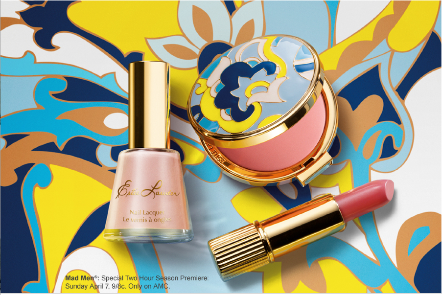
The collection consists of a lipstick in Pinkadelic, nail polish in Pink Paisley, and blush in Light Show, which comes in an enameled compact that is a "replica of actual designs from Estee Lauder's '60s era collections."

(image from esteelauder.com)
I think the pattern evokes late '60s psychedelia and I love the retro shape of the nail polish bottle. However, it's maddening (haha) that nowhere in the advertising campaign does Estée Lauder show the original design. I can't be the only person who would like to see it, and I'm sure Estée has it in their archives somewhere if this really is a replica. Since they're not revealing it, I question their claim that the pattern is an authentic vintage Estée print. Seeing the original would definitely make me want to purchase the compact. Without it though, this seems to be a weak attempt to make what's possibly a brand new design appear to have a connection to the company's history – it's just smoke and mirrors.
As I said last year, the company could have done more with the Mad Men tie-in. It's a shame Estée squandered the opportunity.
What do you think?
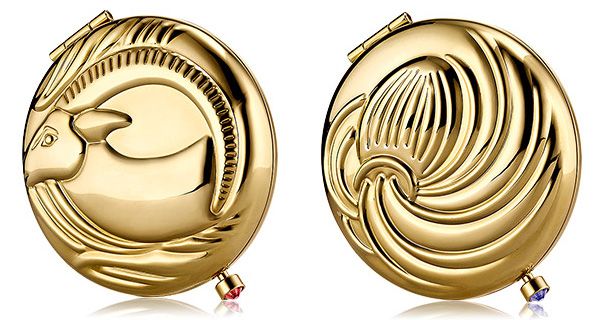
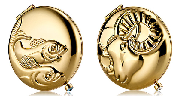
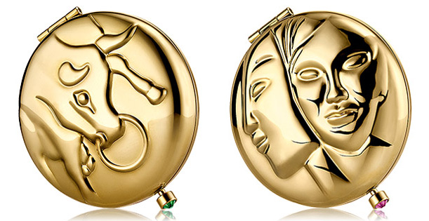
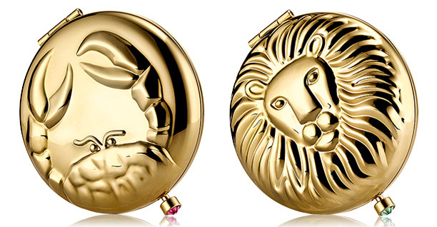
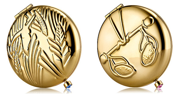
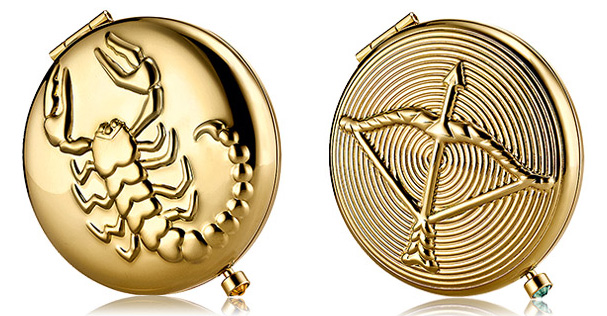
Well, it's my birthday week. Yes, I celebrate the entire week! I feel that the older you get the more you deserve to celebrate. Since my b-day falls in mid-November, that makes me a Scorpio, and it got me thinking about these gorgeous Estée Lauder Zodiac compacts that I spotted a few months ago. I like the designs, but I think the nicest thing about these compacts is the corresponding birthstone on each clasp.
Capricorn and Aquarius:

Pisces and Aries:

Taurus and Gemini:

Cancer and Leo:

Virgo and Libra:

Scorpio and Sagittarius:
 (images from esteelauder.com)
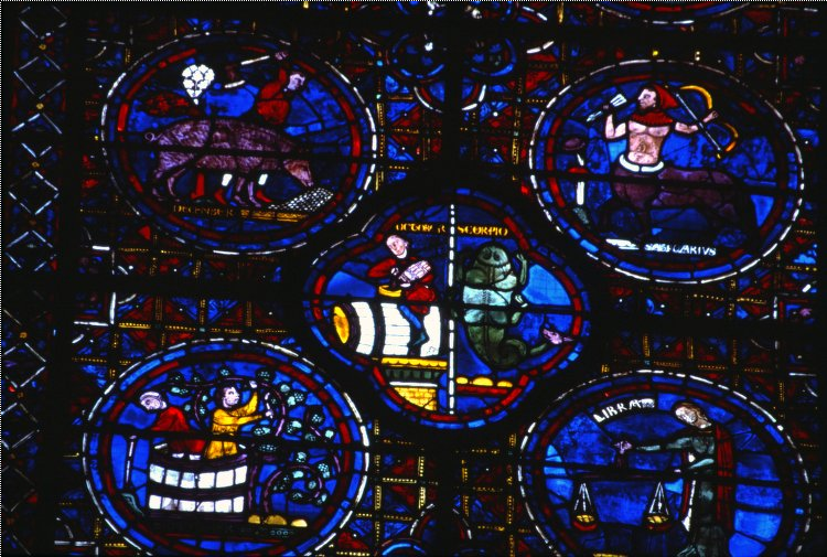
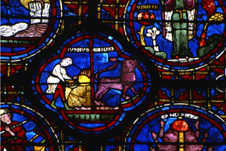
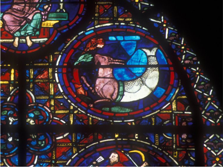
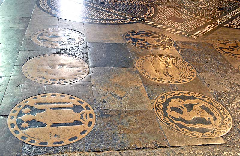
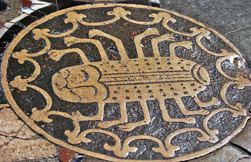
Let's take a peek at some art historical references. Zodiac signs figured prominently in Western medieval art. Of course, back then depictions of the zodiac signs weren't as closely linked to personality traits as they are now – they usually represented the labor performed in each month (there were many variations depending on the region, however). Here are some of my favorite examples.
Stained glass windows at Chartres Cathedral – this picture shows Scorpio (in the middle), Sagittarius (upper right), the month of December (upper left), Libra (lower left):

Leo (middle), Virgo (upper right), Cancer (lower right):

Capricorn:

(images from medart.pitt.edu)
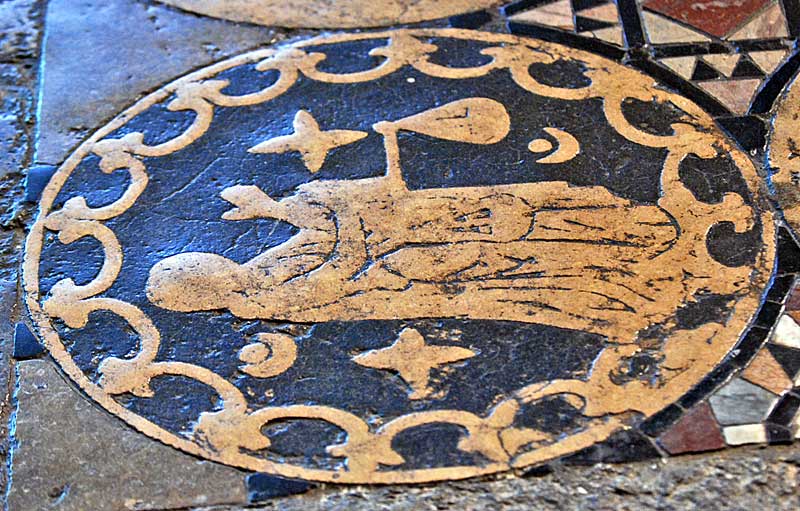
Roundels at Canterbury Cathedral:

Cancer:

Libra:

(images from paradoxplace.com)
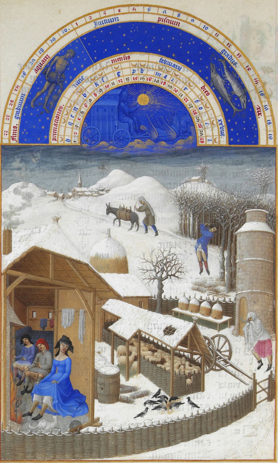
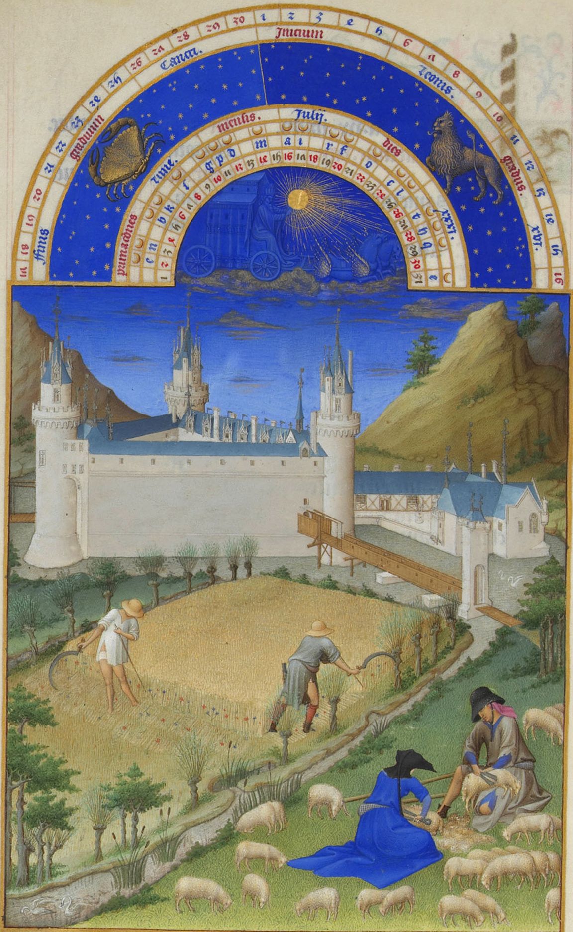
February (typically represented by warming by the fire) and July (wheat threshing) month pages from Les Très Riches Heures de Duc de Berry, an illuminated manuscript:

 (images from en.wikipedia.org)
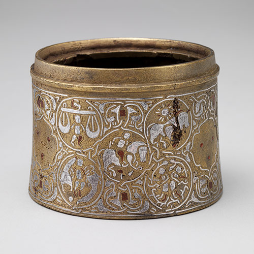
At roughly the same time, zodiac signs were gaining popularity in Egyptian, Syrian and Iranian art. Both these regions as well as those in the West based their illustrations on ancient Greek astrology.
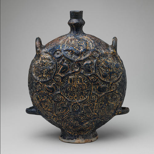
Here's an inkwell and flask, both from Iran:


(images from metmuseum.org)
So that concludes this altogether too-brief survey of zodiac signs in medieval art. Which one was your favorite? Do you like your zodiac sign? Will you be snapping up one of these Estée Lauder compacts in honor of your birthday?
P.S. Speaking of birthdays and presents, be sure to enter to win some NARS Andy Warhol treats!
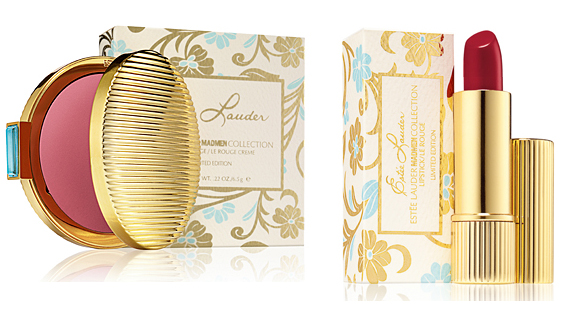
So, was everyone excited for the season 5 premiere of Mad Men? I have to admit that I don't watch the show, but I'm still intrigued by Estée Lauder's two-piece collection. It includes a cream blush and lipstick, outfitted in pleated gold cases inspired by the company's original 1960s designs. The outer boxes have a swirly, ultra-feminine floral motif in pale blue and gold.
 (images from esteelauder.com)
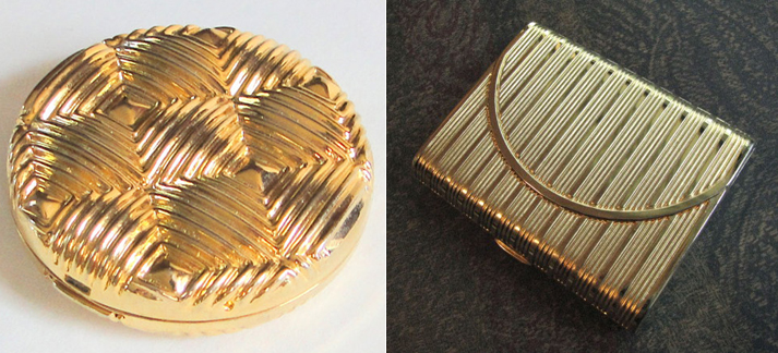
I wanted to see whether this collection had any relation design-wise to the company's vintage packaging to so I did a little research. As these examples show, pleated gold did figure prominently in Estée Lauder compacts from the '60s.
 (images from juliasbeadedjewelry on etsy.com and artfire.com)
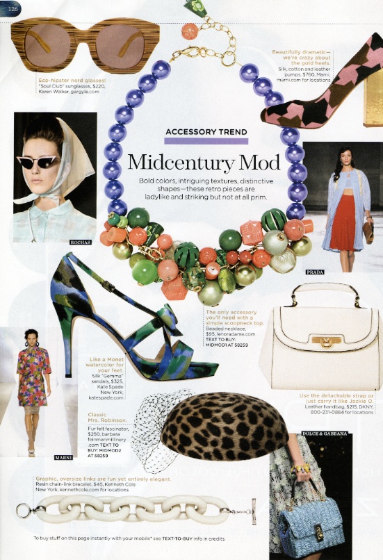
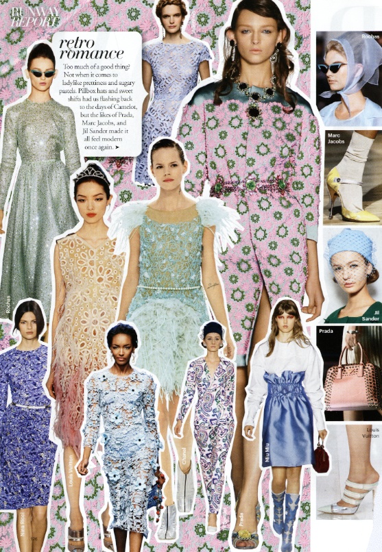
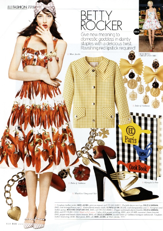
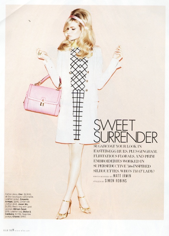
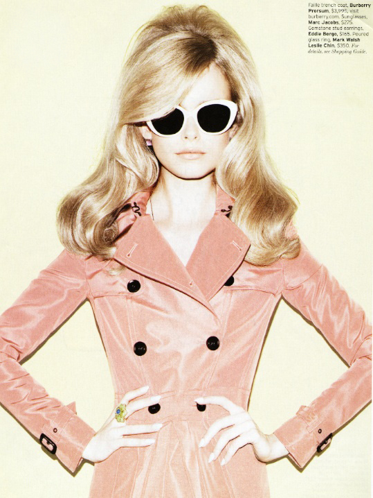
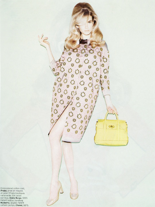
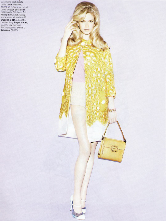
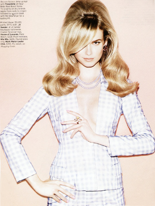
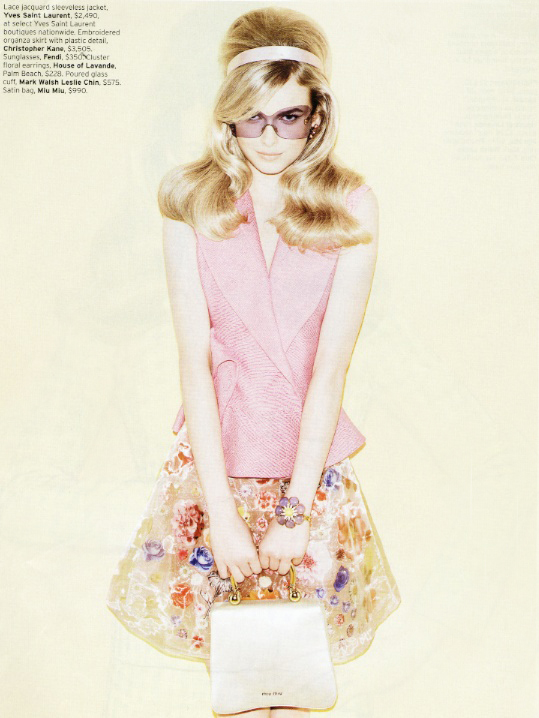
It's okay that the Mad Men collection echoed Estée Lauder's chic '60s packaging, but I would have liked to see an exact replica of a real compact from their archives, rather than a new design that was vaguely inspired by older pieces. Anyway, while it's lucrative to have product tie-ins to a hit show at any time, it's especially fitting that the company chose this season to introduce the collection. Recent issues of Lucky, Vogue, and Elle magazines feature the retro trend that rocked the spring 2012 runways.


Elle did an especially long feature with this style (thanks to my H. for scanning all these!)


The gingham in this picture reminds me of MAC's Shop/Cook collection.


So Estée is right on trend.
The thing that's sticking in the back of my head, though, is this article at The Gloss. Writes Jamie Peck, "[T]his leaves me a bit ambivalent. On the one hand, I love the cat’s eyes, curvy figures, and red lips of 1960s style. On the other, I’m wary of mindless nostalgia for an era that was actually pretty terrible for women in a lot of ways, ways Mad Men examines with unflinching honesty. Much like the men who see Don Draper and go out and buy a Brooks Brothers suit in an effort to be like him (i.e, tortured and constantly lying?), I worry some women might be taking the utterly wrong message from the show if thinking about Mad Men gets them in a happy, makeup-buying mood and not a gutted, 'this shit’s not fair, why won’t they let Joan fulfill her intellectual potential?' mood. Then again, it’s totally possible to appreciate an era’s aesthetic beauty while acknowledging that said beauty is tied to some very problematic history. I just wish that sentiment had been present anywhere in the press release." Like Peck, I do think it's possible to enjoy the '60s look (and packaging design, of course) while remembering that that time period wasn't exactly enlightened in terms of how women were perceived. I mean, that's kind of my point in getting into collecting vintage compacts – while the objects are beautiful in and of themselves, they act as an historical reminder that women didn't always have the rights they have now.
But I think the thing that really prevented me from buying the collection, however, was that these were vintage-inspired from actual Estée Lauder designs. Don't get me wrong, I love retro-looking packaging. As I noted earlier, however, I think the company could have dug through their archives a little more thoroughly – they could have taken an amazing design from the '60s and recreated it.
What do you think? And do you watch Mad Men? Am I missing out?
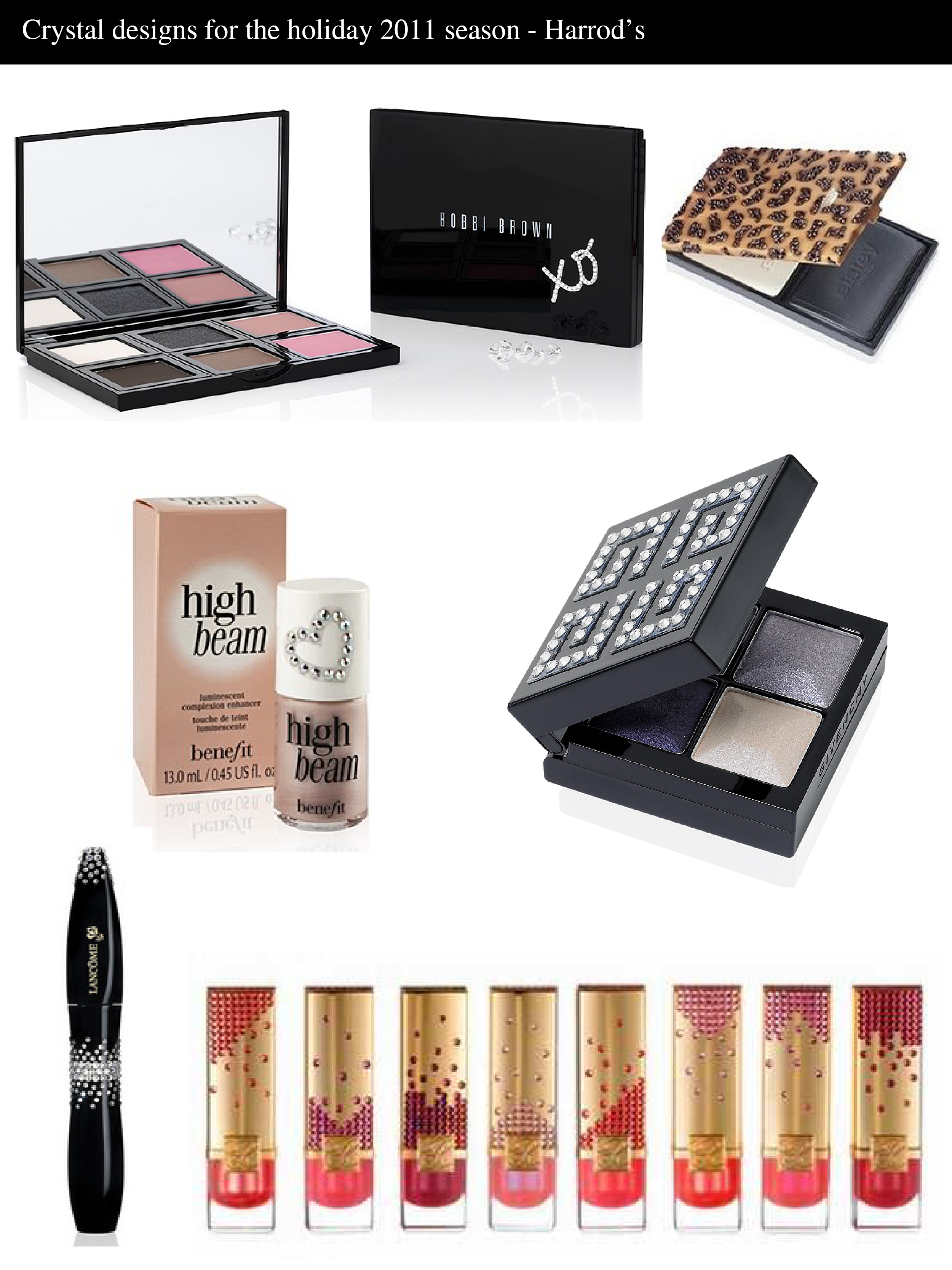
For the second part of the Museum's spotlight on crystal details, I thought I'd focus on Harrod's totally blinged out exclusive Swarovski collection. Items include: a Bobbi Brown palette, Sisley Phyto Poudre Compacte, Benefit High Beam liquid highlighter, Givenchy eyeshadow quad, Lancôme Hypnose mascara and Estee Lauder lipsticks.

(images from harrods.com, beautyalmanac.com, designerplanet.org)
I'm glad I visited London in September, but I sort of wish I could go back to pick up these items, particularly the Sisley palette – it's sold out online. On the other hand, I have some crystal items from previous holiday collections, so maybe it's good I can't buy these since I don't want to blind myself. 😛
I have to admit that Estee Lauder doesn't normally grab me (starfish bronzer aside), but this piece from their fall collection piqued my interest. According to this video, Creative Director Tom Pecheux wanted to create something "modern" and "urban", to reflect the "many faces of the city". Additionally, in an interview Pecheux says this about the overall concept: "I was inspired by modern architecture, modern buildings and all the phenomenal reflections you see on glass buildings that show the skyline. Whether it’s a blue sky, a snowstorm or a beautiful sunrise or sunset, it’s never the same skyline colors you normally see because of the unique way the light is reflected off the glass. With Modern Mercury, you can be wearing the same colors, but you will never end up with the exact same look." This theme is definitely present in the Illuminating Powder Gelee in that you can create a lot of different looks with it, since it can be used as a highlighter or eye shadow, but I'm not really seeing it so much in the actual design. I guess the wavy pattern is reminiscent of ligh reflecting off of buildings, but it looks more like a weird op-art painting to me.

(image from esteelauder.com)
Thus, I'm still on the fence as to whether the design is interesting enough to be in the Museum's collection. What do you think?
I don't really have much to say about this, except that I don't think there's anything more perfect for summer palettes than slapping on shimmery sea creatures. This starfish is especially pretty.


With flash:

I think I might prefer the starfish on MAC's Marine Life palette from last year, or Chantecaille's Protected Paradise palettes, but this is quite lovely in its simplicity.
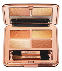
 Normally I think gold is more suited to a summer collection (like Paul & Joe's most recent), but Estee Lauder is making it fall-appropriate by introducing a more rosy hue rather than a warm gold. At first glance I thought the design in the powder was another snakeskin pattern (animal prints are so popular for fall!), but as it turns out it's supposed to be a "hammered gold" pattern. And sure enough, it's pretty dead-on – look at the palette compared to this hammered gold cuff bracelet. Nice job, EL!

(photos from nordstrom.com and hunnyjewelry.com)
I've always admired Estee Lauder's fancy jeweled compacts, but this season they seem to be focusing on the makeup itself rather than its outer packaging. Their Fleur de Lys and Vivid Garden powders feature intricate floral patterns in gorgeous spring colors.
 (photos from esteelauder.com)
While I love the colors and the dragonfly on the Vivid Garden palette, I find the fleur-de-lis palette particularly interesting since the emblem has such a rich history. It's a bit too long to go into here, but it was traditionally a symbol of the French monarchy and appears in much French architecture and art. Here are a couple examples.
The ceiling of Sainte Chapelle:
 (photo from sacred-destinations.com)
A stained-glass window at Bourges cathedral:
(photo from uark.edu)
The Arts Council of New Orleans even commissioned artists to produce fleur-de-lis structures around the city to represent its French heritage:
(photos from nolanotes.com)
It's a little odd that this motif made an appearance considering it had nothing to do with the collection, but since this is the first time Estee Lauder has branched out into designs onto the actual makeup rather than the outer compact I won't be too harsh. ;) I also like that the design on the palette is a bit more abstract than the traditional fleur-de-lis.
Let's wait and see if this is a continuing trend for the brand.
