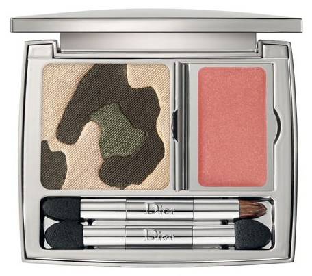
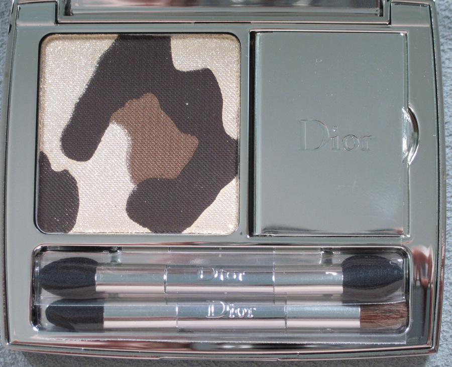
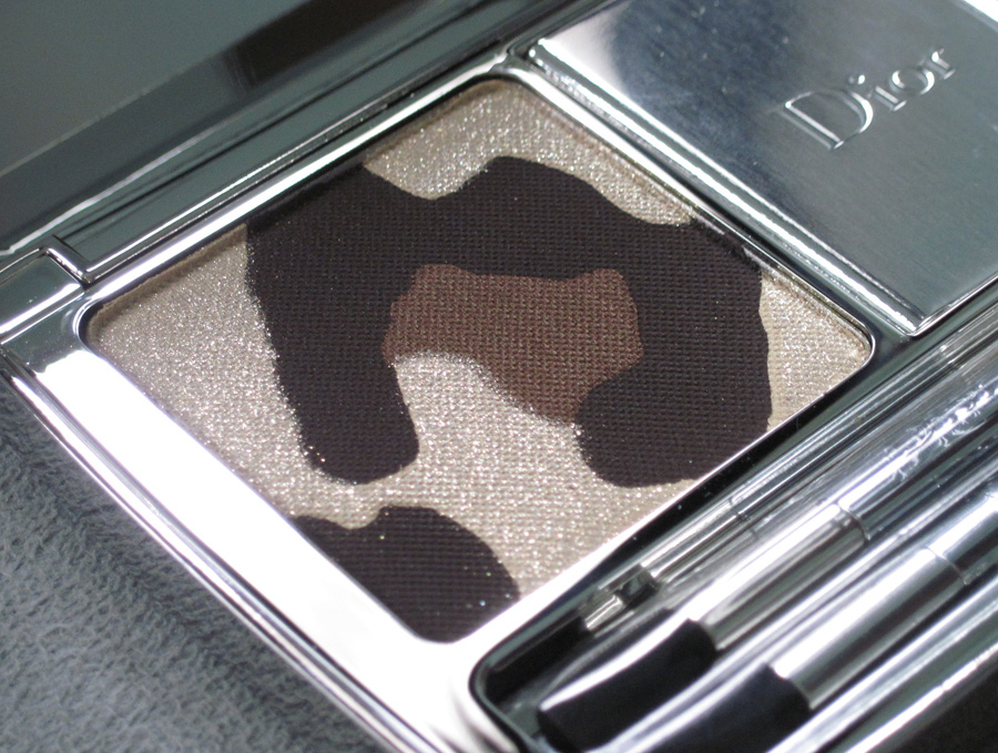
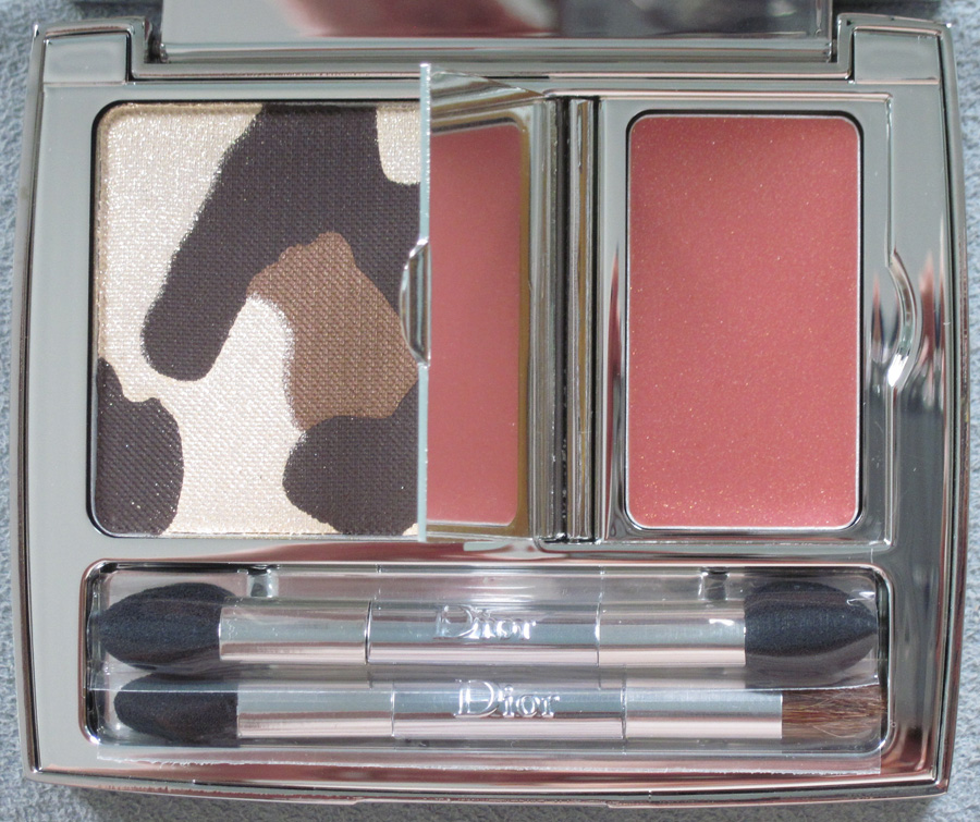
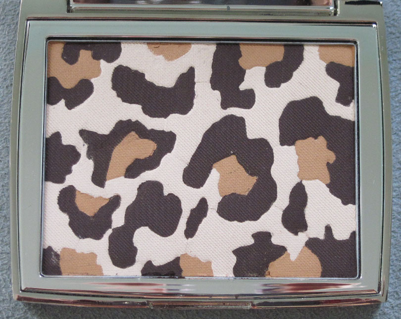
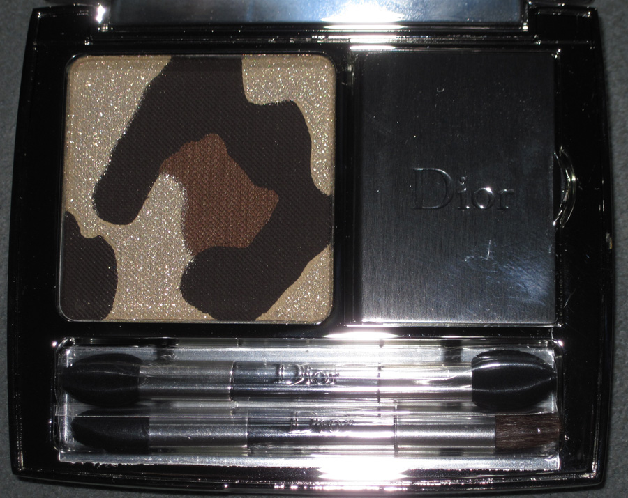
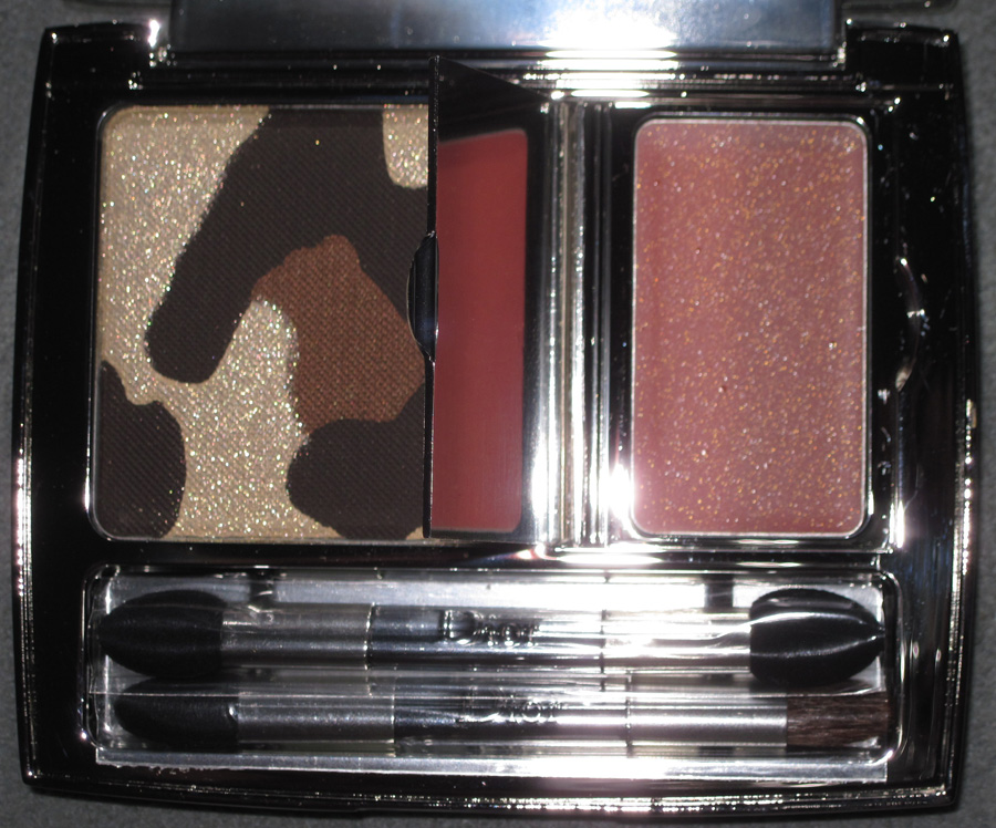
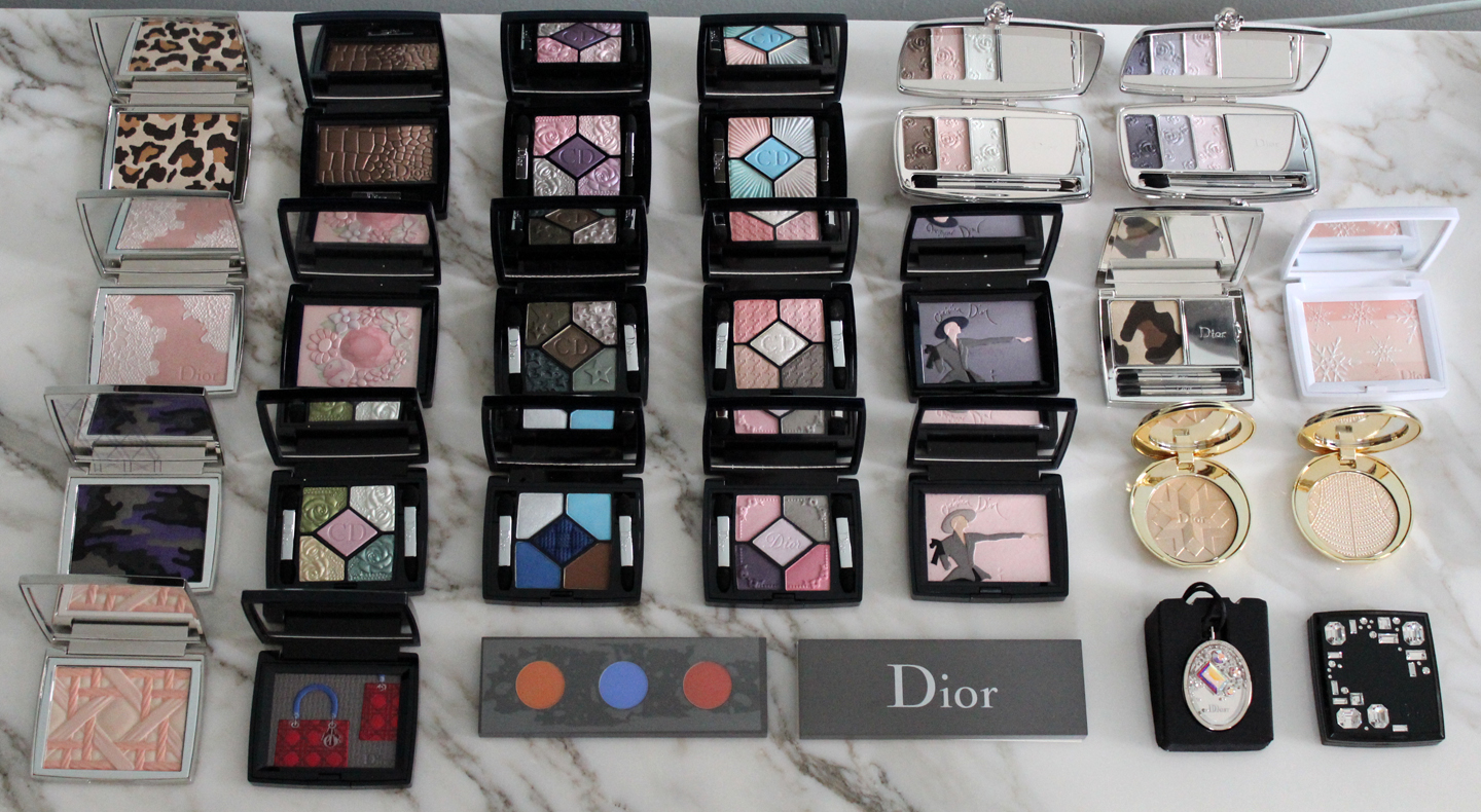
I'm still a bit shocked that I haven't posted a single thing about Dior makeup in nearly 6 years! I guess Instagram has taken over the shorter posts I'd normally share here. But there have been some beautiful objects that serve as excellent homages to pieces of Dior's history and as today is the designer's birthday*, I thought it would be a good time to catch up. These are by no means all of the Museum-worthy Dior releases since 2016; I'm just focusing on the ones that have a more inspired relationship to the fashion.
Trafalgar blush and lipstick were released in fall 2019 as tributes to the designer's penchant for red as well as a fun little trick he used while showing his collections.
As the story goes, Dior would often send a surprise down the runway – usually in the form of a striking red dress – halfway through the show to keep viewers on their toes, dubbing this tactic a "coup de Trafalgar". Talk about audience engagement! I have no idea whether this "afternoon dress" from the winter 1955 collection was used as a coup de Trafalgar, but it is beautiful.
The brand named September 9, 2019 "#999 Day" to celebrate their iconic #999 shade in its cosmetics and announced the new Trafalgar collection then. According to the online Fashion Magazine, Creative Director of Dior Makeup Peter Philips designed the Trafalgar lineup to make "revolutionary variations on Dior’s iconic red," while the embossed motif on the blush and lipsticks "pays homage to Maria Grazia’s Chiuri’s work at the house, as well as the power of a true red."
The idea of a capsule makeup collection dedicated to the coup de Trafalgar must have been in the works for some time, at least since 2016, when Philips noted he was inspired by Dior's little runway maneuver. From the New York Times T Magazine backstage beauty report of the spring 2016 Dior couture show: "'Christian Dior had this idea: Halfway through the show when people were getting bored, he’d do a surprise — and quite often it was a red dress that suddenly came out of nowhere,' Philips said, referring to what has come to be known as the 'coup de Trafalgar.' He lined a handful of models’ lips with a Dior lip pencil in Rouge Royale before painting them with Diorific lipstick in Fabuleuse."
Next up is the Blooming Garden pressed powder. To celebrate the launch of Dior's Toile de Jouy fragrances, in spring 2021 the cosmetics division released a face powder embossed with the toile's floral pattern. I tried so hard to identify the part of the pattern that's on the powder, but couldn't find an exact match.
Before we get to Dior's use of toile de Jouy, a little background on toile de Jouy's origins is in order. My apologies for the laziness, but Pattern Observer has an excellent condensed history of toile de Jouy so I am copying and pasting it here. "Toile, or more properly, Toile de Jouy (meaning, “cloth from Jouy”) is a type of print that is characterised by complex vignettes scattered over the surface of the cloth. Originally, they were scenes carved on woodblocks or engraved on copper, printed in only one colour (often red, black, or blue) onto a white or cream background. To understand the print, it’s also useful to look at the history of the basecloth. Cotton was first imported in France in the 16th century, and quickly became the fabric of choice because it was cheap and easy to look after. Its ever-growing success was such that it began to threaten the local textile industries of wool and silk, and so eventually cotton was banned in 1686, with the ban stayed in force for around 70 years. Christophe-Phillipe Oberkampf was born during this time and had been working in the family textile business for several years. In 1759 when he heard the ban on imported cotton was going to be lifted, he took the only piece of furniture that he owned – a printing press – and set up business in Jouy-en-Josas outside Paris. There, influenced by Rococo art and its romantic zeitgeist, he joined with engraver and designer Jean Baptiste Huet to design idyllic pastoral scenes for their fabrics. These became immensely popular. The business grew and they began commissioning other designers, and by the time Oberkampf died in 1815, the company had a catalogue of over 30,000 patterns. Toile prints were the perfect medium for spreading not only populist themes, but political messages and recording historic events too; one by Huet proudly showed off France’s scientific advancement with scenes from the first hot-air balloon flight in 1784, and other toiles featured images of Colonial expansion with sailing ships landing on tropical islands and negotiating with tribal leaders. Other printing companies in France, England and America soon followed suit as the popularity of the toile spread."
Dior first used toile de Jouy for the medallion chairs and other surfaces in his boutique. Wallpaper explains that the designer's artist friend Christian Bérard – whose makeup ad illustrations I hope to cover later this year – recommended that Dior decorate his boutique with toile de Jouy. "Bérard understood that the pattern, typically associated with the rococo extravagance of the 18th century, could in the contemporary context of a Parisian boutique be used to create a modern, sumptuous aesthetic that was well-suited to the newly opened couturier. As Christian Dior later wrote of Bérard’s vision, 'it was he who advised us to hang the boutique with toile de Jouy and to scatter hat boxes bearing the name of the house everywhere, on top of wardrobes and in every corner. Beneath this semblance of disorder, he had created life.'"
According to Marie Clare France, Bérard designed a pattern based on some of Huet's sepia drawings and Fragonard's The Swing. Too bad I can't seem to locate a close-up photo of the toile de Jouy print used in the Dior boutique – I would love to see how it references the painting. (Side note: the article also mentions there is an entire toile de Jouy museum!) Dior began incorporating toile de Jouy in his fashion as early as 1956, when Roger Vivier created a pair of pumps in collaboration with the designer.
Apparently many Dior designers followed suit over the years. Alas, I don't have any Dior fashion books on hand – I only have the Art of Color book, which I used as a background for some of the photos here (see if you can spot which ones!) – so I had to make due with what was available online. The only other examples of toile de Jouy in Dior that I could find were these pieces from John Galliano's collections, and I don't even know what years they are. Browsing the runway shows at Vogue, I saw there were a few more by Galliano as well as Raf Simons that may have been toile de Jouy, but as I'm not a fashion historian or expert I couldn't tell for sure. The Marie Claire article notes that this piece from the fall 2010 lineup is toile, but again, my fashion eye is not trained enough to know with certainty.
Chiuri revived the pattern several times over the past few years, most notably for the spring 2019 collection. "The idea for the toile de Jouy came to me at the studio one day when we were all chatting together. The French on the squad weren’t sure what to think. But I, being Italian, saw this painting as something exotic. The main reservation was that we were touching on something so coded, so bourgeois, that it was going to prevent modernity," she says. Interestingly, it may also be another one of Chiuri's sneaky ways of calling attention to women's rights via fashion: as one blogger points out, "female workers comprised one-third to one-half the [toile de Jouy] workforce at various times. Female printers earned half the pay of male printers…Famously known for her “WE SHOULD ALL BE FEMINISTS” t-shirt, maybe [Chiuri] also knew a little history about toile."
Dior had also reintroduced the print for the holiday 2018 season. The pop-up stores were decorated entirely in toile de Jouy and sold a wide variety of accessories and homeware.
Getting back to the pressed powder, I think it's Museum-worthy, but might have been more interesting and versatile had Dior adhered to a toile color scheme, i.e. a red, blue or black pattern against a cream background. Perhaps the raised flowers could have been red or dark pink shimmer and set on top of a translucent powder, or they could have been rendered in black and/or blue and the background a shimmery ivory shade to make an eye palette. Those may have worked for more skintones than the the very pale pink powder. Although it was billed as an all-over "brightening and correcting" product and an Asia-exclusive (I think), more colors wouldn't have hurt. Also, purely from an aesthetic standpoint, in this case a dual color scheme would be far more visually appealing than using all one shade. I hate to say it, but to my eye the floral pattern bears a vague resemblance to broccoli or cauliflower, or something from a petri dish. There's a sense of growth but not a blooming garden – more like multiplying microbes.
Anyway, Dior regained its limited edition makeup footing (sort of) later in 2021 with the Millefiori blush.
As with the Toile de Jouy powder, the Millefiori blush was launched to celebrate the release of a new (old) fragrance in the fall of 2021. I'm sure a perfume historian could say exactly how many times the Miss Dior fragrance has been reformulated since its debut in 1947, but the latest iteration is called Millefiori. True to its name, the fragrance is described as an "olfactory 'millefiori', imagined like a bouquet of a thousand shimmering and colorful flowers." Chiuri designed a lovely dress for brand ambassador Natalie Portman to wear in the commercial.
I find it to be a gorgeous and modern take on the original Miss Dior dress, which was created for the spring 1949 collection and boasted a sumptuous embroidered mille fleurs design.
There wasn't quite as much product with the Millefiori theme as the Toile de Jouy. There were several scarves but no clothing, bags, housewares, etc. However, the Dior pop-up stores all got the thousand flowers treatment…literally!
The reason I'm mentioning the pop-up stores again is that I believe the imprint on the blush is actually from the pop-up store and not any of the Millefiori patterns on the scarves or dress. I pored over all of them and like the Toile de Jouy, none were an exact match. Then I spotted photos of celebrities in front of the pop-up and thought the wall decoration looked very familiar.
The pattern on the store, in turn, appears to be a mishmash of the flowers from the scarves.
I have no idea why Dior would "remix" their Millefiori patterns for decorating their pop-ups and then put it on the blush. Technology-wise it probably would have been just as easy to use a section from the scarf print or even one of the dress's flowers. Also, I'm baffled by the use of the Italian "millefiori"…why not call the fragrance the original French "mille fleurs"? I get that Chiuri is Italian, but the fragrance was not her creation, and her cruise 2021 collection centered on the mille fleurs motif and was not referred to in the Italian phrase (even though the show took place in Italy). Am I missing something?
Fortunately, the holiday 2021 collection was a bit more straightforward. Dior released a glamourous minaudiere and other items embossed with an image of Dior's first boutique located at 30 Avenue Montaigne. I wonder if the company was looking at Chanel's recent Poudre Cambon or if they remembered the Maison Lancome palette from 10 years ago. Depicting a storefront on makeup is not a new or even all that innovative idea, but I think Dior executed it nicely. I also thought it was a touch more inspired than their 2020 New Look '47 capsule makeup collection (which, mind you, I purchased immediately but still think it was a bit bland, especially compared to the Tailleur Bar palettes.)
Sadly, part of the embossing on the lipstick got mashed. It wasn't my fault (for once) – I think with embossing that intricate some of it is bound to wear off when swiveling up the bullet.
In any case, the imprint really does resemble the atelier's facade.
In my opinion, I believe it was inspired not just by old photos of the boutique, but also a detailed illustration by artist Xavier Casalta. Casalta was commissioned by Dior for the original run of the Dior: Designer of Dreams exhibition held from July 2017 through January 2018 at the Musée des Arts Décoratifs. (The show is wrapping up soon at the Brooklyn Museum; I am heartbroken that COVID is still proving too risky for me to get on public transport to see it.)
This piece took even longer than the Millefiori dress, clocking in at over 600 hours as compared to a mere 500 for the dress. I really wish I could have seen it in person. Anyway, I love the minaudiere's design and I believe the dimensions – at least for the compact portion – are comparable to vintage pieces. I won't know for sure until the vintage minaudiere I purchased from eBay arrives, but I will compare the sizes of the two as soon as it gets here and update this post. So stay tuned for that as well as a new post on Dior's use of houndstooth, which covered the spring 2022 makeup collection. 🙂
What was your favorite here? Are you inspired to learn more about Dior fashion? Truth be told, I liked all of these, but I'll be honest: none are really on the same level as, say, the Lady Dior palette. Speaking of which, they're still collaborating with artist for those bags, so I wish Dior would borrow their designs for makeup from time to time as they did previously.
*Backdated as usual since everything takes me longer than expected, plus a nasty bout of food poisoning struck me down so I was even tardier finishing up this post. Sigh.
I won't say this is a total disappointment from Dior, but I also won't lie and say it's inspired. For their spring 2016 makeup collection Dior was againinfluenced by the designer's upbringing in Granville and its fabulous gardens. I picked up the blush and one of the eye shadow palettes.
Unfortunately I found the flower print on these compacts had very little to do with Dior's runway collections. I guess you could say the color palette for the spring ready-to-wear collection is similar, but none of the garments had the same flower print.
The print actually most closely resembled the one found on these pieces from the couture collection.
I think the palettes would have been more visually appealing if Dior had borrowed one of the prints below. The one on the right almost looks like little bees – how fun would that have been?
I also couldn't tell what kind of flowers are on the palettes. They look fairly nondescript and generic. They're not delphiniums, which would have been cool given that the spring 2016 runway was draped in these blooms. I was thinking perhaps geraniums or maybe phlox.
So, these compacts were worth purchasing and will certainly be delightful in a spring exhibition, but definitely not as interesting as some of Dior's previous releases.
Thoughts?
I'm adding these Dior items to my list of ones that got away. A few months ago Chic Profile featured these two blushes, which apparently were available at select Dior boutiques in the U.S. I didn't think they were worth tracking down until I started digging a bit based on the information provided at Chic Profile.
Today we know Miss Dior as one of the fragrances from the couture house, but in the early 1960s a line of ready-to-wear hats was launched with the Miss Dior name. Then in September of 1967 Dior introduced another ready-to-wear line, also called Miss Dior. From Vintage Fashion Guild: "The Miss Dior line was launched in September 1967 and was a less expensive ready-to-wear line made to appeal to a younger customer. The Miss Dior store was located on Rue Francois Premier, next door to the Dior couture house. For the first three years the Miss Dior line was sold in stores throughout France, but was not exported, so as not to compete with the Dior-New York label. It became available in the US in December 1970 and was an immediate success. The line was designed by Philippe Guiborge, who also designed the Dior Boutique line and was assistant to Marc Bohan in the couture house." I also found this Telegraph article dated January 6, 1967 announcing the line.
The letters in the new blushes are rendered in the same style as the Miss Dior tags. Some examples of Miss Dior styles and their respective tags:
The same font was also used by famed illustrator René Gruau in some Miss Dior ads. I wonder if the actual shopping bags looked like they do in these ads or whether it was Gruau's own creation. Unfortunately I was unable to find any photos of real-life Miss Dior shopping bags.
In any case, the scant number of photos I was able to find was enough for me to want to procure the Miss Dior blushes for the Museum. I do find it strange that Dior is releasing these in 2015, as I think 2017 might have been a more appropriate date given that it would be the 50th anniversary of the launch of the Miss Dior line, but nevertheless the blushes represent a nod to another piece of the house's history.
Thoughts?
I come across the strangest things when I'm researching vintage makeup. I was looking up items for the summer exhibition and spotted this 1948 Coty ad.
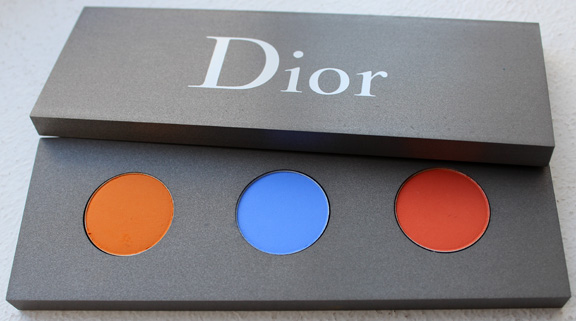
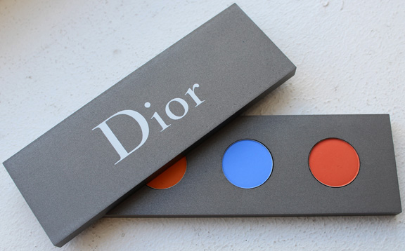
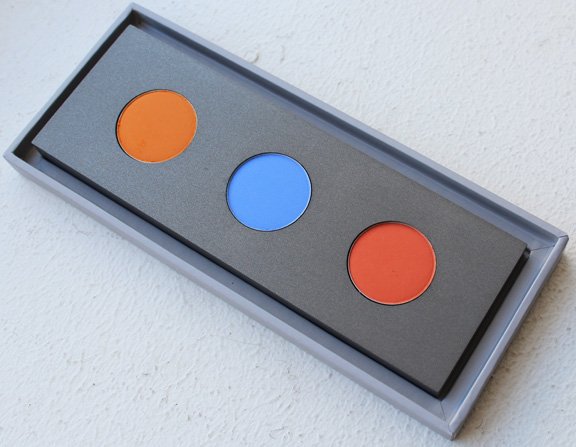
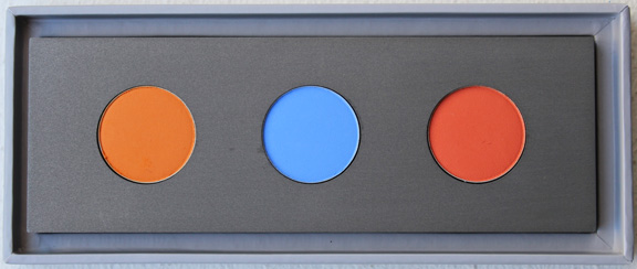
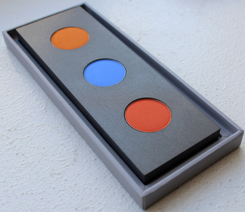
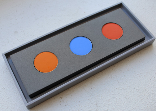
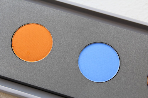
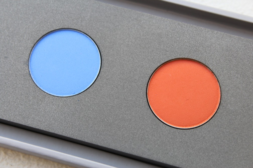
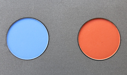
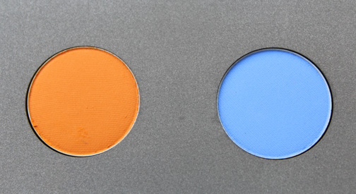
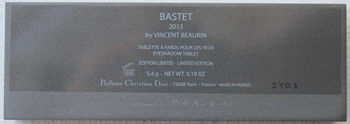
It's fairly unremarkable…until I noticed the colors in the palette shown on the lower left of the ad are incredibly similar to Dior's Les Tablettes de Bastet palette designed by artist Vincent Beaurin in 2013. They're not identical, but both palettes contain a warm golden terracotta shade, a cool medium blue and a bold red.
You can read all about Beaurin's rather complex reasoning behind the colors he chose in my post on the palette. Coty, on the other hand, has a much simpler explanation. The ad indicates that blue is for eye shadow, the red for blush, and the golden tint is for foundation. I doubt that one shade suited all complexions and the red blush and blue eye shadow most likely looked incredibly garish when worn together, but then again, as I noted previously, Beaurin's colors aren't exactly easy to work with either.
Do you see a color resemblance between the two palettes?
So many pinwheels, so little time. I was heartbroken from not being able to get my hands on this palette back in the fall of 2014. In honor of the grand opening of Dior's Omotesando beauty boutique, a small collection was launched and sold exclusively at the boutique. The star of the lineup was this lovely blush with Dior's name spelled out in whimsical pinwheel form. It just happened to surface on e-bay from a reliable seller that I've purchased things from in the past, so I pounced.
Here's a promo image so you get a better sense of the design:
The exclusivity and the pretty colors were enough for me to add it to the Museum's collection, but I'm still curious as to why they chose this design for the palette. According to Rouge Deluxe, the letters aren't actually pinwheels but toy windmills. However, to my knowledge neither pinwheels nor windmills figure prominently in Dior's work. I did find this "Moulin à Vent" ("windmill") dress from the 1949 fall/winter Trompe L’Oeil collection, but that was basically it.
I also checked out Dior's fall 2014 couture and ready-to-wear collections, and saw nothing that would point to windmills or pinwheels. So I have no idea why Peter Philips, Creative and Image Director for Dior Beauty, would select this motif…unless, as I wondered with Guerlain's Poudre de Soie palette, pinwheels/windmills are meaningful in Japanese culture?
In any case, I was pleased to be able to cross this palette off my very extensive wishlist! While it was released in the fall, I think it would be a nice addition to a spring exhibition. What do you think?
Dior's Transat collection pays homage to both Dior's first resort collection from 1948 and Raf Simons' modern take on the designer's original vision. From the website: "Christian Dior presented his first Resort and Spring line in 1948, inspired by the great transatlantic crossings that fascinated this couturier. Synonymous with freedom, elegance and picturesque destinations, the nautical world has always been an invaluable source of inspiration for Dior and its creations. Today, Raf Simons upholds this heritage with the Cruise 2014 collection: his outfits feature all the elegance of a modern nautical look with timelessly chic styling. Transat, the summery look created by Dior makeup is reminiscent of these outfits. A radiant, sun-kissed complexion; ultramarine blue eyes; intense lips and nails with sailor stripes: Transat brilliantly breezes through summer. Nautical chic, Dior style." I picked up one of the two eye shadow palettes in Atlantique. The rope detailing and the colors very much align with the collection's description.
And I was pleased to see there was also a direct connection to the fashion that came down the runway for Dior's 2014 resort collection. Compare the Transat promos to some of the looks at the show:
I don't really have anything to add, except that I did come across more information in Dior's online magazine about how Dior was one of the first designers to introduce the notion of a resort collection, which was quite interesting. "'As a true native of Granville, I have sea legs,' wrote Christian Dior in his autobiography 'Christian Dior and Me'. The couturier grew up facing the ocean, in his beloved family villa perched on the cliffs of Granville, in Normandy. As a boy, he contemplated fishing boats with billowing sails and the Channel Islands, which seemed so near in fine weather. Dior grew up gazing at an infinite horizon, which cultivated his taste for travel. This passion for elsewhere would last his entire life, and live in the heart of his creations. By 1948, he was a renowned couturier in France, and opened his house in the United States. He offered his American clients a collection called 'Resort and spring'. The clothes’ colors were summery, their materials and lines light and easy to wear, their names evocative of paradise : 'Bahamas', 'Honolulu', 'Palm Springs'. In America at that time, the fashion was for cruises, long voyages aboard a steamship with stops in sunny destinations. A quest for summer in the middle of winter; warm holidays spent on distant horizons during the coldest season of the year. One had to dress accordingly. One needed a wardrobe of outfits that were easy to pack and to wear, something ideally suited to long steamboat excursions. And the notion of Cruise collections was born. 'If you travel frequently, you will need clothes that don’t take up too much space, that are light and won’t wrinkle,' Christian Dior wrote in his Little Dictionary of Fashion ; and with his very first collections the designer expressed his taste for travel and marine codes (boat necks and sailor stripes). In 1950, the press communiqué for his Resort collection specified that 'Monsieur Dior has chosen for his color palette soft variations on the magnificent colors of the South Seas', and the couturier offered his French clients wide-brimmed hats, robes for lounging and shorts in floral or gingham fabrics with names like 'Bain de minuit', 'La Croisette' and 'Méditerrannée' – names that chimed with the dream of sunny, never-ending vacations. Today, dreams of travel to sunny climes continue to inspire fashion at the House of Dior." I tried to find images of some of these pieces but came up empty-handed.
While the design didn't knock my socks off the way those of previous Dior palettes have (i.e. Lady Dior or Tailleur Bar) I still think it's a solid addition to my summer-themed collectibles, given how well it ties into both a recent fashion collection and Dior's idea of resort wear over half a century ago. The only downside is that it makes me yearn to take a fabulous trip on my non-existent yacht!
What do you think?
Dior's spring 2014 collection was inspired by the Petit Trianon, part of Marie Antoinette's private estate. From the Dior website: "Christian Dior's beloved monarch, a flower-woman painted in a palette of wild roses, reigns supreme over Spring 2014. The Trianon Collection is an ode to the 18th-century aesthetic so adored by the founder of the 30, avenue Montaigne maison. Powdery colors and Fontanges bows capture the magic of Versailles and the palace gardens in full bloom." Louis XVI bestowed the Petit Trianon to Marie Antoinette as a gift in 1775, who promptly overhauled the gardens surrounding it to suit her taste. In my opinion, the spirit of the Petit Trianon was best represented in the colors in this collection, which encapsulate the hues of the lush variety of blooms.
I got the eye shadow palette in Pink Pompadour. While Dior has utilized the bow motif many times before, I enjoyed the daintiness of this particular bow.
While there was no official Trianon theme for Dior's ready to wear spring 2014 fashion lineup, it was most certainly flower-focused. Dior Artistic Director Raf Simons created a garden of sorts on the runway, where models walked underneath a canopy of hanging flowers.
The flowers used in the Trianon collection's promo images are quite similar to the ones that adorned some of the dresses. Not only do the colors of the flowers match, they seem to be cut out and superimposed onto their respective backgrounds.
Finally, the palette seen on the runway – pastels offset by hints of more vibrant shades – directly corresponds to the colors of the Trianon collection.
But what about those delicate little bows that were embossed on all the powder-based items from the Trianon collection? Well, they may not have made an appearance in the ready-to-wear show, but they did peek out from the models' necks and hands at the couture show.
Thus there was some overlap with the couture collection as well as the ready-to-wear.
While I appreciate the attempt to use Dior's fascination with Marie Antoinette and her private estate as the springboard for the Trianon collection, ultimately I didn't find it to be all that creative, especially since a garden-themed collection has been done before and with a much more meaningful foundation: the spring 2012 Garden Party collection, which took the designer's magnificent childhood home and gardens as its inspiration. The Trianon collection certainly had a nice selection of spring-appropriate colors, but the overall expression of the theme was lacking.
What did you think of this collection?
As the holidays near, I become less resistant to the lures of any luxe, shiny, metallic makeup items, particularly those with a pretty pattern. Initially I wasn't going to purchase the Illuminating Powder but ultimately found myself helpless against the elegant gold packaging and shimmery delicate beaded design. Plus, it's perfumed with Dior's J'Adore fragrance.
There is another one available in Rose d'Or, which has a more pink hue, but the gold Perle d'Or appealed to me more.
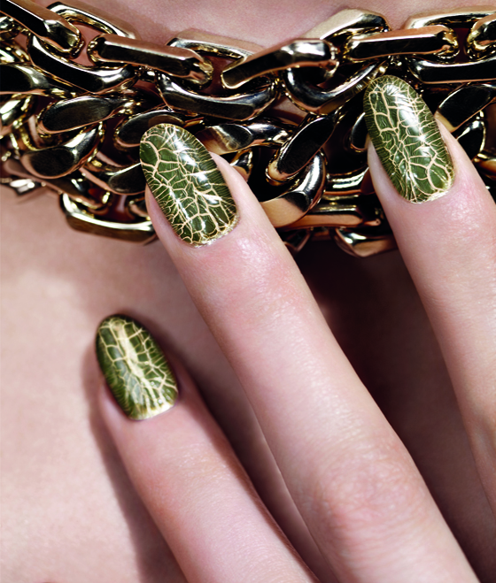
The pattern reminded me of the dazzling gold beaded necklace Charlize Theron wears in the J'Adore ads.
What I didn't realize at first was that this necklace, and others in previous Dior ads like the one below, was used in the bottle's silhouette as a result of former Dior designer John Galliano's Maasai-inspired collections.
His first collection for Dior debuted in 1997 and contained a high-fashion Western spin on the traditional bead and wire necklaces worn by the Maasai people in Kenya and Tanzania.
I don't really want to get into how Galliano appropriated Maasai culture or his other racist views, but I will say that it's interesting how Dior reinterpreted some of their past designs in this powder. I like that's it not clear whether it's a literal representation of one of Galliano's necklaces or if it's vaguely based on the J'Adore perfume bottle and ads.
What do you think of this compact?
The star (haha) of yesterday's Color Connection is also the subject of Couture Monday. The Bonne Etoile palette uses a motif Christian Dior believed helped seal his fate as a fashion designer.
As the story goes, in early 1946 Dior was debating whether to open his own couture house. Wandering along rue du Faubourg Saint-Honoré, he nearly tripped over something in the street: "Bending over, Christian Dior picked up an object that would restore his
faith: a star, the one that will propel him into the firmament of haute
couture and luxury, a guiding star showing him the path to follow. At
that moment he knew his answer would be 'yes', that he could no longer
ignore the hand of fate." The star, though rusty, is still preserved at his house in Normandy.
While the star was certainly important to Dior, it was never as ubiquitous in his designs as, say, the cannage pattern. I could only find a few things that displayed the star motif, like this bracelet:
There was also a "Lucky Star" palette offered for the 2005 holiday season. I couldn't find any decent stock photos but you can see what it looks like here.
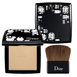
As for breaking out the star for this season's collection, there was no tie-in to the fashion. The fall ready-to-wear show contained pieces featuring the early works of Andy Warhol, and the couture show had nothing to do with stars or even a sort of "mystical" theme that was the inspiration behind the makeup collection. According to Dior's online magazine, "Mystic Metallics defines a mysterious
universe in which the Dior woman as conceived of by Tyen, director of
color creation, is resplendent in subtle and iridescent hues, as if by
magic…'The harmonies I've created for this look
reflect the galaxy's mysterious colors. It's a voyage from the earth to
the moon,' claims Tyen." I agree the Bonne Etoile palette represents Tyen's vision, but it's entirely different than what Raf Simons sent down the runway.
What do you think about this palette and the star pattern? While I don't think it's the greatest expression of something that was very dear to Dior, the colors are truly stunning.