I am pleased to see that Lancôme has been spicing up their Juicy Tube packaging in the past year or so. Recently these lip glosses have featured stars (for the holiday 2007 collection) and fishnet stockings:

And for the fall 2008 Maharani Jewels collection, henna-like scrollwork:
But the most intriguing of these new designs is the World Tour collection, released in March 2008. Lancôme collaborated with up-and-coming British fashion designer Christopher Kane to create nine limited-edition Juicy Tubes whose names represent four "hot fashion" cities: Tokyo, New York, Rio and Paris. Previously Lancôme partnered with Thakoon, Proenza Schouler, and Behnaz Sarafpour to create limited-edition lipsticks whose colors reflect in some way the designer's aesthetic, so working with fresh fashion designers isn't new for the company. However, none of these products featured unique packaging, so the collaboration with Kane is a new direction.
From left to right: Rio Mango, Moulin Rose, Tokyo Plum Blossom, Red Hot New York
Details:
The dresses on the tubes are very similar to the ones presented at Kane's spring 2007 show – the frilly sleeves, the lace detailing and the overall silhouettes are virtually the same. Even the bright colors relate to those seen on the runway.
(photos from style.com)
The Juicy Tube packaging is a very literal translation of Kane's work, and his style is well suited to decorate these glosses. As one critic remarked on the spring 2007 collection, "Driven by lust for eye-socking color and allover decoration, it zings with an amazing new energy and optimism."1 I believe the same be said for new shades of ultra-shiny, brightly-colored lip gloss.
1 Sarah Mower, style.com. https://www.style.com/fashionshows/review/S2007RTW-CKANE/ September 20, 2006.
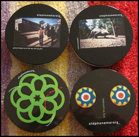
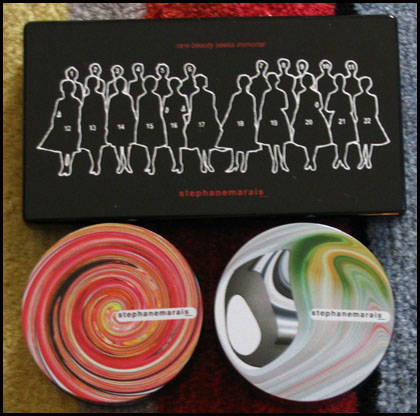
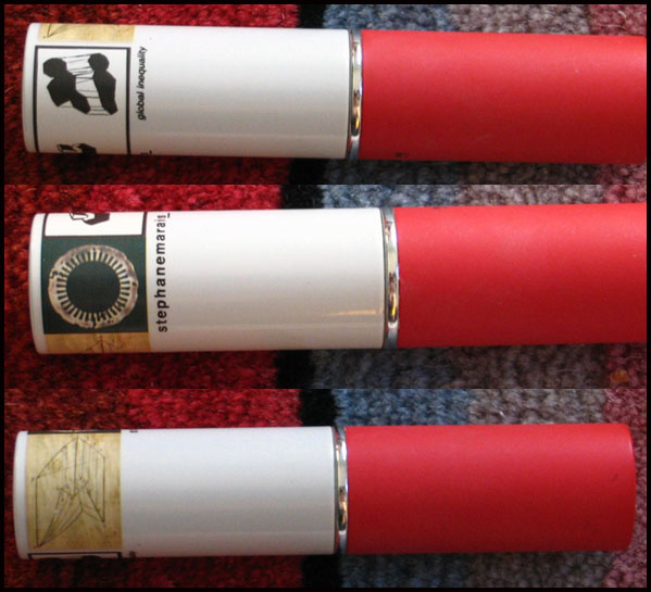
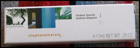
Makeup artist Stéphane Marais launched his line of cosmetics in 2002. The collection featured bizarre designs on the packaging unlike anything I've ever seen in makeup. Naturally I had to get my hands on as much of it as possible!
Some of the eyeshadows:
Powder foundation and gel eye liners:
Stick concealer:
Brow gel:
Loose powder:
And a lipstick:
I'm not really sure what a dinosaur or phrases like "Groove flowers up to the sky. Ohh my god" and "Only for primates" have to do with makeup, but the designs truly were different than anything on the market. According to one source the images were an "ode to Marais's work in fashion shows for Jean Paul Gautier, and advertising campaigns for Dior, Calvin Klein and Givenchy." His original idea was to change the packaging every season, because "You have to keep your customer amused. The approach is very childish, rich — like a candy store.'' It's also a commentary on the fast-paced, ever-changing fashion world.1
Sadly the line was discontinued in 2005, but I'm forever hoping for something with comparable packaging.
1 "Cosmetics That Change with the Seasons," Ruth La Ferla, New York Times, June 1, 2004.
Graphic artist and creator of Tokidoki, Simone Legno, collaborated with Smashbox in the spring of 2007 and came up with a whimsical, playful collection for the company. All of the limited-edition items featured Tokidoki's signature illustrations as well as Italian names such as Bella (the cream blush stick), Stellina (the mirror outfitted with small silver stars) and Modella (one of the eye shadow palettes.) In this way it fuses Japanese and Italian cultures.
Here's the Modella eye shadow quad:
Here's the compact opened – a nice little surprise awaits on the lower-left corner of the mirror:
1 "Designs Reveal Artist's Personality", Nadine Kam, January 11, 2007. https://starbulletin.com/2007/01/11/features/story02.html. To watch an interview with Legno, click here.
Created by Parisian Sophie Albou in 1995, clothing label Paul & Joe branched out into cosmetics in 2002. Each season the company releases limited-edition collections (almost always consisting of 3 face color powders and 3 lipsticks) featuring absolutely stunning packaging and which are, according to the website, "linked with that particular season's fashion." In the past it was cute, precious and almost cloying – lots of delicate flowers and ribbons – but the company has slowly been moving towards more sophisticated, Art-Nouveau-inspired designs.
This fall's theme is called "Inspiree":
“An intriguing room,
A delicate floral pattern,
A fragile antique plate,
An old cushion cover saved from a Paris flea market,
These eclectic things are the source of inspiration
For Paul & Joe creator Sophie Albou.
Keepsakes we will continue to adore and be entranced by
As the days and years pass.
We have created a collection of colours inspired by these special things.
Remarkable colours that conjure up such haunting memories."
Here are the face color powders. From left to right: Pressed Petals, Lullaby and Atelier (with flash and in natural light)

And two of the three lipsticks, Muse on the left and Motif on the right:

The pattern continues all the way around to the back of the lipstick bullet:

I'm not sure the theme behind this collection matches the packaging and colors. "Intriguing room", "delicate floral pattern", "fragile antique plate", "old cushion cover" – all of these could be used to describe the colors and packaging designs of previous collections. The theme also mentions a "Paris flea market", which was, incidentally, the name of the fall 2005 collection. While the packaging is lovely, the theme could have been a little better written to more fully tie into the feel of the collection – it's a bit uninspired this time which is a shame considering the collection's name. Nevertheless I'm loving the designs and the fact that the lipsticks are all engraved with the signature Paul & Joe flower that appears on most of their packaging, which is something the company hadn't done before. It definitely "projects a unique presence", as is Ms. Albou's vision for the cosmetics line.
Oops, they did it again! That is, Shu Uemura has released a new advanced formula cleansing oil, and in honor of its launch created a limited-edition, Asia-exclusive bottle. It's not clear when the advanced formula will hit the States. But what's bothering me more than that uncertainty is the fact that I don't know if an artist collaborated on the bottle's design.

It's impossible to tell whether this is something the company has come up with or if an outside artist was brought in. (As mentioned earlier, Shu has a history of working with artists on designs for the cleansing oil bottles.) I'm guessing this is something the company did itself since there's no mention of an artist on the bottle or box.
The abstract flourish is reminiscent of this painting by Franz Kline:
 (photo from moma.org)
I think it's fitting that Shu chose an abstract design for this product. The idea of a product having a new "advanced" formula is difficult to express visually, so a simple abstract brushstroke in silver works well in terms of signaling the release of a new and improved product.
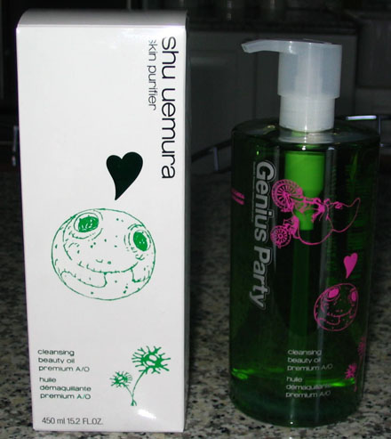
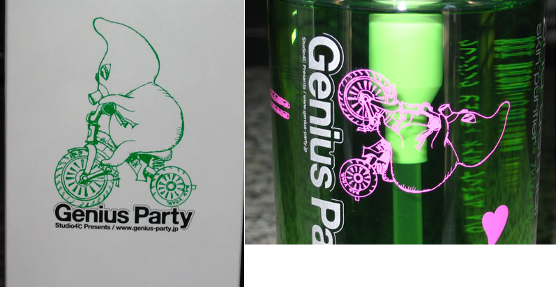
In the past, Japanese makeup company Shu Uemura collaborated with artists John Tremblay and Ai Yamaguchi to create limited-edition packaging for the company's best-selling cleansing oils. Shu is continuing their tradition of interesting skincare packaging with a Japan-exclusive release in honor of the 25th birthday of their flagship boutique, a collaboration with the producers of the anime anthology Genius Party.
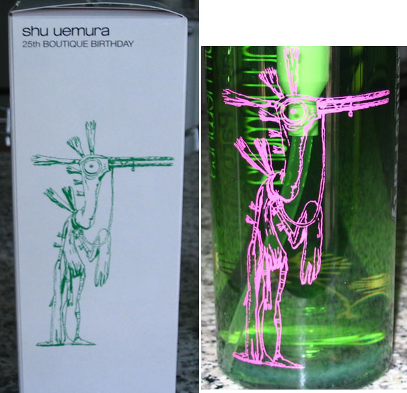
Genius Party was released in July 2007 and consists of 7 short anime films. The bird-man and smiling egg-like characters on the bottle are taken from the opening film and namesake of the anthology, which was directed by Atsuko Fukushima.
This character is from the 3rd movie in the anthology, titled "Deathtic 4" and directed by Shinji Kimura.

Unfortunately I can't seem to find a link to watch the films, but I did come across a very thoughtful and interesting analysis of the first segment as well as a review of the entire series.
I'm glad Shu continued working with visual artists to create unique packaging. I'm always curious to know the motivations behind the artist selection, besides the obvious goal of creating designs meant to sell products on a wide scale. The Genius Party cleansing oil, however, possibly represents a departure from this. Fukushima had this to say about the anthology: "The Genius Party project is completely the opposite of the kind of approach where you first assume to target a certain audience, and then create the content to match."1 Thus, Genius Party wasn't meant to appeal to anyone in particular. This begs the question of how these artists ended up working with with a cosmetics company whose primary interest in the partnership was to sell a skincare product.
There is no tie-in to the product itself or any kind of central theme, as there was with the Tremblay and Yamaguchi designs. Those two artists were commissioned to create illustrations specifically for the cleansing oil, while the Genius Party images were seemingly slapped on rather than being linked in some fashion. What's more, the opening piece supposedly explores the vague theme of the "birth of images"2, and the third segment involves a boy rescuing a frog from something called the "Life-Form Disposal Squad". Neither of these have anything to do with selling a product, so it's unclear as to why the characters from these particular films were chosen. My conclusion is that Shu simply wanted a unique-looking bottle intended for collectors and fans of the premium cleansing oil alike, and decided to work with artists who are on the cutting edge of anime.
1 This quote was taken from an article by Roland Kelts, accessed at https://japanamerica.blogspot.com/2008/04/anime-and-studio-4c.html.
2 "Einsteins of Anime," The Japan Times Online, June 28, 2007. https://search.japantimes.co.jp/cgi-bin/ff20070628r1.html
3 Author's note: The majority of online information on Genius Party and the Shu bottle is in Japanese, which unfortunately I'm unable to read, and the automated English translations were more or less useless. If I were able to get all of the information I came across in English this post may have been a bit more insightful.


