The graphic designer I hired (okay, he's my fiance) has come up with a truly fabulous logo for the Makeup Museum. He presented it to me in a range of awesome colors…and then informed me that I now owe him $3,000 for his work. I can only assume he was joking! In any case, I am very excited to share these.
#1:

#2:

#3:

#4:

#5:

While my favorite color combination is yellow and grey, I'm thinking the Museum needs bright red, reminiscent of a great lipstick shade. So I'm having him work on weaving that in somehow, along with making me some business cards. 🙂
Which one is your favorite? Post in the comments section!
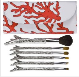
 The end of Memorial Day weekend signals the beginning of summer (although in my mind, summer doesn't officially start until the solstice on June 21) and what better way to kick off the season than a set of coral reef shaped brushes? I've seen this sort of design on utensils before, but never makeup brushes – I believe this is the first brush set that has been molded to a particular shape. The bag adds a nice splash of color too. Summer here we come!
(photo from target.com)
 I was browsing Makeup Minute and came across a post about a new line
starting up by beauty tutorialist Lauren Luke. And the packaging for
her color kits is gorgeous! The Curator is very eager to get her hands
on these palettes, as they would be excellent in a spring exhibition. I also love how each flower corresponds to the colors inside, i.e., the green flower palette contains a host of green and the blushes/lip colors to go along with them, the blue flower one has blue shadows and the accompanying colors to create a complete look, etc. And they're fairly inexpensive, retailing for $32.50 each.
Clearly I need all of these…off to check my bank account. 😉
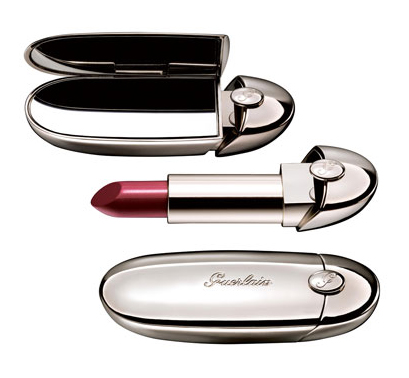
Since the outer casing looks so architectural, I found it a little hard to believe that the new Rouge G by Guerlain was designed by jeweler Lorenz Baumer. It reminds me of some futuristic space capsule, or an oval-shaped skyscraper.

$45 is a bit steep for lipstick, but you're not only paying for the packaging – apparently the lipstick also has a "precious ruby powder" that "interacts with daylight to reveal spectacular radiance." I don't know if I buy that, but the design is pretty interesting – it's always good to see a company branch out and collaborate with other designers.
Move over, Cargo PlantLove! Urban Decay's newest palette, the Sustainable Shadow Box, contains ten eyeshadows that sit in recycled paper and a cruelty-free brush to apply them, while the cover is made out of eco-friendly bamboo. I think the use of this material is pretty ingenious. I've seen clothing made out of bamboo before, but not cosmetics. According to Cosmetics and Personal Care Packaging, the palette is the first in the industry to make use of bamboo.

(photo from urbandecay.com)
Urban Decay says the designs on the palette's cover are supposed to be "reminiscent of your high school notebook". But a not-so-environmentally friendly silk-screen and lacquering process was used for the designs. "'We tried to use greener decorating options, but unfortunately, they didn't work very well,' says Nick Gardner, vice president of sales, HCT Packaging USA (Los Angeles). The decision was made to with the best option that looked best, aesthetically." Thus it seems that there still lies a conflict between green packaging and aesthetics – the technology hasn't come quite full circle yet in terms of hip, modern design. (The use of corn-based plastic - the kind used to package Cargo's PlantLove line - may have offered more eco-friendly design options, but still required the use of oil in its manufacturing.) While Urban Decay acknowledges the palette isn't as green as it possibly could be, I think that the company, along with Cargo, has done an excellent job in leading the way towards greener packaging without sacrificing design. I'm hoping more cosmetics companies follow their lead. They strive to stay on top of the latest trends in product ingredients or even products in general (case in point: nearly all makeup lines now have at least one or two mineral makeup items in their lineup after Bare Escentuals products became best-sellers) so they should compete to see who can come up with the greenest, chicest packaging.

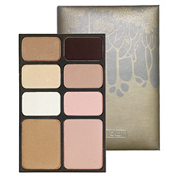
Ever since Allure magazine featured palettes by Hourglass I've been intrigued by them. Well, the not the palettes themselves but the leather case used to hold them! The delicate, understated trees have a gorgeous Art Nouveau character about them, and even the font on the Hourglass logo looks vaguely early 1900s. At the same time, the palettes have a modern sensibility in how compact they are as well as the colors and ingredients used. The colors are subtle and are carefully chosen to create a cohesive look – whether it's a tropical one (the Island palette, with its bronzes and light golds, would be perfect for a sun-kissed summer look) or a daring nighttime one (the smoky shades in the Dusk palette are spot on for this), there is a palette to fit any mood of the wearer. And as a skincare bonus, all of the blushes and shadows contain Vitamin E.
I do wish the packaging for the rest of the line outside the palettes was as interesting, or at least for the palettes to have different designs depending on the colors. They could just make the trees a different color to distinguish the palettes from one another…especially given that the makers of Hourglass seem to enjoy the tree motif – they've also created a separate bath and body line called, you guessed it, Trees. Here's hoping the palettes are merely a starting-off point for more pretty packaging!
(photo from sephora.com)
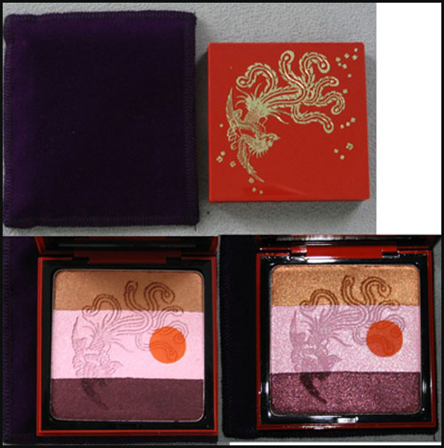
In honor of the 30th anniversary of YSL's Opium1 fragrance, the company released a limited-edition bottle and palette in the fall of 2007. The palette features a red lacquered case with an exquisite phoenix and floral details.

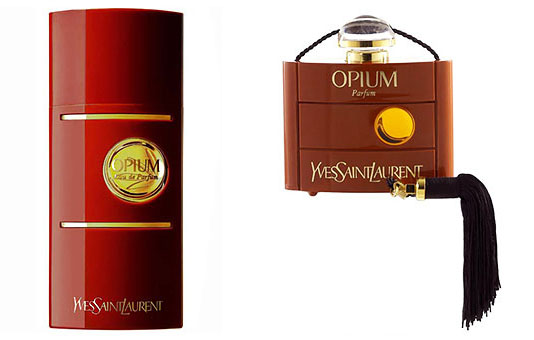
While I'm not really sure what the reddish orange dot on the interior is supposed to represent, it could just be referring to the circle on the fragrance bottles themselves:

(photos from yslbeautyus.com)
The iconography of the phoenix is a little strange – maybe it's meant to represent the "rebirth" of the fragrance, but truthfully I can't find any concrete explanation of why the company went with a phoenix.
In any case, I can understand why they would have released this to go with the fragrance's anniversary, but that doesn't quite explain why they came out with a limited-edition Opium fragrance bottle and a palette featuring a matching design in the fall of 2006.
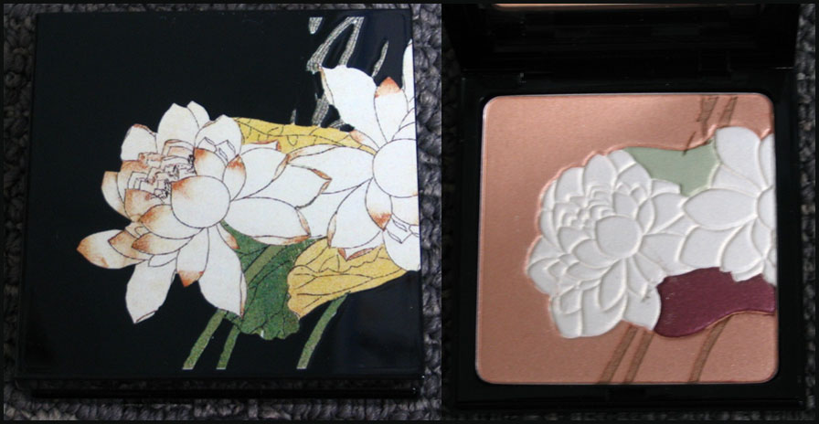
Both the bottle and the palette are adorned with a beautiful lotus flower, because, according to the company, the bloom represents “purity and splendour." That's all well and good, but I think it would have been more interesting if they included a flower whose scent is one of the notes in the perfume, or if they wanted to be really adventurous, a poppy flower.1 ;) Plus I'm not sure what "purity and splendour" have to do with the fragrance considering the Sephora description for it:
"Rarely in the history of fragrance has a creation embodied such enchantment, mystery, magic, and exoticism…Opium symbolizes Yves Saint Laurent's fascination with the Orient and his unique understanding of a woman's hidden emotions and inexplicable passions." I think in this case though, "Orient" refers to China, since the company introduced many China-inspired fragrances in recent years.
Over all, both of these palettes represent the designer's "fascination with the Orient" and the spirit of the Opium fragrance – I like that the same image was used for both the perfume bottles and palettes. And they're simply gorgeous to look at!
1Allure reported that there was an entire museum exhibition devoted to the 30th anniversary of Opium in Paris, complete with a faux opium den. The curator is most upset she was not able to attend!
2 For a perfume blogger's perspective on the fragrance, click here.
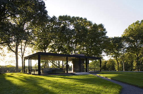
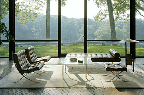
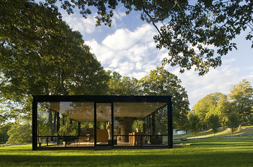
The Curator is visiting Philip Johnson's Glass House for the weekend and enjoying the crisp fall weather up there. Stay tuned for a post on fun packaging next Friday. :)


(all photos from time.com)
(The Curator is very busy/tired…Couture Monday will return next week.)
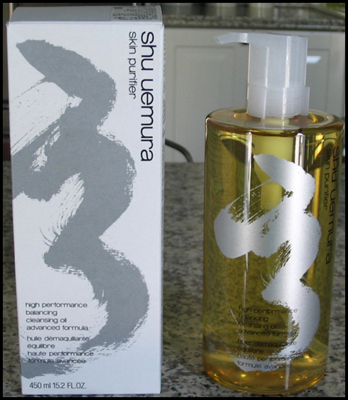
A few weeks ago I posted about Shu Uemura's latest cleansing oil, the Advanced Formula, which came with an abstract design on the bottle. I didn't know when it would be hitting the U.S. and surmised that this wasn't an artist collaboration since there was no mention of an outside artist on the bottle or box. This morning though I received an e-mail from the company announcing the U.S. release of this oil and they revealed what that design is – it's calligraphy from Mr. Uemura himself! Here's my picture again:

Silly me, it should have dawned on me that it was calligraphy, and calligraphy from Shu himself – that's very fitting. But trained in Western art that I am, I thought it had more of an abstract expressionist feel to it. In any case, I'm happy to find out what it was!
I finally got my hands on one piece from Shu Uemura's fall 2008 collection called "Instinct". Here is the description of the collection from the website: "Stimulate your instincts with shu uemura's Fall Mode Makeup Collection! Explore these layerable, sensual and iridescent shades of Fall to discover your own make-up expression! Staying true to shu uemura's heritage of innovative and conceptual design, each item is encased within palettes of silver, gold and black motifs, expressing the modernism and elegance of the collection's femininity."
I felt as though there are a lot of fancy words in there but no real meaning. "Modernism," "sensual," "stimulate," while interesting, weren't really painting a cohesive picture of the collection for me. So off to Google I went to find more info, and I found this description of the collection at temptalia: "There are periods of time a woman has an alluring glow and enlightened expression, often times of great pleasure and confidence. Capture these most sensuous moments and recreate the indulgent merge of mesmeric forces with the collection of Instinct. shu uemura explores the power of instinct with an arousing collection of deep color veils and lush texture to reveal the evocative allure of every woman."
Still a lot of fluff, but it makes more sense when actually looking at the collection's items. There is a rose powder (I'm assuming it gives an "alluring glow"), eye shadow duos that can create smoky or soft looks, depending on their application, and blushes with names like "Steam" and "Lust."

Here is what the blushes and eye shadow duos look like:

(photos from shuuemura-usa.com)
Still, I thought the packaging overall was a little weak. The rose powder in particular has a somewhat 80's feel to it – between the graphic shapes and the shiny, reflective surface, it reminds me of packaging that would have been really cutting-edge 20 years ago. (In fact, the author of makeupandbeautyblog draws a very literal comparisonbetween the packaging and promotional ad and the '80s.) Plus, I'm still not sure where "Instinct" fits into all this. I think of instinct as something innate, an automatic feeling emanating from your subconscious, not necessarily "enlightened expression", and I'm not sure how the images on the packaging are in keeping with this. If anything, the package design should have been expressed in a more raw, primal way, sort of like the automatismof Jackson Pollock…perhaps a paint-splattered compact would have been more appropriate. 😉

(photo from artinthepicture.com)
