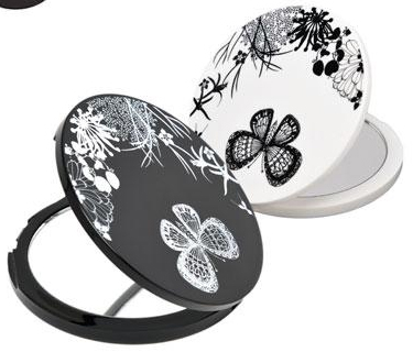
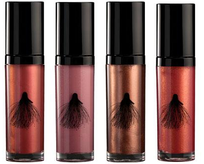
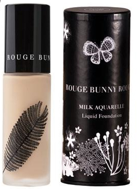
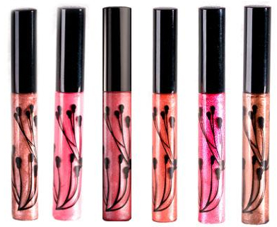
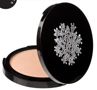
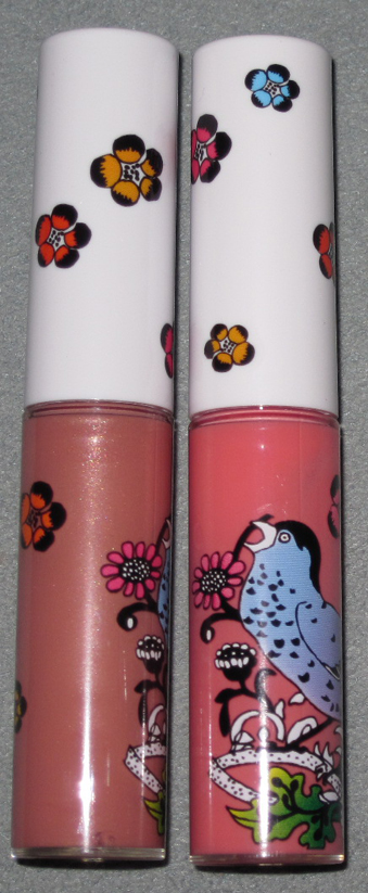
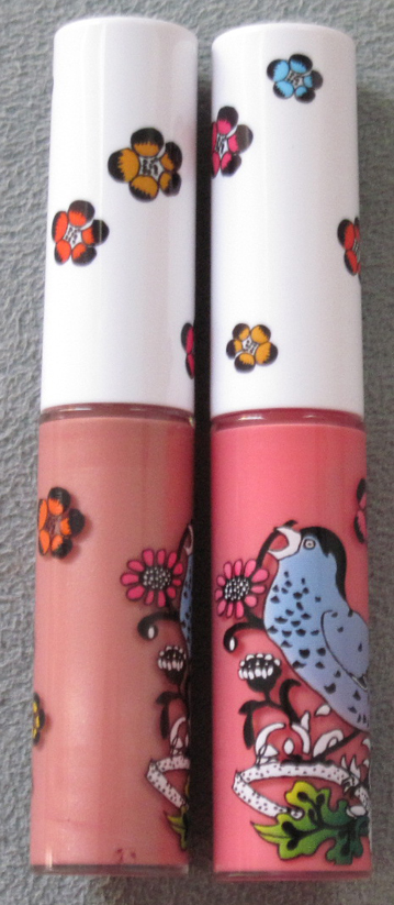
Via Britishbeautyblogger I came across this gorgeously designed English line. Each piece in the Rouge Bunny Rouge lineup, from foundations to lip glosses to highlighters, is adorned with a pretty, organically-inspired image:


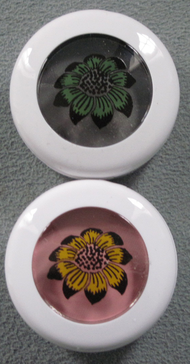
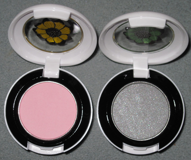
I think my favorite items are the Double Duty mirrors:

All of the designs remind me a little of Paul & Joe's delicate chrysanthemum blossom on their packaging – so simple yet very elegant and modern. Another thing I love about this line is the unusual, if not downright bizarre, theme behind it. From the website: "Imagine, if you will, the Garden of Plenty in the grounds of the Princess's Palace. She goes by the name of Her Royal Highness, Princess Rouge. Princess Rouge has been having a recurring dream about a magical garden, through which a frolicsome Red Bunny chaperones her. Wishing to turn her recurring dream of the Enchanted Garden into reality, she calls upon her most talented artists and artisans to recreate for her the ethereal beauty of the magic land…in honour of the Enchanted Garden story, the Order of RBR brings to you a collection that intertwines a Victorian fairytale, with mystery and a whispering sense of danger." I sense a bit of Alice in Wonderland but with a red rabbit instead of white. I love how the story is like a children's fairytale but the packaging is definitely more mature. What do you think?
(images from zuneta.com)
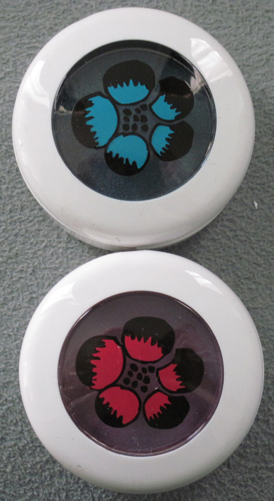
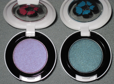
Woohoo, it's here! The long-awaited MAC Liberty of London collection, that is. I was very excited for this as I adored London when I visited and Liberty was my favorite department store (sorry, Harrod's and Selfridge's!) Well, let's delve into what I procured for the Museum.
Powder in Shell Pearl:

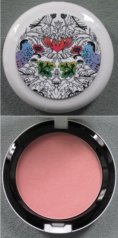
Blush in Prim and Proper:

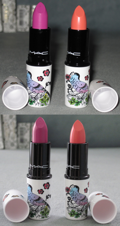
Lipsticks in Petals 'n' Peacocks and Ever Hip (with and without flash):

Lipglosses in Frankly Fresh and Perennial High Style (with and without flash):


Eyeshadows in Bough Grey and Give Me Liberty of London:


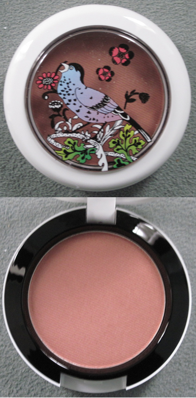
And in Birds and Berries and Dame's Desire:


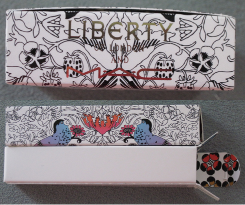
I love that the boxes have the Liberty name in gold, and the flower print is contained inside:

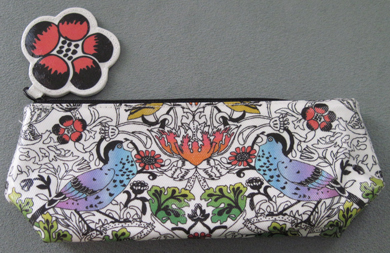
Finally, the small makeup bag:

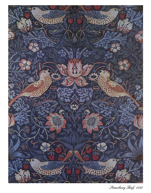
I love the shades in this collection (I'm actually going to use Ever Hip and Frankly Fresh rather than keeping them as collectibles!) but obviously the packaging and concept are my favorite things about it. Temptalia has a wonderful summary of how the print was created and what the collection's vibe is meant to be. The print is based on William Morris' "Strawberry Thief" print which goes back to 1883, but was reworked to fit the MAC collection and to make it exclusively theirs. "James Gager, Senior Vice President and Creative Director for MAC Cosmetics, says, 'I’m
particularly proud of the packaging… White [packaging] speaks to a
reawakening of everyone’s sensibilities for spring. [It] has a
remarkably fresh, springy look to it. Even if you don’t know what
Liberty is, you want to own these pieces because they are so unique and
special. It’s evident that something original has taken place here in
terms of the collaboration.'" Naturally I had to search for the original Strawberry Thief print, and indeed, the MAC print is definitely a great modern take on it, although they did take the strawberry completely out of the equation:

(image from artsycrafty.com)
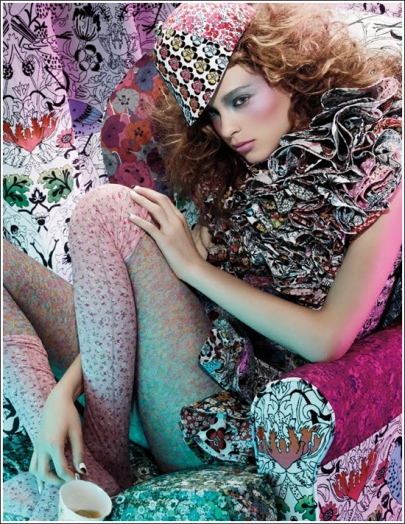
More from Temptalia: "Gager says, 'The inspiration was all Liberty and all London.' Miles Aldridge, photographer, shot the visuals in London, with
Charlotte Tilbury, makeup artist, created the look. (Both Aldridge and
Tilbury are English!) Gager goes on to say, “The idea was to
capture the spirit of the famous Brit wit, bohemian chic girl. Katy
England, another famous Brit, styled the shoot. She also designed the
outfit worn by the model, using many Liberty prints and turning them
into an over-the-top ruffled dress. With the MAC Give Me Liberty of
London collection, we aspired to capture the spirit of this dreadfully
chic, cool English girl, sitting on a chair, decked out in all the
British regalia. She’s a Liberty freak and a MAC addict; she can’t get
enough of either brand.'" I can definitely see their vision in the promo ad:

Anyway, I wish I were able to get my hands on the scarf, but at $95 I thought a better use of Museum funds would be to get lots of items for the same amount! I also kind of wish MAC came out with a shirt or another non-makeup collectible – Helly Kitty had tons of stuff and Fafi had adorable little dolls and a tee. But overall I thought they did a great job with this. What are your thoughts and what, if anything did you buy?
Guerlain takes us from the cold recesses of Russia for their fall lineup to warm up in the Far East with their spring collection, Cherry Blossom. Meant to evoke "'La Vie En Rose' with an Asian twist" the stand-outs clearly are the blush, which has "shades reminiscent of Japanese cherry trees in bloom" and eye shadow palette, which was "inspired by the rays of sunlight
reflecting on the surface of a lake, while the violet and mauve evoke
oriental flowers playing with shadows in a garden at dusk." Both feature delicate, abstract fan patterns.
Blush, with and without flash:

The eye shadow palette:

Why Guerlain didn't do an actual cherry blossom design is beyond me, but these are gorgeous nonetheless – pale pinks and purples always nice to see for spring, and while I wish the pattern were a bit closer to the theme, it's fairly creative as far as makeup designs go. I also like this collection since it reminds me a tiny bit of the European fascination with Japanese textiles and art in the late 19th-century: Japonisme. While this term really refers to the techniques used (particularly for wood-block prints called ukio-e) rather than the subject matter, some Japanese objects can be seen in paintings from this time. Among the most famous is Claude Monet's 1875 portrait of his wife in a kimono and holding a fan:

(image from artistandart.org)
And while Van Gogh is famous for his sunflowers and irises, he too got swept up in the craze for anything Japanese and painted almond blossoms:

(image from blog.stillriverstudios.com)
I sort of feel like Guerlain creative director Olivier Echaudemaison (quite a name, non?) was channeling Japonisme1 in this collection – a distinctly Western take on a part of Japanese culture.
1For more on Japonisme, check out Japonisme: The Japanese Influence on Western Art Since 1858 by Siegfried Wichmann or Japonisme in Western Painting from Whistler to Matisse by Klaus Berger.
Hello Dollface posted about these last week, wistfully noting that while they are pretty, they're just not practical for her (and I'm inclined to think not practical for most of us!) Featuring either clear or black Swarovski crystals (or pink, available only at Harrod's, it seems), these $100 tweezers take plucking to a whole new level. At least, that's what the marketing department at Tweezerman wants you to believe.

(images from neimanmarcus.com)
I wonder how much they would enhance the experience of neatening one's brows. If I had money to burn I'd be all over these just for the sheer novelty of having crystal-encrusted tweezers. Yes, they're totally frivolous but also fun. What do you think?
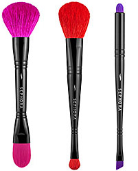
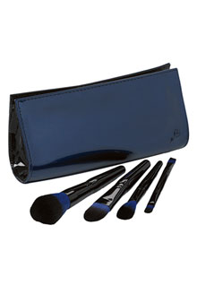
 Hooray, another brush set that's branching out from the usual black or neutral-colored bristles! Earlier this year Sonia Kashuk brought us lovely coral-inspired brushes and Lancôme introduced a sleek set of blue-bristled brushes as part of their Declaring Indigo collection. Now Sephora is following suit with these. It's the dawning of a new brush era!
(photos from sephora.com)
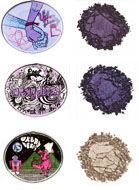
 I've posted before about Urban Decay's Deluxe eye shadows. Makeup aficionados love them for their silky texture and excellent pigmentation, but I love them for the unique design on each. The company has just released three new ones: Freakshow, Frigid and Ruthless. Sadly I couldn't find any pictures larger than these, but the artwork on each looks pretty good. I really must make adding these to the Museum's collection a priority!
(photos from urbandecay.com)
Several recent releases are taking their cue design-wise from Moroccan architecture and patterns. The raised surface of Laura Mercier's Moroccan Bronze palette looks to be inspired by the amazingly intricate stucco work in the Bahia Palace in Marrakech:


(photo from s3images.com)
And the interlocking pattern of the Sephora Moroccan collection palette is reminiscent of the door to the Mohamed V Mausoleum in Rabat:

(photo from sephora.com)

If you can't get to Morocco any time soon these items can suffice. Pretty!

In honor of Bastille Day I thought I'd feature part of Lancôme's
Declaring Indigo collection, which is inspired by "French irreverence."
There is no shortage of compacts and palettes with interesting
packaging, but brushes are by and large neglected in terms of design.
That's why I was so happy to see this brush set featuring partially
blue bristles instead of the usual black or natural. The set is exclusive to Nordstrom, but the rest of the collection can be purchased at the Lancôme website. And for some great real-life pics, check out this post at Blogdorf Goodman.
(photo from nordstrom.com)
My post on Armani's Sienna Minerals palette reminded me of Shu's spring Mirage collection – lots of desert-themed makeup lately! All we need is a collection called Oasis. Anyway, the idea behind these was to "create an
illusion-like, unforgettable makeup image that gently and gradually
arises like a mirage." I understand the concept behind the makeup shades, but I'm not really sure how the abstract designs on the compacts are supposed to represent a mirage.

(photos from nordstrom.com)
To me they look more like billowing smoke. I think it would have been more interesting to have a mirror image of the design on each side. While this collection was a bit of a miss for me, Shu definitely redeemed itself with the lovely Tokyo Kamon Girls collection, which I am still adoring. (Availability udpate: I spotted some of the oils in Allure magazine's July issue, which means they will definitely be available in the U.S.!)
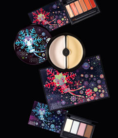
 The Curator is very late to this party (as I don't follow non-U.S. brands as closely as I should), but this collection is definitely museum-worthy so I am writing about it several months after its release. Korean brand Laneige released a spring line with illustrations done by Finnish designer Klaus Haapaniemi. The collection was "inspired by delicate splendid snow crystals" and the designs were meant to represent the "fairy-tale image of snow", in keeping with the brand's namesake. Whimsical without being juvenile and colorful without being garish, the designs encapsulate what the artist is best known for: a fun, modern twist on traditional Scandinavian folk art.
Haapaniemi's work is influenced not only by the art of his home country but also Russian and Eastern European cartoons. He also gets inspiration from the prints his theater costume designer grandmother used. He has collaborated with many companies including Diesel, Cacharel and Dolce & Gabbana. Hmm, maybe D&G could hire him not just for their clothes but for their new makeup line!
(photo from joseibi.com)
