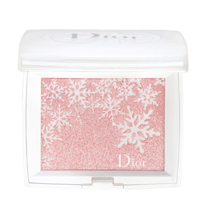
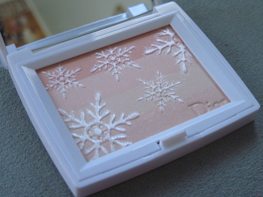
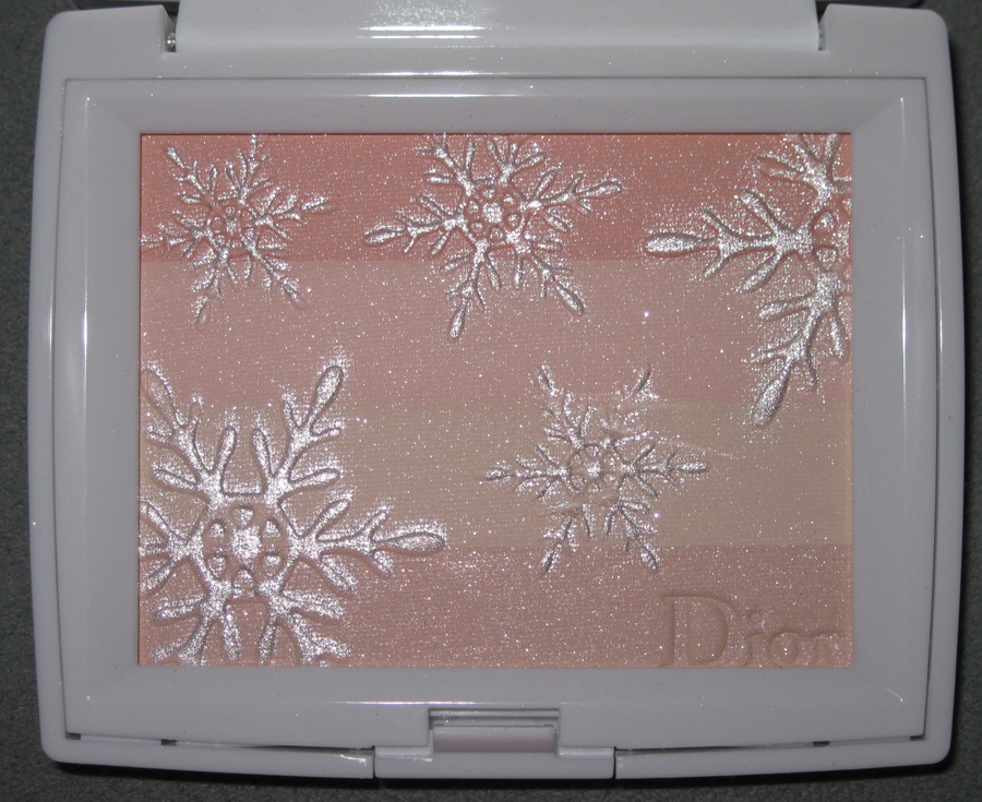
I know it's odd to be posting a wintry palette such as this at the end of April, but Dior's Asia-exclusive Icy Halo collection came out a little over a month ago, and I simply couldn't wait till next winter to share the stand-out from the collection: the Voile de Neige Light Amplifying Face Powder.
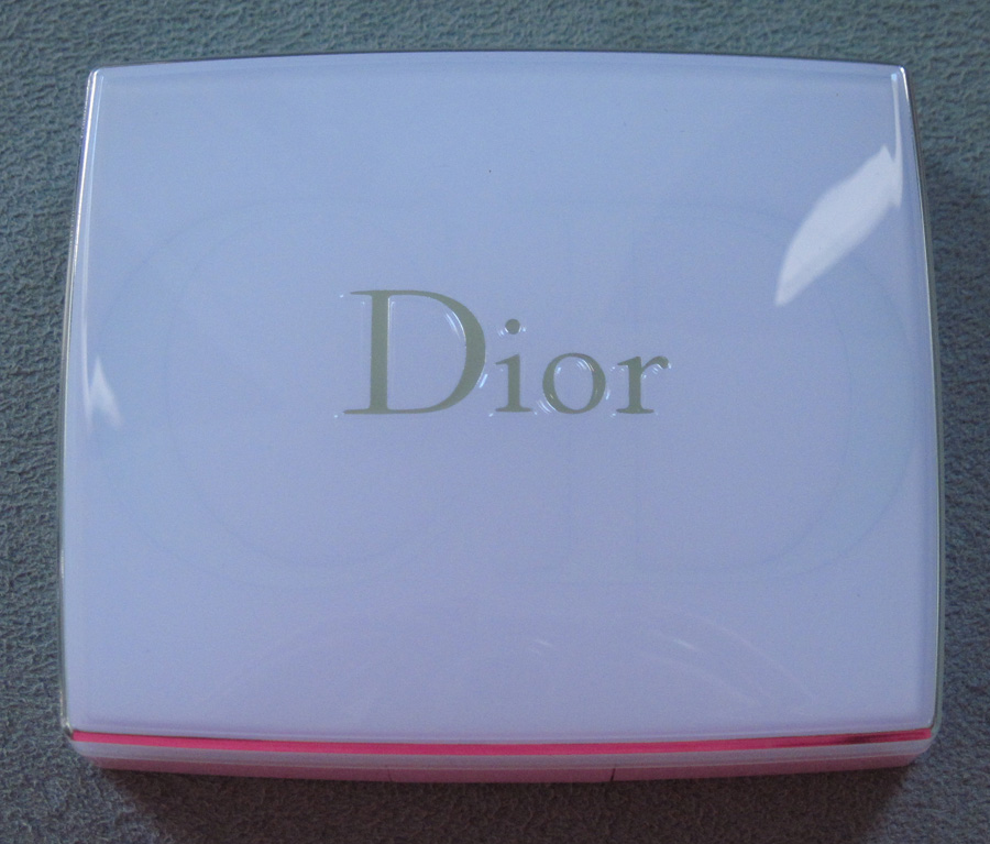
The outer case is a beautiful pearly white that seems much more expensive than white plastic normally is.

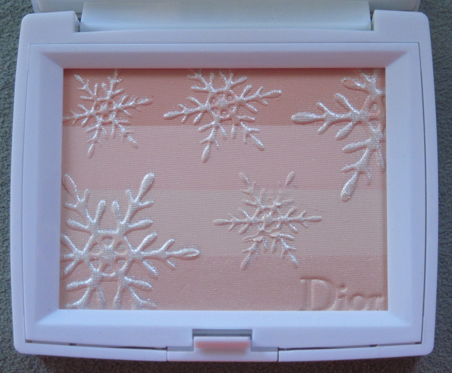
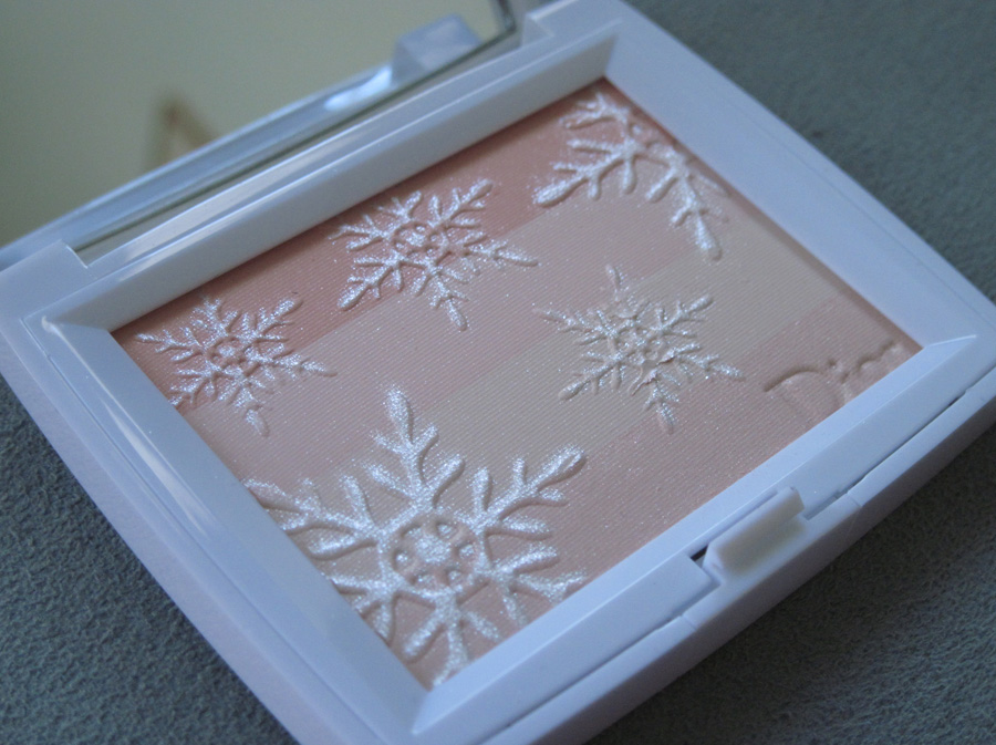
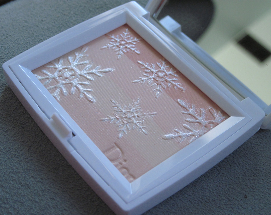
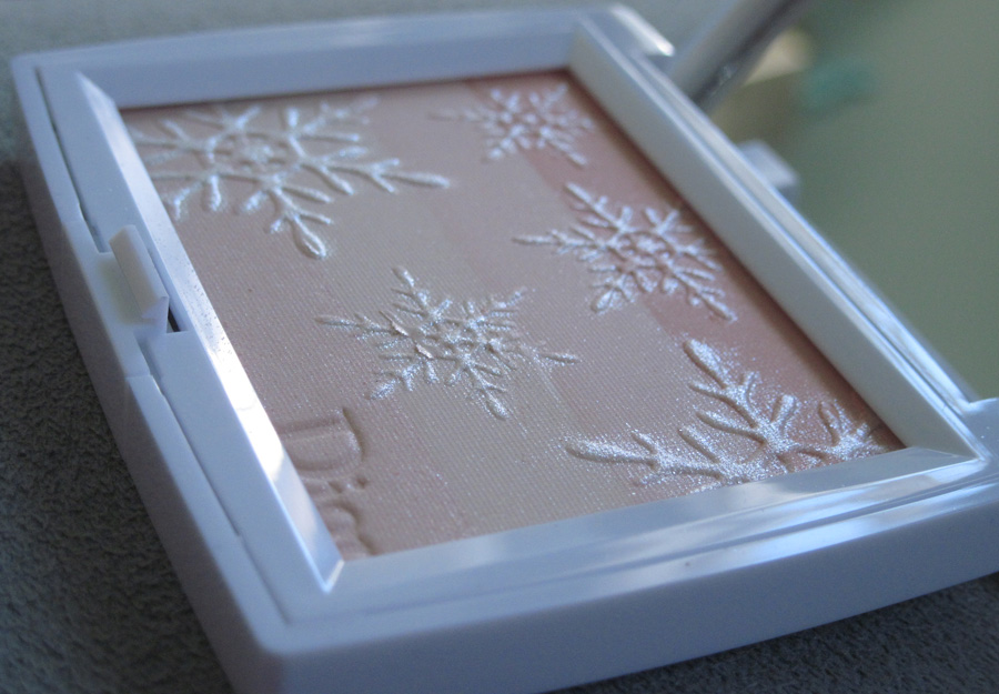
Inside, white shimmering snowflakes gently drift against a background of pale pink stripes with the Dior name in the lower right corner.


With flash:

According to the Dior website, the palette was designed by Dior makeup artist Yasuhior Tokunaga especially for Asian skintones. "Like the sky reflected in snow…A hazy, barely blue sky, ice crystals that toy with the light… Dior draws inspiration from the beauty of winter to create Diorsnow Icy Halos. Inspired by the purity of snow crystals, Diorsnow Voile de Neige is applied as a final touch of beauty whose transparency reveals the skin's radiance. The 4 Voile de Neige shades were specially designed for Asian skin. Once blended, the four delicate shades give the face beauty and synergy. The radiant pink gives the complexion a healthy rosy glow. The pale pink neutralises the yellow of the skin tone, giving it greater freshness. The soft beige swathes the skin in a lightly golden halo. Finally, the pearly pink catches the light in incredible fashion. The four shades are rich in new-generation shimmers that reflect almost 100% of the light, just like snow. "
I wonder how the concept is different from the Lumières de Neige palette that was released in 2009:

(image from weloveshopping.com)
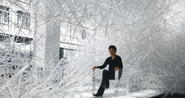
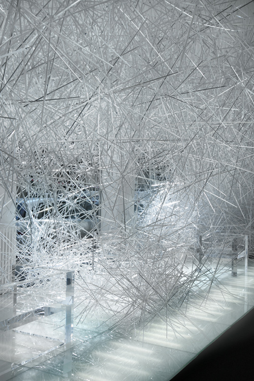
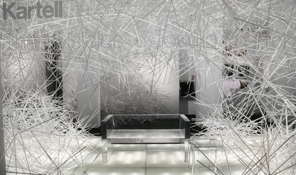
I like the idea of "ice crystals toying with the light" and the snow's luminous reflections. If I wasn't collecting this palette I'd use it for an ethereal glow. I also would like to be wearing it should I ever experience an installation like this. Designer Tokujin Yoshioka created an otherwordly installation for design chain Kartell's flagship store in Milan to go with his "Invisibles" collection – furniture made of sturdy clear acrylic that will leave the sitter feeling as though they are floating in mid-air.


(images from architecturephoto.net and cubeme.com)
Says the artist for the Snowflake installation: "I will create a serene world with numerous transparent prism sticks in plastic. The accumulation of transparent sticks is tinged with white color just like real snow. I believe that the installation will offer visitors extraordinary experiences as if stepping into the snowflake." This guy has great ideas – chairs that make you feel weightless and installations that mimic being nestled within a pristine snowflake? Both sound fantastic.
Getting back to the Dior palette, I think I prefer their other limited-edition palettes that reflect the history of the couture house (Mitzah, Tailleur Bar, etc.), plus I feel as though the design could have been a little more inventive. The snowflakes are all the same shape, but no two snowflakes are exactly alike, correct? They could have made them all a little different. Still, this is rather pretty and will make an excellent addition to winter exhibitions. If only I could get my hands on the 2009 version!
I have to admit, I was pretty excited when I saw this collaboration between Sephora and Pantone. When I first met my husband over a decade ago, I remember being fascinated with the Pantone color guides he had in his home office. I felt especially cool and design insider-y when he explained what they were and how they're used. Basically, Pantone is a standardized color system used by designers to accurately calibrate their color usage. "By standardizing the colors, different manufacturers in different locations can all refer to the Pantone system to make sure colors match without direct contact with one another."
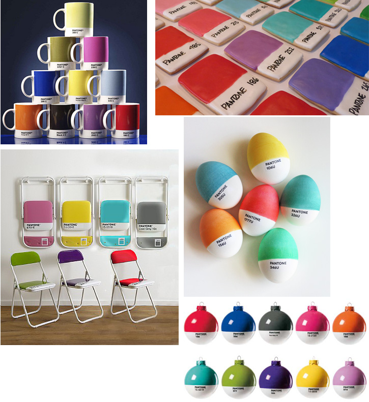
Lately though, Pantone has been making its way into the non-designer's world. The company introduced Pantone Universe, "a collection of lifestyle products based on fashion color trends for the consumer. The collection, consisting of tabletop, stationery items, travel gear, accessories and rainwear, combines timeless designs and modern materials with current trend colors." Us regular folks can buy or drool over a range of Pantone items or just Pantone-inspired ephemera like these:
 (Mugs from YumSugar, eggs from How About Orange ornaments from seletti.it, paint chip cookies by Kim Neill, folding chairs from The Holding Company, phone cases found at Design Boom)
Says the Pantone Universe website, "Color is essential to your life. The colors you love are deep and vital affirmations of who you are. Bringing those colors into your day and your environment is the ultimate form of self-expression." This would make an excellent makeup philosophy, which is why Sephora was a perfect partner for this company.
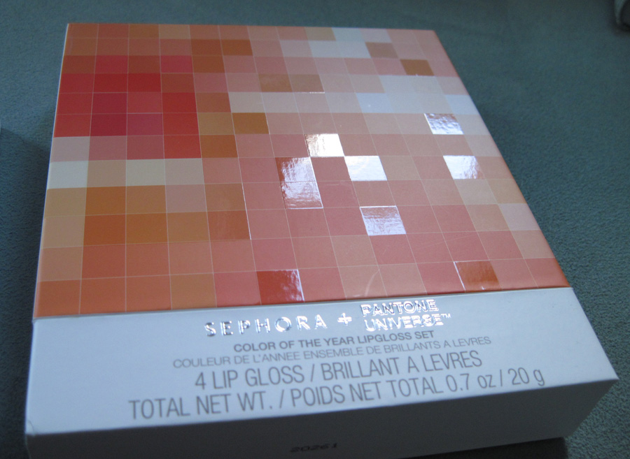
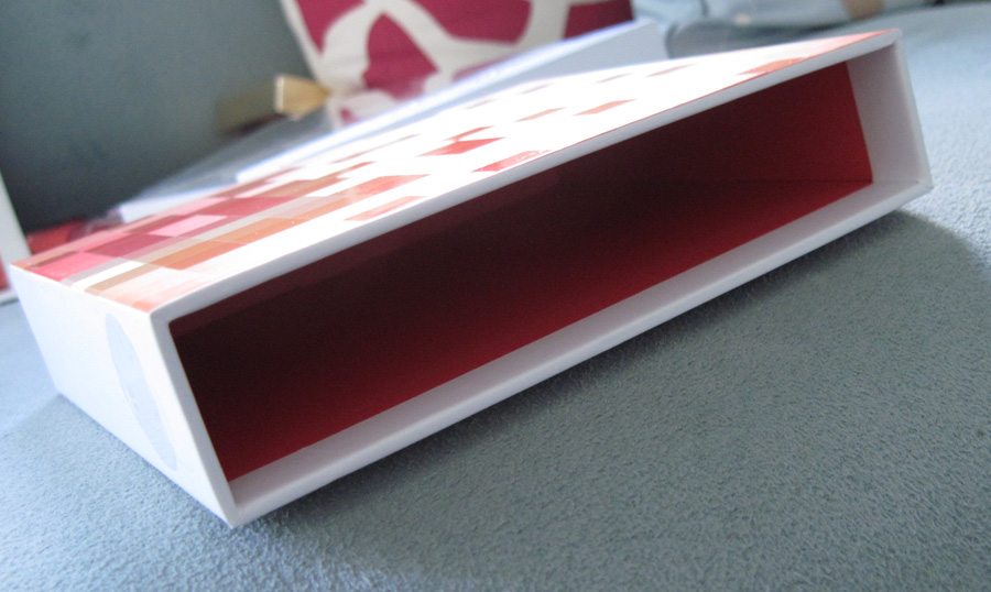
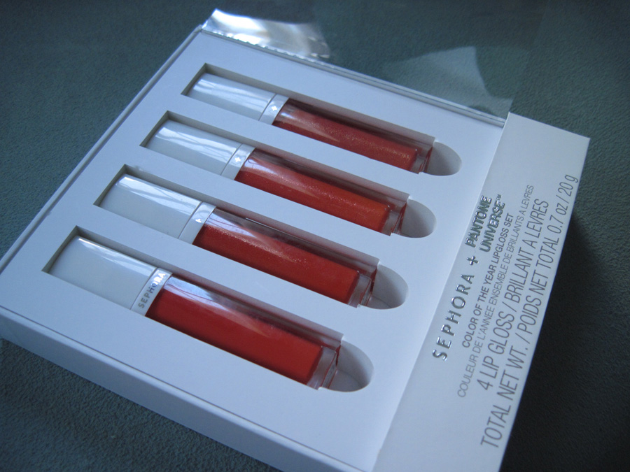
I got the Tangerine Tango lip gloss set, which includes 4 glosses and a pretty fancy box. I like the mix of matte and glossy finishes on the square swatches, along with the Tangerine Tango-lined interior.


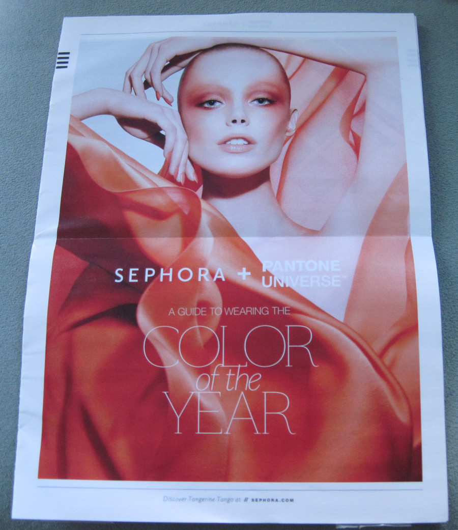
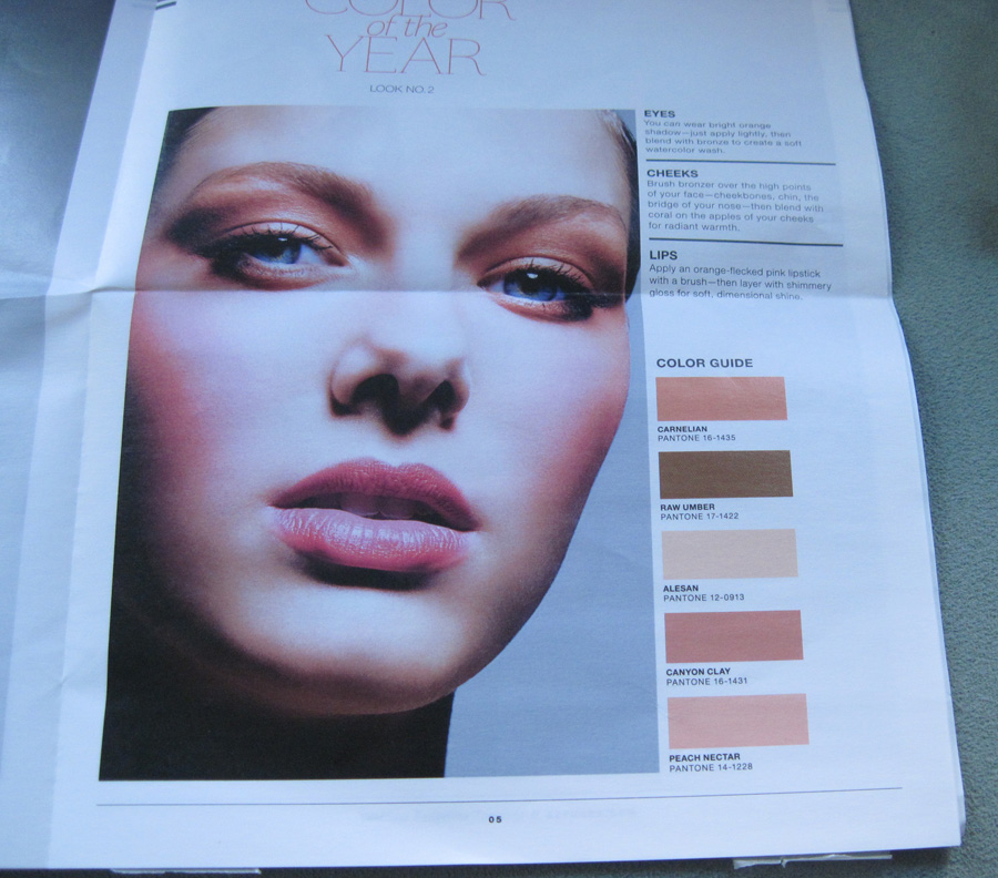
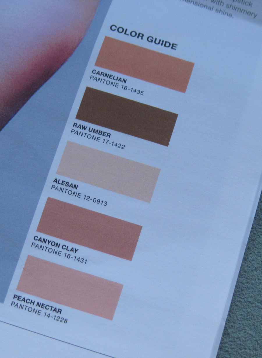
What was really cool though was the mailer I received from Sephora about the collection.

It explains how to wear the colors from the Pantone collection with other colors and details several different looks using the Pantone system. Here's look 2:


All in all, this was a lovely marriage of design and cosmetics. I wish Sephora (or other makeup companies) would do a Pantone color of the year collection every year.
Did you or will you be purchasing any Tangerine Tango items? And did you know what the Pantone system was before the Sephora collection came out?
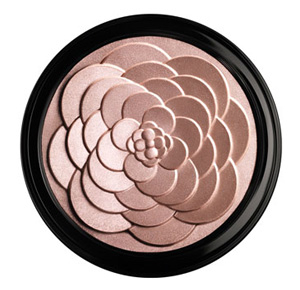
Just a quick post to point out how similar Guerlain's spring Cruel Gardenia highlighting powder is to Laura Mercier's Rose Rendezvous palette from the holidays. What's going on here? How did these two items with a nearly identical design manage to get released?

(image from neimanmarcus.com)
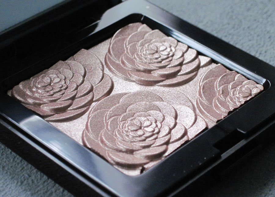
Compare to Rose Rendezvous:

Really, the only difference are the petals in the center: Guerlain's are more clustered while those in the Rose Rendezvous palette features a star-like pattern. (Although I find it funny that one calls it a rose and the other a gardenia when it's the same floral design!) These two are virtually twins so they weren't even worth a classic Makeup Museum smackdown, sniff. But don't worry, one is coming tomorrow. 😉
 (image from a MAC email)
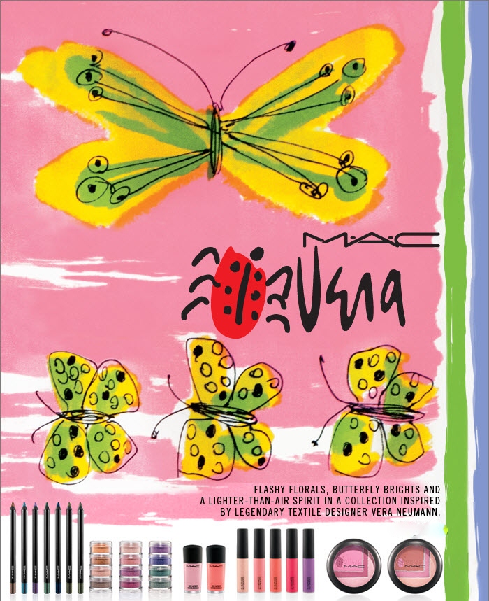
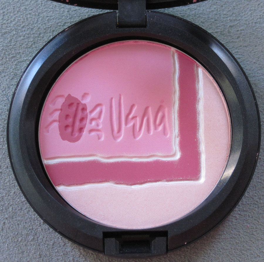
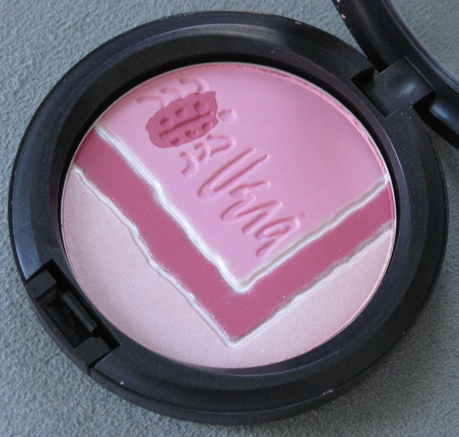
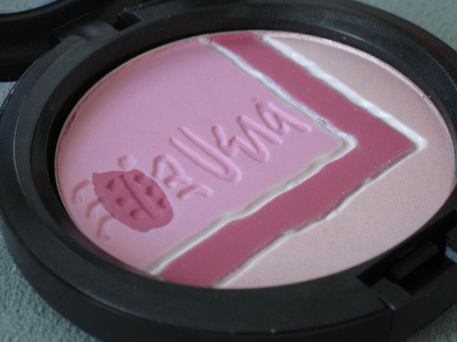
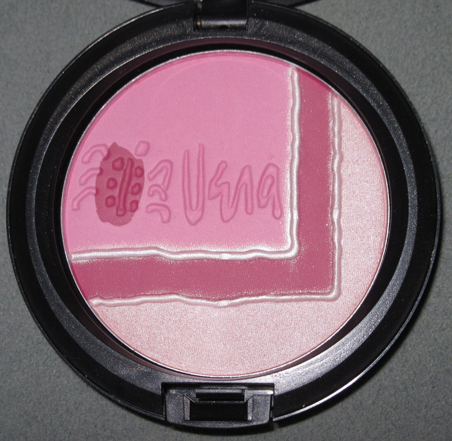
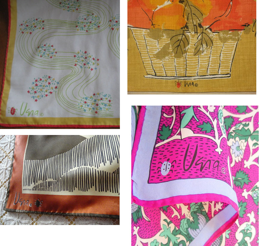
In keeping with the optimistic spirit that pervades the first week of spring, I present to you the Vera Neumann collection for MAC. "Brilliant butterflies, flashy florals and gorgeously geometric graphics…A colourful collaboration between M·A·C and the artist known worldwide as Vera, who merged fine arts with linens, murals, textiles and silk scarves in her punchy, painted patterns. Now in shades plucked straight from her most lavish prints, M·A·C Vera embraces the luxe, lighter-than-air spirit that delivers the kind of startling, look-at-me statement that defines what it means to be an instant classic." The colors are definitely Vera-inspired, but what interested me the most were the Pearlmatte Face Powders, which feature the artist's signature ladybug perched on what appears to be the edge of one of her wildly popular scarves. I picked up Sunday Afternoon:


With flash:

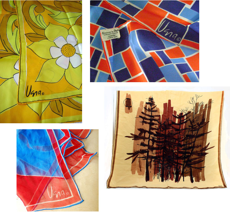
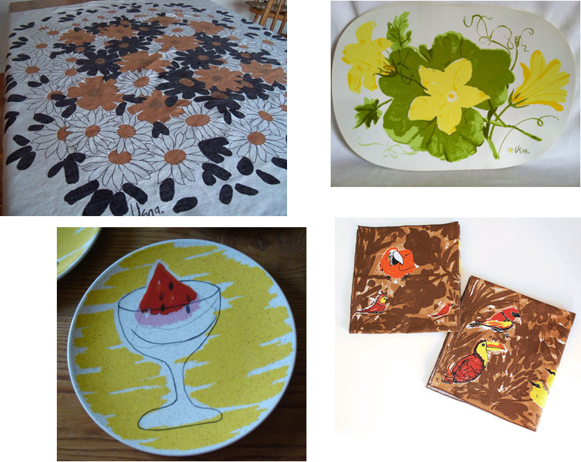
Despite being a pretty big design/art enthusiast, I have to admit I wasn't familiar with Vera Neumann's work. An artist turned textile designer, Vera's somewhat kitschy, colorful prints were household staples from the 1950s through the '70s.1 (I imagine she was sort of like the Orla Kiely of her time.)
From what I gathered she was best known for scarves:
 (images from artfire.com, cherryrivers.blogspot.com, and curiouscrowvintage on Etsy)
And a wide range of kitchenwares:
 (images from yorkshiregalhomeshop, hotcoolvintage [both on Etsy], thevintagetraveler.wordpress.com, and thamesandbrass on Etsy)
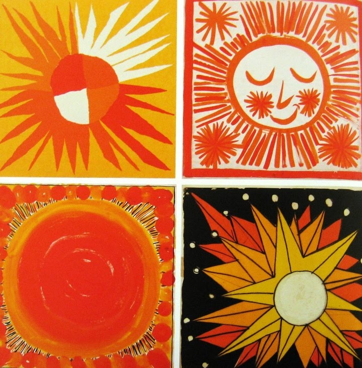
Note: These aren't necessarily the best images that came up, but I was determined to show authentic, vintage work by Vera rather than the ubiquitous reproductions found nowadays! Anyway, I think my favorite works by her are these cheerful sun prints she created for the 1964 World's Fair.
 (image from ellenbloom.blogspot.com)
Getting back to the MAC palette, I thought I'd include some examples of the ladybug that accompanied her signature.
 (images from sixballoons.blogspot.com, retrorenovation.com, vintagedetail.blogspot.com, smilesgowitheverything.com)
"A ladybug means good luck in every language," she explained about her signature motif. While I think it's great that MAC worked it into some of their collection's pieces, I think they could have done more for the outer packaging given the enormous wealth of prints and patterns to draw from. Maybe they just couldn't get the licensing to use her prints on the packaging, but I'm doubtful given how many companies have churned out Vera collections. In any case, this powder is quite charming and will make a nice piece for a spring exhibition.
What do you think, both of Vera's work and the MAC collection?
1For a great summary of her work and life, check out this post. And if you're really into Vera, buy this book.
I was introduced to this Italian brand via Beautifulwithbrains a few weeks ago. Leave it to the Europeans to be right on trend design-wise – geometric patterns and origami-inspired items seem to have been posted at every design blog in the past month or so. Just today Google honored origami artist Akira Yoshizawa by making the usual Google letters into origami shapes.
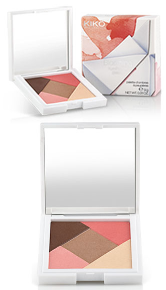
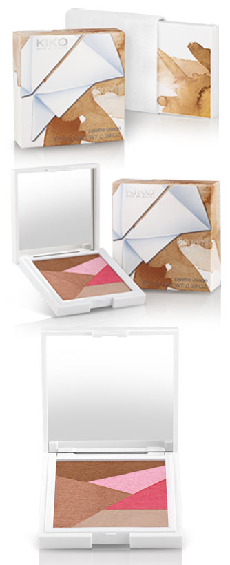
Here are some pieces from Kiko's Blooming Origami collection for spring 2012. I like the combination of colorful flowers against the stark delicacy of the white origami paper shapes on the packaging.
Eye shadow palette:

Face palette:

(images from kikocosmetics.com)
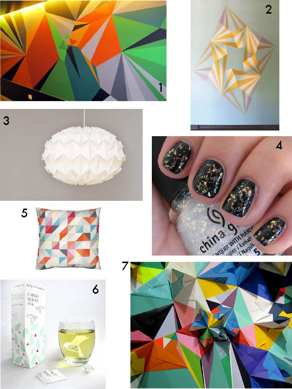
And because there are so many artists who specialize in geometrical motifs and so much origami- and geometry-inspired design lately, I couldn't narrow it down to just one. Enjoy a little collage of the angled goodness I've spotted making the rounds.

1. Mural by Matt W. Moore at Vincci Bit Hotel in Barcelona (via DesignMilk)
2. Almost But Nich by Jay Shinn (via DesignMilk)
3. Origami lamp shades by Studio Snowpuppe (via Design Crush)
4. China Glaze Luxe and Lush nail polish (via BlushingNoir)
5. Geometric pillow at John Lewis (via Creature Comforts)
6. Origami tea bags by Natalia Ponomareva (via Fokal)
7. Geometric paper installation by Nuria Mora (via DesignSponge)
Questions: which one of these looks most like Kiko's design? And which one do you like the most? I think that trippy wall mural most resembles the Kiko shapes. I also think it's my favorite, although the origami tea bags are pretty sweet too!
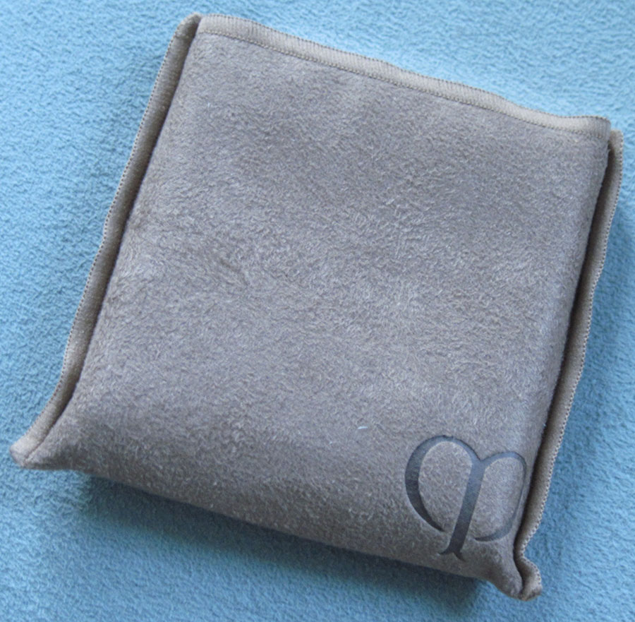
I couldn't resist scooping up this gorgeous highlighter from Clé de Peau.


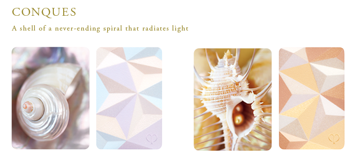
The colors are inspired by the luminous hues found in seashells (a similar idea to Armani's Madreperla palette):
 (image from cledepeau-beaute.com)
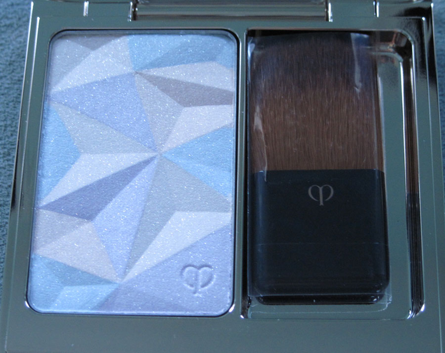
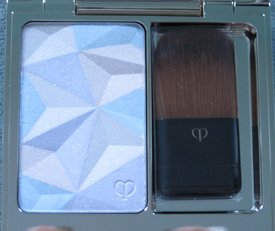
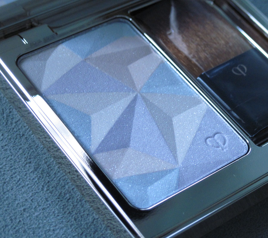
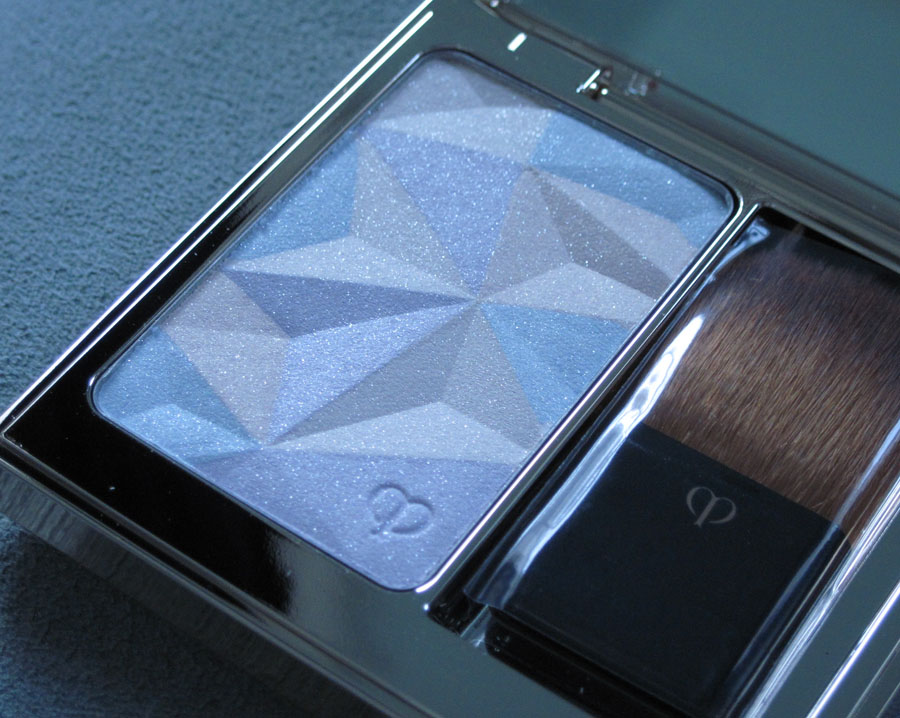
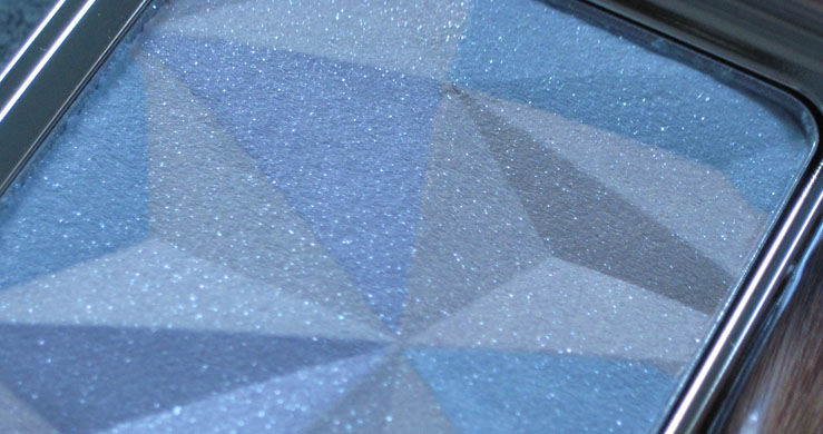
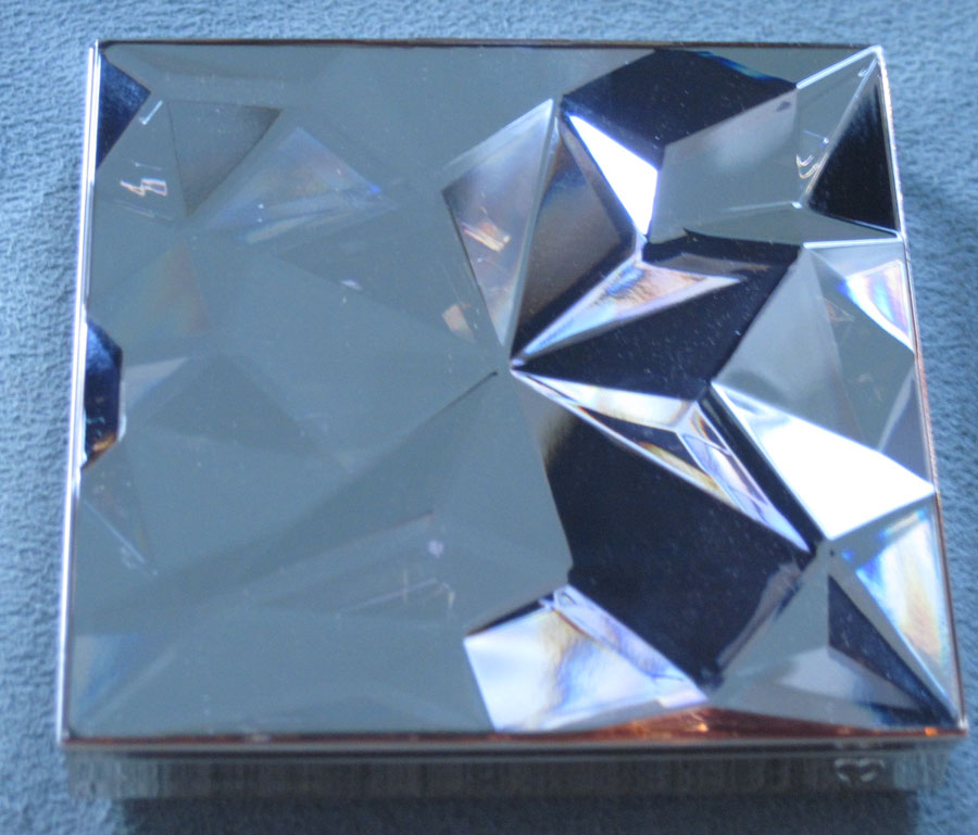
Here are some more close-ups – I love how the sharp angles are made softer by the shimmer and pastel shades:


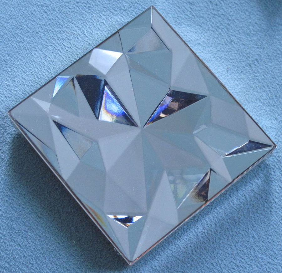
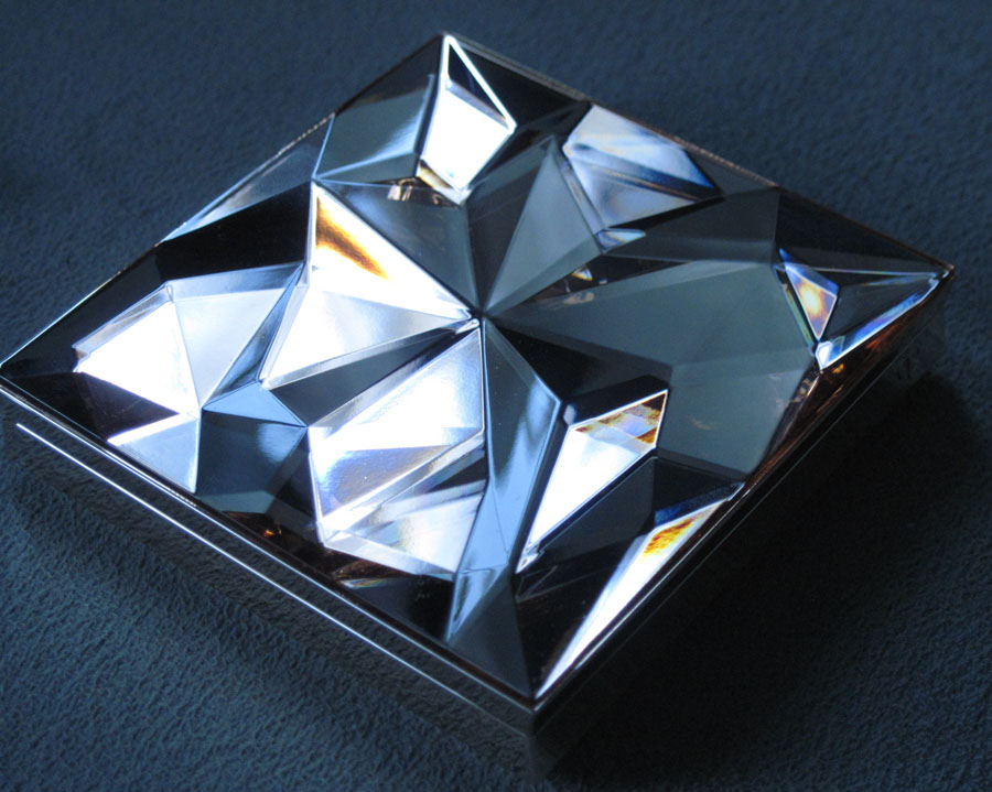
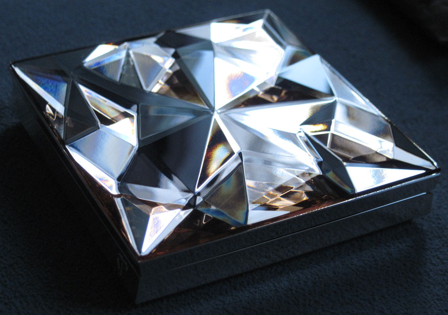
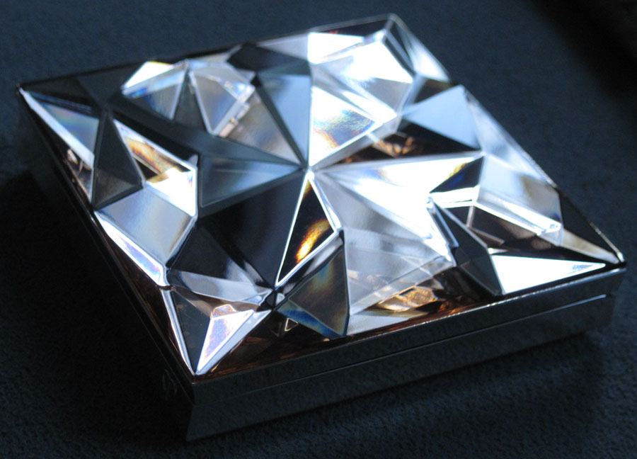
Yes, the powder is gorgeous, but what I really want to talk about is the outer case. It was created by jewelry designer Shaun Leane, who had this to say about the design: “When we first designed the compact, our thought was to craft a piece which was both tactile and desirable. In terms of its aesthetic, we wanted the design to be as though it was a jewel with a multitude of facets; to be chic, sophisticated, whilst exuding an element of glamour and fun, just like the lady who will be inspired by it.”
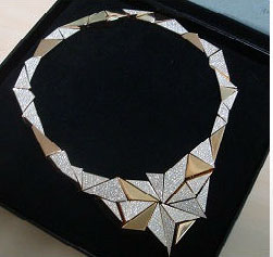
Leane also made a stunning gold "Reflection" necklace to be displayed at the brand's store in Tokyo's Ginza district. Set with 1,355 diamonds, this little piece of extravagance embodies the luxe, gem-like nature of the compact.

(image from racked.com)
In case you're wondering, the necklace is for display purposes only and is not for sale. However, I think it should be donated to the Museum. 😉
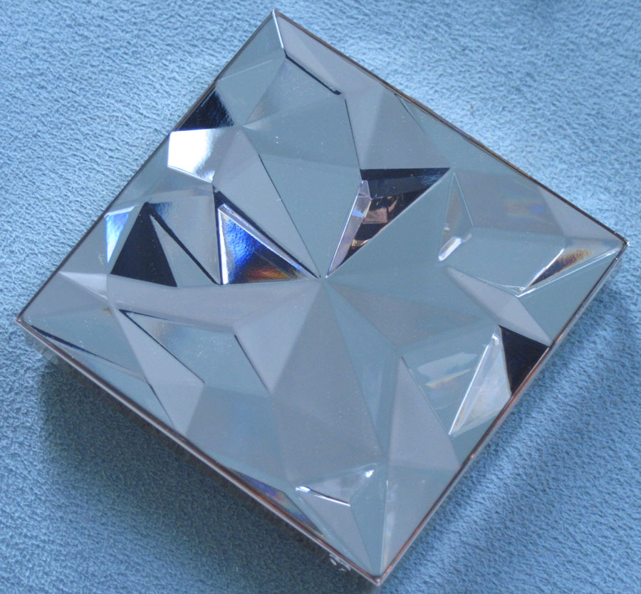
Anyway, here are some more pictures of the outer case. I admire Lane's restraint in this design. While he could have taken the easy way out and stuck a bunch of tiny rhinestones on the case to mimic the necklace's diamonds (hello, gaudy), he went with reflective geometric planes cut in such a way to make the case look like a real, 3D gem (it's totally smooth to the touch).


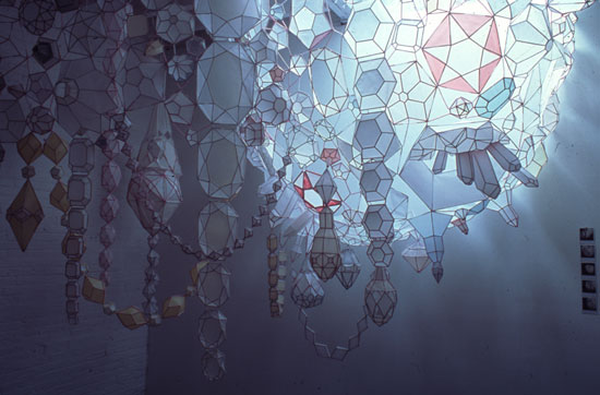
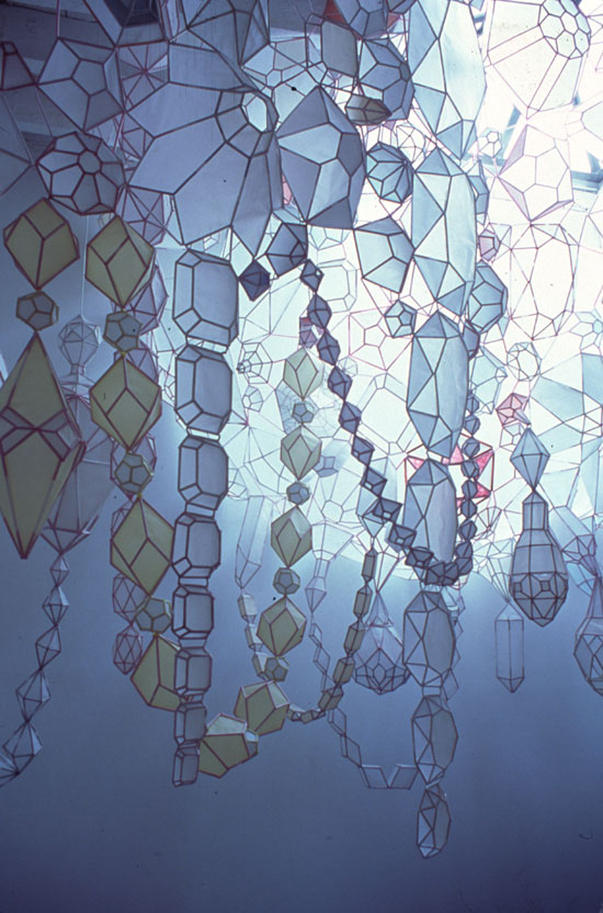
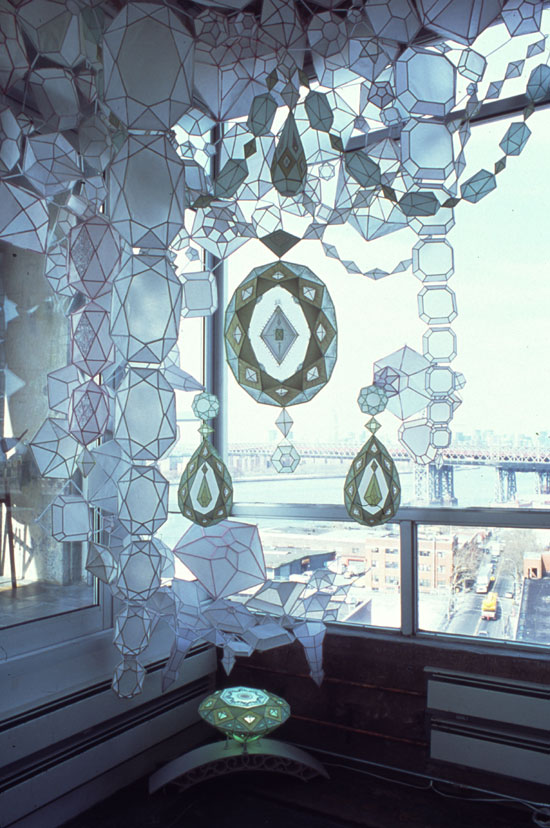
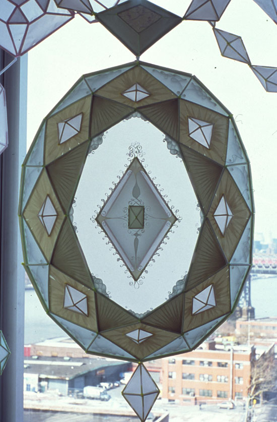
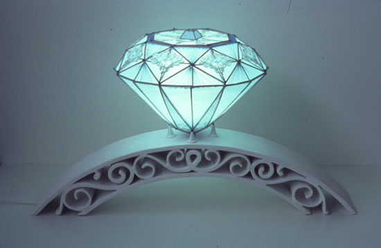
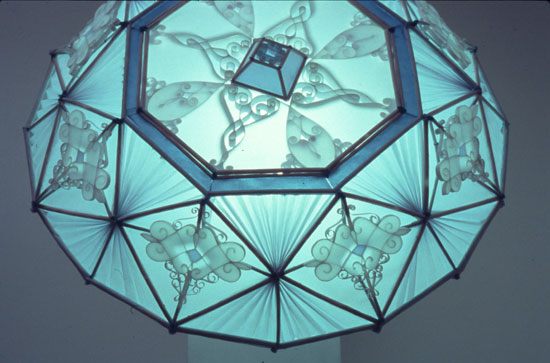
All of this talk of facets and opulent jewels reminded me of Kirsten Hassenfeld's work, which I first spotted at The Jealous Curator a while ago. In the early 2000s Hassenfeld created a series of gemstones constructed entirely out of paper.
Dollar Dreams, 2002:


Parure, 2003:


Blue Fancy, 2003 (which looks to be part of the Parure installation above):

 (images from bellwethergallery.com)
While Hassenfeld's work has taken a slightly different direction in recent years, these pieces focus on the themes of luxury and privilege. From the press release at Bellwether Gallery for her 2004 show:
"Kirsten Hassenfeld creates extravagantly decorated, over-sized translucent gem and crystalline sculptures painstakingly crafted predominantly from paper. Borrowing forms and techniques from jewelry and other luxury goods, she creates opulent hybrids of traditional decorative art and otherworldly excess. Her works speak to notions of privilege, ownership, family pedigree, and the confusion of what we have with who we are through an embarrassment of riches…Kirsten playfully evokes traditional markers of power and symbols of plenty, mixing their opulence with the fragility of the hand hewn." Says the artist: "My work has evolved into a three-dimensional daydream in which my ambivalence toward material wealth and privilege is expressed. Precious objects speak about the cultures that produce and consume them; I revamp these objects with decidedly un-precious materials and varying scales, making fantasy tangible in a manner that calls into question what is considered precious. I conjure up for the viewer concoctions of wishes in an ephemeral form, promoting a state of wistful half-fulfillment. My sculptures, as they reference specific markers of status, are themselves part of a larger economy of privilege. Contemporary art is, in the most extreme way, a luxury. My artwork self-consciously acknowledges its own extravagance and impracticality."
I'm interested in the how these works question the idea of worth – how valuable are jewels if they're made out of paper? And in the case of Clé de Peau, out of plastic and powder? While the brand is known for jewel motifs (see their vintage Holiday palettes) this time the company hired an actual jewelry designer to make the compact and the accompanying necklace. Even more so than with previous palettes, they're trying to appeal to consumers' desire for status and luxury by showing the compact with an exclusive necklace that is so precious that it's not even for sale – purchasing the compact means we can have a little taste of what priceless feels like, the "wistful half-fulfillment" that Hassenfeld mentions.
This tactic works – for me, anyway. I wasn't going to buy the compact until I saw that necklace! What are your thoughts on the palette and on Hassenfeld's work?
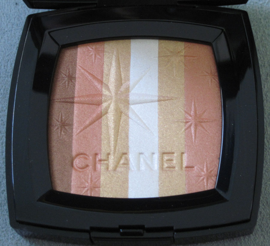
This was quite the sneaky little surprise from Chanel. In honor of their remodeled boutique in the Bellagio Hotel in Las Vegas, the company released a small collection consisting of golden lip liner, lipstick and nail polish along with a highlighter – the Lucky Stripes palette. From the press release:
"A city arises from the middle of nowhere in a feverish vision, like a mirage. Under the azure blue of a cloudless sky, Las Vegas keeps the desert dust at bay in the hypnotic ballet of neon lights. Along the Strip, the luxury hotels and casinos set the scene for a modern fairytale in which all dreams are possible. Amongst them stands the Bellagio Hotel. Its sumptuous gallery will welcome an entirely remodeled CHANEL boutique in earlier this year. An elegant stopover in a modern-day treasure hunt.
Peter Philips, Creative Director of CHANEL Makeup, creates a gold-plated collection and strews stardust over polyester dreams. The iconic gold of CHANEL elegance slips into every texture. A silky powder on the skin, sunny lacquer on the nails or a sheer whisper on the lips, it highlights a radiant face that’s on a lucky streak.
The Exclusive Creation of the collection concentrates the entire spirit of Las Vegas in its traditional square case. Lined up in rows, four shades of sand and bronze sweep through every variation of a fabulous desert in which gold embraces the sun and shines. On the surface of the colours, an embossed star design seems to extend a warm welcome to the city of dreams."
As soon as I saw this I knew I had to have it for the Museum. It's a beautiful combination of warm-hued stripes with a large, off-centered star, several smaller stars scattered throughout and the Chanel name debossed at the bottom.


With flash:


I love that the star is a replica of the eight-pointed one that appears on the famously flashy Las Vegas welcome sign (of course, the best picture of this sign involves Traveling Babo):

(image from en.wikipedia.org)
The 25-foot sign was designed by Betty Willis and built in 1959. While the sign itself has been replaced, the original design remains intact. What's really cool is that Willis considered the design to be her gift to the city – she never copyrighted it so that it could belong in the public domain.
I have to admit that when I first saw the palette, I didn't immediately think of the Las Vegas sign. Rather, that retro star reminded me of the ones from the bowling alley in the film The Big Lebowski:

(image from blog.moviefone.com)

(image from seattletimes.nwsource.com)

(image from granadatheater.com)
The movie was filmed at Hollywood Star Lanes. Sadly that alley was demolished to make way for an elementary school in 2003, but the style lives on in Lucky Strike Lanes:

(image from eventup.com)
Anyway, I've never been to Vegas but have always wanted to (even though I'm afraid I might get a seizure/panic attack from all the lights!) I think the Chanel palette is an understated, slightly more subtle representation of the city's vibe – when I think of Vegas I think bright, garish colors and glitter everywhere. Lucky Stripes tastefully works in a Vegas icon and keeps the shimmer fairly restrained.
Questions for you: 1. Do you like the Lucky Stripes palette? 2. Have you ever been to Vegas? and 3. Do you like The Big Lebowski? Actually that last question is just silly – everyone loves The Big Lebowski and if you don't (or if, gasp, you haven't seen it) there's something wrong with you! 🙂
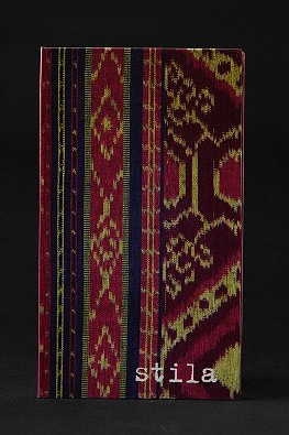
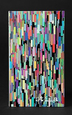
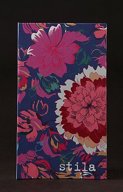
Stila has released three more $14 travel-sized palettes, this time for Urban Outfitters. I'm guessing that since Stila girls might be a little too cutesy/girly for the average UO consumer, Stila came up with these designs instead.
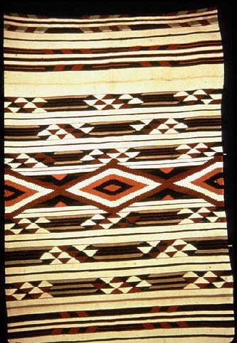
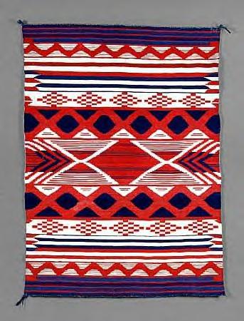
First up is a vaguely Native American geometric pattern. I'm wondering if it was originally labeled as Navajo and got pulled as a result of the kerfluffle surrounding UO's "Navajo" line of items, but probably not. None of the three palettes are named anything in particular – only referred to as "pocket palettes".

Admittedly, it does look like a bit like Navajo blankets:

(image from tfaoi.com)

(image from turtletrack.org)
The second palette features vertically-overlapping multicolored rectangles – this one's my favorite, as the Curator loves abstract art.

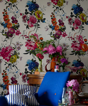
And finally we have a basic floral pattern, which to my eye looks like it would be more at home at Anthropologie than at Urban Outfitters. It's not overly sweet and girly, but it resembles wallpaper to me.

(palette images from urbanoutfitters.com)
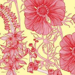
Wallpaper from Designers' Guild and Camilla Meijer:


So what do you think of all these? Anything worth buying as a collectible? I can't think of a time when I'd display 2 out of the 3, but the abstract rectangle palette is softly calling my name.
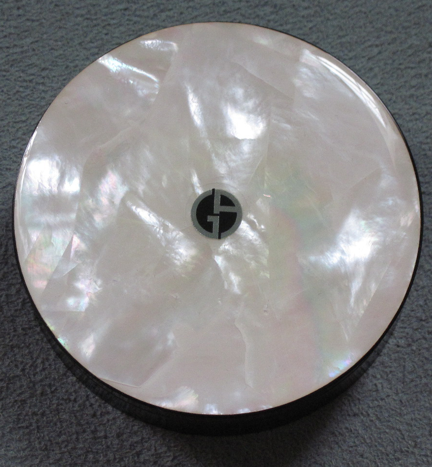
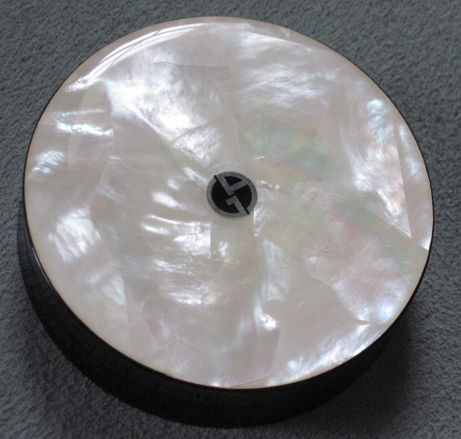
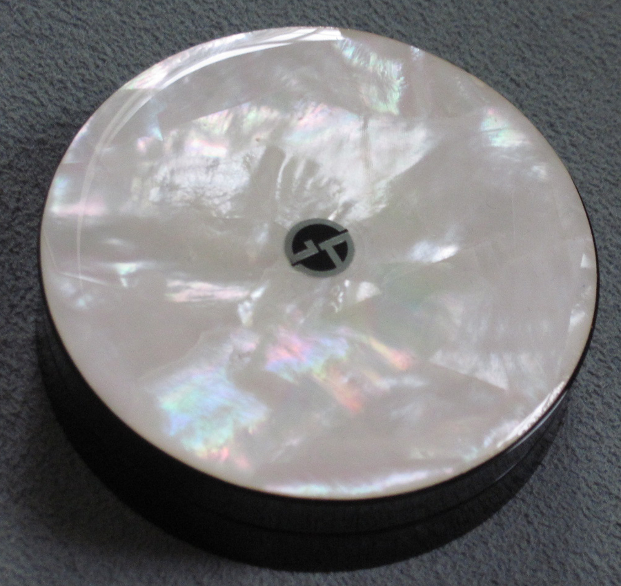
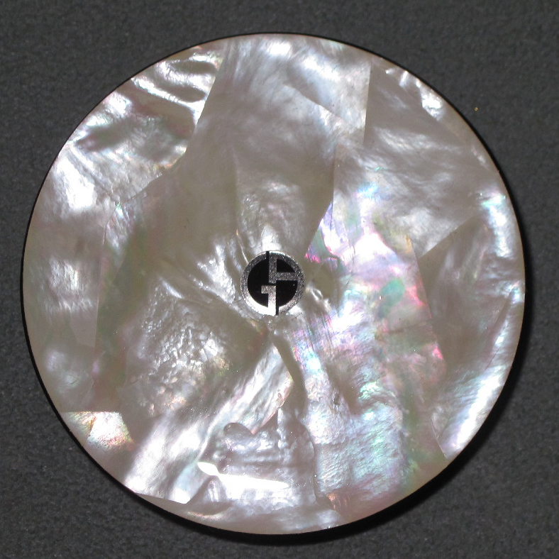
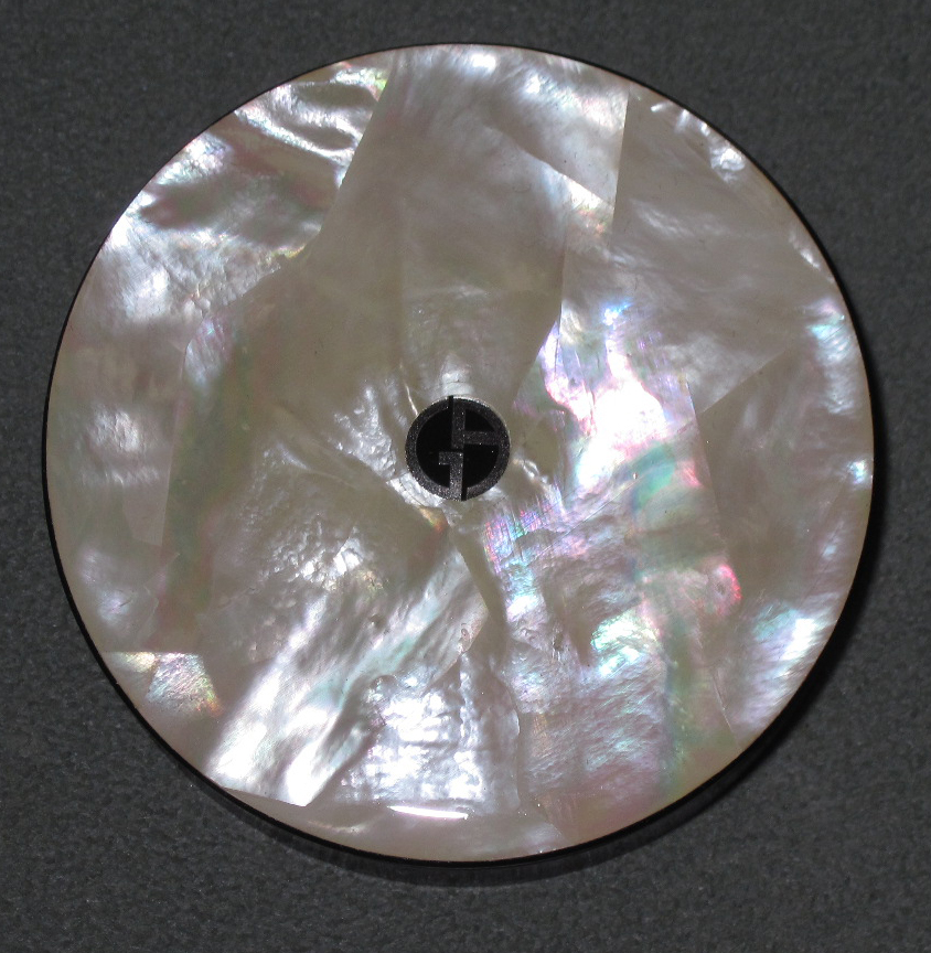
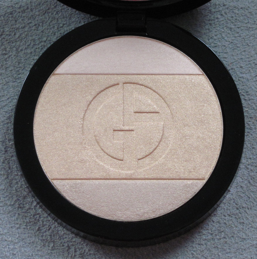
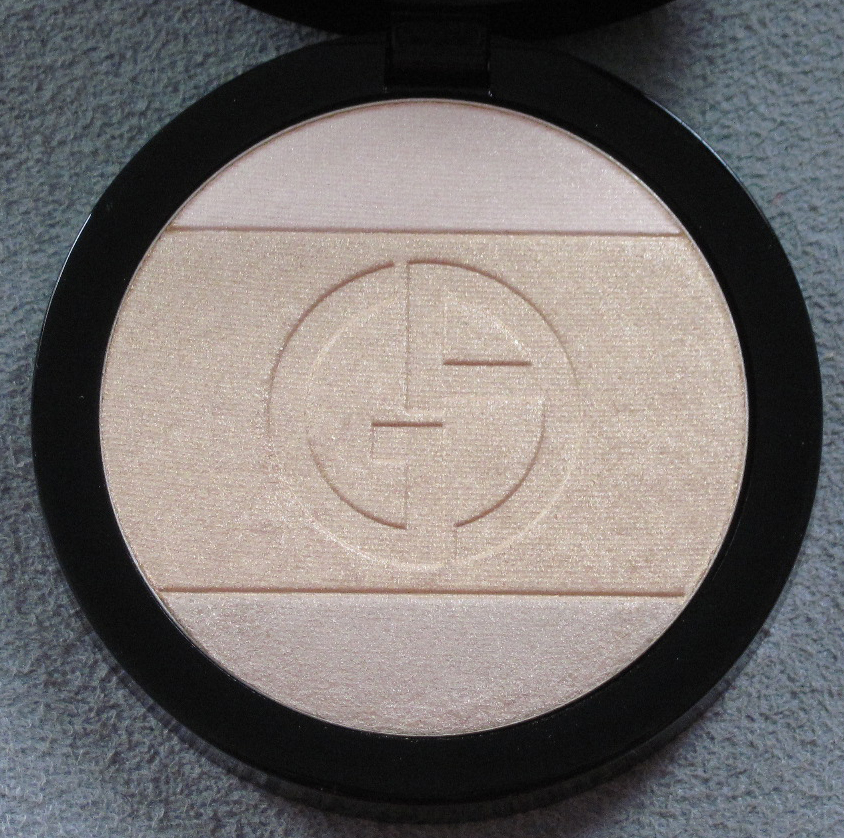
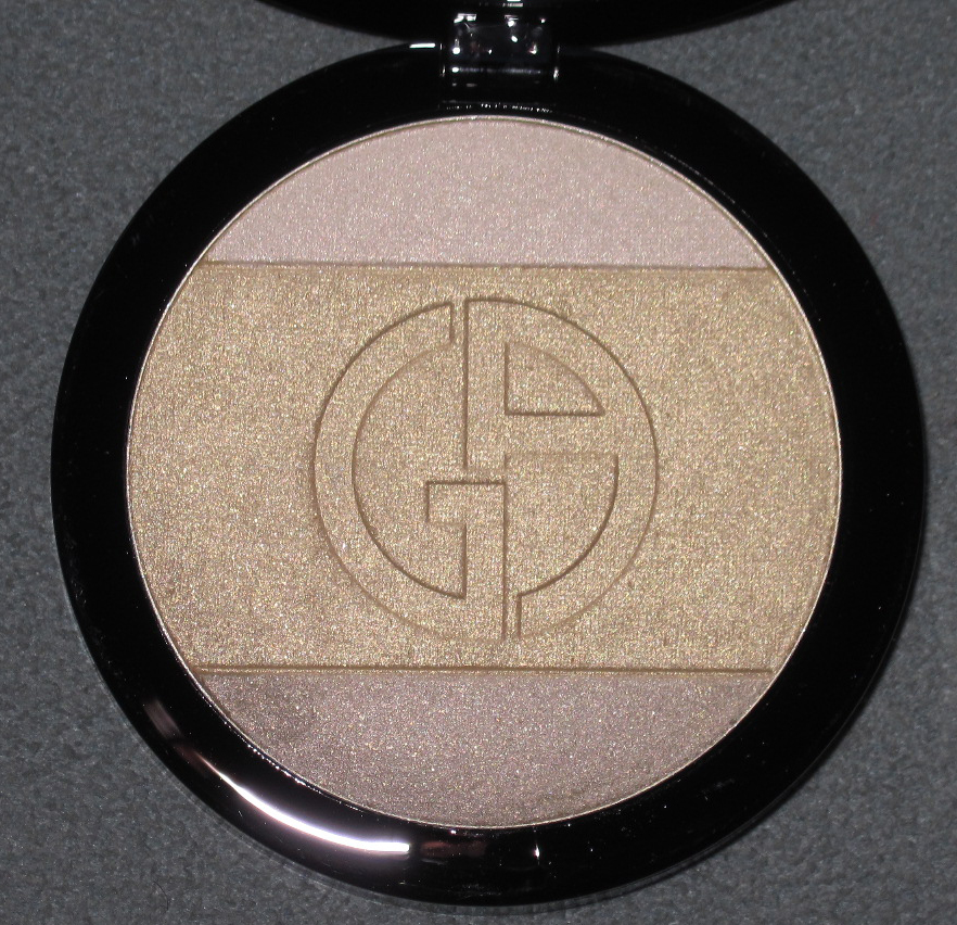
I was a bit nervous about getting my hands on this, as apparently only 3,000 were produced, but I made it mine. (I am now skeptical that this is in such limited supply as it was fairly easy to get and is also not numbered). As part of the holiday 2011 collection Armani introduced the Madreperla (mother-of-pearl) Face and Eye Palette. Inspired by Armani's spring 2012 ready-to-wear show, this palette features a handmade, genuine mother-of-pearl outer case with the Armani logo centered in silver.


You can really see the prism-like iridescence towards the bottom from this angle:

With flash, so you can see the different ways the light reflects off the pearly surface:


Here's the interior:


With flash:

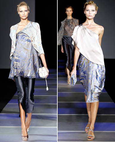
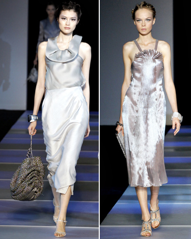
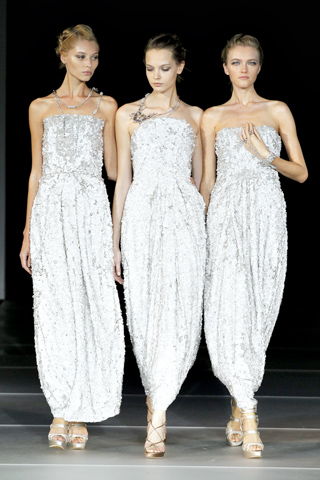
According to Women's Wear Daily, Armani stated about the show, “The idea…is taking all the colors from the pearl. Everything is a play on light; the shiny effect comes and goes.” Indeed, the palette for the clothes included whites and ivories, pale blue and lavender, and charcoal, all infused with an ethereal sheen evoking a "madreperla" surface.


(images from style.com)
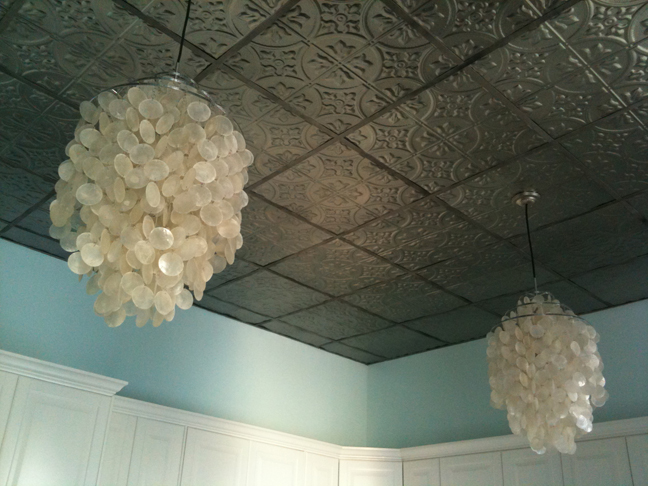
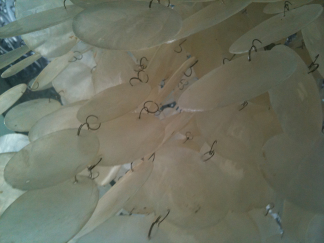
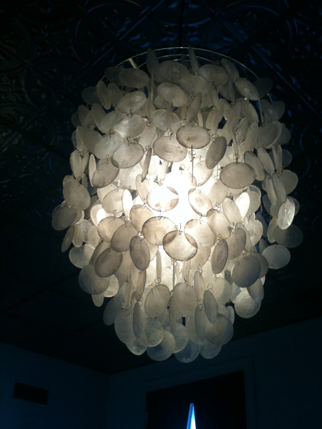
While the use of mother-of-pearl as a vehicle for playing with light and reflections in a fashion and makeup context is pretty genious, I must say that it has been done before in interior design. Iconic designer Verner Panton had the extremely clever idea way back in the 60s to use mother-of-pearl discs as surroundings for a lamp. Here are the "Fun 1DM " series lights in our kitchen:


A little history behind his use of mother-of-pearl: "The raw material chosen was something as unusual as large sea shells, coated on the inside with motherof-pearl and which were available by the million in the Tropics. If these shells could be sold in Europe, it would give the economies of various developing countries a cash injection and perhaps form the foundation for a unique product. This is how the mother-of-pearl Fun series was born – and later the series was also produced in metal. A feature of both was the stunning interplay of light and sound produced by the lamps when just a slight breeze was blowing." It's true – a soft twinkly sound comes from the lights whenever there's a draft from our very old windows. (Side note: if you like the looks of these lights but don't want to shell out the money for them [pun fully intended] West Elm makes some good knockoffs.)
Anyway, getting back to the palette, it's also fitting that mother-of-pearl was utilized to house a product that illuminates one's features and highlight the areas where light hits most (cheekbones, browbones, etc.) Overall I think this was spot-on – it's a perfect extension of the spring 2012 fashion collection and it's elegant and unique to boot, as I don't think mother-of-pearl has ever been used on a contemporary palette. Armani's fascination with light effects doesn't end here, however: his entire spring 2012 makeup collection is devoted to light play and aptly named "Luce".
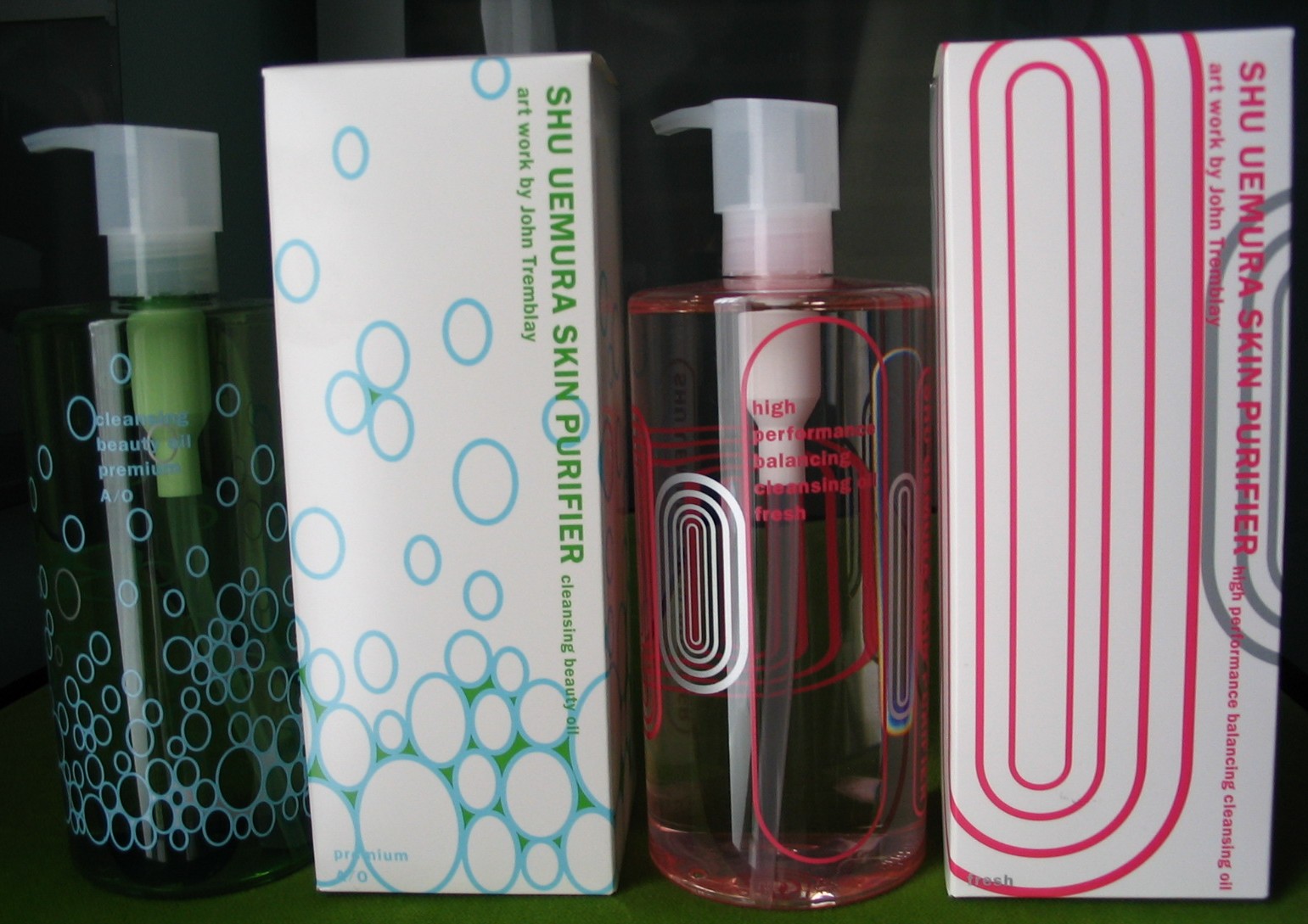
I was digging through the Museum archives today for some more things for the Fall exhibition (coming soon, once I can get around to it!) and thought I'd feature these pretty cleansing oils from Shu's 2006 fall collection. The company teamed up with New York-based artist John Tremblay, who created designs for each bottle based on their particular qualities, meant to interact with the contents of the bottle. "Shu Uemura brand manager Tina Tinio said, 'This year’s collection is more sophisticated and subtle; to be able to appreciate the design, you have to see how it interacts with the oil.'" While that statement makes it seem like Tremblay came up with these designs specifically for Shu, but in my opinion, they're essentially the same as his previous work.
We'll start with the Premium and Fresh oils:

The bubbles in the green oil and ovals in the pink oil are very similar to two works by Tremblay, Tourist Trap from 2006:

(image from artnet.com)
And Infinity Trial, 2003:

(image from art49.com)
According to this Malaysian news article, for the Premium oil, "The blue ovals representing oxygen found in the water and sky, ascending from the bottom to the top of the green oil bottle, signifying the buoyancy of life and the power of nature while the silver colour used signifies the energy of light reflecting off a shiny surface", while the Fresh oil bottle "features pink and metallic silver concentric ovals inspired by the shape of an air pocket in the bottle when the bottle is tilted on its side. The various sizes and layers of the ovals enable you to play with the bottle to fit the air pockets inside the ovals and to view the ovals on the other side of the bottle through the empty oval, as if gazing into future from a window." Interesting concept but I'm not sold. I guess the only thought Tremblay had to put into these particular designs was determining which of his earlier work would be most suitable for each oil.
Here are the Enriched and Regular oils:

The wavy oval on the Enriched bottle is similar to this work (unfortunately the image came from of a catalogue and there was no name or date on the page where it appeared):

(image from ecal.ch)
The Star article says that the Enriched oil "has seductive flow motion emblems in pink and yellow inspired by the flow of oil", and the Classic "features the design of olive and yellow ovals in varying sizes, inspired by the psychedelic 60s. The overlapping ovals expanding from one side to the other create geometric exchange constantly morphing when viewed through the transparent golden oil."
While the designs are rip-offs, somewhat, of Tremblay's earlier work, the way the company spun it such that they seemed to be created just for the qualities of the oils is pretty ingenious. If nothing else, some of the proceeds went to RxArt, a charity devoted to arts healing. And, of course, Shu made me recognize an interesting artist that I probably never would have discovered otherwise.
