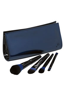
In honor of Bastille Day I thought I'd feature part of Lancôme's
Declaring Indigo collection, which is inspired by "French irreverence."
There is no shortage of compacts and palettes with interesting
packaging, but brushes are by and large neglected in terms of design.
That's why I was so happy to see this brush set featuring partially
blue bristles instead of the usual black or natural. The set is exclusive to Nordstrom, but the rest of the collection can be purchased at the Lancôme website. And for some great real-life pics, check out this post at Blogdorf Goodman.
(photo from nordstrom.com)
My post on Armani's Sienna Minerals palette reminded me of Shu's spring Mirage collection – lots of desert-themed makeup lately! All we need is a collection called Oasis. Anyway, the idea behind these was to "create an
illusion-like, unforgettable makeup image that gently and gradually
arises like a mirage." I understand the concept behind the makeup shades, but I'm not really sure how the abstract designs on the compacts are supposed to represent a mirage.

(photos from nordstrom.com)
To me they look more like billowing smoke. I think it would have been more interesting to have a mirror image of the design on each side. While this collection was a bit of a miss for me, Shu definitely redeemed itself with the lovely Tokyo Kamon Girls collection, which I am still adoring. (Availability udpate: I spotted some of the oils in Allure magazine's July issue, which means they will definitely be available in the U.S.!)
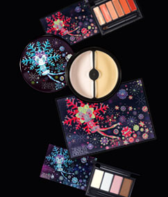
 The Curator is very late to this party (as I don't follow non-U.S. brands as closely as I should), but this collection is definitely museum-worthy so I am writing about it several months after its release. Korean brand Laneige released a spring line with illustrations done by Finnish designer Klaus Haapaniemi. The collection was "inspired by delicate splendid snow crystals" and the designs were meant to represent the "fairy-tale image of snow", in keeping with the brand's namesake. Whimsical without being juvenile and colorful without being garish, the designs encapsulate what the artist is best known for: a fun, modern twist on traditional Scandinavian folk art.
Haapaniemi's work is influenced not only by the art of his home country but also Russian and Eastern European cartoons. He also gets inspiration from the prints his theater costume designer grandmother used. He has collaborated with many companies including Diesel, Cacharel and Dolce & Gabbana. Hmm, maybe D&G could hire him not just for their clothes but for their new makeup line!
(photo from joseibi.com)
The graphic designer I hired (okay, he's my fiance) has come up with a truly fabulous logo for the Makeup Museum. He presented it to me in a range of awesome colors…and then informed me that I now owe him $3,000 for his work. I can only assume he was joking! In any case, I am very excited to share these.
#1:

#2:

#3:

#4:

#5:

While my favorite color combination is yellow and grey, I'm thinking the Museum needs bright red, reminiscent of a great lipstick shade. So I'm having him work on weaving that in somehow, along with making me some business cards. 🙂
Which one is your favorite? Post in the comments section!
 I was browsing Makeup Minute and came across a post about a new line
starting up by beauty tutorialist Lauren Luke. And the packaging for
her color kits is gorgeous! The Curator is very eager to get her hands
on these palettes, as they would be excellent in a spring exhibition. I also love how each flower corresponds to the colors inside, i.e., the green flower palette contains a host of green and the blushes/lip colors to go along with them, the blue flower one has blue shadows and the accompanying colors to create a complete look, etc. And they're fairly inexpensive, retailing for $32.50 each.
Clearly I need all of these…off to check my bank account. 😉

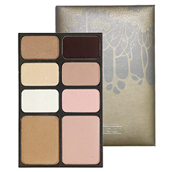
Ever since Allure magazine featured palettes by Hourglass I've been intrigued by them. Well, the not the palettes themselves but the leather case used to hold them! The delicate, understated trees have a gorgeous Art Nouveau character about them, and even the font on the Hourglass logo looks vaguely early 1900s. At the same time, the palettes have a modern sensibility in how compact they are as well as the colors and ingredients used. The colors are subtle and are carefully chosen to create a cohesive look – whether it's a tropical one (the Island palette, with its bronzes and light golds, would be perfect for a sun-kissed summer look) or a daring nighttime one (the smoky shades in the Dusk palette are spot on for this), there is a palette to fit any mood of the wearer. And as a skincare bonus, all of the blushes and shadows contain Vitamin E.
I do wish the packaging for the rest of the line outside the palettes was as interesting, or at least for the palettes to have different designs depending on the colors. They could just make the trees a different color to distinguish the palettes from one another…especially given that the makers of Hourglass seem to enjoy the tree motif – they've also created a separate bath and body line called, you guessed it, Trees. Here's hoping the palettes are merely a starting-off point for more pretty packaging!
(photo from sephora.com)
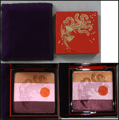
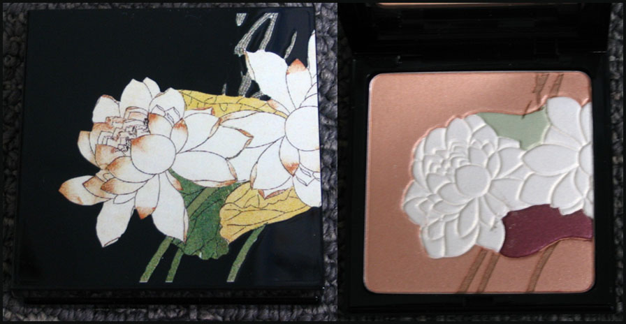
In honor of the 30th anniversary of YSL's Opium1 fragrance, the company released a limited-edition bottle and palette in the fall of 2007. The palette features a red lacquered case with an exquisite phoenix and floral details.

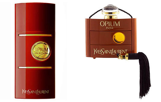
While I'm not really sure what the reddish orange dot on the interior is supposed to represent, it could just be referring to the circle on the fragrance bottles themselves:

(photos from yslbeautyus.com)
The iconography of the phoenix is a little strange – maybe it's meant to represent the "rebirth" of the fragrance, but truthfully I can't find any concrete explanation of why the company went with a phoenix.
In any case, I can understand why they would have released this to go with the fragrance's anniversary, but that doesn't quite explain why they came out with a limited-edition Opium fragrance bottle and a palette featuring a matching design in the fall of 2006.
Both the bottle and the palette are adorned with a beautiful lotus flower, because, according to the company, the bloom represents “purity and splendour." That's all well and good, but I think it would have been more interesting if they included a flower whose scent is one of the notes in the perfume, or if they wanted to be really adventurous, a poppy flower.1 ;) Plus I'm not sure what "purity and splendour" have to do with the fragrance considering the Sephora description for it:
"Rarely in the history of fragrance has a creation embodied such enchantment, mystery, magic, and exoticism…Opium symbolizes Yves Saint Laurent's fascination with the Orient and his unique understanding of a woman's hidden emotions and inexplicable passions." I think in this case though, "Orient" refers to China, since the company introduced many China-inspired fragrances in recent years.
Over all, both of these palettes represent the designer's "fascination with the Orient" and the spirit of the Opium fragrance – I like that the same image was used for both the perfume bottles and palettes. And they're simply gorgeous to look at!
1Allure reported that there was an entire museum exhibition devoted to the 30th anniversary of Opium in Paris, complete with a faux opium den. The curator is most upset she was not able to attend!
2 For a perfume blogger's perspective on the fragrance, click here.
(The Curator is very busy/tired…Couture Monday will return next week.)
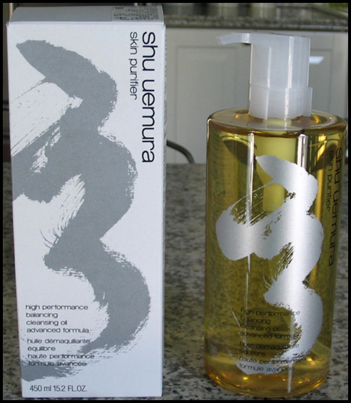
A few weeks ago I posted about Shu Uemura's latest cleansing oil, the Advanced Formula, which came with an abstract design on the bottle. I didn't know when it would be hitting the U.S. and surmised that this wasn't an artist collaboration since there was no mention of an outside artist on the bottle or box. This morning though I received an e-mail from the company announcing the U.S. release of this oil and they revealed what that design is – it's calligraphy from Mr. Uemura himself! Here's my picture again:

Silly me, it should have dawned on me that it was calligraphy, and calligraphy from Shu himself – that's very fitting. But trained in Western art that I am, I thought it had more of an abstract expressionist feel to it. In any case, I'm happy to find out what it was!
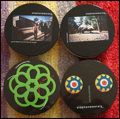
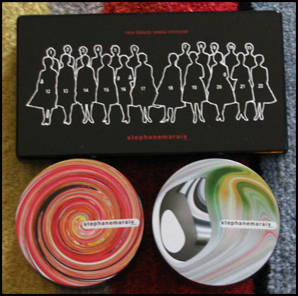
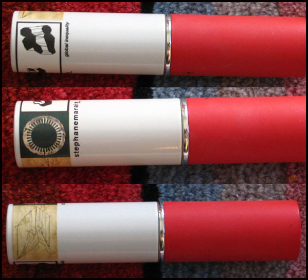
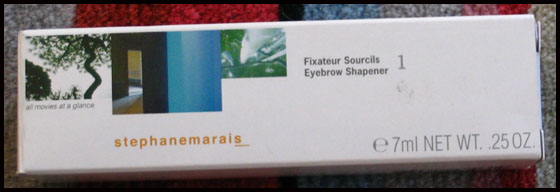
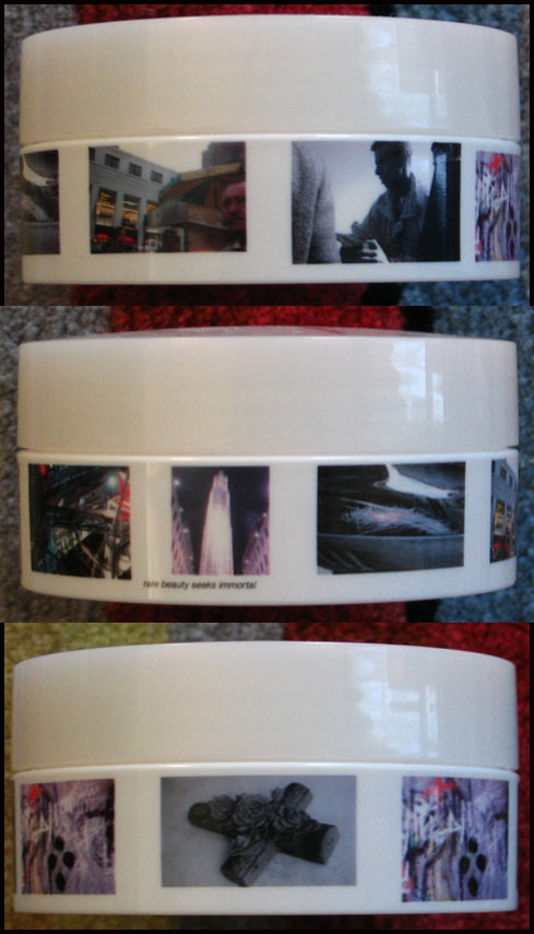
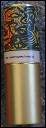
Makeup artist Stéphane Marais launched his line of cosmetics in 2002. The collection featured bizarre designs on the packaging unlike anything I've ever seen in makeup. Naturally I had to get my hands on as much of it as possible!
Some of the eyeshadows:
Powder foundation and gel eye liners:
Stick concealer:
Brow gel:
Loose powder:
And a lipstick:
I'm not really sure what a dinosaur or phrases like "Groove flowers up to the sky. Ohh my god" and "Only for primates" have to do with makeup, but the designs truly were different than anything on the market. According to one source the images were an "ode to Marais's work in fashion shows for Jean Paul Gautier, and advertising campaigns for Dior, Calvin Klein and Givenchy." His original idea was to change the packaging every season, because "You have to keep your customer amused. The approach is very childish, rich — like a candy store.'' It's also a commentary on the fast-paced, ever-changing fashion world.1
Sadly the line was discontinued in 2005, but I'm forever hoping for something with comparable packaging.
1 "Cosmetics That Change with the Seasons," Ruth La Ferla, New York Times, June 1, 2004.
Graphic artist and creator of Tokidoki, Simone Legno, collaborated with Smashbox in the spring of 2007 and came up with a whimsical, playful collection for the company. All of the limited-edition items featured Tokidoki's signature illustrations as well as Italian names such as Bella (the cream blush stick), Stellina (the mirror outfitted with small silver stars) and Modella (one of the eye shadow palettes.) In this way it fuses Japanese and Italian cultures.
Here's the Modella eye shadow quad:
Here's the compact opened – a nice little surprise awaits on the lower-left corner of the mirror:
1 "Designs Reveal Artist's Personality", Nadine Kam, January 11, 2007. https://starbulletin.com/2007/01/11/features/story02.html. To watch an interview with Legno, click here.
