This post has been in the making for literally years. I finally conceded that I couldn't find a complete history of either Benefit's Glamourette compact, released in 2002, or the vintage compact it was based on, House of Platé's Trio-ette (ca. 1944-1947). But I did turn up a few nuggets of information, so figured I'd share the little bit that was readily available.

House of Platé Trio-ette compact (ca. 1944-1947) and Benefit Glamourette compact (ca. 2002-2003)

House of Platé Trio-ette compact (ca. 1944-1947) and Benefit Glamourette compact (ca. 2002-2003)

The House of Platé company was established in 1944 by Robert T. Plate in Detroit. From what I was able to piece together from various archives, it seems Plate was born in 1897 in Lima, Ohio and received a Bachelor's degree in mechanical engineering from the University of Michigan in 1923. Specializing in automobile design, his first job was draftsman for the Willys-Overland Company in Toledo. Beginning in 1932 Plate worked for General Motors, and in 1938 he was doing business as the Plate Manufacturing Company. In 1945 he trademarked the Trio-ette compact under Curly Lox Products.  The biggest mystery for me is why Plate decided to market cosmetics. I'm assuming it was a side hustle to earn a little extra cash, or maybe he thought he could become the next Max Factor. (As a side note, Plate moved quite frequently throughout his life, bouncing around from Ohio to Michigan to New York to LA…if it's the same Robert T. Plate, I'm not sure whether he was trying to help his business take off across the country or moving for engineering jobs.)

Trio-ette trademark registration

The design of the compact was based on a "quaint Victorian rose cameo hand mirror" according to one ad. This one is reproduced in Roselyn Gerson's book Vintage and Vogue Ladies' Compacts (2nd edition).

Trio-ette ad, House and Garden, 1946

It's really fascinating to see how a mechanical engineer who designed cars approached makeup. Compacts with powder, rouge and lipstick had existed for years, but few had the novelty and charm of the Trio-ette's design. (However, one can definitely tell an engineer also thought of the rather unimaginative House of Platé name. I guess Plate thought adding an accent over the "e" would make it sound vaguely French and therefore instantly appealing.) I'm so disappointed that I wasn't able to find patent drawings despite having the serial number. But maybe the trademark is different than patenting the actual design.

Trio-ette compact box

Trio-ette compact

Trio-ette rouge

Trio-ette compact open

Trio-ette compact outer mirror

Trio-ette compact lipstick

The name on the handle is such a sweet little detail.

Trio-ette compact handle

Trio-ette ad in the Californian, October 1946
(image from archive.org)

As the Trio-ette was conceived and launched during WWII, it was made of plastic, specifically tenite, instead of metal. Tenite apparently is the trade name for a cellulosic plastic created by Eastman Chemicals in 1929. (I wish I knew the difference between tenite, bakelite, and celluloid. Alas, I have no clue.) The Trio-ette was also refillable. This snippet from Drug and Cosmetic Industry shows the refill kit, but the really interesting thing about this blurb is that the journal was not falling for the Trio-ette's hype, claiming it was nothing more than a "gadget" and citing the more "streamlined" designs from established big-name brands.  It's true: companies had been making triple compacts for a good 20 years by that point.

Trio-ette - Drug and Cosmetic Industry, January 1945
(image from archive.org)

Whether it was a novelty or a truly handy compact to carry, the Trio-ette seemed popular, or at least, it was readily available across the entire country in department stores as well as drugstores. Plate, though not a businessman by trade, understood the importance of advertising. In late 1945 he hired NY-based firm Norman D. Waters and Associates to oversee a national campaign they would launch early the following year. The Trio-ette allegedly reduced "bag fumbling" and "makeup fatigue".

Advertising Age, February 1946

As with lipstick mirrors, it was considered a social faux pas to be digging through one's purse to look for your makeup, mostly because it was a potential inconvenience for men. Ladies, with the Trio-ette he won't mind waiting for you to touch up since it won't take long at all – all your makeup is in one place so you won't waste his time searching for it. *eyeroll* These ads certainly paint a picture of gender norms, don't they?

Green_Bay_Press_Gazette_Mon__Apr_8__1946_

There were other products from House of Platé, including a double-ended lipstick called the Duo-ette and the Vista, a lipstick with a built-in mirror (again, you can see my post on those.)

House of Platé ad, 1946

The Trio-ette came in a variety of colors as well as black ones with a pink rose or a rhinestone border.  According to collector's guides, the most valuable colors are blue, pink and green. Personally, while I love all the shades, my most-wanted would be the rhinestone version followed by the green and mock tortoiseshell.

Trioettes and Duo-ette lipstick
(image from pinterest)

Trio-ette compact with rhinestones
(image from etsy.com)

The Trio-ette was quite short-lived. I'm not sure why exactly; it could be that Plate had run into a trademark issue with Curly Lox, or maybe after the war a return to metal compacts was all the rage and plastic fell out of favor. Or it could also be that a copycat was released around the same time. In the UK, a company named Jason released a nearly identical compact in late 1947. The only difference I can see besides the name is that the front of the compact is plain instead of bearing a sculpted rose.

Trio-ette by Jason, ca. 1947-1949
(image from antiquesatlas.com)

According to the British Compact Collectors Society, the Jason Trio-ette was also known as a "three-in-one" and available in blue, green, ivory, black and tortoiseshell and could be ordered by mail from Targett Tools Ltd., London. It's not clear what, or even if, there was a relationship between House of Platé and Jason.

Jason Trio-ette, Board of Trade Journal May 1948

What's undeniable is the impact the Trio-ette had on future compact designs for the bigger brands. Volupté launched a compact with powder, lipstick handle and outer mirror in 1951 within its Demitasse line, and by 1953 it was advertised as the "Lollipop".

Volupte Demitasse Lollipop compact, ca. 1951-1954

Volupte Demitasse Lollipop compact, ca. 1951-1954
(images from etsyc.com)

Volupte Lollipop ad, Hartford Courant, June 1954

Around 1952 Coty launched its Parisienne vanity, similar to the Volupté Lollipop, but with no mirror on the outside of the compact.

Coty Parisienne compact, ca. 1952-1959

Coty Parisienne compact, ca. 1952-1959
(images from etsy.com)

Perhaps another reason for the Trio-ette's brevity was simply that Plate couldn't compete with the more well-known brands, who in addition to name recognition, also had a far bigger advantage in terms of marketing savvy. Coty's Parisienne, for example, was somewhat misleadingly advertised as a "4-in-1" even though it actually only contained two products – the mirror and puff were considered the 3rd and 4th items. While some ads describe the design as a miniature hand mirror just like the Trio-ette, some others claim the Parisienne to be a "replica of a Cartier-designed original," which sounds way fancier than a Victorian hand mirror. Maybe if Plate had hired an agency with sneakier copy writers to advertise the compact differently, it might have had some longevity. As I noted earlier, he was educated as a mechanical engineer and not a businessman, so navigating the world of ad agencies and cosmetics marketing was a tricky prospect.

Anyway, House of Platé dropped the accent over the "e" and inexplicably shifted to making plastic toys by mid-1948, which continued through 1951.

House of Plate ad in The Billboard, 1949
(image from archive.org)

Unfortunately Plate was no longer running a legitimate business at that point. According to a 1951 FTC ruling, essentially the House of Plate was mailing people products they did not order and then demanding payment. It's a common scam that persists today in the form of "free trials" of various products. (A few years ago my own mother was the victim of one of these schemes in the form of a trying out a "free" face cream she was sent.) In 1951 the company was officially dissolved. Plate passed away on December 10, 1966 in Athens, Greece.

Now let's investigate Benefit's Glamourette. First, a little background. Founded as a San Francisco boutique called The Face Place by twin sisters Jane and Jean Ford in 1976, the company was renamed to Benefit in 1990 and launched at Henri Bendel in 1991. The cheeky names and retro vibe quickly made their products best-sellers across the country. In 1997 Benefit made its international debut and was acquired by LMVH in 1999. Using vintage mannequins as their mascots and creating packaging inspired by everything from '20s face powders to '70s lip glosses, Benefit was widely recognized as a fun brand that lightheartedly saluted beauty products of yesteryear.

Benefit ad - Vogue, May 2000

Benefit ad - Vogue, May 2000(images from archive.vogue.com)

The company had firmly established its playful kitschy take on cosmetics by the early 2000s, but why they decided to draw on the Trio-ette specifically is unclear. None of their other products seemed to be literal remakes of a particular piece of makeup from earlier times. As with the Trio-ette, I wish I could hunt down the patent drawings for their version of the compact. I also wish I could find anyone who worked for Benefit during that time and see if they have any inside information as to what inspired the company to update the Trio-ette.  We know that the Ford sisters were vintage collectors, so maybe one of them came across a Trio-ette and thought it was the perfect compact to use in their line, but why?

Benefit Glamourette trademark filing

Benefit Glamourette box

Let's compare the Glamourette with the Trio-ette. I would have done a smackdown because they are nearly identical but pitting a spry 20-year-old against a 70+ relic didn't seem like a fair fight.  Obviously the formulas for the makeup itself were updated with newer ingredients.

Benefit Glamourette compact (ca. 2002-2003) and House of Platé Trio-ette compact (ca. 1944-1947)

The lace pattern on the inside of the lid is a nice nod to the pink floral pattern that appears on the insert included with the Trio-ette.

Benefit Glamourette box

Instead of a rose on the lid Benefit used an abstract squiggle design. Also, I don't think the Glamourette was offered in other colors; to my knowledge, only black plastic was available.

Benefit Glamourette

Benefit Glamourette outer mirror

The lipstick mechanism appears to be the same between the two compacts, but Divine's rosy brown hue is unmistakably '90s/early 2000s. Instead of the company's name on the cap there's a sticker saying "lipstick". I would have strongly preferred Benefit's name rather than a totally unnecessary sticker. I know people are dumb but it's pretty obvious it's lipstick…no need for a sticker.

Benefit Glamourette lipstick in Divine

Benefit Glamourette blush in Divine

Interestingly, the powder and blush are reversed from the Trio-ette, i.e. the blush is on the inner part of the compact and the powder is on the outer side. You could also swap out the powder for Fancy Lady cream highlighter.

Glamourette Fascinating Finish face powder

The shade range for the face products had not improved since the 1940s. In fact, I suspect the Glamourette's was even worse. I'm not 100% sure, but it's my understanding from reviews that Fancy Lady didn't come in any other shades besides a pale ivory/champagne. And while I can't make out this tiny photo, it looks like Fascinating Finish powder, appallingly, also only came in one very light shade.*  I know it was 2002, but I was pretty into makeup by then and I distinctly remember just about every line having at least 3 options for face powders and tinted moisturizers by then: light, medium and dark. It's absolutely inexcusable that Benefit didn't offer the bare minimum for face powder shades in the Glamourette compact.

Benefit Glamourette ad
(image from amazon)

Getting back to comparing the two, unlike the Trio-ette, the Glamourette came with a wristlet that could be used as a storage pouch. It's a very sheer piece of organza that I don't think would have been too helpful in terms of preventing wear and tear, but interesting to note.

Benefit Glamourette wristlet

Obviously the advertising for the Glamourette was similar to its 1940s counterpart. Both touted ease of use, refillable products and chic, vintage-inspired packaging. Bag fumbling was still presented as a tedious time waster for the new millennium's busy modern woman. Perhaps as a sort of snooty counterpoint to the golden age of trashy reality TV and super glossy, frosty makeup finishes that appealed more to teens than adults, the Glamourette was also described as "discreet" and something a "real lady" would carry, whatever that means.

Benefit Glamourette ad in the Orlando Sentinel, November 2002

Daily_News_Thu__Aug_8__2002_

The Glamourette was generally well-received. There are a few reviews on Makeupalley gushing over its cuteness and convenience while acknowledging it was a gimmick. One reviewer mentioned she would pass it on to her 11 year-old daughter in a few years, so Benefit helped rekindle the notion of makeup as a keepsake. While most MUA'ers felt the amount of product was a bit stingy for the price point, overall they loved the style and found the compact practical for a night out. Several reviews also pointed out the similarity to the black plastic packaging of Anna Sui's line. 

Speaking of product amounts, I don't have the exact numbers for the Trio-ette, but if they were the same as the Glamourette, the latter was actually a better deal. The Trio-ette retailed for $5.50 in 1946, and according to an inflation calculator it would have cost about $51 in 2002 when the Glamourette was being sold. Glamourette's retail was $38 ($55 CAD and £32.50 in the UK). I also find it amusing that the reviews commented on how streamlined and tiny the compact was when Glamourette is actually a smidge larger than the Trio-ette, which was described as "bulky" in the Drug and Cosmetic Industry article. As we know, makeup packaging gradually got bigger over the years, so the Glamourette demonstrates how both design and consumer expectations changed. 

Benefit Glamourette compact (ca. 2002-2003) and House of Platé Trio-ette compact (ca. 1944-1947)

Despite the amount of press and good reviews, the Glamourette was a limited edition item that did not return to the market after its brief two-year stint. Even against the backdrop of '90s/early aughts' nostalgia for mid-century styles (see also Too-Faced's Quickie Chronicles) maybe the Glamourette was too retro for most customers. I know when I laid eyes on it I thought it was cute but overly vintage-looking for my taste. It could also have been the type of products included. While there absolutely was and will always be a demand among those sticking to simple polished looks and makeup classics in neutral tones, in the early 2000s traditional lipstick, face powder and blush weren't the most wanted product categories among the younger crowd. Says one Makeupalley reviewer, "It has powder and blush which I never use to touch-up, so I'd never carry this with me. And it also has lipstick, and I'm not a fan of lipstick. If they replaced it with concealer, bronzer, and lipgloss, I'd sell my soul for it!!"  Perhaps a tiny sifter of body glitter may also have been more palatable for a Y2k audience. Finally, the lack of shades for anyone whose skin was deeper than mayonnaise obviously eliminated a good portion of the market.

Benefit Glamourette compact (ca. 2002-2003) and House of Platé Trio-ette compact (ca. 1944-1947)

I still can't wrap my head around why Benefit chose this exact compact. I'm just spitballing here, but maybe it's precisely because House of Platé wasn't a well-known brand that's still sold today. Perhaps Benefit didn't want to risk running into copyright issues that may have occurred if they chose to release an updated version of, say, Revlon's Futurama cases. The patents for those designs may have expired, but the companies are still around and significantly larger than Benefit was – although it was owned by LMVH by that point, Benefit's rivals had the potential to take legal action if the company tried to update an iconic product from their archives.

Even though there's a 55 year age gap between the Trio-ette and the Glamourette, their advertising and reception were remarkably similar. So much had changed between 1947 and 2002, yet the design appealed to totally different audiences. As Drug and Cosmetic Industry noted with the Trio-ette, people love a novelty product even if the underlying concept – in this instance, having three makeup products in one attention-getting case – has been done before. It got me thinking about how a third iteration of the compact would be marketed and received today. The small sizes and refills would be attractive to today's makeup consumers, but the compact would have to be made out of sustainable packaging; plastic won't play well. Maybe the products could be even smaller to make space for brushes rather than puffs. There would probably have to be some kind of emphasis on "wellness" and "self-care" or at the very least, "clean" (sigh), vegan and ethically-sourced ingredients. Most importantly, the shades would need to accommodate all skintones. One parting thought: I'd also be curious to see what would happen if a company released it not today but 55 years after the Glamourette. I wonder how makeup customers in 2057 would react.

House of Platé Trio-ette compact (ca. 1944-1947) and Benefit Glamourette compact (ca. 2002-2003)

What do you think of the designs of these compacts? Do you have a preference for one or the other? And do you like having your makeup all in one place? I could see using something like this for touch-ups, but it would still fall short. Until a product is developed that combines concealer, powder, blotting sheets and lip color all in one, I'm destined to dig around in my bag.


*There was an article in Global Cosmetic Industry from 2002 that lists the following colors for Glamourette blush and lipstick refills. It doesn't make any mention of multiple shades being available for the highlighter and powder. "Rouges in Divine, Fickle and Coy, Fascinating Finish Translucent Powder and Fancy Lady Highlighting Creme are priced at $11.00 each. The line offers Lip shades priced at $9.00 each in Keen (champagne pearl), Vain (vibrant red), Divine (rich plum), Swell (dusty rose), Prim (pink-cocoa pearl), and Coy (mocha apricot) varieties." I cannot for the life of me locate the article now but I know it existed!

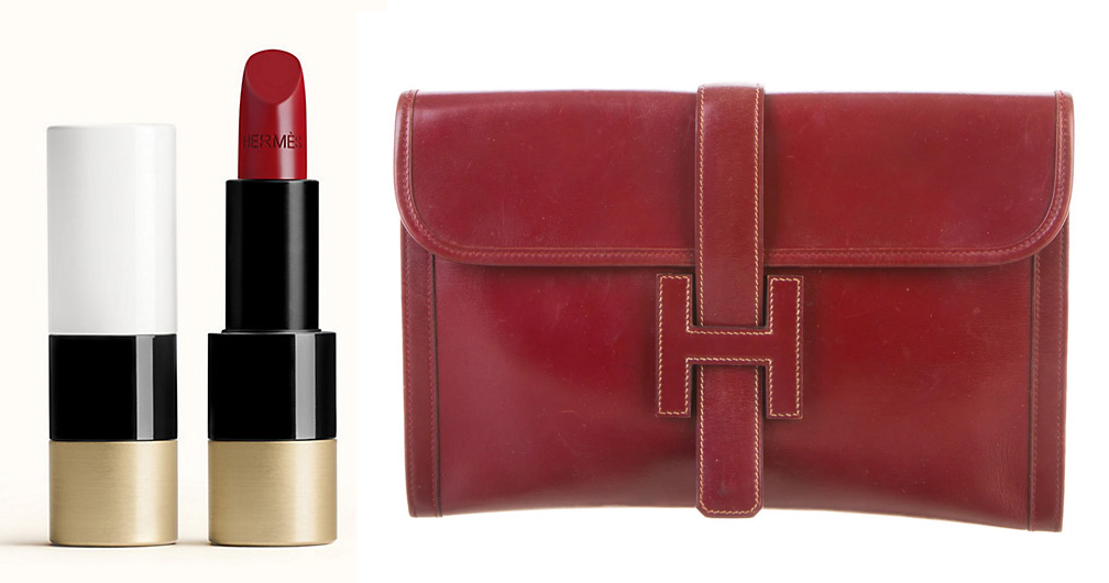
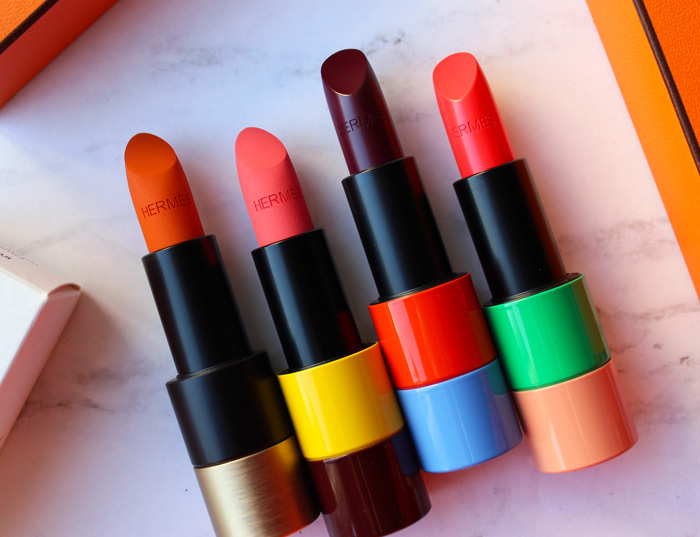
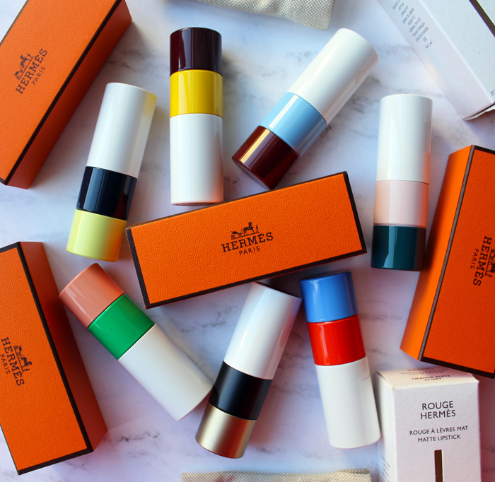
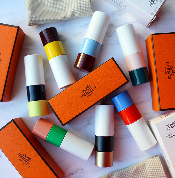
Rouge Hermès lipsticks

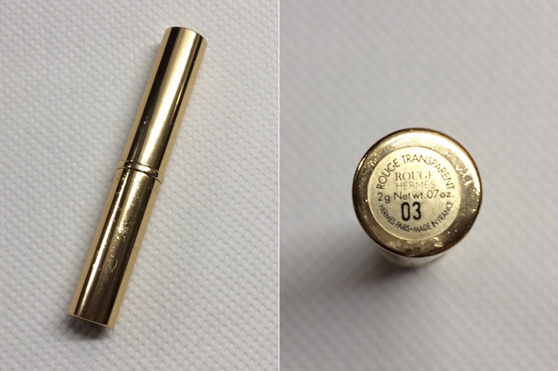
Here's a bit of luxury to start off your week! (Yes, I backdated this post.) Hermès, historic French purveyor of fine leather goods and other accessories since 1837, debuted a lipstick line back in March.  Once I saw the modern color-blocked tubes I knew some of them had to make their way into the Museum's collection, so I picked up a few of the limited-edition ones and one from the permanent line.  I'm not going to spend any time discussing the merits of the Birkin bag vs. the Kelly or anything else related to Hermès fashion and history, as there are any number of resources out there. Instead, I'll talk about the house of Hermès in passing only as it relates to the lipstick.   

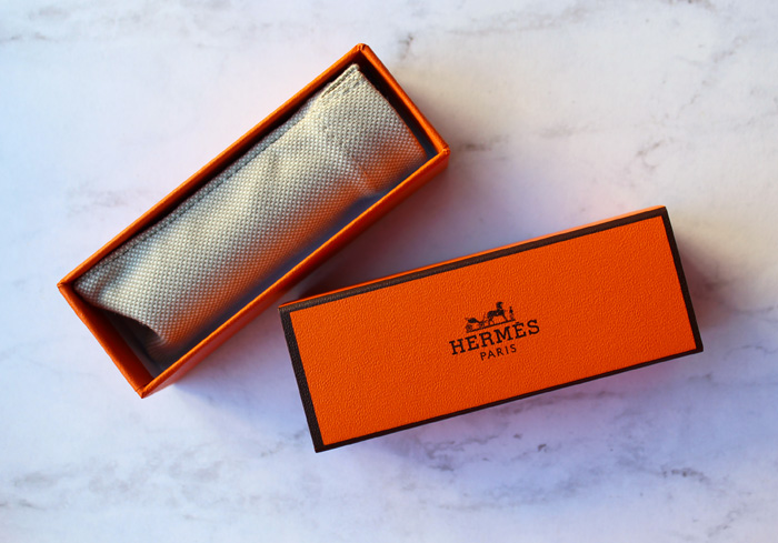
I love the canvas pouch and signature orange box each are housed in. The tubes were created by Pierre Hardy, creative director of Hermès jewelry and shoes.

Hermès lipstick

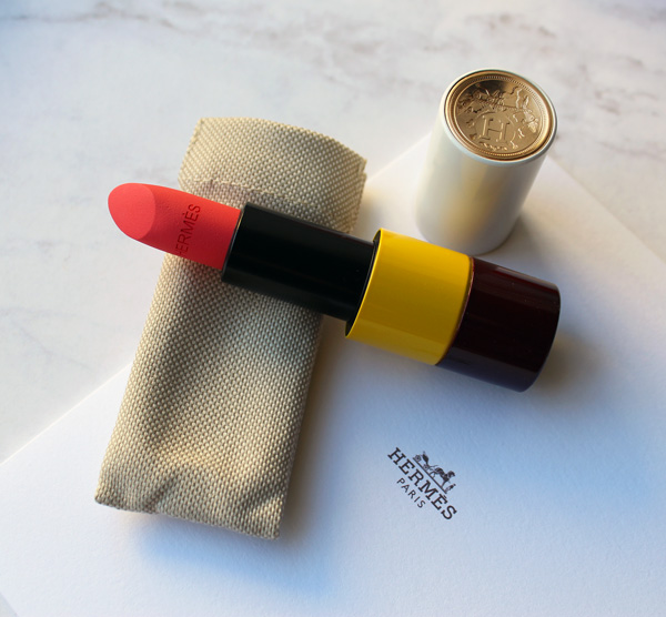
The caps are engraved with the ex-libris emblem chosen by Émile Maurice Hermès for his personal library in 1923. "The top curves inward a bit like a fingerprint, giving it a little softness…an anticipation of the gesture to come," Hardy explains to Wallpaper magazine.

Rouge Hermès lipstick in Rose Inoui

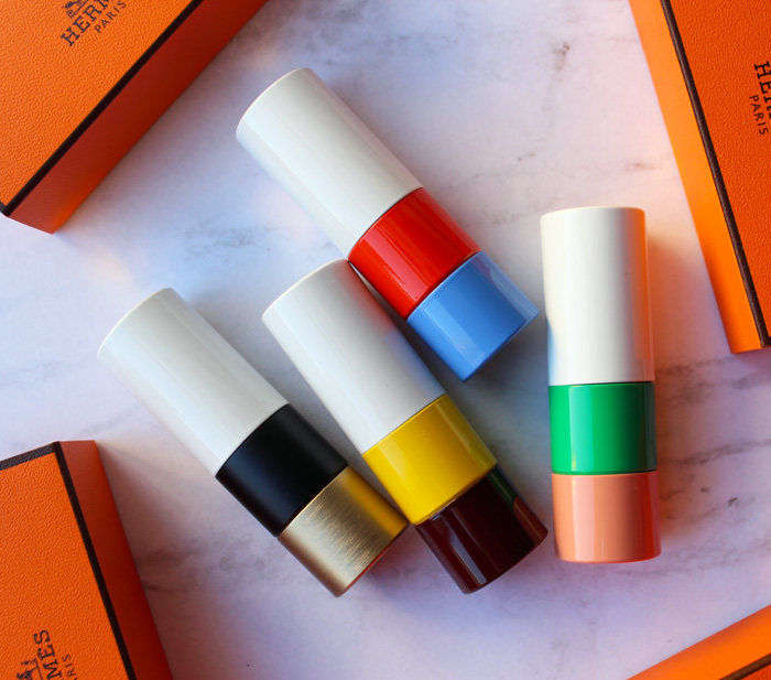
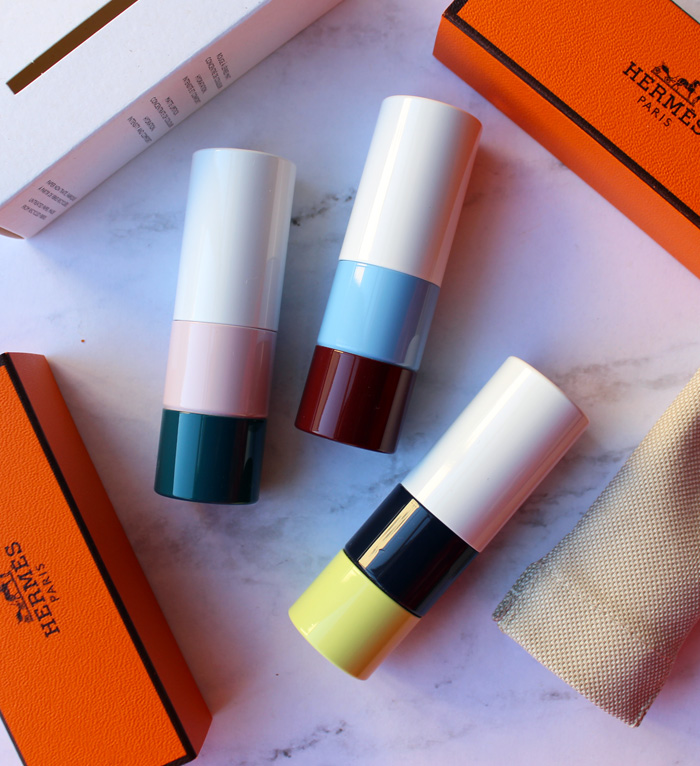
I adore the color combinations and the material is equally impressive.  Though the tubes may resemble some sort of plastic, they are entirely free of it and are also refillable.  The brushed metal on the tubes used for the permanent shades is a nod to Hermes's "perma-brass" fixtures on their bags.  I'll let Wallpaper expand on the design:  "Each lipstick tube is made of 15 different elements by partner workshops in France and Italy. Refillable, they are meant to be kept as precious objects, like jewels.  The modern graphic design of the tubes contrasts with the classic ex-libris on the cap. The top half of the tube is white, or what Hardy calls 'the image of purity and simplicity'. Hardy will play around more freely with the colour blocks of these tubes, finding ‘harmonies’ with each individual shade. For the first edition, an intense purple lipstick comes in a tube with bands of red and cornflower blue, while a coral shade is offset by emerald green. The overall effect is very Memphis Group…Prior to this, Hardy had no experience with beauty products, and neither, really, did Hermès. He says there were advantages in approaching the design with a blank slate. ‘I thought, let’s act as though nothing else existed. I will try to create the quintessence of an object that is feminine, pure, simple. One that is immediately desirable but will stand the test of time, and that can convey the Hermès style: luxury and sobriety.'" 

Rouge Hermès lipsticks

A couple of points here:  first, the very old idea of makeup containers as jewelry or art objects is obviously still going strong in 21st century.  Second, I had to google the Memphis Group (they're a design collective from the '80s, FYI) but the resemblance in terms of color-blocking is striking. 
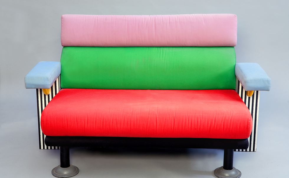
Memphis Group sofa
(image from designmuseum.org)

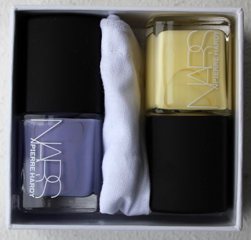
Third, the article says that Hardy had not designed makeup before.  This is not exactly true, as he collaborated with NARS on a collection back in 2013.  Do you remember the adorable little shoe duster bags for the nail polish duos?  I'm almost positive this charming design touch was Hardy's idea.

Pierre Hardy x NARS nail polish duo

In addition to makeup as jewelry, Hardy brings up another age-old idea: makeup as art, specifically painting. Regarding the lip pencil and brush he designed for Hermès in addition to the tubes, he remarks, "I studied visual arts, and these materials – brushes, pencils – resemble what we used back then. It is interesting to approach the question of femininity like a painter: what can we offer a woman so she can be an artist of her own beauty?"

Hermès lip pencil and brush
(image from lifestyleasia.com)

Now let's talk about the lipsticks themselves. Jérôme Touron, formerly of Dior and Chanel, was hired as the creative director of Rouge Hermès specifically to oversee the shade selection and textures.  Each of the 24 colors (the number based on the house's address at 24 Rue du Faubourg Saint Honoré) is inspired by the roughly 900 leather colors and over 75,000 silk swatches from the company's archives.  While it was difficult to narrow down the initial lineup, Touron enjoyed the "pure freedom" of digging through the archives. "It’s like a carré [square]; there is a profusion, an infinity of possibilities, and at the same time, a frame, that is clear and precise. Make-up works exactly the same way; there is an infinity of options in terms of colours, textures and types of application and at the same time it has to meet a certain function." The matte Orange Boîte, shown below, is a direct reference to Hermès's orange boxes, while Rouge H is from a color released in 1925 that I may have to buy.  As Touron explains, "[Emile] introduced at the International Exhibition of Modern Decorative and Industrial Arts in Paris, with a truly pioneering spirit: he was the first to ask his tanners to create an exclusive 'signature' shade for leather. This colour immediately became a signature colour for Hermès because of its unique and singular hue: different (darker) from the Art Deco bright red of the time."

Rouge H. lipstick and bag(images from hermes and therealreal.com)

The lipsticks are allegedly scented with a custom fragrance concocted by the brand's perfumer Christine Nagel with notes of sandalwood, arnica and angelica, but I couldn't detect any scent. (Hopefully I'm not developing COVID.) There are 10 with matte finishes and 14 with satin, representing the various finishes of leathers, Doblis suede for the mattes and calfskin for the satins.  However, Elle magazine reports that the satin texture is inspired by the company's silk scarves, so who knows.

Hermès lipsticks in Orange Boite, Rose Inoui, Violet Insensé, and Corail Fou

Hermès lipsticks in Orange Boite, Rose Inoui, Violet Insensé and Corail Fou

Hermès plans on releasing limited edition shades every 6 months, so I purchased the three fall 2020 colors. I really will try not to buy all three each and every season because it might not be the best use of the Museum's budget, but the color-blocking is just so irresistible (even if we have seen it on lipstick before).  And as a collector there's a compulsion to have them all. 

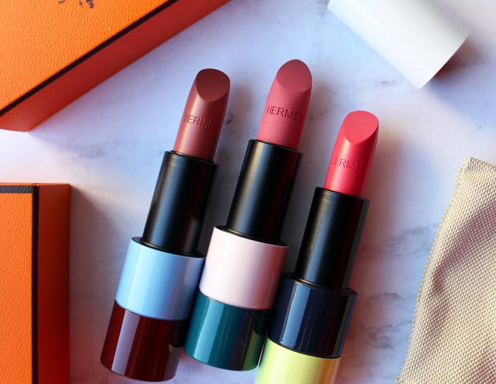
Hermès limited edition lipsticks, fall 2020

Also, all of the shades of the limited-edition lipsticks are inspired by an 1855 book Touron refers to when creating colors: The Principles of Harmony and Contrast of Colours and Their Applications to the Arts by Michel-Eugène Chevreul (that's a mouthful!)

Hermès limited edition lipsticks, fall 2020

Hermès fall 2020 lipsticks in Rose Ombré, Rose Nuit and Rose Pommette

I'm still scratching my head over what exactly Touron does. I thought for sure he was a makeup artist since most lines have a makeup artist involved, but apparently he is a "product developer" according to the Wall Street Journal.  The article reports that the decision not to hire a makeup artist or celebrity face was intentional. "'The idea of one makeup artist giving all the rules was not ours,' says [President and CEO of Hermès Parfums] Agnes de Villers. Touron is a product developer. He used makeup artists to help him test and develop products, but no one is signing a product group or telling anyone how to wear anything. For [artistic director Pierre Alexis] Dumas, that approach infantilizes customers. 'We've always relied on the good sense and intelligence of our clients,' he says. There will be no Hermès 'face of the season' or step-by-step inserts with line drawings. As Dumas puts it: 'Lipstick is not a status symbol, nor a sign of submission to an order, but an affirmation of the self.'"  It's certainly a unique approach and only time will tell whether it pays off.

Jerome Touron(image from buro247.me)

I have to say I wasn't impressed with Touron's reasoning for starting with a lipstick or its meaning. "I think the lipstick is special because it has the ability to reveal personality in a few seconds, in a single gesture, in just one application. Instantly, it reveals the colour of the personality. In a way, it exemplifies our conception of beauty: to reveal, not to transform. Hence the desire to start the Hermès Beauty with a lipstick collection. Also, perhaps because a lipstick concentrates in a very small size, our whole approach to the object, the colour, the material and the gesture in other words, some of the great fundamentals of Hermès."  Eh. I wish he had been honest rather than trying to spin it into something more profound than what it is: good business sense. Nearly all major cosmetic lines start with one product and it's usually lipstick because it's the most profitable makeup item and a good way to test the waters. Lipstick is really a barometer to see how the line is received and whether there's interest in a full collection. As for the "gesture" nonsense it's really just the brand's tagline of "beauty is a gesture", and I also think makeup can absolutely be transformative, even as it's "revealing" one's true colors.  I did, however, enjoy the beautiful boxed set he came up with for the holiday season and his description of the relationship between color and music.  The Piano Box set contains all 24 permanent shades.  "Laid out in a line with their black and white lacquering, the lipsticks looked just like piano keys…for me, colors are like musical notes; they can be combined to create harmonies and resonance. More fundamentally, color, like music, is at the same time a precise system—like a frame, and something free, artistic, and deeply emotional."  That could explain why there are so many music-themed makeup objects!
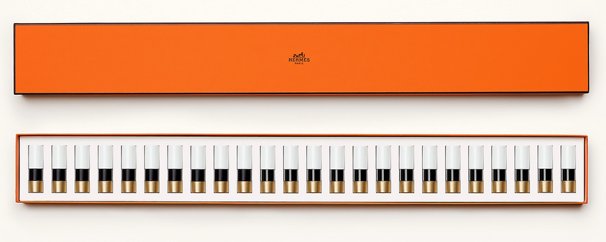
Rouge Hermes Piano Box for holiday 2020
(image from elle.com)

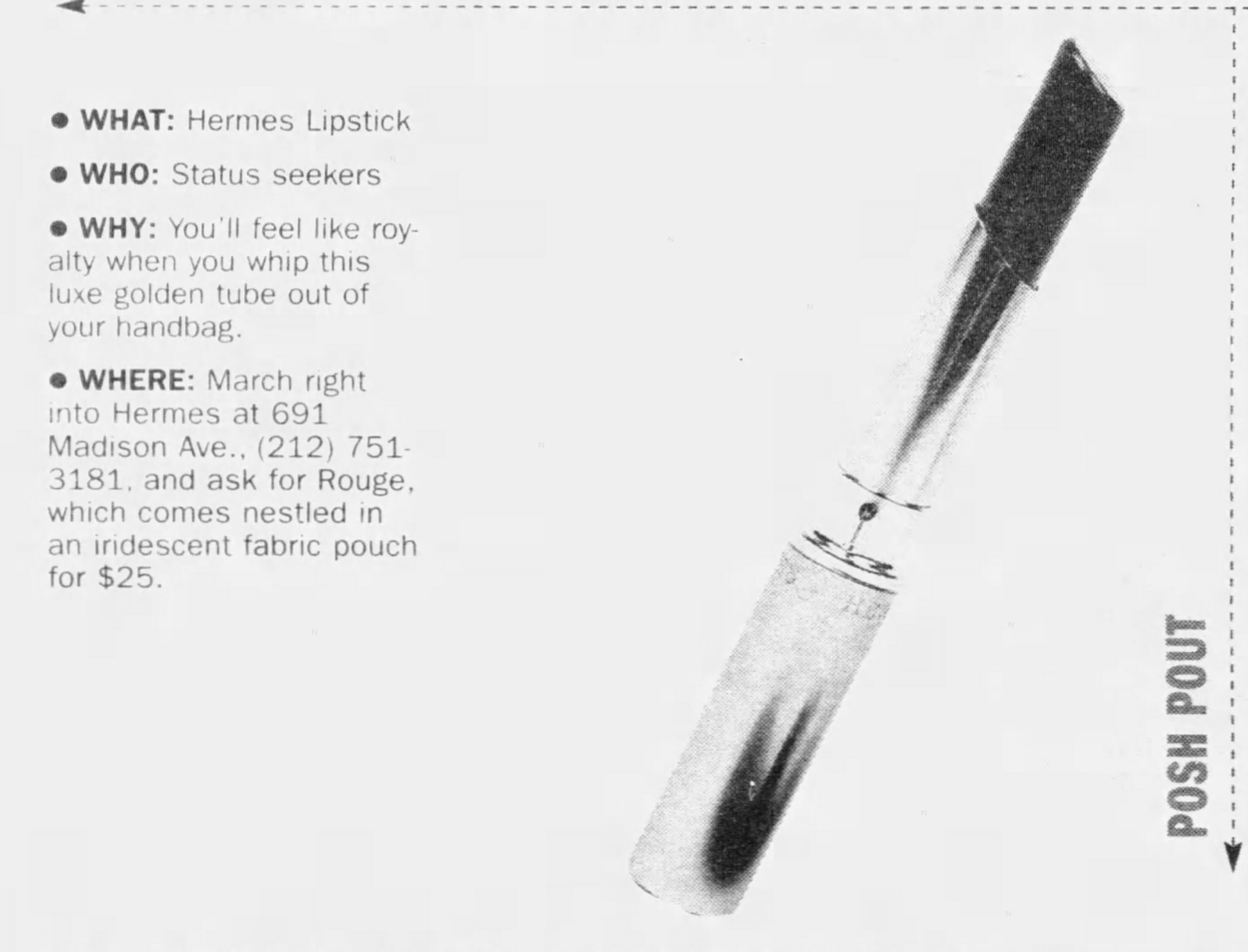
Anyway, what's especially interesting is that nearly every article claims this is the first time Hermès released lipstick.  That is not true and I have the photos to prove it. A very kind Museum supporter on Instagram sent me images of a previous lipstick by Hermès.  She's not sure exactly when they came out, but according to newspaper articles it debuted in early 2001 in the U.S., selling for $25.  The Wall Street Journal cited earlier reports that artistic director Pierre Alexis Dumas had suggested lipstick back in 2000 but that the company turned out not to be ready for a full line. "'I think I was the one who suggested to my father [Jean-Louis Dumas, the late chairman and creative director of the house] that we should register the name for lipstick.' They didn't do it then—instead just once making a single shade of red lipstick in limited edition. They needed to think it through some more." However, this photo shows a number on the lipstick which implies there were more shades.  Perhaps in Europe, where this online friend of mine is based, offered more colors and in the U.S. we only got one.
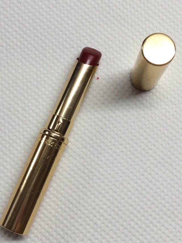
Hermès lipstick, ca. 2001

Hermès lipstick, ca. 2001
(images from @amalia.vet)

Hermès lipstick newspaper ad, January 2001

Article by Lisa Anderson, April 2001

In looking at the older lipstick and comparing it to the 2020 version, I must say the new line is far superior design-wise than Hermès's previous attempt at makeup. It makes sense, since Touron, Hardy, Nagel, Dumas, along with Bali Barret, director of Hermès Women, spent 3 years bringing the cosmetics line to fruition. There wasn't nearly as much fanfare or press for the earlier release, which leads me to believe it was more of a quick money grab led primarily by their marketing department without any real thought put into it – one can tell top executives and designers were not too hands-on.  I'm all for minimal style, but the slim, plain packaging reads as very uninspired and not at all distinct from other brands, nor does it really capture Hermès's vision.  This could also be the reason why the line failed within a year – I saw no mention of it after March 2002 – and why nearly all the coverage for the new line omits any reference to their earlier foray into cosmetics. In hindsight, the company may see it as a mistake and prefer that it stays buried in newspaper archives…unfortunately for them, beauty aficionados don't forget!

Anyway, as with other luxury makeup, many people will want to know whether Hermès lipstick is worth shelling out a significant amount of money for. On the surface, $67-$72 is an absurd price for a single lipstick.  But as I noted with Louboutin nail polish, you're not just paying for the product; you're paying for the Hermès name along with all of the thoughtful details outlined above, not to mention that they are more affordable than nearly any other Hermès item (the leather cases for the lipsticks start at $340).  Having said that, there are plenty of other quality lipsticks to choose from if you're not into forking over some 70 bucks for the name or packaging.  Most reviews have indicated that Hermès performs well although not necessarily better than other high-end brands, so splurging on one (or several) because of the luxurious feel makes sense. But I don't believe any of the ingredients or technology in the product by itself warrant the price tag – beeswax, shea butter and mulberry extract are not that special, after all.  Bottom line: if you're wondering whether it's worth it to buy these, yes, but only if you're really into all the luxurious bells and whistles, a collector or if you love the brand. Again, if you just want a lipstick that performs well and don't care about the label, pretty orange boxes and colorful tubes, there are many comparable lipsticks out there.

Rouge Hermes lipsticks

To conclude, I'm really enjoying Rouge Hermès despite the fact that I haven't swatched any of the lipsticks I purchased (although it is very tempting!) You know I admire attention to detail when it comes to makeup packaging and design, and these tick every box.  I also think these tie into the company's aristocratic history but look much more approachable than I was expecting.  I always perceived Hermès as a sort of blue-blood, old-money type brand – I mean, they started as a company that made fancy leather horse saddles and harnesses for people wealthy enough to consider equestrianism a hobby – but the modern and colorful design of the lipsticks proves they may not be as stuffy as I thought.  Still, I'd like to see more adventurous shades and textures, i.e. their Malachite green or a glitter finish. And obviously they need more diversity in their advertising.  I can't say I've seen any, ahem, mature-looking models or anyone resembling a gender besides cis women, so hopefully they'll branch out a bit while still keeping true to the brand's heritage.  A full makeup line is planned to be in place by 2023, so fingers crossed we'll see some other interesting limited edition items…maybe a Birkin-embossed highlighter or one of their scarf patterns printed on the outer cases. ;) 

What do you think of Rouge Hermès?  Would you or have you tried them?
"I want a case that glows with fashion. That has such fashion magic it trans­mits right through the lipstick and onto the faces of women. Makes them feel the beauty touching their lips." – Charles Revson, January 13, 1954.

I know, more vintage Revlon lipsticks.  But I promise it's very interesting!  There didn't seem to be a comprehensive history of Revlon's Futurama line so I thought I'd take a stab at it.  Futurama was a collection of refillable lipstick cases designed by famed jewelers Van Cleef and Arpels for Revlon.  The line was introduced in 1955 with much fanfare, especially its debut on the popular game show the $64,000 Question.  But how did the collaboration between Revlon and Van Cleef happen?  Who was responsible for the design?  What is Futurama's significance in makeup history?  I can't say I have answers to all of these questions, but I'll do my best. 

Revlon Futurama ad, 1956

First, a quick background.  Refillable lipsticks had been on the market since the 1920s and became more widespread in the '40s as a way to save metal during wartime.  Every last scrap was needed; the country couldn't afford to have women wasting a used lipstick tube. 

Elizabeth Arden and Hudnut lipstick refill ads, 1942

The concept of makeup-as-jewelry has a longer history, with "etuis" produced in the 1700s.  At the turn of the 20th century artisans were creating pendants and bracelets that held powder and lip color, and by the 1920s high-end jewelers were producing vanity cases made out of precious materials.  In 1933 Van Cleef and Arpels invented and patented the minaudière, a new variation of the portable vanity case.1

Van Cleef and Arpels minuadiere ad, 1952(image from ebay)

The notion of makeup as an additional accessory was reinforced by the fact that many compacts were sold in jewelry stores in addition to the jewelry section at department stores, with custom engraving and monogramming available. 

Compact engraving-Oct_17__1947_

Jewelry designers Ciner and Paul Flato also had their own compact and lipstick combinations in the late '40s and early '50s.

Ciner compact and lipstick(image from thesprucecrafts.com)

Paul Flato lipstick and compact, ca. 1950

By and large, compacts and lipstick cases were already perceived as another item of jewelry thanks to companies like Van Cleef and Arpels leading the way. So what was new and special about Revlon's Futurama cases? 

Revlon Futurama ad, 1957

There were two key factors that Revlon advertised as the differentiators: design and price point.  The concept for the design is a fascinating story.  As he explains in the book Business Secrets That Changed Our Lives, Revson was inspired by a business trip to Paris. “The candlelit room, the elegant service, the fine furnishings bespoke good taste and an appreciation of beauty. Next to me sat a chic and lovely woman. What interested me most about my dinner partner was not her beauty but a small object she had taken out of her purse. My eyes returned to it again and again, until finally, with an amused smile, she handed it to me saying, ‘I would not have expected an American man to be so interested in a lipstick.’ The beauty of the   case, hand-engraved and diamond-bedecked, was one outstanding feature. What really caught my eye, though, was that the lipstick could be removed with a single click-in, click-out action in just one section. And because the lipstick was contained in its own cylinder, removal of it was not only easy, but smudge-proof. My dinner partner's remark kept goading me-‘I would not have expected an American man to be so interested in a lipstick.’ Of course not! All that an American man ever saw was one of those undistinguished brass bullets!”2 Revson took a similar case back to the U.S. and less than a month later, on January 13, 1954, summoned Earl F. Copp into his office. Copp was Chief Operation Officer for Risdon Manufacturing Company, which had been making Revlon’s cases since 1947. Revson explained what he had in mind: “I want a case, a refillable case. You have to make it different from this one. This is too much like the others, refillable perhaps, but not elegant enough. I want to see luxury, fashion, expensive jewelry. No more bullets. Can you see what I mean? I want a case that glows with fashion. That has such fashion magic it trans­mits right through the lipstick and onto the faces of women. Makes them feel the beauty touching their lips…I don't want just one case, but a whole line. So that women will want one for morning, one for evening, one for special occasions-all suitable for refills with whatever different colors they prefer.”  While refillable lipsticks existed previously, the way Futurama was advertised suggested a totally new frontier. According to design historian Matthew Bird3, Lurelle Guild (1898-1985), a prominent industrial designer at the time, was brought on board to oversee the aesthetics of the cases.  As another design scholar notes, Guild was the ideal choice to design a cutting-edge, futuristic lipstick case, as he had been responsible for other iconic '50s styles such as Electrolux's Model G vacuum, which sported "rocket-like fins".4  While the cases were being advertised in 1955, Guild filed a patent in early 1956.  Grace Gilbert van Voorhis, Raymond Wolff and Henrieta Manville are also named on the patents, with Manville’s name on the “utility” patent for the inner mechanism of the case.  Based on census records, Manville most likely worked with Earl Copp at Risdon Manufacturing, while Wolff may have worked in Guild’s office.  As for Van Cleef’s role, it appears they signed on in name only and let Revlon deal with the designs themselves; this seems especially likely given that none of the cases really resemble anything Van Cleef was making at the time.

Patent for Revlon Futurama liptsick

Patent for Revlon Futurama liptsick

The designs on their own were modern for the time, but another aspect that Revlon claimed as new was the actual refill mechanism.  While they weren't quite the hardship Revlon's Futurama ads made them out to be, earlier versions of refillable lipsticks could get a little messy and took a minute or two to change as compared to Revlon's alleged 3 seconds. 

Lipstick refill-instructions-Wed__Mar_31__1943_

Futurama's "click in, click out" was certainly less involved than wartime lipstick refill instructions!

Revlon Futurama lipstick ad, 1956
(image from cosmeticsandskin.com)

The second aspect that set Futurama apart from previous lipsticks was that customers were made to feel as though they were getting a luxury item by a brand name at an affordable price. "Like rubies and emeralds, a really luxurious lipstick case has seemed out of reach to most women…though Revlon's new cases look loftily priced, some are a low $1.75, including lipstick. Besides which, women find Futurama a money-saver since refills only cost 90c."

Revlon Futurama ad, 1956(image from Life Magazine)

The cases themselves were presented as affordable, but Revlon also promoted the idea of the refillable lipstick as a cost-saving measure – once the customer "invested" money in a case, refills would be less expensive in the long term than buying a whole new lipstick.

Revlon Futurama ad text, 1956

You would think a company as large as Revlon wouldn't take a chance with their reputation by participating in price fixing, but in 1958 their shady tactic of setting refill prices was admonished by the FTC, who cracked down on them for conspiracy.  The author of the fabulous Cosmetics and Skin website explains: [Futurama] went on sale in 1955 after Revlon acquired the Braselton lipstick patents for lipstick cartridges in 1954. Revlon then entered into an agreement with Helena Rubinstein and Merle Norman – along with a number of container manufacturers, including Scovill and Risdon – to fix the price of lipstick refills, including non-patented lipstick inserts, until they were charged by the U.S. Federal Trade Commission (FTC) with conspiracy." 

Revlon Futurama ad, 1956(image from saintsalvage.blogspot.com)

Even though it had been advertised previously, the breakout moment came when Revlon featured a commercial for Futurama on the game show The $64,000 Question, which they were sponsoring. (Revlon's sponsorship of the short-lived quiz show is a fascinating history in and of itself.)  It was during this commercial that viewers could witness in real time the ease and tidiness of Futurama lipsticks, making video even more critical than print ads.  As Bird notes, "YouTube allows us to watch a vintage television ad and learn that the design separated the lipstick from the case, and saved money by offering refills.  The line was marketed to women, but also to husbands and children as an affordable but seemingly luxurious gift. Without this TV advertisement, the design is easy to write off as mere decoration.  With this added information, the design transcends mere aesthetics to address user needs, perceived value, material use, marketing, and problem-solving.  Seeing the design in action gives it a life and sophistication not evident in the brutality of an elevation view patent drawing or two-dimensional photograph."6

Overall, Futurama was presented as the wave of, well, the future. The case designs, particularly the elongated styles that were tapered in the middle and wider at the ends, were intended to reflect the modern era rather than mimic shapes of the past. Revson discusses the design selection process.  "When the designs started to come in, it was an exciting and stimulating experience. Many shapes were proposed: prisms, octagons, ribbons and bows, pencils, thimbles and countless others. But the most inspired was the hourglass, a shape that four designers suggested independently. We experimented with many surface treatments, too: brocaded gold on silver, silver-plated with a gold spiral, wedding bands en­ circling the cylinder. With Bert Reibel, our packaging designer, I selected two basic shapes by the end of March, 1954. One group of cases, shaped like hourglasses, would retail at $2.50 or more; the other group, thimble-shaped, would be less  expensive. Of all the samples submitted, only one surface treatment resembled that of expensive jewelry. We had to make arrangements with Fifth Avenue jewelers and designers, visit art museums and study color photographs of good-looking jewelry from the archives. Almost every major jewelry shop in Manhattan was visited, to study expensive, hand-designed compacts and cases. But we were still little closer to our goal. During the next eight months, we made up many thousands of designs and some five hundred actual models, each with a different surface or slightly modified shape. Parts were interchange­ able, so we could produce still different combinations. We in­vented our own special language: 'belts,' 'skirts,' 'balances,' 'waistlines.' Which 'belt' looked best with which 'skirt'? Which 'waistline' went best with which 'collar'?  It got to be a joke that I was often awake all night worrying about a dimension of one-sixteenth of an inch. And it was true! The search for new surface treatments inevitably brought us face to face with the limitations of machinery. I had become in­trigued by one finish we found on expensive compacts-'Florentine' by name-which was a texture of minute, finely etched lines. In 1954 no case manufacturer had the facilities or know­ how to produce it in volume…[Copp] finally, after long weeks of experimentation, had de­vised belts and grinding wheels that would simulate the 'Floren­tine' finish. To produce other finishes, he had to dispatch engineers to Switzerland and Italy before he could locate and buy the only turning machines on earth that could do a mass production job."

You'll notice there are very few scratches on this black case, which was the result of Revson's insistence that all the finishes should last at least 2 years before showing significant wear.  "Two coats of high-bake vinyl lacquer" did the trick.  The longevity of the pavé settings on the tops of some of the cases was also difficult to ensure. 

Revlon Futurama lipstick case

Revlon Futurama lipstick case

Revlon Futurama lipstick case

Revlon Futurama lipstick case

After nearly a year of design work, Revlon began working on the marketing, with Vice President Kay Daly (who had previously came up with the questions for Revlon's iconic Fire and Ice quiz) leading the way.  "Early attempts missed the boat because they emphasized the fashion element, but did not adequately sell the 'refillable' idea. The most frustrating task [Daly] undertook was the selection of a name for the cases. Hundreds were suggested, considered and re­jected. l could not agree-no one could agree-on any of them. Finally, she hit on Futurama. To my mind, this suitably brought home the newness, the excitement, the fashionableness of the product…A market research or­ganization reported that Futurama 'is not a good name. It is too masculine. It sounds too much like General Motors.'…In the end, I had to make the decision. There was, of course, only one way to look at it: from the viewpoint of the American woman herself. I de­cided to rely on my original reaction that the name was good, and that it would appeal to the consumer I knew best."  The name was rumored to be taken from the Futurama exhibition at the 1939 New York World's Fair and speaks to the post-World War II futurist trend in American design and technology.  Additionally, Revlon declared both the economic practicality and new designs to be the most cutting-edge ideas in cosmetics, and any modern woman should want to join the party.  "Are you ready for Futurama?" asks this 1958 ad.

Revlon Futurama ad, 1958

If you weren't on board with Futurama, you were getting left behind; the ads not so subtly implied that women who didn't purchase Revlon's latest offering were unfashionable and stuck in the past. According to one commercial, "The days of old-fashioned, un-style-conscious mothers are about as out-moded as old-fashioned brass lipstick…modern mothers may be old-fashioned on the inside, but they want to be the picture of glamour and style on the outside."

By late 1957 Futurama had expanded to compacts, which were also refillable.  While not as notable as the lipsticks, the compacts solidified Futurama as the most recognized line for Revlon at the time.  Something that is of note, however, is the fact that Andy Warhol may have been involved in the design of at least one of the compacts. A while ago a private collector sent me some photos and surmised that Warhol might have been responsible for a Revlon Futurama compact featuring his drawing of an early 1900s style shoe. This is what she had to say:  "I emailed Van Cleef and Arpels about who exactly designed these lovely creations and I actually got a call from a representative wanting to find out information on a specific compact I have that she called 'the Warhol Boot'…It was supposedly one of 5 display/prototypes that went missing between 1959 and 1961. It was designed by Andy Warhol but rejected by Revson because it didn't fit the 'mood' of the collection."  If this is true, what an amazing find! Take a gander at the second compact from the left in the second row.

Revlon Futurama compacts, private collection

I reached out to another collector whose father worked for Revlon, but she was unable to find any definitive proof that Warhol designed the compact.  Still, it resembles his shoe illustrations.

Andy Warhol shoe illustrations, 1955
(image from artnet.com)

Getting back to the lipsticks, Revlon's competitors were just as cutthroat as they would be today in that several companies released jewelry-inspired cases of their own.  Take, for example, DuBarry's Showcase.  Model Suzy Parker was featured in DuBarry's ads – an unusual move given her appearance in Futurama ads.  What is not surprising that the company doing this is DuBarry, who you might remember would go on to shamelessly rip off Revlon's Fire & Ice lipstick with their Snowball of Fire shade in 1959.

DuBarry Showcase lipstick ad, 1957(image by feldenchrist on flickriver.com) 

Dubarry Showcase lipsticks ad, 1957

Dubarry Showcase lipsticks ad, 1957(images from pinterest)

Cutex was even more blatant in their plagiarism (but at least they used a different model, Sara Thom).  In 1958 the company introduced their "designer's cases" which were apparently similar to something one would find in a "Fifth Avenue jeweler's window".  The notion of previous lipstick case styles as being "passé" was also copied from Revlon.  I'm not sure these were refillable, but they were definitely lower priced than Revlon's refills.

Ad for Cutex Designer's Case lipsticks, 1958

Ad for Cutex Designer's Case lipsticks, 1958(images from ebay)

There was also this Avon clone making a series of "jewel-like" cases at a price "every woman can afford."

Cort representative booklet, 1959

Can you say "knock-off"?  Then as now, this sort of plagiarism was rampant in the industry (more on that in another post).  To my knowledge none of these brands had partnerships with actual jewelry companies the way Revlon did, but they were definitely capitalizing on the makeup-as-inexpensive-jewelry concept.  

As of December 1960 Futurama was still being heavily promoted by Revlon.  A vast array of designs had joined the original lineup, while the older styles received elaborate outer packaging to suit any occasion.

Revlon Futurama ad, 1960

Revlon gold Futurama lipstick case

Revlon Futurama ad, 1960

Something that I have not been able to confirm is the numbering of the cases.  This one is listed in the ad as 9029, but engraved on the bottom is 587.  I believe the numbers on the bottoms of the Futurama cases correspond to the lipstick shades, not the case model, but I can't be certain.

Revlon Futurama lipstick case

Revlon Futurama lipstick case

Revlon Futurama lipstick case

Futurama was phased out by the mid-1960s, but its influence is alive and well today.  Many makeup companies have collaborated with jewelry designers either for their permanent collection or limited edition collections.  The idea of owning luxurious yet modestly priced jewels via makeup persists.  As with the beauty lines of fashion houses or artist collaborations, if one cannot afford vintage jewelry or an original piece by a high-end designer/artist, makeup allows the customer to get a taste of the real deal. Here's a quick list of some of the more memorable makeup/jewelry collaborations.  I'm also keeping my eyes peeled for one of these Cutex lipstick bracelets, which were sold around 1955-1958.

Jewelry-makeup

  1. Lulu Frost for Bobbi Brown, holiday 2013
  2. Bauble Bar x Stila, holiday 2014
  3. Elsa Peretti for Halson, late 1970s
  4. Ayaka Nishi for Suqqu, holiday 2016
  5. Ambush for Shu Uemura, spring 2017
  6. Robert Lee Morris for Elizabeth Arden, 1992
  7. Jay Strongwater for Chantecaille, spring 2007
  8. Robert Lee Morris for MAC, fall (see also MAC's collaborations with Jade Jagger and Bao Bao Wan)
  9. Monica Rich Kosann for Estée Lauder, holiday 2016 (Kosann continues to design Estée's holiday compact line.)

Some high-end lines go the Cutex route by creating makeup that can actually be worn as jewelry.  Dior, YSL and Louboutin have all released lip products in pendant form.

Lip gloss pendants - Dior, YSL and Louboutin

Refillable lipsticks with outer cases meant not only to last but also displayed are thriving in 2020, given the increasing demand for sustainable packaging.  The most recently unveiled jewelry-inspired line, and probably the one most similar to Futurama besides Guerlain's Rouge G, comes from fashion designer Carolina Herrera.  “We wanted to give women an opportunity to wear their makeup like a piece of fabulous jewelry," Herrera stated.  The entire line is refillable and offers customization options in the form of detachable charms and a variety of case styles.

Carolina Herrera makeup line(image from vogue.com)

Would all of these examples have existed without Revlon Futurama?  Sure, but Revlon did a lot of the heavy lifting.  Despite the exaggerated tone of the ads, Futurama was groundbreaking in that it popularized the notion of attainable luxury within the cosmetics arena and simplified the lipstick refill process.  The cases also serve as a prime example of the futuristic flavor of 1950s American design. These factors make Futurama a significant cultural touchstone on par with Revlon's previous Fire & Ice campaign. At the very least, Futurama represents several key developments in cosmetics advertising and packaging that helped lay the groundwork for today's beauty trends and shape consumer tastes.

Which Futurama design is your favorite?  Would you like to see a history of refillable lipsticks or an exhibition expanding on the makeup-as-jewelry concept?  I have to say I'd be curious to see what Revlon would come up with if they did another collab with Van Cleef…it would be awesome if Futurama 2.0 incorporated Van Cleef's signature Alhambra motif.


1 Give yourself a crash course in learning the lingo for various makeup cases and the differences between them. Noelle Soren's website is a treasure trove of knowledge!

2Revson elaborates on existing cases. "For a long time it had been bothering me that American women-so alert in many ways-had been content with that old smooth brass cylinder . It had no distinctive shape, color, finish or design. It looked like a cartridge case. They would buy them and discard them when they were used up, and then buy another…A number of cosmetics manufacturers had for years tried to make cases more distinctive. We had played around with the idea at Revlon. But all that any of us ever came up· with was an­ other version of the cartridge case. For one thing, all case manufacturers, including Risdon, had the same kinds of machines, with the same old limitations." ("The Matter of Beauty:  The Development of the Futurama Lipstick Case" in Business Secrets that Changed Our Lives, edited by Milton Shepard (1964), p. 294.

3 Matthew Bird, "Using Digital Tools to Work Around the Canon" in Design History Beyond the Canon, edited by Jennifer Kaufman-Buhler, Victoria Rose Pass, and Christopher S. Wilson (2018), p.114-117.

4 Through this paper I discovered that there are two folders worth of Revlon correspondence and sketches for lipsticks in the official Lurelle Guild papers, which are housed at Syracuse University.  I have requested electronic copies of these but obviously since the library is closed due to the coronavirus I will have to wait to receive them and see if they shed any more light on the Futurama design process.  I'm also still trying to figure out whether Van Cleef designed this beautiful jeweled case, as Pinterest is literally the only place I've ever seen it.

5 There is an ad in the January 1956 issue of Reader's Digest that mentions Charles Revson "commissioning" Van Cleef and Arpels to design the Futurama line. Google, however, will not let me see the entire ad, and I've purchased 2 copies of that particular edition of Reader's Digest to no avail – there was no Revlon ad in either of them. Either Google has the date wrong or, as one eBay seller noted, the ads differed between Reader's Digest even if they were the same exact editions (i.e. same month and year.) If anyone knows how to access Reader's Digest in full online, please let me know!

6 Matthew Bird, "Using Digital Tools to Work Around the Canon" in Design History Beyond the Canon, edited by Jennifer Kaufman-Buhler, Victoria Rose Pass, and Christopher S. Wilson (2018), p.114.

Clé de Peau continues their streak of beautiful and inspired holiday collections.  This year's theme, Kimono Dream, is an homage to two venerable Japanese art forms:  the kimono and bijin-ga ("pictures of beautiful women").  Obviously a deep dive into the history of both of these is way beyond this blog post, but as usual I'll provide a condensed version.  First, let's take a look at the collection itself.

Each piece is packaged in a sturdy paper sleeve.  Remove the sleeve, and the package opens to reveal a bijin-ga painting featuring a woman wearing a kimono. The intricate folding is reminiscent of how the traditional kimono is held in place with an obi, the decorative sash worn around the waist, as well as tatou, the folded paper used to wrap and store silk kimonos to protect them from humidity.  The patterns on the sleeves are inspired by obi patterns as well.  The unfolding aspect of the packaging is gorgeous and highlights traditional Japanese art, but it's also perfect for the theme Clé de Peau wanted to express, which was revealing women's inner beauty.  Each painting represents one of four traits: passion, strength, charm and gentleness.

Clé de Peau Kimono Dream lipstick packaging

It's a bit contrived, but I appreciate that Clé de Peau took the time to align the products with the traits they wanted to convey and write little descriptions for each.  Here's the one for the lipsticks, which symbolize passion.  "Intense. Dynamic. Instantly revealing the passion within. Represented by plum, and evergreens pine and bamboo, against bright red silk. Despite your elegant façade, the force of your passion is unmistakable. A signal of powerful emotion that can’t be concealed."

Clé de Peau Kimono Dream lipsticks

Clé de Peau holiday 2019 lipsticks

The eyeshadow quad was my favorite piece – I loved the striking black kimono shown on the woman contrasted with the delicate embossing on the shadows.  "Strong, essential, with a flash of feminine red. Peonies and daffodils bloom in the snow, showing determination and vitality. A woman at one with her inner strength. Noble, dignified, the plum tree signifies resilience. You look outward at the world, through confident eyes."

Clé de Peau Kimono Dream eyeshadow

Clé de Peau Kimono Dream eyeshadow

Clé de Peau Kimono Dream eyeshadow

Clé de Peau Kimono Dream eyeshadow

Next is the face powder, signifying charm.  "Evoking prettiness and innocence. Symbolized by the peacefulness of wisteria and chrysanthemum against soft salmon-pink. Inspired by the simplicity of flowers, you rest sweetly in softness."

Clé de Peau Kimono Dream face powder

Clé de Peau Kimono Dream face powder

Clé de Peau Kimono Dream face powder

Clé de Peau Kimono Dream face powder

Finally we have the face oil, which embodies gentleness.  "Your open, unbounded heart. Fresh blue silk accented with vermillion and soft pink. The serenity of a goldfish in water. Cooling, refreshing, harmonious. Surrounded by gentleness, you are wholly embraced."

Clé de Peau Kimono Dream face oil

Clé de Peau Kimono Dream face oil

There was also a matte liquid lip color, but that didn't seem to be included in the four traits.  Nevertheless it is stunning and the packaging was different than the others so I had to include it!

Clé de Peau Kimono Dream matte lip color

Clé de Peau Kimono Dream matte lip color

I couldn't resist sharing the embossing on the outer boxes.  Such a nice little touch.

Clé de Peau Kimono Dream box

Clé de Peau Kimono Dream box

Now here's where the real history and collaborations come in.  First up is the kimono Clé de Peau commissioned exclusively for the holiday collection.  Fortunately for me (less work, haha!) the company did a fantastic job explaining the partnership and kimono-making process.  "The kimono commissioned by Clé de Peau Beauté, created in collaboration with Tachibana, an embroidery and dyeing studio in Kyoto that plays a role in preserving kimono culture.1 Crafted using a valuable dyeing technique called Surigata-Yuzen, which uses dozens of stencils to dye different patterns, layering one color over another. Since Tachibana’s foundation in 1947, its colorful works have been captivating kimono fans. Founder Zenzo Sodesaki (born in 1911) learned the basics of making kimono at Chiso, a traditional Japanese textile producer and one of the oldest yuzen coloring companies in Kyoto.  Current representative Yohei Kawai is the third generation, following Zenzo Sodesaki and second generation president, Kenichi Kawai."  The red and pink colors were chosen specifically to match Clé de Peau's two holiday lipstick shades.

Clé de Peau kimono by Tachibana

After the pattern is determined and sketched, it's time to stencil.  The Clé de Peau kimono used a particular technique called Surigata-Yuzen.   I'll let Clé de Peau describe the process in a nutshell.  "The Surigata-Yuzen method uses dozens of stencils to dye patterns onto kimono silk, layering one color over another to produce a gradation. Every gradation is done by hand, adding another layer to the painstaking art of the kimono…For each color, dyeing is repeated in different tones, the layers achieving a complex and extraordinary beauty."  A whopping 34 stencils were used for Clé de Peau's kimono. 

Clé de Peau kimono by Tachibana

Tachibana's bowtie website provided a little more insight into the process.  "Dedicated professionals hand-carve patterns to create the stencils, which were at one time made simply of layered paper but are now mixed with resin to give them strength. Hoshi-awase, the positioning of the stencils, is one of the most important parts of the dyeing process. All of the stencils in a given pattern have small holes called hoshi. By aligning the hoshi of each stencil at the exact same place, dozens of stencils can be positioned on the fabric with great accuracy. Senshoku is the process of dyeing a pattern on fabric using brushes with colors. Various-sized brushes are used according to the size of a pattern. Once part of the fabric is dyed, a stencil is moved to the next place on the fabric. Stencils are accurately aligned using the hoshi holes. Pattern dyeing is followed by a process called noribuse, in which the whole pattern is covered with rice glue before dyeing with ground colors."

Clé de Peau kimono by Tachibana

To be honest, I'm still confused as to how surigata-yuzen differs from other forms of yuzen techniques.  This website seems to insinuate that surigata-yuzen is unique to Kyoto, therefore a subset of kyo-yuzen, but I'm really not sure.

Clé de Peau kimono by Tachibana

Next, the entire kimono was hand-dyed with a brush via a process called Hikizome.  Hikizome is used not just for kimonos but can be applied to all kinds of textiles – pillows, curtains, towels, etc. I believe this is true for yuzen as well, but once again I'm not certain.

Clé de Peau kimono by Tachibana

The last step is to wait for the dye to dry in its own good time.  According to Clé de Peau, "To make a kimono is to live by the laws of nature.  So as not to alter the natural drying process, temperature condition is maintained the same throughout the year.  The fate of the color finish is in the hands of nature, as the outcome is never the same."  This aspect of the process fascinates me, especially for the Clé de Peau collection.  The company wanted very specific colors that perfectly matched their two lipstick shades, so given that the drying is left to nature, how could they know for sure the color would turn out the way they wanted?

Kimono-drying(images from cledepeau-beaute.com)

Obviously it doesn't really matter, but it's interesting to consider that no one can predict the exact color.  That makes the control freak in me rather anxious, but I can also appreciate the respect for nature.  While I enjoyed reading about the kimono production process, I would have liked to see a little guide on how to fold and secure a kimono and how the obi fits in, as this aspect of the kimono was emphasized in the collection's packaging.  Oh well. 

Now let's take a look at the amazing paintings by Ayana Otake, which graced the interiors of the packaging.  Again, I didn't have to do much digging to get some information about Otake, for Clé de Peau also provided a brief bio.  "Born in Saitama in 1981, Otake-san grew up surrounded by traditional culture and kimono. In 2007, she graduated in the Japanese Painting from the Department of Painting at Tokyo University of the Arts. She has produced works for galleries and department stores in Tokyo, and also practices bookbinding and package design."  I would have liked to interview Otake to hear more about the Clé de Peau collaboration – I'm always curious to know how companies and artists find each other – but looking at Otake's other work as well as finding out a little about the tradition of bijin-ga will have to suffice. 

Otake specializes in a modern version of bijin-ga.  "Ga" means "picture" and "bijin" means "beautiful person", but is nearly always translated to "beautiful woman".   Like kimonos, bijin-ga has an incredibly rich and long history.  Part of me feels guilty for reducing it to a few paragraphs, but mostly I feel that since I'm not a Japanese art expert, I need to reign it in.

The genre of bijin-ga originated in the late 17th century and was popularized towards the end of the 18th century via ukiyo-e (woodblock prints). The women depicted at the outset were prostitutes, but over time bijin-ga expanded to include women from all walks of life.  This website hosted by the Atsumi International Foundation explains the early origins of bijin-ga.  "[W]ith the changes in society related to the rise of the merchant class, there was a new interest in depicting daily activities and pleasures of contemporary life.  Popular entertainments were used for subject matter in paintings and then an interest developed in the beauty of personal appearance and form of women, including their clothing. Women of the brothels and pleasure quarters were predominately represented, and bijinga became a principal genre of the new *ukiyo-e 浮世絵. Single female figure portraits developed in the Kanbun 寛文 era (1661-73) with the Kanbun beauty *kanbun bijin 寛文美人. Typically, a yuujo 遊女 (courtesan or licensed prostitute) in a standing position was depicted in the bijinga of early ukiyo-e. Bijinga gradually broadened to include tea shop waitresses, the daughters and wives of tradesmen, etc. Nishikawa Sukenobu 西川祐信 (1671-1751) and Suzuki Harunobu 鈴木春信 (1725-70) produced pictures of women of various social classes, in addition to courtesans."2  

Suzuki Harunobu, The Courtesan Kasugano Writing a Letter, ca. 1765
(image from metmuseum.org)

In addition to portraying a variety of women, bijin-ga gradually expanded in the late 19th century to emphasize a woman's inner beauty as well as outer.  "During the Meiji Era (1868-1912), portraits of beautiful women — which later became known as bijinga — evolved to focus on not only physical beauty, but also inner beauty. During this time, many artists excelled at bijinga, including Kiyokata Kaburaki (1878-1972), who was acclaimed for emotionally rich portraits; Shinsui Ito (1898-1972), who depicted real women rather than models; and Uemura Shoen (1875-1949), a female artist who brought a sense of dignity and refinement to the women she portrayed." As we'll see, I think Uemura Shoen's work in particular is a precursor to Otake's in that her paintings seek to express not just internal beauty but perhaps an inner monologue.  The women in both artists' paintings appear very contemplative – I'd love to know what's going on in their heads.  I'd also propose that both artists' perspectives are more feminist than they appear at first glance.

Uemura Shoen, Firefly, 1913
(image from japonica.info)

Anyway, the shin hanga ("new prints") art movement of the early 1900s cultivated further evolution of the bijin-ga genre.  As the century progressed, the women portrayed became fully liberated from the earlier negative connotations, and the emphasis on capturing their internal beauty and positive traits became the primary attribute of modern bijin-ga.  Otake's work continues the tradition of bijin-ga on a very basic level in that her paintings are of beautiful women; however, they have a thoroughly modern sensibility.  Gone are the perfectly coiffed and made-up ladies of the old bijin-ga, as Otake shows women in a more natural, relaxed state – half-dressed with loose hair, lounging in bed or on the floor.  There's a greater sense of intimacy and introspection in these scenes, as well as personal agency.  These women don't seem to be waiting for anyone, they're simply enjoying some time alone.

Ayana Otake

Ayana Otake

Ayana Otake

Ayana Otake(images from @ayana_otake)

As far as I know Otake created original works for the Clé de Peau collection rather than recycling existing pieces.  They tie into the collection not just through the inner beauty aspect but also by Otake's particular process, as her technique mimics one the methods used for kimono production.  In the video below, she says:  "When I'm not painting I look at greenery and try to be in touch with nature as much as possible…If it isn't sunny or a dry day, I can't work.  So I look to the weather. Nothing beats natural drying.  And authenticity is not about going against nature, but to live with nature, which I think is important."  Otake notes that while sometimes she uses a dryer to speed up the drying time of her paintings, she usually "messes up".  Her respect for nature and allowing it to complete her paintings serves as a parallel to letting the kimono dry naturally according to the weather, without any other intervention. 

Overall, this is another winner from Clé de Peau.  The intricacy of the packaging echoes the labor involved in the traditional kimono-making process, while the paintings serve as an updated version of a centuries-old artistic genre – it's a perfect marriage of old and new.  I admired that for this collection, instead of doing a straight-up artist collaboration as in years past, (nothing wrong with those, of course!) they honored waning cultural traditions to raise awareness and educate people, a concept perhaps borrowed from Sulwhasoo's Shine Classic compacts.  Finally, I loved all the details:  the folding of the packaging, the fact that the paintings were on the inside to represent inner beauty, dyeing the kimono the same colors as the lipsticks, even the embossing on the boxes all came together to form a cohesive collection.  I must congratulate the design team, as every last detail served a purpose.  They were stunning, sure, but they also weren't superfluous – every single one contributed to the theme.  I will say I'm scratching my head as to the whereabouts of Clé de Peau Creative Director Lucia Pieroni, as she doesn't seem to be as involved with this collection as in previous years, but the collection itself turned out beautifully.

What do you think of this collection?  Which painting was your favorite?


1For further reading on the history and cultural meanings of the kimono I'd recommend Kimono:  A Modern History

2 This author points out that while they were euphemistically labeled as "courtesans", the prostitutes depicted in early bijin-ga had rather tragic lives. "Often the images were published with the prostitutes' names. Such prints were usually commissioned by high-ranking oiran as a kind of advertising posters. In today's print descriptions by ukiyo-e dealers or auction houses, the women shown on bijin prints are usually named 'courtesans'. The life for these 'courtesans' was not so beautiful. They were kept like slaves in these licensed quarters."  Yikes.

"There must be freedom of movement.  If one feels like running, there must be freedom to run; if sitting, there must be freedom to sit."  – Annika Rimala

This collection was released way back in early spring, but I kept putting off writing about it because the thought of trying to condense the entire history of iconic Finnish design house Marimekko made me want to cry.  Fortunately, I no longer feel that obligation since Clinique mercifully chose patterns that were the work of a single Marimekko designer:  Annika Rimala (1936-2014).  So I will be focusing just on Rimala and the 10 designs that were selected for the Clinique collection.  While I still felt the urge to educate myself a little further beyond what I could find online, hence the purchase of two books on Marimekko, I won't be attempting to rehash their nearly 70-year history and aesthetic.  Suffice it to say that Marimekko's output is beloved the world over, having been celebrated in numerous museum exhibitions and appearing in countless collaborations with other brands.  It can also conceivably be recognized as the world's first lifestyle brand.

Clinique x Marimekko

I'm still not sure why Clinique decided to team up with Marimekko. The rather generic and bland quotes in the press release didn't shed any light either.  "'Marimekko was created to bring colour and happiness into people's everyday lives. Sharing the same joyful approach to life, we're thrilled to partner with Clinique to offer something surprising and exciting to customers around the world,' says Päivi Paltola, Marimekko's Chief Marketing Officer.  'This collection captures the quintessential modern aesthetic of Marimekko and the bright vibrancy of Clinique to inspire and empower women by bringing the joy of possibilities to her every day,' says Jane Lauder, Clinique Global Brand President.  'The prints chosen for the collection represent some of the most recognizable and celebrated Marimekko designs of all time. They capture the craftsmanship behind Marimekko's art of print making: utilizing overlays of colour and surprising colour combinations to create impactful designs,' says Minna Kemell-Kutvonen who is in charge of Marimekko's print design."  I couldn't find any concrete reason for their partnership (why Clinique?  Why Rimala?  Why now?) but I was still delighted to see the work of such a legendary design house on makeup packaging.  And while it's not the first time Marimekko has appeared on cosmetics (see Avon's 2008 collection), I thought it was very nicely done.

Let's meet Annika Rimala and her designs, shall we?  Rimala originally studied graphic design at the Institute of Industrial Arts in Helsinki.  In 1959, upon a recommendation from a neighbor who worked at Marimekko, Rimala applied for a job with the company and worked in their children's clothing store Muksula.  Just a year later she became one of their chief fashion designers, a role she held until 1982 when she left to start her own business.

Annika Rimala
(image from marimekko)

Rimala not only played a pioneering role in establishing the company in their early years as a global purveyor of timeless, versatile prints, but also helped put Marimekko on the map as a leading fashion house.  Rimala carefully ensured her prints worked in a variety of scales while also finding her own individual voice as a designer.  As the biography in Marimekko: Fabrics, Fashion and Architecture states: "According to Rimala herself it was difficult at first to find her own direction, because [previous Marimekko designer] Vuokko Nurmesniemi's influence was so strong, even after her departure in 1960…Rimala's first fabrics were small-patterned and 'quiet,' but as she grew more confident she increased the scale and chose stronger colors.  The first collection was followed by a series of lively designs, whose colors and forms were inspired by the era's youth culture…whether the patterns were free-form, checked, or striped, an essential feature of Rimala's clothes was variation in scale…her working method began by testing the practicality of a pattern in black and white.  Color was added only when she was certain that the pattern and dress form were compatible.  It was important that they form a structural whole" (p. 299).  What I found most interesting about Rimala's style is its egalitarian (dare I say feminist?) bend, i.e. it was designed for women's freedom both intellectually and physically, which aligned with Marimekko's vision at the time.  "From its inception Marimekko had provided clothes for independent, educated women who kept a watchful eye on the mood of the times, irrespective of age.  The Marimekko woman liked to be portrayed as an academic and an independent professional.  Marimekko offered clothes that were different.  Even if these designs were sold in large numbers, the women who wore Marimekko believed they were asserting their own sense of independence…[In the late '60s] Rimala increased the volume of the dresses, favoring spaciousness and comfort, especially at the sleeves and shoulders.  Rimala began the debate on fashion versus function, or ergonomic design in clothing, which intensified at the end of the decade.  In her view clothes needed to be designed so that it was possible to move freely in them – to run, jump and sit," notes Ritta Anttikoski in Fabrics, Fashion and Architecture (p. 97-99).*

Here are the 10 patterns that were selected for the Clinique collection, in rough chronological order.  I tried to find both vintage and contemporary examples of these prints.  Again, you'll see how well they work in the '60s as well as today and in a variety of mediums. 

First up is the Tarha (garden) pattern from 1963.

Clinique x Marimekko Tarha pattern

Vintage Marimekko dress, Tarha pattern

Marimekko - Tarha designs
(images from rubylane, finnstyle and finnishdesign)

Next up is Hedelmäkori (fruit basket) from 1964.

Clinique x Marimekko - Hedelmakori pattern

Marimekko Hedelmakori print dress, 1976

Marimekko - Hedelmakori pattern(images from wear.jp)

Here's Kukka (flower) from 1965.

Clinique x Marimekko - Kukka pattern

Marimekko - Kukka pattern
(images from wear.jp and global.rakuten.com)

As the Marimekko website points out, Rimala's graphic design training is especially apparent in the Laine (wave) print from 1965. 

Clinique x Marimekko Laine pattern

Marimekko dresses, Laine print(images from finnstyle.com and amazon.co.jp)

The Pikku Suomu (small fish scale) from 1965 worked equally well as the larger version (Isu Suomu).

Clinique x Marimekko Pikku Suomu pattern

Marimekko - Iso Suomu jumpsuit, 1967(image from makedesignedobjects.com)

This contemporary dress and bag prove that while silhouettes might have changed, the print holds up beautifully after over 50 years.

Marimekko - Pikku Suomu print dress

Marimekko Iso Suomu print
(images from pinterest and sokos.fi)

I honestly thought these next two, Petrooli (paraffin/oil) and Klaava (tails) were the same, but I was wrong.  Petrooli debuted in 1963, while Klaava was introduced in 1967.

Clinique x Marimekko Petrooli and Klaava patterns

Marimekko - Petrooli print dress, 1963
(image from pinterest)
 

Marimekko Petrooli print(images from wear.jp and sumally.com)

If I'm not mistaken it appears the Klaava print is a blown-up version of Petrooli. 

Marimekko Klaava print dress, ca. late 1960s
 (image from auctions.roseberys.co.uk) 

Marimekko - Klaava print dresses
(images from marimekko and wear.jp)

A trip to Mexico inspired the Papajo (papaya) pattern, which Rimala designed in 1968.  "Carvings found in Maya temples gave her the idea for the Papajo pattern."

Clinique x Marimekko Papajo pattern

Marimekko - Papajo print dresses

Marimekko Papajo print dress

Marimekko Papajo accessories
(images from finnstyle.com and global.rakuten.com)

Now for the two patterns I neglected to buy, not originally realizing that there were 10 distinct patterns.  Whoops.  Here's Keidas (Oasis) from 1967.

Clinique x Marimekko, Keidas pattern
(images from clinique)

Marimekko Keidas print dresses, 1967

Marimekko - Keidas prints, 2016
(image from marimekko)

I swear the Puketti (bouquet) print from 1965 didn't make it onto any of the Clinique products except for the bags in this Macy's gift with purchase.

Clinique x Marimekko GWP
(image from 247moms.com)

Marimekko Puketti print dress, 1964

Marimekko Puketti print dress
(image from wear.jp)

Marimekko Puketti print accessories
(images from cloudberryliving.co.uk and cms.whiterabbitexpress.com)

On the one hand, I'm glad Clinique limited their pattern choices to ten.  This was an appropriate number to get a good sense of Rimala's work without the collection getting too huge.  On the other hand, Rimala had so many amazing designs, it's a shame more weren't chosen.  For example, the Tasaraita (even stripe) pattern, which she introduced in 1968, is one of her best-known and represented a completely new and unique way of thinking about fashion so I'm still scratching my head as to why it didn't make the cut. "In the late 1960s Rimala began to take an increased interest in design for everyday life.  The denim streetwear that had become common led her to conceive a product that would suit anyone, regardless of age, sex, or size, that would be timeless, and that could be worn anywhere and at any time.  In addition, its price would be modest. The result, Rimala's Tasaraita (even stripe) cotton jersey, became one of Marimekko's widely sold products." (Marimekko:  Fabrics, Fashion and Architecture, p. 299).

Marimekko Tasaraita pattern, ca. 1969
(image from mtv.fi)

Marimekko Tasaraita pattern
(images from finnstyle.com)

In any case, while I love the work of other Marimekko designers, I have to concede it was a smart move on Clinique and Marimekko's part to select just one designer.  There's no way each one could be well-represented given their prolific work throughout the years – how could you possibly narrow it down to just 1-2 patterns from each?  

Overall I was pretty impressed with this collection.  I would have liked to see a more elegant version of Avon's embossed Marimekko powders using Rimala's designs, but putting the prints the lipstick and gloss packaging worked well.  As we've seen, it's virtually impossible to make Rimala's patterns look bad, as they were specifically designed to be adapted for any size and medium.  And of course I'd like to know why they chose Rimala out of all the other Marimekko designers and why this collaboration was happening now, but I guess I can't be too picky.  🙂

What do you think of this collection?  Which is your favorite print?  I adored all but I think Laine is my favorite. 


*Catering to an "educated" customer sounds remarkably classist, so Marimekko made sure to update this in their book In Patterns (p.11): "Long before the term target group even existed, the company oriented its products to a certain group – intelligent and well-educated women.  And what woman wouldn't want to count herself among those who are visible, strong, and influential, those who point the way.  Nowadays at Marimekko we no longer think about the customer's level of education but rather about her character."  While I believe this is merely lip service delivered by the marketing department, at least Marimekko recognizes that their old way of thinking about their desired demographic isn't acceptable now.

Jacqueline Cochran, ca. 1938

"It never dawned on me not to do something because I was a woman…I thought nothing of approaching men like Vincent Bendix, the airplane manufacturer for whom the transcontinental air race was named, to explain my position: 'I can fly as well as any man entered in that race.'  I didn't see it as being boastful so much as speaking the truth.  I learned through hard work and hard living that if I didn't speak the truth about myself, no one else would fill in the missing pieces." – Jacqueline Cochran

As with Tommy Lewis and Richard Hudnut, I found a very interesting piece of makeup history completely by chance.  I was thinking how cool it would be to see some mid-century modern designers' work on makeup packaging, i.e. Alexander Girard, Charley Harper and Paul Rand.  On a whim I typed in "Paul Rand makeup" into Google (I think I was under the impression that I could somehow will makeup packaging with his work into being if I just believed hard enough) and lo and behold, a bunch of ads he had designed for a brand called Jacqueline Cochran Cosmetics popped up.  I had never heard of it so I searched for just Cochran's name…and was mighty confused by the results. 

Jacqueline Cochran

Jacqueline Cochran (1906?-1980) was a pioneer of aviation in the 20th century, a.k.a. an aviatrix (don't you just love that word?! So bad-ass!)  A contemporary of Amelia Earhart, Cochran set world records for flying from the '30s through the '60s, including:

  • The first woman to enter the famous Bendrix race in 1935, and the first to win in 1938
  • The first woman to fly a bomber across the Atlantic in 1941
  • The first woman civilian to earn the Distinguished Service Medal for serving as the director of the Women's Air Force Service Pilots (WASPs) and training women pilots in WWII
  • The first woman to break the sound barrier in 1953
  • The first living woman to be inducted into the Aviation Hall of Fame in 1971
  • Held more speed, distance and altitude records than any pilot in history at the time of her death.

Further along in my search I discovered that this amazing woman was, in fact, the same Jacqueline Cochran as the one behind the cosmetics line.  While I don't wish to diminish her accomplishments as a pilot, obviously I'm more interested in telling the story of her makeup company.  As we'll see, Cochran may never have gotten into flying if it wasn't for her interest in cosmetics. 

It seems like I'm sharing too much of Cochran's early life, but I promise it's relevant!  Jackie Cochran (original name Bessie Lee Pittman1) was born an orphan around 1906 in Florida.  The exact year is unknown because she didn't have a birth certificate.  Adopted by an impoverished foster family, Cochran worked throughout basically her entire childhood.  When I say "impoverished" I don't mean the family couldn't afford multiple cars; I mean they literally didn't know when or if their next meal would come, and the children's clothing consisted of flour sacks stitched together.  In 1914 the family relocated to Columbus, Georgia to work at a cotton mill, children included.  At the age of 14 she experienced her first foray into the beauty industry by taking on the role of "beauty operator" at a local salon, learning how to operate the perming machines and dyeing clients' hair.  A traveling salesman for a perm machine knocked on the door one day and offered her a job as an operator in Montgomery, Alabama, and off she went.  (I can't even imagine going to a strange town with not a penny in my pocket and knowing nearly zero people, especially at 15.)  One of her regular customers suggested she go to nursing school despite the fact that Cochran only had a third-grade education.  After deciding nursing wasn't the career for her, Cochran moved to New York and landed a job at Antoine's, a high-end salon located within Saks department store.  I'm astonished at how hard Cochran had to work just to survive, and though sheer grit and fierce will to succeed, she was able to make a slightly better life for herself as a teenager than as a child.  (You really need to read her autobiography, which is where I'm getting most of this information2 – the courage and determination she had were mind-blowing, yet she presents it in a very matter-of-fact manner, not in any sort of bragging or "woe is me" way.  When a group of school girls asked why she was so ambitious, she straightforwardly replied, "poverty and hunger").

Jacqueline Cochran(image from floridamemory.com)

It was at a party in 1932 where she met her future husband, millionaire lawyer and businessman Floyd Odlum.  Cochran was completely unaware of his background (and wealth) at the time, but was immediately attracted to him.  The party's host introduced them, and during their chat, Cochran mentioned her desire to get out of the salon.  "I've been thinking about leaving Antoine's to go on the road selling cosmetics for a manufacturer…the shop can be so confining and the customers so frustrating and what I really love to do is travel.  I want to be out in the air."  To which Odlum replied, "If you're going to cover the kind of territory you need to cover in order to make money in this kind of economic climate, you'll need wings.  Get your pilot's license" (p. 57). And with that, Cochran took flying lessons and earned her pilot's license in a mere 3 weeks – setting records right from the start of her aviation career.  In 1935 she officially established her eponymous line, which was meant for a more active woman who wanted to have adventures but also look polished while doing so.  (Not that women need to look polished, or even require makeup to look polished, of course.)  The brand's use of "wings to beauty" and claim that a full beauty routine takes just a few minutes a day suggest that it was a brand intended for the busy go-getter, perhaps even an early version of athleisure beauty.  Indeed, both the ads and Cochran's own words in a 1938 interview demonstrate a no-nonsense, time-saving approach to beauty – ever practical, she skipped blush while flying.  Says the article, "Mandarin fingernails and artificial eyelashes are ceiling zero to [Cochran]. 'You get pale at high altitudes,' she explains. So rouge just stands out in one big spot.' Likes an eye cream to 'keep my eyelids from drying'.  There's a foundation cream with an oil base. 'Your skin gets dry in high altitudes.' Then lipstick and powder.  That's all.  In summer, she likes a grease make-up – foundation cream that makes you look all bright and shiny and is worn without any powder. 'Just a touch of paste rouge and your lipstick. It's young-looking and very attractive with sports clothes.'"  I think Cochran definitely would be a fan of athleisure makeup today, as she seemed to prefer a minimal, fresh-faced look.

Jacqueline Cochran makeup ad, 1939
(image from hprints.com)

Jacqueline Cochran cosmetics ad, 1939

Jacqueline Cochran cosmetics ad, 1939

Jacqueline Cochran cosmetics ad, 1940

Some more of her musings on makeup:  "I'm feminine but I can't say that I was ever a feminist…I refused to get out of the plane [after a crash in Bucharest] until I had removed my flying suit and used my cosmetics kit.  That was feminine and it was natural for me.  It gave me the pick-me-up I needed and I wasn't ashamed to do it.  I didn't want to be a man.  I just wanted to fly" (p. 20).  Though she says otherwise, Cochran's actions most definitely paint a feminist picture.  I'm seeing her reapplication of makeup following a crash as more of a coping technique and less "I need to look pretty".  As we'll see, however, later advertising for the brand took a decidedly ageist turn.3

Jacqueline Cochran cosmetics ad, 1940

The brand was also a reflection of Cochran's unstoppable determination and desire to innovate.  "I wanted no part of other people's products because I was crazy enough then to think I could do better…when I first set about to develop a greaseless night cream, I was told that a greaseless lubricant was clearly impossible.  I knew they were wrong and I never recognized the word impossible.  My most successful cream, Flowing Velvet, is the result of my stubbornness" (p. 119).  Flowing Velvet was possibly the first moisturizer on the market intended to replenish the skin in high altitudes and extreme travel distances – i.e. long flights.  It was introduced around 1942 and the line expanded in the '50s to include face powder and lipstick.  Sadly, the advertising greatly contradicts Cochran's own words, as it seems to be geared towards ancient ladies over the age of 20 (!) trying to regain their youthful glow.

Jacqueline Cochran Flowing Velvet ad, 1955

Jacqueline Cochran Flowing Velvet ad, 1960

I couldn't locate a jar of the famous cream, but I did scrounge up a powder refill from the early '60s. 

Jacqueline Cochran Flowing Velvet powder, ca. 1961

Jacqueline Cochran Flowing Velvet powder

Jacqueline Cochran Flowing Velvet powder ad, 1960

Jacqueline Cochran Flowing Velvet lipstick ad, 1959

One of the most unique products Cochran came up with was the "perk-up stick", which contained 5 beauty products in a tiny cylinder for on-the-go usage. "I was proud of what we used to the Jacqueline Cochran 'Perk-Up' cylinder.  I would take one on all my trips, on all my races.  It was a three-and-a-half inch stick that came apart into five separate compartments for weekends or trips.  It would fit anywhere and it had everything" (p. 119).

Jacqueline Cochran Perk-Up Stick ad, 1947
(image from Blue Velvet Vintage)

Jacqueline Cochran Perk-Up Stick ad, 1947

Jacqueline Cochran Perk-Up Stick ad, 1948

I was fortunate enough to snag one of these for the Museum. 

Jacqueline Cochran Perk-Up Stick

Jacqueline Cochran Perk-Up Stick

I've taken most of it apart so you can see what it looks like.  I couldn't get some of the compartments open and didn't want to break it, but all of the ones I did open still had product left.

Jacqueline Cochran Perk-Up Stick

Jacqueline Cochran Perk-Up Stick

At one point it had a sifter for the powder so that it didn't spill out when you opened the compartment. 

Jacqueline Cochran Perk-Up Stick

Jacqueline Cochran Perk-Up Stick

The Perk-Up Stick also came with a little spatula so you could refill it as needed and hygienically apply everything.  While the concept seems genius (seriously, why aren't companies now coming up with things like this?!) one must remember that products in the first half of the 20th century were generally smaller and more streamlined – no big huge honkin' palettes back then.  And refillable packaging was way more common.  In thinking about the lovely compacts I've collected over the years, I'm remembering that people didn't throw them out, they just popped in a refill.  Still, the Perk-Up stick is unlike anything I've seen, contemporary or vintage.  As the author of Blue Velvet Vintage notes, the closest thing we have today to the Perk-Up Stick are stackable jars.

Jacqueline Cochran Perk-Up Stick

I also purchased one more piece from the early '60s.  However, the photo below is not mine, for you see, I bought not one but TWO of these compacts, yet ended up with none.  I bought one in late February, only for USPS to claim it had been delivered when it had not…and then a few weeks later when it still didn't resurface, I found another floating around on Ebay and bought it to replace the lost one. Despite being from a totally different seller in a completely different part of the country, somehow USPS lost the replacement as well.  How they managed to do that I have no idea – perhaps this compact is cursed.  There are others available for sale but they're not in as good condition as the ones I purchased, and at this point I'm not willing to invest any more money into it.  Nevertheless it would have been a nice piece to have in the collection.

Jacqueline Cochran L'Opera compacts(image from pinterest)

Jacqueline Cochran L'Opera compacts ad, 1961

As for the Paul Rand ads, despite reading almost as much as I could find on Cochran, I'm still not clear on how the partnership with Rand started.  I do know that I'm in love with the ads. 

Jacqueline Cochran ad designed by Paul Rand, 1945

Jacqueline Cochran ad designed by Paul Rand, 1946

Jacqueline Cochran ad designed by Paul Rand

Jacqueline Cochran ad designed by Paul Rand

Jacqueline Cochran ad designed by Paul Rand

As this exhibition catalogue shows, I'm missing a few more of his ads, alas.

Jacqueline Cochran ads designed by Paul Rand(image from amulhall015.portfolio.com)

Jacqueline Cochran cosmetics ad designed by Paul Rand, 1944(image from pinterest)

Obviously I'd give my eye teeth for this crazy powder!

Jacqueline Cochran face powder box designed by Paul Rand

Jacqueline Cochran face powder box designed by Paul Rand(images from paul-rand.com)

One observation I had in looking at these was that as heavily as the Chromoblend powder was marketed throughout the '40s – given the abundance of ads I'm imagining this was one of the pillars of the line in addition to Flowing Velvet – I couldn't find any jars to actually buy.  I'm wondering if custom blend face powder king Charles of the Ritz was too stiff a competition.  Did Cochran launch her own custom face powder as a way of thumbing her nose at his company and trying to prove that, once and for all, her product was superior?  While it's unclear which Charles she was referring to, Cochran recalls her meeting with him less than fondly. "What an irritating snob of a man Mr. Charles was.  I made the interview worse by insisting outright that I was an expert at everything.  He didn't believe me.  I didn't look old enough to be expert at anything, he said.  We were two big egos out to prove who is bigger, better.  In fact, I told Charles of the Ritz that not only was I good, I was probably better than he was.  That amused him for a minute, but he was not so amused when I wanted fifty percent commission on every customer I had in his salon…it makes me smile to think that the cosmetics company I would found several years later, Jacqueline Cochran Cosmetics, still competes with Charles of the Ritz" (p. 55).

The overall concept of going to a counter and having custom face powder blended is remarkably similar.

Jacqueline Cochran cosmetics ad designed by Paul Rand, 1945

The use of the spatula in this ad and the idea of making custom powder "while you wait and watch" is also nearly identical to Charles of the Ritz's ads.

Jacqueline Cochran cosmetics ad designed by Paul Rand, 1944

So what happened to Jacqueline Cochran Cosmetics after its heyday in the '40s and '50s?  Cochran sold the company in 1963 to American Cyanamid Co.  It was then formally acquired by Shulton, a subsidiary of American Cyanamid, in 1965.  Unfortunately the ageism continued to run rampant in ads throughout the '60s.

Jacqueline Cochran Flowing Velvet ad, 1966

At least they were still touting a speedy beauty routine for women who don't have much time to devote to skincare.  Then again, sitting around and drinking tea doesn't exactly scream "busy".  Like, they couldn't have shown a woman on her way to work or engaged in a sport of some kind?

Jacqueline Cochran Flowing Velvet ad, 1967(images from ebay)

But making women terrified of aging must have been effective, since the Flowing Velvet line was popular enough to continue expanding to include eye makeup and lip gloss.

Jacqueline Cochran Flowing Velvet eye color, ca. 1967
(image from pinterest)

Jacqueline Cochran Flowing Velvet Model Mouth, ca. 1967
(image from pinterest)

Unfortunately I'm not really sure of the brand's trajectory after the '60s.   The timeline below suggests that Jacqueline Cochran Cosmetics is long gone, but also was part of a recent re-branding effort.  So maybe there are plans to revive the line?

Jacqueline Cochran cosmetics timeline(image from behance.net)

In any case, while the later advertising left something to be desired, you had to give Cochran credit for setting world flying records while simultaneously managing a multi-million dollar cosmetics company that at one point had over 700 employees.  She also made good on the originally intended purpose of her pilot's license:  after the war ended, Cochran flew an average of 90,000 miles a year to sell her line in various locales.  For Cochran, the beauty industry allowed her to both get out of poverty and provide women with a sense of well-being (ageist advertising aside).  "In a beauty shop the customers always came in looking for a lift.  And unless I really screwed up, they left with that lift.  I could give them that.  I could give them hope along with a new hairdo.  My skills as a beautician had bought me a one-way ticket out of poverty, and I'd never forgotten it.  I was always proud of my profession" (pp. 46 and 57).

Jacqueline Cochran testing out color combinations

Had you ever heard of Jacqueline Cochran?  What do you think of her and her line?  It was pretty eye-opening for me – I think I should Google the other mid-century artists I mentioned and see what rabbit holes I can fall into. 🙂


1 Interestingly, Cochran's autobiography completely leaves out how her got her surname.  Apparently she married Robert Cochran in 1920 at the age of 14, had a son a year later (who died at the age of 4 in 1925), and divorced Cochran in 1927.  She selected the name Jacqueline on a whim while working at Antoine's.  In the book there is no mention of her first husband; instead, she claims she chose the name from a phone book.  "I went to the first phone book I could find, ran my finger down a list of names, and decided on Cochran.  It had the right ring to it.  It sounded like me. My foster family's name wasn't really mine anyway…I wanted to break from them in name.  I had my own life, a new one.  What better way to begin than with my own name.  Cochran.  Why the hell not?" (p. 49)

2 In addition to the staggering amount of information online, there are also several official biographies of Cochran.  I chose the autobiography because I wanted to hear her story in her own words and get a sense of her personality.

3 It seems highly unlikely that Cochran was directing the ad copy for her line, so I can't fault her too much for that, as distasteful as it is.  However, a bit of gossip that appeared in a 1951 newspaper article makes me think that Cochran wasn't the feminist hero we'd like her to be.  I've included a few excerpts in which Cochran basically says "no fatties allowed" in the Air Force's women's pilot program.  Yikes. 

Jacqueline Cochran 1951 news article

Jacqueline Cochran 1951 news article

Save

Save

Save

Save

Save

Save

Save

Save

Save

Save

Save

Save

Save

I was supposed to write a post rounding up all the delectable Chinese New Year goodies, but not all of the ones I ordered arrived.  I didn't want to write it without having everything in hand so instead, I thought I'd celebrate the packaging design mastery that is the MAC Jeremy Scott collection.  You might remember Scott's teddy bear-themed Moschino/Sephora collab from last year, but the MAC collection is under the designer's own name, and dare I say, even more amazing design-wise than the "beary" cute goodness served up by the Sephora collection.  This is especially true for those of us who grew up with mix tapes and CDs – as a child of the '80s and a teen/young adult in the '90s, the nostalgia is quite strong with this collection.

Scott wanted it to look like "something you'd buy at Best Buy" and that's exactly what it resembles.  Every last detail on each of the three pieces (CD, cassette tape and boom box) make them look like the real deal.  As a matter of fact, I left them sitting on the kitchen counter for a couple days before taking photos and every time I walked by they threw me for a loop.  I couldn't remember whether I was supposed to be making a mix tape or CD for someone, or thought maybe the husband is making one for me, as he did early on in our courtship.  It was sort of like being in a time warp.

MAC Jeremy Scott

The collection is obviously inspired by music and the fact that Scott remains one of the top designers for the world's leading pop stars.  It also reflects his perspective on the similarities between music and makeup .  He explains to British Vogue:  "Music plays a huge part in getting me into the mood, whether that be music from certain time period, or something aggressive or something that sounds ethereal – it envelops me and gets my mind in a certain frame for creating. Often when I’m designing clothes for my girls like Katy Perry, Rihanna, Miley Cyrus, either for a tour or for a red carpet event, I will play their songs and channel their spirit. Or when I miss them, I play their music and they’re with me, they’re chatting in their room. Music carries the essence of somebody. That’s why we fall in love so hard with musicians, they’re connecting with our hearts on such a visceral level…I’m fascinated by music and how you can change the mood of a whole room just by changing the song. Music fills the air and wraps itself around you. To me, that’s a similar quality to what make-up can do – both have such a transformative quality. You can wear a plain white T-shirt and scruffy jeans, but put on a bold lip and there’s a whole different feeling. Make-up can overpower the apparel. I wanted this collection imagery to show different inspiring moments in music, including a boom box, cassette players and CDs, and really play on the frivolity of a night out as well as make-up and music’s transformative power."

MAC Jeremy Scott

MAC Jeremy Scott

MAC Jeremy Scott

MAC originally approached Scott two years ago for a collaboration, since they've been doing the makeup for his runway shows for years.  The reason it took so long for it to come to fruition was in fact the design aspect.  I can absolutely believe it would take years to create makeup packaging that 100% mimics the technology we used back in the day to listen to music.  Scott notes the importance of the packaging to him and his hopes that one would display it. "Any time you have special molds for compacts and cases, that takes a super long time. I wanted the compacts to be a living thing — maybe after you’ve used all of the makeup, you still want to keep it because it’s an object. I think it can be repurposed and sit on your shelf."

MAC Jeremy Scott

MAC Jeremy Scott

MAC Jeremy Scott

The coup de grace in the collection (and the most divisive among makeup enthusiasts, as we'll see shortly) is the boom box eye shadow palette containing 29 shades.  It's simply filled with breath-taking details, from the box to the outer case to the interior of the palette.  I'm wondering whether MAC did all of these in-house or worked with an outside design firm.  Either way, the collection is beyond creative and unique, and I hope whoever came up with the designs gets an award.

MAC Jeremy Scott

MAC Jeremy Scott

MAC Jeremy Scott

MAC Jeremy Scott

MAC Jeremy Scott

MAC Jeremy Scott

MAC Jeremy Scott

While many shared my favorable opinion of this collection, there was a handful of detractors who outright abhorred the eye shadow palette.   Some commenters claimed that the overall gigantic size of the palette made it clunky and inelegant, but it was the inside that seemed to make people the most hostile. Many took issue with the "waste of space" necessary to achieve the equalizer effect.  Here are a few rather harsh comments

  • "That wasted space is making me sick."
  • "All I can think about is the other eyeshadows that could of been in that palette…"
  • "What a complete over production of excess packaging. Poor Earth."
  • "It looks like they forgot to add the rest of the shadows in the palette. I mean I get the concept but it shouldn't be for makeup…don't these companies realize consumers don't care about that stuff we care about cost effectiveness and getting as much as you can for your money when you're purchasing these products."
  • "Why are we being sold half empty products? The packaging is a joke."
  • My OCD is kicking in full force."
  • "What incredibly wasteful packaging. Plastic destroys our environment people. At least HALF of the packaging on a couple of these products could have been done without. It’s a shame how complacent people are about environmental destruction… and all for what? Eyeshadow."

MAC Jeremy Scott

The collection also seemed to dredge up the age-old discussion of buying makeup just for the packaging.  I'm cringing from this Reddit post: "So the New eyeshadow palette is half empty because of the equalizer design/Sound waves. And I saw someone on IG saying that she bought it, was never going to use it, But just had to buy it because of the packaging. This palette costs 75$! I hear so many on youtube talking about packaging and how they are gonna buy something just because it looks cute/beautiful/whatever, and I don't understand how that can be enough of a reasoning. Makeup is (in my eyes) not decor But something to be used. So my question is, can anyone explain Why packaging is enough of a reason to buy something, What you do with the makeup that you don't use But is pretty or just give your overall thoughts on gimmicky packaging and limited edition “collectors items”? 🙂 I'm sorry if I Sound super judgy, I just dont get Why you would buy something only for the packaging, name, brand or theme if you know you don't like the colours or wont/cant use it."

It seems my decade-long attempt to get people to understand that collecting makeup with interesting/beautiful packaging is just fine, and even worthwhile from a historical perspective, has gone unnoticed.  It's disheartening to say the least, as many respondents chimed in with how they appreciate nice packaging but would never buy makeup just for the packaging alone and not use it; apparently it's "mindlessly consumerist" and "dumb".  One of the positive things in that Reddit post is that the OP noted that she sees "so many" on YouTube purchasing makeup just because it's pretty, without any intent of using it.  So maybe more people are getting into the notion that appreciating makeup as an art object in and of itself is an acceptable pursuit.  Still, I'm tired of people being judgmental about collecting makeup.  (I'm also sick of these same people claiming not be judgmental by adding drivel such as "to each their own" or "whatever, it's not my money" to their disparaging comment, as if that makes their statement non-judgmental.  Please.  It's like someone texting "fuck you" with a smiley face emoji – doesn't make it any less obnoxious).  I mean, no one's forcing them to buy things just for the packaging, so what do they care if other people do?  There's no harm in companies making whimsical packaging or in people buying it.  I don't want to continue rehashing my stance on makeup collectibles and why they are museum-worthy, but you can read it here.  In the case of the Jeremy Scott collection and the issue of waste, it's annoying to see people complain about what they perceive to be excessive packaging.  I guess if you only look at makeup solely as a utilitarian item, you're narrow minded and have no imagination that's fine, but I don't think it's right to be holier-than-thou and pontificate about the environmental impact of certain items when they were designed to be collector's pieces.  I wonder whether these people complain as much about this for other objects or only makeup.  I'm also betting that the vast majority of people who bought the collection aren't necessarily going to throw the items in a landfill when they're done using them – as Scott suggested, they are more than likely to keep them as display pieces.  Finally, I think in the case of this particular palette, it's actually a decent value – at $75 for 29 colors, it comes out to about $2.60 per shadow.  (Alas, the quality was dismal, but that's not what I'm focusing on, obviously).

The other packaging-related thought I have rattling about in my head that is that the collection still has not sold out.  On the release date (February 8), I woke myself up around every half hour starting at midnight so that I could have a chance of nabbing the collection before it sold out, which I was sure it would do in seconds.  Instead, over 2 weeks later all three pieces are still widely available at various retailers.  I'm wondering whether it has something to do with the packaging – not because wasted space issue, but because it's not appealing to a younger crowd.  You would think the bright colors would be a natural draw for a youthful demographic, but CDs, tapes and boom boxes probably don't have the same nostalgic impact on, I'd say, anyone under 25, so the packaging might have missed the mark with a good portion of MAC's target audience.  I'm having this vision of a group of teens/early 20-somethings walking by the MAC counter and being genuinely confused as to what they're looking at ("What's THAT supposed to be?"), since they were raised in the digital age where music largely doesn't exist in these sorts of physical formats anymore.  Indeed, I'm not the only one who thinks this might be the reason behind the non-sellout status of the collection.  I also think one commenter's musing that the collection might have been more palatable to the youth if it had included a record-shaped compact is hilarious – maybe those teenage hipsters who listen to records would have bought it.

  • "Love it!! Only people who grew up with this stuff will get it."
  • "i need this!!! as an 80s 90s lover i must have this"
  • "i was born 79..i'm so happy all you guys don't want it..that means it will be around for 2 weeks. i thought it would sell out..but i forgot a lot of these people are so young the probably never had a real boom box. Maybe if the palette was a record the kids would be more interested in it."
  • "Such beautiful collectors items. Millennials born in the 80's can appreciate this I think. The new generation Z peeps… Not so much."
  • "The packaging is everything and calling me. #90sgirl"

Final thoughts:  it might be the nostalgia talking, but obviously I think the collection was worth every penny due to the incredible packaging.  The design is also a perfect reflection of Jeremy Scott since it's just as fun and over-the-top as he is.  Even without his name on every piece you could most likely tell it was his collection.  While I'm dismayed at how some people criticized the packaging of the eye shadow palette with no legitimate reason, I'm heartened by my fellow xennials who recognized and appreciated just how faithfully every detail of the music technology we grew up with was replicated.  The only thing I would have done differently is add a Walkman palette to the mix – I was positively glued to mine in the '90s and still miss it to this day.

What do you think? 

I remember thinking how cute and novel these wine bottle-shaped lipsticks were when they were making a sensation back in the fall.  (I do have one on the way but the package somehow keeps getting delayed so here's a stock photo for now.)  I'm not a wine person – gives me a horrible headache – but I do appreciate adorable makeup packaging so this gets a thumbs-up from me.  I mean on the one hand I'm not fond of wine once again being associated with a clichéd feminine stereotype (all ladies love wine, shopping, chocolate and shoes, amirite?), but on the other hand, this lipstick is just too cute.

Chateau Labiotte wine lipstick
(image from beautyboxkorea.com)

Turns out, this isn't the first time lipstick has been designed to resemble booze.  I was positively tickled when, during one of my customary Friday night vintage makeup searches on Etsy (I lead a very exciting life, I know), I came across this miniature lipstick cleverly packaged as a whiskey bottle.

Carstairs miniature whiskey bottle lipstick

Carstairs miniature whiskey bottle lipstick

Carstairs miniature whiskey bottle lipstick

It really is mini!

Carstairs miniature whiskey bottle lipstick

I'd never heard of Carstairs before, but apparently from roughly the '40s through the '60s they did a good amount of advertising for their White Seal whiskey, which is still sold today.  In addition to the lipsticks, they offered mini screwdrivers and toothpicks, along with seal clock figurines and the usual print advertising.  According to one (no longer active) ebay listing, the lipstick bottles started being produced around 1944 and other listings say they're from the '50s, so I guess they were used as promotional items for a few decades.  Here's a photo of one in Madeleine Marsh's excellent book, which also dates it to the '50s. 

Carstairs miniature whiskey bottle lipstick in Compacts and Cosmetics by Madeleine Marsh

I'm guessing that for the most part, the lipsticks were provided to bars and liquor stores and given away as a small gift-with-purchase, as there are quite a few full boxes of them floating around. I would have bought this one in a heartbeat because how cute would it have been to display it alongside a whole Chateau Labiotte set?

Vintage Carstairs whiskey lipstick set

Chateau Labiotte set(images from etsy.com and labiotte.us)

But the individual lipsticks are obviously a lot cheaper and I have many things I want to purchase for the summer exhibition, so I had to pass for now. ;)  As for the lipstick itself, a company called Christy Cosmetics, Inc. was responsible for producing it.  I couldn't find much information about it online, other than it was a New York-based company and was also the manufacturer of a line called Diana Deering (who was an entirely fictional character, or, as the patent puts it, "fanciful".)

Christy Cosmetics ad, 1944(image from what-i-found.blogspot.com)

Diana Deering ad, 1944

Diana Deering/Christy Cosmetics patent(image from tsdrapi.uspto.gov)

I'm sure there's information about Christy out there somewhere, but as usual I lack the time and other resources to do proper research, i.e., looking beyond Google.  If anyone knows anything about their relationship with Carstairs and how they were chosen to produce their promo items I'd love to hear it.

Uh-oh, we have a situation here.  Once again a certain little Sailor is up to no good.  "It's just my size!" 

Bottoms up!

I better go get this wrapped up and into storage before he smears it all over his face in attempt to "drink" the non-existent whiskey.  In any case, Happy St. Patrick's Day and I hope these lipsticks have inspired you to let your hair down and enjoy some adult beverages tonight!

In honor of National Lipstick Day I thought I'd take a quick peek at how Urban Decay's lipstick tubes have essentially come full circle with their new Vice collection.  When the brand launched in 1996, the gritty, decidedly un-pretty feel of both the packaging and color names were fairly groundbreaking.  The design of the Vice lipsticks, which debuted earlier this summer, is a nod to the shotgun shell-shaped cases in which the lipsticks were originally housed. For your viewing pleasure I took some comparison photos (and skipped directly over the now-discontinued Revolution lipsticks.)

I kind of wish they kept the brown cardboard boxes and punk-inspired font.

Urban Decay lipsticks, '90s vs. 2016

The Vice packaging is definitely more sleek and modern, plus the company's name is engraved on the case, which makes it a little more luxurious than the somewhat plain-looking former case.  The only drawback to having a shiny metal case vs. a brushed metal finish is that the former gets very fingerprint-y very quickly.

Urban Decay lipsticks, '90s vs. 2016

Urban Decay lipsticks, '90s vs. 2016

Urban Decay lipsticks, '90s vs. 2016

Urban Decay lipsticks, '90s vs. 2016

Urban Decay lipsticks, '90s vs. 2016

Nostalgia is a powerful thing.  I remember thinking how edgy the whole Urban Decay line was and how badass the shotgun shell packaging looked – whipping one of these out made me feel like a rebel and even a little dangerous, which I enjoyed.  In hindsight, however, I think this design should be left firmly in the '90s.  I don't want to write a whole big long whiny essay because, you know, it's a special day for us makeup junkies, plus it's Friday and I wanted to keep this post light, but I must point out that I'm not sure Urban Decay should have referenced their original packaging at all, as much as I liked it back then.  Given all the gun violence we have now (and it was a problem in the '90s too, to be sure, but I was young and dumb and not as "woke" as I am now) any beauty product that evokes mass shootings shouldn't exist.  I understand you can't avoid it completely – we commonly refer to lipstick shapes themselves as bullets – but no matter how cool Urban Decay's packaging seemed in 1996 and its importance in cosmetics history, I just don't think it's appropriate now.*  I'm not the only one who shares this sentiment either.  Says Tynan Sinks at XO Jane, "In 2016, perhaps we could model our lipstick packaging after anything but bullets," while the author of A Life With Frills remarks, "I don't agree with the fact that Urban Decay are marketing these lipsticks as looking like shotgun shells. I understand that Urban Decay are a brand that like to push boundaries (and I love them for that) but given the way guns are used in the world now and the impact they have, it's not appropriate to trivialise them like this."  I think Jane at British Beauty Blogger says it the best:  "I get it that the roots of Urban Decay are all about the badass and the edgy and going against the grain – who needs make up to look pretty? It should speak to our rebellious side or our sexy side – but not, er, our inner killer."  I fully appreciate that Urban Decay wants us to remember that they were among the first companies to run completely contrary to many outdated notions of what's attractive and why we wear makeup, but I think in this instance they should have gone in a different direction.  Having said all this, I won't stop buying the Vice lipsticks anytime soon (I own 3 and have my eye on several more) but I felt the need to at least mention my issue with the packaging.  So, um, happy National Lipstick Day, I guess.  Leave it up to me to put a bit of a damper on it.  :P  At the very least, the tubes make an interesting case study in how the brand has evolved in the past 20 years. 

What do you think?  And did you own the original Urban Decay lipsticks?


*I'm particularly aghast that these lipsticks actually exist and are for sale.  Just…no.

I spotted this makeup mirror on one of the 204 design blogs I follow in Feedly and was instantly smitten.  It's a very simple design but rather genius. 

Makeup mirror table by Victor Pucsek

Created by Hungarian designer Viktor Pucsek, this modern vanity consists of a rectangular mirror upon a tripod easel.  There's a thin glass shelf at the bottom of the mirror for beauty items.   More details:  "The supporting structure is made from slim rods finished in solid ash that are hinged to the mirror top without any seams. The backing of the mirror is made of a laser cut copper sheet.  For storage there is a shelf provided made from beautifully crafted tampered glass, and for the perfect lighting there is a lamp that can be easily clipped and adjusted to everyone's needs."

Makeup mirror table by Victor Pucsek

Makeup mirror table by Victor Pucsek(images from n3stproject.com)

The idea of makeup as art has a long history – which I won't go into now because it would be an entire book – but I view this table as a modern continuation of the theme.  Just for fun I rounded up some ads and items that portray the application of makeup as traditional painting.

Dorin of Paris ad, 1922(image from cosmeticsandskin.com)

Dorin of Paris ad, 1922(image from library.duke.edu)

I swear the word "niggardly" is not a racial slur! 

Bourjois Java face powder ad, 1922
(image from library.duke.edu)

1923-vivaudou-mavis-ad
(image from collectingvintagecompacts.blogspot.com)

Volupté released some palette-shaped compacts starting in 1940 (at least, that's when this ad is from – too bad I couldn't find a larger pic so we could see the text.)

Volupté palette compact ad, 1940
(image from pinterest.com)

Volupté palette compact

Volupté black palette compact(image from etsy.com)

Don't you love these Avon palettes?  They were used as salesperson demos.  I wish stores today had testers in cute packaging like this!

Vintage Avon face powder tester, mid-1940s(image from pinterest.com)

Vintage Avon face powder tester, ca. 1950s(image from ebay.com)

Here's a sketch for an ad by famed fashion illustrator René Gruau for skincare and makeup brand Payot, ca. 1951:

René Gruau, Payot
(image from arcadja.com)

I wonder if this 1980 Dior ad (and this crazy palette hat from the fall/winter 2007 couture collection) took its cue from that illustration, even though it wasn't created for Dior. 

Dior-1980-nail-polish-lipstick-ad
(image from hprints.com)

More recent examples include Chanel's Les Gouaches set and Stila's Masterpiece palettes from 2013.  I can't remember exactly when the Gouaches set came out (I want to say 2002) but I do know that 1. I bought it hook, line and sinker specifically because the pigments looked like real paint tubes and I could pretend I was an artist while doing my makeup, and 2.  I REALLY regret getting rid of it.  Back then I wasn't collecting and swapped it on Makeupalley because I never used it.  Little did I know I should have held on!

Chanel Les Gouaches set, ca. 2002(image from ebay.com)

Stila Masterpiece series palettes, 2013

Stila artistry collection promo, 2013(images from pinterest.com)

As you can see, the general concept of makeup as art, along with the depiction of makeup as paint applied from an artist's palette are not new.   However, I feel as though the idea came full circle with Pucsek's mirror design.  We had one part of the equation (makeup colors literally shown as a painter's palette) but needed an expression of the counterpart, which is the face-as-canvas idea.  In the case of this design, the mirror stands in for the canvas through directly reflecting it (i.e., one's face).  The description of the mirror bolsters this argument:  "Figuratively a canvas which we can paint(ed) on to show the person we would like to be, identify ourselves with and the eyes we would like to see the world through."

In terms of practicality, I can't say I'd have any use for this as my foundations alone take up way more space than that shelf could accommodate, but if you have a small stash and want to feel like a true artist every day, this is a beautifully minimal way to apply and store your makeup.  It also seems like a very rudimentary setup, so I bet it's possible to go the DIY route…but I don't think would look nearly as elegant.  It may be a moot point anyway, as I'm not sure it's actually for sale.

What do you think?  Do you pretend you're a real painter when applying your makeup, or at least, find the idea appealing?  I definitely do…I can't paint or do anything remotely artistic, really, so makeup gives me a chance to explore and be somewhat creative.  I especially love playing with all my various brushes and seeing how they perform with different products and textures.

Save