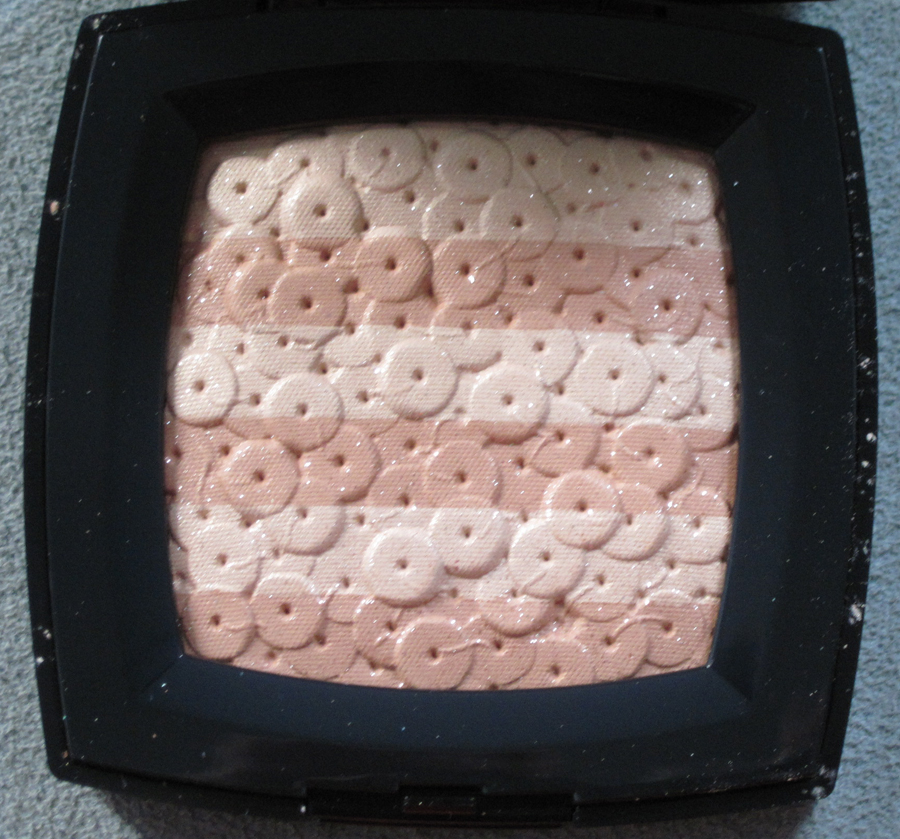
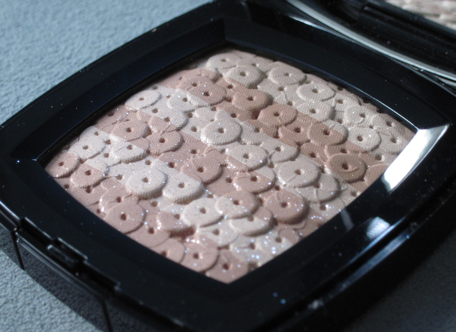
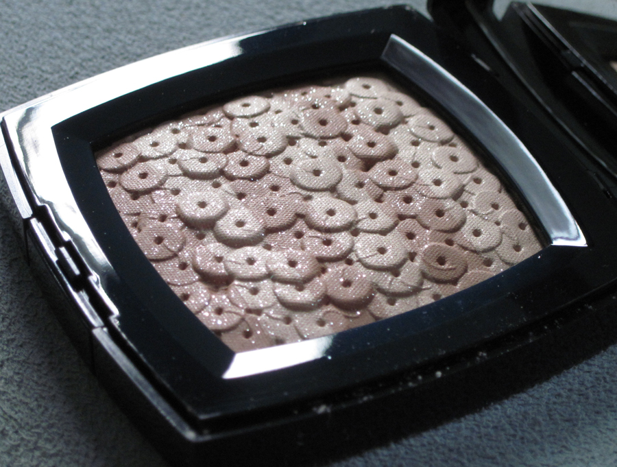
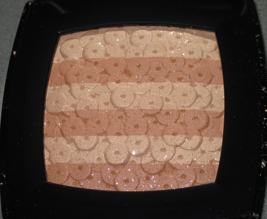
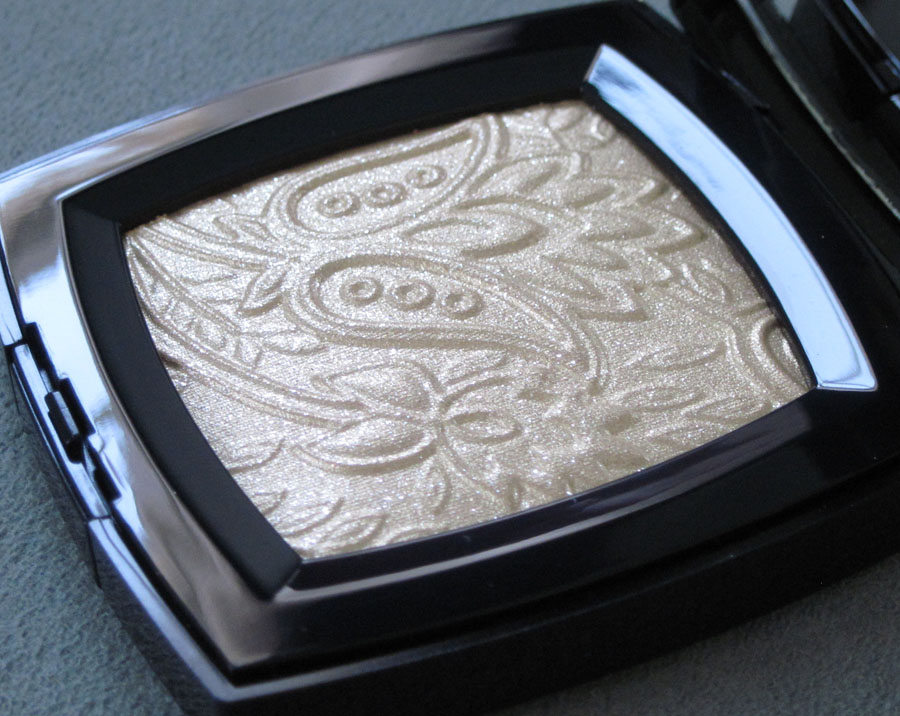
Chanel released this palette for their fall 2012 collection. The sequin embroidery design is a duplicate of its predecessor from the spring 2007 collection.


With flash:

Unlike the 2007 Chanel Lumière d'Artifices palette, this beige version actually seems to be relevant to the brand's fall 2012 couture collection. Dubbed "New Vintage" by designer Karl Lagerfeld, the collection "showcased the
extraordinary handwork which the house’s ateliers and the subsidiary
embroidery houses that Chanel now owns, are so capable of producing… 'All
the tweeds are embroidery,' Karl declared. 'Three thousand hours for
some of them.' Whilst some were created entirely from looped silken
threads and shimmering paillettes, others were sophisticated patchworks
of color-block plaids."
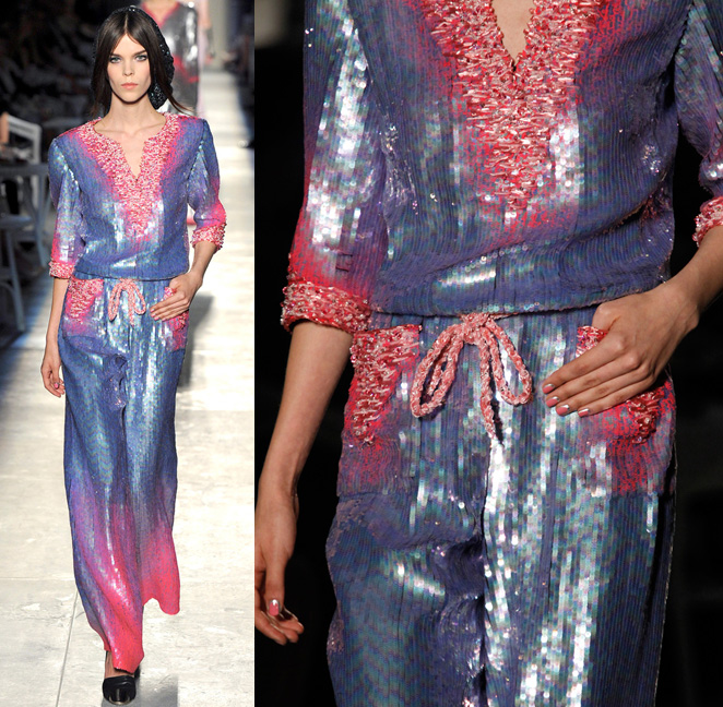
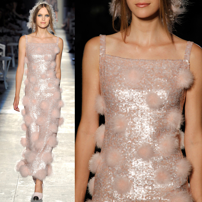
Indeed, several examples of the "looped silken threads and shimmering paillettes" came down the runway.


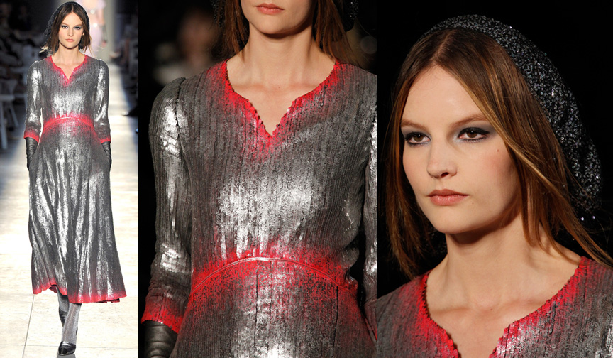
Even the hat for this model showed sequins painstakingly sewn into the fabric.

Not only were sequins in abundance, there were also variations of the subtle stripes of color seen on the palette.
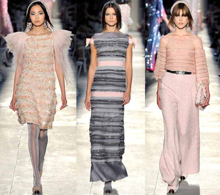 (images from style.com)
While I'm not thrilled that Chanel put out a palette that is, except for color, the same one released over five years ago, I was pleased to see that it was consistent with the couture collection.
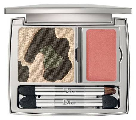
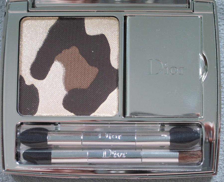
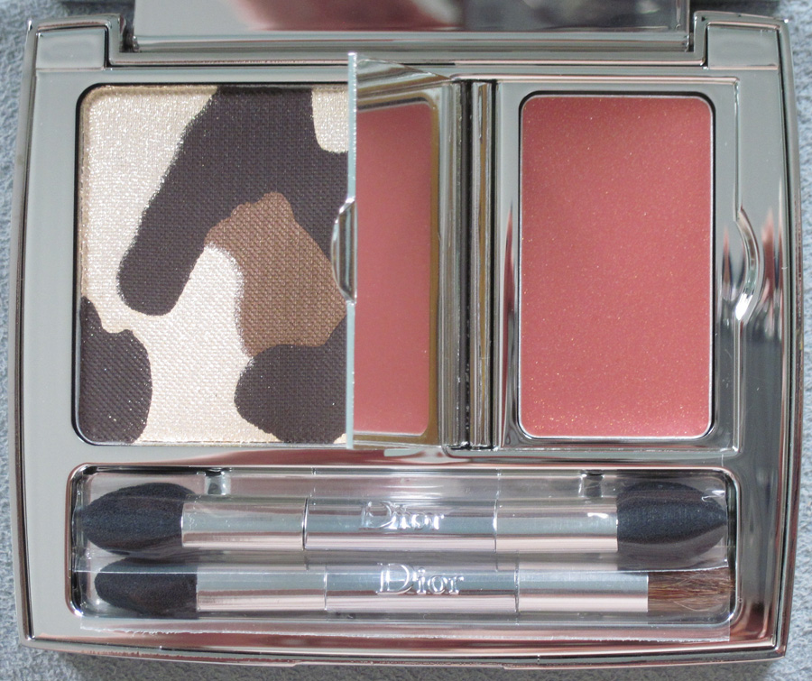
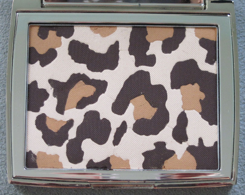
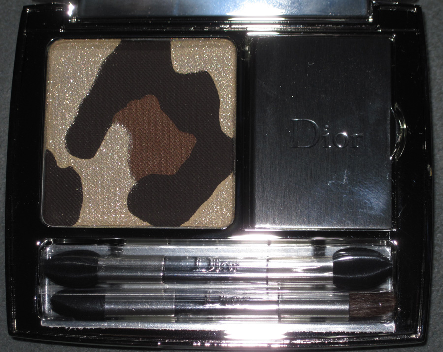
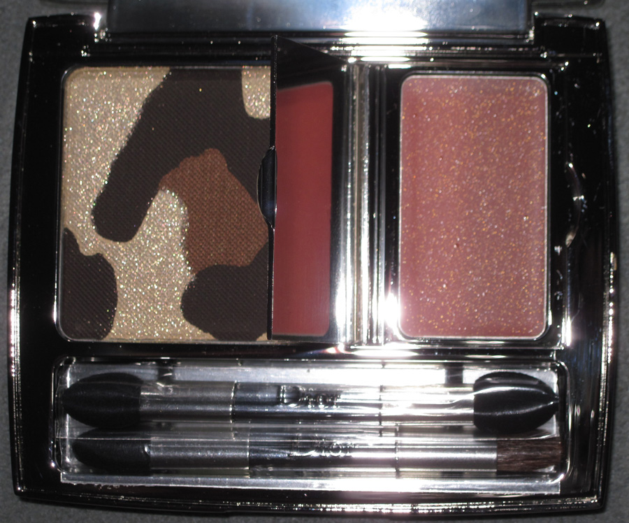
Like the revamped Tailleur Bar palette, Dior seemingly has recycled another palette from seasons past. The fall 2012 makeup collection, entitled Golden Jungle, contains a leopard print palette that borrows from the Mitzah palette from last fall. Actually there are two leopard palettes, Golden Khaki and Golden Browns, but only the latter was released in the U.S. I would have liked to have both but ultimately decided it wasn't worth tracking down Golden Khaki.
Here it is, just for fun:

(image from retailtherapy.onsugar.com)
And here is Golden Browns.


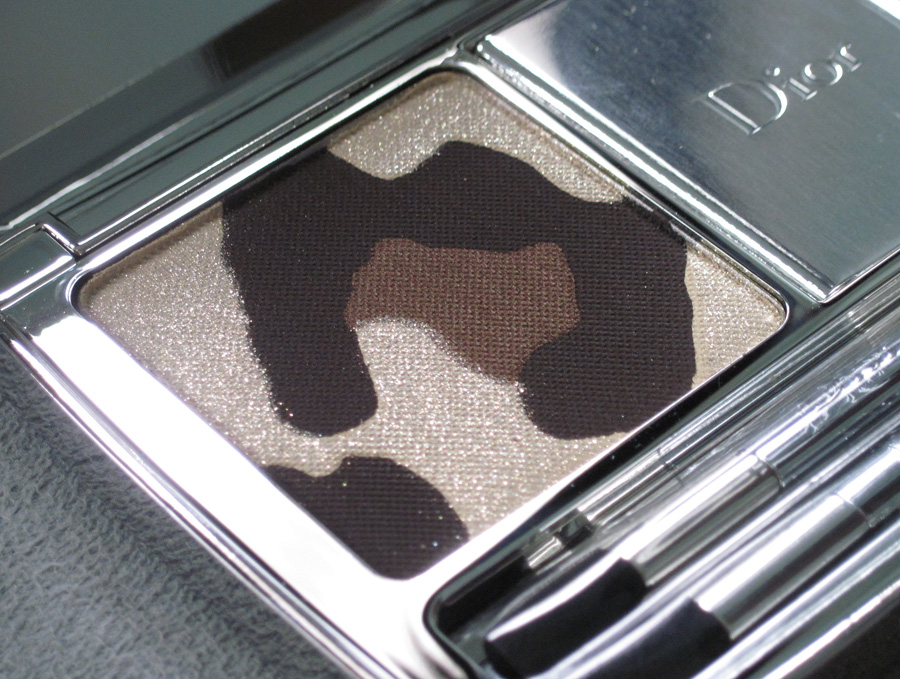
I noticed that this particular leopard spot is exactly the same as the one that's in the middle of the Mitzah palette.

Anyway, here is the Golden Browns palette with flash:


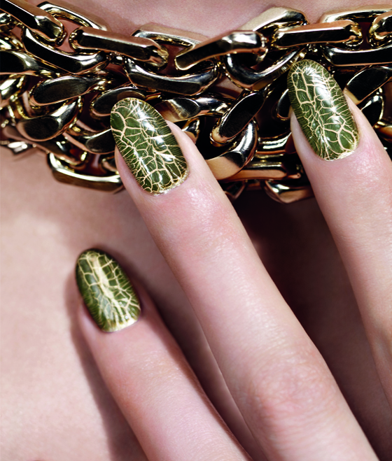
Unfortunately, the U.S. also did not receive this cool nail duo that yields a crocodile skin effect, which is a nice addition to a jungle-themed collection.

(image from retailtherapy.onsugar.com)
According to the collection's press release, Dior's famous leopard print has been "revamped": "In February 1947, Christian Dior presented his first
collection to the international press in the Dior salons of Avenue
Montaigne in Paris. Along with the Huit and Corolle lines that would
inaugurate the era of 'The New Look,' the couturier revealed another of
his favourite themes: Leopard Print. Fashion editors were smitten, the
room burst into applause and women rediscovered the mysterious allure of
this iconic, timeless print.
At once avant-garde, sophisticated and sensual, the Jungle Motif has
been a signature of the House of Dior from its debut. Actress Marlene
Dietrich and the muse and friend of Mr. Dior, Mitzah Bricard, were its
first fervent ambassadors. With each decade and runway show, variations
of leopard print are cleverly reinterpreted by Dior Couture.
In the Dior Autumn/Winter 2012 makeup collection, Tyen revamps the
Jungle Motif with another hallmark of Dior, a touch of shimmering gold,
embodying the luxury of the urban jungle and inspired by the deep,
earthy tones of the jungle."
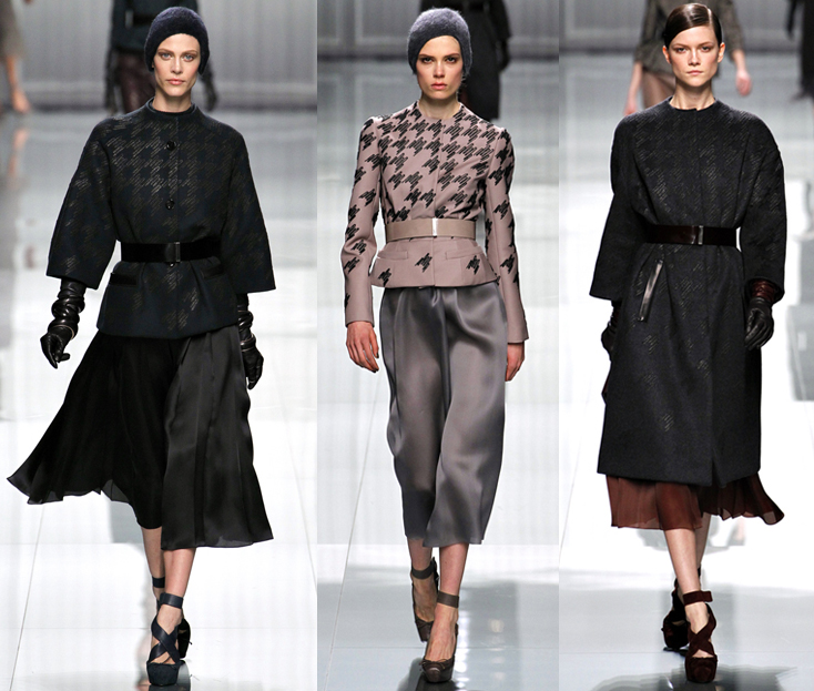
I'm not sure why they chose to revamp it this for this season, as leopard print did not make an appearance in either the ready-to-wear or couture shows. However, there was some houndstooth pieces at the ready-to-wear show.

(images from style.com)
Why not have used that instead of essentially copying the Mitzah palette from last year? Sigh. Dior Beauty had been on a hot streak collectible-wise but this season the company is just recycling previous items. I hope they return to originality and come up with something that pays homage to the designer but isn't a rehash of what they've done before.
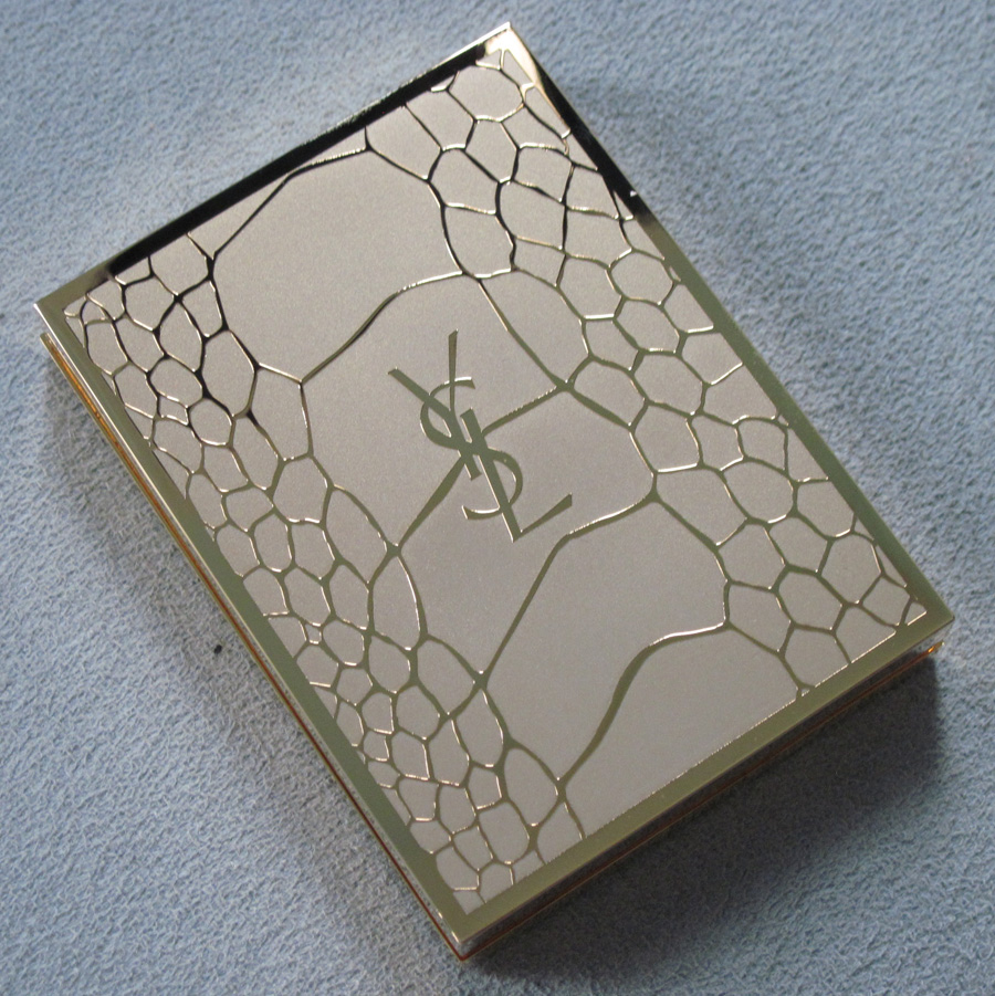
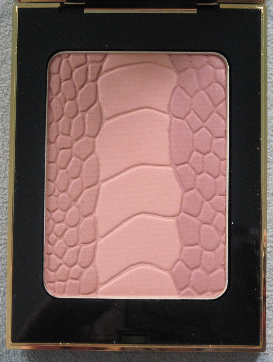
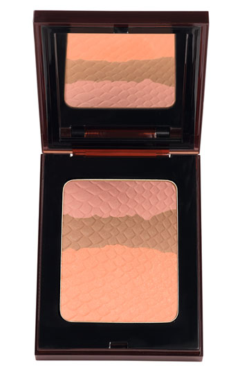
We've seen crocodile-patterned palettes before, but I thought the print looked particularly smashing on the gold outer casing of YSL's Palette Couture for fall 2012. Very luxe!

Apparently crocodile is the "emblem of the YSL accessories
and leather goods collection," according to the press release. I don't know why they never used it on a makeup item before.


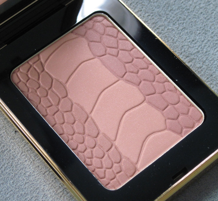
With flash:

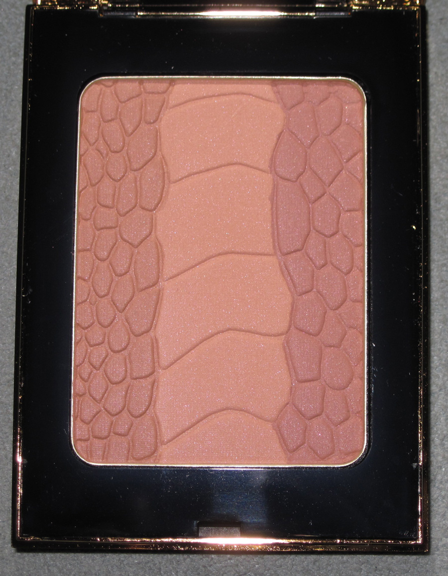
While I think crocodile-themed items always make a good addition to the Makeup Museum, I was disappointed that this was more or less a rehash of YSL's summer 2012 bronzers:

(image from nordstrom.com)
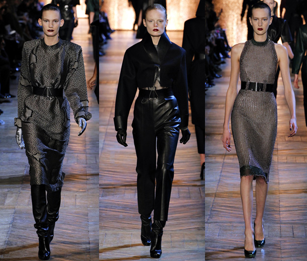
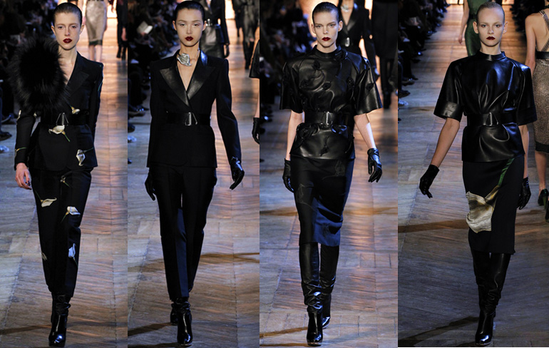
Plus, there was no crocodile to be found anywhere for the fall 2012 ready to wear show. The look was supposed to be "contemporary Amazon" (which was also the theme for the fall 2012 makeup collection). The strong shoulder contours and metal chain mail accompanied by dark blood-red lips and slicked-back hair definitely evoked fierce women warriors.

But what really stood out to me was the use of calla lillies. According to Style.com writer Tim Blanks, "Backless
dresses in a chain mail made of metal and rubber were the ultimate
expression of [designer Stefano] Pilati's hypersexualized vision. So he naturally picked
the calla lily, Roman symbol of lust, as the floral accent for the
collection."
 (images from style.com)
I think that these flowers would have made a more interesting and relevant design for the palette than crocodile print. What do you think?
You may remember that Dior released a gorgeous palette in the fall of 2010, which depicted the designer's "New Look" as sketched by Dior illustrator Rene Gruau. The company released the same palette this fall, only with different colors. I'm puzzled by the decision and wasn't sure whether to purchase it, as it's the same design as the 2010 version. I eventually bought it…a collector can't resist serial numbers!
Let's take a look at it and compare to the 2010 palette.
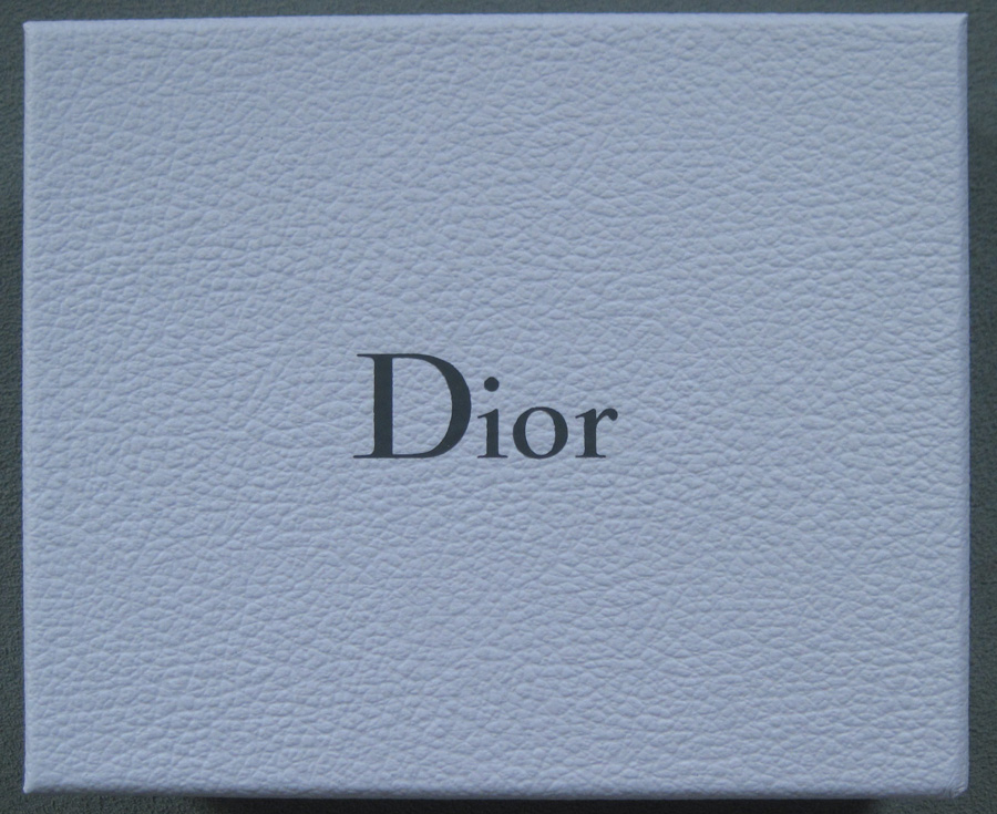
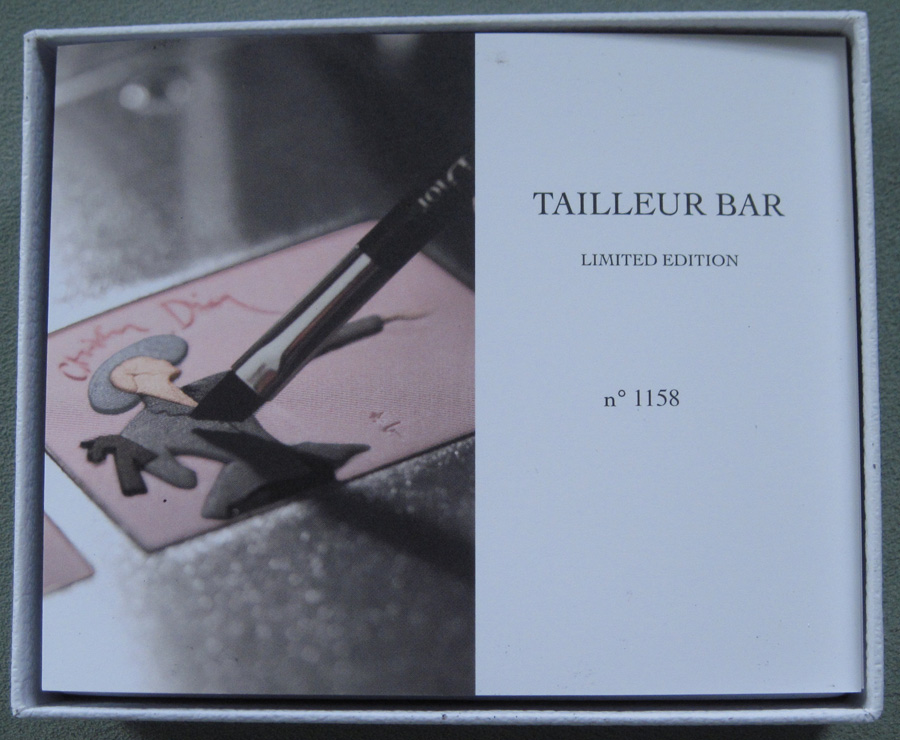
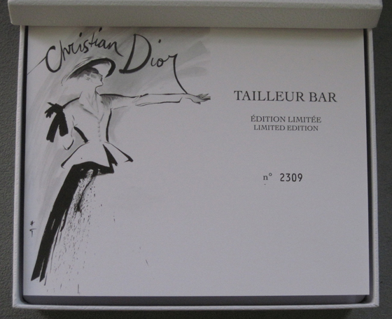
The box is the same pebbled white with the Dior name in the middle.

The pamphlet shows a photo of an eye shadow brush just about to dip into the palette.

The layout is the same (image on the left, text on the right) but the photo is different for 2012. In 2010 Gruau's original sketch was chosen for the pamphlet image.

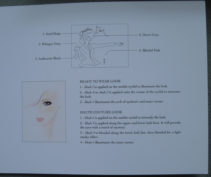
Inside the pamphlet, the copy is the same for the both 2010 and 2012:
However, the 2010 pamphlet contained the description in French as well as English, where the 2012 only included English. "February 12, 1947:
Christian Dior presents his first Haute Couture collection. The public
is amazed: this new vision of an elegant woman, with accentuated curves
and a regal posture would come to be a revolution that took the fashion
world by storm. Instantly named the 'New Look' by Carmel Snow,
Editor-in-Chief of American Harper's Bazaar, the 'Tailleur Bar' (Bar
Suit), perfectly embodied this new silhouette. The jacket, with its
nipped-in waist, and the twirling skirt became the absolute symbol of
the Dior silhouette. Rene Gruau, long-time associate of the Couturier,
immortalized the famous Bar Suit in a sketch that captured Monsieur
Dior's genius in a few cleve strokes This legendary image is now
embossed on a new Dior limited edition eyeshadow palette."
Both contained a demonstration of the looks that could be created with the palette.

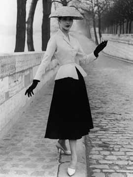
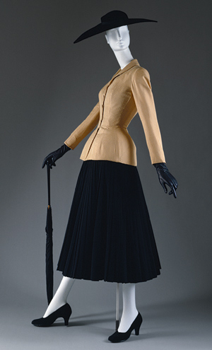
And the "New Look" modeled:

(image from customfad.com)

(image from metmuseum.org)
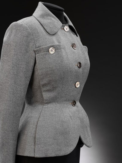
Here's a version of the jacket in grey, just like the palette (although the collar and pockets are different than the original jacket).

(image from vam.ac.uk)
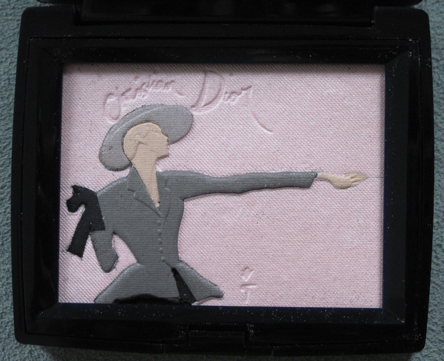
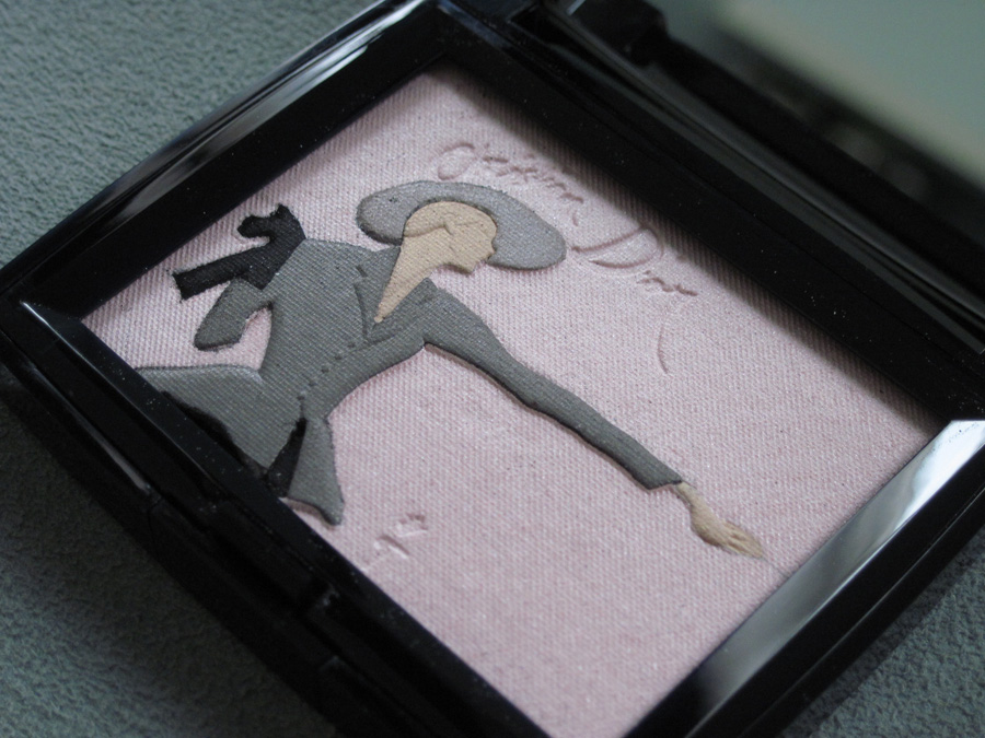
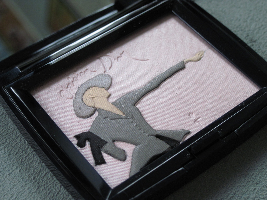
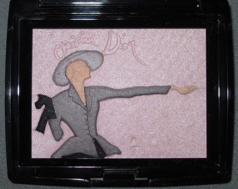
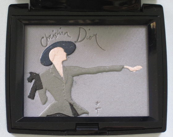
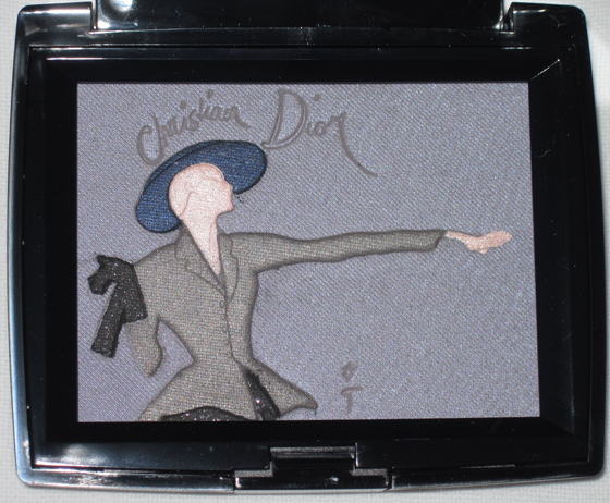
So let's get to the palette itself. It's similarly colored to the 2010 one, but the background is pink rather than grey and the hat is light grey instead of deep blue.


With flash:

For comparison, here is the original 2010 palette:


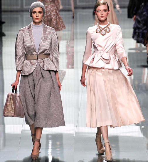
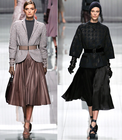
I was trying to figure out why Dior decided to recycle a palette they had done previously so I checked out their fall 2012 ready to wear show to see if a modern "New Look" figured prominently. It was not main theme of the show, but there were some pieces with a New Look feel – fitted jackets and full skirts hitting below the knee.

Edgy leather gloves updated the very feminine and ladylike gloves included with the '40s New Look:

(images from style.com)
I thought these pieces were okay, but a little underwhelming. As one critic said, "['Soft modernity'] was a notion whose nebulosity
dogged the catwalk, where deflated New Look looks simultaneously evoked
Dior's stellar past and its lunar (as in
moonstruck) present… it felt like Dior by the numbers…there was an intangible lifelessness to the clothes."
I have to say that this critique can be applied to the palette as well. 2010 and 2011 seemed to be golden years for Dior beauty, as the original Tailleur Bar palette, Mitzah palette, and Lady Dior palette were released – and all of them featured an original design that perfectly translated a bit of Dior history and iconic fashion into cosmetics. This 2012 Tailleur Bar is simply a repeated design in new colors. Disappointing, yes, but I guess if you missed out the first time around this is a decent replacement.
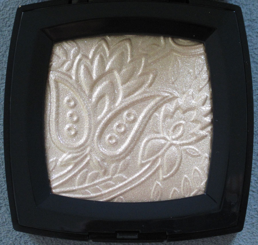
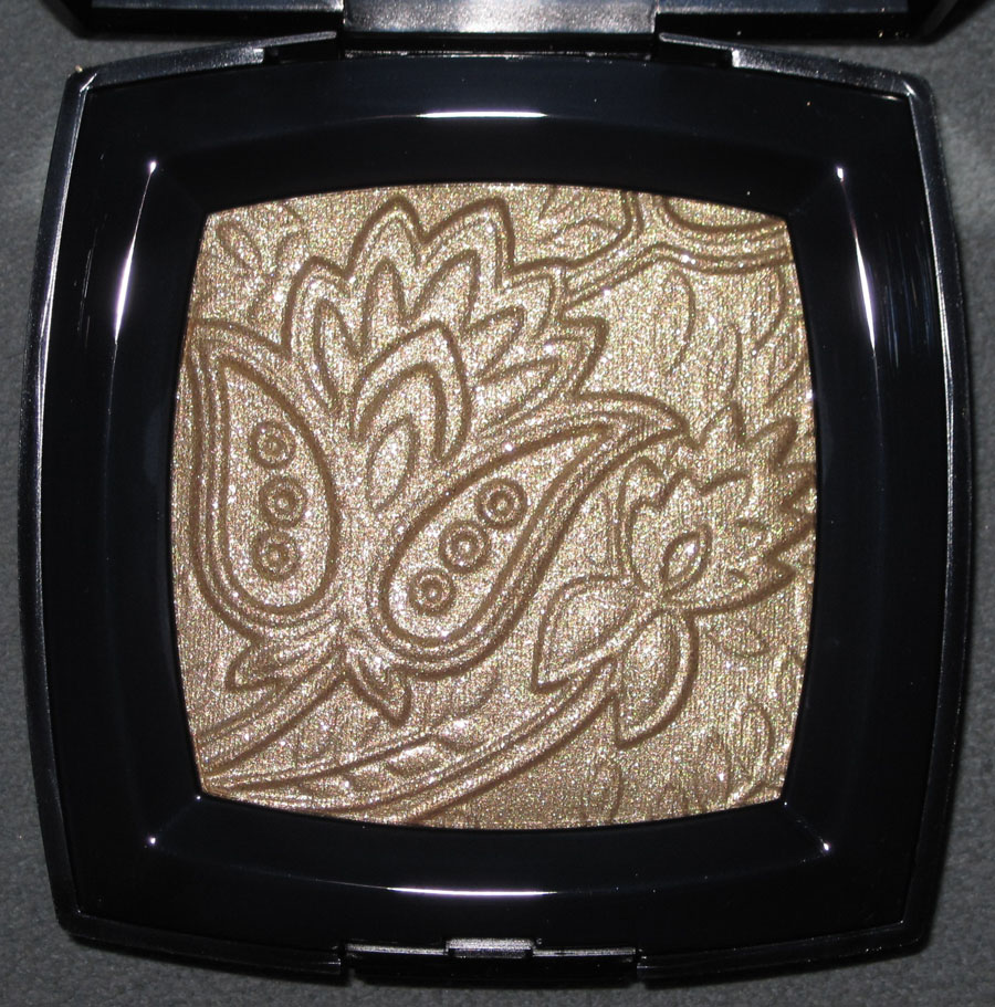
Chanel introduced this very festive highlighting powder as part of its Bombay Express collection, based on the brand's pre-fall 2012 show. From the the press release: "Each year, the Chanel Métiers d’Art fashion show celebrates the exceptional talent of the Métiers Houses, pairing their know-how with a legendary destination. This year, Bombay Express de Chanel showcases a specific vision of India. Peter Philips, Creative Director of Chanel Makeup, intensifies the proportions of iconic Indian eye makeup to give it a universal character. Graphic makeup with saturated colour blocks stretches out from the corner of the eye to express strength and femininity. Eyes succumb to the boldness and mystery of a black eyeshadow in all its nuances with Illusion D’Ombre Mirifique. The rest of the face focuses on gold and light. The Exclusive Creation of the Collection is a precious, evanescent golden powder to dab onto cheekbones and eyelids in scintillating touches. In its classic black-lacquered case, Route des Indes de Chanel recreates an embossed motif of a rare fabric, a piece of bronze brocade from an Indian-influenced collection created by Gabrielle Chanel in the 1960s."


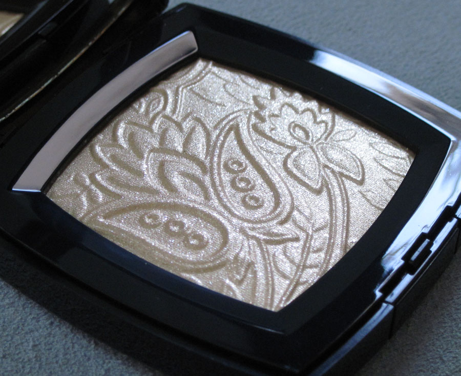
With flash:

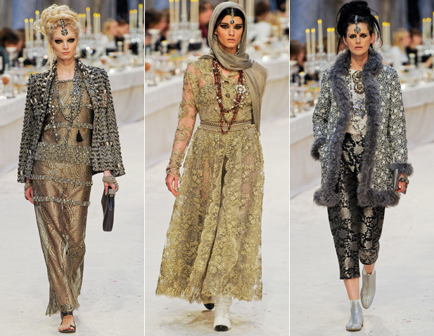
Try as I might, I was unable to find an image of the fabric on which the palette's pattern was based, nor did anything quite like it appear in the 2012 collection. Sigh. However, I do think the palette captures the fashion's extremely opulent and lavish feel (reminiscent of their pre-fall Byzantine collection last year). While there were no overtly similar patterns to the palette, there were some intricately designed pieces:

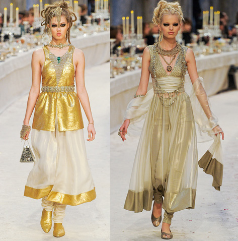
Along with lots of gold:


(images from style.com)
On the one hand, it's nice Chanel didn't go too literal with the palette's motif. On the other hand, it would have been nice to see it referenced somewhere in the collection – maybe not in the actual clothes but perhaps in a bag or jewelry.
What are your thoughts on the Route des Indes palette?
I have a little game for you. Who wants to play Makeup Museum Curator? Today you can!
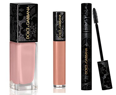
I spotted this new collection from Dolce & Gabbana at Saks's website. It includes nail polish, lip gloss and mascara all in sexy black lace packaging.

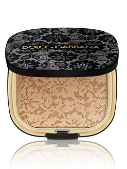
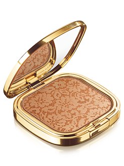
There's also the bronzer, which is identical (except for the outer case) to the previously released Sicilian Lace bronzer.

The older one just had a plain gold case:

(images from saksfifthavenue.com)
Now it's time for you to play Curator. My question is, do you think I need to procure the newer Sicilian Lace bronzer for the Museum, along with the other items in the collection? Or do you think the older version in the gold case is good enough? I'm genuinely up a creek here! The black lace on the newer version is much fancier and the other lace-topped pieces would round it out nicely, but I do have to consider that the fall collections are arriving and I will need funds for those items – why should I buy something that's virtually the same to an object I already own?
Won't you weigh in in the comments, please?
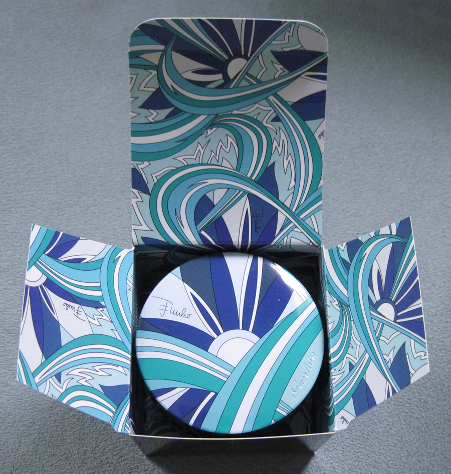
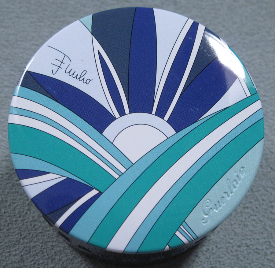
Guerlain collaborated with fashion brand Pucci for the cosmetics company's spring 2007 collection. Five years later, the two teamed up again to give us the Bella Azura summer collection. I think Guerlain's press release did a nice job of describing the collection: "'Guerlain by Emilio Pucci' embodies the union of two prestigious Houses in perfect synergy. This exceptional makeup collaboration draws its inspiration from summertime in the Italian Riviera, with its light-hearted and energetic 'dolce vita' attitude that welcomes the warm, sea weather. Created by Guerlain Creative Director, Olivier Echaudemaison, and Pucci’s Image Director, Laudomia Pucci, the collection embraces summer with delightfully sunny shades and vibrant bursts of color. The common thread of this second collaboration is a motif inspired by an iconic print, 'Winter Capri', taken from the Emilio Pucci archives. Exclusively retouched for this collection, this signature print, a blue flower interlaced with swirls and flames, adds a joyful and elegant Pucci touch to the Guerlain summer products."
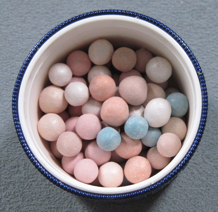
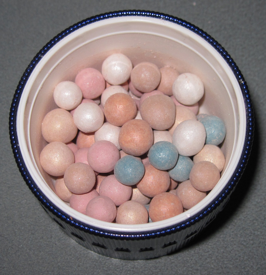
I picked up two items: perennial highlighting fave Météorites and the powder brush.
Guerlain did a great job putting different parts of the print on the sides of the Météorites box.


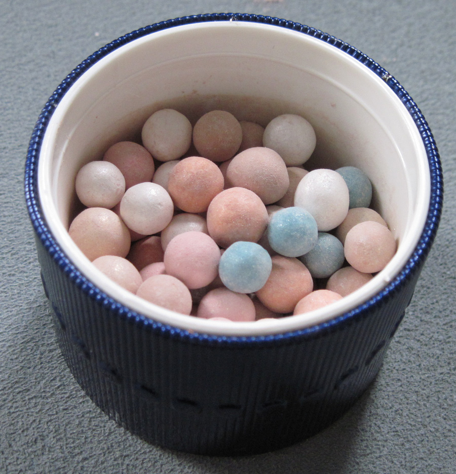
Interestingly, the sides of the container are plain blue – the 2007 Météorites container had the print on the sides as well as the top.

With flash:

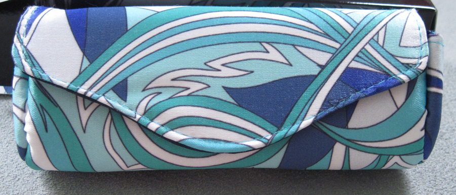
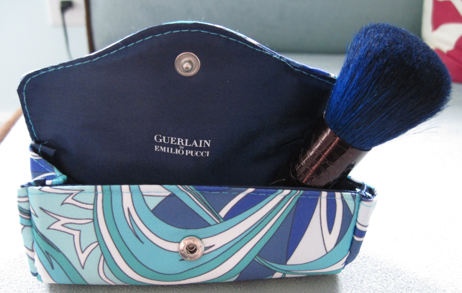
Here is the blue-tipped brush, complete with its own Pucci-printed carrying case.


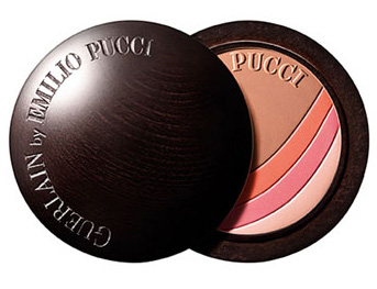
There was another collectible item that the Museum, sadly, did not have the funds to purchase (I suppose I could have, but that would have meant not buying other necessary summer 2012 items): the Bronzing Powder & Blush. The shiny wood case was supposed to be reminiscent of yacht paneling. "The star of the collection, this exquisite powder and blush combines two success stories: Guerlain’s legendary Terracotta powder and Emilio Pucci’s iconic prints. The world of beauty and fashion unite in a single case to beautifully enhance the complexion. Half bronzer and half blush, this hybrid powder has a lightweight formula and offers a universal harmony of four shades. The outer case pays tribute to the paneling of a Riva yacht with an ebony-colored varnished wood. Presented in an accessory pouch printed with the Pucci motif, this is the ultimate summery accessory."

(image from nordstrom.com)
I didn't buy it because it was the most expensive of the three items shown here, and I think the Météorites is always the "star" of any Guerlain collection, no matter what the ad copy says. Still, it's a gorgeous piece and if I didn't have to sacrifice buying something else, I would have gotten it.
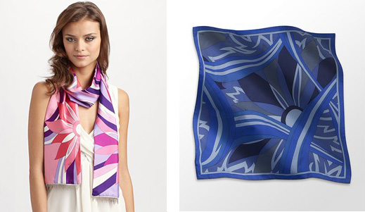
Anyway, let's talk a little about the "Winter Capri" print. I couldn't really find anything on the history of it – the design process used by Pucci to create it, how it was used previously, etc. I do know that it still exists today in scarf form:

(images from saksfifthavenue.com and polyvore.com)
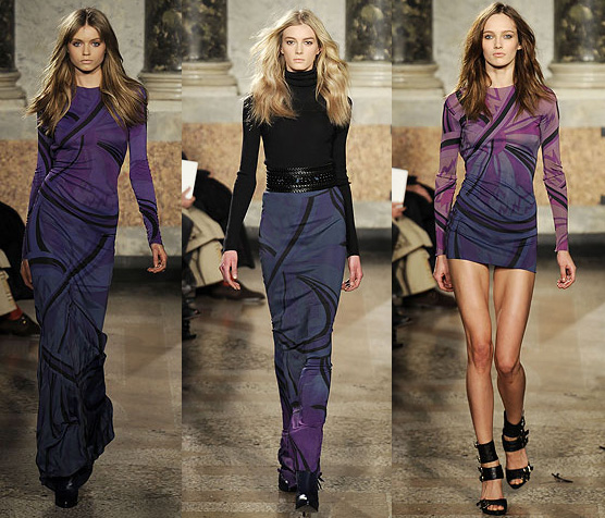
I searched through many runway archives to see if it had been used there, and sure enough, it made an appearance in the fall 2010 collection.

(images from style.com)
I think it works better in the bright blue and aqua hues in the Guerlain collaboration, but it was very interesting to see it take a darker turn for a fall collection. Other than this example and the scarves I was unable to turn up anything else on the print. I do wonder why Pucci decided to resurrect it for this particular collection, although I'm happy they were using an actual Pucci print. For the 2007 collaboration Guerlain came up with a new, "Pucci-inspired" print, which I did find a little odd (although very pretty) – why not just use an existing one? In any case, I'm enjoying the 2012 collaboration more than their previous one. I find the print more appealing, and I like that it was a unique one from the archives that hadn't been done to death.
Do you like this collection? And are you a Pucci fan?
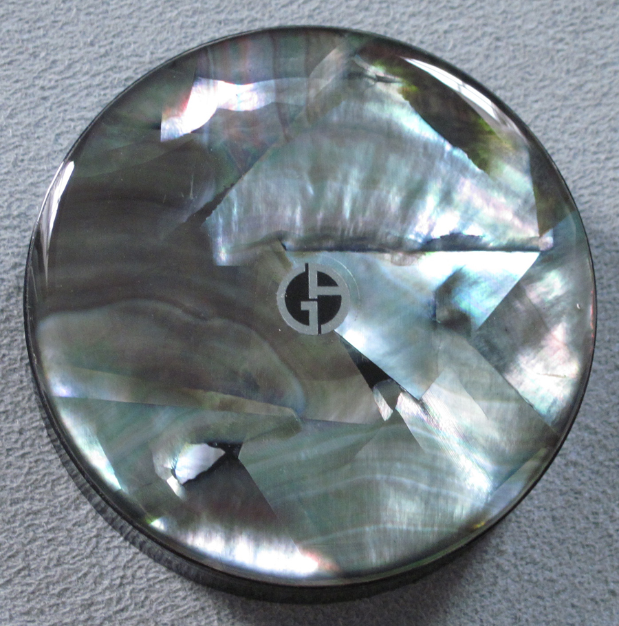
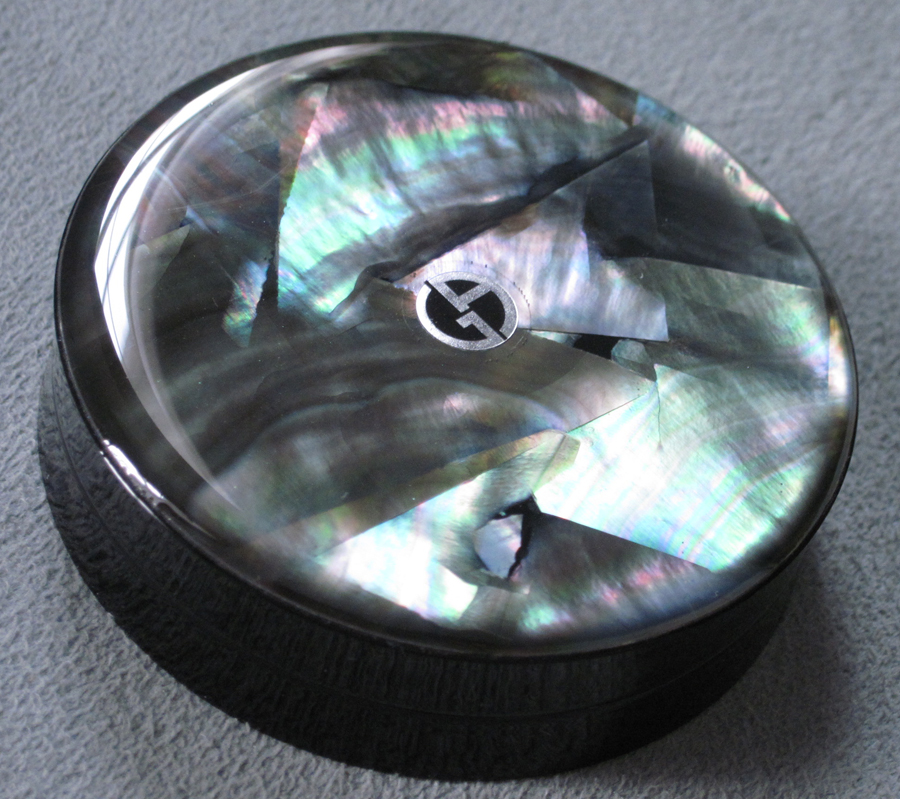
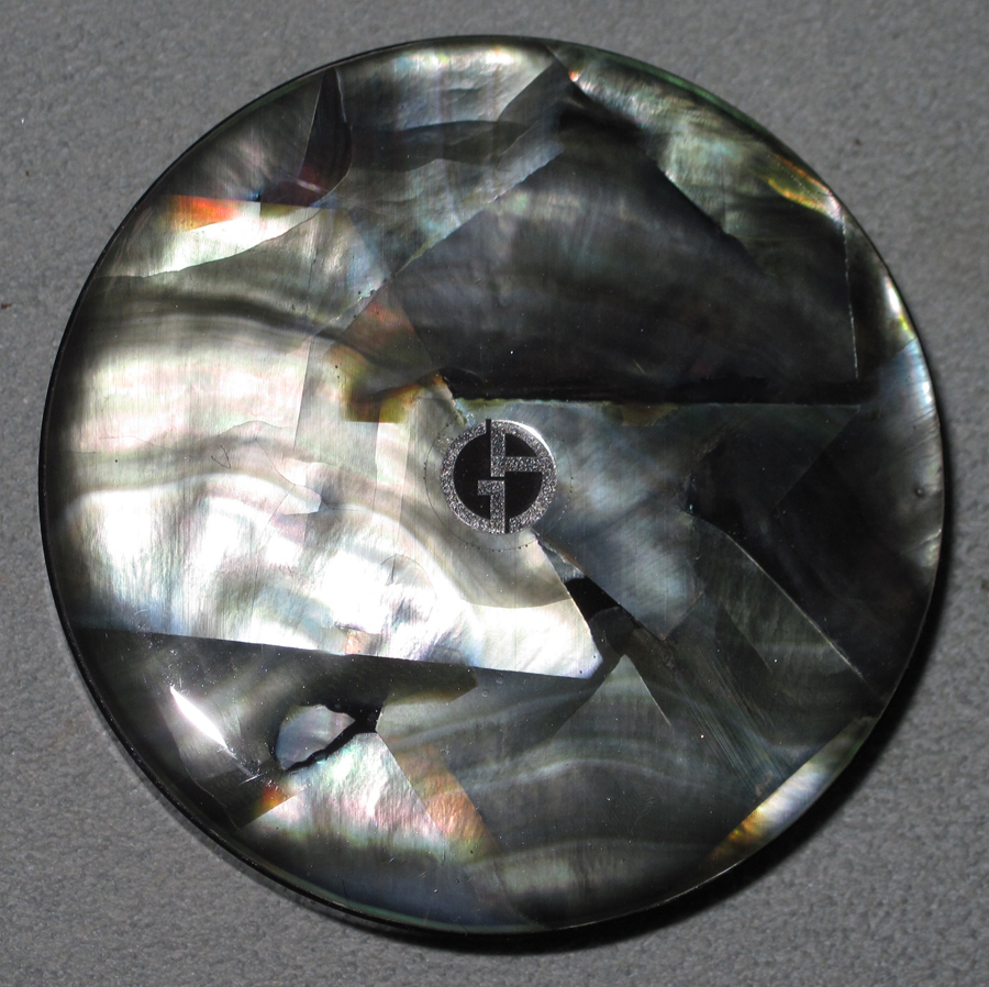
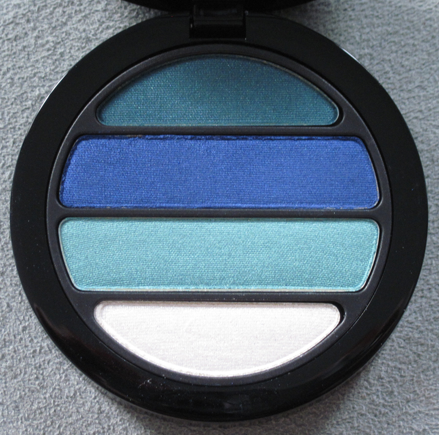
While this summer palette from Armani is essentially the same as their 2011 holiday palette (only with black of mother-of-pearl instead of white), I'm in love with it…and the whole summer collection, for that matter. I rarely connect to the descriptions that come with collections – I find them to be fairly empty – but the copy for Armani's Les Ecailles really spoke to me and is definitely part of the inspiration for the Museum's summer exhibition (coming soon!). "This summer, Giorgio Armani Cosmetics reveals a new facet to uncover the mysterious allure of the sea: women’s beauty linked with the depths of the sea, where reds and oranges disappear, giving way to cooler liquid tones." Linda Cantello, International Makeup Artist for Armani, says, "This collection is inspired by the play of moonlight on the ocean, by myriad shades from inky depths, by white and black pearls. The complexion is pale and luminous, lips are soft and feminine." I love these two ideas: the mystery held by the depths of the sea and the patterns light makes when it reflects off the ocean.
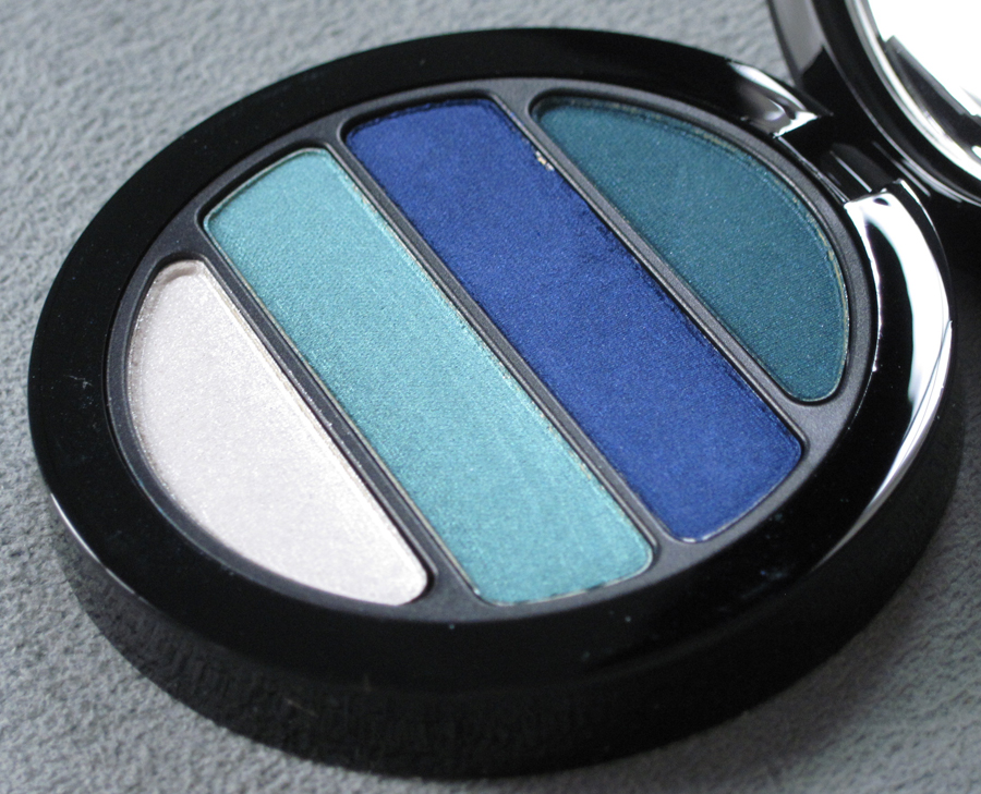
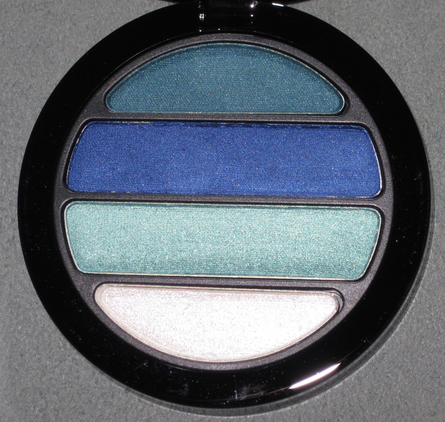
Onto the palette, which contains "a harmonious blend of deep sea blue, algae, lagoon turquoise and shimmering crest-of-a-wave white: colours to awaken eyes with a splash of natural radiance."


With flash:

Inside:


With flash:

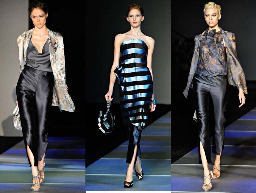
As with the holiday 2011 Madreperla palette, this one draws on Armani's spring/summer 2012 fashion collection. As one review says, "The theme was aqua—or perhaps more accurately, what happens to aqua when moonlight hits it and causes all sorts of ripples and reflections." I chose to highlight some of the darker-hued pieces from the collection:

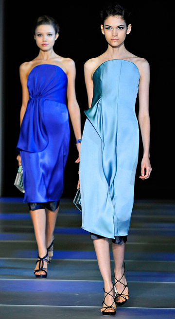
In looking at the spring-summer collection again, I noticed that the colors on the runway are identical to some found in the summer makeup collection. For example, these blue and aqua dresses are the same shades of the two middle colors in the summer palette.

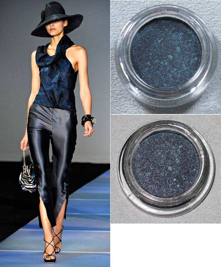
And this shimmery blackened teal blouse is exactly the same as the summer collection's Eyes to Kill eye shadow in Obsidian Black (shown in natural light on top and with flash below):

(runway images from vogue.com)
Again, while a mother-of-pearl palette is more or less a repeat of holiday 2011's star product, I feel Armani took it in a new direction. When you see the palette with the rest of the colors in the collection and compare them to those on the runway, it does feel more inspired and distinct from the white mother-of-pearl palette we saw a few months ago, rather than merely recycled.
What do you think?
Welcome to the Makeup Museum's On the Water week! I'm kicking it off with a water-inspired eye shadow palette from Dior's summer collection. From their press release:
“'On vacation, you can wear all the colorful and casual clothing that you like, but you must always be elegant,' said Christian Dior. Inspired by the art de vivre of the French Riviera, the Dior Croisette Collection combines the peace of the French countryside with the splendour of Saint Tropez. These locations have always been a prolific source of inspiration for Christian Dior. From Dior’s first swimsuit collections and seaside fashion creations in the Fifties to the current Cruise Collections, the French Riviera also embodies the brand’s most daring, fresh and colorful lines today. Between the shimmering turquoise of the Mediterranean Sea and the sparkling gold of the sand, through soft coral and bikini pink, the Croisette reveals all its elegance and optimism in sunny and aquatic-inspired shades. The skin is warmed up and illuminated in a natural glow effect, while the eyes are dressed up with luminescent sunny shades or fresh azure blues. The lips are colorful and subtly sparkling while the nails complete the look with coral and blue shades inspired by the most glamorous emblems of the French Riviera."
As a side note, I must agree – the colors in this collection are spot-on for creating this look. For my personal non-Museum stash (i.e., things I actually wear) I picked up Orange Pareo lip gloss, a shimmery sheer orange, and St. Tropez nail polish, a pale aqua. I'll be pretending I'm a rich jetsetter spending a few weeks on the Riviera whenever I wear them. 🙂
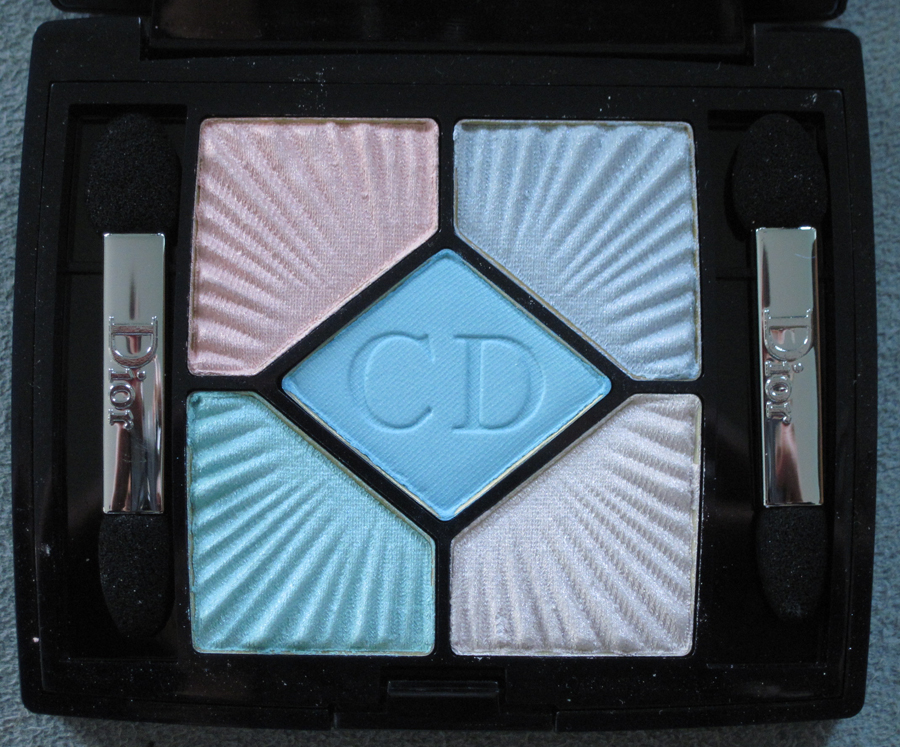
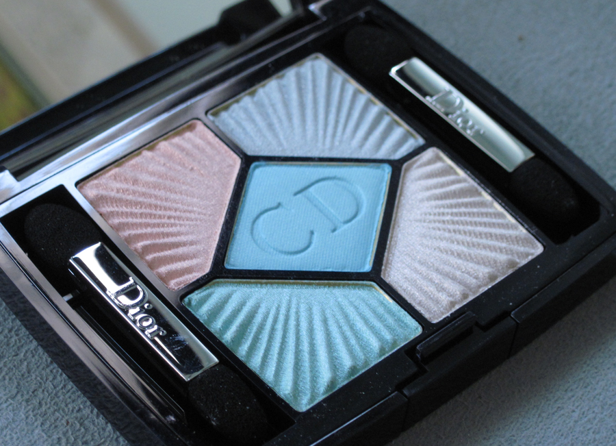
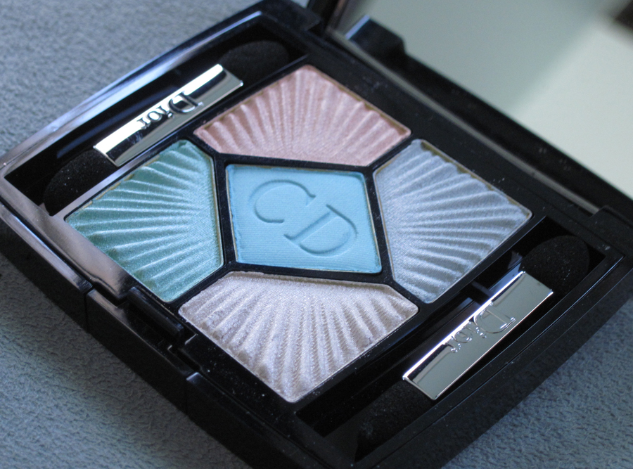
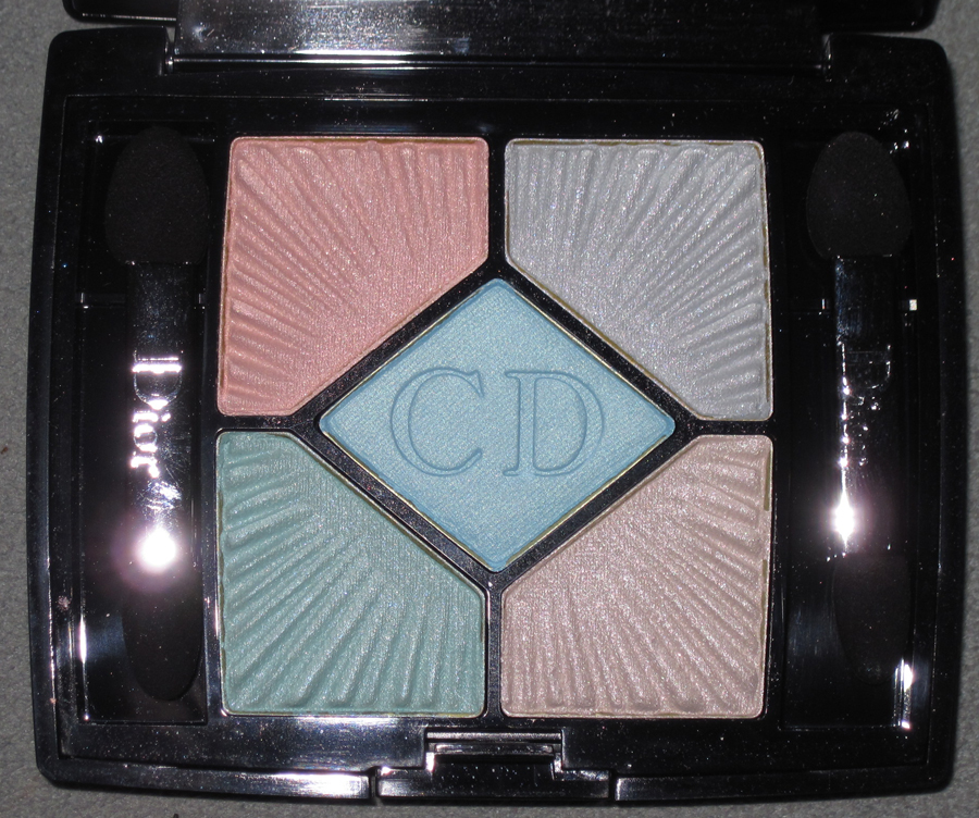
Anyway, I got the eye shadow quint in Swimming Pool. The embossed, sunburst-like pleats mimic those found on Dior dresses. Swimming Pool is "meant to recall a dive into the Mediterranean". Well, a pool isn't the same as a sea so I'm not sure why they named it Swimming Pool instead of Mediterranean, but whatever – both are water and that's good enough.


With flash:

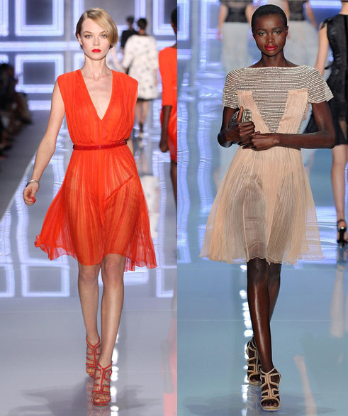
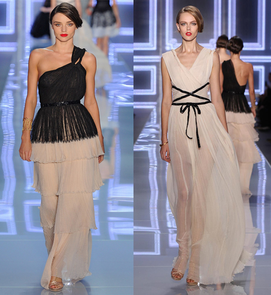
While this isn't the most impressive piece from a design standpoint, given how intricate some of Dior's other palettes have been, it definitely is in keeping with Dior's 2012 spring/summer ready-to- wear collection. Pleats abound in the evening dresses, both short and long:


(images from vogue.it and dior.com)
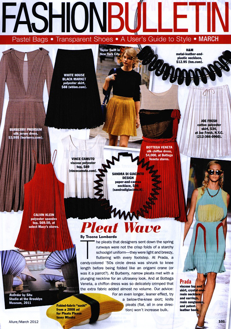
I'm sure Dior was one of the fashion houses responsible for making pleats one of this summer's hot trends, as evidenced by this round-up in Allure magazine:

This is another one of those Museum items I'm tempted to use – the colors are so fresh and summery.
What do you think of Dior's summer collection? And do you do pleats?
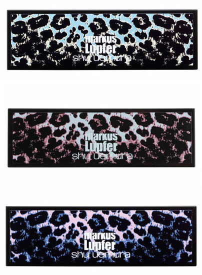
I'm way overdue on posting on this collection – it was released in February – but I thought that by now I would have the items in my hands. German-born fashion designer Markus Lupfer collaborated with Shu Uemura to produce a UK-exclusive collection featuring a leopard print from the designer's spring 2012 lineup. I simply don't have the wherewithal to call Selfridges (they will ship to the U.S. only if you call, you can't order online) or scour E-bay for these in order to have them in my possession, so stock photos will have to suffice. For now anyway…I may still pick these up for a special exhibition for which I'm currently hashing out the concept. 😉
The collection contains three customizable palettes available in mint, pink or blue leopard:

(image from vogue.co.uk)
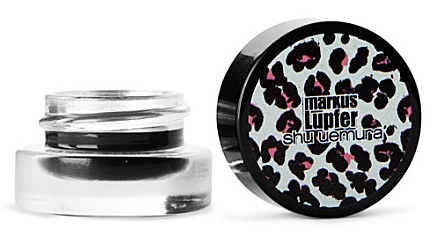
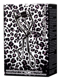
Along with a gel eye liner and eyelash curler:

(image from selfridges.com)

(image from shuuemura.co.uk)
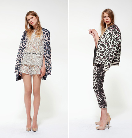
Said the knitwear designer on the collaboration, "It's a dream come true for me to collaborate with Shu Uemura…I love the colours and textures that Shu Uemura has to offer, and feel that both our brands have such a similar spirit." Here is the leopard print that appeared on some of Lupfer's pieces from the spring 2012 season:

(images from style.com)
Leopard print always lends itself perfectly to makeup design, whether it's on the outside of the packaging, as in this collection, or in the makeup itself (see D&G's Animalier bronzer for an example). So I thought this was a good use of Lupfer's work.
Are you into leopard print either in makeup or clothes? And had you heard of Markus Lupfer before his collaboration with Shu? (I admit I hadn't.)
 (images from style.com)