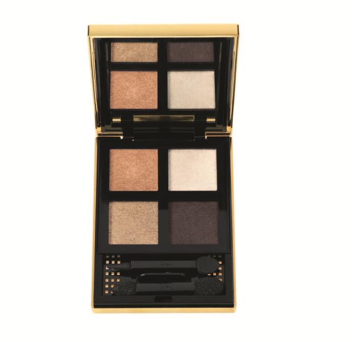
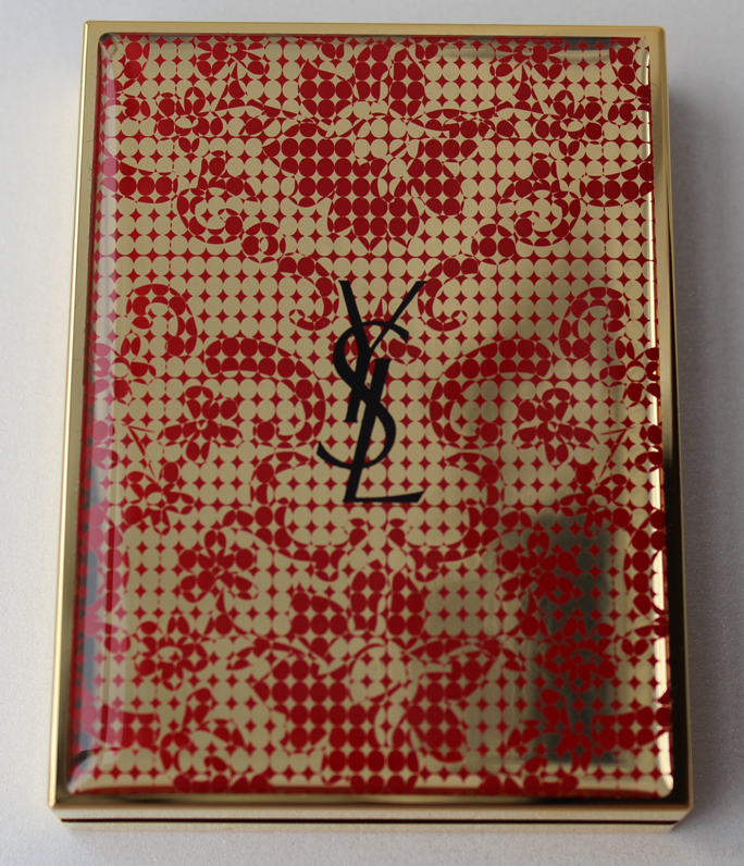
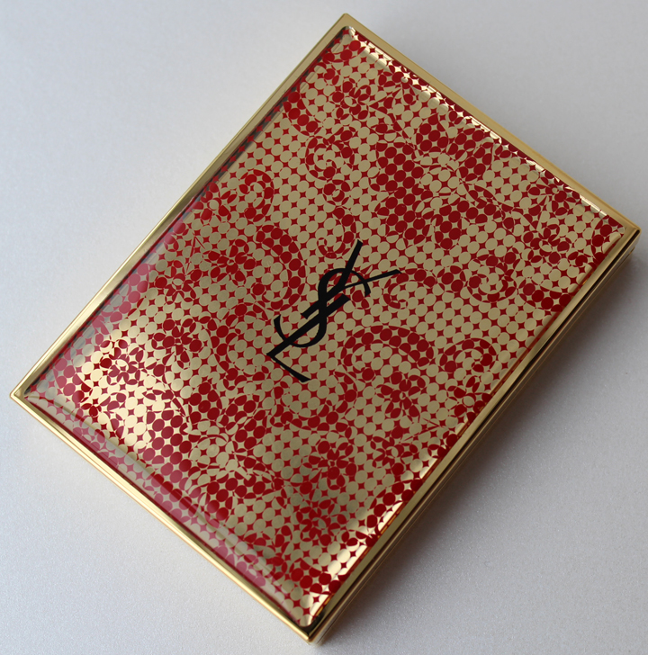
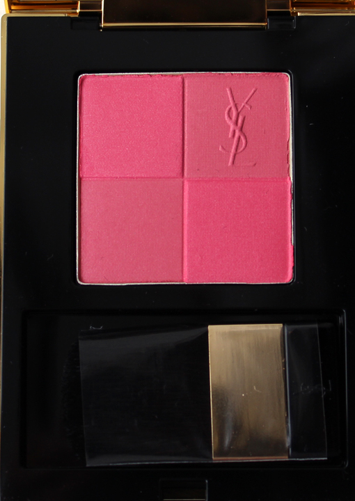
As you know, I've been quite harsh on the more recent releases from Yves Saint Laurent. Just as I had completely lost my faith in the brand being able to come up with some worthy collectible items, they released this beauty in honor of the Chinese New Year. Outfitted in red and gold, the colors of the Chinese New Year, the design is inspired by one of YSL's floral print open-back dresses as well as the cherry blossoms used as decorations in various Chinese New Year celebrations.


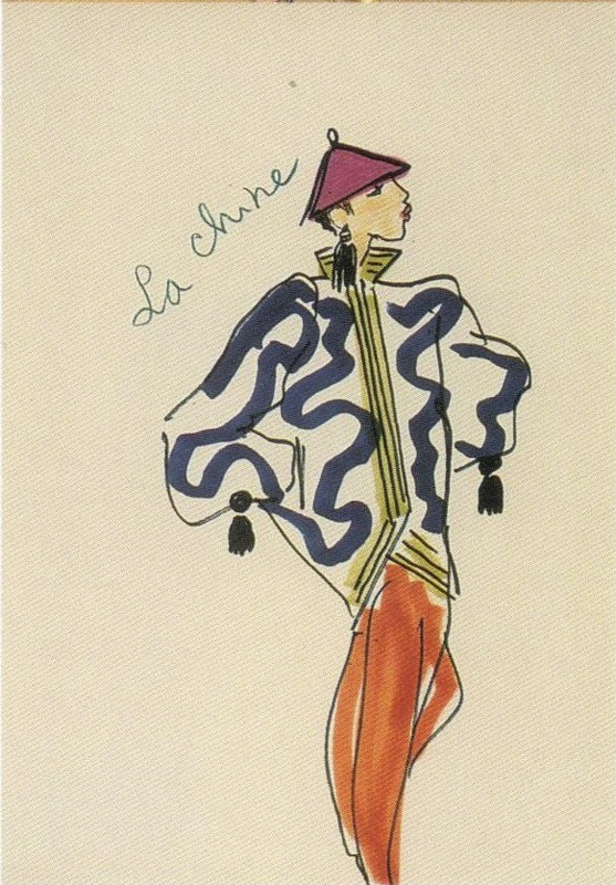
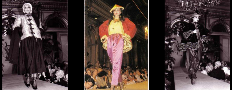
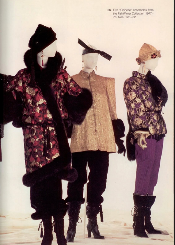
While I wasn't able to find any dresses remotely resembling the pattern on the palette, I did come across one clue as to why YSL would release a Chinese New Year-themed palette: namely, the designer's iconic Fall/Winter 1977 Chinese collection. As The Handbook of Fashion Studies explains, "Saint Laurent had a very French idea of the Orient stemming from late seventeenth and eighteenth-century exoticism and chinoiserie, commingled with twentieth-century collecting and the display of artifacts in European interiors and museums." I'm a little surprised I wasn't aware of this very influential fashion collection, or the link between it and the release of the designer's legendary fragrance Opium, which launched later that year (and went on to inspire two gorgeous palettes.)

(image from pinterest.com)

(images from fondation-pb-ysl.net and pinterest.com)

(image from decadesinc.com)
Style and culture blogger Suzanna Mars has an excellent description of the collection: "St. Laurent was on an exotic-destination high that summer of 1977, having earlier discoursed on Les Ballets Russes, gypsies, and peasants a l'Espagnole. Now he ventured onto the steppes of Outer Mongolia for a fantasy (but still wearable) collection, his most sumptuous to date. In a 2.5-hour runway show, St. Laurent sent models down the catwalk in Empress dresses (robes d'Imperatrice), pantalons, vests, jackets, and kimonos. These garments were rendered in suede, taffeta, silk, oilskin, damask, satin, and velvet with gold-thread embroidery, tassels and mink trim. The gold thread cost $200 a meter. Tatar and Chinese influences were equally represented in a triumph of aesthetic refinement."
Seeing this collection, along with how Tom Ford re-invented the theme for his final YSL show in 2004, gives me a much better understanding of the link between the palette and the fashion – something that's been sorely lacking in recent YSL beauty releases. While I do wish I could see the exact YSL dress that inspired the pattern, this palette is much more harmonious in terms of the fashion of YSL while also beautifully representing the Chinese New Year.
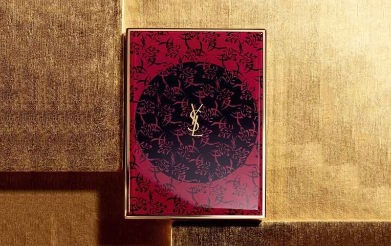
Interestingly, when I was researching the connection between YSL and China, I stumbled across this equally lovely palette that was apparently released back in the fall of 2013 in honor of the brand's launch in China.


(images from butterboom.com)
I'm adding this to my "ones that got away but still hoping I can track down" list. 🙂
What do you think of Chinese New Year palette? Has YSL Beauty made a comeback in your eyes?
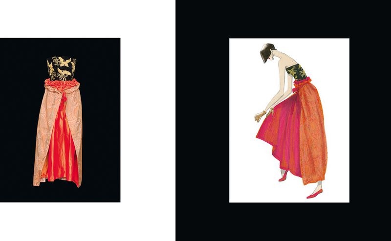
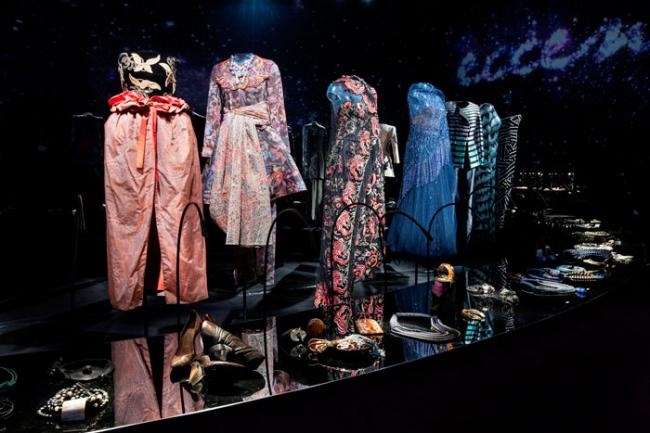
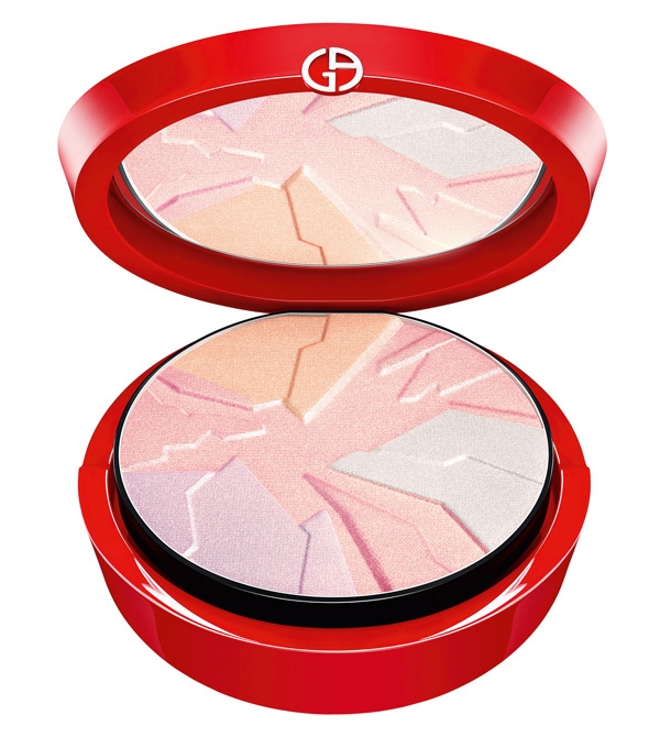
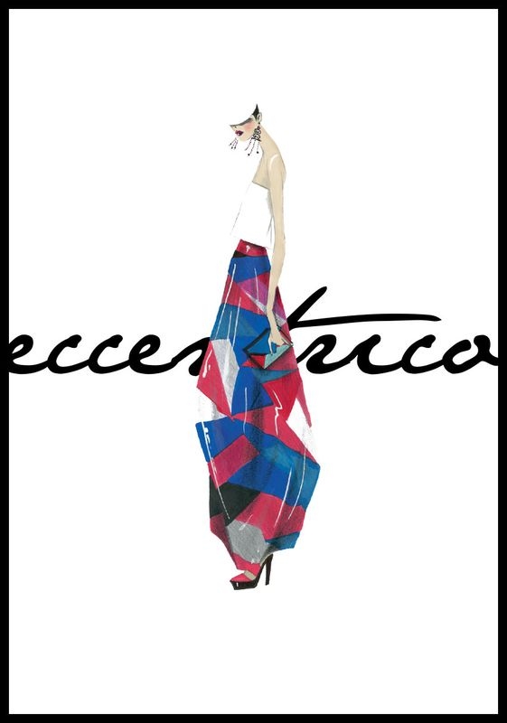
This is an unusually vibrant offering from Armani for the holiday 2013 season. The Eccentrico collection was created in conjunction with the fashion exhibition of the same name. "Eccentrico" was a pop-up exhibition debuting for one night only in Milan, Tokyo, Rome and Hong Kong that displayed some of Armani's more memorable designs spanning from 1985 to the present day. From the website, in the designer's own words: "Eccentrico is an installation of exceptional clothes and unique accessories, a journey through the imagination and a study of the capacity for transformation, playing with shapes and materials to explore cultural connections and artistic symbols. It is this aspect – of the unusual – that I wished to highlight, because it represents an exuberant form of creativity that extends the concept of minimalism and rigour linked with my fashion design. And as simplicity of line does not equal simplicity of thought, I have underscored the wealth and freedom of inspiration that form the foundation of my work and that tell a long and unexpected story. My own story, beyond the clichés."
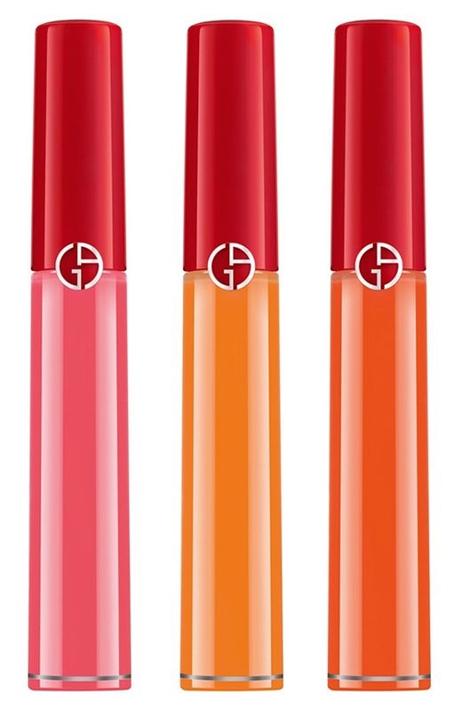
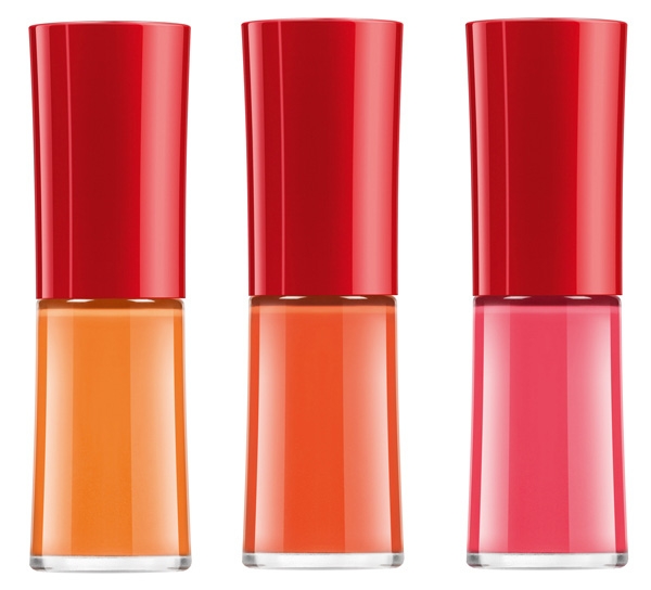
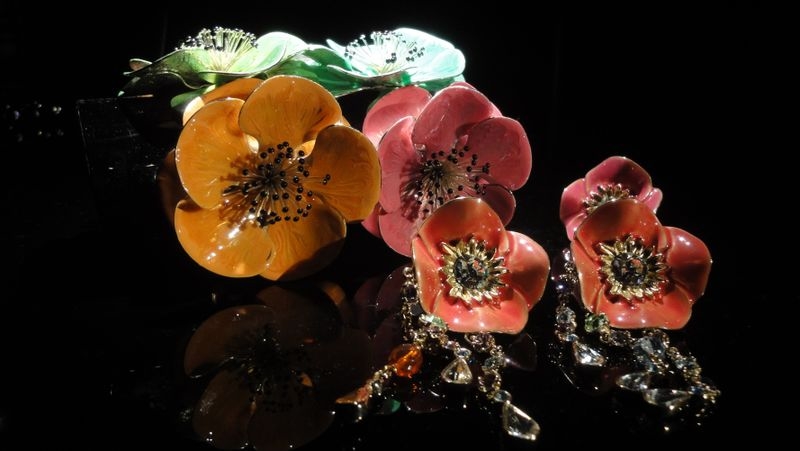
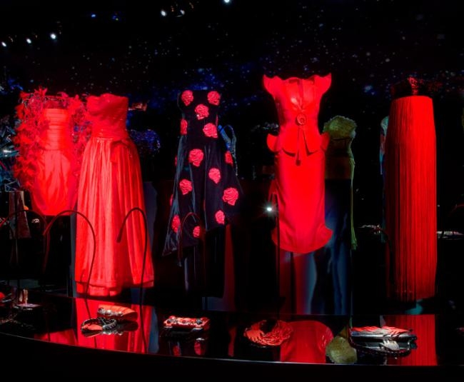
For the holiday makeup collection, the "Eccentrico" spirit was captured in some strange and unexpected colors that, at least to my eye, read more spring/summer than winter. However, they are appropriate given the colors of the items in the exhibition. A bold palette of red, pink and orange was repeated throughout. Compare the lip glosses and nail polishes to the flower brooches and some of the dresses:


(images from chicprofile)

(image from becomingarmaniman.com)

(image from www2.stile.it)

(image from corraini.com)

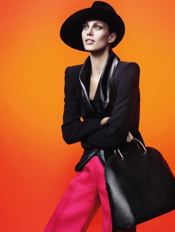
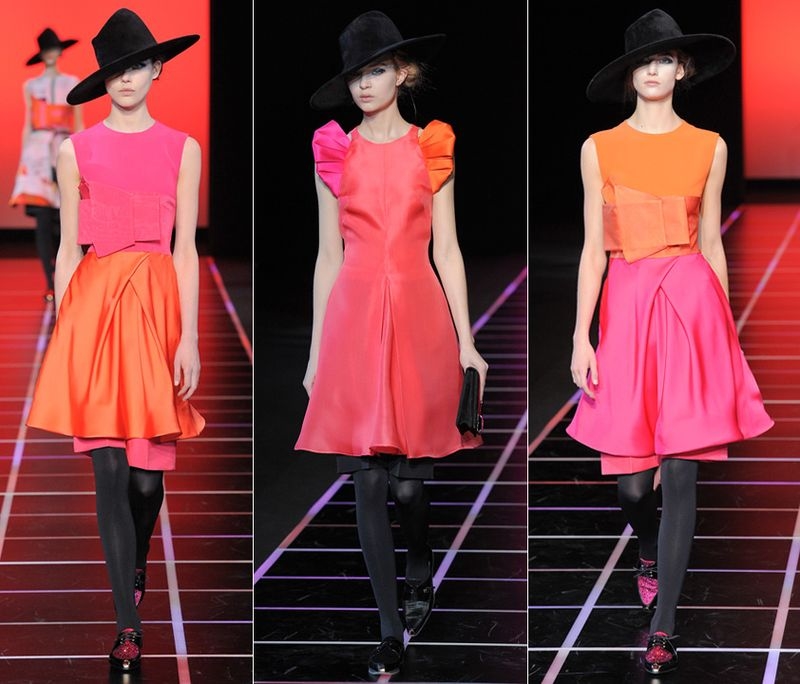
The colors also drew heavily not just from the pieces in the Eccentrico exhibition but the fall 2012 collection as well.

(image from herblog.com)

(images from style.com)
The star of the holiday makeup collection was the highlighting powder, a combination of pastel shades in shapes reminiscent of jagged mountain peaks.

(image from chicprofile.com)
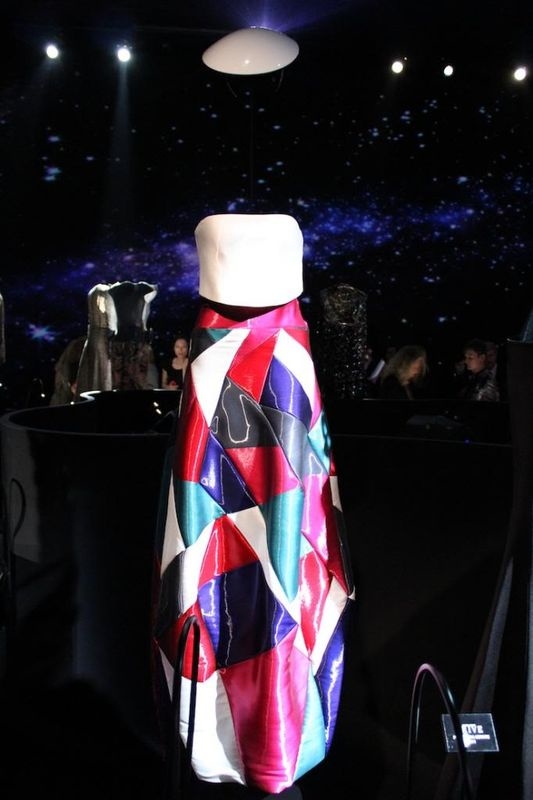
The reason I didn't purchase it, however, was that I was looking for an exact match in one of the items from the Eccentrico exhibition. This skirt was the closest thing I found, but it's still not identical. While the shapes are sharp and geometric, they're not exactly the same as those found in the palette.

(image from onenightonly.armani.com)

(image from sickbytrend.com)
I am puzzled as to why the palette had a distinct design yet one that didn't quite match up with any of the pieces in the exhibition – it makes me wonder why they bothered giving the palette that geometric design at all. Overall, I think Eccentrico definitely lived up to the name given the strange colors; however, there was nothing worth buying collectible-wise. It would have been nice to see a palette that had a more direct link to the something in the exhibition.
What did you think of the collection and the Eccentrico exhibition?
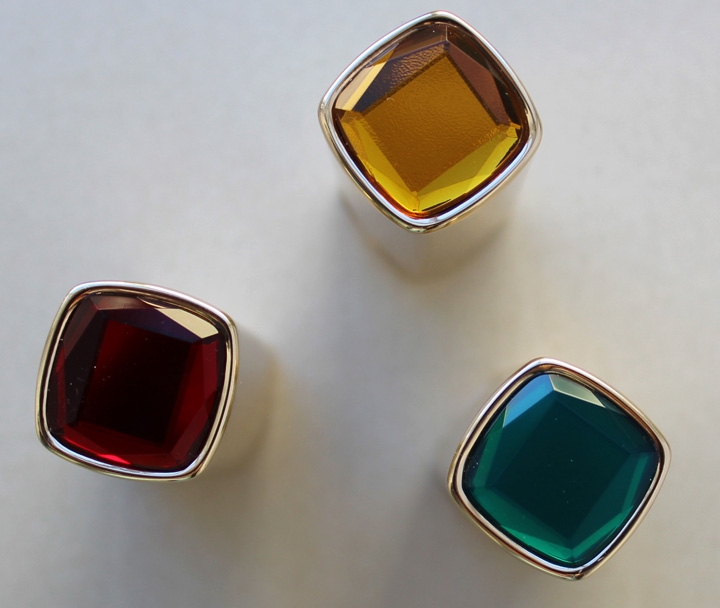
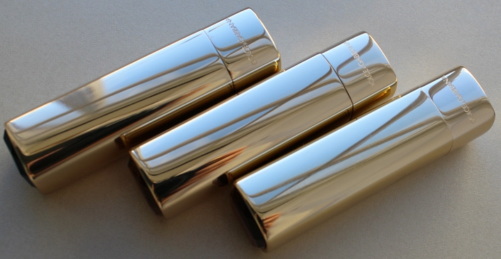
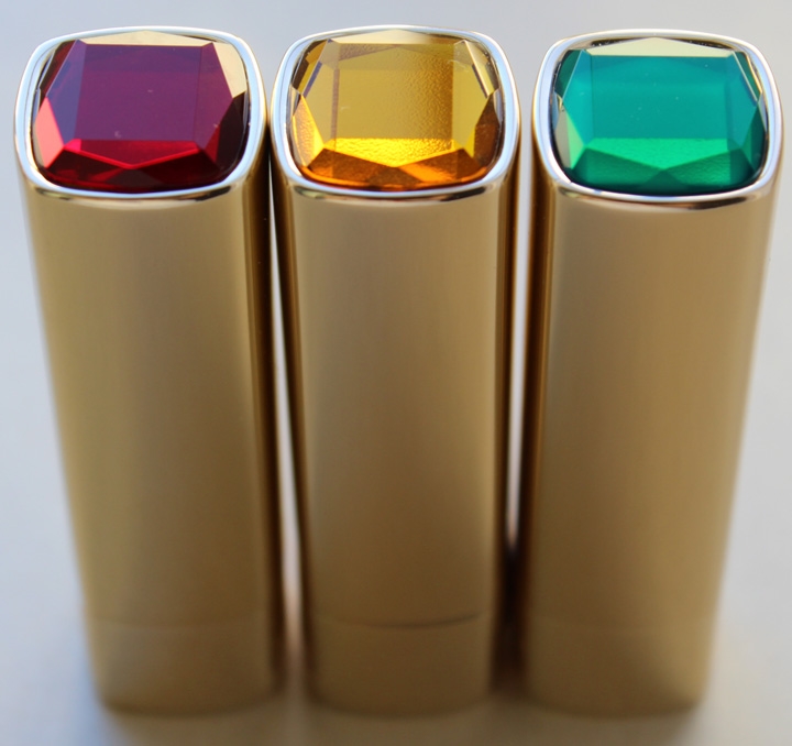
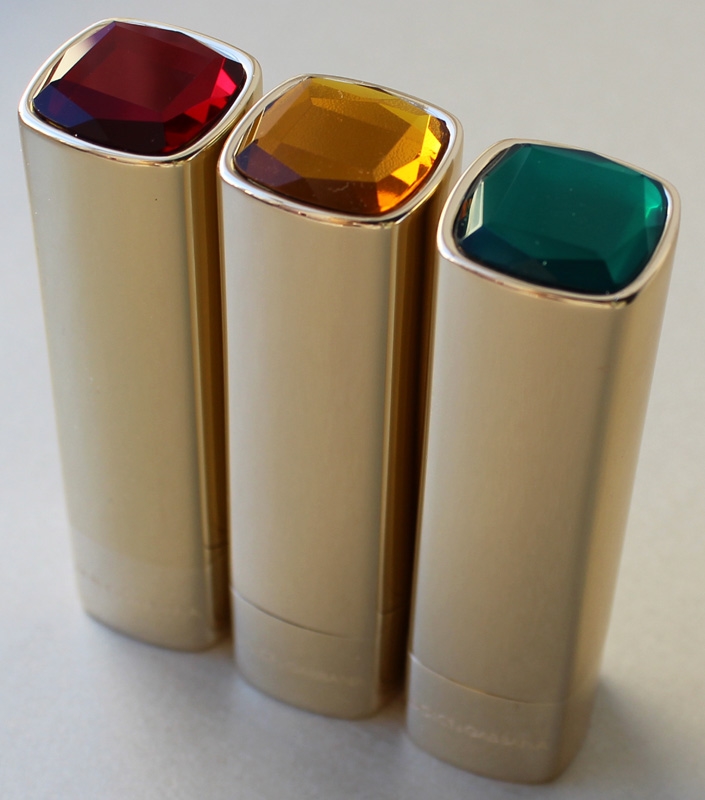
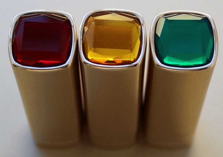
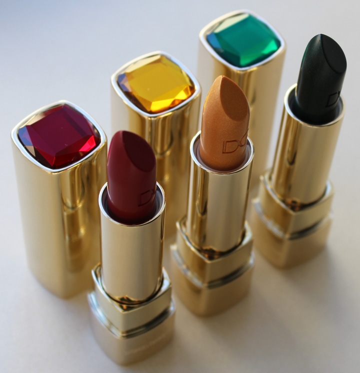
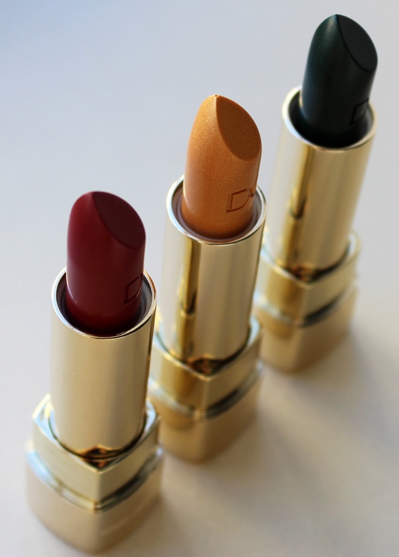
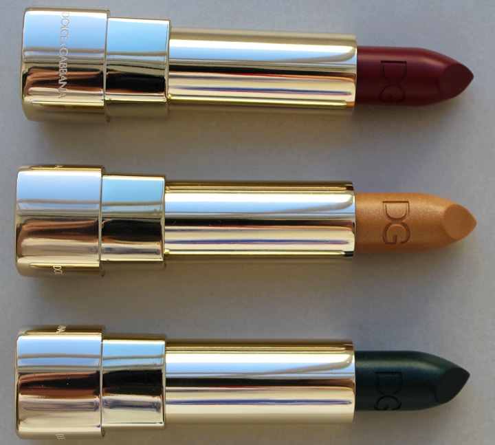
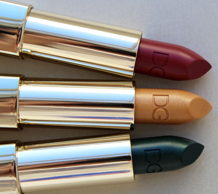
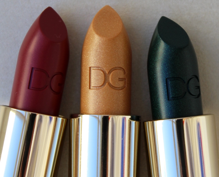
It was nice to see Dolce & Gabbana coming up with a more collectible lineup for the holidays. The Sicilian Jewels collection includes four lipsticks with four corresponding nail polishes. Now that doesn't sound so interesting, but I'd say that at least one of the lipstick colors breaks new ground. Plus all four shades are encased in shiny gold with a gem that matches the color inside.
I picked up the ones I thought would be most holiday-exhibition-appropriate: Topazio (gold), Rubino (red) and Smeraldo (green). Yes, a green lipstick!


Dolce & Gabbana's creative adviser and makeup artist extraordinnaire Pat McGrath had this to say about the green lipstick: "I think they’re just fun colors to wear if you go out at night, and then you can just try those crazy blues and greens and that’s a fun thing…it really encourages you to wear braver lip tones and to have fun with lipstick." Eh…I'll need more convincing that green lipstick is actually wearable outside the runway. (See swatches here and judge for yourself!) Of course, you could also mimic McGrath's technique of blending it into an otherwise red lip: "For me, I basically keep it on the center of a red mouth, [blending it a bit to] make it more brown and do the whole ombré thing. But she also mentions wearing it as eye shadow: "And, I would definitely wear it on my eyes. I do love lipstick on my eyes — I love the cream color and I think it’s a very nice, rich tone. That, on your eyes, is going to be incredible." Once again, I don't think this is practical. A cream-based lipstick, even with an eye shadow primer, isn't going to stay put for long on anyone's lids. It's a trick best left to the runway.
All that aside, I was immensely fascinated with the novelty of this green lip color.


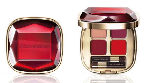
This isn't the first time D & G has adorned their cases with gems – the Lip Jewels palette from their holiday 2010 collection also utilized the same shape and color of the jewel from this year's Rubino lipstick.

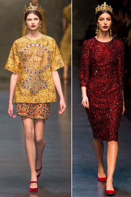
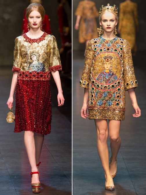
However, while this is more or less a repeated design, I liked that it came on the heels of the designers' fall 2013 runway show. Says Stefano Gabbana, "I love jewels; they are a symbol of power and passion…I love how they reflect the light: that’s why they have always been part of our collections since the very beginning. We adorn with gems our accessories, our corsetry, everything, like in our latest winter collection, which is the ultimate expression of what jewelry means for us."
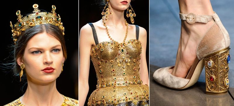
Indeed, the Byzantine-inspired collection showcased a plethora of bedazzled frocks and accessories, offset by an ubiquitous use of gold.


(images from style.com)
In this instance, I think re-using the jewel motif was acceptable since it ties in to a recent fashion collection. Plus, as McGrath points out, “Matching your lipstick to your nail lacquer is a hot makeup trend. We chose four new shades that showcase the theatrical and playful side of looking good: they are so shiny and special that they’ll be a perfect complement to any holiday or New Year outfit. They can be worn in a young, ironic interpretation or with a more grown-up, sophisticated vibe. Just like a piece of jewelry.” So it's evident that some thought was actually put into the collection to make it relevant to both the fashion and to the holiday season, when most folks like to break out glamourous, rich jewel tones for both lips and tips.
What do you think of Sicilian Jewels? And would you wear green lipstick? I might give it a shot, but only for a fun night out, obviously – I don't think anyone at work would appreciate it. 😉
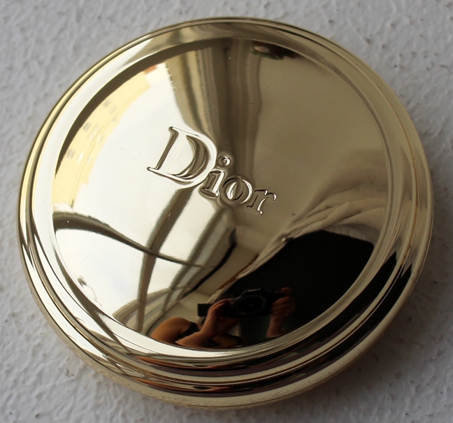
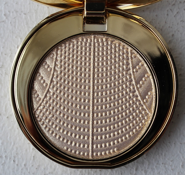
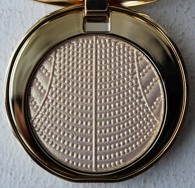
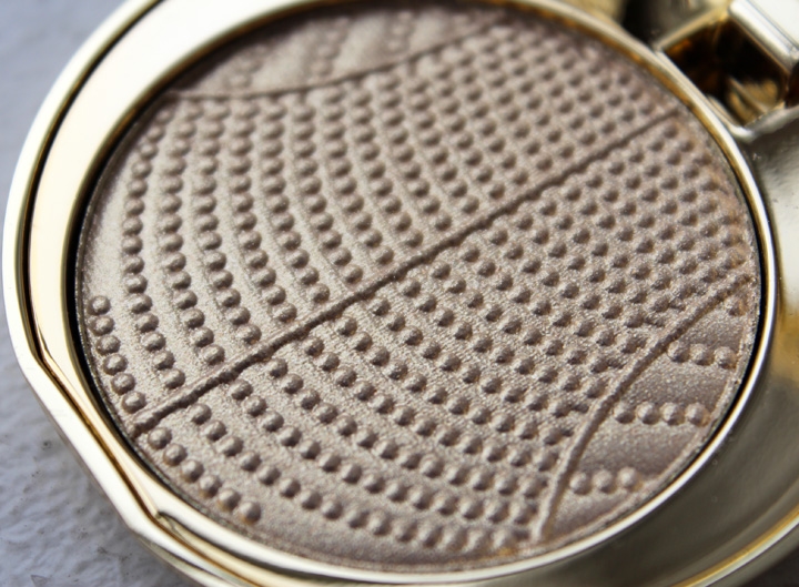
As the holidays near, I become less resistant to the lures of any luxe, shiny, metallic makeup items, particularly those with a pretty pattern. Initially I wasn't going to purchase the Illuminating Powder but ultimately found myself helpless against the elegant gold packaging and shimmery delicate beaded design. Plus, it's perfumed with Dior's J'Adore fragrance.
There is another one available in Rose d'Or, which has a more pink hue, but the gold Perle d'Or appealed to me more.


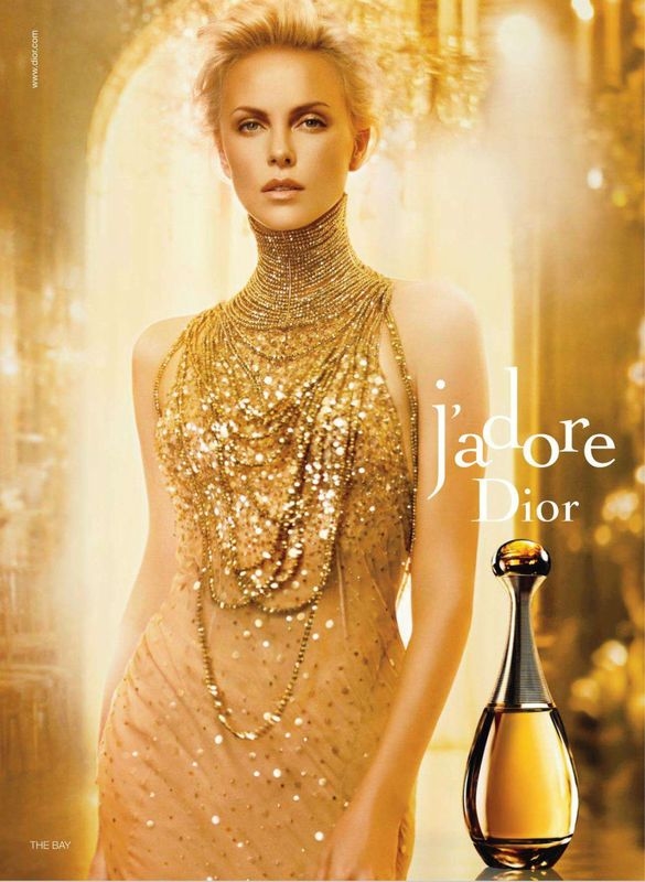
The pattern reminded me of the dazzling gold beaded necklace Charlize Theron wears in the J'Adore ads.

(image from thebeautysmith.com)
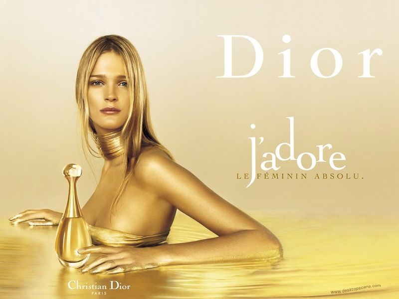
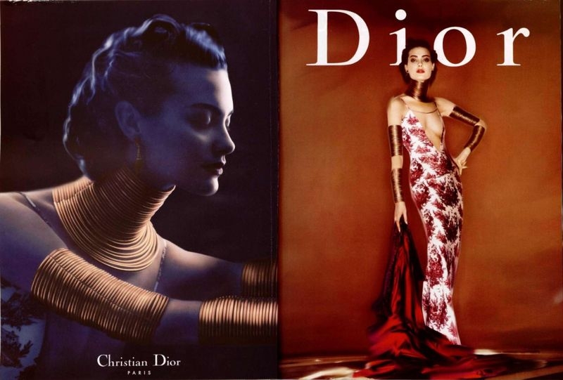
What I didn't realize at first was that this necklace, and others in previous Dior ads like the one below, was used in the bottle's silhouette as a result of former Dior designer John Galliano's Maasai-inspired collections.

(image from thenonblonde.com)
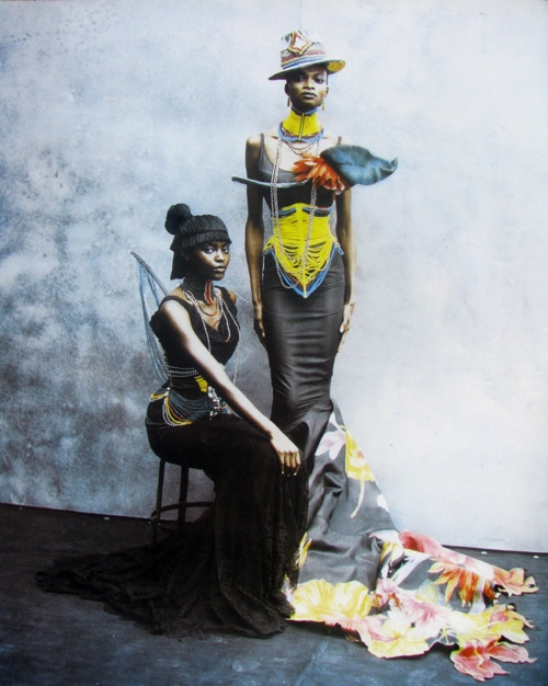
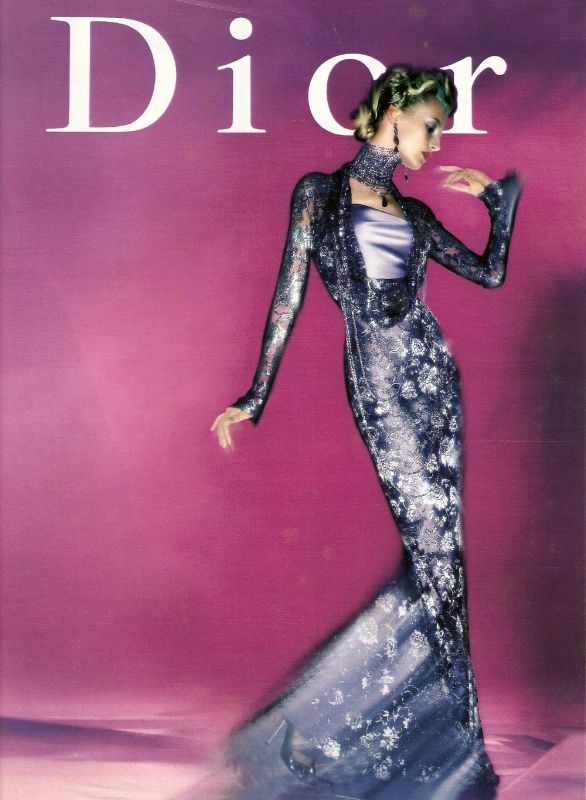
His first collection for Dior debuted in 1997 and contained a high-fashion Western spin on the traditional bead and wire necklaces worn by the Maasai people in Kenya and Tanzania.

(image from maliciousglamour.tumblr.com)
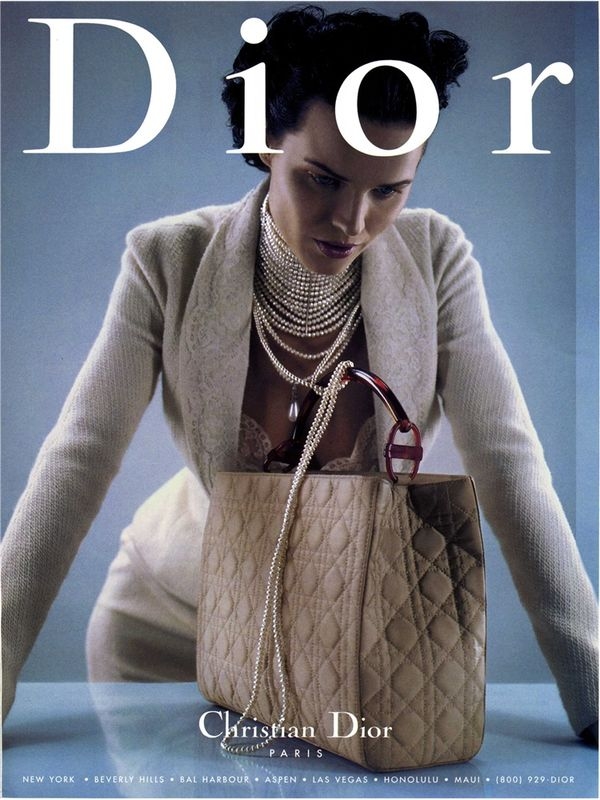
More variations of these necklaces appeared in Galliano's 1998 creations as well.


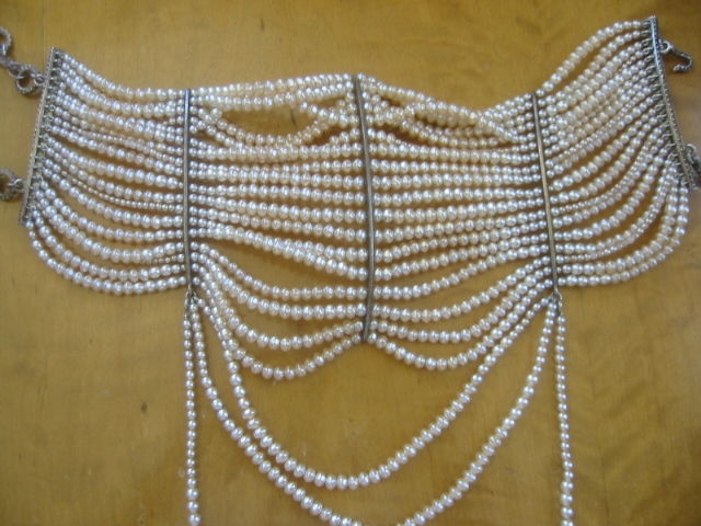
I think the design on the Perle d'Or powder most closely resembles the pearl version of the necklace…

(image from styleregistry.livejournal.com)
…especially when you see it open.

(image from 1stdibs.com)
I don't really want to get into how Galliano appropriated Maasai culture or his other racist views, but I will say that it's interesting how Dior reinterpreted some of their past designs in this powder. I like that's it not clear whether it's a literal representation of one of Galliano's necklaces or if it's vaguely based on the J'Adore perfume bottle and ads.
What do you think of this compact?
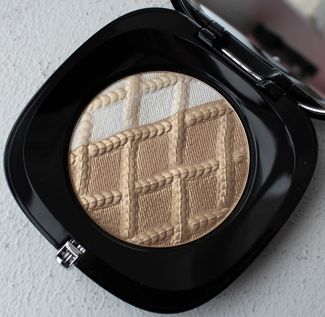
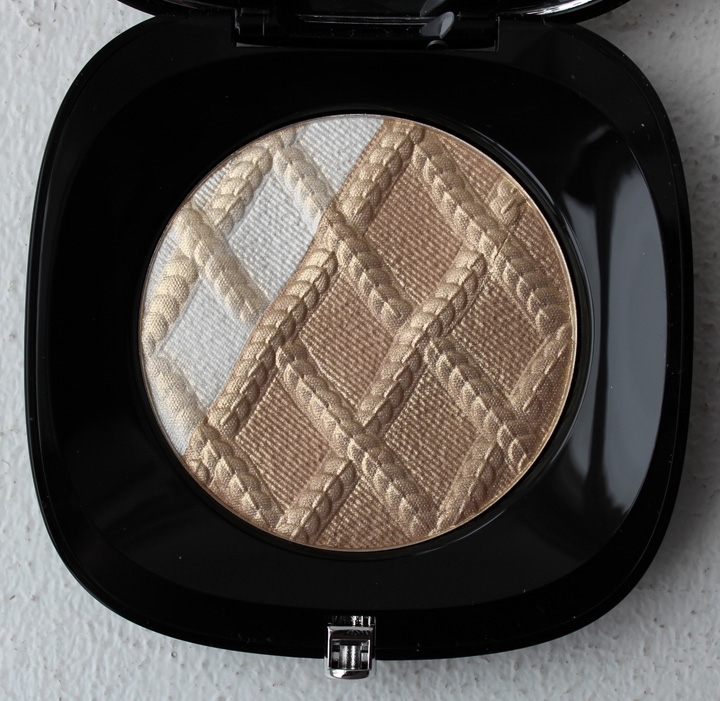
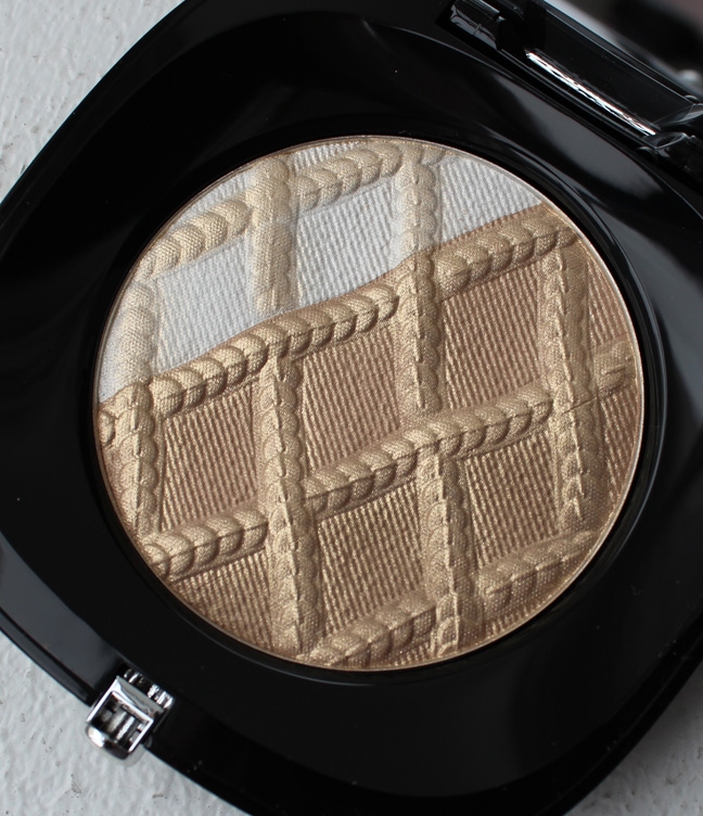
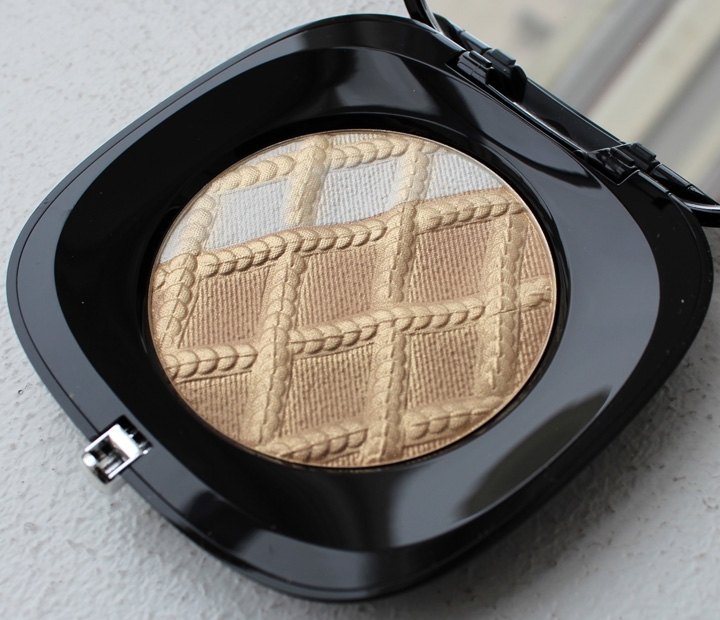
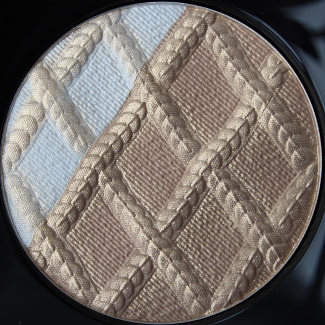
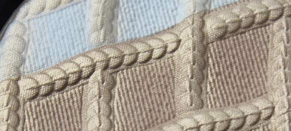
The Curator was ever so pleased to see that Marc Jacobs Beauty wasted no time in making the leap to collectible items since the introduction of the line in August. We've seen shimmery sequins on palettes before, courtesy of Chanel, but Jacobs' Lightshow Luminizing Powder presents a markedly different treatment of this motif. Instead of Chanel's Lumière d'Artifices palettes' scattered sequins neatly contained within horizontal bands of color, Marc Jacobs' holiday 2013 highlighter features radiant, criss-crossed strands placed diagonally.


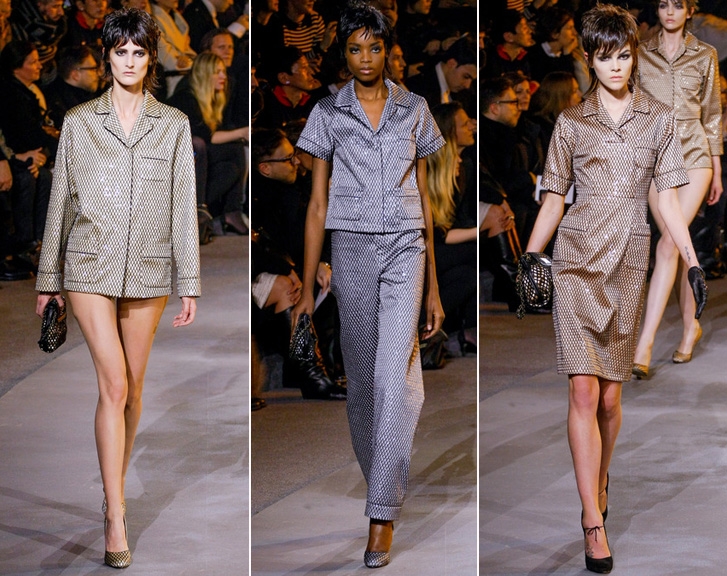
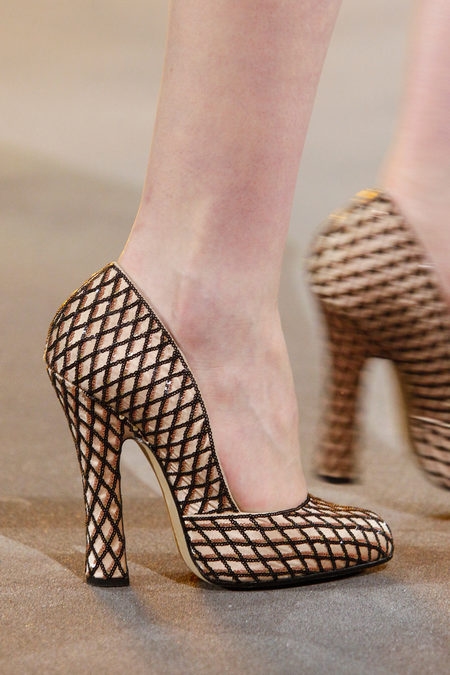
I hesitated in buying this palette because I wasn't sure if the pattern was based on a design from Jacobs' fall 2013 collection, but this sequinned oversized fishnet weave appeared in many pieces, from blouses and dresses to bags and shoes.

(images from style.com)
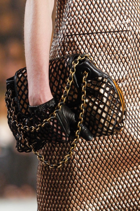
A closer look at the accessories – I love how it looks on those shoes!


(images from style.com)
I thought this was a great example of how the fashion arm of a company translates a detail or item from the clothing into cosmetics. The sequins are easily recognizable from the fall 2013 collection but tweaked ever so slightly to lend themselves to a useable palette. In this case, the black threading was eliminated and the gold emphasized so as to create a versatile highlighter that will, no doubt, be in heavy rotation once the holiday season is in full swing – if you can bear to use it, that is. (Obviously mine is for exhibition purposes only!)
What do you think of this palette? I know I was delighted to see this brand-new line come up with something collectible so soon after its launch.
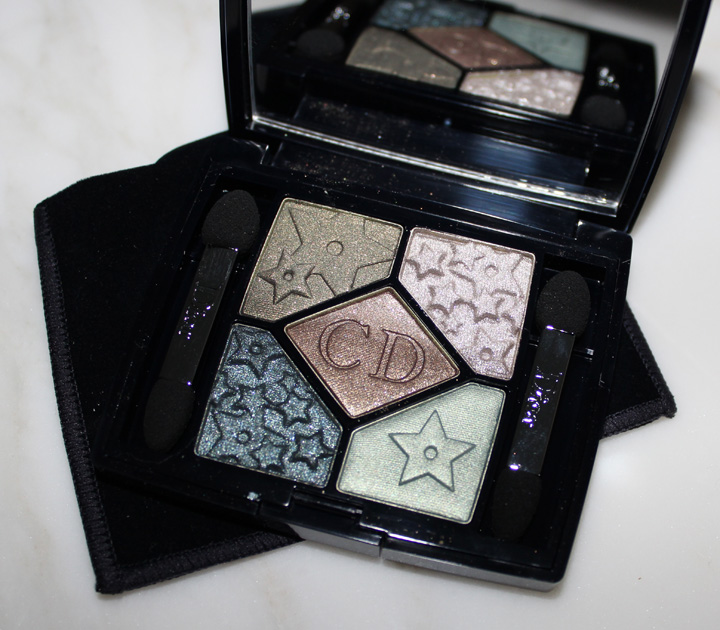
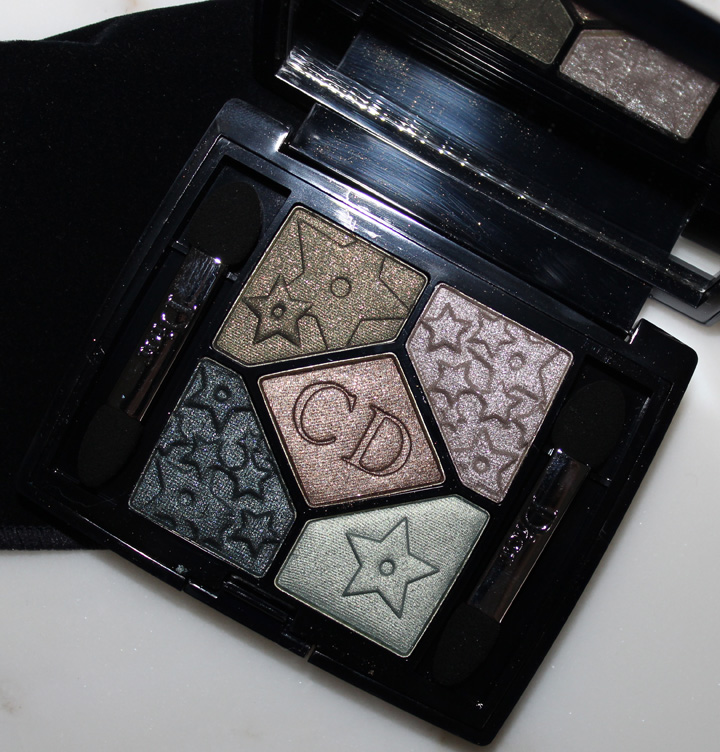
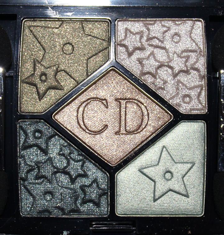
The star (haha) of yesterday's Color Connection is also the subject of Couture Monday. The Bonne Etoile palette uses a motif Christian Dior believed helped seal his fate as a fashion designer.


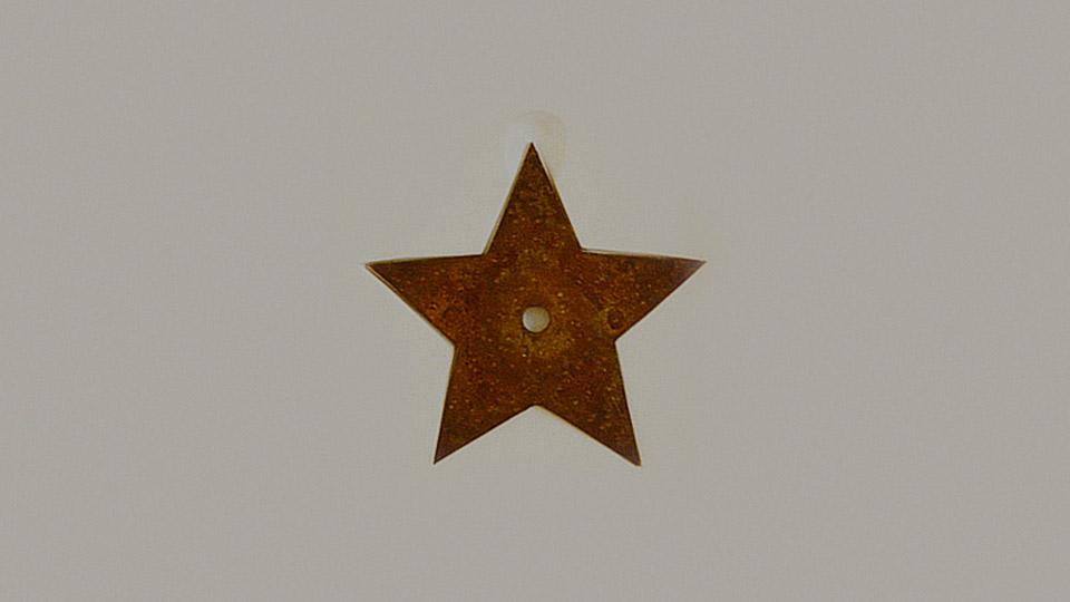
As the story goes, in early 1946 Dior was debating whether to open his own couture house. Wandering along rue du Faubourg Saint-Honoré, he nearly tripped over something in the street: "Bending over, Christian Dior picked up an object that would restore his
faith: a star, the one that will propel him into the firmament of haute
couture and luxury, a guiding star showing him the path to follow. At
that moment he knew his answer would be 'yes', that he could no longer
ignore the hand of fate." The star, though rusty, is still preserved at his house in Normandy.

(image from dior.com)
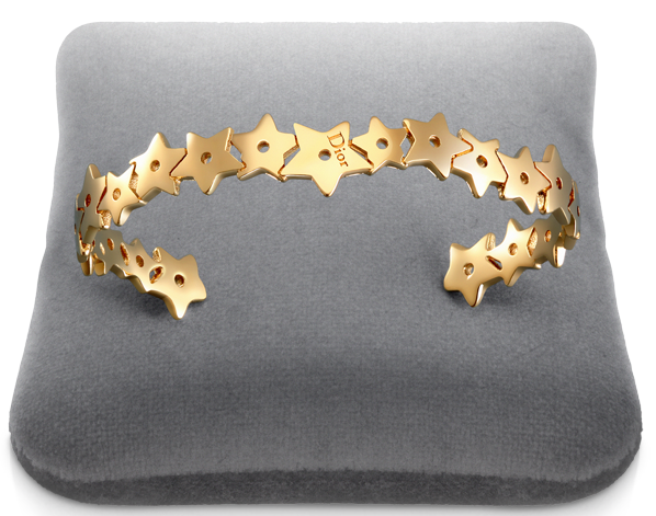
While the star was certainly important to Dior, it was never as ubiquitous in his designs as, say, the cannage pattern. I could only find a few things that displayed the star motif, like this bracelet:

(image from dior.com)
There was also a "Lucky Star" palette offered for the 2005 holiday season. I couldn't find any decent stock photos but you can see what it looks like here.
As for breaking out the star for this season's collection, there was no tie-in to the fashion. The fall ready-to-wear show contained pieces featuring the early works of Andy Warhol, and the couture show had nothing to do with stars or even a sort of "mystical" theme that was the inspiration behind the makeup collection. According to Dior's online magazine, "Mystic Metallics defines a mysterious
universe in which the Dior woman as conceived of by Tyen, director of
color creation, is resplendent in subtle and iridescent hues, as if by
magic…'The harmonies I've created for this look
reflect the galaxy's mysterious colors. It's a voyage from the earth to
the moon,' claims Tyen." I agree the Bonne Etoile palette represents Tyen's vision, but it's entirely different than what Raf Simons sent down the runway.
What do you think about this palette and the star pattern? While I don't think it's the greatest expression of something that was very dear to Dior, the colors are truly stunning.

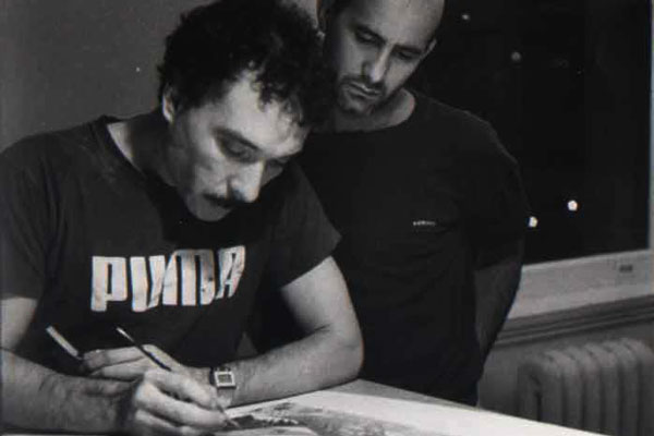
Lopez at work while Juan Ramos looks on (image from latinoaids.org)
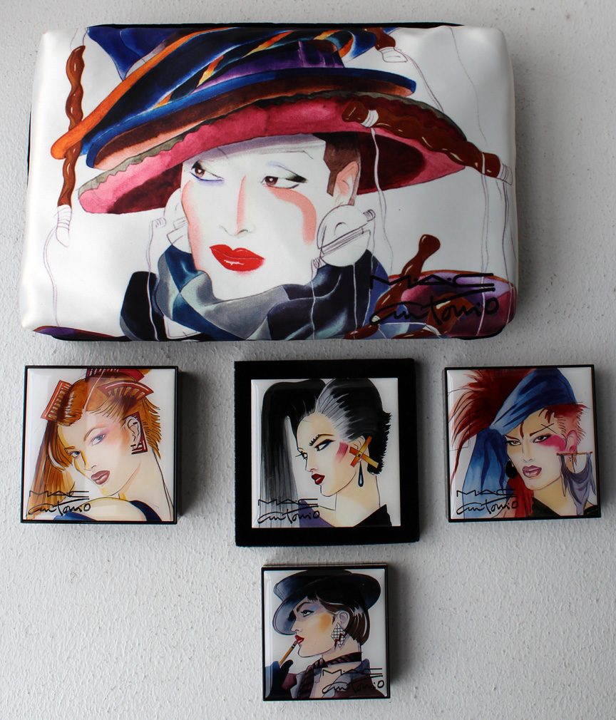
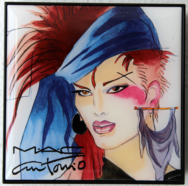
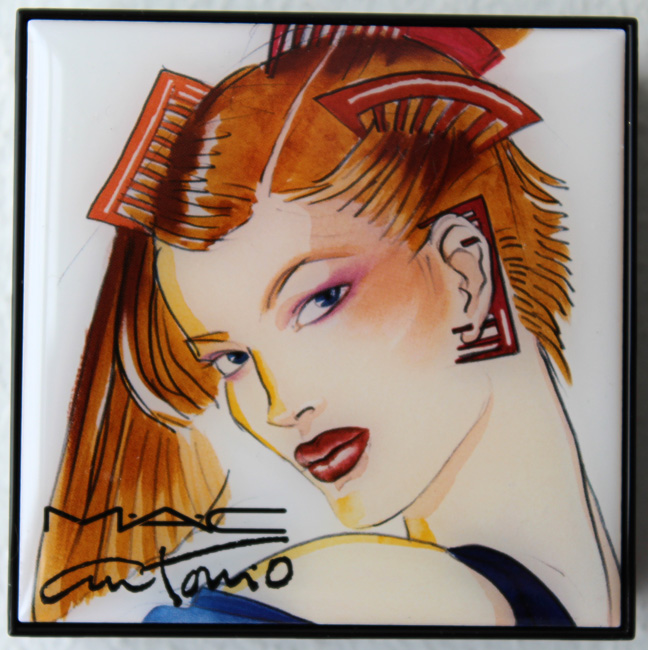
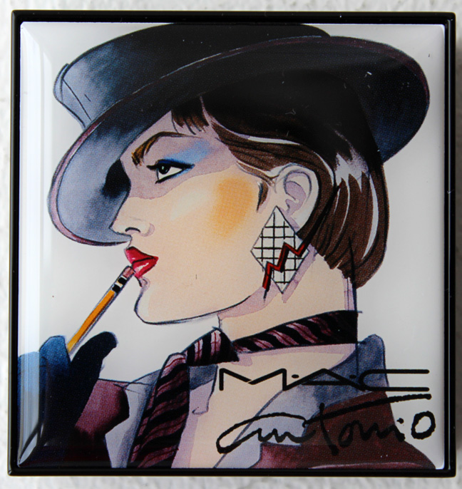
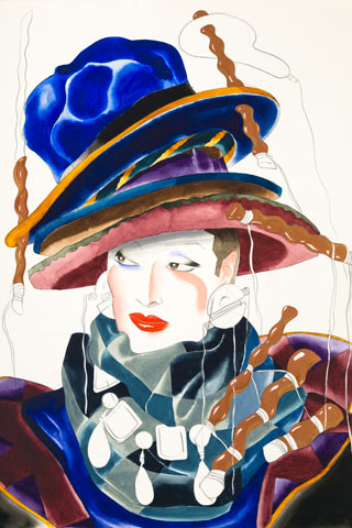
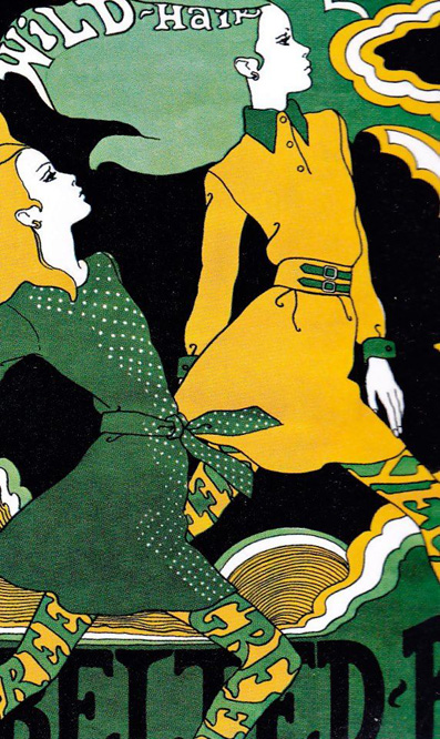
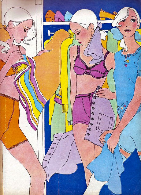
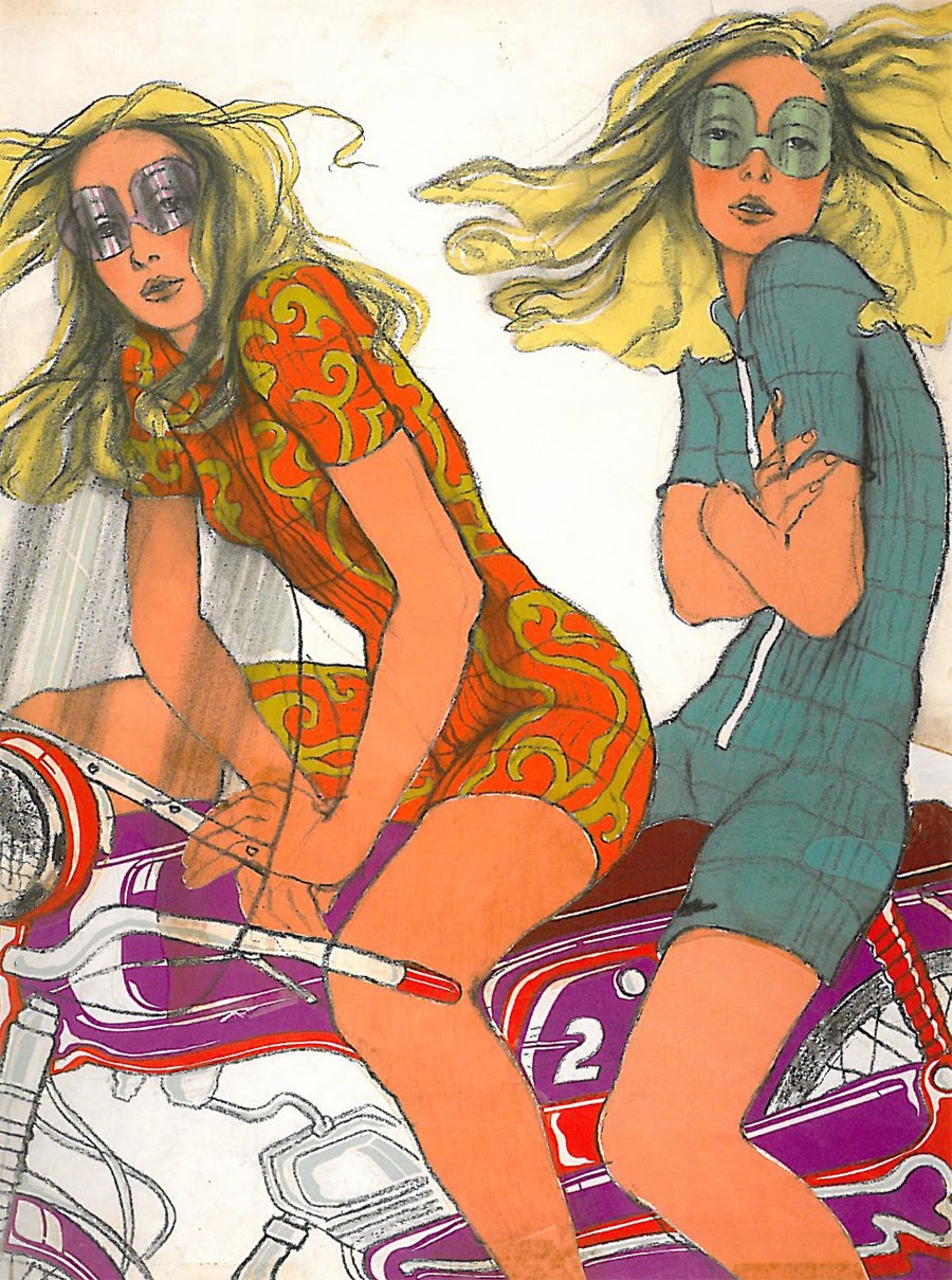
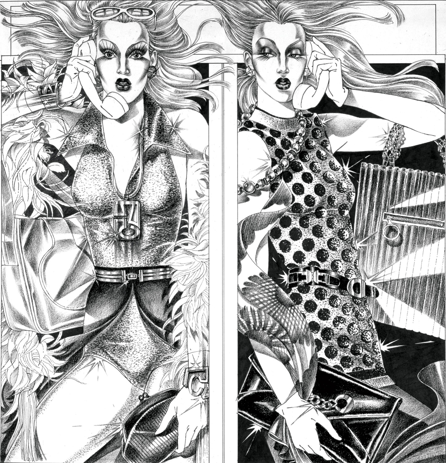
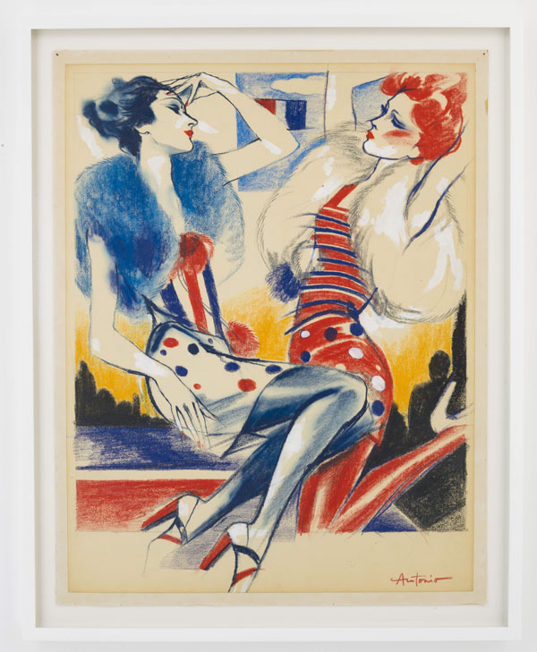
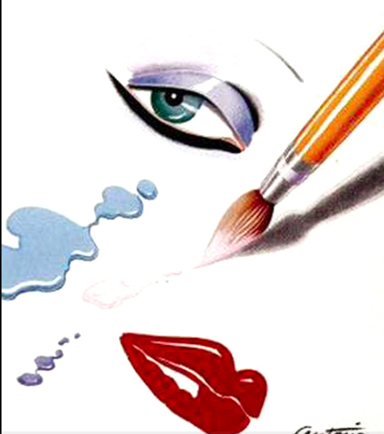
Like the stars of previous cosmetics collaborations (Warhol, Basquiat), the work of fashion illustrator Antonio Lopez (1943-1987) has been particularly popular of late. With an exhibition at SCAD this summer, along with a beautifully detailed monograph and accompanying exhibition last year, Lopez's art is enjoying a robust resurgence. The MAC collaboration honors this extremely influential artist and uses images that represent perhaps his best-known style from the early '80s for the packaging.
Born in Puerto Rico in 1943 and raised in Harlem, Lopez attended the Fashion Institute of Technology and landed a short-lived job at Women's Wear Daily in 1962. Within a year he left to become a freelance illustrator, and by 1965 he was earning $1,000 per illustration. Lopez spent most of the 1970s in Paris, where he befriended the likes of Karl Lagerfeld and Yves Saint Laurent. In the early '80s he returned to New York, continuing his work for magazines like Vogue, Harper's Bazaar, Interview and Vanity. (You can read a brief bio here.)
Onto my purchases.

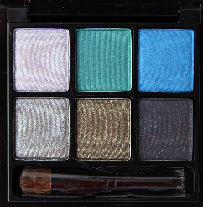
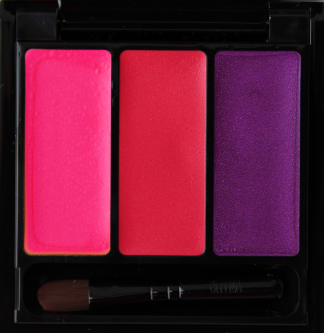
I picked up one of the eye shadow palettes:


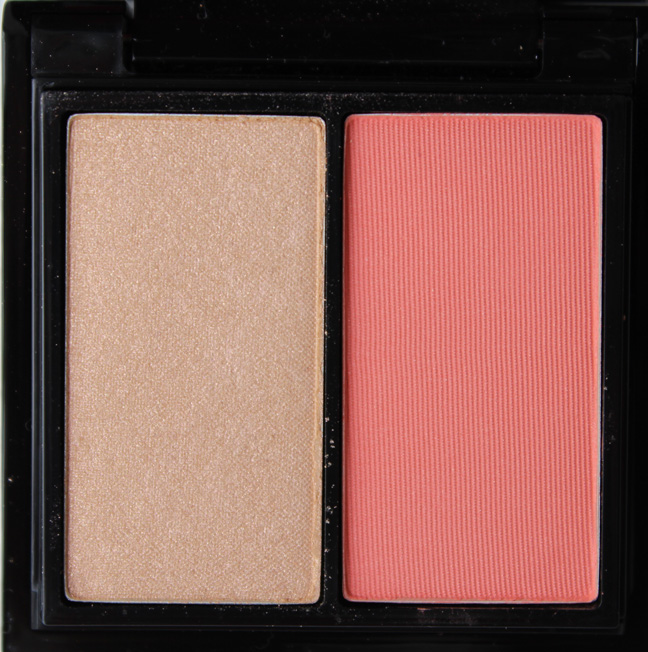
Cheek palette:


Lip palette:


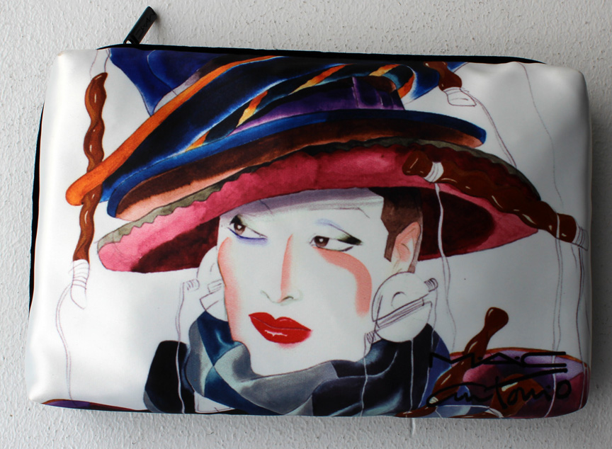
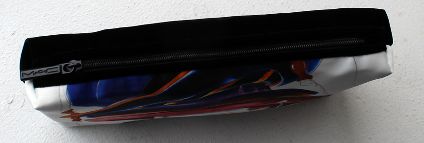
And the makeup bag – I love the velvet backing:


The image is a 1983 portrait of Maria Snyder:

(image from elle.com)
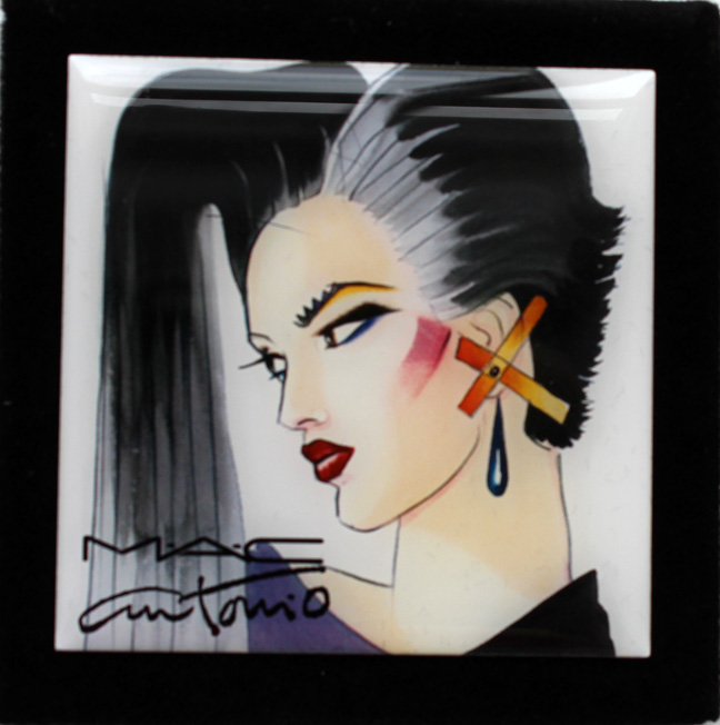
And the mirror:

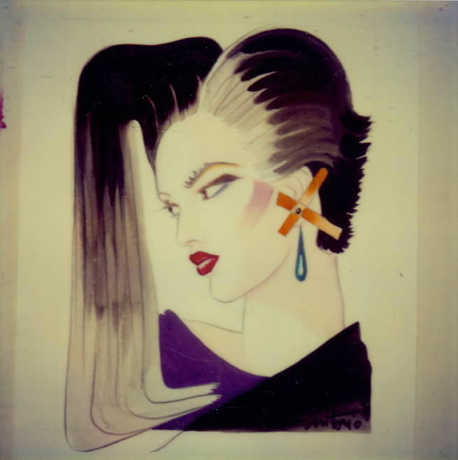
I'm not sure who the model is, but here's the original image:

(image from theantoniolopezbook.com)
Let's take a look at Lopez's work and how it captured the essence of the heady times in which he lived.
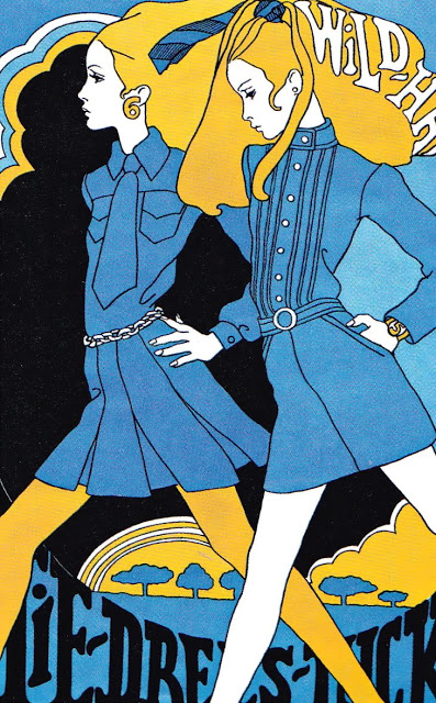
Some psychedelic work for Intro Magazine, 1967:


(images from sweetjanespopboutique.blogspot.com)
A similar style for Elle Magazine, May 1967:

(image from trendland.com)
In 1970, we can see his style changing with the dawn of a new decade.

(image from notedelhotel.blogspot.com)
As early as 1972, we can see a bolder, more graphic style that serves as the foundation for some of his most notable illustrations in the '80s.

Mr. Chow's Drawing, Paris III, 1973:

(image from fashionschooldaily.com)
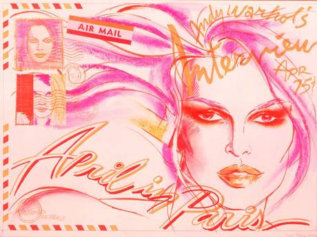
An illustration of Brigitte Bardot for Interview magazine, 1975:

(image from independent.co.uk)
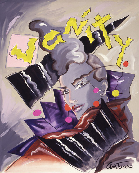
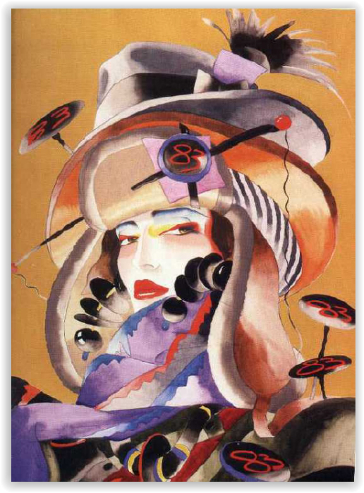
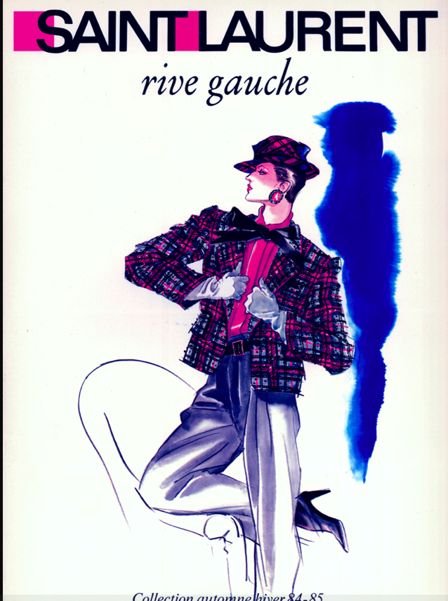
The following images most closely resemble those on the MAC products.
Vanity Magazine, 1981:

(image from style.com)
1983:

(image from wewastetime.wordpress.com)
Yves Saint Laurent ad, 1984:

(image from theantoniolopezbook.com)
So what made Lopez stand out from other fashion illustrators? For one, in the early '60s most fashion illustrations resembled very basic, catalog-like depictions of clothing. Lopez galvanized the medium, infusing representations of designer garments with an energy and movement they previously lacked. Secondly, Lopez understood how to both capture and evoke a particular era. André Leon Talley, Vogue editor and a former colleague of Lopez, remarks that Lopez "knew how to suggest the mood of the time." Adds East of Mayfair Director Janina Joffe, "The greatest fashion artists create desirable images that capture the entire spirit of an era and still remain timeless. Antonio Lopez was a definitive master of this skill."
Finally, Lopez's work disguinshes itself from from that of other illustrators in that it heavily influenced the designers – they took their cue from his work rather than the other way around. In an interview with Harper's Bazaar, Mauricio Padilha, one of the authors of Antonio Lopez: Fashion, Art, Sex & Disco, had this to say: "Some of the models, he wouldn’t even put clothing on them. He would have the model standing next to the clothing in a leotard or whatever and he would illustrate how he saw the clothing onto the model’s body. It became something different and a lot of times designers would go back and then rework their outfits so it looked more like his illustrations." Indeed, Lopez's influence is still rippling through the psyche of various designers today. "[A] fresh crop of fashion designers, stylists and photographers seem to have been thumbing through Antonio's back-catalogue – the December 2012 issue of Vogue Italia featured a Steven Meisel covershoot titled 'High Gloss' that paid homage to the heady world of hedonism captured in Lopez's polaroids, eye-obscuring Jerry Hall mane and all. The same imagery – and that lop-sided hairdo – roamed Jonathan Saunders' spring catwalk in London…Antonio, of course, wasn't only about girls – his eroticised drawings of male models populated campaigns for Versace and Missoni in the eighties. Those exaggerated images – man as hunter-gatherer in buttery-leather and luxury knits, respectively – were fodder for Kim Jones' sophomore menswear collection for Louis Vuitton, where the emphatic shoulders, artfully wrapped capes and chiselled jawlines whispered of Antonio heroes past. Their feminine counterparts, the sketches of Jerry, Pat et al, inspired the disco diva bugle-beaded gowns of New York designer Jason Wu's 2013 pre-Fall collection, translating Antonio's pen marks into cashmere and chiffon," writes Alexander Fury at The Independent.
Getting back to the MAC collaboration, MAC Creative Director James Gager states that it was Lopez's "tremendous zest for living" that was the catalyst for the collection. He adds, “When you see the pictures and the drawings, you want to re-meet these people at a party or on the street. You want to stop them and say, 'You look incredible!'” I suppose if any company is going to launch a collection inspired by Lopez's hedonistic vibe expressed in bold colors and strong lines, MAC is appropriate. However, I would have liked if they could have indicated which models were in the illustrations that appeared on the packaging. The promo ad reunites three of "Antonio's Girls" (Jerry Hall, Pat Cleveland and Marisa Berenson), but it's unclear if any of them are in the illustrations that were selected. Plus, I stumbled across this image and thought it would have been perfect for a makeup collection:

(image from theantoniolopezbook.com)
Anyway, I prefer Lopez's earlier work of the late '60s to the flashier designs he created in the late '70s and '80s. The colors appear garish and incongruous, the lines harsh and severe. Of course, it could just be that I simply don't care for '80s fashion, and Lopez amplified the excess of the decade. If I find the '80s aesthetic to be unappealing, Lopez's work certainly heightened it (i.e., made it seem uglier than it actually was.) Conversely, if you love '80s fashion then Lopez's work sublimely elevates it.
What do you think, both of Lopez as an illustrator and of the MAC collection?
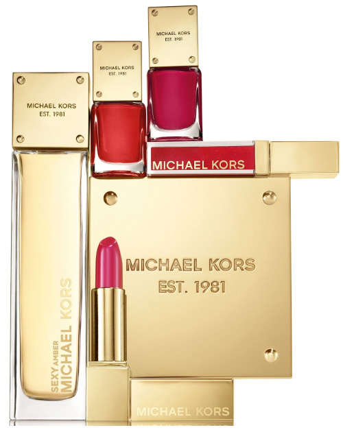
We've got another fashion designer wanting to break into the beauty business. Like Marc Jacobs, Michael Kors launched several successful fragrances previously, but is now branching out into cosmetics.
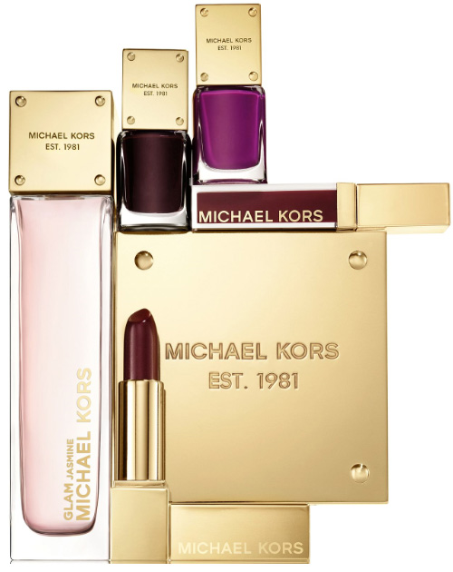
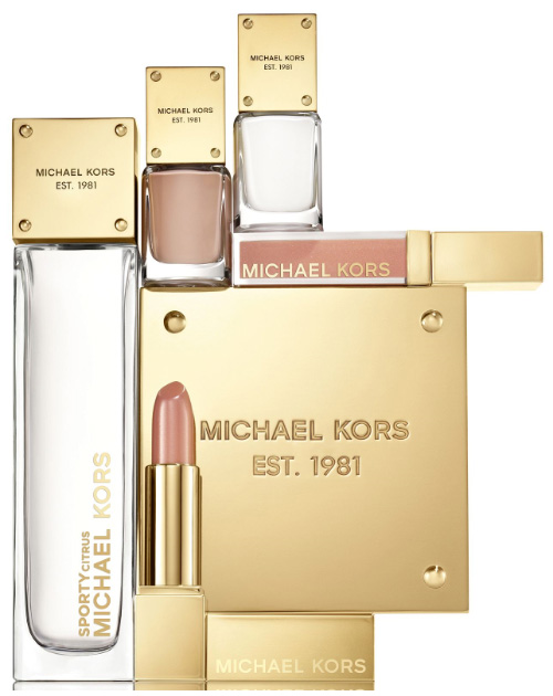
The carefully edited line (there are only 24 products) consists of three "moods" – glam, sporty and sexy.


(images from chicprofile.com)
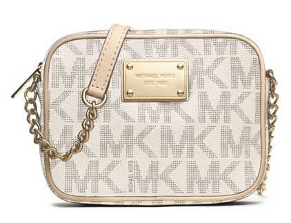
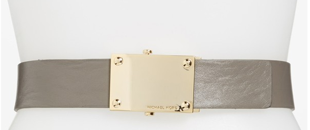
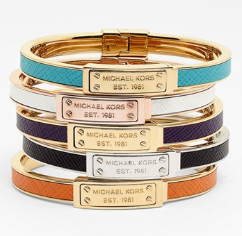
The gold packaging is borrowed from the name plates that appear on Michael Kors bags and other accessories.


(images from nordstrom.com)
According to an interview in the August issue of Allure magazine (p. 166), Kors got the idea to start a makeup line when he won the CFDA Lifetime Achievement Award three years ago. Spurred on by the encouragement of friend and colleague Diane von Furstenberg, Kors "combed through photographs of past collections for inspiration…these pictures, too, were populated by happy, glowing people who seemed to be on permanent vacation. 'I realized that I'd been playing with these three moods – sporty, sexy and glamorous – and balancing them,' says Kors." He adds, "In a weird way, I thought about creating cosmetics just like I always think about creating apparel and designing accessories… How would you set up the perfect closet? You need a gorgeous cove of caramel basics, a section of sexy red and black dresses that knock everyone out, and the audacious things – like white pantsuits and gold tops – that aren't a bit practical, but they're totally divine." The division of colors and textures into these three categories clearly represent Kors's aesthetic.
I like that there's not a huge amount of products. Basics like mascara or concealer are not included since the emphasis is on creating one of the three signature looks using the shades provided. I also like that he works in some impractical shades – hopefully this means we'll be seeing some creative limited-edition pieces that are pretty to look at but aren't quite as functional as the permanent items.
What do you think?
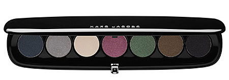
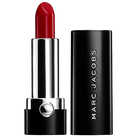
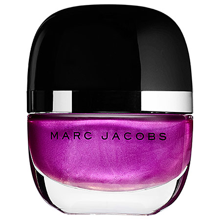
After years of producing successful fragrances, Marc Jacobs has finally joined the beauty game in full with a new 120-piece line that debuted at Sephora last week as well as his new beauty boutique in Soho.


(images from sephora.com)
After years of leaning towards more natural territory for the runway, recently Jacobs felt that stronger makeup is necessary to complete a certain look, which was the impetus behind the cosmetics line's creation. "A young girl looking natural – that's what I did every season. And then one day the face didn't feel finished. Maybe it's because my shows became more theatrical. Maybe it's because I grew up. But I realized that makeup is a vital accessory. Even if it's just a groomed eyebrow, there has to be a final punctuation to the look," he states in the August issue of Allure.
The line is also influenced by famed makeup artist Francois Nars, a long-time friend and colleague whom Jacobs managed to coax out of runway retirement into doing the makeup for his shows in 2009. Says Jacobs, "When I started working with Francois again, the mood got more stagy, with more references to the '70s and '80s. But the shows are a theatrical presentation – not real life." This interest in the '70s and '80s might account for products like the super high-gloss Lip Vinyls. Additionally, the August issue of In Style notes how Jacobs paid homage to some of his favorite film characters through the names of a few of the products, just as Nars does. (Jacobs has even had his makeup done by Nars for the artist's 2009 book commemorating the 15th anniversary of his line.)
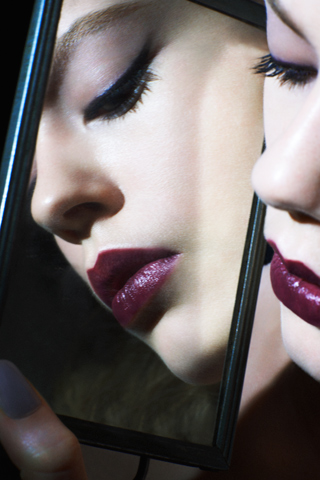
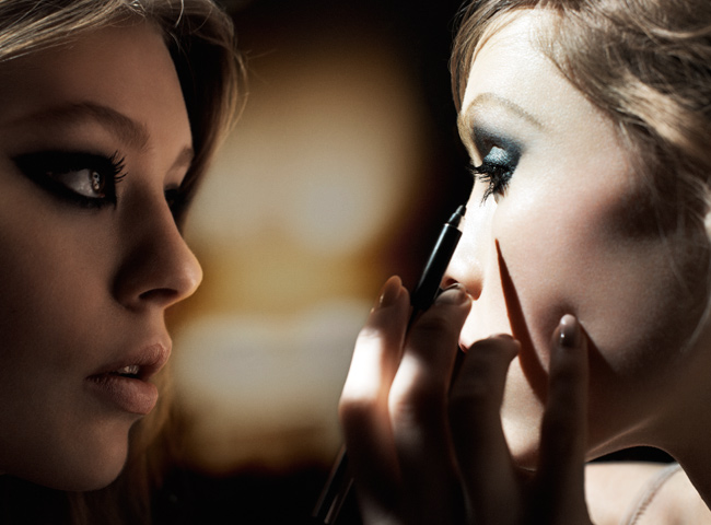
I also like the promo images thus far. "We wanted an image that suggested this love for the ritual of two young women putting on makeup,” Jacobs told elle.com. “There’s a certain reference to a backstage sort of glamour—or staying home and being in your bathroom and putting on your makeup for hours and talking…the images are meant to stimulate or inspire someone to be irreverent, to enjoy the process, and do what feels right for them. It’s about transforming oneself to be the person you’d like the world to see.”


(images from elle.com)
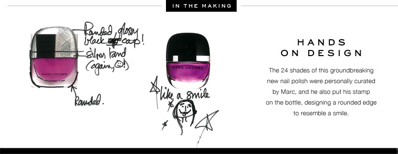
Finally, I think the packaging is very representative of Jacobs' aesthetic – the black is sleek and fashion-forward, while the rounded edges hint at a youthful playfulness and a bit of quirk, which is exactly what you see in his fashion (especially the Marc by Marc Jacobs diffusion line). The rounded edges are also repeated on the bottom of the nail polish bottles, representing a smile.

(image from sephora.com)
I do hope that like Dolce & Gabbana we will see limited-edition items with cool designs in a fairly short amount of time. I think we will. If M. Nars eventually caved to creating Makeup Museum-worthy objects, I have a feeling Jacobs will follow suit.
What do you think of the line so far?
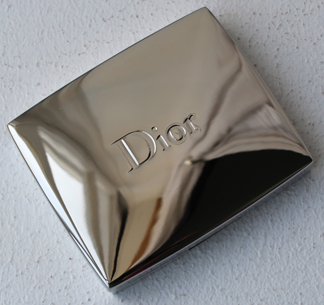
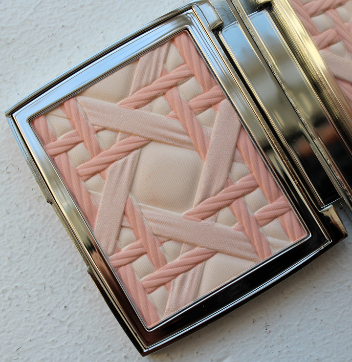
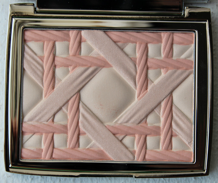
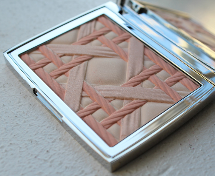
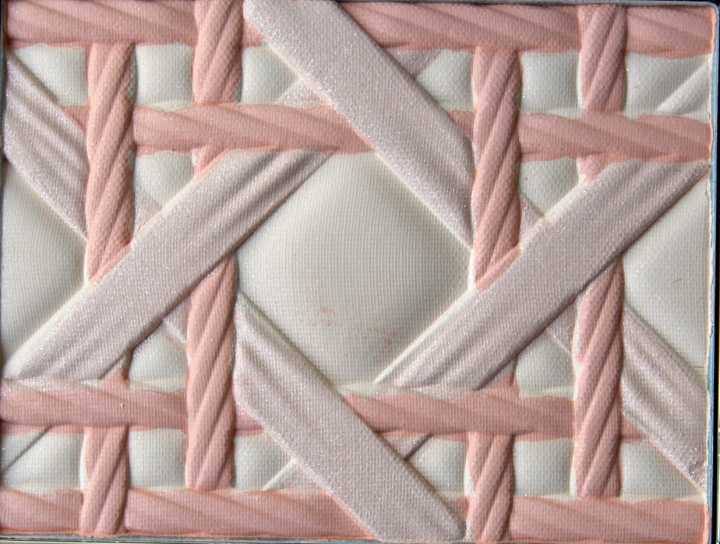
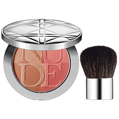
Today's installment of Couture Monday was supposed to be devoted to Marc Jacobs' new beauty line. Unfortunately I was too lazy busy over the weekend to gather all the images I wanted. Instead, today I bring you a lovely Dior palette released back in the spring in honor of the fashion house's arrival at Harrod's. The My Lady palette is a blush/highlighter embossed with Dior's iconic cannage pattern.


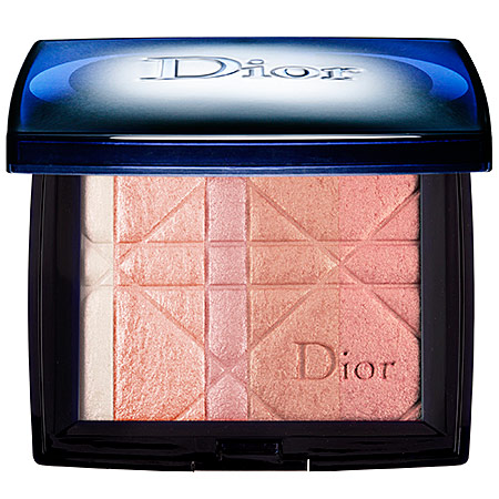
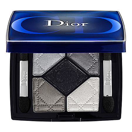
I'm not going to pretend this pattern is something Dior hasn't done before in makeup. The cannage motif is part and parcel of their current product lineup:


(images from sephora.com)
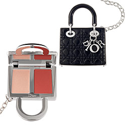
And appeared previously in a 2011 bronze/blush palette (albeit a different variation), as well as in their Lady Dior bag gloss:

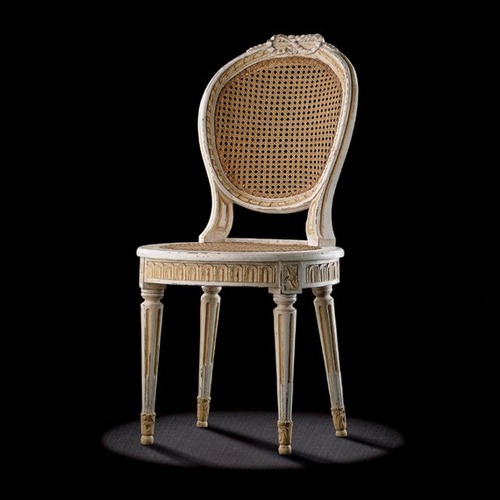
I'm also not going to delve into the complete history of the cannage pattern. Suffice it to say that it was taken from the chairs Dior had selected for his very first fashion show in 1947. In 1953 he began experimenting with the cannage pattern as a signature motif in his designs.

(image from the atticplace.tumblr.com)
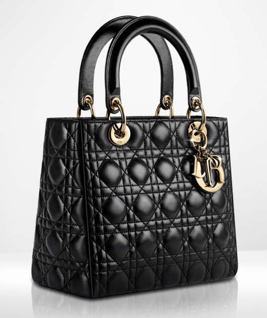
The most famous example of the cannage pattern appears in the legendary Lady Dior bag, which was introduced in 1995. A favorite of Princess Diana, it remains the best-selling Dior bag nearly 20 years later. (You can watch a fascinating video of its production here.)

(image from dior.com)
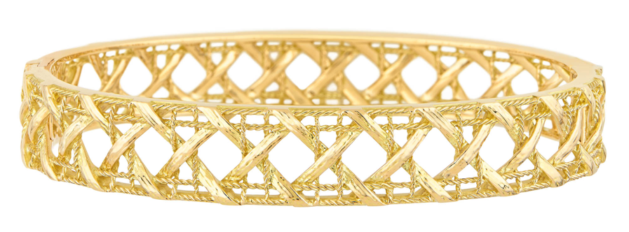
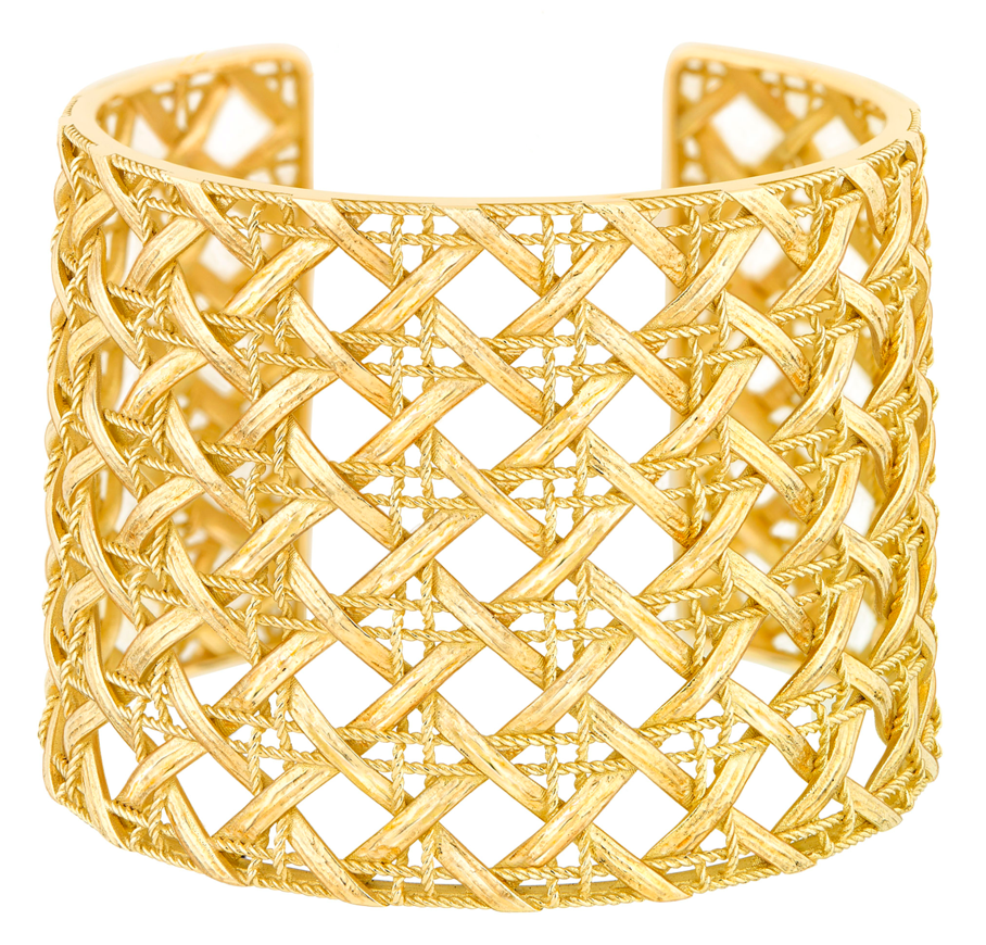
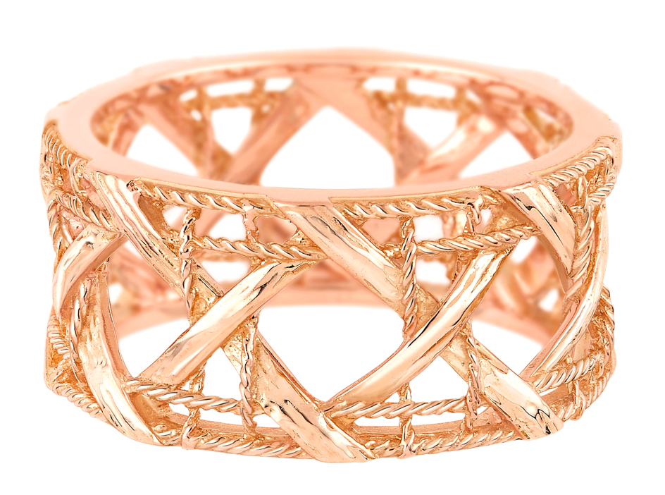
According to Harrod's product description, the palette's pattern was meant to be a tribute to the Lady Dior bag. However, to my eye the pattern on the My Lady palette most closely represents the My Dior jewelry line by Dior's Jewelry Director Victoire de Castellane rather than the Lady Dior bag. This jewelry line debuted in spring 2012 and features a more textured version of the cannage pattern with twisted and tufted interwoven strands.


(images from dior.com)
In the grand scheme of things, I guess it doesn't matter exactly which cannage pattern was used in the palette – it's different enough from the others that were previously released and in the current product lineup. Plus I think this one is the most visually appealing – the strands are thicker than those on the Lady Dior bag, but not quite so literally straw-like.
What do you think?
