I'm still on the fence as to whether to purchase any pieces from the collaboration between Estée Lauder and fashion designer André Courrèges, but in the meantime I thought I'd at least take a look at the collection, as the packaging represents a significant departure from the usual. I also don't know why Estée Lauder chose to release this collection now (I'm not aware of any Courrèges milestone) but the press release explains some of the intent behind the collection.
"Cosmonauts, satellites, missiles to the moon. Unprecedented advancement and achievement underwrote the inaugural period of intergalactic exploration that came to be known as the Space Age of the early-1960s. When a culture of futurism subsequently consumed the era, there were two names firmly in the vanguard: Estée Lauder and André Courrèges. She, a beauty industry innovator whose 'every woman can be beautiful' mantra was ahead of its time; he, a fashion force whose avant-garde aesthetic broke all the style rules by injecting an air of playfulness, movement, and egalitarianism into every one of his haute couture collections. Visionaries both, their brands have now joined together to pioneer a new interpretation of color. Introducing Courrèges Estée Lauder Collection: a limited edition collection of zero-gravity shades that draws on a shared point of view on color, beauty and the resolution to never stop moving forward.
Courrèges Estée Lauder Collection is a 13-piece limited edition line that marries the floating-on-air feeling of an embellished Courrèges mini dress, and the punched-up precision of Estée Lauder’s progressive product design, seen through the Courrèges lens. The formulations were designed to be surprising in their lightness, in their sensorial delivery, their translucency, reflectivity, and in their pop-y palette. They are an invitation to have fun with color, texture and special effects while defying the confines of nostalgia by creating a look that is wholly of today."
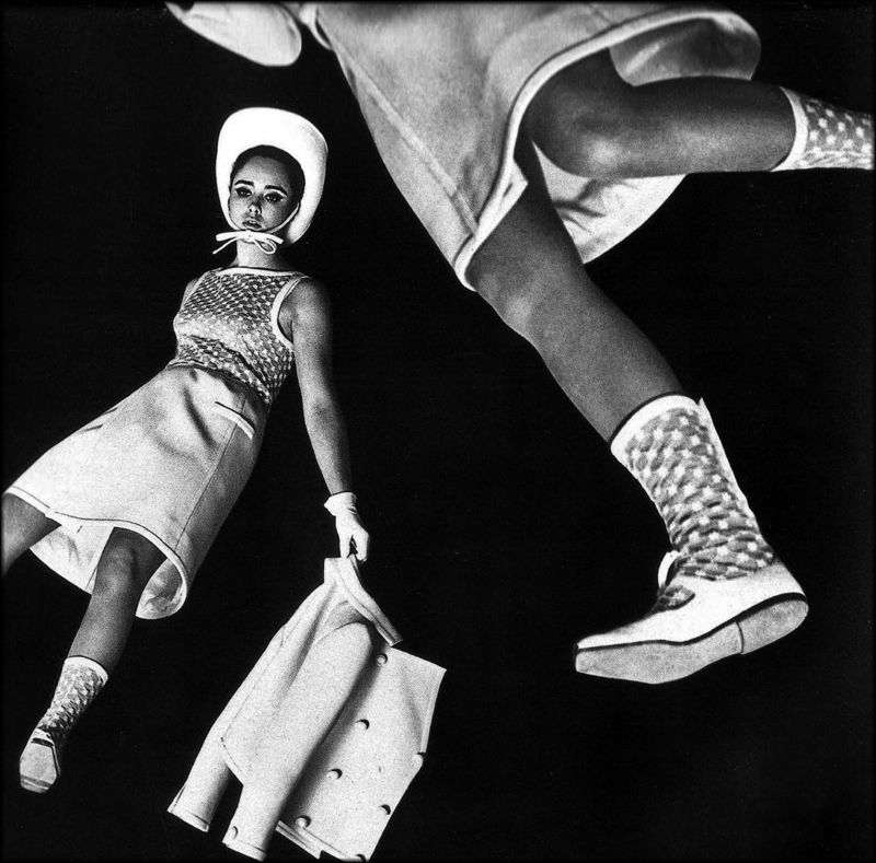
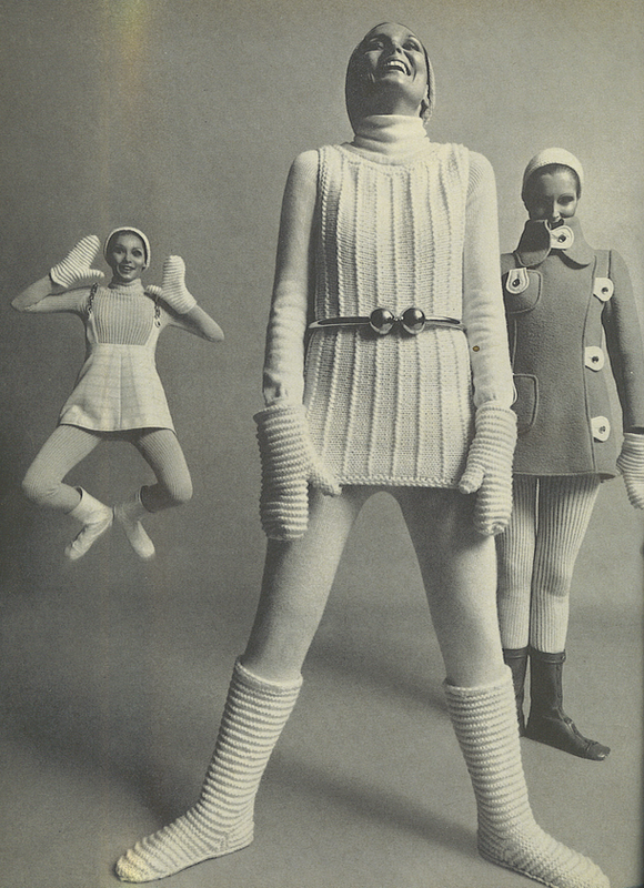
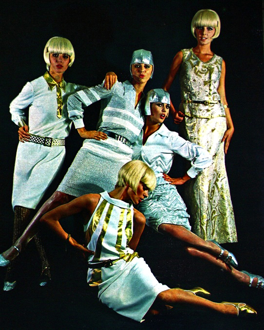
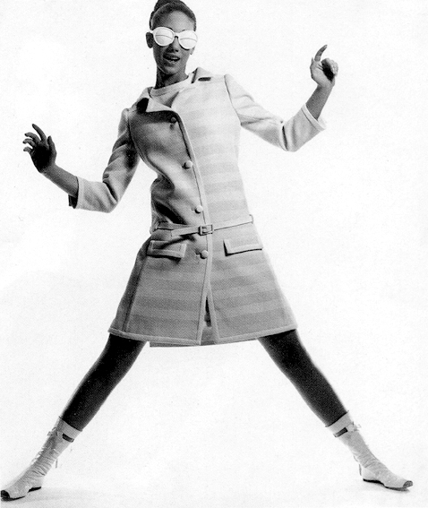
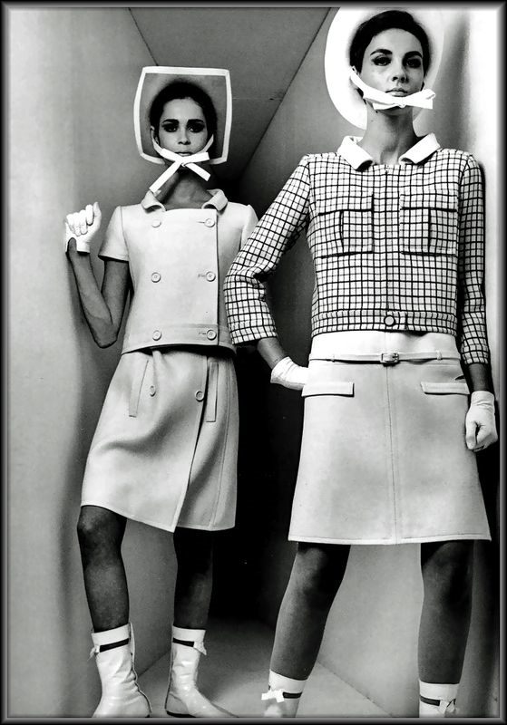
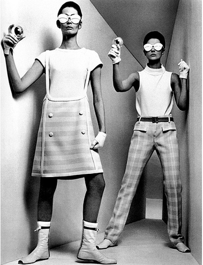
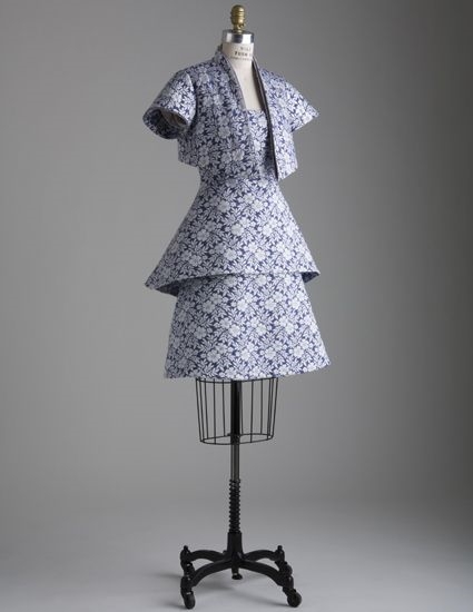
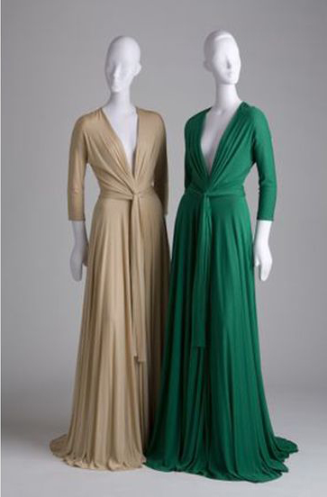
André Courrèges (b. 1923), along with Paco Rabanne and Pierre Cardin, defined the concept of "space age" couture. Inspired by the notion of space exploration, in the early '60s Courrèges put himself on the fashion map with a collection of futuristic garments featuring streamlined yet avant-garde silhouettes. Using a lunar palette primarily consisting of white and silver with touches of bold pink, orange and green, Courrèges was said to "build" his pieces rather than merely design them. His vision demonstrated a new way of thinking about fit, execution and materials. (This is the nutshell description of his work – for more eloquent, thorough analyses, check out the articles at Fashion Lifestyle Magazine, House of Retro and Fashion Bank.)


(images from houseofretro.com)
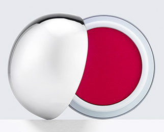
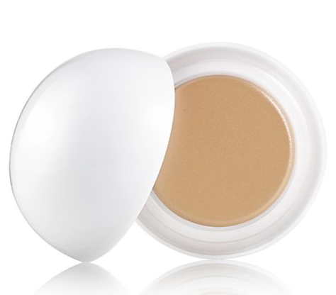
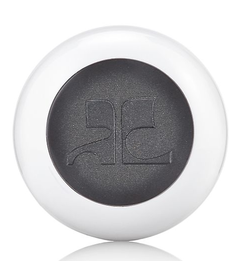
The packaging for the Estée Lauder Courrèges collection is immediately eye-catching, but upon closer inspection you can see just how thoroughly it also captures Courrèges' aesthetic. Take, for example, the silver ball used to house a lip and cheek product.

(image from esteelauder.com)


(image from pinterest.com)
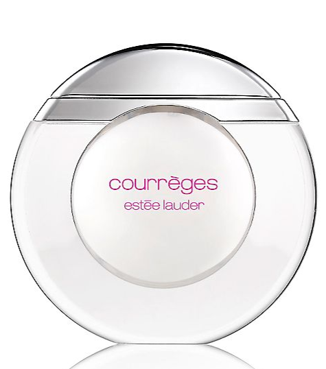
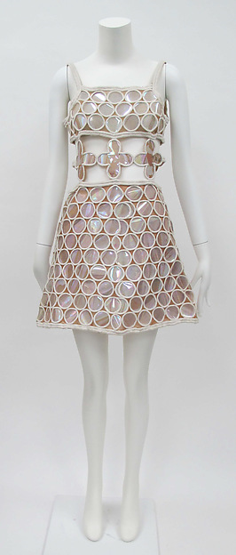
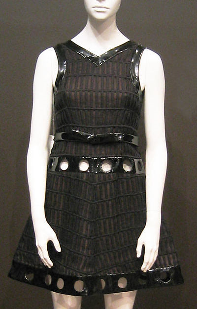
Or the round container for clear lip balm, reminiscent of this dress with circles and see-through paneling around the waist.

(image from saksfifthavenue.com)

(image from metmuseum.org)
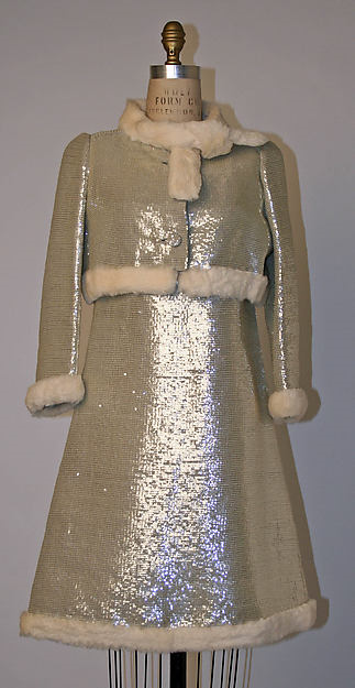
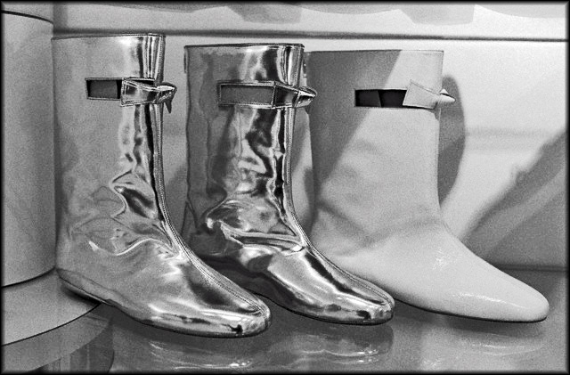
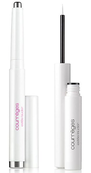
The collection would not have been complete without a highlighter of some kind. In addition to extensive use of silver and plastic, Courrèges utilized a variety of other materials to ensure that his clothes had an other-worldly, highly reflective sheen. "I want to let the light into my clothes," he explained.

(image from saksfifthavenue.com)

(image from houseofretro.com)

(image from metmuseum.org)
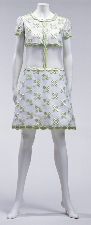
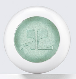
Even the colors in the Estée Lauder collection are similar to the ones Courrèges used, like this pale green:

(image from kci.or.jp)

(image from esteelauder.com)
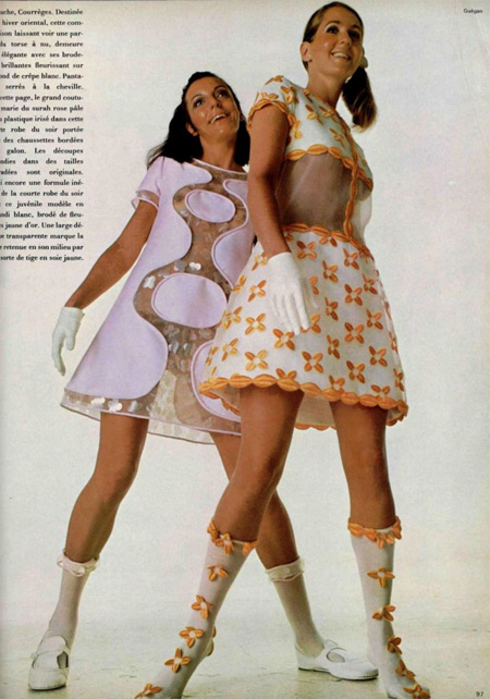
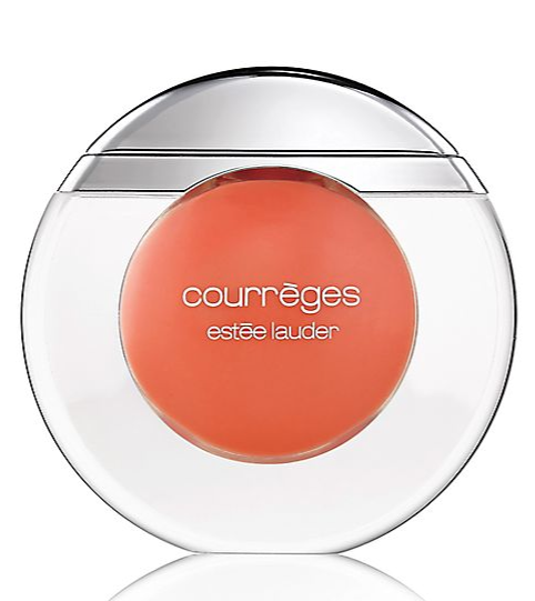
Bright tangerine:

(image from bustownmodern.blogspot.com)

(image from saksfifthavenue.com)
Shiny black:

(image from metmuseum.org)

(image from saksfifthavenue.com)
And, of course, the ever present silver and white:

(image from houseofretro.com)

(image from saksfifthavenue.com)
Overall I'm impressed with the collection. Again, I don't know whether it's museum-worthy, but I do think it was well-designed and a great change of pace for Estée Lauder.
What do you think of both the collection and Courrèges's fashion?
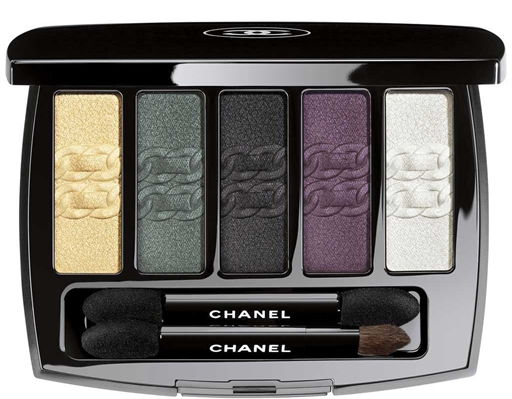
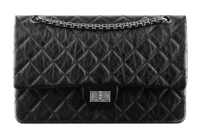
It's almost officially summer but I still want to catch up on spring releases, such as this chic little number from Chanel. L'Intemporel was released back in March this year and features an embossed design of the signature chain strap on Chanel's legendary 2.55 bag. The colors themselves also look like they may have a slightly crackled effect to mimic the leather of the bag, but as I haven't seen this in person I'm not 100% sure. I'm still debating whether to snatch it up for the museum.
 (image from chanel.com)
For reference, here's what the bag looks like.
 (image from chanel.com)
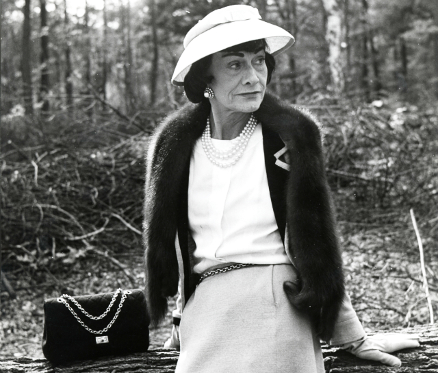
Why did Chanel choose to highlight the chain on this bag? Well, the history behind the bag's design is quite fascinating. Coco Chanel had originally designed a handbag in 1929, but in February 1955 (the bag is named for this date) she modified it by adding a strap to keep her hands free. "I got fed up with holding my purses in my hands and losing them, so I added a strap and carried them over my shoulder," she said. As for the chain, it may have been inspired by the chained belts the nuns wore to carry their keys at the convent where Coco grew up. Additionally, she said, "I know women — give them chains, women adore chains." Some other fun facts: the bag was originally lined in burgundy, another nod to the convent where Coco was raised (the uniforms were this color), and the front flap has a zippered compartment where she allegedly stored her love letters.
 (image from dejavuteam.com)
I liked that Chanel chose to highlight a key element of the 2.55 for the palette. I never knew that the bag had such a history (or the strap, for that matter) so it was nice to see it celebrated here. I think in this case not recreating the entire bag on the palette works – featuring only the chain is a subtle and sophisticated homage. And releasing this in 2015 is also somewhat appropriate, as it's the 60th anniversary of the original bag.
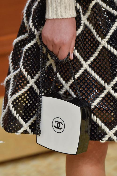
On a slightly unrelated note, it looks like there may have been a reversal in the inspiration between Chanel's fashion and beauty arms recently. Check out this fall 2015 collection bag in the shape of Chanel's Les Beiges powder compact. This is the first time I've seen makeup packaging influencing fashion rather than the other way around.

(image from yahoo.com)
What do you think of the palette and the 2.55 bag? Personally I'm partial to Chanel's boy bag, but I wouldn't mind owning a reissued 2.55. 😉
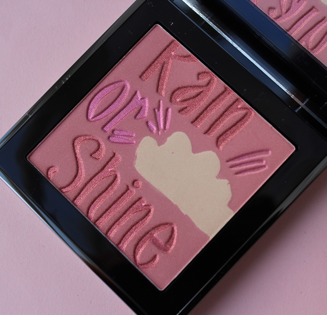
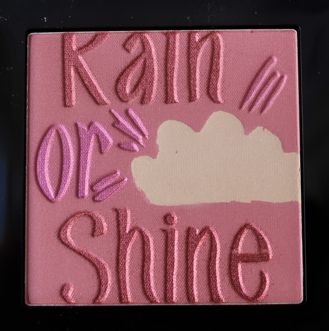
I thought I'd try to brighten up this grey dreary Monday by sharing a very cute palette from Burberry.


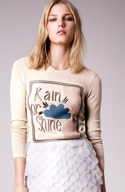
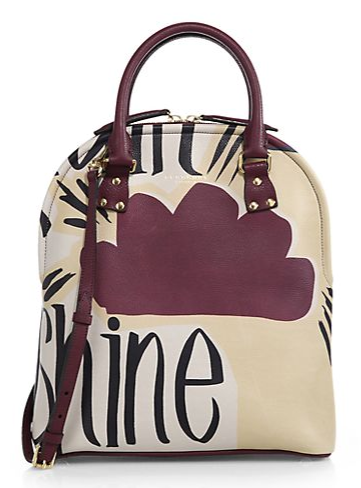
The palette's design was taken from a sweater and hand-painted bag from the Burberry Prorsum spring 2015 collection.

(image from us.burberry.com)

(image from saksfifthavenue.com)
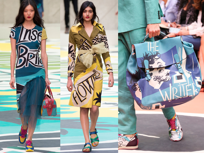
One of the inspirations behind Burberry's spring 2015 collection was vintage book covers, which is evident in both the "rain or shine" sweater and some other pieces that came down the runway.

(images from style.com)
In doing a quick image search for vintage book cover illustrations I could definitely see their influence in the Burberry collection, particularly the work of George Salter. I'm not sure why Burberry decided to go in this direction for spring (plus, using vintage book covers as fashion inspiration isn't a new idea) but I'm happy to see literary themes any time of year. 🙂
Getting back to the palette, I think the design works equally well on clothes and makeup. I also liked that this was a change of pace for Burberry beauty. I usually think of their makeup as being refined and sophisticated but at times it can get a little stuffy – they don't have a ton of what I'd consider "fun" (read: loud) colors and textures. I was pleased to see them let their hair down and be a bit more relaxed and playful with this palette.
What do you think?
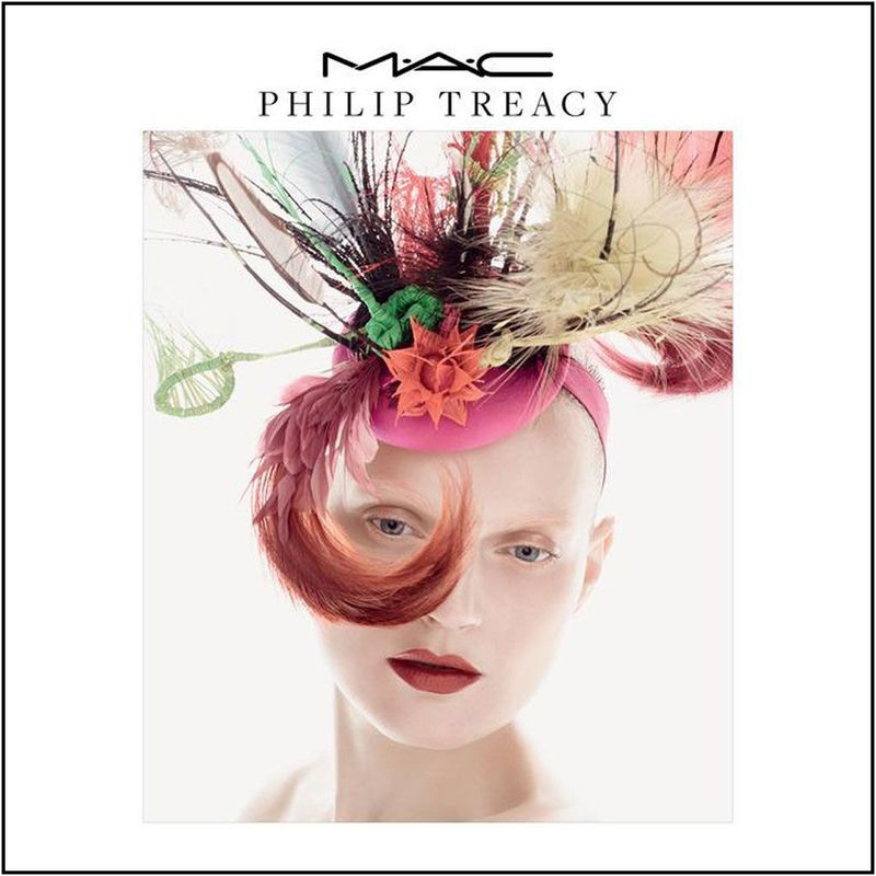
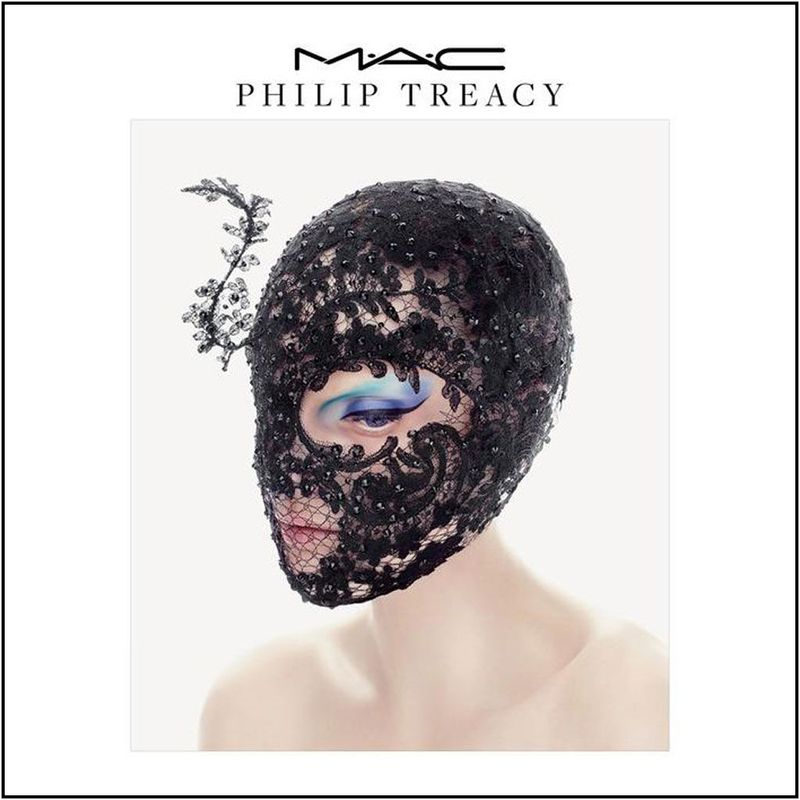
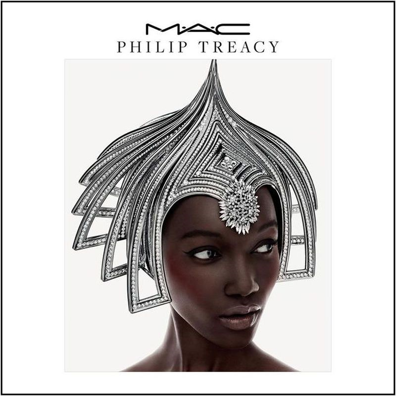
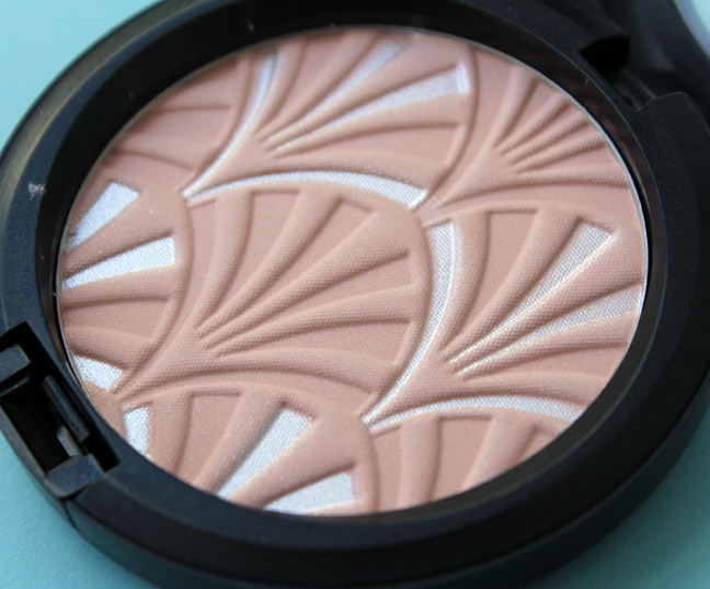
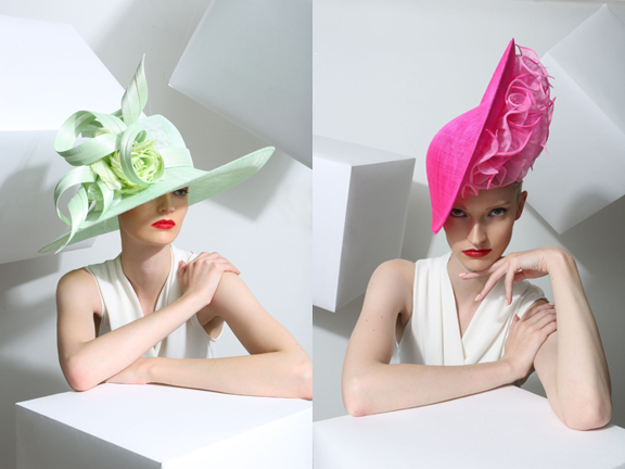
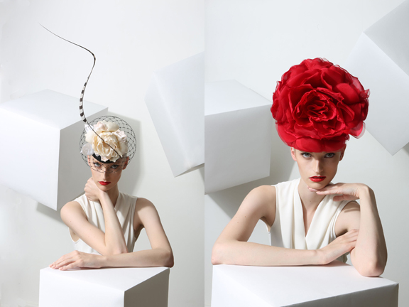
For their latest fashion collaboration MAC teamed up with British milliner Philip Treacy to create a small collection based on the designer's renowned hats, a natural choice as MAC has worked with Treacy for over 20 years on his runway shows. The collection is divided into three parts to reflect the three chosen designs, with each one focused on a different part of the face (lips, eyes and cheeks): "A kind of futuristic Hollywood, one is all about color and the other is a kind of Gothic, modern future," Treacy notes.
This feathery number inspired the bright lipsticks in red and pink, while the black lace one served as a muse for the bold blue eye liners.


I think the most interesting one is this silvery arched hat, which I'm assuming is the "futuristic Hollywood" Treacy mentioned. He explains, "It comes from an image of Greta Garbo in a movie called Mata Hari, so I just ordered it to be made up a bit more 21st-century."

(images from allurabeauty.com)
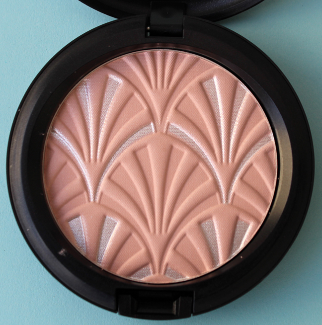
The modified version of the design appears on two highlighting powders. I picked up Blush Pink.


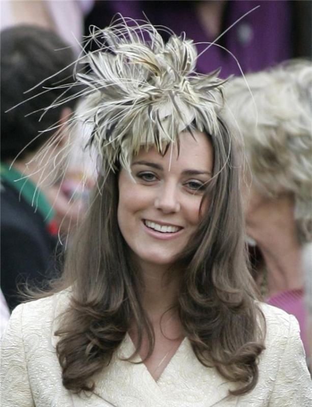
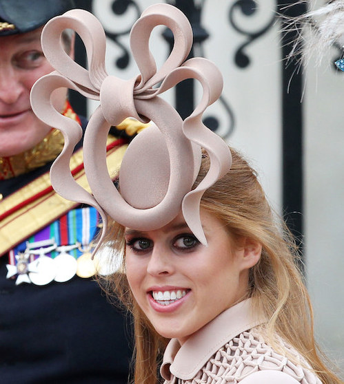
Treacy's outlandish designs are probably best recognized on celebrities, most notably British royalty:

(image from starstyle.com)
 (image from fashionbite.co.uk)
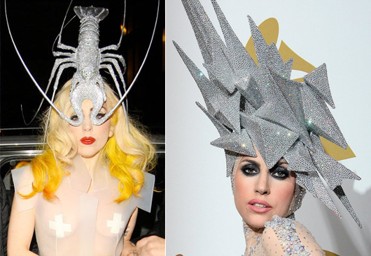
And let's not forget Lady Gaga. I believe she is the only pop star who can truly pull off his creations. Seriously, is this not a fashion-music match made in heaven?

(images from abc.net.au)
Just for fun I decided to take a peek at Treacy's spring 2015 collection. These were my favorites – I imagine putting one of these on would be like wearing a garden on your head.


(images from philiptreacy.co.uk)
Getting back to the MAC collection, Treacy says the colors are a direct representation of his aesthetic. He also recognizes the joy a shiny new makeup bauble can bring. "It’s what Phillip Treacy make-up could look like – it’s about color, exuberance and beauty…you can transform yourself with beautiful make-up. It is an enhancer; people buy a lipstick to cheer themselves up. It’s about having fun with what you’ve got."
While I do think this was a well-edited and thought-out collection in terms of colors, I would have liked to see more design-wise. There was a huge opportunity here to recreate some of Treacy's designs in powder form, and I feel it was squandered. The highlight powder is nice but it doesn't necessarily scream "couture millinery" – unless you saw the accompanying promo image, it looks like just another pattern. And while I don't think copying a design exactly as it appears in fashion is always the solution, I think it would have been ideal in this case. (See Dior's Lady Dior palette as a good example of a literal representation of one of their most iconic pieces.) So I was a little let down by this collection, as I don't think it fully captured the range of Treacy's work from a design perspective.
What do you think?
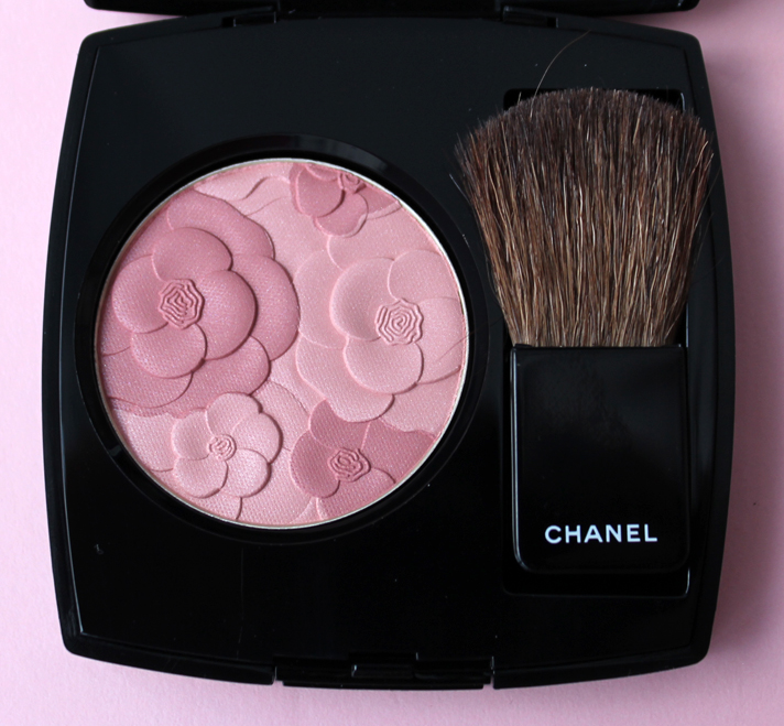
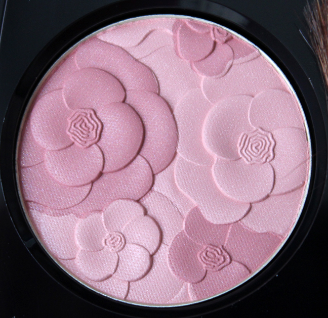
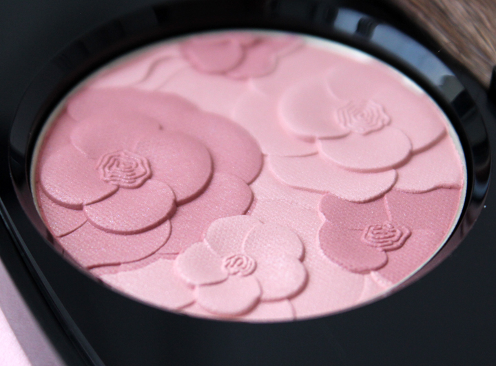
I have to admit that the only reason I picked this up is because it's pretty. I'm not thrilled that Chanel revisited a camellia design, but this was so nice to look at I overlooked the lack of inspiration in the concept.

Shimmery, multi-layered camellias in a range of lovely soft pink tones – who could resist?


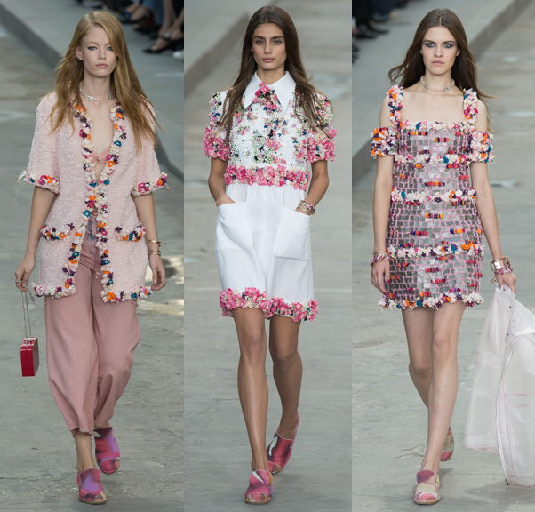
While the blush is gorgeous on its own, I was determined to see if it had anything to do with what was shown on Chanel's spring 2015 runway shows. There were a few pieces with delicately sewn petals at the ready-to-wear show:

(images from style.com)
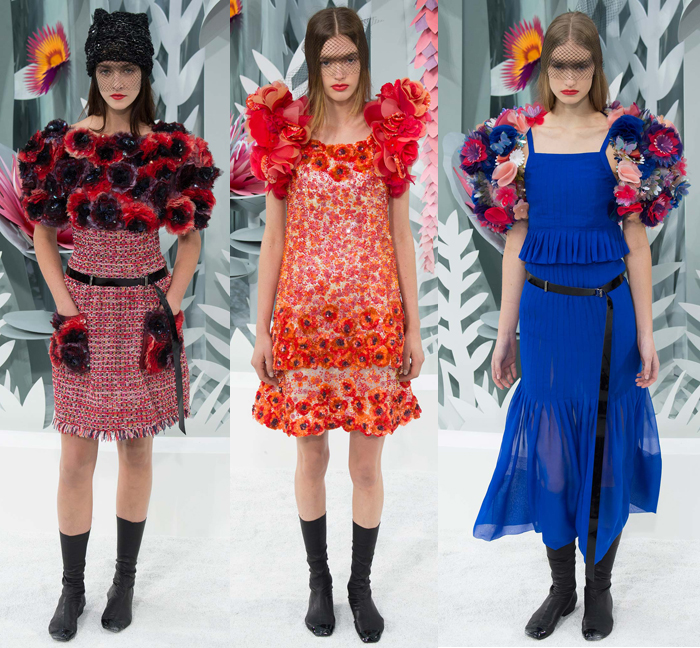
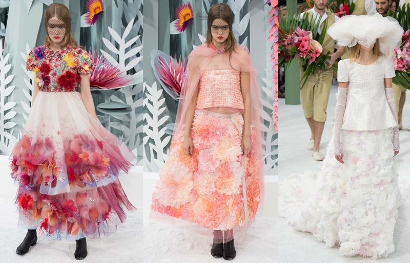
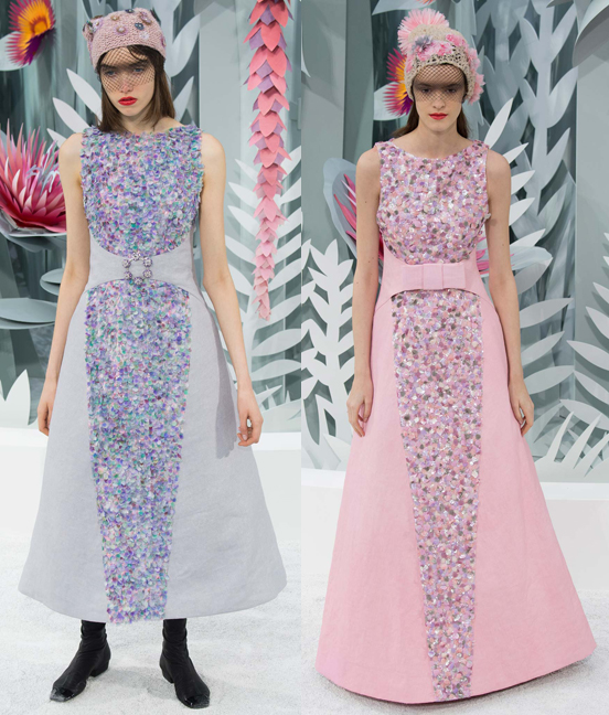
But it was the couture collection though, I think, that ties into the palette the most. Lagerfeld's vision for the show's setting, a futuristic, somewhat surreal garden made with paper flowers, was "not the nature that we know, because these flowers, the great God forgot to make them, it’s the flowers that we invented." Meanwhile, the palette is allegedly "inspired by Parisian gardens" so it looks like both the fashion and beauty departments at Chanel had gardens on the brain this season.


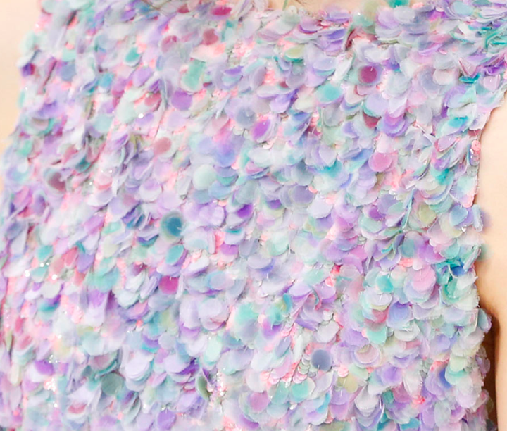
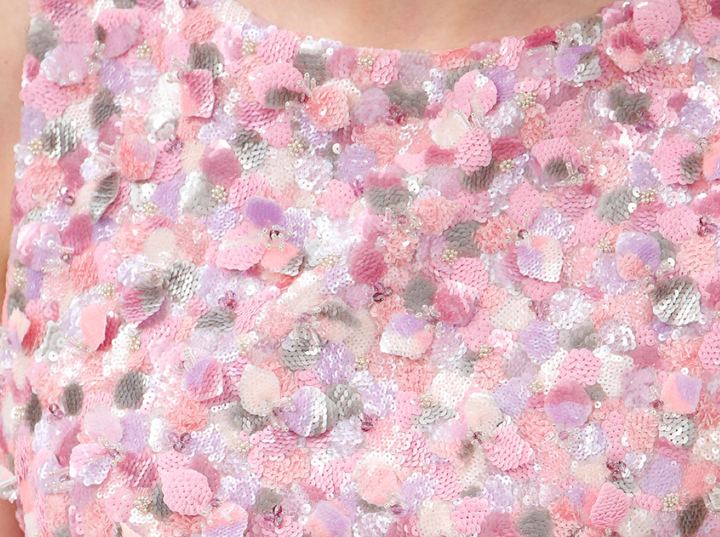
While I didn't spot any camellias, I did think the petals on these two dresses are reminiscent of the layering of the camellia petals on the palette.


(images from style.com)
Overall, while I'm not so impressed that Chanel served up another camellia, especially when there was so much floral inspiration to draw from in this season's couture line, this blush was worthy enough of the Makeup Museum. And it looks like we have yet another camellia design coming up in the Chanel's summer collection, so perhaps eventually I can do a Chanel garden show of my own featuring only camellias.
What do you think?
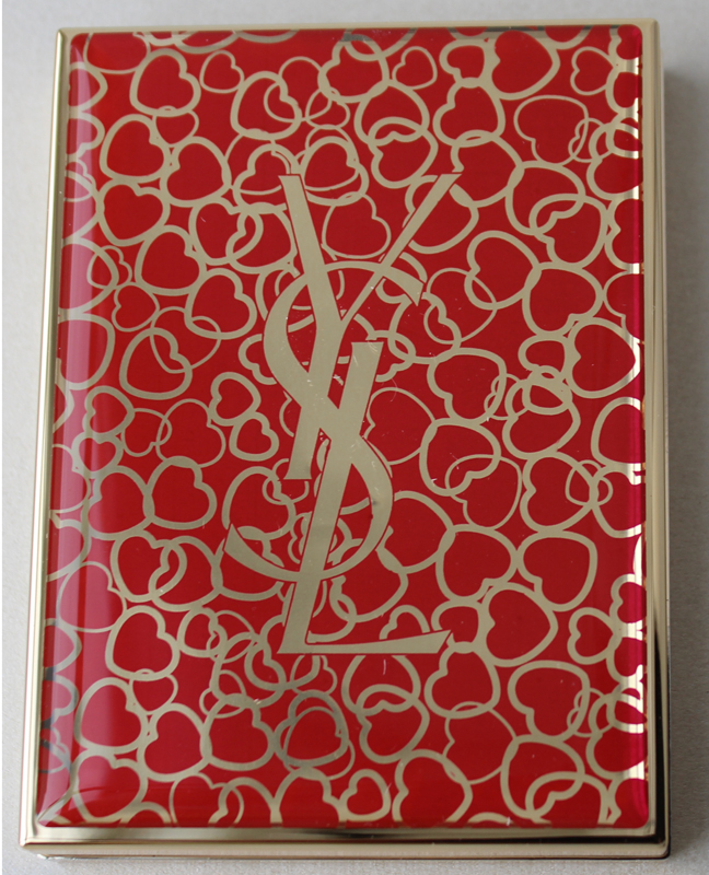
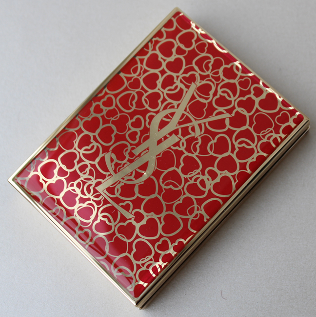
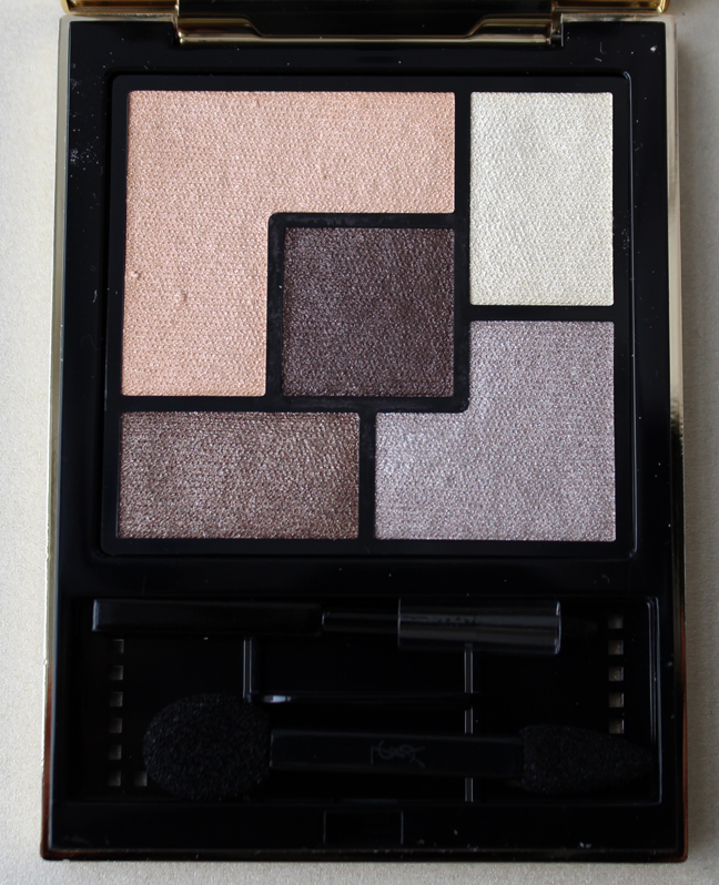
Ah, Yves Saint Laurent. I had high hopes that last year's Chinese New Year palette would be the start of a renaissance for the brand in terms of collectible items, but unfortunately they continued their trend of bland, fairly nondescript releases through the end of 2014. But at least YSL managed to pull it together again for the 2015 Chinese New Year (which is this Thursday) with this eye shadow palette whose case is decorated with an explosion of hearts outlined in gold against a red background.


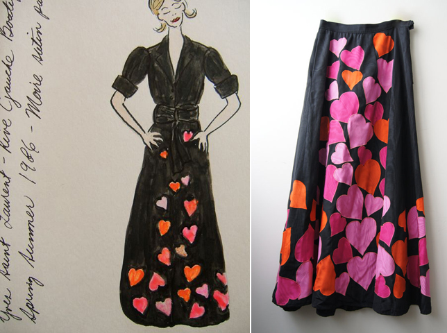
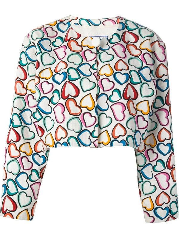
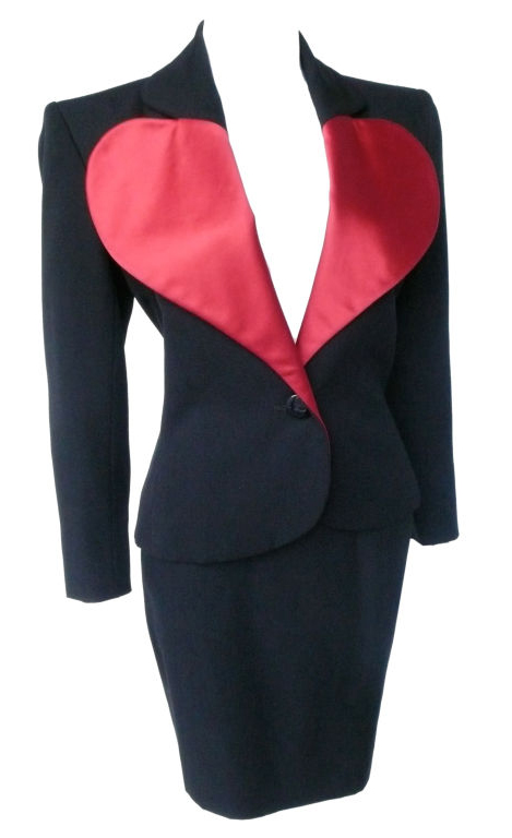
So…the questions on my mind were why hearts and why now? Well, YSL has a history of using hearts in their designs, most notably in accessories, but also occasionally on the clothing. Take a peek at this heart-printed maxi skirt, jacket and "le smoking" suit from the '80s:

(images from pinterest.com and etsy.com)

(image from lyst.com)

(image from 1stdibs.com)
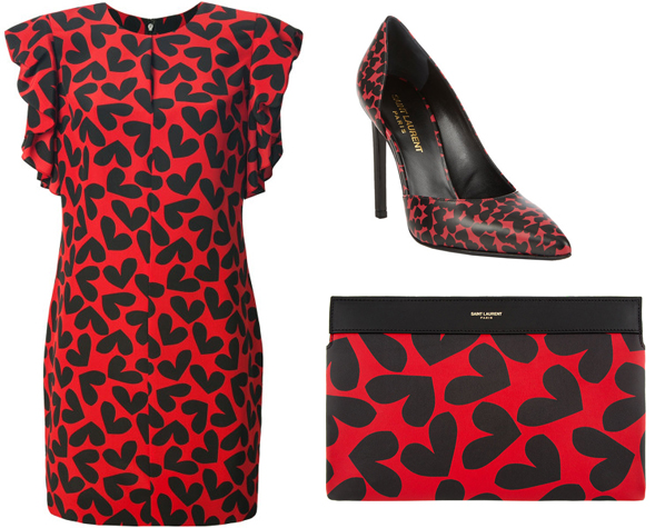
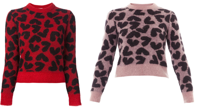
More recently, YSL Creative Director (or should I say Saint Laurent, since the "Yves" was dropped) Hedi Slimane resurrected the original designer's love of hearts in an extensive collection containing a slew of heart-printed items, from dresses and shoes to bags and sweaters. I'm not sure when this came out, as none of these pieces appeared in any of Slimane's ready-to-wear shows to date, but my best guess is around summer 2014.
 (images from barneys.com and lyst.com)

(images from polyvore.com and lyst.com)
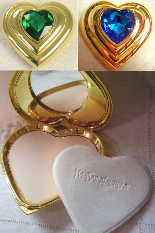
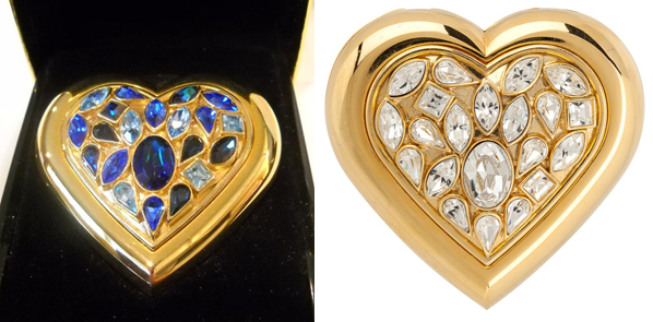
While the cosmetics arm of the famed fashion house has also worked hearts into recent releases, including the Love collection, some matte face powders from 2010 and a powder compact from the holiday 2013 collection, I was surprised to see that the use of hearts in YSL's makeup range goes as far back as the '80s, as evidenced by these bejeweled compacts.

(images from rubylane.com)

(images from etsy.com and onekingslane.com)
So hearts appearing on YSL's makeup is nothing unusual. But why now, for a palette celebrating the Chinese New Year? Well, each year from 1970 until 2000, the designer illustrated a love-themed card to ring in the new year and sent them to his friends and family. (Perhaps you remember the spring 2008 Palette Pop, which was based on a card from 1992.) Thus, a New Year's palette decorated with hearts is the perfect homage to this tradition. Additionally, as of last Friday the book detailing all of these "love cards" has been reissued in France and the U.S., a sneak peek of which you can see here. While I would have liked to see another palette centered on the design of one of these cards, or maybe a design that had more to do specifically with the Chinese new year, the hearts were a good choice and appropriate given the aforementioned 2014 heart-printed fashion collection.
What do you think?

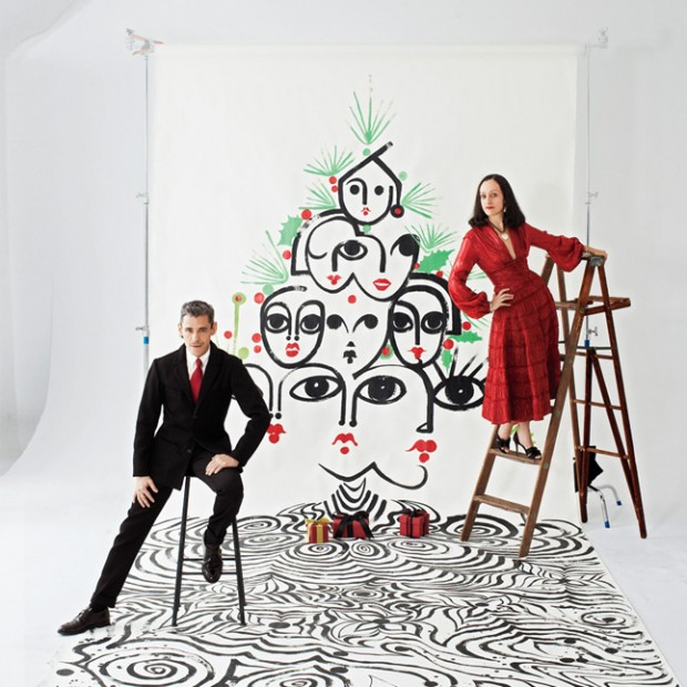
How cute are these two?
(image from style.com)
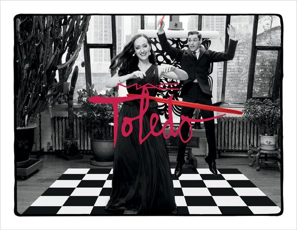
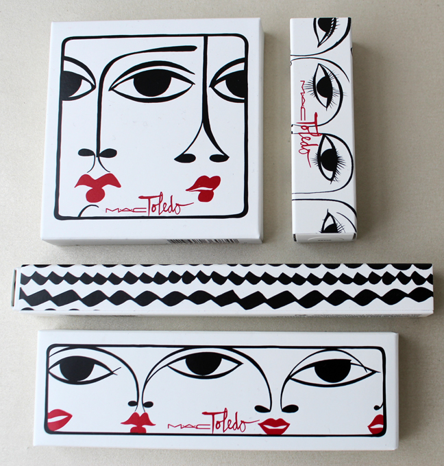
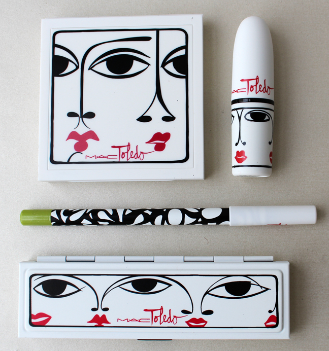
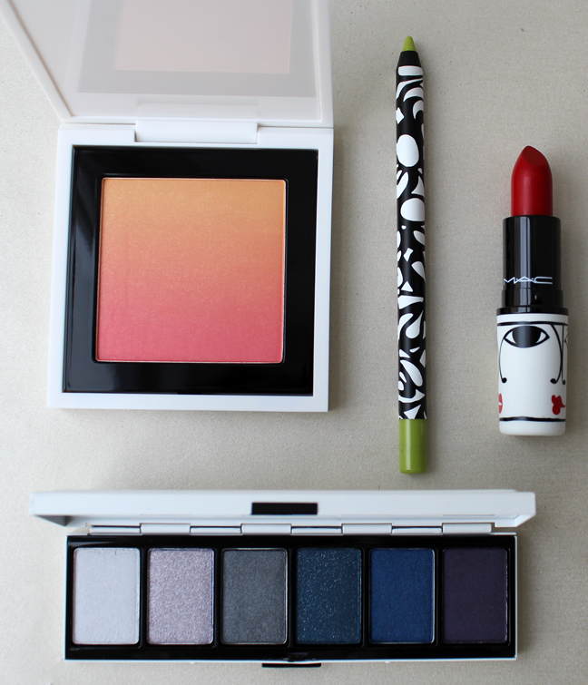
I must say that upon first glance this collection didn't do much for me, or at least the packaging didn't. Then I started reading up on the fashion super duo behind MAC's latest collaboration and was so impressed with their work I had no choice but to purchase several pieces. Husband and wife team Ruben and Isabel Toledo are a force to be reckoned with and frankly I'm ashamed that I didn't know who they were until now.
Both Cuban-born, Isabel is a clothing designer while Ruben works as a fashion illustrator, producing delightful drawings not only for his wife's work but for a plethora of other projects. While I admire their work (I'll get to that in a sec) it was their long-term romance and partnership that made me connect to them, which you can read about here and here. As for the MAC collection, both were very excited for the opportunity, explaining that they had worked with the brand on other projects for several decades. "We were thrilled when M∙A∙C approached us to work on a collection together; it was a dream-come-true. We share a long history of 30 years with M∙A∙C, collaborating on many of the same charity projects. The opportunity to create objects of art and desire came together like a family affair, especially since M∙A∙C works brilliantly with artists and they have a global following of fans. James Gager [M·A·C creative director] and Jennifer Balbier [M·A·C VP of product development] gave us complete creative freedom and helped bring our vision to life."
I chose what I thought were the most iconic pieces in the collection. The illustrations on the packaging, of course, are Ruben's portraits of Isabel with her signature red lips. He says, "When creating the different illustrations for the collection I was inspired by the fluidity of the lines and the spur-of-the-moment feel of it. If I'm doing a portrait I start with the eyes. If the eyes don't speak to me, then I just start over again. I need to capture that one thing in the eyes where the mystery and the soul are. I love painting, the drawing of the lines and the graphics of it all. It is my passion on paper." Isabel is always his primary muse, however: “It’s the face I draw again and again and always. It’s just in the flow of my hand, Isabel’s face.” Awwww!!


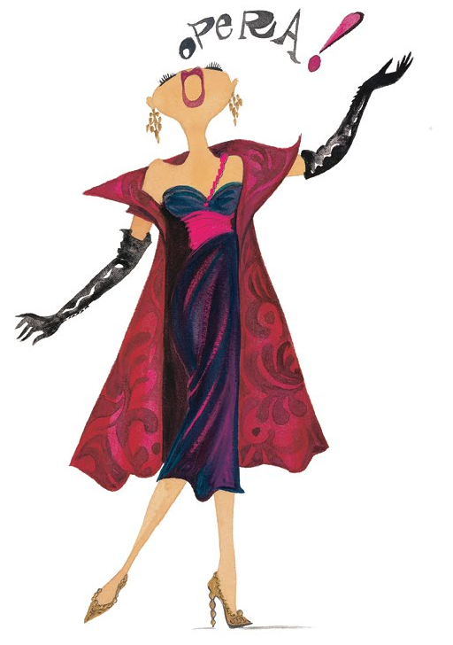
As for the shades themselves, they might seem rather discordant, with no connection to each other at all. However, the variances express Isabel's early experimentation with color and also serve as a nod to her party nights at Studio 54. She says, "I love poetic colors, unusual combos, and nameless hues, all unexpectedly mixed in with the everyday. For me, it's much more about the tones than the actual colors. For instance, I love nudes with neon or a smoky mysterious eye with a bright and happy futuristic red lip. I love to see denim worn with just a t-shirt accompanied by deep operatic lips. Studio 54, disco, punk, and new wave allowed for a lot of freedom of expression in the way I dressed, danced, and presented myself. It was a great way for me to find my look as a young lady of 14 and 15! I went from wearing jeans and a tube top with smoky film noir makeup one night, to futuristic yellow brows paired with a nude mouth the next. Makeup moves faster than fashion, that's what makes it so fresh." Her take on unrestrained use of color definitely speaks to me, and I also was intrigued that she likens makeup to painting: "I see Ruben's watercolor paintings, and I wanted the freedom to do that on my face. I wanted to all of a sudden do my eyelashes in yellow or green with a matching eyeliner, something that's not natural. It's like having the ability to paint. And I mean, if you think about it, women paint every day standing in front of the mirror." Our philosophies on makeup are perfectly aligned!

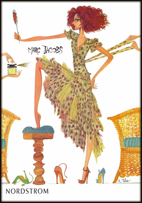
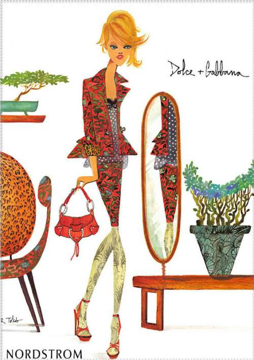
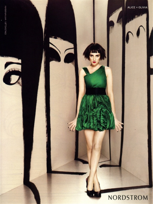
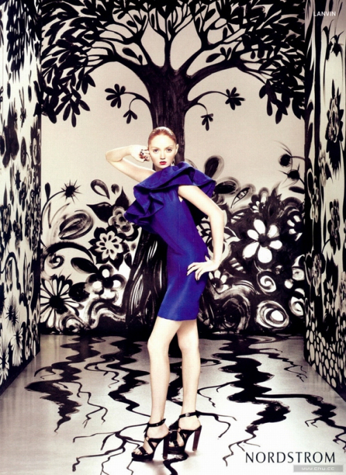
I wanted to see what some of Ruben's other illustrations involve. Once again, I'm embarrassed I didn't recognize his name or previous work as he's landed some pretty huge projects, including Nordstrom catalogs:


(images from dcwdesign.wordpress.com)
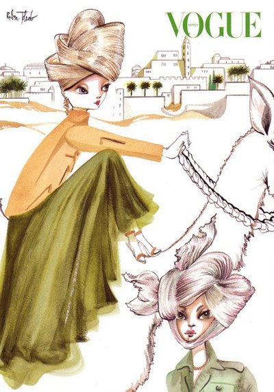
And of course Vogue:

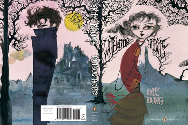
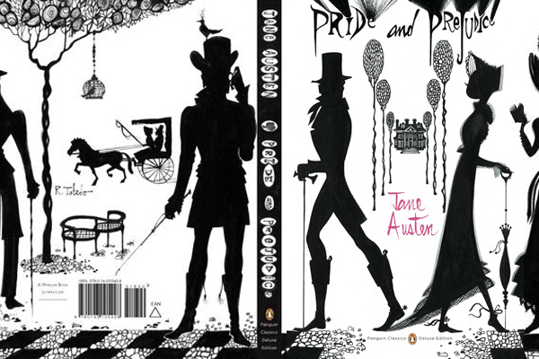
He's even done classic book covers:


(images from pbcstyle.blogspot.it)
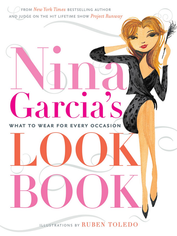
Ruben also did illustrations for many fashion books, including one for Nina Garcia.

I included this picture from the book since the lipstick I purchased from the collection is named Opera, and Isabel references "deep operatic lips" as one of her inspirations.

(image from fatsistersguidetolife.blogspot.com)
I also wanted to see if he's drawn Isabel for other projects, and indeed he has. This illustration for the 2012 holiday issue of Bon Appetit looks very similar to the ones on the packaging for the MAC collection.

(image from bonappetit.com)
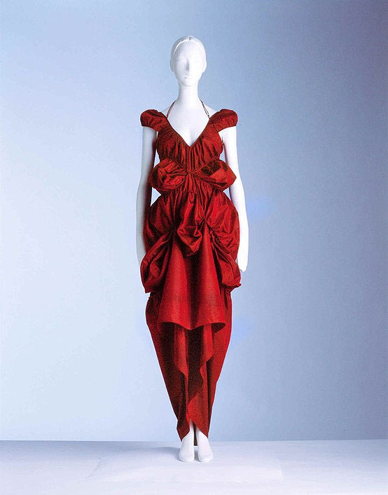
I also wanted to see whether there was any correlation between Isabel's fashions and the MAC collection. The Fashion Institute of Technology (FIT) offered a 2009 exhibition devoted to Isabel's work, and from there I got a better sense of her aesthetic. Much like her taste in makeup, it's all over the place – lots of bold color, unusual but not unwearable silhouettes, and there's definitely a penchant for experimentation.


(images from fitnyc.edu)
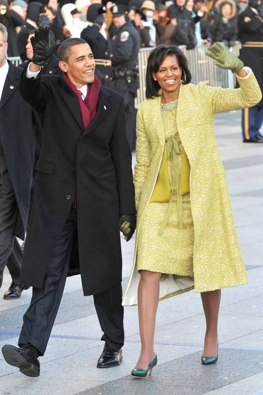
More notably, how could I forget Isabel's pale chartreuse number that she designed for Michelle Obama to wear to her husband's inauguration? It's fashion-forward but still appropriate for a First Lady.

Overall I was glad I read a little more about the collection and eventually decided to bring some pieces home. It captures the essence of this husband and wife team in that they each contribute something different but the end result is even greater than the sum of its parts. As Ruben remarked, "We're so meshed, it's impossible to separate what we do."
I also feel like Isabel and Ruben are very creative and interesting people but have none of the pretentiousness that plagues most of the fashion world. From interviews with them as well as the MAC promo, they seem like fun-loving, down-to-earth people who don't really care about what's cool or popular – they just want to make their art. I could totally see me and the husband having dinner with them…he and Ruben could discuss illustration, while Isabel and I would play in my makeup stash and talk about shoes. 🙂
What do you think of the collection and of the Toledos' work?
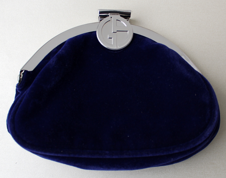
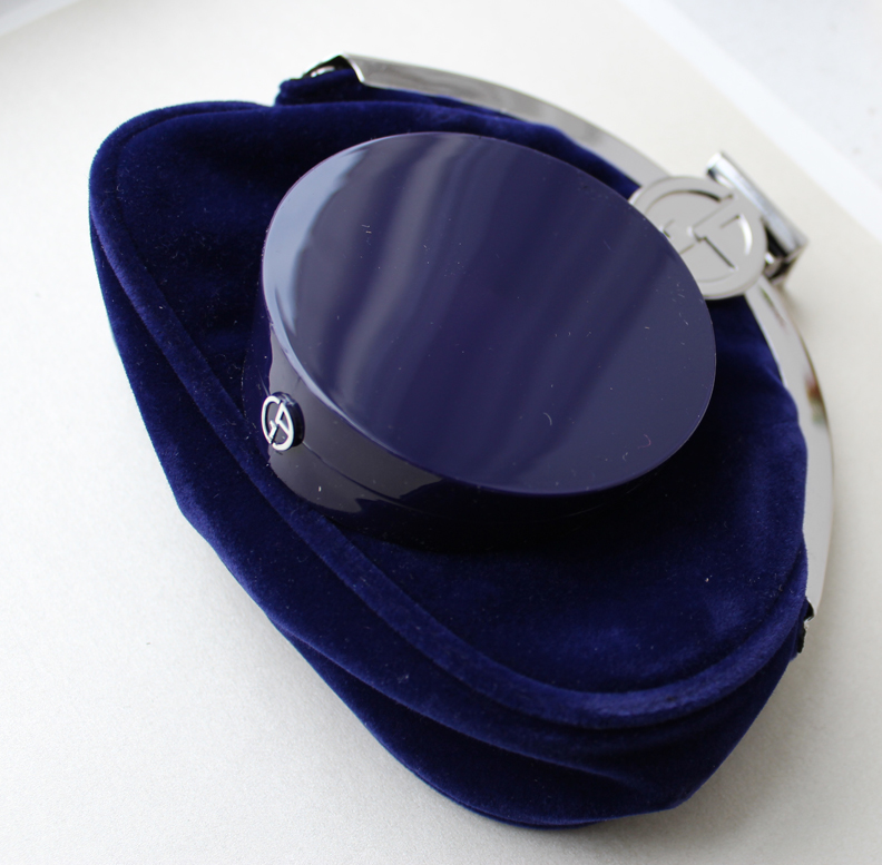
While not as spectacular as some of Armani's previous holiday offerings, I was pleased enough with the Orient Excess palette to buy it. The palette comes with a sapphire blue velvet pouch.

Unlike the palettes from 2009 and 2008, there is no bling on the outer side of the case, but the deep blue is quite striking on its own.

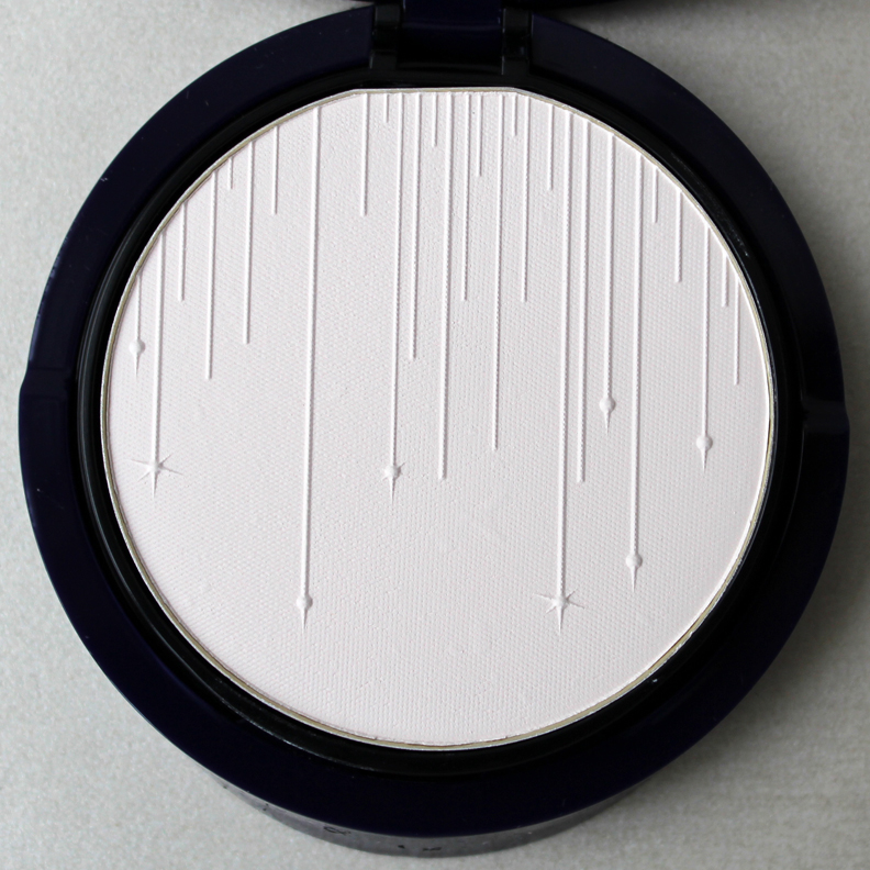
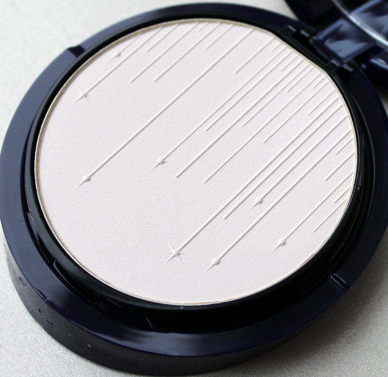
Inside, Armani went for a simple cascade of thin vertical lines of varying lengths streaming from the top of the palette, some punctuated with stars. It's an abstract design but still is reminiscent of holiday/winter motifs, like baubles dangling from a Christmas tree or perhaps icicles. Like the T.LeClerc Paris in Winter palette, the beauty of the design lies in its subtlety – no harsh colors or glitter, or even prominent shimmer.


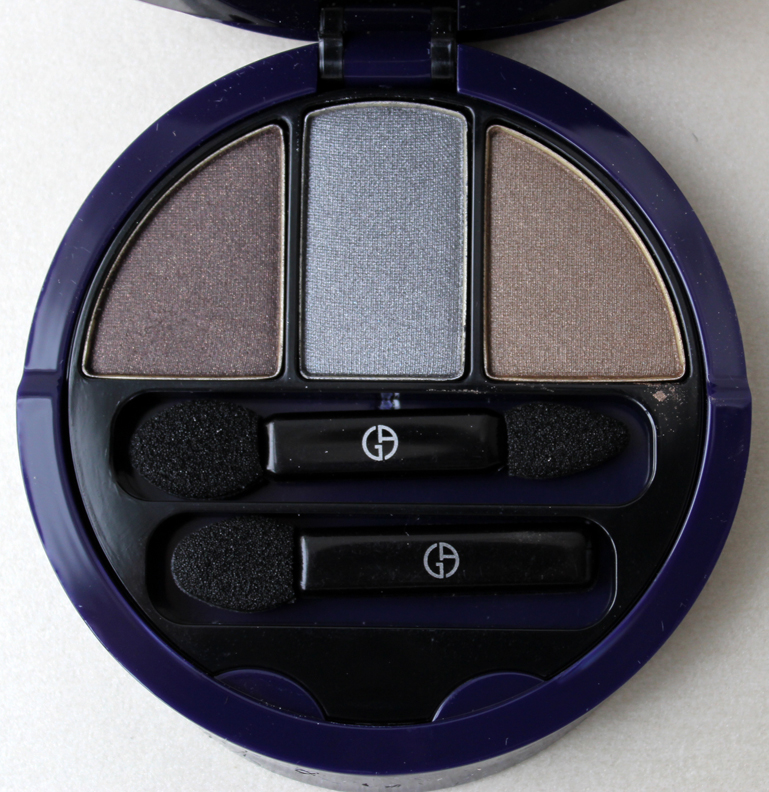
The eye shadow tier:

Naturally I had to see whether there was any direct connection to Armani's recent fashion shows. The fall ready-to-wear show was the inspiration for the Organica palette so it's not from that. I checked the fall couture show and nope, there was nothing there either that would suggest any relation to the palette. So I went to the press release about the holiday collection and found this description: "To celebrate the end of the year, the Orient Excess collection invites you on an exotic journey to the snowy steppes of the Far North. These immaculate plains, covered in frost and stretching as far as the eye can see, inspired by Giorgio Armani Beauty to create a polar atmosphere through pure and intense make-up." That certainly paints a picture and the highlighter does bring to mind some sort of frozen tundra-filled landscape, but there's still no explicit reference to Armani clothing.
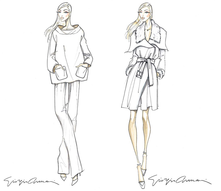
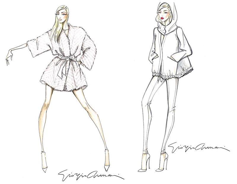
Then I came across an article announcing Armani's Luxury White capsule collection. For a capsule it's rather large, running the gamut from jackets and sweaters to shoes and bags. However, the color scheme is restrained, consisting only of variations of white and ivory. The variety of textures keeps the pieces interesting though, as alpaca, rabbit fur, silk, and three types of cashmere were used.
As you can see from the sketches the collection's title is apt. The fur-collared trench coat and the bathrobe (ooh, is it cashmere?) look particularly sumptuous to me.


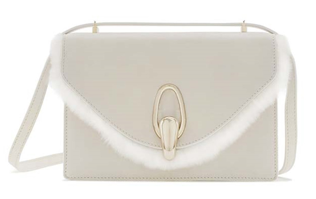
While there are only sketches of the clothing online, stock photos of some of the accessories were released, like this rabbit fur trimmed bag.

(images from vogue.it)
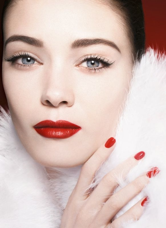
So while I have no quote from Armani about the link between this collection and the Orient Excess lineup, I'm pretty sure Luxury White was the inspiration, especially when you consider the model in the Orient Excess ad, who is swathed in white fur. There's also a line from the aforementioned press release that calls to mind the extravagant textures used in the Luxury White collection: "Featuring a porcelain, universally translucent face powder for that essential, winter glow and a trio of eyeshadows, inspired by the softest mink, chinchilla and sable furs, to bring a touch of animal warmth to translucent skin."

(image from beautezine.com)
What do you think of the Orient Excess palette? Think my theory about it being loosely based on the Luxury White collection holds any water?
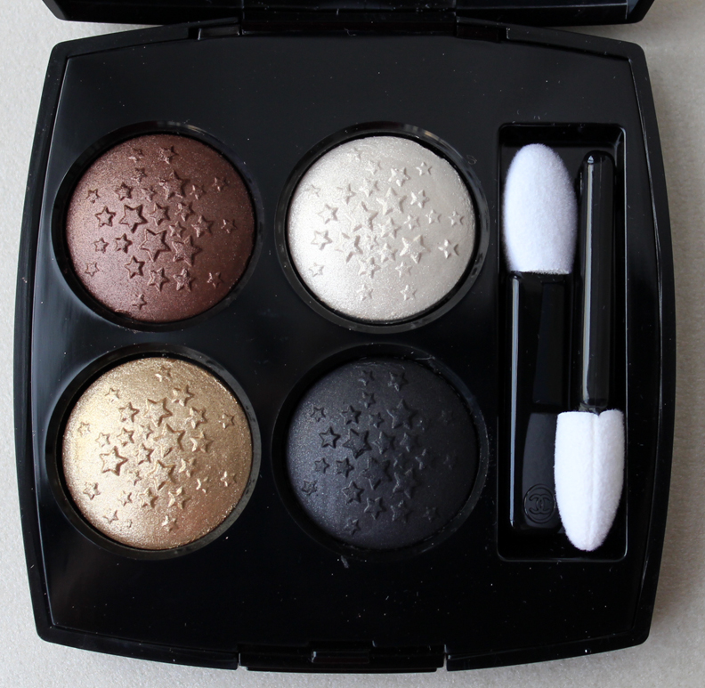
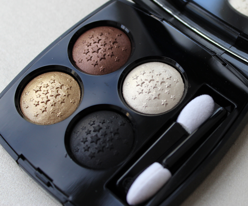
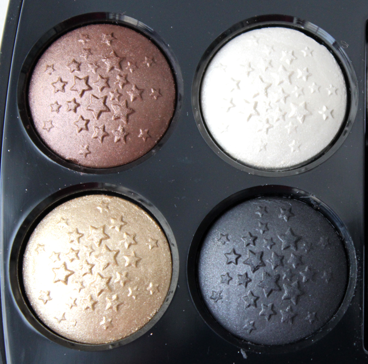
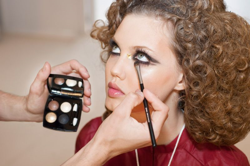
Today I want to share a relatively hard-to-find Chanel quad that debuted during their 2015 cruise collection show. (This quad is also being given away by me – there's still a few hours left to enter – but will be arriving soon to the Chanel website so don't fret if you don't win the giveaway!) Rêve d'Orient has a gorgeous color scheme consisting of shimmery ivory, warm gold, deep bronze and matte black, all embossed with a smattering of tiny stars.


This quad was used on the models for 2015 resort collection runway show to create a smoky, Middle East-inspired eye with a dab of luxurious gold leaf placed on the inner corners.

(image from vogue.co.uk)
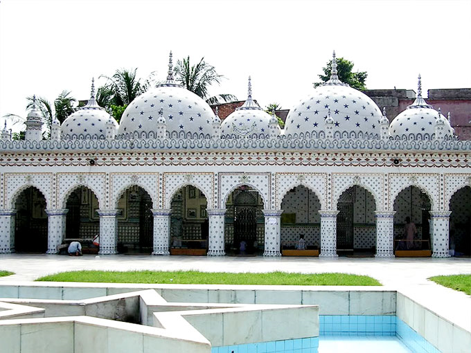
However, I have no idea why a star design was included on the shadows themselves. Stars didn't appear on any of the clothing. One possibility is that it's an homage to Islamic religion (the show took place in Dubai), whose mosques are sometimes adorned with stars. The most famous example is the Star Mosque in Bangladesh.

(image from beautifulmosque.com)
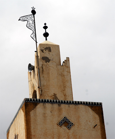
Some mosques have stars at the top of their spires, usually paired with a crescent.

(image from essaouira.nu)
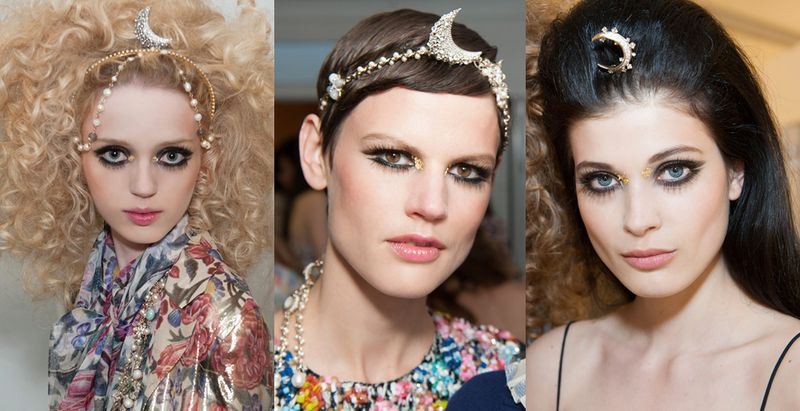
And some of the headbands at the show featured a crescent motif.

(image from vogue.co.uk)
Still, most star patterns in Islamic art and architecture consist of 6-, 8- and 10-pointed stars so it's quite a reach to assume Islam is what Chanel was referencing, especially considering there's no symmeterical pattern but rather a random scattering of stars. It could just be that it's a nonspecific expression of Karl Lagerfeld's latest take on the East-meets-West theme. As Lagerfeld remarked, "It’s a collection made for this part of the world, but I think, and hope, it’s for women all over the world."
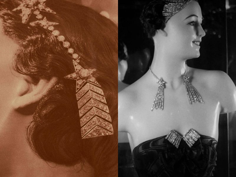
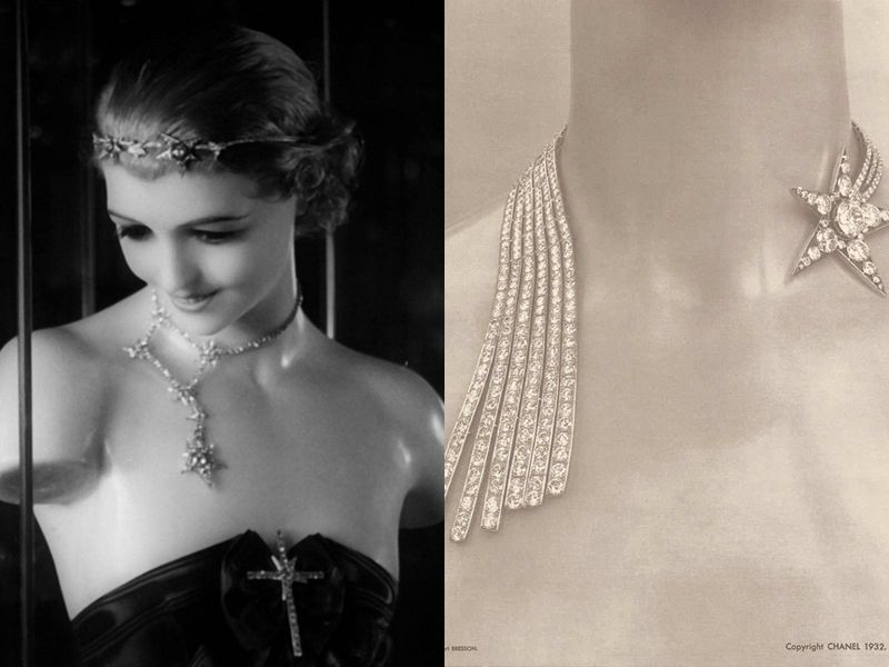
The more likely possibility is that as with the Camelia de Plumes highlighter, the stars are borrowed from the first jewelry line by Coco Chanel that was introduced in 1932; specifically, the Comète series. Here are some of the original pieces (does anyone else find the mannequins to be incredibly creepy?)


(images from elle.com)
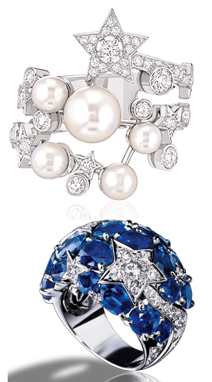
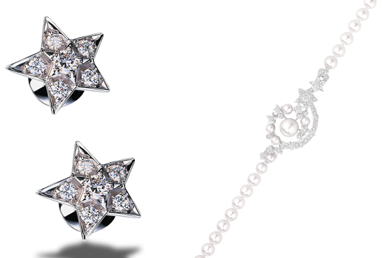
An updated line was released for the original's 80th anniversary in 2012.


(images from chanel.com)
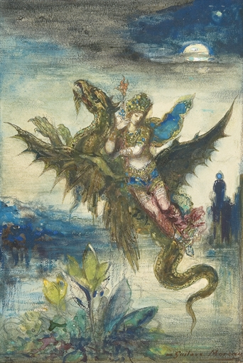
Since I have no conclusive answer on the star pattern, I thought I'd show you a slightly different Rêve d'Orient. This 1881 watercolor by Gustave Moreau (1826-1898) has the same name as the Chanel quad and shows a Peri (a fairy-like creature from Persian mythology) perched on a dragon and holding a lotus flower. The top of a mosque appears on the right side in the background.

(image from christies.com)
You can read the entire description of this work and the meaning behind it here, since Christie's does a much better job than I can. Moreau is one of my favorite artists – I love French Symbolism and I'm actually reading this book on it now, so I was really excited to find this.
Anyway, as with the Chanel Camelia de Plumes highlighter, I'm a little disappointed there was no concrete explanation for the pattern. Both palettes vaguely reference Chanel fashion and history, but there's no real, literal connection to the clothing we saw in recent shows. Nevertheless the Rêve d'Orient quad is pretty and the star design is perfect for the upcoming holiday exhibition, so I can't complain too much.
What do you think the stars mean? And I know it's comparing apples to oranges, but do you prefer Chanel's Rêve d'Orient or Moreau's?
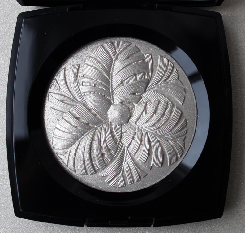
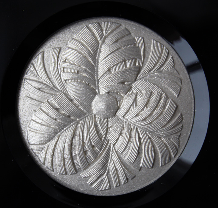
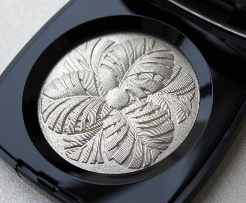
As soon as I saw this palette from Chanel I knew I had to have it. Not only was I drawn to it due to the sparkly platinum gold color, I liked that the classic camellia was illustrated a bit differently, its petals made from feathery plumes anchored by a gemstone shape in the center.


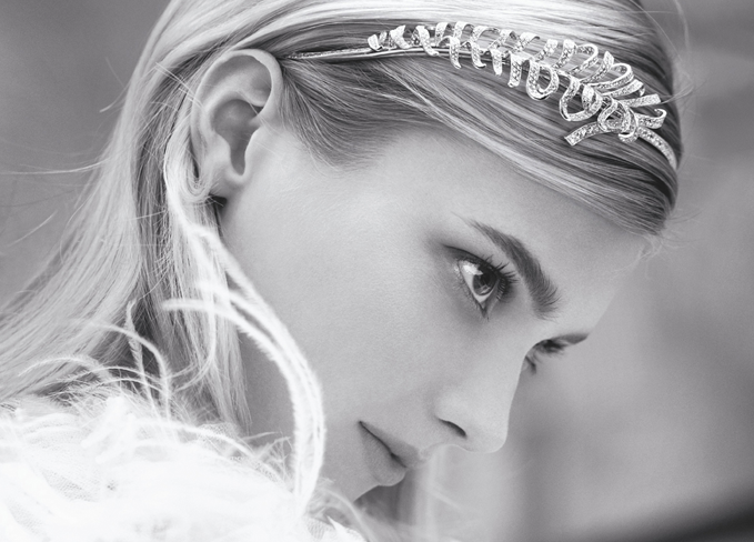
The description for the palette states that it was inspired by "Gabrielle Chanel's original jewelry creations," and I'm guessing it took its cue from the Plume de Chanel jewelry collection released last year, which also referenced the original line from 1932.

From the website: "The feather entered the CHANEL creative landscape in 1932, when Mademoiselle opened her apartment in the rue du Faubourg Saint Honoré to present her Fine Jewellery collection. It was called, quite simply, ‘Bijoux de Diamants’. It explored the timeless themes that she particularly loved and which became some of the House classics: comets, stars, bows…one of these new creations particularly caught the eye: a spectacular brooch in the form of a feather. It was intentionally large and extravagant, fully jointed and set with diamonds. Deliberately daring, it called on the imagination of the wearer. It was magnificent pinned to a hat, on a dress, as a tiara, or even snuggling against a shoulder to emphasise its curves. The gracefully feminine Plume de CHANEL is an unmissable collection that demonstrates the independent creative spirit of CHANEL, as well as its outstanding jewellery expertise. Mademoiselle Chanel’s visionary spirit is still very much alive in this collection, spreading its wings once more in the contemporary age."
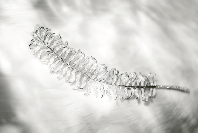
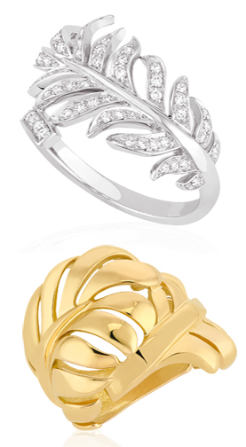
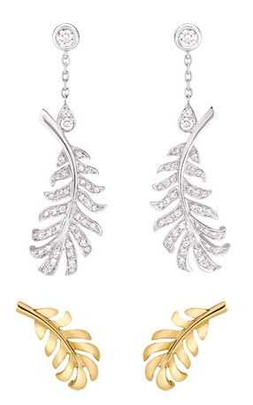
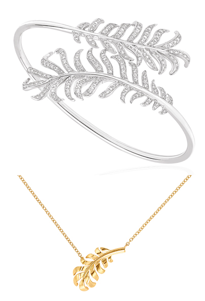
Here is the brooch, plus other pieces from the contemporary collection.

(image from theparisianeye.com)


(images from chanel.com)
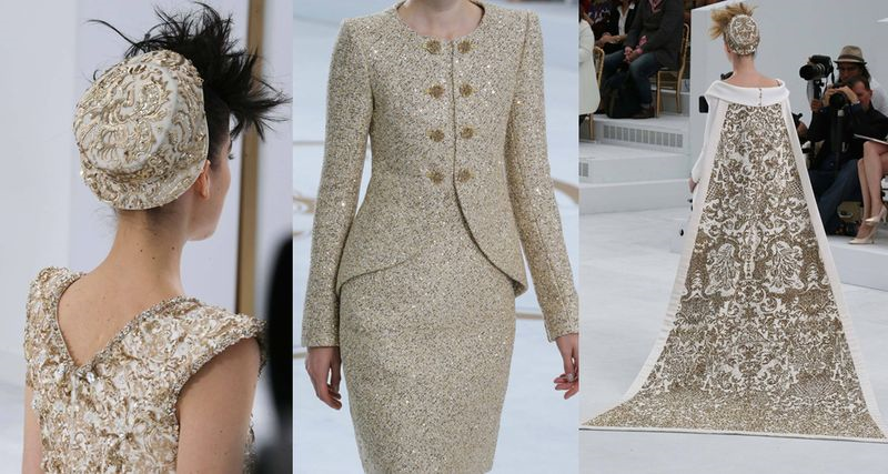
While I couldn't find a jewelry piece that specifically looked to be a camellia made from feather shapes, I like that the highlighter palette at least references the collection. I'm still puzzled as to why Chanel chose to release this highlighter now since feathers did not figure prominently in any of the recent fashion collections, so I'm not sure why they'd want to reference a jewelry collection seemingly out of nowhere. My hunch, as with Chantecaille's designs as of late, is that the company put an intern in charge of creating this highlighter. I'm envisioning a bigwig telling some poor kid to come up with something sparkly for the holiday collection, and they went digging through the archives and randomly came up with this design. It just doesn't seem like there was a whole lot of thought put into it. (Perhaps Chanel beauty is still a bit lost after the resignation of Peter Phillips?) Having said that, at least the color is spot-on, as it's the perfect mix of the yellow and white gold that the jewelry is available in. Additionally, while there were no plumes to be found in the fall 2014 ready-to-wear or couture collections, the color is reminiscent of the glittering gold that was sent down the runway for the couture show.

(images from style.com)
Overall, while I wish the Camelia de Plumes had a closer tie to a recent fashion collection, I like that Chanel mixed it up a little and gave us a feathery camellia rather than the usual flowery one. What do you think?
