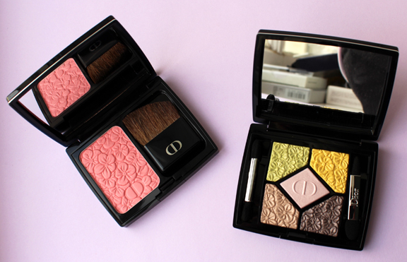
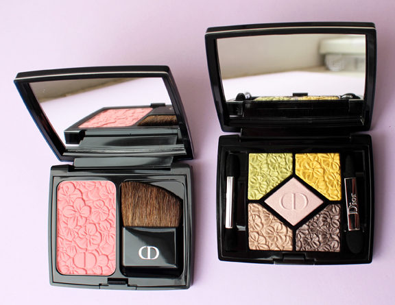
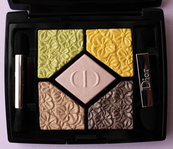
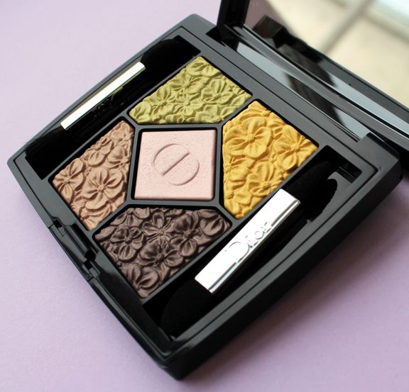
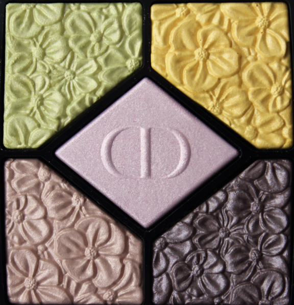
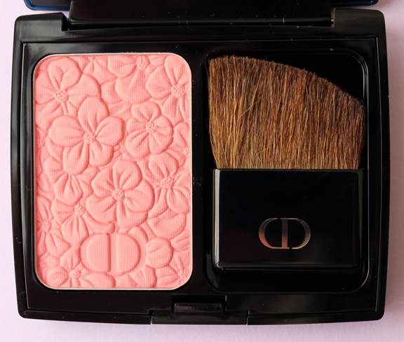
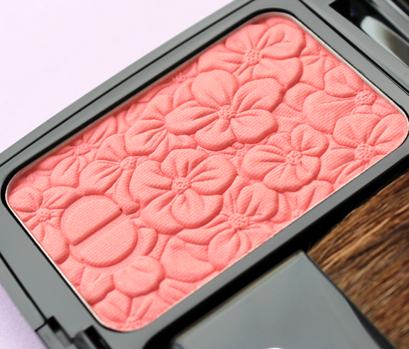
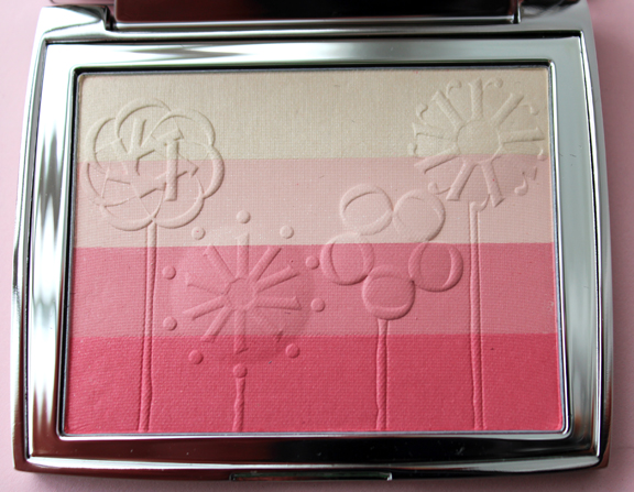
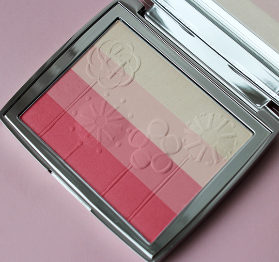
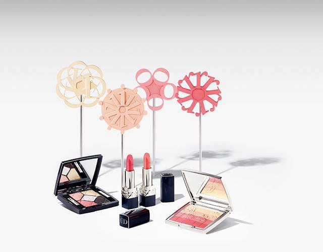
I won't say this is a total disappointment from Dior, but I also won't lie and say it's inspired. For their spring 2016 makeup collection Dior was again influenced by the designer's upbringing in Granville and its fabulous gardens. I picked up the blush and one of the eye shadow palettes.


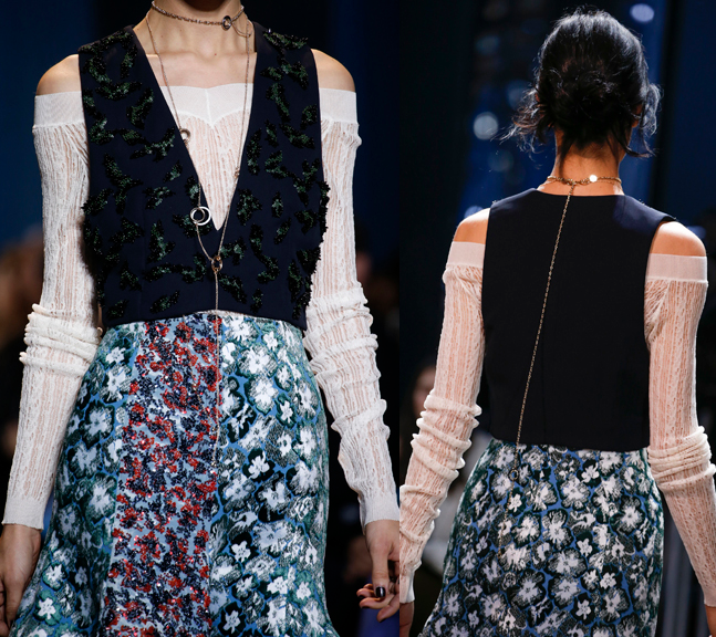
Unfortunately I found the flower print on these compacts had very little to do with Dior's runway collections. I guess you could say the color palette for the spring ready-to-wear collection is similar, but none of the garments had the same flower print.
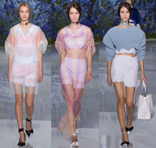 (images from vogue.com)
The print actually most closely resembled the one found on these pieces from the couture collection.

I think the palettes would have been more visually appealing if Dior had borrowed one of the prints below. The one on the right almost looks like little bees – how fun would that have been?
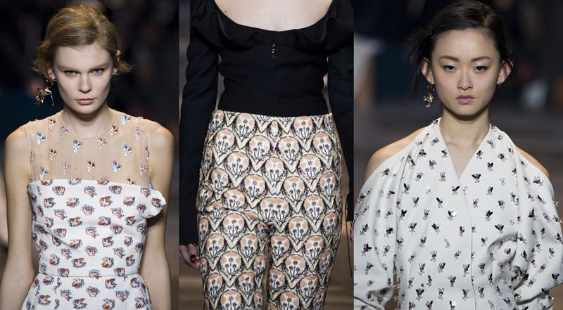 (images from vogue.com)
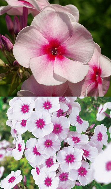
I also couldn't tell what kind of flowers are on the palettes. They look fairly nondescript and generic. They're not delphiniums, which would have been cool given that the spring 2016 runway was draped in these blooms. I was thinking perhaps geraniums or maybe phlox.

(images from flowerinfo.org and bloomiq.com)
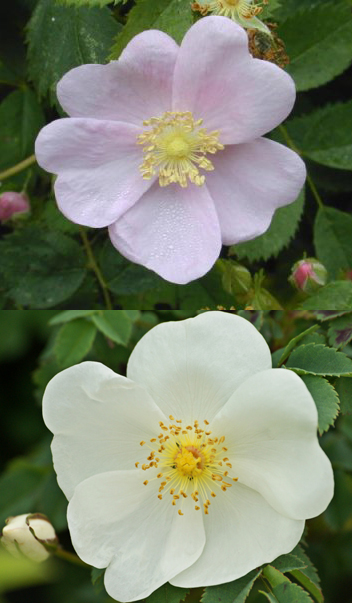
But they could also be wild roses, which would make sense given the legendary roses at Granville.

(images from 50states.com and photos-for-you.com)
So, these compacts were worth purchasing and will certainly be delightful in a spring exhibition, but definitely not as interesting as some of Dior's previous releases.
Thoughts?
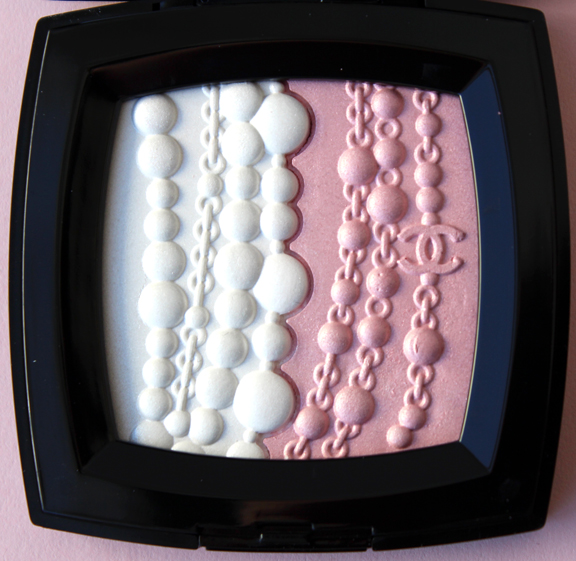
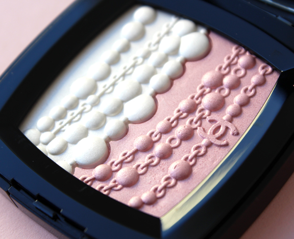
This highlighter was a sweet little surprise from Chanel. I'm not sure why they chose to release it now, as a pearl jewelry collection was introduced in 2014, but it's a delightful nod to Coco Chanel's popularization of long, dangling strands of faux pearls as well as their use in Chanel's contemporary fashion.


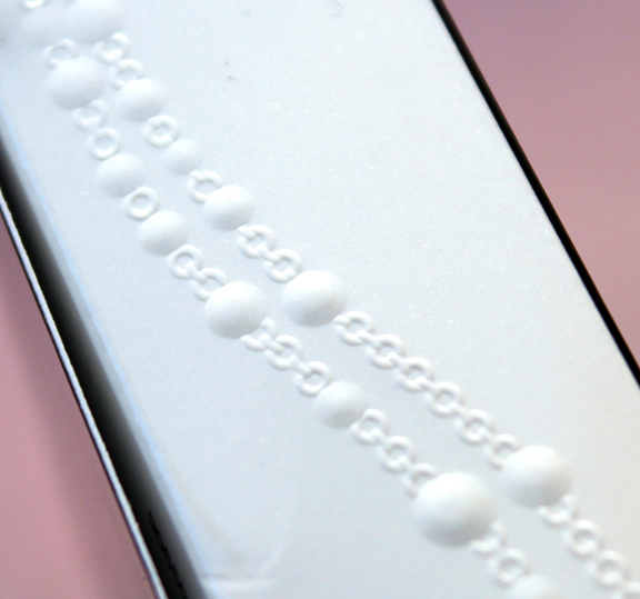
The embossing on the box was a nice detail.

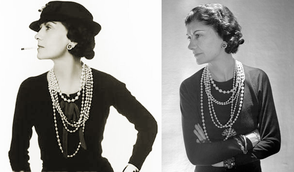
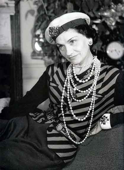
While she was not the first to make use of costume jewelry in her collections, Coco Chanel introduced the notion of mixing them with one or two real pieces. "A woman should mix fake and real. To ask a woman to wear real jewelry only is like asking her to cover herself with real flowers instead of flowery silk prints. She'd look faded in a few hours. I love fakes because I find such jewelry provocative, and I find it disgraceful to walk around with millions around your neck just because you're rich. The point of jewelry isn't to make a woman look rich but to adorn her; not the same thing." Coco's idea of piling on faux jewelry alongside real gems democratized the practice of wearing jewelry, as the combination of genuine and fake allowed women to perfectly accessorize their outfits at a more affordable price. And her costume jewelry of choice? Long strands of oversized fake pearls, sometimes mixed with chains and beads.
 (images from mystylefest.com and marlm.com)

(image from milkywayjewels.com)
These strands have been an integral part of Chanel style for many years, but the couture house is constantly reinventing them and using pearls in new and innovative ways. Today I thought I'd highlight some my personal favorites from the past 10 years.
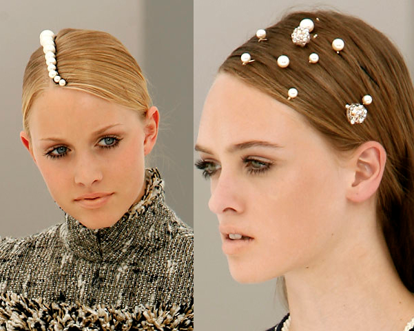
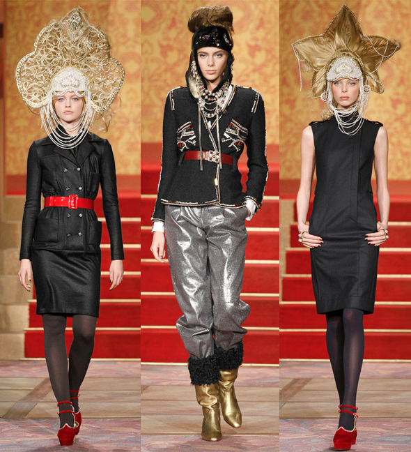
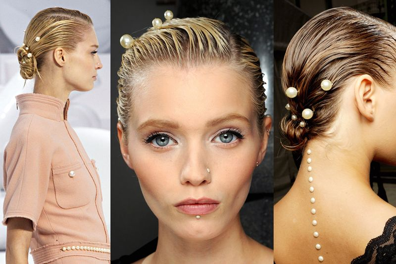
Pearls were used as hair accessories, either fairly simple (shown here at the fall 2006 couture show)…

…or elaborate, as at the pre-fall 2009 show.

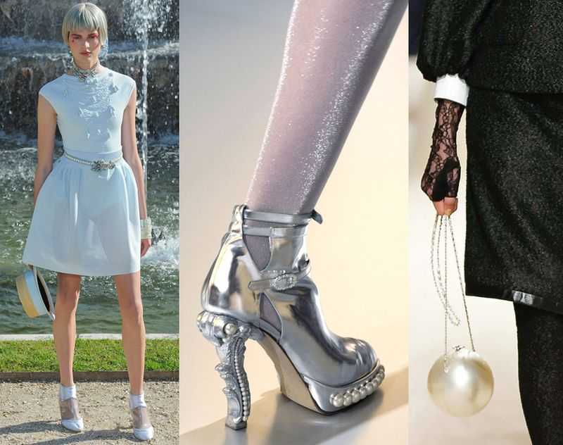
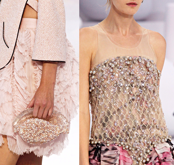
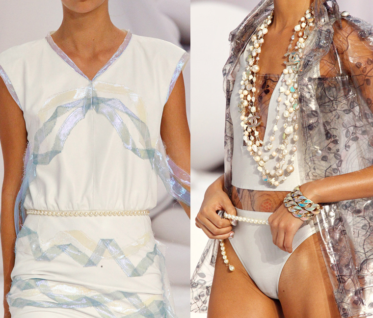
Pearls can also be delicate belts, shoe decorations or even a small purse.

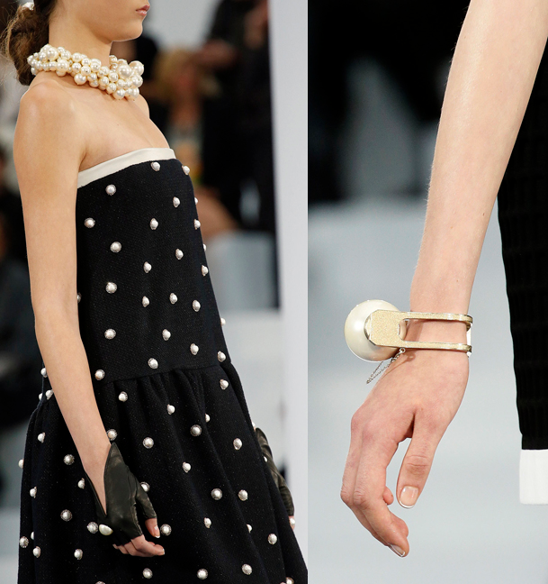
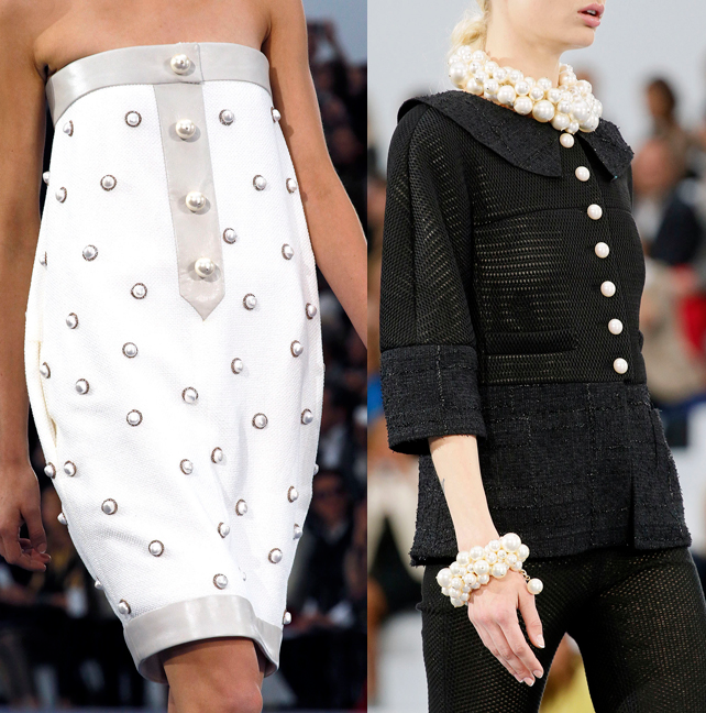
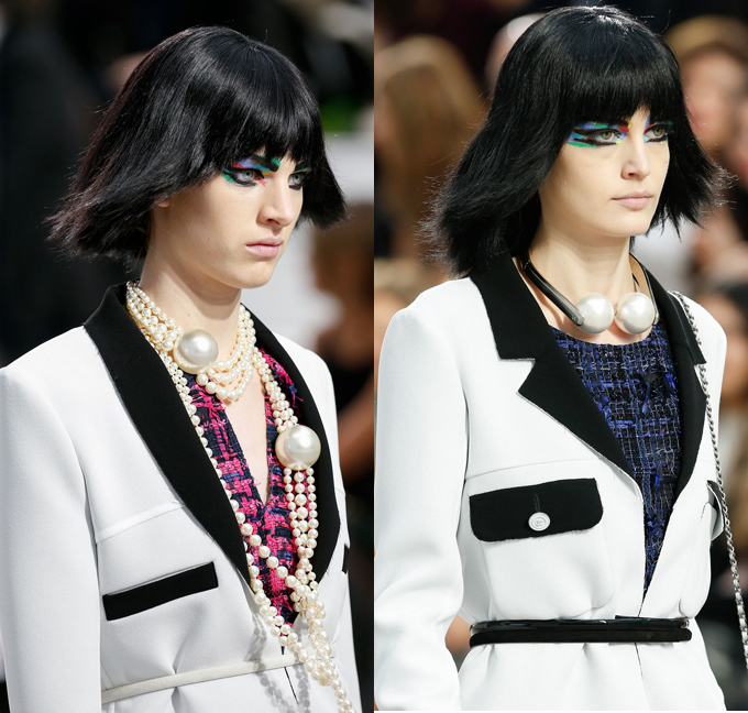
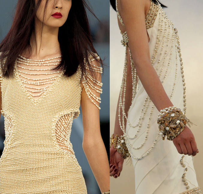
Another thing I've noticed is how Chanel plays with proportions of pearls. Take, for example, the enormous pearls that adorned the necks and wrists of the models while also dotting the clothes themselves for the spring 2013 ready-to-wear collection, or as veritable boulders at the spring 2014 ready-to-wear show.


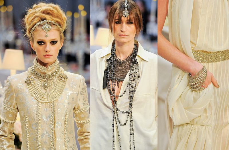
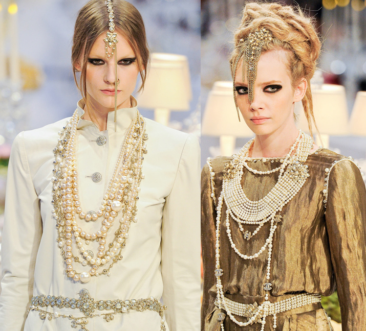
In sharp contrast to the relatively tidy, orderly application of pearls in the above collections, pre-fall 2012 was all about haphazardly heaping them on in multiple places – of course as necklaces and bracelets but also as belts and and sewn onto jackets. Mixed with intricate embroidery, lamé, metalwork and gemstones, pearls lent an incredibly luxe yet sophisticated feel to the collection. Indeed, Karl Lagerfeld wanted a collection reminiscent of traditional Indian royalty that also acknowledged India's modernity, and the use of Chanel's signature pearl strands combined with other jewels was essential in achieving this.


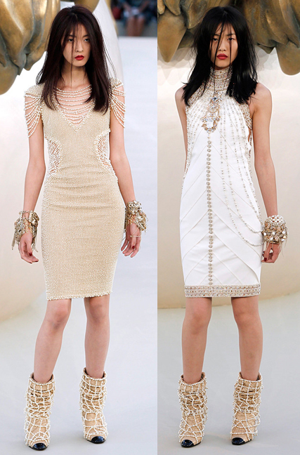
I saved my 2 favorites for last: the fall 2010 couture collection and the stunning spring 2012 ready-to-wear show.

I really only care for pearls when they're edgy and/or disheveled, so obviously I'd kill to have the bracelet below.

You might remember how inspired I was by the ethereal, under-the-sea vibe of these pieces, not to mention the mermaid-esque beauty look.


 (images from vogue.com)
Overall, I liked this palette as it's a simple representation of a rather groundbreaking and recognizable aspect of Chanel's aesthetic. Would I have liked to see a little more detail in the pearls? Perhaps, but sometimes with depictions of couture house icons, a more straightforward design is best.
What do you think? And are you a pearl wearer? As I said above, I don't like a neat little line of pearls – I need to have them messily mixed with spikes, studs, etc. to toughen them up.
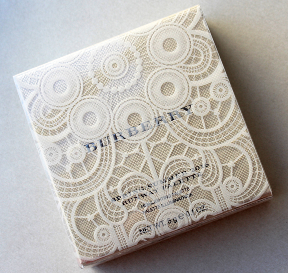
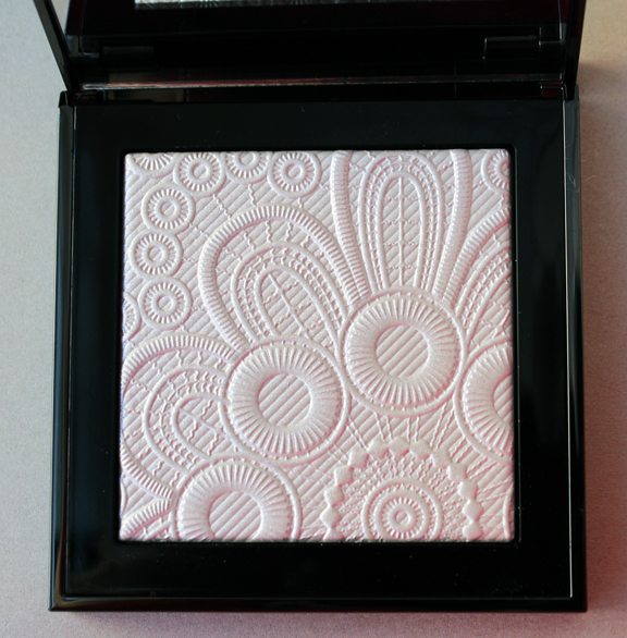
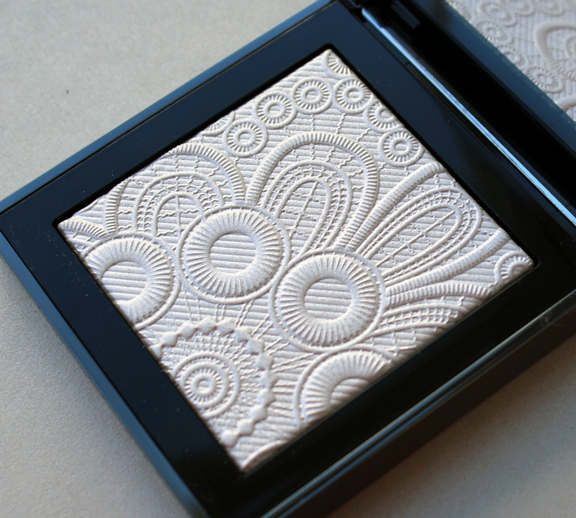
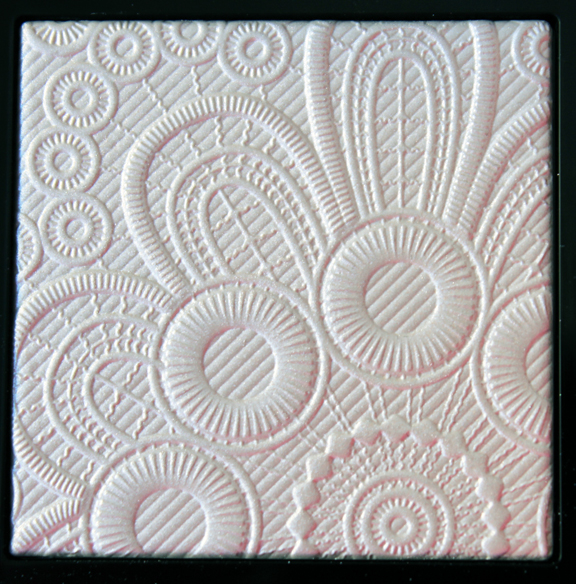
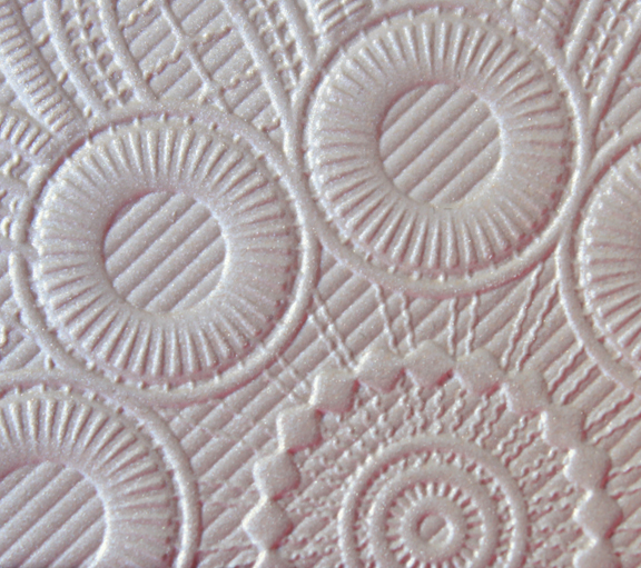
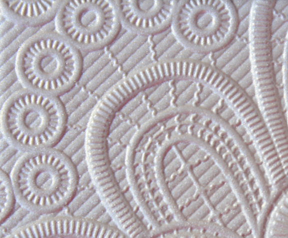
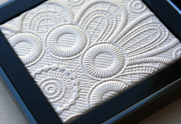
I usually don't like to post spring items until at least the beginning of March, but I couldn't resist sharing a little taste of spring today. Burberry continues its streak of "runway" palettes with two lovely highlighters – one a rich gold, the other a bright shimmery white – embossed with a lace pattern taken from their spring 2016 fashion collection. I picked up the white one as it seemed more spring-like to me.


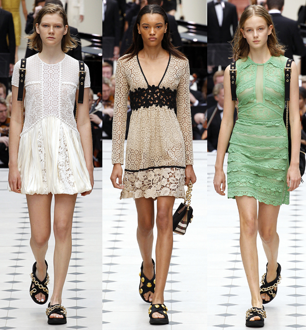
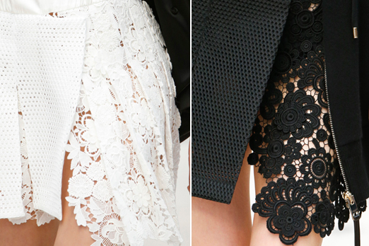
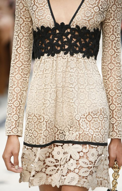
Burberry chose a leather and lace theme for their spring 2016 collection.

I eagerly looked at the detail photos for the lacy pieces to find where the pattern on the palette had come from. While it looked close to some of the pieces, it wasn't an exact match.


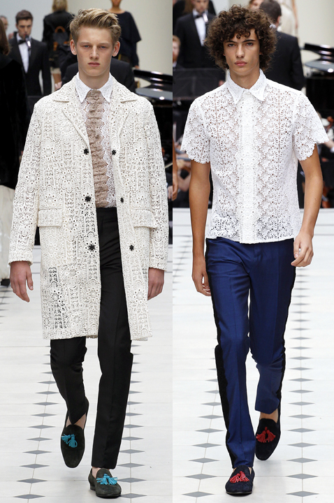
And then I realized the pattern on the palette is actually from the lace that appeared on several men's items. I hadn't thought to investigate the details for the men's stuff initially, but the fact that I couldn't find the exact pattern was driving me nuts so I took a good look at them.

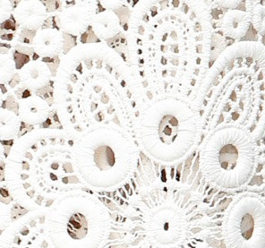
Here's the section of the pattern that was reproduced on the palette.

(images from vogue.com)
I guess I shouldn't be surprised that Burberry took the pattern from men's items, which is a tactic Paul & Joe also uses occasionally, but I do find it interesting. I wonder whether their marketing people thought it would be more visually appealing or whether it was easier to re-create in powder form than the lace that appeared on the women's pieces. Like Chanel's Dentelle Précieuse, I guess we'll never know their reasoning for using this particular lace pattern sure.
What do you think? Where does this fall for you in terms of lace-themed palettes? I like it more than Dior's and Dolce & Gabbana's, but still not as much as the aforementioned Chanel. I also like it more than both of Burberry's previous runway palettes, as it was more intricate than the fall 2015 camouflage palette and not quite as literal as last spring's "Rain or Shine" palette – I had to dig a little for the pattern.
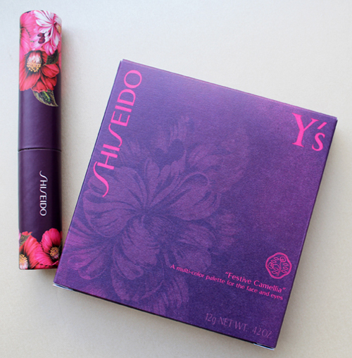
I spotted this palette way back in the fall at British Beauty Blogger and knew I had to get my hands on it. Shiseido teamed up with Japanese fashion designer Yohji Yamamoto to create their Festive Camellia palette for the holiday 2015 season. As you might know, Shiseido's symbol is the camellia flower, and they asked Yamamoto to come up with a palette design that portrayed both the significance of the camellia for the company's history and the designer's unique aesthetic. Yamamoto explains, "The camellia flower is always beautiful… at the moment when it blossoms with its greatest energy, and even at the moment when it dies. It does not die away by losing its petals like other flowers, but instead ends its life in its full blossom and form. By depicting this beautiful camellia, filled with dignity and vitality until the end of its life, I have related the camellia's most beautiful moments to those of a woman."

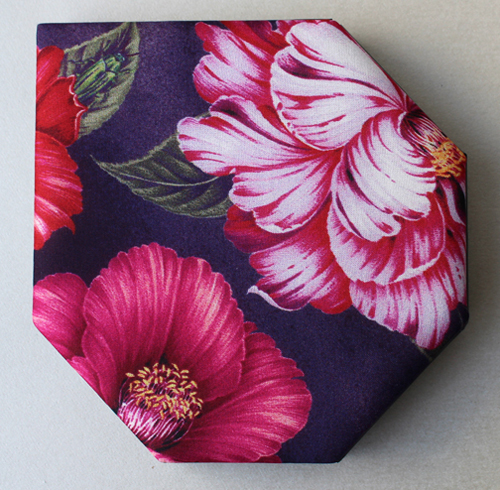
As with the MAC Guo Pei collection, the palette is encased in fabric. I'm not sure how well that would hold up in one's makeup bag, but it's lovely nonetheless. According to the Shiseido website, it's silk: "By getting the full cooperation of Y's creative support, silk has been used on the palette just like it is used in Y's clothes; and it has been specially printed in Kyoto."
If you look at the leaf on the upper left, you'll see a green beetle – I have to admit I didn't even notice the little guy hiding there until I read the palette's description!

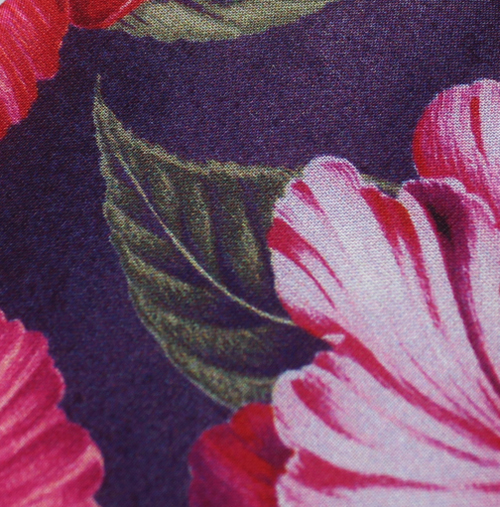
Here's a detail of the fabric.

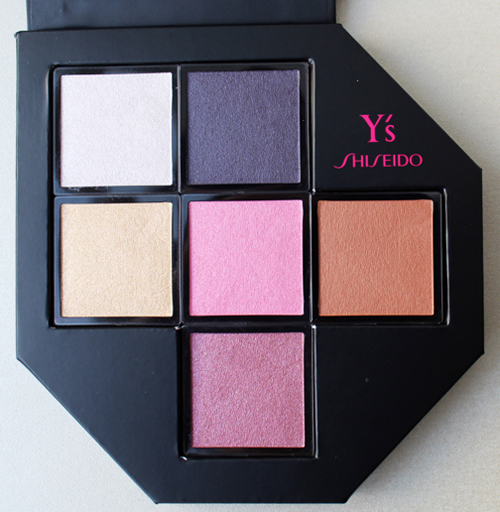
The camellia-inspired colors were chosen by long-time Shiseido adviser and makeup artist extraordinaire Dick Page, who named each color individually.
Top row: Snow and Velvet
Middle row: Japonica, Winter Rose, and Petal
Bottom color: Heart


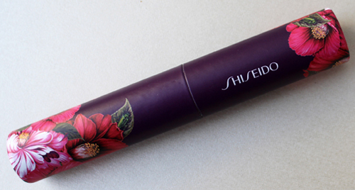
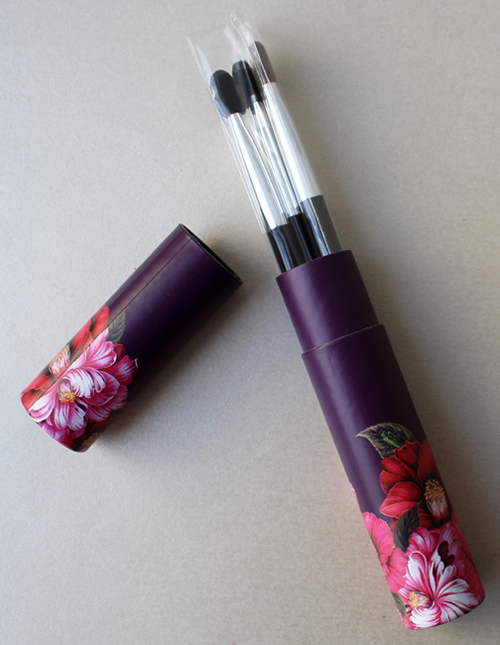
The palette came with a little brush set.

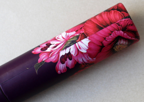
I was slightly disappointed that the pattern didn't line up on the brush set tube.


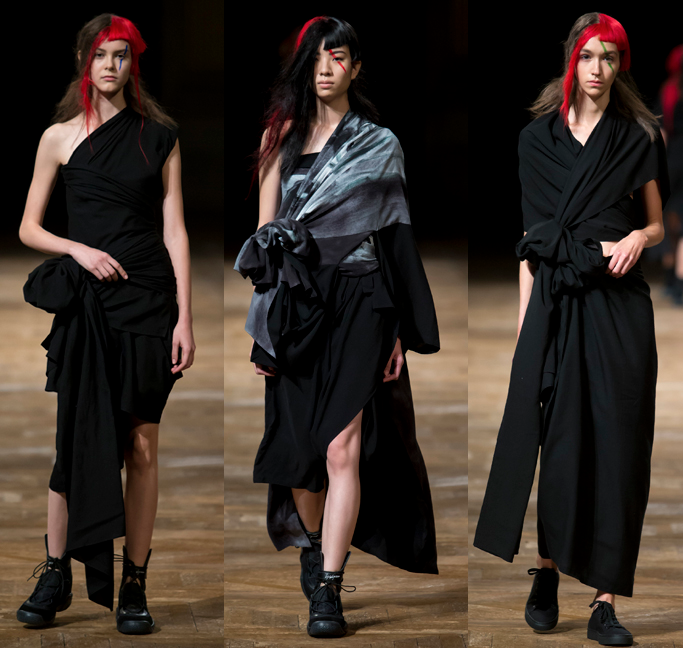
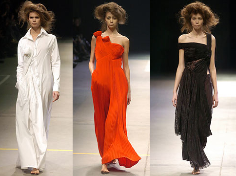
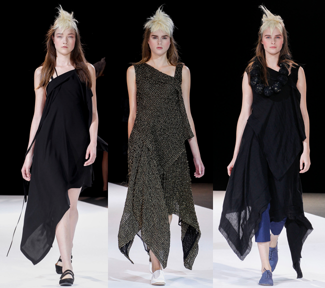
Despite Yohji Yamamoto having runway shows since 1981 (he established his line in 1972) I wasn't familiar with the name at all. So I played one of my favorite games and set about exploring his work and seeing whether the palette is a good representation of it. There is definitely a resemblance to Yamamoto's overall design – not one season in particular, but his general emphasis on asymmetry and deconstruction. Obviously designers have to know how to manipulate fabric, but this is one area where Yamamoto truly excels. Gathering, folding, wrapping and pleating fabric to create one-of-a-kind silhouettes is another hallmark of his work. He says, "Fabric is everything. Often I tell my pattern makers, "Just listen to the material. What is it going to say? Just wait. Probably the material will tell you something." He's like the fabric whisperer. 🙂
Some of my favorite examples:


(images from vogue.com)
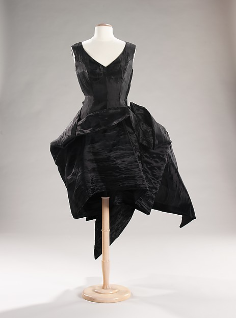
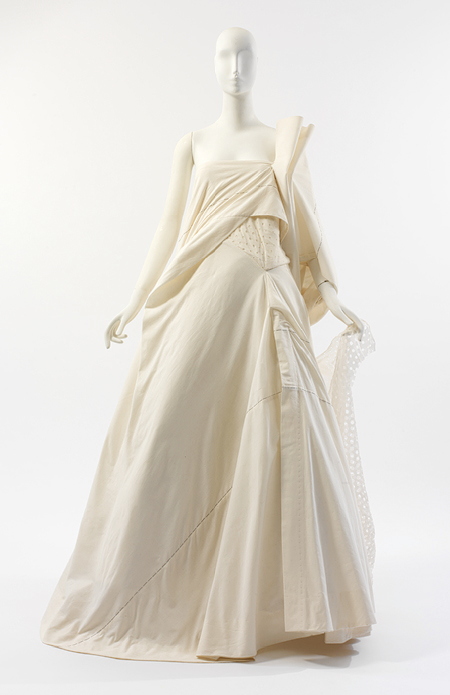
I especially loved these two dresses.


(images from metmuseum.org)
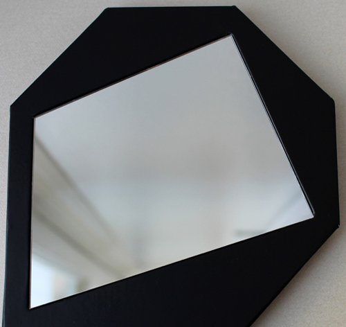
As for the palette, I was definitely seeing how Yamamoto's shapes influenced the design. The hems on these dresses from the spring 2013 collection, for example, remind me of the asymmetrical corner of the palette as well as the mirror:

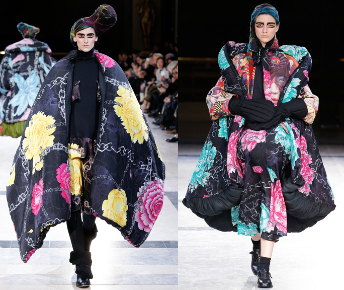
And the floral print is reminiscent of those that appeared in his fall 2014 show, with the same voluminous, detailed petals.
 (images from vogue.com)
Once again, a cosmetics company plucks a designer from the high fashion world that I wouldn't have otherwise known about and allows me to have a little piece of couture in makeup form. I can honestly say that Yamamoto is like nothing I've ever seen, and he did an excellent job translating his work into the palette (although I think a black background instead of purple might have been a better choice, given how ubiquitous it is in all of his collections.)
What do you think?
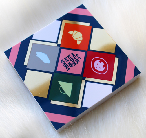
For their holiday 2015 collection, Shu collaborated with hip French fashion label Maison Kitsuné for an "East meets West" theme. I had heard of the line before but it wasn't really on my radar. However, as with all makeup collabs, I get more interested in the artist or designer once I see their work on the packaging.
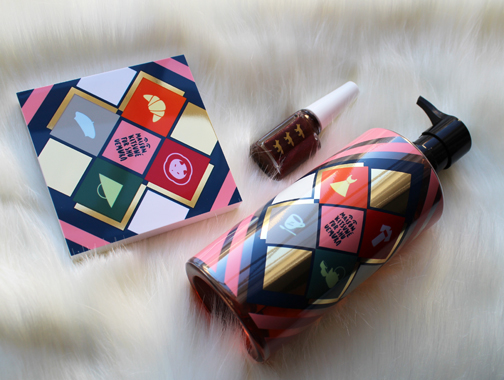
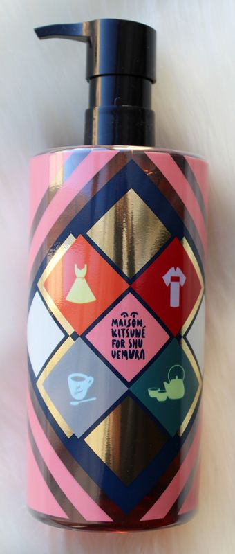
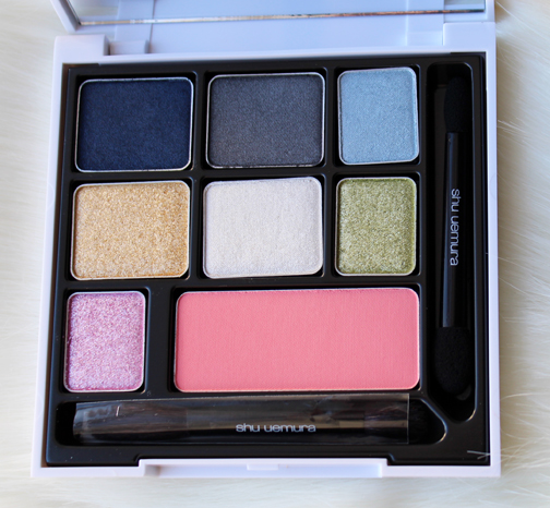
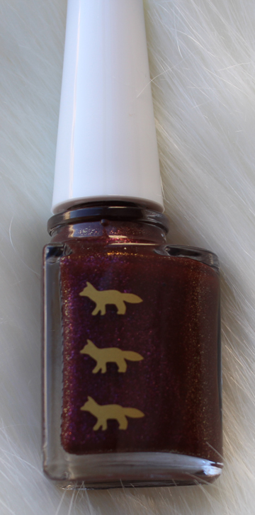
I picked up the Indigo palette, Plum Glitz nail polish and the cleansing oil. The packaging is adorned with an equal mix of Parisian and Japanese motifs to represent the East/West concept – a beret vs. a straw hat, coffee vs. green tea, a flouncy dress vs. a kimono, etc. And of course the brand's little fox logo makes an appearance too (kitsuné means fox).
I tried to up my photography game by using this very soft faux fur blanket as a backdrop…not sure how successful that was but I can tell you that blanket is ridiculously comfortable! I encourage everyone to buy one.


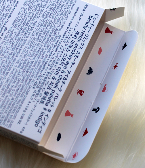
You know I love when the patterns continue on the inside of the boxes!


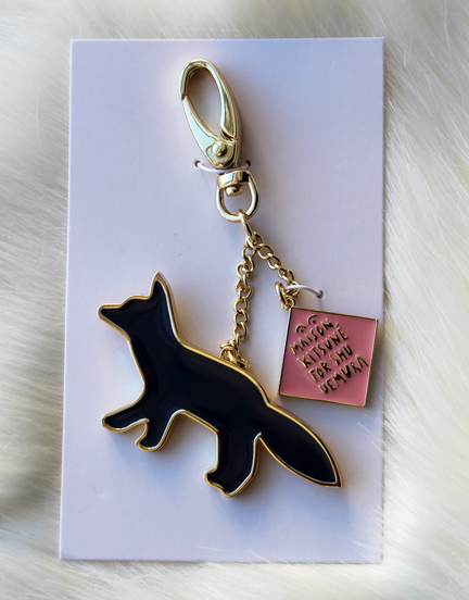
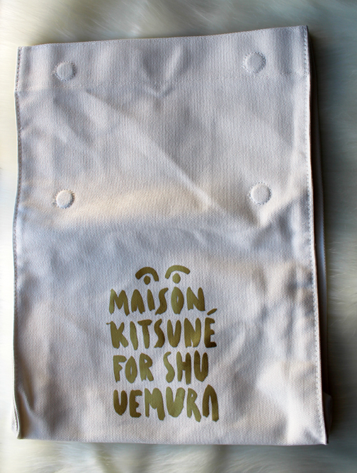
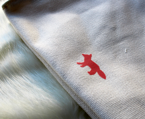
Because I'm such a good customer I got both a free key chain and tote bag – too cute!


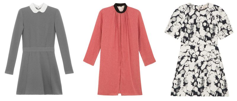
Let's take a quick peek at some of Maison Kitsuné's fashion, shall we? The line was founded in 2002 by Gildas Loaëc and Masaya Kuroki, who seek to blend contemporary Parisian and Tokyo style. From the website: "Maison Kitsuné men and women recognize this perfect balance between tradition and modernity, comfort and simplicity, chic and laid-back. While the 'classics' are constantly reinvented, giving the collections a sense of timelessness, the daring mix of colours, prints and materials anchor them firmly in the zeitgeist.
With a passion for all things beautiful and a keen eye for detail and finish, the house has a unique savoir-faire."
Their work reminds me of Paul & Joe, only a little less twee and shot through with a slight Tokyo vibe.


(images from shop.kitsune.fr)
Getting back to the Shu collection, I believe the designs on the packaging were made specifically for the collection, as I couldn't find any reference to them in Maison Kitsuné's fashion pieces. I like that they didn't just recycle something they've done a lot in the past but rather developed an original creation that also clearly represented what Maison Kitsuné is about: a playful yet sophisticated combination of Paris and Tokyo fashion. From a purely aesthetic perspective, I enjoyed the variety of motifs against the colorful geometric background, and that different items had different patterns. For example, the Indigo palette and the cleansing oil have a different set of emblems, while the nail polish stayed simple by featuring only the fox logo. Overall, I thought Maison Kitsuné did a great job in adjusting their fashion concept to fit cosmetic packaging – you know it's theirs but not because they slapped on a bunch of prints from previous collections. I think they perfectly answered the question of how one would depict a marriage of Parisian and Japanese styles.
What do you think?
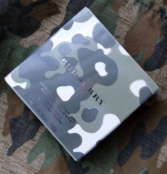
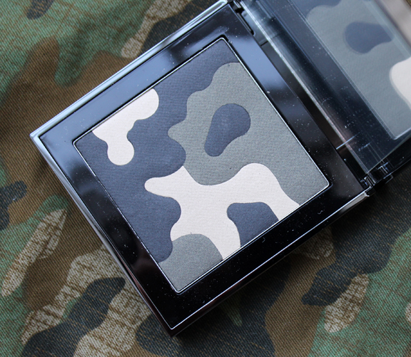
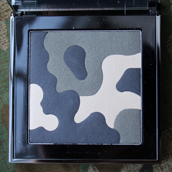
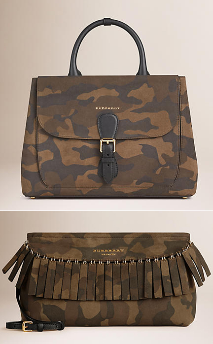
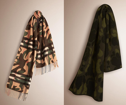
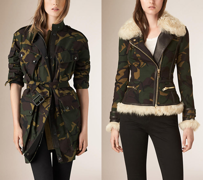
I don't think the fall 2015 palette from Burberry is quite as cute as their spring 2015 offering, but it was worth purchasing for the Museum's collection. I may be biased because I finally fulfilled a long-time desire to get a camouflage jacket as homage to a character from one of my favorite TV shows, or it could just be my love of green eye shadow, but in any case camouflage is especially appealing to me right now.


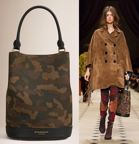
According to the palette's description at the website, the print is inspired by Burberry's fall 2015 camouflage version of their bucket bag.

However, the camo print appeared on many other items as well. Here's a few:


(images from us.burberry.com)
While this isn't the most imaginative use of a pattern on a palette, I still think it was the best choice out of Burberry's fall pieces, and you can't go wrong with such rich colors for autumn. Sadly, that's all I have to say about this. I wanted to write something profound and insightful on makeup as camouflage, but I'm pretty tired and my brain just isn't making any coherent connections right now.
What do you think of this palette? Oh, and if you were wondering, the camouflage jacket shown in my pics is from Banana Republic – got it for 40% off!
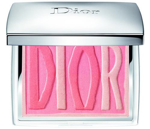
I'm adding these Dior items to my list of ones that got away. A few months ago Chic Profile featured these two blushes, which apparently were available at select Dior boutiques in the U.S. I didn't think they were worth tracking down until I started digging a bit based on the information provided at Chic Profile.


(images from chicprofile.com)
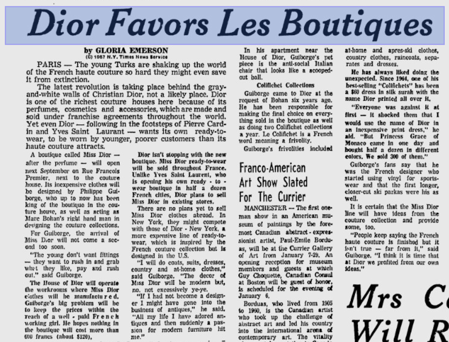
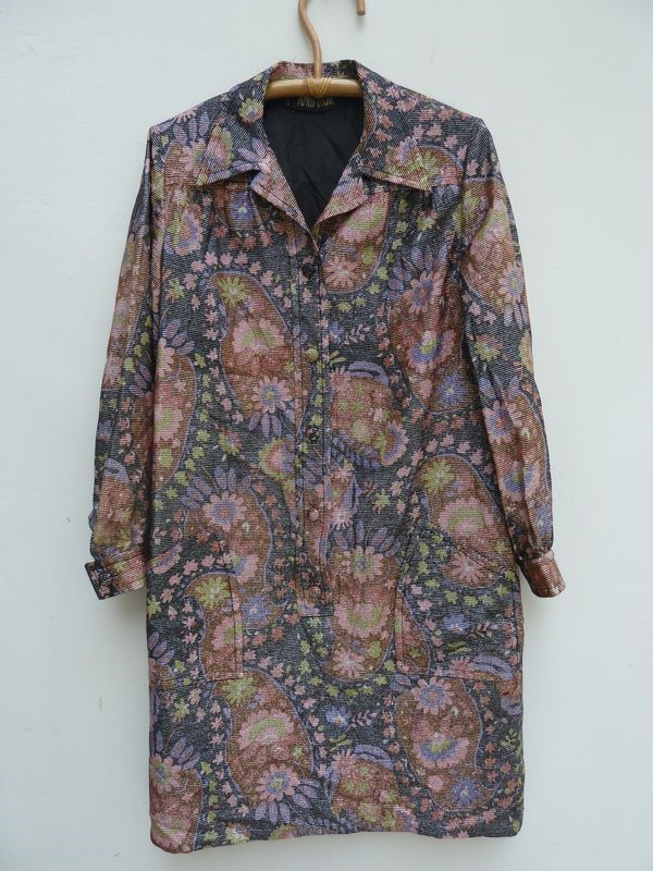
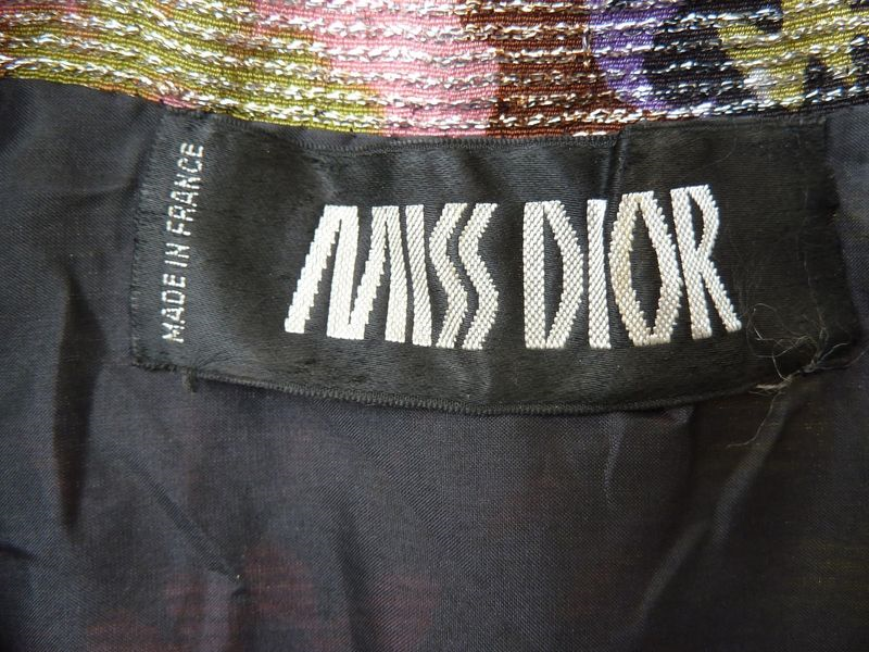
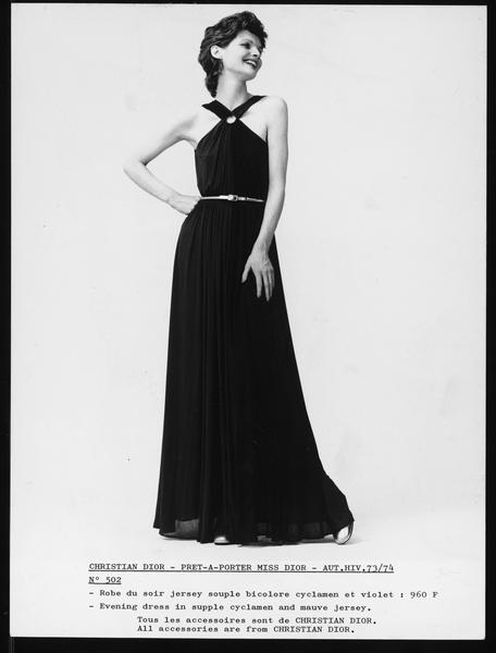
Today we know Miss Dior as one of the fragrances from the couture house, but in the early 1960s a line of ready-to-wear hats was launched with the Miss Dior name. Then in September of 1967 Dior introduced another ready-to-wear line, also called Miss Dior. From Vintage Fashion Guild: "The Miss Dior line was launched in September 1967 and was a less expensive ready-to-wear line made to appeal to a younger customer. The Miss Dior store was located on Rue Francois Premier, next door to the Dior couture house. For the first three years the Miss Dior line was sold in stores throughout France, but was not exported, so as not to compete with the Dior-New York label. It became available in the US in December 1970 and was an immediate success. The line was designed by Philippe Guiborge, who also designed the Dior Boutique line and was assistant to Marc Bohan in the couture house." I also found this Telegraph article dated January 6, 1967 announcing the line.

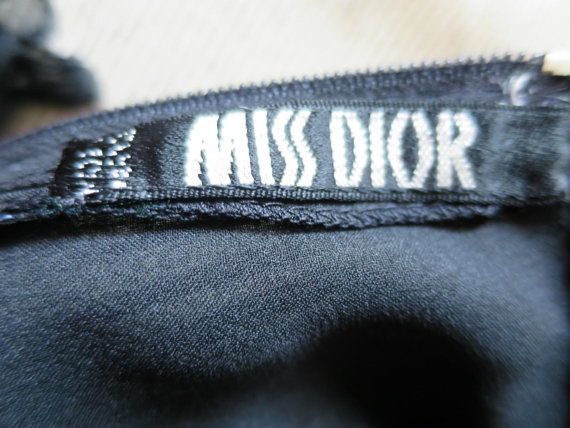
The letters in the new blushes are rendered in the same style as the Miss Dior tags. Some examples of Miss Dior styles and their respective tags:


(images from etsy.com)


(images from collectorsweekly.com)
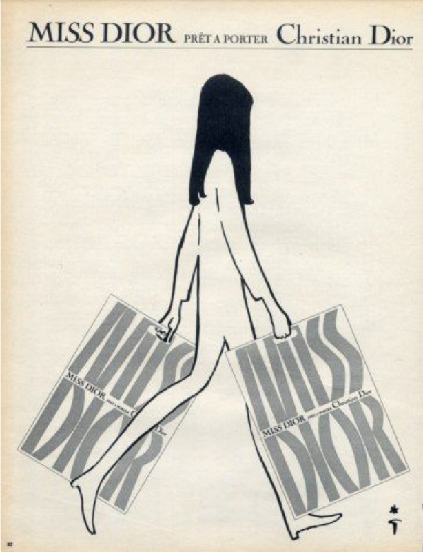
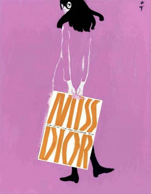
The same font was also used by famed illustrator René Gruau in some Miss Dior ads. I wonder if the actual shopping bags looked like they do in these ads or whether it was Gruau's own creation. Unfortunately I was unable to find any photos of real-life Miss Dior shopping bags.

(image from hprints.com)

(image from roswebbart.hubpages.com)
As for more examples of Miss Dior clothing, they were few and far between. I managed to scrounge up this 1970 ad.

(image from exposicoesvirtuais.arquivonacional.gov.br)
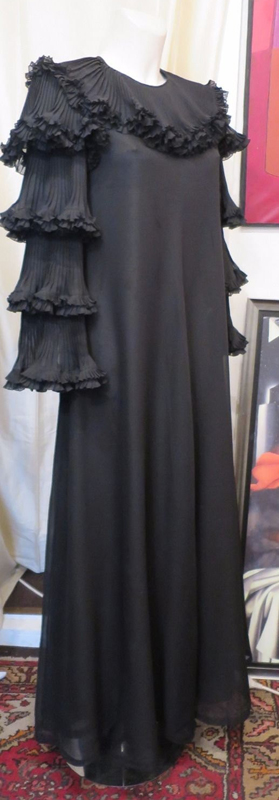
And this dress from 1974:

(image from vads.ac.uk)
In any case, the scant number of photos I was able to find was enough for me to want to procure the Miss Dior blushes for the Museum. I do find it strange that Dior is releasing these in 2015, as I think 2017 might have been a more appropriate date given that it would be the 50th anniversary of the launch of the Miss Dior line, but nevertheless the blushes represent a nod to another piece of the house's history.
Thoughts?
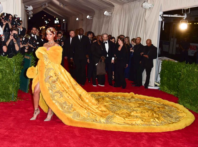
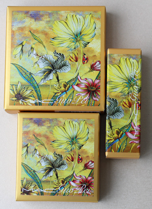
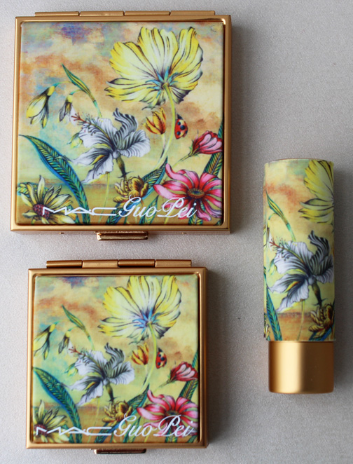
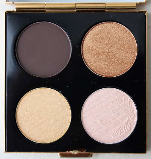
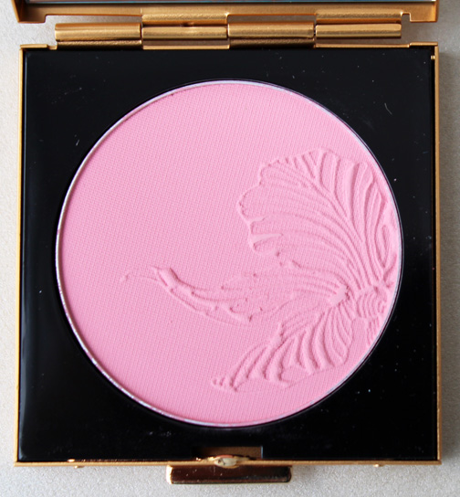
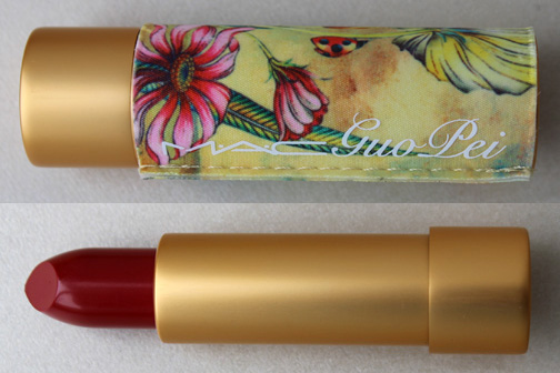
I'll get to the fall exhibition in a hot second, but first I thought I'd kick off this week with the beautiful Guo Pei/MAC collaboration. I had been salivating over this collection since we got a sneak peek back in May and was very pleased I was able to get my hands on it since I was so afraid of it selling out. Like most people, I hadn't heard of Chinese couturier Guo Pei until Rihanna wore one of her dresses to the Met Gala earlier this year (which was, incidentally, when the MAC collaboration was announced).

(image from fashionista.com)
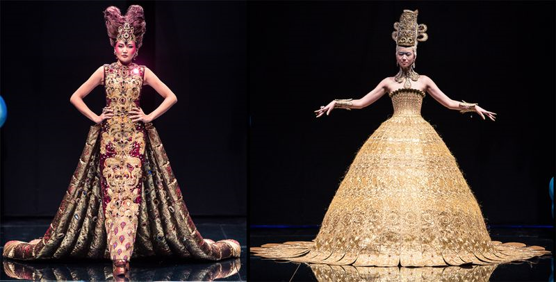
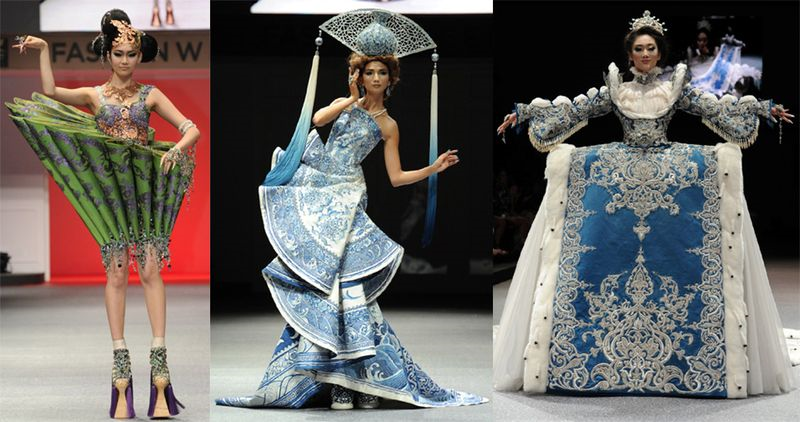
But Guo Pei has been designing elaborate, painstakingly detailed couture gowns for over 15 years and is well-known in her home country, outfitting every A-list Chinese star as well as the ceremony dresses for the 2008 Beijing Olympics. And when I say "elaborate" I mean it. Some of her creations can take up to 50,000 hours to construct and require assistance on the runway due to their weight. (The dress Rihanna wore weighed in a relatively manageable 55lbs). But why make such ornate pieces? The designer says, "The impression China gives to the world today is a rapidly developing economy, cheap labor, and fast production. But China has 5,000 years of history and is very diverse…I don't do this for profit. It is my responsibility to let the world know China’s tradition and past, and to give the splendor of China a new expression. I hope that people do know China in this way." While literally years of work go into her clothing, Guo Pei shuns the usual Chinese perspective of luxury, aiming to create pieces for her customers that they will love for years to come rather than appealing to those who simply want to flaunt the label. "I don't like the concept of luxury. In China, luxuries are seen as things you don’t really need and it conveys a negative feeling. In my opinion, luxury is products that are beautiful, elegant, and represent the culture. It’s born of love. Luxurious products should have an ability to grasp peoples’ hearts, and it is love that makes those products survive. I hope that people are buying my dresses because they love them and not because they want to show off."
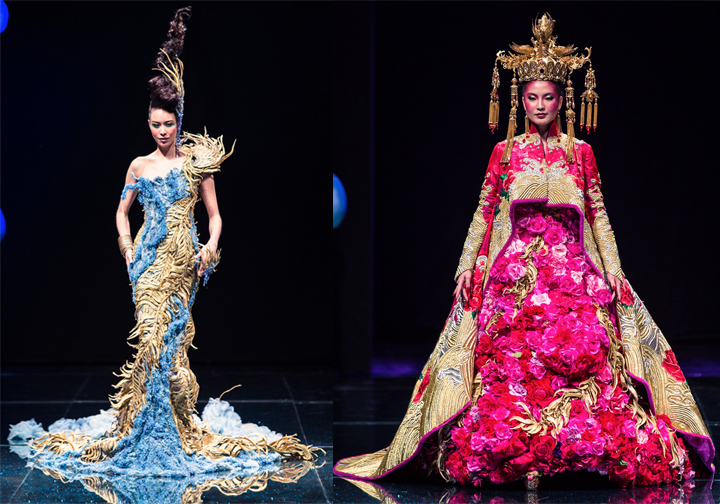
Some of my favorites from 2012 and 2013. I love how skillfully she blends traditional Chinese motifs with avant-garde silhouettes.


(images from fidefashionweeks.com)
As with some of MAC's other designer collaborations (such as Toledo), the collection came about as a result of MAC creating the makeup looks for Guo Pei's runway shows. "MAC has been doing the backstage for every one of my fashion shows," she told Refinery29. "In China, we pay attention to feelings — when you've got common feelings with somebody and there's something between you. With MAC, it was a happy collaboration."
What I liked about this collection is not only the gorgeous, unique pattern – it was sketched by the designer herself specifically for MAC – but that it also had a distinct theme. "The theme of the story is about happiness and the soul garden…the soul garden is full of fresh flowers, and it's up to you to tend to it and take care of that private space. A lot of people are very negative about life, and they don't pay that much attention to their inner soul garden."


I so wish I could have purchased the Night Sky quad, but it was the one piece that I wasn't fast enough for despite camping out in front of my computer and refreshing the MAC website every two seconds for the collection to appear. The reason I wanted that quad instead of this one is the significance of blue for Guo Pei in this collection. "In the garden of van Gogh near Paris, I saw the blue flowers. This flower, to me, is what's in my inner garden. They're the flowers of happiness…I don't like being with the seasons and [paying attention] to what's trendy or not trendy — I don't want to be constrained by the time frame. To me, blue is a color I like and the color of the soul. I think a touch of blue in the eyes is a smart color." She also told New York Magazine's The Cut, "The choice of the colors gives me a sense of power. I was inspired by the colors of the universe. Blue is a very important color because it is a color of the soul. It’s also the base color of the universe and our world. I chose pink and coral for the lip colors because I think they are colors of happiness. I want to affect the people around me with happiness."


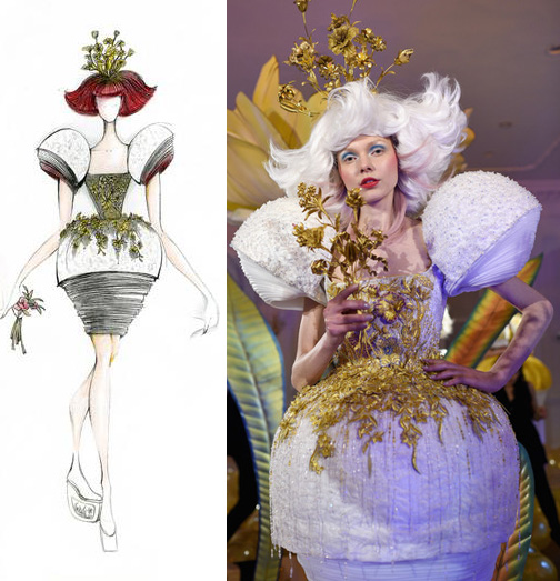
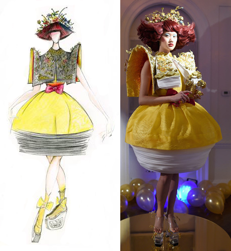
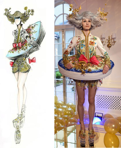
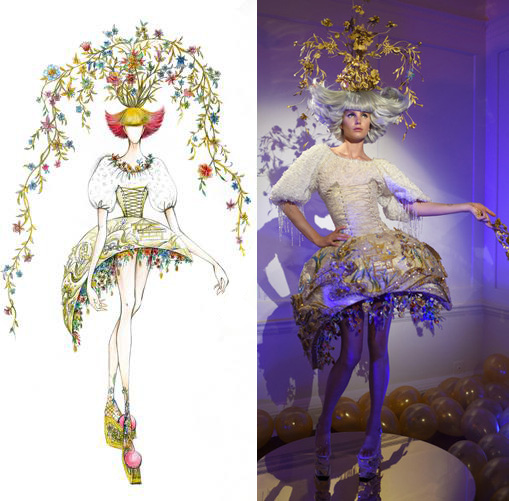
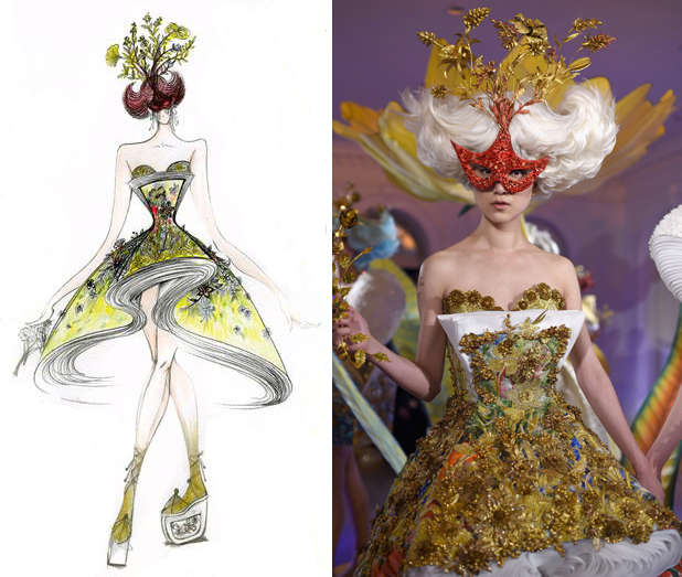
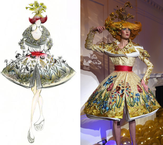
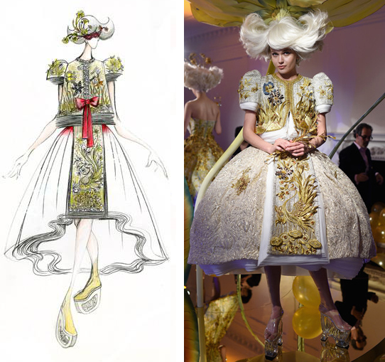
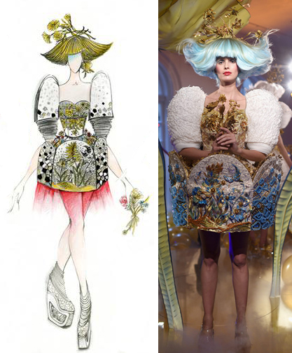
Not only did she sketch the pattern herself, Guo Pei also made 8 dresses (!) as a sort of springboard for the collection's inspiration. She explains, "There is a Chinese saying, 'There is a kingdom in a flower; a wisdom in a leaf.' I always find the power of nature fascinating, especially when the flowers are blossoming. The idea inspired the creative process of the dresses for MAC. I finished my preliminary sketch in my study on one quiet afternoon without a break. However, while the drawings were beautiful, they lacked completeness. Then one day, my daughter showed me a set of extraordinarily beautiful pictures of the Milky Way. The intoxicating colors of the universe sparked a power of life in my soul… I captured the energy and created eight dresses for MAC – 'Garden of Soul.' Based upon the eight dresses, we developed this beautiful makeup collection." I was able to gather images of the sketches and dresses, which were revealed at a very fancy dinner on May 5, the day after the Met Gala.


(images from chicprofile.com and zimbio.com)
The colors in both the dresses and the models' makeup are definitely well-represented in the MAC collection, while the heavy use of gold in each dress corresponds to the MAC packaging. I also really like that actual fabric was used in the packaging – being able to manipulate fabric in unusual ways is an essential skill for haute couture, so I liked the nod to fabric's importance in Guo Pei's work. Overall I think this is one of the prettiest collections MAC has done in the past few years, and unlike some designer collabs (ahem, Philip Treacy), the designer's work is reflected quite nicely.
What do you think of this collection and of Guo Pei's work?
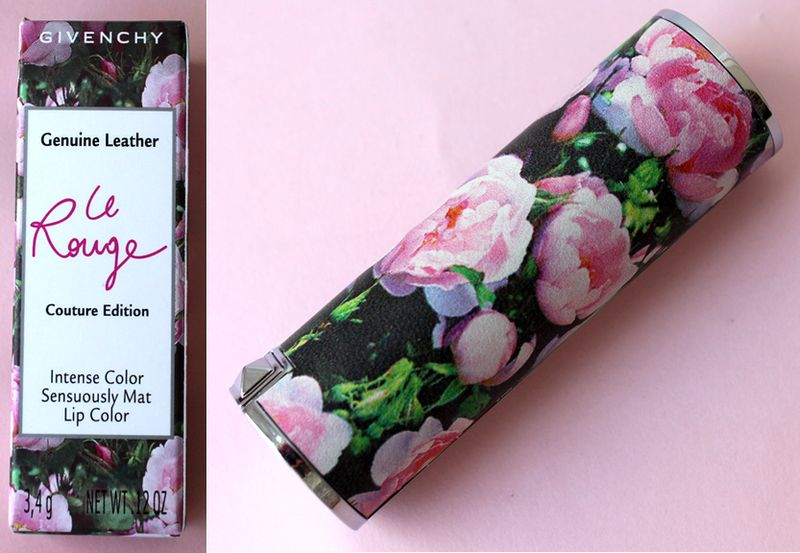
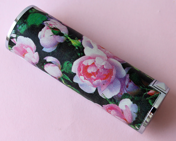
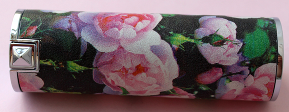
This lovely little lipstick case almost slipped through my fingers! I finally caught up on some June issues of various magazines and this Givenchy case was in nearly every one. Luckily, even though I was late to the party it was still available at Sephora.


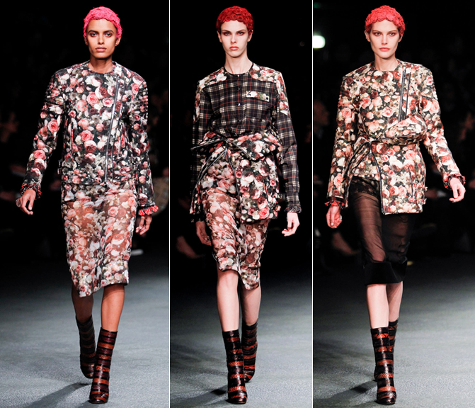
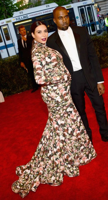
I wasn't sure if I needed it for the Museum's collection until I saw that the floral pattern was lifted directly from Givenchy's fall 2013 ready-to-wear collection.
 (images from style.com)
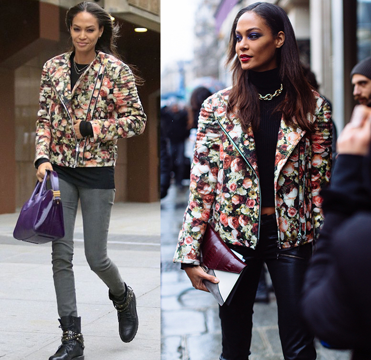
The print had quite the celebrity following, including the likes of Joan Smalls and Kim Kardashian.
 (images from fashionbombdaily.com and fashionising.com)

(image from huffingtonpost.com)
While the print is quite pretty, I personally think it works better in small doses. For me, even putting it on a punk moto jacket (worn by a supermodel, no less) couldn't save it from looking dowdy to me. That's why I think it's an excellent choice for a lipstick case. I do wonder why Givenchy chose to release this in 2015, however – the print is from a collection that's two years old, so why they decided to put it on a lipstick now is beyond me. Then again, the company did use a pattern from the 2012 resort collection on their summer 2014 bronzer, so maybe there's just a general 2-year lag between the fashion and beauty collections.
What do you think?
p.s. I just now realized I didn't take any pictures of the lipstick itself, oops. Fortunately HelloJaa has some excellent photos and swatches, so check them out if you're curious.
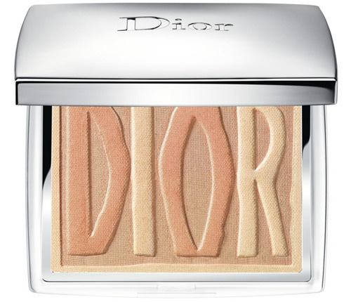
So many pinwheels, so little time. I was heartbroken from not being able to get my hands on this palette back in the fall of 2014. In honor of the grand opening of Dior's Omotesando beauty boutique, a small collection was launched and sold exclusively at the boutique. The star of the lineup was this lovely blush with Dior's name spelled out in whimsical pinwheel form. It just happened to surface on e-bay from a reliable seller that I've purchased things from in the past, so I pounced.


Here's a promo image so you get a better sense of the design:

(image from chicprofile.com)
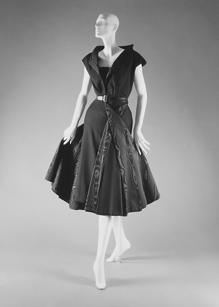
The exclusivity and the pretty colors were enough for me to add it to the Museum's collection, but I'm still curious as to why they chose this design for the palette. According to Rouge Deluxe, the letters aren't actually pinwheels but toy windmills. However, to my knowledge neither pinwheels nor windmills figure prominently in Dior's work. I did find this "Moulin à Vent" ("windmill") dress from the 1949 fall/winter Trompe L’Oeil collection, but that was basically it.

(image from metmuseum.org)
I also checked out Dior's fall 2014 couture and ready-to-wear collections, and saw nothing that would point to windmills or pinwheels. So I have no idea why Peter Philips, Creative and Image Director for Dior Beauty, would select this motif…unless, as I wondered with Guerlain's Poudre de Soie palette, pinwheels/windmills are meaningful in Japanese culture?
In any case, I was pleased to be able to cross this palette off my very extensive wishlist! While it was released in the fall, I think it would be a nice addition to a spring exhibition. What do you think?
 (images from vogue.com)
 (images from vogue.com)