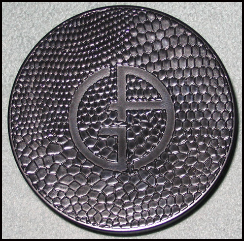
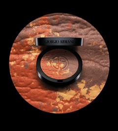
 I was a little disappointed in this palette, especially after seeing the spring offering, but I do appreciate the different colors and texture of it. While most makeup brands are pushing a beached-based bronze look (and Armani does do this somewhat with its Mediterranean palette), I feel this bronzer represents a departure from the usual advertising. The texture and reddish-brown tint evokes a dry, desert landscape instead of a beach – something you'd wear out West to the canyons of New Mexico, rather than, say, the islands of the Caribbean. While I'm guessing the overall effect of the product is essentially the same as other bronzers, I like that Armani offered a different approach and representation for a summer staple (a staple for us pale people, anyway!)
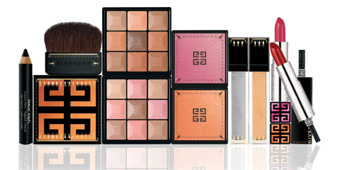
The makeup artistic director for Givenchy, Nicolas Degennes, created an India-inspired theme for the line’s spring/summer 2009 collection. While at first I thought the colors didn’t have much to do with India, an interview with Degennes for Vanity Fair explained his thoughtful construction of the collection. “The must-have products re-interpret the radiance of Indian saris, with Precious Sari Glitter Eyeshadow and Sari Glow Iridescent Blush, while Magic Kajal Eye Pencil Intense Look beautifies the eyes with a stroke of bewitching black. Adorned with bindis, the cases take refinement to the extreme, featuring mirrors and applicators that evoke the opulent decorative style of India…The Bollywood vision of the sari, embroidered with mirrors and gold, evolved into Precious Sari Glitter Eyeshadows in Maharani Silver and Maharani Gold. The refined architecture and colors of Jaipur Palace were my inspiration for Sari Glow luminous cheek powder. Orange for the earth, omnipresent in all its shades and variations, is captured in Maharani Orange. For a touch of sweetness and demure femininity, there is Maharani Pink. Earth and henna are so much a part of India, and inspired Rouge Interdit Lip Colors in Maharani Rose and Maharani Henna.” Judging from this interview, there seems to have been a lot of consideration going into the collection in terms of color selection, which makes the Curator happy. But what about the packaging?
Compared to the elephant-embossed compact Lancôme released last fall for their Indian-themed collection, Givenchy’s packaging is definitely more subtle, with a delicate pattern adorning the edges of each product. I liked that you can tell it’s India-inspired without it hitting you over the head. Another thumbs-up for the latest creation from Degennes!
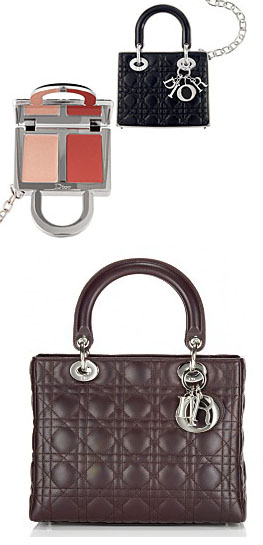 The Curator has an affinity for anything mini, so when I saw this Dior lip gloss duo I thought it was a very clever and cute idea to replicate one of their signature bags in miniature and fill it with gloss. While I still prefer cool embossed patterns, I love when a couture house ties in their makeup line to their fashion. It's a bit gimmicky, sure, but Dior still deserves a pat on the back.
(photos from Sephora and e-luxury.com)
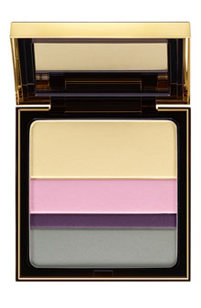
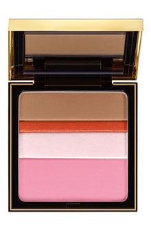
The spring 2009 collection for YSL included these so-called “collector palettes for the eyes/complexion”, featuring stripes of color that can be mixed and matched to “turn your look into a work of art”. “Contemporary art inspires this year’s Spring Look. An explosion of
vivid colours, graphic lines and sensorial textures reveal a strikingly
modern interpretation of beauty,” says the YSL website.
I’m not really sure what the company intended these to look like – they remind me a bit of a Rothko, (one of the curator’s favorite artists) but the edges of the colors are obviously neater and lack the fading that Rothko’s “color fields” have. Still, that looks like the inspiration for the palettes, no? In my opinion, it’s modern visual art and not the the YSL clothing lineup for the spring 2009 season that was the jumping-off point for these palettes. The ready-to-wear collection, created by Stefano Pilati, had an “East-meets-West” feel to it and had nothing to do with modern art. One of the questions I always try to answer in Couture Monday is whether the company intended their makeup collections to correspond to the season’s clothing. Usually this is not the case, as the cosmetics division of a couture house is completely separate from the actual clothing and run by totally different people. With these palettes YSL follows that pattern. And while I’m pleased the palettes look Rothko-esque, it’s still a fairly vague suggestion with no clear relation to a particular artist or genre. Another somewhat disappointing release for spring!

The creators behind the big couture houses' spring palettes seem to be suffering from the winter blahs. Armani's Pink Light palette for the spring 2009 collection is nothing more than Armani's signature slapped on top of a plain black compact. While all of the colors in the collection are great for spring (lots of luminescent, fresh pinks living up to the Pink Light title) the packaging for the palette could have been a bit more creative. I guess they wanted something very simple to go with the basic colors in the palette. "This limited-edition palette is embossed with Mr. Armani's signature, a distinct design for a classic spring palette." I don't know about distinct, but I guess the colors could be described as classic for spring. In any case, I'm excited about the upcoming Bronze Mania collection, which features a very interesting, desert-like patterned palette.
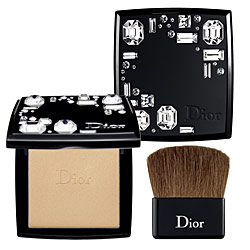
The glitz and glamour of the holiday season are fast approaching, so today I'm looking at the oh-so-sparkly Night Diamond palette by Dior. Adorned in big clear crystals, the sparkliness continues on the interior of the palette – it's filled with a glowy highlighting powder that will come in handy for all those fancy holiday parties.
I love pocket watches – they have a vintage air about them even if they're not actually antiques. (Plus my fiance wears one so I guess I'm a bit biased.) I was pretty happy to see Givenchy breaking the makeup-as-jewelry mold with this "watch" containing a highlighter for lips and cheeks. I'm not particuarly fond of these pieces as I find them to be relatively useless gimmicks (I have yet to see someone actually accessorizing with these) consisting of fancy silver and gold metal packaging with a lackluster product, but this stands out to me.
Other companies have released wearable makeup items (see pictures below) and they're always the usual jewelry items. Yves Saint Laurent released a heart-shaped pendant containing two lip glosses for last year's holiday season, while Dior came out with a pendant lip gloss this past summer as well a lip gloss gloss a few years back.

(photos from sephora, neiman marcus and nordstrom.com)
Givenchy's watch goes beyond the typical accessory, eschewing a charm bracelet or locket for an item usually worn by men, which I believe makes it a bit edgier. After seeing the product name is "Sweet Dandy" I dug around and discovered that the muse for Dior's fall 2008 collection, the dandy, was the same inspiration for Givenchy's watch. Creator Nicolas Degennes was taken with the "sophisticated ambiguity of the dandy style…with its mixture of masculine and feminine codes." I could launch into a very long discussion about traditional gender roles and how certain products signify gender, but suffice it to say I think Degennes definitely hit the nail on the head with the watch - it's a perfect blend of male and female accoutrements. The item does fall short of relating in any way to the fashion house's fall clothing lineup (the ready-to-wear line by Riccardo Tisci has a "Latino Gothic" feel, according to the press release), but it is a well-executed realization of Degennes's original concept.
 It's finally fall here in the Curator's neck of the woods – time for cold-weather fabrics like corduroy, cashmere and tweed, so I thought I'd look at Chanel's Pink Lamé palette. Released in the fall of 2006, the palette features a pink tweed pattern with silver and gold running throughout.
As with the Camellias palettes, Chanel took one of its signature fashion symbols and placed it onto a makeup item. While tweed obviously isn't an exclusive Chanel fabric, the tweed Chanel jacket is considered a classic and makes an appearance in nearly every seasonal collection.
I had been thinking for a while how cool it would be to have this tweed pattern repeated in other items within the line, and it looks like the company was reading my mind. Chanel has just released new blushes with tweed patterns on them. So if you missed the limited-edition Pink Lamé (and can't afford a Chanel tweed jacket) you can still get your Chanel tweed fix in these new blushes!
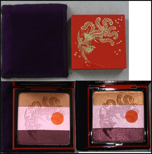
In honor of the 30th anniversary of YSL's Opium1 fragrance, the company released a limited-edition bottle and palette in the fall of 2007. The palette features a red lacquered case with an exquisite phoenix and floral details.
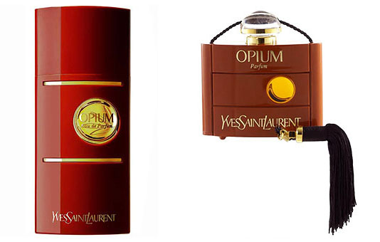
While I'm not really sure what the reddish orange dot on the interior is supposed to represent, it could just be referring to the circle on the fragrance bottles themselves:
For the inaugural Couture Monday post, I’ll be looking at Armani’s fall 2007 blush and fall 2008 palette, both of which feature animal prints. The Fall 2007 palette has the pattern on the outside of the case, while the fall 2008 one moves the print inside the palette.
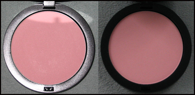
Fall 2007 Leather collection blush (there was also an eye shadow palette with the same print on the case):
The blush inside: (with flash on left; in natural light on right)
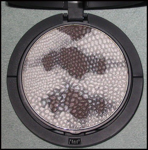
Fall 2008:
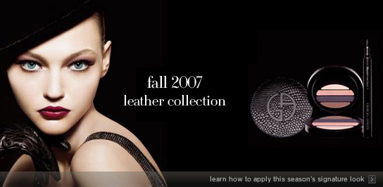
Let’s first examine the fall 2007 blush. The copy for this item at the Armani website read “Outfitted in a unique black faux-crocodile skin packaging, the tender peach-pink hue is a one-of-a-kind addition to any fall wardrobe.” The trouble with this is that the print is identical to the eye palette, the copy for which read, “Drawing inspiration from Armani’s exquisite collection of leather accessories, the eye mania palette features four versatile shades encased in a luxurious black snakeskin print compact.” So the blush is apparently crocodile and the eye shadow is snakeskin, but they’re exactly the same!
Now, let’s just say the blush really is a crocodile print. Armani’s fall 2007 ready-to-wear line did feature some croc pieces, or at least ones made of leather embossed to look like croc. Additionally, Armani stated that he was inspired by David Bowie and rock music1 for his privé line that season, hence the prominence of fedoras and fingerless gloves. And lo and behold, the model for the Leather collection is wearing a fedora, along with leather gloves (albeit not fingerless ones):
I think Armani did a splendid job in coordinating the fall makeup line with the fall clothing collections. Even though there is some conflation of crocodile vs. snakeskin, the overall themes, the use of leather and hats as well as a rock n’ roll type feel in both makeup and clothing is harmonious and inspired.
Now let’s turn to the the fall 2008 python palette. At first glance it expresses the themes of the fall ready-to-wear collection, at least colorwise. Black, white and grey/silver dominated the ready-to-wear line, as evidenced in these photos from the runway. One of the models is carrying what looks to be a python bag. Take a look at the models’ eye makeup too – it’s a very dark, smoky greyish black, which is the look the python portion of the palette is meant to create. The privé line continues with the color scheme and also features a shiny python jacket.
However, Armani described his ready-to-wear look as “free-spirited”2, which doesn’t quite match the palette – when I see python print, I think sophisticated and drop-dead sexy, while “free-spirited” brings to my mind a more playful, carefree style. The privé line contained a python jacket and some dresses but the majority of the looks were pantsuits, which don’t exactly correlate to the sultriness and glamour of snakeskin (although the suits do convey a sense of power.) Also, if you look at the fall 2007 ready-to-wear line in its entirety, the exact same color palette is there, right down to the model’s makeup. Thus it seems as though this season Armani recycled last fall’s makeup collection, without consideration of style of the clothes that were sent down the runway. The choice of snakeskin print for the palette really doesn’t go with the feel of either the couture or ready-to-wear lines; there is no unifying theme between makeup and fashion. While a couture brand does not necessarily have to link the two, the makeup is an extension of the clothing, so for big seasonal releases it would make sense to have them go together.
1 Review by Sarah Mower, July 2007, https://www.style.com/fashionshows/review/F2007CTR-APRIVE.
2 Review by Nicole Phelps, February 2008, https://www.style.com/fashionshows/review/F2008RTW-GARMANI/.
