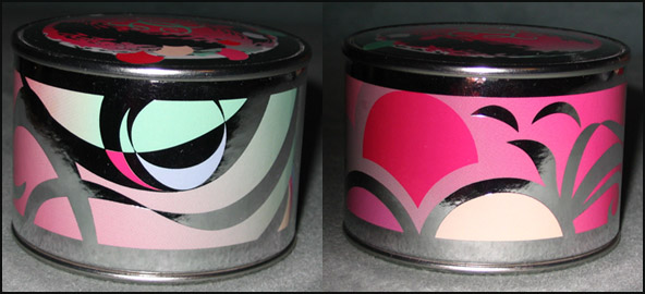
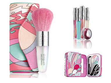
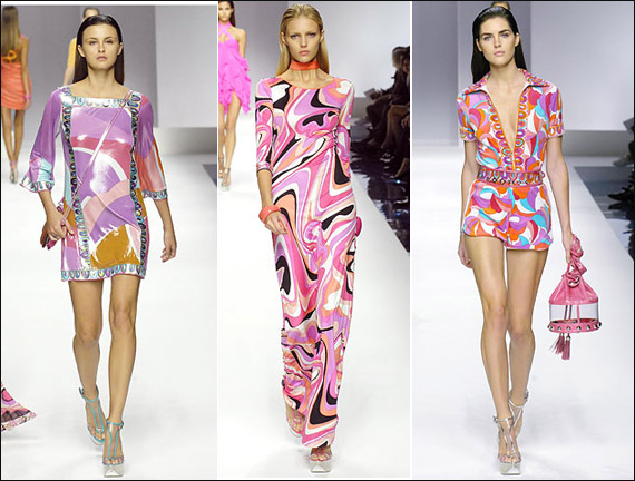
It's not even winter here yet but today is very cold and dreary, so I thought I'd take a look back at a nice cheery spring collection. In May of 2007 Guerlain teamed up with Pucci to create a limited edition collection that included lip glosses, powder brush, and eye makeup set along with Guerlain's best-selling Meteorites (for those of you not familiar with this product, it's a face highlighter in the shape of little balls). The Museum's Advisory Committee voted against buying the entire collection, using the argument that the print was more or less the same on all the items, but unanimously agreed to procuring, at a minimum, the Meteorites.
I love pocket watches – they have a vintage air about them even if they're not actually antiques. (Plus my fiance wears one so I guess I'm a bit biased.) I was pretty happy to see Givenchy breaking the makeup-as-jewelry mold with this "watch" containing a highlighter for lips and cheeks. I'm not particuarly fond of these pieces as I find them to be relatively useless gimmicks (I have yet to see someone actually accessorizing with these) consisting of fancy silver and gold metal packaging with a lackluster product, but this stands out to me.
Other companies have released wearable makeup items (see pictures below) and they're always the usual jewelry items. Yves Saint Laurent released a heart-shaped pendant containing two lip glosses for last year's holiday season, while Dior came out with a pendant lip gloss this past summer as well a lip gloss gloss a few years back.

(photos from sephora, neiman marcus and nordstrom.com)
Givenchy's watch goes beyond the typical accessory, eschewing a charm bracelet or locket for an item usually worn by men, which I believe makes it a bit edgier. After seeing the product name is "Sweet Dandy" I dug around and discovered that the muse for Dior's fall 2008 collection, the dandy, was the same inspiration for Givenchy's watch. Creator Nicolas Degennes was taken with the "sophisticated ambiguity of the dandy style…with its mixture of masculine and feminine codes." I could launch into a very long discussion about traditional gender roles and how certain products signify gender, but suffice it to say I think Degennes definitely hit the nail on the head with the watch - it's a perfect blend of male and female accoutrements. The item does fall short of relating in any way to the fashion house's fall clothing lineup (the ready-to-wear line by Riccardo Tisci has a "Latino Gothic" feel, according to the press release), but it is a well-executed realization of Degennes's original concept.
I haven't been able to get my hands on Manish Arora which was officially released today (as a Curator who's no stranger to limited-edition products, I wasn't sure why I thought this wouldn't sell out right away when it was posted at the MAC website two days ago), so I thought I'd catch up on another MAC collection that was released last week. MAC teamed up with Emmanuel Ungaro to create a limited-edition collection representing designer Esteban Cortazar's vision for his fall 2008 fashions. "Dreamy, softly impressionistic, reverential…Softly shaded to match the understated mood of the collection" is how the look is described at the MAC website, and I think the promotional picture represents it well, especially when compared to the models' makeup and soft, slightly messy updos at the fall show.
 (photos from style.com)
While the colors themselves are definitely wearable and a nice extension of those seen on the runway, the packaging could have used a little oomph. Repeating the Ungaro logo doesn't seem "understated" to me but rather, well, repetitive and unimaginative.
 (photos from maccosmetics.com)
The Museum's Advisory Committee voted unanimously not to accession any of the Ungaro items and instead use the budget towards Manish Arora. ;) It's a shame that the packaging wasn't more interesting, but at least the colors were the same as those used to create the fall 2008 Ungaro fashion. In that sense the collection is a success.
For a great interview with Cortazar and MAC makeup artist Sharon Dowsett check out this Spoiled Pretty blog post.
 It's finally fall here in the Curator's neck of the woods – time for cold-weather fabrics like corduroy, cashmere and tweed, so I thought I'd look at Chanel's Pink Lamé palette. Released in the fall of 2006, the palette features a pink tweed pattern with silver and gold running throughout.
As with the Camellias palettes, Chanel took one of its signature fashion symbols and placed it onto a makeup item. While tweed obviously isn't an exclusive Chanel fabric, the tweed Chanel jacket is considered a classic and makes an appearance in nearly every seasonal collection.
I had been thinking for a while how cool it would be to have this tweed pattern repeated in other items within the line, and it looks like the company was reading my mind. Chanel has just released new blushes with tweed patterns on them. So if you missed the limited-edition Pink Lamé (and can't afford a Chanel tweed jacket) you can still get your Chanel tweed fix in these new blushes!
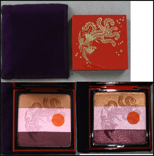
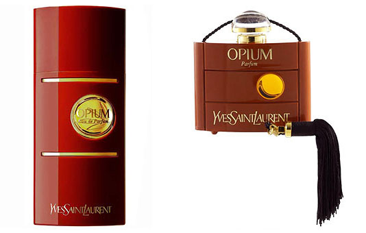
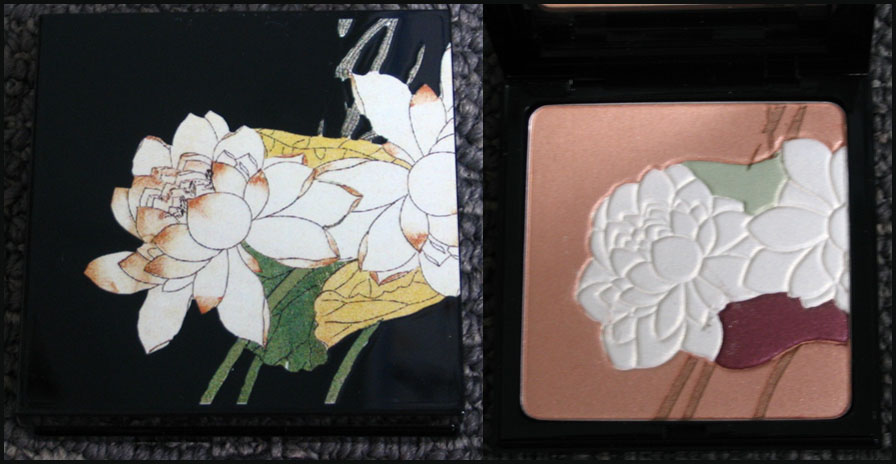
In honor of the 30th anniversary of YSL's Opium1 fragrance, the company released a limited-edition bottle and palette in the fall of 2007. The palette features a red lacquered case with an exquisite phoenix and floral details.
While I'm not really sure what the reddish orange dot on the interior is supposed to represent, it could just be referring to the circle on the fragrance bottles themselves:
I decided to dedicate this installment of Couture Monday to Shu Uemura's newest in false eyelashes. Each year the company adds a host of new pairs to their Tokyo Lash Bar collection. These lashes are not for the faint of heart. Featuring bright colors, rhinestones, and unusual materials, these are meant for those who want to make an impression. Some examples:

(photos from shuuemura-usa.com)
As if these weren't elaborate enough, this year Shu significantly upped the ante by collaborating with high-end fashion duo Viktor & Rolf to create "couture" false eyelashes. "Blink couture this fall with Viktor & Rolf's luxurious handmade false eyelashes designed for Shu Uemura," the promotional e-mail reads. At $95 per pair, these definitely have a couture price tag (although still not as expensive as Madonna's $10,000 mink lashes, but that's another story.)
From left to right: Wing Couture, Swirl Couture, and Rhombus Couture:
And the promo ad:
These were inspired by Viktor & Rolf's spring/summer 2008 line, which in turn was inspired by Marcel Marceau, a pioneer of pantomime1 – hence the white mask the lashes are adhered to as well as on the model. The diamond pattern on the rhombus pair is reminiscent of a harlequin's costume and this pattern also adorns the model. What I love about this collection and the promo ad is that they really do go along with the designers' vision for their spring collection – a conflation of traditional clowns and mimes. Fashion reviewers pointed out the "Pierrot" collar and one of the looks is a quite literal interpretation of Pierrot, a stock "sad clown" character from French and Italian theatre. Compare it to Antoine Watteau's 1718 painting of Pierrot:
(photos from style.com and louvre.fr)
In keeping with the harlequin theme several of the pieces featured diamond patterns as well:

I think this is a terrifically well-executed collaboration between Shu and Vikor & Rolf – couture, art and makeup all come together in such a cohesive, meaningful way. And the lashes are really spectacularly designed around the concept of the silent mime…when wearing these lashes, you can let your eyes do all the talking!
1 Ally Pyle, "Pantomime Flair", https://www.vogue.co.uk/beauty/news/080506-shu-uemuraviktor-rolf.aspx
It seems a lot of the big fashion houses like to break out the animal prints for fall – not just for fashion but for the makeup lines too (see my previous posts on Armani's python palette and YSL Fauve). This season Dior also took a walk on the wild side with their croc-patterned eye shadow palette, part of their Dandy Lady collection.

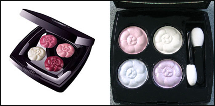
This Monday I'm looking at Chanel's Camélia palettes, which feature four colors molded into the shape of Coco's favorite flower. The first of these, a lip palette, was released for the 2007 holiday season, while the second came out in spring 2008 and featured eye shadow rather than lip color.
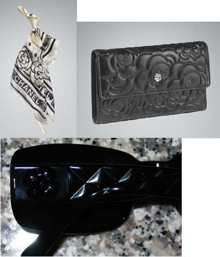
Camellias figure prominently in Chanel fashion – the brand even has an entire jewelry collection featuring the flower. From bags to sunglasses to scarves, the ubiquitous camelia has become a Chanel icon.
(top photos from chanel.com)
But why the camellia? According to the Chanel website, "The camellia appealed to Mademoiselle's taste for provocation due to its reference as the forbidden flower, both androgynous and ambiguous. Without perfume or thorns, the camellia seduces by its simplicity. Mademoiselle adored the camellia for its almost geometrical roundness and the regular perfection and classical order of its pure white petals."
There you have it. I think it was about time Chanel spread this famous icon from accessories into their beauty line. The only problem with it is that when one actually uses the palette, the camellia pattern will disappear. We can hope that Chanel will come out with a limited-edition compact in the shape of a camellia or at least put the camellia design on the compact, rather than on the makeup itself. This way people can enjoy this Chanel symbol over and over again instead of ruining it with one use. You can have your camellia and eat it too!
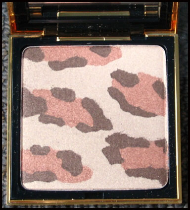
Today I'm taking a look back at Yves Saint Laurent's Fauve palette from the fall 2005 collection. It's a square compact filled with a shimmery leopard-print powder.
Fauve translates to "large feline" or "predator" in French so it's a fitting name, but I was curious as to why the company named it that instead of going with plain old leopard. So I asked City Girl, Brooklyn-based author of a very informative blog on city lifestyle (and whose first language is French!) if she could shed some light on this. According to her, the French have several words for this kind of creature: guepard, panthere and léopard. She hypothesized that since léopard is not usually used in the fashion sense, and Cartier has a "panthere" collection, and "fauve" is more encompassing than guepard, it made the most sense for YSL to name the palette fauve. Interesting, no?
Now let's look into why YSL chose a leopard print. The copy for the palette said that the palette was "inspired by one
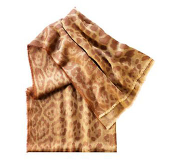
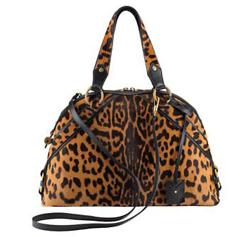
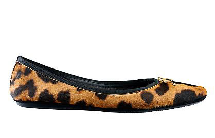
of the most distinctive fashion features of the legendary design house." While I don't think the use of leopard print is the number-one icon of YSL, the company does utilize it frequently (and wisely, I would say) on accessories:
(photos from ysl.com/us)
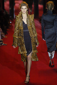
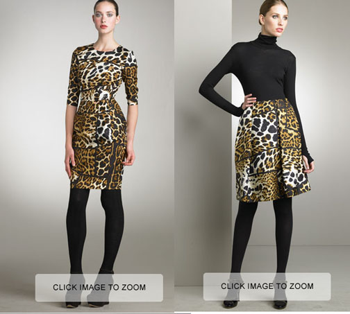
Although sometimes the brand ventures out and uses it on clothing:
(photo from style.com)
(photos from bergdorfgoodman.com – note that you can't actually click to zoom…these are screenshots and I didn't want to cut off the model's feet so I didn't crop out that part.)
Judging from these, I'd say it's appropriate for YSL to use the leopard print on a compact – it definitely goes with the fashion the company produces (even though Yves stepped down in 2002). Plus, in my opinion even in compact form there's something about leopard print that makes the wearer feel powerful, a bit dangerous and definitely wild. Call it the Fauve effect.
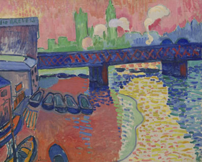
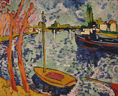
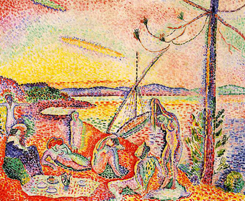
Speaking of which, now it's time for a little art lesson! The palette's name brings to mind one my favorite (though short-lived) art movements: fauvism. Starting around 1905 and led by Henri Matisse, fauvism was characterized by an unfettered use of intense colors, strong brushwork, and a flat, almost 2-d approach to the picture plane. Fauvism got its name from an art critic who, upon seeing the colorful work of this group mixed in with a conventional, Renaissance-type sculpture, exclaimed, "Donatello au milieu des fauves!"1
Some examples:
Andre Derain's Charing Cross Bridge, London (1906)
(photo from National Gallery of Art)
Maurice de Vlaminck's The River Seine at Chatou (1906)
(photo from Metropolitan Museum of Art)
Luxe, Calme et Volupté (1904-1905) by Matisse – the title is taken from an 1857 poem by Baudelaire.1
(photo from wikipedia)
So what can we conclude from all this? Perhaps it's that in makeup as in art, the wild beast within us sometimes cannot be tamed. ;)
1 Arnason, H.H. and Marla F. Prather. History of Modern Art, 4th edition. (New York: Harry N. Abrams, 1998) p. 132. For more comments on the title, see this essay.
2 Arnason, p. 131. For further reading: Whitfield, Sarah. Fauvism. (Thames and Hudson, 1996.) You can also check out this online exhibit of Fauvism at the National Gallery.
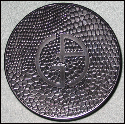
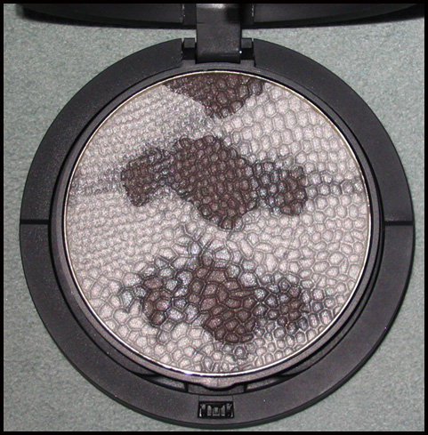
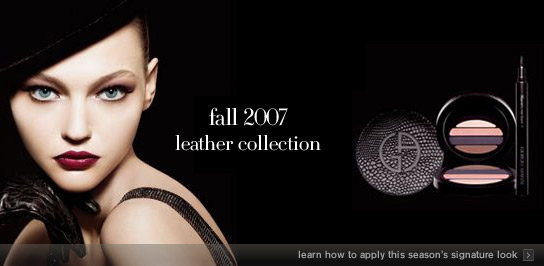
For the inaugural Couture Monday post, I'll be looking at Armani's fall 2007 blush and fall 2008 palette, both of which feature animal prints. The Fall 2007 palette has the pattern on the outside of the case, while the fall 2008 one moves the print inside the palette.
Fall 2007 Leather collection blush (there was also an eye shadow palette with the same print on the case):
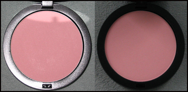
The blush inside: (with flash on left; in natural light on right)
Fall 2008:
Let's first examine the fall 2007 blush. The copy for this item at the Armani website read "Outfitted in a unique black faux-crocodile skin packaging, the tender peach-pink hue is a one-of-a-kind addition to any fall wardrobe." The trouble with this is that the print is identical to the eye palette, the copy for which read, "Drawing inspiration from Armani's exquisite collection of leather accessories, the eye mania palette features four versatile shades encased in a luxurious black snakeskin print compact." So the blush is apparently crocodile and the eye shadow is snakeskin, but they're exactly the same!
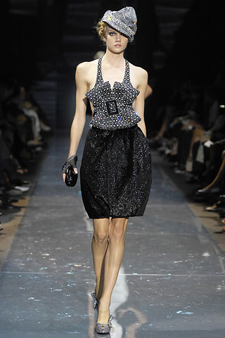
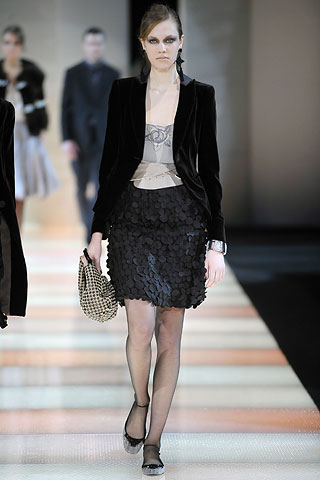
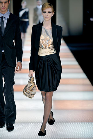
Now, let's just say the blush really is a crocodile print. Armani's fall 2007 ready-to-wear line did feature some croc pieces, or at least ones made of leather embossed to look like croc:
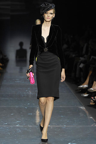
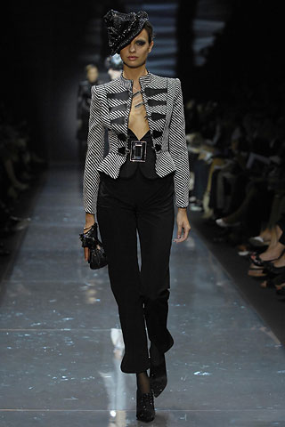
Additionally, Armani stated that he was inspired by David Bowie and rock music1 for his privé line that season, hence the prominence of fedoras and fingerless gloves:
And lo and behold, the model for the Leather collection is wearing a fedora, along with leather gloves (albeit not fingerless ones):
I think Armani did a splendid job in coordinating the fall makeup line with the fall clothing collections. Even though there is some conflation of crocodile vs. snakeskin, the overall themes, the use of leather and hats as well as a rock n' roll type feel in both makeup and clothing is harmonious and inspired.
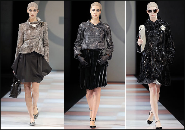
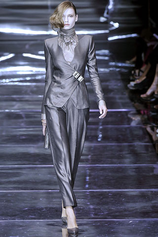
Now let's turn to the the fall 2008 python palette. At first glance it expresses the themes of the fall ready-to-wear collection, at least colorwise. Black, white and grey/silver dominated the ready-to-wear line, as evidenced in these photos from the runway:
This model is carrying what looks to be a python bag.
Take a look at the models' eye makeup too – it's a very dark, smoky greyish black, which is the look the python portion of the palette is meant to create.
The privé line continues with the color scheme and also features a shiny python jacket:
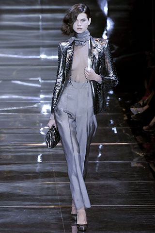
(all runway photos from style.com)
However, Armani described his ready-to-wear look as "free-spirited"2, which doesn't quite match the palette – when I see python print, I think sophisticated and drop-dead sexy, while "free-spirited" brings to my mind a more playful, carefree style. The privé line contained a python jacket and some dresses but the majority of the looks were pantsuits, which don't exactly correlate to the sultriness and glamour of snakeskin (although the suits do convey a sense of power.) Also, if you look at the fall 2007 ready-to-wear line in its entirety, the exact same color palette is there, right down to the model's makeup. Thus it seems as though this season Armani recycled last fall's makeup collection, without consideration of style of the clothes that were sent down the runway. The choice of snakeskin print for the palette really doesn't go with the feel of either the couture or ready-to-wear lines; there is no unifying theme between makeup and fashion. While a couture brand does not necessarily have to link the two, the makeup is an extension of the clothing, so for big seasonal releases it would make sense to have them go together.
1 Review by Sarah Mower, July 2007, https://www.style.com/fashionshows/review/F2007CTR-APRIVE.
2 Review by Nicole Phelps, February 2008, https://www.style.com/fashionshows/review/F2008RTW-GARMANI/.
