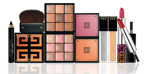
The makeup artistic director for Givenchy, Nicolas Degennes, created an India-inspired theme for the line’s spring/summer 2009 collection. While at first I thought the colors didn’t have much to do with India, an interview with Degennes for Vanity Fair explained his thoughtful construction of the collection. “The must-have products re-interpret the radiance of Indian saris, with Precious Sari Glitter Eyeshadow and Sari Glow Iridescent Blush, while Magic Kajal Eye Pencil Intense Look beautifies the eyes with a stroke of bewitching black. Adorned with bindis, the cases take refinement to the extreme, featuring mirrors and applicators that evoke the opulent decorative style of India…The Bollywood vision of the sari, embroidered with mirrors and gold, evolved into Precious Sari Glitter Eyeshadows in Maharani Silver and Maharani Gold. The refined architecture and colors of Jaipur Palace were my inspiration for Sari Glow luminous cheek powder. Orange for the earth, omnipresent in all its shades and variations, is captured in Maharani Orange. For a touch of sweetness and demure femininity, there is Maharani Pink. Earth and henna are so much a part of India, and inspired Rouge Interdit Lip Colors in Maharani Rose and Maharani Henna.” Judging from this interview, there seems to have been a lot of consideration going into the collection in terms of color selection, which makes the Curator happy. But what about the packaging?

(photo from vanityfair.com)
Compared to the elephant-embossed compact Lancôme released last fall for their Indian-themed collection, Givenchy’s packaging is definitely more subtle, with a delicate pattern adorning the edges of each product. I liked that you can tell it’s India-inspired without it hitting you over the head. Another thumbs-up for the latest creation from Degennes!
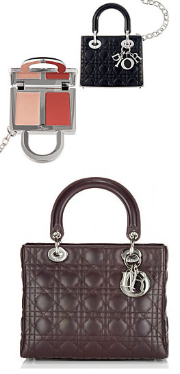
 The Curator has an affinity for anything mini, so when I saw this Dior lip gloss duo I thought it was a very clever and cute idea to replicate one of their signature bags in miniature and fill it with gloss. While I still prefer cool embossed patterns, I love when a couture house ties in their makeup line to their fashion. It's a bit gimmicky, sure, but Dior still deserves a pat on the back.
(photos from Sephora and e-luxury.com)
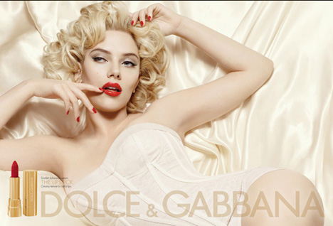
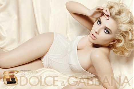
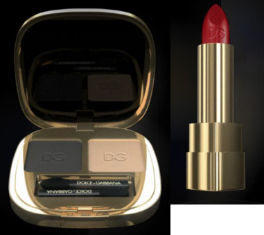
Italian couturiers Dolce & Gabbana have created their own line of cosmetics. They've already ventured into fragrances, so it was just a matter of time before they developed a makeup line. The line took ten years to create, and the designers recruited world-famous makeup artist Pat McGrath to help develop the products. The campaign ads, featuring a very sexy and sultry Scarlett Johannson, reflect the concept behind the line. According to Allure magazine (April 2009, p. 62) the goal is "to play up a woman's sex appeal".
The ads show Johannson modeling two looks: a slightly retro one with red lips and nails and a more modern one with smokey eyes and nude lips.

(photos from dolcegabbanamakeup.com)
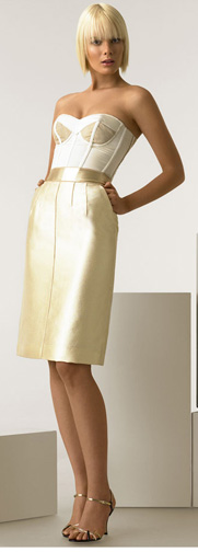
I think they did an excellent job reflecting the line in the ad campaign. I noticed that the corset/bustier is very similar to this D & G dress:
(photo from nordstrom.com)
As for the collection itself, the packaging consists of pale gold – fitting considering the duo's love of the metal (many of their pieces include gold touches, and the pair even owns a restaurant called Gold.)
 (photos from dolcegabbanamakeup.com)
The product names also correspond to the designers' oeuvre. "We decided to call some of the products with the names of some important objects for us and for our brand…For instance, Stromboli — from the turbulent landscape of Stromboli's charred, glistening black sand, one of our favorite isles…Dahlia — the flower we love most or Ruby — our favorite stone," stated Dolce.
The designers seem to be very hands-on in the development of their line, which comes through in all aspects – marketing, packaging and product line-up. This is somewhat rare for a couture house, as most of the time the makeup is distinct from the fashion and usually doesn't represent the overall feel of the brand, so I'm happy to see how well D & G's style is reflected in their cosmetics thus far.
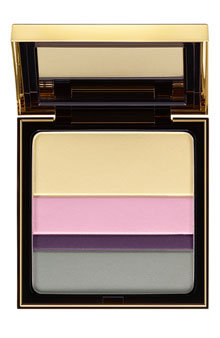
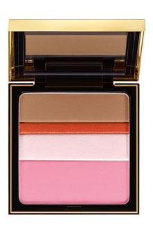
The spring 2009 collection for YSL included these so-called "collector palettes for the eyes/complexion", featuring stripes of color that can be mixed and matched to "turn your look into a work of art". "Contemporary art inspires this year’s Spring Look. An explosion of
vivid colours, graphic lines and sensorial textures reveal a strikingly
modern interpretation of beauty," says the YSL website.


(photos from nordstrom.com)
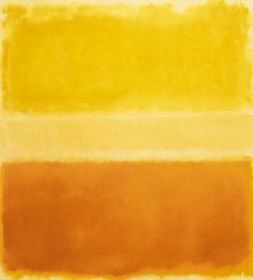
I'm not really sure what the company intended these to look like – they remind me a bit of a Rothko, (one of the curator's favorite artists) but the edges of the colors are obviously neater and lack the fading that Rothko's "color fields" have:

(Mark Rothko, Yellow and Gold, 1956, image from worldgallery.co.uk)
Still, that looks like the inspiration for the palettes, no? In my opinion, it's modern visual art and not the the YSL clothing lineup for the spring 2009 season that was the jumping-off point for these palettes. The ready-to-wear collection, created by Stefano Pilati, had an "East-meets-West" feel to it and had nothing to do with modern art. One of the questions I always try to answer in Couture Monday is whether the company intended their makeup collections to correspond to the season's clothing. Usually this is not the case, as the cosmetics division of a couture house is completely separate from the actual clothing and run by totally different people. With these palettes YSL follows that pattern. And while I'm pleased the palettes look Rothko-esque, it's still a fairly vague suggestion with no clear relation to a particular artist or genre. Another somewhat disappointing release for spring!

The creators behind the big couture houses' spring palettes seem to be suffering from the winter blahs. Armani's Pink Light palette for the spring 2009 collection is nothing more than Armani's signature slapped on top of a plain black compact. While all of the colors in the collection are great for spring (lots of luminescent, fresh pinks living up to the Pink Light title) the packaging for the palette could have been a bit more creative. I guess they wanted something very simple to go with the basic colors in the palette. "This limited-edition palette is embossed with Mr. Armani's signature, a distinct design for a classic spring palette." I don't know about distinct, but I guess the colors could be described as classic for spring. In any case, I'm excited about the upcoming Bronze Mania collection, which features a very interesting, desert-like patterned palette.
I have to say I was a bit underwhelmed with the spring 2009 palette from Chanel. The gypsy-inspired collection features dark eye shadows and bright red lip colors. Peter Philips, Chanel's global creative makeup director, was digging through Chanel archives when he found sketches of gypsy dresses by Gabrielle Chanel. He used those as a jumping-off point for the collection. “The
Gypsy is a heroine with very distinctive beauty codes…The gypsy’s eyes are as dark as her lips are fiery. She
has the passion of travel in her veins, that of celebration, dance, and
especially that of darkness and mystery.” While I think the colors overall go with Philips' concept (including lipsticks called Fuego ["fire" in Spanish] and Gipsy Scarlett – both fierce reds), I'm not sure where this palette fits in.

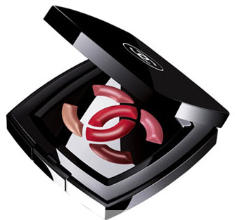
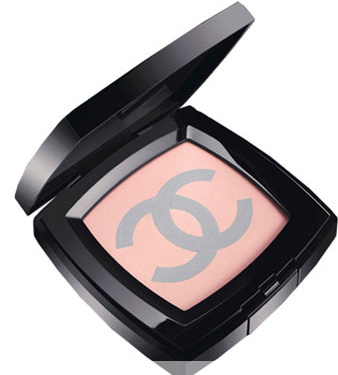
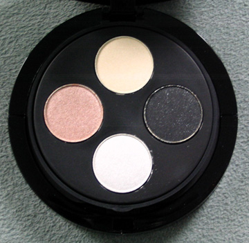
Interlocking Cs are a Chanel icon, but that doesn't exactly scream "gypsy" to me. The design was recycled from an exclusive Nordstrom palette released last summer – a similar palette is currently being sold at Neiman Marcus:
(photos from neimanmarcus.com)
So while I was happy to see that Mr. Philips took his inspiration from bohemian-style dresses designed by Mademoiselle Chanel, this palette sort of missed the mark. What would have been more interesting is creating a palette that incorporated a pattern from one of the sketched dresses he unearthed while going through the archives. The Chanel C's are nice, but very uninspired unlike the rest of the collection. Here's to hoping Chanel will come out with a more innovative palette for the fall season.
Time for a good old-fashioned palette smackdown! Two makeup companies are duking it out to see who can come up with the best use of crystals on their holiday offerings.
LET'S GET READY TO RUMBBBBLLLLE!!
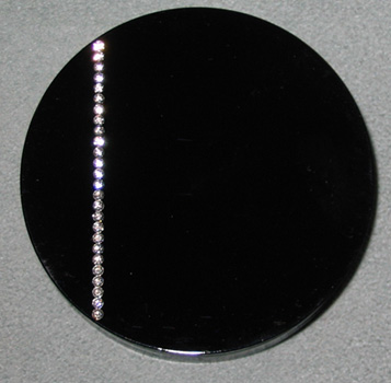
In the right corner we have Armani's crystal palette, featuring a single vertical line of Swarovski crystals:
And the interior of the palette:

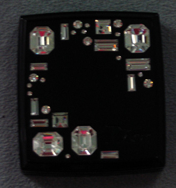
In the other corner we have Dior's Night Diamond powder, which has much bigger crystals, but that cannot boast the Swarovski name:

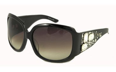
So who do you think did crystals better? Will Armani's simple, understated design beat out the flashier use of faux gems by Dior? Or will Dior's more geometric pattern, ingeniously borrowed from a pair of the company's sunglasses, crush his competitor? You can determine the winner – cast your vote in the comments section!
 Back in August various beauty blogs reported that Lancôme's new artistic director, Aaron de Mey, created a limited-edition lip set consisting of a sparkly black lip gloss and a lipstick inspired by the instantly recognizable red sole of a Christian Louboutin shoe.
Named after the "black sand beach where Aaron grew up in New Zealand," the Piha set would be released in November, appearing only at the 59th street location of Bloomingdales in NYC and several Lancôme boutiques with 500 sets made available. An additional 100 sets would be sold online at the Lancôme website. (I must note that I've been stalking the Lancôme site since November 1 and have yet to see them, and e-mailed customer service and was told they had no idea when the sets would arrive.) In any case, the idea behind the set is genius – a combination of the latest cosmetics trend (dark lips) and a lipstick that resembles the iconic creation (red soles) of Louboutin. But perhaps I'm also taken with the set because it brings together my two biggest weaknesses: makeup and shoes.
Now for the fun part! Although I was unable to procure a Piha set for myself to compare the lipstick to Louboutin soles (I am the proud owner of the ones shown below), I can still determine if the lipstick is a good match based on online photos, like the one above from the New York Times.

Judging from these two pictures, the lipstick looks pretty accurate!
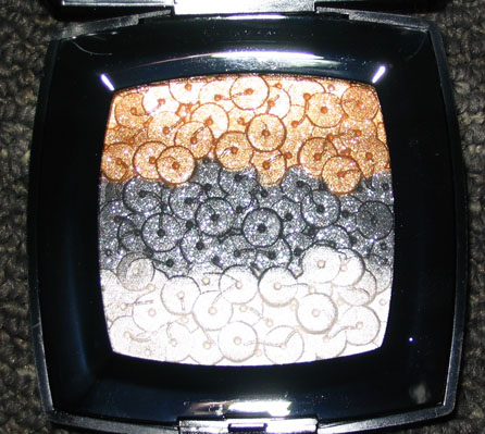
Chanel put out this little gem for the spring 2007 collection, but with the colors, texture and shimmer this always struck me as being more appropriate as a holiday release. This palette was "inspired by the hand-detailed designs of Chanel master embroiderers" and features three rows of dazzling sequined-shaped eye shadow/highlighter.
As with the tweed-patterned Pink Lamé palette and the Camelias palettes, this item doesn't focus on any particular season but rather expresses the overall use of sequins by the brand on various fashion pieces, like these couture gowns:
(photos from style.com)
I'd say the color on the middle row of sequins in the palette is a dead ringer for those on this evening bag:
(photo from harpersbazaar.co.uk)
While tweed jackets and camellias come to mind when I think of Chanel, that's not necessarily the case for sequins. I don't doubt Chanel does amazing things with sequins, as seen in the couture gowns and bag above, but I don't think their use is quite as iconic as tweed or camellias. Still, this palette was well-executed, especially considering the tiny "threads" holding the sequins on – it truly looks like embroidered sequins.
The only thing that would have made this palette a little better is releasing it for the holidays rather than spring. Maybe I have Christmas on the brain, but when I opened the compact this morning to help me write this post, all I could think of was how festive and perfect for a holiday exhibition this piece is. Ah, silver and gold…just like the song Sam the Snowman sings in "Rudolph the Red-Nosed Raindeer"! If you're not in the holiday spirit yet, here's a little serenade…and a very fitting one for this palette. :)

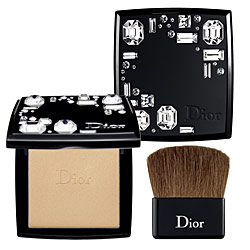
The glitz and glamour of the holiday season are fast approaching, so today I'm looking at the oh-so-sparkly Night Diamond palette by Dior. Adorned in big clear crystals, the sparkliness continues on the interior of the palette – it's filled with a glowy highlighting powder that will come in handy for all those fancy holiday parties. I have to admit that at first glance I didn't think this was anything special, particularly after I saw it in person. It just looked like a compact with a lot of overly large cheap fake crystals glued onto it, making it seem, dare I say, a bit tacky. The compact is apparently inspired by Dior's "On the Rocks" sunglasses collection, which features the same crystals on the stems of the glasses (see photo below). But I was pleased to see that the concept behind one of Dior's fashion accessories was carried over into the makeup line of the brand, since Dior can be hit or miss when it comes to articulating their vision clearly in cosmetics. While these big faux gems don't appeal to me personally (which is why I'm still debating purchasing it for the Museum), Dior made a very fitting choice in grafting the crystals from their sunglasses onto a palette that's being marketed for the holiday season.
(photo from amazon.com)
