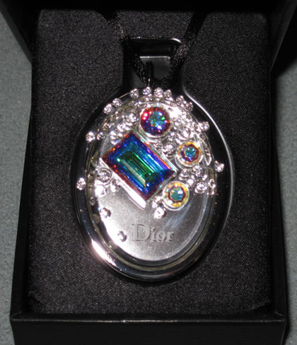
Looks like Santa is bringing us some major Dior bling this season. The Cristal Boréal lip gloss pendant contains no less than 52 Swarovski crystals, 4 of which are the famous rainbow-colored "Aurore Boréale" originally created by Swarovski for Dior in 1955. Dior was enamored by the light at the Hall of Mirrors in Versailles and asked Manfred Swarovski to create a crystal that captured the amazing iridescence of the reflections.
I think it's great that Dior went back to its archives and then collaborated with the Swarovski company to make a new product. I am a bit puzzled by several things, however. First, why did Dior request this? I'm assuming he used this new crystal in his designs but have yet to find any examples. It could be that only Swarovski used these? Second, according to one source, the pendant's oval shape is inspired by the "neo-Louis XVI chairs that Christian Dior loved," but according to Splendidcity, "the pendant was designed after the decorative style of brooches of
the 18th Century Louis XVI." Hmmm. Well, at least the Louis XVI part is consistent!
Questions aside, here are some pics. Get ready to shield your eyes from all the shine!

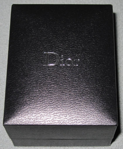
I love that it comes in a sturdy jewelry box:

I'd never wear this, but it does make a nice holiday addition to the collection. I also like that there's a bit of history behind the crystals and that Dior didn't slap them on a pendant for no reason!
I wasn't so impressed when I saw this fall palette from YSL. An initial made into bronzer/highlighter seemed pretty boring. But then the "stitching" on the Y itself caught my eye and I thought, maybe this Y has shown up on a dress or bag.

And indeed it has! Obviously the one with the metal studs is my fave out of these 4:

images from splendidcity.com, pursepage.com, purseblog.com, mymanybags.com
YSL Beauty doesn't normally come out with such literal interpretations of the company's fashion, so this was a nice little surprise. Plus the website's statement that the stitching gives the "allure of a true handbag
accessory" reminds me a bit of Chanel's tactic of putting their interlocking C's on their makeup – if you can't afford a bag with the Chanel logo, you can at least have a lipstick palette with it!
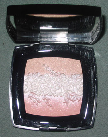
The Curator is over the moon that the beautiful Chanel Fleurs Célestes palette, rumored to be an Asia exclusive, has hit the States. I got it in my hot little hands as soon as I could!

For an explanation of the inspiration behind the palette's design, see my previous post about this collection. 🙂
Save
Save
 Even though it's still warm, fall is in full swing in the makeup world. And that means tons of animal prints – not just in fashion but on compacts, like the "manta ray" pattern Armani's fall 2009 eye shadows. "Inspired by the precious and luxurious materials used in Giorgio Armani fashion accessories, the palettes offer a beautiful selection of color harmonies inspired by nature. The collection features subtle hues that offer a new take on the timeless color 'Greige,' created by Giorgio Armani."
Meh. I'm just not sure how the pattern is much different from Armani's previously released fall offerings – it looks pretty similar to the python or croc palettes from years past. I understand that it's Armani and the company wants to express how the designer is inspired by "precious and luxurious materials" in their accessories, but 1. this is a bit repetitive, and 2. I don't think Armani has used an actual manta ray in their accessories. Thus, I don't think these are a must-have for the Museum. Let's hope Armani comes out with an interesting holiday collection (and preferably one that uses something other than crystals!)
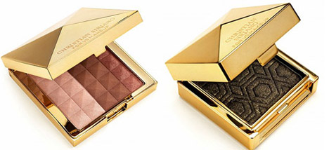
Following in the footsteps of the successful Heidi Klum-designed makeup collection, Victoria's Secret teamed up with Project Runway season 4 winner Christian Siriano for a limited-edition collection inspired by the designer's work. Included are lip glosses, eye liners, a bronzer and several eye shadows (the last two shown below.) Of course, you couldn't have a collection by Christian without at least one mention of the word "fierce", and as such this sparkly black eye shadow is named Gilded Fierce. Rawr!
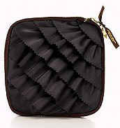
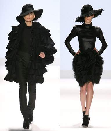
My favorite of the collection though is this black ruffled makeup bag – I think this is the one item that really has Christian's stamp on it, since it's reminiscent of several of his pieces.
(photos from victoriassecret.com and about.com)
In 2006 Lancôme started collaborating with fashion designers to create a limited-edition lipstick that reflected the designer's style. These lipsticks quickly sold out and became hard-to-find cult favorites, and now it looks like a new frenzy is about to begin: Lancôme has just announced that they will be teaming up with designer Chris Benz to develop a new shade. Not only that, there was a naming contest via Chris Benz' Facebook page – you can submit your idea for what the lipstick should be called (alas, the deadline was July 12.) The winner will not only have the honor of naming the color, but will also be awarded 5 of the lipsticks plus a $500 Lancôme gift certificate.
While the Curator did not enter the contest, I'm excited to see what the color and name turns out to be. And just to give you an idea of past creations, here are some of the others in the Pout à Porter series (unfortunately I couldn't find a good pic of the first in the series – a bright red created by Behnaz Sarafpour).
Proenza Schouler – Proenza Pink – spring 2007

Peter Som – P.S. Kiss – Fall 2007

Thakoon – Pixel Pink – spring 2008

(photos from Makeup Minute and BellaSugar.com)
I love that Lancôme pairs up with designers – while Pout à Porter is a great series, Lancôme also branches out and comes up with different products, like the Christian Louboutin-inspired lipstick and black gloss set from last year, or the lovely Juicy Tubes designed with Christopher Kane.
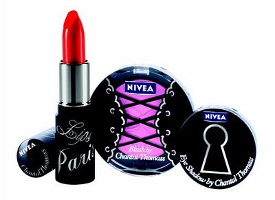
Looks like Nivea, a leading drugstore skin care line, has partnered with lingerie designer Chantal Thomass to create a limited edition "Boudoir" makeup line. The collection debuts this month and alas, is only available in Europe. I think it's an odd choice for Nivea, given that they've never done anything glamourous/sexy in packaging or the products themselves, but it's good to see them branching out. The collection features 8 lipsticks, 6 shadows and 2 blushes. According to the Chantal Thomass site, the designer "chooses glamourous printings elegantly styled on the packaging…to choose the tint of the blue of the packaging, the creator was inspired by a small pantie, a silky one of course."

The blush appears to have a corset design on it. Not terribly interesting as we've seen this motif in Benefit's Thrrrob blush, but I'm guessing an image of a lacy bra or undies would have been too risque. Some of the eye shadows have little bows embossed into the powder, and others have a key (with the keyhole on the outer package shown above.) Still, I think they could have had slightly more inspired packaging – the bow was a great idea, but how about a just an abstract lacy pattern? Or maybe a patterned stocking? Ah well. I'm happy Nivea took a chance and strayed from its "safe" products to create a sexy makeup line. Hopefully there will be more partnerships in the future!
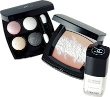
 I do hope this lovely palette is available in the U.S. eventually. The Chanel fall 2009 collection has just been released here, but no sign of this beauty. I came across it at the Glossy Kiss blog and now I must have it.
According to Glossy Kiss, the collection is "inspired
by the noble and elegant spirit of the pure white floral designs in
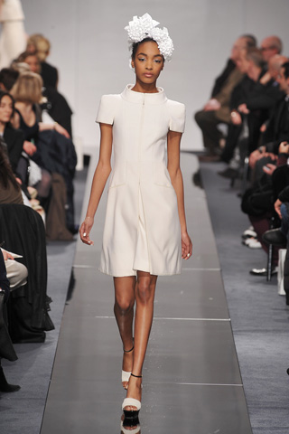
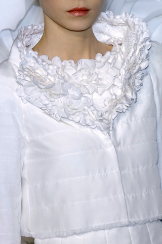
Chanel's spring 2009 haute couture collection." Naturally I had to check out the collection to see if there were any flowers and lots of white. And indeed there was! This palette definitely represents the styles that came down the runway – lots of fresh, romantic pieces with tons of roses, camelias, and leaf details. The flowers on the palette look just like this model's headpiece (which, incidentally, was made entirely out of paper):

Or the collar on this jacket:

(photos from glossy-kiss.blogspot.com and style.com)
I think this is one the most gorgeous couture collections I've ever seen. Now I need to get my hands on the palette that matches it!
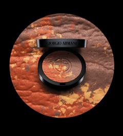
 I was a little disappointed in this palette, especially after seeing the spring offering, but I do appreciate the different colors and texture of it. While most makeup brands are pushing a beached-based bronze look (and Armani does do this somewhat with its Mediterranean palette), I feel this bronzer represents a departure from the usual advertising. The texture and reddish-brown tint evokes a dry, desert landscape instead of a beach – something you'd wear out West to the canyons of New Mexico, rather than, say, the islands of the Caribbean. While I'm guessing the overall effect of the product is essentially the same as other bronzers, I like that Armani offered a different approach and representation for a summer staple (a staple for us pale people, anyway!)
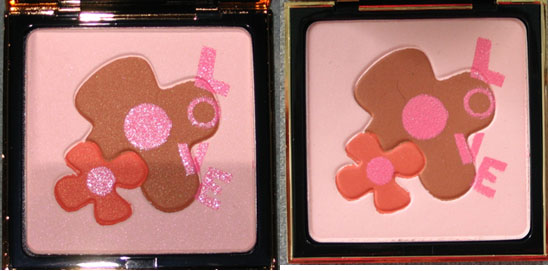
Since I was a bit disappointed with YSL's spring 2009 offerings, I thought I'd take a look back at last year's spring palette. The description from Neiman Marcus: "To celebrate the 30th anniversary of YSL make-up, Yves Saint Laurent has created this collector powder for face and cheeks. Directly
inspired from the greetings card Mr. Saint Laurent drew and sent in
1992, it is a perfect tribute to love and flowers." Indeed.
Unfortunately I cannot seem to locate a picture of the original greeting card he sent, so I have to assume that this is the design that was used for it. I suspect I could find the image in this book, which contains a collection of YSL's greeting cards, but I haven't gotten a chance to buy it yet!
