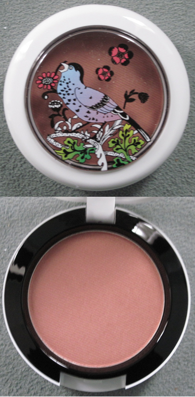
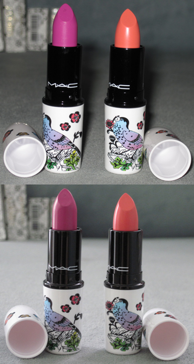
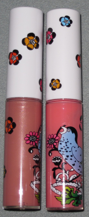
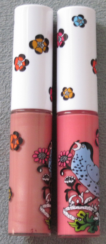
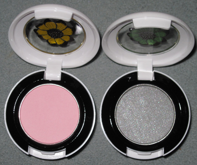
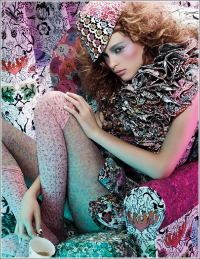
Woohoo, it's here! The long-awaited MAC Liberty of London collection, that is. I was very excited for this as I adored London when I visited and Liberty was my favorite department store (sorry, Harrod's and Selfridge's!) Well, let's delve into what I procured for the Museum.
Powder in Shell Pearl:

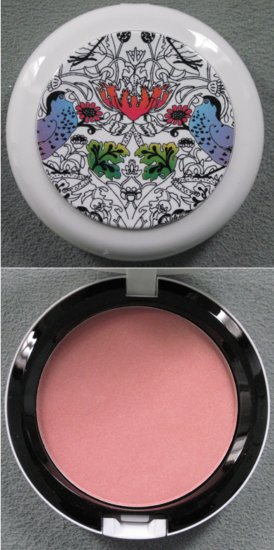
Blush in Prim and Proper:

Lipsticks in Petals 'n' Peacocks and Ever Hip (with and without flash):

Lipglosses in Frankly Fresh and Perennial High Style (with and without flash):


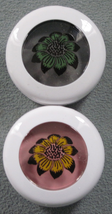
Eyeshadows in Bough Grey and Give Me Liberty of London:


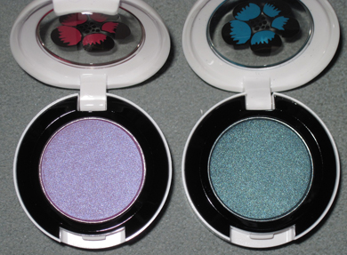
And in Birds and Berries and Dame's Desire:


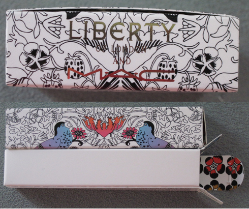
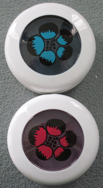
I love that the boxes have the Liberty name in gold, and the flower print is contained inside:

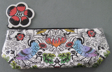
Finally, the small makeup bag:

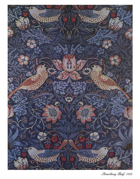
I love the shades in this collection (I'm actually going to use Ever Hip and Frankly Fresh rather than keeping them as collectibles!) but obviously the packaging and concept are my favorite things about it. Temptalia has a wonderful summary of how the print was created and what the collection's vibe is meant to be. The print is based on William Morris' "Strawberry Thief" print which goes back to 1883, but was reworked to fit the MAC collection and to make it exclusively theirs. "James Gager, Senior Vice President and Creative Director for MAC Cosmetics, says, 'I’m
particularly proud of the packaging… White [packaging] speaks to a
reawakening of everyone’s sensibilities for spring. [It] has a
remarkably fresh, springy look to it. Even if you don’t know what
Liberty is, you want to own these pieces because they are so unique and
special. It’s evident that something original has taken place here in
terms of the collaboration.'" Naturally I had to search for the original Strawberry Thief print, and indeed, the MAC print is definitely a great modern take on it, although they did take the strawberry completely out of the equation:

(image from artsycrafty.com)
More from Temptalia: "Gager says, 'The inspiration was all Liberty and all London.' Miles Aldridge, photographer, shot the visuals in London, with
Charlotte Tilbury, makeup artist, created the look. (Both Aldridge and
Tilbury are English!) Gager goes on to say, “The idea was to
capture the spirit of the famous Brit wit, bohemian chic girl. Katy
England, another famous Brit, styled the shoot. She also designed the
outfit worn by the model, using many Liberty prints and turning them
into an over-the-top ruffled dress. With the MAC Give Me Liberty of
London collection, we aspired to capture the spirit of this dreadfully
chic, cool English girl, sitting on a chair, decked out in all the
British regalia. She’s a Liberty freak and a MAC addict; she can’t get
enough of either brand.'" I can definitely see their vision in the promo ad:

Anyway, I wish I were able to get my hands on the scarf, but at $95 I thought a better use of Museum funds would be to get lots of items for the same amount! I also kind of wish MAC came out with a shirt or another non-makeup collectible – Helly Kitty had tons of stuff and Fafi had adorable little dolls and a tee. But overall I thought they did a great job with this. What are your thoughts and what, if anything did you buy?
In honor of Piet Mondrian's birthday yesterday (albeit in 1872) I'm sharing these pretties from Yves Saint Laurent.

(image from neimanmarcus.com)
In 1965 Yves Saint Laurent created a jersey shift dress inspired by the work of Mondrian. The Met summarizes this fashion landmark nicely: "As the sack dress evolved in the 1960s into the modified form of the shift, Saint Laurent realized that the planarity of the dress was an ideal field for color blocks. Knowing the flat planes of the 1960s canvases achieved by contemporary artists in the lineage of Mondrian, Saint Laurent made the historical case for the artistic sensibility of his time. Yet he also demonstrated a feat of dressmaking, setting in each block of jersey, piecing in order to create the semblance of the Mondrian order and to accommodate the body imperceptibly by hiding all the shaping in the grid of seams." Here is the dress and what I'm guessing was the particular painting that inspired it, completed in 1930.

(images from metmuseum.org and actlab.utexas.edu)
What I love about the palettes is that they took an original fashion concept from Yves Saint Laurent and made them wearable. Obviously red, yellow and blue are not the most versatile colors to wear on your face, so the palettes provide a nice variation on the YSL-Mondrian theme. These are definitely on my wishlist, but at $54 a pop I don't think I'll be getting them any time soon since the spring collections have depleted Museum funds. Someday I'll get them!
 Like last spring's palette from Chanel I was disappointed with this. The trademark interlocking Chanel Cs just aren't very imaginative – basically they just slapped the Chanel logo on a highlighting powder. Also, what's up with the little circles surrounding the Cs? It doesn't look any better in person either. I thought perhaps it was just the way it was photographing, but they're fairly ugly in my opinion. Since they're raised and not uniformly shaped the image that comes to my mind, honestly, are barnacles on a ship! Try again, Chanel. I for one will not be buying something for the Museum that resembles what you'd find on the underside of a boat. Maybe they'll come out with something better for fall.
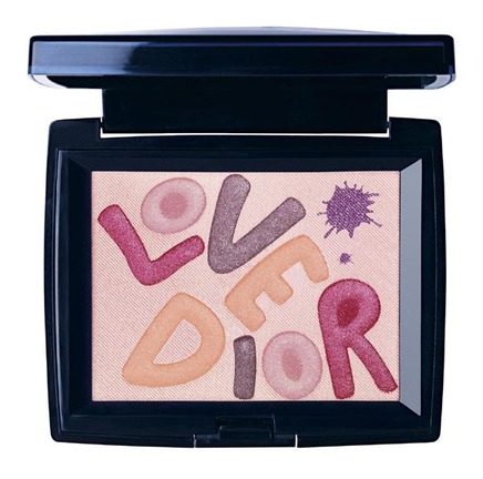
File this under "ones that got away". I was researching something totally unrelated to Dior (Bourjois, for a post I'm putting up tomorrow), and I came across this palette:

(image from mimifroufrou.com)
According to Britishbeautyblogger, this palette was a Selfridge's exclusive released in conjunction with the department store's opening of the largest Dior beauty counter in the world in October 2009. The palette itself was designed by Dior's creative director, Tyen, to celebrate his 30 years with the brand. My question to you is, how the hell did I miss this?! I guess because it was a UK-exclusive and not available in the States (at least to my knowledge – one website said it would be available "internationally" but that may not mean the U.S.), but still…that's disappointing! I'll just add it to the Museum's wishlist and keep stalking E-bay. Sigh. I'm off to sulk in the corner.
I was at the Ulta site looking for Stila's Black Cat smudge pot which I had missed out on back in the fall, and stumbled across this new paint can! Near as I can tell, it's an Ulta exclusive. Since Stila paint cans are one of my favorite aspects of the Museum's collection I just had to buy it. There really isn't a very good concept behind it – "instant glam in a can" is kind of vague and not tied to any specific couture line, but I am a sucker for paint cans.

Other side:

It comes with a mini-sizes of Peony Convertible Color and Pomegranate Lip and Cheek Stain (which I'm loving so far!) and full-sized Major Lash Mascara and Kitten eye shadow. Not bad for $28 (plus I used a 20% off code). 🙂
I have to say I was a bit surprised to hear that MAC was doing a collection with preppy Palm Beach resort designer Lilly Pulitzer. MAC's other fashion collaborations have been with designers who are, ahem, much more youth-oriented and cutting-edge (Heatherette, DSquared, Ungaro) so I could see Lilly Pulitzer working with, say, Elizabeth Arden but not so much MAC. Lest I be accused of ageism (I'm not ageist, I'm an old lady myself!), I will say that I like the blush and eye shadow that was offered in this collection – springy colors and a fun print provide an antidote to the winter blues.
Here's the Pearlmatte blush, with and without flash in natural light:

And Pearlmatte eyeshadow trio:

I think these (and the rest of the colors in the collection) are definitely a good reflection of Lilly Pulitzer style. I like that the eye shadow was in her signature colors, bright pink and green:

As evidenced below, floral patterns abound in Lilly Pulitzer so it's no surprise they were incorporated into the design of the MAC collection.

(images from lillypulitzer.com)
Personally I find the floral prints to work better on makeup than on clothes. ;)
Jewelry and hair accessory designer Tarina Tarantino has just launched her own cosmetics line, now available at Sephora. The jury is still out on the quality of the makeup itself, but here at the Museum I am more interested in discussing the packaging. It's more or less what I was expecting from her work (I have a really cool pink and yellow plastic skull ring from her that I adore) – extremely girly, full of bows and pearls and pink. Here's an eyeshadow and blush:

This so called "Sparkicity shimmer dust" comes in a pink bottle complete with fluffy atomizer – instead of a spritz of scent you'll get a healthy dose of shimmer. And of course the brushes in the line had to be fuchsia!

(images from sephora.com)
As you can see from some of her pieces below, the makeup line definitely is in keeping with her style:

Although I must say part of me would have loved to have seen something a bit less girly and, well, juvenile. The packaging almost looks like it was meant for a child. Maybe she could have worked in some of her skulls or spiders to make it a bit more edgy and therefore mature?

(images from tarinatarantino.com)
While the packaging is cute and fun, it's not Museum-worthy – a little too childish for me (and this is coming from someone who has Disney, Hello Kitty and Barbie on some of her makeup) and not all that interesting. Benefit and Too-faced do fun and playful packaging a lot better. What do you think?

Yesterday's post reminded me that last year (a year ago today, actually!) I pitted Dior's and Armani's holiday palettes against each other since both prominently featured crystals to see who did a better design with them. This year both companies offered up more crystal-laden goodies, so it's time for another crystal smackdown!
LET'S GET READY TO RUMMMMBLLLLE!
The competition is much stiffer than last year. In the right corner we have Dior's Crystal Boreale pendant. In 2008 Dior's crystals weren't even real Swarovski, but this year the company clearly upped the ante by placing no less than 52 Swarovski crystals on the pendant, 4 of which are the "aurora boreale" iridescent crystals Swarovski created in 1955 exclusively for Dior.

In the other corner we have Armani's "Black Lace" palette which features the usual clear Swarovski crystals but also black crystals, all arranged in a lovely circular pattern. The pattern is echoed in the highlighter contained within. Armani's has several weaknesses, however: the crystals are off-center and there is no interesting story behind the design.


So who do you think did crystals better? Will Armani's elaborate (if ill-placed) pattern beat Dior's seemingly haphazard crystal cluster? Or will Dior's prismatic gems, complete with historic backstory, trounce Armani's misguided "Black Lace" design? Determine the winner by posting in the comments section!
Armani loves to break out the Swarovski crystals this time of year (see last year's holiday palette) but like the 2008 palette this doesn't seem to have much to do with Armani fashion. There isn't any sort of attempt to connect it to Armani's work in the product description: "Shimmering and glittering palette adorned with fine crystals. Inside, an embroidered silky powder highlights the face and the décolleté. Featuring festive eye shadow shades." Well, that's great but I'm a little disappointed there wasn't any link to the fashion. In any case, here are some pics:

Inside:

Second tier:

I just couldn't resist getting a lipstick as well as the palette!

This is truly a beautiful design, however, I'm disappointed not only by a lack of connection to Armani fashion but also by the sloppiness of the crystal placement. If you look at both the palette and lipstick case, the crystals aren't aligned properly – they're completely off-center. I didn't bother to demand a replacement since I figured they're probably all like this, but as a collector you want your items to be in pristine condition. Oh well.
I've been excited for this collection ever since I heard about it a few months ago. Shu has done another wonderful collaboration for their holiday collection, this year with designer Tsumori Chisato. Chisato got her start in 1977 working for Issey Miyake and launched her own line in 1990. Her work is described as "print-heavy with a healthy dose of manga/bohemian cuteness." And not surprisingly, this aesthetic is reflected in the Shu collection – lots of stars and cats!
Here's the mirror, which was surprisingly large in real life – much bigger than the usual compact:

I'm in love with the little pawprints on it:

Planet Cat palette – I didn't even notice the kitty had a crystal for an eye until I saw it in person:

Blush/highlighting powder:

Inside of the blush, which sadly did not include the entire cat design (there's a plastic overlay on top which tricked me!), just the silhouette of the head:

There were also several lipsticks and this palette, which, alas, was not in the Museum's budget:

(image from sephora.com)
I found these designs to be in keeping with Chisato's work, especially in this star dress, shirt and socks:

The metallic dots from this dress even made an appearance on the compact for the blush:

(images from lagarconne.com)
Apparently the "lucky cat" is one of Chisato's favorite icons, but she doesn't seem to use it frequently in her work. The only piece I found with a cat was this purse:

(image from polyvore.com)
But that's okay – I think these cats go better on makeup than fashion items anyway! Overall I think Chisato did a fabulous job in this collaboration. Her sense of fantasy and whimsy comes through very clearly, and I always love when fashion designers re-use their iconography in a new and creative way for makeup.
