 I was most pleased to see Bobbi Brown branching out for a collaboration with a fashion designer, and the resulting prettily designed bag. The company partnered with Tibi. Bobbi, whose favorite flower is the peony, wanted delicate pinks but still something that was "equal parts lovely and edgy". Hence the mix of a pink flower and dark grey snake scales, matching the palette's offering of pink and grey eye shadows.
(image from bloomingdales.com)
The set in its entirety:

(image from tibi.com)
Hopefully this will be the start of more pretty, limited edition packaging from Bobbi!
I spotted this beautiful set at Beauty Snob and very nearly forked over $250 just to get my hands on that bejeweled palette. It could really make my holiday exhibitions even more sparkly and give the Armani Crystal palettes and Dior Night Diamond palette a run for their money! So. Many. Jewels.

(image from beautysnob.com)
In the end though, my wallet said no. To see real-life pics from someone brave enough to buy it, check out this blog post.
Dolce & Gabbana released a rather blingy palette for the 2010 holiday season. The Lip Jewels compact features 4 shades for lips enclosed in a ruby jewel-shaped case.

(image from herblog.com)
So, the eternal question for couture-related makeup items: what does the design of this palette have to do with the fashion? Apparently Stefano Gabbana wanted a ruby palette "because the ruby ring is so dear to my heart; it represents so many memories." Additionally, legendary makeup artist and consultant for D & G The Makeup, had this to say: “The mouth is such a focal point; Stefano, Domenico and I have always believed that drop dead glamour and innermost sensuality comes from an emphasis on the lips…so we really worked hard to come up with the shades that were not just our favorites but every woman’s favorites. The three reds we chose are very luscious, shades I’ve worked with time and again on the runway. I’ve played with them a lot-I’ve mixed them together, used them solo-and have come up with very rich passionate looks. And Nude is so perfect for contrast or a really simple natural look… they’re all just gorgeous… overall stunning.”
So while there is no direct relation between the design of this palette and the actual fashion coming down the runway, at least the makeup colors from this palette were used in the show.
Anyway, I'm sort of kicking myself for not buying this…when I first saw it I have to say it looked somewhat gaudy and over the top, but now I'm thinking it would have been a really good acquisition for a holiday exhibition. Sigh. Another one that got away!
 I'm still trying to figure out the design on this palette. From the website: "YSL's New Limited Edition Palette for Complexion is inspired by YSL Fashion. This season's star is embellished with a detail of passementerie engraved on the emblematic YSL compact in contrasting matte and shiny gold. This powder in interlacing barely-there shades will give you sinful radiance." Hmm, to my eye it looks like a big squiggly blob. I must admit I didn't know exactly what passementerie was, but a quick Google search revealed that it is type of trimming, most often in gold or silver cord or silk and used in a range of fashion items (prominent, oddly enough, in military uniforms.) While it does look like the examples I found, I still say overall it's not a very interesting design – the company could have done a lot more with a fashion detail that has such a rich history. I don't think YSL is especially known for passementerie details either, so this seems pretty uninspired. I will save Museum funds for something better!
(image from yslbeautyus.com)
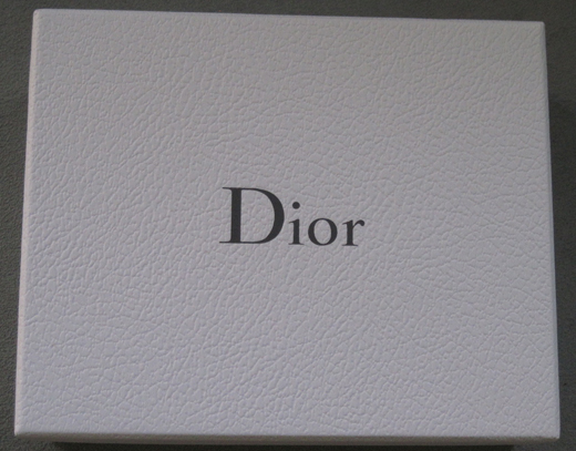
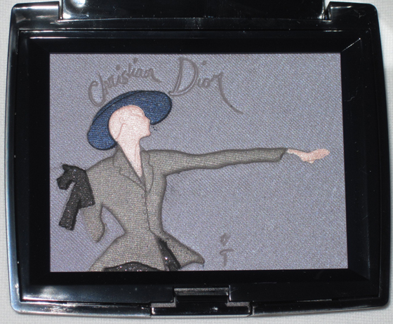
Oh boy, I had been waiting to get my hands on this Dior palette for months. At first I was disappointed that it didn't seem to be available in the U.S., but low and behold Neiman Marcus had it during their beauty week in September. I was on my honeymoon at the time but still managed to get my grubby little paws on it when I returned – the first Neiman Marcus I called still, miraculously, had one left in stock! Now, of course, it's up at the Neiman Marcus site. Oh well.
First, the fancy pebbled box:

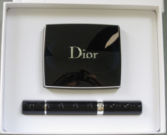
The inside:

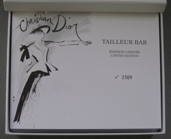
Here's the booklet explaining the design.

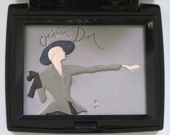
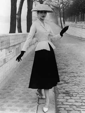
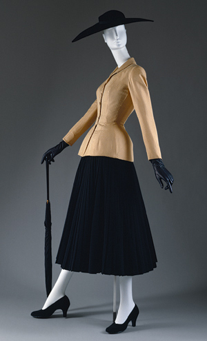
And the palette itself, in natural light and with flash. The design comes from a sketch (seen on the front of the booklet) by Rene Gruau. Here's the whole story, from the booklet: "February 12, 1947: Christian Dior presents his first Haute Couture collection. The public is amazed: this new vision of an elegant woman, with accentuated curves and a regal posture would come to be a revolution that took the fashion world by storm. Instantly named the 'New Look' by Carmel Snow, Editor-in-Chief of American Harper's Bazaar, the 'Tailleur Bar' (Bar Suit), perfectly embodied this new silhouette. The jacket, with its nipped-in waist, and the twirling skirt became the absolute symbol of the Dior silhouette. Rene Gruau, long-time associate of the Couturier, immortalized the famous Bar Suit in a sketch that captured Monsieur Dior's genius in a few cleve strokes This legendary image is now embossed on a new Dior limited edition eyeshadow palette."


Here are a couple of images to get a sense of the what the actual clothes looked like:

(image from customfad.com)

(image from metmuseum.org)
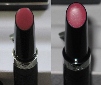
Oh, and if you're interested, the lip serum, in natural light and with flash:

The shape of the lip serum, I must say, is a bit odd. When I first opened the set my husband asked why the palette came with a mini flashlight. Ha! It does indeed resemble that. Anyway, I feel like Dior did a great job with this. Between numbering each set and making a palette out of a sketch of one of Dior's iconic looks, the company created a true collector's piece.
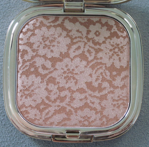
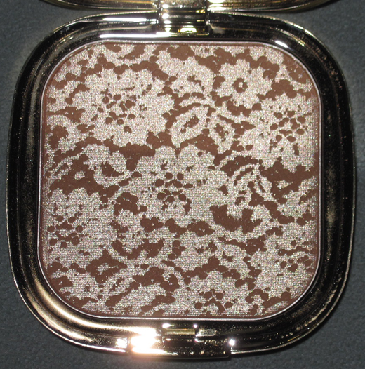
I was excited for this bronzer ever since I first spotted it months ago at Britishbeautyblogger. It finally arrived for Dolce & Gabbana's fall collection at Saks.

With flash:

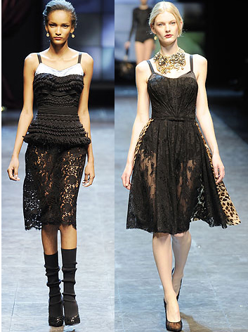
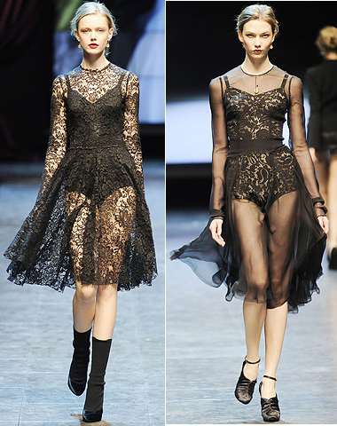
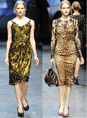
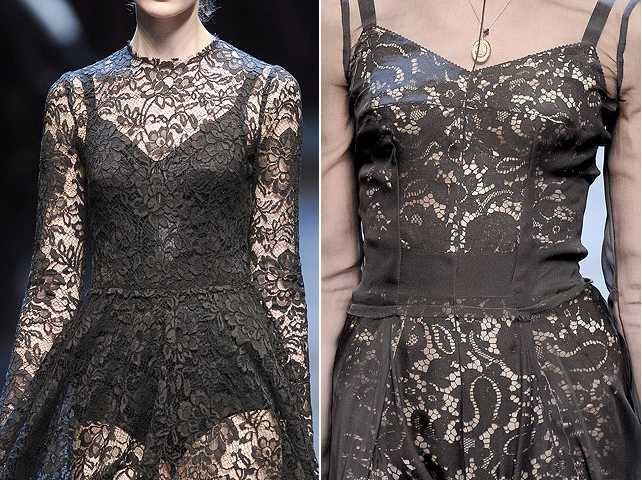
Now it's time to play one of the Curator's favorite games: seeing if the makeup corresponds to the designer's fashion for the season. In this case, it definitely does. Lace was all over the runway for D & G's fall 2010 collection. (all following images from style.com)


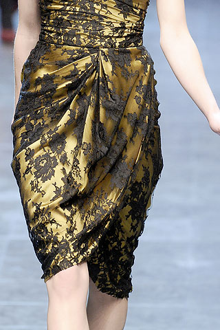
In addition to all lace frocks, the designers put it on as an overlay in some pieces:

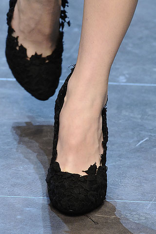
And even shoes!

So a lace theme was definitely a good choice for their fall makeup collection, as it's reflected in their clothes. Now, if we can get even more specific, let's see if the lace on the palette is the same pattern as that on the clothes. I think these two are very similar to the bronzer:

Or possibly this one?

Even if there is not an exact match between the lace pattern on the clothing and the bronzer, this is way better than most of the other high-end fashion designers' makeup items that don't correspond at all to what they did on the runways. Let's hope D & G keeps it up.
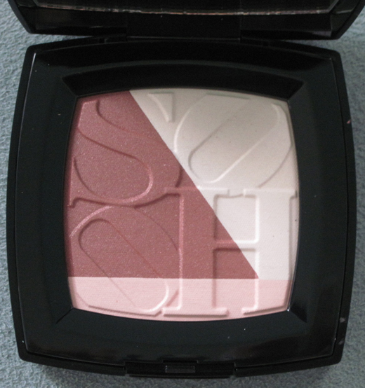
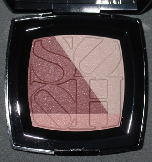
To celebrate the reopening of their Soho boutique, Chanel decided to do an exclusive collection ("exclusive" meaning only available at Chanel boutiques and at their website) devoted to the hip Manhattan neighborhood. I was intrigued enough to buy the highlighter/blush.

With flash:

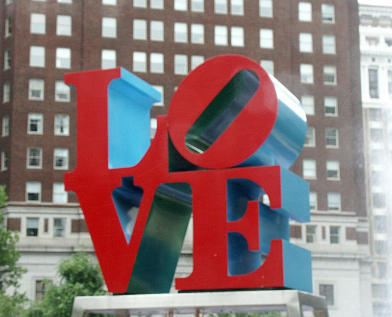
I tried to find some answers about the inspiration behind the colors of the collection and the palette's design. Peter Philips, CHANEL Global Creative Director of Makeup had this to say about the collection: “For me, SoHo is a place where Bohemian ideals meet the toughness of the city… I love the tension and energy this creates.” To echo this "toughness", the two nail polishes in the collection were named Steel (dark shimmery grey) and Strong (sparkly purple). As for the design on the blush, here's the description from the Chanel website: "This blush-and-powder palette, comprised of light plum, pink-ivory and soft pink shades for face and décolleté, puts the name of the CHANEL Boutique — in hip, downtown SOHO, New York City — front and center." Well, that's lovely, but it also looks a lot like Robert Indiana's LOVE design, no?

(image from bluffton.edu)
Now that I really look at it, I'm not sure how interesting the design on the palette actually is, or how the colors and design capture Soho's essence (I've visited there a few times and this doesn't strike me as particularly Soho-ish.) I guess it might come in handy if I ever do a NY-themed exhibition. And I very well could someday, what with the release of the Urban Decay NYC palette – I'll be discussing that as soon I get around to taking pictures of it. 🙂
Burberry is the latest fashion brand to come out with a makeup line. I think they did a pretty good job with the packaging, albeit not all that surprising. I would have been a bit disappointed if they hadn't put their trademark plaid to good use, and they used it everywhere.


I like that it's even etched in the face powders and eye shadows:


(images from nordstrom.com)
So while this didn't knock my socks off (they played it very safe) it was fairly well-designed and definitely in keeping with the brand's image and aesthetic. Maybe for limited edition collections they'll do a more interesting plaid pattern or colors.
Between following various beauty and wedding blogs, I came across a picture of this lovely Stila palette back in the fall. Stila did the makeup for couture bridal designer Claire Pettibone's fall runway show and they were going to release a palette you could use to recreate the looks this spring. I waited and waited but it didn't come out. I ended up emailing Stila in late March asking when it would be released, and just last week (finally!) I got this seemingly hastily typed response: "sorry there was press about this product before we officially decided to produce it. the eye shadow trios are a great option for weddings as is convertible color!"

(image from weddingstyle.com)
How disappointing! Even if I wasn't getting married soon I'd still buy this palette hook, line and sinker – Stila did a wonderful job illustrating a dreamy Claire Pettibone dress. For those of you unfamiliar with this bridal designer, here are some of her gowns. She started out as a lingerie designer, and the romantic delicacy and extensive use of lace details in her designs reflect that.


I think this one (the "Cloisonne") looks most like the one the Stila girl is wearing:


(images from clairepettibone.com)
I'm pretty bummed this didn't actually go into production, but I have been assured by Stila that there will be other Stila girl palettes to collect. ;)
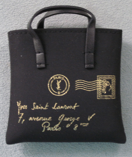
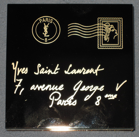
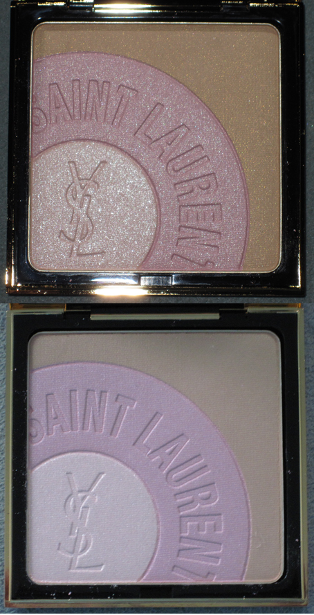
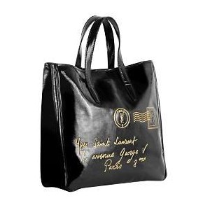
I have to admit I didn't think this was the most interesting palette YSL has come out with, but I thought enough of it to buy it for the Museum. It's basically the YSL "Y-Mail" bag, which bears the French address of the YSL boutique, in highlighter form.

Outer case (excuse my grubby paw prints):

The powder, with and without flash:

I like that it came with a little replica of the actual bag, shown here in shiny patent:

The Y-Mail bags were originally released in spring 2008, so why YSL is coming out with palette inspired by them now is a little strange. Perhaps they're running out of ideas, since they came out with a Y-Bag inspired palette this past fall. Still, while the concept isn't all that original, I do like the partial-stamp design in the powder itself. And since I'm a sucker for anything miniature, I love the little replica bag!
 I was most pleased to see Bobbi Brown branching out for a collaboration with a fashion designer, and the resulting prettily designed bag. The company partnered with Tibi. Bobbi, whose favorite flower is the peony, wanted delicate pinks but still something that was "equal parts lovely and edgy". Hence the mix of a pink flower and dark grey snake scales, matching the palette's offering of pink and grey eye shadows.


