
Here’s a bit of luxury to start off your week! (Yes, I backdated this post.) Hermès, historic French purveyor of fine leather goods and other accessories since 1837, debuted a lipstick line back in March. Once I saw the modern color-blocked tubes I knew some of them had to make their way into the Museum’s collection, so I picked up a few of the limited-edition ones and one from the permanent line. I’m not going to spend any time discussing the merits of the Birkin bag vs. the Kelly or anything else related to Hermès fashion and history, as there are any number of resources out there. Instead, I’ll talk about the house of Hermès in passing only as it relates to the lipstick.
I love the canvas pouch and signature orange box each are housed in. The tubes were created by Pierre Hardy, creative director of Hermès jewelry and shoes.

The caps are engraved with the ex-libris emblem chosen by Émile Maurice Hermès for his personal library in 1923. “The top curves inward a bit like a fingerprint, giving it a little softness…an anticipation of the gesture to come,” Hardy explains to Wallpaper magazine.

I adore the color combinations and the material is equally impressive. Though the tubes may resemble some sort of plastic, they are entirely free of it and are also refillable. The brushed metal on the tubes used for the permanent shades is a nod to Hermes’s “perma-brass” fixtures on their bags. I’ll let Wallpaper expand on the design: “Each lipstick tube is made of 15 different elements by partner workshops in France and Italy. Refillable, they are meant to be kept as precious objects, like jewels. The modern graphic design of the tubes contrasts with the classic ex-libris on the cap. The top half of the tube is white, or what Hardy calls ‘the image of purity and simplicity’. Hardy will play around more freely with the colour blocks of these tubes, finding ‘harmonies’ with each individual shade. For the first edition, an intense purple lipstick comes in a tube with bands of red and cornflower blue, while a coral shade is offset by emerald green. The overall effect is very Memphis Group…Prior to this, Hardy had no experience with beauty products, and neither, really, did Hermès. He says there were advantages in approaching the design with a blank slate. ‘I thought, let’s act as though nothing else existed. I will try to create the quintessence of an object that is feminine, pure, simple. One that is immediately desirable but will stand the test of time, and that can convey the Hermès style: luxury and sobriety.'”

A couple of points here: first, the very old idea of makeup containers as jewelry or art objects is obviously still going strong in 21st century. Second, I had to google the Memphis Group (they’re a design collective from the ’80s, FYI) but the resemblance in terms of color-blocking is striking.

(image from designmuseum.org)
Third, the article says that Hardy had not designed makeup before. This is not exactly true, as he collaborated with NARS on a collection back in 2013. Do you remember the adorable little shoe duster bags for the nail polish duos? I’m almost positive this charming design touch was Hardy’s idea.

In addition to makeup as jewelry, Hardy brings up another age-old idea: makeup as art, specifically painting. Regarding the lip pencil and brush he designed for Hermès in addition to the tubes, he remarks, “I studied visual arts, and these materials – brushes, pencils – resemble what we used back then. It is interesting to approach the question of femininity like a painter: what can we offer a woman so she can be an artist of her own beauty?”
Now let’s talk about the lipsticks themselves. Jérôme Touron, formerly of Dior and Chanel, was hired as the creative director of Rouge Hermès specifically to oversee the shade selection and textures. Each of the 24 colors (the number based on the house’s address at 24 Rue du Faubourg Saint Honoré) is inspired by the roughly 900 leather colors and over 75,000 silk swatches from the company’s archives. While it was difficult to narrow down the initial lineup, Touron enjoyed the “pure freedom” of digging through the archives. “It’s like a carré [square]; there is a profusion, an infinity of possibilities, and at the same time, a frame, that is clear and precise. Make-up works exactly the same way; there is an infinity of options in terms of colours, textures and types of application and at the same time it has to meet a certain function.” The matte Orange Boîte, shown below, is a direct reference to Hermès’s orange boxes, while Rouge H is from a color released in 1925 that I may have to buy. As Touron explains, “[Emile] introduced at the International Exhibition of Modern Decorative and Industrial Arts in Paris, with a truly pioneering spirit: he was the first to ask his tanners to create an exclusive ‘signature’ shade for leather. This colour immediately became a signature colour for Hermès because of its unique and singular hue: different (darker) from the Art Deco bright red of the time.”
 (images from hermes and therealreal.com)
The lipsticks are allegedly scented with a custom fragrance concocted by the brand’s perfumer Christine Nagel with notes of sandalwood, arnica and angelica, but I couldn’t detect any scent. (Hopefully I’m not developing COVID.) There are 10 with matte finishes and 14 with satin, representing the various finishes of leathers, Doblis suede for the mattes and calfskin for the satins. However, Elle magazine reports that the satin texture is inspired by the company’s silk scarves, so who knows.

Hermès lipsticks in Orange Boite, Rose Inoui, Violet Insensé and Corail Fou
Hermès plans on releasing limited edition shades every 6 months, so I purchased the three fall 2020 colors. I really will try not to buy all three each and every season because it might not be the best use of the Museum’s budget, but the color-blocking is just so irresistible (even if we have seen it on lipstick before). And as a collector there’s a compulsion to have them all.

Also, all of the shades of the limited-edition lipsticks are inspired by an 1855 book Touron refers to when creating colors: The Principles of Harmony and Contrast of Colours and Their Applications to the Arts by Michel-Eugène Chevreul (that’s a mouthful!)

Hermès fall 2020 lipsticks in Rose Ombré, Rose Nuit and Rose Pommette
I’m still scratching my head over what exactly Touron does. I thought for sure he was a makeup artist since most lines have a makeup artist involved, but apparently he is a “product developer” according to the Wall Street Journal. The article reports that the decision not to hire a makeup artist or celebrity face was intentional. “‘The idea of one makeup artist giving all the rules was not ours,’ says [President and CEO of Hermès Parfums] Agnes de Villers. Touron is a product developer. He used makeup artists to help him test and develop products, but no one is signing a product group or telling anyone how to wear anything. For [artistic director Pierre Alexis] Dumas, that approach infantilizes customers. ‘We’ve always relied on the good sense and intelligence of our clients,’ he says. There will be no Hermès ‘face of the season’ or step-by-step inserts with line drawings. As Dumas puts it: ‘Lipstick is not a status symbol, nor a sign of submission to an order, but an affirmation of the self.'” It’s certainly a unique approach and only time will tell whether it pays off.
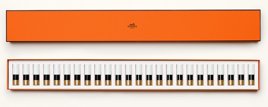
I have to say I wasn’t impressed with Touron’s reasoning for starting with a lipstick or its meaning. “I think the lipstick is special because it has the ability to reveal personality in a few seconds, in a single gesture, in just one application. Instantly, it reveals the colour of the personality. In a way, it exemplifies our conception of beauty: to reveal, not to transform. Hence the desire to start the Hermès Beauty with a lipstick collection. Also, perhaps because a lipstick concentrates in a very small size, our whole approach to the object, the colour, the material and the gesture in other words, some of the great fundamentals of Hermès.” Eh. I wish he had been honest rather than trying to spin it into something more profound than what it is: good business sense. Nearly all major cosmetic lines start with one product and it’s usually lipstick because it’s the most profitable makeup item and a good way to test the waters. Lipstick is really a barometer to see how the line is received and whether there’s interest in a full collection. As for the “gesture” nonsense it’s really just the brand’s tagline of “beauty is a gesture”, and I also think makeup can absolutely be transformative, even as it’s “revealing” one’s true colors. I did, however, enjoy the beautiful boxed set he came up with for the holiday season and his description of the relationship between color and music. The Piano Box set contains all 24 permanent shades. “Laid out in a line with their black and white lacquering, the lipsticks looked just like piano keys…for me, colors are like musical notes; they can be combined to create harmonies and resonance. More fundamentally, color, like music, is at the same time a precise system—like a frame, and something free, artistic, and deeply emotional.” That could explain why there are so many music-themed makeup objects!
(image from hermes.com)
Anyway, what’s especially interesting is that nearly every article claims this is the first time Hermès released lipstick. That is not true and I have the photos to prove it. A very kind Museum supporter on Instagram sent me images of a previous lipstick by Hermès. She’s not sure exactly when they came out, but according to newspaper articles it debuted in early 2001 in the U.S., selling for $25. The Wall Street Journal cited earlier reports that artistic director Pierre Alexis Dumas had suggested lipstick back in 2000 but that the company turned out not to be ready for a full line. “‘I think I was the one who suggested to my father [Jean-Louis Dumas, the late chairman and creative director of the house] that we should register the name for lipstick.’ They didn’t do it then—instead just once making a single shade of red lipstick in limited edition. They needed to think it through some more.” However, this photo shows a number on the lipstick which implies there were more shades. Perhaps in Europe, where this online friend of mine is based, offered more colors and in the U.S. we only got one.


(images from @amalia.vet)

In looking at the older lipstick and comparing it to the 2020 version, I must say the new line is far superior design-wise than Hermès’s previous attempt at makeup. It makes sense, since Touron, Hardy, Nagel, Dumas, along with Bali Barret, director of Hermès Women, spent 3 years bringing the cosmetics line to fruition. There wasn’t nearly as much fanfare or press for the earlier release, which leads me to believe it was more of a quick money grab led primarily by their marketing department without any real thought put into it – one can tell top executives and designers were not too hands-on. I’m all for minimal style, but the slim, plain packaging reads as very uninspired and not at all distinct from other brands, nor does it really capture Hermès’s vision. This could also be the reason why the line failed within a year – I saw no mention of it after March 2002 – and why nearly all the coverage for the new line omits any reference to their earlier foray into cosmetics. In hindsight, the company may see it as a mistake and prefer that it stays buried in newspaper archives…unfortunately for them, beauty aficionados don’t forget!
Anyway, as with other luxury makeup, many people will want to know whether Hermès lipstick is worth shelling out a significant amount of money for. On the surface, $67-$72 is an absurd price for a single lipstick. But as I noted with Louboutin nail polish, you’re not just paying for the product; you’re paying for the Hermès name along with all of the thoughtful details outlined above, not to mention that they are more affordable than nearly any other Hermès item (the leather cases for the lipsticks start at $340). Having said that, there are plenty of other quality lipsticks to choose from if you’re not into forking over some 70 bucks for the name or packaging. Most reviews have indicated that Hermès performs well although not necessarily better than other high-end brands, so splurging on one (or several) because of the luxurious feel makes sense. But I don’t believe any of the ingredients or technology in the product by itself warrant the price tag – beeswax, shea butter and mulberry extract are not that special, after all. Bottom line: if you’re wondering whether it’s worth it to buy these, yes, but only if you’re really into all the luxurious bells and whistles, a collector or if you love the brand. Again, if you just want a lipstick that performs well and don’t care about the label, pretty orange boxes and colorful tubes, there are many comparable lipsticks out there.

To conclude, I’m really enjoying Rouge Hermès despite the fact that I haven’t swatched any of the lipsticks I purchased (although it is very tempting!) You know I admire attention to detail when it comes to makeup packaging and design, and these tick every box. I also think these tie into the company’s aristocratic history but look much more approachable than I was expecting. I always perceived Hermès as a sort of blue-blood, old-money type brand – I mean, they started as a company that made fancy leather horse saddles and harnesses for people wealthy enough to consider equestrianism a hobby – but the modern and colorful design of the lipsticks proves they may not be as stuffy as I thought. Still, I’d like to see more adventurous shades and textures, i.e. their Malachite green or a glitter finish. And obviously they need more diversity in their advertising. I can’t say I’ve seen any, ahem, mature-looking models or anyone resembling a gender besides cis women, so hopefully they’ll branch out a bit while still keeping true to the brand’s heritage. A full makeup line is planned to be in place by 2023, so fingers crossed we’ll see some other interesting limited edition items…maybe a Birkin-embossed highlighter or one of their scarf patterns printed on the outer cases. 😉
What do you think of Rouge Hermès? Would you or have you tried them?
While not as spectacular as some of Armani’s previous holiday offerings, I was pleased enough with the Orient Excess palette to buy it. The palette comes with a sapphire blue velvet pouch.

Unlike the palettes from 2009 and 2008, there is no bling on the outer side of the case, but the deep blue is quite striking on its own.

Inside, Armani went for a simple cascade of thin vertical lines of varying lengths streaming from the top of the palette, some punctuated with stars. It’s an abstract design but still is reminiscent of holiday/winter motifs, like baubles dangling from a Christmas tree or perhaps icicles. Like the T.LeClerc Paris in Winter palette, the beauty of the design lies in its subtlety – no harsh colors or glitter, or even prominent shimmer.


The eye shadow tier:

Naturally I had to see whether there was any direct connection to Armani’s recent fashion shows. The fall ready-to-wear show was the inspiration for the Organica palette so it’s not from that. I checked the fall couture show and nope, there was nothing there either that would suggest any relation to the palette. So I went to the press release about the holiday collection and found this description: “To celebrate the end of the year, the Orient Excess collection invites you on an exotic journey to the snowy steppes of the Far North. These immaculate plains, covered in frost and stretching as far as the eye can see, inspired by Giorgio Armani Beauty to create a polar atmosphere through pure and intense make-up.” That certainly paints a picture and the highlighter does bring to mind some sort of frozen tundra-filled landscape, but there’s still no explicit reference to Armani clothing.
Then I came across an article announcing Armani’s Luxury White capsule collection. For a capsule it’s rather large, running the gamut from jackets and sweaters to shoes and bags. However, the color scheme is restrained, consisting only of variations of white and ivory. The variety of textures keeps the pieces interesting though, as alpaca, rabbit fur, silk, and three types of cashmere were used. As you can see from the sketches the collection’s title is apt. The fur-collared trench coat and the bathrobe (ooh, is it cashmere?) look particularly sumptuous to me. While there are only sketches of the clothing online, stock photos of some of the accessories were released, like a rabbit fur trimmed bag.
So while I have no quote from Armani about the link between this collection and the Orient Excess lineup, I’m pretty sure Luxury White was the inspiration, especially when you consider the model in the Orient Excess ad, who is swathed in white fur. There’s also a line from the aforementioned press release that calls to mind the extravagant textures used in the Luxury White collection: “Featuring a porcelain, universally translucent face powder for that essential, winter glow and a trio of eyeshadows, inspired by the softest mink, chinchilla and sable furs, to bring a touch of animal warmth to translucent skin.”

(image from beautyscene.nl)
What do you think of the Orient Excess palette? Think my theory about it being loosely based on the Luxury White collection holds any water?
This was a nice little surprise for spring – a collaboration between high-end French shoe designer Pierre Hardy and NARS. In my shoe-buying fantasies I'm more of a Louboutin/Prada girl, but I do appreciate the architectural, geometric quality of Hardy's work (more on that later).
The collection consists of 6 nail polish duos and two blushes. I picked up the duo in Sharks because of the beautiful lemon yellow. I actually would not have bought it though if it hadn't been for the very clever packaging.

Once I saw that the nail polishes were arranged on opposite ends and that they came with their own tiny dust bag (just like shoes!), I was smitten.


I was too lazy to swatch these but you can find swatches here.
Here are the two blushes in Boys Don't Cry and Rotonde:


(images from narscosmetics.com)
So what's up with the 3D cube pattern? Simply put, this cube motif has become Hardy's signature in both his fall 2012 and spring 2013 collections. From the landing page at his website…

(image from pierrehardy.com)
…to jewelry and bags (why yes, I will take that cuff bracelet in silver and/or rose gold, thank you!)

And, of course, shoes:

(images from barneys.com)
 (images from barneys.com and fashandfurn.com)
I'm still on the fence about the blushes. On the one hand, I like that NARS didn't go too literal and just put the cube pattern on the blush rather than embossing one of Hardy's actual pieces, like a shoe or a bag on it. On the other hand, that might have been pretty cool! The cube pattern is great, but by itself on a blush there's nothing that denotes it as being distinctly Pierre Hardy.
In any case, I was extremely impressed by how the colors in NARS collection so closely aligned with those in Hardy's spring 2013 lineup. The blush colors are similar to these bags:

The lavender and lemon yellow from the Sharks duo is borrowed from several pairs of shoes, including the ones in the promo image:

(image from myfacehunter.com)
And this low-heeled pump, which to my eye also looks like it contains the tan color from the Easy Walking duo:

(image from pierrehardy.com)

The duo in Venemous takes its cue from the grey and black in another cuff bracelet:

(images from narscosmetics.com)

(image from pierrehardy.com)
All in all, a well-done capsule collection. Did you pick up anything from it?
I spotted Les Tablettes de Bastet back in February at British Beauty Blogger and couldn't find it online anywhere. (As of this morning, however, it's available at the U.S. Dior website). Through my searching I came across Dior Beauty-Palazzo in Las Vegas, which advertised the palette on their Facebook page. Much as I hate Facebook, I was thrilled to see some mention of it at an actual boutique. My fingers couldn't dial the number fast enough!
Look how pretty they wrapped it for me.

The outer case is a sleek grey which beautifully compliments the heavy grey stone of the palette itself.


Insert:


Apparently only 1,450 were made. The edition number and Beaurin's signature are inscribed on the back.

The stone case is magnetized. I must say the two stone pieces clacking together made me nervous about the palette getting damaged.

Now that we've seen the pictures, I bet you're wondering what this palette is all about. Les Tablettes de Bastet was created by artist Vincent Beauin, who had previously taken part in Dior's "Lady Dior as seen by" project in which contemporary artists concocted their own interpretations of the iconic bag.
Dior Magazine (online) has a good summary of the inspiration for the palette. "Christian Dior loved artists; and when he himself was young, dreamt of
becoming an architect. From this childhood dream he would maintain an
overwhelming love for art and those who made it, becoming friends with
Jean Cocteau, Christian Bérard, Max Jacob and many more. The house of
Dior has continued to forge this direct link with the world of art,
regularly collaborating with numerous contemporary artists. Vincent
Beaurin, the French painter and sculptor, is the most recent to create
an original work for the house: 'Les Tablettes de Bastet', an eyeshadow
palette inspired by the Egyptian divinity Bastet, the goddess of music
and dance, of feasting and love, 'like a very ancient stone object that bears the traces of myth and ancestral practices,' according to the artist.
The palette is composed of two magnetized tablets in Trianon gray – one
of Christian Dior's favorite colors – of which one is punctuated with
three disks of natural pigments in shades of sapphire, saffron, and
silex. This artwork in the style of a devotional object expresses, for
Vincent Beaurin, the desire to place 'the practice of make-up in a much wider expanse of time than just a single season.' It's an ode to the color and sobriety, the purity and the
accessibility of art; a step into the core of the output of this French
artist's who, already in 2010, reinvented the Lady Dior as a green and red talisman made of polystyrene and quartz sand." Here is his take on the Lady Dior bag, if you're curious.

(image from dior.com)
This palette is an extension of Beaurin's previous work. In 2011 and 2012 he made several sculptures based on the Egyptian goddess Bastet. Beaurin's take on this goddess: "In ancient Egypt, Bastet was the daughter of the sun-god Ra. In the form of a cat or a woman with a cat’s head, she’s the goddess of music, dancing and feasting. She has the magic power which stimulate love. Bastet is the guardian goddess of women. She has fearsome fits of anger, because something feline is always lurking in her. So she’s identified with the dreadful Sekhmet, sent to earth to punish men for their arrogance. Bastet is a multi-faceted goddess, incarnating gentleness and fierceness."
-3000, 2012:


(images from behance.net)
Bastet, 2011:

In this view, you can see that Bastet's silhouette is replicated on the palette insert.

(images from laurentgodin.com)
Beaurin is also known for his "Spots", series of colored circles made of polystyrene and quartz sand mounted to the gallery's walls. The color combinations lead to a soothing, almost hypnotic effect. We can see the influence of Triptyque Bleu (2011) in the Dior palette:

(image from artslant.com)
Now, how does all this relate to the Dior palette? While I couldn't find out exactly why Beaurin opted to reinterpret ancient statues of Bastet or any in-depth explanations of his fascination with the goddess, this four-page interview at Beaurin's website is chock full of details about the Dior piece. Some of the more notable quotes:
– Beaurin sees the house of Dior as aligning closely with Bastet. "Dior is also a hieroglyph, a very old story, and why not, a story about a goddess."
– Beaurin's choice of the word "tablet" stems from his perception of
the word, which he believes "establishes a link between writing, memory
and ancient objects, often made of schist, on which people crushed pigments to produce eye make-up."
– In addition to expanding on the "Spots" works, the round shape for the colors was chosen so that they would be better suited to use of the palette. "Each colour is a fullness in itself. In a way, each colour is a world, a planet. Similarly, our eyes are round. The circle is a full shape. It recurs often in my work, perhaps precisely because it involves abstraction, going beyond form. Something
round also seems better adapted to the touch than something angular…A lot of people ask me if they can touch my pieces. This project is a way of answering them. You’ll notice that there’s no brush to take up the colour and apply it. Fingers are the sole tools, with the skin, here the eyelid, as the sole destination."
– The palette clearly expands on Beaurin's own work but also shows his
admiration for Jean Arp's biomorphic forms. "Through my project’s
simplicity, the weight of the tablets, the softness of the materials,
the warmth and intensity of the colours, by the involvement of a woman’s
body, her skin, mystery, the notion of space, and all the feelings
resulting from that, it has biomorphic echoes…eyelids are to female faces what wings are to butterflies."
– The most interesting part of the interview for me was the artist's explanation of the colors he chose. On making the palette consist of just three colors, he says, "Three colours are enough to create the interplay of a chromatic infinity, a whole complexity. Three monochrome disks on a grey ground make an abstract landscape." Indeed, this overview of Beaurin's work states that he creates abstract landscapes using the spots. The colors chosen by Beaurin – Saffron, Sapphire and Silex – are part of
his fascination with the shape of the letter S. And while Beaurin has
never been to Egypt, the colors function as a sort of "prism" – his
personal conception of Egypt is expressed through these particular hues. "The repetition of the S, the initial letter of the name of each colour, gives pace to the way the words are uttered, Saffron Sapphire Silex. This pace is part of the dynamics, of the relations occurring between the elements making up the landscape. I also like S for its design, two inverted spirals, an unfinished 8, and for its phonetics, the phonetics of silence…this object is also a vehicle, an instrument of sight and projection and–why not?—a sort of Egyptian prism." Additionally, the colors have "an atmospheric character" that show up best against the dark grey of the stone. Beaurin integrated the grey that Dior was so fond of, but also says he was influenced by Cezanne's love of working under grey skies as well as "the Ardennes sky, unchangingly grey, like slate roofs in the rain, turning ink-like or silver." He adds, [U]nder a grey sky or against a grey backdrop, colours come out unreservedly, without any tension. Grey helps to optimize the way we observe colours, their radiance, and their persistence when they disappear and their reactions when you put them together." Finally, Beaurin notes that while "Spots" typically combine two colors within each circle, the circles in the Dior palette are monochromatic. "The spots are part of a purely meditative and contemplative relationship…two colours are articulated. They meet each other and are mixed together in a zone of intense vibrations. The Bastet tablets are a sort of arrangement, where three disks of monochrome colour are in a way in orbit with each other. They are as if in mid-air and their encounter is waiting for desire and the intervention of the person whose eyelids will be the ideal surface for mixing them."
So there you have it. You can also check out this strange (and, like his Spots, quite hypnotic) video on the palette directed by Beaurin.
While I do love this piece, I think its appeal lies more with the art collector than the makeup fan. I honestly don't think a lot of beauty fiends would actually use it. Beaurin's color theories are intriguing and are implemented quite well in his artistic endeavors, but they don't necessarily translate to makeup – it's difficult to say how one would apply these colors, as they don't seem to be in harmony from a cosmetic standpoint. And while the magnetic closure is a sophisticated, artsy touch, I can tell you that without some sort of hinge to hold the two pieces of stone together, the palette would be a bit cumbersome to handle. Thus, unlike Dior's Anselm Reyle collaboration, this doesn't have a lot of mass appeal (but maybe it's not supposed to). Nevertheless I adore Les Tablettes de Bastet because it incorporates not only the two motifs ("Spots" and Bastet) that Beaurin is best known for, but also his entire artistic outlook.
What do you think?
Chanel released this palette for their fall 2012 collection. The sequin embroidery design is a duplicate of its predecessor from the spring 2007 collection.


With flash:

Unlike the 2007 Chanel Lumière d’Artifices palette, this beige version actually seems to be relevant to the brand’s fall 2012 couture collection. Dubbed “New Vintage” by designer Karl Lagerfeld, the collection “showcased the
extraordinary handwork which the house’s ateliers and the subsidiary
embroidery houses that Chanel now owns, are so capable of producing… ‘All
the tweeds are embroidery,’ Karl declared. ‘Three thousand hours for
some of them.’ Whilst some were created entirely from looped silken
threads and shimmering paillettes, others were sophisticated patchworks
of color-block plaids.”
Indeed, several examples of the “looped silken threads and shimmering paillettes” came down the runway. Even one of the hats showed sequins painstakingly sewn into the fabric. And not only were sequins in abundance, there were also variations of the subtle stripes of color seen on the palette. While I’m not thrilled that Chanel put out a palette that is, except for color, the same one released over five years ago, I was pleased to see that it was consistent with the couture collection.
Like the revamped Tailleur Bar palette, Dior seemingly has recycled another palette from seasons past. The fall 2012 makeup collection, entitled Golden Jungle, contains a leopard print palette that borrows from the Mitzah palette from last fall. Actually there are two leopard palettes, Golden Khaki and Golden Browns, but only the latter was released in the U.S. I would have liked to have both but ultimately decided it wasn’t worth tracking down Golden Khaki.
Here it is, just for fun:

(image from retailtherapy.onsugar.com)
And here is Golden Browns.


I noticed that this particular leopard spot is exactly the same as the one that’s in the middle of the Mitzah palette.

Anyway, here is the Golden Browns palette with flash:


Unfortunately, the U.S. also did not receive this cool nail duo that yields a crocodile skin effect, which is a nice addition to a jungle-themed collection.
(image from retailtherapy.onsugar.com)
According to the collection’s press release, Dior’s famous leopard print has been “revamped”: “In February 1947, Christian Dior presented his first collection to the international press in the Dior salons of Avenue Montaigne in Paris. Along with the Huit and Corolle lines that would inaugurate the era of ‘The New Look,’ the couturier revealed another of his favourite themes: Leopard Print. Fashion editors were smitten, the
room burst into applause and women rediscovered the mysterious allure of this iconic, timeless print. At once avant-garde, sophisticated and sensual, the Jungle Motif has been a signature of the House of Dior from its debut. Actress Marlene Dietrich and the muse and friend of Mr. Dior, Mitzah Bricard, were its first fervent ambassadors. With each decade and runway show, variations of leopard print are cleverly reinterpreted by Dior Couture. In the Dior Autumn/Winter 2012 makeup collection, Tyen revamps the Jungle Motif with another hallmark of Dior, a touch of shimmering gold, embodying the luxury of the urban jungle and inspired by the deep, earthy tones of the jungle.”
I’m not sure why they chose to revamp it this for this season, as leopard print did not make an appearance in either the ready-to-wear or couture shows. However, there was some houndstooth pieces at the ready-to-wear show.
Why not have used that instead of essentially copying the Mitzah palette from last year? Sigh. Dior Beauty had been on a hot streak collectible-wise but this season the company is just recycling previous items. I hope they return to originality and come up with something that pays homage to the designer but isn’t a rehash of what they’ve done before.
We’ve seen crocodile-patterned palettes before, but I thought the print looked particularly smashing on the gold outer casing of YSL’s Palette Couture for fall 2012. Very luxe!

Apparently crocodile is the “emblem of the YSL accessories and leather goods collection,” according to the press release. I don’t know why they never used it on a makeup item before.


With flash:

While I think crocodile-themed items always make a good addition to the Makeup Museum, I was disappointed that this was more or less a rehash of YSL’s summer 2012 bronzers:

(image from nordstrom.com)
Plus, there was no crocodile to be found anywhere for the fall 2012 ready to wear show. The look was supposed to be “contemporary Amazon” (which was also the theme for the fall 2012 makeup collection). The strong shoulder contours and metal chain mail accompanied by dark blood-red lips and slicked-back hair definitely evoked fierce women warriors. But what really stood out to me was the use of calla lillies. According to Style.com writer Tim Blanks, “Backless dresses in a chain mail made of metal and rubber were the ultimate expression of [designer Stefano] Pilati’s hypersexualized vision. So he naturally picked the calla lily, Roman symbol of lust, as the floral accent for the collection.”
I think that these flowers would have made a more interesting and relevant design for the palette than crocodile print. What do you think?

The glitz and glamour of the holiday season are fast approaching, so today I'm looking at the oh-so-sparkly Night Diamond palette by Dior. Adorned in big clear crystals, the sparkliness continues on the interior of the palette – it's filled with a glowy highlighting powder that will come in handy for all those fancy holiday parties. I have to admit that at first glance I didn't think this was anything special, particularly after I saw it in person. It just looked like a compact with a lot of overly large cheap fake crystals glued onto it, making it seem, dare I say, a bit tacky. The compact is apparently inspired by Dior's "On the Rocks" sunglasses collection, which features the same crystals on the stems of the glasses (see photo below). But I was pleased to see that the concept behind one of Dior's fashion accessories was carried over into the makeup line of the brand, since Dior can be hit or miss when it comes to articulating their vision clearly in cosmetics. While these big faux gems don't appeal to me personally (which is why I'm still debating purchasing it for the Museum), Dior made a very fitting choice in grafting the crystals from their sunglasses onto a palette that's being marketed for the holiday season.
(photo from amazon.com)
 It's finally fall here in the Curator's neck of the woods – time for cold-weather fabrics like corduroy, cashmere and tweed, so I thought I'd look at Chanel's Pink Lamé palette. Released in the fall of 2006, the palette features a pink tweed pattern with silver and gold running throughout.
As with the Camellias palettes, Chanel took one of its signature fashion symbols and placed it onto a makeup item. While tweed obviously isn't an exclusive Chanel fabric, the tweed Chanel jacket is considered a classic and makes an appearance in nearly every seasonal collection.
I had been thinking for a while how cool it would be to have this tweed pattern repeated in other items within the line, and it looks like the company was reading my mind. Chanel has just released new blushes with tweed patterns on them. So if you missed the limited-edition Pink Lamé (and can't afford a Chanel tweed jacket) you can still get your Chanel tweed fix in these new blushes!

(photo from neimanmarcus.com)
In honor of the 30th anniversary of YSL's Opium1 fragrance, the company released a limited-edition bottle and palette in the fall of 2007. The palette features a red lacquered case with an exquisite phoenix and floral details.

While I'm not really sure what the reddish orange dot on the interior is supposed to represent, it could just be referring to the circle on the fragrance bottles themselves:

(photos from yslbeautyus.com)
The iconography of the phoenix is a little strange – maybe it's meant to represent the "rebirth" of the fragrance, but truthfully I can't find any concrete explanation of why the company went with a phoenix.
In any case, I can understand why they would have released this to go with the fragrance's anniversary, but that doesn't quite explain why they came out with a limited-edition Opium fragrance bottle and a palette featuring a matching design in the fall of 2006.
Both the bottle and the palette are adorned with a beautiful lotus flower, because, according to the company, the bloom represents “purity and splendour." That's all well and good, but I think it would have been more interesting if they included a flower whose scent is one of the notes in the perfume, or if they wanted to be really adventurous, a poppy flower.1 ;) Plus I'm not sure what "purity and splendour" have to do with the fragrance considering the Sephora description for it:
"Rarely in the history of fragrance has a creation embodied such enchantment, mystery, magic, and exoticism…Opium symbolizes Yves Saint Laurent's fascination with the Orient and his unique understanding of a woman's hidden emotions and inexplicable passions." I think in this case though, "Orient" refers to China, since the company introduced many China-inspired fragrances in recent years.
Over all, both of these palettes represent the designer's "fascination with the Orient" and the spirit of the Opium fragrance – I like that the same image was used for both the perfume bottles and palettes. And they're simply gorgeous to look at!
1Allure reported that there was an entire museum exhibition devoted to the 30th anniversary of Opium in Paris, complete with a faux opium den. The curator is most upset she was not able to attend!
2 For a perfume blogger's perspective on the fragrance, click here.

