Around this time 2 years ago I got my first tattoos. In honor of that momentous occasion, I thought I'd take a look at a vintage brand that featured some truly wild advertising. I had come across Tattoo years ago, as well as its sister line Savage, and was immediately struck by the images used in their ads and on the products themselves. I managed to snag two of the ads, as well as the lipstick case and rouge container. Given their tropical feel I had originally intended on including them in the summer exhibition, but upon closer inspection I decided against it. Let's see why, shall we?
Sadly I was unable to make out the name of the illustrator who created the imagery on this one. It's something with an R, but beyond that I'm completely lost.
This one is by John LaGatta (1894-1977), and as you can tell by the publication name and spelling of "colour", appeared in a British magazine.
As with Po-go Rouge, the compact is teeny compared to today's blushes.
The puff is imprinted with the same design.
There was another compact with "U.S.A." inscribed beneath the Tattoo name. (Of course, I totally forgot I had this one and ended up with two…I could be wrong, but I don't think the "U.S.A." imprint presents any real significance; I believe it's just a slight change in production.)
There was also a difference in the bottoms of the compacts. The one with U.S.A. on the front doesn't have any inscription on the back. Again, I don't think there's any real significance to this, just a negligible difference in the manufacturing.
What IS an interesting difference, however, is an alternate design on the lipstick and rouge. It appears these were sold around the same time as the more commonly seen design. It may have been a mini version, but I'm not sure.
This is the only ad I found in which the alternate design appeared. It's from 1947, so maybe it only showed up towards the end of Tattoo's reign (the latest newspaper ad for Tattoo was from September 1949).
I also own a Savage powder box, which you might remember from this post and then its later appearance in the 2015 summer exhibition. I deeply regret including it now.
I don't have the complete story of Tattoo/Savage, but thanks to Collecting Vintage Compacts and what I was able to cobble together from old newspaper ads, the lines were introduced in the early 1930s by James Leslie Younghusband, a Canadian military/stunt pilot turned Chicago-based businessman. Younghusband was the brains behind another "indelible" lipstick line called Kissproof, which he invented in 1923. Despite its poisonous ingredients, the lipstick was sold until the early 1940s. I'm not sure why Younghusband felt compelled to develop not one but two "permanent" lipstick brands while Kissproof was still being sold, since I've compared the copy from the Tattoo and Savage ads to the Kissproof ones and all touted them as long-wearing lipsticks that were also comfortable to wear – formula-wise, there doesn't seem to be much difference. The author of Collecting Vintage Compacts has promised a second installment about Younghusband and the launch of Tattoo and Savage so I'll update this post with additional information, but in the meantime I wanted to share some thoughts and other questions I have about these lines.
First, I'm not going to dance around the obvious here: there's no way any company could get away with this sort of fetishizing of "exotic" people and cultures today. The ads and product design certainly are eye-catching – who wouldn't want to wear colors inspired by a tropical paradise? - but when you look closely and read the ad copy, you realize how racist they are. Tattoo and Savage represent the pinnacle of white men's fantasies about "native" women's sexuality, which in their minds is completely untamed and animal-like. By wearing lipstick shades appropriated from these "uncivilized" cultures, white ladies can show off their racy side while still adhering to traditional American/European standards of female decorum. Take, for example, the copy in this ad. "From South Sea maidens, whom you know as the most glamorous women on earth, comes the secret of making and keeping lips excitingly lovely and everlastingly youthful. In that land where romance is really real, you'll naturally find no coated, pasty lips. Instead, you'll find them gorgeously tattooed! Not with a needle, but with a sweet, exotic red stain made from the berries of the passion-fruit…Tattoo is the civilized version of this marvelous idea." Yes, it's so very uncivilized to wear a lip stain made of crushed berries – only cavewomen do that!1
Savage is even more blatantly racist, highlighting the fact that their colors were inspired by "primitive, savage love".
And their reds are "paganly appealing hues that stir the senses…rapturous, primitive reds, each as certainly seductive as a jungle rhythm." Bonus points for this ad linking "wickedness" to indigenous cultures.
The Tattoo ads (including the two I own) feature a variety of tan-skinned women catering to pale white women, imagery that dates back at least to the Renaissance and is still used today in an effort to make a scene appear "historically accurate." You'll notice that these particular women are depicted in stereotypical garb that existed solely in white people's imaginations, i.e. hula skirts and flower necklaces. And just to further the idea of their supposedly insatiable lust, they are also shown topless. Women of color are reduced to othered, highly sexualized props whose only purpose is to serve white women. (Somewhat unrelated, but if you want to take a gander at the lipstick display shown in this ad, you can see it here. I remember one popped up on ebay a couple years ago with an starting bid of a mere $199.99.)
More proof: the ideal "Tattoo girl" was white and blond.
Savage also threw in a nod to colonization with the use of "conquer".
All of this begs the question of what Younghusband was trying to accomplish with these lines.* Indelible lipstick was all the rage in the '20s and '30s; no doubt Younghusband's company faced stiff competition from the likes of Tangee and others. Perhaps he felt that this manner of cultural appropriation, i.e. creating what was probably the decade's most risqué and raciest makeup line by portraying the indigenous people of the South Pacific as feral and completely unfettered by "civilized" society's code of conduct, and then offering white women a socially acceptable way to channel that imagined freedom via lipstick, was the best way to stand out in a crowded market. The ads repeat words like "thrilling", "maddening", and suggests that the color will last through late-night activity. Sounds very exciting, yes?
The other possible reason Younghusband looked towards the South Pacific was the rise of tourism to Hawaii and other islands during the 1930s. As the blog author of Witness to Fashion astutely points out in a post on Tattoo, the increased tourism heralded a cultural love affair with anything tropical. "Tourism to Hawaii, via luxurious cruise ships, increased in the 1930s. The “white ships” of the Matson Line sailed from San Francisco to Hawaii and the South Seas. Quite a few movies with a tropical setting were made in the thirties, including Mutiny on the Bounty (1935), The Hurricane (1937) and Her Jungle Love (1938) — both starring queen-of-the-sarong Dorothy Lamour, Charlie Chan in Honolulu (1938), and Honolulu (1939). Bing Crosby and his movie Waikiki Wedding (1937) popularized the song 'Sweet Leilani,' written in 1934." Sounds plausible.
Getting back to my other questions, I'm unclear on the difference between the Tattoo and Savage lines, or why Younghusband would launch both nearly simultaneously. As I noted previously, there doesn't seem to be an appreciable difference between the two, and they were released at approximately the same time – around 1933 for Tattoo and 1934 for Savage. Tattoo lasted till about 1949, while the last newspaper ad I found for Savage dates to October 1941. At first I thought perhaps Savage was a drugstore line, whereas Tattoo was sold only in department stores, since their respective prices were 20 cents and one dollar. This 1939 Gimbel's ad for Savage, however, kills that theory.
Finally, and you may be wondering this as well, why on earth did I knowingly purchase such racist items for the Museum and then choose to blog about them? Unfortunately I can't really answer that myself. It's not like I wasn't familiar with these lines or thought they were okay and then realized they weren't, which has happenedbefore. I also like to consider myself at least somewhat conscious about racial and cultural appropriation issues within the beauty industry. I guess I thought that, distasteful though they are, they're important from a historical perspective. I wanted to have tangible reminders of what was acceptable back then. Items like this also help me remember to be a little more mindful when purchasing contemporary pieces. So while I've made the decision not to feature such items in exhibitions, since it dawned on me that I prefer exhibitions to have more of a celebratory spirit and racist beauty products aren't things I necessarily want to champion, I think a cosmetics museum should have these types of items and open a dialogue about the ugly side of the beauty industry and its history. My main goal for the Museum is for it to serve as a happy, magical place full of wonderful and beautiful things, but sometimes it's necessary to take a good hard look at some of the problematic issues within the world of cosmetics.
Well, that's enough of my blather, except to say that I'm sorry I don't have more concrete information on these lines – hopefully Collecting Vintage Compacts will shed further light on them. Thoughts?
1 While I was poking about at newspapers.com I came across an article from 1934 that serves as historical evidence of how indigenous people were viewed by Americans/Europeans in the '30s. This one tells the tale of one young woman "explorer" (read: colonizer) who attempted to "civilize" the "ferocious Amazonians" in South America by bringing them cosmetics. I literally can't even with this.
2I do really wonder what the hell was wrong with Younghusband. In the news articles I found, his first wife passed away in 1927, and he went on to remarry 4 different women in the span of 13 years, all of whom accused him of adultery. The rough timeline is that he divorced the 2nd wife in 1931, married his third in April 1933 and divorced her in 1935. I'm not sure about the 4th wife, but in November of 1937 he married his fifth. A 1950 article regarding the divorce of his 5th wife states that he went so far as to "spend thousands of dollars on detectives, photographers, wire tappers and gigolos in attempt to frame [his wife] in an embarrassing position in a Florida hotel so he could gather divorce evidence." What a psycho. The same article also claims that during the wedding, Younghusband hit a police reporter in the head after inviting him to cover the wedding. So yeah, something wasn't right with this guy, and it's not just the rampant racism in his company's lipstick lines.
Save
Save
Before I get to my review of Susan Stewart's Painted Faces, I must disclose that I received a copy for free from the author. In no way, shape or form did getting it for free influence my review, nor was it intended as a bribe for a positive one – I believe I was given a copy in exchange for me lending photos of some of the Museum's collection to be included in the book. Not only did Dr. Stewart provide an autograph, she also included me in the acknowledgements, which was incredibly kind.
Again though, I'd like to reiterate that this did not sway my opinion of the book at all. Now that that's out of the way, I can dive into the review.
The goal of Painted Faces is much the same as Lisa Eldridge's Face Paint in that it strives to provide a history of makeup from ancient times to the present day. However, a trained scholar/historian approaches this vast topic in a markedly different way than a makeup artist such as Eldridge. Neither perspective is better or worse than the other; ways to tell the story of makeup are nearly as varied as the people who wear it. Nor do I believe one has to have a set of particular credentials to write accurately and compellingly about makeup history, as I believe it comes down to a matter of preference for a certain writing style. As we saw with her first book, Painted Faces is more academic than Face Paint and relies on highlighting the economic and sociological aspects behind various beauty practices, whereas Eldridge adopts a more artistic tone, choosing instead to communicate makeup's history by focusing on application and styles as they evolved.
Stewart begins with an introduction (which also serves as the first chapter) summarizing the need to study makeup and beauty practices as it gives valuable insight into history that we may not have considered before. "Because of its wider significance, researching makeup, its uses, ingredients, its context and application, can provide clues not only to the nature and circumstance of the individual but can also help us to interpret the social, economic and political condition of society as a whole in any given period. That is to say, studying cosmetics can further our understanding of history…they are a window into the past and can encapsulate the hopes and ideas of the future. In short, makeup matters" (p. 8 and 10). Can I get an amen?! Stewart also carefully sets the parameters for the book, outlining the sources used and why she is primarily writing about cosmetics in the Western world.
Chapter 2 is essentially a condensed version of Stewart's previous tome on cosmetics in the ancient world, which doesn't need to be rehashed here (you can check out my review of that one to peruse the content). That's no small feat, considering how thorough it was. The next chapter covers the Middle Ages, which is interesting in and of itself since so little information about makeup and beauty exist from this era. As Stewart points out, the rise of Christianity meant people were no longer being interred with their possessions as they were in ancient Greece and Rome – these artifacts provided a wealth of knowledge about beauty practices then. Thus, any time after the spread of Christianity and before the modern age historians must rely primarily on texts, such as surviving beauty recipes and classic literature, rather than objects to infer any information about the use of makeup and other beauty items. The dominance of this religion also meant even more impossible beauty standards for women and more shame for daring to participate in beauty rituals. "According to medieval religious ideology, wearing makeup was not only the deceitful and immoral – it was a crime against God" (p. 60). The other interesting, albeit twisted way Christianity affected beauty is the relentless belief that unblemished skin = moral person. Something as innocuous as freckles were the mark of the devil, and most women went to great lengths to get rid of them or cover them so as not be accused of being a witch. I shudder thinking about those who were affected by acne.
Chapter 4, which discusses beauty in the late 15th and early 16th centuries (i.e., approximately the Renaissance) presents the continuation of certain beauty standards – pale, unblemished skin on both the face and hands, a high forehead, barely there blush and a hint of natural color on the lips- as well as judgement of those who wore cosmetics. As we saw previously, it's the old "look perfect but don't use makeup to achieve said perfection" deal – women who wore makeup were viewed as dishonest, vain sinners. But one's looks mattered greatly in the acquisition of a husband, so many women didn't have a choice. "Clearly a woman had to get her makeup just right not simply for maximum effect but to avoid getting it wrong and spoiling the illusion of youth and beauty entirely, a fault that could cost her dearly in terms of wealth, status and security" (p. 94).
However, there were some notable differences between the Renaissance and medieval periods. For starters, due to inventions such as the printing press, beauty recipes were able to be much more widely disseminated than they were previously. Increased trade meant more people could get their hands on ingredients for these recipes. Both of these developments led to women below the higher rungs of society (i.e. the middle class) to start wearing cosmetics. So widespread was cosmetics usage at this point, Stewart notes, that the question became what kind of makeup to wear instead of whether to wear it at all.
This chapter was probably the most similar to those on Renaissance beauty in Sarah Jane Downing's book, Beauty and Cosmetics: 1550-1950. Given the lack of information regarding cosmetics during this time period, both authors had to draw on the same sources to describe beauty habits. However, as with Eldridge, the approaches Downing and Stewart take are slightly different. Once again, Stewart opts for a straighter historical approach whereas Downing looks more to paintings and literature of the time, and doesn't take quite as deep a dive into the larger social and economic forces at work. There's also not much overlap between the descriptions of recipes and techniques, as you'll find different ones in each book. For example, one that was mentioned only in passing in Downing's book was using egg white to set makeup. I'm thinking of it as a early version of an illuminating setting spray (although obviously it was brushed on, not sprayed in a bottle) as it lent a slightly luminous, glazed sheen. Stewart points out that it also caused one's face to crack, thereby eliminating the wearer's ability to make any sort of facial expression. It seems certain beauty treatments, whether egg white or Botox, occasionally come with the side effect of suppressing women's expression of emotion. Coincidence? I think not.
Chapters 5 and 6 are tidily sequential, discussing beauty during the the 17th and 18th centuries, respectively. As in the Renaissance, both eras witnessed significant growth in the number of women who wore makeup due to technological advances and increased trade. Growing literacy rates drove demand for the new medium of ladies' magazines. Pharmacies selling raw materials to make beauty treatments had started to crop up in the 17th century and their numbers increased dramatically by the beginning of the 18th century. Not only that, pharmacies and chemists started offering their own pre-made formulas, and these goods became commercially exported to other countries. The widespread sale of these products came with several undesirable effects: counterfeit cosmetics and downright false claims about the product's efficacy.
The 1700s also saw the rise of excessive, decidedly unnatural makeup being worn by members of the aristocracy in both France and England, followed by a post-French Revolution return to more subtle makeup in the early 1800s. This brings us to Chapter 7, which outlines the myriad changes leading to what would become the modern beauty industry, including department stores, industrialization and the new commercial market of the U.S. As for beauty standards, a natural look was still strongly preferred by both men and women, with the emphasis in terms of products on skincare rather than color cosmetics. Here's a literal lightbulb moment: despite my research on Shiseido's color-correcting powders, in which I learned some were meant to counterbalance the effects of harsh lighting, I had completely overlooked the influence of artificial light on the skyrocketing production of face powders. "Suffice it to say that in the early years of the twentieth century, the use of artificial light in homes of the wealthy as well as in public places such as theatres and concert halls would become more widespread, in the latter years of the nineteenth century there was already an understanding that to make the best impression, makeup needed adjusting to suit the light, whether it be natural or artificial" (p.198).
Chapter 8 leads us into the 20th century. While there are more detailed accounts of makeup during this time, Stewart does an excellent job describing the major cultural and technological influences that shaped modern beauty trends and the industry as a whole. I was very impressed with how she was able to narrow down the key points about 20th century beauty without regurgitating or simply summarizing other people's work. Some of the information presented is familiar, of course, but the manner in which it's arranged and categorized sets it apart. It just goes to show that everyone's individual background equals an infinite number of ways to tell the story of makeup.
I'm partial to this chapter since the items I took photos of for the book are all from the 20th century. :)
Here are some powder boxes on the dust jacket.
While I was deliriously happy to see some of the Museum's items in a real published book and get credited for them, I was also pleased to see photos of other pieces as well. Their inclusion in addition to illustrations was a bit of an upgrade to Stewart's previous book. This is a minor issue to be sure, as I believe solid writing more than makes up for a lack of photos, but they are a nice touch if available.
The last chapter serves as an addendum in which Stewart reflects on how the past, present and future of beauty are linked, noting that while some things have stayed the same – the use of ancient ingredients in modern formulas, the connection between health and beauty – 21st century attitudes towards cosmetics represent a significant change from earlier times.
Overall, this is a more scholarly history of makeup than we've seen before, but by no means dry and boring. Stewart's gift for wading through hundreds of historical documents and neatly consolidating the major social, economic and cultural forces that shaped makeup's history, all while sharing fascinating snippets such as ancient beauty recipes and anecdotes from people who lived during the various eras she covered, makes for a thoroughly engaging read.
Will you be picking this one up?
Save
Save
Save
Save
Save
"It never dawned on me not to do something because I was a woman…I thought nothing of approaching men like Vincent Bendix, the airplane manufacturer for whom the transcontinental air race was named, to explain my position: 'I can fly as well as any man entered in that race.' I didn't see it as being boastful so much as speaking the truth. I learned through hard work and hard living that if I didn't speak the truth about myself, no one else would fill in the missing pieces." – Jacqueline Cochran
As with Tommy Lewis and Richard Hudnut, I found a very interesting piece of makeup history completely by chance. I was thinking how cool it would be to see some mid-century modern designers' work on makeup packaging, i.e. Alexander Girard, Charley Harper and Paul Rand. On a whim I typed in "Paul Rand makeup" into Google (I think I was under the impression that I could somehow will makeup packaging with his work into being if I just believed hard enough) and lo and behold, a bunch of ads he had designed for a brand called Jacqueline Cochran Cosmetics popped up. I had never heard of it so I searched for just Cochran's name…and was mighty confused by the results.
Jacqueline Cochran (1906?-1980) was a pioneer of aviation in the 20th century, a.k.a. an aviatrix (don't you just love that word?! So bad-ass!) A contemporary of Amelia Earhart, Cochran set world records for flying from the '30s through the '60s, including:
The first woman to enter the famous Bendrix race in 1935, and the first to win in 1938
The first woman to fly a bomber across the Atlantic in 1941
The first woman civilian to earn the Distinguished Service Medal for serving as the director of the Women's Air Force Service Pilots (WASPs) and training women pilots in WWII
The first woman to break the sound barrier in 1953
The first living woman to be inducted into the Aviation Hall of Fame in 1971
Further along in my search I discovered that this amazing woman was, in fact, the same Jacqueline Cochran as the one behind the cosmetics line. While I don't wish to diminish her accomplishments as a pilot, obviously I'm more interested in telling the story of her makeup company. As we'll see, Cochran may never have gotten into flying if it wasn't for her interest in cosmetics.
It seems like I'm sharing too much of Cochran's early life, but I promise it's relevant! Jackie Cochran (original name Bessie Lee Pittman1) was born an orphan around 1906 in Florida. The exact year is unknown because she didn't have a birth certificate. Adopted by an impoverished foster family, Cochran worked throughout basically her entire childhood. When I say "impoverished" I don't mean the family couldn't afford multiple cars; I mean they literally didn't know when or if their next meal would come, and the children's clothing consisted of flour sacks stitched together. In 1914 the family relocated to Columbus, Georgia to work at a cotton mill, children included. At the age of 14 she experienced her first foray into the beauty industry by taking on the role of "beauty operator" at a local salon, learning how to operate the perming machines and dyeing clients' hair. A traveling salesman for a perm machine knocked on the door one day and offered her a job as an operator in Montgomery, Alabama, and off she went. (I can't even imagine going to a strange town with not a penny in my pocket and knowing nearly zero people, especially at 15.) One of her regular customers suggested she go to nursing school despite the fact that Cochran only had a third-grade education. After deciding nursing wasn't the career for her, Cochran moved to New York and landed a job at Antoine's, a high-end salon located within Saks department store. I'm astonished at how hard Cochran had to work just to survive, and though sheer grit and fierce will to succeed, she was able to make a slightly better life for herself as a teenager than as a child. (You really need to read her autobiography, which is where I'm getting most of this information2 – the courage and determination she had were mind-blowing, yet she presents it in a very matter-of-fact manner, not in any sort of bragging or "woe is me" way. When a group of school girls asked why she was so ambitious, she straightforwardly replied, "poverty and hunger").
It was at a party in 1932 where she met her future husband, millionaire lawyer and businessman Floyd Odlum. Cochran was completely unaware of his background (and wealth) at the time, but was immediately attracted to him. The party's host introduced them, and during their chat, Cochran mentioned her desire to get out of the salon. "I've been thinking about leaving Antoine's to go on the road selling cosmetics for a manufacturer…the shop can be so confining and the customers so frustrating and what I really love to do is travel. I want to be out in the air." To which Odlum replied, "If you're going to cover the kind of territory you need to cover in order to make money in this kind of economic climate, you'll need wings. Get your pilot's license" (p. 57). And with that, Cochran took flying lessons and earned her pilot's license in a mere 3 weeks – setting records right from the start of her aviation career. In 1935 she officially established her eponymous line, which was meant for a more active woman who wanted to have adventures but also look polished while doing so. (Not that women need to look polished, or even require makeup to look polished, of course.) The brand's use of "wings to beauty" and claim that a full beauty routine takes just a few minutes a day suggest that it was a brand intended for the busy go-getter, perhaps even an early version of athleisure beauty. Indeed, both the ads and Cochran's own words in a 1938 interview demonstrate a no-nonsense, time-saving approach to beauty – ever practical, she skipped blush while flying. Says the article, "Mandarin fingernails and artificial eyelashes are ceiling zero to [Cochran]. 'You get pale at high altitudes,' she explains. So rouge just stands out in one big spot.' Likes an eye cream to 'keep my eyelids from drying'. There's a foundation cream with an oil base. 'Your skin gets dry in high altitudes.' Then lipstick and powder. That's all. In summer, she likes a grease make-up – foundation cream that makes you look all bright and shiny and is worn without any powder. 'Just a touch of paste rouge and your lipstick. It's young-looking and very attractive with sports clothes.'" I think Cochran definitely would be a fan of athleisure makeup today, as she seemed to prefer a minimal, fresh-faced look.
Some more of her musings on makeup: "I'm feminine but I can't say that I was ever a feminist…I refused to get out of the plane [after a crash in Bucharest] until I had removed my flying suit and used my cosmetics kit. That was feminine and it was natural for me. It gave me the pick-me-up I needed and I wasn't ashamed to do it. I didn't want to be a man. I just wanted to fly" (p. 20). Though she says otherwise, Cochran's actions most definitely paint a feminist picture. I'm seeing her reapplication of makeup following a crash as more of a coping technique and less "I need to look pretty". As we'll see, however, later advertising for the brand took a decidedly ageist turn.3
The brand was also a reflection of Cochran's unstoppable determination and desire to innovate. "I wanted no part of other people's products because I was crazy enough then to think I could do better…when I first set about to develop a greaseless night cream, I was told that a greaseless lubricant was clearly impossible. I knew they were wrong and I never recognized the word impossible. My most successful cream, Flowing Velvet, is the result of my stubbornness" (p. 119). Flowing Velvet was possibly the first moisturizer on the market intended to replenish the skin in high altitudes and extreme travel distances – i.e. long flights. It was introduced around 1942 and the line expanded in the '50s to include face powder and lipstick. Sadly, the advertising greatly contradicts Cochran's own words, as it seems to be geared towards ancient ladies over the age of 20 (!) trying to regain their youthful glow.
I couldn't locate a jar of the famous cream, but I did scrounge up a powder refill from the early '60s.
One of the most unique products Cochran came up with was the "perk-up stick", which contained 5 beauty products in a tiny cylinder for on-the-go usage. "I was proud of what we used to the Jacqueline Cochran 'Perk-Up' cylinder. I would take one on all my trips, on all my races. It was a three-and-a-half inch stick that came apart into five separate compartments for weekends or trips. It would fit anywhere and it had everything" (p. 119).
I was fortunate enough to snag one of these for the Museum.
I've taken most of it apart so you can see what it looks like. I couldn't get some of the compartments open and didn't want to break it, but all of the ones I did open still had product left.
At one point it had a sifter for the powder so that it didn't spill out when you opened the compartment.
The Perk-Up Stick also came with a little spatula so you could refill it as needed and hygienically apply everything. While the concept seems genius (seriously, why aren't companies now coming up with things like this?!) one must remember that products in the first half of the 20th century were generally smaller and more streamlined – no big huge honkin' palettes back then. And refillable packaging was way more common. In thinking about the lovely compacts I've collected over the years, I'm remembering that people didn't throw them out, they just popped in a refill. Still, the Perk-Up stick is unlike anything I've seen, contemporary or vintage. As the author of Blue Velvet Vintage notes, the closest thing we have today to the Perk-Up Stick are stackable jars.
I also purchased one more piece from the early '60s. However, the photo below is not mine, for you see, I bought not one but TWO of these compacts, yet ended up with none. I bought one in late February, only for USPS to claim it had been delivered when it had not…and then a few weeks later when it still didn't resurface, I found another floating around on Ebay and bought it to replace the lost one. Despite being from a totally different seller in a completely different part of the country, somehow USPS lost the replacement as well. How they managed to do that I have no idea – perhaps this compact is cursed. There are others available for sale but they're not in as good condition as the ones I purchased, and at this point I'm not willing to invest any more money into it. Nevertheless it would have been a nice piece to have in the collection.
As for the Paul Rand ads, despite reading almost as much as I could find on Cochran, I'm still not clear on how the partnership with Rand started. I do know that I'm in love with the ads.
As this exhibition catalogue shows, I'm missing a few more of his ads, alas.
One observation I had in looking at these was that as heavily as the Chromoblend powder was marketed throughout the '40s – given the abundance of ads I'm imagining this was one of the pillars of the line in addition to Flowing Velvet – I couldn't find any jars to actually buy. I'm wondering if custom blend face powder king Charles of the Ritz was too stiff a competition. Did Cochran launch her own custom face powder as a way of thumbing her nose at his company and trying to prove that, once and for all, her product was superior? While it's unclear which Charles she was referring to, Cochran recalls her meeting with him less than fondly. "What an irritating snob of a man Mr. Charles was. I made the interview worse by insisting outright that I was an expert at everything. He didn't believe me. I didn't look old enough to be expert at anything, he said. We were two big egos out to prove who is bigger, better. In fact, I told Charles of the Ritz that not only was I good, I was probably better than he was. That amused him for a minute, but he was not so amused when I wanted fifty percent commission on every customer I had in his salon…it makes me smile to think that the cosmetics company I would found several years later, Jacqueline Cochran Cosmetics, still competes with Charles of the Ritz" (p. 55).
The overall concept of going to a counter and having custom face powder blended is remarkably similar.
The use of the spatula in this ad and the idea of making custom powder "while you wait and watch" is also nearly identical to Charles of the Ritz's ads.
So what happened to Jacqueline Cochran Cosmetics after its heyday in the '40s and '50s? Cochran sold the company in 1963 to American Cyanamid Co. It was then formally acquired by Shulton, a subsidiary of American Cyanamid, in 1965. Unfortunately the ageism continued to run rampant in ads throughout the '60s.
At least they were still touting a speedy beauty routine for women who don't have much time to devote to skincare. Then again, sitting around and drinking tea doesn't exactly scream "busy". Like, they couldn't have shown a woman on her way to work or engaged in a sport of some kind?
But making women terrified of aging must have been effective, since the Flowing Velvet line was popular enough to continue expanding to include eye makeup and lip gloss.
Unfortunately I'm not really sure of the brand's trajectory after the '60s. The timeline below suggests that Jacqueline Cochran Cosmetics is long gone, but also was part of a recent re-branding effort. So maybe there are plans to revive the line?
In any case, while the later advertising left something to be desired, you had to give Cochran credit for setting world flying records while simultaneously managing a multi-million dollar cosmetics company that at one point had over 700 employees. She also made good on the originally intended purpose of her pilot's license: after the war ended, Cochran flew an average of 90,000 miles a year to sell her line in various locales. For Cochran, the beauty industry allowed her to both get out of poverty and provide women with a sense of well-being (ageist advertising aside). "In a beauty shop the customers always came in looking for a lift. And unless I really screwed up, they left with that lift. I could give them that. I could give them hope along with a new hairdo. My skills as a beautician had bought me a one-way ticket out of poverty, and I'd never forgotten it. I was always proud of my profession" (pp. 46 and 57).
Had you ever heard of Jacqueline Cochran? What do you think of her and her line? It was pretty eye-opening for me – I think I should Google the other mid-century artists I mentioned and see what rabbit holes I can fall into. 🙂
1 Interestingly, Cochran's autobiography completely leaves out how her got her surname. Apparently she married Robert Cochran in 1920 at the age of 14, had a son a year later (who died at the age of 4 in 1925), and divorced Cochran in 1927. She selected the name Jacqueline on a whim while working at Antoine's. In the book there is no mention of her first husband; instead, she claims she chose the name from a phone book. "I went to the first phone book I could find, ran my finger down a list of names, and decided on Cochran. It had the right ring to it. It sounded like me. My foster family's name wasn't really mine anyway…I wanted to break from them in name. I had my own life, a new one. What better way to begin than with my own name. Cochran. Why the hell not?" (p. 49)
2 In addition to the staggering amount of information online, there are also several officialbiographies of Cochran. I chose the autobiography because I wanted to hear her story in her own words and get a sense of her personality.
3 It seems highly unlikely that Cochran was directing the ad copy for her line, so I can't fault her too much for that, as distasteful as it is. However, a bit of gossip that appeared in a 1951 newspaper article makes me think that Cochran wasn't the feminist hero we'd like her to be. I've included a few excerpts in which Cochran basically says "no fatties allowed" in the Air Force's women's pilot program. Yikes.
Save
Save
Save
Save
Save
Save
Save
Save
Save
Save
Save
Save
Save
As usual, I forget exactly what I was searching for at newspapers.com when, about a month ago, I stumbled across a very interesting article from 1938. I know the search term must have included Richard Hudnut’s name, but beyond that I can’t remember. In any case I was delighted to uncover a profile of a rather remarkable man. Thomas R. “Tommy” Lewis apparently designed many of the compact cases for perfumer Richard Hudnut from possibly the mid-1920s through at least the ’30s. Both Collecting Vintage Compacts and Cosmetics and Skin have excellent histories of the brand, so you can check them out there. I, however, will be focusing on Lewis and some of the compacts he may have created. The reason why I felt such a compelling need to share his story is a matter of race: Lewis was one of very few American Black jewelers in his day, and one who overcame both racism and poverty to establish his own very successful jewelry firm. In honor of Black History Month I thought it would be appropriate to share as much information as I was able to find on Lewis, and hopefully I can do it without whitesplaining or tokenizing. I offer my sincere apologies in advance if I offend! (Constructive criticism is welcome; mean comments are not).
According to another article written in 1935 that I found online, Lewis was born into an impoverished family in Providence, Rhode Island. Undaunted by his circumstances and without the support of his parents or siblings, he attended RISD with the hopes of becoming a jeweler, earning a scholarship in the process. After graduating he worked for a leading jewelry manufacturer in Providence for several years, then struck out on his own.
I was unable to find the date he started his company or much other information besides what was in these two articles. The 1935 online article says that he started his business 27 years prior, so I’m assuming he established it in 1908; however, the 1938 article says that he had been in business for 26 years, so maybe it was 1912. And there’s no information on his relationship with Hudnut other than what was in that article, so when he started making compacts for them is unclear. The only (rather patronizing) mention is as follows:1 “Visit the cosmetics department in any first class store, ask the clerk to show you a Richard Hudnut powder compact and then surprise him by telling him that he is looking at the work of a [Black] man. Everyone of those compacts was designed and produced here in a plant at 19 Calendar Street, the home of the Lewis Jewelry Manufacturing Firm. The same is true of their perfume bottles, for Mr. Lewis works on glass as well as platinum, gold, silver or any other metal from which jewelry or ornaments can be made. The Richard Hudnut people are among his biggest customers, but not his most consistent. That honor is reserved for other jewelry manufacturers who regularly send in their commissions for original designs in bracelets, watch chains and other novelty jewelry.” So it seems that while Hudnut was not the biggest source of business for Lewis’s company, we know that he was designing all of their compacts by 1938, and presumably earlier. When I purchased these compacts for the Museum I made sure to select ones that I could get specific dates for, i.e. compacts that were plausibly produced by Lewis given the approximate timeline, and also ones that seemed to be the most jewelry-inspired.
First up is the original “twin” compact, which was introduced in late 1922. I didn’t realize this until after I bought it, but this double case was designed by a man named Ralph Wilson in 1921 and patented in early 1922. Wilson was the New York representative for Theodore W. Foster and Bro. Company, a prominent compact and jewelry manufacturer. Foster, like Lewis, was also based in Providence, so maybe there might be some connection between this company and Lewis’s – perhaps this is the company Lewis worked for after graduating from RISD? In any case, we have proof that the twin compact was created by a company other than Lewis’s, so this is not his work. I still like to think, though, that Lewis may have apprenticed with Foster, grew familiar with Hudnut’s aesthetic and went on to earn the company’s favor over Foster.
How cool is this? You flip over the blush and there’s powder on the other side. Genius.
Hudnut’s Deauville fragrance was introduced in 1924. Again, no telling whether this was done by Lewis, but probably not given that it’s basically the same interior mechanism as the earlier twin compact.
Le Début, a fragrance available in 5 different variants that were color-coordinated to their bottles and powder compacts, well, debuted in 1927. I was fortunate enough to track down an original ad for these beauties. They’re actually pretty common – I was able to find all the colors shown in the ad – but in the end I thought the black one was the most elegant. (Okay, I really love the silver one too!)
In the 1938 photo below it states that Lewis designed the “famous Richard Hudnut compact”, but I really have no idea which one they’re referring to. It could be Le Début, or it could be the “triple vanity” compacts designed in the mid ’30s.
This enameled, oh-so-Deco case came out in 1936, according to the newspaper ads I found, and the last mention of it was in 1938. Again, it’s funny how certain objects call to you. This one was also available in a variety of colors, but I just knew the red belonged in the Museum.
The triple vanities had three compartments for powder, blush and lipstick.
The ad also mentions jewelry several times, so I’m hopeful it was made by Lewis’s hand.
Lastly, I picked up this stunner, which dates to about 1939. Evidently between this one, the Three Flowers compact and the silver Evans compacts I have a thing for sunburst patterns, probably because they remind me of glorious sunny days.
How exquisite is this jewel detail? And in such impeccable shape for a nearly 80 year-old compact – it’s mind-boggling that none of the stones are missing.
To give you a sense of how dainty and small these triple vanities are, here they are with one of NARS’ highlighting trios.
Getting back to Lewis, I can’t say for sure whether his company was responsible for any of these compacts; I can only hope at least some of these jewelry-inspired designs were his. The fact that the 1935 article doesn’t specifically mention Richard Hudnut makes me think that perhaps Lewis wasn’t designing compacts for Hudnut until somewhere between 1936-1938. But it’s also entirely possible he had been producing compacts for them for years. In any case, I want to highlight just how difficult it was for a Black man in the 1900s to not only get out of poverty, but graduate from one of the top design schools in the country AND start his own business that eventually employed up to 60 workers in the busy seasons. As the 1935 profile states: “But jeweler, designer, silversmith? What chance would he have? Where could he work? Who ever heard of a [Black] man, a designer, a master craftsman in the jewelry trade of all trades! One can imagine what would have been Lewis’s fate if his ambitions had been left in the hands of some of the so-called vocational guidance counselors who are at the present time shaping the lifework of many [Black] students in the public schools of our large cities. According to the formula which they use, there are no [Black] jewelers now in existence, hence no future; it would be impossible for a [Black] silversmith to get a job since he cannot belong to the union, and the white jewelers would not employ him anyhow.” Through incredibly hard work and innate talent, Lewis persevered, not only becoming a success himself but also helping others do the same. Most of his employees were Black, and Lewis provided them with better wages than other jewelry firms in Providence as well as training.
I just wish I could have found more information and photos to make for a somewhat complete biography. Searching online for Lewis’s company yielded nothing, as did basic searches for Lewis himself. I ended up contacting the Rhode Island Historical Society and they kindly provided census records indicating his year of birth (1880), but said they didn’t have any business records related to Lewis’s company, which I think is bizarre. If it was as prolific as the articles claim it was, and if it really did provide hundreds of thousands of pieces of costume jewelry to the likes of Saks and Woolworth’s and compacts for Hudnut, I find it very strange that there are absolutely zero traces of his company left save for these two profiles. Especially since the 1938 article even gives the address of his workshop – with that specific type of information there should be historic maps or architectural records listing it. He also apparently had over 200 patents to his name, none of which I was able to find. I guess the saddest part is that there are tons of other stories like Lewis’s, and we simply don’t hear about them. So many histories for non-white people are erased or buried, and I really wanted to bring Lewis’s story to the surface because it was truly outstanding (and not only because it’s Black History Month…I just so happened to find the newspaper article around a month ago and thought the timing worked out nicely). I really hope this post didn’t come across as patronizing or me highlighting a “token” Black person.2 I find Lewis’s story impressive not because I can’t believe a Black man could ever be creative and intelligent enough to start a jewelry firm, but because of all he had to overcome to achieve his goals. “Perhaps it is the memory of a [Black] boy with a dream to become a jeweler, a silversmith, a designer, a [Black] boy who kept his dream despite the doubts of his family from within and racial prejudice from without. For Thomas Lewis is an artist and so he believes in young men and young women with dreams.”
Thoughts?
Update, 11/24/2022: One of the Museum’s Instagram followers alerted me to a video made by a vintage compact collector who mentioned Tommy Lewis while showing some of her Hudnut collection. It got me thinking whether anything else on Lewis had been discovered and lo and behold, two students from Rhode Island College were able to unearth some more information, including a map showing where his store and factory were! While it didn’t shed any light on Lewis’s relationship with the Hudnut company, their article surely adds more to this important piece of history. Lewis was born on April 5, 1880 and graduated from RISD in 1902. In 1925 a lacquer explosion caused a fire at Lewis’s shop located at 171 Eddy Street, which damaged much of the building. I’m wondering if some of the early business records were lost in that fire. Throughout his life, in addition to providing training and employment for Black workers, he was a philanthropist and active in the YMCA and other community organizations. Lewis passed away in 1958. I can only hope someone writes a full biography of this exceptionally talented man, but in the meantime sure to check out the article at rhodetour.org. Oh, and they even included the Makeup Museum’s original article as a “related resource”. I’m so honored!
1 I spent several hours googling whether it was acceptable to type the word “c*lored” if I was quoting from an old newspaper article. In the end I realized I personally didn’t feel comfortable using it even if it was a quote, so I replaced it with “black”.
2 I rarely, if ever, highlight makeup histories featuring people of color, i.e. Madam C.J. Walker, Annie Turnbo Malone, etc. because I’m not sure whether it’s okay for a white person to do that – while I think their stories absolutely need to be heard and recorded, once again I fear that it would come off as whitesplaining or tokenizing if I attempted to write about them. In the case of Tommy Lewis, there was such scant information available I’d figure I’d make an exception in order to at least introduce him and his work.
Save
Save
Save
Save
I don't know how this tome managed to slip under my beauty book radar. I wasn't aware that this little gem existed until the author followed me on Twitter. Much has been written about the modern beauty age (20th-21st centuries), but there are not many in-depth resources available on beauty practices prior to that. Fortunately, Dr. Susan Stewart, an independent scholar and librarian at Scotland's Broxburn Academy, is here to help fill in the gaps. Drawing on literary texts, visual arts and material objects as primary source material, Cosmetics and Perfumes in the Roman World presents a thorough history of makeup and fragrance usage during the Roman Empire (roughly 1-300 A.D.)
The introduction also serves as Chapter 1, which is an overview of the author's sources, geographic areas and time period that are covered – basic but necessary. Chapter 2 is probably my favorite, since it summarizes the ingredients used in cosmetics as well as the beauty ideals of the time. Empresses and mythical goddesses set the beauty standards that most women aspired to. Unsurprisingly, the key beauty goals for women were identical to today's – clear skin, large eyes and silky hair. And lest you think our obsession with a youthful appearance is a fairly new scourge, this chapter highlights several recipes for wrinkle creams and hair dyes. Even some ingredients haven't changed much; mascara and brow filler were made from soot, which is almost identical to what we think of as the first modern mascara concoction. Stewart also notes that most of the recipes and techniques date back even further, as the Romans borrowed them from the ancient Egyptians.
Chapter 3 tackles the health and hygiene aspects of Roman beauty products. While I prefer reading about actual face paint, this chapter is important since it provides the foundation (see what I did there?) for understanding modern cosmetics. Since its infancy the beauty industry has linked good health with attractiveness: glowing skin, bright eyes, a pleasant scent and white, even teeth are all still considered markers of beauty. If one was beautiful and smelled nice they must be healthy and vice versa. "One's appearance in general is improved by good health and reflects good health; making health a constituent of beauty and beauty in turn a constituent of health" (p.51). One of the most interesting pieces of proof of this belief among the Romans were the images of Venus commonly displayed at bath houses.
Whereas the previous chapters laid out the what and the how, the next two chapters examines the who and the why, i.e. the differences in use of beauty and hygiene products based on gender, race and class power structures, along with society's perception of women who used cosmetics. Needless to say, by and large women were heavily critiqued for wearing makeup for the same reasons we see today. "A woman displayed her inferiority by feeling compelled to improve upon her appearance, her weakness by being tempted by luxury (in the form of expensive beauty products), her obsession with sex by trying to make herself attractive to men other than her husband, her deviousness by disguising her true appearance with makeup and finally, her idleness by having too much time to spend on personal grooming" (p.65). Once again women who wear makeup are vain and shallow, and women generally were expected to look perfect but not use any beauty aids. Same old story, right? Sadly, it wasn't really any better for men; Stewart notes that men who were overly prettified by society's standards were seen as effeminate and unfit to perform traditional men's work. Despite all of these negative perceptions, literally hundreds of makeup/perfume containers and application utensils have been recovered from Roman ruins over the years, which serves as hard evidence that most people engaged in beautification and grooming practices. However, while these items were widely used, class played a significant role in the types of products and their application. As was the case in the early 20th century, a more "natural" look achieved with higher quality ingredients was a mark of the middle and upper classes, while heavy makeup and scent made from cheap, readily available sources were associated with prostitutes (obviously, since the latter couldn't afford more expensive beauty products.)
The last chapter explores the notion of luxury as it relates to cosmetics and perfumes during the Roman empire. As noted previously, given their widespread use among different economic classes, most beauty products weren't luxury items. Male philosophers (especially those damn Stoics) believed makeup and fragrance to be highly unnecessary and therefore luxury goods, but physical evidence suggests this wasn't a widely held view. While empresses and other high-class women used only the "good stuff" made from extremely pricey ingredients, there were many options available at all price points. And this range isn't reflected only in the ingredients but in the containers as well; everything from silver, bronze and clear, colorless glass (high-end) to blue-green glass (the most inexpensive type of container) was used to store beauty products.
All in all, this is a well-researched and fascinating read, and most importantly, it's accessible for the masses. Despite all of the classic literature and art history references, Stewart makes it easy for non-academics to understand. The information is presented in a straightforward yet compelling manner, i.e. there was no boring, bland spouting of one fact after another but rather a narrative that flowed from describing the basics (makeup ingredients, utensils, etc.) to more complex ideas (the cultural and political climate that influenced why and how they were used.) Also, even though I shouldn't be, I'm amazed (and a bit sad) by how little things have changed; beauty standards are still more or less the same as they were 2,000 years ago, despite current efforts to diversify them. My only critique is that I would have liked to have seen more photos rather than illustrations. The drawings were able to communicate the ideas and objects well enough, but they lacked the visual impact photos would bring. I'm assuming museums wanted exorbitant fees to use their photos so the author had no choice but to use illustrations.
Will you be picking this one up? Oh, I almost forgot – Stewart has a new publication on cosmetics history coming out in December, which obviously is already at the top of my Christmas list. ;) Keep your eyes peeled!
The life of a makeup museum curator is insanely glamorous. For example, a lot of people go out on Friday nights, but not me – I have way more thrilling plans. I usually browse for vintage makeup at Ebay and Etsy on my phone while in bed and am completely passed out by 8pm. EXCITING. It was during one of these Friday night escapades that I came across a fabulous box of vintage lipstick pads and naturally, that sent me down quite the rabbit hole. Today I'm discussing a cosmetics accessory that has gone the way of the dodo: lipstick tissues. This is by no means a comprehensive history, but I've put together a few interesting findings. I just wish I had access to more than my local library (which doesn't have much), a free trial subscription to newspapers.com and the general interwebz, as anyone could do that meager level of "research". I would love to be able to dig deeper and have more specific information, but in lieu of that, I do hope you enjoy what I was able to throw together.
The earliest mention of lipstick tissues that I found was January 1932. It makes sense, as several patents were filed for the same design that year.
While they might have existed in the 1920s, I'm guessing lipstick tissues didn't become mainstream until the early 30s, as this December 1932 clipping refers to them as new, while another columnist in December 1932 says she just recently discovered them (and they are so mind-blowing they were clearly invented by a woman, since "no mere man could be so ingenious".)
In addition to the tear-off, matchbook-like packages, lipstick tissues also came rolled in a slim case.
This lovely Art Deco design by Richard Hudnut debuted in 1932 and was in production at least up until 1934. I couldn't resist buying it.
By 1935, restaurants and hotels had gotten wind of lipstick tissues' practicality for their businesses, while beauty and etiquette columnists sang their praises. Indeed, using linens or towels to remove one's lipstick was quickly becoming quite the social blunder by the late 30s.
Kleenex was invented in 1924, but it wasn't until 1937, when the company had the grand idea to insert tissues specifically for lipstick removal into a matchbook like package, that these little wonders really took off. You might remember these from my post on the Smithsonian's collection of beauty and hygiene items. The warrior/huntress design was used throughout 1937 and 1938.
Kleenex started upping the ante by 1938, selling special cases for their lipstick tissues and launching campaigns like these "true confessions", which appeared in Life magazine (and which I'm sure were neither true nor confessions.) With these ads, Kleenex built upon the existing notion that using towels/linens to remove lipstick was the ultimate etiquette faux pas, and one that could only be avoided by using their lipstick tissues.
These ads really gave the hard sell, making it seem as though one was clearly raised by wolves if they didn't use lipstick tissues. Or any tissues, for that matter. Heaven forbid – you'll be a social pariah!
Look, you can even use these tissues to cheat on your girlfriend! (insert eyeroll here)
Not only that, Kleenex saw the opportunity to collaborate with a range of companies as a way to advertise both the companies' own goods/services and the tissues themselves. By the early '40s it was difficult to find a business that didn't offer these gratis with purchase, or at least, according to this 1945 article, "national manufacturers of goods women buy." And by 1946, it was predicted that women would be expecting free tissue packets to accompany most of their purchases.
Needless to say, most of them consisted of food (lots of baked goods, since apparently women were tethered to their ovens), and other domestic-related items and services, like hosiery, hangers and dry cleaning.
Naturally I had to buy a few of these examples for the Museum's collection. Generally speaking, they're pretty inexpensive and plentiful. The only one I shelled out more than $5 for was the Hudnut package since that one was a little more rare and in such excellent condition. Interestingly, these have a very different texture than what we know today as tissues. Using contemporary Kleenex to blot lipstick only results in getting little fuzzy bits stuck to your lips, but these vintage tissues have more of a blotting paper feel, perhaps just a touch thicker and ever so slightly less papery. It could be due to old age – paper's texture definitely changes over time – but I think these were designed differently than regular tissues you'd use for a cold.
Anyway, Museum staff encouraged me to buy the cookie one. 😉
I took this picture so you could get a sense of the size. It seems the official Kleenex ones were a little bigger than their predecessors.
Wouldn't it be cool to go to a restaurant and see one of these at the table? It would definitely make the experience seem more luxurious. I certainly wouldn't feel pressure to use them for fear of committing a social sin, I just think it would be fun.
I figured having a restaurant/hotel tissue packet would be a worthy addition to the Museum's collection, since it's another good representation of the types of businesses that offered them. I'd love to see a hotel offer these as free souvenirs.
Here's an example that doesn't fit neatly into the baked goods/cleaning/hotel categories.
This one is also interesting. Encouraging women to be fiscally responsible is obviously more progressive than advertising dry cleaning and corn nut muffins, but it's important to remember that at the time these were being offered by Bank of America (ca. 1963), a woman could have checking and savings accounts yet still was unable to take out a loan or credit card in her own name. One step forward, 5 steps back.
I was very close to buying these given how cute the graphics are, but didn't want to spend $20. (I think they're now reduced to $12.99, if you'd like to treat yourself.)
Plus, I already have these DuBarry tissues in the collection.
Funny side note: I actually found a newspaper ad for these very same tissues! It was dated July 27, 1948, which means the approximate dates I included in my DuBarry post were accurate.
By the late '40s, lipstick tissues had transcended handbags and became popular favors for various social occasions, appearing at country club dinner tables to weddings and everything in between. I'm guessing this is due to the fact that custom colors and monogramming were now available to individual customers rather than being limited to businesses.
"Bride-elect"? Seriously?
While the matchbook-sized lipstick tissues are certainly quaint, if you wanted something even fancier to remove your lipstick, lipstick pads were the way to go. These are much larger and thicker than Kleenex and came imprinted with lovely designs and sturdy outer box. This was the item that made me investigate lipstick tissues. I mean, look at those letters! I was powerless against their charm.
I couldn't find anything on House of Dickinson, but boy did they make some luxe lipstick pads.
This design is so wonderful, I'd almost feel bad using these. If I were alive back then I'd probably go digging through my purse to find the standard Kleenex ones.
I also couldn't really date these too well. There's a nearly identical box by House of Dickinson on Ebay and the description for that dates them to the '60s, which makes sense given the illustration of the woman's face and the rounded lipstick bullet – both look early '60s to my eye.
However, the use of "Milady" and the beveled shape of the lipstick bullet, both of which were more common in the '30s and '40s, make me think the ones I have are earlier.
By the mid-late '60s, it seems lipstick tissues had gone out of favor. The latest reference I found in newspapers dates to November 1963, and incidentally, in cartoon form.
I'm not sure what caused lipstick tissues to fall by the wayside. It could be that there were more lightweight lipstick formulas on the market at that point, which may not have stained linens and towels as easily as their "indelible" predecessors – these lipsticks managed to easily transfer from the lips but still remained difficult to remove from cloth. Along those lines, the downfall of lipstick tissues could also be attributed to the rise of sheer, shiny lip glosses that didn't leave much pigment behind.
While these make the most sense, some deeper, more political and economic reasons may be considered as well. Perhaps lipstick tissues came to be viewed as too stuffy and hoity-toity for most and started to lose their appeal. My mother pointed out that lipstick tissues seemed to be a rich people's (or at least, an upper-middle class) thing – the type of woman who needed to carry these in her handbag on the reg was clearly attending a lot of fancy soirees, posh restaurants and country club dinners. This priceless clipping from 1940 also hints at the idea of lipstick tissues as a sort of wealth indicator, what with the mention of antique table tops and maids.
Lipstick tissues were possibly directed mostly at older, well-to-do "ladies who lunch", and a younger generation couldn't afford to or simply wasn't interested in engaging in such formal social practices as removing one's lipstick on special tissues. Plus, I'm guessing the companies that used lipstick tissues to advertise labored under the impression that most women were able to stay home and not work. With a husband to provide financially, women could devote their full attention to the household so advertising bread recipes and dry cleaning made sense. This train of thought leads me, naturally, to feminism: as with the waning popularity of ornate lipstick holders, perhaps the liberated woman perceived lipstick tissues as too fussy – a working woman needed to pare down her beauty routine and maybe didn't even wear lipstick at all. Lipstick tissues are objectively superfluous no matter what brainwashing Kleenex was attempting to achieve through their marketing, so streamlining one's makeup regimen meant skipping items like lipstick tissues. Similarly, after reading Betty Friedan's 1963 landmark feminist screed The Feminine Mystique, perhaps many women stopped buying lipstick tissues when they realized they had bigger fish to fry than worrying about ruining their linens. Then again, one could be concerned about women's role in society AND be mindful of lipstick stains; the two aren't mutually exclusive. And the beauty industry continued to flourish throughout feminism's second wave and is still thriving today, lipstick tissues or not, so I guess feminism was not a key reason behind the end of the tissues' reign. I really don't have a good answer as to why lipstick tissues disappeared while equally needless beauty items stuck around or continue to be invented (looking at you, brush cleansers). And I'm not sure how extra lipstick tissues really are, as many makeup artists still recommend blotting one's lipstick to remove any excess to help it last longer and prevent feathering or transferring to your teeth.
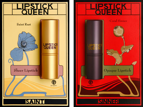
In any case, I kind of wish lipstick tissue booklets were still produced, especially if they came in pretty designs. Sure, makeup remover wipes get the job done, but they're so…inelegant compared to what we've seen. One hack is to use regular facial blotting sheets, since texture-wise they're better for blotting than tissues and some even have nice packaging, so they're sort of comparable to old-school lipstick tissues. Still, there's something very appealing about using a highly specific, if unnecessary cosmetics accessory. I'm not saying we should bring back advertising tie-ins to domestic chores or the social stigma attached to not "properly" removing one's lipstick on tissues, but I do like the idea of sheets made just for blotting lipstick, solely for the enjoyment of it. I view it like I do scented setting sprays – while I don't think they do much for my makeup's longevity, there's something very pleasing about something, like, say, MAC Fruity Juicy spray, which is coconut scented and comes in a bottle decorated with a cheerful tropical fruit arrangement. As I always say, it's the little things. They might be frivolous and short-lived, but any makeup-related item that gives me even a little bit of joy is worth it. I could see a company like Lipstick Queen or Bite Beauty partnering with an artist to create interesting lipstick tissue packets. Indeed, this post has left me wondering why no companies are seizing on this opportunity for profit.
Should lipstick tissues be revived or should they stay in the past? Why do you think they're not made anymore? Would you use them? I mean just for fun, of course – completely ignore the outdated notion that one is a boorish degenerate with no manners if they choose to wipe their lips on a towel, as those Kleenex ads would have you believe. 😉
Save
I was originally going to write a meatier post about the history of tanning that included sunless tanning, but there's actually been plenty of research already. Rather than essentially re-writing what's already out there I decided to go the more visual route and show ads for products promising to give you that sun-kissed glow for both face and body. I will include some history and links throughout, but mostly this is a way for me to share my never-ending obsession with vintage beauty ads. :)
Prior to the early 1920s, having tawny, sun-drenched skin simply wasn't desirable – at least for women. Fair complexions were associated with the leisure class, while tan skin indicated a lower social status (i.e. people who had to work outdoors). While the beauty industry was in its infancy, there were still plenty of products, such as this Tan No More powder, that promoted the pale skin ideal.
Just five short years later, however, the tan tide had turned. Coco Chanel is credited by many historians as the one responsible for making the bronzed look stylish following a cruise she took in 1923, essentially reversing the significance of pale vs. tan complexions (i.e., tans were now associated with having the time and money for a luxury vacation in a sunny paradise, as well as good health.) By 1929 products were on the market to achieve the glowing effect on the skin without the need to travel to some far-flung destination, such as this Marie Earle "Sunburn" line of makeup. (Cosmetics and Skin has an excellent history of this company. While not much is known about the founders, the Marie Earle line had some fairly innovative, if ineffective products, like breast-firming cream and eye masks.)
Interestingly, in 1928 Marie Earle was bought by Coty, so it's probably not a coincidence that Coty released their Coty Tan bronzing powder and body makeup a year later.
The 1940s saw an increase in the number of bronzers and tanning body makeup, the latter influenced partially by the shortage of nylon stockings during World War II – women resorted to painting their legs with makeup or staining them with a tea-based concoction to create the illusion of stockings. Always looking to sell more products, companies soon began offering tinted body makeup to mimic a natural tan.
By the late '40s cosmetics companies made sure women could also artificially tan their faces, as a slew of bronzing powders entered the market. I couldn't resist purchasing a few of these ads.
Once again, I fell victim to the idea that a beauty product has only been around for a few decades. But it looks like spray tans have been around since at least the mid-50s!
In the late 1950s Man Tan sunless tanning lotion – or what we call self-tanner more commonly these days – debuted, featuring a new way of getting tan without the sun. Instead of traditional tinted makeup that merely covered the skin, Man Tan used an ingredient known as dihydroxyacetone (DHA), which works on the amino acids on the skin's surface to gradually darken its color. It sounds like a harmful, scary process that relies on synthetic chemicals, but DHA is actually derived from sugar cane and is still used in most self-tanners today.*
In 1960 Coppertone introduced QT, short for Quick Tan, and many others followed. The poor models in these ads already look orange – I shudder to think of how carrot-like you'd be in person.
In addition to bronzers, around this time companies were also launching color campaigns specifically for tanned skin. These shades aren't so different from the ones we see in today's summer makeup collections – warm, beige and bronze tones abound. Both Max Factor's Breezy Peach and 3 Little Bares (get it?!) were seemingly created to complement a tawny complexion, while Clairol's powder duos and Corn Silk's Tan Fans line offered bronzer and blush together to artificially prolong and enhance a natural tan.
Meanwhile, Dorothy Gray had tan-flattering lip colors covered. This was not new territory for them, as this 1936 ad referenced a new "smart lipstick to accent sun-tan". In any case, the 1965 ad is also notable for the yellow lipstick all the way on right, which was meant to brighten another lip color when layered underneath…over 50 years before Estée Edit's Lip Flip and YSL's Undercoat.
The tanning craze wasn't going anywhere soon, as various self-tanning and bronzer formulas for body and face continued to be produced from the '70s onward. As skin cancer rates rose, there was also an uptick in the number of ads that emphasized protection from the sun over the convenience angle (i.e., the ability to get a tan in just a few hours and no matter the climate) – self-tanners started to be marketed more heavily as a healthy alternative to a real tan.
When it launched around 2004, I thought Stila's Sun Gel was such an innovative product. Little did I know Almay had done it roughly 30 years prior.
Tried though I did, I was unable to find a vintage ad for Guerlain's legendary Terracotta bronzer, which debuted in 1984. So I had to settle for these Revlon ads from the same year.
I searched all the '90s magazines in the Museum's archives, but realized almost all of them were March, September or October issues, so I couldn't unearth any fake tan ads for most of the decade. I did have better luck with finding ads online and in the Museum's archives for the 2000's, however. It makes sense as I had started collecting by then, not to mention that the early-mid aughts were the Gisele Bundchen/Paris Hilton era so fake tanning was at its peak. I just remembered that I neglected to check my old Sephora catalogs…I'll have to see if I can locate any photos of Scott Barnes' Body Bling, another hugely popular product in the 2000's.
As the decade came to a close, there was some discussion as to whether tanned skin, real or fake, was passé. But the continuing growth of the self-tanning market (as well as the influence of the bronzed Jersey Shore cast) showed that the infatuation with tanning wasn't slowing down. The Paris Hilton era segued seamlessly into the Kardashian age, which also contributed to the popularity of the bronzed look. Companies are still trying to keep up with the demand for bronzers and self-tanners. For the past 5 years or so, Estée Lauder, Lancome, Clarins, Guerlain and Givenchy have released new bronzing compacts at the start of the summer, and just this past year Hourglass and Becca released a range of new bronzing powders. Meanwhile, established products like Benefit's Hoola bronzer and St. Tropez's self-tanning line are being tweaked and expanded.
In terms of advertising bronzers and self-tanners, I think cosmetics companies do a damn good job. The products themselves certainly look tempting, but one also can't deny the sex appeal of the glowy, bronzey look of the models (not to mention that a tan makes everyone look like they lost 10 lbs). Who doesn't want to resemble a sunkissed goddess lounging about in a tropical paradise? It's largely this reason, I think, that the tan aesthetic persists. As usual, Autumn Whitefield-Madrano offers an insightful exploration of why tawny skin continues to be in vogue so rather than me rambling further I highly encourage you to read it in full. As for me, well, I've largely given up on self-tanning. It was messy, came out uneven no matter how much I exfoliated and how carefully I applied it, and still didn't look quite like the real deal. I do, however, still use bronzer once in a while (mostly as blush, but occasionally in the summer I'll dust it all over my face) and have been tinkering with temporary wash-off body bronzers. I don't consider bronzer a staple by any means – most days I fully embrace my pasty self – but the fact that I own 6 of them is proof of the long-standing allure of the tan and how effectively the products required to achieve it are marketed.
What do you think? Which of these ads are your favorite? And are you down with the tanned look or no?
Welcome to the Makeup Museum's spring 2017 exhibition! As you may know, for the past few months I've been hopelessly under the spell of anything holographic/iridescent/prismatic, and I think this morphed into an obsession with all the colors of the rainbow. (Or it could be Desus and Mero's nightly rainbow feature seeping into my subconscious.) Duochrome makeup is obviously different than rainbow makeup – I see the former as having color-shifting principles, while the latter is vibrant yet static – but I'd argue that they're all on the same…spectrum. (Sorry, couldn't resist). What I mean is that merely colorful makeup is different than holographic, but they share similar qualities. Generally speaking, I was inspired by the broader notion of color play and the endless possibilities a variety of colors can provide. I've always loved vividly colorful makeup because as we'll see, over the years it's become synonymous with fun and self-expression, which is basically my makeup credo. From 6-hued rainbow highlighters and a set of primary colors to create unique shades to more subtle gradient palettes and sheer lipsticks, makeup that encompasses the whole spectrum allows for a great amount of experimentation. Even color correctors offer the opportunity to play. I wanted this exhibition to express the joy and creativity that a wide range of colors can bring, especially when viewed as a collective whole such as a rainbow.
While I could have probably could have done an entire rainbow-themed exhibition, there were some new, non-rainbowy releases that were simply too good not to include, plus I thought they added a nice balance to all the color. Also, did you notice the labels? I got the idea to make them a gradient rather than all one shade, but my husband, super smarty pants that he is, chose the exact colors and how to arrange them. I think this is the first exhibition where I had to determine where everything was going prior to printing the labels. Usually I just print them out and figure out placement of the objects later since I can always move the labels around, but this time I had decide on placement first since moving things would mess up the gradation effect.
Let's take a closer peek, shall we?
Top shelves, left to right.
I spotted this 1970 Yardley set on ebay and knew it would be perfect.
The box isn't in the best shape but aren't the graphics so cool?!
I love that the insert encourages you to have fun and experiment. It's a stark contrast to actual ad for the product, which, underneath its seemingly feminist veneer, is horrifically ageist.
I tried cleaning up the tubes but I scrubbed too hard on the yellow one, which resulted in a few cracks. I forget these things are over 40 years old and that plastic doesn't necessarily remain durable for that amount of time.
The similarity between the eye makeup for Dior's spring 2017 collection campaign and an ad from 1973 is striking.
My heart skipped a beat when I saw that Addiction would be featuring the work of Swedish artist Hilma af Klint on their compacts this spring. Af Klint's work really spoke to me and I'm so happy Addiction helped spread the word about her.
Second row, left to right.
These lipsticks are so delectable!
I know it's just a fake flower with highlighter dusted on top, but it still makes me swoon.
Still haven't figured out a name for this little lady.
If you remember that popular video that was making the rounds a little while ago, it showed a Charles of the Ritz powder bar.
If I ever display this again I'll update the label. Turns out Charles of the Ritz tried to bring back the service in August of 1988, but I don't think it stuck around long. Perhaps they couldn't compete with the likes of Prescriptives, who was by that point leading the way in custom blending? (Sidenote: I'm tickled at how the article is written by Linda Wells, who was just 2 years shy of launching what would become the world's best-known beauty magazine, and how it also cites Bobbi Brown and refers to her as simply a "makeup artist." Little did they know that Bobbi's own line would be taking the makeup world by storm in another 3 years.)
Third row, left to right.
I'm not sure why Guerlain used a rainbow for this spring's campaign and not for their summer 2015 Rainbow Pearls, but they look good together.
Ah! I was so excited when this set popped up on ebay I could hardly contain myself. This is probably the best representation of late '60s/early '70s beauty. It doesn't have the insert but overall it's in great condition. I don't know whether this particular set is specifically the pastel version mentioned in the ad (which is a printout of an original from 1973 – forgot to put that on the label, oops) or the regular non-pastel crayons, but I was overjoyed to finally get one into the Museum's collection.
In doing a little background research for this exhibition I came across some interesting things. I couldn't possibly pull together a comprehensive history of colorful/rainbow-inspired makeup, but here's a quick look back on some of the highlights. While color correcting powders existed early on in the modern beauty industry, it seems as though the more colorful side of makeup wasn't popularized until the early '60s. Ads for collections featuring a robust range of vibrant shades included words like "fun", "play" and "experiment", thereby associating color variety with happiness and creativity.
This 1967 ad not only depicts a spectrum of color, it encourages the wearer to create different looks by adding varying amounts of water to the pigments. I'm assuming you could adjust the opacity this way.
While I love the Yardley Mixis set and the classic Mary Quant crayons, I think this brand is my favorite representation of late '60s beauty, at least in terms of advertising (you can see more here). It's so crazy and psychedelic…looking at this makes me want to dance around in a field with flowers in my hair, LOL. Sadly I was unable to track down any original makeup or ads from this line, which I believe was exclusive to Woolworth's in the UK.
More recently, rainbow-inspired beauty has had its moments. The models at Peter Som's spring 2013 runway show sported pastel rainbow eye shadow, while later that year, Sephora's holiday collection brush set featured iridescent rainbow handles. For summer 2015 MAC released a collection with basically the same finish on the packaging, and come November, Smashbox's collaboration with artist Yago Hortal offered an eye-popping array of shades. I'd argue that 2016 was the tipping point for the rainbow beauty craze, with fashion designers leading the way. These runway looks helped set the stage for the likes of ColourPop's rainbow collection and Urban Decay's Full Spectrum palette, both released last year, along with MAC's Liptensity collection, which brought a whole new dimension to color perception. While it wasn't a rainbow-themed collection per se, Liptensity's "tetrachromatic" formulation ushered in a new way of thinking about and playing with makeup pigments in much the same way rainbow makeup did.
It doesn't look like rainbow makeup is going anywhere soon, as evidenced by the stunning looks Pat McGrath created for Maison Margiela's fall 2017 show, along with products like MAC's Colour Rocker lipsticks and Kat Von D's Pastel Goth palette. Even Sephora's typography got a rainbow makeover. (While the gradient rainbow style was used more to convey holographic makeup/highlighters, it represents exactly what I meant earlier – rainbow makeup and holographic makeup may be distant cousins, but they definitely belong to the same family).
Then there are these magazine features from the March 2017 issues. (Yes, I still tear out magazine pages. Yes, I'm aware there's Pinterest and that we live in a digital world.)
That was long! Phew, I'm tired. Actually I'm not, since looking at a bunch of different colors together energizes me. As a matter of fact, I tend to get a little overstimulated, which is why I do most of my makeup shopping online – in-store browsing at all those colors displayed on the counters is very bad for my wallet.
Update, 4/3/2020: I realized I never addressed rainbow makeup as it pertains to the LGBTQIA+ community. In addition to rainbow makeup's role as a way for people to explore more colorful cosmetic options, it also functions as an important extension of the rainbow symbolism created by and for the community over 40 years ago. One questionable trend, however, has been the rise of companies slapping rainbow packaging on some of their regular line items in order to "celebrate" (co-opt?) Pride month. By and large, it’s a positive development as the products raise visibility for LGBTQIA+ rights and most of them donate the sale proceeds from these items to various charities. They also call attention to makeup’s significance for the LGBTQIA+ movement, both past and present. On the other hand, sometimes it feels like a shameless cash grab with the main focus being the product instead of meaningful action or change. If you’re on the market for new makeup and want to feel good knowing that your purchase helps a marginalized population, go for it – no one should be embarrassed to buy them. I personally cannot get enough of rainbow packaging and purchased several items just for the colorful designs on the boxes. But the motivations of some of these companies are questionable, i.e. are they really committed to the cause or just once a year when they put rainbows on their packaging and call it a day? One thing is for certain though: although the Museum is committed to LGBTQIA+ rights year round, I look forward to the rainbow looks Pride month brings (and obviously I think people should feel free to wear rainbow makeup year round as well.) Pride looks exemplify the raison d’etre of rainbow makeup by demonstrating the joy playing with color can bring and the freedom to wear it.
I hope you enjoyed the exhibition and that you'll play with color this season, either by wearing shades so bright they hurt your eyes or simply giving color correctors a go (and everything in between). Just have fun!
It was love at first sight with this precious doll-shaped powder box that Les Merveilleuses Ladurée released in honor of their 5th anniversary. I mean, even the outer packaging is gorgeous. As a collector, I was also overjoyed to receive a free tote bag from the seller, which I used as a background for these photos – isn't it pretty? There is also a beautiful rose shaped blush with the same outer packaging that I have on its way to me, but the star of the show is clearly the powder.
Both whimsical and sophisticated, this delicate doll figurine is outfitted in a sumptuous blue velvet dress with a purple satin ribbon.
It looks like it might be heavy in the photos, but it's actually very lightweight and seems quite fragile – I was so afraid it would shatter if I dropped it.
I wonder how many people bought this to actually use it and not collect. While the velvet dress is lovely, you'd have to be really careful to make sure the powder doesn't get all over it.
When I first laid eyes on this my makeup historian sense was immediately tingling; somehow I just knew this design wasn't new. Upon searching for vintage doll powder boxes I came across many different kinds, most made of porcelain or ceramic, but the ones made of papier mache stood out to me. That particular material jogged something in my brain and I suddenly remembered where I had seen them before.
Yup, at the 2014 Makeup in New York exhibition! How could I forget? I guess I wasn't paying attention to the labels on these even though I took photos of them, LOL.
Terre de Retz was a line of doll-shaped powder boxes introduced by famed French department store Galeries Lafayette sometime around 1920. This blog post had the full scoop on them and led me to buy this book. Yes, I bought an entire book on perfumes just to get the tiny morsel of additional information it had on these powder boxes, and also because I had totally forgotten they were in this book as well. Anyway, they were designed by Georges Duchesne (most of them are signed G. Duchesne) and came in a wide variety of styles ranging from Marie Antoinette-era fashions to 1920s flappers. I suspect Terre de Retz was the inspiration for Ladurée's anniversary item, as both are constructed from a paper-based material and the general design for some of the Terre de Retz figurines is the same (i.e. the way in which the powder box is hidden and fits into the top part of the doll).
The ones that appear to be the most common are these masked figurines and ones dressed in a mid-19th century style (at least, they resemble that period to my eye).
Some other ones I liked:
My favorites though were the ones that most resembled the Ladurée figurine. While these ladies flaunt a more French Revolution-era style in terms of hair and makeup, they have voluminous blue skirts, fans and necklaces.
This one also has a bow. I really wanted to buy it but it's missing the bottom part of the box, plus, as I sadly discovered, Terre de Retz figurines are not cheap. This one is going for $695 on ebay and the lowest price I've seen for one so far is $299. Maybe someday I will have one for my very own but not right now!
While I have no proof that Ladurée drew on Terre de Retz for their 5th anniversary powder box, it would be quite a nice nod to their French heritage. In terms of a more modern, artsy take on figural powder boxes, I'd dearly love for a company to collaborate with this contemporary artist – while she doesn't make powder boxes to my knowledge (only figurines), I think she'd come up with some amazingly imaginative designs given her style.
Thoughts?
Save
Save
I remember thinking how cute and novel these wine bottle-shaped lipsticks were when they were making a sensation back in the fall. (I do have one on the way but the package somehow keeps getting delayed so here's a stock photo for now.) I'm not a wine person – gives me a horrible headache – but I do appreciate adorable makeup packaging so this gets a thumbs-up from me. I mean on the one hand I'm not fond of wine once again being associated with a clichéd feminine stereotype (all ladies love wine, shopping, chocolate and shoes, amirite?), but on the other hand, this lipstick is just too cute.
Turns out, this isn't the first time lipstick has been designed to resemble booze. I was positively tickled when, during one of my customary Friday night vintage makeup searches on Etsy (I lead a very exciting life, I know), I came across this miniature lipstick cleverly packaged as a whiskey bottle.
It really is mini!
I'd never heard of Carstairs before, but apparently from roughly the '40s through the '60s they did a good amount of advertising for their White Seal whiskey, which is still sold today. In addition to the lipsticks, they offered mini screwdrivers and toothpicks, along with seal clock figurines and the usual print advertising. According to one (no longer active) ebay listing, the lipstick bottles started being produced around 1944 and other listings say they're from the '50s, so I guess they were used as promotional items for a few decades. Here's a photo of one in Madeleine Marsh's excellent book, which also dates it to the '50s.
I'm guessing that for the most part, the lipsticks were provided to bars and liquor stores and given away as a small gift-with-purchase, as there are quite a few full boxes of them floating around. I would have bought this one in a heartbeat because how cute would it have been to display it alongside a whole Chateau Labiotte set?
But the individual lipsticks are obviously a lot cheaper and I have many things I want to purchase for the summer exhibition, so I had to pass for now. ;) As for the lipstick itself, a company called Christy Cosmetics, Inc. was responsible for producing it. I couldn't find much information about it online, other than it was a New York-based company and was also the manufacturer of a line called Diana Deering (who was an entirely fictional character, or, as the patent puts it, "fanciful".)
I'm sure there's information about Christy out there somewhere, but as usual I lack the time and other resources to do proper research, i.e., looking beyond Google. If anyone knows anything about their relationship with Carstairs and how they were chosen to produce their promo items I'd love to hear it.
Uh-oh, we have a situation here. Once again a certain little Sailor is up to no good. "It's just my size!"
I better go get this wrapped up and into storage before he smears it all over his face in attempt to "drink" the non-existent whiskey. In any case, Happy St. Patrick's Day and I hope these lipsticks have inspired you to let your hair down and enjoy some adult beverages tonight!