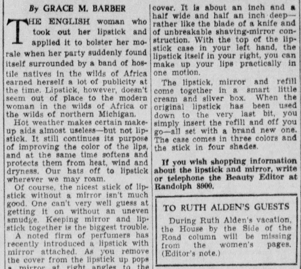
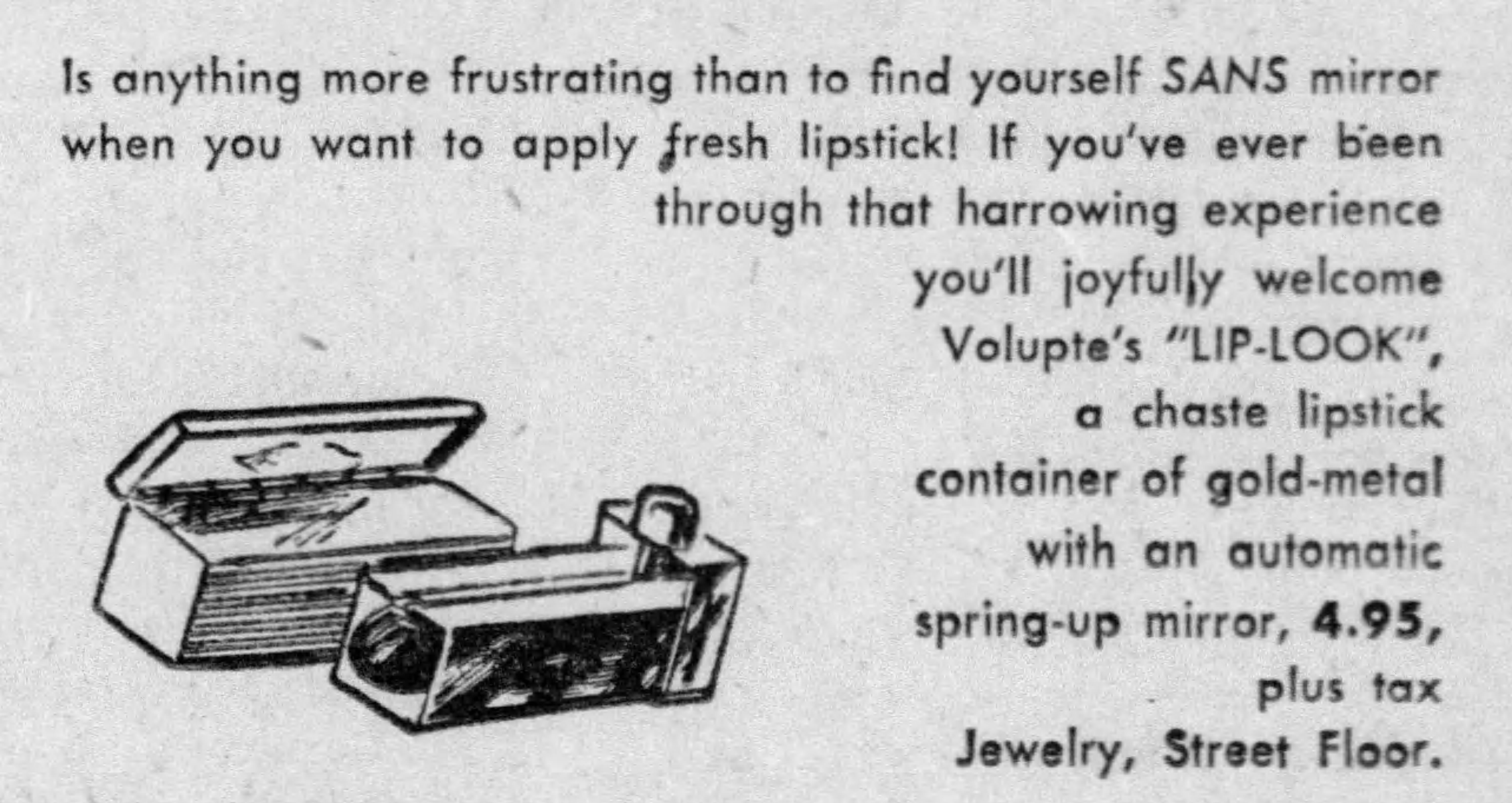
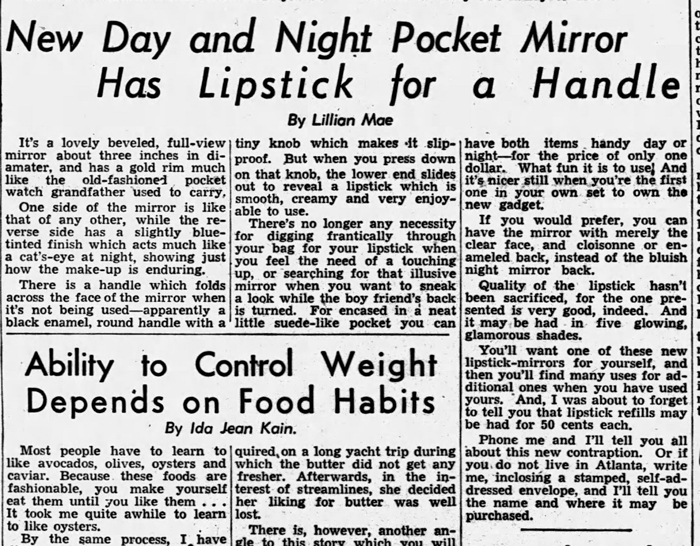
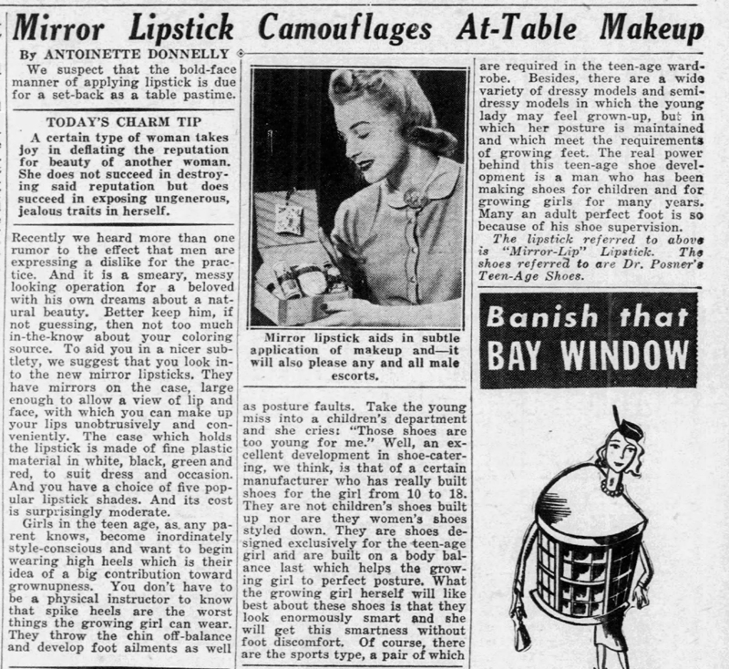
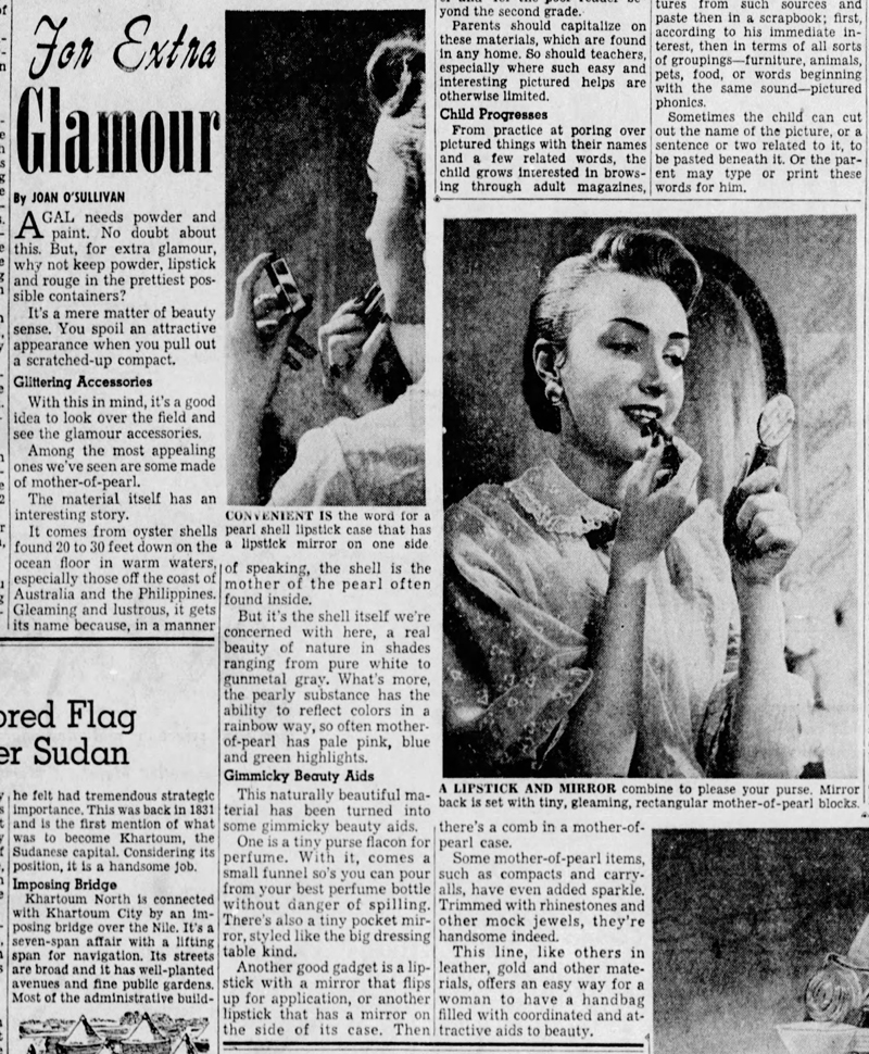
Color coordination is just one of many facets of the vast and complex makeup-fashion relationship. This post will attempt to outline the trajectory of this concept from the 1920s through the early 1960s and examine how it was being marketed, with particular attention being paid to the notion of a lipstick wardrobe. The usual disclaimer applies: it won't be as thorough as I'd like given the limited access I have to certain resources, but hopefully will give a cohesive picture.

In the nascent cosmetics industry, color harmony usually referred to coordinating makeup shades to one's skin tone, hair and eye color. (It must be noted that women of color, particularly Black women, were completely left out of the "types" developed by Max Factor and others.) But as makeup became more acceptable and even expected, outfits began to take on importance in terms of coordinating makeup. The rise of ready-to-wear fashion and designers releasing seasonal collections also played a significant role. By the late 1920s beauty columns were advising women to select their makeup with the color of their "costumes" in mind in addition to the original three pillars of color harmony.1

Color complexion chart, Woman's World, 1925
(image from flickr.com)

Cincinnati Enquirer, May 1, 1927

Beauty columnists also advised a bit of color correcting through the use of mauve or green-tinted powders (which, you may recall, was pioneered by Shiseido), as this would enhance the complexion depending on lighting and the color of dress.  The racist/colorist goal of "heighten[ing] the effect of whiteness" via makeup persisted throughout the 20th century. While most articles weren't quite as blatant about achieving whiteness to coordinate with various clothing colors, the sentiment was implicit in many color coordination guides.

St. Louis Star and Times, June 15, 1927(images from newspapers.com)

While makeup shade selection was still sparse, cosmetic companies began using dress colors as a marketing opportunity. Elizabeth Arden led the way, declaring in 1931 that "any woman can wear any color". Cosmetics and Skin explains, "Unlike clothing fashion colours, that changed from season to season and year to year, lipsticks, rouges, face powders and nail polishes were sold in the same shades over long periods of time. Although limited, the colour ranges available in the 1920s and 1930s generally included vivid colours for evening wear and enough shades to enable women to make some allowances for different outfits and/or accessories like brightly-coloured jewellery. In the 1930s, recognising that make-up, like hair dyes, could change a woman’s ‘natural’ colouring, Elizabeth Arden and others went further, suggesting that make-up could enable women to wear a greater range of fashionable colours than her natural colouring might otherwise suggest." By the end of the '30s, "Women began buying new make-up items simply because of a change in colour, thereby increasing sales."

Tussy lipstick ad, Vogue, October 12, 1929
(image from archive.vogue.com)

Cosmetic companies and beauty columnists seized on the idea of choice that color coordinated makeup supposedly allowed. Women no longer had to fear certain dress colors; they could wear them with confidence provided their makeup was aligned. With a change of outfits and harmony between makeup and clothing shades, women could also express various moods and personalities. The ad copy for Elizabeth Arden's lipstick ensemble claims one could be the "The same woman…but with infinite variety" and equipped with "the power to change your personality to suit your mood – or your gown."  Columnist Antoinette Donnelly expanded on the concept, suggesting that by frequently switching up makeup and clothing combinations and breaking free from their set type, the average woman could become whoever they wanted. "[Witness] the manner in which makeup is worked out so that the woman can change her dress color to one that will put her in an entirely different category than that she is occupied in the somber shades, let's say. Or, with the help of certain makeup colors, she can be a stunning black-frocked siren, pale-cheeked and red-lipped, whereas before she may have been only a negative personality…these are frequently the type, who, rebelling, finds in an entirely new makeup scheme just that transforming note that lifts them out of the nondescript class…our interesting beauties are getting away from type classification. They're going in chiefly for being that something different which is always welcome, and particularly welcome in a world now filled with good-looking women. Makeup is the avenue over which you travel to get that difference and the crowning achievement will be reached when you know your makeup colors and what dress colors they should be associated with…the point is that this new makeup occupation of playing color successfully against dress colors is going to permit you a more dress-color latitude and will supply your audience with a woman about whom it can't be said: 'She always looks the same.'"2

Elizabeth Arden ad - Vogue, June 15, 1931

Ad for Elizabeth Arden lipstick ensemble, Vogue, January 15, 1932
(images from archive.vogue.com)

Still, there was a lot less flexibility than beauty columnists and ads cared to admit. Any woman can wear any color, perhaps, but only by following the prescribed advice and buying particular colors. Couched in the language of freedom and excitement, a variety of makeup shades may have offered new possibilities in terms of dress, but there were rules dictated by self-appointed experts and businesses who overwhelmingly encouraged women to wear what was "becoming", not necessarily whatever color combination one desired.

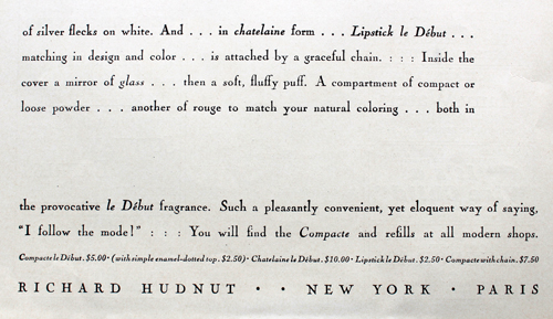
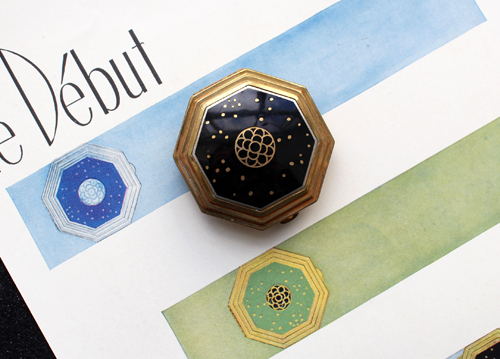
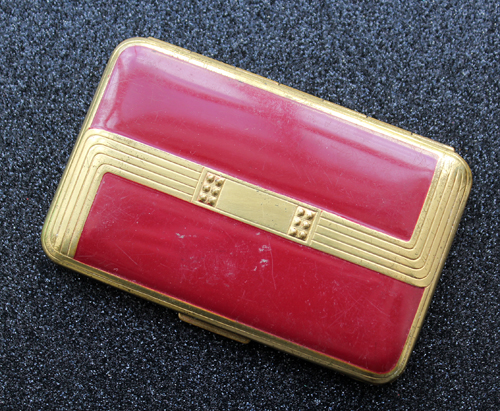
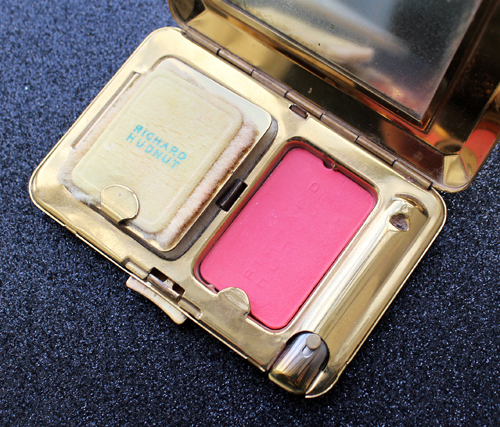
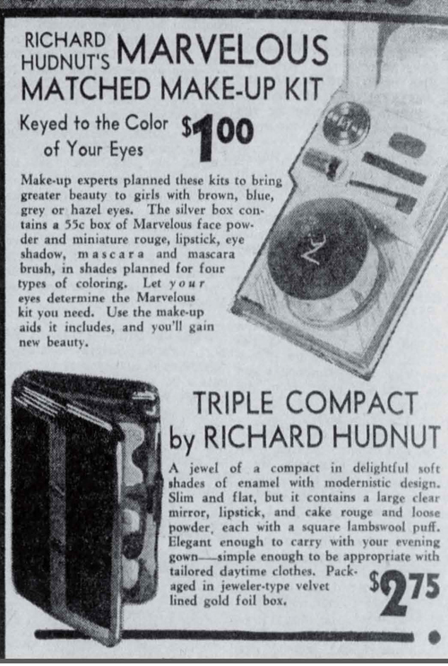
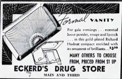
Nevertheless, the industry wanted to make it easy for women to buy multiple shades and the notion of sticking to one color or ensemble seem antiquated. As one 1933 article encourages, "Don't say, 'I can't wear grey'- or blue, or green as the case may be. It's hopelessly old-fashioned. Smart women these days merely change their complexions to suit their costumes, and find that there are no longer any forbidden shades…when you know your makeup story, it's all so simple."3 In addition to this sort of rhetoric that emphasized simplicity and modernity, cosmetic companies boosted sales by creating ensembles that made choosing colors less daunting for customers. The assumption was that by eliminating confusion regarding what beauty products went with what fashion color, pre-made sets detailing appropriate shades would appeal to shoppers who would otherwise be intimidated by makeup-dress color coordination (or those who merely didn't want to be bothered spending time picking out the "right" shades), normalize the idea that women should own more than one color, and introduce shades customers may not have considered otherwise. Matched makeup products and sets existed – most notably by Max Factor and Richard Hudnut – but without the fashion component, instead focusing on the original three tenets of color harmony (complexion, hair and eye color). Elizabeth Arden's lipstick ensemble and color harmony boxes may have been the first official sets designed to take the guesswork out of makeup-clothing color coordination.

Ad for Elizabeth Arden Color Harmony boxes, The New Yorker, June 1932

General guidelines on color coordination proliferated and more companies began releasing pre-made sets.

Harpers Bazaar, January 1935 article on lipstick tips and color matching

Newspaper ad for Lucien Lelong's Tic Tac Toe lipstick trio, October 1939
(image from newspapers.com)

Elizabeth Arden may have also been the first to collaborate with department stores on showcasing new colors that went with the latest fashions. In 1931, a fashion show held at Lord & Taylor demonstrated not only new dresses, but the Arden products that went along with them. "How the new striking colors of the season may be worn by all women if the proper makeup is utilized was illustrated by various feminine types wearing the proper cosmetics with the colorful gowns chosen for them."4 Five years later, makeup companies were advertising their seasonal shades alongside the latest fashion colors in department store windows. Primrose House, Helena Rubinstein and Charles of the Ritz displayed their new tawny shades in next to white sportswear collections.5

Elizabeth Arden continued to lead the way by introducing "color capes" at counters and salons where customers could try on little capes in the season's latest fabrics and decide what makeup went best with them.

Elizabeth Arden "color cape" ad, Vogue, October 1, 1936(image from archive.vogue.com)

Generally speaking, color coordination guidelines were to stick to either warm or cool tones (i.e. don't mix a warm-toned brown dress with a blue-red lipstick) but still wear colors that allowed for maximum contrast between skin and dress. While dress and accessory shades needed consideration, one's own coloring was the most important in terms of picking out makeup. If your outfit had two or more contrasting shades, the makeup should be matched to the dominant color or the one closest to your face. One should own at least three lipsticks: a "clear" or true red (what I suspect has neutral undertones), a blue red (cool-toned) and an orange red (warm-toned). Finally, coordinating lip color was more critical than face powder for a harmonious look, if one had to choose between the two. Some rather harsh color coordination advice from the decade6:

  • "There are shades of rouge and lipstick and powder that are unequivocally antagonistic to other colors in close juxtaposition. This is seen in makeup colors themselves. Such as a bright orange face rouge and a purplish or deep raspberry lipstick. This combination is really ugly. Extend the idea to apparel. Take a blue eyeshadow with a red or flame colored dress. Just wrong, that's what it is."
  • "You must change the lipstick and rouge cases that you carry in your pocketbook as regularly as you change your frock, if you want a pleasing ensemble."
  • "Remember always that your lips supply the most outstanding color to your face. If they are wrong, your whole face might as well give up."

In terms of individual colors, the prescriptions were as follows. It's very interesting to see the roots of makeup color theory, especially considering how advanced it is today. Some of the advice is debatable, most likely due to the fact that there simply weren't many shades back then. And once again, these sorts of color-specific tips were intended for white women only. While some of the principles could theoretically be applied to BIPOC skin tones, it's obvious that the industry was focused on a white audience. Racism and colorism were on full display, particularly in the advice given for black dresses.

Red:

  • "Keep rouge and lipstick in the tone of the costume color – red geranium for an orange red or vermillion dress, red raspberry for the purple-reds, the rich wine shades and fuchsias."
  • "When wearing red, violet or blue-violet, it is very important to have the same basic tones in rouge, lipstick, and costume – no clash of orange with blue-red. That's bad!"
  • "If your dress is red, your lipstick leans toward purple and your rouge is borrowing its tones from orange, you will look as flamboyant as a circus poster."
  • "Red is a danger color in makeup. If the costume color is a bright shade of red, it should be matched as closely as possible with lipstick and rouge. The smartest crimson frock could be ruined by proximity to orange rouge and mandarin lipstick."
  • "If you wear red, particularly the bright, slightly off shades, the lipstick must match your costume exactly. Your rouge must be properly toned with your lipstick."

Beige and brown:

  • "Rouge and powder should have a touch of yellow. Green eyeshadow is stunning with beige."
  • "For wheatstalk and other beiges, use a vivid note: peach makeup base and peach powder, red geranium lipstick, rouge and nail polish. Green eyeshadow and blue-green mascara."
  • "If you are wearing browns that let orange supply their gaiety, you will want a touch of orange in your makeup."
  • "A warm terra cotta or russet makeup base, terra cotta or russet rouge and lipstick and a faintly mauve shade of face powder. Use bronze shadow and brown mascara."

Grey:

  • "All shades of grey needed a decided contrast."
  • "It is advisable to accentuate lip and eye makeup and subdue grayish pallor by using a deep peach rachel powder. When cheek rouge is used, it should be of a dark red or true blood tone, never a light orange shade."
  • "For grey, a vivid makeup is recommended for contrast: peach makeup base, a light shade of pinkish tan powder, red coral rouge and lipstick and matching nail polish. Blue eyeshadow and blue-green mascara."
  • "If you emphasize the pinkish tones in your skin and use a warm, bright rouge and lipstick the color will be more becoming."

Purple:

  • "The new purple shades are difficult colors to wear, so be sure to use a double application of pale peach foundation to give the skin an extra smooth texture and even coloring. Red coral rouge and lipstick have the clear quality that you need with difficult costume shades. Use blue eyeshadow if your eyes are blue, blue-green if they are brown."
  • "If you're in purple, lipstick and rouge ought to have bluish tones under the red."
  • "For lilac, mauve and violet, makeup base with a brownish undertone, a light shade of pinkish tan powder, red raspberry rouge, lipstick and nail polish. Black mascara and blue eyeshadow."

Green:

  • "For costumes of green – the vivid shades – a bright flame rouge and lipstick with pale rachel powder and green-gray eyeshadow could be tried out with effectiveness assured."
  • "For deep green costumes, use the same rouge, powder and lipstick shades, but use blue-green mascara and shadow according to the color of your eyes."
  • "For greens, from pale green to emerald and vivid green, makeup base with a brownish undertone, light shade of pinkish tan powder, red geranium lipstick, red strawberry rouge with a blue undertone, red geranium nail polish. Jade or emerald green eyeshadow, and blue-green mascara."
  • "Greens and yellow-greens are trying, but if you bring out the warm rose tones in your coloring you will stand a better chance of wearing these colors successfully. If these colors make your skin appear sallow, blend a little mauve face powder with the color you normally select to match your skin. Use a dark rosy lipstick to give your mouth a definite outline and a brown or grayish purple eyeshadow."

Blue:

  • "For blue apparel ensembles the 'blue' idea is stressed. The powder should have a good deal of purple pink in it, the rouge and lipstick with a purple cast. And blue eyeshadow by all means."
  • "If your favorite gown is in one of the bright new blue shades, use a soft peach shade of makeup base and powder and raspberry rouge and lipstick."
  • "For guardsman blue, dusty blue and other spring blues, peach makeup base, peach powder, red strawberry lipstick with a blue undertone, matching rouge and nail polish. Blue mascara and blue eyeshadow."
  • "Blue has a way of throwing bluish or purplish shadows on the face. Use a creamy tinted powder to soften this effect and use a lighter color of rouge and lipstick, yet one that is vivid and bright."

White:

  • "White requires little rouge – the amount that is chic with black is blatant with white – and the paler tones are more successful."
  • "White, like black, takes either a dark or a fair makeup, but nothing is more striking than white worn with the darker powders. Golden skins, tawny skins, make a gorgeous contrast with white."

Black:

  • "Black requires a more brilliant makeup to complement it than a color does. A powder as light as your skin tone permits, and the bright shades of rouge and lipstick, those on the geranium cast, prove most effective."
  • "Black is most striking and flattering when the skin is fair, pearly and transparent-looking. Black is not becoming with sun-tanned skin or sallow, yellowish skin. If your new fall costume is to be black, then you must get rid of your leftover tan and get your skin as freshly pink and white as possible…powder with a warm pinkish or peach cast, rouge and lipstick that are a blush rose or a frank red – those are good to wear with black."

Pastels:

  • "Shades which have a suggestion of blue in them call for a rouge with a blue cast. Shades with a hint of yellow look their best when the face is made up with rouge and lipsticks with an orange cast."

Vogue also offered general color coordination guidelines in their October 1, 1938 issue.

Vogue makeup color guide, October 1, 1938.

Another development in the 1930s was the recognition of the win-win situation offered by color-coordinated makeup and clothing. As early as 1932 both industries acknowledged the opportunity to profit through various types of partnerships. According to the December 30 issue of WWD that year, "Clothes-stylists and cosmetic experts are in a strong position to help each other today, with the result that more clothes and more cosmetics can be sold."  The end of the decade marks the point at which cosmetic companies began creating makeup shades based on seasonal fashion colors and/or formally collaborating with fashion houses on colors.

Ad for Dorothy Gray Sierra Gold, Vogue, November 1939
(images from archive.vogue.com)

Perhaps in an effort to outdo Elizabeth Arden, in the fall of 1938 Helena Rubinstein collaborated with noted milliner Marion Valle to produce the "vanity box of hats" series, a collection of 6 hats "based on the colors of six Rubinstein products."  The hats and cosmetics were displayed together in department store windows.

Newspaper ads for Helena Rubinstein/Marion Valle "vanity box of hats", October 1938

Newspaper ads for Helena Rubinstein/Marion Valle "vanity box of hats", November 1938
(images from newspapers.com)

To further emphasize the connection between fashion and cosmetics, it was around this time that companies began referring to color coordinated makeup using fashion terminology. Gone was the "ensemble"; enter the "wardrobe".

Germaine Monteil lipstick wardrobe, Global Cosmetic Industry, June 1938
(image via archive.org)

Article on lipstick wardrobe, Chicago Tribune, February 5, 1939(image from archive.lib.msu.edu)

In short, the 1930s witnessed the solidification of clothing/makeup color coordination, mostly due to cosmetic and fashion companies realizing they could have mutually beneficial relationships in terms of sales, but also due in part to the greater trend of accessory coordination and the growth of the cosmetic industry more generally. The 1940s strengthened the notion of color coordination. The sales tactics, accessory coordination, and pre-made sets remained more or less the same. Advised a 1946 issue of Chain Store Age to salespeople, "Lipsticks must also harmonize with costume colors so women need a vari-colored lipstick wardrobe. Point out to your customer that she should have one for daytime, one for evening, one when her skin tans, etc."

"Making Up to the New Fabrics", Harpers Bazaar UK, February 1940

Newspaper ad for Lucien Lelong Pif Paf Puf sets, May 1940

Makeup and accessory coordination advice,The Atlanta Constitution, June 2, 1940
(images from newspapers.com)

Maybelline ad in Hollywood magazine, 1940
(image from archive.org)

In the spring of 1947, U.K. company Gala of London presented a similar idea to Arden's color capes by encouraging customers to visit their "Colour Room" with swatches of their dresses in hand. It's not clear whether they were inspired by Helena Rubinstein/Marion Valle partnership some 9 years prior, but Gala also collaborated with Gertrude Harris on several creations based on lipstick shades. 

Gala lipstick/hat collab, Harpers Bazaar UK, July 1947

Seasonal colors really came into their own in the 1940s. Primrose House released a shade called Maraschino, a "cherry red designed for wear with summer clothes," while Revlon came up with Pink Lemonade and Red Punch for summer 1940.

Revlon Pink Lemonade ad, 1940

Dorothy Gray continued introducing colors to go with the latest fashions, a tactic they had begun in the the late 1930s, but launched sets in addition to individual coordinated colors. The company was one of the first to present sets as a cost-effective way to have the necessary variety of colors on hand. "To offset the disadvantage and expense of various makeup colors to match costumes, there is a new 'Portrait Make-up' package at a nominal cost, which will harmonize with any color scheme milady might have for spring."7

Ad for Dorothy Gray Portrait makeup set, April 1941
(image from archive.vogue.com)

Formal collaborations between cosmetic and fashion houses also continued in the '40s. Elizabeth Arden, still the runaway leader in fashion/makeup color coordination, began partnering with a collective named Color Affiliates in early 1940.

Elizabeth Arden Color Affiliates ad, Harpers Bazaar, February 1940

Elizabeth Arden Color Affiliates ad, Life magazine, September 9, 1940
(image from books.google.com)

Ad for Elizabeth Arden and Color Affiliates, Harpers Bazaar, February 1941

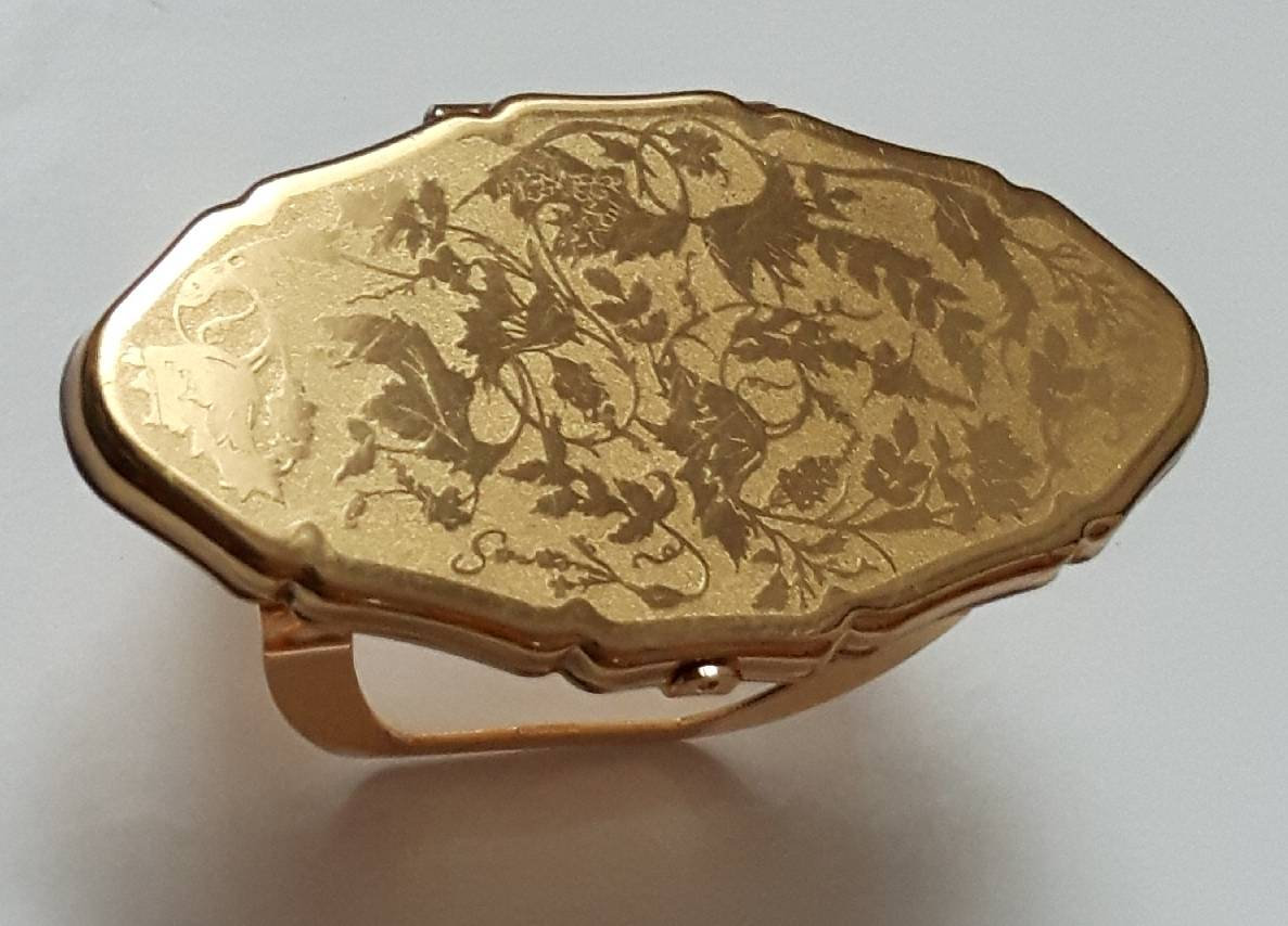
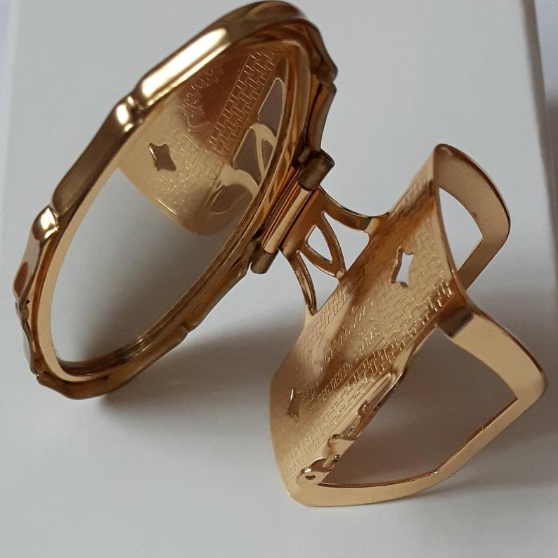
As a side note, some companies had a more literal interpretation of the lipstick wardrobe idea. Gala's set, most likely released during this decade, consisted of an outer box featuring an illustration of a wardrobe and slid open to reveal four colorful dress silhouettes with corresponding mini lipsticks.

Gala of London lipstick wardrobe, ca. 1940s. Collection of The Makeup Museum.

Tussy's Kiltie Red was obviously named for the Scottish garb and the bottom of the tubes adorned with a plaid kilt-like ribbon.

Tussy Kiltie Red ad, Vogue, 1941
(image from archive.vogue.com)

While Elizabeth Arden was the preeminent expert in color coordination, in 1945 Helena Rubinstein introduced her "color spectrograph", which detailed makeup-dress coordination for five types.

Helena Rubinstein Color Spectrograph, 1945
(image from repository.duke.edu)

Helena Rubinstein Color Spectrograph, 1945(image from tmagazine.blogs.nytimes.com)

Rubinstein introduced several products relating to the color spectrograph, including lipstick wardrobes in a pouch, Four-Cast lipsticks and Keys to Beauty sets. These were all basically the same concept but packaged differently. (Keys to Beauty had been launched previously in 1940, but was not marketed as a color-fashion coordinating set. Rather, there was only one set of three shades meant to be worn at different times of day.)

Helena Rubinstein lipstick wardrobe ad, Harpers Bazaar, October 1945

The lipstick tubes for the Four-Cast and Keys to Beauty were cleverly correlated to the outfit color family, i.e. the lipstick in the pink tube would go with pink or pastel outfits, while the shade in the green tube went with green or similarly colored outfits. (I would have taken these out to demonstrate but sadly, they had not an insignificant amount of mold.)

Helena Rubinstein Four-Cast lipstick set, ca. 1947. Collection of The Makeup Museum

Helena Rubinstein Keys to Beauty set, ca. 1948-1952. Collection of The Makeup Museum.

Helena Rubinstein Keys to Beauty set, ca. 1948-1952. Collection of The Makeup Museum.

Ad for Helena Rubinstein Four-cast lipstick set, Vogue, March 1948
(image from archive.vogue.com)

The idea of being able to pull off any color also continued as a selling point for makeup, although by this time fashion salespeople were officially in on the concept. As noted earlier, it was a win-win situation: if the only thing holding back a customer from buying an outfit in a hard-to-wear shade is makeup, it benefitted fashion companies to have their sales force advise buying the appropriate cosmetics. And voila! New outfit AND new makeup purchases means profits for designers and cosmetic companies alike. Echoing the commentary from 15 years prior, one department store buyer remarked in 1947,  "A wide-awake ready-to-wear salesperson who has a customer who feels she cannot wear fall's vivid green or wine, can so easily suggest that the woman consult with the cosmetic department about a makeup which will alter her skin tone enough so that she can wear one or both of those colors, and wear them well! Toilet goods people can also suggest complete new makeups for customers who may mention that fall colors are difficult to wear." Additionally, the department store window cosmetic tie-ins that had begun in the early '30s had become de rigueur for the big makeup companies by the late 1940s.

Women's Wear Daily, September 5, 1947

 The trend of selecting colors to go with one's clothing continued throughout the 1950s and early '60s, with more or less the same marketing tactics and new seasonal shades. Lipstick remained the key to color harmony.

Coty spring color chart ad, Vogue, March 1, 1950

Coty fashion right colors ad, Vogue, October 1, 1950

Coty check list for fall ad, Vogue, October 1, 1951

Ad for Dorothy Gray Carillon Colors, Vogue, October 1, 1951
(images from archive.vogue.com)

Women's Wear Daily, March 20, 1953

Revlon jewel lip kit, December 1954. Collection of The Makeup Museum.

Elizabeth Arden ad, Vogue, September 15, 1958
(image from archive.vogue.com)

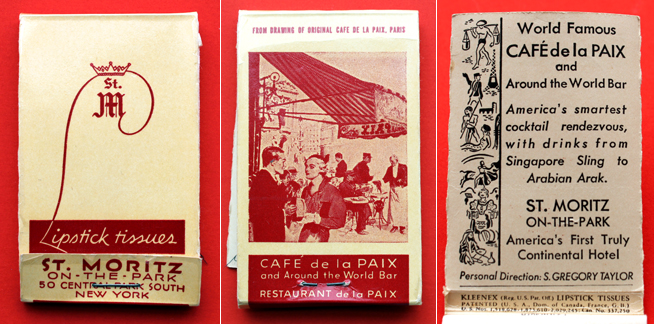
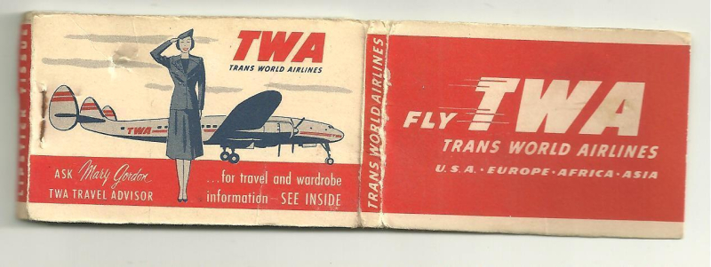
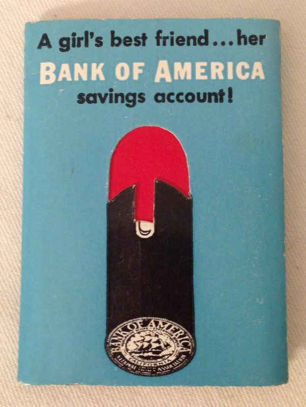
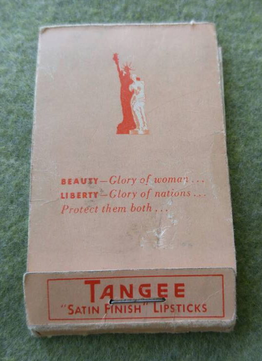
Pre-made lipstick wardrobes continued to flourish, usually in sets of 3, 4 or 5 tubes.

Cutex lipstick wardrobe, ca. 1950s

Cutex lipstick wardrobe, ca. 1950s

Of note is Charles of the Ritz's lipstick wardrobe containing single-use matchsticks, which was introduced in 1952 after the company had success with an individual matchbook released in 1948.

Ad for Charles of the Ritz lipstick matches, The New Yorker, September 25, 1948

Charles of the Ritz lipstick wardrobe, ca. 1952. Collection of The Makeup Museum.

Charles of the Ritz lipstick wardrobe, ca. 1952. Collection of The Makeup Museum.

Charles of the Ritz lipstick wardrobe, ca. 1952. Collection of The Makeup Museum.

In looking at these ads and guides, it seems being a woman back then must have been absolutely exhausting. Not only was one expected to wear makeup regularly, nails and clothing needed to coordinate with it. And not just a dress, but one's bag, shoes, hat, scarf, gloves, hosiery, etc. also had to "harmonize". According to the ads and advice at the time, it was simply a matter of planning ahead, but the process seemed extremely labor-intensive.

Makeup matching article, Redbook, October 1959

Yardley lipstick wardrobe, The Evening Standard, Feb. 11, 1957

Possibly the strangest take on the makeup-clothing color coordination trend was a Pond's Angel Face campaign that ran from about 1959-1962. Their claim that using different tints of face powders would allow every outfit to be flattering no matter one's complexion. It wasn't a new idea, as Pond's actually offered a different powder in 1940 that advertised roughly the same notion.  Pond's essentially took the color correcting/enhancing concept described in the 1927 news column by Lucille Buchanan a (questionable) step further. While swapping out lipstick shades to better coordinate with clothing makes sense in the abstract, trying to change one's entire complexion to suit a particular fashion color is a fool's errand. A dusting of bronzer, color correcting or translucent powder is fine; wearing the completely wrong shade of powder or base makeup will look odd, to say the least. Given the excessive number of ads (which mostly ran in Life magazine), it seems Pond's was set on convincing women they could in fact change their skin tone through powder rather than lipstick. I guess we should give them credit for going against the conventional wisdom that lipstick is the most important factor in makeup-outfit color harmony.

Angel Face by Pond's ad, 1959

Angel Face by Pond's ad, 1959

Angel Face by Pond's ad, 1960

Angel Face by Pond's ad, 1960

What's especially amusing about the ads is that Pond's wasn't actually applying differently colored face powders or even clothing to the models – it's very obvious it's the same series of photos artificially colorized.

Angel Face by Pond's ad, 1960

Angel Face by Pond's ad, 1960

Angel Face by Pond's ad, 1960

Angel Face by Pond's ad, 1961

Angel Face by Pond's ad, 1961

Angel Face by Pond's ad, 1961

Angel Face by Pond's ad, 1961

Ponds 1961

Angel Face by Pond's ad, 1962(images from ebay.com)

Companies were still not finished with the lipstick wardrobe concept in the late '50s and early '60s. However, the shade ranges expanded considerably as cosmetic chemistry and technology improved. Compare, for example, the range of Coty's shades in 1961 vs. the lineup they offered a decade prior.

Coty lipstick ad, Vogue, April 1961
(image from archive.vogue.com)

Pastels, corals, bright pinks, orange and iridescent shades were now considered as essential as different reds were in the 1930s and '40s. "Lipstick wardrobes should contain pale pastel tints, brilliant vibrant tones, medium shades and iridescent colors," notes one 1961 article. Another from 1962 states, "Every woman should own a lipstick wardrobe that includes a shade of coral that best becomes her, one of the pink-to-rose tint, and a clear red, which is the safest choice when in doubt" and a year later, "One color is never right for every costume. The lipstick wardrobe should always include at least an orange, a pink and a pure red lipstick."8

Seventeen, April 1962

With more colors to choose from for both eyes and lips, pre-made wardrobes now included 5-10 mini lipsticks in addition to the usual 2-5 item sets. Experimentation and play also became a bigger part of the makeup-clothing color conversation. Whether this was due to the increased volume of available colors for which the established coordination rules didn't apply, or companies trying to shift away from rules so that customers felt more emboldened to buy a multitude of colors, or simply feeling the need try a new(ish) marketing tactic is anyone's guess.

Beauty Ideas magazine, spring 1960. Collection of The Makeup Museum.

The copy for Revlon's Colorkins, Tussy's Lipstack and Pond's Angel Face lipstick wardrobe utilized traditional color coordination sales tactics (i.e., the need to have a variety of colors conveniently on hand) as well as encouraged the customer to experiment. They also were proponents of mixing shades. 

Revlon Colorkins lipstick set, 1962. Collection of The Makeup Museum.

Revlon Colorkins lipstick set insert. Collection of The Makeup Museum.

Revlon Colorkins lipstick set insert. Collection of The Makeup Museum.

Pond's Angel Face lipstick wardrobe, ca. early 1960s

Pond's Angel Face lipstick wardrobe insert, ca. early 1960s
(images from twitter.com)

Tussy Lipstack ad, McCall's, May 1961(image from archive.org)

Mixing colors to suit one's outfit was not a new concept, of course, as our good friend Antoinette Donnelly explained in 1956:

The Daily News, September 1, 1956
(image from newspapers.com)

Despite these developments, some of the advice remained much the same as twenty years prior. The March 1961 issue of Glamour contained a feature on how to coordinate with the seven "happy colors" of spring. (Apologies for the wrinkled condition of these pages…not sure how they managed to get crumpled while sitting in storage.)

Glamour, "7 Happy Colors" article, March 1961. Collection of The Makeup Museum

Glamour, "7 Happy Colors" article, March 1961. Collection of The Makeup Museum.

Glamour, "7 Happy Colors" article, March 1961. Collection of The Makeup Museum.

Glamour, "7 Happy Colors" article, March 1961. Collection of The Makeup Museum.

Glamour, "7 Happy Colors" article, March 1961. Collection of The Makeup Museum.

Glamour, "7 Happy Colors" article, March 1961. Collection of The Makeup Museum.

Glamour, "7 Happy Colors" article, March 1961. Collection of The Makeup Museum.

Glamour, "7 Happy Colors" article, March 1961. Collection of The Makeup Museum.

Glamour, "7 Happy Colors" article, March 1961. Collection of The Makeup Museum.

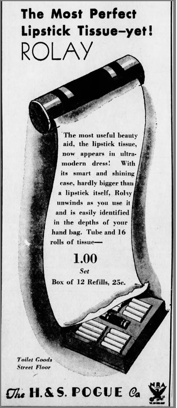
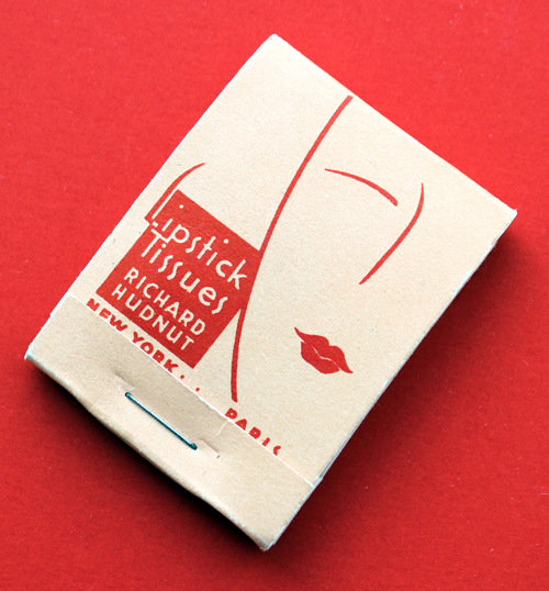
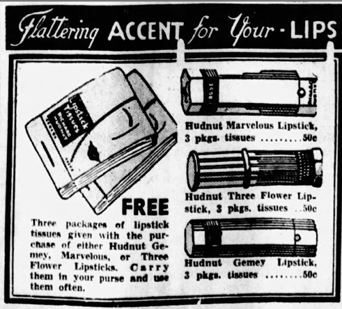
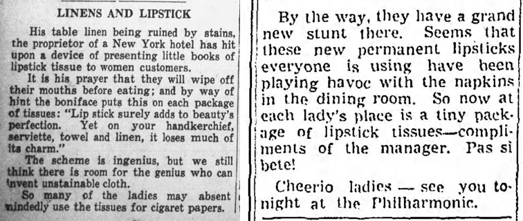
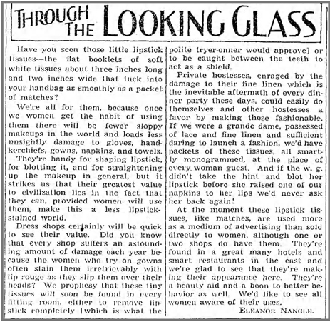
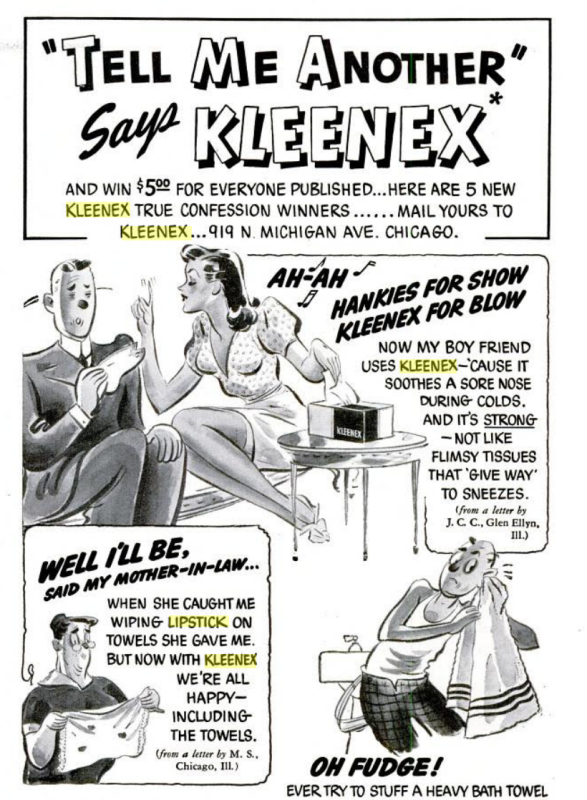
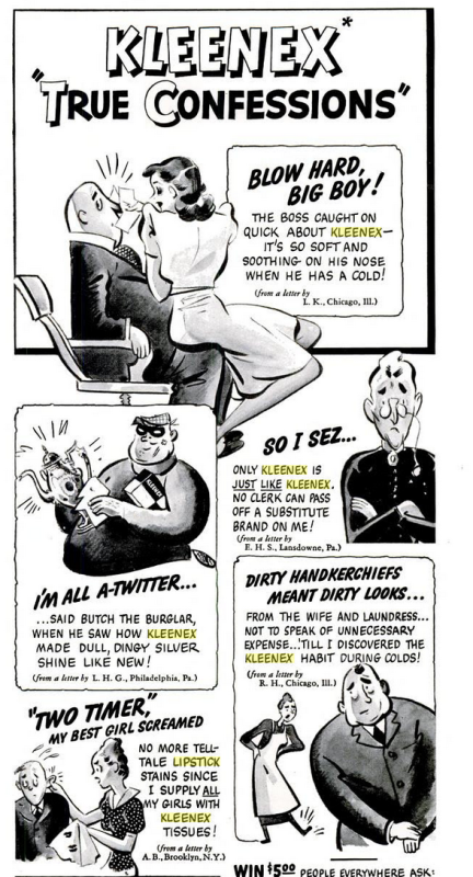
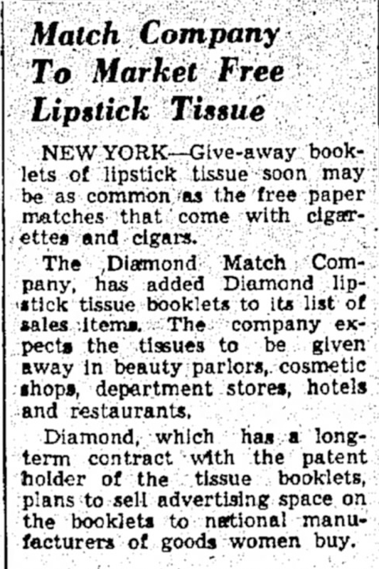
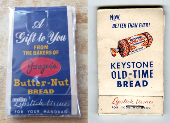
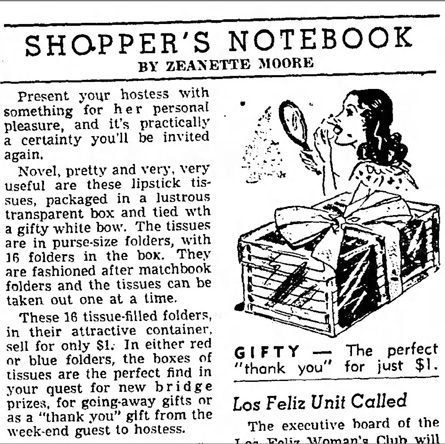
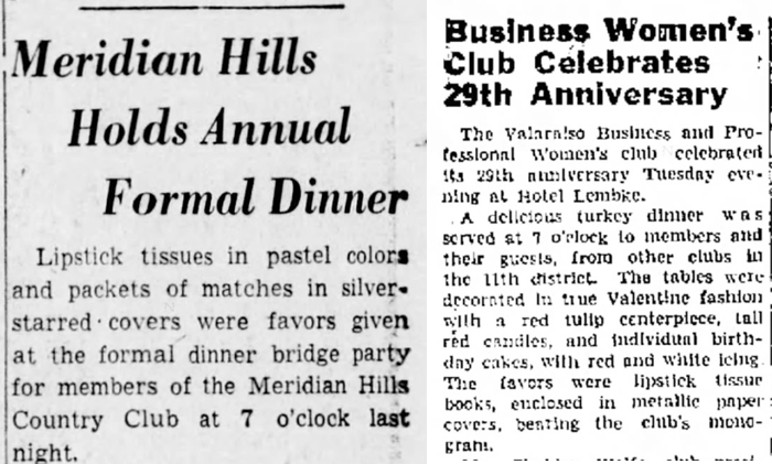
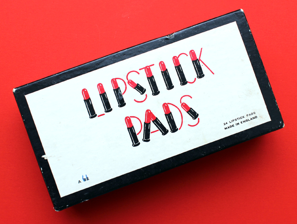
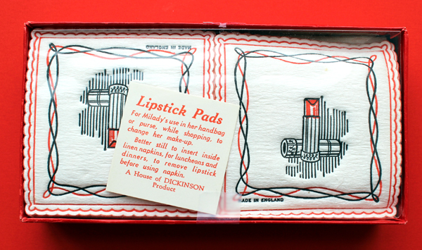
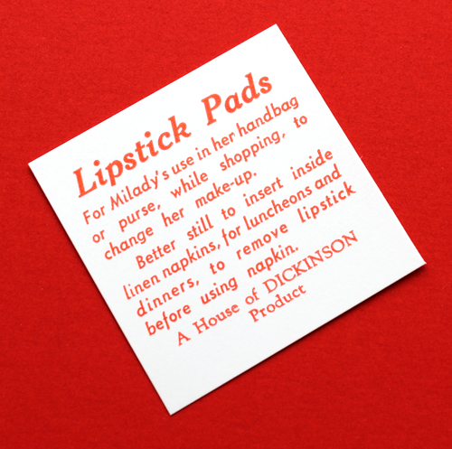
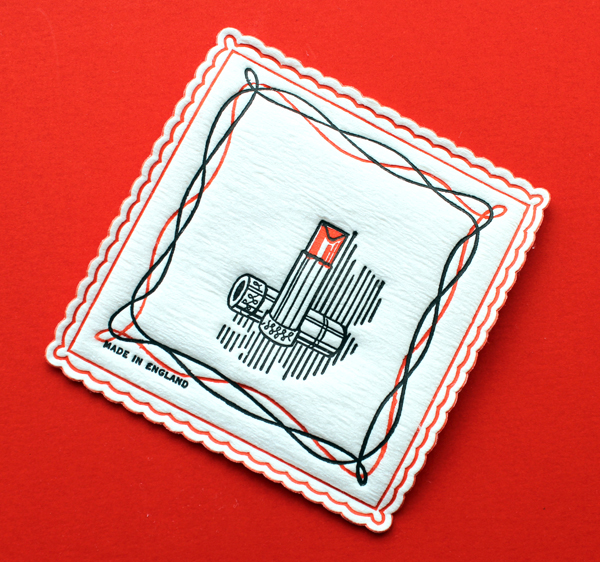
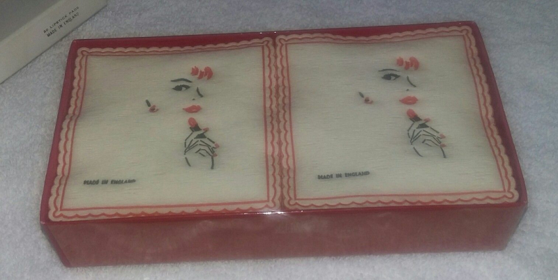
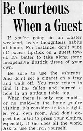
The color chart at the end of the feature is simply mind-boggling – even more complicated than what was outlined in the Redbook article. With the consideration of no fewer than 6 accessories along with makeup and outfit, were women really free to experiment? Obviously these were intended just as suggestions – indeed, as all makeup advice should be – and it's highly doubtful any woman followed this chart, or for that matter any other color-coordination advice, to the letter. As with the faux pas of not blotting one's lipstick properly on special lipstick tissues or handkerchiefs, clashing colors were not as big of a misstep as the marketing for such color coordination would lead one to believe. Yet I find it troubling that a chart detailing how to organize the colors of 8 different components was even conceptualized. Perhaps if women were kept busy figuring out what to wear with what they wouldn't notice how few rights they had, or be too exhausted to take action if they did. I'm not suggesting makeup-outfit color coordination was a nefarious plot devised by the patriarchy to distract women from fighting for equality, but there is a strong implication that they were expected to put at least a moderate amount of effort into their appearance.  As we'll see in part two of this post, charts like this don't exist in mainstream magazines these days.

Glamour, "7 Happy Colors" article, March 1961. Collection of The Makeup Museum.

In conclusion, it seems that the attempts of both the fashion and cosmetic industries in the first part of the 20th century to ensure color harmony between makeup and clothing was little more than a cash grab. First, the shades from the 1930s through the early '50s really weren't all that different. Colors were more or less recycled from year to year, just given different names. Secondly, some customers were genuinely curious to learn what colors suited them and switched makeup based on their outfits purely for fun, in which case the advice and pre-made sets were of use to them. But the main narratives surrounding color coordination pushed by both industries – that women needed more than one shade of powder, lipstick and blush in order to really pull off any fashion color, and that they also needed to change seasonally – are false. Given the cost of owning multiple shades and outfits, it seems doubtful many customers bought into the hype and scrupulously followed the prescribed makeup-fashion color guidelines. If pre-made color coordinated sets were popular, most likely it was due to the simple appeal of being able to grab several shades conveniently packaged in one set rather than hours of careful outfit planning – at least one color from the set is bound to work, right? Perhaps also back then, with a limited selection of shades, it was more important to select the few colors that went best with one's coloring and wardrobe. These days, with the literally thousands of colors on the market and an array of custom-blending options, it's far easier for consumers to buy just one lipstick/powder that can be worn with all different color outfits. No one needs 10 lipsticks or powder (or any makeup, for that matter, but that's a whole other story) specifically for various clothing colors when a "my-lips-but-better" lipstick and translucent powder will suffice. This is to say nothing, of course, about the fact that there is no need to color coordinate between clothes and makeup at all. If you want to wear a cool purple lipstick with a warm red dress, go for it.

I don't know when part two will be arriving as I've neglected to follow up on a couple of other posts that need a second act, but stay tuned for more on fashion-makeup color coordination, which will cover the mid-1960s through today. In the meantime, what are your thoughts? And how many lipsticks do you own?

1Not all that significant, but worth mentioning is that in 1924 Bourjois disguised ads for their Peaches and Peaches and Cream face powders under the headline of "Does Your Makeup Match Your Costume?" and being appropriate for "the real outdoor girl" and to "give a 'health, vim and vigor' effect," respectively, making it possibly the first time a cosmetic company advertised dress-specific makeup.

2"Possibilities in Makeup," The Baltimore Sun, August 16, 1931.

3"Blonde or Brunette Can Try New Shades: Just Change Your Make-Up to Suit the Frock is Timely Hint to Timid Shopper," The Akron Beacon Journal, April 5, 1933.

4"Cosmetics Style Show Demonstrates Color for All Types: Lord & Taylor and Elizabeth Arden Collaborate in Costumes and Makeup in Special Blends," Women's Wear Daily, November 18, 1931.

5"Arnold Constable Promotes Vivid Makeup for White Summer Costumes: Coordination of Costumes and Cosmetics Stressed in Window Series Devoted to White Sportswear Accented by Bright Sun Tan Makeups," Women's Wear Daily, May 15, 1936.

6All of these tips came from the following articles:

  • "Match Makeup to the Costume!", Viola Paris (syndicated column), July 1930.
  • "Make the Tale Your Mirror Tells Please You," Helena Lundh, Winnipeg Tribune, May 31, 1931.
  • "A New Makeup Scheme for Winter: Smart Cosmetic Aids Must Blend Harmoniously with the Color of the Costume," Antoinette Donnelly (syndicated column), November 1931.
  • "Makeup Should Match Costume to Give Effect," Alicia Hart (syndicated column), September 1932.
  • "New Makeup Tone Said to Suit All Types," Jacqueline Hunt (syndicated column), October 1937.
  • "Match Makeup with Costume," Juliet Shelby (syndicated column), March/April 1938.
  • "Let Makeup Blend with Your Dress Colors for Spring Wear," Jacqueline Hunt (syndicated column), February/March 1939.

7"Beauty Expert Gives Spring Beauty Hints", March 28, 1941

8"Lipstick Hue Is the Key to Beauty," Abilene Reporter-News, June 9, 1961; "Key Lips, Nails to Fall Colors" by Alicia Hart (syndicated column), October 1962; "Say It With Lips" by Solange Bertrand, Baltimore Sun, March 31, 1963.

I was skimming through vintage copies of Ebony magazine at archive.org, hoping to find some interesting and not widely known-about Black beauty pioneers.  I struck paydirt with the February 1949 issue, which profiled a TV makeup artist named Blanche Hunter. 
 
Article on CBS makeup artist Blanche Hunter, Ebony magazine, February 1949
Hunter worked at a library in Harlem before starting her role at CBS as "wardrobe mistress" in 1943. After a year she became the head makeup artist. While the Ebony article and one in the Baltimore Sun from the same year detail Hunter's exceptional skills, there was almost no biographical information.  So off I went in search of her personal background and to hopefully find out what she did after her time at CBS. According to this book she worked there for 11 years, but her career after CBS is unclear.  I also wanted to know if she was the first Black head makeup artist at a national TV network. What follows now is a summary of the research by me and another lovely Museum volunteer, Professor Melissa! Melissa is a bona fide professor and reference librarian in New York, and she did much of the legwork contacting various archives.
 

The Baltimore Sun, December 4, 1949

 
Hunter was always referred to as "Miss" in the articles but in this image she appears to be wearing a band on her left ring finger, so Hunter may possibly be her married name. The round flat containers could be Max Factor. Given the packaging, the articles' mention of Hunter's fondness for pancake makeup, and the fact that she came from a theatrical background so would be quite familiar with Max Factor, it's as good a guess as any.

Blanche Hunter, November 1, 1948

It's impossible to tell how old she is in the Getty/CBS archive photos, but I'm guessing Hunter was born about 1905-1910. My assumption was that she was born and raised in New York City so looking at city-based databases and archives made the most sense. I started with the NY Genealogical Society. The research consultant there couldn't tell me much unless I could pay an unaffordable fee to an actual genealogist, but she did suggest some leads.

1.  The Schomburg Center at the NYPL; check out the city directories they have.
2. Check both the NY state and federal census from about 1905 through 1940. (I did see an entry for a Blanch May Hunter born in 1903 in one of those ancestry sites, but there was an E missing from her first name and again, it's not certain whether Hunter is her married name. I don't think any marriage records or obituaries showed up. I also found a mention and photo of a Blanche Hunter in the Baltimore Afro-American from February 1950 attending the funeral of her brother, but the picture is far too blurry to see if it's the same Blanche Hunter.)
3. CBS archives: I looked at their online archives and in addition to the photos there were 1 or 2 mentions of Hunter, but it just indicated the shows she worked on…not much info.
4. The last few places the consultant recommended: the NY state municipal archives, NY Times obituary project, and any New York land records.

Blanche Hunter, November 1, 1948(images from gettyimages.co.uk)

 
I was completely overwhelmed, but fortunately Melissa enthusiastically stepped in to follow up on these suggestions. She reached out to no fewer than 6 archives and organizations. Here are the results.
1. Museum of the Moving Image – no mention of Blanche Hunter in the archives
2. NYPL Schomberg Center – had some CBS clips, including the Bob Howard Show, but there were too many clips and would require paying their research fee. While it would have been interesting to see the clips, they didn't primarily focus on Hunter; we were looking more for interviews with her rather than clips of the TV shows she worked on.
3. Library of Congress – recommended contacting the Paley Center
4. Paley Center – no information
5. NY Historical Society and WBSS Media – no response
 
The only other mentions we could find online were either irrelevant (such as a 1946 issue of Billboard magazine and the 1947 issue of a publication called the Decisions and Orders of the National Labor Relations Board), provided no additional or visible information, or were located in books that were impossible to get a copy of, such as this one – Melissa could only find a single copy, which currently has a price of $283 on Amazon. There may be some copies in university libraries near Museum headquarters, but without library privileges I can't get my hands on it. Another book, Radio Live! Television Live! contains a brief anecdote regarding Hunter's work on The Garry Moore Show. Prior to a special taping in Florida, Moore tried to ensure the two Black employees working on the show would be treated the same as the white ones. While Hunter and the other Black employee, production assistant Alfreda Diggs, were not harmed, they recalled being "fearful" of leaving the hotel they were staying at. It also seems like they were forced to eat separately from their white colleagues. (I think the author might be greatly underestimating the level of racism in 1957 New York. It may not have been as egregious as the South, but the statement that "color wasn't a problem" in NYC rings very false to me.)
 
Page 60 of Radio Live! Television Live!, 2003
Page 61 of Radio Live! Television Live!, 2003
Also, the date of this story conflicts with the earlier timeline of Hunter's tenure with CBS. If she had started in 1943 and stayed 11 years, it would mean that she stayed with the network until 1954. The above anecdote is allegedly from 1957, so how long was Hunter actually working for CBS? This is further confused by a mention in this book published in 1957 which states that Hunter had been with CBS for 13 years.

Blanche Hunter on p. 178 of America's 10th Man

My only parting thought on Blanche Hunter is that she was amazingly talented. A Black woman working as the head makeup artist on a national TV network and garnering press in the late 1940s must have been highly unusual. As we know, Black women have to work twice as hard to get half as much, so for Hunter to succeed at such a high level during that era demonstrates truly outstanding ability. Unfortunately, like so many other Black luminaries, her story is not complete.

I'd like to give a big HUGE thanks to Professor Melissa for her excellent work on this. Given her research prowess, I'd be shocked if anyone else is able to obtain additional information for Ms. Hunter, but if you do, please send it my way!

Update, February 2023: Lo and behold, a smidge more information! I'm so grateful to game show historian Matt Ottinger, whose eagle eyes spotted Blanche during the 4th anniversary episode of I've Got A Secret, which aired on June 13, 1956. You can also see her waving goodbye at the end of the clip. The sign around her neck says Wardrobe, which sort of makes sense given that her official title during most of her time at CBS was wardrobe mistress, but I am curious to know who the mystery makeup man is. He sits down next to Blanche around the 2:57 mark.


There's a very good chance it's Bob Jiras1, who is credited for establishing the first formal makeup department at CBS and was appointed its director shortly after his arrival. A profile of Jiras from April 19502 discusses one of his first tasks for CBS, which was the tricky makeup for Dr. Jekyll and Mr. Hyde on the show Suspense. That particular episode aired in September 1949, so we can assume Jiras arrived at CBS well after Hunter. If that's true, it seems racism and sexism were at play: it's certainly possible CBS offered the job of makeup department head to Blanche which she turned down for whatever reason, but given the era, most likely it was the case that a major TV network would not allow a Black woman to be the head of makeup, even though she had been there some 6 years longer than a white man and had the exact same skill set and experience (if not greater). Granted, Jiras was a seasoned pro, having come from Hollywood and working with Dick Smith so he was especially good with special effects, but there doesn't seem to be any discernible reason Hunter couldn't have been in charge. Especially since, by all accounts, she was CBS's resident makeup expert at the time.

Anyway, Matt kindly scanned and sent me the pages from Ladies and Gentlemen, The Garry Moore Show: Behind the Scenes When TV Was New, the original source for the previously mentioned anecdotes about the trip to Florida and confirmed it did indeed take place in 1957.

Excerpt from Ladies and Gentlemen, The Garry Moore Show: Behind the Scenes When TV Was New by Herb Sanford, 1976.

He also pointed out that the book did not in fact make the claim that New York wasn't racist at the time but instead indicates that Florida was far more overt in terms of segregation. So between the I've Got A Secret episode and confirmation from the book, now we know Blanche was with the network at least until 1957. Thank you for these new findings, Matt! By the way, his current project is a very deep dive into the history of I've Got A Secret, which grew out of his incredibly extensive archive on Bill Cullen. It's all super fascinating, so go check it out!

1It's impossible to tell for sure from old newspaper photos, but there is a strong resemblance between images of Jiras in various newspaper articles and the footage from this episode – it could very well be the same man.

2 John Crosby, "Makeup for Video Actors Big Problem," The Oakland Tribune, April 21, 1950, 36.  The article was re-printed with different headlines in several papers throughout the U.S.

Makeup artist Scotty Ferrell I'm always so grateful when someone agrees to an interview with the Museum, and the one I'm featuring today is very special! You might remember the AstroLips lipstick line that was mentioned in the Museum's history of zodiac-themed makeup and how I was puzzled over not being able to find any information about it or its creator, makeup artist Scotty Ferrell. Well, as luck would have it, Scotty found the Museum's article and  introduced himself and offered more information on the line. Naturally I wanted to hear as much as possible about it, along with Scotty himself! He kindly granted me an interview. Please read on to discover his work, his experience working with some of the biggest brands in the '90s and early 2000s, and his latest venture: an (actually useful!) beauty app.
MM: How did you get into makeup? What interested you about it?

SF: My fascination for cosmetics began when I got into trouble playing in my Mom’s makeup and opening all the small perfume bottles she had from Avon. I would get so excited when the Avon lady came over to visit and brought her big case of colors and potions. I was hooked. The mystery of all the pretty colors and glass containers captured my spirit.

MM: What was your experience working in makeup in the '90s? And what were the big trends/products?
SF: The 1990’s really were amazing years for makeup. People were so excited to sit and learn about their makeup wanting to know how to apply eyeliner themselves and experiment with color. Quality makeup brushes and how to use them was so rewarding to work with people ready to discover and develop their own personal style. I had so much fun painting faces because the trends were really strong and each seasonal look was trying to top the next. I think the light lid and strong crease was all the rage because finally single eyeshadows were available in the artistry brands allowing for more experimentation. I loved when I started applying to my clients two different color liners top and bottom lash lines. Jewel tones in combination were really big during late 90’s.

Estée Lauder Bejeweled collection ad, fall 1998

The true smokey eye also came from this time period. The smokey eye really is buffing out the eyeliner on the lower lid and layering it with a dark shadow. But now today, anyone wearing eyeshadow says it’s a smokey eye when it’s not. I am not a big fan of the influencers because too much misinformation and lack of experience working with real people seems to be most popular. Influencers are pushing wrong information because they lack the makeup artistry experience applying makeup on people other than themselves. Too many influencers are promoting low quality products and wiz-bang techniques that do not wear or look professional. The legacy brands still have the some of the best tried and true products like Lancome’s Effacernes and Aquatique eye concealer/base, Elizabeth Arden Flawless finish cream foundation these products cannot be beat. Influencers are pushing the industry against quality products that cannot withstand a real photoshoots, catwalks under hot lights or outdoor weddings.

MM: Tell us about your alter ego, Gigi Romero, and how she inspired you to create the AstroLips line!
SF: Say GiGi Romero to me and I light up and am romanced dreaming about the silver screen stars like Bette Davis, Ava Gardner, Sophia Loren just to name a few. GiGi Romero is my muse/ alter ego that channels the larger than life confidence and on-stage personality that celebrates their fans with great entertainment. Makeup delivers the fantasy to a tangible reality, a way to feel special because it’s fun to play dress-up. So when the brainstorm came over me about AstroLips with Lovespell, I thought of GiGi Romero conjuring up the colors and speaking directly with the cosmos to create the shades and stories
belonging to each sun sign. AstroLips with Lovespell may still have a come back yet when GiGi Romero connects with the stars once again!

AstroLips ad, 2000. Image provided by Scotty Ferrell.

AstroLips shades, 2000. Image provided by Scotty Ferrell.

AstroLips shades, 2000. Images provided by Scotty Ferrell.
AstroLips shades, 2000. Image provided by Scotty Ferrell.

AstroLips shades, 2000. Image provided by Scotty Ferrell.

AstroLipLiners, 2001. Image provided by Scotty Ferrell.

AstroLipLiners, 2001. Image provided by Scotty Ferrell.

MM: You had mentioned [in a previous correspondence] you had some stories about Smashbox, Trish McEvoy planners, etc. Can you expand on those?
SF: Bill Parks, rest his loving soul, does not get the credit he deserves creating the Smashbox brand from scratch let alone me helping him launch the brand coast to coast. I consider the absence of acknowledging his contribution to Smashbox beyond shameful on the part of Estee Lauder and the great grandsons of Max Factor, Dean and Davis. The origin story begins with Bill Parks and me working for Trish McEvoy. Trish McEvoy held a big, big meeting with Nordstrom west coast to bring a next-level strategy for her Nordstrom counters putting Bill Parks in charge and me as at-counter National Artist to produce at the events. After this meeting show casing Bill Parks as a business superstar that he was, Nordstrom secretly invited just Bill to a clandestine behind the curtain meeting for Smashbox. Nordstrom was initially investing in the launch of Smashbox the artistry brand for Dean and Davis Factor, but knew it needed someone who actually understood selling color cosmetics. Bill agreed to their offer and left to be the creative head of Smashbox to create products, sell the products and be the personal face launching the line coast to coast. I stayed with Trish McEvoy for a couple more years seeing Bill grow the brand all on his own.

Smashbox postcard, ca. 1996

Smashbox postcard, ca. 1996


Bill actually worked to formulate the first cream eyeliner for that time because he knew the pitfalls from Trish’s eyeshadow liners and brush #11. How did Smashbox get on QVC? Well, let me tell you a story. Michael diCesare haircare and hair brushes were in several Nordstrom stores where he also met Bill Parks. They hit it off and whenever I saw Michael he would always ask me where’s Bill? Michael was already on QVC selling his products and asked Bill to do the makeup for his models. The rest is history once QVC met Bill Parks he began selling Smashbox to record heights on their channel. I joined Bill Parks in 1998 launching Smashbox into other retailers in addition to more Nordstrom doors. I trained Holly Mordini who later took Bill’s place on QVC after Bill passed away suddenly. I have many cherished memories and stories about my time with Trish and learning directly from her extremely talented hands and eye for color. Trish gave me the freedom, encouragement and confidence to become the best showman and artist I could be. Trish demanded us to all have a Franklin Planner and follow its system to set goals and exceed them. So after a big, big event in Dallas Neimans Northpark we all piled in this van we thought to go back to the hotel or wherever we were staying that night, but instead Trish had other plans. Somehow she kept telling the driver to continue to drive around, drive around while we all talked and Trish was in the groove to with her vision to send us her elite team back across the country opening counters, raising up important stores that needed an open to buy and who would stay in Dallas making sure we prevented any event returns or sold more than might come back to counter. A bunch of us, her elite team were frantically turning the pages to our Franklin Planners trying to make sure we got every word and detail correct coming from Trish. Suddenly, we all start talking about how organizing our makeup just like our Franklin Planners! I was already putting Face Essential shadows on palette boards to make it easier to paint at events. We all were competing for an edge to sell better and did our best with our brush rolls and our go-to favorites. It was decided that night that Trish had to go to Italy to get this new idea off the ground. The first set of pages were that same kind of plastic used for potted plants you get from the store. The brush bag of course had to be like Trish’s black Chanel bag that I did get to hold for her on one of our trips. The story about how Trish’s Planner came in to existence has changed over the years. Trish tells the story now moving up the timeline to when she was in Italy with her husband ordering the first version. The beginning year of the Planner was very exciting but took a lot of effort before we got better and better versions of the pages which had to be switched out several times for customers.

Trish McEvoy makeup planner
(image from trishmcevoy.com)
There is a very, very important story that I still to this day want to remind Trish personally. I am certain Trish does remember that Saks 5th Avenue almost sabotaged the Planner’s first Christmas. The part that Trish may have forgotten, and I would like to definitely remind her that I am the very person who sounded the alarm. I know exactly where I was and how I found out Saks 5th Ave was ready to go to the floor with their knock-off Planner. I was  painting local models for a Saks 5th Ave Fashion show at the Intercontinental Hotel Miami. A Saks 5th Ave big-wig who flew down for the event also came back stage and was showing off what he knew that Saks “had a knock-off Planner in their warehouse ready to go on the Holiday Sales floor to under-cut Trish’s Planner 1 st Christmas.” I ran outside, on my very first cell, all the way outside and called the office demanding to speak with Trish directly.  I said it was extremely urgent and that she had better get her lawyers on the phone to save the Planner!  I called more than once even on a pay-phone in the lobby with every chance I could get until I was sure the message got through. Trish, if you're listening, my cell number is still the same!

MM: How would you say the cosmetics marketing landscape has changed since the late '90s? (e.g. the impact of the Internet/e-commerce/social media, etc.) And what stayed the same? Do you find it more or less difficult to sell makeup now?
SF: After the 90’s, companies did change dramatically not wanting to support events. Not wanting to pay artists who knew the brand intimately and loved teaching customers how to wear new looks, how to apply their makeup providing live- action customer service. The focus became and still is selling one hit-product at a time. Click-bait selling beauty over the internet breaks down the expertise of professionals that know how to design personalized beauty regimens for individual customers. Brands and social beauty stars are ignoring that beauty products must work together to be successful helping people. It is a must to talk to customers and listen to their needs so their lifestyles fit the products that do work together and deliver the results people are after.

MM: You've explained about your new app, but please elaborate on it and what inspired you to create it.
SF: This is the great segueway to my app. Face My Makeup app is reality based and is a digital version of how millions upon millions of makeup and skincare products were sold for years. Face My Makeup app is a digital face-chart but actually its true potential is personalized beauty’s next generation Face-cart that provides customer service and supports sales. I created Face My Makeup app directly from my experience selling on the road for Trish and BABOR. My customers would carry with them for years and tape to their mirrors the Face-charts I made for them with all the tips, tricks, colors, shades and multiple products that we chose together. Countless times a woman I helped years prior would find me again bringing her Face-chart and wanted a fresh new look. This love for the Face-chart and service it provides is so valuable and necessary for personalized beauty to be meaningful to make sense. Face My Makeup app has been received with open arms having over 5000 downloads from Google Play and the same amounts for iPhone app store. The elevator pitch that grabs people’s attention, “If you lost your makeup bag with all your favs, how many eClicks would it take for you to replace all your makeup? Would you remember all the names, shades and brands? Is there an eCommerce site that knows your Day Look products from your Night Look routine?” eCommerce, Mobile sales are obviously here to stay but what I know is must have companion is the Face-cart service from Face My Makeup app. (Disclaimer: The Makeup Museum is not endorsing/advertising the Face My Makeup app and has not been compensated in any way for mentioning it; its inclusion in this interview is merely for information-sharing purposes.)

Face My Makeup app overview. Image provided by Scotty Ferrell.

Face My Makeup app overview. Image provided by Scotty Ferrell.

MM: What are some of your favorite makeup trends or looks? (Can be current, can be historical, whatever you want!)
SF: Deep violet and emerald jewel tones playing off each other in the outer corner is to die for. I love an extended eyeliner that isn’t a cat eye but more Egyptian straight across with a softer edge. I think I still have a similar color story that I created for BABOR. A look I did paint on Jennifer Lopez on South Beach right after she made Selena. It was this beautiful tangerine and lime combination with shadows from Shu Uemura so super hot even though Jenny was less than nice.

MM: Anything else you'd like to add?
SF: I just want to get back on the team and do the work in beauty that I continue to see is still so necessary to produce results. Talking, listening to customers providing them service with the skills and experience to back it up; I’m there. Customers are demanding these conversations but those in charge have never painted a single face, ran an event with 100s of people making sure everyone leaves happy. Anticipating people’s needs and following up with a menu of choices is what it takes to grow a business. Translating this process digitally is doable but only from professionals that have touched faces with honest and real experiences. I mean why is Bobbi Brown now on Jones Road? Huge shout outs to forgotten greats, Alexander De Markoff, Stagelight, Germaine Monteil, Stendahl, PAYOT, Shu Uemura, and my ultimate favorite closest to my heart, Fernand Aubry!

Shu Uemura ME 945 eyeshadow

The highly coveted Shu Uemura ME 945 eyeshadow

Thank you so much, Scotty, for this wonderful history you've provided! It's incredibly illuminating to get a first-hand account of how the makeup industry and trends change (or don't), and I'm so pleased to hear more about my favorite era. The Face My Makeup app sounds great, but I hope we see more of Gigi's creations in the future too. 😉 MM'ers: any thoughts?

Baby Doll cosmetics ad, 1967

You might remember I became obsessed with finding information on the Baby Doll makeup range back in the spring of 2017, when I came across their fabulously psychedelic and colorful ads from the late '60s. While I managed to acquire several of the original ads, I still couldn't find much on brand itself, other than it was exclusive to Woolworth's in the UK and obviously geared towards younger women/teenagers. Fortunately, UK-based Makeup Museum volunteer Emma Berger stepped in to do some research! In addition to what she uncovered on her own, she also had the brilliant idea to email the curator of the Woolworth's Museum, Paul Seaton, who provided additional information. Here's what Emma and Paul had to say about the brand. (Images in this post are the Museum's unless otherwise noted.)
Baby Doll was launched in May of 1967 at all 1,100 Woolworth's locations in the UK. The supplier of the line was a company named E.R. Holloway, a family-owned business. Based in Lavenham, Suffolk, Holloway was a principle supplier of affordable cosmetics following WWII. The ‘Evette’ brand was one of the market leaders in the 1950s, coinciding with shoppers having more spending money and cosmetics becoming more socially acceptable. Later, the company realized there was a vast, largely untapped teenage market that wanted to emulate actresses and models like Twiggy. Holloway conducted some market research by assembling a panel of teenage girls, who indicated that they would like inexpensive, fun makeup with bright colors, especially for nail polish and lip gloss. They found the Woolworth's current makeup offerings to be boring and old-fashioned, and they also didn't want to be "stuck waiting behind older ladies" so they also wanted their own counters.

Baby Doll cosmetics ad

Judging by the ads, E.R. Holloway delivered. I don't know about the quality of the makeup, but the prices appeared to be a pittance for the incredibly colorful and fun product line. According to the Sharon Kane, author of the Sweet Jane blog, the eye-catching ads appeared in UK magazines like Jackie, RAVE and Photoplay magazines. It's unclear as to what prompted the choice to use illustrated girls vs. photographs of models, but I think the decision was appropriate, as it aligned with the Baby Doll brand vision – supplying plenty of colors to choose from and encouraging "playtime" with makeup – and also helped them stand out from their competitors.

Baby Doll cosmetics ad playtime

The use of illustration was fairly unique for the time as by the late 1960s illustrations had become scarce in cosmetic ads. By that point, most companies had shifted towards using photos for the bulk of their marketing – gone were the days of hiring artists and fashion illustrators who ruled advertising from the 1920s through the '40s. The ads can also be considered a precursor of sorts to the Stila girl illustrations some 30 years later.

Baby Doll cosmetics ad

The ads are also representative of their time in their mentions of sun, moon and stars as in the ad below, or numerology as in their Lucky Numbers ad. Remember that flower children were pretty fascinated with astrology and other pseudo-science, so it makes sense to incorporate these aspects as they appealed to the hippie demographic.

Baby Doll cosmetics adObviously I'm smitten with the print ads, but the radio commercials were a hoot.  The spots aired on Radio Luxenbourg and used Woolworth's Embassy Records commercials as a template, given their success with a younger crowd. I tried to put together a little video using the clip that Paul so kindly shared. I couldn't get Typepad to upload it so I had to (shudder) put it on YouTube and link to it. Ugh.

Paul mentioned that Holloway took a "shared risk" approach with Baby Doll by financing the counters and product development in exchange for Woolworth selling the products in all their stores for at least two years and for continuing to carry the Evette line. Consumers were pleased with Baby Doll, at least according to one anecdote shared by Brenda Hendley for Yours magazine. “When working as a Saturday Girl in Woolworths in the late 1960s I was lucky enough to be on the make-up counter when they launched Baby Doll Cosmetics. As a 15-year-old girl, this range was so exciting. It had lilac, green and blue nail varnish, brown eyeshadow and pale pink, lilac and peach lipsticks, instead of the usual red and orange nail colours worn by our mothers. Even the posters were exciting with illustrated dolly girls in the arms of handsome men. To my mother’s horror, I went out that weekend sporting lilac nail polish and lilac lipstick to match my lilac mini dress. I can still remember how excited and glamorous I felt.”

Baby Doll cosmetics ad

Paul confirmed Baby Doll was a successful line, but Holloway may have ended up competing against it by launching Tu, another youth-oriented range, in the 1970s. Tu was popular in both the UK and Canada and was "less fashionable" meaning that perhaps Baby Doll's only flaw was that it was too niche. Rainbow colors are great but if that's all a makeup line offers, only a certain demographic – mostly teenagers, and adventurous ones at that – would have purchased it back then. From the look and sound of it, Tu was an affordable line for younger clientele, but sold more versatile (read: safe) color and products that would be suitable for daily use. Baby Doll, by contrast, had very few neutral shades and textures; unfortunately I don't think yellow lipstick and pink mascara would be considered everyday wear even among younger women. In any case, you can see displays from both the Tu and Evette lines over at Karen Waddy's blog, Made in Lavenham.

Baby Doll cosmetics ad from the February 15, 1969 issue of Jackie magazineSome brief additional thoughts: first, I would give my eye teeth to know who illustrated these ads! I've pored over the ads to see if there was any artist signatures but no luck. Sharon Kane suggested that Caroline Smith may have been responsible for at least some of the ads and I think that's as a good a guess as any. I actually contacted Smith through her website and am hoping for a reply. Update: I heard back from the artist and she confirmed the Baby Doll ads are her work! How very exciting to finally have this makeup mystery solved!

Caroline Smith, Intro magazine, 1968

Caroline Smith
(images from pinterest and artistpartners.com)

I also wish I could locate some of the makeup itself, but I've literally never seen any actual photos of it except for this one.

Baby Doll cosmetics at Woolworth's
(image from woolworthsmuseum.co.uk)

You can sort of see them in this ad which dates to 1969 and does not use the amazing illustrations, instead opting for the typical close-up photo. I think the line definitely loses a bit of its appeal. As noted earlier, without the unique ads, Baby Doll resembles a pretty run-of-the-mill makeup line that doesn't really stand out from other youth-oriented UK brands (although "she didn't tell her ugly sisters either" cracks me up.)

Baby Doll cosmetics ad, 1969

This brings me to my last point: it's strange that you can still buy objects from what I believe were Baby Doll's UK-based competitors at the time, Yardley, Mary Quant, Boots 17, Miner's and Rimmel, but not a single relic from Baby Doll besides the ads still exists that I've seen. I'm very curious about Baby Doll's sales compared to other brands, as they had a very similar outlook in terms of a more playful approach to makeup and were primarily intended for the youth market. Why these brands had longevity while Baby Doll, despite its distinctive ads, did not is interesting. Perhaps the facts that Mary Quant already had significant name recognition as a modern fashion brand and that Yardley hired some of the biggest models of the time for their makeup campaigns had something to do with it. Additionally, while Holloway was an established company, it didn't have quite the pedigree of Rimmel (established in 1834) or the reach of Miner's and Boots 17.  It's a shame, honestly, as I believe Baby Doll was the most creative and fun line out of all of these. Okay, I have a weakness for Quant's crayons and basically all of Yardley's packaging (especially their paint boxes and novelty items), but I think Baby Doll is my favorite for the ads, colors and overall vibe. If I had been around back then I would have bought the whole line.

HUGE thanks to Emma and Paul for researching and gathering this history and permitting me to post it here! And if anyone has additional information or memories they'd like to share about Baby Doll I'm all ears.

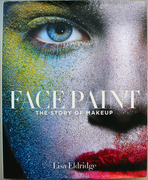
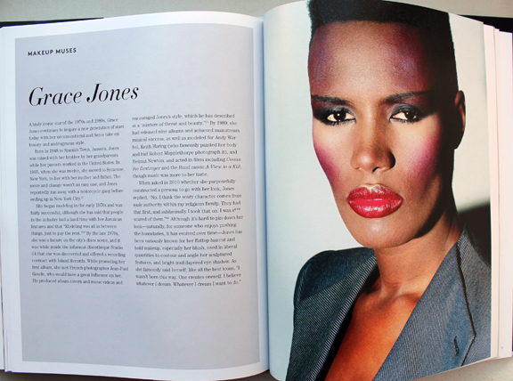
I really enjoyed the shorter bits of history that appeared between chapters in Lisa Eldridge's Face Paint. I liked the idea so much, in fact, that I decided to steal it and use it for my '90s makeup history book. Prom makeup is just one of the many featurettes I want to include. And I realize that prom season has come and gone by this point, but I'm still thinking how crazy it is that I graduated high school and attended my senior prom 25 years ago this spring! So with that, let's see what pop culture and magazine editorials were recommending in terms of prom makeup. Obviously this isn't meant to be an exhaustive list of every '90s prom look ever and how they compare to today's styles, nor is it a philosophical examination of prom and its greater cultural or social significance, especially for teenage girls.  This post is really more of a nostalgic snapshot, especially since sources were hard to find. There are tons of vintage prom photos online but the makeup is barely visible, either because analog photos rarely translate well to digital images or because they were taken at a distance. Very few clear, closeup images of old prom makeup exist, so I had to rely mostly on magazines, movies and TV episodes and they weren't great quality either. Also, I credited where I could, but not all information was available for every photo.

Overall, the decade followed the general makeup trends of the time. As a sort of backlash to the bright colors and general excess of the '80s, from about 1990-1994 the majority of prom looks featured minimal, barely perceptible makeup.

Minimal prom looks from Seventeen Magazine, 1992 and 1991

Minimal prom looks from Seventeen Magazine, 1992 (left) and 1991 (right). Credits for 1992: Hair – Hubert Cartier and Gili. Makeup: Timothy Metz. Photography: Wayne Stambler. Credits for 1991: Hair – Rodney Groves; Makeup – Timothy Metz; Photography – Tierney Gearon.
Monochromatic minimal makeup, Sassy magazine, 1993

Sassy Magazine, 1993. Hair – Daniel Howell; Makeup – Wei Lang; Photography – David Jensen

Are these girls even wearing makeup?! I guess they are since the credits list a makeup artist, but it's nearly invisible.

YM Magazine prom edition, 1994

YM Magazine prom edition, 1994. Credits for top photos: Hair – Christopher Lockhart for Sarah Laird; Makeup – Christy Coleman for Jed Root, Inc. Credits for bottom photos: Hair – Brent Lavent for Celestine; Makeup – Laura Jadro for Visage; Photography – Carlo Dalla Chiesa
YM Magazine prom edition, 1994

YM Magazine prom edition, 1994. Hair – Christopher Lockhart for Sarah Laird; Makeup – Mathew Sky for Vartali Salon. Makeup by Maybelline.
Sassy Magazine, March 1994

Sassy Magazine, March 1994. Hair – Daniel Howell for Oribe; Makeup – Regina Harris; Photography – Cathrine Wessel

Julia Stiles's character in 1999's 10 Things I Hate About You opted for a minimal look for prom, but this might have been more of a stylistic choice to go match her personality rather than a reflection of late '90s trends. Kat Stratford would never go for the glitter, frost and pastel colors that were popular towards the end of the decade.

10 Things I Hate About You prom makeup

Julia Stiles as Kat Stratford in 10 Things I Hate About You, 1999. Makeup artist: Martin 'Vinnie' Hagood

Another trend early on was a return to old school glam. Red matte lips, with or without a winged liner but always keeping the rest of the face neutral, was a popular choice.

Kelly and Brenda in Beverly Hills, 90210

Kelly (Jennie Garth) and Brenda (Shannen Doherty) in Beverly Hills, 90210 "Spring Dance" episode, 1990. Key makeup artist – Sheree Morgan; makeup artist – Alex Proctor.
Seventeen Magazine, March 1991

Seventeen Magazine, March 1991. Hair – Gabriel Saba for John Sahag Salon; Makeup – Jacqui Lefton; Photographer – Dewey Nicks; Model – Limor Luss
Kellie Martin in Seventeen Magazine, March 1992

Kellie Martin in Seventeen Magazine, March 1992. Hair – Patrick Melville for MCM Salon; Makeup – Tracy Sondern; Photography – Bico Stupakoff
Sassy Magazine, March 1995

Sassy Magazine, March 1995. Hair – Diane Wiedenmann; Makeup – Sharon Gault for Cloutier

Again, as with 10 Things I Hate About You's Kat, I think Heather's (Mena Suvari) red lip more a stylistic choice to better suit the character rather than part of a real-world trend. (Sorry about the lack of quality in this photo, I couldn't find a decent shot anywhere. Also, no fewer than 7 makeup artists for American Pie are listed at IMDB so it's not clear who chose her look.)

American Pie prom

Just based on these candids from YM's prom issues, it seems like a lot of girls opted for a red lip or the minimal look for prom for 1993 and 1994.

YM Magazine prom edition, 1993

YM Magazine prom edition, 1993
YM Magazine prom edition, 1994

YM Magazine prom edition, 1994

There was also a somewhat odd combination of soft smoky matte grey or brown shadow and a desaturated but noticeable lip color. I don't really remember this look, probably because I can't say that the early '90s take on a smoky eye is a look I enjoy. It just looks flat and muddy, plus very amateur despite the professional application. It's like someone dipped their fingers into shadow, swiped them across their lids, added a touch of mascara and declared their eye makeup finished. Which would be fine with different textures and shades, but matte shadow in these colors requires some definition.

Seventeen Magazine, March 1992

Seventeen Magazine, March 1992
YM Magazine prom edition 1993

YM Magazine prom edition 1993

My opinion is that it suits nobody, not even Heidi Klum.

YM Magazine prom edition 1994

YM Magazine prom edition 1994. Credits for left photo: Gerald DeCock for Louis Licari Color Group; Makeup – Christy Coleman for Jed Root, Inc. Credits for right photo: Hair – Lawrence DePalma for Pierre Michel Salon; Makeup – Christy Coleman for Jed Root, Inc. Model: Heidi Klum

A monochromatic face is surprisingly artistic and flattering if there's variation in textures and finishes between eyes, cheeks and lips. Matte brown shadow with seemingly no other eye makeup besides a hint of mascara and paired with a warm, orange-brown lip isn't great on most people. Case in point: these prom looks from the March 1994 issue of Seventeen. I know they were really meant to show the hairstyle, but they are so boring! Plus it looks awful on the skin tone of the particular model that was chosen – the poor thing looks like the life got sucked out of her. This combination only works on very specific coloring.

Seventeen Magazine, March 1994.

Seventeen Magazine, March 1994. Hair – Mara Schiavetti; Makeup – Cindy Joseph

Matte, one-dimensional shadow works if the eyeliner is noticeably darker and there is a contrast in tone for the lip color, as in YM's 1993 prom editorial.

YM Magazine prom edition, 1993

YM Magazine prom edition, 1993. Model: Lana Ogilvie. Makeup Artist: Craig Gadson for Cover Girl.

YM Magazine prom edition, 1993

But there is hope. Around 1996 is when we start to see a move away from matte textures and neutral shades. Bring on the metallics, the frost, the GLITTER!!

Seventeen Magazine, March 1997

Seventeen Magazine, March 1997. Hair – Dennis DeVoy for Garren New York; Makeup – Kiyoshi for Oribe Salon; Photography – Iris Brosch
Seventeen Magazine, March 1999

Seventeen Magazine, March 1999

Seventeen Magazine, March 1999

Seventeen Magazine, March 1999
Seventeen Magazine, March 1997

Seventeen Magazine, March 1997. Hair – Matthew Williams; Makeup – Virginia Carde; Still life photos – Aimeé Herring; Model photos – Olivia Graham

There were literally dozens of makeup artists who worked on Buffy the Vampire Slayer, so I'm not sure who was responsible for Buffy's prom makeup, which consisted of a soft silvery grey eyeshadow and pearly pink gloss.

Buffy the Vampire Slayer prom scene, 1999

Sarah Michelle Gellar in "The Prom" episode of Buffy the Vampire Slayer, 1999

Complexion-wise, foundation was less heavy and flat. Even though the early '90s embraced the minimal look, skin still looked a bit dull. There were also few glossy lips to be found. The later part of the decade witnessed a shift towards fresher-looking skin (perhaps more blush added to this effect) and the rise of super shiny lips, which would continue into the early 2000s.

Seventeen Magazine, March 1997

Seventeen Magazine, March 1997. Hair – Matthew Williams; Makeup – Virginia Carde; Still life photos – Aimeé Herring; Model photos – Olivia Graham

Also, there was interest in color again – no longer was the palette limited mostly to red, pink, grey and brown. Blue, peach, yellow, violet and green peeked their eager little faces out for the first time in what seemed like ages.

Sassy Magazine, March 1996

Sassy Magazine, March 1996

Sassy Magazine, March 1996

Sassy Magazine, March 1996
Seventeen Magazine, March 1997

Seventeen Magazine, March 1997. Hair – Dennis DeVoy for Garren New York; Makeup – Kiyoshi for Oribe Salon; Photography – Iris Brosch
Seventeen Magazine, March 1998

Seventeen Magazine, March 1998. Hair – Kevin Woon; Makeup – Kiyoshi; Photography – Marc Baptiste
Seventeen Magazine, March 1998

Seventeen Magazine, March 1998. Hair – Kevin Woon; Makeup – Kiyoshi; Photography – Marc Baptiste

I really wish I could have found better photos of the makeup in prom scenes from movies and TV. (Seriously though, what was up with all the prom sequences in films from 1999? It seems nearly every teen movie made that year had one.) In these stills that I screenshotted and tried to brighten from She's All That you can sort of make out Laney's violet eyeshadow and browbone highlight.

She's All That prom makeup, 1999

She's All That prom makeup, 1999

Rachel Leigh Cook as Laney Boggs in She's All That, 1999. Head makeup artist – Felicity Bowring; Makeup artists – Raqueli Dahan, Jane Galli and Lisa Layman

Meanwhile, mean girl Taylor Vaughan (Jodi Lyn O'Keefe) rocked a monochromatic gold look, complete with face and body glitter. Peak '90s!

She's All That, 1999

She's All That, 1999

And let's not forget Courtney's epic frosty blue eyeshadow in 1999's Jawbreaker. Once again there was a huge makeup department so whose idea it was I'm not sure.

Rose McGowan in Jawbreaker, 1999

Now there were some trends that appeared in various iterations throughout the whole decade rather than being confined to  certain years. Pink reigned supreme for prom makeup in the '90s. Whether it was full-on bubblegum or a more natural, "romantic" look, rosy hues were a staple.

YM Magazine prom edition 1992

YM Magazine prom edition 1992. Hair – Brian Devine, Oribe at Elizabeth Arden; Makeup – Melissa Rogers
Kellie Martin in YM Magazine prom edition, 1992

Kellie Martin in Seventeen Magazine, March 1992. Hair – Patrick Melville for MCM Salon; Makeup – Tracy Sondern; Photography – Bico Stupakoff
Sassy Magazine, March 1992

Sassy Magazine, March 1992. Hair – Colleen Creighton for Pierre Michel; Makeup – Lutz; Photography – Steven Miller

Sassy Magazine, March 1992

Sassy Magazine, March 1992

Sassy Magazine, March 1992. Hair – Colleen Creighton for Pierre Michel; Makeup – Lutz; Photography – Steven Miller

YM Magazine prom edition, 1993

YM Magazine prom edition, 1993

Sassy Magazine, March 1994

Sassy Magazine, March 1994. Hair – Daniel Howell for Oribe; Makeup – Regina Harris; Photography – Cathrine Wessel
YM Magazine prom edition, 1994

YM Magazine prom edition, 1994

YM Magazine prom edition, 1994. Hair – Gerald DeCock for Louis Licari Color Group; Makeup – Mara Schiavetti for Jean Owen
Sassy Magazine, March 1995

Sassy Magazine, March 1995. Hair – Diane Wiedenmann; Makeup – Sharon Gault for Cloutier
Sassy Magazine, March 1996

Sassy Magazine, March 1996
Seventeen Magazine, March 1997

Seventeen Magazine, March 1997. Hair – Matthew Williams; Makeup – Virginia Carde; Still life photos – Aimeé Herring; Model photos – Olivia Graham
Seventeen Magazine, March 1999

Seventeen Magazine, March 1999

Sixties-inspired makeup also seemed to be a popular pick in both the early and later parts of the decade.

Seventeen Magazine, March 1991

Seventeen Magazine, March 1991. Credits: Hair – Rodney Groves; Makeup – Timothy Metz; Photography – Tierney Gearon
Seventeen Magazine, March 1991

Seventeen Magazine, March 1991. Credits: Hair – Rodney Groves; Makeup – Timothy Metz; Photography – Tierney Gearon
YM Magazine prom edition 1992

YM Magazine prom edition 1992
Seventeen Magazine, March 1991

Seventeen Magazine, March 1991. Hair – Gabriel Saba for John Sahag Salon; Makeup – Jacqui Lefton; Photographer – Dewey Nicks
Seventeen Magazine, March 1994

Seventeen Magazine, March 1994.  Hair – Debbie Horgan; Makeup – Lorraine Leckie; Photography – Troy House

Sassy Magazine, March 1996

The most outrageous example is possibly from 1999's Never Been Kissed. It's like '60s mod meets Evening Gown Barbie, Disco Barbie and Malibu Barbie, respectively (at least, according to the characters).

Never Been Kissed, 1999

Never Been Kissed, 1999 with Kristin (Marley Shelton), Kirsten (Jessica Alba) and Gibby (Jordan Ladd). Makeup dept. head – Kimberly Greene; Makeup artists: Joni Powell and Lyssa Wittlin Baumert

Yours truly opted for the more subtle look. Yup, that's the Curator at age 17, doing her best impression of Audrey Hepburn in Breakfast at Tiffany's for her senior prom. I eschewed my usual dark plum lip in favor of Holly Golightly's pale pink, and though you can't make it out in this old picture, I also had some pretty serious feline eyeliner. (I actually am a disaster at winged liner; my sister's friend did my makeup). Too bad I had to ruin my updo by adding the ever-present '90s tendril…then again, the bangs were already atrocious.  But I loved my makeup, gloves, jewelry (shout-out to Y necklaces!), and dress. I really regret getting rid of those last two.

1996 prom

Finally, grunge, goth and punk influences occasionally emerged from subculture status on a decade-wide basis.

Sassy Magazine, March 1993.

Sassy Magazine, March 1993. Hair – Daniel Howell. Makeup – Wei Lang. Photography – David Jensen
Seventeen Magazine, March 1997

Seventeen Magazine, March 1997. Hair – Pasquale Ferrante; Makeup – Susan McCarthy for Shu Uemura; Photography – Grey Zisser

The models aren't named in these next two photos but I'm almost positive I spy Alexis Bledel.

Seventeen Magazine, March 1998

Seventeen Magazine, March 1998. Hair – Kevin Woon; Makeup – Kiyoshi; Photography – Marc Baptiste
Seventeen Magazine, March 1998

Seventeen Magazine, March 1998. Hair – Kevin Woon; Makeup – Kiyoshi; Photography – Marc Baptiste

There were a handful of exceptions to all the usual looks. In one feature from YM's 1993 prom edition, a red lip was paired with a pale gold shadow rather than brown or grey and it actually looks like some blush was applied. I would absolutely wear this today (minus the skinny brows, of course.)

YM Magazine prom edition, 1993

Hair – Howard Barr for Celestine; Makeup – Wendy Osmundson for Cloutier; Model – Melissa Billingsly.

These next two looks had some appealing contrast between eyes and lips. While the eyebrow shapes are firmly '90s, the mix of either cool purple or silver shadow with a satin-finish plum or pink lip falls outside the usual trends from the era.

YM Magazine prom edition, 1993

YM Magazine prom edition, 1993. Hair – Phillippe Barr for Salon Ziba; Makeup – Kelly Quan for Sarah Laird.
YM Magazine prom edition, 1992

YM Magazine prom edition 1992. Hair – Brian Devine, Oribe at Elizabeth Arden; Makeup – Melissa Rogers

And here's another monochromatic gold look, but it's several years ahead of its time.

Seventeen Magazine, March 1994

Seventeen Magazine, March 1994

But there weren't really many outliers. Overall, prom makeup in the '90s seemed very much a microcosm of the larger trends of the decade. It was a little disappointing not to uncover any totally atypical looks (although I do think the late '90s was way more fun than the start of the decade). But I'm guessing the big magazines and movie studios/TV shows weren't going to push much unconventional prom makeup or feature anyone who wore it, and those who would opt for more daring looks on a regular basis probably weren't going to prom. Fortunately, mainstream media has somewhat caught on to a new aesthetic. The styles are very safe in most magazine covers and online content. The looks are nice and definitely updated from the '90s, but they are, shall we say, basic, or mimicking "Instagram" style makeup. However, a closer look suggests there is experimental, Euphoria-type makeup being recommended, such as the incorporation of embellishments (flowers, gems, etc.), graphic liner in a bright color, or creative use of glitter. For example, compare several of Seventeen's recent prom covers with their online recommendations, or the fairly unremarkable cover look on Teen Vogue's 2014 prom issue with the far more interesting editorial inside. (Diversity in terms of race and body shape/size still needs work.)

Seventeen Magazine prom editon covers

Seventeen Magazine prom edition – 2015, 2016 and 2019 covers
Seventeen Magazine prom looks, 2020

Seventeen Magazine prom looks featured online, 2020

(images from seventeen.com)

Teen Vogue April 2014

Teen Vogue April 2014

Teen Vogue 2014 prom editorial

Teen Vogue 2014 prom editorial

Teen Vogue 2014 prom editorial. Hair – Rutger using Oribe; Makeup – Ralph Siciliano using Lancome; Photography – Greg Harris

(images from streeters.com)

I was very relieved to see these looks, as I was horrified at the possibility of Gen Z'ers receiving the same advice that me and my fellow Gen X'ers did, i.e., to play it safe. In my day prom was akin to one's wedding in terms of makeup (which is another whole disturbing can of worms that I don't want to open right now.) The most common tips for both occasions were to play up one feature only, stay away from using multiple colors, and don't deviate much from your everyday look, along with a bunch of tricks to help one's makeup last longer. Ho-hum.

Boring prom makeup tips from YM Magazine prom edition 1994

Not surprised by Bobbi advocating for safe makeup.

Safe makeup tips from Bobbi Brown, Seventeen Magazine, March 1997

If simple and natural is your style, or you don't want to try anything too wild for a big occasion, great! But I'd like it if makeup that actually takes risks were as normalized as looks featuring minimal makeup.

While this hasn't been the most insightful post, a glimpse of '90s prom makeup serves as a good refresher on the decade and helps give more context to the trends. Plus as a print junkie, it was insanely fun to flip through old magazines. (The movies did not hold up well..although honestly even at the time they were fairly problematic.) It kind of makes me want to do a whole book or exhibition on prom makeup from all decades. 😉

Any favorite looks here? Did you attend any proms or formals in high school and if so, do you remember your makeup or have any photos you'd be willing to share?

Hypebae article on blushTooting my own horn again, apologies. But I was so excited to be interviewed for an article on the history of blush and its current resurgence (and in which I was referred to as an "expert"!) In case you haven't noticed, blush is back with a vengeance. You can click over to Hypebae for the article, but given how much time I spent answering the journalist's questions I thought I'd post my full answers here. Plus, more Museum photos! Enjoy…and please let me know any and all thoughts on blush in the comments. 🙂

Blush has been used in ancient cultures across Egypt, Greece and more. Can you walk us through the origins of blush and explain how it was used in different areas of the world? (Please feel free to include as much detail as possible.) The ancient Egyptians were most likely the first to use blush as a cosmetic aid. A fresco in Santorini from the Bronze Age depicts women with red cheeks, the rest of their faces unadorned. In China, blush was used as early as the Shang Dynasty (1600-1046 BCE). Later, during the Tang Dynasty reign, imperial concubine Yang Guifei (719-746 AD) regularly wore heavy blush at court. In Greece and Rome, blush was primarily used by upper class women and applied in a subtle way; noticeable check color was frowned upon. Blush also crossed gender lines throughout some early civilizations and up through the 18th Over time, as white supremacy grew ever more powerful, blush became part of an “ideal” complexion that signified wealth and high status – blush was used in part as a way to make pale skin stand out more, which was desirable as white skin represented a life free from toiling outside. At the same time, for the most part blush was supposed to be undetectable. It wasn’t until the 20th century that blush became socially acceptable.

A selection of the Makeup Museum's vintage blushes, ca. 1920s-30s

A selection of the Makeup Museum's vintage blushes, ca. 1920s-30s

Why do you think blush has endured as a widely used makeup product?
Blush has endured primarily because it’s a critical element of meeting two long-standing beauty ideals: health and youth. Cheek color signifies vitality; while I don’t think any live person not wearing blush would be mistaken for a corpse, blush heightens one’s natural color, further emphasizing a healthy flow of oxygenated blood (i.e., a literal life force) to the face. Cheek color became associated with markers of health such as physical fitness, good nutrition and rest. Cheek color is also associated with youth, which has been a pillar in beauty standards for millennia and one that persists today. (Note: I can expand on the link between health, youth and beauty but it would take forever as there are quite complex psychological and scientific explanations).

Princess Pat rouge ad, 1940

Princess Pat rouge ad, 1940

Some historians claim that blush’s universal appeal, much like lip color, is due to its mimicking of sexual arousal or a post-coital flush. While I personally find that theory dubious – I’m just not a fan of the sexualization of makeup – it’s important to remember that the most famous and possibly best-selling blush in modern times is NARS’ Orgasm. Additionally, for centuries in the Western world, with a few exceptions here and there (such as mid-late 18th century France), excessive makeup, including noticeable rouge, was considered the domain of prostitutes, so that’s another connection between blush and sexuality. Along those lines, one could even argue that the traditional virgin-whore dichotomy is a factor in blush’s longevity. Looking flushed could point to embarrassment at the notion of intimate relations, signaling a dainty, demure and virtuous woman, or it could be overtly sexual. Either way, blush’s sexual connotations helped solidify its status as an essential cosmetic. Finally, a simplistic reason for blush enduring through the years was that it was as easy to obtain ingredient-wise as lip color. There were readily available materials across the world. Whether it was the ochre of ancient Egyptians, poisonous cinnabar of the Romans, safflower used in parts of Asia or a basic mixture of berries and water, raw ingredients could be found virtually anywhere.

NARS Orgasm special edition blush, summer 2016

Blush sales are increasing. In your opinion, what could be contributing to that rise? First, I believe there’s a psychological component involved. Most of us have been privileged enough to work from home, see friends and family via video conference, and were able to adjust our routines, but that all of that has taken a toll on our mental health. Being trapped behind a screen far more than we’re used to, with little in-person contact, struggling to work and interact and essentially function in a completely different way for over a year can lead to feeling drab and lifeless, despite being physically healthy. As noted earlier, cheek color represents vigor and liveliness. This is why every spring fashion and beauty magazines have features on banishing the “winter blahs”, with the number one tip inevitably being the purchase of a new shade of blush to look and feel rejuvenated. Thus, with its promise of restoring a youthful, rested glow, blush may help combat the dullness experienced as a result of having to curtail so many activities that are essential to one’s well-being as well as general pandemic-related exhaustion. As one beauty writer notes, she applied “a generous helping of blush to help me look alive even though on most days I felt dead inside.” I also think that now since the pandemic is on the verge of ending, we are collectively dreaming about fresh starts and enjoying life more fully again. More so than other makeup categories, on a spiritual level the application of blush may help us awaken from the trauma and upheaval unleashed by the pandemic, a way to feel more vibrant and a reminder that our health is relatively intact. On related note, a healthy flush is associated with being outdoors, which many of us haven’t been able to do. If you can’t enjoy a reinvigorating jaunt through nature, you can at least pretend you got the blood flowing with some blush.

Blush-2021

1. Melt Cosmetics Cream Blushlight 2. Natasha Denona Puff Paint liquid blush 3. Tower 28 Beach Please Lip and Cheek Cream 4. Hermes Rose Hermes Silky Blush Powder 5. LYS Beauty cream blush 6. Lisa Eldridge Enlivening Blush 7. Pat McGrath Divine Blush 8. Merit Beauty Flush Balm

Secondly, even though we are optimistically looking towards the end of the age of COVID-19, life has not returned to how it was pre-pandemic for most. Many people are still reconsidering and adjusting all of their makeup, including blush, in light of continuing Zoom calls. Depending on one’s camera and lighting, a person may need to increase the amount of color so as to not appear washed out; in other cases, they’re finding that their regular application is too heavy-handed. Thus, in addition to adapting their current products, they’re seeking either new shades or new formulas that are effortless and “goof-proof” for video.

Finally, I think at the moment the market is so saturated with every other form of makeup – highlighters, (especially!) eye products, lip colors, even base makeup, companies figured it was time to swing the pendulum back to blush. It’s a product category that’s been relatively neglected due to the popularity of contouring and the no-makeup look. But these two trends were already waning, with consumers wanting a simpler approach to cheek color than the skill and time required by contouring as well as a look that was more than the bare minimum of the no-makeup face. Another trend that’s been gaining traction the past few years is the notion of wellness. Consumers are increasingly interested in cosmetic options that might also have benefits for their physical and mental well-being. The pandemic engendered a renewed focus on health, making wellness and self-care more important to consumers than before. It follows that blush, and its long-standing association with health, would be more in demand. In short, a return to blush was brewing for a while and was accelerated by the pandemic, hence the rise in sales now.

During the 19th century, symptoms of tuberculosis including pale skin and red, feverish cheeks became fashionable, leading women to recreate a sickly appearance using makeup. Can you explain the link between beauty and illness, as well as how that relationship might manifest into the age of coronavirus? The mimicking of TB wasn’t a widespread or long-lasting trend because historically there is a much stronger link between beauty and health than illness. Having said that, what the recreation of tuberculosis did was simply exaggerate the already entrenched notions of beauty – pallid skin and flushed cheeks. No one was feigning smallpox, for example, because the effects of that disease were viewed as ugly and disfiguring. (And as soon as TB began to be associated with the lower classes, it quickly became unfashionable to fake it…but that’s a whole other story.) Today there are some trends such as Igari (the “hangover” look) and Byojaku (“sickly”), but they are intended to achieve a distinct kawaii aesthetic. Again, no one is doing a tutorial on getting the coronavirus look using makeup because the symptoms are viewed as unappealing (plus I’d like to think with so many lives lost people would be a little more sensitive than to pull a stunt like that.) There is a link between beauty and illness, but only so far as the illness’s effects align with current beauty standards. Overall, blush is primarily used to look healthy. For every one “hangover” or other similar trend piece, there are at least 10 articles emphasizing the importance of wearing blush while ill to counteract the symptoms that are perceived as unattractive. Sometimes a warm-toned blush or even bronzer is recommended to distract from redness or other discoloration around the nose and eyes, as that symptom is viewed as aesthetically undesirable.

Clairol blush ad, 1967

Clairol blush ad, 1967

Over the past year, have you noticed a shift at all in how people are wearing blush? What I’ve been observing in beauty publications and on social media is that people are perceiving blush as more than an afterthought or a basic necessity in tying a look together. Blush is becoming exciting in its own right again; cheeks are no longer playing third fiddle to eyes and lips or serving just as a canvas for contour and highlight. On a basic level, unlike the lips, at least part of the cheeks is still visible while wearing a mask. Some have adapted the ‘80s trend of taking blush up past the temples, closer to the eyes, so that it’s more noticeable behind a mask – as with eye makeup, the emphasis is on what can still be seen in a mask.

More significantly, how people are wearing blush is just one part of the pandemic’s larger impact on makeup routines more generally. People found their normal beauty routine disrupted, and they’ve been questioning it: why am I wearing makeup, who am I wearing it for, and do I really want to be wearing a full face every day? From my perspective, people seem to have gone in several directions or a combination thereof: some kept up with their usual makeup routine to retain a sense of normalcy, others began experimenting with makeup in ways they wouldn’t normally otherwise, and still others greatly pared down their routine. It’s this last path, I think, that has caused the biggest shift in how people are wearing blush. Many are finding they don’t want or feel the need to do a full face for virtual meetings and staying at home, so they’re embracing a more relaxed approach that includes a quick swipe of blush rather than combining it with contour and highlight. Sculpted cheekbones are being pushed aside in favor of a less “done”, more carefree look that is easily achieved with blush. Whether or not low-maintenance makeup sticks around as quarantine life fades away is anybody’s guess; I think it might, but I also think in some instances people will be piling on the makeup as a way to celebrate the end of the pandemic – now that our faces aren’t obscured we can wear as much as we like without a mask rubbing it off. In fact, while the average makeup wearer may be rediscovering the joys of basic blush application, over the top blush is already trending on the editorial side. If the usual amount of cheek color signifies physical well-being, in the age of COVID-19, perhaps an excessive application will reinforce the notion of health. The super flushed look may end up as an exuberant symbol of survival.

Pat McGrath blushes

This post has been in the making for literally years. I finally conceded that I couldn't find a complete history of either Benefit's Glamourette compact, released in 2002, or the vintage compact it was based on, House of Platé's Trio-ette (ca. 1944-1947). But I did turn up a few nuggets of information, so figured I'd share the little bit that was readily available.

House of Platé Trio-ette compact (ca. 1944-1947) and Benefit Glamourette compact (ca. 2002-2003)

House of Platé Trio-ette compact (ca. 1944-1947) and Benefit Glamourette compact (ca. 2002-2003)

The House of Platé company was established in 1944 by Robert T. Plate in Detroit. From what I was able to piece together from various archives, it seems Plate was born in 1897 in Lima, Ohio and received a Bachelor's degree in mechanical engineering from the University of Michigan in 1923. Specializing in automobile design, his first job was draftsman for the Willys-Overland Company in Toledo. Beginning in 1932 Plate worked for General Motors, and in 1938 he was doing business as the Plate Manufacturing Company. In 1945 he trademarked the Trio-ette compact under Curly Lox Products.  The biggest mystery for me is why Plate decided to market cosmetics. I'm assuming it was a side hustle to earn a little extra cash, or maybe he thought he could become the next Max Factor. (As a side note, Plate moved quite frequently throughout his life, bouncing around from Ohio to Michigan to New York to LA…if it's the same Robert T. Plate, I'm not sure whether he was trying to help his business take off across the country or moving for engineering jobs.)

Trio-ette trademark registration

The design of the compact was based on a "quaint Victorian rose cameo hand mirror" according to one ad. This one is reproduced in Roselyn Gerson's book Vintage and Vogue Ladies' Compacts (2nd edition).

Trio-ette ad, House and Garden, 1946

It's really fascinating to see how a mechanical engineer who designed cars approached makeup. Compacts with powder, rouge and lipstick had existed for years, but few had the novelty and charm of the Trio-ette's design. (However, one can definitely tell an engineer also thought of the rather unimaginative House of Platé name. I guess Plate thought adding an accent over the "e" would make it sound vaguely French and therefore instantly appealing.) I'm so disappointed that I wasn't able to find patent drawings despite having the serial number. But maybe the trademark is different than patenting the actual design.

Trio-ette compact box

Trio-ette compact

Trio-ette rouge

Trio-ette compact open

Trio-ette compact outer mirror

Trio-ette compact lipstick

The name on the handle is such a sweet little detail.

Trio-ette compact handle

Trio-ette ad in the Californian, October 1946
(image from archive.org)

As the Trio-ette was conceived and launched during WWII, it was made of plastic, specifically tenite, instead of metal. Tenite apparently is the trade name for a cellulosic plastic created by Eastman Chemicals in 1929. (I wish I knew the difference between tenite, bakelite, and celluloid. Alas, I have no clue.) The Trio-ette was also refillable. This snippet from Drug and Cosmetic Industry shows the refill kit, but the really interesting thing about this blurb is that the journal was not falling for the Trio-ette's hype, claiming it was nothing more than a "gadget" and citing the more "streamlined" designs from established big-name brands.  It's true: companies had been making triple compacts for a good 20 years by that point.

Trio-ette - Drug and Cosmetic Industry, January 1945
(image from archive.org)

Whether it was a novelty or a truly handy compact to carry, the Trio-ette seemed popular, or at least, it was readily available across the entire country in department stores as well as drugstores. Plate, though not a businessman by trade, understood the importance of advertising. In late 1945 he hired NY-based firm Norman D. Waters and Associates to oversee a national campaign they would launch early the following year. The Trio-ette allegedly reduced "bag fumbling" and "makeup fatigue".

Advertising Age, February 1946

As with lipstick mirrors, it was considered a social faux pas to be digging through one's purse to look for your makeup, mostly because it was a potential inconvenience for men. Ladies, with the Trio-ette he won't mind waiting for you to touch up since it won't take long at all – all your makeup is in one place so you won't waste his time searching for it. *eyeroll* These ads certainly paint a picture of gender norms, don't they?

Green_Bay_Press_Gazette_Mon__Apr_8__1946_

There were other products from House of Platé, including a double-ended lipstick called the Duo-ette and the Vista, a lipstick with a built-in mirror (again, you can see my post on those.)

House of Platé ad, 1946

The Trio-ette came in a variety of colors as well as black ones with a pink rose or a rhinestone border.  According to collector's guides, the most valuable colors are blue, pink and green. Personally, while I love all the shades, my most-wanted would be the rhinestone version followed by the green and mock tortoiseshell.

Trioettes and Duo-ette lipstick
(image from pinterest)

Trio-ette compact with rhinestones
(image from etsy.com)

The Trio-ette was quite short-lived. I'm not sure why exactly; it could be that Plate had run into a trademark issue with Curly Lox, or maybe after the war a return to metal compacts was all the rage and plastic fell out of favor. Or it could also be that a copycat was released around the same time. In the UK, a company named Jason released a nearly identical compact in late 1947. The only difference I can see besides the name is that the front of the compact is plain instead of bearing a sculpted rose.

Trio-ette by Jason, ca. 1947-1949
(image from antiquesatlas.com)

According to the British Compact Collectors Society, the Jason Trio-ette was also known as a "three-in-one" and available in blue, green, ivory, black and tortoiseshell and could be ordered by mail from Targett Tools Ltd., London. It's not clear what, or even if, there was a relationship between House of Platé and Jason.

Jason Trio-ette, Board of Trade Journal May 1948

What's undeniable is the impact the Trio-ette had on future compact designs for the bigger brands. Volupté launched a compact with powder, lipstick handle and outer mirror in 1951 within its Demitasse line, and by 1953 it was advertised as the "Lollipop".

Volupte Demitasse Lollipop compact, ca. 1951-1954

Volupte Demitasse Lollipop compact, ca. 1951-1954
(images from etsyc.com)

Volupte Lollipop ad, Hartford Courant, June 1954

Around 1952 Coty launched its Parisienne vanity, similar to the Volupté Lollipop, but with no mirror on the outside of the compact.

Coty Parisienne compact, ca. 1952-1959

Coty Parisienne compact, ca. 1952-1959
(images from etsy.com)

Perhaps another reason for the Trio-ette's brevity was simply that Plate couldn't compete with the more well-known brands, who in addition to name recognition, also had a far bigger advantage in terms of marketing savvy. Coty's Parisienne, for example, was somewhat misleadingly advertised as a "4-in-1" even though it actually only contained two products – the mirror and puff were considered the 3rd and 4th items. While some ads describe the design as a miniature hand mirror just like the Trio-ette, some others claim the Parisienne to be a "replica of a Cartier-designed original," which sounds way fancier than a Victorian hand mirror. Maybe if Plate had hired an agency with sneakier copy writers to advertise the compact differently, it might have had some longevity. As I noted earlier, he was educated as a mechanical engineer and not a businessman, so navigating the world of ad agencies and cosmetics marketing was a tricky prospect.

Anyway, House of Platé dropped the accent over the "e" and inexplicably shifted to making plastic toys by mid-1948, which continued through 1951.

House of Plate ad in The Billboard, 1949
(image from archive.org)

Unfortunately Plate was no longer running a legitimate business at that point. According to a 1951 FTC ruling, essentially the House of Plate was mailing people products they did not order and then demanding payment. It's a common scam that persists today in the form of "free trials" of various products. (A few years ago my own mother was the victim of one of these schemes in the form of a trying out a "free" face cream she was sent.) In 1951 the company was officially dissolved. Plate passed away on December 10, 1966 in Athens, Greece.

Now let's investigate Benefit's Glamourette. First, a little background. Founded as a San Francisco boutique called The Face Place by twin sisters Jane and Jean Ford in 1976, the company was renamed to Benefit in 1990 and launched at Henri Bendel in 1991. The cheeky names and retro vibe quickly made their products best-sellers across the country. In 1997 Benefit made its international debut and was acquired by LMVH in 1999. Using vintage mannequins as their mascots and creating packaging inspired by everything from '20s face powders to '70s lip glosses, Benefit was widely recognized as a fun brand that lightheartedly saluted beauty products of yesteryear.

Benefit ad - Vogue, May 2000

Benefit ad - Vogue, May 2000(images from archive.vogue.com)

The company had firmly established its playful kitschy take on cosmetics by the early 2000s, but why they decided to draw on the Trio-ette specifically is unclear. None of their other products seemed to be literal remakes of a particular piece of makeup from earlier times. As with the Trio-ette, I wish I could hunt down the patent drawings for their version of the compact. I also wish I could find anyone who worked for Benefit during that time and see if they have any inside information as to what inspired the company to update the Trio-ette.  We know that the Ford sisters were vintage collectors, so maybe one of them came across a Trio-ette and thought it was the perfect compact to use in their line, but why?

Benefit Glamourette trademark filing

Benefit Glamourette box

Let's compare the Glamourette with the Trio-ette. I would have done a smackdown because they are nearly identical but pitting a spry 20-year-old against a 70+ relic didn't seem like a fair fight.  Obviously the formulas for the makeup itself were updated with newer ingredients.

Benefit Glamourette compact (ca. 2002-2003) and House of Platé Trio-ette compact (ca. 1944-1947)

The lace pattern on the inside of the lid is a nice nod to the pink floral pattern that appears on the insert included with the Trio-ette.

Benefit Glamourette box

Instead of a rose on the lid Benefit used an abstract squiggle design. Also, I don't think the Glamourette was offered in other colors; to my knowledge, only black plastic was available.

Benefit Glamourette

Benefit Glamourette outer mirror

The lipstick mechanism appears to be the same between the two compacts, but Divine's rosy brown hue is unmistakably '90s/early 2000s. Instead of the company's name on the cap there's a sticker saying "lipstick". I would have strongly preferred Benefit's name rather than a totally unnecessary sticker. I know people are dumb but it's pretty obvious it's lipstick…no need for a sticker.

Benefit Glamourette lipstick in Divine

Benefit Glamourette blush in Divine

Interestingly, the powder and blush are reversed from the Trio-ette, i.e. the blush is on the inner part of the compact and the powder is on the outer side. You could also swap out the powder for Fancy Lady cream highlighter.

Glamourette Fascinating Finish face powder

The shade range for the face products had not improved since the 1940s. In fact, I suspect the Glamourette's was even worse. I'm not 100% sure, but it's my understanding from reviews that Fancy Lady didn't come in any other shades besides a pale ivory/champagne. And while I can't make out this tiny photo, it looks like Fascinating Finish powder, appallingly, also only came in one very light shade.*  I know it was 2002, but I was pretty into makeup by then and I distinctly remember just about every line having at least 3 options for face powders and tinted moisturizers by then: light, medium and dark. It's absolutely inexcusable that Benefit didn't offer the bare minimum for face powder shades in the Glamourette compact.

Benefit Glamourette ad
(image from amazon)

Getting back to comparing the two, unlike the Trio-ette, the Glamourette came with a wristlet that could be used as a storage pouch. It's a very sheer piece of organza that I don't think would have been too helpful in terms of preventing wear and tear, but interesting to note.

Benefit Glamourette wristlet

Obviously the advertising for the Glamourette was similar to its 1940s counterpart. Both touted ease of use, refillable products and chic, vintage-inspired packaging. Bag fumbling was still presented as a tedious time waster for the new millennium's busy modern woman. Perhaps as a sort of snooty counterpoint to the golden age of trashy reality TV and super glossy, frosty makeup finishes that appealed more to teens than adults, the Glamourette was also described as "discreet" and something a "real lady" would carry, whatever that means.

Benefit Glamourette ad in the Orlando Sentinel, November 2002

Daily_News_Thu__Aug_8__2002_

The Glamourette was generally well-received. There are a few reviews on Makeupalley gushing over its cuteness and convenience while acknowledging it was a gimmick. One reviewer mentioned she would pass it on to her 11 year-old daughter in a few years, so Benefit helped rekindle the notion of makeup as a keepsake. While most MUA'ers felt the amount of product was a bit stingy for the price point, overall they loved the style and found the compact practical for a night out. Several reviews also pointed out the similarity to the black plastic packaging of Anna Sui's line. 

Speaking of product amounts, I don't have the exact numbers for the Trio-ette, but if they were the same as the Glamourette, the latter was actually a better deal. The Trio-ette retailed for $5.50 in 1946, and according to an inflation calculator it would have cost about $51 in 2002 when the Glamourette was being sold. Glamourette's retail was $38 ($55 CAD and £32.50 in the UK). I also find it amusing that the reviews commented on how streamlined and tiny the compact was when Glamourette is actually a smidge larger than the Trio-ette, which was described as "bulky" in the Drug and Cosmetic Industry article. As we know, makeup packaging gradually got bigger over the years, so the Glamourette demonstrates how both design and consumer expectations changed. 

Benefit Glamourette compact (ca. 2002-2003) and House of Platé Trio-ette compact (ca. 1944-1947)

Despite the amount of press and good reviews, the Glamourette was a limited edition item that did not return to the market after its brief two-year stint. Even against the backdrop of '90s/early aughts' nostalgia for mid-century styles (see also Too-Faced's Quickie Chronicles) maybe the Glamourette was too retro for most customers. I know when I laid eyes on it I thought it was cute but overly vintage-looking for my taste. It could also have been the type of products included. While there absolutely was and will always be a demand among those sticking to simple polished looks and makeup classics in neutral tones, in the early 2000s traditional lipstick, face powder and blush weren't the most wanted product categories among the younger crowd. Says one Makeupalley reviewer, "It has powder and blush which I never use to touch-up, so I'd never carry this with me. And it also has lipstick, and I'm not a fan of lipstick. If they replaced it with concealer, bronzer, and lipgloss, I'd sell my soul for it!!"  Perhaps a tiny sifter of body glitter may also have been more palatable for a Y2k audience. Finally, the lack of shades for anyone whose skin was deeper than mayonnaise obviously eliminated a good portion of the market.

Benefit Glamourette compact (ca. 2002-2003) and House of Platé Trio-ette compact (ca. 1944-1947)

I still can't wrap my head around why Benefit chose this exact compact. I'm just spitballing here, but maybe it's precisely because House of Platé wasn't a well-known brand that's still sold today. Perhaps Benefit didn't want to risk running into copyright issues that may have occurred if they chose to release an updated version of, say, Revlon's Futurama cases. The patents for those designs may have expired, but the companies are still around and significantly larger than Benefit was – although it was owned by LMVH by that point, Benefit's rivals had the potential to take legal action if the company tried to update an iconic product from their archives.

Even though there's a 55 year age gap between the Trio-ette and the Glamourette, their advertising and reception were remarkably similar. So much had changed between 1947 and 2002, yet the design appealed to totally different audiences. As Drug and Cosmetic Industry noted with the Trio-ette, people love a novelty product even if the underlying concept – in this instance, having three makeup products in one attention-getting case – has been done before. It got me thinking about how a third iteration of the compact would be marketed and received today. The small sizes and refills would be attractive to today's makeup consumers, but the compact would have to be made out of sustainable packaging; plastic won't play well. Maybe the products could be even smaller to make space for brushes rather than puffs. There would probably have to be some kind of emphasis on "wellness" and "self-care" or at the very least, "clean" (sigh), vegan and ethically-sourced ingredients. Most importantly, the shades would need to accommodate all skintones. One parting thought: I'd also be curious to see what would happen if a company released it not today but 55 years after the Glamourette. I wonder how makeup customers in 2057 would react.

House of Platé Trio-ette compact (ca. 1944-1947) and Benefit Glamourette compact (ca. 2002-2003)

What do you think of the designs of these compacts? Do you have a preference for one or the other? And do you like having your makeup all in one place? I could see using something like this for touch-ups, but it would still fall short. Until a product is developed that combines concealer, powder, blotting sheets and lip color all in one, I'm destined to dig around in my bag.


*There was an article in Global Cosmetic Industry from 2002 that lists the following colors for Glamourette blush and lipstick refills. It doesn't make any mention of multiple shades being available for the highlighter and powder. "Rouges in Divine, Fickle and Coy, Fascinating Finish Translucent Powder and Fancy Lady Highlighting Creme are priced at $11.00 each. The line offers Lip shades priced at $9.00 each in Keen (champagne pearl), Vain (vibrant red), Divine (rich plum), Swell (dusty rose), Prim (pink-cocoa pearl), and Coy (mocha apricot) varieties." I cannot for the life of me locate the article now but I know it existed!

A few months ago I was perusing an auction site and came across this interesting-looking makeup case.  As it turns out, it belonged to Hanna Rovina (1888-1980), a.k.a. the "first lady of Israeli theatre". 
 
Hanna Rovina applying makeup, June 1949
(image from commons.wikimedia.org)

Hanna Rovina makeup case
(image from liveauctioneers.com)
 
Originally a kindergarten teacher, in 1917 Rovina left her teaching job to pursue acting, becoming a founding member of a Hebrew theater group in Moscow that later became Habimah, the national theatre of Israel and the first professional Hebrew theater in the world. She became a leading actress after her breakout role as Leah in An-ski’s The Dybbuk in 1922. Rovina was soon renowned in the international theater community due to impressive performances that ranged from Hebrew productions to Shakespeare and classical plays across Europe and the U.S. Her stage makeup was fittingly dramatic, keeping with the style of the time. Historian Raphael Patai describes the "masklike" look Rovina used for the role of Leah in the 1920s. "Her face was powdered or painted chalk white, her black wig hugged her head and face, her eyes were framed with thin black lines, and the areas between her eyes and her thinly penciled-in black eyebrows, and even more so between the eyes and the ridge of her nose, were painted almost black…the only color livening up this somber black-and-white appearance was her mouth, painted blood-red in the form of a narrow double bow that is familiar to those who still remember the heroines of the early silent Hollywood films."

Hanna Rovina as Leah in The Dybbuk, 1920s
(image from haaretz.com)
 
Her theatrical cosmetic style changed slightly from role to role, as seen in this 1955 photo of Rovina portraying Medea.

Hanna Rovina as Medea, 1955
(image from picclick.fr)


Love this shot of her dressing table, probably taken in the 1960s. There's a red jar on the far right that looks like it could be Leichner, but that seems unlikely. Beyond that, embarrassingly, I can't make out any of the items.

Hanna Rovina dressing room
(image from wikipedia.org)
 
So why am I posting about Rovina and her makeup case today? Well, on this day in 1956, Rovina was awarded the prestigious Israel Prize for her contributions to Israeli theatre. As for the makeup case, judging from Rovina's dramatic stage looks and her dressing table, I can only imagine what treasures it holds! Too bad the keys to the locks are missing. But despite bidders not being able to see the contents – or even IF there was anything inside – the case sold at auction for $750, far exceeding the original sale estimate of $150-$200. I can only hope whoever the new owner is figures out a way to open it and publicly share what's in there, even if it turns out to be empty.
 
Hanna Rovina makeup case
 
Had you ever heard of Hannah Rovina? What are your best guesses as to what's inside her makeup case? And if anyone can identify the items on her dressing table I'd love to know!
 

While hunting for vintage Christmas makeup a few months ago I stumbled across a brand from the 1960s called Holiday Magic. This won't be a complete history either of the brand or the man who founded it, but it's one of the most compelling (for all the wrong reasons).  Buckle up because you're in for a truly wild ride!

In 1964, a California salesman by the name of William Penn Patrick (b. March 31, 1930; d. June 9, 1973) noticed a neighbor having a garage sale of organic fruit-based cosmetics called Zolene.  Sensing a new business opportunity, Patrick bought the entire stock for $16,250 (or about $137,000 today).  Re-branded as Holiday Magic, Patrick proceeded to start selling them as a multi-level marketing business (MLM).  Now, MLMs for cosmetics and other goods had been around for many years prior to Holiday Magic, such as Avon, Mary Kay, Watkins, Fuller Brush, etc. While their ethics are murky – on the one hand it gave people jobs and products that they otherwise wouldn't have access to, on the other they require fairly unsavory tactics – they are not technically against the law.  But Holiday Magic wasn't just your average MLM:  it was possibly the biggest pyramid scheme prior to Bernie Madoff. 

Holiday Magic ad in Vogue magazine, October 15, 1967

Within a year of its launch, Holiday Magic had made Patrick a millionaire, and by 1967, the company was allegedly earning $6 million per month.  The makeup products were quite average – nothing appears to be innovative about them.  There was the standard eyeshadow, eyeliner, mascara, brow pencil, lipstick and blush.  I would have had my own photos but I have no idea what happened to the objects I purchased from eBay, which sadly has become the norm these days.  (It looks like tracking information was prepared but the package never was actually mailed. I've contacted the seller numerous times and have yet to receive a reply, let alone a refund. I guess William Penn Patrick is still working through others to scam customers from beyond the grave.)

Holiday Magic cream blush and face powder

Holiday Magic eye products

Holiday-magic-lipstick

The only thing of interest makeup-wise was the connection to the House of Westmore.  The details aren't clear, but it seems Ern Westmore allowed his facial exercises to be used by Holiday Magic, which may have given an air of legitimacy to the brand. 

Westmore facial exercises record for Holiday Magic

Westmore facial exercises for Holiday Magic

Westmore facial exercises instructions(images from ebay and amazon)

While the makeup itself wasn't all that groundbreaking, the fruit-based skincare was fairly ahead of its time.  The two women who founded Zolene, Helene Fly and Zoe Swanagon (hence the company's moniker, a combo of their first names), were committed to using fresh ingredients without preservatives, and did a lot of research on skincare recipes that had been circulating quite literally for centuries.  They were even writing a cosmetics history book!

Zolene cosmetics, 1964

Zolene cosmetics

A lot of their products remind me of LUSH or 100% Pure's offerings.  And I really wish I could find them, I love the Mid-Century Modern star packaging.  Anyway, Zolene continued to supply Holiday Magic with its concoctions until 1967 when the founders became aware of Holiday Magic's business practices. But the company's lack of innovative makeup did not deter it from making a fortune for Patrick. In pyramid schemes, profit is not made by selling products but rather recruiting more salespeople – the products themselves have nothing to do with how the money is made, so it doesn't matter if they're any good.  According to The Snapping Point, a website about business scams, the four characteristics that separate pyramid schemes from MLMs are:

  • the only way for consultants to make a profit is to recruit other consultants. 
  • consultants are required to ‘inventory load’, or constantly inventory to profit.
  • consultants are operating in a ‘saturated market’, or a market where there are more sellers than buyers. 
  • consultants are required to sell products for a fixed price (‘price-fixing’). 

This book explains it in more detail.  Basically, the only way for sales reps to make money was not by selling products but through essentially "buying" more sales people, convincing them to make an "investment" in the company.  Unlike regular MLMs, where by the majority of product purchased by sales reps is actually sold to customers, in pyramid schemes most of the product does not reach them.  In Holiday Magic's case, in 1967 it was estimated that 55% of their product was not distributed to customers, with sales reps having entire garages full of makeup.  In 1973, an FTC attorney stated that he could find no evidence of products being sold directly to customers, only to "master" and "general" distributors, while the former president of Holiday Magic, Benjamin Gay, testified that less than 10% of products sold to distributors ever reached customers.  "There could be sawdust in those jars. The cosmetics were there as a front," he said. The way in which Holiday Magic's hierarchy was arranged, Holiday "girls" could invest $18.91, "organizers" $109.71 to $501, "master" distributors $4,500 (plus a $250 training fee that was never mentioned until the investor signed the contract), and "general" distributors $8,750, plus training fees. 

Holiday Magic ad in Vogue, September 1967
(image from archive.vogue.com)

In addition, Patrick was known for other aggressive, highly immoral practices that went beyond pyramid selling. While Holiday Magic did not officially go bankrupt until 1974, as early as 1967 the company was charged by the California State Attorney General's office for "false and misleading advertising" in which the ads claimed distributors could make roughly $2200 a month (or $18,600 nowadays) working full-time. In retaliation, he took out full page newspaper ads attacking the state attorney general. Basically, any time the company faced a legitimate lawsuit, Patrick would double down and countersue, claiming that his constitutional rights were being violated.  But the coup de grace was Leadership Dynamics, a "training institute" for Holiday Magic representatives established by Patrick and then-company president Gay in 1967.  Sales agents were not required but "encouraged" to take a training course for a mere $1,000, while those higher up on the pyramid were required to take courses there.  However, Leadership Dynamics was not so much training as it was torture; according to a 1972 exposé entitled The Pit, among the many cult-like techniques used to humiliate and brainwash sales reps were severe beatings, being locked naked in cages or tied to a cross, forced to sleep in coffins and, of course, racial slurs hurled at the Black attendees. I'm not sure how much of the book is true, but several newspaper articles as well as an article in Newsweek detail the abuse and numerous lawsuits brought about by attendees who supposedly sustained serious injuries. 

William Penn Patrick

The exceedingly punchable face of William Penn Patrick.

Patrick also dabbled in politics, running against Ronald Reagan in California's 1966 gubernatorial race as an "ultra-conservative Republican" with the slogan "Stop the Commies at Cal".  Gee, color me shocked that a money-hungry narcissist was the complete opposite of liberal.  His political views are not surprising; many rich white mediocre men truly believe the conservative myth that success is due to hard work (bootstraps!) and brilliance, rather than their own privilege, dumb luck or directly screwing over other people.  Indeed, as one former Holiday Magic employee reminisced in 2016, "The whole organization (or lack of) was absolutely bizzare [sic], run by a bunch of frat boys with not a business degree among them. But they had a Phd in pyramid schemes."  A couple of other tidbits:

  • In 1967, as president of the "Victory in Vietnam Committee" he attempted to run a recall campaign against an Idaho Democratic Senator, because you know when Democrats win an election it's because they stole the race (insert eyeroll here).  When the AFL-CIO organized a boycott of Holiday Magic, Patrick promptly sued them.
  • His wife, Marie, was going to be a doctor but abandoned her plans shortly after marrying him to work as a teacher, largely to support them both after Patrick's string of failed businesses. Once Holiday Magic achieved success, she began attending meetings with Patrick because "otherwise, I'd never see him". 
  • On September 24, 1972, one of Patrick's vintage planes, an F86 Sabre piloted by the general manager of Spectrum Air (another company owned by Patrick) crashed into an ice cream parlor shortly after takeoff.  The pilot escaped with a few broken bones and scratches, while 22 on the ground died, including 10 children. Patrick wasn't directly responsible, but the fact that he allowed it to be flown speaks volumes about his complete disregard for others.
  • On June 9, 1973, Patrick died in a crash while performing stunts on another one of his vintage jets, a WWII plane called a P51 Mustang that, again, any regular citizen should not have had a license to own, let alone fly. He also managed to kill a colleague who was in the plane with him, a 30 year-old director of Holiday Magic in Finland named Christian George Hagert.  SMDH.

A few months after his death and a spate of lawsuits in multiple states, as well as a $5 million suit from Avon, Holiday Magic's new president, along with Patrick's widow, announced that the line would be sold "along conventional marketing lines" and get rid of the pyramid aspect of their sales.  They also promised a "fair" method of reimbursing roughly 3,000 of the Holiday Magic distributors in California who had been swindled.  The SEC's ruling earlier that year claimed that 80,000 individuals had been bilked out of $250 million, so it's not clear what happened to the other 77,000 people who were ripped off. In May 1974 there was a class action settlement of over 31,000 members that established a trust fund of approximately $2.6 million, but that's pennies compared to the actual amount investors lost. Even in 1980 people were still writing to their local paper about the various lawsuits that had been filed and whether they'd get their money back.

But the big issue I wanted to highlight in this sordid tale is the fact that Holiday Magic seemed to have actively sought out Black communities in the U.S. to recruit distributors.  While some other MLMs such as Avon, Fuller and Watkins targeted Black sales reps and customers, in their cases it seemed to be more a matter of expanding their market reach and at least supplying steady jobs rather than overtly preying on marginalized people. (Stay tuned for more about Black people's roles in various MLM cosmetic companies.)

Holiday Magic ad, Ebony Magazine, January 1968(image from books.google.com)

I really wish I could find some numbers to further support my theory, but it appears the scheme disproportionately affected Black and other POC investors.  "The real tragedy is that Holiday Magic appeals to minority people who want to get rich," remarked SEC staff lawyer Louis F. Burke. Patrick bragged in 1968 that 2 of his top 6 distributors in the U.S. were Black, but even if that were true, it's not necessarily a good thing. As a former distributor noted, Holiday Magic's setup was "like being thrown into a dark pit. The only way you can get out is to drag another person into the pit and step on his shoulders." For the most part, Black customers would only be further disenfranchised if they bought into Holiday Magic.  As if that's not bad enough, the company didn't even attempt to formulate any products for deep skin tones. As one wise Black would-be Holiday Magic salesman pointed out in 1975, the line was intended for white people: "Holiday Magic packaged cosmetics for fair-skinned people. Now why in the world would I want to sell light lipstick to Black women?" At least Avon tried to come up with products that would be suitable for Black customers.

Holiday Magic handbooks
(images from ebay) 

In the UK, it's estimated that the West Indian community lost £33 million in the early 1970s, and 26 people committed suicide after losing everything.  These figures are somewhat corroborated by a British publication called Grassroots, which in 1974 reported that Holiday Magic targeted "almost exclusively West Indian and Asian communities" in the Midlands region.  It's incredibly heartbreaking considering that people were taking out second mortgages on their homes to sink £1,000 into becoming a Holiday Magic distributor, only to end up paying at least double that in the long run and ending up far worse off financially than they were before. Note: I know nothing about this Grassroots publication and have no idea how reliable it is, but I don't think their claims are completely baseless. 

It was obvious early on that Patrick was going beyond an MLM and into pyramid scheme territory along with the other illegal sales tactics, yet Holiday Magic was being advertised nationally in well-known publications as late as 1969, and still being sold in pyramid form through 1973. (A new Holiday Magic line with a less deceptive sales model was sold through the mid-'80s.) Perhaps it was a combination of systemic racism and his unbridled wealth that Patrick's sham wasn't stopped before it did so much damage.  Maybe if he targeted only wealthy white people he would have been shut down sooner? Then again, Madoff did just that for about the same amount of time.

Anyway, despite what the show's creators say, I think the short-lived TV series On Becoming a God in Central Florida was based mostly on Holiday Magic – even more so than Amway.  Everything, from the cult-like behavior and "motivational" mantras spewed by Patrick to the garages full of product and targeting of BIPOC communities has an uncanny resemblance to Holiday Magic.

On Becoming a God in Central Florida
(image from meoww.com)

Thoughts?  Had you ever heard of this brand? I promise I have a much more positive story on the way. 😉


Sources:  In addition to the links throughout this post, here are some newspaper articles used.

"Holiday Magic Inc. Offers Tasty Cosmetic Products," Asbury Park Press, September 17, 1967.

"The Real William Penn Patrick," Daily Independent Journal (San Rafael, CA), December 28, 1968.

"Cosmetics Firm Files Suit Against Competitors," Harford Courant, May 18, 1972.

"'Torture Training' Basis for Suit by Students," Associated Press, August 16, 1972.

"22 Die as Ex-Fighter Jet Hits Ice Cream Parlor," Chicago Tribune, September 25, 1972.

"Patrick Hit With $5.2 Million Suit," Daily Independent Journal, October 19, 1972.

"Holiday Magic Hit With Two Big Suits," Daily Independent Journal, February 22, 1973.

"4.2 Million Suit Names Patrick," San Francisco Examiner, March 19, 1973.

"The Magic Pyramid," Daniel Grotta, The Philadelphia Inquirer, April 8, 1973.

"William Penn Patrick, Cosmetics Millionaire, Dies in Plane Crash," The Fresno Bee, June 10, 1973.

"Quiet Helpmate at Patrick Empire Helm," Daily Independent Journal, August 1, 1973.

"20.3 Million Suit Against Patrick Firm," Daily Independent Journal, September 29, 1973.

Carmen Murphy in 1969"To borrow Dr. King's phrase all I had, too, was a dream.  I got into the business mainly because Black women, myself included, had been searching for cosmetics that would look good on them for years.  There just weren't any."
– Carmen Murphy

In an effort to dig into Black makeup history, I came across many pioneering entrepreneurs who filled the much-needed gap for Black cosmetics and hair care that haven't really gotten their due historically.  I'm not sure whether this is appropriate for a white person to do – I still feel as though it's not my story to tell – but as with my article on Tommy Lewis I figured bringing awareness to bits of forgotten history even through a white lens was better than not doing it at all.  If anyone would like to weigh in on how I can do a better job and not whitesplain/whitewash, I am all ears.

So with that caveat in place, let's take a look at Carmen Cosmetics and the savvy businesswoman behind it, Carmen C. Murphy.  Carmen Murphy (née Caver) was born on October 20, 1915 in a small town just outside of Little Rock, AR.  The second oldest of nine children in an impoverished family, she began modeling to support herself.  At the age of 19 she married a pediatrician, Scipio Murphy, and they moved to Detroit.  She studied Home Economics and Business Administration at Wayne University. While much larger than the small Southern town Murphy grew up in, Detroit still lacked high-end beauty services for Black women.  They were excluded from white salons and the few Black salons didn't have the expertise.  "No one knew high fashion.  The beauticians used far too much oil and it took two weeks before [the hair] became nice and soft again," Murphy noted.  In 1946 she purchased a dilapidated three-story Victorian mansion located at 111 Mack Avenue (or 188 Mack Avenue) and spent $50,000 of her own money turning it into a 24-room salon. In November of 1947,  Olivia Clarke, president of the Rose Meta Beauty Products Company and the successful Rose Meta House of Beauty in Harlem, along with Rose Meta founder Rose Morgan and business manager Odessa Trotter, visited Detroit to finalize plans for opening a salon "fashioned" after the original House of Beauty in New York.  On May 30, 1948, the space officially opened as House of Beauty, with Trotter serving as beauty consultant.  However, I'm still confused as to the relationship between Morgan and Murphy and the latter's role in conceiving the House of Beauty.  According to one article, "The business project is the brain-child of Mrs. Murphy, who has had the cooperation of Rose Morgan of the New York House of Beauty…". Could it be that Murphy had the idea of a full-service salon around the same time as Morgan,  discovered the Rose Meta salon and then worked with her to develop a salon in Detroit with the same name, yet the two would be totally independent of each other?  Or did Murphy purchase her building in 1946 with the intent of opening a Rose Meta-style salon from the start? In of the articles regarding the grand opening, it's referred to as the Rose Meta House of Beauty, as if Murphy's enterprise was just another location of the original salon in New York, but Murphy was actually the owner.

In any case, the House of Beauty was intended to provide "tip to toe" beauty services for Black women.  The salon did $76,000 worth of business in its first year, with a staff of 35 serving an average of 200 clients per day, roughly a quarter of whom were white.  House of Beauty's operation was particularly innovative for its use of an "assembly line" service where customers received everything from massages to makeup consultations in a streamlined, orderly yet relaxing fashion.  Quipped Murphy's husband, "Leave my wife alone, and the House of Beauty would be as large as the Ford plant at River Rouge."

House of Beauty feature article, Ebony, 1951

While the salon did well, Murphy was still frustrated by the continuing lack of cosmetics available for deeper skin tones. "Most of us simply would not use any makeup," she said.  Murphy approached every major beauty company, including Avon, Helena Rubinstein and Revlon, only to be rejected.  "They would tell you firmly that they weren't interested, and that if they sold products for N*groes, it might spoil their image in the white community."  But in 1950 the owner of eponymous line Rose Laird offered to help Murphy develop and launch her own line.  "She simply said, "I'll help you'", Murphy recalled.  Laird assigned her chief chemist, Irving Wexler, to create formulas that wouldn't turn ashy or red on Black skin tones and that would actually match the diversity of Black skin.  In 1951 Carmen Cosmetics was officially launched.  Around this time the "Rose Meta" portion of the Detroit House of Beauty name was removed, perhaps due to the new makeup line.  Rose Meta also sold their own line of makeup for Black women in their New York salons and it's uncertain whether they were sold in the Detroit House of Beauty, but it seems that Carmen Cosmetics would be the in-house makeup brand for the salon starting in 1951. Given the partnership with Rose Laird and the new formulas concocted by Wexler, we can assume they were products that were entirely distinct from the Rose Meta line. 

House of Beauty feature article, Ebony, 1951

Murphy began promoting her line outside of Detroit shortly after its launch.  By 1953 Carmen Cosmetics had a foothold in a handful of other states. Again, notice that by 1953 the salon is referred to as Carmen Murphy's House of Beauty rather than Rose Meta.  I'd really love to unravel the mystery of the relationship between the two!

Carmen Murphy - House of Beauty Cosmetics, 1953

House of Beauty Cosmetics booth in Ammon Center for the Pittsburgh Courier Home Service Fair, June 9-11, 1953. Photo from the Charles "Teenie" Harris archive, Carnegie Museum of Art.
Carmen Murphy - House of Beauty Cosmetics

House of Beauty Cosmetics booth in Ammon Center for the Pittsburgh Courier Home Service Fair, June 9-11, 1953. Photo from the Charles "Teenie" Harris archive, Carnegie Museum of Art.

(images from collection.cmoa.org)

In early 1957 a more extensive sales campaign for the line was launched through the Student Marketing Institute based in New York.  Roughly 250 salespeople were deployed in 40 major urban markets across 17 states, targeting department and drug stores, Black salons and individual customers.  The theme was "everyday beauty for every smart woman", with window displays depicting "the varied roles played by every busy woman daily."  The items' retail price began at $1.25, competitive for other major cosmetics brands at the time.  Six shades of face makeup were offered along with face powder, mascara, brow pencil, blush and 6 lipstick colors. 

House of Beauty ad, 1957

House of Beauty ad from the 1957 Picture book of business and program of annual Trade Week campaign of Housewives League of Detroit. Burton Historical Collection, Detroit Public Library.

(image from detroitpubliclibrary.org)

In 1963 the salon had outgrown its original space and was moved to the Great Lakes Insurance Building at 8401 Woodard Avenue.  The Small Business Administration denied Murphy a loan despite the success of the original salon, so she and her husband had to use their own savings and borrow on their insurance to open at the new location.  Nevertheless, in April of that year Carmen Cosmetics made its world debut.   This article is useful but cringe-worthy for the use of "oriental" to describe an Asian skin tone; however, at least it doesn't refer to Murphy as the "N*gro Helena Rubinstein", which is how she was referred to in several major articles.  Ugh.  What was part of the success of the Carmen Cosmetics line was that it may have been the first Black-owned line to cater to every skin tone.  The formulas for other Black-owned lines were primarily intended for for Black clientele (and justifiably so), but Murphy wanted to accommodate "every female on the face of the earth."  Sort of a precursor to the "multicultural" beauty campaigns and products of the '90s, yes?

Detroit Free Press, April 6, 1963

Carmen Cosmetics continued using this as a marketing strategy throughout the '60s, at least when dealing with potential sales outlets.

Carmen Cosmetics sales letter, 1967

Carmen Cosmetics sales letter, 1967(images from Wayne University library archives)

In 1966 Rose Laird passed away, and in 1968 Murphy purchased the company for about $175,000 and named Wexler president. Early in the year the salon moved again, this time to 6080 Woodward Avenue to accommodate even more services.  This brief profile from the February 1, 1969 issue from Vogue discusses the salon and highlights Murphy's role as the first Black woman to head a major cosmetics firm.  While other Black beauty pioneers such as Madame C.J. Walker and Annie Turnbo Malone were well-known for their hair care products and services, and there were some Black-founded lines that offered  products for deeper skintones (Rose Morgan's Rose Meta, La Jac, Valmor, and Overton's High Brown powder come to mind) Carmen Murphy was among the first to focus on providing a comprehensive range of cosmetics for Black women, and the first to land significant business partnerships to distribute it.  What's also remarkable is that Murphy's business did not rely as much on direct sales as other companies that courted Black customers did at the time (Fuller, J. R. Watkins, etc.)  The salespeople for Carmen Cosmetics were responsible for getting the line into stores or doing in-store demonstrations, with less emphasis on going door-t0-door to individual clients.  From my understanding, there were no Carmen Cosmetics "dealers" as with Avon and the like.

Carmen Murphy profile in Vogue, Feb 1., 1969(image from archive.vogue.com)

From late 1968 it's unclear what happened next to the business.  By then Murphy had landed a deal with Universal to supply her line to their film studios and was in negotiations with Bristol Myer (producer of Clairol) for international distribution, but it's not specified whether that arrangement went through, since according to an article from January of 1969 she was still considering it along with 2 others from major corporations. By 1971 Carmen Cosmetics was sold in Woolworth's, Kresge and Lamston stores, but an article in October of that year refers to a "big" deal that did not take place because she needed a loan to seal the final agreement, and the SBA again refused a loan.  Murphy laid out how systemic racism prevented Carmen Cosmetics from expanding further.  "Basically, the financial institutions do not want to see us succeed in big business.  They will loan you enough to get you started, usually just enough to get you in trouble.  Being refused by banks has been a blow to me.  I feel that, if you become large, and if you become a real threat on the market, they decide to box you in…white people are trying to prove that we do not have the ability.  Given the opportunity, we will fail.  This is a planned, white, negative approach to help.  We will fail, and this will come back at us for years to come…a white business woman definitely would not encounter this problem.  She would have a line of credit, something we never had."  Referring to the House of Beauty, she concluded:  "My dream has not been fulfilled here." Although this occurred nearly 50 years ago, it demonstrates exactly why we need programs like Juvia's Place and Glossier's grant programs today. The system is still incredibly unjust, bigoted and actively preventing Black entrepreneurs from fulfilling their vision.

In 1974 Murphy retired as the House of Beauty's owner, and there's basically no readily available information regarding what happened to the Carmen Cosmetics line or the salon after that. There was a brief mention in a November 1975 issue of Black Enterprise so we know it was still being sold then, but that was about it.  I contacted 4 organizations in Detroit and no one was able to locate business records for House of Beauty or correspondence for Carmen Murphy.  Nor could anyone find her obituary.  She was still alive in 1995, when she received an award for her founding of H.O.B. Records (House of Beauty Records), but had passed by 2010 which is when a video of her receiving the award was uploaded.  She had two sons, Scipio Jr. who tragically died quite young from polio in 1950, and Robert, an accomplished pianist and music teacher who is also deceased.  Her nephew (her sister's son), Van Cephus, was a jazz musician who sadly died by suicide in 2014.  From the comments on the aforementioned video it looks like there are a couple of surviving relatives, but obviously I don't feel comfortable reaching out to them for any information they might have. 

So as not to end on a complete down note, I want to highlight Murphy's other achievements.  Throughout her career she continued to give back to the Black community.  In 1958 she started H.O.B. Records initially to fund gospel recordings. She then set up a practice room in the salon's basement for up and coming musicians to use. H.O.B. Records quickly became the launchpad for dozens of talented musical groups.

HOB records
(image from fhcmag.blogspot.com)

With the cooperation of the Detroit Board of Education, Murphy also spoke at local schools about proper grooming.  "All the poverty programs usually come to us for beauty and good grooming touches before they finish.  I want young people to take pride in their appearance.  Many haven't had the opportunity to dress properly, to act properly or to wear the right things. I want to teach them to take an interest in themselves and the world around them," she said.  On the one hand, I suspect, sadly, that "properly" and "the right things" are code for white standards of beauty and decorum. On the other, it's wonderful that Murphy was providing underprivileged Black youth with some of the tools that would aid them in advancing their social and economic status.  Along those lines, in late 1969 she began supplying Carmen Cosmetics to American Airlines for use in their Grace and Glamour program, which helped "young girls build confidence through good grooming habits and proper makeup techniques."  The program provided mini flight kits containing Carmen Cosmetics to be used by the girls, which they were permitted to keep.  The Grace and Glamour program doesn't exactly sound like a bastion of feminism, but it's important to keep in mind that there were very few opportunities available for disadvantaged Black girls at the time.  And it seems that at least some of the girls enjoyed the products and the makeup process. 

Jet Magazine, January 8, 1970(image from Jet Magazine)

By 1971, Murphy had served as a volunteer driver for the Red Cross, was a lifetime member of the National Association for N*gro Women and NAACP, a member of the African Art Committee at the Detroit Institute of Arts, the women's auxiliary of the Detroit Symphony, the Booker T. Washington Trade Association, the YWCA and the Detroit Roundtable of Catholics, Jews and Protestants, Inc. 

As there are still many loose ends to tie up regarding Ms. Murphy – namely, any sort of correspondence, business records, or obituary – I'm contemplating the idea of hiring a private researcher to see if they can find any official business records and additional photos, but it's going to depend on their fees.  I saw tons of article "snippets" on Google books and a New York Times article that I was unable to access as well, so there's more information out there.  Also, there are plenty of online articles about Rose Morgan but obviously I'd like to do a really in-depth profile of her and also see if I can find anything about her business relationship with Carmen Murphy. 

Huge thanks to James from Cosmetics and Skin for his assistance with this article! He supplied the 1951 Ebony article and wrote an excellent profile of Rose Laird if you're interested in additional background to the Carmen Cosmetics line…just go through his whole site, it's chock full of thorough and well-researched information.  I also must thank the archivists at the Detroit Historical Society, the Burton Historical Collection at the Detroit Public Library, the Bentley Historical Library at the University of Michigan, and the Charles H. Wright Museum of African American History

Thoughts?  Feedback?  I'd really like to do more profiles of early Black beauty lines and makeup artists…let me know who you think needs more attention or if I should keep my white mouth shut.

UPDATE, February 2021: I was thrilled when Carmen Murphy's granddaughter Laura got in touch and shared some memories of her grandmother, along with photos of the Carmen Cosmetics line! Laura visited her grandmother over Christmas and summer breaks during her youth and was able to provide some insight on Ms. Murphy's style, the salon's closure and the products.  "She had an image that she HAD to maintain for herself…very feminine, stylish, slim, well-coiffed and manicured.  I don't remember a specific beauty regimen, but of course she used her own products and supplemented them with masks, scrubs and lotions made by other companies.  She was the first person to introduce me to a loofah and a pumice stone.  LOL.  Even in her later years, she had to at least have on lipstick whenever we went out (even to the pharmacy or grocery store)…Since I was so young when the House of Beauty closed, I'm unfortunately not sure how and why her business ended. She was quite a visionary, and had some very forward-thinking ideas about make-up and fashion for women of color.  But I'm told she made some bad business decisions and trusted the wrong people (who took advantage of her).  She was able to survive for several years off of the reputation she'd built in Detroit and the patronage of her loyal customers.  After [the salon closed] the things I remember most were the ladies who would come to the house to buy her products when I would visit for the summers.  She would have me go to the basement to fill the product orders and if the customers paid in cash, she'd sometimes give me a dollar or two.  I didn't recognize the value of what she had achieved until much, much later when she no longer had those things."

Here are some photos from Laura of the actual products!  "The Silking Oil was primarily applied to the scalp, but could also be applied directly to the hair to promote moisture retention.  The Toning Lotion and Foam Cleanser are pretty self explanatory.  The bulk of the packaging that I remember looked like the Silking Oil – pale pink with the 'Carmen' logo on it.  (The product packaging changed a couple times, so the items I have were from the last change.)  She had cream and liquid foundation and pressed powder in pink compacts, and she named the shades after types of furs – I only remember Sable and Russian Sable, which were the most popular." 
 
Carmen Cosmetics Toning Lotion and Foam Cleanser
Carmen Cosmetics Silking Oil
 
She also provided photos of what she believes is Carmen's first House of Beauty.  "You can't see the products close up, but they give you an idea of the different types of packaging on the shelves (and yes that is THE Mary McLeod Bethune)."
 
Mary McLeod Bethune and Carmen Murphy
 
Mary McLeod Bethune at the House of Beauty, ca. early 1950s
 
How amazing!  Laura, thank you so much for this incredible update and all the photos.


Sources:  As with my previous post, I linked throughout to relevant sources and pulled the rest of the story together from various newspaper and magazine articles, so those additional sources are listed below.

Gale Research International, "Who's Who Among Black Americans," 2002, p. 222.

"Cosmetics Firm Uses New, Unique Sales Approach," the New York Age, January 12, 1957.

Valerie Jo Bradley, "Grace and Glamour comes to Langston University Co-Eds," Jet, January 8, 1970, p. 28-31.

"Why Herb Martin Keeps Chugging Along, Just Like…er…uh…Horatio Allen," Detroit Free Press, October 24, 1971.

Mary Ellen Kirby, "Beauty: Skin deep, then some to Carmen Murphy," Detroit News, October 21, 1968.  Article provided by the Charles H. Wright Museum archives.

John L. Dotson, Jr., "Black is beautiful: Carmen Murphy's beauty salons bring cosmetics to N*gro women," Newsweek article featured in the Kenosha News, January 8, 1969.