"There must be freedom of movement.  If one feels like running, there must be freedom to run; if sitting, there must be freedom to sit."  – Annika Rimala

This collection was released way back in early spring, but I kept putting off writing about it because the thought of trying to condense the entire history of iconic Finnish design house Marimekko made me want to cry.  Fortunately, I no longer feel that obligation since Clinique mercifully chose patterns that were the work of a single Marimekko designer:  Annika Rimala (1936-2014).  So I will be focusing just on Rimala and the 10 designs that were selected for the Clinique collection.  While I still felt the urge to educate myself a little further beyond what I could find online, hence the purchase of two books on Marimekko, I won't be attempting to rehash their nearly 70-year history and aesthetic.  Suffice it to say that Marimekko's output is beloved the world over, having been celebrated in numerous museum exhibitions and appearing in countless collaborations with other brands.  It can also conceivably be recognized as the world's first lifestyle brand.

Clinique x Marimekko

I'm still not sure why Clinique decided to team up with Marimekko. The rather generic and bland quotes in the press release didn't shed any light either.  "'Marimekko was created to bring colour and happiness into people's everyday lives. Sharing the same joyful approach to life, we're thrilled to partner with Clinique to offer something surprising and exciting to customers around the world,' says Päivi Paltola, Marimekko's Chief Marketing Officer.  'This collection captures the quintessential modern aesthetic of Marimekko and the bright vibrancy of Clinique to inspire and empower women by bringing the joy of possibilities to her every day,' says Jane Lauder, Clinique Global Brand President.  'The prints chosen for the collection represent some of the most recognizable and celebrated Marimekko designs of all time. They capture the craftsmanship behind Marimekko's art of print making: utilizing overlays of colour and surprising colour combinations to create impactful designs,' says Minna Kemell-Kutvonen who is in charge of Marimekko's print design."  I couldn't find any concrete reason for their partnership (why Clinique?  Why Rimala?  Why now?) but I was still delighted to see the work of such a legendary design house on makeup packaging.  And while it's not the first time Marimekko has appeared on cosmetics (see Avon's 2008 collection), I thought it was very nicely done.

Let's meet Annika Rimala and her designs, shall we?  Rimala originally studied graphic design at the Institute of Industrial Arts in Helsinki.  In 1959, upon a recommendation from a neighbor who worked at Marimekko, Rimala applied for a job with the company and worked in their children's clothing store Muksula.  Just a year later she became one of their chief fashion designers, a role she held until 1982 when she left to start her own business.

Annika Rimala
(image from marimekko)

Rimala not only played a pioneering role in establishing the company in their early years as a global purveyor of timeless, versatile prints, but also helped put Marimekko on the map as a leading fashion house.  Rimala carefully ensured her prints worked in a variety of scales while also finding her own individual voice as a designer.  As the biography in Marimekko: Fabrics, Fashion and Architecture states: "According to Rimala herself it was difficult at first to find her own direction, because [previous Marimekko designer] Vuokko Nurmesniemi's influence was so strong, even after her departure in 1960…Rimala's first fabrics were small-patterned and 'quiet,' but as she grew more confident she increased the scale and chose stronger colors.  The first collection was followed by a series of lively designs, whose colors and forms were inspired by the era's youth culture…whether the patterns were free-form, checked, or striped, an essential feature of Rimala's clothes was variation in scale…her working method began by testing the practicality of a pattern in black and white.  Color was added only when she was certain that the pattern and dress form were compatible.  It was important that they form a structural whole" (p. 299).  What I found most interesting about Rimala's style is its egalitarian (dare I say feminist?) bend, i.e. it was designed for women's freedom both intellectually and physically, which aligned with Marimekko's vision at the time.  "From its inception Marimekko had provided clothes for independent, educated women who kept a watchful eye on the mood of the times, irrespective of age.  The Marimekko woman liked to be portrayed as an academic and an independent professional.  Marimekko offered clothes that were different.  Even if these designs were sold in large numbers, the women who wore Marimekko believed they were asserting their own sense of independence…[In the late '60s] Rimala increased the volume of the dresses, favoring spaciousness and comfort, especially at the sleeves and shoulders.  Rimala began the debate on fashion versus function, or ergonomic design in clothing, which intensified at the end of the decade.  In her view clothes needed to be designed so that it was possible to move freely in them – to run, jump and sit," notes Ritta Anttikoski in Fabrics, Fashion and Architecture (p. 97-99).*

Here are the 10 patterns that were selected for the Clinique collection, in rough chronological order.  I tried to find both vintage and contemporary examples of these prints.  Again, you'll see how well they work in the '60s as well as today and in a variety of mediums. 

First up is the Tarha (garden) pattern from 1963.

Clinique x Marimekko Tarha pattern

Vintage Marimekko dress, Tarha pattern

Marimekko - Tarha designs
(images from rubylane, finnstyle and finnishdesign)

Next up is Hedelmäkori (fruit basket) from 1964.

Clinique x Marimekko - Hedelmakori pattern

Marimekko Hedelmakori print dress, 1976

Marimekko - Hedelmakori pattern(images from wear.jp)

Here's Kukka (flower) from 1965.

Clinique x Marimekko - Kukka pattern

Marimekko - Kukka pattern
(images from wear.jp and global.rakuten.com)

As the Marimekko website points out, Rimala's graphic design training is especially apparent in the Laine (wave) print from 1965. 

Clinique x Marimekko Laine pattern

Marimekko dresses, Laine print(images from finnstyle.com and amazon.co.jp)

The Pikku Suomu (small fish scale) from 1965 worked equally well as the larger version (Isu Suomu).

Clinique x Marimekko Pikku Suomu pattern

Marimekko - Iso Suomu jumpsuit, 1967(image from makedesignedobjects.com)

This contemporary dress and bag prove that while silhouettes might have changed, the print holds up beautifully after over 50 years.

Marimekko - Pikku Suomu print dress

Marimekko Iso Suomu print
(images from pinterest and sokos.fi)

I honestly thought these next two, Petrooli (paraffin/oil) and Klaava (tails) were the same, but I was wrong.  Petrooli debuted in 1963, while Klaava was introduced in 1967.

Clinique x Marimekko Petrooli and Klaava patterns

Marimekko - Petrooli print dress, 1963
(image from pinterest)
 

Marimekko Petrooli print(images from wear.jp and sumally.com)

If I'm not mistaken it appears the Klaava print is a blown-up version of Petrooli. 

Marimekko Klaava print dress, ca. late 1960s
 (image from auctions.roseberys.co.uk) 

Marimekko - Klaava print dresses
(images from marimekko and wear.jp)

A trip to Mexico inspired the Papajo (papaya) pattern, which Rimala designed in 1968.  "Carvings found in Maya temples gave her the idea for the Papajo pattern."

Clinique x Marimekko Papajo pattern

Marimekko - Papajo print dresses

Marimekko Papajo print dress

Marimekko Papajo accessories
(images from finnstyle.com and global.rakuten.com)

Now for the two patterns I neglected to buy, not originally realizing that there were 10 distinct patterns.  Whoops.  Here's Keidas (Oasis) from 1967.

Clinique x Marimekko, Keidas pattern
(images from clinique)

Marimekko Keidas print dresses, 1967

Marimekko - Keidas prints, 2016
(image from marimekko)

I swear the Puketti (bouquet) print from 1965 didn't make it onto any of the Clinique products except for the bags in this Macy's gift with purchase.

Clinique x Marimekko GWP
(image from 247moms.com)

Marimekko Puketti print dress, 1964

Marimekko Puketti print dress
(image from wear.jp)

Marimekko Puketti print accessories
(images from cloudberryliving.co.uk and cms.whiterabbitexpress.com)

On the one hand, I'm glad Clinique limited their pattern choices to ten.  This was an appropriate number to get a good sense of Rimala's work without the collection getting too huge.  On the other hand, Rimala had so many amazing designs, it's a shame more weren't chosen.  For example, the Tasaraita (even stripe) pattern, which she introduced in 1968, is one of her best-known and represented a completely new and unique way of thinking about fashion so I'm still scratching my head as to why it didn't make the cut. "In the late 1960s Rimala began to take an increased interest in design for everyday life.  The denim streetwear that had become common led her to conceive a product that would suit anyone, regardless of age, sex, or size, that would be timeless, and that could be worn anywhere and at any time.  In addition, its price would be modest. The result, Rimala's Tasaraita (even stripe) cotton jersey, became one of Marimekko's widely sold products." (Marimekko:  Fabrics, Fashion and Architecture, p. 299).

Marimekko Tasaraita pattern, ca. 1969
(image from mtv.fi)

Marimekko Tasaraita pattern
(images from finnstyle.com)

In any case, while I love the work of other Marimekko designers, I have to concede it was a smart move on Clinique and Marimekko's part to select just one designer.  There's no way each one could be well-represented given their prolific work throughout the years – how could you possibly narrow it down to just 1-2 patterns from each?  

Overall I was pretty impressed with this collection.  I would have liked to see a more elegant version of Avon's embossed Marimekko powders using Rimala's designs, but putting the prints the lipstick and gloss packaging worked well.  As we've seen, it's virtually impossible to make Rimala's patterns look bad, as they were specifically designed to be adapted for any size and medium.  And of course I'd like to know why they chose Rimala out of all the other Marimekko designers and why this collaboration was happening now, but I guess I can't be too picky.  🙂

What do you think of this collection?  Which is your favorite print?  I adored all but I think Laine is my favorite. 


*Catering to an "educated" customer sounds remarkably classist, so Marimekko made sure to update this in their book In Patterns (p.11): "Long before the term target group even existed, the company oriented its products to a certain group – intelligent and well-educated women.  And what woman wouldn't want to count herself among those who are visible, strong, and influential, those who point the way.  Nowadays at Marimekko we no longer think about the customer's level of education but rather about her character."  While I believe this is merely lip service delivered by the marketing department, at least Marimekko recognizes that their old way of thinking about their desired demographic isn't acceptable now.

Today's post highlights two recent collections that once again show the enormous range in makeup packaging design.  As I did last time, I'll start with the cute.  

Both Adrienne at The Sunday Girl and Karen at Makeup and Beauty Blog reviewed these Clinique travel bags that are currently being sold exclusively at duty-free stores, so that means I will not be getting my greedy little paws on them (which sucks as I really need two of them for the fall exhibition.)  Each bag is not only adorably illustrated with motifs of a given city – New York, Paris, Hong Kong, and London – but are also filled with the best-selling products from each city.  That's a pretty genius concept and one that also yields a truly useful makeup set.  I so rarely buy sets or even palettes because I know I won't use everything in them, but when a company offers its top-selling products in a variety of colorways in amazingly cute packaging, it's a home run.  I'd use every product in these bags (well, maybe not the Chubby Sticks as I have…issues with their name) and of course the bags are purchase-worthy on their own given the illustrations.

Clinique travel box - New York

Clinique travel box - Hong Kong

Clinique travel box - London

Clinique travel box - Paris(images from dutyfreehunter.com)

I doubt Clinique hired an outside artist to create the illustrations, but whoever made them did a fantastic job.  I could also see these working on stationery – wouldn't they make great wrapping paper? 

Now on to some creepy (to me, anyway) packaging.  Chic Profile posted this Estée Lauder gift with purchase for edgy store Opening Ceremony.  You know I love quirky, weird fashion and makeup and I actually enjoy browsing Opening Ceremony on occasion, but this was decidedly off-putting to me.  Not to mention the fact that you'd have to spend $500 to get the gift.  Then again, given Opening Ceremony's inventory that wouldn't be difficult to do.

Estée Lauder Opening Ceremony gift with purchase(image from openingceremony.us)

Something about those disembodied hands grasping each other into infinity just creeps me out.  Sort of reminds me of a more fashion-forward version of a horror movie where zombie hands rise up from graves grabbing at the living.  A rather ugly shade of orange is used for the flesh of the arms, making them look burned, while the nails are blue, further heightening the dead hand effect.  I love blue nail polish but here I think it looks corpse-like given the overall design.  I mean I realize the blue is the same shade as the background, but they should have chosen a different color scheme.  I still don't like the pattern in black and white, but it's not as bad.  It's also worth pointing out that the disembodied hand is par for the course for Opening Ceremony, so it's not completely out of left field.  It was even the star motif for their fall 2014 collection, inspired by Belgian folklore. I guess I just don't like it in any context.  I especially don't like it in these colors, and I don't think it's a suitable print for a makeup tie-in.

Thoughts on these pieces from Clinique and Estée?  Are they as disparate as they seem to me?

No April Fool's jokes here today,  just some spring prettiness from Clinique.  Daisies are the most cheerful flowers besides sunflowers – you just can't be sad while looking at them, especially when they come in such bright colors.  (Unsurprisingly, daisies and sunflowers belong to the same general family of flowers.)  I picked up Berry Pop and Peach Pop.

Clinique-cheek-pops

Clinique-cheek-pops-spring2014

Clinique-berry-pop

Clinique-peach-pop

As I did last year with Elizabeth Arden's sunflower palettes, I'm providing a brief round-up of daisies in art.  Unfortunately I can't give any commentary, as none of these works were given any significant scholarly exploration (online, anyway), but generally speaking, daisies are considered a symbol of innocence and purity

The Bouquet of Daisies by Jean Francois Millet:

The-bouquet-of-daisies-jean-francois-millet
(image from fineartamerica.com)

Winslow Homer, Girl and Daisies, 1878:

Homer-GirlandDaisies1878
(image from hamiltonauctiongalleries.com)

Vincent Van Gogh, Red Poppies and Daisies, 1890:

Van-Gogh-Red-Poppies-and-Daisies
(image from vangoghgallery.com)

Theodore Robinson, In a Daisy Field, 1884:

Theodore+Robinson-In-a-Daisy-Field-1884
(image from bjws.blogspot.com)

Charles Demuth, Daisies, 1925:

Demuth-Daisies1925
(image from nbmaa.wordpress.com)

Georgia O'Keeffe, Yellow Hickory Leaves with Daisy, 1928:

OKeeffe-daisy
(image from artic.edu)

Henri Matisse, Daisies, 1939:

Matisse-daisies
(image from artic.edu)

Marc Chagall, Lovers and Daisies, 1949-1959:

Chagall-lovers-and-daisies
(image from veroushka.tumblr.com)

Andy Warhol, Daisy, c. 1982:

Warhol-daisy-prints
(images from feldmangallery.com and tacomaarts.wordpress.com)

I wish I had something more meaningful to say, but sometimes it's nice to just sit back and enjoy pretty things, be it makeup or paintings, rather than analyzing them. 

Will you be picking up any daisies, in blush form or actual flower form?  I received a lovely bouquet of gerberas over the weekend, which is probably why I ended up posting on this subject today. 🙂

Clinique's summer collection is already out, but I didn't want their juicy spring collection slipping through the cracks!  I like that Clinique did something spring-like without using any type of flower.  Indeed, fresh fruit is very springy!

Here is the Fresh-Picked Pears eye shadow:

 
Pear
 

And Fresh Picked Berry:

Berries
 
There was also a blush palette, Mixed Berries:

_5996130
I failed to buy it as I decided Museum funds could be spent elsewhere *cough MAC To the Beach collection cough cough*.  ;)  While the designs on these aren't all that complex, it was refreshing to see something other than flowers for a spring collection. 

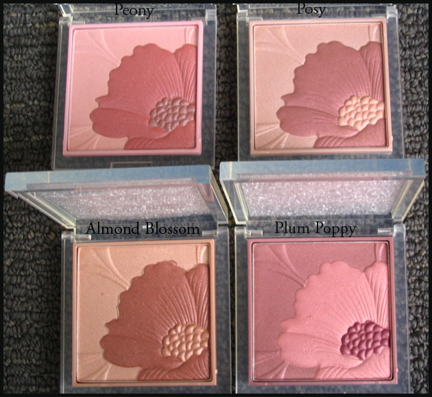
The Curator is positively chomping at the bit for spring to start – oh, how I despise the winter – so I figured I'd share these Fresh Bloom palettes by Clinique.  I loved the pretty floral design so much I got them all immediately when they were released in spring 2007.  They were limited edition for a while, but the demand became so great Clinique made them part of their regular line.  

Cliniquefresh bloom

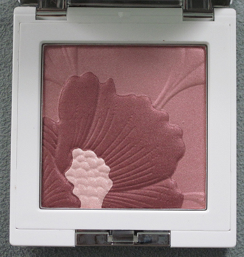
Another got released in the fall of 2008, Blackberry Bloom (sorry it's a separate picture from the others – I was too lazy to retake them all together!):

IMG_0897

And there is also a Bamboo Pink one released last summer, which sadly I am missing.  I need to get my hands on it to complete the collection!

Clinique bamboo
(image from temptalia.com)

Hurry up spring!