I really wish more companies would make palettes like this. Clarins' Essentials palette is both made from all recycled materials and is itself entirely recyclable, complete with a sustainably-sourced birch wood brush. Oh, and the colors are really pretty too!
Additionally, Clarins has partnered with Pur Projet, "an association which aims
to preserve ecosystems in partnership with disadvantaged communities." One of Pur Projet's initiatives is supporting the Kuntanawa people in Brazil, whose Amazonian culture is threatened by deforestation (the Kuntanawa population is under 400.) Proceeds from the Clarins Essentials palette will go to the company's goal of planting 10,000 trees with medical and cosmetic purposes in the area. Interestingly, "among these trees is the urucum, which produces a
red pigment traditionally used for the community's ritual make-up." It's a great concept – I love the idea of buying makeup to help an indigenous culture sustain their own makeup.
Will you be partaking in this do-gooder palette?
We have another pretty bronzer for summer 2013. Clarins Splendours Summer Bronzing Compact features a translucent red case that holds a bronzing powder with an exquisitely intricate design.
I had a lot of trouble getting a picture of the case without getting a ton of reflections.
So then I tried putting the flash on, which worked a lot better. The way it went off in this picture makes it look like there's a candle inside the palette, spreading a warm glow and softly illuminating the pattern.
Here's the collection description: "Sunshine into gold. Travel to far away lands, to the heart of an ancient people…and discover the splendours of a pre-Columbian civilization that worshiped the sun. Gold, a rich cultural symbol, is the highlight of this summer make-up collection. Sprinkle it on the eyes, neck and lips. Jade, sapphire, ruby and tourmaline appear as crystalline gemstones and illuminate this elegant sun-kissed collection."
Of course, they don't mention specifically which Pre-Columbian civilization. As we saw with the Guerlain Terra Inca collection, I'm in over my head in
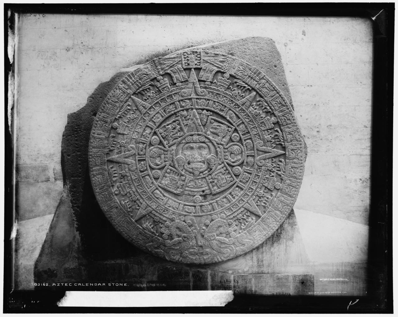
trying to decipher what specifically this palette is based on – I'm no
archaeologist or Pre-Columbian scholar. But after a brief search on Google I think it most resembles this Aztec sun stone:
Looking closely at the palette, I'm more inclined to think this particular stone was the inspiration for the design. The circle in the center surrounded by four square shapes is found in each, along with the concentric triangle at the top of the center circle and the four dots placed around the squares and one at the bottom of the inner circle. The tiny horseshoe-like pattern appears throughout both as well. The triangles with the scrolled edges in the stone find themselves in the outer case of the palette and are also present in the powder, albeit slightly deconstructed there (the triangle is broken up into its base shape with two scrolls on each side). Additionally, this stone (weighing in a whopping 24 tons – wow!) is actually believed to be an altar or ceremonial container for the sun god Tonatiuh rather than a calendar. So it would make sense that the Clarins collection, based on people that worshipped a sun god, would choose an item used in worship instead of a calendar for their inspiration.
I think this is a beautiful palette and for once, Clarins provided at least a glimmer of explanation as to their vision for the collection. What do you think?
Last week I came across these wonderful illustrations by Korean artist Gobugi, a.k.a. Park Jung Eun, at Design Is Mine. I went to pin one of them to one of the boards at my non-Makeup-Museum Pinterest account and decided to check out the rest of her work, when this caught my eye:
I immediately said "oooh!" and frantically checked to see if this lovely drawing will be appearing or already appeared on any Clarins products. While my search did not turn up a collaboration with Clarins, it did reveal a cosmetic connection to the illustration: Allure's Green Campaign, an annual program launched in 2008 by the Korean version of this beauty magazine. The campaign aims to "increase public awareness of the importance of the environment." While I couldn't find much info for the 2013 campaign, I imagine it was similar to the one for 2012.
In 2012, ten illustrators contributed original drawings to be used on t-shirts, and Korean celebrities modeled their creations. All of the proceeds from the t-shirts went to an animal monitoring program run by Green Korea United that has the protection of mountain goats as one of its chief initiatives. Gobugi was one of the illustrators selected to create the designs that year as well. (You can see the other goat-tastic designs here and here). Nearly $25,000 was raised!
As far as I know the Green Campaign is a Korea-exclusive campaign, which strikes me as
very strange – it's a fantastic idea that Allure should implement in
other countries.
I'll leave you with this strange but still celebratory image Gobugi created for Allure Korea's 9th anniversary. If she thoroughly works her Allure connections, maybe we will see a Gobugi collaboration with an actual makeup line rather than magazine/t-shirt illustrations. While impressive in those formats, I would dearly love to see her designs on a palette.
What do you think of Gobugi's work? And do you think Allure's Green Campaign should be worldwide?
To brighten up this gray day I thought I'd share a little floral happiness from Clarins. The spring 2013 face palette features an embossed iris with stripes and pink and peach on either side.
I don't really have much to say about this, except that like Karen at Makeup and Beauty Blog, I thought this was a hibiscus. It doesn't look very iris-like to me either in color or shape. I also wish Clarins would fill us in on where they get their inspiration. They've been making some really gorgeous palettes in recent years but it seems they just slap something on with no explanation. It's a little frustrating for collectors like me, who like to know about the design behind each piece. Still, it's a worthy addition to a spring exhibition.
Clarins really upped their game this season in terms of packaging. This beautiful highlighting powder, from their Odyssey collection, is presented in a gold case with delicate, engraved details.
The powder inside features the same design. I'm amazed at the level of intricacy.
With flash:
The collection contains several other pieces with the same motif, including this deluxe makeup palette:
(image from salonskincare.co.uk)
And this eye shadow quad:
I did a little digging about the inspiration behind the collection. As the name and Grecian garb-clad model would suggest, ancient Greece played a part in the development of the design.
Apparently the motif is the "original Odyssey emblem of ancient Greece". I searched high and low but couldn't find any information on this symbol, or even anything that suggested it actually existed. I will say, however, that the lavish gold and elaborate pattern is certainly reminiscent of ancient Greek jewelry. Take a gander at this necklace and earrings, all from about 300 B.C.:
(images from metmuseum.org)
In that sense, Clarins captured the more extravagant, opulent side of ancient Greek culture. While I would have liked to see a more concrete explanation for the motif, it's not as vague as some previous Clarins collections. And the level of detail is on par with more high-end brands, so all in all I'm pleased with this.
Did you/will you be partaking in the Odyssey collection?
I thought this eye shadow quartet from Clarins' summer collection would be a good follow-up to yesterday's post on Chanel's Indian-inspired palette. I didn't purchase this because I didn't think it was quite up to Museum standards, nor do I see it fitting in to any upcoming exhibitions just yet, but it's worth a mention.
The outer case has a delicately dotted pattern along the left and a large circular one on the right. The same shapes appear on each eye shadow.
(images from nordstrom.com)
I'm not sure about the teardrop-shaped design, but I'm fairly certain the circular pattern is a variation on a mandala, a motif in Buddhist and Hindu art. According to mandalaproject.org, "the word 'mandala' is from the classical Indian language of Sanskrit. Loosely translated to mean 'circle,' a mandala is far more than a simple shape. It represents wholeness, and can be seen as a model for the organizational structure of life itself–a cosmic diagram that reminds us of our relation to the infinite, the world that extends both beyond and within our bodies and minds."
Here are some examples on a temple ceiling in Madurai, South India.
(image from travel.yahoo.com)
Here's a more detailed shot of the ceiling:
And a mandala on the floor:
(images from kitchenoperas.com)
However, I'm inclined to think the Clarins design looks less authentic than the mandalas you'd find in temples – it looks more like this henna tattoo drawing:
(image from tattoodonkey.com)
What do you think?
Clarins' summer collection is already out, but my mind is still on spring and their Colour Breeze Face Palette, which features three different-sized stemless pinwheels against a beige background.
(image from nordstrom.com)
When I first saw the palette I wasn't so surprised by the motif – the pinwheel has recently been gaining popularity in various forms, especially wedding accoutrements.
The pinwheel began as a simple children's toy, while the wheels themselves morphed into a popular geometric pattern used for quilts starting around 1795. Over the years the pinwheel made its way into "high" art, as evidenced by Alexander Calder as well as contemporaryartists. But I think my favorite pinwheel-based art is this installation at Los Angeles' 2007 Swerve Festival (for my fellow Balti-morons, the description of this festival sounds a lot like our Artscape).
(image from laist.com)
And pinwheels aren't only used in design and art. In looking up images for this post I found that pinwheels are utilized as the symbol for a variety of charitable causes. Some examples:
Pinwheels for COPD (Chronic Obstructive Pulmonary Disease) – these are made from license plates…
Looking at all these makes me think it would have been nice for Clarins to work with one of these organizations and donated a portion of their profits to them, but in all likelihood they may not have realized just how many organizations use the pinwheel motif as a force for positive social change (I certainly had no idea!) Still, it's a cute palette and I might still pick it up as it will be good for future spring exhibitions.
What do you think of the Clarins palette and pinwheels more generally as a design element?
Like Lancôme's Golden Hat palette I struggled with whether to buy this. There is a neat pattern on it, but with no explanation of what it could be or how it relates to Clarins' holiday theme (named "Passion"), I skipped it.
(images from clarinsusa.com)
To my eye it looks vaguely pre-Columbian – maybe like an Aztec stamp? Some examples:
(image from brooklynmusem.org)
(image from visualphotos.com)
(image from mexicolore.co.uk)
So while the pattern is interesting and possibly pre-Columbian inspired, there is no description as to what it is or why it appeared on this highlighter. With a design that unusual there should be some kind of explanation, at least in my opinion. Also, it's not very holiday-ish. Maybe Clarins should have taken a page from these sparkly holiday items – slap some crystals on the palette and call it a day. 😛
Clarins released a pretty interesting palette for fall. At first glance it reminded me of either pixels or a paused game of Tetris, ha.
With flash:
But then I was brushing up on my op art for MAC's upcoming Art of Powder collection and stumbled across an artist named Francois Morellet. This work (Blue and Red Composition, 1970) jumped out at me right away:
(image from kettererkunst.com)
While it's a work on paper and therefore not in 3D (meaning the little squares are flat and not sticking out as in the palette), the seemingly random scattering of different colored squares is really close to the Clarins piece. What really made my head almost explode though, is Morellet's work from 1960, Random Distribution of 40,00 Squares using the Odd and Even Numbers of a Telephone Directory:
(image from tate.org.uk)
Morellet explains, "The catalyst for the idea of the painting Random Distribution of 40,000 Squares using the odd and Even Numbers of a Telephone Directory (1960) came about after a conversation with Ellsworth Kelly, who at the time was living in France. He had recently visited Jean Arp’s studio and talked about one of Arp and Sophie Taeuber’s joint collages, Squares Arranged to the Laws of Chance, made in 1917…With Random Distribution, the purpose of my system was to cause a reaction between two colours of equal intensity. I drew horizontal and vertical lines to make 40,000 squares. Then my wife or my sons would read out the numbers from the phone book (except the first repetitive digits), and I would mark each square for an even number while leaving the odd ones blank. The crossed squares were painted blue and the blank ones red. For the 1963 Paris Biennale I made a 3-D version of it that was shown among the Groupe de Recherche d’Art Visuel installations (and re-created it again on different occasions). I wanted to create a dazzling fight between two colours that shared the same luminosity. This balance of colour intensity was hard to adjust because daylight enhances the blue and artificial light boosts the red. I wanted the visitors to have a disturbing experience when they walked into this room – to almost hurt their eyes with the pulsating, flickering balance of two colours. I like that kind of aggression."
Now, the Clarins palette obviously isn't influenced by this work or anything in particular, but since discovering this artist, I do like pretending the palette is a mini version of a Morellet (with soft pink colors instead of the strong red and blue that formed a "dazzling fight"). Another little piece of art. 🙂
Oooh, two makeup brands coming out with mosaic-inspired bronzers. You know what that means!! Ding ding! Time for an old-fashioned makeup design SMACKDOWN! Awwww yeah, it's ON! (We are way overdue – the last MM battle took place in 2009!)
In the first corner we have Clarins Mosaique bronzing powder. As the item still hasn't appeared on the Clarins website, I was fortunate to have found the description at Addictedtolipstick.
"Mosaic, a timeless decorative motif, has crossed the ages to reach us in all its beautiful splendour. As an ornament of Roman baths, frescoes in the elegant homes of ancient Pompeii or the sumptuous decoration of Byzantine basilicas… the mosaic has been a major, refined art in all Western civilizations. This summer, Clarins has taken its inspiration from the rich forms and colours in the mosaic universe to offer a vibrant make-up collection full of sun and vitality."
Wow. Clarins certainly talks a big game, but can it deliver?
In the other corner, weighing in at a whopping .98 oz and measuring nearly 5 inches across (since it's meant for both face and body) we have Guerlain Terracotta Mosaic bronzer. This one is so confident in its design it doesn't even have a detailed description like Clarins. However, it also lacks a connection to the previous Guerlain summer release (the Inca collection) – I'm not sure why they would come out with a mosaic bronzer which has basically nothing to do with the rest of the summer collection.
Now, since budget constraints precluded me from buying these two items, you can look at the stock photos in my oh-so-cool poster above (I know you're all jealous of my mad design skillz), or you can check out real-life pics of Clarins here and Guerlain here. Go ahead, I'll wait.
So…who wins the Mosaic Melee?? Is it our fearless Guerlain, who has a lot more experience with limited editions and whose sheer gigantic size obliterates all other bronzers? Or is it the quiet underdog Clarins, who makes up for its small stature with a prettier, more detailed outer case? Let me know in the comments section!