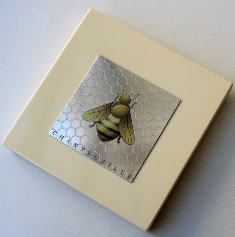
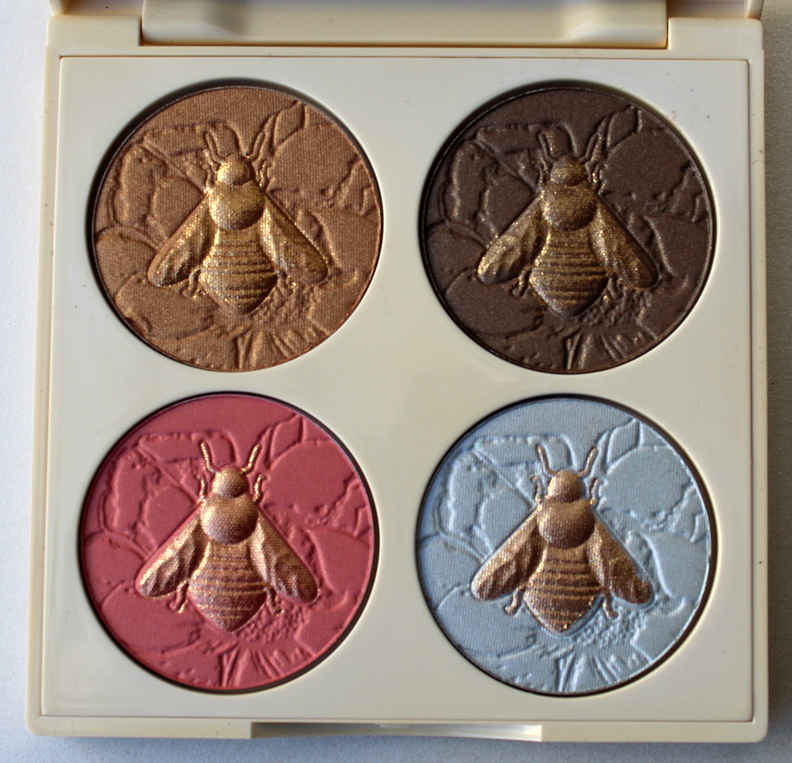
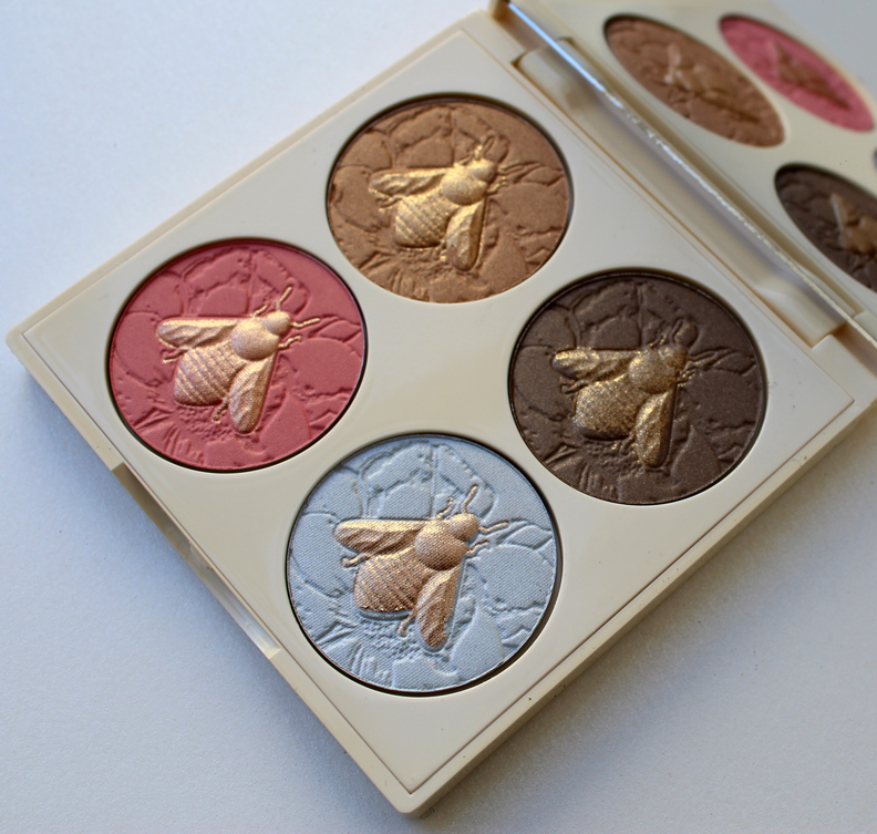
I don't really have much to say about this palette except the usual stuff I write about animal-themed pieces by Chantecaille, which is that 1. Five percent of the proceeds will go to a cause that helps the animal or their habitat (in this case, the Xerces Society); and 2. I'm getting REALLY sick of these 4-pan palettes. Please, Chantecaille, come up with something that rivals your old stuff. It's almost like they told some intern, "This is easy – just copy the design from the horses/sharks/ elephants/turtles/tigers/ dolphins palettes." Meh.

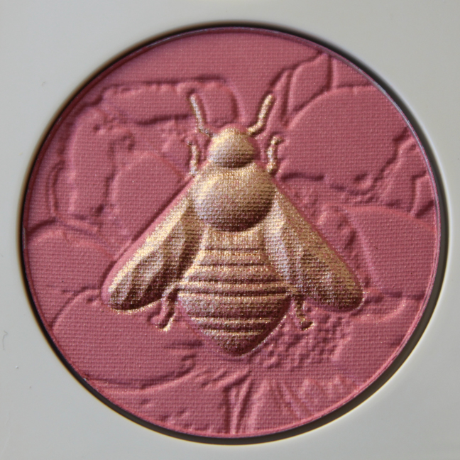
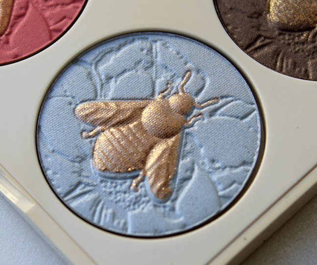
The bee design is nice, but why not make each one a different color instead of all of them being gold? Or if you want to get really intricate, make the colors of the wings different from the bodies on each, a la the butterfly eye shadows. I'm also puzzled as to why the neat little honeycomb pattern on the palette case isn't repeated in the backgrounds of the individual pans. It's not even a flower either, at least none that I can recognize – just a strange, jagged abstraction.


While I'm bored with the 4-pan format, I bought this because it's good for rounding out a spring exhibition (for some reason I associate bees/honey with spring – see last year's exhibition poster) and also because the idea of having a whole menagerie in palette form is appealing to the collector in me.
Have you gotten stung by Chantecaille's bees or are you keeping your distance?

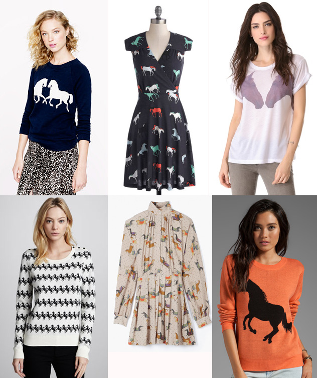
(top row images from jcrew.com, modcloth.com, shopbop.com; bottom row from cusp.com, paulandjoe.com, and revolveclothing.com)
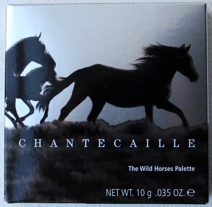
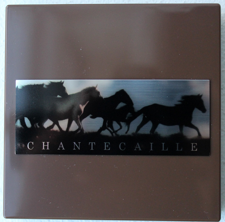
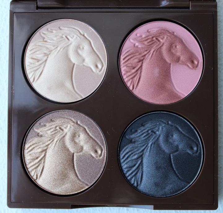
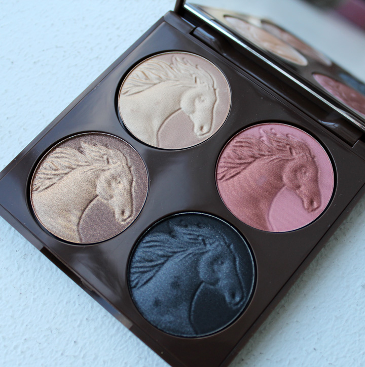
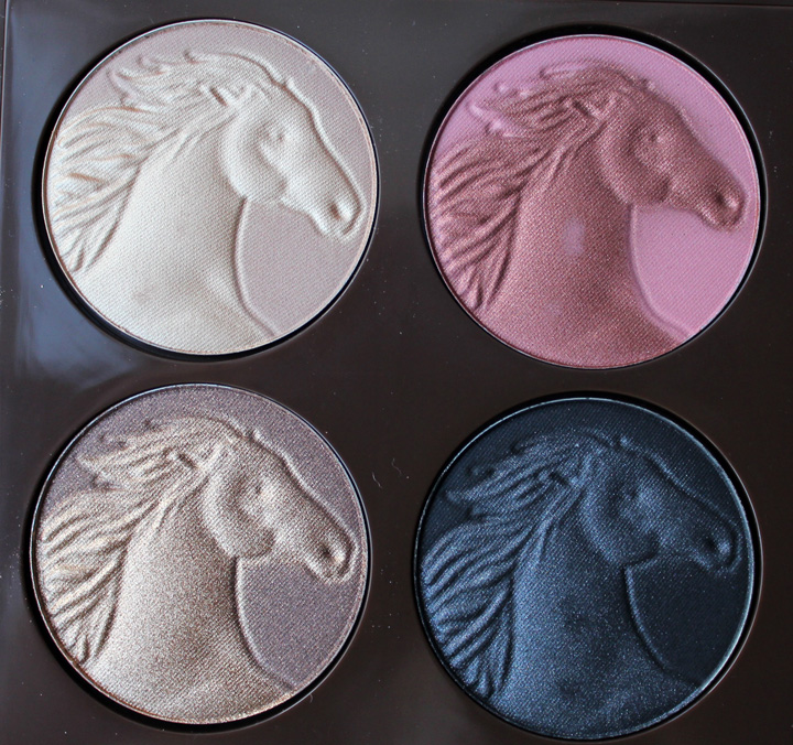
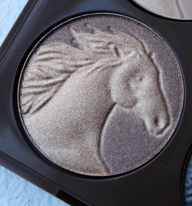
Bird motifs are SO 2011. "Put a horse on it!" seems to be the rallying cry for many designers this fall, as evidenced by the clothing above. Chantecaille is on board the trend as well with their Wild Horses palette. As with previous animal-themed palettes, 5% of the proceeds go to an organization that helps the animals – in this case, the Humane Society. According to the video at Chantecaille's website, there were over 2 million wild horses roaming freely in the Western part of the United States at the start of the 20th century; that number has now dwindled to just over 31,500. Horses are quickly losing their land to make way for sheep and cattle. The Humane Society works to pass legal protections for the horses and to "persuade the government to manage populations with humane, effective, economical methods" instead of allowing them to be sold and slaughtered.


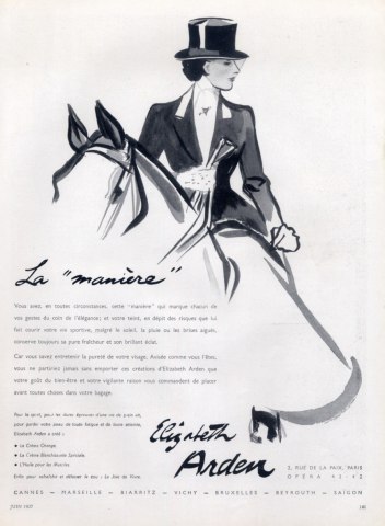
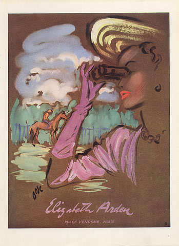
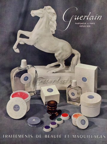
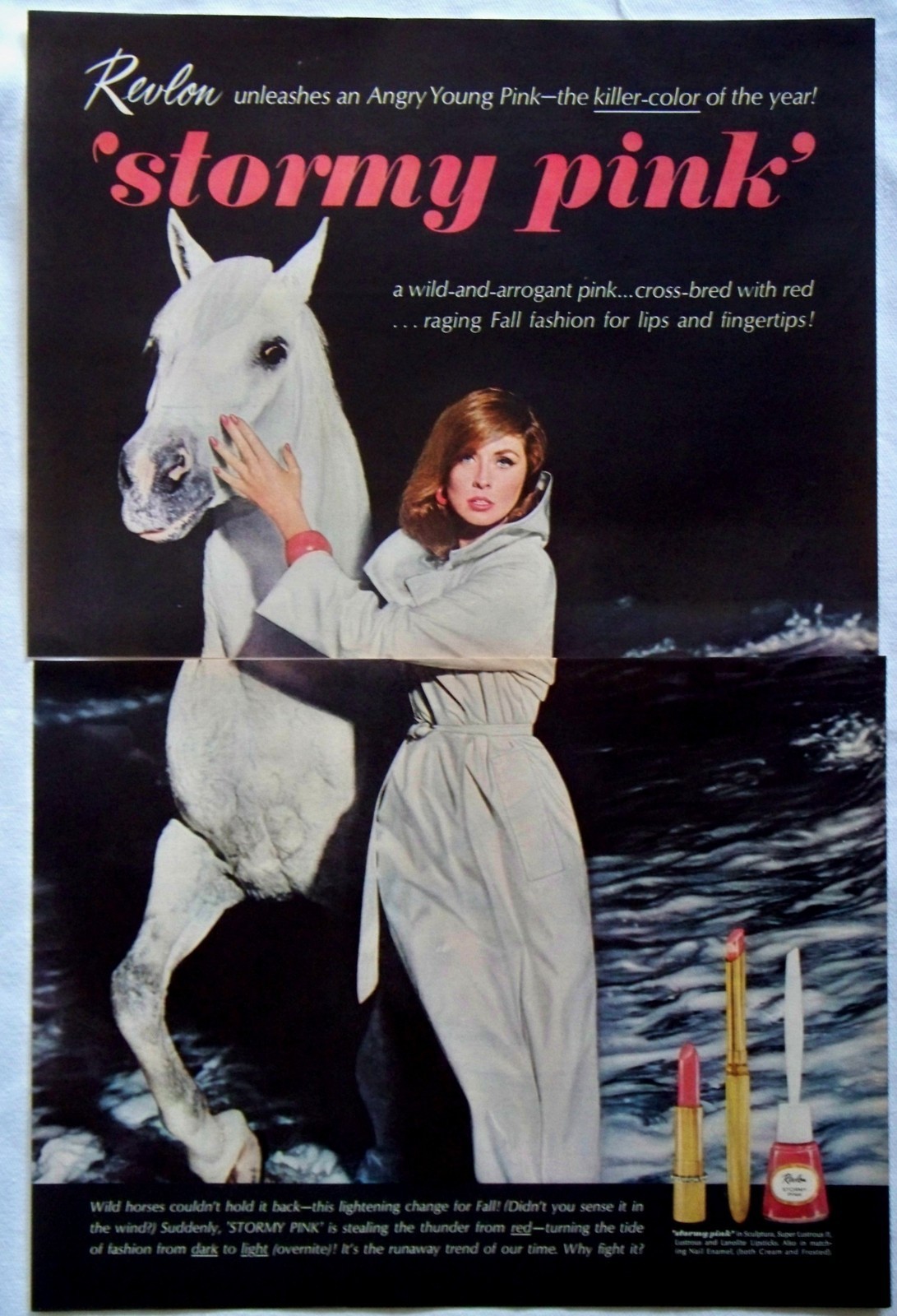
When I first saw this palette, I do what I always do when it comes to animals appearing on beauty products – try to remember whether I'd ever seen horses in an ad or on another palette. There was Paul & Joe's Carousel collection this past spring which featured horses, but they were really more merry-go-round ponies than living, breathing horses. So I decided to do a little research and, to my surprise, horses have made it into a number of makeup ads.
Elizabeth Arden first used an equestrian theme in 1937 and revisited it 10 years later.


(images from hprints.com)
Guerlain, 1953:

(image from hprints.com)
And the best of the bunch in my opinion, simply because the ad copy cracks me up, is Revlon's Stormy Pink ad from 1963 (you can still buy this shade today!):

(image from ebay.com)
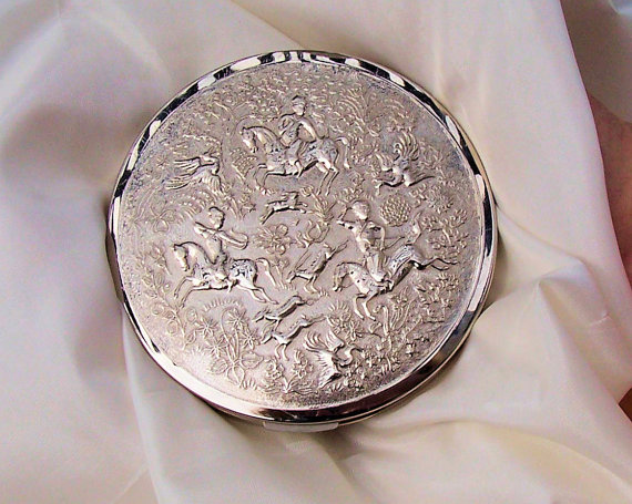
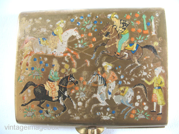
Hunting scenes involving horses also made it on to several compacts, like these beauties from Tussy (1960s) and Stratton (1950s):

(image from etsy.com)

(image from etsy.com)
So horses in beauty ads and products weren't as rare as I suspected.
Getting back to the Chantecaille palette, this isn't my favorite. First of all, I'm not a horse fan. There I said it. I just don't understand how they're considered the "graceful, majestic creatures" they're usually made out to be. To me they're just not…attractive. This doesn't mean, of course, that I think they should be wiped out or that I'm indifferent to them being rounded up and slaughtered, but purely from an aesthetic standpoint I find them to be rather uninteristing and ugly – awkward, smelly and somewhat dangerous, with no real redeeming qualities. The other reason this isn't my favorite offering from Chantecaille is that this is the 6th animal-themed palette in a row (following sharks, elephants, turtles, tigers and dolphins) with the same four-pan design, so frankly I'm getting bored. Would it kill Chantecaille to shake it up a little and come up with a different design? I wish they would revisit their glory days of the Protected Paradise palettes.
Anyway, what do you think of this palette?
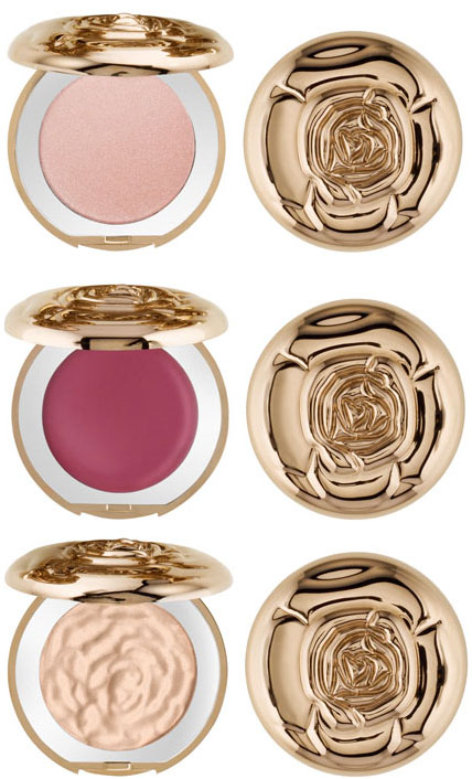
I'm a bit disappointed in Chantecaille's holiday offering, Les Pétales collection. This features – you guessed it – roses on gold compacts.

(images from bergdorfgoodman.com)
Between the fall rose palette and lots of other makeup companies doing a rose motif , I'm rosed-out. Maybe for spring Chantecaille will get back to their endangered species specialties.
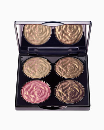
I love Chantecaille, but their fall release is making me cranky. Yet more roses? Sigh. Dubbed "Sylvie's Quattro palette", the compact features 3 eye shadows and a blush. I must admit the colors are nice for fall, but the design could have been more inventive.

(photo from neimanmarcus.com)
So many roses this year, I could probably do an entire exhibition just with rose-themed makeup! Say, that gives me an idea…
Chantecaille came out with these lovely palettes last year. Five percent of proceeds went to the Pew Fellowship in Marine Conservation. The intricate fish are gorgeous, but I think the tiny seahorse on the right is my favorite part.
And the face powder:
Next to Chantecaille's butterfly eyeshadows, these are easily the most detailed of the compacts the company has come out with. While I'm still not tired of summer, especially after enduring the coldest winter my city had in almost 30 years, I'm hoping Chantecaille will come out with something equally gorgeous this fall.
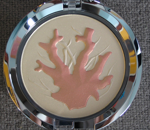
Yesterday's post got me thinking about another coral-inspired makeup item: Chantecaille's lovely coral highlighting powder from spring 2007. A portion of the proceeds went to Reefs of Hope, run by the Pew Institute of Ocean Science.

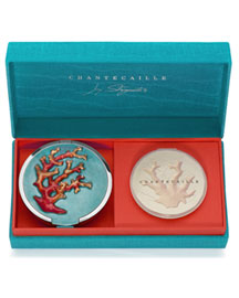
But the real collectible is this little gem by designer Jay Strongwater, who teamed up with Chantecaille to create a limited-edition, hand-lacquered refillable compact. Unfortunately I lacked (er, still lack) the $420 (!!!) necessary to purchase this, but I would love to get my hands on this for the Museum if it were still available. Just another item that got away!

(photo from neimanmarcus.com)
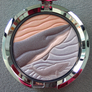
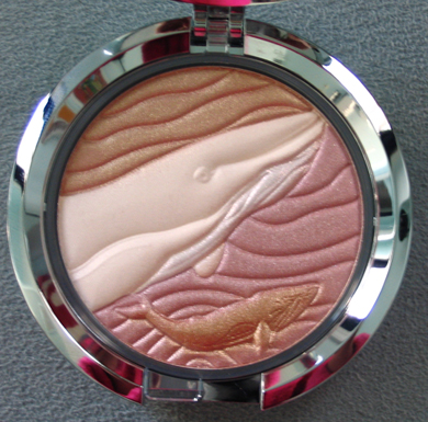
For spring Chantecaille released these lovely palettes. Five percent of sales will go to the International Union for Conservation of Nature to help save the whales. I think what I like most about these isn't the abstract waves formed by undulating lines, it's the little baby whale swimming below the larger one.
Eyes:
Face:

I'm happy Chantecaille is continuing its trend of putting out palettes with endangered species – it's another way the cosmetic industry can do some good. If only the packaging itself were eco-friendly. Sylvie better get on that. 😉
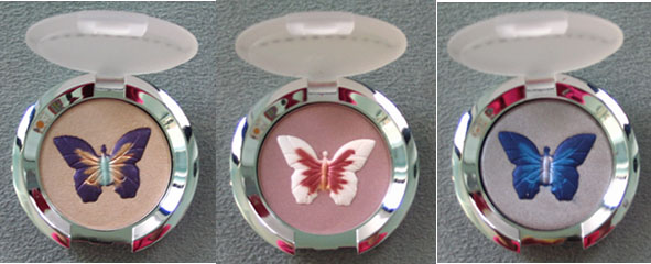
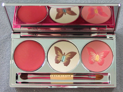
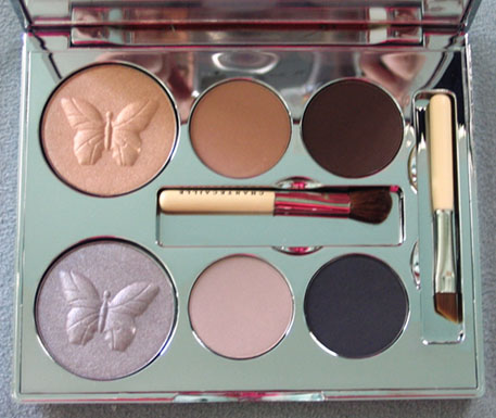
It all started with a face powder embossed with a butterfly in the center. Then Chantecaille released three eye shadows, each with a different color butterfly. In the spring of 2006 the Garden in Kyoto palette, featuring 2 butterflies in gorgeous spring shades, was released. Finally, the coup de grace was a beautiful holiday palette with gold and silver butterflies. While the Museum is missing the butterfly face powder, I was able to procure the 3 shadows and the palettes. Aren't butterflies the best symbol for spring?
Papillons Violet, Rose and Bleu:

Garden in Kyoto:

The Muse (a.k.a. Ethereal Eyes) palette:

Chantecaille has since moved on to feature other endangered species in their limited edition items, but the butterflies will always remain very special as they were among the first to use such intricate embossing.
