(Click to enlarge)

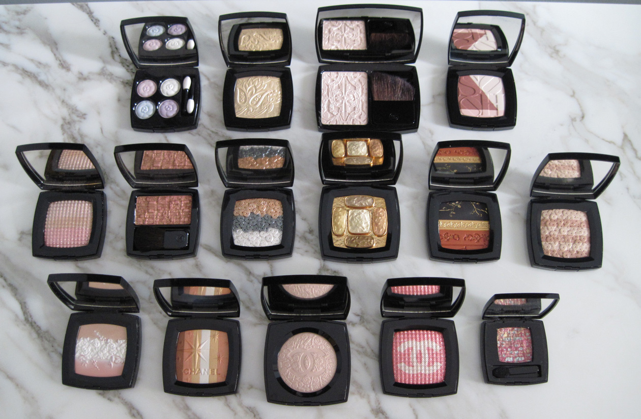
Top row: 4 Fleurs de Chanel, Lumière Sculptée, Route des Indes, Soho
Middle row: Ombres Tissées, Beige Tweed, Lumière d'Artifices, Lumieres Byzances, Coromandels, Lumière d'Artifices Beiges
Bottom row: Fleurs Celeste, Lucky Stripes, Poudre Signée, Brompton Road, Pink Lamé
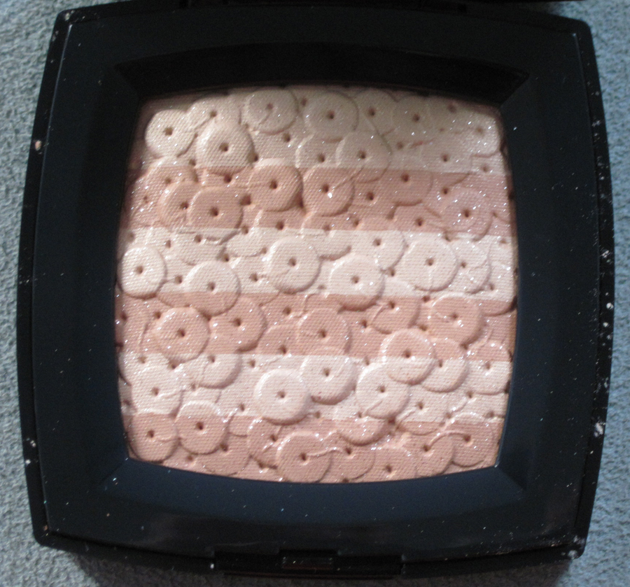
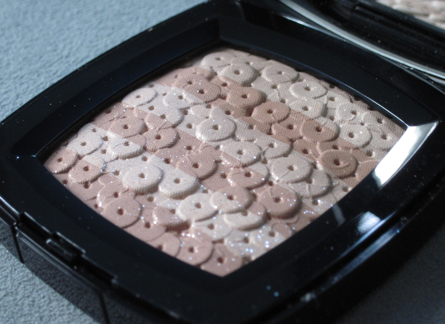
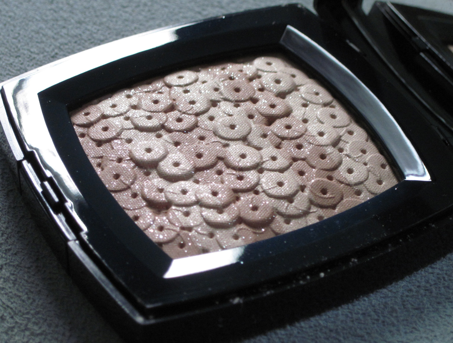
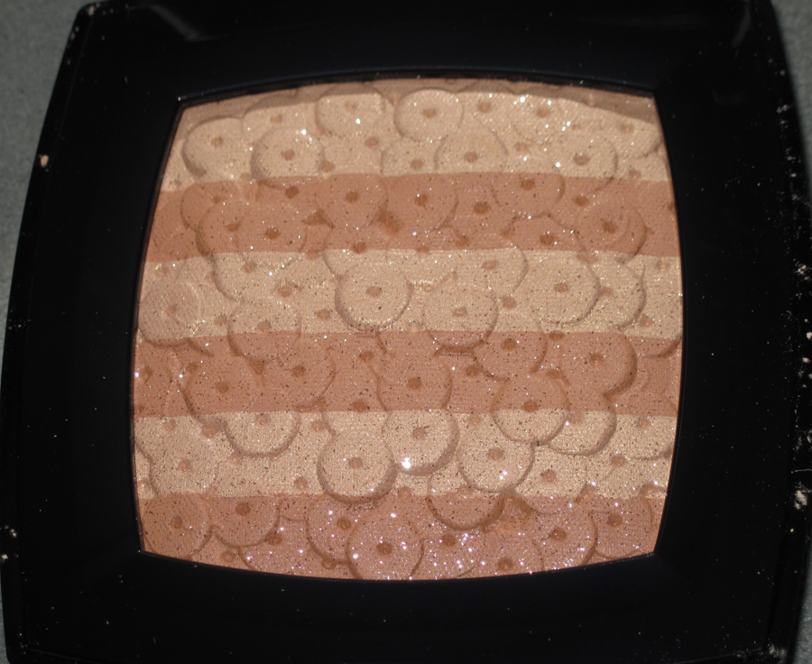
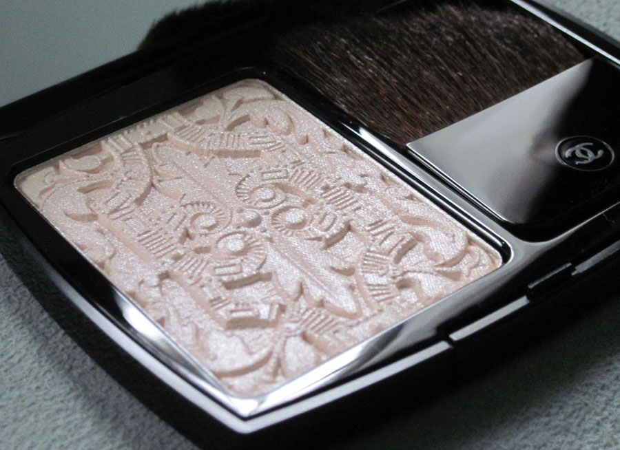
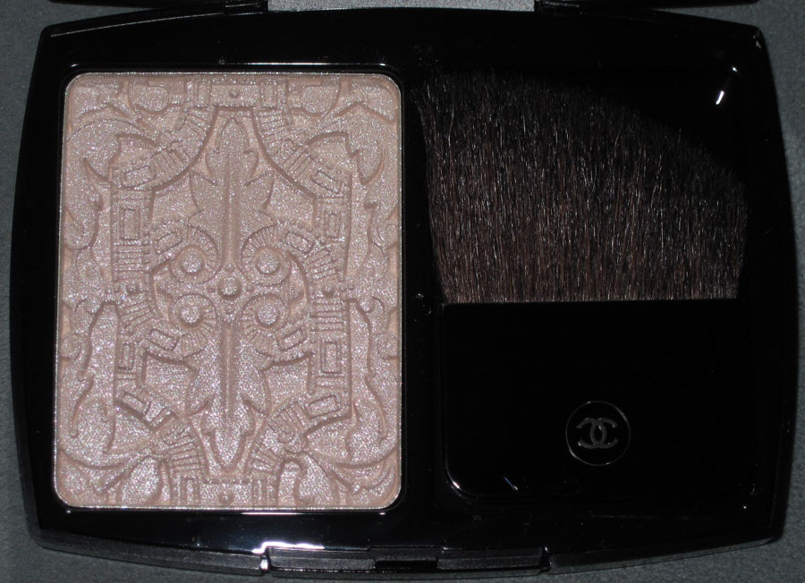
Chanel released this palette for their fall 2012 collection. The sequin embroidery design is a duplicate of its predecessor from the spring 2007 collection.


With flash:

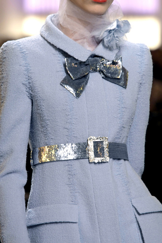
Unlike the 2007 Chanel Lumière d'Artifices palette, this beige version actually seems to be relevant to the brand's fall 2012 couture collection. Dubbed "New Vintage" by designer Karl Lagerfeld, the collection "showcased the
extraordinary handwork which the house’s ateliers and the subsidiary
embroidery houses that Chanel now owns, are so capable of producing… 'All
the tweeds are embroidery,' Karl declared. 'Three thousand hours for
some of them.' Whilst some were created entirely from looped silken
threads and shimmering paillettes, others were sophisticated patchworks
of color-block plaids."
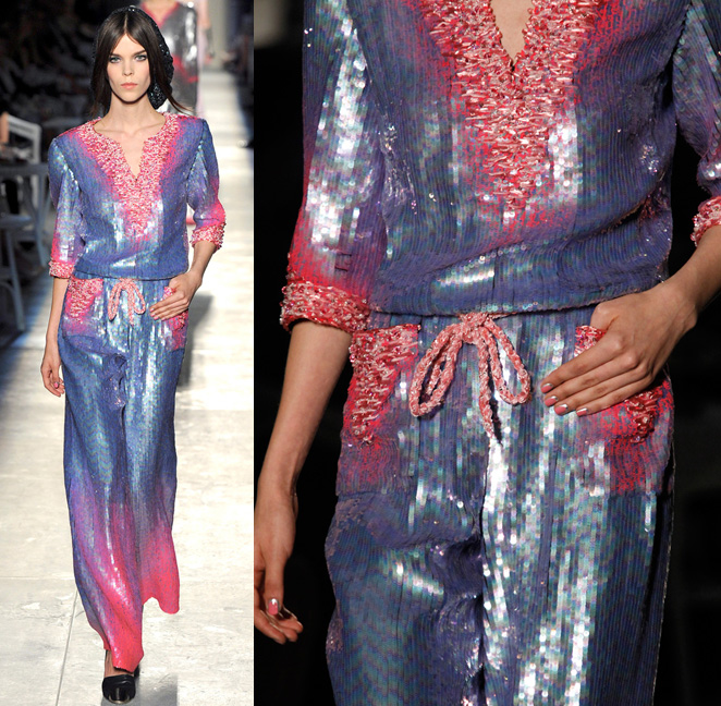
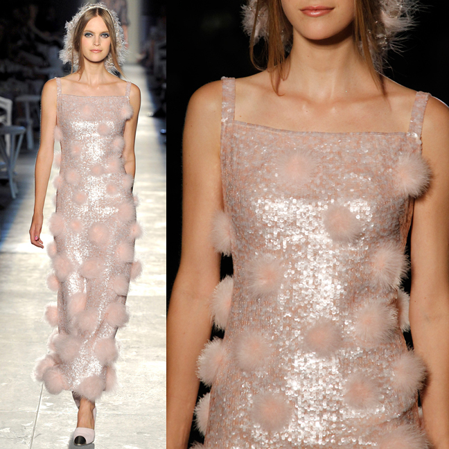
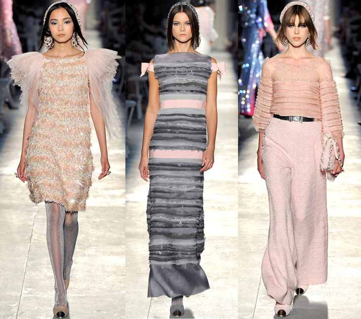
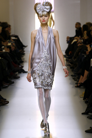
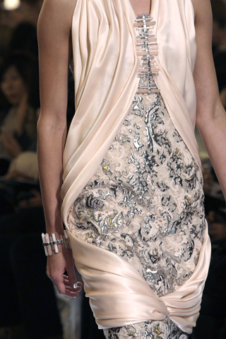
Indeed, several examples of the "looped silken threads and shimmering paillettes" came down the runway.


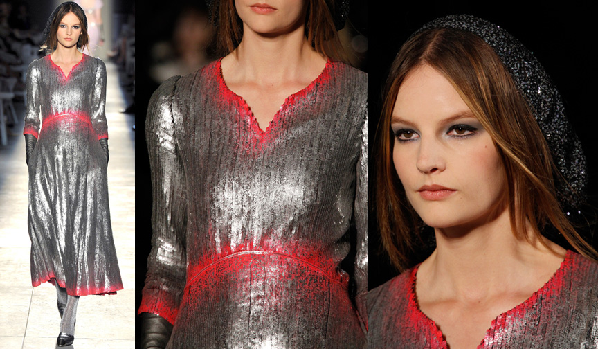
Even the hat for this model showed sequins painstakingly sewn into the fabric.

Not only were sequins in abundance, there were also variations of the subtle stripes of color seen on the palette.
 (images from style.com)
While I'm not thrilled that Chanel put out a palette that is, except for color, the same one released over five years ago, I was pleased to see that it was consistent with the couture collection.
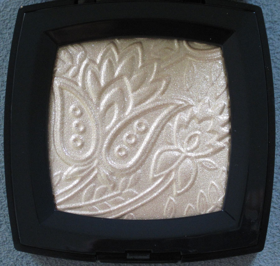
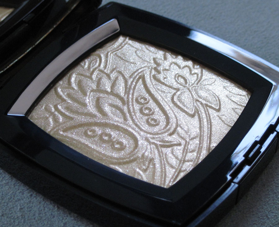
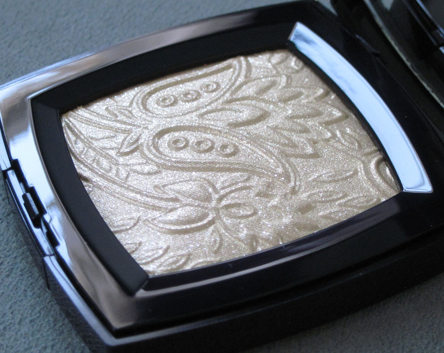
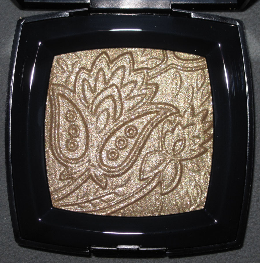
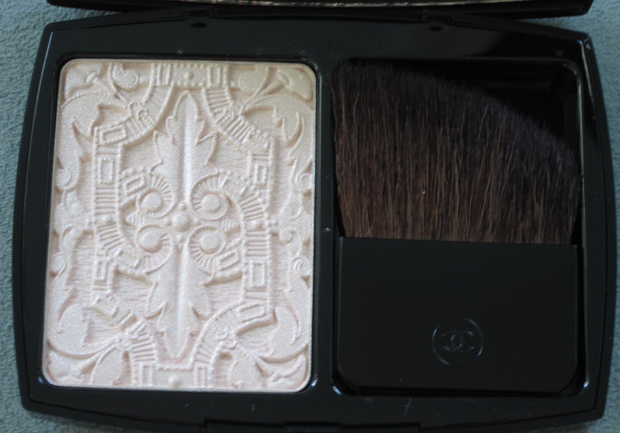
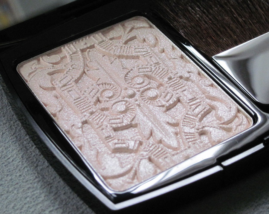
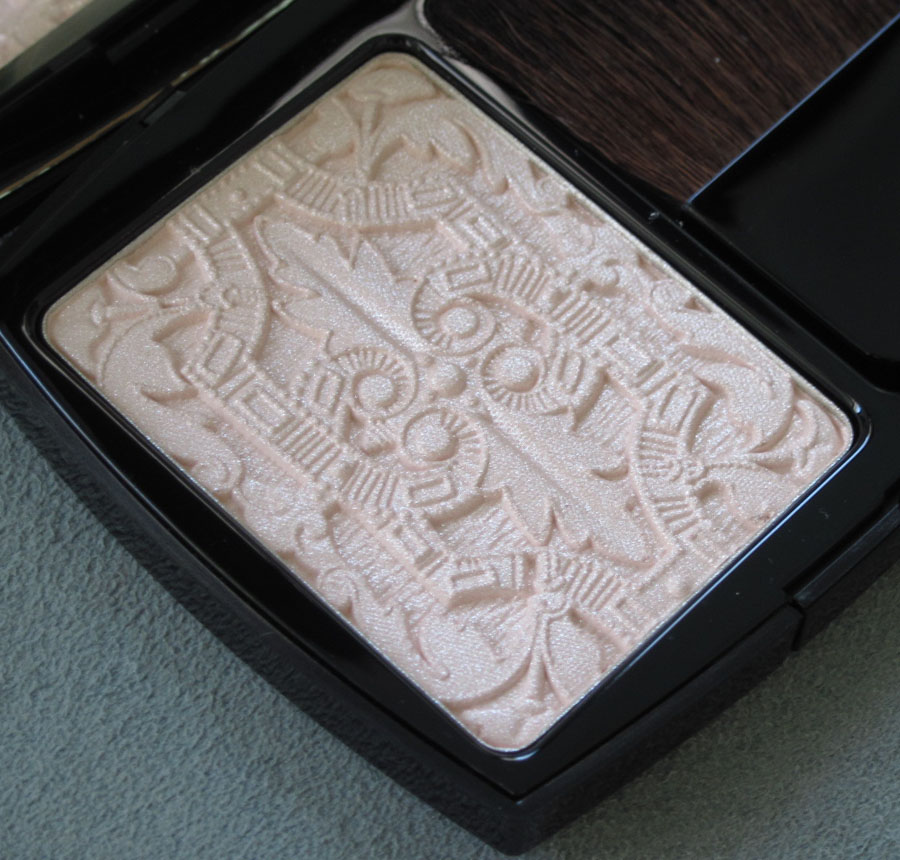
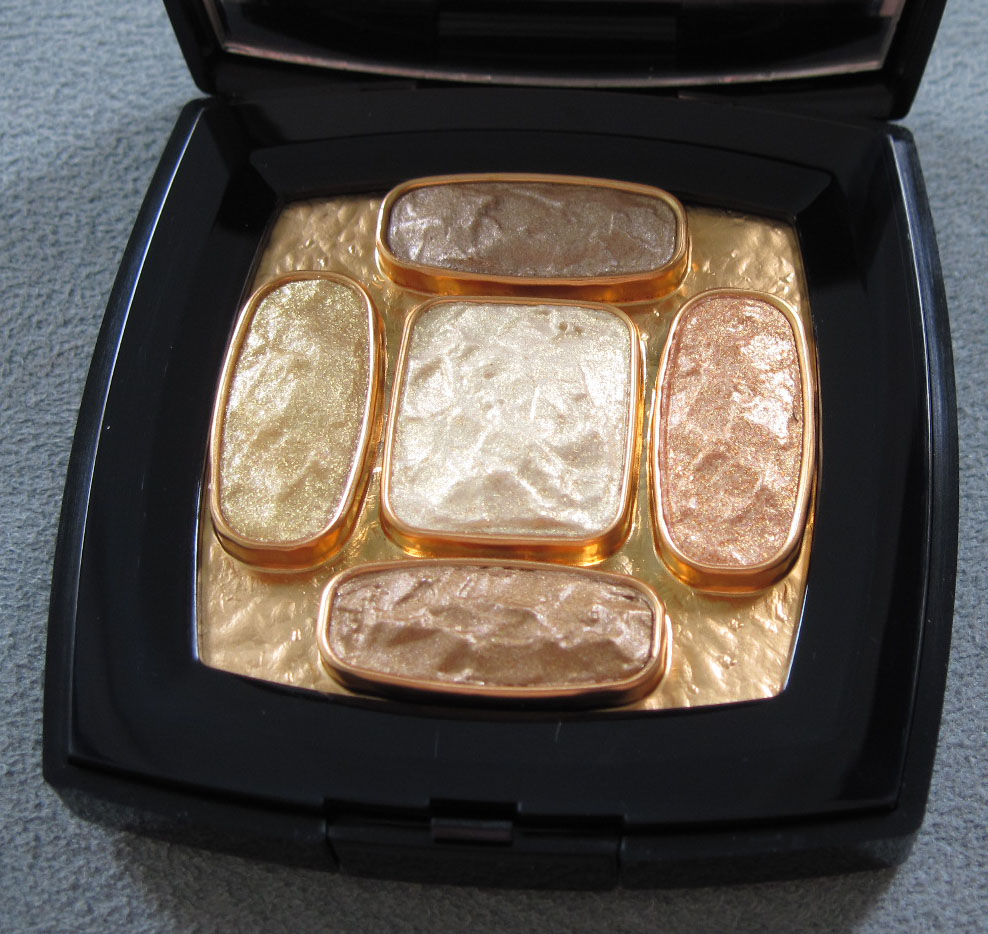
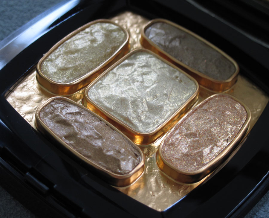
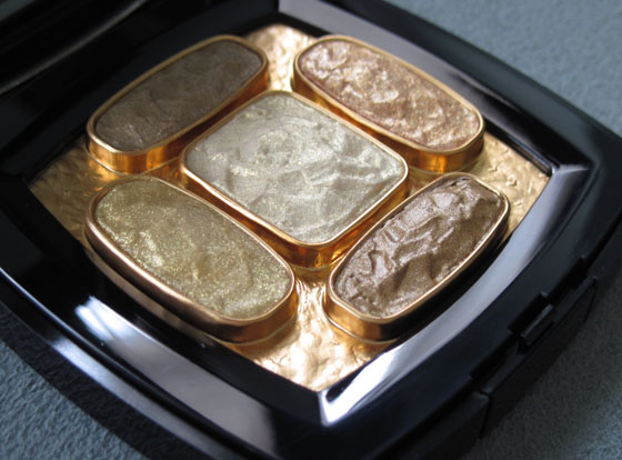
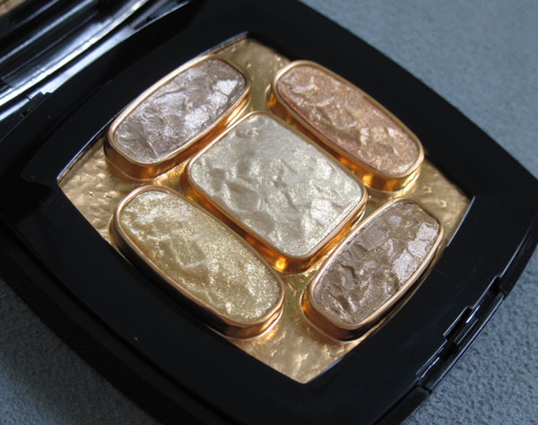
Chanel introduced this very festive highlighting powder as part of its Bombay Express collection, based on the brand's pre-fall 2012 show. From the the press release: "Each year, the Chanel Métiers d’Art fashion show celebrates the exceptional talent of the Métiers Houses, pairing their know-how with a legendary destination. This year, Bombay Express de Chanel showcases a specific vision of India. Peter Philips, Creative Director of Chanel Makeup, intensifies the proportions of iconic Indian eye makeup to give it a universal character. Graphic makeup with saturated colour blocks stretches out from the corner of the eye to express strength and femininity. Eyes succumb to the boldness and mystery of a black eyeshadow in all its nuances with Illusion D’Ombre Mirifique. The rest of the face focuses on gold and light. The Exclusive Creation of the Collection is a precious, evanescent golden powder to dab onto cheekbones and eyelids in scintillating touches. In its classic black-lacquered case, Route des Indes de Chanel recreates an embossed motif of a rare fabric, a piece of bronze brocade from an Indian-influenced collection created by Gabrielle Chanel in the 1960s."


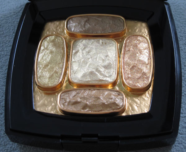
With flash:

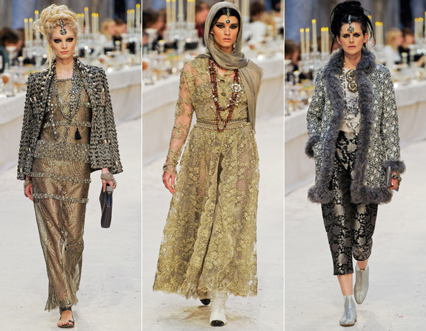
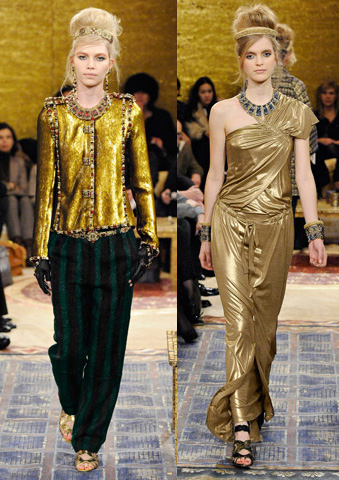
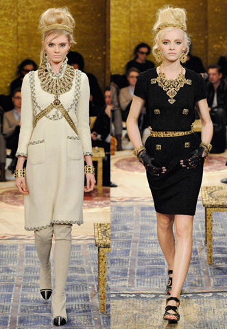
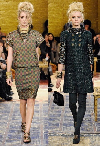
Try as I might, I was unable to find an image of the fabric on which the palette's pattern was based, nor did anything quite like it appear in the 2012 collection. Sigh. However, I do think the palette captures the fashion's extremely opulent and lavish feel (reminiscent of their pre-fall Byzantine collection last year). While there were no overtly similar patterns to the palette, there were some intricately designed pieces:

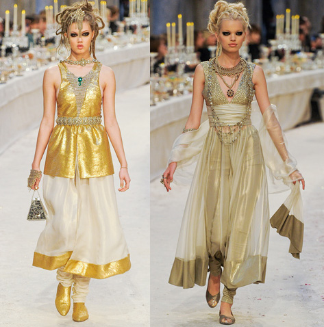
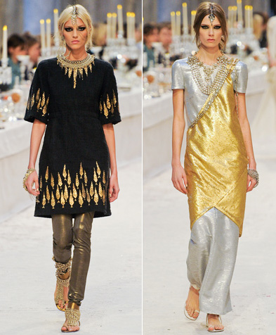
Along with lots of gold:


(images from style.com)
On the one hand, it's nice Chanel didn't go too literal with the palette's motif. On the other hand, it would have been nice to see it referenced somewhere in the collection – maybe not in the actual clothes but perhaps in a bag or jewelry.
What are your thoughts on the Route des Indes palette?
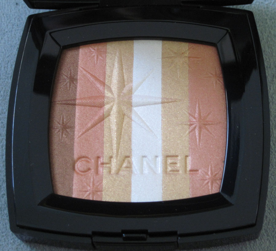
This was quite the sneaky little surprise from Chanel. In honor of their remodeled boutique in the Bellagio Hotel in Las Vegas, the company released a small collection consisting of golden lip liner, lipstick and nail polish along with a highlighter – the Lucky Stripes palette. From the press release:
"A city arises from the middle of nowhere in a feverish vision, like a mirage. Under the azure blue of a cloudless sky, Las Vegas keeps the desert dust at bay in the hypnotic ballet of neon lights. Along the Strip, the luxury hotels and casinos set the scene for a modern fairytale in which all dreams are possible. Amongst them stands the Bellagio Hotel. Its sumptuous gallery will welcome an entirely remodeled CHANEL boutique in earlier this year. An elegant stopover in a modern-day treasure hunt.
Peter Philips, Creative Director of CHANEL Makeup, creates a gold-plated collection and strews stardust over polyester dreams. The iconic gold of CHANEL elegance slips into every texture. A silky powder on the skin, sunny lacquer on the nails or a sheer whisper on the lips, it highlights a radiant face that’s on a lucky streak.
The Exclusive Creation of the collection concentrates the entire spirit of Las Vegas in its traditional square case. Lined up in rows, four shades of sand and bronze sweep through every variation of a fabulous desert in which gold embraces the sun and shines. On the surface of the colours, an embossed star design seems to extend a warm welcome to the city of dreams."
As soon as I saw this I knew I had to have it for the Museum. It's a beautiful combination of warm-hued stripes with a large, off-centered star, several smaller stars scattered throughout and the Chanel name debossed at the bottom.


With flash:


I love that the star is a replica of the eight-pointed one that appears on the famously flashy Las Vegas welcome sign (of course, the best picture of this sign involves Traveling Babo):

(image from en.wikipedia.org)
The 25-foot sign was designed by Betty Willis and built in 1959. While the sign itself has been replaced, the original design remains intact. What's really cool is that Willis considered the design to be her gift to the city – she never copyrighted it so that it could belong in the public domain.
I have to admit that when I first saw the palette, I didn't immediately think of the Las Vegas sign. Rather, that retro star reminded me of the ones from the bowling alley in the film The Big Lebowski:

(image from blog.moviefone.com)

(image from seattletimes.nwsource.com)

(image from granadatheater.com)
The movie was filmed at Hollywood Star Lanes. Sadly that alley was demolished to make way for an elementary school in 2003, but the style lives on in Lucky Strike Lanes:

(image from eventup.com)
Anyway, I've never been to Vegas but have always wanted to (even though I'm afraid I might get a seizure/panic attack from all the lights!) I think the Chanel palette is an understated, slightly more subtle representation of the city's vibe – when I think of Vegas I think bright, garish colors and glitter everywhere. Lucky Stripes tastefully works in a Vegas icon and keeps the shimmer fairly restrained.
Questions for you: 1. Do you like the Lucky Stripes palette? 2. Have you ever been to Vegas? and 3. Do you like The Big Lebowski? Actually that last question is just silly – everyone loves The Big Lebowski and if you don't (or if, gasp, you haven't seen it) there's something wrong with you! 🙂
Chanel cooked up this lovely highlighter for their holiday collection. Apparently it was inspired by a Baroque-style belt worn by Coco Chanel. I have been unable to dig up some pictures of any kind of Baroque-looking Chanel belt. Nevertheless I'm enjoying the intricacies of the design.


With flash:

I find it a little strange that Chanel chose this theme for a 2011 collection – it probably would have been more appropriate to release it with their spring/summer 2010 "neon Baroque" show. The pattern on the palette is reminiscent of the designs from the collection.
Some dresses:


And lo and behold, a belt buckle:

(images from style.com)
While I understand the palette's design came from the Baroque-inspired accessories of Mademoiselle Coco, I couldn't help but think that it also reminded me of rock carvings. Ommorphia Beauty Bar pointed out that the palette looks similar to Mayan art, and I'm inclined to agree.
Overall I think this would have been a stronger item design-wise if Chanel had included a picture of the type of belt they were referencing. Once again, a piece of Chanel history inspired one of the company's makeup item, but it didn't delve deeply enough into it. Close but no cigar!
Whew! I'm back from London (I will recap my trip for this weekend's Curator's Corner) and managed to pick up this little beauty while I was there. In honor of the launch of Chanel World at Harrod's department store, Chanel created this exclusive palette.


With flash:


While I don't think it's as inspired as some of their other recent pieces – we've seen the Chanel logo on palettes numerous times and the tweed effect is the same pattern as the Ombres Tissees – I still like that there was something exclusive made for the Harrod's launch. And it's pink and sparkly, so what's not to like?
That said, I didn't even check out Chanel World. I basically picked up the palette and made my way to the confectionary to check out some chocolates I had read about at one of my favorite blogs, Domestic Sluttery – the ladies there had a very informative post about the best chocolatiers in London, so naturally I had to get to as many as possible. Fortunately some of the stores had stands in Harrod's. I am a makeup addict but also a chocoholic!
Here's Charbonnel & Walker:

Melt:

And Prestat:

So that's a little taste of my trip. 🙂
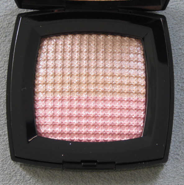
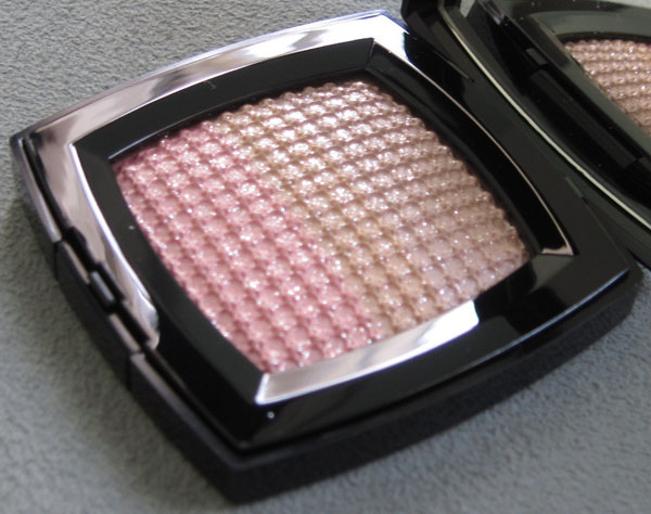
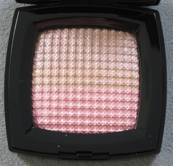
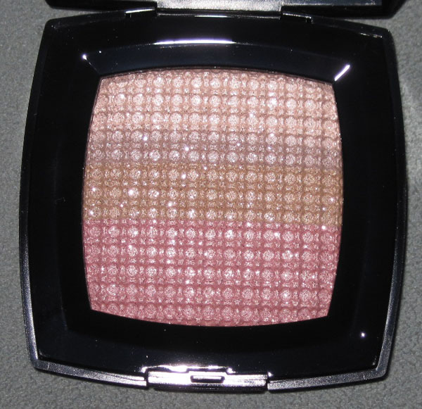
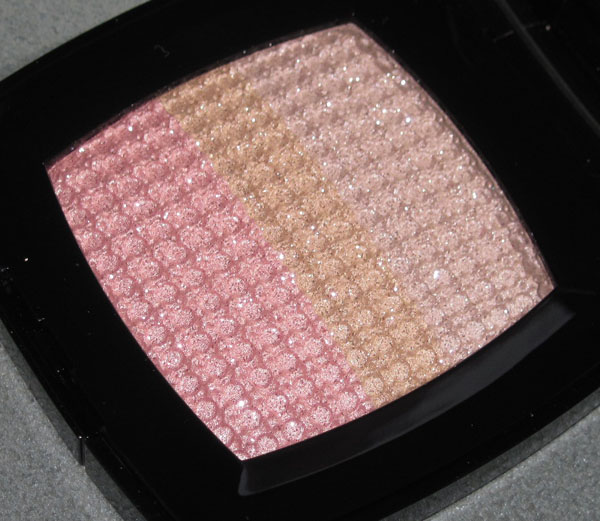
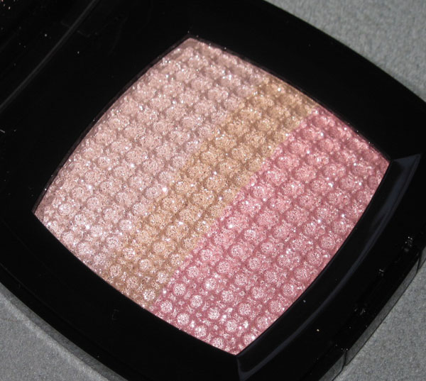
I was pleased to see this pretty little eyeshadow/highlighter combo from Chanel's Aquarelles collection. The pattern is their "iconic woven tweed", but it's a variation on the tweed pattern they have released previously (Pink Lamé and the tweed blushes) – noticeably different from those.


With flash:


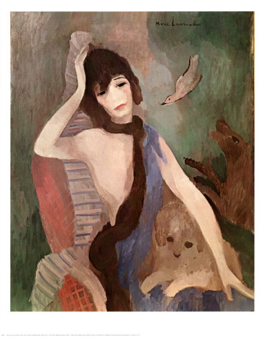
Here's the idea for the inspiration from Temptalia (why don't they put this at the Chanel website?): "In the 1920s, Marie Laurencin painted a watercolor portrait of Gabrielle Chanel. Today, Karl Lagerfeld employs that image as a point of departure for the 2011 Spring-Summer Haute Couture Collection, suffused with light and restraint. The atmosphere is pastel-toned, with clean silhouettes of catwalk models styled as ballerinas, evanescent and nonchalant. Soft pinks merge into tones of ivory and dove grey. Every aspect of the cherished rue Cambon style is washed over with the candor of youth. The enigmatic grace of a black satin ribbon tied high around the neck accentuates the mysterious spirit hidden behind the models’angelic faces…Created in the image of the 2011 Spring-Summer Haute Couture Collection, the shade range focuses on a palette of pinks and delicate grey on the eyes, framed by black and bathed in light. An exclusive creation, OMBRES TISSÉES Beiges takes on a fine-knit texture of silvery, golden and pinkish tones of beige. Arranged in three bands within their square case, these satiny eyeshadows smooth transparently over eyelids, while illuminating facial contours with touches of light."
It sounds a little vague, but the actual 1923 portrait by Laurencin shows that once again, Creative Director Peter Philips can take an artwork and create a spot-on makeup look based on it.

(image from artcyclopedia.com)
You can see the soft pastel shades and the subdued, almost gauzy texture of the brush strokes. And I'm sure the aforementioned black ribbons tied around the models' necks also found their inspiration in this painting. It's as if the painting has come to life in the various colors and textures of the Aquarelles collection (the name is also quite apt, as the painting by Laurencin is a watercolor.) I also like that the tweed pattern is a bit different and softer than the other Chanel palettes, and the fact that idea for the collection comes directly from a specific piece of the brand's history. Can't wait for the holiday palette – looks like it's going to be a another very inspired piece!
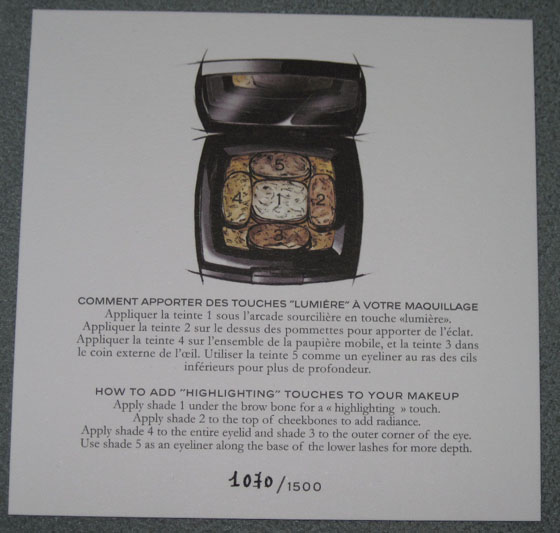
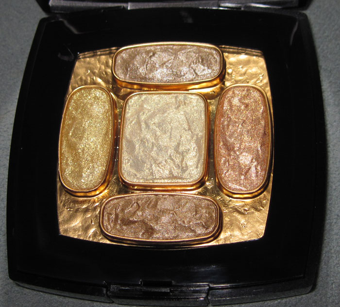
Whew! It was quite a struggle, but I managed to get my paws on what may be the most exclusive makeup item in recent history. I bought it months ago but wanted to wait till the rest of the Byzantine collection was actually out (it has been for a couple of weeks now).
*drumroll* This is the piece de resistance, the Makeup Museum's equivalent to the Louvre's Mona Lisa, THE stand-out in the entire collection thus far (and easily the most expensive many times over, oof): Lumieres Byzances de Chanel!


Only 1500 were made and of those, only 130 reached U.S. shores. This one came from the 57th Street boutique in NYC.

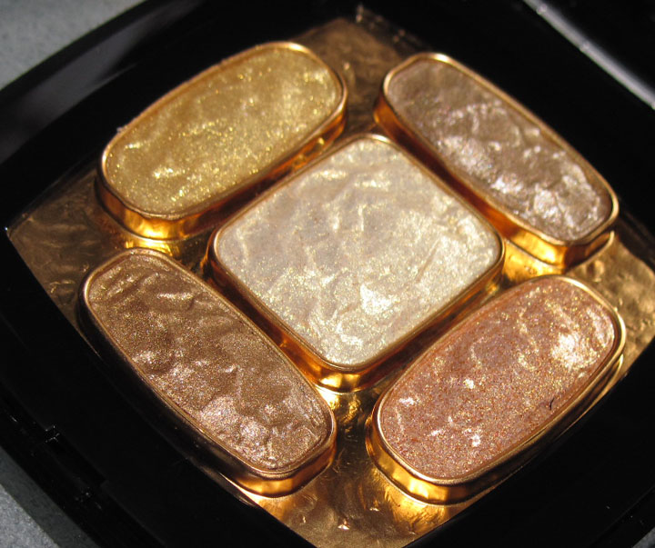
With flash:


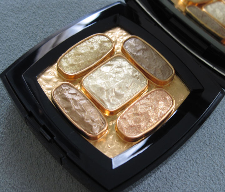
And some more pics because I couldn't seem to stop taking pictures of it – too pretty!!


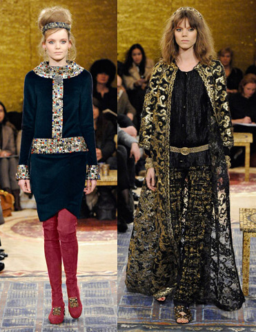
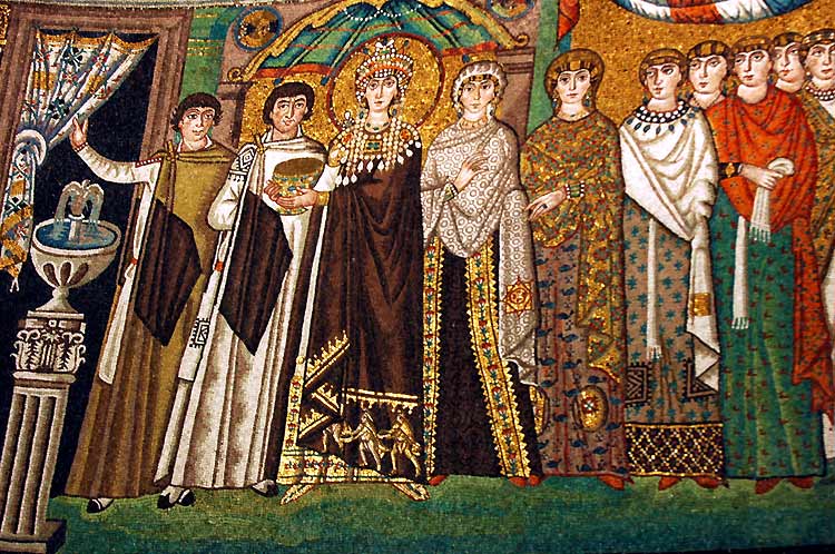
The Chanel Byzantine makeup collection was meant to be paired with the pre-fall 2011 fashion collection. According to Fashionologie, "The theme was inspired by Gabrielle Chanel's Byzantine cross-adorned cuffs and the Byzantine empress Theodora." Says Karl Lagerfeld, "Theodora was a circus artist who became empress, like Chanel, who was a little singer and became a fashion empress…I like the idea of these two strong women." And the Chanel website had a nice little summary of the exact architecture Mr. Lagerfeld was so inspired by:
"The Church of San Vitale in Ravenna, Italy was constructed between 527 and 548 during the reign of Emperor Justinian and his wife Theodora. The UNESCO-protected monument is a treasure trove of glittering glass and enamel mosaics, which attracted the lens of Karl Lagerfeld in 2010. Portraying richly-dressed figures laden with jewels, these images bear witness to the extravagance of Constantinople and the splendour of its iconography.
Karl Lagerfeld plays with this aesthetic in conceiving a collection that glitters with reflections of this vanished luxury. Recently unveiled in Istanbul, the collection revives historical ties between Ravenna and Byzantium that saw San Vitale serve as the prototype for the Hagia Sophia in Istanbul. Now the capital of Turkey, Istanbul was once known as Byzantium and renamed Constantinople in 330, when it became capital of the Eastern Roman Empire. At the peak of its success in the sixth century, the burgeoning empire gave rise to a brilliant, refined civilisation that survived until the fall of Constantinople in 1453. Mosaic-lined basilicas are a testament to the society at the heart of the Christian empire. The last remnants of this iconic art survive in Ravenna to this day."
When I was quickly perusing Byzantine art online1, several things struck me: the use of gold in the background of icon paintings, the iridescent jewel-like glass of the mosaics, and the overall opulence that the art embodied. All of these attributes were beautifully translated into the Chanel collection.
First, the gold, both fabric and jewelry:


The mosaic-like patterns on some of the pieces (I've never seen anything like the sleeves and collar on the coat on the right!):

And finally, the richness of velvet and embroidery:

(runway images from style.com)
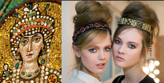
And obviously, the Lumieres palette shares these features as well: gold inlay used to hold the individual shadows, their shiny jewel-like shapes, and rich colors and texture (obviously I didn't swatch the palette, but I bet the cream shadows have a wonderful texture). I think the best part of the Byzantine collection, besides the lovely and extravagant palette, is that the makeup look of the runway show was directly taken from Theodora's face as portrayed in the mosaic at the San Vitale church.

(image from paradoxplace.com)
According to talkingmakeup.com, Peter Philips, Global Creative Director of Chanel Makeup, had this to say: “The links and associations with Chanel are rich and plenty. Karl Lagerfeld gave Sam [McKnight] and me a sketch giving us a rough idea of the direction he wanted for the look, from then the tone was set. Karl also showed us the world-famous mosaic portrait of Theodora, the Empress of the Byzantine Empire Mosaic from the Saint-Vital de Ravenne Basilica, which very naturally became the inspiration for the show’s makeup. The portrait gave me a focus point : the red eye shadow/liner that she wears on the arch of her eyebrows. This look is all about light and rich textures. The choreography between gold, bronze, black and red can be easily personalized according to the desires of each woman.”
Here's a closeup of Theodora and the makeup at the show so you can really see the influence:

(images from thebolognadiaries.wordpress.com and talkingmakeup.com)
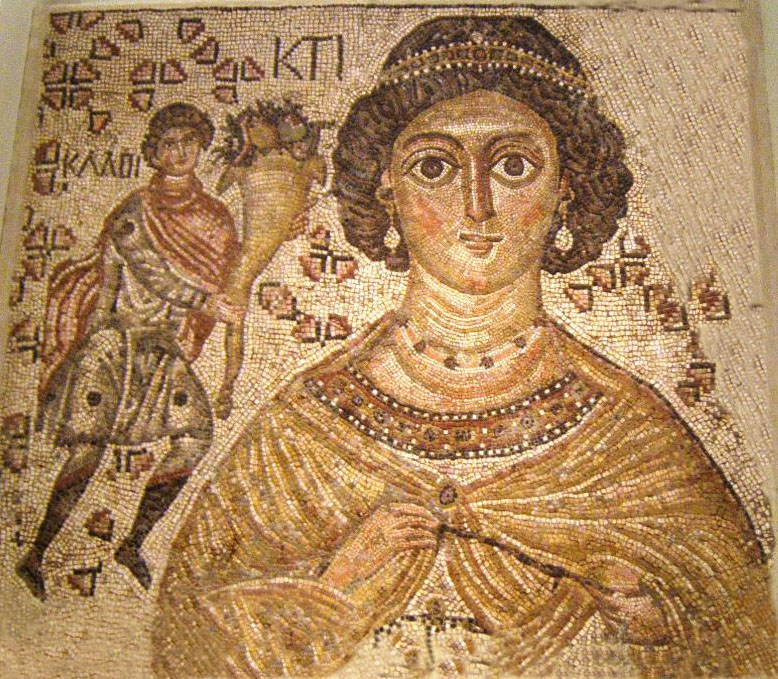
I adore the headbands too – you can see one in this fragment of a floor mosaic from the Met. The woman, Ktisis, is "a personification of generous donation or foundation":

(image from byzantiumnovum.org)
As a really cool bonus, Chanel made these amazing mosaic window displays at their South Coast Plaza boutique – the Beauty Look Book has some great pictures of them!
So there you have it. I do wonder if we will ever see a makeup item quite like this – both in terms of price and how well it ties into a given theme – ever again.
1 For more on Byzantine art online, check out the Metropolitan Museum of Art's summary here. For books, I'd check out Helen C. Evans (Curator of Early Christian and Byzantine Art at the Met) and Robin Cormack, Professor Emeritus of Art History at the Courtauld Institute of Art.
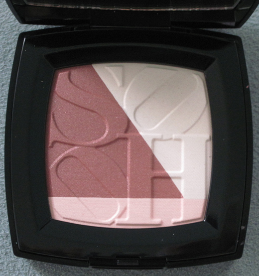
To celebrate the reopening of their Soho boutique, Chanel decided to do an exclusive collection ("exclusive" meaning only available at Chanel boutiques and at their website) devoted to the hip Manhattan neighborhood. I was intrigued enough to buy the highlighter/blush.

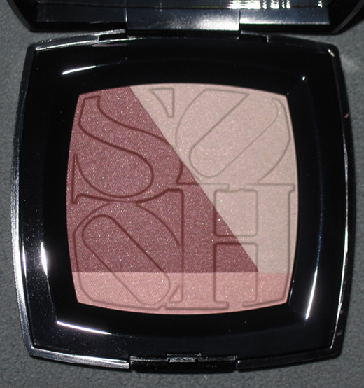
With flash:

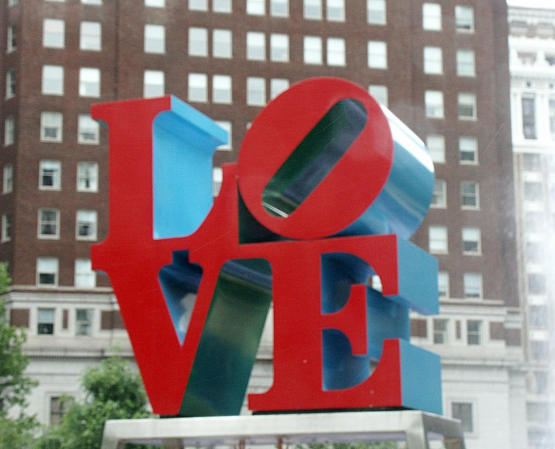
I tried to find some answers about the inspiration behind the colors of the collection and the palette's design. Peter Philips, CHANEL Global Creative Director of Makeup had this to say about the collection: “For me, SoHo is a place where Bohemian ideals meet the toughness of the city… I love the tension and energy this creates.” To echo this "toughness", the two nail polishes in the collection were named Steel (dark shimmery grey) and Strong (sparkly purple). As for the design on the blush, here's the description from the Chanel website: "This blush-and-powder palette, comprised of light plum, pink-ivory and soft pink shades for face and décolleté, puts the name of the CHANEL Boutique — in hip, downtown SOHO, New York City — front and center." Well, that's lovely, but it also looks a lot like Robert Indiana's LOVE design, no?

(image from bluffton.edu)
Now that I really look at it, I'm not sure how interesting the design on the palette actually is, or how the colors and design capture Soho's essence (I've visited there a few times and this doesn't strike me as particularly Soho-ish.) I guess it might come in handy if I ever do a NY-themed exhibition. And I very well could someday, what with the release of the Urban Decay NYC palette – I'll be discussing that as soon I get around to taking pictures of it. 🙂
 Like last spring's palette from Chanel I was disappointed with this. The trademark interlocking Chanel Cs just aren't very imaginative – basically they just slapped the Chanel logo on a highlighting powder. Also, what's up with the little circles surrounding the Cs? It doesn't look any better in person either. I thought perhaps it was just the way it was photographing, but they're fairly ugly in my opinion. Since they're raised and not uniformly shaped the image that comes to my mind, honestly, are barnacles on a ship! Try again, Chanel. I for one will not be buying something for the Museum that resembles what you'd find on the underside of a boat. Maybe they'll come out with something better for fall.
