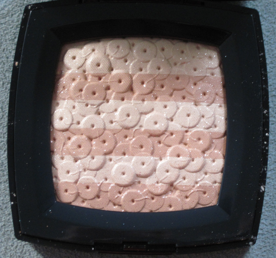
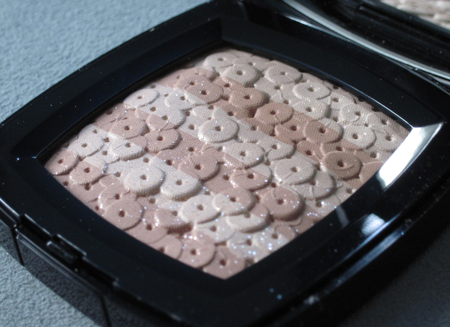
Still plowing through holiday 2017 collections – hopefully you're not getting tired of them!  Today I'm sharing Chanel's exquisite Signe du Lion highlighting powders, which are based on their Sous le Signe du Lion jewelry line that was launched in 2013. 

Chanel Signe du Lion highlighters

I don't know why Chanel released these highlighters now, as I didn't spot any lion-themed pieces in any of their most recent fashion collections, but I'm not sure I care.  Just look at them!

Chanel Signe du Lion highlighters

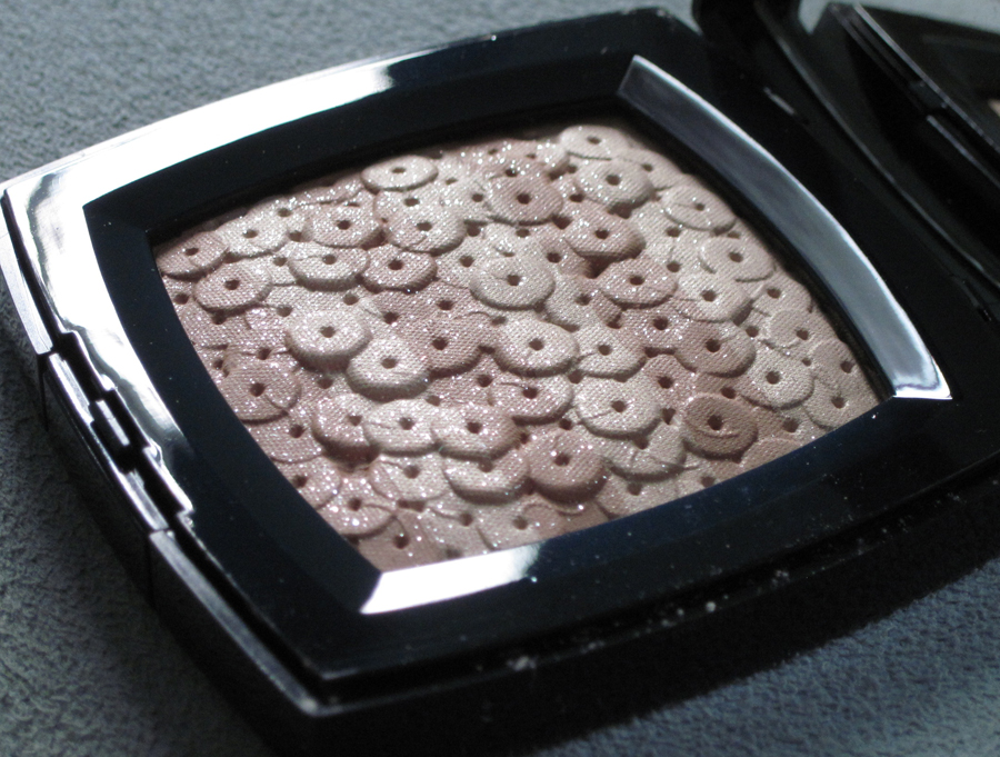
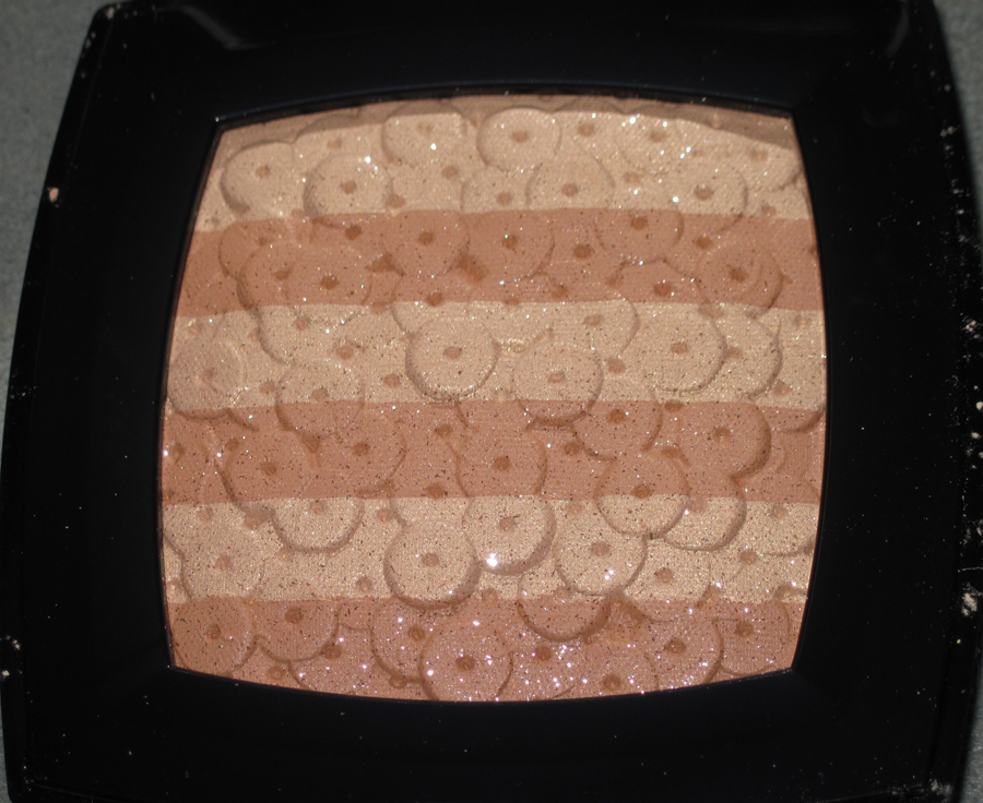
I also really like that Chanel opted for rose gold and white gold colorways rather than the more traditional silver and yellow gold.  Of course those are always nice options -  I will never turn my nose up at silver and gold, especially around the holidays – but I feel these are more understated and a little bit unexpected.

Chanel Signe du Lion highlighter

Chanel Signe du Lion highlighter

The jewelry line originally consisted of 58 pieces and was inspired by Coco Chanel's love of the lion motif.  I'll let The Jewellery Editor give the full background.  "Not only was Mademoiselle Gabrielle Chanel born under the star sign of Leo. In 1920 she travelled to Venice for the first time, at an impressionable moment her life when she was mourning the death of Boy Capel, her great love.  Lulled by the waters of the lagoon and entranced by the opulence of Byzantine art, it was in Venice that Gabrielle emerged from her sorrow. Here she found inspiration and strength in the rich gold tiles of the church cupolas, the mesmerisingly bejewelled Palo d'Oro altar piece of St Mark's and the ubiquitous lions that grace almost every building, door knocker and public monument of La Serenissima.  The lion is the symbol of St Mark, the patron saint of the city, whose relics rest in the Basilica. The lion is also a symbol of power and the dominance of Venice over the world during the Renaissance – an apt figure for Gabrielle Chanel, a powerful woman who decorated her rue Cambon apartment with statues of lions and used them in couture details such as buttons, handbag clasps and brooches."

Let's take a moment to drool over some jewelry highlights, shall we?

Chanel lion bracelet

Chanel lion earrings

Why yes, you can buy me this necklace.  It's such a bargain at a mere $86,500.

Chanel lion necklace

Chanel lion earrings

Chanel lion ring

Chanel lion brooch

I think this ring most resembles the design on the highlighters.

Chanel lion ring
(images from chanel and jewelsdujour.com)

I wanted to see whether any lions had popped up in Chanel jewelry and accessories prior to the 2013 jewelry line and was pleasantly surprised to find they had been roaring throughout a good chunk of Chanel's history. 

Chanel lion brooch, 1960s
(image from 1stdibs)

Chanel lion coat of arms jewelry set, 1970s
(image from 1stdibs)

Chanel lion bracelet, 1980s 
(image from onekingslane)

Chanel lion bracelet, 1992
(image from tradesy)

Chanel lion brooch, 2001
(images from 1stdibs)

I was also curious to know whether Chanel was fabricating, or at the very least, embellishing Coco's fondness for lions as a marketing ploy to sell the jewelry line.  Once again I was surprised to see that Gabrielle Chanel did appear to have a genuine love for the motif as evidenced by this 1960 magazine spread and photos of her apartment, which show that she did indeed decorate it with an abundance of lions.  Additionally, in 2016 Chanel carried on the legacy of its founder's appreciation for the motif by paying for the restoration of the lion statue, as well as the surrounding mosaic, on the facade of St. Mark's basilica in Venice.  So it looks like Chanel wasn't…lion. (I'll be here all day, folks.)

Chanel-1960(image from parismatch.com)

Lion statue in Coco Chanel's apartment(image from ilovecuriosity.wordpress.com)

Chanel's apartment(image from interiormonologue.com)

This bronze statue served as the inspiration for Chanel's fall 2010 couture show, for which Karl Lagerfeld, grandstander that he is, commissioned an enormous version of the statue as the runway's focal point.  He even had a male model don a lion's head for the grand finale.

Bronze lion statue in Coco Chanel's apartment(image from styleblog.ca)

Chanel fall 2010 couture show

Chanel fall 2010 couture show

Chanel fall 2010 couture show(image from vogue and popsugar)

The most recent lion reference I was able to find in Chanel's accessories besides the jewelry line was this series of Leo bags from spring 2011.  This doesn't mean they don't exist; I just didn't notice any in my cursory browsing of runway photos from 2015-2018.

Chanel Leo bag
(image from designer-vault.com)

Chanel Leo bag
(image from tradesy)

As for the highlighters, I'm still not sure why Chanel decided to release them now, as the jewelry line debuted a few years back and I didn't see any lions in more recent runway collections.  But I will say that the simplicity of the highlighters' faceted design and subtle hues instead of an overly busy and more colorful one nicely reflect the 2013 jewelry line, which I also believe was the best choice in terms of inspiration for highlighting powders.  I don't think fine jewelry is always better designed than costume jewelry, but I think in the case of Chanel's lion-themed baubles, the 2013 collection is way more refined and modern compared to the costume jewelry from previous decades, not to mention incredibly luxurious – it translates perfectly to highlighters.  I would like to see a bronzer embossed with Lagerfeld's oversized version of the lion statue…I'm envisioning a shiny golden bronze powder for the lion and a dazzling white pearly highlighter for the sphere under its paw. ;) 

What do you think about these highlighters?  Are you a Leo?

Initially I was pretty unimpressed with Chanel's holiday 2016 lineup, as early reports indicated that there wouldn't be any sort of show-stopping palette for the season.  But I should have known Chanel had a very beautiful surprise up their sleeve!  Behold, the exquisite Ombres Lamées palette. 

Unlike some of their previous palettes, this one comes in a luxurious pebble-textured box with two separate brushes.

Chanel Ombres Lamées box

Chanel Ombres Lamées

The design is inspired by the fall 2016 runway collection.  We'll look at that in a second, but in the meantime, you must appreciate the palette in all its intricate golden glory.

Chanel Ombres Lamées

Chanel Ombres Lamées

Chanel Ombres Lamées

Chanel Ombres Lamées

Chanel Ombres Lamées closeup

I did my usual "let's find the pattern match from the fashion" but I discovered that the palette was indeed only "inspired" by the fall 2016 collection rather than being a literal recreation of some of the patterns.  Still, the designs on the palette are faithful to the runway pieces in that they represent the gold thread woven into the clothing in a variety of ways, from the traditional Chanel tweeds to chunky knit sweaters and lamé skirts.  There was even a bag in the shape of a spool loaded with gold strands to further emphasize the craftsmanship behind these pieces, which, when combined with the pared-down runway atmosphere, seem more couture than ready-to-wear.

Chanel fall 2016 ready-to-wear

Chanel fall 2016 ready-to-wear

Of course, this isn't the first time Chanel highlighted gold in a collection (see the pre-fall 2012 collection as well as the fall 2014 and spring 2016 couture collections, just to name a few examples), but once again Lagerfeld has given new life to this shiny staple.  It's a bit more subtle than in seasons past, even though it made its way onto nearly every item.  With the exception of a couple dresses, bags and boots, I felt like I had to look closely to see the glints of gold peeking out along hems, buried in a pair of gloves or crinkled in a skirt.  Gold was a detail and yet it wasn't; it was incorporated into almost every piece but in a whisper more than a shout.  I also think the fact that the gold weave was interspersed within a relatively neutral color palette of ivory, white, beige and black also makes it seem more understated.

Chanel fall 2016 ready-to-wear

Chanel fall 2016 ready-to-wear

Chanel fall 2016 ready-to-wear

My favorite piece from the runway, and I think the one that most resembles the palette, is this beautiful column dress.

Chanel fall 2016 ready-to-wear

Chanel fall 2016 ready-to-wear
(images from vogue.com)

As you can see, it's not an exact replica of the patterns, but the various colors and textures neatly stacked on top of each other is similar to the palette's design. 

Overall, as you might have guessed, I'm pretty in love with this palette.  It's easily the best one Chanel has come out with in about 2 years (this is the last one I was truly wowed by), and it was well-timed – who doesn't want some bling for the holidays?  As for fabric-esque makeup, I don't think anyone does it better than Chanel.  Dior, YSL, Armani, Burberry, et. al. have all come up with some wonderful runway-inspired palettes, but in terms of ones that actually look like fabric, Chanel has the market cornered.  (See the Museum's Woven exhibition for more fabric-themed items – I'd love to re-do it and include Ombres Lamées!)  Oh, and a word about purchasing this beauty: I was told by Chanel.com that the palette wouldn't be released in the U.S. so in my panicked state I ordered from Bonbon Cosmetics, but as usual Chanel's customer service was wrong – the palette will be available on the Chanel website starting November 28.  I saw a notice at Refinery29 yesterday and received an email directly from Chanel this morning notifying me that it's coming, so we have confirmation it will be stateside shortly.  The email also said, however, that it will be available in "limited quantities" so if you want it don't wait!

Do you plan on picking it up?  Any other thoughts?

Save

This highlighter was a sweet little surprise from Chanel.  I'm not sure why they chose to release it now, as a pearl jewelry collection was introduced in 2014, but it's a delightful nod to Coco Chanel's popularization of long, dangling strands of faux pearls as well as their use in Chanel's contemporary fashion.

Chanel Perles et Fantasies highlighter

Chanel Perles et Fantasies highlighter

The embossing on the box was a nice detail.

Chanel Perles et Fantasies highlighter

While she was not the first to make use of costume jewelry in her collections, Coco Chanel introduced the notion of mixing them with one or two real pieces. "A woman should mix fake and real.  To ask a woman to wear real jewelry only is like asking her to cover herself with real flowers instead of flowery silk prints.  She'd look faded in a few hours. I love fakes because I find such jewelry provocative, and I find it disgraceful to walk around with millions around your neck just because you're rich. The point of jewelry isn't to make a woman look rich but to adorn her; not the same thing."  Coco's idea of piling on faux jewelry alongside real gems democratized the practice of wearing jewelry, as the combination of genuine and fake allowed women to perfectly accessorize their outfits at a more affordable price.  And her costume jewelry of choice? Long strands of oversized fake pearls, sometimes mixed with chains and beads.

Coco Chanel(images from mystylefest.com and marlm.com)

Coco Chanel, 1937
(image from milkywayjewels.com)

These strands have been an integral part of Chanel style for many years, but the couture house is constantly reinventing them and using pearls in new and innovative ways. Today I thought I'd highlight some my personal favorites from the past 10 years.

Pearls were used as hair accessories, either fairly simple (shown here at the fall 2006 couture show)…

Chanel fall 2006 couture hair

…or elaborate, as at the pre-fall 2009 show.

Chanel pre-fall 2009

Pearls can also be delicate belts, shoe decorations or even a small purse.

Chanel resort 2013, spring 2010 and pre-fall 2015

Another thing I've noticed is how Chanel plays with proportions of pearls.  Take, for example, the enormous pearls that adorned the necks and wrists of the models while also dotting the clothes themselves for the spring 2013 ready-to-wear collection, or as veritable boulders at the spring 2014 ready-to-wear show.

Chanel spring 2013 ready-to-wear

Chanel spring 2013 ready-to-wear

Chanel spring 2014 ready to wear

In sharp contrast to the relatively tidy, orderly application of pearls in the above collections, pre-fall 2012 was all about haphazardly heaping them on in multiple places – of course as necklaces and bracelets but also as belts and and sewn onto jackets.  Mixed with intricate embroidery, lamé, metalwork and gemstones, pearls lent an incredibly luxe yet sophisticated feel to the collection.  Indeed, Karl Lagerfeld wanted a collection reminiscent of traditional Indian royalty that also acknowledged India's modernity, and the use of Chanel's signature pearl strands combined with other jewels was essential in achieving this.

Chanel pre-fall 2012

Chanel pre-fall 2012
I saved my 2 favorites for last: the fall 2010 couture collection and the stunning spring 2012 ready-to-wear show.

Chanel fall 2010 couture

I really only care for pearls when they're edgy and/or disheveled, so obviously I'd kill to have the bracelet below.

Chanel fall 2010 couture

You might remember how inspired I was by the ethereal, under-the-sea vibe of these pieces, not to mention the mermaid-esque beauty look.

Chanel spring 2012 ready-to-wear

Chanel spring 2012 ready-to-wear

Chanel spring 2012 ready-to-wear(images from vogue.com)

Overall, I liked this palette as it's a simple representation of a rather groundbreaking and recognizable aspect of Chanel's aesthetic.  Would I have liked to see a little more detail in the pearls?  Perhaps, but sometimes with depictions of couture house icons, a more straightforward design is best.

What do you think?  And are you a pearl wearer?  As I said above, I don't like a neat little line of pearls – I need to have them messily mixed with spikes, studs, etc. to toughen them up.

Mum.fall.fracas.smackdown.poster.2pp

Fall leaves can be pretty…but also lethal.  This year multiple brands adopted a foliage theme in advertising and packaging.  So instead of the usual one-on-one match, I had no choice but to create a bracketed competition.  Chanel will be squaring off with Dolce & Gabbana for the best leafy ads, while Catrice will fight Laura Geller to see which one has the most tantalizing foliage design.  The winners of each of those rounds will then duke it out to see who has the top leaf motif in all the (makeup) land.  Settle in folks, this is gonna be epic!

Let's get ready to rummmmbbbblllllle!  *ding ding*

In the right corner we've got some luscious promos for the Les Automnales de Chanel collection.  Chanel's strength lies not only in the very orderly yet artful arrangements of plants and makeup, but also in the variety of the types of botanicals.  Can D & G withstand the onslaught of leaves, flowers, berries and twigs in perfect fall hues?

Chanel fall 2015 makeup

Chanel fall 2015 makeup

  Chanel fall 2015 makeup

Chanel fall 2015 makeup
(images from fashionisers.com)

Well, let's see.  In the other corner is D & G, whose fall collection promos depict an unexpected melange of red, purple and rose leaves that match the makeup.  Will this unnatural and bold color scheme catch Chanel off guard?  Or are the images too repetitive to pack a good punch?

Dolce & Gabbana fall 2015 makeup

Dolce & Gabbana fall 2015 makeup

Dolce & Gabbana fall 2015 makeup

Dolce & Gabbana fall 2015 makeup

In the next ring, we have Catrice's "Fallosophy" 2015 collection up against Laura Geller's Italian Garden set.  Catrice throws a sharp right hook with eye shadows, nail polishes and lipsticks all featuring a sleek leaf illustration.

Catrice fall 2015

Catrice fall 2015

Catrice fall 2015
(images from chicprofile.com)

Laura Geller's Italian Garden set, a QVC exclusive, contains only one item with a leaf design. 

Laura Geller Italian Garden set

However, what the collection lacks in number it makes up for in the palette's color and detail.  Interlocking leaves in a variety of rich fall colors return a powerful blow to Catrice's monochrome foliage.

Laura Geller - Italian Garden palette
(images from qvc.com)

Who are your bracket picks and the final winner?  Tell me in the comments!

It's almost officially summer but I still want to catch up on spring releases, such as this chic little number from Chanel.  L'Intemporel was released back in March this year and features an embossed design of the signature chain strap on Chanel's legendary 2.55 bag.  The colors themselves also look like they may have a slightly crackled effect to mimic the leather of the bag, but as I haven't seen this in person I'm not 100% sure.  I'm still debating whether to snatch it up for the museum.

L'intemporel de Chanel palette(image from chanel.com)

For reference, here's what the bag looks like.

Chanel 2.55 bag(image from chanel.com)

Why did Chanel choose to highlight the chain on this bag?  Well, the history behind the bag's design is quite fascinating.  Coco Chanel had originally designed a handbag in 1929, but in February 1955 (the bag is named for this date) she modified it by adding a strap to keep her hands free.  "I got fed up with holding my purses in my hands and losing them, so I added a strap and carried them over my shoulder," she said. As for the chain, it may have been inspired by the chained belts the nuns wore to carry their keys at the convent where Coco grew up.  Additionally, she said, "I know women — give them chains, women adore chains."  Some other fun facts:  the bag was originally lined in burgundy, another nod to the convent where Coco was raised (the uniforms were this color), and the front flap has a zippered compartment where she allegedly stored her love letters.

Coco Chanel with the 2.55 bag(image from dejavuteam.com)

I liked that Chanel chose to highlight a key element of the 2.55 for the palette.  I never knew that the bag had such a history (or the strap, for that matter) so it was nice to see it celebrated here.  I think in this case not recreating the entire bag on the palette works – featuring only the chain is a subtle and sophisticated homage.  And releasing this in 2015 is also somewhat appropriate, as it's the 60th anniversary of the original bag.

On a slightly unrelated note, it looks like there may have been a reversal in the inspiration between Chanel's fashion and beauty arms recently.  Check out this fall 2015 collection bag in the shape of Chanel's Les Beiges powder compact.  This is the first time I've seen makeup packaging influencing fashion rather than the other way around.

Chanel compact bag - fall 2015
(image from yahoo.com)

What do you think of the palette and the 2.55 bag?  Personally I'm partial to Chanel's boy bag, but I wouldn't mind owning a reissued 2.55.  😉

I have to admit that the only reason I picked this up is because it's pretty.  I'm not thrilled that Chanel revisited a camellia design, but this was so nice to look at I overlooked the lack of inspiration in the concept. 

Jardin de Chanel blush, spring 2015

Shimmery, multi-layered camellias in a range of lovely soft pink tones – who could resist?

Jardin de Chanel blush, spring 2015

Jardin de Chanel blush, spring 2015

While the blush is gorgeous on its own, I was determined to see if it had anything to do with what was shown on Chanel's spring 2015 runway shows.  There were a few pieces with delicately sewn petals at the ready-to-wear show:

Chanel spring 2015 ready to wear
(images from style.com)

But it was the couture collection though, I think, that ties into the palette the most.  Lagerfeld's vision for the show's setting, a futuristic, somewhat surreal garden made with paper flowers, was "not the nature that we know, because these flowers, the great God forgot to make them, it’s the flowers that we invented."  Meanwhile, the palette is allegedly "inspired by Parisian gardens" so it looks like both the fashion and beauty departments at Chanel had gardens on the brain this season.

Chanel spring 2015 couture

Chanel spring 2015 couture

While I didn't spot any camellias, I did think the petals on these two dresses are reminiscent of the layering of the camellia petals on the palette.

Chanel spring 2015 couture

Chanel-couture-spring-2015-detail

Chanel-spring-2015-couture-detail
(images from style.com)

Overall, while I'm not so impressed that Chanel served up another camellia, especially when there was so much floral inspiration to draw from in this season's couture line, this blush was worthy enough of the Makeup Museum.  And it looks like we have yet another camellia design coming up in the Chanel's summer collection, so perhaps eventually I can do a Chanel garden show of my own featuring only camellias. 

What do you think? 

Today I want to share a relatively hard-to-find Chanel quad that debuted during their 2015 cruise collection show.  (This quad is also being given away by me – there's still a few hours left to enter – but will be arriving soon to the Chanel website so don't fret if you don't win the giveaway!)  Rêve d'Orient has a gorgeous color scheme consisting of shimmery ivory, warm gold, deep bronze and matte black, all embossed with a smattering of tiny stars.

Chanel Rêve d'Orient quad

Chanel Rêve d'Orient quad

Chanel Rêve d'Orient quad closeup

This quad was used on the models for 2015 resort collection runway show to create a smoky, Middle East-inspired eye with a dab of luxurious gold leaf placed on the inner corners. 

Chanel resort  2015 makeup
(image from vogue.co.uk)

However, I have no idea why a star design was included on the shadows themselves.  Stars didn't appear on any of the clothing.   One possibility is that it's an homage to Islamic religion (the show took place in Dubai), whose mosques are sometimes adorned with stars.  The most famous example is the Star Mosque in Bangladesh

Star mosque, Bangladesh
(image from beautifulmosque.com)

Some mosques have stars at the top of their spires, usually paired with a crescent.

Moroccan mosque
(image from essaouira.nu)

And some of the headbands at the show featured a crescent motif.

Chanel resort 2015 - crescents
(image from vogue.co.uk)

Still, most star patterns in Islamic art and architecture consist of 6-, 8- and 10-pointed stars so it's quite a reach to assume Islam is what Chanel was referencing, especially considering there's no symmeterical pattern but rather a random scattering of stars.  It could just be that it's a nonspecific expression of Karl Lagerfeld's latest take on the East-meets-West theme.  As Lagerfeld remarked, "It’s a collection made for this part of the world, but I think, and hope, it’s for women all over the world."

The more likely possibility is that as with the Camelia de Plumes highlighter, the stars are borrowed from the first jewelry line by Coco Chanel that was introduced in 1932; specifically, the Comète series.  Here are some of the original pieces (does anyone else find the mannequins to be incredibly creepy?)

Chanel Comète jewelry, 1932

Chanel Comète jewelry, 1932
(images from elle.com)

An updated line was released for the original's 80th anniversary in 2012.

Chanel Comète rings

Chanel Comète earrings and bracelet
(images from chanel.com)

Since I have no conclusive answer on the star pattern, I thought I'd show you a slightly different Rêve d'Orient.  This 1881 watercolor by Gustave Moreau (1826-1898) has the same name as the Chanel quad and shows a Peri (a fairy-like creature from Persian mythology) perched on a dragon and holding a lotus flower.  The top of a mosque appears on the right side in the background. 

Rêve d'Orient by Gustave Moreau
(image from christies.com)

You can read the entire description of this work and the meaning behind it here, since Christie's does a much better job than I can.  Moreau is one of my favorite artists – I love French Symbolism and I'm actually reading this book on it now, so I was really excited to find this. 

Anyway, as with the Chanel Camelia de Plumes highlighter, I'm a little disappointed there was no concrete explanation for the pattern.  Both palettes vaguely reference Chanel fashion and history, but there's no real, literal connection to the clothing we saw in recent shows.  Nevertheless the Rêve d'Orient quad is pretty and the star design is perfect for the upcoming holiday exhibition, so I can't complain too much.

What do you think the stars mean?  And I know it's comparing apples to oranges, but do you prefer Chanel's Rêve d'Orient or Moreau's?

As soon as I saw this palette from Chanel I knew I had to have it.  Not only was I drawn to it due to the sparkly platinum gold color, I liked that the classic camellia was illustrated a bit differently, its petals made from feathery plumes anchored by a gemstone shape in the center.

Chanel Camelia de Plumes highlighter

Chanel Camelia de Plumes highlighter

Chanel Camelia de Plumes highlighter

The description for the palette states that it was inspired by "Gabrielle Chanel's original jewelry creations," and I'm guessing it took its cue from the Plume de Chanel jewelry collection released last year, which also referenced the original line from 1932.  

Chanel Plume headband

From the website:  "The feather entered the CHANEL creative landscape in 1932, when Mademoiselle opened her apartment in the rue du Faubourg Saint Honoré to present her Fine Jewellery collection. It was called, quite simply, ‘Bijoux de Diamants’. It explored the timeless themes that she particularly loved and which became some of the House classics: comets, stars, bows…one of these new creations particularly caught the eye: a spectacular brooch in the form of a feather. It was intentionally large and extravagant, fully jointed and set with diamonds. Deliberately daring, it called on the imagination of the wearer. It was magnificent pinned to a hat, on a dress, as a tiara, or even snuggling against a shoulder to emphasise its curves.  The gracefully feminine Plume de CHANEL is an unmissable collection that demonstrates the independent creative spirit of CHANEL, as well as its outstanding jewellery expertise. Mademoiselle Chanel’s visionary spirit is still very much alive in this collection, spreading its wings once more in the contemporary age."

Here is the brooch, plus other pieces from the contemporary collection.

Chanel Plume brooch
(image from theparisianeye.com)

Chanel Plume rings

Chanel Plume earrings

Chanel Plumes bracelet and necklace
(images from chanel.com)

While I couldn't find a jewelry piece that specifically looked to be a camellia made from feather shapes, I like that the highlighter palette at least references the collection.  I'm still puzzled as to why Chanel chose to release this highlighter now since feathers did not figure prominently in any of the recent fashion collections, so I'm not sure why they'd want to reference a jewelry collection seemingly out of nowhere.  My hunch, as with Chantecaille's designs as of late, is that the company put an intern in charge of creating this highlighter.  I'm envisioning a bigwig telling some poor kid to come up with something sparkly for the holiday collection, and they went digging through the archives and randomly came up with this design.  It just doesn't seem like there was a whole lot of thought put into it.  (Perhaps Chanel beauty is still a bit lost after the resignation of Peter Phillips?)  Having said that, at least the color is spot-on, as it's the perfect mix of the yellow and white gold that the jewelry is available in.  Additionally, while there were no plumes to be found in the fall 2014 ready-to-wear or couture collections, the color is reminiscent of the glittering gold that was sent down the runway for the couture show.

Chanel Couture fall 2014
(images from style.com)

Overall, while I wish the Camelia de Plumes had a closer tie to a recent fashion collection, I like that Chanel mixed it up a little and gave us a feathery camellia rather than the usual flowery one.  What do you think? 

I was so happy this lovely palette finally made it stateside.  I had anxiously been waiting out unconfirmed reports that Chanel Dentelle Précieuse would be available in the U.S. as a Nordstrom exclusive for their anniversary sale in July, and fortunately the rumors turned out to be true.  I bought it the minute it became available. 

Chanel-Dentelle-Precieuse

Chanel-Dentelle-Precieuse-palette

Chanel-Dentelle-Precieuse-closeup

Chanel-Dentelle-Precieuse-detail

The palette's intricate lace design was inspired by "Gabrielle Chanel's love of lace" and was appropriate given all the lace that came down the runway for Chanel's fall 2014 couture show. 

Chanel-couture-2014
(images from style.com)

I would have liked to explore the use of lace throughout the history of this hallowed fashion house, but that would be an entire book.  Instead I'll examine this particular pattern more closely.  I studied the lace detailing of some of the fall 2014 pieces and none of them quite matched the pattern on the palette.  They were very close but not identical.  I was a little disappointed that it wasn't the exact same pattern, but I did some digging and I think it's actually from the spring 2009 ready-to-wear collection. 

Chanel-spring-2009-rtw
(images from style.com)

I rotated the picture of the palette and zoomed in on one of the sleeves from the top shown above.  The white circle is around the exact spot where I thought there was a match.

Chanel-lace-pattern

I might be wrong but they look the same to me (although the pattern on the palette is upside down).  If they are the same, I'm puzzled as to why Chanel would have used that lace pattern instead of a more recent one…maybe that particular one was just easier to produce in makeup form.  In any case, you can't argue that the design is truly gorgeous and probably the best lace design I've ever seen in a palette (including Dior's Dentelle collection from spring 2010 and D & G's Sicilian Lace bronzer.)

What do you think?

I am now the proud owner of a mint condition Chanel's Mouche de Beauté Illuminating Powder (sans fingerprints), so today we'll be looking at this little gem from the 2013 cruise collection.

Chanel-mouche-de-beaute-versailles

Chanel-mouche-de-beaute-cruise-2013

Chanel-mouche-de-beaute-side

Chanel-mouche-de-beaute.side

With flash:

Chanel-mouche-de-beaute-with.flash

Chanel's 2013 cruise collection focused on French royal superficiality and excess, with the show itself actually taking place at the gardens at Versailles.  "Formal eighteenth-century details, like panniers and
fichus, were re-created in casual twenty-first-century fabrics—chambray,
tech denims, even plastics—dressed up with frothy lace ruffles and
cuffs, and dressed down with gold platform trainers and short shorts.
Occasionally awkward though it may have been, the lightness, the
girlishness, of the clothes had a balletic quality, reflective perhaps
of Louis' own love of dance. Lagerfeld said he wanted something floating
and frivolous. 'Frivolity is a healthy attitude,' he said after the
show. "I know people who were saved by frivolity.'" (source)

Chanel-cruise-2013
(images from style.com)

Indeed, the clothes definitely had a Marie Antoinette feel.  Says one fashion critic, "If Sofia Coppola’s 2006 film depicted how young Marie
Antoinette’s court looked in the past, this was as if Lagerfeld had
imagined what a teenage princess and her entourage might look like
today, charging around in brothel creepers in the actual gardens where
the Austrian-born queen played out the fantasy games that eventually led
to her sticky end at the guillotine."

In keeping with with this theme of Versailles grandiosity/Marie Antoinette-era extravagance, Chanel released a small makeup collection including a cream-to-powder highlighter featuring designs that are reminiscent of the architectural details at the palace of Versailles.  While I couldn't find an exact match between online pictures of Versailles and the palette's design, I found something that was close.  When we think of Versailles we typically think of the Hall of Mirrors, but the details on this palette seem to be more similar to those found in the king's private quarters:  specifically, the gold paneling on the walls.  Here is one of the rooms from that area of the palace.  The panels at the lower right have a nearly identical shape to that of the palette.

Chateau_de_Versailles_king-room_
(image from commons.wikimedia.org)

I cropped it so you can get a better glimpse.  While the floral motif in the corners is markedly different, the overall look is comparable.

Chateau_de_Versailles_king-room-detail

One thing that is troubling me is the bee crawling towards the right side of the palette.  It could be a nod to Napoleon, who used the insect as his emblem, but that doesn't make much sense as Napoleon reigned after the French Revolution.  If the collection was meant to be in the spirit of Marie Antoinette's style and her dalliances at Versailles, why include a symbol of the emperor who ruled after her?  However, the bee could refer to Louis XIV, who built Versailles and was thought of as the "King Bee", or perhaps Louis XVI (husband of Marie Antoinette), whose visage appeared on a coin with the reverse side depicting a hive of bees.

Louis-xvi-bee-coin
(image from beastcoins.com)

While that mystery might not be solved, along with which exact architectural detail was reproduced, it's a gorgeous palette that looks unmistakeably French.  With its rich gold color and intricate embossing,  I think it might have been luxe enough for Marie Antoinette herself.  😉

What do you think?