My heart skipped a beat when I spotted what Sulwhasoo had up their sleeve for this year's ShineClassic compacts. Every year the company collaborates with an artist who represents an aspect of Korean artisan culture to create a design for two compacts, a tradition Sulwhasoo began in 2003. Master craftswoman Hong Jeong Sil was selected to produce the ShineClassic compacts for the 2018 holiday season. We'll delve more into the traditional metal inlay technique known as ipsa that Hong used to create these stunning pieces, but first, let's take a look at them in all their glory. Unlike last year's release (another that I never got around to writing about, sigh), this year I was so smitten with the design I got both compacts, steep price tag be damned. I really try to only buy one since the designs are the same, just with different color schemes, but I simply couldn't resist these!
Even the boxes are works of art inside and out.
So luxurious!
The inside of the lids are etched in a metallic finish depicting a charming nature scene with trees, waterfalls, birds, deer and even a turtle. According to the Sulwhasoo website, these "symbolize longevity and great fortune, carry the message 'One can achieve his or her purposes and lead a healthy, peaceful life.'" As it turns out, the inclusion of these motifs is not accidental. Like many Korean artists, Hong is inspired by a traditional group of ten symbols of longevity collectively known as Ship-jangsaeng: Sun, mountains, water, cranes, turtles, pine trees, bamboo, mushrooms, deer and clouds. I thought the whole scene was merely cute and whimsical and that Hong just personally found these images enjoyable – I had no idea how culturally significant these motifs are.
The intricacy of the compacts themselves is exquisite.
Of course, I managed to nick the powder on this one…I must learn to control my excitement when handling Museum objects.
Here's some of the pamphlet that tells a little bit about the ipsa tradition.
So what exactly is ipsa? I'm afraid I can't go into too much detail since I completely didn't see this entire book on it until it was too late, but hopefully what I was able to gather online will suffice for now. (I plan on ordering the book and updating this post accordingly, if I remember.) Basically ipsa is the art of inlaying thin, delicate strands of silver, copper or gold onto a metal surface. It's similar to damascene and other metal inlay techniques found around the globe, but two elements make ipsa uniquely Korean: the focus on graceful lines and the preference for silver over other metals. This very helpful article from Koreana magazine explains the history and general style of ipsa. "During the Goryeo Dynasty (918-1392) and the Joseon Dynasty (1392-1910), it was developed into a brilliant art form, representing the epitome of metal craft. Still, Korean metal inlay is unique for its emphasis on the 'art of lines.' The designs made with lines of a consistent width are simple yet artistic, basic yet whimsical. Designs expressing wishes for good fortune and prosperity, health and longevity, abundance and fertility, or images of the ten symbols of longevity (including birds and flowers, grass and insects, and landscape scenes with ducks in a stream under weeping willows), were crafted onto incense burners, braziers, tobacco cases, clasps, and stationery items, which were always kept close at hand and appreciated for their refined appearance…Though gold was rarer, silver was the preferred choice…Silver is rather plain by itself but radiates brilliance when combined with other materials. It has a subtle elegance that endures over time, rather than something fancy that can quickly fade. These qualities of silver appeal to the inherent nature of the Korean people, which is why silver was most commonly used for metal inlay work." Hong's work for the Sulwhasoo compacts definitely represents the traditional ipsa style through the "basic yet whimsical" lines and symbols of longevity.
Like the other holiday collabs we've seen so far, ipsa requires precision and painstaking labor. The patterns must be carefully drawn out on the surface before the inlay is applied. Each strand of metal, some as thin as .25 millimeters, must be formed by hand and then attached to the surface individually. This means even a very simple line takes hours. Over 30 types of tools are used – everything from pliers and hammers to tweezers and chisels. As Hong says, it's essentially "embroidery with metal." Sulwhasoo provided a few snapshots of the process, but I would have loved to see a video showing Hong creating the original design.
Additionally, there are two main types of ipsa. I'll let Koreana take over again: "The first, called kkium-ipsa, involves incising a decorative design onto the surface of a metal object using a burin, and inlaying the threads of silver into the incisions. This technique was widely used during the Goryeo Dynasty. Because Goryeo had adopted Buddhism as its official religion and ideology, the metalworks that were produced primarily included bronze Buddhist implements, such as incense burners, incense cases, and kundikas. During the subsequent Joseon Dynasty, Buddhism was suppressed and supplanted by Confucianism. The production of bronze Buddhist implements thus diminished, while large quantities of ironware items were supplied to the royal palace and the homes of the elite class. Since the major material for metalworks was now iron instead of bronze, it was necessary for the metal inlay techniques to be adjusted accordingly. This led to a second technique, jjoum-ipsa, in which the entire surface of a metal item is uniformly incised and then silver thread hammered into the incisions. This is the technique that Hong learned and applies in her works today. The surface has to be engraved four times, each time in a different direction, which calls for painstaking patience and perseverance." There was only one design for Sulwhasoo intended for a small surface so it may not have taken that long, but the shapes clearly require a lifetime of skill. I might be able to inlay a single pre-made strand of silver onto a surface in a straight line, but could I form many strands into deer and trees? No way!
In addition to the Sulwhasoo compacts, another impressive example of the labor involved to produce an ipsa piece is this vase by Hong. I can't even imagine how long it took, since it appears to use three different kinds of metal of varying lengths to form a pattern. There must be hundreds of individual strands.
I also wanted to share this image from Hong's protege, who is taking ipsa in a very futuristic direction by creating a QR code that can be scanned and connected online. The code is made with very thin strands of silver inlaid on an iron plate. Again, each strand is handmade and applied individually. It must take hours to get them to perfectly line up; otherwise, I suspect the code might not work.
The final element of the ipsa technique is making a black background (historically from burnt pine soot) or leaving it unfinished. "Those parts of the surface not inlaid with silver thread are colored black, using traditional techniques, or left unfinished to emphasize the natural color and texture of the metal. The black background surface contrasts with the sheen of the silver thread and highlights its brilliance. In the past, the soot of burnt pine was mixed with vegetable oil to make the black coloring, but these days powdered graphite is used. After applying the black coloring, the surface is rubbed with vegetable oil and then polished to a lustrous finish." I'm not sure how the background for the original design of the gold ShineClassic compact was created, but it's truly striking. I am a bit puzzled as to why the silver toned compact is on a white background, however.
As did Yang Huazhen and Zhang Xiaodong, a Qiang embroiderer and kite maker, respectively, who collaborated with Shu Uemura, Hong answered the call of reviving a dying cultural tradition and more or less single-handedly brought it back from the verge of extinction. Born in 1947, she graduated in 1969 from Seoul Women's University with a degree in crafts, followed by a graduate degree at Seoul National University in 1971. While studying there, she came across an old ipsa piece in an antiques district and it was "love at first sight": "'The silver thread embroidery of the old metal artifact seemed to reveal the purity of the artist's heart and spirit. I was spellbound by the beauty and started to ask around about learning metal inlay. But I was surprised to find that it was a disappearing art. In a book, Human Cultural Treasures, that I had come across by chance, it said that 'traditional metal inlay is no longer practiced,' which bothered me so much I couldn't sleep that night.'" Hong was struck by the fact that there were so few artisans left, and took it upon herself to learn ipsa in order to preserve Korea's cultural history. "It was almost like the book was assigning me a mission," she says. After five years of searching, she found one of the few remaining ipsa artists, Lee Hak-eung, who took her on as an apprentice. Even though Lee was nearing 80 years old and hadn't actively practiced ipsa in over 10 years, he agreed to be Hong's instructor. At first he was reluctant to teach her ("Why do you want to learn this? It is a difficult road paved with poverty," he told her) but knowing that ipsa was nearly wiped out, coupled with Hong's dedication and talent, eventually he relented. There was a steep learning curve, as Hong soon found out. "The hardest part about learning everything was the lack of ‘curriculum,’ so to speak, because there was so little information available about ipsa at the time. Nobody had really researched it because hardly anyone even knew about it. It had basically been abandoned," she says.
Under Lee's tutelage, Hong quickly realized that ipsa needed to be officially recognized by the Korean government in order to not disappear completely. For her, getting ipsa on the government's radar, along with educating a new generation about it, were just as important as learning its technique in terms of preservation. “If people don’t know about it, then it won’t stay alive. You can’t keep something alive simply by being very good at it, because then it ends with you. You have to let people know; you have to show them." Hong submitted a comprehensive report documenting every ipsa piece she could find, and because of this effort, the craft was registered as an "important intangible cultural property" in 1983. Hong went on to establish her own school, the Gilgeum Handicraft Research Institute, and in 1996 she was awarded the Intangible Cultural Heritage of Korea No. 78, making her the official holder of ipsa (Lee was the previous holder and had passed away in 1988). Making ipsa modern was also an important lesson. "I learned that metal inlay could not be done if the hands did not follow the heart. I also realized that although I was learning a traditional art I would have to develop it to fit modern times," Hong says. While the Sulwhasoo compacts depict fairly traditional Korea motifs, Hong's other work expresses a more modern sensibility. Take, for example, this sculptural paperweight/brush rest from 1980 that resembles a post-modern mountain range.
And the painterly flourishes on this vase from 2013 merge a classic silhouette with 21st century abstraction. As Hong notes, "Tradition and modernity, past and present, aren’t separated by some boundary like some people think. They are inevitably linked. The past isn’t over; it illuminates the present and helps reveal the future."
While Hong has made a career out of rescuing ipsa, she doesn't think Korea's modernization necessarily caused it to be almost completely erased from history. In fact, she believes the modern era helped Korea reflect on its cultural heritage. Explains Hong, “Some people despair at the disposal of traditional culture that occurred throughout Korea’s often rushed modernization, but I think it couldn’t have been any other way. Only now can we afford to look back and reflect on what can be learned from our past, on what can be salvaged. Only now do we have the economic status that affords us the ability to value our traditional culture…Korea’s culture and traditional arts are getting more attention these days, not because they’ve gotten better or more beautiful – they’ve always been beautiful – but because people’s perceptions have changed. Korea’s original sense of beauty, something only we can intuitively know, is finally getting some attention." I'd add that it's far easier to connect with aspiring artisans and reach the public at large nowadays. While educating new generations via the usual methods (schools, museums, etc.) is critical, a beauty collaboration is a wonderful way of bringing people's attention to an otherwise little-known art form and in this way, helps preserve it.
In conclusion, I thought Hong's work translated beautifully to the compacts. While perhaps not as intricate as the original ipsa design they're based on, the engraving captures the essence of the technique and ipsa's overall style. Ipsa is heavily focused on lines, and the beauty and grace of Hong's shapes remained intact on the compacts (i.e. they didn't get out of proportion or distorted). Elaborate metal compacts such as Sulwshasoo's ShineClassics are obviously the perfect vehicle to showcase a historical metal inlay technique. And as with all artist collabs, I'm happy to have learned about such a historic part of Korea's culture, and I appreciate people like Hong keeping it alive. Hong is equally pleased to share her work: "I want to make Korean-style beauty known to the world. I want people to exclaim: 'So this is what Korea is about. This is the beauty of Korean silver inlay.'" Mission accomplished!
What do you think of these? Have you ever heard of ipsa?
Yet again I find myself completely entranced by another artist collab this holiday season. For their 2018 holiday collection, Shiseido teamed up with Japanese artist collective Ribbonesia. Like last year's partnership with Sisyu, the product lineup is fairly small, consisting of two cushion compacts, puff, lipstick set and Shiseido's famous Ultimune serum. I skipped the lipstick since the packaging design wasn't as interesting as the cushions and the serum since I try to avoid spending precious Museum dollars on skincare rather than makeup. The chosen theme for the collaboration was "beauty is a gift", and according to this site, "[uses] satin to express the bud of life in nature and the red string of fate that connects people." Mmmkay. Unfortunately I couldn't really dig up much more information on how the collab came about or the particular designs on the makeup. I will say that they are beyond festive. Folding, looping, swirling shiny ribbons that form bows, flowers and even birds evoke a joyous holiday complete with beautifully wrapped presents. The color scheme is also seasonally appropriate: red and gold with hints of green, blue and pink are reminiscent of the multicolored strands of lights adorning a Christmas tree.
So who is Ribbonesia? The group consists of artist Baku Maeda and creative director Toru Yoshikawa. Maeda, who originally started out as an illustrator, began experimenting with ribbon designs in 2008. Given their success, in 2010 he and Yoshikawa officially established Ribbonesia. Maeda has a lifelong fascination with origami, so manipulating ribbon to make elaborate shapes came naturally. (In fact, given Maeda's focus on animals, his designs remind me a bit of origami artist Hoang Tien Quyet, who I featured in this Guerlain post.) Maybe it's because the Jen Stark/Smashbox collab is still fresh in my head, but elements of Ribbonesia's work sound similar: specifically, taking a fairly simple, flat material and creating very intricate and three-dimensional pieces entirely by hand. Says Maeda, "Wrapping ribbons are everywhere, but they are purely decorative: familiar but unessential. We wanted to put it to use. It’s like three-dimensional painting: each twist is a brushstroke. The reflectiveness of ribbon and the way it reacts to light gives it a new face and new impressions at different angles, creating this wonderful energy. Of course, it can be tricky to use – you can’t make any shape you want. You have to work with the physics of the fabric, because it has its own tension and character. But that’s what makes it so interesting…growing up in Japan, I was always playing with paper and making origami. I think that has influenced the way I use my hands. I like tactile art: translating a flat illustration into a 3D object and forming flat ribbon into something with body." I can only imagine how long each piece takes; it doesn't sound like Maeda uses any kind of advanced technology or shortcuts to make the shapes he does. And like Stark's work, each piece shifts as viewers walk around it, albeit in different ways.
I have to point out that it takes considerable skill to be able to go from 2D to 3D. One of the menial tasks I'm required to perform on occasion at my miserable job is assembling bankers' boxes. It usually takes me about 20 minutes and several tries before I get it right. Needless to say, I'm always amazed by how artists can bend and fold various materials to create recognizable forms, and beautiful ones at that.
Another similarity between Ribbonesia and Jen Stark is the focus on the complexity of natural forms and making it more visible. While Maeda's work is more literal and doesn't delve as deeply into mathematical concepts, the two artists share a love of bringing overlooked natural phenomena to the surface. "I look to nature for inspiration – animals, flowers, the seas and ocean. The movement of ribbon feels very organic, and the natural world is full of wonders. A lot of our art highlights the little things that you know are there but didn’t notice before," explains Maeda. In addition to Ribbonesia, Maeda's other work (see his "leaf beasts" and "bit leaves" series) demonstrates his passion for emphasizing the often-missed parts of nature and transforming the mundane into something new and different. “I do not consider myself a designer but as someone trying to create something that has never been seen before."
There were so many breathtaking designs in Ribbonesia's oeuvre that I had a significant amount of trouble narrowing down and organizing the images I wanted to feature in this post. In the end I decided to go in rough chronological order, as I think it shows the evolution of Ribbonesia's work. These whimsical animal brooches are fairly early on in Ribbonesia's history, around 2011 or so. Once again, the idea of taking some ribbon and making a sculpture out of it blows my mind. In addition to any sort of box, I can't fold a nice gift bow to save my life – hell, I can barely tie my shoes, and you can see my sad attempt at styling ribbon in my photos above – so while these are less intricate than Maeda's future creations, I'm still in awe. Yes, these are the "simple" designs. This particular image comes from a book of Ribbonesia's early work. If only I had known about it before writing this post, I would have bought it since books are my favorite background for blog photos. (The Ribbonesia scarf I obtained is pretty sweet though – the story of how I managed to get that will be in a later post.)
As you can see, Ribbonesia began producing more complex designs. I'm particularly fond of these Chinese zodiac critters.
By 2013 Ribbonesia had reached new heights, literally and figuratively, with a series of incredibly elaborate headdresses. I'm struck by the various patterns formed by intertwining different ribbon colors, such as the ears of the goat (?) on the left and the middle section of the piece on the right.
In 2015 Ribbonesia launched a forest-themed exhibition. It was an absolutely magical wonderland that depicted a variety of flora and fauna in all sizes and colors.
I appreciate the strands of ribbons hanging down as garlands, as they heighten the energy and dynamism of the sculptures. In their natural, basic state, they also serve as a reminder of how a simple material can be transformed into something magnificent.
A year later, Ribbonesia created a series called Eternal Cosmos. When combined with titles like "Gift from God", the works' flowers and animals appear slightly less playful and perhaps linked to the spiritual realm. This connection is an avenue Ribbonesia seeks to explore: "Ribbonesia focuses on natural shapes because we see an essential beauty in every regularity and complexity within the natural world, its necessity, and how it functions as a whole. Normally beauty appears in nature as the ‘result’ of natural habitats being reborn over and over again. Ribbon forms are also the ‘result’ of elastic and tensile forces ‘working with each other’. This unexpected beauty is almost a ‘property of the gods’. Ribbonesia experiences this encounter between beauty and a universal nature, out into the cosmos, and beyond."
While the floral inspired piece above is beautiful, it's the sea creatures that captured my heart. Crabs, squid, jellyfish and an octopus swim alongside sand dollars, shells and even coral. These perfectly rendered seascapes are a testament to Maeda's incredible talent and creativity.
I know I'm repeating myself but I could sit there with a pile of ribbon for a hundred years and never figure out how to make anything that would remotely resemble an animal, let alone one with this kind of detail – look at the suckers!
Last year Ribbonesia continued showcasing their work at an exhibition in Tokyo entitled Murmur. I'm not exactly sure what this one was about, but the works are stunning.
Naturally, Ribbonesia caught the attention of various companies eager to collaborate. In 2014 Ribbonesia was charged with designing the windows and interior spaces for Hong Kong department store Lane Crawford.
This endeavor was followed up in 2017 with a holiday display for the Shibuya location of Japanese department store Seibu.
In light of these collaborations, it's no surprise Shiseido wanted to work with Ribbonesia. While I liked the collection and obviously adore Ribbonesia's work, I'm not entirely sure it's the best fit for makeup or clothing. Given the emphasis on three-dimensional contours, I feel that the magic of these ribbon sculptures is a bit diminished when applied to a 2d surface. I'm not sure how a makeup collection could have been designed to maintain the texture and shapes of intricately folded ribbon, but seeing the designs on a flat cushion compact doesn't have quite the same impact as viewing a sculpture. Maybe they could have gone the MAC Shiny Pretty Things route and embossed a bow or two onto a highlighter or blush to have some semblance of a 3d effect, or even somehow have ribbons affixed to the outer cases. Having said that, I always appreciate an artist collab, especially when it's an artist I'm not familiar with, as it introduces me to a whole new body of work. In this case I was delighted to learn that such a thing as ribbon art exists. And the colors and designs are perfect for the holiday season. I just wish I had more information about how the collection came to be and if the designs were created by Ribbonesia especially for Shiseido.
What do you think of Ribbonesia and the collection? Are you good at wrapping gifts?
Welcome to the first of what will be many holiday 2018 artist collabs. I figured I'd start with Smashbox since last year I didn't get around to writing about their fabulous collection with Ana Strumpf, so I was determined not to miss another artist collab from them this year. For their holiday 2018 collection, Smashbox teamed up with L.A.-based, Miami-born (and MICA educated!*) artist Jen Stark. For once, I had actually heard of this artist prior to the Smashbox collection, as her incredibly colorful and almost hypnotizing work had caught my eye at many of the art blogs I follow. (The more pop-culture attuned among you might also recognize the crazy backdrops she created for Miley Cyrus at the 2015 VMAs.) Naturally I was pleased to see it in makeup form.
I picked up the face palette, primer set and a festive red lip gloss. I'm kind of kicking myself for not getting the lipstick set, which had some of the designs etched onto the lipstick bullets.
Let's take a look at Stark's background and work. I'll be doing my usual summary of artist/critics' quotes instead of trying to come up with my own analysis. I fully admit my laziness, but I maintain the artist's own words serve as the best description. Finding tons of information online about an artist is a double-edged sword: one the one hand I love being able to learn about their work and process, but on the other hand it can be overwhelming to try to condense it all into one blog post. There are dozens of interviews and articles about Stark's work so this fell into the overwhelming category, but I'll try to keep it coherent.
Stark was born and raised in Miami, Florida. While she was always interested in painting and sculpture, rising early in the morning before the rest of her family to draw, paint and make collages, there was one family member in particular who recognized her talent and encouraged her to continue following her passion for art. In an interview with Curator, Stark notes, "When I was very young my grandfather (who was a hobby artist) would invite me over to teach me how to paint with watercolors. He would paint things like waterbirds, landscapes and boats on water. One day during our painting session we decided to paint my [favorite] Cabbage Patch Kid doll. We each painted a portrait our own version, and when we were finished he said, 'Yours looks better than mine!' And I thought to myself 'Wow, maybe I can really be an artist'. Haha, I was probably 5 or 6 years old (and looking back now the painting was not very good, it was just such a thrill to get a compliment from my grandfather, who I looked up to)…He was just probably trying to make me feel good but he was really encouraging. Our styles are completely different but he helped nurture me. He passed away a few years ago. I’ll always remember him. I tell people how he’s the one that made it happen." I have to say, her childhood drawings are way better than anything I could do at those ages!
Stark's technique with paper cutouts has its roots in a tale as old as time: the story of a young, broke art student. During her junior year at MICA she enrolled in a study abroad program in Aix-en-Provence in France, and it was there she began finding her artistic footing due in part to her lack of funds. She explains, "Since we were only allowed to bring 2 suitcases for 5 months I decided I'll just get my art supplies when I got there. Well, the Euro was way above the dollar and things were expensive so I decided to get one of the cheapest things–a stack of construction paper–and see what I could do with it…When I arrived I had no exact artistic direction. I knew I loved colors and labor intensive work, but hadn’t pin pointed my style yet…Having little money to buy expensive art materials helped me become more creative with the supplies I had, and turn lemons into lemonade! It made me realize I could create artwork out of anything, as long as it was a unique idea and I worked hard at it. That was definitely a big turning point in my evolution as an artist. So, in this case, necessity allowed me to discover a new way of art-making."
Stark kept at it, and in 2007 she quit her job designing retail store spaces and took the leap to being an artist full-time. Around 2008 is when the first "drip pattern" surfaced, which surprisingly had its origins in a t-shirt. She notes in this video: "I just created this t-shirt design of this one rainbow drip going down the front. I wanted to make it look sort of blooming, very psychedelic…I started honing that in and kind of creating a pattern out of it. To me it references psychedelia, altered states, different dimensions. I just love how it's so dynamic, it looks like it's oozing and moving down." These sorts of patterns became Stark's signature, and over time expanded from two-dimensional to 3D mediums due to an increasing interest in Op Art effects: "The viewer's interaction with my work is becoming more and more important to me…lately I've been experimenting with Op Art ideas, like trying to get the static lines and colors in the work to sway and make the viewer's eyes vibrate. I'm also getting interested in colors and angles, having colors change as viewers walk around the piece. I have a love for all kinds of optical illusions and things that seem to distort reality in a subtle way."
While it seems a bit haphazard at first glance due to the undulating lines and vibrant colors, Stark's work is actually quite precise and is based on forms found in nature as well as mathematical concepts such as fractals. She named her 2012 exhibition "To the Power Of", referencing the exponential multiplication of numbers and how her process is informed by growing patterns in a particular ratio. "I've always loved the idea of math in nature. There are so many natural forms that have complex mathematical equations that we don't even know how to calculate, yet is seems like this equation flows through so many living things from fractals to snowflakes, and from the shape of a hurricane to the similar-looking milky way galaxy," she says. In fact, every once in a while she'll get a email from a mathematician who recognizes a specific equation in the patterns she's created. (While Stark says she wasn't good at math in school, she excels at representing high-level mathematical concepts visually.) Growing up in Miami, with its abundance of lush year-round plant life, also influenced her work. She elaborates, "I’ve always had a deep fascination for nature and how it relates to science and spirituality. I feel there is a parallel between different shapes within our universe: like how the Fibonacci spiral equation relates to so many things in nature – from the shape of shell to how a fern unfurls. Sacred geometry is a big inspiration in my work. I love thinking about how enormous shapes out in the universe can have the same patterns as tiny microorganisms under a microscope. How geometric shapes and certain spiraling patterns apply to designs in nature big and small. Also, it is interesting to me how much we still don’t know about science and the way things work. I hope to maybe reveal, on a visual level, some truth or insight about these ideas." A healthy dose of psychedelia gives Stark's work a more mystical, spiritual feel that beautifully complements the exactness of the patterns."Lately I’ve been delving into the world of meditation and consciousness and what is considered reality. I’ve been reading a book by Terence McKenna called Food of the Gods, which talks about how early humans may have evolved thanks to the help of psychedelic mushrooms and altered states from medicine plants. I’m so fascinated by all these ideas and the link between the psychedelic world, the afterlife, and how this all relates. For thousands of years our ancestors cultivated this amazing culture. My work relates to the psychedelic movement because of ideas of perception, and a sense of altered consciousness. I’m also drawn to the radiant colors associated with psychedelics and the fascination with optical patterns and mind alterations. I think in certain ways, psychedelia is a quest to discover unknowns about ourselves and the universe, and I’m striving to answer these type of questions through my artwork," Stark explains. In layman's terms, her work is pretty trippy but also oddly meditative. I feel like I could stare at it all day and feel energized due to the vibrant color palette (like I did with Smashbox's 2015 artist collaborator Yago Hortal), but also contemplative, as I felt with the work of Hilma af Klint (who also was fascinated by merging natural, organic-looking forms with the spiritual realm.) The repetition of shapes and the gentle, almost melting movement of the lines is calming and hypnotic, but the bright colors keep the viewer's eyes stimulated. The controlled orderliness mixed with vivid hues led one interviewer to coin the phrase "psychedelically precise", which I think perfectly describes Stark's style.
This meditative quality is not accidental; Stark perceives the painstaking process to create her paper sculptures as a form of meditation. "I wouldn’t say [making my art is] emotional because once I make it I’m not really attached to it like a lot of other artists. I just get it out in the world and I want other people to see it. I would say it’s more spiritual and meditative. It’s more about the process of brainstorming and coming up with the ideas…For me, the act and process of creating art is just as important as the final product. My art practice is very meditative and brings me to a trance-like state when I’m creating – especially with very repetitive tasks. I’m not a really OCD person in my life but with my art work it’s the satisfaction of doing intricate kind of work all day. There’s a joy I get from it which is weird but it happens. I don’t know, I’ve always liked repetitive motion; things like that make me happy…Repetition and movement play a huge role in my creative process. The repetition is similar to how the layers of a plant unfurl and reveal the future layers inside, waiting to grow out. I also love having a tedious process attached to my work, and feeling like I’m piecing it all together to create something amazing."
In looking at her work, I can absolutely see how someone would be as mesmerized actually creating the piece as a viewer would be just looking at it. Of course, if there's a deadline I imagine it might be less fun, given how labor-intensive the process is. Speaking of which, I wanted to highlight how much work goes into each of these paper sculptures. Depending on the size and complexity of the piece, it can take anywhere from a week to a month to complete, and consist of 50 to 150 layers of carefully cut and glued paper. The paper is cut entirely by hand using an X-acto knife, then adhered with archival glue to wooden backing for sturdiness. Stark explains: "Typically, I sit down at my studio desk and begin sketching ideas in my sketchbook. I write down lots of words in addition to images. Then, once I pin down a favorite idea, I’ll begin to create it. If it is a paper sculpture, I’ll cut each layer out by hand with an exacto knife and sequentially put it together." While assistants help with the gluing of the layers, Stark eschews their assistance as well as technological advances when it comes to the actual cutting of the paper because the technique is so integral to her style – and it's individual to her. "The whole handmade thing is a part of my work. Using a laser cutter would cause the work to lose a lot…I’ll do the cutting myself because it’s kind of impossible for someone else to do that part—it would look like their hand." I think the photo below gives a good idea of the work involved to create these sculptures.
So why go through all this? Stark points out that paper is a universally recognized material, and again, she finds joy in doing repetitive work that also transforms a flat, 2d surface like paper into something three-dimensional. Plus, Stark's training in fibers helped her explore the possibilities of paper and fostered her passion for handmade pieces. In a 2012 interview, she notes: "In college, I majored in Fibers. This usually throws people off because I mainly work in paper and wood, but Fibers at my college was more of a technique and concept-based major. They taught us the basics of things like sewing, screen-printing and weaving, but there was also a big emphasis on ideas, process and accumulation…I’ve always been drawn to intricate work and labor-intensive, handmade things, so discovering the paper sculptures was a gradual journey from age two to 28! I love how common and versatile paper is. It is in everyone’s daily lives and people tend to overlook the amazing things it can do and be transformed into. I also love the idea of taking something that’s two-dimensional and flat and making it three-dimensional and intricate."
The drawings and paintings are less labor-intensive, and for Stark these provide relief from the repetitive nature of the sculptures. It makes sense; I think we need a break from even things we enjoy. "I make drawings too, and see these as more of a spontaneous, organic process. They allow both my mind and hands to take a break from the monotony of the sculptures. [Drawings are] a way for my mind to just breathe. The sculptures are structured and I have to go through this strict process to create them. The drawings are spontaneous, I literally put paper down in front of me and start making a little mark here and a little there and it just grows." This organic process also reflects Stark's fascination with nature and how natural shapes evolve as they grow. "I kind of want [my works on paper] to seem like some sort of cosmic, chaotic eruption but at the same time still beautiful. I try to make them an organized type of chaos, like what happens in nature…[they're] kind of an escape from doing sculptures. They're a breath of fresh air because they're very spontaneous. I usually don't have an idea of what they'll look like in the end. I don't do any sketches, I just start making marks on the paper and it grows from there. I really like the idea of an object, through slow, gradual, layered changes, completely changing over time…I feel like a lot of my work comes from that, taking one shape and tracing it, changing it a little bit through the layers of evolution."
Since my love of makeup stems mostly from my love of color, I wanted to briefly discuss Stark's use of color. As with the patterns she creates, her sense of what shades to use are also inspired by nature. "My process with color comes from the interest of color in nature and how color is such an attention-grabber…to caution poison in mushrooms, or to reveal a delicious fruit that will spread it’s seed. I love how certain colors look next to each other and attract the viewer’s attention. The exact color schemes are not typically planned out. I usually spontaneously pick colors that I think will look great next to each other and build from there." Stark also relies on her own artistic instincts. "I took color theory in college, so I absorbed all of that, but in my own way of choosing colors, it’s very instinctual. I’ll just know what colors to put next to each other. Usually it deals with contrasting, light and dark hues, stuff like that, but it’s pretty much just my brain deciding. I normally don’t have to think about it too hard." While there's not a creative bone in my body, I feel like this approach is similar to mine when it comes to makeup. I never really have to think about which colors go together, I just sort of know. (I also wake up "feeling" certain colors or textures – not synesthesia, per se, but similar.)
Since her move from Miami to L.A. in 2012, Stark has continued expanding the materials and techniques she uses (though the dry weather there is a great boon to working with paper, since it doesn't "wrinkle or do weird things" as is the case with Florida humidity.) "Living in LA has helped to expand my ideas on fabrication and thinking about what artwork can be. There are so many possibilities to be able to create work using particular materials, with so many fabrication houses. The possibilities seem endless. Also living in LA has made me more open to the definition of what an artist can be. I’m diving into all different avenues of artwork like creating clothing, digital animations, public art, working with great brands, etc. It has made me realize I don’t have to have one set path, I can create my own world. I use many different materials in my work, like wood, plastic, paint, metals, etc."
Finally, while I admire Stark's smaller works, it's the large-scale ones that capture my imagination the most. Seeing these mind-bending designs on a building feels even more tremendous than viewing a painting or even a sculpture in a gallery. Once again, Stark's interest in natural forms drives her desire to create public installations that have "visual and environmental benefits": My dream commission would definitely be a public sculpture in nature. I’d love to create a large scale sculpture that incorporates renewable energy and gives back energy to us, yet at the same time is an intriguing and beautiful object. It would be amazing to do this in a park or at a school (and that same energy would go directly into the school). It would be great to make big installation type work where the viewer can be immersed and actually walk through the piece out in nature…I would absolutely love to someday make a monumental artwork that transcends a gallery. Maybe something dealing with outer space or in the ocean would be great." Stark also recognizes the importance of making art accessible. "I would love to keep doing more public art because I think that’s the most powerful, and people don’t have to go into a gallery or a museum to view it," she says.
I particularly enjoy this mural she did for the Fashion Outlets of Chicago in 2013. Can you imagine going underneath the escalator and being greeted with that?! Makes one's shopping experience far more interesting, that's for sure.
Getting back to the Smashbox collab, despite the numerous articles and interviews, I was unable to find anything specific about their partnership (and obviously was too intimidated to reach out to the artist directly, especially since I had been burned before.) Stark is no stranger to collaborations, having previously teamed up with Vans and Google, but there was nothing about her experience working with Smashbox or how it came to be. I'm assuming Smashbox contacted Stark since they prefer championing L.A.-based artists, and her work looks as good on a palette as it does on a building. I'm wondering if the company got the idea to team up with Stark based on a December 2015 Vogue article in which she mentions her admiration for the brand, among others (MAC and Urban Decay also had shout-outs). "Lately, I've been wearing a lot of Smashbox, and love their lipsticks and glosses for nighttime." The article also provided some insight into Stark's approach to makeup, which, as you probably guessed, is as boldly colored as her sculptures. "I try to dress as colorfully as my work, and wear amazing vibrant makeup to connect everything," she says. "Your face becomes its own blank canvas—it's fun! I usually keep my face au naturel—no powder, or even foundation—and focus on the eyes and lips, using vibrant colors to add brightness to my face." I have to say, in nearly every photo I've seen of her, it seems she wears minimal makeup with muted colors (or at least they're not visible in the photos.) Anyway, Stark also got the attention of nail art company Vanity Projects, who recreated the artist's patterns in gel nail form for Art Basel Miami.
As for the collection packaging, I honestly couldn't tell which exact paintings of hers made it on to the palette and other items. Did she create something entirely new for Smashbox or did they recycle one of her earlier pieces? This print from 2015, originally created with nothing but paper and markers, seems very similar but it's not identical.
I couldn't even begin to try to guess the designs on the other products. In any case, I thought it was a great collection despite my preference for seeing Stark's work on a larger scale. As for the artist herself, she doesn't seem like she's interested in cashing in; as one article notes, "[Stark] is especially mindful about how much commercial work to accept and for which companies. It's more than just a desire to avoid overextending: she wants what she does to fit." In everything I've seen, Stark remains humble and simply wants people to enjoy her art. As I always say, artist collabs are a wonderful way for people to access art if they can't purchase it or even see it in person, which can be difficult if you're not part of the art world. Stark's take: "Good art should be inclusive rather than exclusive. I enjoy that my artwork attracts all different types of people from students, to teachers, artists, designers, middle-aged housewives and even mathematicians. My audience isn’t just limited to people in the art scene. Many different types of people are able to enjoy it and take something away from it." Coupled with her passion for public art, it follows that she would be enthusiastic about a makeup collaboration with a brand as well-known as Smashbox.
What do you think of this collection and Jen Stark's work?
*As someone trying to move out of Baltimore City, I can't help but be amused at Stark's comments regarding her brief time living here while attending MICA. "I guess the cold weather and fear of crime rate sort of forced me to become creative in the studio," she states (silver lining?) and also: "I don't recommend Baltimore." That makes two of us, Jen!
While I'm not Burberry's biggest fan at the moment, I did want to share their spring/summer 2018 blush (leftover inventory of which I'm hoping doesn't go up in flames). As with previous releases the design is a makeup version of one of Burberry's seasonal pieces. In this case, the blush borrows one of the patterns from the Doodle collection, an illustration-based lineup created by British artist/director Danny Sangra. I like that they chose the artist collaboration from their spring collection rather than blindly using an in-house design. Lovely though they can be, using the work of an outside artist is a nice change of pace.
The particular "doodle" on the palette appeared on this trench coat and sweatshirt. It may have been on other pieces but I didn't spot any.
As usual, I felt the need to show the exact part of the pattern used. I believe the eye on the right was moved down from where it was in the original pattern so as to fill some blank space. It's an incredibly strange design that looks almost surreal or psychedelic to my eye. Between the hand that appears to have a pinky finger with teeth, the square made up of tiny x's, the arrow shapes and the words "oh" and "England", there's some weird stuff going on here. However, that's par for the course with this artist.
So as not to leave you in the dark about the style of the artist who created this very odd pattern, let's take a peek at Danny Sangra's illustrations and his collaboration with Burberry. I have to give them credit for seeking out a young, fresh artist who was able to infuse this venerable brand with a little cheekiness. Sangra, who studied graphic design at London's prestigious Central St. Martin's, has been drawing approximately since he was 8 years old, when he took a tumble off a chair at his mother's hair salon. "I was a little shaken so to calm me down, my mum’s assistant got me to draw some cartoons. That is literally the day I started to draw with enthusiasm," he says. Most of his images consist of vintage magazine pages covered in offbeat phrases and words – sometimes surreal, sometimes hilarious (or both), but always visually compelling. They remind me a little of drawing in your junior high textbook or passing funny notes during class; there's something a bit juvenile about marking up these images that makes me giggle.
I cracked up at this one, since it reminded me of the time I left a magazine out on the kitchen counter only to come home and find that my husband had blacked out the cover girl's teeth and gave her a mustache. I can't for the life of me remember who it was (maybe Katy Perry), but it was just one of those moments that made me hysterical laughing. Nothing like coming home from work and being unexpectedly confronted with a graffitied magazine. (I asked him why he did it and he said he was just bored and thought it would be funny. Fair enough.)
Scribbling random words and images in fashion magazines may have gotten Sangra in trouble with his parents when he was a kid, but proved to be worthwhile long-term: in the summer of 2017, his "doodles" caught the attention of Burberry, who gave Sangra free reign to re-imagine some of their campaign images from their archives with his signature humorous style in a project called "Now Then". Phrases are scattered across the photos in an almost stream-of-consciousness manner, infused with British silliness that doesn't fall into stereotypical traps. He explains, "I tend to play with colloquialisms, surreal thoughts and kitchen sink-esque observations…it feels like a very British commentary. [T]ypically, I write things that need to be deciphered. However, for the Burberry project, from the beginning it was meant to be very British – but I wanted to make sure it wasn’t just 'Big Ben’ and ’London Bus' British! I was born in Yorkshire, but have lived in London almost half my life; I wanted a lot of colloquialisms which I knew would bring a humour to the project."
This one was my favorite. "I'll put the kettle on."
The advertising project led to more work with Burberry – an augmented reality app*, a Snapchat takeover, and of course, Sangra's work appearing on Burberry's clothing and accessories. The color schemes for both the app and fashion items were coordinated due to, ironically, Sangra's colorblindness. "I've always been very specific about colour – because I have to be!…For the bag collection, it was actually dictated by the Augmented Reality project I did previously with Burberry. Because I was painting in Virtual Reality, and the colour had to pop against whatever real-life situation people chose to use the app, I went for primary colours. Then, when it came to designing the bags, we felt it would be good to keep the world cohesive, which is why I made the bags bright unlike the archive illustration pieces." Sangra kept the primary colors as well as Burberry's traditional brown check pattern, but also added a healthy dose of vibrant shades.
Sangra also did live illustration at several Burberry flagships across the globe, decorating customers' bags as well as the store windows. “It's always an entertaining way to connect with the people passing by…Kinda like if the store was talking to you. That seems an over the top way of describing what I'm doing — essentially it's Burberry letting a tall bloke paint random things on their windows,” he says. This sort of hands-on artist involvement with a brand isn't new – see OBfor Shu Uemura and Donald Robertson – but Sangra brought his unique brand of irreverence and wit to the concept. Unsurprisingly, he didn't want the run-of-the-mill "pretty" window displays: "I knew I would write “How do you say roast beef Yorkshire pudding” in the Tokyo store window, but I didn't know I was going to lay down and pretend I was asleep! I've kept every window on the tour 'internationally local' – but once I'm in the window, who knows! I've been getting away with more and more as this tour progresses. I want people on the street to stop and take it in. I don't just want some pretty windows."
As to be expected, Sangra also had a field day with customizing the bags at these events.
It was a fruitful collaboration to be sure, but the key to its success was Burberry giving more or less carte blanche for Sangra to do as he pleased, which is quite refreshing in the land of artist collaborations. He explains, "[W]hat surprised me was how much freedom they have given me. Usually, with companies of that size, there's tons of restrictions – but Christopher [Bailey] and the team have just let me get on with what I do. Obviously, I reacted to the fact it's an illustrious British brand that is so ingrained in the culture. Whatever I did, it had to feel honest." Sangra clearly enjoyed this freedom, even poking gentle fun at the Burberry brand.
What I like most about Sangra is obviously his sense of humor; the fact that he doesn't take himself or art in general all that seriously makes his work easily accessible. His approach: "I think you need humour across the board in general. Humour allows for more interaction. It seeks to unify rather than segregate (most of the time). I have a difficult time when I see people taking art too seriously. Art shouldn't be elitist, it should inspire. Humour is just another tool to create a response. I tend to use humour as a cloaking device…I think the humour [in my work] comes from me not trying to sell the work; I'm just writing whatever is on my mind, from either my own points of view or my characters’ points of view. I don't really try make stuff funny, it's just the way it comes out. There's an awkwardness to the way I present it that adds to it – you either relate to my work or you don’t, I’m not trying to hook you in!"
Additionally, Sangra's clever use of text, whether alone or scrawled over magazine images, is the key ingredient in making his work come alive. While Sangra is also a film director, reading and writing serve as the foundation for his creative process. "I'm not a heavy reader as I lack the patience, but I'm trying! I find reading gives me the most inspiration…I write more than anything else these days. I constantly write notes. Words, conversations etc. Those tend to ignite a project. I'll hear a phrase and then I'll either think of a film I can make with it or how it could become a series of images." Jotting down a few phrases on a slip of paper seems overly simple – I can see how some wouldn't consider it "real" art – but keep in mind that the written word is essential to the work of tons of "real" artists (i.e., Basquiat, Barbara Kruger). The process is slightly more complex than you'd think. Having said that, I don't believe Sangra's scribbles are incredibly high-brow or overly conceptual pieces (although his in-store antics could certainly serve as performance art), but sometimes it's nice not to be confronted with anything that could be remotely construed as pretentious. With Sangra, what you see is what you get; there's no affectation here.
Getting back to the Burberry palette, I'm so curious to know whether Sangra is aware that one of his illustrations appeared on a makeup item. While I think it would have been incredibly fun to present him with an empty palette and have him come up with something just for the makeup line, I still appreciate that Burberry used one of his existing designs rather than relying on their usual seasonal collection. As for the design itself, the fact that it's such an odd jumble of images makes it memorable and takes away the haute couture formality and seriousness that can sometimes plague makeup releases from high-fashion houses. By choosing possibly the strangest illustration Sangra had created for Burberry, the blush perfectly represents not only his work but also a more playful, casual side of the brand that we don't often see. I must add, however, that I think it would have been hilarious to have one of the Now Then images on the outer packaging. 😉
What do you think?
*I had no idea what an AR app was. Fortunately this article explains it in a nutshell: "The augmented-reality feature interacts with users’ camera feeds to digitally redecorate their surroundings with Burberry-inspired drawings by the artist Danny Sangra…The new augmented-reality feature allows users to export the images they create, enhanced with graffiti-like doodles, to social media in a Burberry frame."
Apologies for the back-to-back artist collaboration posts, but I'm just too excited to wait any longer to share this beautiful mermaid collection from Rodin Olio Lusso (plus it's a nice way to celebrate the arrival of Mer-Babo!) I have to admit I never paid Rodin much attention, since I rarely see it reviewed on beauty blogs and there are no counters near me to check out the line in person, but the amazing (mer-mazing?) packaging for their latest collection, created by artist/illustrator Donald Robertson, definitely got my mermaid tail wagging. You might remember Robertson, a.k.a. the "Warhol of Instagram", from his collaboration with Smashbox in 2015. If not, head on over to this post to check out a brief bio of Robertson and a summary of his style and process, which I don't want to re-hash here. Instead, I'll discuss the inspiration for the Rodin collection and provide a short update of his work since 2015.
You know that I rarely buy entire limited-edition collections, especially ones with as steep a price point as these beauties, but they were far too special for me not to purchase. Mermaids AND an artist collab?! It was a no-brainer for me.
First up is the lip oil.
I can't resist showing the sides of the boxes, as the details go all the way around.
Next we have the body oil. It looks so luxurious, I'm tempted to slather myself in it.
The liquid illuminator is another one I want to actually use instead of admire.
The powder brush feels nice and fluffy, but it's the box that won my heart. Look at the jellyfish!
Finally, we have a simply stunning highlighting powder. I don't think I've ever seen a powder with a mermaid embossed design; to my knowledge they've only appeared on the outer cases.
I love all the details, especially her little belly button! The way her head and tail are tilted and long pretty locks remind me a bit of the ethereal nymph designed by Marcel Wanders for the Cosme Decorte holiday 2015 compact.
I appreciate that Robertson explained a little bit about the process for manufacturing the powder: "It starts with a gaffer tape circle outline in sharpie … the powder people needed layers for sculpting so I used acetate and played in marker and cut tape overlays. I wanted it to match my mermaid box paintings." Eun Sun Lee, President/Creative Director of design firm CMYK+WHITE, Inc., oversaw the final product packaging.
So how did the collection come about? Here's a succinct background from the Rodin website: "[Rodin founder] Linda, a Pisces with an affinity for the sea, believed she’d been a mermaid in a previous life. Her fantasy sparked artist-friend Donald Robertson’s interest so much that he put his paintbrushes to work and brought the RODIN Mermaid Collection to life." From what I was able to find online, Robertson and Rodin have been friends since at least 2015, when they attended the Fragrance Foundation awards.
Working with Rodin appears to be a joy for him, as she's one of his muses in addition to a friend. Robertson was immediately struck by the former model and Harpers Bazaar stylist: “The first time I saw a picture of Linda, I became obsessed…She’s so visual. When I see somebody I like, I steal their image and put them on paper.”
He was there for Rodin's debut at L.A. based beauty store Violet Grey in 2016, so his familiarity with the brand as well as Rodin's own style makes Robertson the best candidate to create limited-edition packaging.
I scrolled through Robertson's Instagram to try to get a better sense of the timeline for the mermaid collection. While he officially announced he was working on a new mermaid-themed project in late 2017, as early as January 2017 it appears he already had mermaids on the brain. Check out this custom caviar packaging. The mermaid looks quite a bit like the one on the Rodin highlighting powder, yes?
In June 2017 Robertson created a mermaid pool float collection for FUNBOY, proprietors of "the world's finest luxury pool floats". I didn't know "luxury" pool floats existed, but I guess it's not surprising.
Fast-forward to October 2017, when Robertson first shared he was working on a mermaid-themed project. This image ended up being used for the body oil.
By February 2018, nearly all of the designs had been finalized. Here are a few that didn't make it onto the Rodin packaging but are gorgeous nevertheless.
In the months leading up to the collection's release, it seems Robertson was inspired by Rodin's assertion that she's really a mermaid. Using the playful hashtag #peopleisuspectaremermaids, he painted a series of fashion figures as mer-people.
After the collection debuted, Robertson kept the mermaid magic going with some bonus illustrations andanimations on Instagram.
He even did specially painted bags for the collection's launch in the UK, along with a rendering of the queen as a mermaid. So. Cute.
As for his other projects, Robertson's been keeping rather busy since we first looked at his work in 2015. In addition to the Rodin collab, he's done collections for Alice & Olivia, Canada Goose, S'well water bottles and Flirt Cosmetics. He also released a book of his work, which has now made its way onto my Amazon wishlist.
Plus, Robertson manages to make time for a number of in-store illustrations. This brings me to a fabulous bit of news to share with you all: I was lucky enough to get my hands on a custom-painted bag by Robertson himself! My heart dropped when I saw that Robertson would be painting tote bags at Bergdorf Goodman and that they were available in-store only…or so I thought. A fellow makeup collector and long-time Museum supporter (who was even more determined than I was to get the custom bag!) called the store and somehow found a very nice salesperson who agreed to send her one. This incredibly sweet collector kindly thought of me and gave me the salesperson's info so that I could get a bag too! Not only that, the salesperson even asked me if I had any requests to give to the artist, and I asked for a mermaid and/or jellyfish. Both she and Robertson delivered by giving me a beautiful red-headed mermaid swimming alongside two pink jellyfish. I couldn't believe my eyes when I opened the package. I know I gave a sneak peek in the Mer-Babo post since the little guy declared it to be his, but here's the bag in all its glory.
It's one of those super special items that if, in a fire, I only had time to save only a couple Museum pieces, this would be one of them. While I wish I could have made it up to NYC in person so I could meet Robertson and the lovely Bergdorf sales associate, I'm deliriously happy to get my hands on a bag he actually painted and so grateful that another collector was looking out for me.
Overall, obviously I'm in love with this collection. Robertson did an excellent job coming up with mermaid designs that are both elegant and whimsical, as well as being perfectly suited to the Rodin line. From their beautiful flowing tresses to their tails that show just a hint of colorful scales, these stylish mer-ladies coquettishly frolicking with their underwater friends whisk us away to a summery ocean fantasy. Robertson also completely nailed the color scheme – I love the soft greens and blues with pops of pink, orange and purple contrasted with the black outlines of the shells and sea kelp.
What do you think about this collection? Are you as smitten as I am?
Save
Save
Save
Save
I've been following fashion illustrator Blair Breitenstein on Instagram more or less since I joined about 2 years ago, and I figured it was only a matter of time before her work appeared on beauty packaging. The only surprise was the brand – I thought for sure MAC would have scooped up Breitenstein for a collab (more on that later) but it turns out Fresh beat them to it. As you know, I try not to make a habit of collecting skincare/bath and body products, but I haven't been able to resist Fresh's artist collaborations and knew their iconic soy cleanser illustrated by Breitenstein had to join the crew. It seems like odd timing, as Fresh usually does special packaging to mark an expected milestone, but decided to celebrate the 19th anniversary of the introduction of the cleanser. Why they wouldn't wait until 20 years is beyond me, but really, no special occasion is needed for an artist collab in my view. 🙂
Breitenstein honored the original product packaging that featured a "soy girl" by maintaining a female presence, but thoroughly modernized it with her own style and added another girl. I love the image, since for me it represents the timeless tradition of women bonding over beauty rituals. And their robes look so plush! It's an appealing scene and one that reminds us to take some time out for ourselves and take pleasure in the cleansing process. I love applying my makeup, but I also enjoy feeling the warm water rinsing away the day's grime and knowing that it's time to wind down for the night. (I guess if you use it in the morning it's an equally enjoyable way to prepare for the day ahead.) While I think the concept of "self-care" has been ridiculously co-opted at this point, face-washing is a necessity so you might as well make it a nice experience for yourself. This cozy and comforting image definitely helps with that.
Let's get to know Breitenstein and take a look at her work, shall we? Born and raised in Seattle (though she now calls NYC her home), the 28 year-old illustrator attended Washington State University and majored in communications (with a minor in art history, ahem!) Breitenstein had always loved art, especially painting, but it was a class she took her junior year of college that helped shape the path to her career as an illustrator and, arguably, her spontaneous drawing process: "My junior year I studied abroad in Florence and took all art classes. One of my classes was called Florence Sketch Book. The class was literally drawing all over Florence in our sketchbooks. One assignment was to draw as many paintings in the a museum as you could before class ended. That's when I fell in love with sketching. I loved the quick quirky half drawn pieces more than anything I had ever taken a lot of time to paint." Indeed, there a freshness and immediacy to Breitenstein's illustrations. While they appear hastily sketched at first glance, they're much more detailed than meets the eye.
Fashion was a natural source of inspiration, given her family's interest in fashion and Breitenstein's own lifelong affair with fashion magazines. "I grew up surrounded by fashion. My mom and grandma love fashion, so even early on my art has been inspired by fashion. My grandpa was an artist. I have always wanted to be an artist…When I was growing up fashion was an escape. I remember flipping through a W Magazine when I was very young, and I was fascinated with the opulence of it all. I was intrigued by the fantastical and remote settings in the editorials. At the time, I assumed everyone enjoyed magazines and fashion imagery as much as I did. Later I realized I didn’t just enjoy flipping through magazines. I realized fashion was my passion and my muse…fashion still is an escape. The things I draw are not realistic to me. I do not have the place or money to wear Dior but it is too beautiful for me to ignore so I draw these things."
As for her process, Breitenstein selects images from the runway, magazines, or social media and works from those. "I am always collecting images. I screenshot, browse tumblr, mark up magazines, etc. I usually start my morning reviewing all of my images; then I just start drawing. I draw for a few hours in the mornings." For tools, Breitenstein relies mostly on watercolor, but utilizes markers and pastels as well. The variety ensures she's able to capture the range in materials and silhouettes in the clothing she represents. "I get fixated on textures, colors, shapes and movement of clothing. I get completely lost looking at fashion week coverage," she says. One of my favorite uses of various artist tools comes in the form of these illustrations based on couture gowns by Dior and Giambattista Valli. The watercolor allows the viewer to practically feel the sheer, gauzy texture of the garments between their fingers, while markers add just enough definition to the dresses' layers as well as the models' hair and makeup; in the case of Dior, the dark eye makeup provides a delightfully sharp contrast to the soft tulle on the dresses, while the red pouts on the models at Giambattista Valli stand out without overpowering the design.
Just for fun (and because I'm almost legally blind from nearsightedness), I wanted to share another area in which Breitenstein excels: eyewear. Her drawings of fabulously bespectacled ladies seriously make me want to ditch my contacts.
I can't tell whether I like Breitenstein's takes on Vogue covers more than her runway illustrations…probably just a little bit more since, like me, she's a huge Pat McGrath fan. McGrath did the makeup for the following covers, and I think Breitenstein captured the vibrancy and uniqueness of her work perfectly.
Breitenstein also recreates some pretty amazing vintage covers. It's not surprising, since she cites '60s and '70s style as an influence: "I would describe my style as exaggerated, moody, sexy, and fashionably on trend with a nod to the 60’s and 70’s."
In hearing her describe her work, I feel as though she left out one descriptive term, but perhaps one that was too obvious. All I could think of was "chic". Even non-models are impossibly chic – whether playing tennis, gardening, or just languidly lounging about on sofas or poolside in bikinis, these women are incredibly stylish, and seem somewhat intimidating in all their glamour. But perhaps their confident stares are signaling mystery and intrigue. As Breitenstein notes, "I think I’m a bit mysterious, and I think my illustrations are a bit mysterious too."
The bathing beauty on the left is particularly great. Drink in hand, this woman combines a bouffant, pearls and a fierce winged liner with an expression of mild disdain and boredom. She's a completely unapologetic rich bitch, which for some reason greatly amuses me.
To bring this post full circle, the MAC sketches are why I was a little surprised Fresh tapped Breitenstein for a collab – if any beauty company was going to approach her I think it would be MAC. Then again, it's always possible she'll get a line from them too. In any case, the ever humble Breitenstein notes how pleased she was to work with Fresh and create a more regular girl rather than a high-end fashion model. "I was really excited to work on the Soy Face Cleanser because I got to bring the Soy illustrated girl to 2018. She's different than the normal girls I create. She's also a bit more like me – less done up – and that was really exciting for me to be able to create a girl that I can really relate to."
These girls definitely seem more approachable than Breitenstein's usual figures, while still maintaining her signature chicness. I think it's partially due to the fact that they're in profile and not staring out at the viewer, which is the case for most of her work. And I know I mentioned the fluffy robes previously, but depicting women in "bath-leisure" attire rather than high fashion also helps tone down the intimidation factor.
Overall, I think the illustration perfectly captures the essence of Fresh Soy Cleanser. In terms of brand imaging, Fresh packaging has always been spa-like and sleek, while the product itself is soothing and calming, just like the water cascading from the girls' hands. I admire how Breitenstein modified her style just a bit to accommodate both the Fresh brand and a specific product from them. Plus I'm really happy to see her continued success via a collaboration with a major beauty company. Not only is Breitenstein talented, she seems pretty down to earth and grateful for the exposure her work garnered via social media. "I never thought art would lead to a career. No one ever explained that their are SO many jobs that require a BFA...If instagram was a person I would hug it and send it a billion thank you cards and flowers." I just hope the fashion industry doesn't crush her spirit!
What do you think?
Save
Save
Save
I've been waiting for literally over a year to blog about these amazing mermaid brushes by, funnily enough, a UK-based brand named Unicorn Cosmetics. I finally got them in hand back in December, but wanted to wait until the warm weather was imminent to blog about them. The brushes themselves are incredible, but the packaging was also breathtaking.
Each brush came individually wrapped with a little charm in the shape of that particular mermaid tail. What a great little detail!
All of artwork was done by American artist Kurtis Rykovich, who created four mermaids to correspond to the brushes. Save for this interview, information about the inspiration behind his work and his partnership with Unicorn Cosmetics was non-existent, so I gathered all my courage and reached out to this artist for an exclusive Makeup Museum interview. Initially he seemed very enthusiastic and agreed to provide answers within a week, but after not hearing anything, followed by several gentle reminders via both email and IG over the course of a month, I gave up. This is why my blogging schedule got completely off track recently, as I was patiently trying to give plenty of time to accommodate him. In the end I just couldn't wait any longer. I'm incredibly disappointed, to say the least, because I'm so interested in hearing his perspective and there wasn't any other in-depth info about this collection. Guess it's just another item to add to the long list of Museum failures. And it will most likely be the last time I contact an artist. 🙁
In an effort to not be too salty about the lack of communication on his part – us Scorpios are known to hold a grudge – I'm sharing some of Rykovich's other work, which consists of (mostly female) otherworldly beings. Everything from Disney princesses and fairy tale heroines to creatures of ancient myths are represented. I also find it interesting that they all have such long lashes – you might be aware that Unicorn Cosmetics was formerly known as Unicorn Lashes and specialized in uniquely shaped, fairly elaborate false eyelash sets that resemble the ones in Rykovich's paintings. I can only wonder if the company saw Rykovich's long-lashed beauties and reached out to him.
This magical unicorn princess was used for another Unicorn Cosmetics brush set.
This one was especially created for a new Unicorn Cosmetics palette.
As for the mermaid brushes, the purpose of each one is described on the back of the postcard with Rykovich's image.
We'll start with the highlighting brush that corresponds to Bubbles.
Next up is Korali (all-over powder brush).
Delphie is for blush.
Finally, there's LiLu, used for foundation and contouring.
The brush set also came with a clamshell stand for display – how cool is that?!
I also really loved seeing the evolution of the design. These images are from January 2017 through their release at the end of the year.
Overall, I'm positively in love with these brushes. We've seen mermaid tail brushes before and they're very cute, but they lack the level of detail of the Unicorn Cosmetics set. I also think Rykovich is a perfect match for Unicorn Cosmetics, given the mutual love of magical, feminine creatures that only exist in our imagination.
What do you think? Do you have a favorite?
Save
Easing back into blogging (and spring, hooray!) with this beautiful compact by Guerlain. In what I'm hoping is a never-ending series of artist collaborations, for their Parure Blanc compact this year the company teamed up with Ros Lee, founder of home decor brand Polkaros. We'll get to that in a second, but first, let's admire the delicate pair of swans gracing the compact.
I absolutely adore the white and pale baby blue hues of the swans, especially with the pops of vibrant orange-red on the their beaks, cheeks and Lee's signature. It almost looks like they're wearing blush! The reverse color scheme is genius as well – Lee's graphic design experience definitely shines here.
So who is Ros Lee and what is Polkaros? Lee comes from quite an interesting background, both personally and professionally. Born in Singapore into a family of potters, Lee developed a love of art early on and learned pottery skills from her father. After studying graphic design, in 2002 she visited Tokyo to take part in a design festival and was so taken with the city she decided to stay. In 2005 she won a National Arts Council Takashimaya Scholarship to study art and design there, and the following year entered the Joshibi University of Art and Design. Majoring in textile design, after graduating Lee landed a job at Tokyo's Accent Corporation as a lifestyle product designer. Five years later, Lee began working as a consultant/accessories designer for Clinique and decided to start her own line of home goods on the side, and Polkaros was born. Lee explains why she chose the name: "I hoped that the products I create would carry the same characteristics as the polkadot pattern – happy, cute, classic, timeless and simple. It always amazes me how you can find polkadots everywhere and in many different eras. This may be a bit overly ambitious but I wish that our products would add a bit of childlike fun in every household and last for decades…I find inspiration from old toys, folk art and ethnic cultures. I love to look at the motifs and colors from the past as they tell a story about a certain time and a different way of life." In looking at her work, I think Lee definitely achieved her goal. Everything from plates and utensils to vases and planters are brimming with playfulness without being juvenile. There's also a simplicity that echoes various forms of folk art – nothing fussy, just uncomplicated shapes that emphasize their handmade nature.
Two of my favorites are these dessert-inspired vases. This one is takes its cue from ice kachang, a Singaporean dessert with shaved ice, jelly beans and syrup.
And this one is inspired by Lee's favorite childhood dessert, tang yuan.
Of course, I'm smitten with this holiday mer-lion print, another nod to Lee's Singapore upbringing.
I also want to briefly highlight some other key elements of Polkaros's style. It's described as "a lifestyle brand that combines influences from Japanese traditional crafts with modern zakka goods." While I'm unfamiliar with the former – the only Japanese craft I know about is origami – "zakka" was totally foreign to me. I found that there are entire museum exhibitions devoted to the concept so a full history is well beyond the scope of this blog post, but in a nutshell, zakka is a way of adding beauty to mundane objects. This site describes it as a "celebration of humble, everyday objects that bring its users great satisfaction. Zakka aren’t antiques, they’re not expensive, they’re not flashy; they’re familiar and timeless." Needless to say I love this idea and, like hygge, I think I've been embodying it for years without realizing it – particularly when it comes to office supplies. (Anything to help me cope with the horror of work is welcome; I'm partial to pretty/funny post-it note pads.) As we've seen, Polkaros takes basic objects such as planters and utensils and makes them aesthetically pleasing through adding charming little faces and/or playful colors. As for Japanese craft traditions, they are also well-represented in Lee's work. Take, for example, this wrapping paper filled with craft motifs.
Or these tote bags bags, which are modern interpretations of traditional Japanese patterns. From the website, I learned that the one on the left is a Kikko tsunagi pattern, which is inspired by the hexagonal scales on a turtle shell, while the one on the right is Uroko-gara, "a scale pattern made of a combination of triangles that is believed to ward off evil."
Meanwhile, the blue pattern is a twist on seigaiha, a traditional blue wave pattern (and, incidentally, one we've seen on a Guerlain piece before), and the yellow one is inspired by Mizuhiki knots: "Mizuhiki is the art of knotting rice paper cord into a decorative element."
Then there are also these vases inspired by kokeshi dolls. Again, kokeshi is such a vast topic I couldn't possibly cover it all, but they are wooden Japanese dolls that originated in northern Japan and date back all the way to the Edo period (1600-1868). All of Polkaros' kokeshi are ceramic and have individual names and descriptions. This little guy is known as Riku, who "practices martial arts by day and paints at night."
More recently, Lee created a beautiful collection for Hinamatsuri, a.k.a. "dolls' day" or "girls' day" in Japan that occurs annually on March 3. It's a truly fascinating celebration in which ornamental dolls representing the Emperor, Empress and various assistants and musicians are displayed in a rather elaborate setup of 6-7 platforms. Typically people display at least the Emperor and Empress, if not the full arrangement. These are Lee's representations of the royal couple.
And this hanging piece is Lee's take on tsurushi-hina, a traditional decoration consisting of handmade dolls and other objects on strings.
I'm impressed with Lee's vast knowledge of Japanese cultural traditions and how she infuses them with her signature modern, playful style. Getting back to the Guerlain collab, I'm not sure how it came about. Guerlain and Clinique are owned by different parentcompanies, so I doubt Lee's work for Clinique had anything to do with the partnership. I'm also a little puzzled about the swan motif. I love it, but am wondering where the inspiration came from and why it was chosen. I did a little sleuthing at Lee's lovely Instagram page and saw this photo from a trip to New York in 2014.
There was also this swan, with the same overall shape and similar facial design (look at that pop of color on the cheek!) from January 2016. It was captioned simply "a change of pace" (at least, that's what Google translate told me), and it is indeed a more sophisticated departure from Lee's usual style. So I'm guessing Lee does have a fondness for swans and I assume they were selected as a more elegant motif to better suit Guerlain's image.
While Polkaros's typical aesthetic is certainly delightful, it doesn't seem to align perfectly with the Guerlain brand. Once again, I'm impressed with how Lee modified her childlike approach while maintaining the sense of whimsy to fit the likes of a high-end French line.
Overall, this collab gets an A from the curator. (It would have been an A+ if the powder inside the compact had been embossed with the same swans.) Not only was I introduced to Polkaros's magical world, I learned a lot about traditional Japanese crafts and the concept of zakka, which I now plan on consciously incorporating a little more into my daily life.
What do you think? And do you prefer Przemek Sobocki's 2017 Guerlain compact over this one? They're apples and oranges to me – totally different styles but I love both equally.
When I first spotted this collection at Sephora I thought it was another collaboration with Curtis Kulig. Surprise, there's actually another street artist who has made grungy, graffiti-style hearts and love the main themes of his work. UK-born J. (James) Goldcrown spends his time shuttling between New York and L.A. making colorful, heart-filled murals to liven up city streets and spread a message of hope and positivity. I'm not sure how the partnership with Sephora came about, but I do know that the business-savvy Goldcrown is no stranger to these sorts of deals (more on that later.)
The collection included several makeup bags, a brush set and a quadruplet of heart-shaped makeup sponges. I picked up the last two since I thought they were the best representation of his work.
I love how the sponges are meant to resemble chocolates, both in the heart designs on the box and the paper liners to hold each one.
The rainbow of overlapping hearts that Goldcrown is so famous for were a sort of happy accident. "‘Bleeding hearts’ kind of started as a mistake. I was aware I was doing it, but at the same time, I wasn’t doing it for anyone. I was actually testing the pressure of spray cans because I mixed spray paint with my multimedia and fashion photography work. To get the right pressure from the cans, I sprayed hearts on this door in my studio. Eventually, the door was full of hearts. When a client came in to pick up a piece I made for him, he ended up buying the door as well—he loved the hearts. Soon after I went to Art Basel and showed a wide spectrum of my projects. Two of them were bleeding hearts and they sold immediately. It ended up being a sell-out show, but I realized that what the people were ordering were the bleeding hearts."
Born in West London and entirely self-taught, Goldcrown started out as a fashion photographer. After taking a brief break from fashion to make an award-winning documentary on the AIDS/HIV epidemic in Africa, he founded a communal New York studio in 2014. In November of that year a local eatery approached Goldcrown for a mural. Ambivalent at first, he eventually took the plunge: "[Lasso] asked me if I’d like to do a mural, but they were booked until February, and that was in like November, so I had time, and then I was -had no idea what to do, I’d never done a mural in my life, I’d never done anything in the streets apart as a kid – I’d never done anything legally or being asked to do it and paid for it! One of my friends was like 'why don’t you just do the hearts?' but I thought it was too obvious — again – being told what to do. I was like “NO” and as it came I was like, 'Shit yeah, I should really do the hearts, it’s valentines there’s a lot of logic behind it.'And then I did it without any kind of understanding where I was and the power of – and people just genuinely come here to photograph street art and then I think four days later I was in a paper and it was just like people just using it as a backdrop and it just went viral."
Indeed, Goldcrown's success is due not only to the quality of his work but also being in the right place at the right time. After Lucky magazine founder Eva Chen posted a photo of her posing in front of the wall, Goldcrown gained roughly 4,000 Instagram followers. And #lovewall has over 1 billion tags on the platform. As more fashion bloggers started to expand their social media presence to Instagram, "wall-scouting" has become a veritable art form in and of itself over the past several years; Goldcrown's work hit just as fashionistas were searching for the latest and greatest backdrops as a tactic to boost their IG numbers. “It’s really just some hearts layered up, in bright colours. I can see the appeal to a fashionable eye – the colours are bound to match something. But it’s also fun. People like that, to liven up their social media presence. Maybe people are looking for more in their Instagrams,” Goldcrown muses. In addition to his painting style, I'd wager that his experience in the fashion industry gives him a natural eye for what will photograph well, an ability that definitely helps skyrocket one to Instagram fame. It's also this background that allows him to carefully select the collaborations he feels are in line with his professional goals. "I want to kind of stay the level of the people I’m working with, the brands like Rag and Bone and Toms, because it’s very important like I’ve done a lot of work as well cause I feel it’s not the right fit for me." I can see those two companies, but Maybelline doesn't seem like a "right fit". However, the draw for Goldcrown was that he would be creating the packaging for their number 1 best-selling item worldwide, Baby Lips lip balm. I don't think I'd pass up that opportunity either. And I guess after having completed one successful cosmetic collaboration, teaming up with Sephora seemed a natural next step.
I think it's worth pointing out that for Goldcrown, it's less about selling products and more about contributing to the brand by creating actual art that can be enjoyed by people passing by the business, no purchase necessary. With the exception of Sephora and Maybelline collections, I find the products bearing his work to be generally downplayed. For example, while Goldcrown did create a line of shoes for Toms, the emphasis was more on the art he made for the storefronts.
Or this wall for Space NK in Nolita. As far as I know there weren't any products to be sold at Space NK with his work, just good old fashioned art.
I also had the pleasure of seeing one of Goldcrown's pieces firsthand when I was in NYC a few weeks ago to see this exhibition. We regularly stay at the NoMo Soho and I was positively tickled to see these panels in the dining area. I managed to snap a few pictures before we left.
Of course, because I'm a moron, I failed to look up and witness the ceiling portion…I only discovered it at Goldcrown's website a few days ago.
One of my favorite anecdotes is how he turned down the opportunity to partner with Apple. Just a few years prior, while selling his art outside of an Apple store, he was told by an employee to move across the street. Who knew that years later they'd be knocking at his door? While Apple would seem like a plum job (see what I did there), Goldcrown maintains that such a seemingly big opportunity actually would have eliminated future possibilities and diluted his brand. Like Murakami, the artist understands the importance of turning one's art into a marketable label. "I just think when you work with brands that big, you lose your identity and I’ve learn from that as well that it’s really important do work for brands that my name has to be included, not like an artist thing like reason and everything, it’s more because that’s the brand identity and it’s like important, it’s like if you have a t-shirt and it doesn’t have a label that says where it’s from, it’s like they lose their identity and no one knows where to get it."
However, if you still think Goldcrown is only doin' it for the 'gram, lately his work has taken on a more political stance. In November 2016 the artist completed several window murals of the Henri Bendel department store in NYC, directly across from the Trump Tower. (There was a line of purses as well, but I barely even read about those. Again, the focus seems to be on Goldcrown's art rather than the product).
In an interview held shortly after the presidential election, Goldcrown explained how the "Love Wall" is moving beyond serving merely as a pretty Instagram backdrop and is helping to spread a positive message of tolerance and unity, notions that lie in stark contrast to the hatred and vitriol emblematic of the Trump era. It's also a literal opposition to the idea of Trump's proposed wall along the Mexican border. "Going forward, I definitely would like to use the wall to make more of a politically-charged message. I feel a huge responsibility for the message this [artwork] puts out into the world. With the current political forecast, it’s more important than ever to make a statement with my artwork. Love Wall started off as a sort of an Instagram backdrop for beautiful photos. However, now it definitely has taken on a powerful political message…I think that having my artwork across from Trump Tower is some sort of parallel universe meant to be thing. I hope seeing the contrast here on Fifth Avenue gives people hope and faith…the past few days [after the election], it’s been crazy the things that have been coming out of the woodwork. Even kids in middle school chanting 'build a wall,' and saying racial slurs to their peers. It angers me that this country has now taken several steps back with this presidential-elect. He allows people to amplify their racist voices. I hope the Love Wall helps people take a stand against that hatred." Lately Goldcrown has expanded his oeuvre to include text mingled with the hearts to emphasize the message.
I greatly admire the style and positivity of Goldcrown's work. Hearts are not a new motif, and using them to spread any sort of "inspirational" message would normally make me gag. But rendered in an edgier graffiti style in vibrant colors removes the saccharine factor and makes them much more palatable. Plus, the urban setting and grand scale make all the difference. I don't think the bleeding heart pattern has the same impact when reduced in size to accommodate shoes or makeup or bags, but when it appears on a gritty wall in the middle of a bustling city it feels overwhelmingly comforting and peaceful. It's a reminder that while the world can be a terrible place at times, there's still beauty and love. And it's just nice to be going about your daily business and be confronted with something positive – I'd rather see a bunch of hearts than graffiti telling me to fuck off (even though initially it would probably make me laugh).1 Finally, hearts are a universally understood symbol that has the capacity to unify people. As Goldcrown says, "Love Wall has become a universal language. Just like soccer is played across the world and everyone knows the same rules, you don’t need to talk to each other about what hearts represent. They speak for themselves. I truly believe that seeing these walls all over the world brings peace to people’s minds." Along those lines, I wish Goldcrown would lend his talents to Baltimore. I'm not going to pretend a mural would magically solve the out-of-control murder rate and homeless epidemic, but the city could really use some good vibes in the form of public art.2
As for the Sephora collection, I definitely would have preferred to see actual makeup instead of just accessories with Goldcrown's art. Could you imagine a highlighter or eye shadow palette with all those different colored hearts?! Additionally, I do think his work is more powerful on a larger scale given the heart motif and underlying message. Reproducing street art on makeup products can be tricky; sometimes it translatesnicely, sometimes, not so much. Having said all that, even though I think more could have been done with this collection, I always appreciate an artist being brought to my attention via beauty products and having a little piece of their work in makeup form.
What do you think? Do you heart Goldcrown's work? 😉
1. It reminds me a little bit of John Lennon's reaction to Yoko Ono's Yes Painting: "It looked like a black canvas with a chain with a spyglass hanging on the end of it. This was near the door when you went in. I climbed the ladder, you look through the spyglass and in tiny little letters it says 'yes'. So it was positive. I felt relieved. It's a great relief when you get up the ladder and you look through the spyglass and it doesn't say 'no' or 'fuck you' or something, it said 'yes'."
2. The poor guy would probably get mugged while painting, but hey, it's worth a shot, right?
Save
Save
Save
Save
Save
Save
Save
Save
Save
Save
Save
Save
Save
Save
Save
Save
Save
Save
Save
Save
Save
Save
Save
Save
Today I'm sharing another shiny holiday 2017 release to brighten up this dreary winter day. Shiseido collaborated with the rather enigmatic Japanese calligraphy artist Sisyu to create some beautiful packaging for their Symphony of Light collection. Centered on the theme of light (or as it's known in Japanese, Hikari), Sisyu drew 21 versions of the Japanese character (光) to "express the way light brings out each person’s inner beauty differently," according to the website. The artist then intertwined and layered these characters to form a "luminous holiday garland". The finished design indeed resembles an intricate, iridescent garland draped across the palette and encircling the cushion compact.
I don't know whether Shiseido or Sisyu came up with the idea of a reflective rainbow effect, but it really enhances the light concept.
I couldn't resist couple more shots of the iridescent yumminess.
Here's the cushion compact. It was also available in white, and there were several other skincare items in the collection.
And here are the characters created by Sisyu that were interlaced on the packaging. I'm assuming the regular character for Hikari that these are based on isn't included, since I count only 20 and not 21 characters.
Let's learn a little about this very mysterious artist. Sisyu (whose alias comes from the words for "purple" and "boat"1) was born in Japan and began calligraphy when she was only six years old. She prefers to keep her real name and age under wraps, so about all we know is that she's currently a professor at Osaka University of Art. I also couldn't find any information about where/if she formally studied art, but it appears she has significant training in traditional calligraphy. What I do know is that Sisyu is a world-renowned artist who uses her background in more conventional methods of calligraphy to expand and modernize the this art form. Whether it's making iron and glass sculptures out of characters or digitally animating them on a gallery wall, Sisyu is bringing calligraphy into the 21st century in a variety of creative ways.
Traditional calligraphy done by hand is appealing to Sisyu for two reasons. First, it requires a high level of concentration and the ability to tune out everything else, a difficult feat in the digital age. Secondly, calligraphy acts as one of the oldest forms of self-expression – much can be revealed by studying how the characters are written (sort of like analyzing one's handwriting). Sisyu says, "The brush is not easy to control. It needs an intense level of concentration. When you are able to command the brush, you master that concentration, you are able to free yourself from anything that binds you down. You are able to focus yourself on just that moment in time…Just as the body and heart are connected, there is also a connection with what we write. You can tell things from it about the person who wrote it, like the proof of their existence, the emotions they were feeling, and so on." Here are a couple of the artist's more traditional pieces.
These more colorful ones combine characters with brightly colored images, a Japanese tradition that, as Sisyu notes in an interview, goes back thousands of years and is continued today in manga and anime.
I apologize for the lack of titles on all of these. I tried Google Translate and as usual it generated nonsensical phrases. This one, for example, came up as "Wind Day Sun Chicken". Oof.
You know how I love bold color so my favorite pieces are in this 2017 series, which includes a phoenix and depictions of the traditional Japanese gods of wind and thunder/lightning. The vivid colors make them seem just a touch psychedelic.
When I went to look up the names for these two, I just saw that Fujin and Raijin were names of gods and then tried to test my visual comprehension skills to guess what they stood for just by looking at Sisyu's images. She makes ideas easy to understand, a point I'll return to later.
While these examples demonstrate her skill in more traditional, albeit colorful calligraphy, Sisyu maintains that it's important to incorporate a digital component to make calligraphy more accessible to a younger crowd and to cultures outside Japan. It's also a way to represent both Japan's artistic heritage and leadership in technological advances. She explains, "When we were young, it was basically still an analogue world, right? But since then, digital has spread all over. One argument for why is that it’s just ones and zeros: Like kanji written on paper, its components or brushstrokes are hidden, allowing for expression that’s free from conventions. Things like age, origin and nationality don’t matter. In that same way, if I incorporate calligraphy into digital art, it makes it easy to approach and it might affect young people, or those from abroad, in a way traditional calligraphy doesn’t. Plus, more than anything, Japan is a country of culture and technology. I think combining those two elements is the best way to transmit Japan to the world. Until recently, Japan was very strong in terms of economics. But that’s no longer the case. In our age, in order to get people to take interest in Japan, we can use cultural power rather than economic power. That’s what my generation can do." These ideas are expanded upon in the interview below.
I thought one of the most interesting parts of the interview2 was her desire to give a modern twist to calligraphy by making it three-dimensional. "Instead of writing characters directly on the screen, I put sculptures about 50 cm from the screen, and they cast a shadow. The shadow collaborates with the screen. It's all about taking writing and calligraphy beyond tradition and beyond the page."
I'm blown away by these animations in which one touches a character on the wall and up pops a beautiful illustration of the meaning of that character. In this way Sisyu achieves what she set out to accomplish: making Japanese culture and calligraphy easier to understand via the use of digital technology. Above all, her work is driven by the need to communicate a specific idea across all cultures and ages. After showing her work at the Venice Biennale in 2005, she still felt it wasn't getting across. "Art expresses things. It crosses borders without the need for words. Why can't Sho-do [calligraphy] do the same? Is it because the language is Japanese? We sing songs in languages we don't understand. How can I get to that sort of level? I thought, okay, from now on I'm going to make art that gets across to people even if they don't know anything about traditional Japanese culture." This epiphany led her to create the calligraphy sculptures and utilize new technology that goes beyond paper and ink.
There wasn't much information on the process behind the Shiseido collection, but based on the very short ads I suspect the artist used a similar digital animation program to create the final design from the original hand-drawn characters.
In the video interview, Sisyu also discusses how she can make up to 500 versions of a single character to express its different meanings. I believe that the 21 versions of Hikari she created for Shiseido was her way of representing all different types of light – from the physical, such as stars and holiday lights – to the spiritual, as in positive energy. She says: "The holiday season is the peak time of the year when lights inspire people, and they are uppermost in people's minds. Light has significance—it illuminates and brightens people. The light collection expresses the image of lights that brightens up each and everyone of us in the world. Merciful light that illuminates everyone's road ahead. Soft, tiny, big, weak, strong, tender, or dazzling lights. Light that visibly and invisibly supports you. Light that makes your path to the future brilliant. I gathered light together, like a glimmering sunny spot, so that it may gently continue to be with you."
In sum, I think this was a gorgeous and thoughtful collection. Sisyu is an excellent match for Shiseido, as they both have a thorough understanding of the past and build upon it on to create a harmonious fusion of old and new. Sisyu adds digital and 3-D technology to calligraphy and Shiseido continuously revamps its most iconic products, but neither lose sight of the traditions and history from which they came. And like Shu Uemura, Shiseido is strongly committed to celebrating Japanese art and culture and sharing it worldwide. Sisyu, with her focus on communicating a message across all demographics, is perfectly suited to this task. She effortlessly translated the Japanese Hikari character to a more modern format that everyone can understand, and created a beautiful piece of art in the process. Even if you're not familiar with Japanese calligraphy and characters, you know the packaging symbolizes light.
What do you think? And have you ever attempted any sort of calligraphy?
1 Sisyu shares why she chose her pseudonym: "In Japan, purple is thought of as a very noble colour. It also refers to the character Murasaki in ‘The Tale of Genji’. Murasaki was exceptionally beautiful and beloved by her suitors. As for boat, it’s a character that’s been used in the names of many calligraphers and sumi-e (Japanese ink painting) artists throughout Japanese art history, so I adopted it as a part of that tradition."
2. Another interesting part of the interview was where she talks about her desire to create kanji for Hollywood movies. She was granted her wish in 2015 – Pixar hired her to make the kanji for Inside Out.


 (images from sulwhasoo.com)


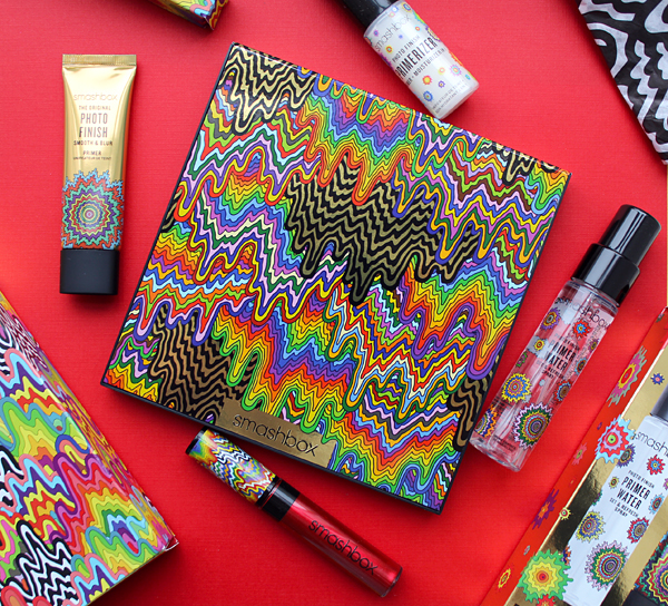


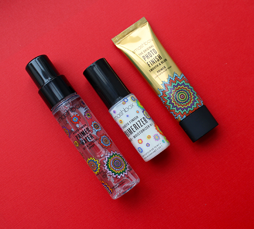


, 2013")


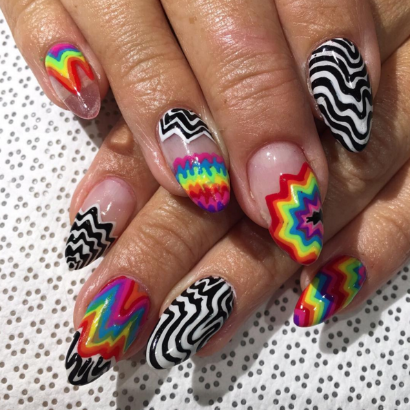


")
")


