Fenty Beauty, the brand founded by musician Rihanna in 2017, had possibly its most adventurous releases in 2022. In August that year the company launched a set of 6 packets containing a mystery substance produced by cheeky Brooklyn art collective MSCHF (which I hope to cover eventually), and in December, a $500 crystal-studded lipstick case to celebrate the brand’s 5th anniversary. While I’ve been using Fenty since its inception – the matte foundation, cheek stix, and lipsticks are excellent – it’s the limited-edition products with special packaging that go into the Makeup Museum. However, having skipped this year’s holiday lineup, a collab with video game-inspired animated series Arcane, today I’m looking back at 2022’s Navy collection. Illustrated by L.A.-based cartoonist Obi, the Navy set is a nod to the nickname for Rihanna’s fan base, which in turn comes from one of her song lyrics, 2009’s “G4L”: “We’re an army / Better yet, a navy / Better yet, crazy”
Before we delve into the set, let’s take a peek at the work of the artist behind it. First generation Nigerian-American Obi Arisukwu was born and raised in Houston, Texas. Strongly influenced by cartoons and superheroes, particularly the Teenage Mutant Ninja Turtles, he began drawing at the age of 3. He earned a Bachelor’s degree in Visual Design and went on to become the lead graphic designer for ConocoPhillips, doing illustration on the side. After 4 years in the corporate world, however, he had enough. “When I was working at ConocoPhillips, I loved it at first. Then slowly and slowly, it became the same mundane pattern of going to work, being in a cubicle, and never being able to express my creativity. My talents weren’t being utilized the way they should have been. For instance, I was the head graphic designer there, but I was doing PowerPoint presentations. After a while it was kind of, “What am I here for? This is not really what I want to do. I really want to get into cartoons.’”
This was also a period of rapid growth for Instagram, where Obi would be inspired by other artists’ work as well as their ability to quickly cultivate large audiences. At the age of 30, he quit his job and moved back in with his parents to pursue illustration full-time. Obi acknowledges the first 6 months were difficult, as he had to learn to set up a business and earn clients, but ultimately his talent and perseverance paid off. “Living with my parents, they’re really great. They’ve always supported me and it’s like a really good Airbnb. It’s definitely tough because when you first quit and go on your own, you’re going to go through that period, that downfall, of where you’re not getting any business or no clientele because you’re still working on your service, still working on getting yourself out there. Then, for me, after like six months, I started getting a lot more projects. I really stopped doing graphic design work to focus more on illustrations. This is one of those things where you don’t give up.” Yay for supportive parents! (Side note: His mother’s only request was for Obi to buy her a Chanel bag after he had achieved success.)
In December 2017 Obi posted a comic strip loosely based on his life as a millennial. This proved enormously popular – it was the most engagement he had ever received on his Instagram posts – and he began posting a new comic each Friday. “The comic strip parodies real life situations like dating, friendships, politics, etc. Even though I’m the main character in the strips, I’ve taken on the role as the ‘every man’ so that the comic strips is relatable to everyone who reads it. [The strips were just the everyday things that we go through [as] millennials…Whatever it is and kind of making it to where people can just resonate,” he explains.
It’s a gentle humor that doesn’t stray into corny “dad joke” territory. I’m not too up to date on my comics and cartoons, but Obi’s work seems to be a breath of fresh air in an age of sarcastic, “edgy” or even offensive animated series (South Park, Family Guy) or the nonsensical (Aqua Teen Hunger Force and other Adult Swim programming). While I’m partial to the likes of Archer and Metalocalypse, I also appreciate Bob’s Burgers and Home Movies, or comics such as the Far Side. A light-hearted, softer type of humor is not a bad thing!
Obi continued with the comic but also drew Black pop cultural icons, athletes and other important figures. “There’s a lot of awesome things happening in the Black community, so I like to showcase that in my art,” he says. In 2018 Obi’s illustration of Childish Gambino from his “This Is America” video went viral, earning over 30,000 likes in 24 hours. Obi followed that up with another viral post featuring Will & Jaden Smith.
While these viral pieces may have led to the collaboration with Fenty and other opportunities, it was Obi’s “every man” comic that landed him his own animated series on HBO. The news was announced in early 2021, but it’s unclear as to when the show will actually debut. It will have the same vibe as his comic – a show about day-to-day life as a Black millennial man. Obi expands on his vision for the show as it pertains to race: “This cartoon is not just about me, it’s about society as a whole. It’s just kind of through the lens of a Black person. But it’s definitely a cartoon that everybody can watch…My biggest thing that I want to do when it comes to bringing diversity, especially with my Obi cartoon, is that I want to show the world that we live in as Black people, that’s not all about us getting shot by the police…we’re more than just victims all the time. I want to have four Black main characters who literally are just living life trying to make it in this world…OBI is the daily experiences we all can relate to, it’s just from the Black perspective. We always see us getting shot. We see slavery and racial injustice all the time. Sometimes we [Black people] need to escape from that. We’re more than the racial shit that happens to us. We have other things going on too. This cartoon will have moments where it does address being Black, but it’ll still have the comedy element to it. We’re more than our racial injustices…This show is about all the day-to-day, societal issues that go through as Black people that other races can relate to as well and laugh at with us.” This is a really important point that I think sometimes gets lost, especially in conversations regarding racial justice. Black people are more than their trauma and while it’s critical to acknowledge racism and work towards dismantling it, highlighting everyday life is also essential. Indeed, Obi rarely explores instances of racism, but when he does, it’s still done with the same humor.
Now, time for the makeup! The Navy set consists of a zipped canvas bag, a refillable lipstick in a limited edition blue case, a navy blue eyeliner and a cute little mirror. The lipstick shade is MVP, a classic red. (As I didn’t want to break the seal on the refill I don’t have pictures of it, but hopefully the stock photo will show you how pretty it is.)
I spent a good hour searching for photos of Rihanna as she is shown on the set – one with her hair down, green patterned sunglasses perched on her forehead, and lots of jewelry – and the other depicting her with Bantu knots, a green fur coat, white tee and blue cargo pants. Then I watched Obi’s Instagram video about the set and realized that, being an artist, he used his imagination to create these images rather than blindly copying her actual outfits. As someone who does not have any sort of creative flair, it didn’t occur to me that this would be his process! Anyway, there are a few images of Rihanna that can be seen in the video.
The collection was generally well-received, and the retail price of $58 for the set was quite reasonable given that it was adorned with original artwork and the practicality of the items included. Everyone can use a makeup bag, mirror, navy eyeliner and red lipstick, no?
However, some Instagrammers took issue with the depiction of Rihanna’s forehead. Between Fenty Beauty’s account and Obi’s, there were roughly 100 comments accusing Obi of making her forehead too large.
Normally I don’t address meritless criticism such as this – I try to “ignore the haters” as they say – but the reason I’m bringing this up is because I am massively confused. I think her forehead appears totally normal-sized. And while marketing teams sometimes slip up and let mistakes happen, even major ones, I would think that if it really was out of proportion the set wouldn’t have been allowed to be sold and Obi would have had to go back to the drawing board, literally. Beauty brands, particularly celebrity lines, fiercely protect the images of their founders and must show their them in the best possible light at all times.
This is just one of many things I’d like to chat with the artist about! I would have emailed Obi for an interview as he seems incredibly down to earth and approachable, but the week between Christmas and New Year’s isn’t really the best time to reach out to people, so in the end I decided not to. I am still wondering how the collab came about, what the process was like working with the company, if he got to meet or interact with Rihanna at all, and why he chose the images he did as inspiration when creating the artwork for the set. I’d also like to hear what’s happening with his HBO show as I am eager to watch it, and, of course, if he ever purchased a Chanel bag for his mom.
What do you think of Obi’s work and the Navy collection? I really enjoyed it and hope to see more collabs with Black artists. As I’ve pointed out, the cosmetics industry is seriously lagging behind in this regard. I do have one regret, which is not entering Obi’s giveaway contest – he provided signed sets to 5 lucky winners. Obviously I’d love to have a set personally signed by the artist. 😊
Took a while, but I'm pleased to finally talk about Mikimoto's gorgeous collection from holiday 2020. As with the holiday 2018 and 2019 collections, the company enlisted an artist to create the packaging. For the Twinkle Pearls lineup, Mikimoto collaborated with London-based illustrator (and southpaw!) Fee Greening.
Greening illustrated a charming zodiac theme using her signature dip pen, ink and watercolor process.
As with the 2018 collection, the moisturizer is housed in a luminous, iridescent sphere that imitates the brilliance of genuine pearls.
Strands of pearls border the zodiac design on the palette, while the blush is delicately embossed with stars and an oyster shell opened to reveal a shiny pearl.
Gemstones surround a rather regal goddess wearing an elaborate crown made of pearl strands affixed to an oyster shell in the center. The star motif and wave-like clouds in the background fuse the celestial and oceanic atmospheres.
The interior of the box depicts a disembodied hand festooned with pearl strands, while the goddess perches on a lion escorting her through the heavens.
Both the makeup pouch and travel case display more of the lovely illustrations as well as a quote. I'm assuming the latter is from Mikimoto.
Fee Greening (b. 1990) always wanted to draw. Seeing famous paintings in galleries on travels with her parents, she would try to replicate them at home, with much frustration. But she found the right medium when she received a dip pen and ink as a gift. "I used to go to galleries in London with my family and try to recreate oil paintings unsuccessfully with my crayons at home and get very frustrated," she says. "When I was around ten, someone in my family gave me a Murano glass dip pen from Venice. It took a long time to get used to it. For the first few years it was hard to get the ink to run off smoothly and it would often drip. Now I have developed a muscle memory of what angle to hold my pen and it no longer happens."
As evidenced by the above photo of Greening, intricate dip pen illustrations require a lot of time and attention to detail. The finished product is well worth it, however, for both artist and client. "It is a very slow process, the pen can only draw 1/2cm before you need to re-dip it. I also have to wait for it to dry for couple of minutes so I don’t smudge or drag my long hair across the wet ink. Although there are many wonderful aspects of living in a digital age, it has given us very short attention spans. I think we crave traditional analogue outlets to balance out our scrolling culture. A detailed drawing is not only precious because of its beauty but also because of the time dedicated to making it," she says.
Thematically, since childhood Greening has been fascinated by the common narratives within medieval, Renaissance and Gothic art. "I always had a flair for the dramatic as a child, and loved storytelling. I think that’s where my interest in Renaissance and Gothic art came from…There are so many great heroines and doomed love affairs depicted in those artistic eras that I was really drawn to. I think, even though I didn’t know it then, I was very interested in fate and divine will. Characters fated to unavoidable doomed love like Tristan and Iseult, characters answering a calling like Joan of Arc or characters whose decisions had so many repercussions like Pandora and Eve. Maybe it was something to do with coming of age." This interest is expressed through the fairy tale quality in Greening's work. Take, for example, the story she created for Gucci's Acqua di Fiori fragrance in 2018, which depicts half-human, half-flower girls "blossoming" into women. Greening explains, "I explored the perfume’s themes of female coming of age, friendship and metamorphosis, I wanted the girls to literally blossom into women. I looked specifically at mandrakes in medieval illuminated manuscripts. Mandrakes were said to be half human half plant and when pulled from the soil let out a high pitch scream. I wanted to create an idyllic floral world for the budding mandrakes to frolic in and transform into women. I’ve known my closest female friends since my late teens. Drawing these reminded me of our early years of friendship, lazing around barefoot in a sunny garden surrounded by flowers." The inclusion of butterflies completes the theme of transformation.
What's wonderful about Greening's Instagram feed, in addition to seeing work that's not on her website, is that it occasionally includes the artworks that inspire her. Here are some illustrations of mandrakes from medieval books, along with a detail of the mythical Daphne turning into a tree.
Indeed, the concepts of transformation and magic through the lens of medieval and Renaissance art – whether earthly pursuits such as astronomy and botany or mythical like mandrakes and alchemy – figure prominently in Greening's work. While she delights in the fanciful side ("if money was no object I would happily just draw demons and angels," she notes), ultimately her work centers on revealing the magic of natural processes and phenomena. "I enjoy looking for something hallowed and fantastical in every day life." A good example is the triptych Greening created for Martin Brudnizki's Linnaean spa project. The spa's namesake comes from Carl Linnaeus, a Swedish naturalist who developed a "flower clock" in 1748* by planting certain blooms that opened and closed at specific times of day. The center panel of Greening's triptych combines a joyful rendition of an original flower clock illustration with surrounding flora and fauna arranged symmetrically, reminiscent of those found in medieval manuscripts. While the flower clock is based on various scientific principles, Greening uncovers the wonder of this concept and reminds us of the magic hidden in nature. Who would ever think one could use flowers to tell time?! That sounds quite fantastical to me, like something from Alice in Wonderland.
The same periods in Western art history also influenced Greening's style. "I think my fascination with medieval and gothic styles comes from visiting churches and museums in Italy with my family when I was young," she says. After graduating from London's famed Central St. Martin's in 2012, she received a Master's degree in illustration from the Royal Academy of Arts in 2014. It was at the Academy that she further developed her aesthetic, diving into the plentiful examples of medieval manuscripts and alchemical drawings offered there. "There was such an extensive section [on them] in the library. I was already drawing similar themes and using dip pens, so the more research I did on the era the more it reinforced my style. I tend to use the same straight on perspective, heavily detailed borders, hand written text, natural color palette, botanical specimens and symbology. Alchemical drawings are detailed but laid out in very simple, ordered compositions which is something I try to emulate in my own work." These influences are especially apparent in Greening's capitalized letters, which emulate a modern, light-hearted spirit while distinctly retaining their medieval origins.
These plants fused with jewels and a print entitled "forget-me-not" embody the strange, somewhat surreal nature of alchemical drawings. Seemingly disparate elements floating in the ether – flowers, gems, insects, hands – are merged with text to form a dreamlike yet orderly space.
It's unclear how Mikimoto's partnership with Greening came about, but it's not surprising given her previous collaborations including beauty illustrations for Sisley. Perhaps the company observed Greening's love of pearls, shells and coral. Additionally, Mikimoto may have spoken to the artist's interests: pearls can be considered a symbol of metamorphosis or alchemy, as sand is transformed by oysters into a precious and beautiful material.
Once again, it's great to observe the images that rattle around in the artist's brain as she conceives of her drawings. Here are a few pearly details from Greening's IG page.
The selection of a zodiac theme is a bit unexpected for Mikimoto. Something that looked out towards the sea rather than skyward may have been more appropriate. However, it's obvious how much Greening enjoys illustrating the zodiac and other celestial motifs. It looks as though she slightly modified her Celestial design for Mikimoto to make it more fitting.
I love how she pays homage to and re-imagines some of the details from various 17th century illustrations in the collection for Mikimoto, such as the scrolls, stars and fine line work.
These next two zodiac designs from the 1600s have not popped up in Greening's Instagram feed, but I would be surprised if she hadn't looked to them for inspiration. I'm also certain she owns a copy of this book.
My only complaint about Greening's design is that mermaids were strangely absent. Given that the artist has incorporated them into previous commissions and even chose bathroom tiles with a mermaid pattern for her home, I'm a bit disappointed not to see them on the Mikimoto packaging. Plus, they would have aligned nicely with the mer-folk on Mikimoto's previous holiday collections. These invitations and the mermaids therein are inspired by medieval and Renaissance maps…
…especially the ladies in the invitation on the right below.
Absolutely adore these tiles. The mermaid comes from a volume called Solidonius Philosophus, published around 1710 (there appear to be a couple different versions.) The mermaid is depicted with the 4 elements.
Overall, while it wasn't a perfect match in my eyes, Greening did an excellent job for Mikimoto. I wish the company had come up with any sort of narrative as they did with the previous two holiday collections. While they weren't the most coherent – I think something was getting lost in translation – Mikimoto at least tried to tell a story invoking the magic of the holiday season and tying it back to pearls. Greening is a skilled storyteller so her talents were somewhat wasted in that regard. Nevertheless, it's a visually beautiful collection, and my inner art history geek greatly admires Greening's style and influences.
What do you think of this collection and Greening's work? If she ever makes a mermaid print I'm buying every single item!
Today the Museum celebrates Indigenous People’s Day with several beautiful collections from newcomer Prados Beauty. While I would like to examine the traditional cosmetic practices of Native Americans and other Indigenous people around the world1, I’m still debating whether that would do more harm than good, so I thought highlighting a new brand was the way to go.
Prados Beauty was established in 2018 by makeup artist and entrepreneur Cece Meadows, whose background inspired her to create the line. The oldest of four children, Meadows was raised in a small farm town in Arizona. “We didn’t have a lot, but we had each other. School was my safe haven, so I thrived there and ended up being the first in my family to graduate from college,” she says. Meadows excelled at a career in finance in her early ’20s, but suffered a cancer diagnosis at 27. The U.S. healthcare system being what is, insurance only covered a small portion of necessary care, and Meadows found herself broke and homeless shortly after going into remission. But her passion for makeup and drive to create a space for Indigenous people within the beauty sphere led to a cross-country move to cosmetology school in New York City. In 2018 Meadows became the first Native American makeup artist to head a show backstage for New York Fashion Week. She established Prados Beauty the same year and began selling the products online in 2019. “I grew up in a negative environment, but there was always a spark in me that wanted something better. As an adult, that has helped me get myself out of places when I’ve been stuck. I’ve always dreamed of owning my own cosmetics line. My passions are doing makeup and doing philanthropic work, so I figured out a way to make those two things go together.”
Meadows, who identifies as half Chicana, half Native American (Yaqui and Comanche), explains that the lack of representation in the beauty industry was a key factor in starting her own brand. “Growing up as a Xicana and Indigenous girl, I never saw representation of my people in an accurate light,” she says. “When I became a professional makeup artist and would show up in some of my traditional regalia to NYFW or professional photoshoot, I was shocked at the lack of education and awareness from models and designers of Indigenous people…It wasn’t until I was 30 years old that I saw an Indigenous woman in the public spotlight without being oversexualized. It was in 2015 when a First Nations Cree woman, Ashley Callingbull, was crowned Miss Universe in 2015. It was an emotional, yet exciting moment for me. I remember watching the crowning while holding my young son and thinking, ‘we not only have been robbed of our lands, our culture, our beauty, our stories and our people but now we have to compete for a crown that we have always worn.'”
For Meadows, starting her own beauty brand was a way to reclaim Native culture and make it visible within the industry. “I have watched companies and clothing brands appropriate our culture and designs for years and I wanted to take that back. I wanted to create a brand that was 100% inclusive, but highlighted the beauty and story of who we are today. Our brand is about being really proud of who we are and telling our story through makeup. In public schools, you, unfortunately, aren’t really taught the truth about the events that truly unfolded in the United States against Native Peoples. So when my people don’t see ourselves in the mainstream, we make our own way. We support our own, we hype up our own, we become this secret society of creativity and artistic talent that the world fails to see. But we see, we know, and the acknowledgment of our own becomes enough. Because I mean what else are we going to do? Disappear? Never. Our generation has become a fierce generation, filled with hunger and audacity to believe and know that we are worthy of conquering spaces we have been told for hundreds of years we didn’t belong in. This is why I created Prados.”
Accessibility and education of non-Native people were also priorities for Meadows. Individual products are priced around $40 and under. “It is always important for me to have affordable price points. One thing I remember growing up as a kid was not being able to afford things that I felt I needed to have as a budding makeup artist,” she says. Additionally, being an inclusive brand with an outward focus on Native American pride encourages customers to learn about Native people’s heritage, or at least be more mindful of it. Says Meadows, “Every time we gain a new follower, I get excited because it’s one more person who learns about our beautiful culture and our stories. [Prados] has inspired consumers to learn about Indigenous culture. They know that we’re not just a false Pocahontas story, and we can remind people that we’re more than a genocide in a history book. We’re still here.”
Meadows’ goals are identical to those of Steven Paul Judd, the Kiowa-Choctaw artist responsible for the designs on several Prados Beauty collections. Like Meadows, Judd noticed a dearth of authentic Native American figures across all areas of pop culture and understood the necessity in carving out a space for Native representation through art. “[I] make things that I want to see. So I like cool pop stuff, right? And I like movies and music, and I’m also Native American. I grew up on a reservation when I was a kid, went to an all-Native college. I like my Native stuff, obviously, but I still like things that other people like. I live in the same world that other people live in, and I just found that there wasn’t what I felt was cool, pop culture stuff made for me—stickers, toys, action figures—I didn’t feel like they were necessarily speaking to things that I saw or that my family saw, so I decided to do my best to try to make my own…Imagine growing up and in every movie, television show and ad featuring people who looked like you and your family, they were only shown in historical context. It would be like white people were only portrayed as Pilgrims. [The] only Native Americans I was able to see on TV were Iron Eyes Cody—he did those trash commercials, and he wasn’t even Native, he was Italian—and Ponch on Chips, but he wasn’t Native American, and we had Tonto, Jay Silverheels, on old reruns, but besides historical Westerns, I didn’t see any Natives anywhere in popular culture at all.”
Judd is a prolific filmmaker and writer, but he is perhaps best known for his witty mashups of pop culture icons with Native American imagery. Everything from comics and toys to TV and movies are re-envisioned with Native historical figures and traditions. Ultimately, says Judd, “I wanted to make the stuff I never got to see as a kid.”
By giving cultural mainstays like Superman and The Incredible Hulk a Native American spin, Judd deftly upends the dominant narrative. The juxtaposition of Native Americans with easily recognizable cultural references, or the entire replacement of these figures with images of Native Americans and symbols results in an amusing yet profound commentary on the erasure of Native populations and offers a way for them to reclaim their space.
While most of Judd’s work appears lighthearted on the surface, there’s an underlying poignancy in some of his projects that makes the viewer think on a deeper level. Take, for example, his Star Wars series, which recast some of the characters as Native American, thereby creating a new narrative that represents the struggle for freedom among tribes. Judd also makes a point of showing the appropriation of Princess Leia’s iconic bun hairstyle, which most likely originated from photos of women from the Hopi tribe.
Judd’s take on the popular “Space Invaders” video game that was developed with graphic designer Elizabeth LaPensée, in which the players are Native Americans using bows and arrows to ward off an alien invasion, is also a bit weightier than the likes of the artist’s PowWow Rangers and Mindions. “You can read into it,” he explains, “someone is trying to invade where you are living, you know, peacefully. I tell people it’s the only time you’re allowed to play Indian and not get in trouble.” As this article neatly summarizes, the game “is archetypal of Judd’s work, which provocatively combines the ongoing history of subjugation of Native Americans (especially the violation of land treaties) with the mundanity and ephemera of day-to-day life. Judd’s work challenges stereotypes about Native Americans and dehistoricizes the atrocities of the past.”
What’s especially interesting about his love of pop culture is that Judd grew up in a home that was less than well-off financially, with no access to television until late childhood. His first encounter with TV was during a hospital stay. Judd’s work is also extraordinary considering he is entirely self-taught. For photographic imagery in particular, he quickly realized he would have to get acquainted with the proper techniques and software in order to make his ideas come to fruition. “Any of the graphic design stuff I’ve done, I learned how to do it on Photoshop…learning Photoshop is tedious, but I wanted to learn because I couldn’t get these ideas in my head. I couldn’t make them unless I learned. No one’s going to make a vintage boxing poster with Sitting Bull and Custer unless you make it yourself,” he states. And he’s right: I can think of zero Indigenous artists who are remixing cultural touchstones in this manner.
Judd’s unique re-imagining of pop culture references has drawn apt comparisons to Andy Warhol. Like the legendary pop artist, Judd cleverly skewers mainstream American culture, except instead of mindless consumerism Judd’s critique mostly focuses on the overwhelming lack of Native American figures and traditions. Judd is flattered by the comparison, calling himself “Andy Warrior-hol”, while simultaneously acknowledging that the American pop art tradition – including the deification of artists like Warhol – is largely devoid of Native voices. Case in point: a cheeky remix of Warhol’s famous cow wallpaper.
Judd’s emphasis on accessibility and education through art also parallel Meadows’ prioritization of these areas. While a recent painting of Judd’s sold for nearly $20,000, variouswebsites offer stickers, t-shirts and other items showcasing his work at affordable prices. And like Prados Beauty, much of Judd’s oeuvre provides an approachable means of educating non-Native viewers. By framing it as “cool stuff” that the average 12 year-old would be interested in, Judd makes his history more palatable to non-Native Americans. “[I] want people to see the images and realize on their own that they had something to learn…Honestly, I’m creating art for my 12-year-old self. I wanted cool stuff, too – skateboards with Native imagery, action figures, sneakers – what 12-year old doesn’t? [But I want to] educate people on some things without talking down to them or yelling at them. They can laugh at it, like ‘Oh wait, did that really happen?’ and they can learn from it, starting from a humorous point,” he says. This is not to suggest that the atrocities committed against Indigenous populations should be made easily digestible for white people, but humor is one of many useful tools in learning difficult subject matter. Plus, as Meadows noted earlier, it demonstrates that the histories of marginalized groups are so much more than genocide and stereotypes.
Given how the perspectives and missions of Judd and Meadows align so closely, an ongoing collaboration is no surprise. As Meadows remarks, “I feel like his art is a perfect fit for our brand because he takes everyday things like cartoons, television shows and movies we grew up watching, and indigenizes it. My boys love that poster I have hanging in their room because they identify with it. I feel like he always tries to create art that we can associate with and see ourselves in.” Prados Beauty approached Judd to create artwork for the packaging of a new eyeshadow palette in 2020. As Judd wanted the image to look modern and reflect the shades in the palette, he came up brightly colored, mosaic-like portraits of Pretty Nose and Stampede. I don’t know about you, but as soon as I laid eyes on them I had to look into their histories. Educating people through makeup and art absolutely works!
Pretty Nose was an Arapaho (some sources say Cheyenne) warrior chief who fought in the Battle of Little Bighorn in 1876. The Stampede portrait is based on a photo of a Dakota chief taken around 1900. Sadly there was not much more readily available information on either.
The style is reminiscent of a work he created a little later for a display outside the Arthur Ashe Stadium at the 2021 U.S. Open. Judd explains the inspiration for the piece. “When most people think of Native Americans, they think of them as a monolith. But there are over 500 different tribes in the US alone. Each with their own unique culture. From their music and food to their songs and language. I wanted to do a mosaic, each beautiful color representing the many different tribes across the land.”
Once again, Judd’s vision lines up with that of Prados Beauty. A colorful mosaic is a way of bringing all the tribes together while recognizing their individuality. Says Meadows, “When I think of Indigenous beauty, I think of amplifying the voices of not just one particular tribe but all of us together. Using vibrant seeds of color like turquoise and yellow and orange helps accomplish that.”
Just last week, Prados released their new collection entitled Matriarch. According to the website: “For this collection we wanted to put together something beautiful, colorful and powerful! We wanted to honor all the matriarchs in our lives by showing up and showing out!” It’s a great theme as many Native American tribes were matriarchal and matrilineal.
I must disclose that I received the entire Matriarch PR box by mistake. It was meant to go a media contact, but somehow ended up at Museum headquarters. I was really looking forward to receiving what I had actually ordered, which was the Steven Paul Judd 2.0 palette, highlighter and collector’s box, so you can imagine my shock when I opened the package to see roughly triple the products I had ordered, with beautiful images on the packaging I didn’t recognize. I emailed customer service and offered to send it back (even though I didn’t want to, LOL), and within a few hours I received a reply from Cece Meadows herself! She generously allowed me to hang onto the whole box of goodies and, per the included instructions, requested that I not reveal anything until the collection officially dropped. It was all very exciting, for a second I felt like an influencer! I was absolutely flabbergasted that the Museum could keep everything. Plus, my original order arrived a day or two later.
The collection includes an eyeshadow palette, three face palettes, 5 lipsticks, an eyeliner and eyelash glue, two sets of false eyelashes, and a cute little LED mirror.
The imagery Judd created for the packaging for the Matriarch lineup is more varied than the previous collection. As a collector, I appreciate that different images were used on different products.
Aren’t these lipsticks delicious looking? Love the hot pink cases too. Another great thing about Prados is that a whopping 50% (yes, you read that correctly) of profits go to Indigenous communities and people in need, including veterans, single parents, and children with special needs. “Both personally and professionally, I remember every disappointment when I just needed support to get me through tough situations. So I always promised myself during my prayer times that if I ever found myself in a position where I could live comfortably and my family was taken care of, I was going to help people — especially right now during the pandemic. I have raised over $20K to purchase PPE for Native American communities all over the US, Mexico and Canada…In addition, we buy kids shoes for back-to-school season, clothes, jackets and school supplies. We pay rent for single moms, college tuition and living expenses. We even threw a baby shower last year,” says Meadows. She also recently launched the Prados Life Foundation to help facilitate donations.
Prados Beauty lipsticks from the Matriarch collection. Left to right: Jingle Dancer, Chola Vibez, Mirabella, Guerrera, Taos
I’m really enjoying Prados, and I’m not just saying that because they accidentally sent me an amazing PR box and allowed the Museum to hang onto it. After reading more about Meadows and her mission, this is definitely a company you can feel good about buying from, with gorgeous and inspired packaging to boot. I also love Judd’s work as it provides food for thought without being preachy, and well, you know how I much I adore fresh takes on traditional pop culture. If he referenced some ’90s TV shows or movies I would lose my mind. Finally, I can’t think of a better collaboration between a brand and an artist – these two were a match made in heaven. As someone who researches makeup and grew up on a steady diet of mainstream American TV/movies/etc., I can think of only a handful of Indigenous makeup brands, makeup artists, influencers and models, and the scarce portrayals of Indigenous people in pop culture were largely either stereotypes or downright racist.2 There is a dire need to make space for and raise the visibility of Native American and other Indigenous cultures, and both Meadows and Judd are doing a tremendous job helping to fill that void through their respective crafts.
What do you think?
1 While sometimes used this way, Indigenous is not totally interchangeable with Native American. Indigenous refers to those populations living together prior to European colonization. These populations exist outside the United States and on every continent, therefore, while Native Americans are Indigenous, not all Indigenous people are Native American. Check out this site for more information.
2A personal anecdote. The district in Pennsyltucky (excuse me, Pennsylvania) where I attended junior high and high school was named for a local Native American tribe that presumably white people had wiped out. The school’s mascot shares its name with a certain Washington football team. As a teenager it finally dawned on me just how awful it was, but any time I brought it up I was told that it wasn’t offensive in the slightest and that I was being “oversensitive”. As far as I know my former high school STILL thinks it’s okay to use it. Thank goodness for Meadows, Judd and shows like Reservation Dogs. It’s from the same brilliant people who brought us the hilarious What We Do in the Shadows, so definitely check it out.
“My work always aims to grow through an honest contact with people. I love feeling emotions and being able to create something that can touch people’s hearts. My work is about the symbolic things we put into our daily lives, and I’m always curious to see how everyone sees the world. As I mentioned before, I see art as a parallel, innocent language that leads me to different opportunities and challenges to keep growing as a person.” – Jon Jacobsen
Last fall, I remember being very excited to see the launch of a set of Lisa Eldridge lip products in a beautiful velvet pouch. When I saw that the pouch was the work of multimedia artist Jon Jacobsen I knew I had to have it for the Museum. In case you need a refresher, Lisa Eldridge is one of the top makeup artists in the world and launched her own line in 2018. She is also a makeup historian, having written the excellent Face Paint, and she also possesses what is widely considered to be the best collection of vintage makeup in the world. I can only dream that the Museum’s collection will compare to hers someday!
As for Jon Jacobsen, he is a 32 year old Chile-born, Portugal-based photographer, filmmaker and all-around master of digital art. He designed the gorgeous floral pattern for the pouch. The rich shades of the flowers against a black background are dramatic and moody, perfect for a fall release.
The bag is obviously velvet to coordinate with Eldridge’s splendid Velvet lipstick line. Look at that texture! I’m still flabbergasted every time I see it. (And I really need to order some of these to actually use.)
The partnership is not a surprise. I’m guessing it came about as a result of the pair having worked previously on the Sunday Times’ Style beauty feature back in May of 2020. As the world was in lockdown, makeup artists, fashion designers and photographers found themselves unable to work in the flesh, thereby forcing their processes to go virtual. (See also Harris Reed’s 2020 graduate collection.) While “digital makeup” is not new, the pandemic forced a higher level of creativity.
Jacobsen was a natural choice to handle the project, given his unique approach to digital art. (And no, digital art is not just making silly filters for social media apps.) For Jacobsen, digitally altering images isn’t about simply enhancing what’s already there but adding an element of fantasy to produce surreal effects that challenge viewers’ perception of the physical realm. In the case of the Sunday Times feature, Jacobsen deftly “applied” makeup designs created by Lisa Eldridge onto their model’s face. The resemblance to real makeup is shocking. When combined, Eldridge’s and Jacobsen’s techniques yield an incredibly true-to-life effect that is nearly indistinguishable from physically applied makeup, yet still appears magical.
In an Instagram post, Jacobsen explained the role of each artist working on the feature. “The process behind each look was very unique and fascinating: With Lisa Eldridge in London, our lovely model Yumi Lambert in Maui and myself in Porto, we had to come up with an idea to bring all places together having technology on our side. With this in mind, Lisa designed and applied a variety of textures and colours onto her own skin which I later ‘brushed’, twisted and blended using a variety of digital techniques over the portraits that Yumi provided from a shoot that I directed from home. This was new territory for all of us – including for our lovely editors who trusted in us 100% (thank you) – so for several days Lisa and I connected over zoom meetings, experimenting and finding the right harmony, light and combination of textures to achieve something realistic with a hint of fantasy. This was a very meticulous process and I enjoyed every second of it! I might be quiet about this but I do love make up, not only from the fact that you can build endless characters and emotions, but also from how its composition changes through history.” Every single texture and placement – from individual blush powder particles, the sheen of gloss with color concentrated in the center of the lips and shimmery eyeshadows in variety of shades – perfectly mimic makeup applied in the flesh. As Jacobsen notes, “real textures [were] translated to pixels.”
The Sunday Times Style magazine, May 2020. Makeup: Lisa Eldridge. Photography and digital art: Jon Jacobsen. Model: Yumi Lambert. Beauty director: Sarah Jossel. Creative producer: Leila Hartley. Photography assistance: Guillaume Rasquier
His appreciation for makeup is abundantly clear, most likely stemming from his interest in the concept of transformation and questioning the boundaries of the human body, along with his passion for portrait and still life genres. All of these themes are inseparable from makeup. “Beauty shoots are definitely my favourite ones, it literally feels like eating dessert. My team and I always shoot knowing that I might add something on post-edition. Once the photos are taken, I lock myself in the studio to analyse the images and find the right universe of shapes. This a very experimental part of the process that I enjoy doing alone. There I imagine myself as a scientist, a musician, or a cook trying to find the right flavour, the right sound – it’s hard to explain, but it is a blissful moment. Once they are done, I share it with my team and we celebrate…creating feels like making a puzzle that has no shape, but with the help of instinct, a good team and honesty, I can sense once it’s finished.”
FX 2019 masterclass. Makeup: Marcelo Bhanu. Photography: Jon Jacobsen. Model: Javiera Chandia. FX makeup: Carla Gasic.
Makeup/Hair: Nico Ampuero. Photography: Jon Jacobsen. Styling: Santiago Herrera. Model: Erlande Augustin
FX 2019 masterclass. Makeup: Marcelo Bhanu. Photography: Jon Jacobsen. Model: Lauren Skye. FX makeup: Carla Gasic. Assistant, FX makeup: Gaby Paz Olivo Pozo. Photography assistant: Javiera Allende. Styling: Esteban Pomar.
His photos are even more impressive when you discover that Jacobsen is entirely self-taught, citing the Internet as his primary teacher. At the age of 15 he took his first photo. After graduating college with a degree in graphic design, Jacobsen vowed to pursue art full-time. In an interview with Retouching Academy, he describes his journey to becoming an artist. “I started creating images at the age of 15, experimenting with any kind of camera that I could borrow. At that time technology was slowly becoming more accessible and I was curious to know how far I could get with it. I became obsessed with the idea that I was able to create infinite, surreal artworks from the comfort of my own room. My artistic journey began when my art teacher from school, Andrea Reyes, saw some of the images I had posted on social media. She pushed me to keep honing my skills by assigning me extracurricular activities such as additional homework, PowerPoint presentations and giving me quick art history classes during the school breaks. This was a key moment in my development as an artist as it was my first professional encounter with Art. I slowly became obsessed with creating visual metaphors with my images. The Internet also played a very important role in my development as an artist: It was (and still is) my main school. I watch tutorials every day and learn more and more about art. I keep sharing my work on social media, such as Instagram and Facebook, to maintain a close relationship with my audience and to learn from other talents. It wasn’t until I moved to Santiago (at the age of 21) when I decided to turn this ‘hobby’ into a full-time job. I graduated from university as a graphic designer but decided to present myself as an Image-maker, in order to be more flexible and work in all my fields of my interest: from being an artist who exhibits his work, to creating fashion editorials and films for magazines, and working as a high-end retoucher.I became interested in mixed media as a way to find an organic result through digital art. I am constantly creating textures, collecting images from my daily life and working with different kinds of materials depending on the requirements of each artwork…Last but not least, being able to sustain myself by doing this job feels like a big achievement. I come from a middle-low class family, with no art background. Choosing a life as an artist was a huge decision which I don’t regret. It has opened many doors and presented me with great opportunities so far.”
Much of his oeuvre entails futuristic visions of the human body that combine realism with fantasy elements. The artist has been fascinated by photography’s creative potential since childhood. “Since I was a kid I always wanted to add an extra layer of fantasy to things, and photography wasn’t an exception,” he says in an interview. “I loved the idea of bringing something I registered to a computer, a flower for example, and twist it enough to create a completely different result. As much as I appreciate photography as the closest way to capture reality, I find there are many voids to be filled, especially in terms of the emotional aspects. Conventional photography registers light and shows a result based on the norms behind the human eye, but what about the emotions myself and my subject feel at that moment? How can these be shown? Digital art brings endless questions, and I get obsessed with the vast amount of answers I can find. There, I found a space of free will that I can link with my daily life, connecting the real with fantasy.”
He often works with other artists from a variety of fields for his projects, citing the importance of familiarity with other disciplines for one’s own artistic practice. “Working on digital is really fun because it’s pretty versatile, but it can also be daunting when you’re spending days in front of a screen. As a digital artist I crave for tangibility and the desire to use my hands/body to explore other media to keep evolving as an artist. Even if your plan is not becoming a sculptor, try doing it at least once and see what happens, or try out a new cooking recipe… a little bit of the unknown is enough to find a HUGE amount of answers. That’s how I got into dancing, swimming, contemporary jewelry and music. Even if I’m not an expert in those disciplines, I learn a lot and include this new knowledge into my creative process, for example, while tracing the composition before starting a piece, or by creating models/small sculptures, textures and volumes to be used in future projects. Exploring new media also expands your knowledge and brings new contacts to your life: Win-win situation!”
Indeed, Jacobsen’s endeavors are amplified through collaboration. For 2015’s “Ínsula”, for example, he worked with Columbian sculptor Daniel Ramos Obgregón and dancer José Tomás Torres. Jacobsen photographed Torres in different stances and sent the images to Obgregón, who supplied photos of his surreal series of ceramic body accessories and prosthetics. Jacobsen edited the images so that the ceramic pieces became technological-based appendages rather than human. Digitally slicing the dancer’s body to reveal veins coursing with electric currents and smoke-like swirls in place of blood and muscle, Jacobsen presents his vision of the digital age’s impact on human evolution. The official project description: “The digital era is no longer the futuristic set of a sci-movie. It has become our present reality where all digital platforms, computers, mobile phones, and tablets are now prosthetic elements of our daily lives, which work as extensions of our bodies and minds. We invest so much of our time into these objects that we have started to detach from our physical bodies making us now mind-based digital beings – androids in the becoming. Internet and social networks have created a complex social fabric where it is possible, through avatars and alter egos, to interact with the rest of the world – erasing any geographic border that might exist. By questioning this reality and how it affects our body limits ‘Ínsula’ starts as an observation of this behaviors to explore and interpret the evolution from a human into a digital Homo Sapiens.”
While the distorted, grey-skinned figure appears grotesque, Jacobsen maintains his conception of virtual humanity is not dystopian; he’s merely exploring what our digital selves might look like. The lack of normal human skin tone and organs expresses Jacobsen’s notion of our online bodies. “I call it a projection, what we do on Facebook or Instagram, or the Internet in general. A part of ourselves is not physical anymore,” he tells Wired. For Jacobsen, the digitization of the human body, with a smartphone as an additional appendage of sorts, means having access to unlimited knowledge that wasn’t as readily available to previous generations. “You also have your phone attached to your body all day. It can become a vessel of eternal knowledge if you use it wisely. It makes me happy to observe these new generations having technology so intrinsic to their bodies. They grow up playing with apps since day zero and there is so much to reinvent.” I can’t say I fully agree; while I acknowledge the Internet provides a tremendous wealth of information and allows me to connect with people I otherwise would never “meet”, I resent being tethered to my phone 24/7 (which, by the way, I refer to as the “nightmare rectangle”.) I certainly would never want it to physically take over any part of me. Jacobsen’s vision may not be dystopian, but for older generations it certainly can be interpreted as unsettling.
Still, the animation makes a huge difference – the images become less sinister when viewed as fluid motions. Additionally, “Ínsula” is notable in that it was created with the artists situated in different countries. Nowadays that’s not surprising, but 5 years before the pandemic necessitated remote work, it seems even more ahead of its time.
Similar ideas are explored in “The Great Barrier”, a 2018 series of photos that simultaneously recalls the beauty and destruction of Australia’s Great Barrier Reef. The centering of a human body – this time fused with marine flora and fauna instead of tech gadgets and electrical signals – depicts “an abstract vessel interacting with the environment,” mirroring either the vibrancy or decay of its surroundings and perhaps serving as a commentary on humanity’s role in saving or destroying the planet. “The Great Barrier” was also the result of a remote collaboration between Jacobsen and Australian performer/movement director Paul Zivkovich.
In my opinion, Jacobsen’s most refined examination of the body and its boundaries is “Digital Flesh”, which incorporates the style and subjects (flowers, fruit, etc.) found in traditional still life painting and combines them with tendons, muscles and internal organs. “These still lifes focus in finding human shapes in the everyday objects, for they carry the symbolic meaning through our senses and time. Either in their natural state or digitally manipulated selves, these forms float in harmony,” notes the project description.
The one titled “Uncertainty” is my favorite of the series, as there’s something vaguely aquatic about it. The large pink flower towards the left seems to be emanating light, illuminating its surroundings like a bioluminescent creature of the deep ocean.
I also like “Digital Flesh” because it’s the most stylistically similar of Jacobsen’s works to the Floral Fantasy pouch. The artist created a short video that alludes to makeup’s tactile properties. The flowers appear to represent makeup colors and the pollen is reminiscent of delicate powder particles.
Overall, I enjoyed this collaboration. I do think Jacobsen tamped down the weirdness too much; I would have liked to see something more surreal or at least something that spoke more literally to the theme of evolution as in his 2017 film Die Verwandlung (“The Metamorphosis”, based on Kafka’s work), since makeup can be such a powerful agent of transformation. And while I enjoyed the video he created for the collection, it may have been interesting to do a makeup version of “Ínsula” or “Digital Flesh” since the same themes apply to makeup, i.e. showing how cosmetics can become one with, or an extension of, the human body. (Think about all the tips for “melding” a product with the skin rather than having it sit on top of it.) Alas, something really bizarre probably would not have been as marketable. Of course, for me, the stranger the better!
What do you think about Jacobsen’s work and the design he made for Lisa Eldridge?
MAC's Frosted Fireworks was already a fun collection, but they managed to sneak in an artist collab in their holiday lineup too. And amazingly, the artist actually responded to my interview request and kindly answered my questions! We'll get to that in a minute, but to see how Bob Jordan's beautiful designs fit in to MAC's holiday collection, we'll take a quick peek at those objects first.
I picked up the eyeshadow in Silver Bells, highlighter in Let It Glow, highlighting palette, lipstick in Once Bitten, Ice Shy, lip gloss in Set Me Off and the Firelit Kit. Maybe it's because I always have the '90s on the brain, but Frosted Fireworks seemed straight out of 1996 or thereabouts to my eye – both the finishes and retro star patterns are reminiscent of the second half of the decade's obsession with frost and penchant for kitschy takes on MCM designs.
And now for something very special! Here's my interview with Brooklyn-based graphic designer and artist Bob Jordan, who created the bright and exuberant designs for MAC. Bob has a B.F.A. in Graphic Design from Maine College of Art. He founded his design firm, Factory 808 Designs, in 2014. While he had never made cosmetics packaging before, I think he absolutely nailed the MAC collection. I'm so pleased to have some of his work in the Museum and hope to see more makeup creations from him.
MM: Tell me a little bit about your background. Were you always interested in art? How did you end up in graphic design?
Bob: I grew up in my grandfather’s woodshop helping him out. He taught me how to solve problems and think creatively. When I was a teenager, I realized I could draw. Those two things became the foundation for everything I do now. I got into design because it allowed me to be multi-disciplinary in my creative approach. There are a lot of mediums I like to work with and I use them all in my projects. Most importantly, I get to draw. It doesn’t matter what I’m working, everything starts with a pencil and paper.
MM: Who or what influences your work? What other artists and designers do you admire?
Bob: My first influence -and still favorite- is Chuck Close. I’ve always loved his use of color and shape in his compositions. I admire his resilience and his determination to continue to create his art even as a quadriplegic. I have a lot of respect for his process. I also love Sister Corita Kent. She was a pop art nun who fought for social justice causes and was also a teacher at Immaculate Heart College in Los Angeles. Most people would know her as the LOVE stamp designer from the 1980’s. Her 10 rules for Students and Teachers is timeless.
(image from cbsnews.com)
My other major influence is my home and community in Brooklyn. I am inspired daily just by simply walking outside. You get to see both known and unknown artists' work here. There’s a particular energy that resonates with me. Obviously it's tough to look into the future, but I know that it will always be a huge influence on my work.
MM: How did the collaboration with MAC happen? Did you approach them or vice versa?
Bob: The collaboration with MAC was very organic in its development. The head of digital at MAC as she is constantly on the hunt for collaborating with local NY designers on product and packaging design. Discussions began before COVID and went in the summer. It was some thing that we waited for the right time to do.
MM: What was the process like? Did they give you free reign or any sort of direction?
Bob: This process was a pretty open. There was a some seasonal themes and color ways that it needed to adhere to but there was a considerable amount of freedom. I’ve always found these types projects to be very difficult but the most rewarding.
MM: What inspired you to create the designs you did? What was your vision for the collection?
I was someone would had left the city during COVID and spent 9 months in the woods. It was a humbling experience and it allowed me to focus on some other projects but I was also missing the vibrance of the city. I had to come back and just walk around and soak up all the colors and energy. I would walk around during the day and then draw at night. I did that over and over til I found where I needed to be.
MM: How was the experience designing makeup packaging different than other projects you've worked on?
Bob: Designing for makeup packaging is not that different from some of my other work. I design a lot of packaging for cannabis products and there are many similarities. A lot of it is actually makeup packaging that is used so I’m used to working on small products. This was actually a lot easier because I just had to focus on the art and didn’t have to worry about any state regulations.
MM: Would you work with a cosmetics company again?
Bob: This was actually my first experience working with one, the opportunity to work with one just hadn’t come up in the past. I would definitely consider working with a cosmetics company again, but as with any project, I would need to make sure it's the right fit.
MM: Please share any thoughts you might have on makeup packaging or cosmetics in general.
Bob: I really hope that makeup packaging becomes more sustainable and minimalistic. I feel that way about all packaging. Working on cannabis packaging has really opened my eyes about how much packaging waste there is. I love designing packaging and I want to make sure that I’m doing my part. I would love to connect with cosmetics and any other companies whose mission it is to create sustainable products. That's the future. It has to be.
Bob, thank you so much for talking with the Makeup Museum! This was certainly enlightening and so interesting to hear the details behind this collection. And for Museum visitors, which piece is your favorite? I love both but I think the Peace design is my preference.
Normally I’d wait a whole year and do a Ghosts of Christmas Makeup Past post to be more seasonally appropriate, but I simply couldn’t in the case of the amazing (mer-mazing?) Mikimoto holiday collection. As with the 2018 collection, the historic Japanese pearl and jewelry purveyor teamed up with an artist to create some incredibly whimsical underwater-themed packaging. Belgian artist and illustrator Brecht Evens had the honor of being Mikimoto’s second artist collaboration. I must admit I think I like his concept even more than the one by Emmanuel Pierre in 2018. If imagery of celebratory mermaids and assorted mer-critters having the ultimate holiday party doesn’t do anything for you, I question your humanity.
We’ll start with the palettes. The details on everything are staggeringly clever. And while the mishmash of characters and objects may initially seem haphazard, Evens’ messiness is actually entirely intentional. “When I draw the jumble of the city or I draw nature…errors, spots and little incongruities make it more realistic. Because when you’re in a space and you start to look around, you don’t take in the whole. You can’t. You don’t see the world around you like you see a postcard; it’s not organized that way. We’re moving, others are moving, and the eye makes constant choices, it decides what to interpret and what to identify. So at any given moment, there’s a lot of mess in there and, for me, this kind of mess has to stay in. It’s controlled; it’s never like I’m creating randomness. It’s just that incongruities seem to catch the eye better. They’re more natural and they latch onto the eye more realistically. Maybe I do play with a lot of stuff. But I only do it when it serves my narrative. It’s all part of calibrating things. When I use a lot of detail, it’s very calculated – I’m making sure it doesn’t obstruct anything essential.” The dozens of scenes may still be overwhelming for some, but I personally enjoyed picking apart all the individual vignettes and then seeing how they came together as a whole.
This is a particularly amusing exchange between two mer-folk and a nosy little fish. The addition of text is representative of Evens’ background in illustrated books and comics. The humor reminds me a little bit of Danny Sangra, the artist who designed Burberry’s spring 2018 palette.
I’m obsessed with this mer-kitty.
The scenes for the eyeshadow palette are equally spectacular. Sting rays take mer-children for a ride, while a sea elf peeks out from some seaweed to admire a blue-haired mermaid.
On the outer box a school of fish help another mermaid primp for a holiday party. She checks out her reflection in a seashell mirror held by two crabs.
I think the imagery on the sides of the skincare set was my favorite.
The set includes what appears to be a very fancy moisturizer (I didn’t want to open the sealed plastic) and what I believe are packets of face serum. Each one tells a snippet of the “First Snow of Pearls” tale. Unfortunately I couldn’t seem to locate the story at the Mikimoto website as I did last year, so I’m not really sure what it’s supposed to be about.
I love that the images are totally bizarre but also make perfect sense. The concept of a sea-dwelling Santa is absurd, but if one exists, of course his sleigh team would be seahorses instead of reindeer and his bag of presents shaped like a seashell. Ditto for the mermaid taking a ride on the jellyfish “bus”, pulling on its tentacles to signal her stop. While the underwater realm Evens created for Mikimoto is entirely imaginary, the usual rules still apply. As he puts it: “I do think I use visuals that might be dreamlike, or psychedelic, but I don’t think I use dream logic…you have to believe in the world you’re creating.”
There was also a lip gloss, the box for which shared the same illustrations as the skincare set.
Some lovely extras were included as gifts, like this silver toned box topped with a manta ray, a gold seashell cardholder and two cosmetic pouches. I noticed the powder brush was a bit scratchy, but 1. it was free and 2. I don’t intend on using it anyway.
Let’s learn a little more about the artist behind these fantastical scenes. The Belgian-born, Paris-based Brecht Evens (b.1986) studied illustration at Sint-Lucas Gent in Ghent, Belgium. Building on his country’s tradition and notoriety for comics, he focuses on these and illustrated books, but has also completed murals in Brussels and Antwerp, created fabrics for Cotélac, and collaborated with Louis Vuitton on a Paris travel book.
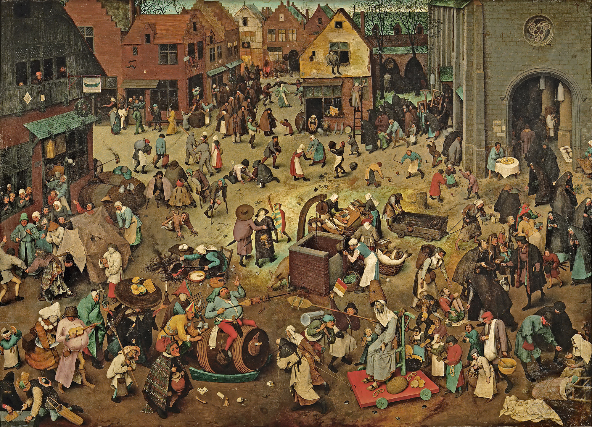
Stylistically, Evens is influenced by his mentors, illustrator Goele Dewanckel and cartoonist Randall Casaer. You can also see glimpses of Pieter Bruegel the Elder, M.C. Escher and Picasso. Take, for example, the resemblance between the artwork Evens created for French publisher Actes Sud and Bruegel’s Fight Between Carnival and Lent (1559). Both utilize a bird’s eye perspective and include dozens of different vignettes.
While Evens published several award-winning books early in his career, he is best known for more recent works Panther (2014) and The City of Belgium (Dutch and French versions released 2018; forthcoming editions in English in 2020). In terms of content, most of Evens’ narratives tend to be a little dark. Panther is about a young girl named Christine whose cat dies. Her mother also threatens suicide, drives away and never comes back. Panther arrives seemingly to be Christine’s friend and help her cope, but ends up being far more malicious than he appears. One reader called it a “apologism of pedophilia, zoophilia and incest”. Yikes.
The City of Belgium (titled Les Rigoles for its French audience and Het Amusement for Belgium) is actually part of the same universe as Evens’s 2009 work The Wrong Place, and the various versions of the book are meant to be connected. “I wanted something like a paperback copy of Balzac, a whole world that would be portable. But, instead of just one city, I wanted to make it a kind of European amalgam…the fun result would be for everyone to think it’s their city.”
The City of Belgium also reflects Evens’ struggle with bi-polar disorder and gradual recovery from a particularly bad episode. While not as unsettling as Panther, the book follows three characters having parallel urban adventures throughout a single evening, one of whom suffers from depression. Evens discusses how the book came to be and acknowledges the “heavy” themes alongside the humor. “The germ was just me coming back to life. A state of depression never carries any potential or interest. Then, once the interest starts returning – bit by bit – it’s like you’re back at zero. At that point, it’s just lines in old sketchbooks, dreams you have, something you happen to see sitting on a terrace. Because it’s so surprising to have ideas again, you notice every little thought and you get them down in a sketchbook…[in 2013 and 2014] things were so messed up; I couldn’t ever have considered such a massive project. The book is a product of peace having descended…the themes may be heavy, but I hope the treatment is light. Don’t forget to mention it’s full of gags and jokes!”
Evens appropriately chose a more lighthearted story for the Mikimoto collection while maintaining the concept of connected times and spaces. The characters and scenes appear disparate at first, but as you look more closely you can see that they’re all part of the same underwater universe – preparing for the holiday season and the First Snow of Pearls. If anyone is going to create a fanciful mermaid-laden paracosm or “expanded reality” as one reviewer put it, Evens is the perfect choice, as he had been making these sorts of “imaginary worlds” since he was a child. “Practically all I did was try to make imaginary worlds come to life, which meant: visible to other people, in comics, designs for buildings, fantasy world maps, board and card games, cassette tapes… No teaching, no explaining, no argument, just a portable world, bound together, with maybe a dust jacket around it or even some leather,” he says. He also did a fantastic job incorporating the pearls, which appear throughout all the scenes. My favorites are the fish helping construct a pearl garland and telling the lazy sea dog to wake up because it’s snowing pearls.
The illustrations were incredibly fun on their own, but the addition of Evens’ signature text provided another layer of humor.
“A lot of people, when they write dialogue, just go ‘A, B’, ‘A, B’, ‘A, B.’ They’ll have the characters neatly wait their turn. Whereas I don’t think our brains really work that way. In reality, it’s more of a constant traffic jam – even when we like each other and we’re interacting well. When we’re interacting less well, it’s more extreme,” he says. You can see the more realistic dialogue (at least, as “realistic” as this mermaid world can be) Evens was aiming for in this scene depicting crabs and fish wrapping holiday presents.
I have no information on how the Mikimoto collaboration came about. I summoned my courage and emailed Evens to see if he could shed any light. He politely declined to be interviewed, but I’m guessing that Mikimoto approached him as he indicated he does not know much about cosmetics. I believe these are new illustrations Evens created especially for the brand, but I find it odd he hasn’t included the collab on his website or IG page. I’m also assuming they were done using his usual handmade techniques. For The City of Belgium, he explains: “All the drawings were done on paper and I write by hand. So the creative parts are all computer-less. Where the computer comes in is for research; when I want things to be ‘right’ or inspired by actual stuff, then I’ll look something up… Ecoline [ink] dominates, but I use a mix. Now I have some different inks and, with the same brush, I’ll also pick up gouache to make it what I want. Or, I’ll mix it with real aquarelle. It all depends on what I’m searching for, what opacity or transparency I need to have. There will also be some pastels and, often, markers.” In looking closely at the lines and the way the colors overlap, it appears Evens did indeed draw everything by hand using a mix of markers and pastels on white paper.
So that about wraps it up. What do you think about this collection? What’s your favorite scene or character? I’d party any time with these mer-folks!
Apologies for the back to back artist collaboration posts. I was hoping to have a February recap in between but work has been sapping my spirit even more so than usual, so I ended up abandoning Curator's Corner last month. I don't think you'll mind too much though, once you see the positively amazing porcine-themed brush from Chikuhodo, who teamed up with illustrator/graphic designer Mochichito (a.k.a. Steph Fung) to celebrate the Chinese New Year. You might remember how smitten I was with Chikuhodo's Moon Rabbit brush, so as soon as I saw this one I knew I had to add it to the menagerie. If I remember I'll try to update this post with comparison shots to that brush so that those of you who actually intend on using it can see how the size and shape compare. I will say that as with the Moon Rabbit brush, the quality of the bristles of the Mochichito one appears impeccable – super soft and fluffy.
The detailing and craftsmanship are simply stunning. The handle has a scene depicting two piglets resting on fluffy silver clouds and a gold crescent moon, while silver and pink cherry blossoms bloom behind them.
Naturally I had to take tons of close-up shots so you can appreciate the beauty, but I'm not sure if they do it justice…it's much more charming than my pictures were able to capture.
As with the Moon Rabbit brush, there's a touch of iridescence on the silver portion.
Just when you think they couldn't possibly get any cuter, Mochichito ratchets up the adorable factor by giving the piggies tiny silver dimples.
So who is the woman behind all this preciousness? Fortunately I didn't have to do much digging, as Beautylish has a brief but informative interview with the artist posted online. Mochichito is the brainchild of Steph Fung, a graphic designer who began focusing more on her illustrative pursuits several years ago. Fung earned her BFA in Digital Media from Otis College of Art and Design in 2011. While she is an accomplished designer, the Mochichito project allows her to indulge her love of anything kawaii and handmade crafts. A lifetime doodler – "I loved drawing in notebooks when I should have been taking notes," she says – the Mochichito brand is a natural progression of Fung's passion for illustration. Interestingly, Fung is primarily a digital artist, i.e. what you see is not made by hand on paper and then translated into a digital format – her illustrations are originally drawn on a screen. Adobe Illustrator is her favorite tool, as she claims she's "never been very good at traditional mediums." I find this fascinating since I believed it would actually be much more difficult to be creative with digital illustration techniques given their limitations, but the ingenuity displayed in Mochichito shows that if you're a true artist, the medium doesn't matter – you'll find a way to uniquely express your vision.
Fung's subject matter consists largely of animals and flowers, with some playful critters that don't actually exist in nature. Yes, there are mermaids! She explains: "I would probably describe my style as kawaii cute! I always try to have fun with word play or convey a fun idea or concept in my art. I love bright colors (but also pastel), animals, and cute faces (is that weird?)". Nope, not at all!
Fung finds inspiration in a variety of places. "I’m very much influenced by anime, stationery and lovely packaging, fashion, music, and other people’s art—there is so much to see at your fingertips these days." Indeed, Fung is mindful of what her fellow artists are up to, and seems to enjoy participating in 100 day Instagram challenges with them. My favorite are these cheeky illustrations she completed for #100daysoflittledudes, which also show her aforementioned love of word play.
The Mochichito store offers an array of stickers, pins, and more recently, acrylic toys based on the illustrations Fung created for the "100 days of tiny terrariums" Instagram challenge. I hope to see stationery or even stuffed animals some day!
Speaking of which, I think another reason Mochichito's work resonates with me so much is the fact that she has a stuffed teddy named Little Bear that accompanies her on her travels.
As for the Beautylish collab, previously Mochichito was responsible for designing the store's Lucky Bags, which are essentially Japanese fukubukuro – a custom for the new year where bags are filled with mystery contents offered at a much lower price than if you purchased them individually. For example, a $75 Beautylish Lucky Bag typically has full size items worth $150 or or more. In 2018 Fung took inspiration from the Japanese legend of the Seven Lucky Gods who are said to grant good luck (shown top to bottom, left to right in the illustration below): Bishamonten, Daikokoten, Hotei, Benzaiten, Ebisu, Jurojin, and Fukurokuju.
This year, Beautylish tapped Fung again to come up with an illustration for a Chikuhodo brush to celebrate the lunar new year. Fung shares the creative process behind the adorable end result: "Since the design was for the Lunar New Year, I knew I wanted to include a moon. 2019 is the Year of the Pig, so I thought making a large, gleaming moon as the pigs' playground would be so cute. Incorporating some floral elements into the design would add some soft, delicate touches to frame the scene. The story behind the design is really up to the viewer! I wanted to keep it kind of open-ended. You could think of the pigs as two lovers, a mama or papa pig and their piglet, or just two frolicking friends."
It was Fung's first time designing a brush handle, and I think she translated the design to suit the handle beautifully. "It was definitely different from anything I’ve worked on in the past. I had to keep in mind the shape and curvature of the brush and make sure all of the important parts of the artwork would be seen from the front of the brush, but also how I might continue the artwork around the sides and back of the brush, while also keeping in mind how it would photograph." I agree that you have to think differently about how an illustration would work in 3D versus on a flat surface, and Fung executed it perfectly.
Overall, obviously I'm in love with this brush and all of Mochichito's work. Art with a more serious style or message is great, but sometimes your eyes and brain just need cute things. And it could be because I've just discovered it and have been watching it nonstop, but Mochichito's characters remind me so much of those from Adventure Time, a truly whimsical kids' cartoon that I can't seem to get enough of lately. There's just something so comforting about cuteness! As for Chikuhodo, the designs on their brush handles tend to be more elegant and sophisticated, so going the kawaii route was a refreshing change of pace.
What do you think of this brush and Mochichito?
I was positively giddy when I heard the news that artist Kathe Fraga had been selected to collaborate with Clé de Peau for their holiday 2017 collection. Kathe (yes, we’re on a first-name basis!) is very talented in her own right, of course, and I knew she’d create a beautiful collection, but the other reason I was ecstatic was that she has kindly been following my ramblings for a few years, so I was very pleased to see a Museum supporter nab such a high-profile beauty collaboration. Fortunately there was an abundance of information on how the collaboration came to be and Kathe also very nicely answered some other questions I had, so let’s get to it!
A detailed entry at Kathe’s blog explains the concept and process for the collection as envisioned by Clé de Peau’s Creative Director Lucia Pieroni. Pieroni wanted to do a love story/narrative entitled “Nuit de Chine” inspired by the Metropolitan Museum of Art’s 2015 China: Through The Looking Glass exhibition. Via email I asked Kathe for a few more details about the collection’s theme and her role in helping it come to life. She said: “I believe that CPB Creative Director, Lucia Pieroni, discovered my work via social media. As you know, she was very inspired by the New York Metropolitan Museum of Art exhibition, China: Through the Looking Glass. If you scroll through Lucia’s Insta account, you’ll see her ‘wall’ with a variety of different images that she used to guide and create the Nuit De Chine collection and love story-a number of my paintings and cards are on this mood board. I discovered through Facebook, and a number of the designers that I’m FB friends with, that the NY exhibit was offering a catalog of the event. I ordered it and found out much later that Lucia had the same catalog-so we were on the same ‘wavelength’ even before we met!” The collection took a year and a half (!) to produce. Clé de Peau selected six original paintings for the collection, 4 of which appeared on the items (the others, I believe, were used for store displays/backdrops and PR materials.)
The skincare set features Kathe’s painting “Premonition”.
“Distance” was chosen for the nail polish set.
I couldn’t seem to find a larger version of this.
The eye pencil set shows “Encounter”.
“Passion” is the name of the painting that appears on the coffret. Kathe also did pencil sketches of the embossing on the colors inside.
Here’s “Nuit de Chine”, which appeared on Clé de Peau store banners in Japan.
Kathe also painted some beautiful makeup pouches with 18kt gold at several launch events at Neiman Marcus in San Francisco and Dallas. Sadly these were available for in-store customers only, so obviously I wasn’t able to get my hands on one…but I would have loved to meet Kathe and have my initials hand-painted in gold!
Let’s learn a little more about Kathe and her style.1 She explains how her frequent childhood moves due to her father’s Navy career influenced her signature fusion of art forms from all over the globe: “Growing up, I had the opportunity to live in a variety of places that have influenced my inspiration and the direction of my art. From a young age, I have lived in South America, both coasts of the U.S. and in Europe. The stained glass and gilded interiors of old world Quito, the pinks and golds and pastels of Paris, the bright reds of Copenhagen, the easygoing style of beach towns in California and the buttoned up vibe of New York have all been a part of my direction. But there was one moment that had an enormous impact – when my father returned from an overseas trip to Japan. He surprised my mother with the most beautiful dark green silk kimono jacket with the most exquisite Chinoiserie patterns in bright orange, red, pink, blue – an unexpected pairing of hues and motifs and I was in love! It opened the door to the joy of combining lovely dense patterns and blocks of colors, which you’ll see in many of my paintings.”
Another point to consider is how modern and fresh these look. Let’s face it, florals can look stuffy and frumpy real fast which is one of the reasons I’m not usually drawn to them. But these are totally updated and contemporary – there’s no mistaking them for some hideous floral pattern you’d find on a cheap sofa. While their styles and mediums are completely different, Kathe’s work reminds me a little bit of Olympia Le-Tan‘s in that they’re both able to modernize things we normally associate with being outdated (in Le-Tan’s case, embroidery).
One of the reasons I believe Clé de Peau tapped Kathe for this collection is their shared passion for bold hues and unexpected color pairings. Pieroni wanted very rich shades suited for the holidays, and Kathe’s unique color schemes fit the bill perfectly. Her childhood travels as well as the abundance of nature surrounding her island home in the Pacific Northwest contribute to her love of color. “Color reacting to color is a big influence for me. It’s exciting, for example, to paint a bold wide swath of red and then layer it with bright orange and then add a subdued branch of soft little pink blossoms to create a surprising mix of modern and sweet small detail. Nature inspires me. From the overwhelming beauty of the blooming Yoshino cherry trees at the University of Washington, to the multi-colored little forest mushrooms that spring up along our wooded trails in the fall, the colors of the Pacific Northwest are wonderful inspirations. (That green moss in our Island forests is the most spectacular green ever!) Our Island beaches, rich with oyster and clam and mussel shells, also hold hidden treasures.” I love the colors in all of her paintings, but I’m really struck by the orange, green, and red combined with the soft pink and purples in this one.
Another aspect of Kathe’s work I adore is the slightly faded, worn look of some of her pieces, a quality that was inspired by her time in France. “Living in France and experiencing Europe and its beauty—old, decaying, historic—this memory guides me every day in my color choices and how I like my paintings to appear worn and with a story—like they were plastered panels in an old French mansion and had been cut away and preserved just before the wrecking ball hit…My ‘French Wallpaper Series’ is all about color, texture, the love of old, the whispers from generations that came before, of relationships…I paint over some parts of my paintings to give a suggestion of a story that was being told but interrupted by another. Have you ever lived in an old house that you’ve fixed up…perhaps a bedroom or the kitchen? You take down a cabinet or pull down a window molding and then there, like treasure, like a voice from the past, you see a lovely old patterned wallpaper that’s been hiding till now. It’s just magical. Who put it there? What was their life all about in this home? What was their story? I see my paintings as parts of a larger frescoed wall, taken from a place from long ago. That’s why flowers will run off the edges, or patterns will continue beyond the canvas.” The idea of archeological treasure being rediscovered and rescued for preservation is very appealing to the art historian in me. What can I say? I just appreciate old things and believe they need to be cared for somehow, even if they’re worn and faded. I believe the wear tells their history.
Combined with the modern style and rich colors, it’s this storytelling ability that clinched the Clé de Peau collection. Lucia Pieroni wanted to share the journey of a couple in love, and fortunately most of the stories Kathe tells via her paintings center on themes of love. As she says in the video below, “Everywhere I look, I see love stories…when I think about love, you’ll see in a lot of my paintings, I never use a single animal. I use deer and birds and butterflies, and typically they’re always in a pair, because I think that tells a story of love and relationship and trust and color. I don’t think true love can ever fade, and I also believe it lasts over generations. I think when two people fall in love, maybe their story continues and they fall in love again and again and again.”
As you might have guessed, I love this collection and was so happy to see Kathe’s work on Clé de Peau’s packaging. While I’ve been impressed with Pieroni’s careful selection of artists for previous Clé de Peau holiday collections, I think this one was the most inspired and most appropriate for both the brand and Pieroni’s vision – there was really no better artist to make her ideas come to life. For example, I enjoyed last year’s collaboration with Ashley Longshore and admired how she shifted her style ever so slightly to fit the Clé de Peau aesthetic, but with this year’s there was no modifying necessary. Kathe’s work was just a natural fit all around. And on a personal level, Kathe genuinely seems like a nice person who has not only been supporting the Museum but has also been incredibly friendly and humble even though she’s hugely successful – I so appreciate that she’s not too “important” to follow me on social media and answer my inane questions. She is one artist I’m not afraid to approach and for that I am grateful.
What do you think? Oh, and if you’d like more of Kathe’s lovely work, she has note cards and pillows available…but I’m still dreaming of owning this painting for my living room (despite the title, haha!).2
1 Kathe frequently refers to her work as “Chinoiserie-inspired”. While I don’t think her work is culturally appropriative – I maintain that it’s more of a mix of various artistic styles she’s observed during her travels – I want to briefly note that the jury is still out as to whether Chinoiserie is a type of cultural appropriation, particularly as it applies to the decorative arts. The aforementioned Met show that both Kathe and Lucia Pieroni were so inspired by had its share of critics. And Chinoiserie’s roots in the 17th century are certainly based on colonialism and “otherness”, i.e. Westerners fetishizing so-called “exotic” cultures. However, I believe in Kathe’s case, her use of “Chinoiserie-inspired” is merely a descriptive phrase to help people understand her style and not actual Chinoiserie. Obviously cultural appropriation is something I’m sensitive to and if I thought Kathe’s work was appropriation I’d discuss it in full, but when I look at her paintings I see a unique take on the global art styles she appreciates, not a bland rip-off of various cultures that’s oblivious to the actual history and meaning of their art or some idealized fantasy of places she’s never been.
2 If I was going to buy any of Kathe’s work it would obviously be one of the paintings she did for this collaboration, but Clé de Peau has purchased all the pieces for their headquarters in Japan. 🙁
Save
Save
Save
Save
I blinked a few times when I first laid eyes on this set by indie brand Sugarpill, thinking it was odd that Mark Ryden had collaborated with them. But then I saw that the company had teamed up with Brandi Milne, another Pop Surrealist whose work, upon closer inspection, is markedly different than Ryden's.
I won't make any excuses as to why I didn't get to posting about this before now even though it was originally released for Valentine's Day; the reason is that I'm simply disorganized. The set got buried under a bunch of other makeup items in the office, and it wasn't until I recently started seeing mentions on various art blogs of Milne's new solo exhibition, which opened last week, that I remembered I had it.
I love that one of the little teeth from the outside of the palette made its way to the interior of the box.
There was a truly overwhelming amount of information and interviews with Milne, so I hope by whittling it down somewhat I can still do her art justice. Get ready for a lot of quotes since I believe the artist's own words are the most useful in understanding their work.
Milne, a self-taught artist, drew and colored throughout her childhood in Anaheim, California (and in a strict Christian household) and began showing her work in various galleries in the early aughts. By January 2008 she was able to make painting her full-time career. Let's explore the various themes in her work and how her style has evolved over the years, shall we?
Early on, Milne's style was more illustrative, most likely due to the fact that she hadn't been exposed to much contemporary art. She explains, "I grew up completely unaware of contemporary artists. In the 90s when I was drawing in my room ('developing my style' at that time), I didn’t know of Mark Ryden and Camille Rose Garcia, or anyone painting wild things the way they were. So I had only my own world of things that influenced me – the children’s books I had as a kid, Bugs Bunny cartoons, coloring books, Woody Woodpecker and Heckle and Jeckle, Disney’s Alice in Wonderland and Pinocchio, vintage Halloween and Christmas decorations, music that had inspired me – and the way my imagination interpreted all of it."
Her passion for art grew, and now Milne cites Mucha, Erte, Maxfield Parrish, Norman Rockwell, along with the aforementioned Garcia, as her chief influences. She gradually switched to painting, which allowed her to be a little less precise than drawing neat, contained lines. "I used to work on paper/illustration board with watercolors, pencil and ink in order to keep things REAL tight and clean. I used to hold my breath whenever I worked, and my poor hand would cramp up because I was so pressed for perfection. Over time, I couldn’t stand feeling like a mistake would set me back the entire piece – I wanted to be free. Painting on wood was my ticket out of that stress filled bind I was putting myself in, and I took the leap a few years back, scared as hell! But since then, that freedom is the rabbit I’ve been chasing!" Interestingly, Milne's husband custom makes all of the wood panels she uses as her canvas. I always love a supportive spouse. :)
Other stylistic shifts include Milne's choice of colors. Earlier work presents a fairly neutral palette, but more recently Milne has favored a brighter, arguably more feminine palette that's heavy on red, pink and white. In reference to her latest exhibition, shesays, "In this new body of work, my palette went from really bright brights—fluorescents paired with really dark contrasts. I wanted to illustrate life blossoming from darkness. That so much beauty and life can spark from or grow from a place that seems frightening or lifeless…I love red and hyper pinks and whites. There was a year within the process of making this body of work where all I wanted to paint was reds and pinks and whites." This is most likely the influence of a new florescent shade of red she stumbled across at an art supplies store a few years ago. In any case, red, pink and white is the dominant color scheme for Milne these days, and this is reflected in the Sugarpill palette as well.
Shenotes that this feature came naturally: "I enjoy bending scale in my work…it wasn’t as important to bend the scale as it was to make the characters feel as if they were at home in their environment. These things are not intentional – they come [instinctively]…Maybe the exaggerated limbs represent a feeling of being larger than life. A feeling of being able to reach and grow beyond what one might feel their capabilities limit. " So not only do these long arms and legs make for a more cohesive composition, they also represent the emotional "stretching" required to handle life's challenges.
Thematically speaking, Milne's portrayals of female characters are highly autobiographical. The title work from her 2009 show "Run Rabbit, Run", for example, represents the emotional strife faced by Milne after the passing of her mother. "The idea and feeling behind this body of work is strongly related to my mother’s passing in March ’08. My work is emotionally narrative (not by choice), and because I’m struggling through this huge loss, it’s reflected in my new works. I’ve tied in the show’s theme ‘Run Rabbit, Run’ – a lyric from Pink Floyd that hit hard for me one day while I was listening to Dark Side of the Moon, and really feeling my mom’s absence. It struck a note with me, and opened up this idea in my mind. This was the inspiration for my new show, and in turn, extremely helpful in my heart…My girls are an endless narrative for me. She’s my way of voicing an emotion in a piece, sad, innocent, scared."
And for I Never Dreamed of Such a Place, she explains, "She's kind of broken. Her body is broken, she’s giving up and hitting bottom. And then myself – I feel like the way that I grew up was in kind of a religious bubble. So in that aspect, I feel like I’m really innocent, you know? As a lamb, being slaughtered. That’s me…It looks cheery, but it’s bloody. She’s broken and I’ve been going through a lot – trying to help myself. So it’s all coming out in the work.”
As for other themes, Milne's work weaves together the many influences from her childhood mentioned previously: Fisher Price toys, holiday decorations, and, of course, proximity to Disneyland. "Pinocchio, Alice in Wonderland, Peter Pan, Dumbo, etc. Having loved all those cartoons, going to Disneyland was surreal. The Tea Cup ride with all the lanterns in the shady trees and twinkly lights above. Flying over that lit-up city in the Peter Pan ride, Frog and Toad, the Matterhorn? Being at Disneyland as a kid, is really unparalleled to anything else. It was hugely influential," she says. Additionally, her mother's religious outlook, coupled with the darker side of fairy tales and Disney movies, inspired the concept of duality that permeates so many of her paintings. While they seem to be cheerful and innocent upon first glance, something sinister lurks beneath the candy-coated surface. One example is Be Good for Goodness Sake, in which two happy snowmen naively enjoy some frosty cold milk…that's actually laced with opium, given the labels on the bottle. (Yes, "milk of the poppy" is indeed a Game of Thrones reference.)
Or Soothe Yourself, which shows an innocent little bunny surrounded by brightly colored sweets munching on a gingerbread man. It's an adorable scene until you notice the gingerbread man is (understandably) frowning, while equally sad-looking teeth look on. A piece of taffy (?) on the left cradles what appears to be a dead tooth, and the cherry cordial on the lower right has broken and spilled onto the snow.
Milne says, "I love duality. It was so confusing to me growing up, I really couldn’t wrap my head around it and I fought it for so long. I believed that things should be black or white; that you were either a good person or a bad person. You were either happy or you were sad. In Disney movies, particularly, I was absolutely astonished to see that Disney chose to include such horrifically sad moments in his storytelling. We were watching a CARTOON and suddenly there was death and heartbreak and I was FEELING it!! I wanted to reject it, fast forward to the fun cute happy parts. I was disturbed by it. But as I was exploring my own work as an adult, I realized that it was that duality I was feeling and that I wanted to talk about. I love beauty and I love happiness, but I wouldn’t have either if I didn’t have the opposites and everything in between…This new body of work was inspired by the notion of good vs. evil, and the fairytale-like memories of being a kid. I painted what it felt like to be happy and innocent and naive and then to discover certain truths about the world and reality." This idea of yin/yang forces is expressed in several paintings from her latest exhibition. Lynrose depicts a bright pink gingerbread house set among a forest filled with candy canes and ice cream. While it looks positively charming at first, several ominous-looking skeletons are creeping up onto the house, and a closer look reveals that even the tree and shrub next to it have skull-like faces.
The title piece also seems utterly harmless initially: it shows a group of jolly, red-cheeked snowmen enjoying some frozen treats. But then you notice the trees in the background are dead, and the ice cream container has a faded skull and crossbones.
Despite the darker imagery in these paintings and others, by and large snowmen represent feelings of happy nostalgia for Milne. She explains, "The snowman is the jolliest fellow! My mom LOVED Christmas – she would transform the house with tinsel and knick knacks and vintage decor, Christmas music would be playing on the big family stereo and it was such happiness for me as a kid. It was a wonderland!! All these years later, I find myself trying to illustrate that feeling – trying to recreate it in my work. The snowman tchotchke was a rare find in the house (there were plenty or reindeer and angels and Santa’s to be found), but I remember specifically adoring what snowmen figures we had, and probably hoarding them from my siblings. The snowman best represents that spirit for me...I wanted that Christmas wonderland to last all year round!" (Interesting side note: Milne also enjoys drawing snowmen since she her favorite shape is a circle – "it has no harsh corners". I suspect this is also the reason for so many paintings featuring Humpty Dumpty, her love/hate relationship with his character notwithstanding.)
While many of Milne's paintings represent the concept of duality, sometimes they're simply whimsical and joyful, with nary a menacing skeleton or dead tree to be found – just unbridled sweetness. "Wide-eyed and maniacal, I try to capture the feeling of pure happiness and bliss as a kid." I couldn't find anything dark or upsetting in the Sugarpill palette or in these paintings.
I'm particularly struck by the maraschino cherries scattered about in this one. They just look so succulent and juicy. Milne greatly enjoys painting these too: "I can't stop painting cherries and all I want is for everything to be translucent!"
I love these since they remind me of characters from children's books, which makes sense given that Milne has illustrated one, not to mention all the delicious treats. You know I'm all about sweets as well as childhood nostalgia since my own was so happy. Milne's reminiscing about her mother's holiday decorations, coupled with the imagery in the paintings, instantly transport me back to celebrating various holidays with my family. (In particular I'm remembering this adorable ceramic ghost with a red face my mom put out for Halloween, and a beautiful ceramic Christmas tree with multi-colored lights…if it wasn't out of my price range I'd commission Milne to paint a couple pieces featuring these items).
Anyway, while there was an enormous amount of information online, I still have a couple unsolved mysteries surrounding Milne's work. First, I'm curious to know about the German references.
This little lamb seems to be wearing a traditional Alpine hat.
There are German words on the script in Strutter.
And this poor little snowman is saying "ouch" in German, while in Long After This a sad pumpkin begs "love me".
Milne herself was also recently photographed wearing what appears to be a dirndl.
I suppose it could be related to fairy tales, since the most famous ones in the Western world come from the Brothers Grimm. Or perhaps Milne has a German background or just appreciates German culture. Whatever it is, I'm surprised I didn't come across any explanations for it.
The second item that left me scratching my head was how the collaboration with Sugarpill came about. I'm assuming Sugarpill reached out to Milne first and they went from there, but it would have been nice to hear more about the process, the inspiration for the palette (who thought of a cat theme?) and how the artwork was created to reflect it. I watched this video of a studio visit and read about Milne's artisticprocess, so I know a bit about how she operates, but I imagine things might be a little different when a commission for a makeup company is involved. At least we know the artwork was an original piece made just for Sugarpill.
That was pretty long despite my best effort to condense everything I found while also trying not to leave out any major points regarding Milne's work. So if you're still reading, thank you! Overall, the Sugarpill palette is a wonderful addition to the Museum's artist collaboration collection and also helps make up for the fact that I failed to nab the Trinket lip gloss from 2016. I enjoy Milne's work so much I may have to ask Santa for a book of her work. ;) I feel as though I gravitate towards it since we're about the same age – we grew up with the same toys, Disney movies, cartoons (and even had similar holiday decorations!) and also because we had happy childhoods. And obviously I love any artwork featuring delectable-looking sweets.
What do you think?
Um, wow. I was pretty excited for the latest NARS collaboration with fashion photographer Guy Bourdin…until I actually started looking at his portfolio. As a feminist I found it troubling, to say the least. As someone who enjoys art and fashion, I can appreciate how groundbreaking Bourdin was in terms of fashion photography. And I understand why Francois Nars chose him as inspiration for this collection, as it was Bourdin's work that inspired Nars to become a makeup artist – the way he captured the rich, saturated hues in many of his photos was truly genius. I recognize that the collection isn't meant to glamourize violence against women but rather to celebrate the bold colors in Bourdin's work.
HOWEVER.
I'd say about half of the Bourdin photos I've seen portray violence against women, and another sizeable portion seem to signify that women are nothing more than blow-up dolls to be used and discarded. I could even consider overlooking these disturbing images if they were part of a larger body of work that didn't glorify dead/objectified women, but I found nearly all of his photos to be fairly repugnant. I could also perhaps consider separating the images from Bourdin himself – just because his photos dehumanize women doesn't necessarily mean he is a misogynist. Unfortunately, that's not the case on that front either. He was just as anti-woman as you would suspect from his photos. Maybe it's because I'm from a different generation. In the '70s these images would have been considered "daring" and "pushing the envelope". In 2013, using offensive pictures to sell something isn't a novel idea. The "edginess" of showing a woman stuffed headfirst into a trashcan has long worn off; this image and others like it are solely abhorrent.
In my cursory research on the matter I found that I'm not alone in my dismissal of this collaboration. These bloggers said it better than I could, so rather than write any more about this I encourage you to read their thoughts on the topic: Temptalia and InTruBeauty.
What do you think? Will you be passing on this collection?

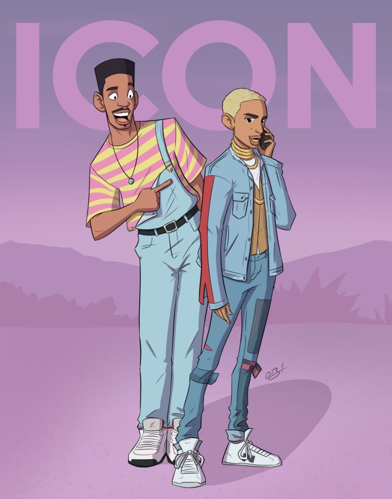
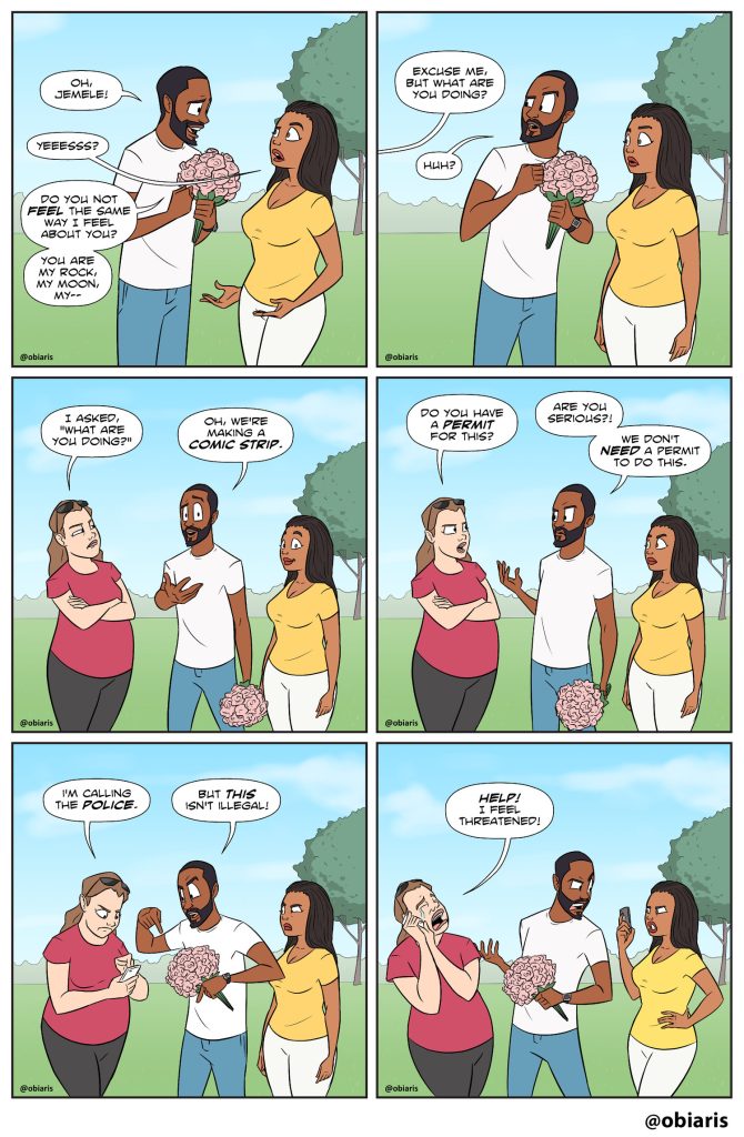
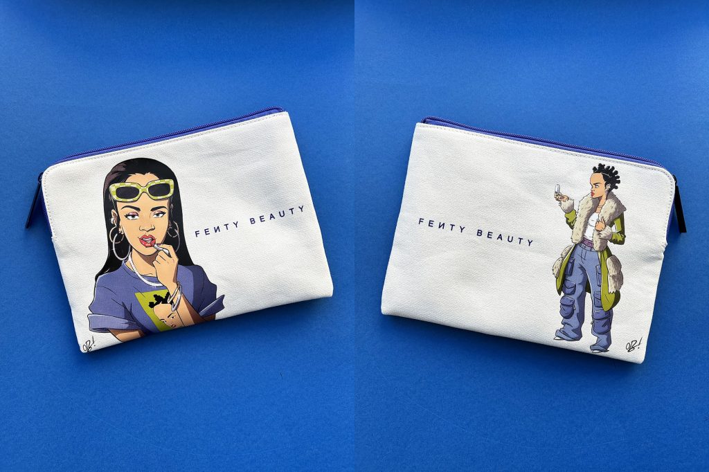
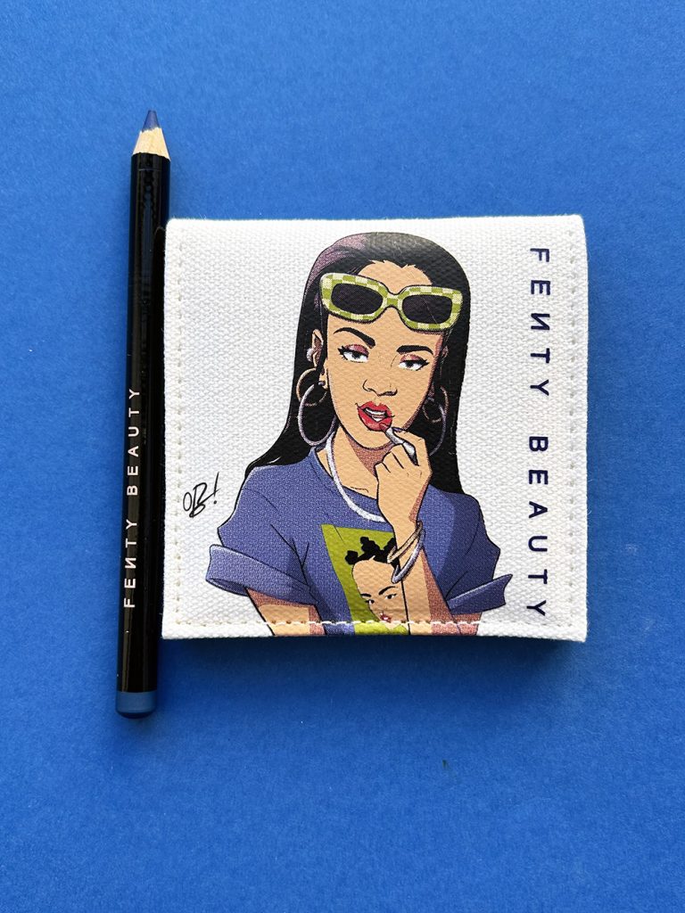
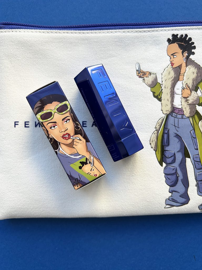
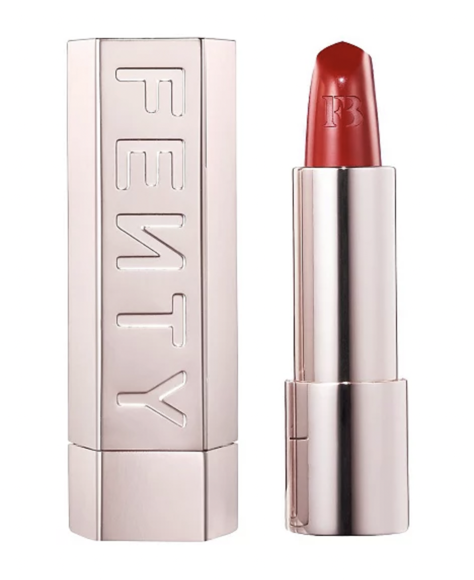
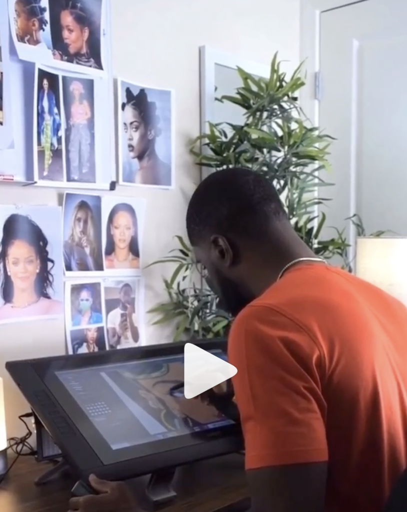
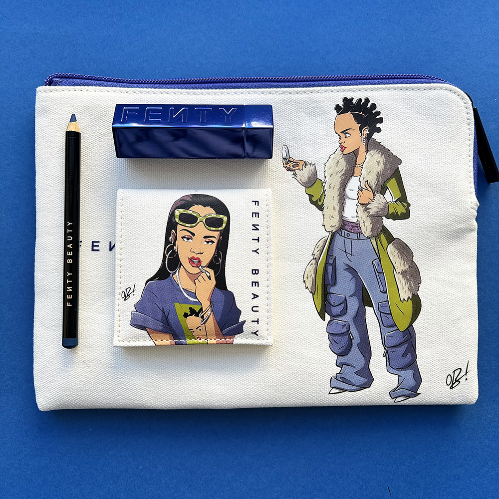
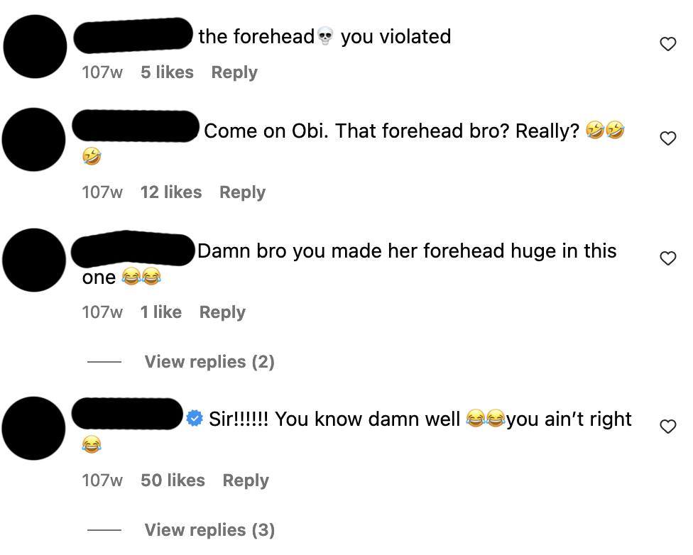


, ca. 1774")


, ca. 1480-1485")


")


, 2017")


")