I’m still here…just been pretty sad and work’s been kicking my ass. The snow we had yesterday on the first day of spring was particularly cruel and depressing. So today I’m hoping to perk myself up a bit by posting about more spring goodies.
I thought this past holiday season was the peak of angel-themed items, but Guerlain’s Angelic Radiance Météorites proved me wrong. The design is a departure from previous Météorites as they’ve got a delicate paper lid, and instead of a pattern there’s a scene of two cherubs frolicking among some foliage. Usually I like a sturdier lid since paper is more prone to damage long-term, but in this case I think it works well combined with the illustration and the soft pink tones. It also makes me a little hungry – I think a larger version of the box would be perfect for macaron packaging. 🙂


I’ve written about cherubs before and gave some examples of them in Renaissance art, but the ornate decorations on the Guerlain box look more like they were inspired by 17th century art rather than the Renaissance. I poked around online to see if I could find anything similar and came across the work of engraver Jean Lepautre (1618-1682), whose work, I think, is reminiscent of the Guerlain container. This site has a concise description of Lepautre: “[He] has been described as the most important ornament engraver of the 17th century. His prodigious output extended to more than 2000 prints, mostly from his own original designs. He was not only the originator of the grandiose Louis XIV style but was also responsible for disseminating and popularizing its full lavish repertoire throughout Europe. Le Pautre’s often over-elaborate and flamboyant designs frequently included arabesques, grotesques and cartouches, together with elements from classical mythology. His diverse range of subject matter, influenced by his carpentry/joinery architectural background, included: friezes, wallpaper, alcoves, fireplaces, furniture, murals, ceiling mouldings, fountains and grottoes.”
In 1751 Charles-Antoine Jombert produced a 3-volume series of Lepautre’s work, and astonishingly enough, the University of Heidelberg digitized the entire thing and made it available to the public. I went through each image and picked out what I thought most resembled the Météorites case.


Admittedly I chose this one not just because of the angels but because there seems to be mermaid angels in the bottom panel!

I tried to get some more close-up images so you could see the similarities between these engravings and the Guerlain box – the etch marks, the lines of the foliage, even the cherubs’ hair are nearly the same.


(images from digi.ub.uni-heidelberg.de); https://doi.org/10.11588/diglit.1638; images are in the public domain
I wonder whether this is just a coincidence or if the design team at Guerlain had been looking at Lepautre. I’m also curious as to why they decided to do a scene featuring angels as I didn’t think cherubs were a Guerlain motif. As it turns out, angels appeared on a Guerlain powder container from 1918. The Poudre aux Ballons were scented with various Guerlain fragrances. (For the record, this is officially on my wishlist – I hope I can track one down! I also just remembered that I’ve come across the Poudre aux Ballons before.)


(images from guerlainperfumes.blogspot.com)
You may recall that balloons were used in last year’s spring promo image (more about that in a future post.)
Anyway, while I can’t say definitively that Guerlain’s latest release is in any way inspired by 17th century ornament engravings, it at least caused me to discover an artist that I wouldn’t have known about otherwise. And I really like the Météorites packaging – so feminine and springy and French. It may not be as sleek and sophisticated, as, say, the Impériale Météorites (holiday 2009) or the 2012 Pucci collection, but I think it’s a refreshing change from what they normally do.
What do you think?
I loved last year’s holiday coffret from Cosme Decorte so it’s no surprise I’m pleased with this year’s version. King of Sweets features the same basic design as the 2013 coffret – a red outer box with a laser-cut scene on the interior of the lid – but with a different theme. The box has been outfitted with a golden bow to resemble a box of candy, while the inside cutout depicts a magical candyland.


The design is really precious, with a jolly crowned snowman as the”king of sweets” holding court amidst a delectable landscape of candy.

The set includes a stick blush (upper left, wrapped in red), an eye shadow palette (lower left, meant to look like chocolate), a candy cane-packaged gel liner and pink lip balm.


When the coffret first arrived I spent a few minutes daydreaming about a forest made of candy (sort of like when Homer visits the land of chocolate). Imagine my great delight a few weeks later when one of my favorite blogs featured the art of Will Cotton, who specializes in painting truly amazing dessert-filled landscapes. They were exactly what I was envisioning when looking at the coffret! While Cotton’s work sometimes represents the darker themes of excess and greed, I personally like to interpret it as a purely happy fantasy, where one can escape to a wondrous world overflowing with an abundance of sweet treats. The bright colors and perfectly rendered textures of all the sweets make these imaginary scenes appear real. That accuracy is not accidental either: Cotton has a professional pastry oven in his studio so that he prepare desserts and re-create them flawlessly on canvas. He also sometimes builds other props and life-size sets, because, as he says, “this way I can really lose myself in the surprises and unexpected details of the subject, and in a very real way, I’m no longer painting something imaginary, because in fact, it’s right there in front of me.”
")
")
")
(images from willcotton.com)
They’re just all so crazily decadent.
Getting back to the coffret, I think it would be a perfect addition to a revamped Sweet Tooth exhibition (and maybe I could have some of Mr. Cotton’s work hanging as a backdrop!)
What do you think of the coffret and of Will Cotton’s work?
We have another pretty bronzer for summer 2013. Clarins Splendours Summer Bronzing Compact features a translucent red case that holds a bronzing powder with an exquisitely intricate design.
I had a lot of trouble getting a picture of the case without getting a ton of reflections.

So then I tried putting the flash on, which worked a lot better. The way it went off in this picture makes it look like there’s a candle inside the palette, spreading a warm glow and softly illuminating the pattern.


Here’s the collection description: “Sunshine into gold. Travel to far away lands, to the heart of an ancient people…and discover the splendours of a pre-Columbian civilization that worshiped the sun. Gold, a rich cultural symbol, is the highlight of this summer make-up collection. Sprinkle it on the eyes, neck and lips. Jade, sapphire, ruby and tourmaline appear as crystalline gemstones and illuminate this elegant sun-kissed collection.”
Of course, they don’t mention specifically which Pre-Columbian civilization. As we saw with the Guerlain Terra Inca collection, I’m in over my head in
trying to decipher what specifically this palette is based on – I’m no archaeologist or Pre-Colombian scholar. But after a brief search on Google I think it most resembles an Aztec sun stone that is housed in the National Museum of Anthropology in Mexico City. This photo was taken around 1890, roughly a century after it was unearthed.
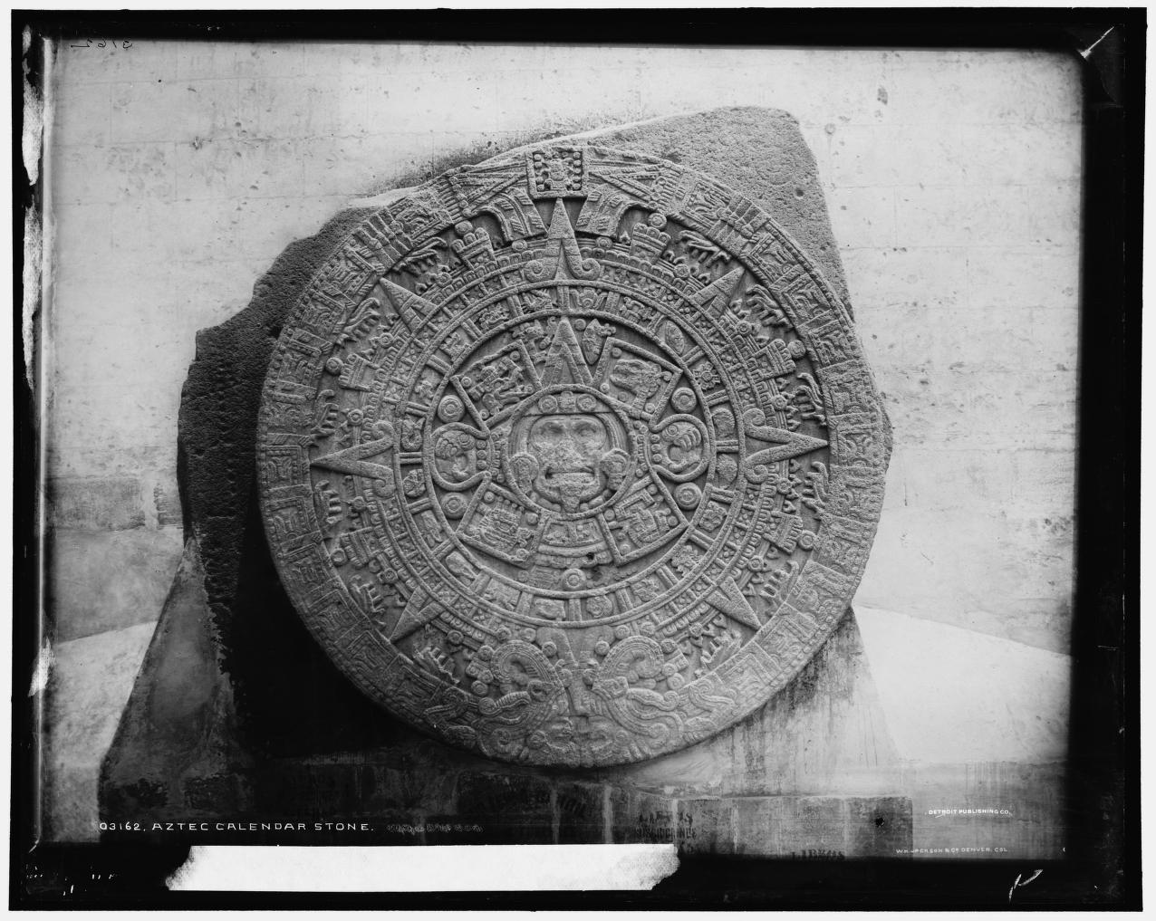
Image from Library of Congress, Prints & Photographs Division, Detroit Publishing Company, LC-DIG-det-4a03446; image is public domain
Looking closely at the palette, I’m more inclined to think this particular stone was the inspiration for the design. The circle in the center surrounded by four square shapes is found in each, along with the concentric triangle at the top of the center circle and the four dots placed around the squares and one at the bottom of the inner circle. The tiny horseshoe-like pattern appears throughout both as well. The triangles with the scrolled edges in the stone find themselves in the outer case of the palette and are also present in the powder, albeit slightly deconstructed there (the triangle is broken up into its base shape with two scrolls on each side). Additionally, this stone (weighing in a whopping 24 tons – wow!) is actually believed to be an altar or ceremonial container for the sun god Tonatiuh rather than a calendar. So it would make sense that the Clarins collection, based on people that worshipped a sun god, would choose an item used in worship instead of a calendar for their inspiration.
I think this is a beautiful palette and for once, Clarins provided at least a glimmer of explanation as to their vision for the collection. What do you think?
“The glittering lights of the Eiffel Tower dazzle in the distance. A gentle, magical breeze kisses your neck. An electric, captivating energy envelops you. This is Paris at dusk. Lancôme invites you and your readers to be swept away by the mystical aura of Paris at midnight with Midnight Roses, the hypnotizing fall collection that evokes the twilight hours when a woman’s beauty comes into full bloom.” To make one feel as though she is a part of this magical scene, Lancôme introduced Moonlit Rose, a pink highlighting powder that takes the shape of (surprise – not!) a rose. I haven’t been able to get my hands on it because I don’t think it was released in the U.S. However, I’m intrigued by the combination of textures – the petals have a perfectly smooth, satin-like finish while the background resembles whisper-thin gossamer threads.

(image from flare.com)
What I enjoy most, though, is the interplay of positive and negative space. Although the petals and background are the same color, the rose shape is easily visible due to the petals’ raised surface.
It reminded me a little of this work by Brazilian artist Vik Muniz. His White Rose (2003, from the Monads series) utilizes a similar concept, only reversed – the negative white space is the rose, formed by thousands of plastic toy bugs. The series “consist[s] of small objects which tell a story by themselves, linked, simultaneously, to the larger story of the whole image they form part of…In White Rose, Muniz composes the image of a pure white rose out
of various insects and animals which, in a certain way, contribute to the birth, life and death of the rose.” (source)
There is also the idea that things are not what they seem. At first glance we can tell the shape is a rose, but it takes a few seconds of looking at the photo to see what is comprising the outlines. In this way the artist “honors, questions and subverts the
traditions of representational art, treading the line between reality and illusion, representation and abstraction, idea and image, means and ends.”
You can read more about him at his website.
I have so many rose palettes, but I think this one also belongs in the Museum. The design is simultaneously simple and complex, and it is the perfect shade of pink – not overly girly or shimmery.
What do you think?
Clarins released a pretty interesting palette for fall. At first glance it reminded me of either pixels or a paused game of Tetris, ha.


With flash:


But then I was brushing up on my op art for MAC’s upcoming Art of Powder collection and stumbled across an artist named Francois Morellet. This work (Bleu Violet, 1973) jumped out at me right away. While it’s a work on paper and therefore not in 3D (meaning the little squares are flat and not sticking out as in the palette), the seemingly random scattering of different colored squares is really close to the Clarins piece. What really made my head almost explode though, is Morellet’s work from 1960, Random Distribution of 40,00 Squares using the Odd and Even Numbers of a Telephone Directory. Morellet explains, “The catalyst for the idea of the painting Random Distribution of 40,000 Squares using the odd and Even Numbers of a Telephone Directory (1960) came about after a conversation with Ellsworth Kelly, who at the time was living in France. He had recently visited Jean Arp’s studio and talked about one of Arp and Sophie Taeuber’s joint collages, Squares Arranged to the Laws of Chance, made in 1917…With Random Distribution, the purpose of my system was to cause a reaction between two colours of equal intensity. I drew horizontal and vertical lines to make 40,000 squares. Then my wife or my sons would read out the numbers from the phone book (except the first repetitive digits), and I would mark each square for an even number while leaving the odd ones blank. The crossed squares were painted blue and the blank ones red. For the 1963 Paris Biennale I made a 3-D version of it that was shown among the Groupe de Recherche d’Art Visuel installations (and re-created it again on different occasions). I wanted to create a dazzling fight between two colours that shared the same luminosity. This balance of colour intensity was hard to adjust because daylight enhances the blue and artificial light boosts the red. I wanted the visitors to have a disturbing experience when they walked into this room – to almost hurt their eyes with the pulsating, flickering balance of two colours. I like that kind of aggression.”
Now, the Clarins palette obviously isn’t influenced by this work or anything in particular, but since discovering this artist, I do like pretending the palette is a mini version of a Morellet (with soft pink colors instead of the strong red and blue that formed a “dazzling fight”). Another little piece of art. 🙂
Through New Curator I have just been alerted to the fact that it is International Museum Day, according to the International Council of Museums. Here's to all the established, traditional museums (think the Met and Louvre) and of course to the smaller, kookier ones like the Makeup Museum and others. If there is an entire museum devoted to clocks and watches, surely there's room for a beauty museum!

Ever since Allure magazine featured palettes by Hourglass I've been intrigued by them. Well, the not the palettes themselves but the leather case used to hold them! The delicate, understated trees have a gorgeous Art Nouveau character about them, and even the font on the Hourglass logo looks vaguely early 1900s. At the same time, the palettes have a modern sensibility in how compact they are as well as the colors and ingredients used. The colors are subtle and are carefully chosen to create a cohesive look – whether it's a tropical one (the Island palette, with its bronzes and light golds, would be perfect for a sun-kissed summer look) or a daring nighttime one (the smoky shades in the Dusk palette are spot on for this), there is a palette to fit any mood of the wearer. And as a skincare bonus, all of the blushes and shadows contain Vitamin E.
I do wish the packaging for the rest of the line outside the palettes was as interesting, or at least for the palettes to have different designs depending on the colors. They could just make the trees a different color to distinguish the palettes from one another…especially given that the makers of Hourglass seem to enjoy the tree motif – they've also created a separate bath and body line called, you guessed it, Trees. Here's hoping the palettes are merely a starting-off point for more pretty packaging!
(photo from sephora.com)
Oops, they did it again! That is, Shu Uemura has released a new advanced formula cleansing oil, and in honor of its launch created a limited-edition, Asia-exclusive bottle. It’s not clear when the advanced formula will hit the States. But what’s bothering me more than that uncertainty is the fact that I don’t know if an artist collaborated on the bottle’s design.

It’s impossible to tell whether this is something the company has come up with or if an outside artist was brought in. (As mentioned earlier, Shu has a history of working with artists on designs for the cleansing oil bottles.) I’m guessing this is something the company did itself since there’s no mention of an artist on the bottle or box.
The abstract flourish is reminiscent of some of Franz Kline’s work, especially Chief (1950).
I think it’s fitting that Shu chose an abstract design for this product. The idea of a product having a new “advanced” formula is difficult to express visually, so a simple abstract brushstroke in silver works well in terms of signaling the release of a new and improved product.
Lancôme has released its fall collection: “Inspired by the rich colors of India, from the raw earth
browns to the intensely vibrant reds, plums and oranges reminiscent of Indian
dyes, Maharani Jewels brings back artistry to Lancôme collections.” The star of the lineup is the Sun of India bronzing powder, a golden shimmery powder embossed with a rearing elephant wearing a brilliant red cover on its back.

With the pose and red saddle, it reminds me a tiny bit of this ca. 1812 painting by Théodore Géricault:
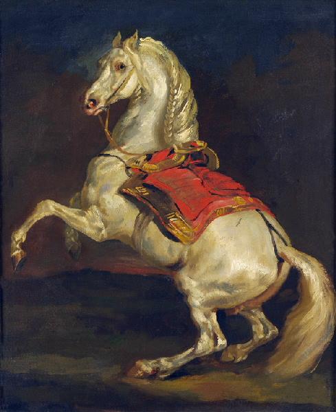
(image from commons.wikimedia.org; image is public domain within the U.S.)
Of course, 19th-century French Romanticism doesn’t have anything to do with a 21st-century bronzer, but I find it interesting that Lancôme chose to have the elephant standing on two legs rather than four, since the placement and stance of the elephant doesn’t affect the application of the product. In any case, I’m thoroughly enjoying the sumptuousness and richness of the colors as well as the detailing surrounding the elephant. Hopefully Lancôme will delve more fully into elaborate palette designs.