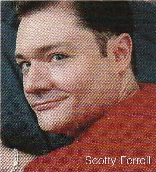
Makeup artist Scotty Ferrell I'm always so grateful when someone agrees to an interview with the Museum, and the one I'm featuring today is very special! You might remember the AstroLips lipstick line that was mentioned in the Museum's history of zodiac-themed makeup and how I was puzzled over not being able to find any information about it or its creator, makeup artist Scotty Ferrell. Well, as luck would have it, Scotty found the Museum's article and  introduced himself and offered more information on the line. Naturally I wanted to hear as much as possible about it, along with Scotty himself! He kindly granted me an interview. Please read on to discover his work, his experience working with some of the biggest brands in the '90s and early 2000s, and his latest venture: an (actually useful!) beauty app.

MM: How did you get into makeup? What interested you about it?

SF: My fascination for cosmetics began when I got into trouble playing in my Mom’s makeup and opening all the small perfume bottles she had from Avon. I would get so excited when the Avon lady came over to visit and brought her big case of colors and potions. I was hooked. The mystery of all the pretty colors and glass containers captured my spirit.

MM: What was your experience working in makeup in the '90s? And what were the big trends/products?
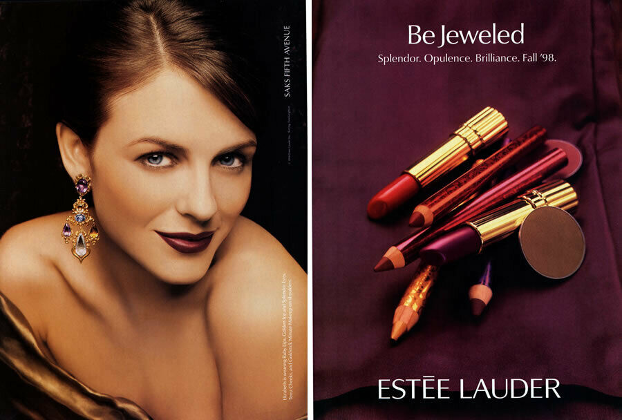
SF: The 1990’s really were amazing years for makeup. People were so excited to sit and learn about their makeup wanting to know how to apply eyeliner themselves and experiment with color. Quality makeup brushes and how to use them was so rewarding to work with people ready to discover and develop their own personal style. I had so much fun painting faces because the trends were really strong and each seasonal look was trying to top the next. I think the light lid and strong crease was all the rage because finally single eyeshadows were available in the artistry brands allowing for more experimentation. I loved when I started applying to my clients two different color liners top and bottom lash lines. Jewel tones in combination were really big during late 90’s.

Estée Lauder Bejeweled collection ad, fall 1998

The true smokey eye also came from this time period. The smokey eye really is buffing out the eyeliner on the lower lid and layering it with a dark shadow. But now today, anyone wearing eyeshadow says it’s a smokey eye when it’s not. I am not a big fan of the influencers because too much misinformation and lack of experience working with real people seems to be most popular. Influencers are pushing wrong information because they lack the makeup artistry experience applying makeup on people other than themselves. Too many influencers are promoting low quality products and wiz-bang techniques that do not wear or look professional. The legacy brands still have the some of the best tried and true products like Lancome’s Effacernes and Aquatique eye concealer/base, Elizabeth Arden Flawless finish cream foundation these products cannot be beat. Influencers are pushing the industry against quality products that cannot withstand a real photoshoots, catwalks under hot lights or outdoor weddings.

MM: Tell us about your alter ego, Gigi Romero, and how she inspired you to create the AstroLips line!
SF: Say GiGi Romero to me and I light up and am romanced dreaming about the silver screen stars like Bette Davis, Ava Gardner, Sophia Loren just to name a few. GiGi Romero is my muse/ alter ego that channels the larger than life confidence and on-stage personality that celebrates their fans with great entertainment. Makeup delivers the fantasy to a tangible reality, a way to feel special because it’s fun to play dress-up. So when the brainstorm came over me about AstroLips with Lovespell, I thought of GiGi Romero conjuring up the colors and speaking directly with the cosmos to create the shades and stories
belonging to each sun sign. AstroLips with Lovespell may still have a come back yet when GiGi Romero connects with the stars once again!

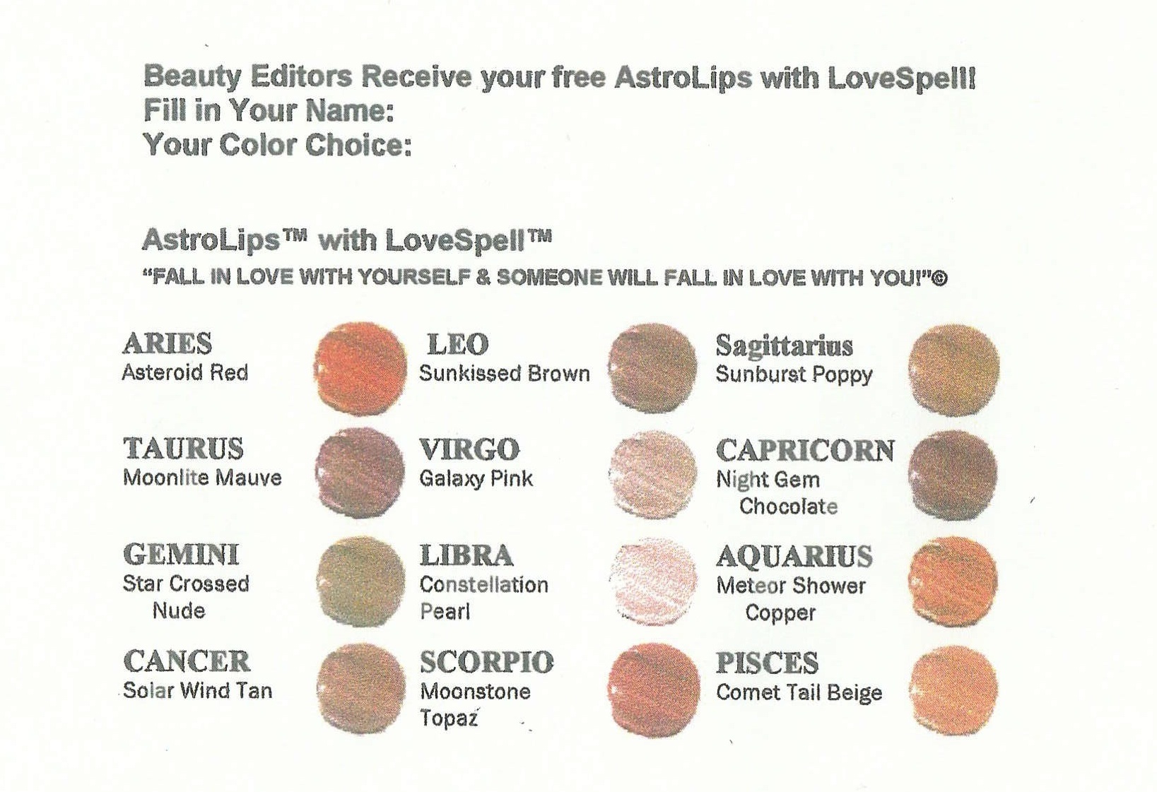
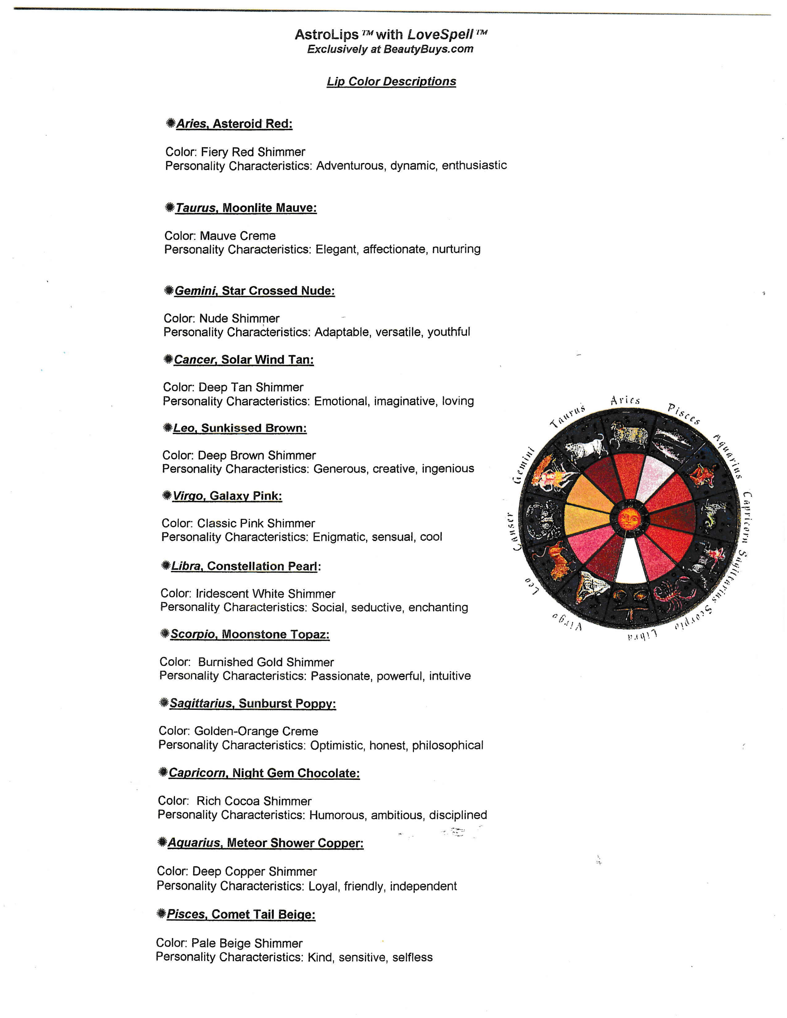
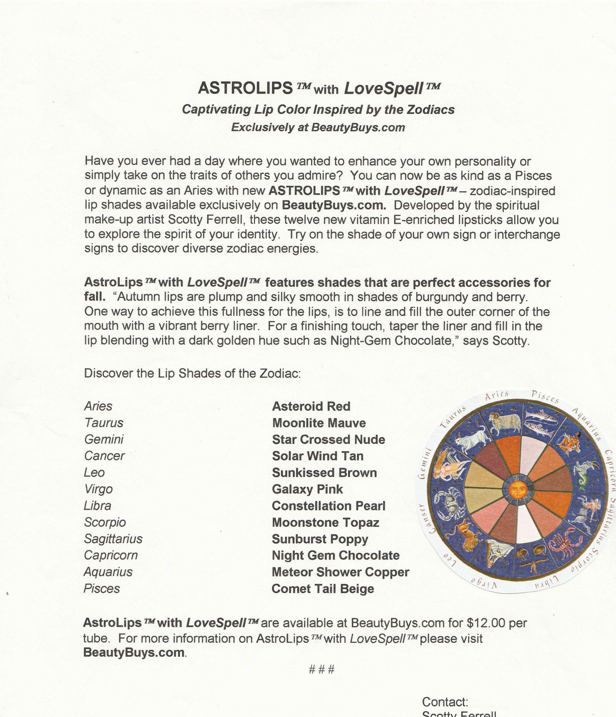
AstroLips ad, 2000. Image provided by Scotty Ferrell.

AstroLips shades, 2000. Image provided by Scotty Ferrell.

AstroLips shades, 2000. Images provided by Scotty Ferrell.
AstroLips shades, 2000. Image provided by Scotty Ferrell.

AstroLips shades, 2000. Image provided by Scotty Ferrell.

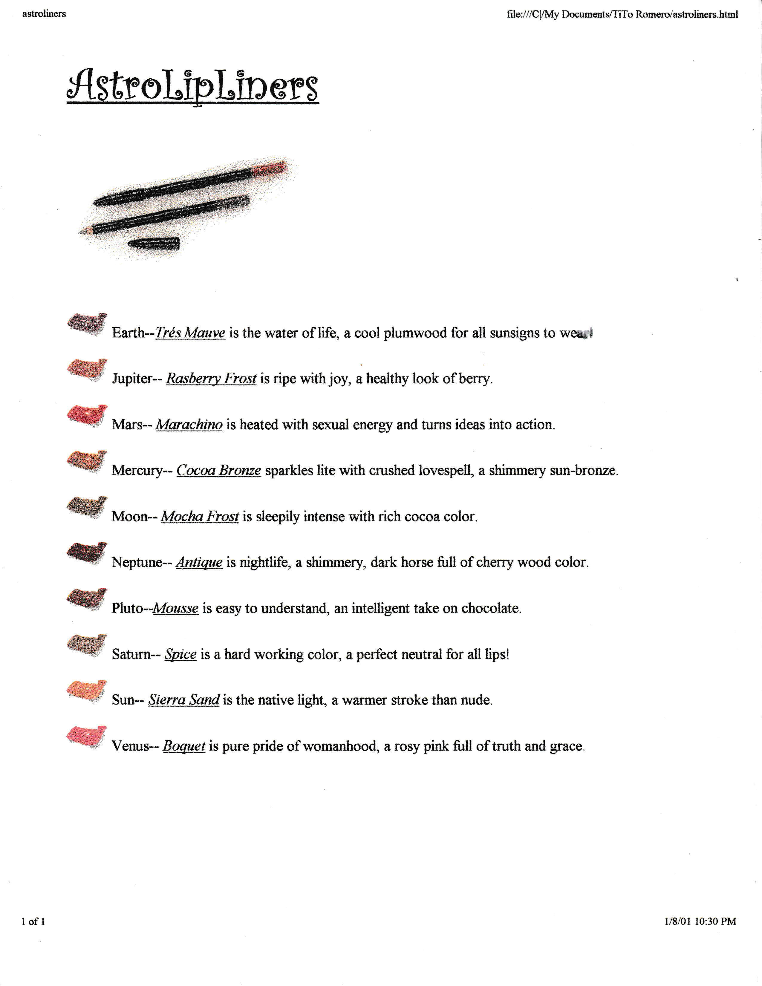
AstroLipLiners, 2001. Image provided by Scotty Ferrell.

AstroLipLiners, 2001. Image provided by Scotty Ferrell.

MM: You had mentioned [in a previous correspondence] you had some stories about Smashbox, Trish McEvoy planners, etc. Can you expand on those?
SF: Bill Parks, rest his loving soul, does not get the credit he deserves creating the Smashbox brand from scratch let alone me helping him launch the brand coast to coast. I consider the absence of acknowledging his contribution to Smashbox beyond shameful on the part of Estee Lauder and the great grandsons of Max Factor, Dean and Davis. The origin story begins with Bill Parks and me working for Trish McEvoy. Trish McEvoy held a big, big meeting with Nordstrom west coast to bring a next-level strategy for her Nordstrom counters putting Bill Parks in charge and me as at-counter National Artist to produce at the events. After this meeting show casing Bill Parks as a business superstar that he was, Nordstrom secretly invited just Bill to a clandestine behind the curtain meeting for Smashbox. Nordstrom was initially investing in the launch of Smashbox the artistry brand for Dean and Davis Factor, but knew it needed someone who actually understood selling color cosmetics. Bill agreed to their offer and left to be the creative head of Smashbox to create products, sell the products and be the personal face launching the line coast to coast. I stayed with Trish McEvoy for a couple more years seeing Bill grow the brand all on his own.

Smashbox postcard, ca. 1996

Smashbox postcard, ca. 1996


Bill actually worked to formulate the first cream eyeliner for that time because he knew the pitfalls from Trish’s eyeshadow liners and brush #11. How did Smashbox get on QVC? Well, let me tell you a story. Michael diCesare haircare and hair brushes were in several Nordstrom stores where he also met Bill Parks. They hit it off and whenever I saw Michael he would always ask me where’s Bill? Michael was already on QVC selling his products and asked Bill to do the makeup for his models. The rest is history once QVC met Bill Parks he began selling Smashbox to record heights on their channel. I joined Bill Parks in 1998 launching Smashbox into other retailers in addition to more Nordstrom doors. I trained Holly Mordini who later took Bill’s place on QVC after Bill passed away suddenly. I have many cherished memories and stories about my time with Trish and learning directly from her extremely talented hands and eye for color. Trish gave me the freedom, encouragement and confidence to become the best showman and artist I could be. Trish demanded us to all have a Franklin Planner and follow its system to set goals and exceed them. So after a big, big event in Dallas Neimans Northpark we all piled in this van we thought to go back to the hotel or wherever we were staying that night, but instead Trish had other plans. Somehow she kept telling the driver to continue to drive around, drive around while we all talked and Trish was in the groove to with her vision to send us her elite team back across the country opening counters, raising up important stores that needed an open to buy and who would stay in Dallas making sure we prevented any event returns or sold more than might come back to counter. A bunch of us, her elite team were frantically turning the pages to our Franklin Planners trying to make sure we got every word and detail correct coming from Trish. Suddenly, we all start talking about how organizing our makeup just like our Franklin Planners! I was already putting Face Essential shadows on palette boards to make it easier to paint at events. We all were competing for an edge to sell better and did our best with our brush rolls and our go-to favorites. It was decided that night that Trish had to go to Italy to get this new idea off the ground. The first set of pages were that same kind of plastic used for potted plants you get from the store. The brush bag of course had to be like Trish’s black Chanel bag that I did get to hold for her on one of our trips. The story about how Trish’s Planner came in to existence has changed over the years. Trish tells the story now moving up the timeline to when she was in Italy with her husband ordering the first version. The beginning year of the Planner was very exciting but took a lot of effort before we got better and better versions of the pages which had to be switched out several times for customers.
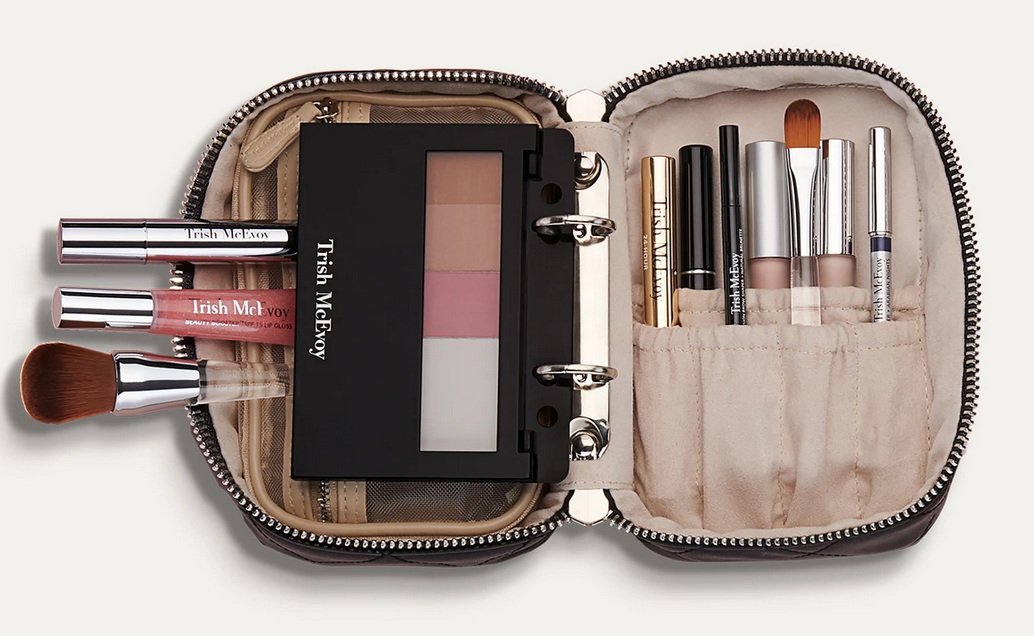
Trish McEvoy makeup planner
(image from trishmcevoy.com)

There is a very, very important story that I still to this day want to remind Trish personally. I am certain Trish does remember that Saks 5th Avenue almost sabotaged the Planner’s first Christmas. The part that Trish may have forgotten, and I would like to definitely remind her that I am the very person who sounded the alarm. I know exactly where I was and how I found out Saks 5th Ave was ready to go to the floor with their knock-off Planner. I was  painting local models for a Saks 5th Ave Fashion show at the Intercontinental Hotel Miami. A Saks 5th Ave big-wig who flew down for the event also came back stage and was showing off what he knew that Saks “had a knock-off Planner in their warehouse ready to go on the Holiday Sales floor to under-cut Trish’s Planner 1 st Christmas.” I ran outside, on my very first cell, all the way outside and called the office demanding to speak with Trish directly.  I said it was extremely urgent and that she had better get her lawyers on the phone to save the Planner!  I called more than once even on a pay-phone in the lobby with every chance I could get until I was sure the message got through. Trish, if you're listening, my cell number is still the same!

MM: How would you say the cosmetics marketing landscape has changed since the late '90s? (e.g. the impact of the Internet/e-commerce/social media, etc.) And what stayed the same? Do you find it more or less difficult to sell makeup now?
SF: After the 90’s, companies did change dramatically not wanting to support events. Not wanting to pay artists who knew the brand intimately and loved teaching customers how to wear new looks, how to apply their makeup providing live- action customer service. The focus became and still is selling one hit-product at a time. Click-bait selling beauty over the internet breaks down the expertise of professionals that know how to design personalized beauty regimens for individual customers. Brands and social beauty stars are ignoring that beauty products must work together to be successful helping people. It is a must to talk to customers and listen to their needs so their lifestyles fit the products that do work together and deliver the results people are after.

MM: You've explained about your new app, but please elaborate on it and what inspired you to create it.
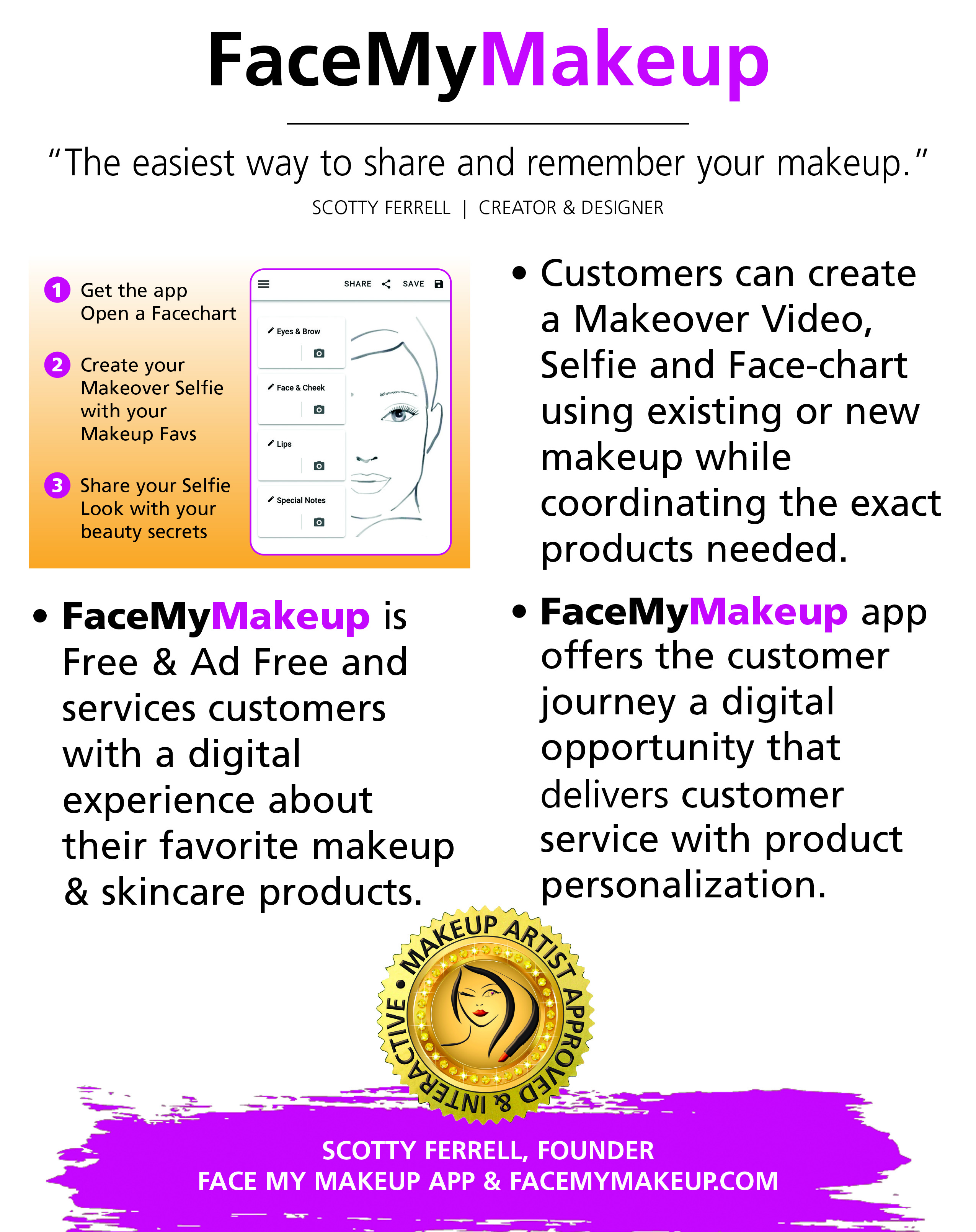
SF: This is the great segueway to my app. Face My Makeup app is reality based and is a digital version of how millions upon millions of makeup and skincare products were sold for years. Face My Makeup app is a digital face-chart but actually its true potential is personalized beauty’s next generation Face-cart that provides customer service and supports sales. I created Face My Makeup app directly from my experience selling on the road for Trish and BABOR. My customers would carry with them for years and tape to their mirrors the Face-charts I made for them with all the tips, tricks, colors, shades and multiple products that we chose together. Countless times a woman I helped years prior would find me again bringing her Face-chart and wanted a fresh new look. This love for the Face-chart and service it provides is so valuable and necessary for personalized beauty to be meaningful to make sense. Face My Makeup app has been received with open arms having over 5000 downloads from Google Play and the same amounts for iPhone app store. The elevator pitch that grabs people’s attention, “If you lost your makeup bag with all your favs, how many eClicks would it take for you to replace all your makeup? Would you remember all the names, shades and brands? Is there an eCommerce site that knows your Day Look products from your Night Look routine?” eCommerce, Mobile sales are obviously here to stay but what I know is must have companion is the Face-cart service from Face My Makeup app. (Disclaimer: The Makeup Museum is not endorsing/advertising the Face My Makeup app and has not been compensated in any way for mentioning it; its inclusion in this interview is merely for information-sharing purposes.)

Face My Makeup app overview. Image provided by Scotty Ferrell.

Face My Makeup app overview. Image provided by Scotty Ferrell.

MM: What are some of your favorite makeup trends or looks? (Can be current, can be historical, whatever you want!)
SF: Deep violet and emerald jewel tones playing off each other in the outer corner is to die for. I love an extended eyeliner that isn’t a cat eye but more Egyptian straight across with a softer edge. I think I still have a similar color story that I created for BABOR. A look I did paint on Jennifer Lopez on South Beach right after she made Selena. It was this beautiful tangerine and lime combination with shadows from Shu Uemura so super hot even though Jenny was less than nice.

MM: Anything else you'd like to add?
SF: I just want to get back on the team and do the work in beauty that I continue to see is still so necessary to produce results. Talking, listening to customers providing them service with the skills and experience to back it up; I’m there. Customers are demanding these conversations but those in charge have never painted a single face, ran an event with 100s of people making sure everyone leaves happy. Anticipating people’s needs and following up with a menu of choices is what it takes to grow a business. Translating this process digitally is doable but only from professionals that have touched faces with honest and real experiences. I mean why is Bobbi Brown now on Jones Road? Huge shout outs to forgotten greats, Alexander De Markoff, Stagelight, Germaine Monteil, Stendahl, PAYOT, Shu Uemura, and my ultimate favorite closest to my heart, Fernand Aubry!

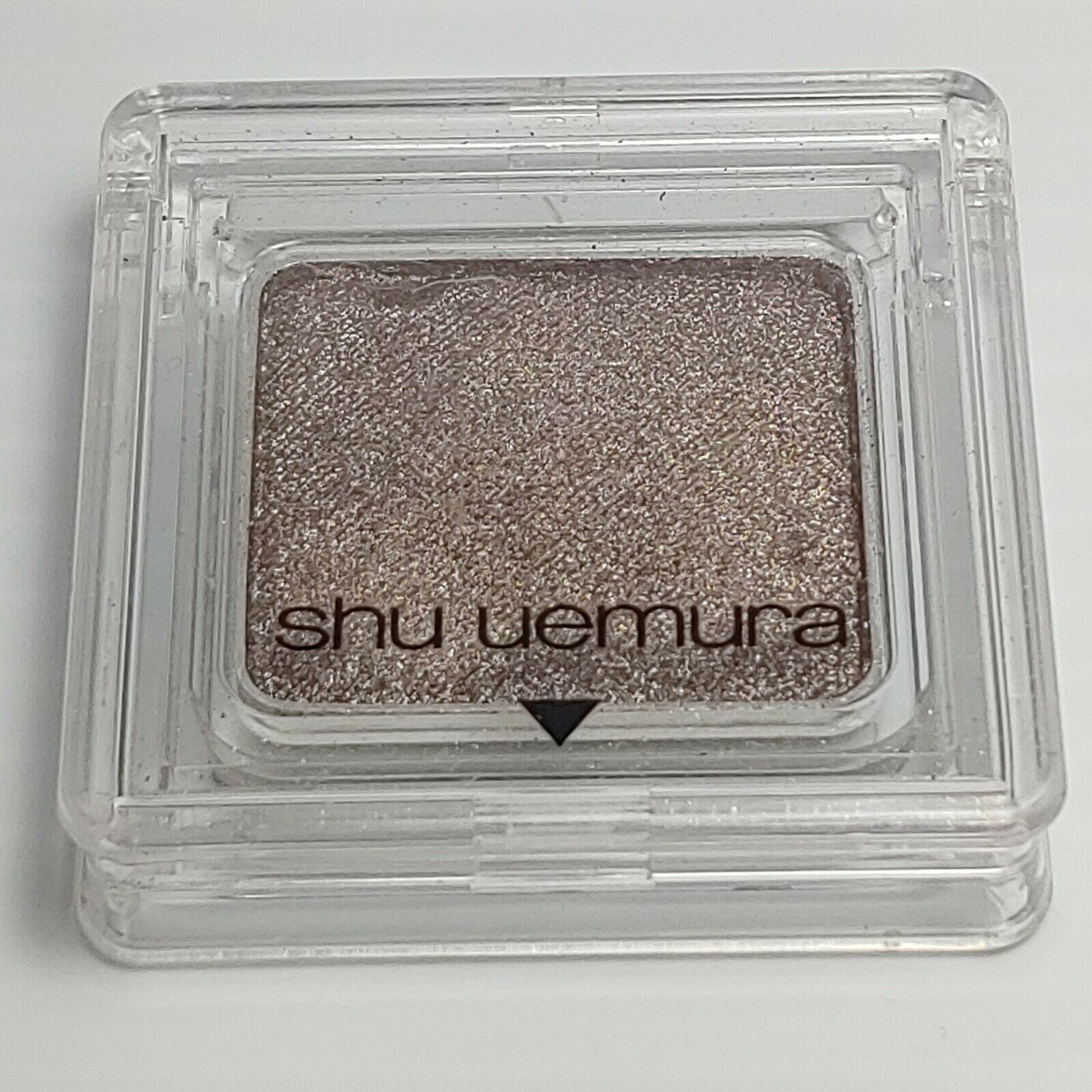
Shu Uemura ME 945 eyeshadow

The highly coveted Shu Uemura ME 945 eyeshadow

Thank you so much, Scotty, for this wonderful history you've provided! It's incredibly illuminating to get a first-hand account of how the makeup industry and trends change (or don't), and I'm so pleased to hear more about my favorite era. The Face My Makeup app sounds great, but I hope we see more of Gigi's creations in the future too. 😉 MM'ers: any thoughts?
This post has been in the making for literally years. I finally conceded that I couldn't find a complete history of either Benefit's Glamourette compact, released in 2002, or the vintage compact it was based on, House of Platé's Trio-ette (ca. 1944-1947). But I did turn up a few nuggets of information, so figured I'd share the little bit that was readily available.

House of Platé Trio-ette compact (ca. 1944-1947) and Benefit Glamourette compact (ca. 2002-2003)

House of Platé Trio-ette compact (ca. 1944-1947) and Benefit Glamourette compact (ca. 2002-2003)

The House of Platé company was established in 1944 by Robert T. Plate in Detroit. From what I was able to piece together from various archives, it seems Plate was born in 1897 in Lima, Ohio and received a Bachelor's degree in mechanical engineering from the University of Michigan in 1923. Specializing in automobile design, his first job was draftsman for the Willys-Overland Company in Toledo. Beginning in 1932 Plate worked for General Motors, and in 1938 he was doing business as the Plate Manufacturing Company. In 1945 he trademarked the Trio-ette compact under Curly Lox Products.  The biggest mystery for me is why Plate decided to market cosmetics. I'm assuming it was a side hustle to earn a little extra cash, or maybe he thought he could become the next Max Factor. (As a side note, Plate moved quite frequently throughout his life, bouncing around from Ohio to Michigan to New York to LA…if it's the same Robert T. Plate, I'm not sure whether he was trying to help his business take off across the country or moving for engineering jobs.)

Trio-ette trademark registration

The design of the compact was based on a "quaint Victorian rose cameo hand mirror" according to one ad. This one is reproduced in Roselyn Gerson's book Vintage and Vogue Ladies' Compacts (2nd edition).

Trio-ette ad, House and Garden, 1946

It's really fascinating to see how a mechanical engineer who designed cars approached makeup. Compacts with powder, rouge and lipstick had existed for years, but few had the novelty and charm of the Trio-ette's design. (However, one can definitely tell an engineer also thought of the rather unimaginative House of Platé name. I guess Plate thought adding an accent over the "e" would make it sound vaguely French and therefore instantly appealing.) I'm so disappointed that I wasn't able to find patent drawings despite having the serial number. But maybe the trademark is different than patenting the actual design.

Trio-ette compact box

Trio-ette compact

Trio-ette rouge

Trio-ette compact open

Trio-ette compact outer mirror

Trio-ette compact lipstick

The name on the handle is such a sweet little detail.

Trio-ette compact handle

Trio-ette ad in the Californian, October 1946
(image from archive.org)

As the Trio-ette was conceived and launched during WWII, it was made of plastic, specifically tenite, instead of metal. Tenite apparently is the trade name for a cellulosic plastic created by Eastman Chemicals in 1929. (I wish I knew the difference between tenite, bakelite, and celluloid. Alas, I have no clue.) The Trio-ette was also refillable. This snippet from Drug and Cosmetic Industry shows the refill kit, but the really interesting thing about this blurb is that the journal was not falling for the Trio-ette's hype, claiming it was nothing more than a "gadget" and citing the more "streamlined" designs from established big-name brands.  It's true: companies had been making triple compacts for a good 20 years by that point.

Trio-ette - Drug and Cosmetic Industry, January 1945
(image from archive.org)

Whether it was a novelty or a truly handy compact to carry, the Trio-ette seemed popular, or at least, it was readily available across the entire country in department stores as well as drugstores. Plate, though not a businessman by trade, understood the importance of advertising. In late 1945 he hired NY-based firm Norman D. Waters and Associates to oversee a national campaign they would launch early the following year. The Trio-ette allegedly reduced "bag fumbling" and "makeup fatigue".

Advertising Age, February 1946

As with lipstick mirrors, it was considered a social faux pas to be digging through one's purse to look for your makeup, mostly because it was a potential inconvenience for men. Ladies, with the Trio-ette he won't mind waiting for you to touch up since it won't take long at all – all your makeup is in one place so you won't waste his time searching for it. *eyeroll* These ads certainly paint a picture of gender norms, don't they?

Green_Bay_Press_Gazette_Mon__Apr_8__1946_

There were other products from House of Platé, including a double-ended lipstick called the Duo-ette and the Vista, a lipstick with a built-in mirror (again, you can see my post on those.)

House of Platé ad, 1946

The Trio-ette came in a variety of colors as well as black ones with a pink rose or a rhinestone border.  According to collector's guides, the most valuable colors are blue, pink and green. Personally, while I love all the shades, my most-wanted would be the rhinestone version followed by the green and mock tortoiseshell.

Trioettes and Duo-ette lipstick
(image from pinterest)

Trio-ette compact with rhinestones
(image from etsy.com)

The Trio-ette was quite short-lived. I'm not sure why exactly; it could be that Plate had run into a trademark issue with Curly Lox, or maybe after the war a return to metal compacts was all the rage and plastic fell out of favor. Or it could also be that a copycat was released around the same time. In the UK, a company named Jason released a nearly identical compact in late 1947. The only difference I can see besides the name is that the front of the compact is plain instead of bearing a sculpted rose.

Trio-ette by Jason, ca. 1947-1949
(image from antiquesatlas.com)

According to the British Compact Collectors Society, the Jason Trio-ette was also known as a "three-in-one" and available in blue, green, ivory, black and tortoiseshell and could be ordered by mail from Targett Tools Ltd., London. It's not clear what, or even if, there was a relationship between House of Platé and Jason.

Jason Trio-ette, Board of Trade Journal May 1948

What's undeniable is the impact the Trio-ette had on future compact designs for the bigger brands. Volupté launched a compact with powder, lipstick handle and outer mirror in 1951 within its Demitasse line, and by 1953 it was advertised as the "Lollipop".

Volupte Demitasse Lollipop compact, ca. 1951-1954

Volupte Demitasse Lollipop compact, ca. 1951-1954
(images from etsyc.com)

Volupte Lollipop ad, Hartford Courant, June 1954

Around 1952 Coty launched its Parisienne vanity, similar to the Volupté Lollipop, but with no mirror on the outside of the compact.

Coty Parisienne compact, ca. 1952-1959

Coty Parisienne compact, ca. 1952-1959
(images from etsy.com)

Perhaps another reason for the Trio-ette's brevity was simply that Plate couldn't compete with the more well-known brands, who in addition to name recognition, also had a far bigger advantage in terms of marketing savvy. Coty's Parisienne, for example, was somewhat misleadingly advertised as a "4-in-1" even though it actually only contained two products – the mirror and puff were considered the 3rd and 4th items. While some ads describe the design as a miniature hand mirror just like the Trio-ette, some others claim the Parisienne to be a "replica of a Cartier-designed original," which sounds way fancier than a Victorian hand mirror. Maybe if Plate had hired an agency with sneakier copy writers to advertise the compact differently, it might have had some longevity. As I noted earlier, he was educated as a mechanical engineer and not a businessman, so navigating the world of ad agencies and cosmetics marketing was a tricky prospect.

Anyway, House of Platé dropped the accent over the "e" and inexplicably shifted to making plastic toys by mid-1948, which continued through 1951.

House of Plate ad in The Billboard, 1949
(image from archive.org)

Unfortunately Plate was no longer running a legitimate business at that point. According to a 1951 FTC ruling, essentially the House of Plate was mailing people products they did not order and then demanding payment. It's a common scam that persists today in the form of "free trials" of various products. (A few years ago my own mother was the victim of one of these schemes in the form of a trying out a "free" face cream she was sent.) In 1951 the company was officially dissolved. Plate passed away on December 10, 1966 in Athens, Greece.

Now let's investigate Benefit's Glamourette. First, a little background. Founded as a San Francisco boutique called The Face Place by twin sisters Jane and Jean Ford in 1976, the company was renamed to Benefit in 1990 and launched at Henri Bendel in 1991. The cheeky names and retro vibe quickly made their products best-sellers across the country. In 1997 Benefit made its international debut and was acquired by LMVH in 1999. Using vintage mannequins as their mascots and creating packaging inspired by everything from '20s face powders to '70s lip glosses, Benefit was widely recognized as a fun brand that lightheartedly saluted beauty products of yesteryear.

Benefit ad - Vogue, May 2000

Benefit ad - Vogue, May 2000(images from archive.vogue.com)

The company had firmly established its playful kitschy take on cosmetics by the early 2000s, but why they decided to draw on the Trio-ette specifically is unclear. None of their other products seemed to be literal remakes of a particular piece of makeup from earlier times. As with the Trio-ette, I wish I could hunt down the patent drawings for their version of the compact. I also wish I could find anyone who worked for Benefit during that time and see if they have any inside information as to what inspired the company to update the Trio-ette.  We know that the Ford sisters were vintage collectors, so maybe one of them came across a Trio-ette and thought it was the perfect compact to use in their line, but why?

Benefit Glamourette trademark filing

Benefit Glamourette box

Let's compare the Glamourette with the Trio-ette. I would have done a smackdown because they are nearly identical but pitting a spry 20-year-old against a 70+ relic didn't seem like a fair fight.  Obviously the formulas for the makeup itself were updated with newer ingredients.

Benefit Glamourette compact (ca. 2002-2003) and House of Platé Trio-ette compact (ca. 1944-1947)

The lace pattern on the inside of the lid is a nice nod to the pink floral pattern that appears on the insert included with the Trio-ette.

Benefit Glamourette box

Instead of a rose on the lid Benefit used an abstract squiggle design. Also, I don't think the Glamourette was offered in other colors; to my knowledge, only black plastic was available.

Benefit Glamourette

Benefit Glamourette outer mirror

The lipstick mechanism appears to be the same between the two compacts, but Divine's rosy brown hue is unmistakably '90s/early 2000s. Instead of the company's name on the cap there's a sticker saying "lipstick". I would have strongly preferred Benefit's name rather than a totally unnecessary sticker. I know people are dumb but it's pretty obvious it's lipstick…no need for a sticker.

Benefit Glamourette lipstick in Divine

Benefit Glamourette blush in Divine

Interestingly, the powder and blush are reversed from the Trio-ette, i.e. the blush is on the inner part of the compact and the powder is on the outer side. You could also swap out the powder for Fancy Lady cream highlighter.

Glamourette Fascinating Finish face powder

The shade range for the face products had not improved since the 1940s. In fact, I suspect the Glamourette's was even worse. I'm not 100% sure, but it's my understanding from reviews that Fancy Lady didn't come in any other shades besides a pale ivory/champagne. And while I can't make out this tiny photo, it looks like Fascinating Finish powder, appallingly, also only came in one very light shade.*  I know it was 2002, but I was pretty into makeup by then and I distinctly remember just about every line having at least 3 options for face powders and tinted moisturizers by then: light, medium and dark. It's absolutely inexcusable that Benefit didn't offer the bare minimum for face powder shades in the Glamourette compact.

Benefit Glamourette ad
(image from amazon)

Getting back to comparing the two, unlike the Trio-ette, the Glamourette came with a wristlet that could be used as a storage pouch. It's a very sheer piece of organza that I don't think would have been too helpful in terms of preventing wear and tear, but interesting to note.

Benefit Glamourette wristlet

Obviously the advertising for the Glamourette was similar to its 1940s counterpart. Both touted ease of use, refillable products and chic, vintage-inspired packaging. Bag fumbling was still presented as a tedious time waster for the new millennium's busy modern woman. Perhaps as a sort of snooty counterpoint to the golden age of trashy reality TV and super glossy, frosty makeup finishes that appealed more to teens than adults, the Glamourette was also described as "discreet" and something a "real lady" would carry, whatever that means.

Benefit Glamourette ad in the Orlando Sentinel, November 2002

Daily_News_Thu__Aug_8__2002_

The Glamourette was generally well-received. There are a few reviews on Makeupalley gushing over its cuteness and convenience while acknowledging it was a gimmick. One reviewer mentioned she would pass it on to her 11 year-old daughter in a few years, so Benefit helped rekindle the notion of makeup as a keepsake. While most MUA'ers felt the amount of product was a bit stingy for the price point, overall they loved the style and found the compact practical for a night out. Several reviews also pointed out the similarity to the black plastic packaging of Anna Sui's line. 

Speaking of product amounts, I don't have the exact numbers for the Trio-ette, but if they were the same as the Glamourette, the latter was actually a better deal. The Trio-ette retailed for $5.50 in 1946, and according to an inflation calculator it would have cost about $51 in 2002 when the Glamourette was being sold. Glamourette's retail was $38 ($55 CAD and £32.50 in the UK). I also find it amusing that the reviews commented on how streamlined and tiny the compact was when Glamourette is actually a smidge larger than the Trio-ette, which was described as "bulky" in the Drug and Cosmetic Industry article. As we know, makeup packaging gradually got bigger over the years, so the Glamourette demonstrates how both design and consumer expectations changed. 

Benefit Glamourette compact (ca. 2002-2003) and House of Platé Trio-ette compact (ca. 1944-1947)

Despite the amount of press and good reviews, the Glamourette was a limited edition item that did not return to the market after its brief two-year stint. Even against the backdrop of '90s/early aughts' nostalgia for mid-century styles (see also Too-Faced's Quickie Chronicles) maybe the Glamourette was too retro for most customers. I know when I laid eyes on it I thought it was cute but overly vintage-looking for my taste. It could also have been the type of products included. While there absolutely was and will always be a demand among those sticking to simple polished looks and makeup classics in neutral tones, in the early 2000s traditional lipstick, face powder and blush weren't the most wanted product categories among the younger crowd. Says one Makeupalley reviewer, "It has powder and blush which I never use to touch-up, so I'd never carry this with me. And it also has lipstick, and I'm not a fan of lipstick. If they replaced it with concealer, bronzer, and lipgloss, I'd sell my soul for it!!"  Perhaps a tiny sifter of body glitter may also have been more palatable for a Y2k audience. Finally, the lack of shades for anyone whose skin was deeper than mayonnaise obviously eliminated a good portion of the market.

Benefit Glamourette compact (ca. 2002-2003) and House of Platé Trio-ette compact (ca. 1944-1947)

I still can't wrap my head around why Benefit chose this exact compact. I'm just spitballing here, but maybe it's precisely because House of Platé wasn't a well-known brand that's still sold today. Perhaps Benefit didn't want to risk running into copyright issues that may have occurred if they chose to release an updated version of, say, Revlon's Futurama cases. The patents for those designs may have expired, but the companies are still around and significantly larger than Benefit was – although it was owned by LMVH by that point, Benefit's rivals had the potential to take legal action if the company tried to update an iconic product from their archives.

Even though there's a 55 year age gap between the Trio-ette and the Glamourette, their advertising and reception were remarkably similar. So much had changed between 1947 and 2002, yet the design appealed to totally different audiences. As Drug and Cosmetic Industry noted with the Trio-ette, people love a novelty product even if the underlying concept – in this instance, having three makeup products in one attention-getting case – has been done before. It got me thinking about how a third iteration of the compact would be marketed and received today. The small sizes and refills would be attractive to today's makeup consumers, but the compact would have to be made out of sustainable packaging; plastic won't play well. Maybe the products could be even smaller to make space for brushes rather than puffs. There would probably have to be some kind of emphasis on "wellness" and "self-care" or at the very least, "clean" (sigh), vegan and ethically-sourced ingredients. Most importantly, the shades would need to accommodate all skintones. One parting thought: I'd also be curious to see what would happen if a company released it not today but 55 years after the Glamourette. I wonder how makeup customers in 2057 would react.

House of Platé Trio-ette compact (ca. 1944-1947) and Benefit Glamourette compact (ca. 2002-2003)

What do you think of the designs of these compacts? Do you have a preference for one or the other? And do you like having your makeup all in one place? I could see using something like this for touch-ups, but it would still fall short. Until a product is developed that combines concealer, powder, blotting sheets and lip color all in one, I'm destined to dig around in my bag.


*There was an article in Global Cosmetic Industry from 2002 that lists the following colors for Glamourette blush and lipstick refills. It doesn't make any mention of multiple shades being available for the highlighter and powder. "Rouges in Divine, Fickle and Coy, Fascinating Finish Translucent Powder and Fancy Lady Highlighting Creme are priced at $11.00 each. The line offers Lip shades priced at $9.00 each in Keen (champagne pearl), Vain (vibrant red), Divine (rich plum), Swell (dusty rose), Prim (pink-cocoa pearl), and Coy (mocha apricot) varieties." I cannot for the life of me locate the article now but I know it existed!

I am so pleased to be posting a wonderful, albeit bittersweet story about the legendary Kevyn Aucoin today, as it commemorates the 21st anniversary of the date he filed for the trademark of his beauty line.  A few months ago I received a very kind email from a makeup artist who actually had the opportunity to work with Kevyn and had an integral role in the launch of his brand.  Amelia Durazzo-Cintron, an Emmy-nominated artist who currently works for PBS, generously agreed to allow me to share the impact Kevyn made on her career as well as her experience with helping to get his makeup line off the ground shortly before his untimely death.  She also permitted me to use some her photos with the man himself and an incredibly special and Museum-worthy brush set that he bestowed upon her.  Here is Amelia's story in her own words.

Amelia Durazzo-Cintron at work, Februrary 2020

Amelia Durazzo-Cintron at work, Februrary 2020

(image from @makeupbyamelia.c)

"I was obsessed with makeup for as long as I can remember.  My mother was born in Italy.  She went to school for fashion design.  I was always in awe of the way she put herself together.  I don’t even think she owns a pair of jeans.  She’s always impeccably dressed.  Her hair and makeup is always on point.  When I was a little girl, I used to watch her put on this cream eye shadow that came in a tube like lipstick.  Once, when she was almost down to the end, she gave it to me to use for when I played dress up…and the rest is history.  I used to study her Italian Vogue. I think that is where I first may have seen Kevyn’s work.  He had a 'style' or look that was hard to imitate but immediately recognizable.   A lot of the makeup back then was pretty garish, blush that looked like stripes, colors that didn’t seem to go well together, nothing was blended. Then there was Kevyn.  Everyone he touched looked absolutely radiant. Although he was amazing at editorial looks his ability to bring out the natural beauty in women was unsurpassed.  It was around that time that he collaborated on a collection for Ultima 2 called the Nakeds.  He literally changed the industry with that launch.  I think I bought every palette.  Then came the Making Faces book.  There is no better makeup book than that! He appeared as a guest on the Oprah Winfrey show to promote the book.  They showed these amazing transformations he had done on several women.

Kevyn Aucoin Making Faces - back cover

"I became obsessed.  I had to meet this guy.  At that time, I had just started my career in the medical field.  I wasn’t particularly happy but it was decent pay and good hours.  Kevyn Aucoin changed my entire career path.  I was always interested in makeup but I didn’t quite know how I would parlay that into a career. I decided to quit my job to work at Nordstrom as a part time beauty associate. I figured it was a good of a place as any to start a career in makeup artistry.  My ex husband was not amused.  But I knew I had to go with my gut.  A few months later, Kevyn launched his second book Face Forward.  The timeline is a little fuzzy but I believe it was also at this time that he started a soft launch of Kevyn Aucoin Beauty at none other than the beauty mecca at the time, Henri Bendel’s.  The counter was placed front and center in the atrium, which was their prime real estate. His product line initially consisted of his mascara, lash curler and brush set.

"They also launched a new website. It had this amazing beauty chat room where fans, aspiring makeup artists, etc. could 'meet up' and discuss product faves, dupes, and anything Kevyn related.   Every once in a while, Kevyn himself would pop in to interact with his fans.  We would go nuts!  We were actually chatting with Kevyn himself!  I also met up with other fans from the beauty community (some of which I am still friends with). One day, Kevyn posted about a meet and greet at Bendel’s to coincide with the launch of his product line. [My friend] and I called one another and immediately made arrangements to meet up.  As I recall there may have been a day’s notice.  I  remember having to change my schedule at work so that I could attend.  There was no way I missing it!  If the event was due to start at, let’s say 5PM, we arrived at 3. They hadn’t even started setting up yet.  We were number one and two in line.  You’ve probably heard of Troy Surratt of Surratt beauty.  Well, Troy was Kevyn’s assistant at the time.  He smiled at us as we watched him merchandise the products very carefully placed in a case at the front of the line. Everyone would have to pass through and have a look on their way to meet Kevyn.  We fell into conversation (seeing as we were two hours early and staring at him) and he couldn’t have been kinder.  

Kevyn Aucoin and Troy Surratt

Kevyn Aucoin and Troy Surratt

(image from racked.com)

"Meanwhile as we were waiting for Kevyn to arrive, some celebs were being escorted into a separate entrance for what I assume to be a launch party. Mary Tyler Moore walked right past me and said hello. Her smile lit up the entire room.  Then Gwyneth Paltrow…she literally had just won the Oscar for Shakespeare in Love. She brushed past me on her way into a roped off area, she came in looking pissed off and like she had smelled something bad. Her demeanor completely changed when she caught a glimpse of Kevyn and I saw them hug.  I guess he had that effect on everyone.

Gwyneth Paltrow and Kevyn Aucoin

Gwyneth Paltrow and Kevyn Aucoin

(image from allure.com)

"When Kevyn arrived he came right to the front of the line and said hello. He thanked us for coming and told us he had heard we waited for him for two hours.  He seemed shocked by this.  I would have waited two days! I’m telling you that the guy had an indescribable energy.  I’ve met many celebs throughout my career but no one impressed me as much as Kevyn.  He was warm and genuine and was so incredibly humble.  I had brought a copy of his book for him to sign. While I had his attention, I told him it was my dream to work for him someday.  I gave him a brief synopsis of my career path and how he had inspired me to become a makeup artist.  Tears welled up in his eyes.  He was truly touched.  He told me that his plan was for him to launch at other department stores.  I believe he may have mentioned Bergdorf Goodman or Barney's as possible contenders.  He would need motivated, knowledgeable and talented artists to work for his line.  At  that time, I was working for Prescriptives, a line owned by Estée Lauder. He said he loved Prescriptives artists because they were well trained in color theory.  At the time, they were one of the most popular makeup brands.  They were [one of] the first cosmetics line to offer custom blending for foundation and always offered exact foundation shade matching.  I was elated hearing that Kevyn gave the brand his seal of approval! He then grabbed a piece of paper and handed me his personal email and told me to keep in touch.  I nearly passed out.  I was so ecstatic!!  We began an email friendship that lasted until the week before he died.  I wasn’t going to let this opportunity slip me by.  I offered to help out in any way I could. At that time, Kevyn’s company consisted of just a handful of employees.  Kevyn had sunk much of his life savings into the launch of his brand. A lot was riding on the success of the line.  They couldn’t afford to hire additional staff so everyone he had on board at the time was a either a close friend or family member.  Eric Sakas was the CEO and also Kevyn’s ex-boyfriend and best friend of many years.  It was also at this time that the beauty board on his website took off.  Just as YouTube is to the beauty influencer, the beauty board was for Kevyn Aucoin Beauty.  It was an important marketing tool which they used to update fans about product launches and share tips and tricks from Kevyn himself, and other fun stuff like personal photos (as he was also an amazing photographer) and his must haves for his kit, etc.  The beauty board took on a life of its own.  

Kevyn Aucoin message boards, early 2002
(image from archive.org)

"His office manager Sarah was having a tough time dealing with the product launch, behind the scenes stuff, etc. and  having to moderate the beauty boards wasn't high on her list of priorities. We had gotten to know one another as Kevyn had her send me some mascaras to try.  I also let her know of my interest in working for the company and sent her my resume for when they were ready to begin the hiring process.   I wanted to be one of the first people to work as a makeup artist for Kevyn Aucoin Beauty!  She was so kind.  She promised to keep me in the loop…and she did, sending me freebies or as we say in the industry 'gratis' to try and sometimes giving me a sneak peek of things they were working on.  She wasn’t a makeup artist so she appreciated the feedback.  Back to the boards…they went from having a few hundred members to tens of thousands.  Every once in a while, you would get your typical internet trolls  trying to start shit and taunting some of the 'regulars'…trying to get them to engage. This one particular day one of them posted the most awful statement about Kevyn being a junkie and that we were 'worshipping a f*ggot drug addict'.  I was horrified!  I immediately called Sarah in a panic.  She took the post down and thanked me profusely for helping them avert a potentially disastrous situation.  Unbeknownst to me at the time, (it was only years later that I found out the truth) Kevyn had people in the industry trying to ruin his reputation.  You may have watched his documentary.  If you did then you’d know that he was dealing with an addiction issue related to the pain meds he took for his condition called acromegaly.  As much as I love this industry, people can be very jealous and vicious.  I suspect that there were rumblings at the time about Kevyn and his issues. Someone decided to go public, most likely to try to deter any potential investors.  This only added to his stress and to that of his friends and family members.  

Kevyn Aucoin and Janet Jackson

Kevyn Aucoin and Janet Jackson

(image from itunes.apple.com)

"That’s when Sarah asked me if I would be interested in becoming an administrator for the website.  They would give me the ability to initiate posts to get engagement and to delete and or block any offensive posts or individuals.  She explained that they couldn’t afford to pay me, but that could pay me in gratis.  I jumped at the chance!!!!! A few days later, I received a package in the mail, a huge box filled with mascara’s, lip glosses and lipsticks that had just launched, both of his books…and the holy grail.. my prized possession…A full set of Kevyn’s brushes complete with a custom mahogany box with an insert that fit all of the brushes inside.  They only made a limited number. If memory serves me correctly, the set sold for $1000!  

Kevyn Aucoin brush set

(image from @makeupbyamelia.c)

"I cried…Kevyn was so appreciative for the help I was providing to him and Sarah.  He emailed me and said that he would continue to supply me with anything I needed.  All I had to do was ask.  I remember thinking how lucky I was.  Friends of mine in the industry were floored.  They were so excited for me.  A makeup artist friend of mine said 'you realize that your life is going to change'…and it did.  But not the way I had hoped.  Not long after I began my work with Kevyn (possibly less than two months later), I received a message from Sarah on my answering machine.  Her tone seemed somber…not like her usual bubbly self.  I immediately thought that perhaps they had another troll situation. I called her back as soon as I got the message. It was far worse than I'd imagined.  Kevyn had passed away that morning. She didn’t want me to hear it on the news or read about it online as she was sure the news would eventually and inevitably end up on the message boards.  I couldn’t even breathe from sobbing.  I felt like my dreams were completely shattered.  I was so despondent that I didn’t go to work for several days…and as predicted the beauty board was buzzing with incorrect information and downright cruel rumors from people who had no idea what they were talking about.  Kevyn’s sister had to shut it down by telling people to please respect the privacy of the Aucoin family.  I was deleting posts left and right.  It got so out of hand that a particular troll threatened several of the members at which time I had to step in and block him.  He proceeded to send me emails threatening to 'cut my throat'.   It all seemed like a bad dream.  

Keith Aucoin speaking at his brother Kevyn's memorial service, May 15, 2002

Keith Aucoin speaking at his brother Kevyn's memorial service, May 15, 2002

(image from theadvertiser.com)

"Then came the aftermath.. I don’t know a lot of what was going on but I do know that the investors they did have on board to help to expand the product line, head for the hills after Kevyn’s death.  His entire estate was tied up in the line.  Eric Sakas who I mentioned earlier was Kevyn’s former partner and closest friend.  He made it his mission to ensure that Kevyn’s line would launch and align with Kevyn’s original vision.  They were slated to launch Kevyn’s signature product which remains a cult classic to this day.  The Sensual Skin Enhancer.  It was already being sold at Bendels and now, they needed to put it up on the website. Eric and Sarah being the business minds of the company, neither of them knew how to properly describe the extensive shade range so that online customers would be able to determine which shade would match their skin tone.  I was asked to help out.  I sat there with Eric swatching prototypes (with Kevyn’s own handwriting on the boxes) coming up with proper descriptions of the shades ie warm, med, neutral, cool, etc.  It took several hours,  They were dealing with so much.  I could see the stress and the sadness in their eyes.  I just wanted to do whatever I could to help.  After having been involved for two years after Kevyn’s death, the line was ultimately sold.  Sarah had left the previous year.  The message board was shut down due to lack of engagement (it was Kevyn’s presence there that encouraged people to hop on and interact).  Things were moving fast in e-commerce and they had to update the site to give it a more streamlined look…they no longer had the need for a website administrator.  Shortly after Kevyn’s death, his family decided to have a private memorial service.  I was so touched when I had received in the mail a photograph of Kevyn that was handed out to the family and closest friends who attended the memorial service.  His mother and father both took the time to write me a note thanking me for the work I did for his website,  I was moved to tears. 

Kevyn Aucoin

"I didn’t give up pursuing my dream to become a makeup artist.  I was hired as a trainer for the NYC  Sephora market for Christian Dior. Kevyn was my motivation every step of the way.  But the retail world was rapidly changing.  The 2008 crash hit hard and my position with Dior, my dream job, was one of the first eliminated.  I was back to square one, working freelance gigs on and off for several years, uninspired and unmotivated.  Then a dear friend of mine called me one day asking if I would be interested in freelancing for a local TV station.  He was the executive producer for a PBS News show. We had met at Nordstrom several years earlier when I was managing the Stila counter and he was going to school and working in loss prevention.  I was intrigued but nervous, as I knew nothing about TV makeup.  I had done makeup at Bryant Park, stage makeup for performances, magazine shoots, but never TV.  I was scared shitless that first day I stepped into the studio. To add to my anxiety, the anchor of the news program I’d be working for was a well respected journalist with a career that spanned 40 years.  She had been a network TV anchor, she was a guest (as herself) on the Murphy Brown show with Candace Bergen, she had been on the cover of People magazine..she was kind of a big deal.  I did her makeup for the first time..my hands were shaking.  All along I thought of Kevyn.  As silly as it sounds I felt his presence that day.  It calmed my nerves and I just did what I would normally do with anyone else.  She loved it.  I was so elated, relieved, and grateful for the opportunity.  What started out as me covering for the studio’s full time artist, ended up with me landing a staff gig. Five years later…I'm still loving my job.  This current situation has been especially hard on me.  [But Kevyn] inspires me to continue honing my skills as an artist.  I'm so proud to say that I was nominated for an Emmy in the NY market last year,  I didn't win but seriously…I could not have imagined it as a possibility! I owe everything to Kevyn."

Kevyn Aucoin and Amelia Durazzo-Cintron

Kevyn and Amelia

(image from @makeupbyamelia.c)

Thank you, Amelia, for taking the time to tell this amazing history!  I am so honored that you chose the Makeup Museum to share it publicly.  I also must thank Amelia for her generous (unrelated) donation to the Museum, which I'll be covering later – so many people want to help build the Museum's collection so I'm planning a rather large post on recent donations.  Stay tuned…and in the meantime, if you want more on Kevyn, there are two documentaries available and a new book from Alcone showcasing his illustrations and face charts.

Makeup Museum spring 2020 exhibition

Introduction
Welcome the Makeup Museum's spring 2020 exhibition!  "Soaring Beauty: The Butterfly in Modern Cosmetics" explores the many ways butterfly imagery is used across all aspects of beauty culture.  For 100 years the butterfly has been an endless source of inspiration for makeup artists and collections, ad campaigns and packaging.  As the butterfly is perhaps the ultimate symbol of transformation, there is no motif more appropriate to embody the metamorphosis that makeup can provide. Like flowers, various butterfly species are a favorite reference for makeup colors, textures and finishes.  More broadly, butterflies represent springtime, rebirth, hope, and freedom.  With "Soaring Beauty", the Makeup Museum seeks to embrace this optimistic spirit and provide a peaceful oasis in the midst of a very uncertain and trying time.

The exhibition focuses on 5 main elements of butterfly makeup, which I will examine briefly before getting to the main show.  Hover over the image for information, and additional details (when available) are listed in some of the captions.

I. Color
The vibrancy of butterflies' coloring and their wings' gossamer texture figure prominently in the beauty sphere. Makeup shades and artist creations include every tone from earthy moth browns and greens to bold blue and orange hues to slightly softer pastels.

Vogue Portugal September 2016, makeup by Michael Anthony

Vogue Portugal September 2016. Makeup: Michael Anthony; Photography: Jamie Nelson; Model: Zuzana Gregorova; Styling: Melaney Oldenhof; Hair: Linh Nguyen

Blanck Digital magazine, December 2016
(image from blanckdigital.com)

Makeup by Sheri Vargas

Editorial: "Ephemeral", spring 2013. Model: Lola; Hair & Makeup: Sheri Vegas; Photographer: Clara Copley

(image from designscene.net)

Makeup by Sheri Terry for Glamour New Zealand
(image from sheriterry.com)

Elle Ukraine, August 2012, makeup by Lloyd Simmonds

Elle Ukraine, August 2012, makeup by Lloyd Simmonds

(image from pinterest)

Quality Magazine, makeup by Hannah Burkhardt

Quality Magazine Germany. Hair and Makeup: Hannah Burckhardt; Photographer: Marco Rothenburger; Models: Krista Tcherneva and Alena N.; Styling: Jennifer Hahn

(image from pinterest)

As butterflies are largely synonymous with spring, rebirth and rejuvenation, the vast majority of butterfly-themed collections are released then and feature bright, fresh colors.

Revlon Butterfly Pink ad, 1958

This ad is racist AF but I thought it was important to include.

Artdeco spring 2013
(image from magi-mania.de)

However, some color stories reflect different seasons via butterflies' natural habitats. Chanel's summer 2013 collection featured rich greens and blues reminiscent of the tropical morpho butterfly, while Anastasia Beverly Hills and Colourpop's fall releases opted for warmer tones inspired by monarch butterflies and their migration in the cooler months.

L'été Papillon de Chanel, summer 2013

L'été Papillon de Chanel, summer 2013 - makeup by Peter Philips
(images from popsugar.com)

ABH Norvina 3 palette

Colourpop fall 2019
(images from anastasiabeverlyhills.com and ulta.com)

II. Texture and Finish
The delicate, lightweight nature of butterflies and the softness of their wings is repeatedly referenced in early 20th century advertisements for face powder.

Icilma advertising postcard, 1920s
(image from maudelynn.tumblr.com)

Lancome powder ad, 1935

Poudre Simon, ca. 1930s-1940s
(image from lesanneesfolles.ocnk.net)

Poudre Simon ad, 1941
(image from hprints.com)

Yardley ad, 1948
(image from wikimedia.org)

For Australian brand Lournay, the "butterfly touch" was an integral part of their marketing for two decades.

1940s Lournay ad

Lournay ad, 1950

Lournay ad, 1952

Lournay ad, 1955

As for finishes, butterfly-themed makeup excels at imparting an iridescent, pearlescent or metallic sheen that reflects light similarly to that of a butterfly's wing.  New technology is being developed to artificially yet seamlessly recreate the iridescent butterfly wing effect in cosmetics, among other areas.

Model Joan Smalls at Jean Paul Gaultier spring 2014 couture show, makeup by Lloyd Simmonds(images from vogue and stylecaster)

Emily Rogers butterfly lipstick, ca. 1965
(image from pinterest)

Lipstick Queen Butterfly Ball lipstick

"Inspired by the beauty of a butterfly's wing, these moisturizing lipsticks shimmer with a flash of turquoise iridescence that lights up the complexion and makes teeth appear whiter. In soft and whimsical shades of pink that flutter and float over lips, this collection of lipsticks brings a butterfly radiance to your entire look."

(image from lookfantastic.com)

Harpers Bazaar Netherlands, October 2015. Makeup by

Harper's Bazaar Netherlands, October 2015. Makeup Artist: Gina Kane; Photographer: Felicity Ingram; Model: Amy Verlaan; Creative director: Piet Paris; Hair Stylist: Anna Cofone

(image from pinterest)

The fascination with butterflies' iridescent quality is also expressed in "morpho" compacts of the 1920s and '30s.  These were made with real morpho butterfly wings or foil and commonly depicted tropical locales.  Popularized by jeweler Thomas Mott at the 1924 British Empire Exhibition, morpho designs were also used in jewelry and other accessories. 

Morpho compacts(images from etsy and pinterest)

III. Movement
Butterfly beauty products embraced the notion of flight and the insects' graceful motion, at times linking them to dance or music to more fully capture the joyous, free-spirited movement of a butterfly soaring through the air.  K-beauty brand Holika Holika simply titles their butterfly embossed blushes "Fly", while jeweler Monica Rich Kosann named the compact she created for Estée Lauder "Butterfly Dance".  Pat McGrath's "techno butterflies" look at Dior's spring 2013 combines pastel "wings" with rhinestone details to impart a rave-like vibe.

Holika Holika Fly blushes

Butterfly Dance compact by Monica Rich Kosann for Estée Lauder
(image from neimanmarcus.com)

Dior spring 2013, makeup by Pat McGrath
(images from beautyfw.com)

But the fluttering movement of a butterfly is best captured in makeup via the eyelashes. 

Paperself deer and butterfly lashes
(image from paperself.com)

Vogue Portugal September 2016

Vogue Portugal September 2016. Makeup: Michael Anthony; Photography: Jamie Nelson; Model: Zuzana Gregorova; Styling: Melaney Oldenhof; Hair: Linh Nguyen

L'Oreal Butterfly Effect mascara ad
(image from pinterest)

Manish Arora spring 2020, makeup by Kabuki
(image from buro247.sg)

IV. Design
Butterflies proved to be a popular design element in general. As far back as the 1900s, jewelers created exquisitely detailed butterfly compacts made with fine glass and sterling silver, and many compact manufacturers incorporated the motif in their offerings.  The butterfly's more whimisical side is expressed in Max Factor's acrylic "Butterfly Kiss" set and more recently, in a Jill Stuart Beauty lip gloss filled with iridescent butterfly-shaped glitter.

Max Factor holiday ad, 1974
(image from pinterest)

Butterfly makeup design

  1.  Austrian sterling silver and glass compact, ca. 1920s
  2.  Lady Wilby compact, ca.
  3.  Jill Stuart Butterfly lip gloss, spring 2019
  4.  Vantine powder box, ca. 1923
  5. House of Sillage lipstick case (in collaboration with the film The Aeronauts), fall 2019
  6. Nacon compact, ca. 1982
  7. Volupte compact, ca. 1946-1952

V. Mood and Metamorphosis
Whether it's subdued or taking a more literal approach, butterfly inspired makeup is a universally recognized symbol for spring and transformation.  Many companies release items embossed with butterflies or incorporate them in the advertising for their spring campaigns to express the larger ideas of hope, joy, freedom and rejuvenation.

Lubin "Butterfly Bouquet" face powder, ca. 1920s
(image from worthpoint.com)

Guerlain ad, 1965
(image from hprints)

Clinique Fresh Bloom ad, spring 2007 - collection of the Makeup Museum

Shown here are Pop Beauty, Mark and Paul & Joe blushes/bronzers/highlighters from spring 2012 and a spring 2016 Clinique GWP bag with a Vera Neumann butterfly print.

Spring butterfly makeup, collection of the Makeup Museum

The theme of metamorphosis is reinforced through the fusing of faces and butterflies. By adhering butterflies to the cheeks, lips and even eyes, the effect is a physical transformation intended to turn the mundane into the magical and capture the essence of the butterfly as it emerges from its cocoon.

Lady Gaga on V Magazine, 2011
(image from fashionista.com)

Schon Magazine, Issue 19

Schon Magazine, Issue 19 (fall 2012), makeup by Elias Hove

(image from trendhunter.com)

Giambattista Valli, fall 2012

"The Garden of Eden theme continued with the make-up – glitter eyes beneath net masks to look like delicate mythical creatures, and butterflies on the models’ lips as though the insects had just landed there for a moment." – Jessica Bumpus for British Vogue

(image from vogue.com)

An outstanding example of this concept is the spring 2020 runway show by Manish Arora.  Makeup artist Kabuki was responsible for the dazzling, otherworldly looks.  Some of the models were drag queens, emphasizing the transformational nature of both makeup and butterflies.

Manish Arora spring 2020

Manish Arora spring 2020

Manish Arora spring 2020(images from buro247.sg)

As noted in part 1 of the introduction, butterfly-inspired makeup usually features an array of colors found on various butterfly species. However, when combined with butterfly application directly to facial features, barely-visible makeup speaks to butterflies' undomesticated environment and conveys the human bond with nature. 

Dazed magazine, June 2012

Dazed magazine, June 2012. Makeup: Peter Phillips; Hair: Syd Hayes; Photographer: Ben Toms; Model: Elza Luijendijk; Stylist: Robbie Spencer 
Dazed and Confused magazine, June 2012

Dazed magazine, June 2012. Makeup: Peter Phillips; Hair: Syd Hayes; Photographer: Ben Toms; Model: Elza Luijendijk; Stylist: Robbie Spencer 

(images from fashiongonerogue.com)


Exhibition
All of the above elements are well represented throughout the objects in the exhibition.  So let's get to it!

Makeup Museum spring 2020 exhibition

Makeup Museum spring 2020 exhibition

Makeup Museum spring 2020 exhibition

Makeup Museum spring 2020 exhibition

Makeup Museum spring 2020 exhibition

Top row, left to right.

Let me just say that the story of Lucretia Vanderbilt makes Tiger King look tame by comparison.  I tried to summarize it the best I could, but for the full story head over to Collecting Vintage Compacts.

Lucretia vanderbilt

Lucretia Vanderbilt compact

Lucretia Vanderbilt powder box

Makeup Museum spring 2020 exhibition label

Possibly my favorite pieces in the exhibition and one of my all-time favorites: Chantecaille Les Papillons eyeshadows and Garden in Kyoto palette.

Chantecaille Les Papillons and Garden in Kyoto palette

Makeup Museum spring 2020 exhibition label

I had to do several labels to cover the Mamechiyo and Chinese New Year collections for this shelf.  I was also going to include the Lisa Kohno collaboration, but given the lack of space and the fact that there's another Shu collection in the exhibition I left it out.

Shu Uemura Chinese New Year 2016 and Mamechiyo collection

Butterfly kite by Zhang Xiaodong

Makeup Museum spring 2020 exhibition label

Shu uemura mamechiyo beauty

Makeup Museum spring 2020 exhibition label

Shu Uemura boutique ceiling by Mamechiyo

Makeup Museum spring 2020 exhibition label

I'm hoping to dig up more information on the artist behind the design on this Stratton palette, which may be tricky as his archives are located in the UK.

Stratton butterfly compact by Holmes Gray

Dior makeup ad, spring 1985, makeup by Tyen

Dior makeup ad, spring 1985

Makeup Museum spring 2020 exhibition label

Second row, left to right.

I couldn't find much information on the inspiration behind Marcel Wanders' compact for Cosme Decorte.  I'd love to know how he came up with the design.  All I know is that the model in this video is wearing a dress made with the same pattern.

Cosme Decorte Marcel Wanders Romantic Butterfly compact

Cosme Decorte Marcel Wanders Romantic Butterfly compact

Slightly better shot of the powder so you can see the lovely little butterfly details.

Cosme Decorte Marcel Wanders Romantic Butterfly compact

Cosme Decorte Marcel Wanders Romantic Butterfly compact

Cosme Decorte Marcel Wanders Romantic Butterfly compact
(promo images from cosmedecorte.com)

Makeup Museum spring 2020 exhibition label

Anna Sui butterfly makeup

Anna Sui butterfly blush

Anna Sui (runway images from vogue.com)

Makeup Museum spring 2020 exhibition label

MAC Madame B pamphlet, spring 2005

MAC Madame B pamphlet, spring 2005

Gucci Sunstone Illuminator

Makeup Museum spring 2020 exhibition label

I wish I could have found a little more info on the Hampden brand and DuBarry's Vanessa face powder.  I remember adoring the 3D butterfly in my brief history of DuBarry but could not find any reference specifically to Vanessa.

Makeup Museum spring 2020 exhibition label

Hampden and Dubarry Vanessa face powder

Hampden face powder, ca. 1931-1945

Dubarry Vanessa face powder

Dubarry Vanessa face powder box detail

Third row, left to right.

Lancome Butterflies Fever, 2011

Alexis Mabille

Makeup Museum spring 2020 exhibition label

You might remember I featured the La Jaynees powder box in the spring 2016 exhibition.  I managed to scrounge up a rouge box. No rouge, but the box is lovely on its own.  Once again Collecting Vintage Compacts did an amazing brand history.

La Jaynees face powder and rouge box

La Jaynees face powder and rouge box

Makeup Museum spring 2020 exhibition label

Recent acquisition, which you can read more about here.

Sulwhasoo x Antoinette Poisson, spring 2020

Makeup Museum spring 2020 exhibition label

I wish I could have cleaned up this Avon palette a little better, but I was afraid of damaging it.  However, one in better condition and with the original box popped up on ebay, so get ready for new photos!

Vintage Avon butterfly palette

Vintage Avon butterfly palette

I wonder if Sears has archives that I could look at to find out anything about their cosmetic line.

Sears makeup ad, 1968

Bottom row, left to right.

I have the lipstick somewhere but am unable to locate it at the moment.  What I really regret is not buying the accompanying Météorites powder or pressed powder compact, but they were so pricey and at the time I just couldn't afford them.

Guerlain Midnight Butterfly eyeshadow, holiday 2008

Guerlain Midnight Butterfly promo and bottle

Makeup Museum spring 2020 exhibition label

More Shu!

Shu Morphorium palettes, spring 2011

Shu Morphorium palettes, spring 2011

Shu Morphorium promo, spring 2011

Makeup Museum spring 2020 exhibition label

I was unable to find any information at all on this powder box, but yet again Collecting Vintage Compacts had everything on the Jaciel brand.

Geo. F. Foster powder box

Vintage Jaciel compact

Jaciel ad, 1928
(Advertisement image from Collecting Vintage Compacts)

Makeup Museum spring 2020 exhibition label

Some more items that were included in the spring 2016 exhibition.

Paul & Joe spring 2016 palettes

For the life of me I couldn't get decent pictures of them on the shelves so here are the images from my original post on them.

Paul & Joe spring 2016 palette

Paul & Joe spring 2016 palettes

Paul & Joe spring 2016 palettes

Paul & Joe spring 2016 palettes

Paul & Joe spring 2016

Makeup Museum spring 2020 exhibition label

There was one more item I wanted to include, but couldn't fit it so I'm using a photo from when I wrote about it.

Urban Decay Alice Through the Looking Glass palette, spring 2016

Makeup Museum spring 2020 exhibition label

Exhibition Notes
I had been wanting to cover the butterfly theme for about 8 years now.  An article on butterfly compacts called "High Fliers" in the February 2017 issue of the BCCS newsletter also inspired me. I wish I could have written a deep think piece on the idea of makeup as metamorphosis or was able to do more research besides what's online, but given the current situation I kept it simple and decided to save my energy for different topics that I can tackle when the libraries reopen, which will hopefully happen in the summer. (I discovered some local university libraries may have the resources I'm looking for, but I cannot access them remotely as I'm not a student or faculty member.) But access to certain archives might have allowed some examples of runway/editorial butterfly makeup that's older than 2012 and more images featuring models of color.  And I know it seems like I included every instance of butterflies in makeup that is at my disposal, but I promise it was thoughtfully edited (curated, if you will.)  There were actually even more looks that I wanted to include but got frustrated at the lack of basic information about them like the makeup artist or year.  As for the objects themselves, I don't think any of them are vegan or cruelty-free, even though some of the companies that made them are now cruelty-free/vegan, such as Chantecaille.

Decor Notes
The husband did an amazing job of "butterflying" the Museum's logo for the exhibition poster and labels.  I was going to buy a paper butterfly garland or use the mini paper butterflies I had gotten for Instagram props in the exhibition, but in the end decided it was too gimmicky (and the garland reminded me too much of a baby shower for some reason.)  I figured given the current space the focus should be more on the ads and objects.  But if the Makeup Museum occupied a physical space, here is some art I would include as decor.  It would be like stepping into a very artsy butterfly garden!

Paper butterflies by Rebecca Coles
(image from rebeccajcoles.co.uk)

Eiji Watanabe(image from mymodernmet.com)

David Kracov, Gift of Life
(image from eden-gallery.com)

Merle Axelrad, Butterfly Effect, 2015
(image from axelradart.com)

Christopher Marley, Exquisite Creatures

Christoperh Marley, Exquisite Creatures
(images from @omsi)

And that wraps it up!  Remember you can participate in the exhibition – find out how here.  In the meantime, one easy way to weigh in is to tell me what your favorite objects, looks or ads were (either in the intro or main exhibition or both) and why. 🙂

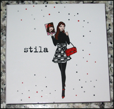
Makeup Museum Stila Girl Exhibition

I'm so very excited to announce the Makeup Museum's special exhibition in honor of Stila's 25th anniversary!  I was too overwhelmed to do a full history of the brand, so I decided to just focus on the famous Stila girl illustrations.  If you've been following me for a while you know that the Stila girls were sort of the gateway drug for my interest in collecting makeup and seeing cosmetics packaging as art.  For such a milestone anniversary I knew I wanted to pay tribute to them, even though the year is almost over (thankfully – it's been miserable for a number of reasons), especially given that I've been itching to put together a special exhibition for them since at least 2016.  I also wanted to try something totally new for the Museum in terms of exhibitions.  Technically all of them are online, but instead of putting things on shelves and taking photos, I wanted it to have a more "real" online exhibition feel.  I've been doing a lot of thinking the past year or so about how to improve the exhibitions even though I'm so limited in what I can do, and I was really inspired by the Kanebo Compact Museum website, and once the husband showed me Squarespace I was sold.  Well that, and the fact that he kindly offered to design the entire exhibition site for me.  ;)  So I set up a domain there which, if this exhibition is well-received, will serve as the space for the Museum's special exhibitions going forward.  The seasonal ones will remain here if I decide to keep going with them.  Looking ahead, I think I'd rather focus on more specific topics than general seasonal trends.  Not that I can delve too deeply into particular themes given the never-ending lack of resources, but I still want to at least try to do slightly more in-depth exhibitions even though they won't be exactly how I want them.  I'm looking at them as a starting point for bigger things.

Enough of my blabbing about the basic stuff, I want to give some more details about the exhibition itself.  It came together nicely, or at least, it was the one I worked most on with the possible exception of Sweet Tooth (still want to revisit that one!)  I really wanted to get interviews with the key people behind the illustrations, so I put my crippling fear of rejection aside and boldly contacted Jeffrey Fulvimari (Stila's original illustrator), Caitlin Dinkins (illustrator during Stila's early aughts heyday) and Naoko Matsunaga (who took over for Dinkins in 2009).  While I was disappointed at not hearing back from two of the three, if only one responded, I was glad it was Jeffrey since I've been following him for a while on Instagram and I love his approach to art and his personality.  He is quite the character!  It ended up giving me so much confidence I reached out to the grand poobah herself and my curatorship namesake, Jeanine Lobell.  Yes, I actually DM'ed the founder of Stila on Instagram and asked if she'd be up for an interview.  And…and…are you sitting down??  You really need to.  Okay, now that you're sitting and won't have far to fall in case you faint, I can tell you that she agreed to do it!! 

Screenshot of DM

Not only that, she actually answered all of my interview questions!!  You have no idea how ecstatic I was to finally be heard by a major industry figure.  Took over a decade but I finally made contact with a big name!  So that was most exciting, easily one of the most exciting things to happen in the Museum's 11-year history.  And her answers were really good too, I've incorporated them throughout the exhibition so make sure to read through.

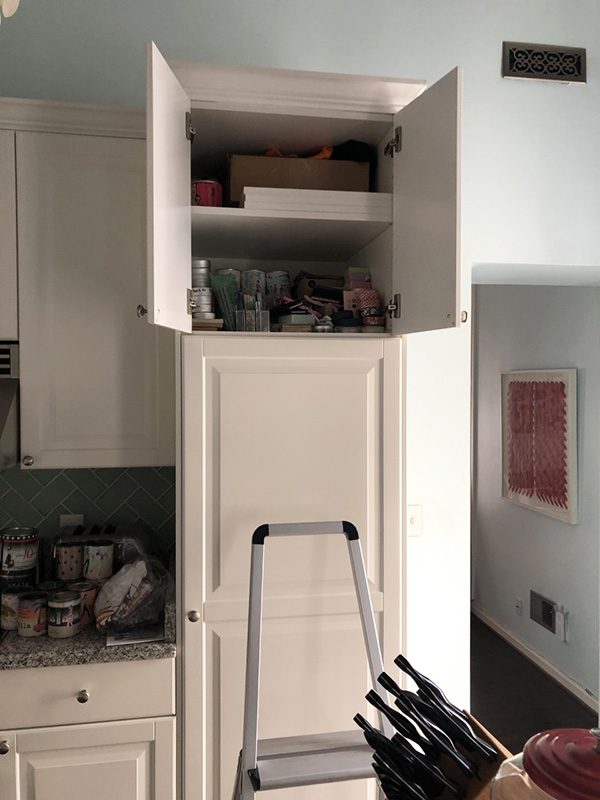
As for the items, I didn't take photos of everything in my collection because again, too overwhelming.  The Museum has over 130 Stila items, nearly all of which feature the girls.  I mean…

Makeup Museum - Stila storage

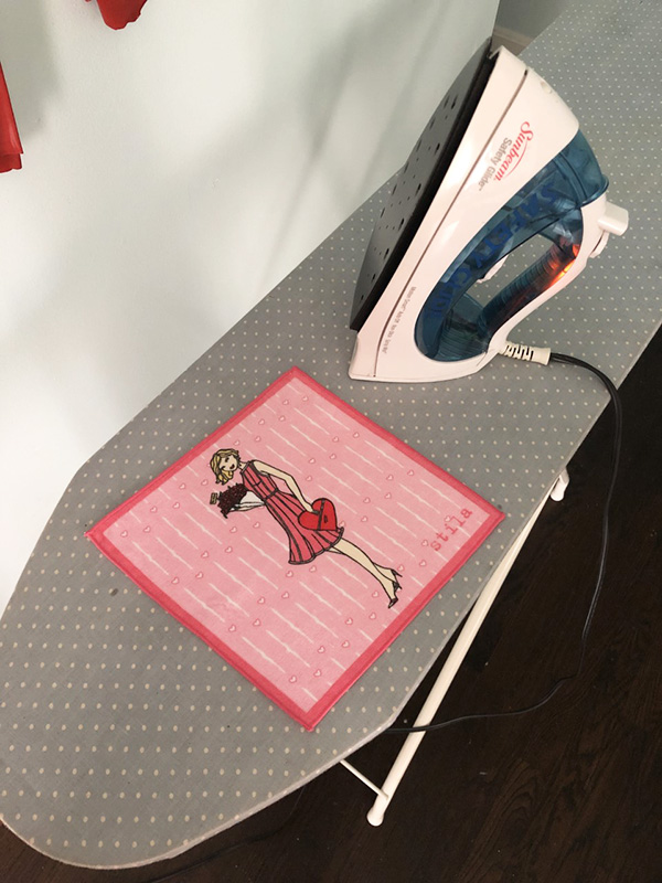
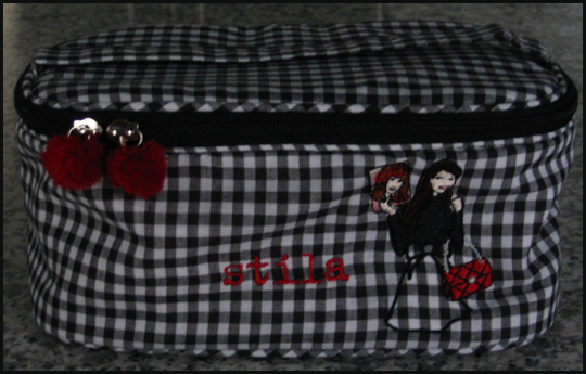
The photos I did take have purposely plain backgrounds because I wanted the emphasis to be on the illustrations.  I tried to have a good mix of memorabilia and the makeup itself.  I even had to iron a few items.

Makeup Museum - Stila memorabilia

I also included a couple photos of things that I don't actually own but are important in getting a full picture (haha) of the illustrations. I'm pleased with how the sections are arranged, and I must thank my husband for organizing them so perfectly in addition to designing the whole site.  I'm thinking of adding a section called Soundbites, a repository of quotes from the both the beauty community and general public telling me why they like the Stila girls or really anything related to the brand, so be sure to email me or comment here.  I really wish I could have an app that would "Stila girl-ize" the user, i.e. you upload a picture of yourself and it would automatically generate a Stila girl style illustration of you, just like this.  And of course, if the Museum occupied a physical space I'd definitely hire an artist to do live drawings at the exhibition opening – how fun would that be?

So that about wraps it up!  Please take a look and tell me what you think of the new exhibition format

I was originally going to write a meatier post about the history of tanning that included sunless tanning, but there's actually been plenty of research already.  Rather than essentially re-writing what's already out there I decided to go the more visual route and show ads for products promising to give you that sun-kissed glow for both face and body.  I will include some history and links throughout, but mostly this is a way for me to share my never-ending obsession with vintage beauty ads.  :) 

Prior to the early 1920s, having tawny, sun-drenched skin simply wasn't desirable – at least for women.  Fair complexions were associated with the leisure class, while tan skin indicated a lower social status (i.e. people who had to work outdoors).  While the beauty industry was in its infancy, there were still plenty of products, such as this Tan No More powder, that promoted the pale skin ideal. 

Ad for Tan No More, 1924(image from library.duke.edu)

Just five short years later, however, the tan tide had turned.  Coco Chanel is credited by many historians as the one responsible for making the bronzed look stylish following a cruise she took in 1923, essentially reversing the significance of pale vs. tan complexions (i.e., tans were now associated with having the time and money for a luxury vacation in a sunny paradise, as well as good health.)  By 1929 products were on the market to achieve the glowing effect on the skin without the need to travel to some far-flung destination, such as this Marie Earle "Sunburn" line of makeup.  (Cosmetics and Skin has an excellent history of this company.  While not much is known about the founders, the Marie Earle line had some fairly innovative, if ineffective products, like breast-firming cream and eye masks.)

Marie Earle ad, 1929
(image from library.duke.edu)

Interestingly, in 1928 Marie Earle was bought by Coty, so it's probably not a coincidence that Coty released their Coty Tan bronzing powder and body makeup a year later.

CotyTan ad, 1929

CotyTan ad, 1929(images from cosmeticsandskin.com and library.duke.edu) 

The 1940s saw an increase in the number of bronzers and tanning body makeup, the latter influenced partially by the shortage of nylon stockings during World War II – women resorted to painting their legs with makeup or staining them with a tea-based concoction to create the illusion of stockings.  Always looking to sell more products, companies soon began offering tinted body makeup to mimic a natural tan.

Ad for Paul Duval Safari Tan, 1941(image from pinterest.com) 

Ad for Paul Duval Safari Tan, 1946(image from ebay.com)

Um…would you like a side of racism with your liquid body bronzer?

Elizabeth Arden ad, 1941(image from library.duke.edu)

Ad for Elizabeth Arden Velva Leg Film, 1946
(image from Found in Mom's Basement)

Elizabeth Arden ad, 1948(image from ebay.com)

By the late '40s cosmetics companies made sure women could also artificially tan their faces, as a slew of bronzing powders entered the market.  I couldn't resist purchasing a few of these ads.

Ad for Lady Esther Malibu Tan face powder, 1947

Ad for Lady Esther Malibu Tan face powder, 1947

Ad for Lady Esther Malibu Tan face powder, 1947

Ad for Lady Esther Malibu Tan face powder, 1947

Ad for Pond's Bronze Angel Face powder, 1948

Ad for Pond's Bronze Angel Face powder, 1951
(image from pinterest.com)
 

Ad for Woodbury Tropic Tan, 1949

Here's a detailed shot so you can see the ad copy…and gratuitous cleavage.  LOL.

Ad for Woodbury Tropic Tan, 1949

Ad for Woodbury Tropic Tan ad, 1951
(image from pinterest.com)

And more casual racism from Germaine Monteil. 

Ad for Germaine Monteil, 1947

Ad for Germaine Monteil, 1950(image from ebay.com)

Once again, I fell victim to the idea that a beauty product has only been around for a few decades.  But it looks like spray tans have been around since at least the mid-50s!

Guerlain Misty Tan ad
(image from fashion.telegraph.co.uk)

Spray tan ad, 1955(image from Found in Mom's Basement)

In the late 1950s Man Tan sunless tanning lotion – or what we call self-tanner more commonly these days – debuted, featuring a new way of getting tan without the sun.  Instead of traditional tinted makeup that merely covered the skin, Man Tan used an ingredient known as dihydroxyacetone (DHA), which works on the amino acids on the skin's surface to gradually darken its color.  It sounds like a harmful, scary process that relies on synthetic chemicals, but DHA is actually derived from sugar cane and is still used in most self-tanners today.* 

Man Tan ad, ca. late 1950s

Miss Man Tan ad, ca. late 1950s
(images from twitter and pinterest)

In 1960 Coppertone introduced QT, short for Quick Tan, and many others followed.  The poor models in these ads already look orange – I shudder to think of how carrot-like you'd be in person.

Ad for Coppertone QT, 1961(image from ebay.com)

Ad for Coppertone QT, 1966(image from pinterest.com)

You MUST watch these commercials, they're a hoot!


In addition to bronzers, around this time companies were also launching color campaigns specifically for tanned skin.  These shades aren't so different from the ones we see in today's summer makeup collections – warm, beige and bronze tones abound.  Both Max Factor's Breezy Peach and 3 Little Bares (get it?!) were seemingly created to complement a tawny complexion, while Clairol's powder duos and Corn Silk's Tan Fans line offered bronzer and blush together to artificially prolong and enhance a natural tan.

Ad for Max Factor Breezy Peach, 1962(image from pinterest.com) 

Ad for Max Factor 3 Little Bares, 1965
(image from pinterest.com) 

Clairol Soft-Blush Duo ad, 1967

Ad for Corn Silk Tan Fans, 1969(image from pinterest.com)

Meanwhile, Dorothy Gray had tan-flattering lip colors covered.  This was not new territory for them, as this 1936 ad referenced a new "smart lipstick to accent sun-tan".  In any case, the 1965 ad is also notable for the yellow lipstick all the way on right, which was meant to brighten another lip color when layered underneath…over 50 years before Estée Edit's Lip Flip and YSL's Undercoat.

Dorothy Gray ad, 1965(image from mid-centurylove.tumblr.com)

The tanning craze wasn't going anywhere soon, as various self-tanning and bronzer formulas for body and face continued to be produced from the '70s onward.  As skin cancer rates rose, there was also an uptick in the number of ads that emphasized protection from the sun over the convenience angle (i.e., the ability to get a tan in just a few hours and no matter the climate) – self-tanners started to be marketed more heavily as a healthy alternative to a real tan.

When it launched around 2004, I thought Stila's Sun Gel was such an innovative product.  Little did I know Almay had done it roughly 30 years prior.

Almay sun gel 1970(image from flickr.com) 

Bain de Soleil ad, 1983

Tried though I did, I was unable to find a vintage ad for Guerlain's legendary Terracotta bronzer, which debuted in 1984.  So I had to settle for these Revlon ads from the same year.

Revlon-pure-radiance-80s

Ad for Revlon Pure Radiance, 1984(images from pinterest and adsausage.com)

Bain de Soleil ad, 1990
(image from Found in Mom's Basement)

Chanel Soleil ad, 1990
(image from pinterest.com)

Estée Lauder self-tanner ad, 1991

Estée Lauder self-tanner ad, 1991(image from fuckyeahnostalgicbeauty)

I searched all the '90s magazines in the Museum's archives, but realized almost all of them were March, September or October issues, so I couldn't unearth any fake tan ads for most of the decade.  I did have better luck with finding ads online and in the Museum's archives for the 2000's, however.  It makes sense as I had started collecting by then, not to mention that the early-mid aughts were the Gisele Bundchen/Paris Hilton era so fake tanning was at its peak.  I just remembered that I neglected to check my old Sephora catalogs…I'll have to see if I can locate any photos of Scott Barnes' Body Bling, another hugely popular product in the 2000's.

Lancome Star Bronzer ad, 2003

Neutrogena ad, 2003(images from reed.edu)

Here are the ones from the Museum's collection.  Thanks to the husband for scanning them!

Armani Bronze Mania ad, 2005

MAC Sundressing postcard, 2006

Love this Armani ad, which coincidentally came out the same year Mystic Tan spray booths were launched.

Armani Bronze Mania ad, 2007

YSL summer beauty postcard, 2008

Benefit summer 2010 catalog

As the decade came to a close, there was some discussion as to whether tanned skin, real or fake, was passé.  But the continuing growth of the self-tanning market (as well as the influence of the bronzed Jersey Shore cast) showed that the infatuation with tanning wasn't slowing down.  The Paris Hilton era segued seamlessly into the Kardashian age, which also contributed to the popularity of the bronzed look.  Companies are still trying to keep up with the demand for bronzers and self-tanners.  For the past 5 years or so, Estée Lauder, Lancome, Clarins, Guerlain and Givenchy have released new bronzing compacts at the start of the summer, and just this past year Hourglass and Becca released a range of new bronzing powders.  Meanwhile, established products like Benefit's Hoola bronzer and St. Tropez's self-tanning line are being tweaked and expanded.

In terms of advertising bronzers and self-tanners, I think cosmetics companies do a damn good job.  The products themselves certainly look tempting, but one also can't deny the sex appeal of the glowy, bronzey look of the models (not to mention that a tan makes everyone look like they lost 10 lbs).  Who doesn't want to resemble a sunkissed goddess lounging about in a tropical paradise?  It's largely this reason, I think, that the tan aesthetic persists.  As usual, Autumn Whitefield-Madrano offers an insightful exploration of why tawny skin continues to be in vogue so rather than me rambling further I highly encourage you to read it in full.  As for me, well, I've largely given up on self-tanning.  It was messy, came out uneven no matter how much I exfoliated and how carefully I applied it, and still didn't look quite like the real deal.  I do, however, still use bronzer once in a while (mostly as blush, but occasionally in the summer I'll dust it all over my face) and have been tinkering with temporary wash-off body bronzers.  I don't consider bronzer a staple by any means – most days I fully embrace my pasty self – but the fact that I own 6 of them is proof of the long-standing allure of the tan and how effectively the products required to achieve it are marketed.

What do you think?  Which of these ads are your favorite?  And are you down with the tanned look or no? 


*Recent research has shown DHA to be safe for topical use; however, inhaling it, say, from a spray tan booth, is less safe.

Save

A few years back I explored makeup that visually resembled sweets.  But what about makeup that actually smells like desserts and other foods?  Sure, bath and body products and skincare items with foodie aromas have been popular for years, but I found it interesting that color products, i.e. items worn on the face that usually aren't scented at all or with the typical floral/herbal scents, are being made to smell like chocolate and other edible delights.  So let's take a look at when this phenomenon started and where it's headed.

The earliest evidence of flavored/scented makeup that I could find is from the late '1930s.  I'm not sure whether these lipsticks were eventually released for sale or even what brand they were, but here are some happy ladies testing them in the May 1939 issue of Popular Science.

Flavored lipstick 1939(image from blog.modernmechanix.com)

Roughly a decade later Harriet Hubbard Ayer released a clove-flavored lipstick. 

Harriet Hubbard Ayer ad,

It was followed by this mint-rose scented lipstick in 1951.

Harriet Hubbard Ayer ad, 1951
(images from ebay.com)

Slightly less sophisticated but extraordinarily popular among the teenage crowd, fruit-scented lip products really took off in the early '60s.  Cutex claims to be the first company to offer fruit-flavored lipsticks in this 1964 ad.  (You might remember this from my fruity ad round-up.)

1964 Cutex ad(image from buzzfeed.com)

Soon after, in 1971, Yardley jumped on the fruit-scented lipstick bandwagon. I also remembered this one from the fruit ad post.

Yardley ad, 1971

And in 1972, the company expanded the Lip Licks line to include dessert-inspired flavors (you might remember this ad from the Sweet Tooth exhibition.)

Yardley ad, 1972(image from flickr.com)

The foody-scented lip balm craze reached new heights in 1973, when a company named Bonne Bell introduced their Lip Smackers flavored balm.  Starting with just 3 flavors, (strawberry, green apple and lemon), the company debuted their Dr. Pepper-scented balm in 1975, and soon Lip Smackers became a staple for tweens and teens everywhere.  By 2012 the company offered 400 flavors worldwide.  (Bonne Bell was purchased by Markwins in 2015, a company that still produces Lip Smackers today sans the Bonne Bell name).

Bonne Bell ad, 1979(image from oldadvertising.blogspot.com)

Avon wanted in on the action, as evidenced by these dessert-flavored balms that were released throughout the '70s and '80s.  (I'm not sure exactly who these were being marketed to – I imagine it was mostly kids, but maybe some teenagers and adults bought them too.)

Vintage Avon Hershey's Kiss balm

Vintage Avon cookie gloss

Vintage Avon lip pomade
(images from etsy.com)

Thanks in large part to the enormously popular Lip Smackers line, other companies proceeded to try to get a piece of the teenage demographic by cranking out flavored lip products through the '80s. 

Maybelline ad, 1980
(image from liketotally80s.com)

By the early aughts, products like Philosophy's Lip Shines and On 10's vintage-inspired lip balm tins came in more upscale, less teenybopper-esque packaging and at a higher price point to appeal to a more grown-up crowd, but retained a few of the same scents as the inexpensive likes of Bonne Bell.  In 2004 Tinte Cosmetics revived popular flavored balms that were known as "Lip Lickers" and produced by a Minnesota-based company from 1977 through 2002.  In an effort to appeal to older women's nostalgic side, Tinte retained both the original sliding tin packaging and graphics.  The food-scented balm market started to achieve full saturation around this time, especially when a company named Lotta Luv began partnering with big food and beverage companies like Hershey's, Pepsi, and Dairy Queen, along with a variety of other well-known snack, candy, cereal, and chewing gum brands.  Novelty companies offering their own crazy food flavored balms soon sprung up afterwards.  By 2012 one could find balms flavored in foods ranging from Cheetos and beer to pickles and corn dogs

My hypothesis is that since foodie lip balms had officially jumped the shark with all these wacky flavors, coupled with the fact that makeup companies were only including lip balms among their scented cosmetic offerings, makeup brands had to get more creative when it came to adding fragrance to their products.  No longer were clear lip balms enough – it was time to branch out into face and eye products, along with lip products that actually contained color.  Chocolate and other desserts were still the reining favorites.  But items like Stila Lip Glazes and Becca Beach Tints, both of which offered a variety of fruity scents, as well as Benefit's peach-scented Georgia blush, also proved popular.  Some items unintentionally offered a subtle food aroma as a natural byproduct of the ingredients used, such as Bourjois's and Too-Faced's cocoa-powder based bronzers and 100% Pure's fruit-pigmented makeup line. 

Food-scented makeup, '90s and early aughts

  1. Bourjois Bronzing Powder, 2006
  2. Benefit Georgia blush, 2004*
  3. MAC Lip Glass Tastis, 2004*
  4. 100% Pure Fruit-Pigmented Mascara, ca. 2007
  5. Urban Decay XXX Slick in Cocoa, 2004*
  6. Becca Beach Tint, ca. 2006
  7. Benefit SugarBomb blush, 2009
  8. Stila Lip Glaze, ca. 1999
  9. Jane Iredale Chocoholicks lip palette, ca. 2009
  10. Too-Faced Soleil Matte Bronzer, 2009

By 2012, foodie-smelling products were becoming less novel and more expected, but this familiarity among consumers didn't seem to diminish their popularity; even chocolate-scented makeup bags made an appearance.  Additionally, as Asian brands became more visible and available to the Western world, sales of their chocolate-scented products took off as well.

Foody-scented makeup highlights, 2012-2014

  1. DuWop Haute Chocolate Lip Venom, 2014
  2. Too-Faced Chocolate Bar palette, spring 2014
  3. Love Switch Pink Brown mascara, 2012
  4. Holika Holika Dessert Time Lip Balms, 2012
  5. Etude House Chocolate Eyes, spring 2013 (it should look familiar, as it was a key exhibition piece)
  6. Makeup Revolution Death by Chocolate palette, 2014
  7. Skin Food Choco Eyebrow Powder Cake, 2013
  8. Rimmel Chocolate Sweet Eyes, 2014

Face products weren't the only ones getting the food scent treatment, however.  While scented nail polishes were previously the sole domain of children, nail companies soon seized on the demand among adults for these products.  From Color Club's Pumpkin Spice Latte scented polish to Butter London's berry-scented polish remover, fingernails were now able to join in on the foodie fun.  Whether it was partially Dior's rose-scented polishes from their spring 2012 collection or the influence of Rosalyn Rosenfeld's (played by Jennifer Lawrence) vivid description of a nail polish top coat's odor in the 2013 film American Hustle, scented nail products rose to prominence in the past 5 years.  And the most popular ones smell not "like flowers, but with garbage"; rather, foodie polishes prove to be the best sellers.

Scented nail products

  1. Butter London polish remover trio, 2012 (I REALLY miss those Butter London polish removers – they were the best!!  They smelled great and worked even better.  They had another limited edition set that contained a pina colada-scented remover called Beach Bum, which I loved.)
  2. Ad for Mattese Happy Hour cocktail-scented polishes – if you can't make it out, the scents were Apple Martini, Shirley Temple, Hypnotic, Tequila Sunrise, Cosmopolitan, and Purple Passion.
  3. Ciaté Mint Choc Pot, 2015 (I think the Choc Pots are the reincarnation of Ciaté's previous foray into scented polish removers, which sucked – I wonder if the Choc Pots are any better).
  4. L.A. Colors Melon nail polish remover pads, ca. 2011
  5. Model's Own Sweet Shop Fizzy Cola Bottles, 2014 (the Sweet Shop collection is a follow up to Model's Own popular Fruit Pastel collection released the previous year)
  6. Sally Girl Vanilla scented polish, holiday 2014
  7. Revlon Parfumerie scented polish, 2013
  8. Color Club Pumpkin Spice Latte polish, ca. 2011 (this company has also released holiday-themed scented polishes)

Companies continue the foodie fad today.  Too-Faced is leading the way with a whopping 5 new food-scented products in their spring/summer 2016 lineup.  Japanese brands Lunasol and RMK both offered sweet-scented items in 2015, while Etude House built on their previous dessert-y releases with their Give Me Chocolate spring 2015 collection, a gingerbread cookie scented bronzer in their holiday 2015 collection, and strawberry-scented cream blushes and nail polishes for their spring 2016 collection.  Finally, this spring Physician's Formula gets tropical with a coconut-scented bronzer.

Foody makeup 2015-2016

  1. Etude House Give Me Chocolate collection, spring 2015
  2. Lunasol Selection de Chocolat eyes, fall 2015
  3. Too-Faced Peach palette, spring/summer 2016
  4. Too-Faced Chocolate Bon Bons palette, winter/spring 2016
  5. Etude House Berry Delicious Cream Blush, spring 2016
  6. RMK Vintage Sweets collection lip glosses (flavors included Maple Syrup and Butterscotch), spring 2015
  7. Too-Faced Peanut Butter and Jelly palette, spring 2016
  8. Physician's Formula Butter Bronzer, spring 2016
  9. Too-Faced Semi-Sweet Chocolate Bar palette, spring 2015
  10. Lunasol Melty Chocolat lip glosses, fall 2015
  11. Too-Faced Melted Chocolate liquid lipsticks, spring 2016
  12. Etude House Gingerbread Cookie Contour Maker, holiday 2015

So, my questions are why companies are continuing to produce food-scented makeup, why we're buying it, and the significance of these items.  There's the obvious need among makeup brands to offer novel products, plus the desire to capitalize on the success of foodie bath and body lines.  Food-scented makeup is a natural expansion of the dessert-scented beauty product craze.  There's also the tactic of engaging the sense of smell as well as sight (shiny makeup in pretty colors) and touch (texture is key when creating an attractive makeup product – people love dipping their fingers in testers).  Appealing to 3 senses instead of two might make consumers more likely to buy the product.  Why simply wear a buttery-soft, chocolate-colored eye shadow when your lids could also smell like it? 

More generally, I suppose the same basic reasoning behind the allure of dessert-smelling bath and body items applies to cosmetics.  I touched briefly on why women may want to smell like chocolate, cake or other food previously in this post and in the Sweet Tooth exhibition, and there have been plenty of news articles, but the most articulate and comprehensive exploration of the topic comes from Autumn of The Beheld.  Her points regarding dessert-inspired beauty products, such as the negative implications of marketing of sweet-smelling products to grown women and the remarkable appeal they continue to maintain, carry over to food-scented makeup.  She writes, "Foodie beauty products are designed to serve as a panacea for women today: Yes’m, in the world we’ve created you have fewer management opportunities, the state can hold court in your uterus, there’s no law granting paid maternal leave in the most powerful nation on the planet, and you’re eight times more likely to be killed by your spouse than you would be if you were a man, but don’t worry, ladies, there’s chocolate body wash!…[foodie products] do smell good, after all; that’s the whole point. And they trigger something that on its face seems harmless: Part of their appeal lies in how they transport us back to an age when all we needed to be soothed was a cupcake. At the same time, they don’t actually transport us to being that age; they transport us to a simulacrum of it."  Indeed, nostalgia can be a tricky thing to navigate in this context. As with kids-themed cosmetics from brands that primarily sell to adult women, the notion of foodie makeup could be seen as an infantilizing pacifier meant to placate and distract women from serious societal issues. 

Another aspect to consider is the advertising for these products.  Today's foodie makeup isn't advertised the same way as their predecessors, who suggest these products are a good way to snag a guy.  "Could you ask for a newer, cooler way to collect men?" asks the Cutex ad.  "Kiss him in his favorite flavor," says Yardley.  (Side note: the notion of making a guy think of his grandmother while kissing is really bizarre to me, and I'm not the only one.)  "Promise Roger your strawberry kisses," implores Maybelline.  Heck, the product is even named Kissing Potion!

While the insinuation of catching a man isn't present in the vast majority of contemporary makeup ads, the idea is still vaguely floating around when it comes to food-scented items.  A reviewer for Too-Faced Chocolate Soleil bronzer titles her review, "Even my boyfriend loves the smell."  And the model for Switch's Pink Brown mascara remarks, "You can feel the chocolate scent from my lushes! [sic]  And I love it when the scent flows as your face getting close to your boyfriend, like when kissing."  (The translation wasn't great but you get the gist.)  The notion of luring a guy with a scrumptious dessert scent certainly isn't unique to makeup, but it's slightly different.  Unlike bath and body products or perfumes, one has to be up close to get a whiff of a flavored balm or cocoa bronzer.

But this fact is also why one could argue that people who wear these items are only doing it for themselves, and that we may be reading too much into these: perhaps they really are just food-scented makeup and nothing more.  Like Autumn, ultimately I don't see anything wrong with enjoying makeup that smells like fruit or chocolate or any other food.  She notes, "[Sometimes] a candy cigar is just a candy cigar…I don’t want to imply that any of us should stop using lemon cookie body souffle or toss out our Lip Smackers—joy can be hard enough to come by plenty of days, and if it comes in a yummy-smelling jar, well, that’s reliable enough for me not to turn my nose up at, eh?"  Speaking from personal experience, I loved Benefit's Georgia – something about having my cheeks smell faintly like peach was incredibly fun – but I can tell you I didn't consider, not for a second, my then boyfriend's (now husband) reaction to how my face smelled.  At the moment I'm tempted by Too-Faced's Peanut Butter and Jelly palette because not only is the smiley pb & j face ridiculously cute, the palette is scented with peanuts.  That is a fragrance I haven't seen in eye shadow before; the sheer novelty of it brings a smile to my face.  I'm not even a palette person, but the idea of inhaling a light peanut aroma while applying eye shadow is the aspect that makes me want to buy it.  I imagine that for most women, it's not about getting close to a significant other, it's about the multi-sensory pleasure you experience when applying these products.  I'd say that given how subtle and ephemeral the scents in foodie makeup are, they're actually intended to be enjoyed at a personal, individual level rather than something to be shared.  As one reviewer for Revlon's Parfumerie nail polish notes, "It's funny because you forget about it, and then I guess I don't realize how many times a day I touch my face, because I keep getting a whiff of it, and each time I'm totally surprised!”  Overall, no matter what makeup companies have in mind when creating these products, I think it's okay to perceive them simply as brief, fleeting pick-me-ups rather than as ways to entrapping a man or treating grown woman like children.  Of course it's a subject worth questioning and we must continue to be mindful of how makeup is marketed, but no one should feel bad for liking chocolate-scented mascara or nail polish that smells like cookies.

What do you think?  Are you down with food-scented makeup?  This very unscientific 2008 poll says that people are fairly evenly divided on the subject, so I'm curious to hear your thoughts.

*Limited edition/discontinued

At a recent trip to the dermatologist, I asked if there was any treatment that could lighten the freckles I have dotting my face.  Many of my formerly cute, small freckles are quickly becoming larger, unattractive splotches (a.k.a. "age spots") so I thought it would be better to nip them in the bud.  (Of course, I could just buy a bejeweled elephant brooch to distract from them.)  The experience jarred my memory of Lancôme releasing a "freckle pencil" many years ago that would allow one to paint one's face with as many specks as they wished.  With that, I thought I'd look into the history of freckles from a beauty standpoint, starting in the 20th century, with an emphasis on the rise of creating faux freckles with makeup.  I found  that, much like Sgt. Pepper's Lonely Hearts Club Band, they've been going in and out of style (but they're guaranteed to raise a smile).

From the late 19th through the early 20th century, freckles were seen as unsightly blemishes that needed to be banished from the complexion, as demonstrated by this Pond's Vanishing Cream ad from1910.

Ponds
(image from vintageadbrowser.com)

Some ads, like these for a potion known as Othine, were downright harsh – freckles are "homely" and shameful.  These are from 1914 and 1928.

Othine-1914-1928
(images from flickr.com and cosmeticsandskin.com

Perhaps the most well-known freckle antidote was Stillman's Freckle Cream.  Below are ads from 1925 and 1934.

Stillmans-1925-1934
(images from tothetwenties.blogspot.com and flickr.com)

Stillman's continued selling their freckle cream throughout the 20th century and, oddly enough, the company exists today (although they mostly sell an alternative lightening cream to the Middle Eastern market).  Here's an ad from 1956 and a picture of their contemporary freckle cream. 

Stillman-1956-today
(images from cosmeticsandskin.com and facebook.com)

I can't explain exactly how or why a shift occurred in the perception of freckles, but somewhere in the mid to late 20th century they became acceptable and even desirable (see this article for possible reasons).  Perhaps the rise of the tan's popularity was a factor – as early as the 1950s, tans correlated to health and a life of leisure, and a byproduct of spending quality time in the sun is the production of freckles.  By the '90s, freckles were also linked to a more youthful appearance, an association that continues over 20 years later. 

It seems that Chanel was the first company to market a product designed to create faux freckles.  Released in 1995, Le Crayon Rousseur was "part of Chanel's effort to gain a high-fashion profile," according to Chanel's then market development manager Timothy Walcot, who added that "the `little girl' look is quite in. This is intended as a bit of fun."  The instructions that came with the pencil recommended that it be used to "emphasize a light tan" as well. 

Indeed, freckles quickly became a symbol of a carefree summer spent lounging under the sun's rays, as this Lancôme ad from 1995 can attest.

Amber-Valetta-1995
(image from style.com)

Lancôme followed in Chanel's footsteps 8 years later by releasing a Freckle Crayon as part of their summer 2003 collection.  The mind behind the pencil, then artistic director Ross Burton, declared that "freckles are a symbol of freedom".  Instead of trying to hide their spots with several inches of caked-on foundation, women were encouraged to "free" themselves from makeup and embrace their natural skin.  And, of course, they were again associated with a summer vacation:  "The natural, sun-kissed look is set to be big for spring/summer,'' stated a Lancome beauty counter rep.  The company wasn't necessarily trailblazing – freckles had been "in" at least since 2001, when celebrities like Lucy Liu and top models Maggie Rizer and Devon Aoki proudly displayed their spots.

Sephora followed suit some time later, releasing a "My Lovelii Freckles" pencil as part of their now-defunct Piiink line.  In the spring of 2009, makeup artist Charlotte Tilbury used a MAC lip pencil to draw dots on the models' faces for Matthew Williamson's spring 2009 runway show.

MWilliamson-spring-2009
(image from style.com)

Each year since then, faux freckles made an appearance in at least one runway show.  Let's take a look at some examples.

A model right before Rachel Comey's spring 2010 show:

Rachel-comey-ss-2010
(image from lederniercri.it)

Chloe Fall 2011 (also by Charlotte Tilbury):

Chloe-fall-2011-tilbury2
(images from style.com)

The trend grew by 2012, where faux freckles dotted the faces of models at the spring shows for Jeremy Scott, Dsquared, Emmanuel Ungaro, D&G, and Donna Karan. 

Donna Karan, where Tilbury struck again. 

Donna-Karan-spring-2012-2
(images from elle.com)

Dsquared and Emmanuel Ungaro:

Dsquared2-ungaro-2012-spring
(images from makeupforlife.net and beautyeditor.ca)

Jeremy Scott:

Jeremy-Scott-2012
(image from beautylish.tumblr.com)

D&G:

DG-spring-2012-mcgrath
(images from foros.vogue.es)

By 2013, freckles had firmly established their role as an anti-aging strategy.  "According to makeup pro Ruth Crilly, the easiest way to keep your youthful visage is to fake a few freckles," states an article at Refinery29.  Adds Pixiwoo.com makeup artist Sam Chapman, "There’s something youthful and fresh about freckles."  The spring 2013 shows further cemented the trend, with freckles proving especially popular at London Fashion Week (where, notably, Tilbury referred to the MAC pencil she uses to create the freckles as a "youth stick".)

Kinder Aggugini:

Kinder-Aggugini-spring-2013-freckles
(images from elle.com)

Antonio Berardi (the makeup was done by Gucci Westman, who also allegedly painted on fake freckles for both Rag & Bone's spring 2012 and 2013 shows – however, the models' complexions looked totally clear in the pictures I found.)

Antonio-berardi-spring-2013
(images from fashionising.com)

Moschino Cheap and Chic:

Moschino-beauty-spring-2013-freckles
(images from fashionising.com)

Holly Fulton:

Holly-fulton-beauty-spring-2013
(images from makeupforlife.net and thelookbookphilosophy.com)

Pucci Fall 2013:

Emilio-pucci-beauty-fall-2013
(images from fashionising.com)

Lisa Perry Fall 2013 – makeup by Westman (I'm beginning to think both she and Tilbury are a little obsessed with freckles!):

Lisa-Perry-fall-2013
(image from socialvixen.com)

However, the addition of faux freckles isn't solely to give a youthful touch.  At many shows, fake spots served an additional purpose:  giving the overall look a retro twist.  Tilbury cited the styles of Anita Pallenberg and Charlotte Rampling for the slightly '70s look she created at Chloe's fall 2011 show.  For the 2012 D&G show, Pat McGrath said her inspiration came from a '60s style icon:  "The look is all about the girls looking beautiful. We were looking at photos of Talitha Getty…the way she looks with the beautiful eyebrows and the freckles and fabulous eyes and we've done a very modern, fresh version of that."  And MAC makeup artist Andrew Gallimore created a “cool California L.A. 50’s girl with a toasted tan, summer freckles, and a sunblock-neon lip” for Holly Fulton's spring 2013 show.

Meanwhile, Westman referred to several '90s types for her work at various spring 2013 shows.  For Antonio Berardi, she says, "The Antonio Berardi girl is sporty, very clean and fresh…a girl reminiscent of a 90s Helmut Lang girl…we used Brown ColorStay Eyeliner to add freckles which gave the girls a youthful look."  For Rag and Bone, she was inspired by "the iconic supermodels of the 90’s and the great structure of their brows."  She adds, "I kept the makeup very pure, adding just a touch of natural flush to the lips by mixing two lip products together, and I used a brow pencil to create subtle freckles and a dramatic brow to top the whole look off.”  Finally, for Lisa Perry, Westman went further back in time to the '60s: – "I focused on the eyes and went for something retro…I kept the skin simple and natural and created subtle freckles on the nose with a nude pencil."

Despite the popularity of freckles on the runway, there has been some ambivalence in the beauty community as to whether it translates to the real world.  While in May 2013 Refinery29 was touting freckles' seemingly miraculous anti-aging properties, just a year and a half prior they were asking their readers whether they'd embrace the trendThe Gloss asked whether it was even appropriate to try to poach something that occurs naturally in many peoples' skin.  Says the author, "This trend reminds me of my redheaded high school friend who despised bottle redheads, or my glasses-wearing friend’s rancor towards people who wore prescription-less glasses."  As of spring 2013, The Gloss is definitively in the no-fake-freckle camp

Additionally, the fact that makeup companies have not recently seized the opportunity to cash in and re-introduce freckle pencils might point to a dislike of, or perhaps disinterest in, the fake freckle trend.  The lack of freckle pencils on the market could also be in part the result of Tilbury's and Westman's divulgence of the exact products they use to create a speckled effect, which already exist – it would be difficult to convince people to buy a new, specialized product when they can already buy something that would give the same look.  Similarly, there's a wealth of tutorials on how to draw fake freckles using a variety of products, from eyebrow pencils to self-tanner painted on with a tiny brush.

My final thoughts:  Personally, I'm indifferent to natural freckles.  Some people have them, some don't, and I don't think people are more or less attractive because of them.  I never really noticed mine, even, until Lancôme came out with that pencil!  Now that they're getting bigger and starting to take over my face due to ever-advancing age, I'm more aware of them, but overall they're just another part of one's face.  My indifference to real freckles means that I do find it strange that people would want to fake them, as I don't see them as a beauty trend one way or the other.  They just…exist.  Still, the makeup junkie in me can understand fake freckles – theoretically, it's not really much different than partaking in other makeup application.  Why does anyone wear blue eyeshadow or paint their nails?

What do you think of both naturally-occuring freckles and the drawn-on ones seen on the runways?  And what do you think caused the shift in the past 100 years from their perception as ugly blemishes to indicators of youth?  Have you ever or would you paint on some fake specks?

The fall makeup collections are everywhere and the thick September magazine issues bursting with fall fashion are weighing down my mailbox, but it's still sweltering here so I wanted to look at some fun summer-themed items from The Balm.  I like to think of this line as a cross between Too-Faced and Benefit – kitschy, retro and girly.  Created by Marissa Shipman, the brand has a "beauty in five minutes" philosophy, which explains why so many of their products are multi-use, and is meant to be "fun and nostalgic."

Below is Hot Mama (pinky peach blush), Bahama Mama (bronzer) and Cabana Boy (eye shadow/blush):

Balm summer
(photos from sephora.com)
 
I'm not sure if the images are original artwork since I haven't checked these out thoroughly in person, but they would definitely be a worthy addition to the Museum.  :)

File this under "oldies but goodies".  In the summer of 2003 Stila came out with these adorable Italian water-ice inspired eye shadow trios featuring the famous Stila girls outfitted in summer finery. 

Uno, Due and Tre:

IMG_8288

IMG_8290

The colors in each are just as summery and refreshing as a delicious cold water ice on a hot summer day, no?  I do wish Stila would return to this type of palette!