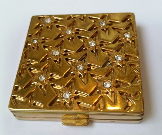
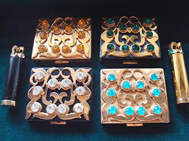
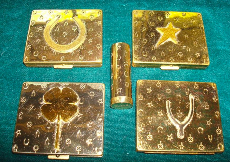
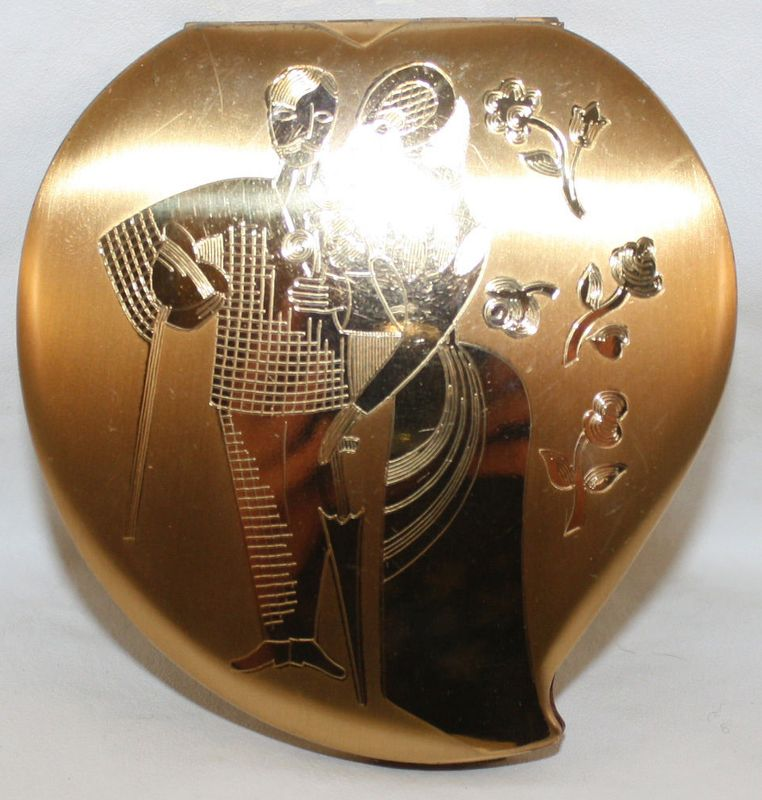
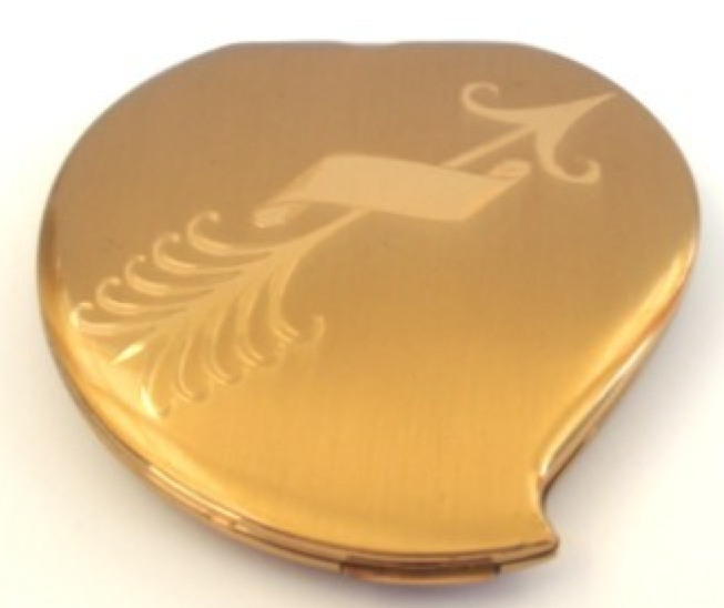
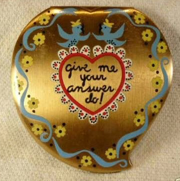
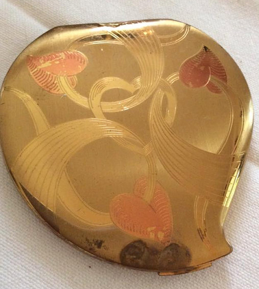
Tiffany? Harry Winston? Fred Leighton? Forget about 'em. While they might be supplying the sparkling baubles for today's red carpet, back in the late '30s and '40s there was a jeweler bigger than those 3 put together: Paul Flato. I'll get to why I'm talking about a jeweler in a sec, but first a brief bio is in order. Paul Flato (1900-1999), moved from his home state of Texas to New York City at the age of 20. He opened his own jewelry store shortly afterwards and employed several designers. By 1937 he had another store on the West Coast to further solidify his status as the go-to jeweler for the biggest Hollywood stars (think Joan Crawford and Katherine Hepburn) as well as a jewelry designer for major films.
Now here's where his story goes off the rails. In 1943 he was arrested for pawning over $100,000 worth of jewels that clients and fellow jewelers had entrusted to him on consignment and served 16 months in Sing Sing. Upon his release from prison he started a lucrative business designing compacts, which was fortunate as his Hollywood career was basically over. After the compacts, Flato continued to design jewelry in the store he opened in Mexico City from 1970-1990, then returned to Texas for the last decade of his life. To my knowledge he never got back into Hollywood's good graces – I couldn't find anything about him supplying jewelry for movies/actresses after 1943 – but it didn't matter since he had already become a legend.
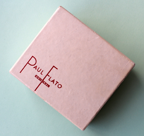
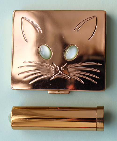
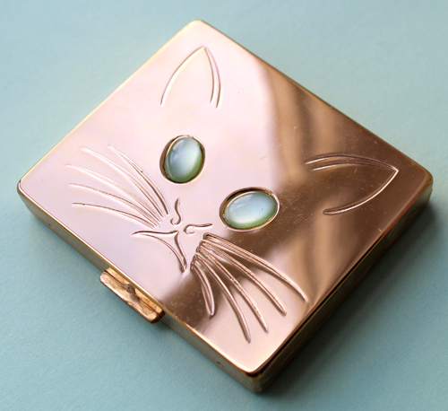
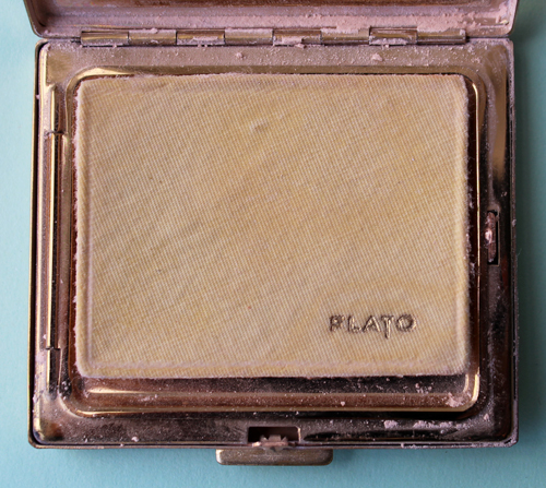
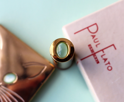
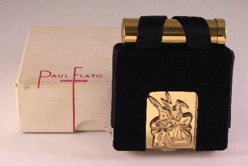
I had seen the Flato brand floating around previously during my various vintage compact hunts and figured one would be a good addition to the Museum's collection, but none of the designs really appealed to me. Since they can be on the pricey side I decided to hold off to see if any really caught my fancy. And as luck would have it this adorable compact and lipstick case, still in the original box, eventually surfaced. Against my better judgement I got involved in a nasty Ebay bidding war, but ultimately won (and probably overpaid a smidge).

Looking back it was totally worth it given how awesome the design is. You may or may not know I have a thing for mint green/jade/bakelite so when I gazed into this kitty's glowing mint green eyes I knew she had to be mine.


Love the matching design on the lipstick case!

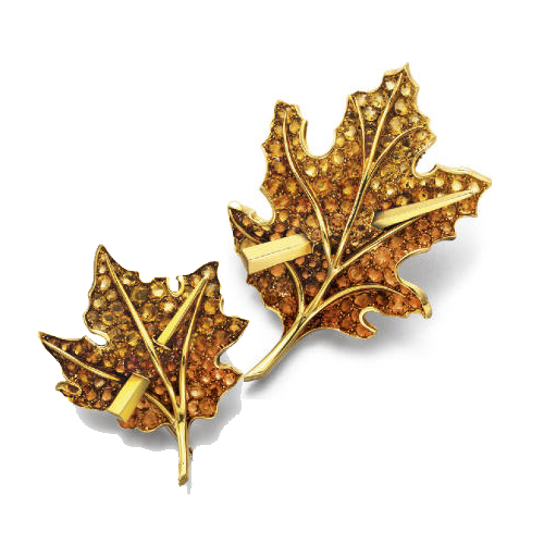
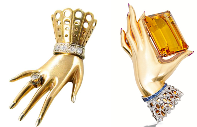
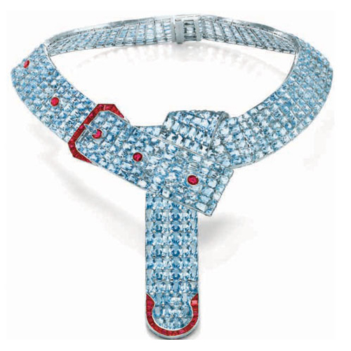
I thought it would be good to discuss Flato's style a little so we can see how it translated to the compacts. I find his pieces to be whimsical and tongue-in-cheek, while still piling on the sparkle. Some examples, according to his obit in the New York Times: "Among them were a diamond 'corset' bracelet, with garters in rubies and diamonds, based on Mae West's undergarment…a compact for Gloria Vanderbilt was studded with gold and enamel angels, including an angel on a chamber pot. A pair of little brooches of gold feet with ruby toenails was originally made for Irene Castle, a play both on her maiden name, Foote, and her dancing career." Flato also drew on everyday experiences and items – his observation of fallen leaves one crisp autumn day turned into this brooch, while a basic belt buckle became a dazzling aquamarine necklace.

(images from langantiques.com)
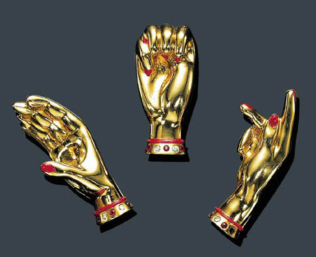
Another prominent motif in Flato's work was hands, according to this site: "Hand imagery had always been of interest to Flato, who notably used antique hand sculptures to display jewelry in ads that appeared in Vogue and Harper’s Bazaar during the 1930s." Here are some quite literal examples.

Not only that, but Flato's own battle with hearing loss at a young age inspired a series of sign language pins.

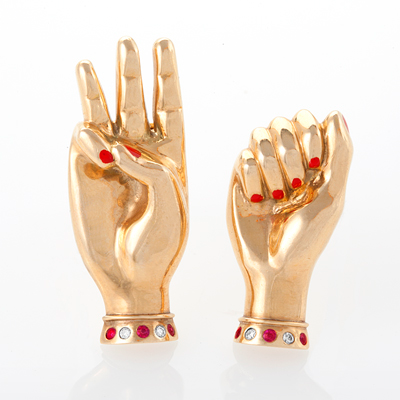
(images from jewelsdujour.com)
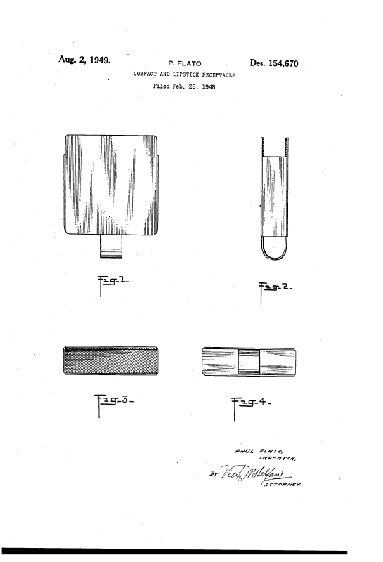
This same playfulness mixed with a healthy dose of sparkle carried over to Flato's compacts. I liked that he created designs that were different from his jewelry line but still maintained his signature style. It looks like Flato filed the patent for the compacts in February 1948 and they were available for sale later that year. Interestingly, this wasn't the first time Flato had the idea to design compacts, as evidenced by this 1940 patent for a compact, cigarette case and lipstick combo.
 (image from google.com)
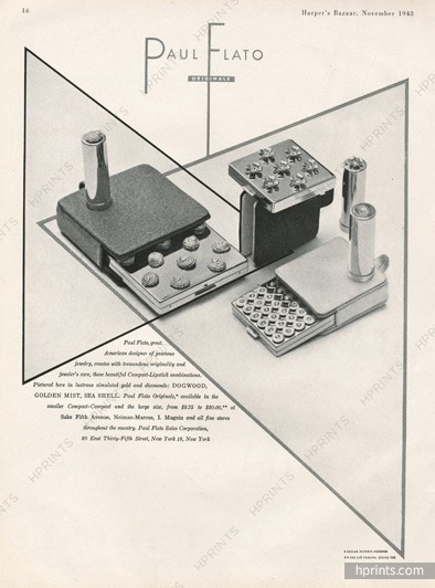
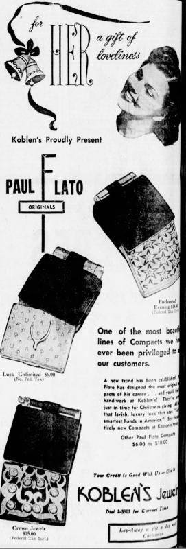
I meant to order this ad from hprints in time for this post and completely spaced on it. Sigh.

(image from hprints.com)
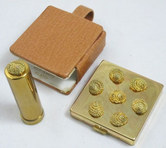
The ones shown in the ad above are fairly common. I wouldn't mind adding the seashell one to my collection. ;) There's also a patent for it too, which is pretty cool.

(image from pinterest.com)
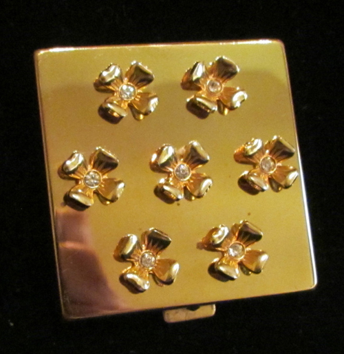
The popular dogwood design:

(image from etsy.com)
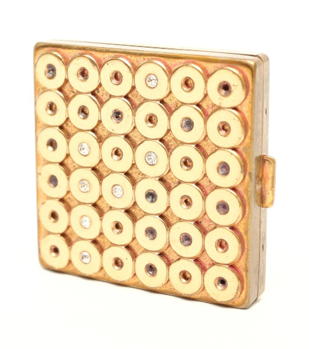
And this circular patterned one.

(image from ebth.com)
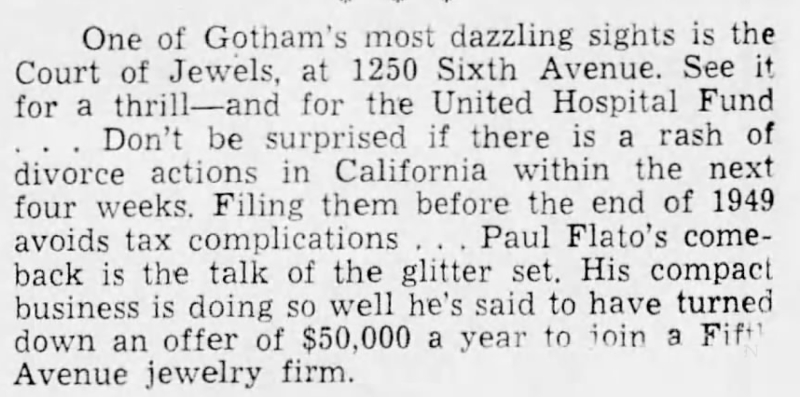
Apparently the compacts were a pretty big hit right away, according to this news snippet from 1949.

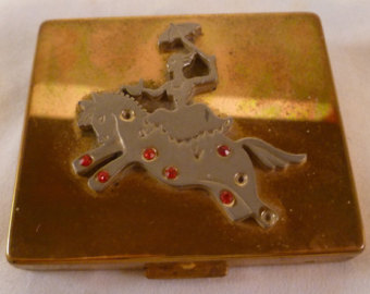
Some more, just for fun.


(image from pinterest.com)


(image from perfumebottles.org)
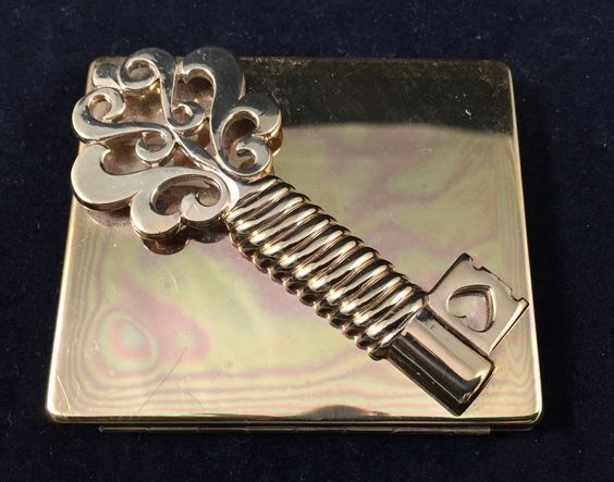
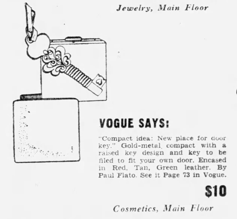
It's not just a key design; it's a key holder! Yes, you could have the key on this compact custom filed to fit your door. Personally I'd be petrified of losing it – my keys need to stay on a ring – but you have to admit there's some innovation there.


(image from pinterest.com)
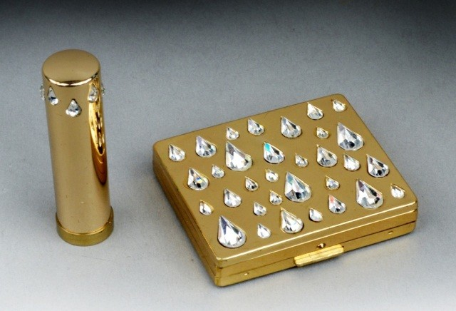
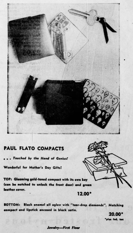
Another key ad, plus the wonderfully blinged-out teardrop design.


(image from liveauctioneers.com)
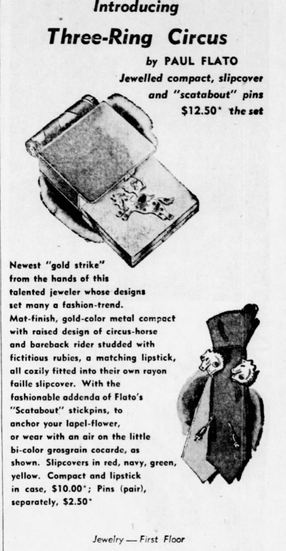
This one definitely shows Flato's sillier side. Would you like one of his "scatabout" pins while you're at it? You know, to anchor your lapel flower? Fashion sure has changed!


(image from etsy.com)
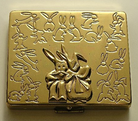
This one is also a lot of fun. I couldn't find any ads for it but I wonder if it was a special release for Easter.


(images from liveauctioneers.com)
The kitty one I have seems to be relatively rare. In my searches I did see one other in a beautiful tiger-eye colorway instead of the green, but I can't seem to find the photo of it now. In any case, I'm pretty pleased with this acquisition as I do think it's one of Flato's better compact designs.
What do you think, both of Flato's jewelry and compacts? Most of them aren't my style but I appreciate them nonetheless. If his jewelry is really striking your fancy you can always buy this lovely catalog of his work.
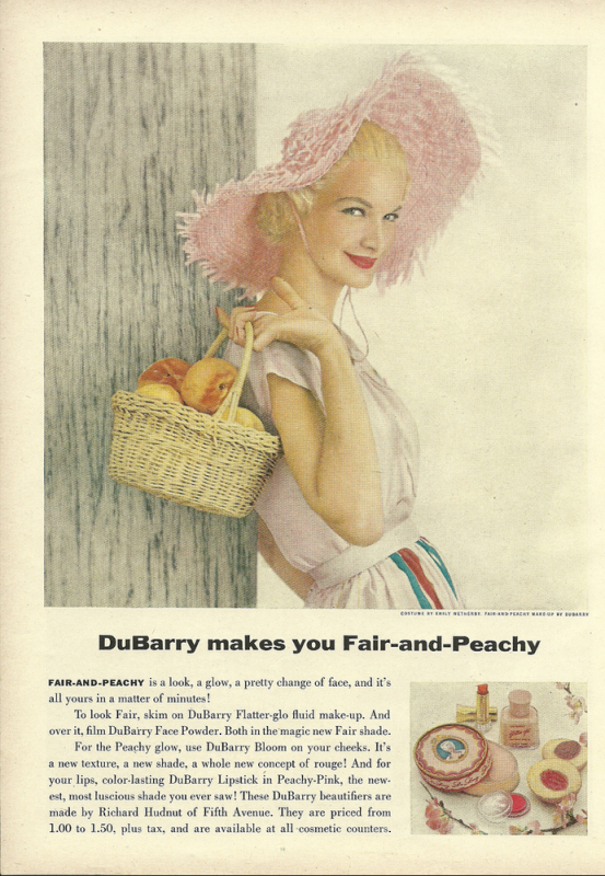
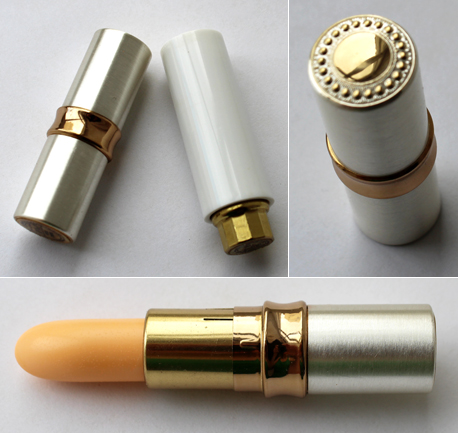
This post is a result of my very kind mother-in-law gifting me some vintage DuBarry items, which she found while cleaning out her deceased mother's belongings. She knew I would appreciate them and give them a good home, and I'm really pleased to have vintage makeup that came from a family member. I'm okay with buying vintage items without knowing anything about who they belonged to, but obviously I feel more of a connection to the object when they come from someone I actually know. Anyway, these items inspired me to learn a little more about the DuBarry line and, of course, purchase some other items so they didn't feel so alone. 😉
I'm not going to rehash the entire history of the line, as both Cosmetics and Skin and Collecting Vintage Compacts have excellent, thorough histories of both DuBarry and Richard Hudnut, the founder of the line (along with many other brands.) The story in a nutshell: DuBarry originally started as a fragrance developed by Hudnut in 1902. In 1929 a makeup and skincare line was spun off the fragrance as an additional revenue source. The line wasn't doing so well by the late 1930s; however, ever the businessman, Hudnut expanded his lucrative "Success School" (a charm school to prepare young debutantes for their coming out events) to include a new DuBarry "Success Course" that borrowed many of the same principles but without the debutante focus. Part fat camp, part beauty and fashion tips, the Success Course earned the company over $4 million in a little over 3 years. Not only was it a major money-maker, the course also helped the DuBarry makeup line gain significant brand recognition. Since the 1960s the company passed through many owners but is still being sold today.
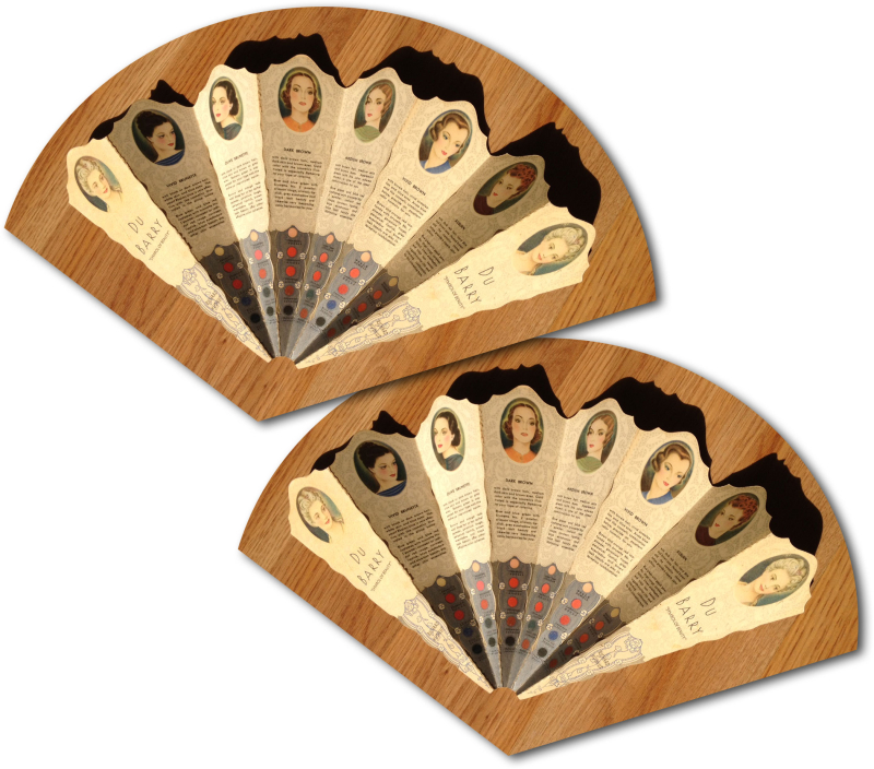
Without further ado, let's take a peek at some notable DuBarry items from their golden age (roughly 1940s-60s). I found this beautiful fan-shaped color guide over at the Baltimore Shoeseum, an online museum that specializes in swing era artifacts. Let's hear it for another Baltimore-based online museum! I'm sort of tempted to call and ask if they'd be willing to deaccession it to me, as I think the Makeup Museum would be a better fit. ;) I think this is from the early '30s.
 (image from baltimoreshoeseum.com)
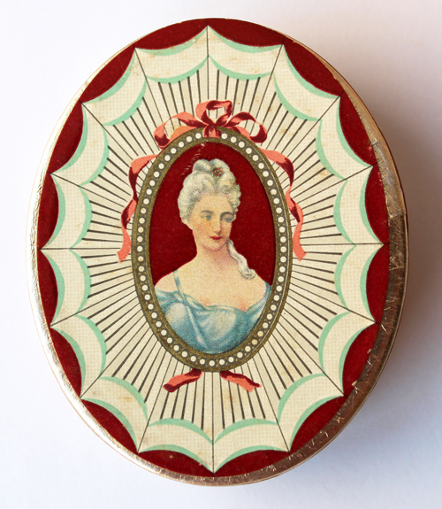
But what DuBarry was particularly known for was the use of an image of Madame du Barry, a.k.a. the last mistress of Louis XV who, along with rival Marie Antoinette, lost her head in 1793. Collecting Vintage Compacts' entry notes that Hudnut named the line after Madame du Barry, but I'm curious to know what the source is on that and why Hudnut chose her. In any case, there is no fabled tale of how Hudnut arrived at using Madame du Barry as inspiration the way there was with Harriet Hubbard Ayer's Madame Recamier skincare. And it shows: the company came up with vague likenesses of Madame du Barry for the product packaging rather than borrowing a real portrait.
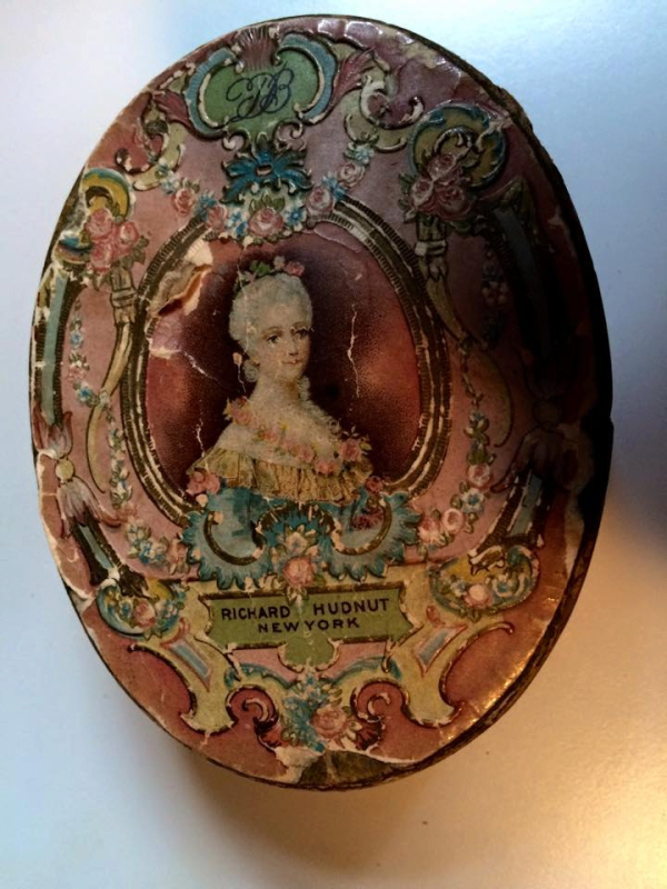
The powder box below looks quite early and also resembles this etching.
 (image from etsy.com)
This box also appears to be very early and is somewhat similar to this portrait. These two boxes are the only ones I've seen with these particular designs, so I wonder if they were samples or prototypes not actually put into mass production.
 (image from etsy.com)
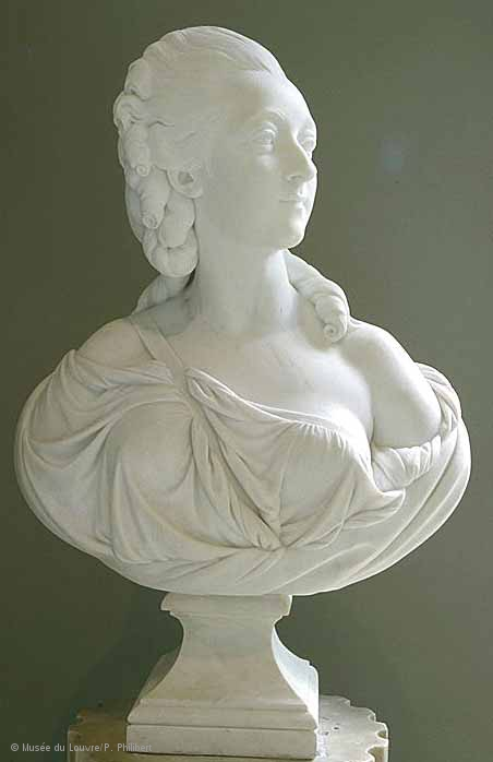
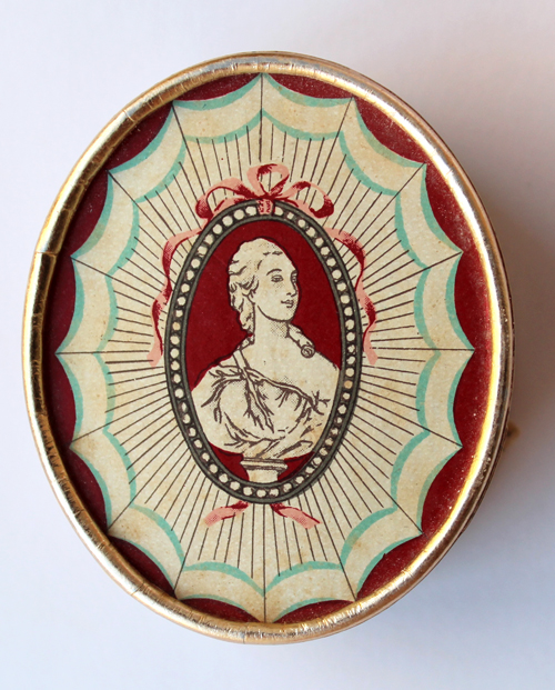
The only exception to DuBarry's lack of faithful reproductions of the Comtesse was a sketch of a sculpture by Augustin Pajou.

(image from louvre.fr)
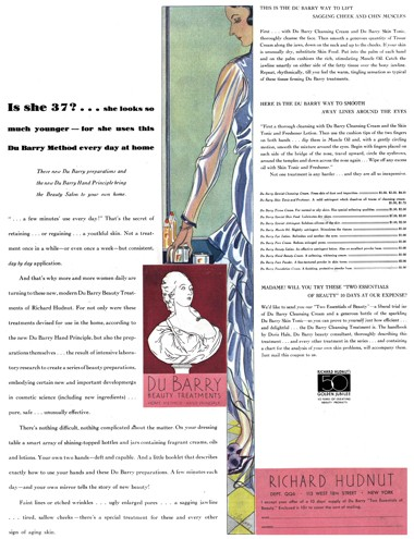
Roughly from the start of the line in 1929, DuBarry utilized a drawing of the sculpture for ads and powder boxes and continued to use it up until the early to mid '40s.

(image from cosmeticsandskin.com)
 (image from library.duke.edu)
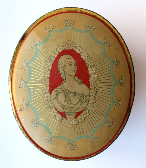
Naturally I had to get one to add to the Museum's collection.

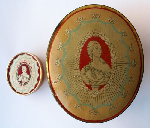
Okay, maybe I got 2! But the design was a little different and I figured variety couldn't hurt.

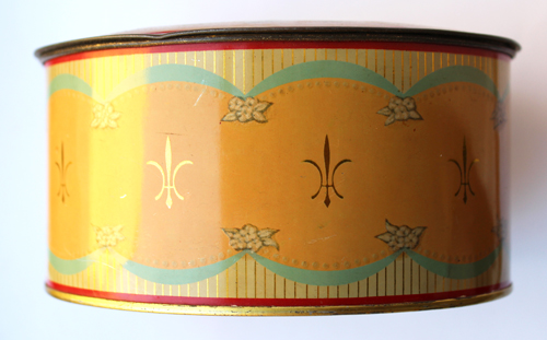
I also liked the pattern on the sides.

Just to give you a sense of the size, that 2nd box is body powder and way bigger than the face powder pox.

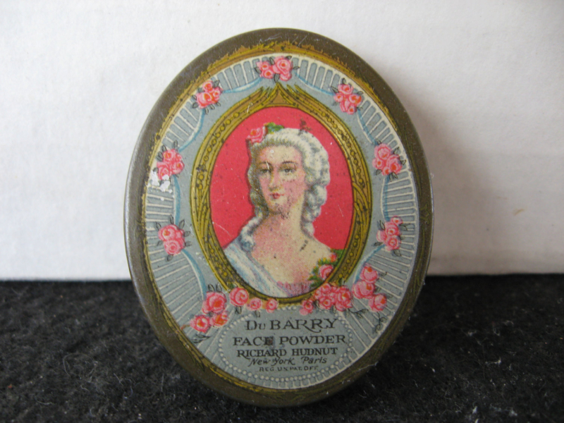
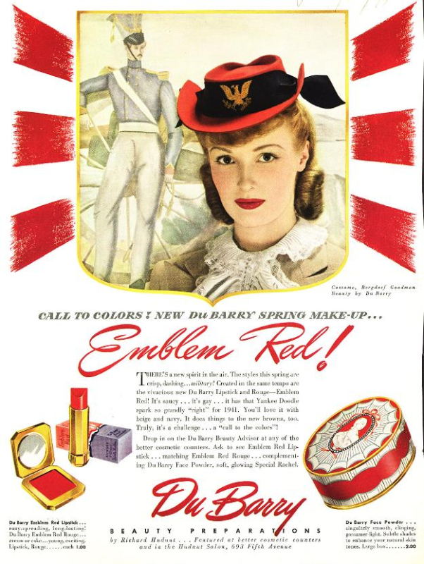
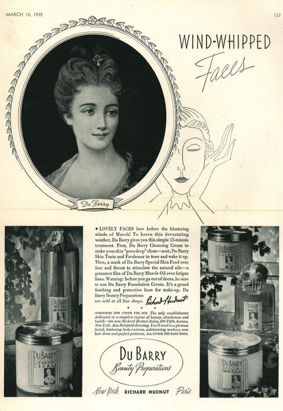
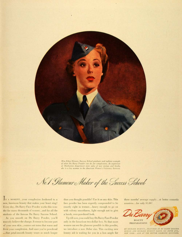
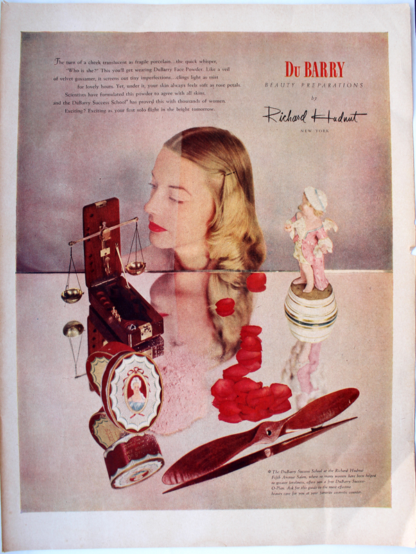
But starting around 1935 (at least according to the ad below), DuBarry displayed a different, completely imaginary representation of Madame du Barry, and it appears that in 1942 they began adding her to their packaging and phasing out the other, accurate Madame du Barry depiction. I've looked everywhere online and there is no portrait of Madame du Barry that even remotely resembles this one.
 (image from library.duke.edu)
It appears to be an amalgam of the Pajou sculpture (the asymmetrical, drapey neckline), this 1770 portrait by François-Hubert Drouais (hair is up with one lone curl around the neck), and this 1771 portrait, also by Drouais (hairstyle is similar, although DuBarry seems to have swapped out the blue ribbon for a blue jewel on the packaging). You can see, however, that the woman on the box is not a direct copy of any portrait, as was the case with the Pajou sculpture.
 (image from periodpaper.com)

I bought this one too, along with the ad above. 🙂

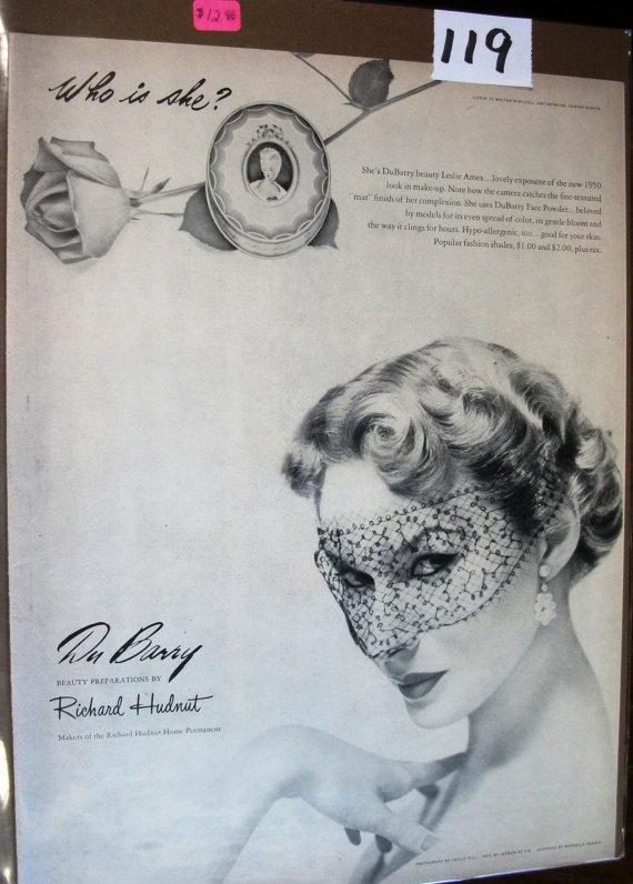
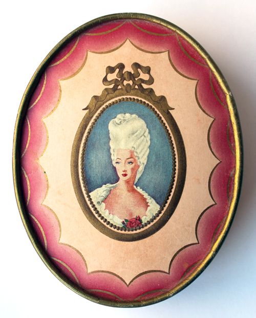
Then in 1949 DuBarry changed the likeness on the packaging yet again. This time Madame du Barry appears with the ridiculously high powdered wig hairstyle that we associate with the French Revolution era. Again, as far as I could tell, there is no portrait of Madame du Barry that resembles this – here's the closest one I found – but even the face on this DuBarry packaging looks nothing like her!
 (image from etsy.com)
This image was used through the mid 1950s.
 (image from flickr.com)
To round out the Madame du Barry representations I had to get this one too. This is probably the most common DuBarry box I came across.

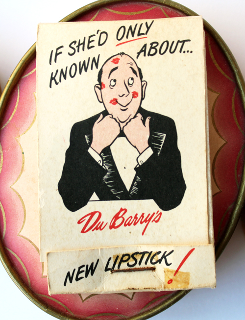
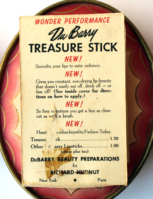
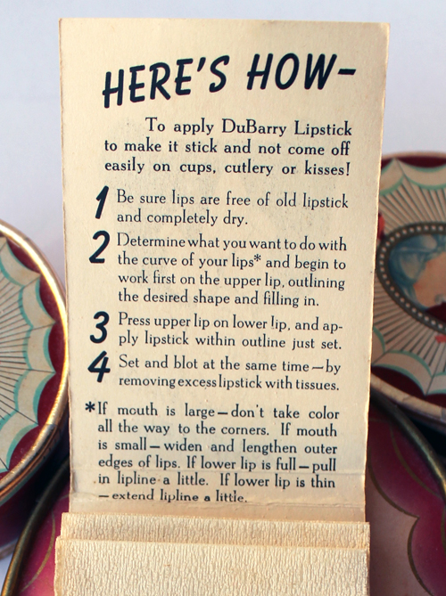
The next item I thought would be a nice addition to the Museum's DuBarry holdings were these lipstick blotting sheets. Clearly men are the only ones who are affected by lipstick transfer and it's their comfort we have to worry about most, not the simple fact that women would just like a lipstick that stays put so we're not constantly touching up. *eyeroll* Still, I thought it was amusing that they put a cartoon man on the case and I don't have any vintage lipstick blotters in the Museum's collection. (And like the DuBarry powder boxes it was super cheap, which is always a plus.)


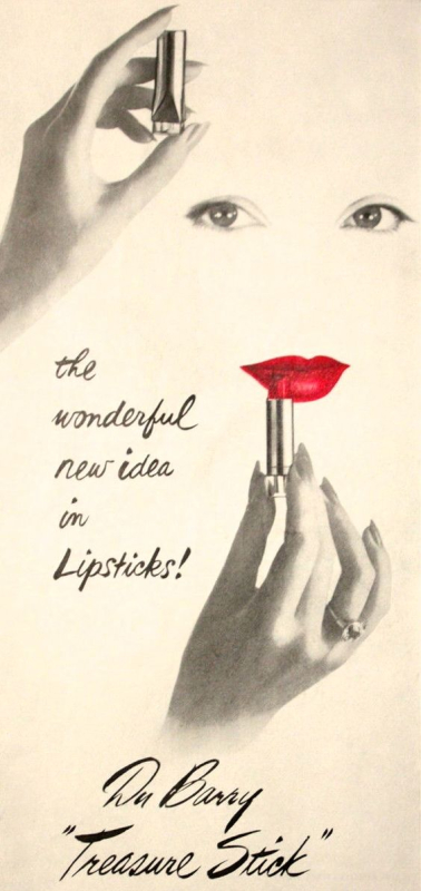
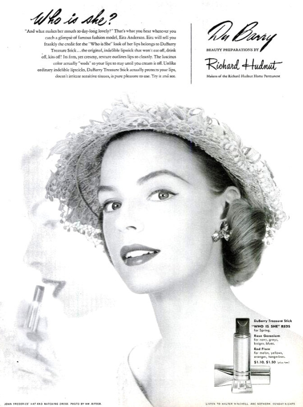
Based on the graphics I really thought this was from the early '60s, but I was way off. Turns out DuBarry's "Treasure Stick" lipstick was introduced in 1947 and was sold at least through 1951, according to the ads below, so these blotting sheets are from around then as well.

(image from pinterest.com)
 (image from etsy.com)
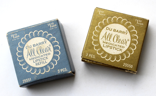
Finally, here are the items that once belonged to the husband's grandmother which my mother-in-law kindly passed along to me. Thanks, M.!


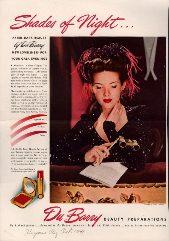
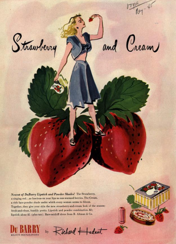
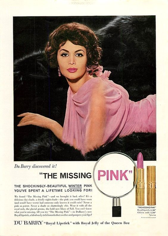
Naturally I was eager to find out approximately when they were from. Just at first glance they appeared to be early '60s to me, but I couldn't say so with any certainty, so off I went to search for clues. Based on the ads below it didn't look like the lipsticks I have are from the '40s.
 (image from library.duke.edu)
 (image from library.duke.edu)
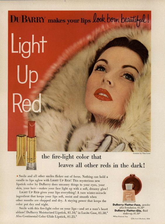
It wasn't from the mid-'50s either.
 (image from pinterest.com)
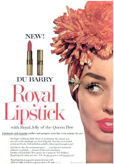
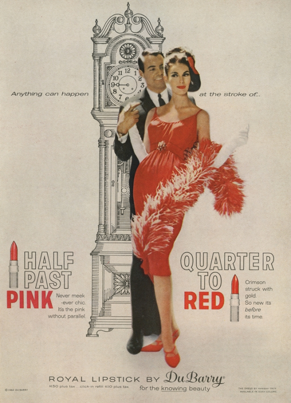
Low and behold, in 1958 we see a new lipstick tube and bullet that are very similar to those bestowed upon the Museum. With the debut of the "Royal" lipstick (you've seen this ad before), there also came a new case. However, it's gold-toned and not silver like the ones I have. Hmmm…


 (image from mudwerks.tumblr.com)
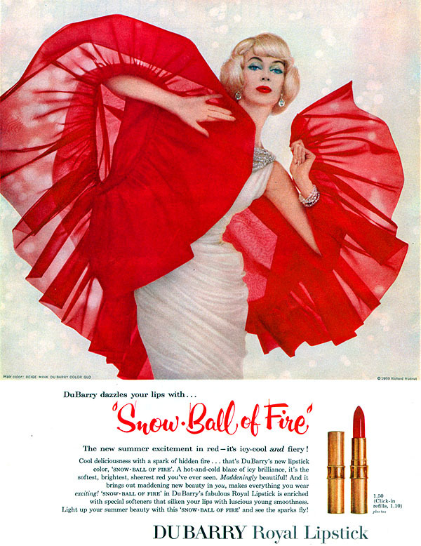
It's hard to tell, but judging from this 1961 ad below, it looks like DuBarry made the switch to the silver casing by then.
 (image from pinterest.com)
 (image from adweek.com)
So while I'm still not 100% sure, I can say with confidence that the lipsticks I was given date from the late '50s or early '60s, especially given that the prices are the same on the refill boxes and in the ads.
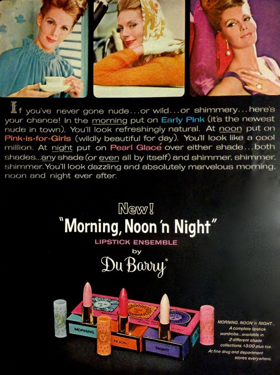
Just for fun, how cute is this "Morning Noon and Night" set? Now that would be quite a find!
 (image from pinterest.com)
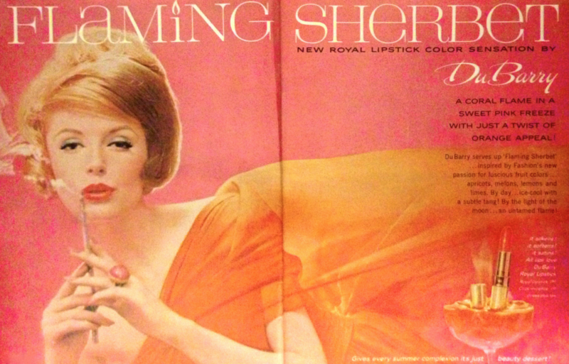
DuBarry went on to launch a pretty interesting campaign for their Glissando range starting in 1964 – at least, from an advertising point of view. Since there were so many ads I simply couldn't narrow it down, but they were a good representation of mid to late '60s style. As noted earlier, the brand changed hands several times over the years but is still around today. I kind of wish they would look to their golden age and re-introduce packaging with an updated (and accurate) depiction of Madame du Barry. As Collecting Vintage Compacts points out, the Comtesse's consumer appeal cannot be denied: "[The DuBarry] fragrance could not have failed to be recognized by the buying public as representing the essence of feminine beauty, intrigue and even a hint of scandal." Indeed, I can see many people buying makeup with the King's favorite adorning the packaging. 🙂
So those are some highlights from DuBarry when they were in their prime. Which ones did you like best?
Save
Save
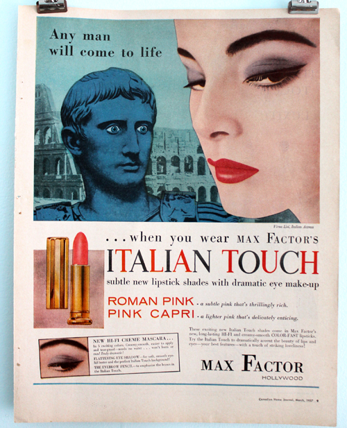
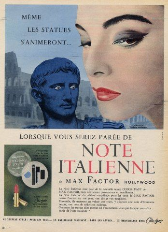
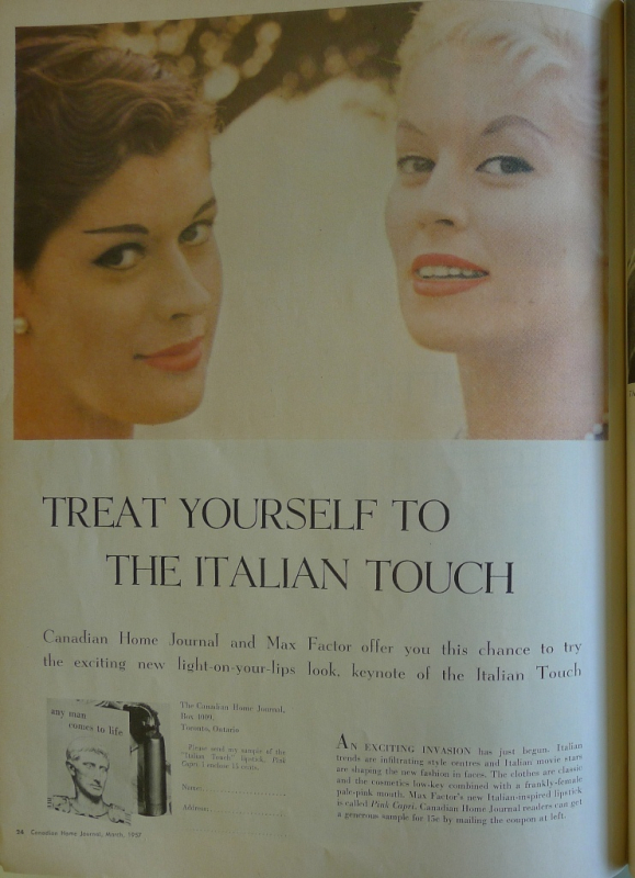
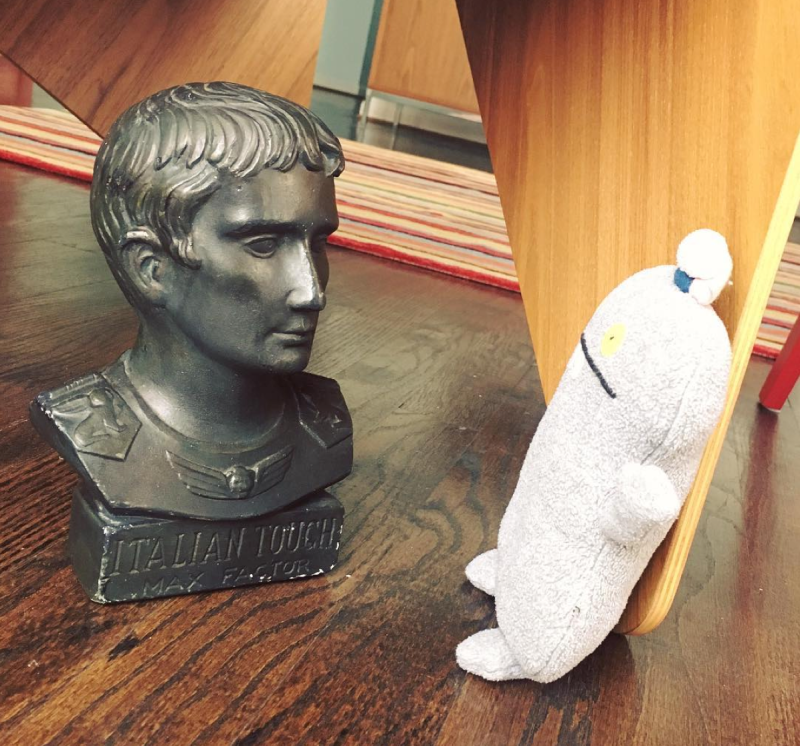
You might remember this neat ad for Max Factor's Italian Touch that I featured in the summer exhibition.

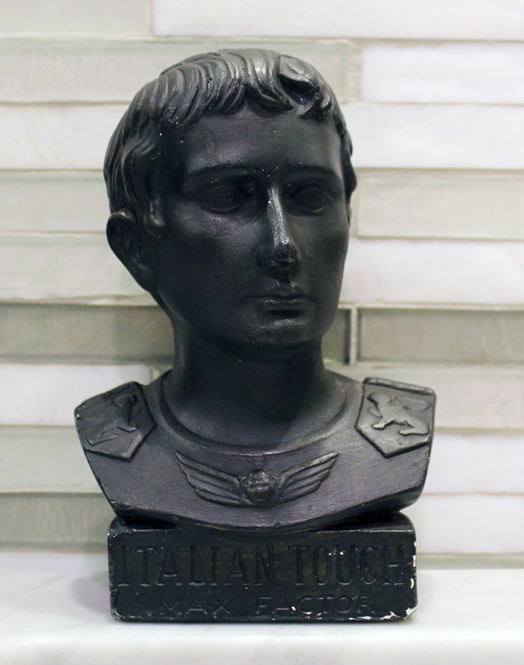
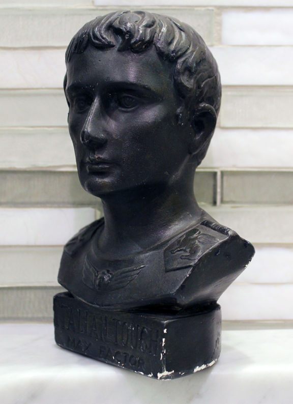
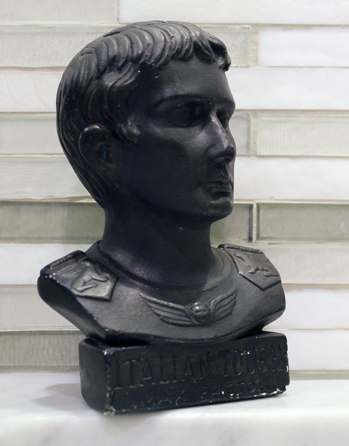
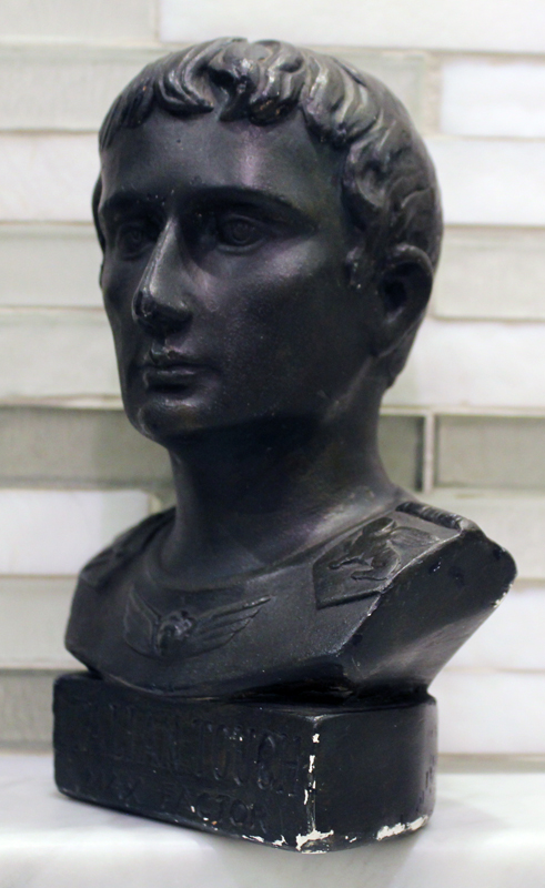
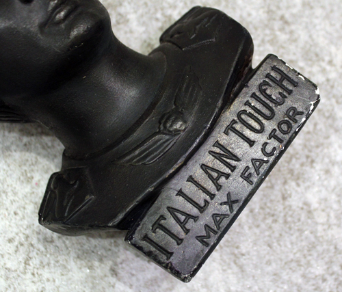
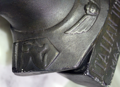
I also mentioned there was a really cool bust used as a store prop floating about on E-bay, but that it was pricey. Well, as it turns out I didn't have to worry about the cost because a certain very thoughtful and generous husband purchased it for me! I really don't have anything like this in the Museum's collection and I was so happy he snagged it for me. As far as store advertising goes it's pretty unique.
I've named him Enrico. 🙂


I love the sphinxes on each shoulder! Perhaps they were borrowed from the Augustus of Prima Porta.

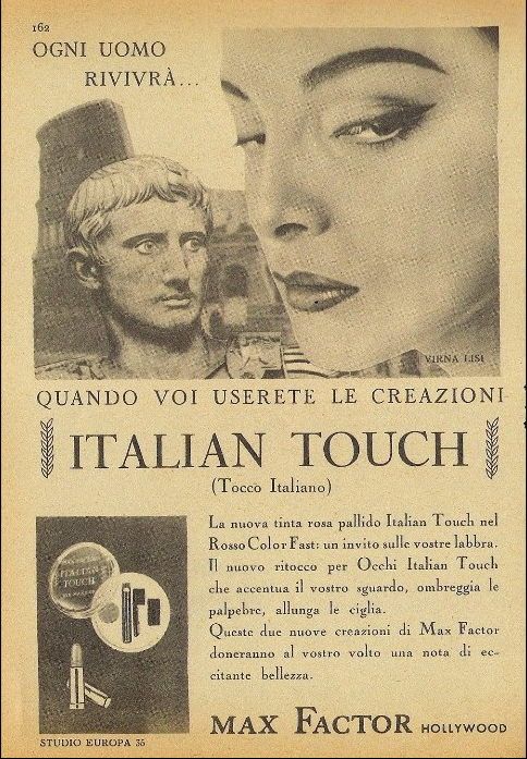
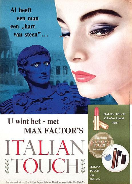
I couldn't find a complete history of the campaign but it must have been quite large, given that I've seen ads in various languages. In addition to plain old English, I also came across French:

(image from hprints.com)
Italian (of course…additionally, Italian film star Virna Lisi starred as the model, which further demonstrates how calculated the campaign was):

(image from delcampe.net)
And Dutch. This is particularly fascinating given that the e-bay seller Enrico was purchased from was located in the Netherlands. I also would have loved to get my hands on the little set pictured in these ads to round out a sort of capsule collection of the Italian Touch campaign, but I'm pretty satisfied with the bust.

(image from invaluable.com)
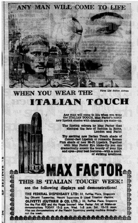
I also found these two English-language ads from Canada and Singapore.
 (image from middlebrowcanada.com)
I couldn't remove the watermark from this but you get the gist.

(image from eresources.nlb.gov.sg)
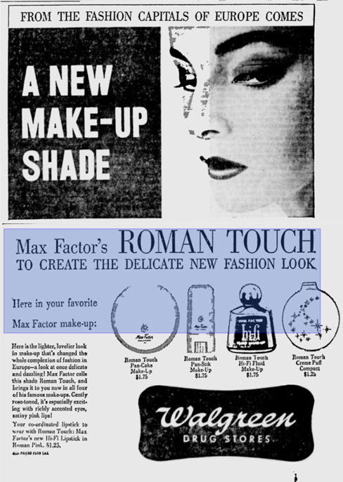
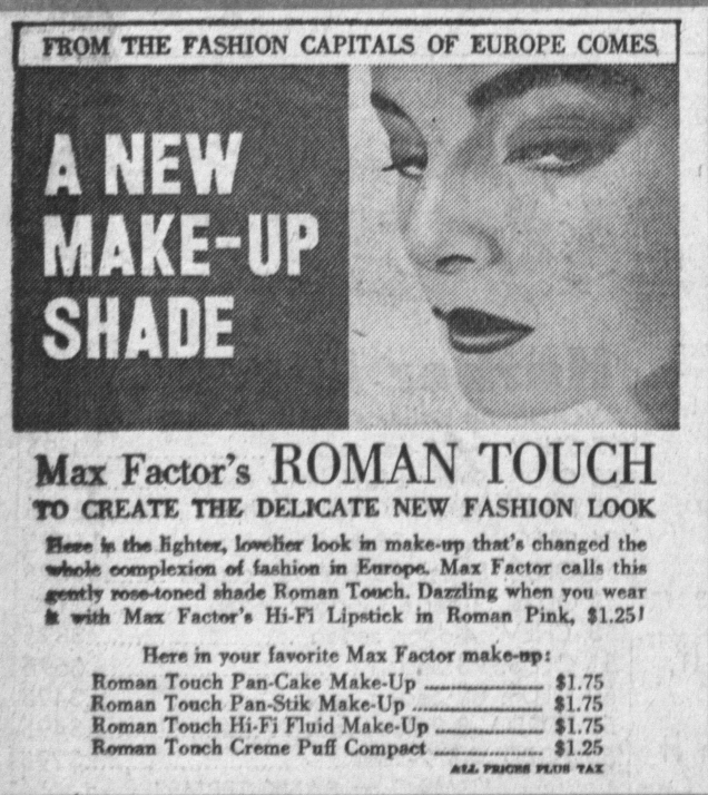
In the U.S., a new shade called Roman Touch was available in several products in addition to the Italian Touch collection.

(image from news.google.com)
 (image from arch.torranceca.gov)
All in all, I think this is one of the strangest, yet well-planned advertising campaigns for a vintage collection I've come across. Normally I'd be creeped out by the idea of statues coming to life, but in this case I think the offbeat nature of it is quite amusing. And based on what Museum Advisory Committee member Sailor Babo has told me about his conversations with him, Enrico is totally harmless and has lots of interesting stories.

What do you think about this latest Museum gift? Big huge thanks to my awesome and supportive husband. 🙂
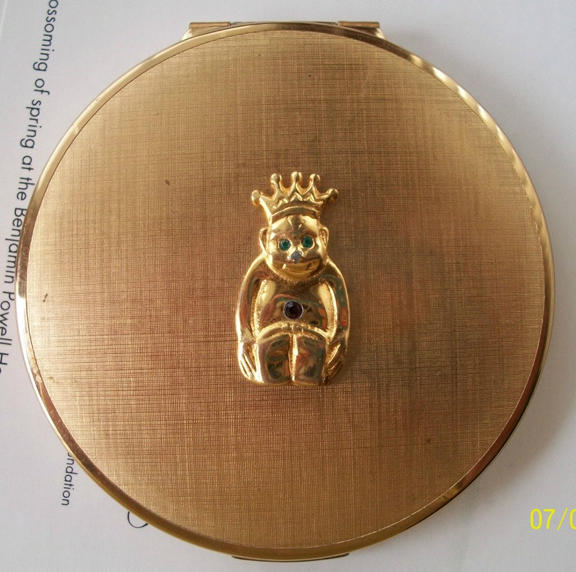
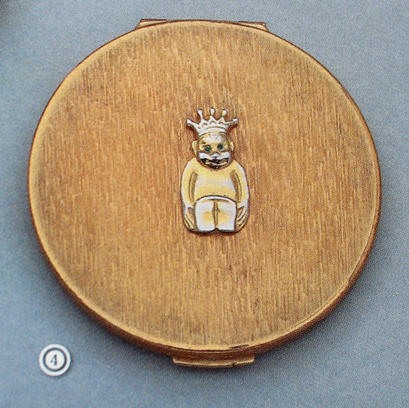
For St. Patrick's Day I originally thought I'd do a quick round-up of vintage compacts adorned with clovers and such. I was searching for a particular vintage Stratton compact, one that has more traditional lucky symbols, and came across this one instead. It was so delightfully strange I simply had to shove aside the other compact I was looking for to investigate this one further.
 (image from etsy.com)
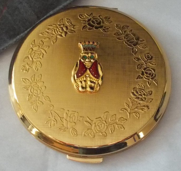
Here's another from a later date (ca. 1950s).
 (image from etsy.com)
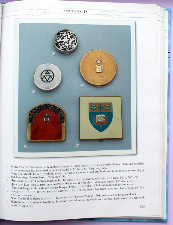
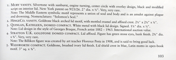
If you're all, "WTF am I looking at?", don't worry, I was too. Apparently the little fella on the front of these compacts is known as a billiken, a symbol of good luck. Both of the websites that list these compacts for sale point out that the Stratton compacts with a billiken on the front are very rare, and are on page 103 of Mueller's Overview of American Compacts and Vanity Cases. So off I went to consult my copy.


Okay, so the billiken was created by an art teacher in 1908 and is a lucky figure. That's a start, but not enough information for me. So I went searching and found myself down quite a bizarre rabbit hole. The billiken was created by Florence Pretz in 1908 after it appeared to her in a dream, while she found the name in an 1896 poem called "Mr. Moon: A Song Of The Little People" by Canadian poet Bliss Carman. The billiken represents "things as they ought to be." Buying a billiken for oneself brought luck, but receiving one as a gift brought even more good fortune. Pretz explained to the St. Louis Post-Dispatch, "I concluded if there is a chance that we shape our own lives, and my clay was mine to fashion as I would, I might as well make an image, which embodied hope and happiness to sort of live up to."
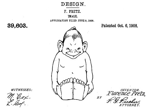
I found her original design patent at the Virtual Corkscrew Museum (the fact that a corkscrew museum exists is proof that a makeup museum is a completely normal and valid idea, yes?) Such a weird-looking little creature, what with the pointy head, prominent ears and compact body – not quite human but not animal-like either.

(image from bullworks.net)
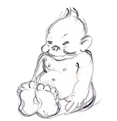
And here's a sketch.

(image from slu.edu)
The billiken's popularity skyrocketed less than a year after the patent was filed and took off as a novelty across the U.S., its likeness appearing on all kinds of ephemera from basic figurines to salt shakers and belt buckles. St. Louis University even adopted the billiken as their mascot, which they still use today.

(image from stltoday.com)
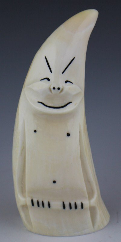
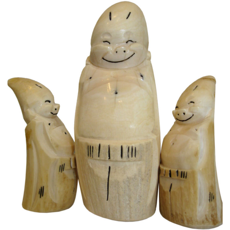
The craze also spread to Alaska, where billikens were carved from whale bone/teeth or walrus ivory and sold as souvenirs. They're still made today, of course from different materials.

(image from liveauctioneers.com)
 (image from 1stdibs.com)
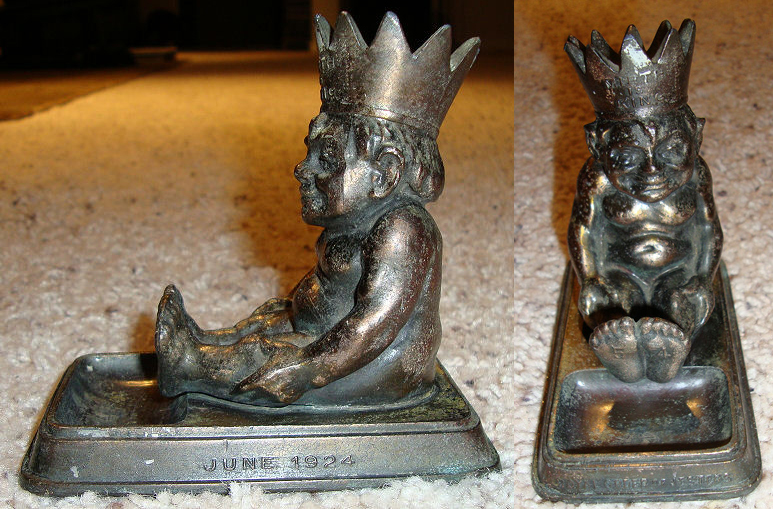
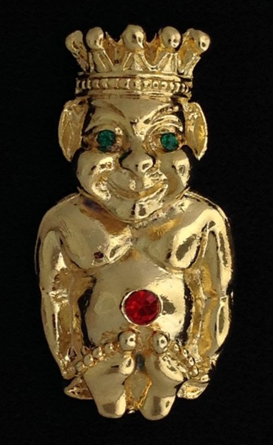
Finally, the Royal Order of Jesters, a group belonging to the larger entity of Freemasons, adopted the billiken as their symbol in 1911. The billikens associated with the Jesters differ from other figures as they're usually wearing crowns.
 (image from phoenixmasonry.com)
This lapel pin especially makes me think that the billiken on the Stratton compact was related to the Royal Order of Jesters, as the design is nearly identical.

(image from fratline.net)
And Stratton did make other Freemason-themed compacts.
 (image from etsy.com)

(image from ebay.co.uk)
I guess what I'm still trying to figure out is how the billiken ended up on the Stratton compacts. Were these part of a custom order for the Royal Order of Jesters? What kind of relationship, if any, did Stratton have with the Freemasons and their associated bodies? Or did Stratton simply decide to put a billiken on their compacts at several points throughout the early 20th century since the billiken was so wildly popular and appearing on nearly every object one could think of? I really can't answer any of these with any certainty. Plus, if the billiken on the Stratton compact is somehow related to the Royal Order of Jesters, it doesn't make a lot of sense to put it on an item primarily used by women. Near as I can figure, the Royal Order of Jesters is your typical boys' club (with some rather sordid, remarkably misogynist moments throughout their history to boot, though I don't know if can trust the sources I linked to.) However, according to the British Compact Collectors Society, Freemason compacts were in fact "presented as gifts on Masonic Ladies’ Nights, when wives of Masons were invited for a special dinner." So maybe the ROJ had similar ladies' nights in the U.S. and these were gifts?
I also found this compact, which just leads to more questions.


(images from etsy.com)
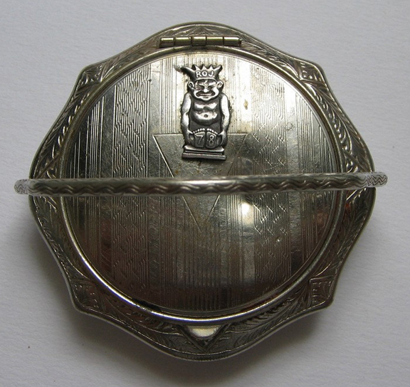
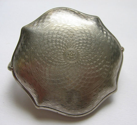
Unlike the Stratton billiken compacts, this one is unmistakably related to the Royal Order of Jesters given the initials on the billiken's crown. No maker is listed but the shape, embossing and the handle are all identical to these enameled compacts. So I'm wondering if this was just a generic compact and you could have it customized. In this case, I'm guessing someone belonging to the Royal Order of Jesters had it made and inscribed with the year they were inducted, given the "78" on the billiken's feet. But again, why a compact? I can only assume it was a gift, since I don't think women can be members of the ROJ.
Anyway, I don't think I'll ever get to the bottom of how a billiken that looks similar to the one used by the Royal Order of Jesters ended up on a vintage compact, but I'm glad I at least found a very interesting, if not totally weird, piece of history. And I always welcome learning about benevolent beings such as the billiken, as we could use a little more good luck and positivity in this world.
Had you ever heard of a billiken? And have you ever dreamed up a totally mythical creature? I have – a few months ago I dreamed of flying rabbits that were called angel bunnies. Their wings were not like feathered bird wings but covered in soft white fur, like the rest of their bodies. They were so cute and fluffy and they only came out at night…I wish they existed, or that I at least had some artistic skill so I could sketch them! Who knows, maybe if I file a patent for them the way Ms. Pretz did with billikens, they could be the next craze sweeping the U.S. 🙂
As I've said before, I think Valentine's Day is kinda dumb so the husband and I don't celebrate it, but I do love any sort of holiday-themed makeup. Vintage compacts are especially fun to browse for V-day, as there's no shortage of lovey-dovey designs.
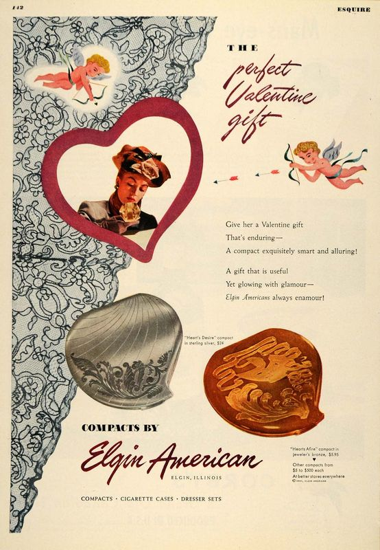
If I had to guess, I think Elgin's heart-shaped compacts were originally created for Valentine's Day (and eventually marketed for Mother's Day and Christmas), since the earliest ad I've seen for them was from February 1947. I'm greatly amused by the fact that this one appeared in Esquire magazine. Clueless men, here's what to get your girl for Valentine's Day!
 (image from elgintime.blogspot.com)
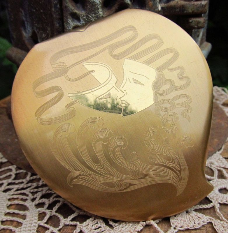
I always love it when I can find the item that I spotted in a vintage ad.
 (image from etsy.com)
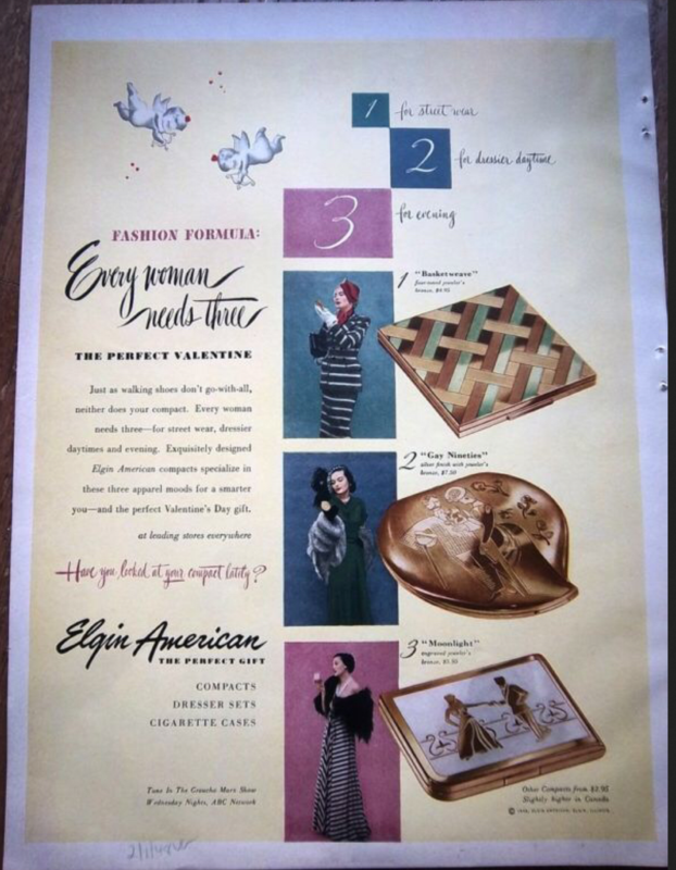
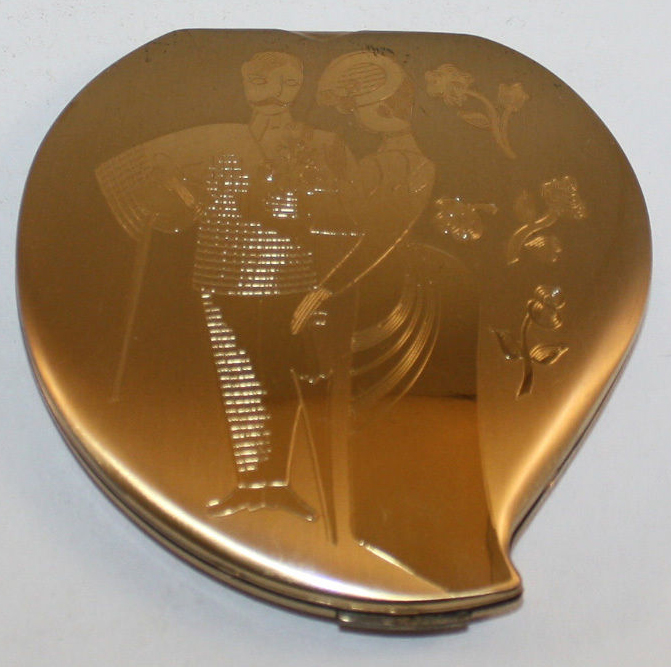
Here's another ad from February 1948. While it seems to be targeting women, it does mention the compacts as Valentine's Day gifts.
 (image from pinterest.com)

 (images from ebay.com)
Some other Elgin compacts that would have been appropriate for Valentine's Day:
 (image from rubylane.com)

(image from worthpoint.com)
 (image from etsy.com)
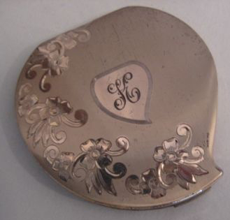
It looks like some of them had space for engraving so you could customize them.

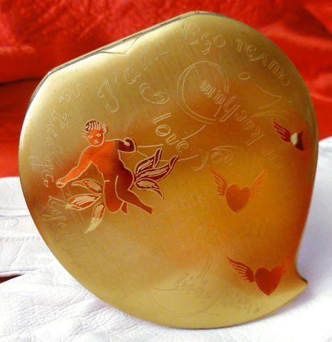
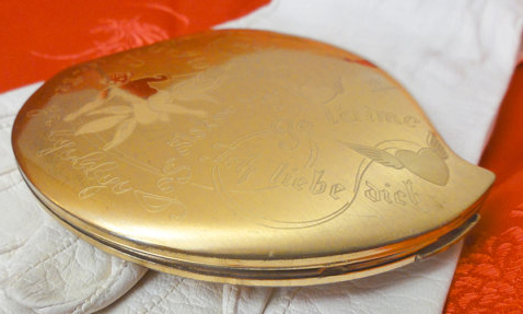
This one is my favorite. Like I said, I'm not really into Valentine's Day crap, but this is precious. It really hits all the love notes – Cupid, flying hearts, and "I love you" in several languages. At least, I think that's Cupid…he doesn't have wings, which is a little odd.


(images from etsy.com)
If I had been more organized I would have gotten one for the Museum in time for V-day. Fortunately there are lots of this particularly design floating around so I can still get it.
What do you think of these? And do you celebrate Valentine's Day? (I won't judge if you do!)


 (image from google.com)