I forget what I was looking for when I stumbled across beautician and stylist Eddie (Eadward) B. Deason (1921-1976). Like Blanche Hunter, Deason's story is incomplete. But the few things I could find are definitely worth highlighting.

Deason opened several successful House of Charm salons throughout the Los Angeles area in the late 1940s and early 1950s. According to features in Jet and Tan, he had pioneered new styling techniques for Black hair, including a less time-consuming process for pin curls. He also lent his name to advertisements for a hair styling brand called K & K Hollywood in the mid-1950s.

Feature on Eddie Deason from Tan Magazine, 1956

The man was a quadruple threat: he sang, styled hair, designed dresses and emceed fashion shows, many of which were benefits for the local Black community.

Eddie Deason emceeing an event, 1940s

Eddie Deason at the opening of his salon in Pasadena, August 1948

He also threw elaborate parties at the homes he shared with his business manager and romantic partner, Frank (Franklin C.) Jackson. Deason's relationship with Jackson presumably dated back to 1939 and lasted at least until 1964.1 Frank is all the way on the left in this photo from 1948.

Frank Jackson and Eddie Deason at the opening of his salon in Pasadena, August 1948

I believe Frank is also shown here, seated 2nd from the right below/between the two blondes.

Eddie Deason and others at a birthday party for Walter L. Gordon, Jr.

The text on this photo reads, "A girl who came west to go into pictures (?) stopped by office — and met Eddie Deason. He made a date (?) with her but affair was doomed. He had Frank [Jackson]." 

Eddie Deason dancing with an unidentified woman, 1940s

Obviously, neither Deason nor Jackson escaped persecution. Deason was arrested in 1947 for being in the "wrong" neighborhood after returning from a fashion show in broad daylight and then falsely accused of smoking marijuana. He was arrested again in 1949 for being "caught in a compromising position with a man in a men's room of a service station" and again in 1951 for sitting in a parked car (and subsequently shot at by police – fortunately he was unharmed.) Both Deason and Jackson were arrested, along with 7 others in a 1959 raid on one of their homes for narcotics possession.2 All of these point to how dangerous it was for Black men to merely exist in the 1950s, made even more so by virtue of being gay.

As the Museum focuses on makeup and not other grooming categories (hair care, skincare, etc.) you might be wondering why Deason is being featured here. Among his many accomplishments, one of the most important ones was Deason's alleged status (at the time) as the first and only Black person to study in Max Factor's studio. He reportedly trained with makeup director Abe Shore and studied cosmetic chemistry at the University of Southern California. He then became the first Black cosmetology student at the Frank Wiggins Trade School (now known as Los Angeles Trade Technical College). In 1941 Deason was appointed the lead makeup artist for the performers in Duke Ellington's all-Black musical revue, Jump for Joy. Interestingly, Ellington forbade the performers to darken their skin tone with makeup3. Deason is not mentioned by name in any of the anecdotes about that and I wonder if he was responsible for the makeup of only the female performers. As one article states, "Uniform 'luscious brown' of Jump for Joy's girls is laid to the cosmetic artistry of the young Factor expert."4

It appears Deason wanted to use this experience as a stepping stone to ultimately "get the makeup concession for all [Blacks] in the motion picture industry".  This might explain Deason's role as an extra in 1942 for the film Hers to Hold, which was released a year later. 

Eddie Deason and others, 1940s(images from library.ucla.edu)

In any case, Shore was invited to attend the grand opening of Deason's salon in Pasadena in 1948, along with the director of the Frank Wiggins Cosmetology school. In December 1952, Jet reported that Deason was offering his makeup services to Los Angeles studios for free as a way to start his own company specializing in TV makeup for Black actors. It doesn't seem that his original plan for entering the makeup business came to fruition, as articles after 1952 only highlight Deason's work as a hair stylist and fashion designer.

Eddie Deason featured in Jet Magazine, April 22, 1954

Eddie Deason featured in Jet Magazine, April 22, 1954
(images from books.google.com)

I really wish I could have found more about the makeup artist side of Deason and more biographical details. UCLA lists his birth and death dates, which I couldn't find anywhere else, so that leads me to believe they may have more information in their archives that hasn't been posted online. I also wonder if the University of Southern California, the various Max Factor archives or Los Angeles Trade Technical College would have anything about Deason.5 It's both frustrating and saddening to witness such a dearth of history about another successful Black beauty entrepreneur, especially one who was possibly the first Black makeup artist to have trained in the predominantly white, though prestigious, space that was the Max Factor studio.

What do you think? If there are any professional researchers, historians, archivists, genealogists, etc. who are willing to help find more information, please let me know!


1The earliest mention of Jackson and Deason attending a social event was from the Victorville Daily Press, January 27 1939 – perhaps they met there? The latest mention that listed both was from the California Eagle, January 9, 1964. The last mention of Deason at all I could find in newspapers was a snippet about an art auction to benefit affordable housing, which was hosted at his home (The Valley News, July 23, 1971)

2As reported in the California Eagle, November 24, 1949; San Bernadino County Sun, June 1, 1951, and the Oakland Tribune, January 31, 1959. This last article gives Deason's age as 34, which doesn't make sense – if he was actually born in 1921, he would have been 38 in 1959. Deason may also have been arrested in August of 1949, but again, the birth date would be off.

3Some Black entertainers – especially comedians – used blackface to adhere to the prevailing racial stereotypes of the time. Obviously colorism in makeup is a huge topic that goes beyond this post, but as it's relevant to Deason I wanted to mention it.

4California Eagle, August 28, 1941

5There is another place that may offer a tiny grain of additional information – this collection has one frame from archival footage showing Deason.

Color coordination is just one of many facets of the vast and complex makeup-fashion relationship. This post will attempt to outline the trajectory of this concept from the 1920s through the early 1960s and examine how it was being marketed, with particular attention being paid to the notion of a lipstick wardrobe. The usual disclaimer applies: it won't be as thorough as I'd like given the limited access I have to certain resources, but hopefully will give a cohesive picture.

In the nascent cosmetics industry, color harmony usually referred to coordinating makeup shades to one's skin tone, hair and eye color. (It must be noted that women of color, particularly Black women, were completely left out of the "types" developed by Max Factor and others.) But as makeup became more acceptable and even expected, outfits began to take on importance in terms of coordinating makeup. The rise of ready-to-wear fashion and designers releasing seasonal collections also played a significant role. By the late 1920s beauty columns were advising women to select their makeup with the color of their "costumes" in mind in addition to the original three pillars of color harmony.1

Color complexion chart, Woman's World, 1925
(image from flickr.com)

Cincinnati Enquirer, May 1, 1927

Beauty columnists also advised a bit of color correcting through the use of mauve or green-tinted powders (which, you may recall, was pioneered by Shiseido), as this would enhance the complexion depending on lighting and the color of dress.  The racist/colorist goal of "heighten[ing] the effect of whiteness" via makeup persisted throughout the 20th century. While most articles weren't quite as blatant about achieving whiteness to coordinate with various clothing colors, the sentiment was implicit in many color coordination guides.

St. Louis Star and Times, June 15, 1927(images from newspapers.com)

While makeup shade selection was still sparse, cosmetic companies began using dress colors as a marketing opportunity. Elizabeth Arden led the way, declaring in 1931 that "any woman can wear any color". Cosmetics and Skin explains, "Unlike clothing fashion colours, that changed from season to season and year to year, lipsticks, rouges, face powders and nail polishes were sold in the same shades over long periods of time. Although limited, the colour ranges available in the 1920s and 1930s generally included vivid colours for evening wear and enough shades to enable women to make some allowances for different outfits and/or accessories like brightly-coloured jewellery. In the 1930s, recognising that make-up, like hair dyes, could change a woman’s ‘natural’ colouring, Elizabeth Arden and others went further, suggesting that make-up could enable women to wear a greater range of fashionable colours than her natural colouring might otherwise suggest." By the end of the '30s, "Women began buying new make-up items simply because of a change in colour, thereby increasing sales."

Tussy lipstick ad, Vogue, October 12, 1929
(image from archive.vogue.com)

Cosmetic companies and beauty columnists seized on the idea of choice that color coordinated makeup supposedly allowed. Women no longer had to fear certain dress colors; they could wear them with confidence provided their makeup was aligned. With a change of outfits and harmony between makeup and clothing shades, women could also express various moods and personalities. The ad copy for Elizabeth Arden's lipstick ensemble claims one could be the "The same woman…but with infinite variety" and equipped with "the power to change your personality to suit your mood – or your gown."  Columnist Antoinette Donnelly expanded on the concept, suggesting that by frequently switching up makeup and clothing combinations and breaking free from their set type, the average woman could become whoever they wanted. "[Witness] the manner in which makeup is worked out so that the woman can change her dress color to one that will put her in an entirely different category than that she is occupied in the somber shades, let's say. Or, with the help of certain makeup colors, she can be a stunning black-frocked siren, pale-cheeked and red-lipped, whereas before she may have been only a negative personality…these are frequently the type, who, rebelling, finds in an entirely new makeup scheme just that transforming note that lifts them out of the nondescript class…our interesting beauties are getting away from type classification. They're going in chiefly for being that something different which is always welcome, and particularly welcome in a world now filled with good-looking women. Makeup is the avenue over which you travel to get that difference and the crowning achievement will be reached when you know your makeup colors and what dress colors they should be associated with…the point is that this new makeup occupation of playing color successfully against dress colors is going to permit you a more dress-color latitude and will supply your audience with a woman about whom it can't be said: 'She always looks the same.'"2

Elizabeth Arden ad - Vogue, June 15, 1931

Ad for Elizabeth Arden lipstick ensemble, Vogue, January 15, 1932
(images from archive.vogue.com)

Still, there was a lot less flexibility than beauty columnists and ads cared to admit. Any woman can wear any color, perhaps, but only by following the prescribed advice and buying particular colors. Couched in the language of freedom and excitement, a variety of makeup shades may have offered new possibilities in terms of dress, but there were rules dictated by self-appointed experts and businesses who overwhelmingly encouraged women to wear what was "becoming", not necessarily whatever color combination one desired.

Nevertheless, the industry wanted to make it easy for women to buy multiple shades and the notion of sticking to one color or ensemble seem antiquated. As one 1933 article encourages, "Don't say, 'I can't wear grey'- or blue, or green as the case may be. It's hopelessly old-fashioned. Smart women these days merely change their complexions to suit their costumes, and find that there are no longer any forbidden shades…when you know your makeup story, it's all so simple."3 In addition to this sort of rhetoric that emphasized simplicity and modernity, cosmetic companies boosted sales by creating ensembles that made choosing colors less daunting for customers. The assumption was that by eliminating confusion regarding what beauty products went with what fashion color, pre-made sets detailing appropriate shades would appeal to shoppers who would otherwise be intimidated by makeup-dress color coordination (or those who merely didn't want to be bothered spending time picking out the "right" shades), normalize the idea that women should own more than one color, and introduce shades customers may not have considered otherwise. Matched makeup products and sets existed – most notably by Max Factor and Richard Hudnut – but without the fashion component, instead focusing on the original three tenets of color harmony (complexion, hair and eye color). Elizabeth Arden's lipstick ensemble and color harmony boxes may have been the first official sets designed to take the guesswork out of makeup-clothing color coordination.

Ad for Elizabeth Arden Color Harmony boxes, The New Yorker, June 1932

General guidelines on color coordination proliferated and more companies began releasing pre-made sets.

Harpers Bazaar, January 1935 article on lipstick tips and color matching

Newspaper ad for Lucien Lelong's Tic Tac Toe lipstick trio, October 1939
(image from newspapers.com)

Elizabeth Arden may have also been the first to collaborate with department stores on showcasing new colors that went with the latest fashions. In 1931, a fashion show held at Lord & Taylor demonstrated not only new dresses, but the Arden products that went along with them. "How the new striking colors of the season may be worn by all women if the proper makeup is utilized was illustrated by various feminine types wearing the proper cosmetics with the colorful gowns chosen for them."4 Five years later, makeup companies were advertising their seasonal shades alongside the latest fashion colors in department store windows. Primrose House, Helena Rubinstein and Charles of the Ritz displayed their new tawny shades in next to white sportswear collections.5

Elizabeth Arden continued to lead the way by introducing "color capes" at counters and salons where customers could try on little capes in the season's latest fabrics and decide what makeup went best with them.

Elizabeth Arden "color cape" ad, Vogue, October 1, 1936(image from archive.vogue.com)

Generally speaking, color coordination guidelines were to stick to either warm or cool tones (i.e. don't mix a warm-toned brown dress with a blue-red lipstick) but still wear colors that allowed for maximum contrast between skin and dress. While dress and accessory shades needed consideration, one's own coloring was the most important in terms of picking out makeup. If your outfit had two or more contrasting shades, the makeup should be matched to the dominant color or the one closest to your face. One should own at least three lipsticks: a "clear" or true red (what I suspect has neutral undertones), a blue red (cool-toned) and an orange red (warm-toned). Finally, coordinating lip color was more critical than face powder for a harmonious look, if one had to choose between the two. Some rather harsh color coordination advice from the decade6:

  • "There are shades of rouge and lipstick and powder that are unequivocally antagonistic to other colors in close juxtaposition. This is seen in makeup colors themselves. Such as a bright orange face rouge and a purplish or deep raspberry lipstick. This combination is really ugly. Extend the idea to apparel. Take a blue eyeshadow with a red or flame colored dress. Just wrong, that's what it is."
  • "You must change the lipstick and rouge cases that you carry in your pocketbook as regularly as you change your frock, if you want a pleasing ensemble."
  • "Remember always that your lips supply the most outstanding color to your face. If they are wrong, your whole face might as well give up."

In terms of individual colors, the prescriptions were as follows. It's very interesting to see the roots of makeup color theory, especially considering how advanced it is today. Some of the advice is debatable, most likely due to the fact that there simply weren't many shades back then. And once again, these sorts of color-specific tips were intended for white women only. While some of the principles could theoretically be applied to BIPOC skin tones, it's obvious that the industry was focused on a white audience. Racism and colorism were on full display, particularly in the advice given for black dresses.

Red:

  • "Keep rouge and lipstick in the tone of the costume color – red geranium for an orange red or vermillion dress, red raspberry for the purple-reds, the rich wine shades and fuchsias."
  • "When wearing red, violet or blue-violet, it is very important to have the same basic tones in rouge, lipstick, and costume – no clash of orange with blue-red. That's bad!"
  • "If your dress is red, your lipstick leans toward purple and your rouge is borrowing its tones from orange, you will look as flamboyant as a circus poster."
  • "Red is a danger color in makeup. If the costume color is a bright shade of red, it should be matched as closely as possible with lipstick and rouge. The smartest crimson frock could be ruined by proximity to orange rouge and mandarin lipstick."
  • "If you wear red, particularly the bright, slightly off shades, the lipstick must match your costume exactly. Your rouge must be properly toned with your lipstick."

Beige and brown:

  • "Rouge and powder should have a touch of yellow. Green eyeshadow is stunning with beige."
  • "For wheatstalk and other beiges, use a vivid note: peach makeup base and peach powder, red geranium lipstick, rouge and nail polish. Green eyeshadow and blue-green mascara."
  • "If you are wearing browns that let orange supply their gaiety, you will want a touch of orange in your makeup."
  • "A warm terra cotta or russet makeup base, terra cotta or russet rouge and lipstick and a faintly mauve shade of face powder. Use bronze shadow and brown mascara."

Grey:

  • "All shades of grey needed a decided contrast."
  • "It is advisable to accentuate lip and eye makeup and subdue grayish pallor by using a deep peach rachel powder. When cheek rouge is used, it should be of a dark red or true blood tone, never a light orange shade."
  • "For grey, a vivid makeup is recommended for contrast: peach makeup base, a light shade of pinkish tan powder, red coral rouge and lipstick and matching nail polish. Blue eyeshadow and blue-green mascara."
  • "If you emphasize the pinkish tones in your skin and use a warm, bright rouge and lipstick the color will be more becoming."

Purple:

  • "The new purple shades are difficult colors to wear, so be sure to use a double application of pale peach foundation to give the skin an extra smooth texture and even coloring. Red coral rouge and lipstick have the clear quality that you need with difficult costume shades. Use blue eyeshadow if your eyes are blue, blue-green if they are brown."
  • "If you're in purple, lipstick and rouge ought to have bluish tones under the red."
  • "For lilac, mauve and violet, makeup base with a brownish undertone, a light shade of pinkish tan powder, red raspberry rouge, lipstick and nail polish. Black mascara and blue eyeshadow."

Green:

  • "For costumes of green – the vivid shades – a bright flame rouge and lipstick with pale rachel powder and green-gray eyeshadow could be tried out with effectiveness assured."
  • "For deep green costumes, use the same rouge, powder and lipstick shades, but use blue-green mascara and shadow according to the color of your eyes."
  • "For greens, from pale green to emerald and vivid green, makeup base with a brownish undertone, light shade of pinkish tan powder, red geranium lipstick, red strawberry rouge with a blue undertone, red geranium nail polish. Jade or emerald green eyeshadow, and blue-green mascara."
  • "Greens and yellow-greens are trying, but if you bring out the warm rose tones in your coloring you will stand a better chance of wearing these colors successfully. If these colors make your skin appear sallow, blend a little mauve face powder with the color you normally select to match your skin. Use a dark rosy lipstick to give your mouth a definite outline and a brown or grayish purple eyeshadow."

Blue:

  • "For blue apparel ensembles the 'blue' idea is stressed. The powder should have a good deal of purple pink in it, the rouge and lipstick with a purple cast. And blue eyeshadow by all means."
  • "If your favorite gown is in one of the bright new blue shades, use a soft peach shade of makeup base and powder and raspberry rouge and lipstick."
  • "For guardsman blue, dusty blue and other spring blues, peach makeup base, peach powder, red strawberry lipstick with a blue undertone, matching rouge and nail polish. Blue mascara and blue eyeshadow."
  • "Blue has a way of throwing bluish or purplish shadows on the face. Use a creamy tinted powder to soften this effect and use a lighter color of rouge and lipstick, yet one that is vivid and bright."

White:

  • "White requires little rouge – the amount that is chic with black is blatant with white – and the paler tones are more successful."
  • "White, like black, takes either a dark or a fair makeup, but nothing is more striking than white worn with the darker powders. Golden skins, tawny skins, make a gorgeous contrast with white."

Black:

  • "Black requires a more brilliant makeup to complement it than a color does. A powder as light as your skin tone permits, and the bright shades of rouge and lipstick, those on the geranium cast, prove most effective."
  • "Black is most striking and flattering when the skin is fair, pearly and transparent-looking. Black is not becoming with sun-tanned skin or sallow, yellowish skin. If your new fall costume is to be black, then you must get rid of your leftover tan and get your skin as freshly pink and white as possible…powder with a warm pinkish or peach cast, rouge and lipstick that are a blush rose or a frank red – those are good to wear with black."

Pastels:

  • "Shades which have a suggestion of blue in them call for a rouge with a blue cast. Shades with a hint of yellow look their best when the face is made up with rouge and lipsticks with an orange cast."

Vogue also offered general color coordination guidelines in their October 1, 1938 issue.

Vogue makeup color guide, October 1, 1938.

Another development in the 1930s was the recognition of the win-win situation offered by color-coordinated makeup and clothing. As early as 1932 both industries acknowledged the opportunity to profit through various types of partnerships. According to the December 30 issue of WWD that year, "Clothes-stylists and cosmetic experts are in a strong position to help each other today, with the result that more clothes and more cosmetics can be sold."  The end of the decade marks the point at which cosmetic companies began creating makeup shades based on seasonal fashion colors and/or formally collaborating with fashion houses on colors.

Ad for Dorothy Gray Sierra Gold, Vogue, November 1939
(images from archive.vogue.com)

Perhaps in an effort to outdo Elizabeth Arden, in the fall of 1938 Helena Rubinstein collaborated with noted milliner Marion Valle to produce the "vanity box of hats" series, a collection of 6 hats "based on the colors of six Rubinstein products."  The hats and cosmetics were displayed together in department store windows.

Newspaper ads for Helena Rubinstein/Marion Valle "vanity box of hats", October 1938

Newspaper ads for Helena Rubinstein/Marion Valle "vanity box of hats", November 1938
(images from newspapers.com)

To further emphasize the connection between fashion and cosmetics, it was around this time that companies began referring to color coordinated makeup using fashion terminology. Gone was the "ensemble"; enter the "wardrobe".

Germaine Monteil lipstick wardrobe, Global Cosmetic Industry, June 1938
(image via archive.org)

Article on lipstick wardrobe, Chicago Tribune, February 5, 1939(image from archive.lib.msu.edu)

In short, the 1930s witnessed the solidification of clothing/makeup color coordination, mostly due to cosmetic and fashion companies realizing they could have mutually beneficial relationships in terms of sales, but also due in part to the greater trend of accessory coordination and the growth of the cosmetic industry more generally. The 1940s strengthened the notion of color coordination. The sales tactics, accessory coordination, and pre-made sets remained more or less the same. Advised a 1946 issue of Chain Store Age to salespeople, "Lipsticks must also harmonize with costume colors so women need a vari-colored lipstick wardrobe. Point out to your customer that she should have one for daytime, one for evening, one when her skin tans, etc."

"Making Up to the New Fabrics", Harpers Bazaar UK, February 1940

Newspaper ad for Lucien Lelong Pif Paf Puf sets, May 1940

Makeup and accessory coordination advice,The Atlanta Constitution, June 2, 1940
(images from newspapers.com)

Maybelline ad in Hollywood magazine, 1940
(image from archive.org)

In the spring of 1947, U.K. company Gala of London presented a similar idea to Arden's color capes by encouraging customers to visit their "Colour Room" with swatches of their dresses in hand. It's not clear whether they were inspired by Helena Rubinstein/Marion Valle partnership some 9 years prior, but Gala also collaborated with Gertrude Harris on several creations based on lipstick shades. 

Gala lipstick/hat collab, Harpers Bazaar UK, July 1947

Seasonal colors really came into their own in the 1940s. Primrose House released a shade called Maraschino, a "cherry red designed for wear with summer clothes," while Revlon came up with Pink Lemonade and Red Punch for summer 1940.

Revlon Pink Lemonade ad, 1940

Dorothy Gray continued introducing colors to go with the latest fashions, a tactic they had begun in the the late 1930s, but launched sets in addition to individual coordinated colors. The company was one of the first to present sets as a cost-effective way to have the necessary variety of colors on hand. "To offset the disadvantage and expense of various makeup colors to match costumes, there is a new 'Portrait Make-up' package at a nominal cost, which will harmonize with any color scheme milady might have for spring."7

Ad for Dorothy Gray Portrait makeup set, April 1941
(image from archive.vogue.com)

Formal collaborations between cosmetic and fashion houses also continued in the '40s. Elizabeth Arden, still the runaway leader in fashion/makeup color coordination, began partnering with a collective named Color Affiliates in early 1940.

Elizabeth Arden Color Affiliates ad, Harpers Bazaar, February 1940

Elizabeth Arden Color Affiliates ad, Life magazine, September 9, 1940
(image from books.google.com)

Ad for Elizabeth Arden and Color Affiliates, Harpers Bazaar, February 1941

As a side note, some companies had a more literal interpretation of the lipstick wardrobe idea. Gala's set, most likely released during this decade, consisted of an outer box featuring an illustration of a wardrobe and slid open to reveal four colorful dress silhouettes with corresponding mini lipsticks.

Gala of London lipstick wardrobe, ca. 1940s. Collection of The Makeup Museum.

Tussy's Kiltie Red was obviously named for the Scottish garb and the bottom of the tubes adorned with a plaid kilt-like ribbon.

Tussy Kiltie Red ad, Vogue, 1941
(image from archive.vogue.com)

While Elizabeth Arden was the preeminent expert in color coordination, in 1945 Helena Rubinstein introduced her "color spectrograph", which detailed makeup-dress coordination for five types.

Helena Rubinstein Color Spectrograph, 1945
(image from repository.duke.edu)

Helena Rubinstein Color Spectrograph, 1945(image from tmagazine.blogs.nytimes.com)

Rubinstein introduced several products relating to the color spectrograph, including lipstick wardrobes in a pouch, Four-Cast lipsticks and Keys to Beauty sets. These were all basically the same concept but packaged differently. (Keys to Beauty had been launched previously in 1940, but was not marketed as a color-fashion coordinating set. Rather, there was only one set of three shades meant to be worn at different times of day.)

Helena Rubinstein lipstick wardrobe ad, Harpers Bazaar, October 1945

The lipstick tubes for the Four-Cast and Keys to Beauty were cleverly correlated to the outfit color family, i.e. the lipstick in the pink tube would go with pink or pastel outfits, while the shade in the green tube went with green or similarly colored outfits. (I would have taken these out to demonstrate but sadly, they had not an insignificant amount of mold.)

Helena Rubinstein Four-Cast lipstick set, ca. 1947. Collection of The Makeup Museum

Helena Rubinstein Keys to Beauty set, ca. 1948-1952. Collection of The Makeup Museum.

Helena Rubinstein Keys to Beauty set, ca. 1948-1952. Collection of The Makeup Museum.

Ad for Helena Rubinstein Four-cast lipstick set, Vogue, March 1948
(image from archive.vogue.com)

The idea of being able to pull off any color also continued as a selling point for makeup, although by this time fashion salespeople were officially in on the concept. As noted earlier, it was a win-win situation: if the only thing holding back a customer from buying an outfit in a hard-to-wear shade is makeup, it benefitted fashion companies to have their sales force advise buying the appropriate cosmetics. And voila! New outfit AND new makeup purchases means profits for designers and cosmetic companies alike. Echoing the commentary from 15 years prior, one department store buyer remarked in 1947,  "A wide-awake ready-to-wear salesperson who has a customer who feels she cannot wear fall's vivid green or wine, can so easily suggest that the woman consult with the cosmetic department about a makeup which will alter her skin tone enough so that she can wear one or both of those colors, and wear them well! Toilet goods people can also suggest complete new makeups for customers who may mention that fall colors are difficult to wear." Additionally, the department store window cosmetic tie-ins that had begun in the early '30s had become de rigueur for the big makeup companies by the late 1940s.

Women's Wear Daily, September 5, 1947

 The trend of selecting colors to go with one's clothing continued throughout the 1950s and early '60s, with more or less the same marketing tactics and new seasonal shades. Lipstick remained the key to color harmony.

Coty spring color chart ad, Vogue, March 1, 1950

Coty fashion right colors ad, Vogue, October 1, 1950

Coty check list for fall ad, Vogue, October 1, 1951

Ad for Dorothy Gray Carillon Colors, Vogue, October 1, 1951
(images from archive.vogue.com)

Women's Wear Daily, March 20, 1953

Revlon jewel lip kit, December 1954. Collection of The Makeup Museum.

Elizabeth Arden ad, Vogue, September 15, 1958
(image from archive.vogue.com)

Pre-made lipstick wardrobes continued to flourish, usually in sets of 3, 4 or 5 tubes.

Cutex lipstick wardrobe, ca. 1950s

Cutex lipstick wardrobe, ca. 1950s

Of note is Charles of the Ritz's lipstick wardrobe containing single-use matchsticks, which was introduced in 1952 after the company had success with an individual matchbook released in 1948.

Ad for Charles of the Ritz lipstick matches, The New Yorker, September 25, 1948

Charles of the Ritz lipstick wardrobe, ca. 1952. Collection of The Makeup Museum.

Charles of the Ritz lipstick wardrobe, ca. 1952. Collection of The Makeup Museum.

Charles of the Ritz lipstick wardrobe, ca. 1952. Collection of The Makeup Museum.

In looking at these ads and guides, it seems being a woman back then must have been absolutely exhausting. Not only was one expected to wear makeup regularly, nails and clothing needed to coordinate with it. And not just a dress, but one's bag, shoes, hat, scarf, gloves, hosiery, etc. also had to "harmonize". According to the ads and advice at the time, it was simply a matter of planning ahead, but the process seemed extremely labor-intensive.

Makeup matching article, Redbook, October 1959

Yardley lipstick wardrobe, The Evening Standard, Feb. 11, 1957

Possibly the strangest take on the makeup-clothing color coordination trend was a Pond's Angel Face campaign that ran from about 1959-1962. Their claim that using different tints of face powders would allow every outfit to be flattering no matter one's complexion. It wasn't a new idea, as Pond's actually offered a different powder in 1940 that advertised roughly the same notion.  Pond's essentially took the color correcting/enhancing concept described in the 1927 news column by Lucille Buchanan a (questionable) step further. While swapping out lipstick shades to better coordinate with clothing makes sense in the abstract, trying to change one's entire complexion to suit a particular fashion color is a fool's errand. A dusting of bronzer, color correcting or translucent powder is fine; wearing the completely wrong shade of powder or base makeup will look odd, to say the least. Given the excessive number of ads (which mostly ran in Life magazine), it seems Pond's was set on convincing women they could in fact change their skin tone through powder rather than lipstick. I guess we should give them credit for going against the conventional wisdom that lipstick is the most important factor in makeup-outfit color harmony.

Angel Face by Pond's ad, 1959

Angel Face by Pond's ad, 1959

Angel Face by Pond's ad, 1960

Angel Face by Pond's ad, 1960

What's especially amusing about the ads is that Pond's wasn't actually applying differently colored face powders or even clothing to the models – it's very obvious it's the same series of photos artificially colorized.

Angel Face by Pond's ad, 1960

Angel Face by Pond's ad, 1960

Angel Face by Pond's ad, 1960

Angel Face by Pond's ad, 1961

Angel Face by Pond's ad, 1961

Angel Face by Pond's ad, 1961

Angel Face by Pond's ad, 1961

Ponds 1961

Angel Face by Pond's ad, 1962(images from ebay.com)

Companies were still not finished with the lipstick wardrobe concept in the late '50s and early '60s. However, the shade ranges expanded considerably as cosmetic chemistry and technology improved. Compare, for example, the range of Coty's shades in 1961 vs. the lineup they offered a decade prior.

Coty lipstick ad, Vogue, April 1961
(image from archive.vogue.com)

Pastels, corals, bright pinks, orange and iridescent shades were now considered as essential as different reds were in the 1930s and '40s. "Lipstick wardrobes should contain pale pastel tints, brilliant vibrant tones, medium shades and iridescent colors," notes one 1961 article. Another from 1962 states, "Every woman should own a lipstick wardrobe that includes a shade of coral that best becomes her, one of the pink-to-rose tint, and a clear red, which is the safest choice when in doubt" and a year later, "One color is never right for every costume. The lipstick wardrobe should always include at least an orange, a pink and a pure red lipstick."8

Seventeen, April 1962

With more colors to choose from for both eyes and lips, pre-made wardrobes now included 5-10 mini lipsticks in addition to the usual 2-5 item sets. Experimentation and play also became a bigger part of the makeup-clothing color conversation. Whether this was due to the increased volume of available colors for which the established coordination rules didn't apply, or companies trying to shift away from rules so that customers felt more emboldened to buy a multitude of colors, or simply feeling the need try a new(ish) marketing tactic is anyone's guess.

Beauty Ideas magazine, spring 1960. Collection of The Makeup Museum.

The copy for Revlon's Colorkins, Tussy's Lipstack and Pond's Angel Face lipstick wardrobe utilized traditional color coordination sales tactics (i.e., the need to have a variety of colors conveniently on hand) as well as encouraged the customer to experiment. They also were proponents of mixing shades. 

Revlon Colorkins lipstick set, 1962. Collection of The Makeup Museum.

Revlon Colorkins lipstick set insert. Collection of The Makeup Museum.

Revlon Colorkins lipstick set insert. Collection of The Makeup Museum.

Pond's Angel Face lipstick wardrobe, ca. early 1960s

Pond's Angel Face lipstick wardrobe insert, ca. early 1960s
(images from twitter.com)

Tussy Lipstack ad, McCall's, May 1961(image from archive.org)

Mixing colors to suit one's outfit was not a new concept, of course, as our good friend Antoinette Donnelly explained in 1956:

The Daily News, September 1, 1956
(image from newspapers.com)

Despite these developments, some of the advice remained much the same as twenty years prior. The March 1961 issue of Glamour contained a feature on how to coordinate with the seven "happy colors" of spring. (Apologies for the wrinkled condition of these pages…not sure how they managed to get crumpled while sitting in storage.)

Glamour, "7 Happy Colors" article, March 1961. Collection of The Makeup Museum

Glamour, "7 Happy Colors" article, March 1961. Collection of The Makeup Museum.

Glamour, "7 Happy Colors" article, March 1961. Collection of The Makeup Museum.

Glamour, "7 Happy Colors" article, March 1961. Collection of The Makeup Museum.

Glamour, "7 Happy Colors" article, March 1961. Collection of The Makeup Museum.

Glamour, "7 Happy Colors" article, March 1961. Collection of The Makeup Museum.

Glamour, "7 Happy Colors" article, March 1961. Collection of The Makeup Museum.

Glamour, "7 Happy Colors" article, March 1961. Collection of The Makeup Museum.

Glamour, "7 Happy Colors" article, March 1961. Collection of The Makeup Museum.

The color chart at the end of the feature is simply mind-boggling – even more complicated than what was outlined in the Redbook article. With the consideration of no fewer than 6 accessories along with makeup and outfit, were women really free to experiment? Obviously these were intended just as suggestions – indeed, as all makeup advice should be – and it's highly doubtful any woman followed this chart, or for that matter any other color-coordination advice, to the letter. As with the faux pas of not blotting one's lipstick properly on special lipstick tissues or handkerchiefs, clashing colors were not as big of a misstep as the marketing for such color coordination would lead one to believe. Yet I find it troubling that a chart detailing how to organize the colors of 8 different components was even conceptualized. Perhaps if women were kept busy figuring out what to wear with what they wouldn't notice how few rights they had, or be too exhausted to take action if they did. I'm not suggesting makeup-outfit color coordination was a nefarious plot devised by the patriarchy to distract women from fighting for equality, but there is a strong implication that they were expected to put at least a moderate amount of effort into their appearance.  As we'll see in part two of this post, charts like this don't exist in mainstream magazines these days.

Glamour, "7 Happy Colors" article, March 1961. Collection of The Makeup Museum.

In conclusion, it seems that the attempts of both the fashion and cosmetic industries in the first part of the 20th century to ensure color harmony between makeup and clothing was little more than a cash grab. First, the shades from the 1930s through the early '50s really weren't all that different. Colors were more or less recycled from year to year, just given different names. Secondly, some customers were genuinely curious to learn what colors suited them and switched makeup based on their outfits purely for fun, in which case the advice and pre-made sets were of use to them. But the main narratives surrounding color coordination pushed by both industries – that women needed more than one shade of powder, lipstick and blush in order to really pull off any fashion color, and that they also needed to change seasonally – are false. Given the cost of owning multiple shades and outfits, it seems doubtful many customers bought into the hype and scrupulously followed the prescribed makeup-fashion color guidelines. If pre-made color coordinated sets were popular, most likely it was due to the simple appeal of being able to grab several shades conveniently packaged in one set rather than hours of careful outfit planning – at least one color from the set is bound to work, right? Perhaps also back then, with a limited selection of shades, it was more important to select the few colors that went best with one's coloring and wardrobe. These days, with the literally thousands of colors on the market and an array of custom-blending options, it's far easier for consumers to buy just one lipstick/powder that can be worn with all different color outfits. No one needs 10 lipsticks or powder (or any makeup, for that matter, but that's a whole other story) specifically for various clothing colors when a "my-lips-but-better" lipstick and translucent powder will suffice. This is to say nothing, of course, about the fact that there is no need to color coordinate between clothes and makeup at all. If you want to wear a cool purple lipstick with a warm red dress, go for it.

I don't know when part two will be arriving as I've neglected to follow up on a couple of other posts that need a second act, but stay tuned for more on fashion-makeup color coordination, which will cover the mid-1960s through today. In the meantime, what are your thoughts? And how many lipsticks do you own?

1Not all that significant, but worth mentioning is that in 1924 Bourjois disguised ads for their Peaches and Peaches and Cream face powders under the headline of "Does Your Makeup Match Your Costume?" and being appropriate for "the real outdoor girl" and to "give a 'health, vim and vigor' effect," respectively, making it possibly the first time a cosmetic company advertised dress-specific makeup.

2"Possibilities in Makeup," The Baltimore Sun, August 16, 1931.

3"Blonde or Brunette Can Try New Shades: Just Change Your Make-Up to Suit the Frock is Timely Hint to Timid Shopper," The Akron Beacon Journal, April 5, 1933.

4"Cosmetics Style Show Demonstrates Color for All Types: Lord & Taylor and Elizabeth Arden Collaborate in Costumes and Makeup in Special Blends," Women's Wear Daily, November 18, 1931.

5"Arnold Constable Promotes Vivid Makeup for White Summer Costumes: Coordination of Costumes and Cosmetics Stressed in Window Series Devoted to White Sportswear Accented by Bright Sun Tan Makeups," Women's Wear Daily, May 15, 1936.

6All of these tips came from the following articles:

  • "Match Makeup to the Costume!", Viola Paris (syndicated column), July 1930.
  • "Make the Tale Your Mirror Tells Please You," Helena Lundh, Winnipeg Tribune, May 31, 1931.
  • "A New Makeup Scheme for Winter: Smart Cosmetic Aids Must Blend Harmoniously with the Color of the Costume," Antoinette Donnelly (syndicated column), November 1931.
  • "Makeup Should Match Costume to Give Effect," Alicia Hart (syndicated column), September 1932.
  • "New Makeup Tone Said to Suit All Types," Jacqueline Hunt (syndicated column), October 1937.
  • "Match Makeup with Costume," Juliet Shelby (syndicated column), March/April 1938.
  • "Let Makeup Blend with Your Dress Colors for Spring Wear," Jacqueline Hunt (syndicated column), February/March 1939.

7"Beauty Expert Gives Spring Beauty Hints", March 28, 1941

8"Lipstick Hue Is the Key to Beauty," Abilene Reporter-News, June 9, 1961; "Key Lips, Nails to Fall Colors" by Alicia Hart (syndicated column), October 1962; "Say It With Lips" by Solange Bertrand, Baltimore Sun, March 31, 1963.

I am forever grateful for those who approach me with makeup they no longer want or that they feel belongs in the Museum.  While 2020 was another hellish year for me personally and the Museum, as well as basically the whole world, I believe a record number of donations were received.  Here's a brief overview of what was graciously bestowed upon the Museum this year. 

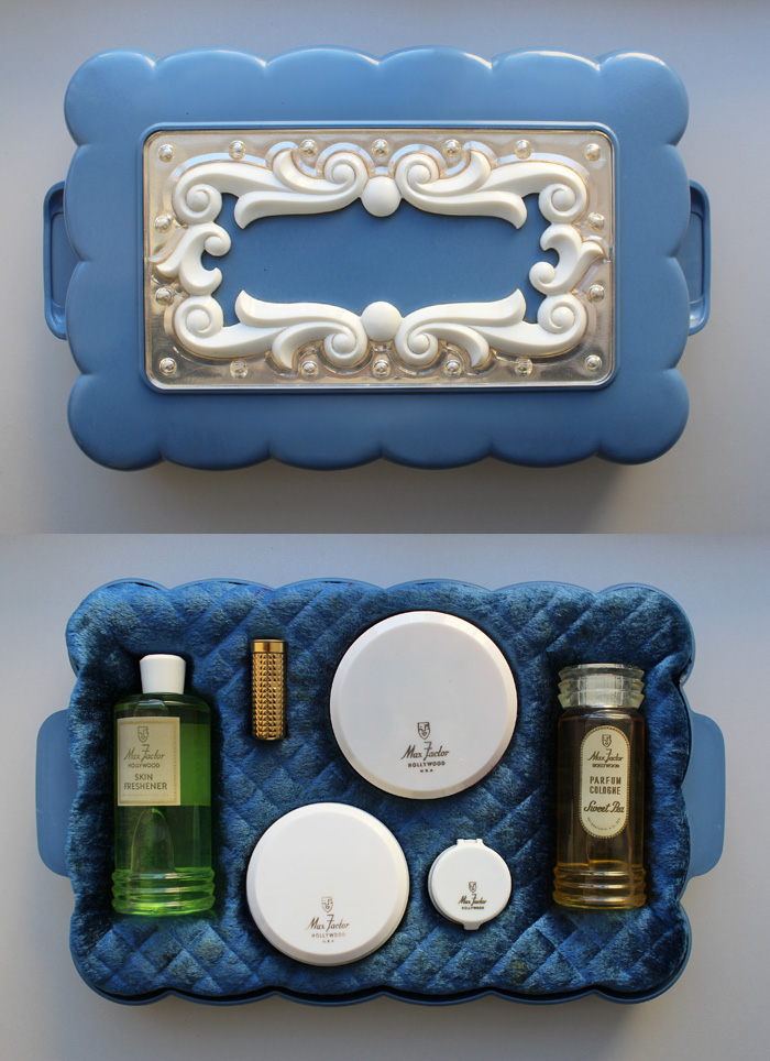
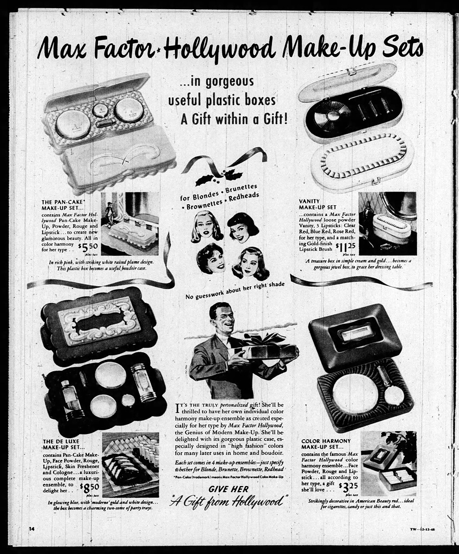
First up is a mint condition Max Factor gift set.  A very nice woman in Canada donated it, noting that it was a birthday present from her father to her mother one year.  According to newspaper ads it dates to about 1948. I love the suggested use for the box lids as "party trays"!

Vintage Max Factor gift set

December 1948 ad for Max Factor gift sets

December 1948 ad for Max Factor gift sets

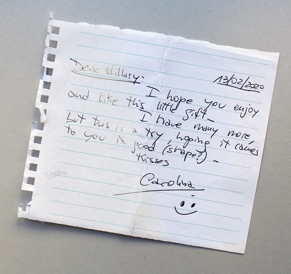
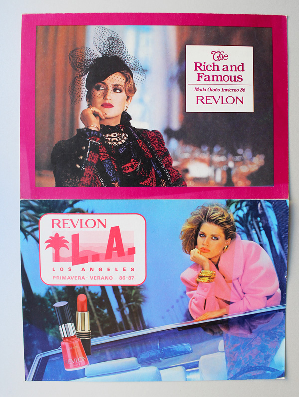
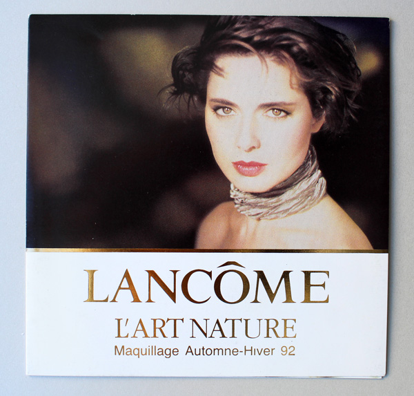
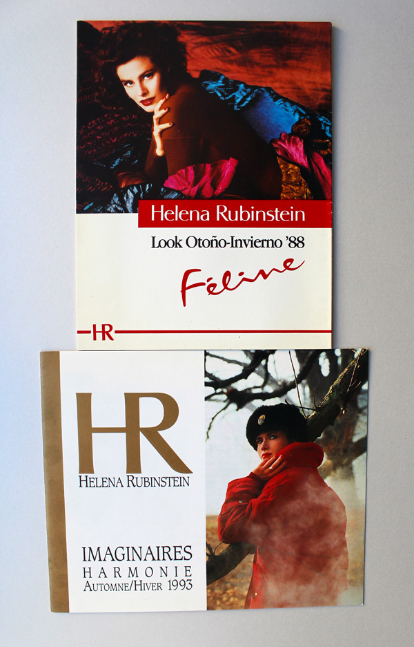
Next up is a slew of awesome ads and postcards from the '80s and '90s, donated by an Instagram buddy from Argentina.  Such a sweet note too!

MM donation note

Revlon Rich and Famous and LA postcard, 1986-1987

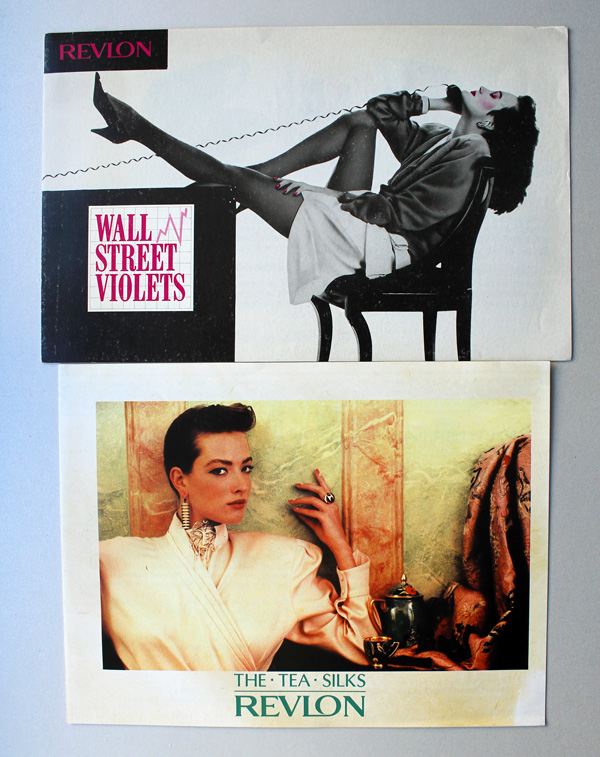
Revlon Wall Street and Tea Silks postcards

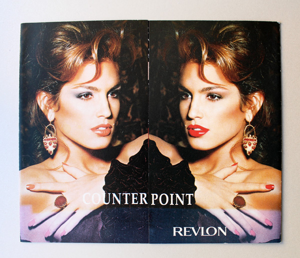
Revlon Counterpoint postcard

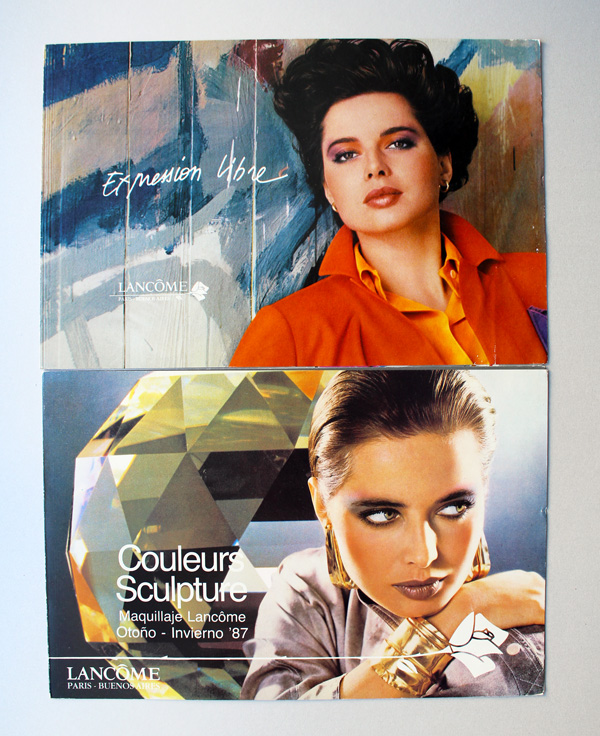
Lancome postcards, 1986-1987

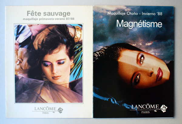
Lancome postcards, 1987-1988

Lancome L'Art Nature postcard, 1992

Helena Rubinstein postcards, 1988

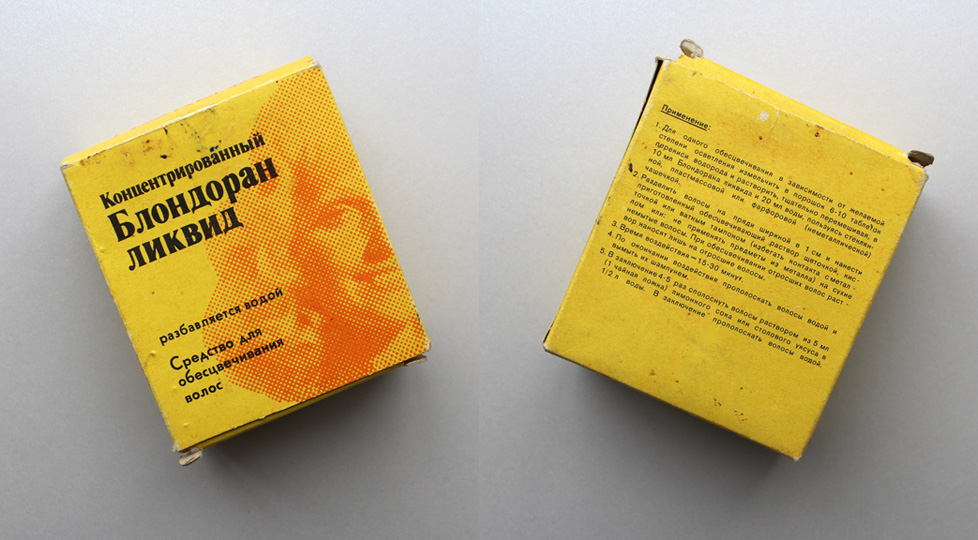
This next one is super interesting.  Normally the Museum does not include hair products, but the donor is a fellow collector and very knowledgeable about Russian culture, having lived in Moscow for several years.  This vintage hair dye was made in East Germany and exported to the USSR.

Florena hair dye

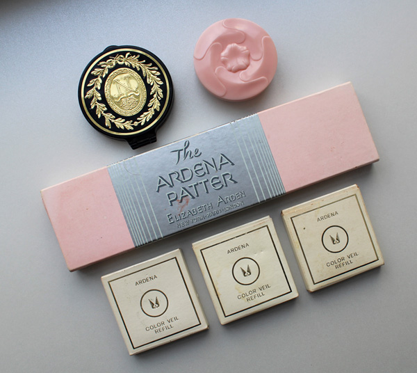
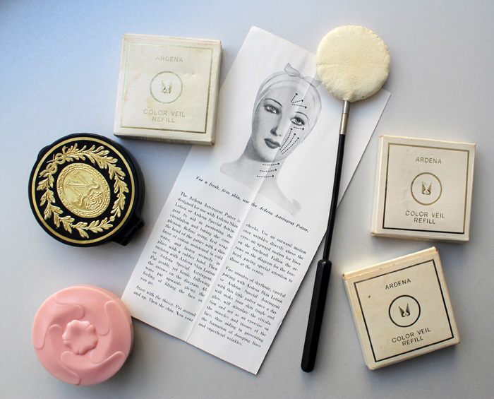
Next up are some lovely Elizabeth Arden objects. These were donated by a woman in California whose mother worked at the Elizabeth Arden counter at a department store.  Here we have the Napoleonic compact which was introduced around 1953, Faint Blush, the famous Ardena patter, and some Color Veil (powder blush) refills.

Makeup Museum donation - Elizabeth Arden

Near as I can figure, the Faint Blush was a sort of foundation primer, but it seems like it could also be worn alone.  I love the plastic pink rose packaging, as it's very much of its era (ca. 1963-1973).

Newspaper ad for Elizabeth Arden Faint Pink, February 1964

I think the patter and the Faint Blush are my favorites from this bunch.

Makeup Museum - Elizabeth Arden donation

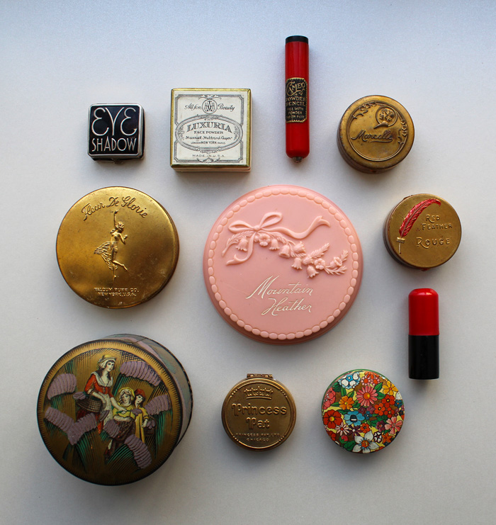
Then, another very kind Instagram friend and fellow collector sent a huge lot of vintage powder boxes and compacts.  The Museum did not have any of these…some I hadn't even heard of and some I had only admired them from afar.  I just about died when I opened the package!  Clockwise from top left: a 1930s eyeshadow by a company called Quinlan, a 1920s Harriet Hubbard Ayer Luxuria face powder, a powder dispenser by Cameo (probably from around the '30s), a '20s Marcelle compact tin, an extremely rare Red Feather Rouge tin (ca. 1919), an unmarked lipstick and floral powder tin, a Princess Pat compact from about 1925, a Yardley English Lavender tin (ca. 1930s) and a Fleur de Glorie face powder compact (ca. 1923-1926).  In the middle is an amazing pink plastic 1940s Mountain Heather face powder case, a line manufactured by Daggett and Ramsdell.

Makeup Museum donation

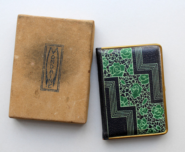
I love each and every piece, but my favorites are the eyeshadow compact, and an adorable Mondaine book compact (with the original box!) that was also included. Bookworm that I am, I want a whole "library" of these designs.

Vintage Mondaine book compact

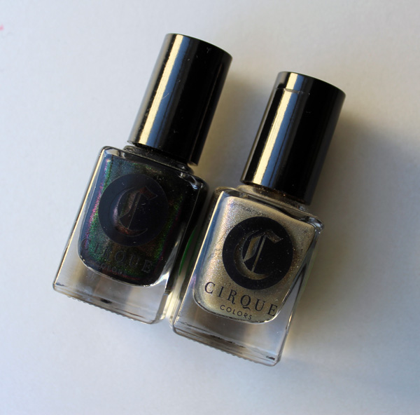
Not all of the donations were vintage.  I was so happy to have received these two nail polishes from another IG friend. They were the result of a 2016 collaboration between Cirque Colors and the Met in honor of the latter's Manus x Machina exhibition.

Cirque Colors Raven and Moon Dust

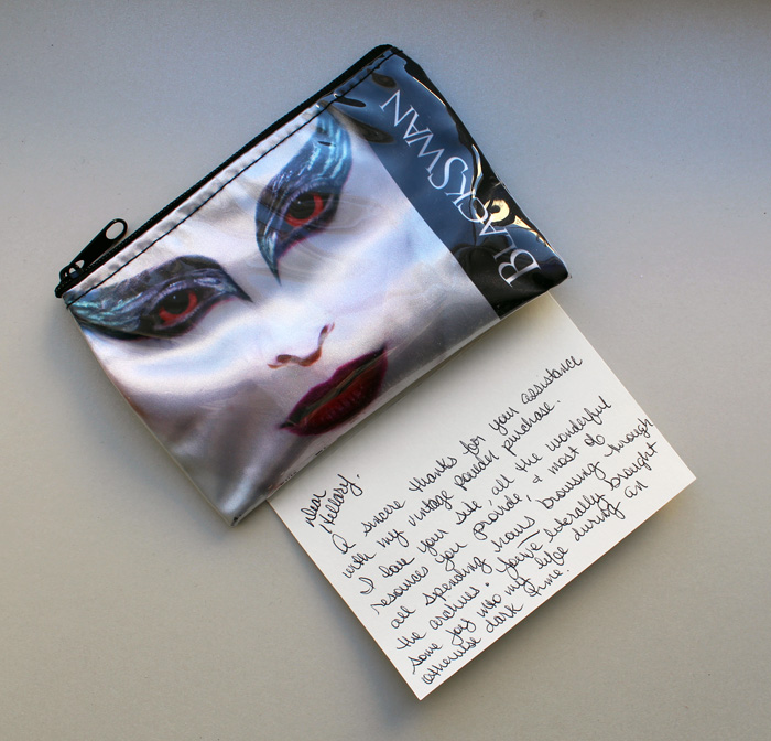
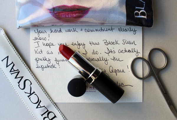
I'm sure you remember the kindness of makeup artist Amelia Durazzo-Cintron, who shared her memories of working for Kevyn Aucoin back in July.  For some reason she felt the need to thank ME instead, and did so by donating a really cool Black Swan makeup kit.  How nice is her note?!

Black Swan makeup kit

Black Swan makeup kit

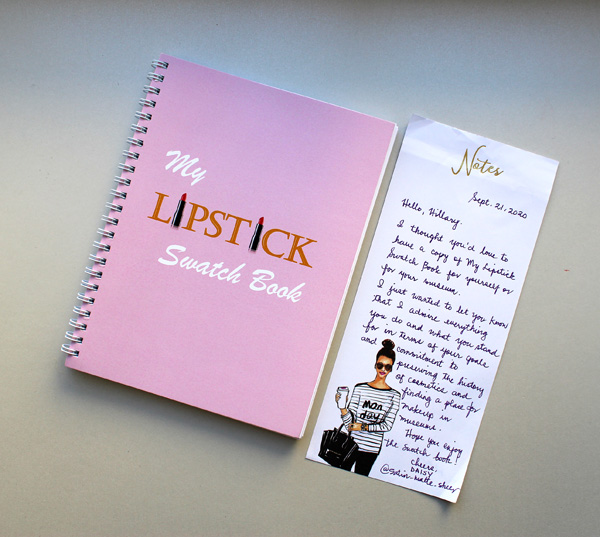
Another Instagram friend and lipstick fanatic has been making lipstick swatch books.  These are kind of a new trend and in my opinion, far easier than taking photos of your lipsticks.  Once again a sweet note was enclosed.

Lipstick swatch book by Satin Matte Sheer

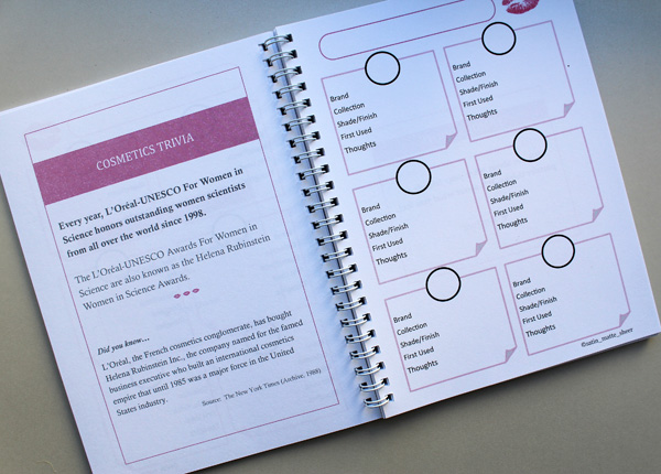
This lipstick swatch book is particularly lovely for its sprinkling of cosmetics trivia and important dates.  (It also reminds me that I never started working on my daily makeup history calendar, sigh.) If you want one of your own you can purchase it here.

Lipstick swatch book by Satin Matte Sheer

And that wraps up MM donations in 2020! I'm so incredibly grateful for these kind souls generously helping to build the collection.  And while physical objects are amazing, it's the notes and messages that come with them that mean the most.  :)  Also, if you have a makeup object you think is historically significant, an object from the Curator's wishlist, or anything else you'd like to give, please check out the Museum's support page.  I'm always looking for old fashion/women's magazines too, along with ads and brochures and such…I can never have too much paper memorabilia!

Which one of these is your favorite?  What's the best gift you've ever received?

Carmen Murphy in 1969"To borrow Dr. King's phrase all I had, too, was a dream.  I got into the business mainly because Black women, myself included, had been searching for cosmetics that would look good on them for years.  There just weren't any."
– Carmen Murphy

In an effort to dig into Black makeup history, I came across many pioneering entrepreneurs who filled the much-needed gap for Black cosmetics and hair care that haven't really gotten their due historically.  I'm not sure whether this is appropriate for a white person to do – I still feel as though it's not my story to tell – but as with my article on Tommy Lewis I figured bringing awareness to bits of forgotten history even through a white lens was better than not doing it at all.  If anyone would like to weigh in on how I can do a better job and not whitesplain/whitewash, I am all ears.

So with that caveat in place, let's take a look at Carmen Cosmetics and the savvy businesswoman behind it, Carmen C. Murphy.  Carmen Murphy (née Caver) was born on October 20, 1915 in a small town just outside of Little Rock, AR.  The second oldest of nine children in an impoverished family, she began modeling to support herself.  At the age of 19 she married a pediatrician, Scipio Murphy, and they moved to Detroit.  She studied Home Economics and Business Administration at Wayne University. While much larger than the small Southern town Murphy grew up in, Detroit still lacked high-end beauty services for Black women.  They were excluded from white salons and the few Black salons didn't have the expertise.  "No one knew high fashion.  The beauticians used far too much oil and it took two weeks before [the hair] became nice and soft again," Murphy noted.  In 1946 she purchased a dilapidated three-story Victorian mansion located at 111 Mack Avenue (or 188 Mack Avenue) and spent $50,000 of her own money turning it into a 24-room salon. In November of 1947,  Olivia Clarke, president of the Rose Meta Beauty Products Company and the successful Rose Meta House of Beauty in Harlem, along with Rose Meta founder Rose Morgan and business manager Odessa Trotter, visited Detroit to finalize plans for opening a salon "fashioned" after the original House of Beauty in New York.  On May 30, 1948, the space officially opened as House of Beauty, with Trotter serving as beauty consultant.  However, I'm still confused as to the relationship between Morgan and Murphy and the latter's role in conceiving the House of Beauty.  According to one article, "The business project is the brain-child of Mrs. Murphy, who has had the cooperation of Rose Morgan of the New York House of Beauty…". Could it be that Murphy had the idea of a full-service salon around the same time as Morgan,  discovered the Rose Meta salon and then worked with her to develop a salon in Detroit with the same name, yet the two would be totally independent of each other?  Or did Murphy purchase her building in 1946 with the intent of opening a Rose Meta-style salon from the start? In of the articles regarding the grand opening, it's referred to as the Rose Meta House of Beauty, as if Murphy's enterprise was just another location of the original salon in New York, but Murphy was actually the owner.

In any case, the House of Beauty was intended to provide "tip to toe" beauty services for Black women.  The salon did $76,000 worth of business in its first year, with a staff of 35 serving an average of 200 clients per day, roughly a quarter of whom were white.  House of Beauty's operation was particularly innovative for its use of an "assembly line" service where customers received everything from massages to makeup consultations in a streamlined, orderly yet relaxing fashion.  Quipped Murphy's husband, "Leave my wife alone, and the House of Beauty would be as large as the Ford plant at River Rouge."

House of Beauty feature article, Ebony, 1951

While the salon did well, Murphy was still frustrated by the continuing lack of cosmetics available for deeper skin tones. "Most of us simply would not use any makeup," she said.  Murphy approached every major beauty company, including Avon, Helena Rubinstein and Revlon, only to be rejected.  "They would tell you firmly that they weren't interested, and that if they sold products for N*groes, it might spoil their image in the white community."  But in 1950 the owner of eponymous line Rose Laird offered to help Murphy develop and launch her own line.  "She simply said, "I'll help you'", Murphy recalled.  Laird assigned her chief chemist, Irving Wexler, to create formulas that wouldn't turn ashy or red on Black skin tones and that would actually match the diversity of Black skin.  In 1951 Carmen Cosmetics was officially launched.  Around this time the "Rose Meta" portion of the Detroit House of Beauty name was removed, perhaps due to the new makeup line.  Rose Meta also sold their own line of makeup for Black women in their New York salons and it's uncertain whether they were sold in the Detroit House of Beauty, but it seems that Carmen Cosmetics would be the in-house makeup brand for the salon starting in 1951. Given the partnership with Rose Laird and the new formulas concocted by Wexler, we can assume they were products that were entirely distinct from the Rose Meta line. 

House of Beauty feature article, Ebony, 1951

Murphy began promoting her line outside of Detroit shortly after its launch.  By 1953 Carmen Cosmetics had a foothold in a handful of other states. Again, notice that by 1953 the salon is referred to as Carmen Murphy's House of Beauty rather than Rose Meta.  I'd really love to unravel the mystery of the relationship between the two!

Carmen Murphy - House of Beauty Cosmetics, 1953

House of Beauty Cosmetics booth in Ammon Center for the Pittsburgh Courier Home Service Fair, June 9-11, 1953. Photo from the Charles "Teenie" Harris archive, Carnegie Museum of Art.
Carmen Murphy - House of Beauty Cosmetics

House of Beauty Cosmetics booth in Ammon Center for the Pittsburgh Courier Home Service Fair, June 9-11, 1953. Photo from the Charles "Teenie" Harris archive, Carnegie Museum of Art.

(images from collection.cmoa.org)

In early 1957 a more extensive sales campaign for the line was launched through the Student Marketing Institute based in New York.  Roughly 250 salespeople were deployed in 40 major urban markets across 17 states, targeting department and drug stores, Black salons and individual customers.  The theme was "everyday beauty for every smart woman", with window displays depicting "the varied roles played by every busy woman daily."  The items' retail price began at $1.25, competitive for other major cosmetics brands at the time.  Six shades of face makeup were offered along with face powder, mascara, brow pencil, blush and 6 lipstick colors. 

House of Beauty ad, 1957

House of Beauty ad from the 1957 Picture book of business and program of annual Trade Week campaign of Housewives League of Detroit. Burton Historical Collection, Detroit Public Library.

(image from detroitpubliclibrary.org)

In 1963 the salon had outgrown its original space and was moved to the Great Lakes Insurance Building at 8401 Woodard Avenue.  The Small Business Administration denied Murphy a loan despite the success of the original salon, so she and her husband had to use their own savings and borrow on their insurance to open at the new location.  Nevertheless, in April of that year Carmen Cosmetics made its world debut.   This article is useful but cringe-worthy for the use of "oriental" to describe an Asian skin tone; however, at least it doesn't refer to Murphy as the "N*gro Helena Rubinstein", which is how she was referred to in several major articles.  Ugh.  What was part of the success of the Carmen Cosmetics line was that it may have been the first Black-owned line to cater to every skin tone.  The formulas for other Black-owned lines were primarily intended for for Black clientele (and justifiably so), but Murphy wanted to accommodate "every female on the face of the earth."  Sort of a precursor to the "multicultural" beauty campaigns and products of the '90s, yes?

Detroit Free Press, April 6, 1963

Carmen Cosmetics continued using this as a marketing strategy throughout the '60s, at least when dealing with potential sales outlets.

Carmen Cosmetics sales letter, 1967

Carmen Cosmetics sales letter, 1967(images from Wayne University library archives)

In 1966 Rose Laird passed away, and in 1968 Murphy purchased the company for about $175,000 and named Wexler president. Early in the year the salon moved again, this time to 6080 Woodward Avenue to accommodate even more services.  This brief profile from the February 1, 1969 issue from Vogue discusses the salon and highlights Murphy's role as the first Black woman to head a major cosmetics firm.  While other Black beauty pioneers such as Madame C.J. Walker and Annie Turnbo Malone were well-known for their hair care products and services, and there were some Black-founded lines that offered  products for deeper skintones (Rose Morgan's Rose Meta, La Jac, Valmor, and Overton's High Brown powder come to mind) Carmen Murphy was among the first to focus on providing a comprehensive range of cosmetics for Black women, and the first to land significant business partnerships to distribute it.  What's also remarkable is that Murphy's business did not rely as much on direct sales as other companies that courted Black customers did at the time (Fuller, J. R. Watkins, etc.)  The salespeople for Carmen Cosmetics were responsible for getting the line into stores or doing in-store demonstrations, with less emphasis on going door-t0-door to individual clients.  From my understanding, there were no Carmen Cosmetics "dealers" as with Avon and the like.

Carmen Murphy profile in Vogue, Feb 1., 1969(image from archive.vogue.com)

From late 1968 it's unclear what happened next to the business.  By then Murphy had landed a deal with Universal to supply her line to their film studios and was in negotiations with Bristol Myer (producer of Clairol) for international distribution, but it's not specified whether that arrangement went through, since according to an article from January of 1969 she was still considering it along with 2 others from major corporations. By 1971 Carmen Cosmetics was sold in Woolworth's, Kresge and Lamston stores, but an article in October of that year refers to a "big" deal that did not take place because she needed a loan to seal the final agreement, and the SBA again refused a loan.  Murphy laid out how systemic racism prevented Carmen Cosmetics from expanding further.  "Basically, the financial institutions do not want to see us succeed in big business.  They will loan you enough to get you started, usually just enough to get you in trouble.  Being refused by banks has been a blow to me.  I feel that, if you become large, and if you become a real threat on the market, they decide to box you in…white people are trying to prove that we do not have the ability.  Given the opportunity, we will fail.  This is a planned, white, negative approach to help.  We will fail, and this will come back at us for years to come…a white business woman definitely would not encounter this problem.  She would have a line of credit, something we never had."  Referring to the House of Beauty, she concluded:  "My dream has not been fulfilled here." Although this occurred nearly 50 years ago, it demonstrates exactly why we need programs like Juvia's Place and Glossier's grant programs today. The system is still incredibly unjust, bigoted and actively preventing Black entrepreneurs from fulfilling their vision.

In 1974 Murphy retired as the House of Beauty's owner, and there's basically no readily available information regarding what happened to the Carmen Cosmetics line or the salon after that. There was a brief mention in a November 1975 issue of Black Enterprise so we know it was still being sold then, but that was about it.  I contacted 4 organizations in Detroit and no one was able to locate business records for House of Beauty or correspondence for Carmen Murphy.  Nor could anyone find her obituary.  She was still alive in 1995, when she received an award for her founding of H.O.B. Records (House of Beauty Records), but had passed by 2010 which is when a video of her receiving the award was uploaded.  She had two sons, Scipio Jr. who tragically died quite young from polio in 1950, and Robert, an accomplished pianist and music teacher who is also deceased.  Her nephew (her sister's son), Van Cephus, was a jazz musician who sadly died by suicide in 2014.  From the comments on the aforementioned video it looks like there are a couple of surviving relatives, but obviously I don't feel comfortable reaching out to them for any information they might have. 

So as not to end on a complete down note, I want to highlight Murphy's other achievements.  Throughout her career she continued to give back to the Black community.  In 1958 she started H.O.B. Records initially to fund gospel recordings. She then set up a practice room in the salon's basement for up and coming musicians to use. H.O.B. Records quickly became the launchpad for dozens of talented musical groups.

HOB records
(image from fhcmag.blogspot.com)

With the cooperation of the Detroit Board of Education, Murphy also spoke at local schools about proper grooming.  "All the poverty programs usually come to us for beauty and good grooming touches before they finish.  I want young people to take pride in their appearance.  Many haven't had the opportunity to dress properly, to act properly or to wear the right things. I want to teach them to take an interest in themselves and the world around them," she said.  On the one hand, I suspect, sadly, that "properly" and "the right things" are code for white standards of beauty and decorum. On the other, it's wonderful that Murphy was providing underprivileged Black youth with some of the tools that would aid them in advancing their social and economic status.  Along those lines, in late 1969 she began supplying Carmen Cosmetics to American Airlines for use in their Grace and Glamour program, which helped "young girls build confidence through good grooming habits and proper makeup techniques."  The program provided mini flight kits containing Carmen Cosmetics to be used by the girls, which they were permitted to keep.  The Grace and Glamour program doesn't exactly sound like a bastion of feminism, but it's important to keep in mind that there were very few opportunities available for disadvantaged Black girls at the time.  And it seems that at least some of the girls enjoyed the products and the makeup process. 

Jet Magazine, January 8, 1970(image from Jet Magazine)

By 1971, Murphy had served as a volunteer driver for the Red Cross, was a lifetime member of the National Association for N*gro Women and NAACP, a member of the African Art Committee at the Detroit Institute of Arts, the women's auxiliary of the Detroit Symphony, the Booker T. Washington Trade Association, the YWCA and the Detroit Roundtable of Catholics, Jews and Protestants, Inc. 

As there are still many loose ends to tie up regarding Ms. Murphy – namely, any sort of correspondence, business records, or obituary – I'm contemplating the idea of hiring a private researcher to see if they can find any official business records and additional photos, but it's going to depend on their fees.  I saw tons of article "snippets" on Google books and a New York Times article that I was unable to access as well, so there's more information out there.  Also, there are plenty of online articles about Rose Morgan but obviously I'd like to do a really in-depth profile of her and also see if I can find anything about her business relationship with Carmen Murphy. 

Huge thanks to James from Cosmetics and Skin for his assistance with this article! He supplied the 1951 Ebony article and wrote an excellent profile of Rose Laird if you're interested in additional background to the Carmen Cosmetics line…just go through his whole site, it's chock full of thorough and well-researched information.  I also must thank the archivists at the Detroit Historical Society, the Burton Historical Collection at the Detroit Public Library, the Bentley Historical Library at the University of Michigan, and the Charles H. Wright Museum of African American History

Thoughts?  Feedback?  I'd really like to do more profiles of early Black beauty lines and makeup artists…let me know who you think needs more attention or if I should keep my white mouth shut.

UPDATE, February 2021: I was thrilled when Carmen Murphy's granddaughter Laura got in touch and shared some memories of her grandmother, along with photos of the Carmen Cosmetics line! Laura visited her grandmother over Christmas and summer breaks during her youth and was able to provide some insight on Ms. Murphy's style, the salon's closure and the products.  "She had an image that she HAD to maintain for herself…very feminine, stylish, slim, well-coiffed and manicured.  I don't remember a specific beauty regimen, but of course she used her own products and supplemented them with masks, scrubs and lotions made by other companies.  She was the first person to introduce me to a loofah and a pumice stone.  LOL.  Even in her later years, she had to at least have on lipstick whenever we went out (even to the pharmacy or grocery store)…Since I was so young when the House of Beauty closed, I'm unfortunately not sure how and why her business ended. She was quite a visionary, and had some very forward-thinking ideas about make-up and fashion for women of color.  But I'm told she made some bad business decisions and trusted the wrong people (who took advantage of her).  She was able to survive for several years off of the reputation she'd built in Detroit and the patronage of her loyal customers.  After [the salon closed] the things I remember most were the ladies who would come to the house to buy her products when I would visit for the summers.  She would have me go to the basement to fill the product orders and if the customers paid in cash, she'd sometimes give me a dollar or two.  I didn't recognize the value of what she had achieved until much, much later when she no longer had those things."

Here are some photos from Laura of the actual products!  "The Silking Oil was primarily applied to the scalp, but could also be applied directly to the hair to promote moisture retention.  The Toning Lotion and Foam Cleanser are pretty self explanatory.  The bulk of the packaging that I remember looked like the Silking Oil – pale pink with the 'Carmen' logo on it.  (The product packaging changed a couple times, so the items I have were from the last change.)  She had cream and liquid foundation and pressed powder in pink compacts, and she named the shades after types of furs – I only remember Sable and Russian Sable, which were the most popular." 
 
Carmen Cosmetics Toning Lotion and Foam Cleanser
Carmen Cosmetics Silking Oil
 
She also provided photos of what she believes is Carmen's first House of Beauty.  "You can't see the products close up, but they give you an idea of the different types of packaging on the shelves (and yes that is THE Mary McLeod Bethune)."
 
Mary McLeod Bethune and Carmen Murphy
 
Mary McLeod Bethune at the House of Beauty, ca. early 1950s
 
How amazing!  Laura, thank you so much for this incredible update and all the photos.


Sources:  As with my previous post, I linked throughout to relevant sources and pulled the rest of the story together from various newspaper and magazine articles, so those additional sources are listed below.

Gale Research International, "Who's Who Among Black Americans," 2002, p. 222.

"Cosmetics Firm Uses New, Unique Sales Approach," the New York Age, January 12, 1957.

Valerie Jo Bradley, "Grace and Glamour comes to Langston University Co-Eds," Jet, January 8, 1970, p. 28-31.

"Why Herb Martin Keeps Chugging Along, Just Like…er…uh…Horatio Allen," Detroit Free Press, October 24, 1971.

Mary Ellen Kirby, "Beauty: Skin deep, then some to Carmen Murphy," Detroit News, October 21, 1968.  Article provided by the Charles H. Wright Museum archives.

John L. Dotson, Jr., "Black is beautiful: Carmen Murphy's beauty salons bring cosmetics to N*gro women," Newsweek article featured in the Kenosha News, January 8, 1969.

Makeup Museum spring 2020 exhibition

Introduction
Welcome the Makeup Museum's spring 2020 exhibition!  "Soaring Beauty: The Butterfly in Modern Cosmetics" explores the many ways butterfly imagery is used across all aspects of beauty culture.  For 100 years the butterfly has been an endless source of inspiration for makeup artists and collections, ad campaigns and packaging.  As the butterfly is perhaps the ultimate symbol of transformation, there is no motif more appropriate to embody the metamorphosis that makeup can provide. Like flowers, various butterfly species are a favorite reference for makeup colors, textures and finishes.  More broadly, butterflies represent springtime, rebirth, hope, and freedom.  With "Soaring Beauty", the Makeup Museum seeks to embrace this optimistic spirit and provide a peaceful oasis in the midst of a very uncertain and trying time.

The exhibition focuses on 5 main elements of butterfly makeup, which I will examine briefly before getting to the main show.  Hover over the image for information, and additional details (when available) are listed in some of the captions.

I. Color
The vibrancy of butterflies' coloring and their wings' gossamer texture figure prominently in the beauty sphere. Makeup shades and artist creations include every tone from earthy moth browns and greens to bold blue and orange hues to slightly softer pastels.

Vogue Portugal September 2016, makeup by Michael Anthony

Vogue Portugal September 2016. Makeup: Michael Anthony; Photography: Jamie Nelson; Model: Zuzana Gregorova; Styling: Melaney Oldenhof; Hair: Linh Nguyen

Blanck Digital magazine, December 2016
(image from blanckdigital.com)

Makeup by Sheri Vargas

Editorial: "Ephemeral", spring 2013. Model: Lola; Hair & Makeup: Sheri Vegas; Photographer: Clara Copley

(image from designscene.net)

Makeup by Sheri Terry for Glamour New Zealand
(image from sheriterry.com)

Elle Ukraine, August 2012, makeup by Lloyd Simmonds

Elle Ukraine, August 2012, makeup by Lloyd Simmonds

(image from pinterest)

Quality Magazine, makeup by Hannah Burkhardt

Quality Magazine Germany. Hair and Makeup: Hannah Burckhardt; Photographer: Marco Rothenburger; Models: Krista Tcherneva and Alena N.; Styling: Jennifer Hahn

(image from pinterest)

As butterflies are largely synonymous with spring, rebirth and rejuvenation, the vast majority of butterfly-themed collections are released then and feature bright, fresh colors.

Revlon Butterfly Pink ad, 1958

This ad is racist AF but I thought it was important to include.

Artdeco spring 2013
(image from magi-mania.de)

However, some color stories reflect different seasons via butterflies' natural habitats. Chanel's summer 2013 collection featured rich greens and blues reminiscent of the tropical morpho butterfly, while Anastasia Beverly Hills and Colourpop's fall releases opted for warmer tones inspired by monarch butterflies and their migration in the cooler months.

L'été Papillon de Chanel, summer 2013

L'été Papillon de Chanel, summer 2013 - makeup by Peter Philips
(images from popsugar.com)

ABH Norvina 3 palette

Colourpop fall 2019
(images from anastasiabeverlyhills.com and ulta.com)

II. Texture and Finish
The delicate, lightweight nature of butterflies and the softness of their wings is repeatedly referenced in early 20th century advertisements for face powder.

Icilma advertising postcard, 1920s
(image from maudelynn.tumblr.com)

Lancome powder ad, 1935

Poudre Simon, ca. 1930s-1940s
(image from lesanneesfolles.ocnk.net)

Poudre Simon ad, 1941
(image from hprints.com)

Yardley ad, 1948
(image from wikimedia.org)

For Australian brand Lournay, the "butterfly touch" was an integral part of their marketing for two decades.

1940s Lournay ad

Lournay ad, 1950

Lournay ad, 1952

Lournay ad, 1955

As for finishes, butterfly-themed makeup excels at imparting an iridescent, pearlescent or metallic sheen that reflects light similarly to that of a butterfly's wing.  New technology is being developed to artificially yet seamlessly recreate the iridescent butterfly wing effect in cosmetics, among other areas.

Model Joan Smalls at Jean Paul Gaultier spring 2014 couture show, makeup by Lloyd Simmonds(images from vogue and stylecaster)

Emily Rogers butterfly lipstick, ca. 1965
(image from pinterest)

Lipstick Queen Butterfly Ball lipstick

"Inspired by the beauty of a butterfly's wing, these moisturizing lipsticks shimmer with a flash of turquoise iridescence that lights up the complexion and makes teeth appear whiter. In soft and whimsical shades of pink that flutter and float over lips, this collection of lipsticks brings a butterfly radiance to your entire look."

(image from lookfantastic.com)

Harpers Bazaar Netherlands, October 2015. Makeup by

Harper's Bazaar Netherlands, October 2015. Makeup Artist: Gina Kane; Photographer: Felicity Ingram; Model: Amy Verlaan; Creative director: Piet Paris; Hair Stylist: Anna Cofone

(image from pinterest)

The fascination with butterflies' iridescent quality is also expressed in "morpho" compacts of the 1920s and '30s.  These were made with real morpho butterfly wings or foil and commonly depicted tropical locales.  Popularized by jeweler Thomas Mott at the 1924 British Empire Exhibition, morpho designs were also used in jewelry and other accessories. 

Morpho compacts(images from etsy and pinterest)

III. Movement
Butterfly beauty products embraced the notion of flight and the insects' graceful motion, at times linking them to dance or music to more fully capture the joyous, free-spirited movement of a butterfly soaring through the air.  K-beauty brand Holika Holika simply titles their butterfly embossed blushes "Fly", while jeweler Monica Rich Kosann named the compact she created for Estée Lauder "Butterfly Dance".  Pat McGrath's "techno butterflies" look at Dior's spring 2013 combines pastel "wings" with rhinestone details to impart a rave-like vibe.

Holika Holika Fly blushes

Butterfly Dance compact by Monica Rich Kosann for Estée Lauder
(image from neimanmarcus.com)

Dior spring 2013, makeup by Pat McGrath
(images from beautyfw.com)

But the fluttering movement of a butterfly is best captured in makeup via the eyelashes. 

Paperself deer and butterfly lashes
(image from paperself.com)

Vogue Portugal September 2016

Vogue Portugal September 2016. Makeup: Michael Anthony; Photography: Jamie Nelson; Model: Zuzana Gregorova; Styling: Melaney Oldenhof; Hair: Linh Nguyen

L'Oreal Butterfly Effect mascara ad
(image from pinterest)

Manish Arora spring 2020, makeup by Kabuki
(image from buro247.sg)

IV. Design
Butterflies proved to be a popular design element in general. As far back as the 1900s, jewelers created exquisitely detailed butterfly compacts made with fine glass and sterling silver, and many compact manufacturers incorporated the motif in their offerings.  The butterfly's more whimisical side is expressed in Max Factor's acrylic "Butterfly Kiss" set and more recently, in a Jill Stuart Beauty lip gloss filled with iridescent butterfly-shaped glitter.

Max Factor holiday ad, 1974
(image from pinterest)

Butterfly makeup design

  1.  Austrian sterling silver and glass compact, ca. 1920s
  2.  Lady Wilby compact, ca.
  3.  Jill Stuart Butterfly lip gloss, spring 2019
  4.  Vantine powder box, ca. 1923
  5. House of Sillage lipstick case (in collaboration with the film The Aeronauts), fall 2019
  6. Nacon compact, ca. 1982
  7. Volupte compact, ca. 1946-1952

V. Mood and Metamorphosis
Whether it's subdued or taking a more literal approach, butterfly inspired makeup is a universally recognized symbol for spring and transformation.  Many companies release items embossed with butterflies or incorporate them in the advertising for their spring campaigns to express the larger ideas of hope, joy, freedom and rejuvenation.

Lubin "Butterfly Bouquet" face powder, ca. 1920s
(image from worthpoint.com)

Guerlain ad, 1965
(image from hprints)

Clinique Fresh Bloom ad, spring 2007 - collection of the Makeup Museum

Shown here are Pop Beauty, Mark and Paul & Joe blushes/bronzers/highlighters from spring 2012 and a spring 2016 Clinique GWP bag with a Vera Neumann butterfly print.

Spring butterfly makeup, collection of the Makeup Museum

The theme of metamorphosis is reinforced through the fusing of faces and butterflies. By adhering butterflies to the cheeks, lips and even eyes, the effect is a physical transformation intended to turn the mundane into the magical and capture the essence of the butterfly as it emerges from its cocoon.

Lady Gaga on V Magazine, 2011
(image from fashionista.com)

Schon Magazine, Issue 19

Schon Magazine, Issue 19 (fall 2012), makeup by Elias Hove

(image from trendhunter.com)

Giambattista Valli, fall 2012

"The Garden of Eden theme continued with the make-up – glitter eyes beneath net masks to look like delicate mythical creatures, and butterflies on the models’ lips as though the insects had just landed there for a moment." – Jessica Bumpus for British Vogue

(image from vogue.com)

An outstanding example of this concept is the spring 2020 runway show by Manish Arora.  Makeup artist Kabuki was responsible for the dazzling, otherworldly looks.  Some of the models were drag queens, emphasizing the transformational nature of both makeup and butterflies.

Manish Arora spring 2020

Manish Arora spring 2020

Manish Arora spring 2020(images from buro247.sg)

As noted in part 1 of the introduction, butterfly-inspired makeup usually features an array of colors found on various butterfly species. However, when combined with butterfly application directly to facial features, barely-visible makeup speaks to butterflies' undomesticated environment and conveys the human bond with nature. 

Dazed magazine, June 2012

Dazed magazine, June 2012. Makeup: Peter Phillips; Hair: Syd Hayes; Photographer: Ben Toms; Model: Elza Luijendijk; Stylist: Robbie Spencer 
Dazed and Confused magazine, June 2012

Dazed magazine, June 2012. Makeup: Peter Phillips; Hair: Syd Hayes; Photographer: Ben Toms; Model: Elza Luijendijk; Stylist: Robbie Spencer 

(images from fashiongonerogue.com)


Exhibition
All of the above elements are well represented throughout the objects in the exhibition.  So let's get to it!

Makeup Museum spring 2020 exhibition

Makeup Museum spring 2020 exhibition

Makeup Museum spring 2020 exhibition

Makeup Museum spring 2020 exhibition

Makeup Museum spring 2020 exhibition

Top row, left to right.

Let me just say that the story of Lucretia Vanderbilt makes Tiger King look tame by comparison.  I tried to summarize it the best I could, but for the full story head over to Collecting Vintage Compacts.

Lucretia vanderbilt

Lucretia Vanderbilt compact

Lucretia Vanderbilt powder box

Makeup Museum spring 2020 exhibition label

Possibly my favorite pieces in the exhibition and one of my all-time favorites: Chantecaille Les Papillons eyeshadows and Garden in Kyoto palette.

Chantecaille Les Papillons and Garden in Kyoto palette

Makeup Museum spring 2020 exhibition label

I had to do several labels to cover the Mamechiyo and Chinese New Year collections for this shelf.  I was also going to include the Lisa Kohno collaboration, but given the lack of space and the fact that there's another Shu collection in the exhibition I left it out.

Shu Uemura Chinese New Year 2016 and Mamechiyo collection

Butterfly kite by Zhang Xiaodong

Makeup Museum spring 2020 exhibition label

Shu uemura mamechiyo beauty

Makeup Museum spring 2020 exhibition label

Shu Uemura boutique ceiling by Mamechiyo

Makeup Museum spring 2020 exhibition label

I'm hoping to dig up more information on the artist behind the design on this Stratton palette, which may be tricky as his archives are located in the UK.

Stratton butterfly compact by Holmes Gray

Dior makeup ad, spring 1985, makeup by Tyen

Dior makeup ad, spring 1985

Makeup Museum spring 2020 exhibition label

Second row, left to right.

I couldn't find much information on the inspiration behind Marcel Wanders' compact for Cosme Decorte.  I'd love to know how he came up with the design.  All I know is that the model in this video is wearing a dress made with the same pattern.

Cosme Decorte Marcel Wanders Romantic Butterfly compact

Cosme Decorte Marcel Wanders Romantic Butterfly compact

Slightly better shot of the powder so you can see the lovely little butterfly details.

Cosme Decorte Marcel Wanders Romantic Butterfly compact

Cosme Decorte Marcel Wanders Romantic Butterfly compact

Cosme Decorte Marcel Wanders Romantic Butterfly compact
(promo images from cosmedecorte.com)

Makeup Museum spring 2020 exhibition label

Anna Sui butterfly makeup

Anna Sui butterfly blush

Anna Sui (runway images from vogue.com)

Makeup Museum spring 2020 exhibition label

MAC Madame B pamphlet, spring 2005

MAC Madame B pamphlet, spring 2005

Gucci Sunstone Illuminator

Makeup Museum spring 2020 exhibition label

I wish I could have found a little more info on the Hampden brand and DuBarry's Vanessa face powder.  I remember adoring the 3D butterfly in my brief history of DuBarry but could not find any reference specifically to Vanessa.

Makeup Museum spring 2020 exhibition label

Hampden and Dubarry Vanessa face powder

Hampden face powder, ca. 1931-1945

Dubarry Vanessa face powder

Dubarry Vanessa face powder box detail

Third row, left to right.

Lancome Butterflies Fever, 2011

Alexis Mabille

Makeup Museum spring 2020 exhibition label

You might remember I featured the La Jaynees powder box in the spring 2016 exhibition.  I managed to scrounge up a rouge box. No rouge, but the box is lovely on its own.  Once again Collecting Vintage Compacts did an amazing brand history.

La Jaynees face powder and rouge box

La Jaynees face powder and rouge box

Makeup Museum spring 2020 exhibition label

Recent acquisition, which you can read more about here.

Sulwhasoo x Antoinette Poisson, spring 2020

Makeup Museum spring 2020 exhibition label

I wish I could have cleaned up this Avon palette a little better, but I was afraid of damaging it.  However, one in better condition and with the original box popped up on ebay, so get ready for new photos!

Vintage Avon butterfly palette

Vintage Avon butterfly palette

I wonder if Sears has archives that I could look at to find out anything about their cosmetic line.

Sears makeup ad, 1968

Bottom row, left to right.

I have the lipstick somewhere but am unable to locate it at the moment.  What I really regret is not buying the accompanying Météorites powder or pressed powder compact, but they were so pricey and at the time I just couldn't afford them.

Guerlain Midnight Butterfly eyeshadow, holiday 2008

Guerlain Midnight Butterfly promo and bottle

Makeup Museum spring 2020 exhibition label

More Shu!

Shu Morphorium palettes, spring 2011

Shu Morphorium palettes, spring 2011

Shu Morphorium promo, spring 2011

Makeup Museum spring 2020 exhibition label

I was unable to find any information at all on this powder box, but yet again Collecting Vintage Compacts had everything on the Jaciel brand.

Geo. F. Foster powder box

Vintage Jaciel compact

Jaciel ad, 1928
(Advertisement image from Collecting Vintage Compacts)

Makeup Museum spring 2020 exhibition label

Some more items that were included in the spring 2016 exhibition.

Paul & Joe spring 2016 palettes

For the life of me I couldn't get decent pictures of them on the shelves so here are the images from my original post on them.

Paul & Joe spring 2016 palette

Paul & Joe spring 2016 palettes

Paul & Joe spring 2016 palettes

Paul & Joe spring 2016 palettes

Paul & Joe spring 2016

Makeup Museum spring 2020 exhibition label

There was one more item I wanted to include, but couldn't fit it so I'm using a photo from when I wrote about it.

Urban Decay Alice Through the Looking Glass palette, spring 2016

Makeup Museum spring 2020 exhibition label

Exhibition Notes
I had been wanting to cover the butterfly theme for about 8 years now.  An article on butterfly compacts called "High Fliers" in the February 2017 issue of the BCCS newsletter also inspired me. I wish I could have written a deep think piece on the idea of makeup as metamorphosis or was able to do more research besides what's online, but given the current situation I kept it simple and decided to save my energy for different topics that I can tackle when the libraries reopen, which will hopefully happen in the summer. (I discovered some local university libraries may have the resources I'm looking for, but I cannot access them remotely as I'm not a student or faculty member.) But access to certain archives might have allowed some examples of runway/editorial butterfly makeup that's older than 2012 and more images featuring models of color.  And I know it seems like I included every instance of butterflies in makeup that is at my disposal, but I promise it was thoughtfully edited (curated, if you will.)  There were actually even more looks that I wanted to include but got frustrated at the lack of basic information about them like the makeup artist or year.  As for the objects themselves, I don't think any of them are vegan or cruelty-free, even though some of the companies that made them are now cruelty-free/vegan, such as Chantecaille.

Decor Notes
The husband did an amazing job of "butterflying" the Museum's logo for the exhibition poster and labels.  I was going to buy a paper butterfly garland or use the mini paper butterflies I had gotten for Instagram props in the exhibition, but in the end decided it was too gimmicky (and the garland reminded me too much of a baby shower for some reason.)  I figured given the current space the focus should be more on the ads and objects.  But if the Makeup Museum occupied a physical space, here is some art I would include as decor.  It would be like stepping into a very artsy butterfly garden!

Paper butterflies by Rebecca Coles
(image from rebeccajcoles.co.uk)

Eiji Watanabe(image from mymodernmet.com)

David Kracov, Gift of Life
(image from eden-gallery.com)

Merle Axelrad, Butterfly Effect, 2015
(image from axelradart.com)

Christopher Marley, Exquisite Creatures

Christoperh Marley, Exquisite Creatures
(images from @omsi)

And that wraps it up!  Remember you can participate in the exhibition – find out how here.  In the meantime, one easy way to weigh in is to tell me what your favorite objects, looks or ads were (either in the intro or main exhibition or both) and why. 🙂

"I want a case that glows with fashion. That has such fashion magic it trans­mits right through the lipstick and onto the faces of women. Makes them feel the beauty touching their lips." – Charles Revson, January 13, 1954.

I know, more vintage Revlon lipsticks.  But I promise it's very interesting!  There didn't seem to be a comprehensive history of Revlon's Futurama line so I thought I'd take a stab at it.  Futurama was a collection of refillable lipstick cases designed by famed jewelers Van Cleef and Arpels for Revlon.  The line was introduced in 1955 with much fanfare, especially its debut on the popular game show the $64,000 Question.  But how did the collaboration between Revlon and Van Cleef happen?  Who was responsible for the design?  What is Futurama's significance in makeup history?  I can't say I have answers to all of these questions, but I'll do my best. 

Revlon Futurama ad, 1956

First, a quick background.  Refillable lipsticks had been on the market since the 1920s and became more widespread in the '40s as a way to save metal during wartime.  Every last scrap was needed; the country couldn't afford to have women wasting a used lipstick tube. 

Elizabeth Arden and Hudnut lipstick refill ads, 1942

The concept of makeup-as-jewelry has a longer history, with "etuis" produced in the 1700s.  At the turn of the 20th century artisans were creating pendants and bracelets that held powder and lip color, and by the 1920s high-end jewelers were producing vanity cases made out of precious materials.  In 1933 Van Cleef and Arpels invented and patented the minaudière, a new variation of the portable vanity case.1

Van Cleef and Arpels minuadiere ad, 1952(image from ebay)

The notion of makeup as an additional accessory was reinforced by the fact that many compacts were sold in jewelry stores in addition to the jewelry section at department stores, with custom engraving and monogramming available. 

Compact engraving-Oct_17__1947_

Jewelry designers Ciner and Paul Flato also had their own compact and lipstick combinations in the late '40s and early '50s.

Ciner compact and lipstick(image from thesprucecrafts.com)

Paul Flato lipstick and compact, ca. 1950

By and large, compacts and lipstick cases were already perceived as another item of jewelry thanks to companies like Van Cleef and Arpels leading the way. So what was new and special about Revlon's Futurama cases? 

Revlon Futurama ad, 1957

There were two key factors that Revlon advertised as the differentiators: design and price point.  The concept for the design is a fascinating story.  As he explains in the book Business Secrets That Changed Our Lives, Revson was inspired by a business trip to Paris. “The candlelit room, the elegant service, the fine furnishings bespoke good taste and an appreciation of beauty. Next to me sat a chic and lovely woman. What interested me most about my dinner partner was not her beauty but a small object she had taken out of her purse. My eyes returned to it again and again, until finally, with an amused smile, she handed it to me saying, ‘I would not have expected an American man to be so interested in a lipstick.’ The beauty of the   case, hand-engraved and diamond-bedecked, was one outstanding feature. What really caught my eye, though, was that the lipstick could be removed with a single click-in, click-out action in just one section. And because the lipstick was contained in its own cylinder, removal of it was not only easy, but smudge-proof. My dinner partner's remark kept goading me-‘I would not have expected an American man to be so interested in a lipstick.’ Of course not! All that an American man ever saw was one of those undistinguished brass bullets!”2 Revson took a similar case back to the U.S. and less than a month later, on January 13, 1954, summoned Earl F. Copp into his office. Copp was Chief Operation Officer for Risdon Manufacturing Company, which had been making Revlon’s cases since 1947. Revson explained what he had in mind: “I want a case, a refillable case. You have to make it different from this one. This is too much like the others, refillable perhaps, but not elegant enough. I want to see luxury, fashion, expensive jewelry. No more bullets. Can you see what I mean? I want a case that glows with fashion. That has such fashion magic it trans­mits right through the lipstick and onto the faces of women. Makes them feel the beauty touching their lips…I don't want just one case, but a whole line. So that women will want one for morning, one for evening, one for special occasions-all suitable for refills with whatever different colors they prefer.”  While refillable lipsticks existed previously, the way Futurama was advertised suggested a totally new frontier. According to design historian Matthew Bird3, Lurelle Guild (1898-1985), a prominent industrial designer at the time, was brought on board to oversee the aesthetics of the cases.  As another design scholar notes, Guild was the ideal choice to design a cutting-edge, futuristic lipstick case, as he had been responsible for other iconic '50s styles such as Electrolux's Model G vacuum, which sported "rocket-like fins".4  While the cases were being advertised in 1955, Guild filed a patent in early 1956.  Grace Gilbert van Voorhis, Raymond Wolff and Henrieta Manville are also named on the patents, with Manville’s name on the “utility” patent for the inner mechanism of the case.  Based on census records, Manville most likely worked with Earl Copp at Risdon Manufacturing, while Wolff may have worked in Guild’s office.  As for Van Cleef’s role, it appears they signed on in name only and let Revlon deal with the designs themselves; this seems especially likely given that none of the cases really resemble anything Van Cleef was making at the time.

Patent for Revlon Futurama liptsick

Patent for Revlon Futurama liptsick

The designs on their own were modern for the time, but another aspect that Revlon claimed as new was the actual refill mechanism.  While they weren't quite the hardship Revlon's Futurama ads made them out to be, earlier versions of refillable lipsticks could get a little messy and took a minute or two to change as compared to Revlon's alleged 3 seconds. 

Lipstick refill-instructions-Wed__Mar_31__1943_

Futurama's "click in, click out" was certainly less involved than wartime lipstick refill instructions!

Revlon Futurama lipstick ad, 1956
(image from cosmeticsandskin.com)

The second aspect that set Futurama apart from previous lipsticks was that customers were made to feel as though they were getting a luxury item by a brand name at an affordable price. "Like rubies and emeralds, a really luxurious lipstick case has seemed out of reach to most women…though Revlon's new cases look loftily priced, some are a low $1.75, including lipstick. Besides which, women find Futurama a money-saver since refills only cost 90c."

Revlon Futurama ad, 1956(image from Life Magazine)

The cases themselves were presented as affordable, but Revlon also promoted the idea of the refillable lipstick as a cost-saving measure – once the customer "invested" money in a case, refills would be less expensive in the long term than buying a whole new lipstick.

Revlon Futurama ad text, 1956

You would think a company as large as Revlon wouldn't take a chance with their reputation by participating in price fixing, but in 1958 their shady tactic of setting refill prices was admonished by the FTC, who cracked down on them for conspiracy.  The author of the fabulous Cosmetics and Skin website explains: [Futurama] went on sale in 1955 after Revlon acquired the Braselton lipstick patents for lipstick cartridges in 1954. Revlon then entered into an agreement with Helena Rubinstein and Merle Norman – along with a number of container manufacturers, including Scovill and Risdon – to fix the price of lipstick refills, including non-patented lipstick inserts, until they were charged by the U.S. Federal Trade Commission (FTC) with conspiracy." 

Revlon Futurama ad, 1956(image from saintsalvage.blogspot.com)

Even though it had been advertised previously, the breakout moment came when Revlon featured a commercial for Futurama on the game show The $64,000 Question, which they were sponsoring. (Revlon's sponsorship of the short-lived quiz show is a fascinating history in and of itself.)  It was during this commercial that viewers could witness in real time the ease and tidiness of Futurama lipsticks, making video even more critical than print ads.  As Bird notes, "YouTube allows us to watch a vintage television ad and learn that the design separated the lipstick from the case, and saved money by offering refills.  The line was marketed to women, but also to husbands and children as an affordable but seemingly luxurious gift. Without this TV advertisement, the design is easy to write off as mere decoration.  With this added information, the design transcends mere aesthetics to address user needs, perceived value, material use, marketing, and problem-solving.  Seeing the design in action gives it a life and sophistication not evident in the brutality of an elevation view patent drawing or two-dimensional photograph."6

Overall, Futurama was presented as the wave of, well, the future. The case designs, particularly the elongated styles that were tapered in the middle and wider at the ends, were intended to reflect the modern era rather than mimic shapes of the past. Revson discusses the design selection process.  "When the designs started to come in, it was an exciting and stimulating experience. Many shapes were proposed: prisms, octagons, ribbons and bows, pencils, thimbles and countless others. But the most inspired was the hourglass, a shape that four designers suggested independently. We experimented with many surface treatments, too: brocaded gold on silver, silver-plated with a gold spiral, wedding bands en­ circling the cylinder. With Bert Reibel, our packaging designer, I selected two basic shapes by the end of March, 1954. One group of cases, shaped like hourglasses, would retail at $2.50 or more; the other group, thimble-shaped, would be less  expensive. Of all the samples submitted, only one surface treatment resembled that of expensive jewelry. We had to make arrangements with Fifth Avenue jewelers and designers, visit art museums and study color photographs of good-looking jewelry from the archives. Almost every major jewelry shop in Manhattan was visited, to study expensive, hand-designed compacts and cases. But we were still little closer to our goal. During the next eight months, we made up many thousands of designs and some five hundred actual models, each with a different surface or slightly modified shape. Parts were interchange­ able, so we could produce still different combinations. We in­vented our own special language: 'belts,' 'skirts,' 'balances,' 'waistlines.' Which 'belt' looked best with which 'skirt'? Which 'waistline' went best with which 'collar'?  It got to be a joke that I was often awake all night worrying about a dimension of one-sixteenth of an inch. And it was true! The search for new surface treatments inevitably brought us face to face with the limitations of machinery. I had become in­trigued by one finish we found on expensive compacts-'Florentine' by name-which was a texture of minute, finely etched lines. In 1954 no case manufacturer had the facilities or know­ how to produce it in volume…[Copp] finally, after long weeks of experimentation, had de­vised belts and grinding wheels that would simulate the 'Floren­tine' finish. To produce other finishes, he had to dispatch engineers to Switzerland and Italy before he could locate and buy the only turning machines on earth that could do a mass production job."

You'll notice there are very few scratches on this black case, which was the result of Revson's insistence that all the finishes should last at least 2 years before showing significant wear.  "Two coats of high-bake vinyl lacquer" did the trick.  The longevity of the pavé settings on the tops of some of the cases was also difficult to ensure. 

Revlon Futurama lipstick case

Revlon Futurama lipstick case

Revlon Futurama lipstick case

Revlon Futurama lipstick case

After nearly a year of design work, Revlon began working on the marketing, with Vice President Kay Daly (who had previously came up with the questions for Revlon's iconic Fire and Ice quiz) leading the way.  "Early attempts missed the boat because they emphasized the fashion element, but did not adequately sell the 'refillable' idea. The most frustrating task [Daly] undertook was the selection of a name for the cases. Hundreds were suggested, considered and re­jected. l could not agree-no one could agree-on any of them. Finally, she hit on Futurama. To my mind, this suitably brought home the newness, the excitement, the fashionableness of the product…A market research or­ganization reported that Futurama 'is not a good name. It is too masculine. It sounds too much like General Motors.'…In the end, I had to make the decision. There was, of course, only one way to look at it: from the viewpoint of the American woman herself. I de­cided to rely on my original reaction that the name was good, and that it would appeal to the consumer I knew best."  The name was rumored to be taken from the Futurama exhibition at the 1939 New York World's Fair and speaks to the post-World War II futurist trend in American design and technology.  Additionally, Revlon declared both the economic practicality and new designs to be the most cutting-edge ideas in cosmetics, and any modern woman should want to join the party.  "Are you ready for Futurama?" asks this 1958 ad.

Revlon Futurama ad, 1958

If you weren't on board with Futurama, you were getting left behind; the ads not so subtly implied that women who didn't purchase Revlon's latest offering were unfashionable and stuck in the past. According to one commercial, "The days of old-fashioned, un-style-conscious mothers are about as out-moded as old-fashioned brass lipstick…modern mothers may be old-fashioned on the inside, but they want to be the picture of glamour and style on the outside."

By late 1957 Futurama had expanded to compacts, which were also refillable.  While not as notable as the lipsticks, the compacts solidified Futurama as the most recognized line for Revlon at the time.  Something that is of note, however, is the fact that Andy Warhol may have been involved in the design of at least one of the compacts. A while ago a private collector sent me some photos and surmised that Warhol might have been responsible for a Revlon Futurama compact featuring his drawing of an early 1900s style shoe. This is what she had to say:  "I emailed Van Cleef and Arpels about who exactly designed these lovely creations and I actually got a call from a representative wanting to find out information on a specific compact I have that she called 'the Warhol Boot'…It was supposedly one of 5 display/prototypes that went missing between 1959 and 1961. It was designed by Andy Warhol but rejected by Revson because it didn't fit the 'mood' of the collection."  If this is true, what an amazing find! Take a gander at the second compact from the left in the second row.

Revlon Futurama compacts, private collection

I reached out to another collector whose father worked for Revlon, but she was unable to find any definitive proof that Warhol designed the compact.  Still, it resembles his shoe illustrations.

Andy Warhol shoe illustrations, 1955
(image from artnet.com)

Getting back to the lipsticks, Revlon's competitors were just as cutthroat as they would be today in that several companies released jewelry-inspired cases of their own.  Take, for example, DuBarry's Showcase.  Model Suzy Parker was featured in DuBarry's ads – an unusual move given her appearance in Futurama ads.  What is not surprising that the company doing this is DuBarry, who you might remember would go on to shamelessly rip off Revlon's Fire & Ice lipstick with their Snowball of Fire shade in 1959.

DuBarry Showcase lipstick ad, 1957(image by feldenchrist on flickriver.com) 

Dubarry Showcase lipsticks ad, 1957

Dubarry Showcase lipsticks ad, 1957(images from pinterest)

Cutex was even more blatant in their plagiarism (but at least they used a different model, Sara Thom).  In 1958 the company introduced their "designer's cases" which were apparently similar to something one would find in a "Fifth Avenue jeweler's window".  The notion of previous lipstick case styles as being "passé" was also copied from Revlon.  I'm not sure these were refillable, but they were definitely lower priced than Revlon's refills.

Ad for Cutex Designer's Case lipsticks, 1958

Ad for Cutex Designer's Case lipsticks, 1958(images from ebay)

There was also this Avon clone making a series of "jewel-like" cases at a price "every woman can afford."

Cort representative booklet, 1959

Can you say "knock-off"?  Then as now, this sort of plagiarism was rampant in the industry (more on that in another post).  To my knowledge none of these brands had partnerships with actual jewelry companies the way Revlon did, but they were definitely capitalizing on the makeup-as-inexpensive-jewelry concept.  

As of December 1960 Futurama was still being heavily promoted by Revlon.  A vast array of designs had joined the original lineup, while the older styles received elaborate outer packaging to suit any occasion.

Revlon Futurama ad, 1960

Revlon gold Futurama lipstick case

Revlon Futurama ad, 1960

Something that I have not been able to confirm is the numbering of the cases.  This one is listed in the ad as 9029, but engraved on the bottom is 587.  I believe the numbers on the bottoms of the Futurama cases correspond to the lipstick shades, not the case model, but I can't be certain.

Revlon Futurama lipstick case

Revlon Futurama lipstick case

Revlon Futurama lipstick case

Futurama was phased out by the mid-1960s, but its influence is alive and well today.  Many makeup companies have collaborated with jewelry designers either for their permanent collection or limited edition collections.  The idea of owning luxurious yet modestly priced jewels via makeup persists.  As with the beauty lines of fashion houses or artist collaborations, if one cannot afford vintage jewelry or an original piece by a high-end designer/artist, makeup allows the customer to get a taste of the real deal. Here's a quick list of some of the more memorable makeup/jewelry collaborations.  I'm also keeping my eyes peeled for one of these Cutex lipstick bracelets, which were sold around 1955-1958.

Jewelry-makeup

  1. Lulu Frost for Bobbi Brown, holiday 2013
  2. Bauble Bar x Stila, holiday 2014
  3. Elsa Peretti for Halson, late 1970s
  4. Ayaka Nishi for Suqqu, holiday 2016
  5. Ambush for Shu Uemura, spring 2017
  6. Robert Lee Morris for Elizabeth Arden, 1992
  7. Jay Strongwater for Chantecaille, spring 2007
  8. Robert Lee Morris for MAC, fall (see also MAC's collaborations with Jade Jagger and Bao Bao Wan)
  9. Monica Rich Kosann for Estée Lauder, holiday 2016 (Kosann continues to design Estée's holiday compact line.)

Some high-end lines go the Cutex route by creating makeup that can actually be worn as jewelry.  Dior, YSL and Louboutin have all released lip products in pendant form.

Lip gloss pendants - Dior, YSL and Louboutin

Refillable lipsticks with outer cases meant not only to last but also displayed are thriving in 2020, given the increasing demand for sustainable packaging.  The most recently unveiled jewelry-inspired line, and probably the one most similar to Futurama besides Guerlain's Rouge G, comes from fashion designer Carolina Herrera.  “We wanted to give women an opportunity to wear their makeup like a piece of fabulous jewelry," Herrera stated.  The entire line is refillable and offers customization options in the form of detachable charms and a variety of case styles.

Carolina Herrera makeup line(image from vogue.com)

Would all of these examples have existed without Revlon Futurama?  Sure, but Revlon did a lot of the heavy lifting.  Despite the exaggerated tone of the ads, Futurama was groundbreaking in that it popularized the notion of attainable luxury within the cosmetics arena and simplified the lipstick refill process.  The cases also serve as a prime example of the futuristic flavor of 1950s American design. These factors make Futurama a significant cultural touchstone on par with Revlon's previous Fire & Ice campaign. At the very least, Futurama represents several key developments in cosmetics advertising and packaging that helped lay the groundwork for today's beauty trends and shape consumer tastes.

Which Futurama design is your favorite?  Would you like to see a history of refillable lipsticks or an exhibition expanding on the makeup-as-jewelry concept?  I have to say I'd be curious to see what Revlon would come up with if they did another collab with Van Cleef…it would be awesome if Futurama 2.0 incorporated Van Cleef's signature Alhambra motif.


1 Give yourself a crash course in learning the lingo for various makeup cases and the differences between them. Noelle Soren's website is a treasure trove of knowledge!

2Revson elaborates on existing cases. "For a long time it had been bothering me that American women-so alert in many ways-had been content with that old smooth brass cylinder . It had no distinctive shape, color, finish or design. It looked like a cartridge case. They would buy them and discard them when they were used up, and then buy another…A number of cosmetics manufacturers had for years tried to make cases more distinctive. We had played around with the idea at Revlon. But all that any of us ever came up· with was an­ other version of the cartridge case. For one thing, all case manufacturers, including Risdon, had the same kinds of machines, with the same old limitations." ("The Matter of Beauty:  The Development of the Futurama Lipstick Case" in Business Secrets that Changed Our Lives, edited by Milton Shepard (1964), p. 294.

3 Matthew Bird, "Using Digital Tools to Work Around the Canon" in Design History Beyond the Canon, edited by Jennifer Kaufman-Buhler, Victoria Rose Pass, and Christopher S. Wilson (2018), p.114-117.

4 Through this paper I discovered that there are two folders worth of Revlon correspondence and sketches for lipsticks in the official Lurelle Guild papers, which are housed at Syracuse University.  I have requested electronic copies of these but obviously since the library is closed due to the coronavirus I will have to wait to receive them and see if they shed any more light on the Futurama design process.  I'm also still trying to figure out whether Van Cleef designed this beautiful jeweled case, as Pinterest is literally the only place I've ever seen it.

5 There is an ad in the January 1956 issue of Reader's Digest that mentions Charles Revson "commissioning" Van Cleef and Arpels to design the Futurama line. Google, however, will not let me see the entire ad, and I've purchased 2 copies of that particular edition of Reader's Digest to no avail – there was no Revlon ad in either of them. Either Google has the date wrong or, as one eBay seller noted, the ads differed between Reader's Digest even if they were the same exact editions (i.e. same month and year.) If anyone knows how to access Reader's Digest in full online, please let me know!

6 Matthew Bird, "Using Digital Tools to Work Around the Canon" in Design History Beyond the Canon, edited by Jennifer Kaufman-Buhler, Victoria Rose Pass, and Christopher S. Wilson (2018), p.114.

As with lipstick holders and tissues, another piece of makeup ephemera has seem to gone nearly extinct:  the built-in lipstick mirror.  Sure, there are still some run-of-the-mill fabric and leather lipstick cases with mirrors inside, and some contemporary companies have recycled the basic designs, but no current lipstick mirrors are as novel as their vintage counterparts.  Today I'll take a look (haha) at the various vintage contraptions and mechanisms that allowed for a quick lipstick touch-up.  As usual this exploration is not intended to be a comprehensive history of lipstick mirrors, but a brief overview and theories as to why they have mostly disappeared from the beauty milieu as well as the reasons they were even produced in the first place.

The simplest design consisted of a mirrored tube, favored by the likes of Avon and Flame-Glo.

Vintage Avon mirrored lipstick tube
(image from etsy.com)

Flame Glo mirro-matic ad, July 1959

The second most basic and inexpensive option was the humble lipstick clip, which attached directly to the lipstick tube.  The adjustable design meant that it could fit virtually any tube and was easily removable. 

C-lip lipstick mirror ad, September 1946

C-Lip lipstick mirror clip on advertisement, July 1947

Vintage Lip Vue lipstick mirror clip on(image from ebay.com)

Coty24 ad, Feb. 13, 1957

I purchased a couple of these clips for the Museum's collection.  Here we have the "Looky" mirror, which was patented in 1957, and Compliments, which most likely dates to around the same time.

Vintage Looky and Compliments lipstick mirrors

Vintage Looky and Compliments lipstick mirrors

The only design flaw with these types of mirrored tubes and clip-on mirrors was that they would be easily smudged since the mirror was exposed.  Enter the folding lipstick mirror and clip!  Elizabeth Arden's Rolling Mirror lipstick debuted in 1959, and while I couldn't find an exact date for Stratton LipViews, they probably were released around the same time and continued to be sold until the early '90s.

Elizabeth Arden Rolling Mirror lipstick ad, Dec. 1960

US3159163-drawings-EA-1960

Elizabeth Arden Golden Rolling lipstick mirror ad, Dec. 1960

Stratton lipview

Stratton lipview
(images from etsy.com)

Avon also made a far less elegant plastic version.

Avon clip on lip mirror

The mirror could also be protected from smudges and scratches via a sliding mechanism instead of a folding one, as shown in this fan-shaped Stratton lipstick holder.

Vintage fan-shaped Stratton lipstick mirror

Stratton fan-shaped lipstick mirror

These next few will put a spring in your step.  Spring-loaded, sliding cases in which the mirror popped up when the lipstick was opened were also quite popular.  Shown here is Volupté's Lip Look, which dates to 1949-1950.  Elgin, Elizabeth Arden and Kotler and Kolpit offered similar cases.

Vintage Volupté Lip Look lipstick mirror

Vintage Volupté Lip Look lipstick mirror

Elizabeth Arden "Looking Glass" lipstick ad 1936

US2121221-drawings-1936

Elgin lipstick mirror ad, Dec. 1953

Vintage Stratton lipstick mirror

Given how many came up in my search for lipstick mirrors at Ebay and Etsy, it appears that the most widely available model of the spring-loaded variety of lipstick mirrors was a silver carved case accented by gemstones.  They're unmarked, meaning no particular company patented the design and choice of metal.  I believe they were mostly sold in department and jewelry stores.

Vintage sliding case lipstick mirror

Vintage sliding case lipstick mirror
(images from etsy.com)

Despite the silver cases' ubiquity, I'd say the most recognized name-brand spring-loaded lipstick mirror was Max Factor's Hi-Society, which was heavily advertised from their debut in 1958 through approximately 1965.

Max Factor Hi-Society lipstick ad, 1959

You might remember I featured these in the Museum's holiday 2016 exhibition.  I'm still hunting down all the designs, which actually isn't difficult given how many the company produced. 

Max Factor Hi-Society lipstick cases

Max Factor Hi-Society lipstick case ad, 1959

Max Factor Hi-Society lipstick cases

US2830602-drawings-1958

Next up is a more complex version of the folding mirror.  Instead of a tube clip, this was an entire folding hand mirror with the lipstick hidden within the handle.  Here's an unmarked, super blingy version.  Stratton also made a bunch.

vintage folding lipstick mirror

folding lipstick mirror ad, May 1, 1953

Here are some rather dainty petit point and floral versions by Schildkraut.

Vintage Schildkraut folding lipstick mirror

Vintage Schildkraut folding lipstick mirror
(images from ebay.com)

Vintage Schildkraut folding lipstick mirror
(images from ebay.com)

Schildkraut's represent possibly the earliest form of lipstick mirrors, judging from the patent.

US1439749-drawings-page-1

The folding model's popularity continued well into the 1960s, as evidenced by Kigu's "Flipette".

Kigu Flipette lipstick

Kigu Flipette lipstick

Kigu Flipette lipstick
(images from etsy.com)

Kigu Flippette lipstick ad, 1964
(image from vintage-compacts.com)

Finally, there are the handle inserts.  This item from Revlon would appear to be a regular hand mirror, but the lipstick is cleverly hidden in the handle.  It was introduced in 1950 as the "biggest news in lipsticks since swivels were born".  How very exciting.

Vintage Revlon lipstick mirror/wand

Vintage Revlon lipstick mirror/wand

Revlon lipstick mirror ad, March 1950

Of course, Max Factor upped the design ante with their "Doll Set" lipsticks, which were introduced in 1967.

Max Factor doll lipstick ad, 1967

Max Factor doll lipstick

Max Factor doll lipstick
(images from pinterest)

Now that we have a good sense of the types of mirrors that were available, let's spend a little time thinking about why they were made, or at least, why the advertising claimed they were the greatest things since sliced bread.  The first reason built-in lipstick mirrors were a necessity – again, according to the advertising at the time – was the ease provided by a fused lipstick and mirror.  Presumably women who wore lipstick also would have also carried around mirrored powder compacts, which could be used for lipstick touch-ups.  Fumbling around in your purse for a mirrored compact when you just needed to touch up your lips and not your face powder, apparently, was too difficult to handle on a regular basis.  As this 1935 newspaper blurb states, "Keeping lipstick and mirror together is the biggest trouble."  Oh, the horror!  (Bonus points for the blatant racism at the beginning of the piece.) 

Detroit Free Press, Aug 13, 1935

Such a "harrowing experience" to not be able to find a mirror!

Volupte Lip-look ad, Oct. 1, 1949

The second reason was that the lack of digging around for a mirror meant lipstick could be applied more discreetly, you know, for "when you want to sneak a look while the boyfriend's back is turned." (More bonus points for the weight/food shaming piece below the lipstick article.)  Much like lipstick tissues, lipstick mirrors were meant to be used to avoid an etiquette faux pas.

The Atlanta Constitution, Oct. 4, 1939

This 1940 column takes the idea of discretion a step further.  As we've seen time and time again, a woman's makeup habits are dictated by what men think.  "We suspect that the bold-face manner of applying lipstick is due for a set-back as a table pastime.  Recently we heard more than one rumor that men are expressing a dislike for the practice.  And it is a smeary, messy looking operation for a beloved with his own dreams about a natural beauty.  Better keep him, if not guessing, then not too much in-the-know about your coloring source."  Heaven forbid a man actually see a woman mend her lipstick!  Ladies, please keep your silly frivolous face painting to yourself so as not to ruin TEH MENZ' unrealistic expectations of so-called natural beauty.  I can't roll my eyes hard enough. 

NY Daily News, Feb. 23, 1940

Thirdly, one can't be seen with a beat-up compact.  Women should always present the prettiest possible cosmetic cases when in public.  Seriously though, at least this 1956 clip is straightforward in proclaiming that a lipstick mirror is merely aesthetically pleasing instead of a necessary accessory in the battles against flaunting your makeup application and a messy purse in which no separate mirror can be easily unearthed.  Just a little dose of "extra glamour".

The Journal News, Feb. 10, 1956

And of course, let's not forget that as part of their goal of making a healthy profit, beauty companies are forever trying to invent another superfluous gadget or product and declaring it the next must-have.  Perhaps lipstick mirrors were the mid-century version of vibrating mascaras.  In any case, despite the lack of popularity for the built-in lipstick mirror as well as the cynicism of modern-day makeup wearers like myself, several brands forged ahead with attempting to resurrect the lipstick mirror over the past 20 years or so.

In late 1999, with much fanfare, Givenchy introduced their Rouge Miroir lipstick designed by by sculptor Pablo Reinoso. Reinoso became Givenchy's Artistic Director for their fragrance and beauty line shortly after the lipsticks' release. 

The March 2000 issue of Vibe magazine proclaimed the sleek, futuristic design to be the height of convenience: "No more knives or rearview mirrors".  Wait, who uses a knife to apply lipstick?!

Givenchy Rouge Miroir
(image from amazon.com)

A year or two later, Estée Lauder launched their Pure Color lipstick line.  I believe these mirrored cases came out in the mid-2000s when Pure Color lipsticks were at their height.

Estée Lauder Pure Color lipstick
(image from amazon.com)

Some more recent examples I found include this mirrored tube from Kailijumei, a brand best known for their "flower jelly" lipsticks. 

Kailijumei
(image from kailijumei.com)

Guerlain's Rouge G series was introduced in the spring of 2018 and comes in a variety of collectible cases (and, duh, I'm working on acquiring them all).  The mechanism is similar to Stratton's in that they won't close unless there's a lipstick bullet inside.  While practical, it makes for quite the hassle to take photos of the cases only as they keep popping open.  I have to tape them closed, which is a less expensive option than buying lipstick bullets to go in each case.

Guerlain Rouge G

Guerlain Rouge G open

Finally, I spotted this folding lipstick mirror from J-beauty brand Creer Beaute, which was included in their 2018 Sailor Moon-themed collection.

Creer beauty sailor neptune

Creer Beauty Sailor Neptune folding lipstick mirror
(images from alphabeauty.net)

Still, these designs are not nearly as common as their predecessors from the early-mid 20th century.  Why did the popularity of the built-in lipstick mirror fade over time?  One theory is that lipstick packaging with built-in mirrors is more expensive than non-mirrored packaging, and therefore, not as appealing to consumers.  Guerlain's Rouge Gs, for example, cost $55 ($33 for the bullet and $22 for case) while their KissKiss lipsticks are priced at $37.  Going further back in time, Elgin's spring-loaded mirrored case by itself was $5.50, while the price of an average lipstick was $1.10.  Why pay for a mirrored lipstick case if you (most likely) already have another mirror available?  Yes, you might have to dig around in your purse a bit, but at least it won't be lighter for having spent money on a lipstick/mirror combo.  This theory could also explain why clip-on mirrors were seemingly everywhere, as they were the cheaper route to fusing lipstick and mirror. 

Another theory for the continuing disinterest in built-in lipstick mirrors could be that for the last 5-10 years there's been increasing demand for less, or at least recyclable, packaging.  While some higher-end brands are refillable, most lipsticks sold with a built-in mirror don't appear to have a refill option, and consumers may be less likely to buy a mirrored lipstick tube knowing yet another packaging component will eventually end up in the ocean.  Plus, while the new designs are relatively slim, they're still bulkier than lipsticks without built-in mirrors.  The majority of beauty consumers, myself included, don't want anything taking up more room in their purse or makeup bag. 

Finally, I believe beauty consumers are savvier than they were in the early days of the industry and are less susceptible to marketing and gadgets.  A built-in lipstick mirror may have been considered revolutionary in the '40s because swivel tube lipstick had been invented just a few decades prior, but by the '70s these mirrors may have seemed old hat.  So certainly by the 21st century we know these designs are not truly a breakthrough, nor are they anything that would be considered a necessity.  I featured no fewer than 6 Kailijumei lipsticks in the Museum's spring 2017 rainbow-themed exhibition, and just now noticed there were mirrors on the tubes.  The fact that the mirror didn't even register with me, a person who enjoys re-applying her makeup and has spent countless hours poring over product packaging, until now when I'm actually discussing lipstick mirrors shows just how unnecessary a built-in lipstick mirror is.  And again, the majority of beauty consumers is likely to be carrying a compact mirror anyway, rendering a lipstick with a built-in mirror redundant.  We also know that makeup companies update older designs and market them differently to see what sticks.  To cite Guerlain's Rouge G, the description at the website highlights how the user can select both the color and case to suit their individual taste.  "Every woman is unique…choose your lipstick from a wide range of shades to match your look: from the most nude to the most extravagant.  Choose your case from an array of styles – from the most timeless to the most trendy".  Rouge G has the same basic mechanism as the spring-loaded lipsticks of yore – it's especially similar to Max Factor's Hi-Society with the array of designs – but the marketing focuses on the customizable aspects (a concept that has spiked in popularity over the last two or so years…I've been meaning to write something about the craze for name engraving/customization) rather than the newness and convenience of a dedicated lipstick mirror.

What do you think of the built-in lipstick mirror?  Would you consider it a must-have?  While I certainly appreciate the aesthetics, it's nowhere near a necessity for me.

The life of a makeup museum curator is insanely glamorous.  For example, a lot of people go out on Friday nights, but not me – I have way more thrilling plans.  I usually browse for vintage makeup at Ebay and Etsy on my phone while in bed and am completely passed out by 8pm.  EXCITING.  It was during one of these Friday night escapades that I came across a fabulous box of vintage lipstick pads and naturally, that sent me down quite the rabbit hole.  Today I'm discussing a cosmetics accessory that has gone the way of the dodo:  lipstick tissues.  This is by no means a comprehensive history, but I've put together a few interesting findings.  I just wish I had access to more than my local library (which doesn't have much), a free trial subscription to newspapers.com and the general interwebz, as anyone could do that meager level of "research".  I would love to be able to dig deeper and have more specific information, but in lieu of that, I do hope you enjoy what I was able to throw together.

The earliest mention of lipstick tissues that I found was January 1932.  It makes sense, as several patents were filed for the same design that year. 

Lipstick tissue compact patent

Lipstick tissue patent
(images from google)

While they might have existed in the 1920s, I'm guessing lipstick tissues didn't become mainstream until the early 30s, as this December 1932 clipping refers to them as new, while another columnist in December 1932 says she just recently discovered them (and they are so mind-blowing they were clearly invented by a woman, since "no mere man could be so ingenious".)

December 1932 newspapers referring to lipstick tissues

In addition to the tear-off, matchbook-like packages, lipstick tissues also came rolled in a slim case.

October 1933 ad for Rolay lipstick tissues

This lovely Art Deco design by Richard Hudnut debuted in 1932 and was in production at least up until 1934.  I couldn't resist buying it.

Richard Hudnut lipstick tissues

February 1934 ad for Richard Hudnut lipstick tissues

By 1935, restaurants and hotels had gotten wind of lipstick tissues' practicality for their businesses, while beauty and etiquette columnists sang their praises.  Indeed, using linens or towels to remove one's lipstick was quickly becoming quite the social blunder by the late 30s.

Restaurants offering lipstick tissues, 1935 and 1939

May 1936 beauty column - lipstick tissues

Kleenex was invented in 1924, but it wasn't until 1937, when the company had the grand idea to insert tissues specifically for lipstick removal into a matchbook like package, that these little wonders really took off.  You might remember these from my post on the Smithsonian's collection of beauty and hygiene items.  The warrior/huntress design was used throughout 1937 and 1938.

Kleenex lipstick tissues, ca. 1937(image from americanhistory.si.edu)

Kleenex started upping the ante by 1938, selling special cases for their lipstick tissues and launching campaigns like these "true confessions", which appeared in Life magazine (and which I'm sure were neither true nor confessions.)  With these ads, Kleenex built upon the existing notion that using towels/linens to remove lipstick was the ultimate etiquette faux pas, and one that could only be avoided by using their lipstick tissues. 

Kleenex lipstick tissue ad, April 1938

These ads really gave the hard sell, making it seem as though one was clearly raised by wolves if they didn't use lipstick tissues.  Or any tissues, for that matter.  Heaven forbid – you'll be a social pariah!

Kleenex True Confessions, February 1938

Kleenex True Confessions, October 1939

Look, you can even use these tissues to cheat on your girlfriend!  (insert eyeroll here)

Kleenex True Confessions, September 1939
(images from books.google.com)  

Not only that, Kleenex saw the opportunity to collaborate with a range of companies as a way to advertise both the companies' own goods/services and the tissues themselves.  By the early '40s it was difficult to find a business that didn't offer these gratis with purchase, or at least, according to this 1945 article, "national manufacturers of goods women buy." And by 1946, it was predicted that women would be expecting free tissue packets to accompany most of their purchases.

Diamond Match Company lipstick tissues - Dec. 1945

Needless to say, most of them consisted of food (lots of baked goods, since apparently women were tethered to their ovens), and other domestic-related items and services, like hosiery, hangers and dry cleaning.

Lipstick tissues(images from ebay.com)

Curtiss Candy company lipstick tissues(images from ebay and etsy.com)

Lipstick tissues(images from ebay.com)

Lipstick tissues
(image from ebay.com)

Naturally I had to buy a few of these examples for the Museum's collection.  Generally speaking, they're pretty inexpensive and plentiful.  The only one I shelled out more than $5 for was the Hudnut package since that one was a little more rare and in such excellent condition.  Interestingly, these have a very different texture than what we know today as tissues.  Using contemporary Kleenex to blot lipstick only results in getting little fuzzy bits stuck to your lips, but these vintage tissues have more of a blotting paper feel, perhaps just a touch thicker and ever so slightly less papery.  It could be due to old age – paper's texture definitely changes over time – but I think these were designed differently than regular tissues you'd use for a cold.

Lipstick tissues

Anyway, Museum staff encouraged me to buy the cookie one.  😉

Lipstick tissues

I took this picture so you could get a sense of the size.  It seems the official Kleenex ones were a little bigger than their predecessors.

Vintage lipstick tissues

Wouldn't it be cool to go to a restaurant and see one of these at the table?  It would definitely make the experience seem more luxurious.  I certainly wouldn't feel pressure to use them for fear of committing a social sin, I just think it would be fun.

Lipstick tissues
(image from etsy.com)

Lipstick tissues
(image from mshhistoc.org)

I figured having a restaurant/hotel tissue packet would be a worthy addition to the Museum's collection, since it's another good representation of the types of businesses that offered them.  I'd love to see a hotel offer these as free souvenirs.

Vintage lipstick tissues

Here's an example that doesn't fit neatly into the baked goods/cleaning/hotel categories.

Lipstick tissues(image from ebay.com)

This one is also interesting.  Encouraging women to be fiscally responsible is obviously more progressive than advertising dry cleaning and corn nut muffins, but it's important to remember that at the time these were being offered by Bank of America (ca. 1963), a woman could have checking and savings accounts yet still was unable to take out a loan or credit card in her own name.  One step forward, 5 steps back.

Lipstick tissues(image from ebay.com)

Of course, cosmetics companies also made their own lipstick tissues.

Tangee lipstick tissues(image from etsy.com)

I was very close to buying these given how cute the graphics are, but didn't want to spend $20.  (I think they're now reduced to $12.99, if you'd like to treat yourself.)

Dubarry lipstick tissues(image from ebay.com)

Plus, I already have these DuBarry tissues in the collection.

Dubarry lipstick tissues

Funny side note:  I actually found a newspaper ad for these very same tissues!  It was dated July 27, 1948, which means the approximate dates I included in my DuBarry post were accurate.

DuBarry lipstick tissues ad, 1948

By the late '40s, lipstick tissues had transcended handbags and became popular favors for various social occasions, appearing at country club dinner tables to weddings and everything in between.  I'm guessing this is due to the fact that custom colors and monogramming were now available to individual customers rather than being limited to businesses.

Lipstick tissue ads - 1946, 1950

Lipstick tissue gift suggestion, 1946

Lipstick tissue favors, 1950 and 1944

"Bride-elect"?  Seriously?

Lipstick tissue wedding favors, April 1951

While the matchbook-sized lipstick tissues are certainly quaint, if you wanted something even fancier to remove your lipstick, lipstick pads were the way to go.  These are much larger and thicker than Kleenex and came imprinted with lovely designs and sturdy outer box.  This was the item that made me investigate lipstick tissues.  I mean, look at those letters!  I was powerless against their charm.

House of Dickinson lipstick pads

I couldn't find anything on House of Dickinson, but boy did they make some luxe lipstick pads.

House of Dickinson lipstick pads

House of Dickinson lipstick pads

This design is so wonderful, I'd almost feel bad using these.  If I were alive back then I'd probably go digging through my purse to find the standard Kleenex ones.

House of Dickinson lipstick pads

I also couldn't really date these too well.  There's a nearly identical box by House of Dickinson on Ebay and the description for that dates them to the '60s, which makes sense given the illustration of the woman's face and the rounded lipstick bullet – both look early '60s to my eye.  

House of Dickinson lipstick pads
 
However, the use of "Milady" and the beveled shape of the lipstick bullet, both of which were more common in the '30s and '40s, make me think the ones I have are earlier.  

By the mid-late '60s, it seems lipstick tissues had gone out of favor.  The latest reference I found in newspapers dates to November 1963, and incidentally, in cartoon form.

Nov

I'm not sure what caused lipstick tissues to fall by the wayside.  It could be that there were more lightweight lipstick formulas on the market at that point, which may not have stained linens and towels as easily as their "indelible" predecessors – these lipsticks managed to easily transfer from the lips but still remained difficult to remove from cloth.  Along those lines, the downfall of lipstick tissues could also be attributed to the rise of sheer, shiny lip glosses that didn't leave much pigment behind. 

While these make the most sense, some deeper, more political and economic reasons may be considered as well.  Perhaps lipstick tissues came to be viewed as too stuffy and hoity-toity for most and started to lose their appeal.  My mother pointed out that lipstick tissues seemed to be a rich people's (or at least, an upper-middle class) thing – the type of woman who needed to carry these in her handbag on the reg was clearly attending a lot of fancy soirees, posh restaurants and country club dinners.  This priceless clipping from 1940 also hints at the idea of lipstick tissues as a sort of wealth indicator, what with the mention of antique table tops and maids.

March 20, 1940 - etiquette

Lipstick tissues were possibly directed mostly at older, well-to-do "ladies who lunch", and a younger generation couldn't afford to or simply wasn't interested in engaging in such formal social practices as removing one's lipstick on special tissues.  Plus, I'm guessing the companies that used lipstick tissues to advertise labored under the impression that most women were able to stay home and not work.  With a husband to provide financially, women could devote their full attention to the household so advertising bread recipes and dry cleaning made sense.  This train of thought leads me, naturally, to feminism: as with the waning popularity of ornate lipstick holders, perhaps the liberated woman perceived lipstick tissues as too fussy – a working woman needed to pare down her beauty routine and maybe didn't even wear lipstick at all.  Lipstick tissues are objectively superfluous no matter what brainwashing Kleenex was attempting to achieve through their marketing, so streamlining one's makeup regimen meant skipping items like lipstick tissues.  Similarly, after reading Betty Friedan's 1963 landmark feminist screed The Feminine Mystique, perhaps many women stopped buying lipstick tissues when they realized they had bigger fish to fry than worrying about ruining their linens.  Then again, one could be concerned about women's role in society AND be mindful of lipstick stains; the two aren't mutually exclusive.  And the beauty industry continued to flourish throughout feminism's second wave and is still thriving today, lipstick tissues or not, so I guess feminism was not a key reason behind the end of the tissues' reign.  I really don't have a good answer as to why lipstick tissues disappeared while equally needless beauty items stuck around or continue to be invented (looking at you, brush cleansers).  And I'm not sure how extra lipstick tissues really are, as many makeup artists still recommend blotting one's lipstick to remove any excess to help it last longer and prevent feathering or transferring to your teeth.

In any case, I kind of wish lipstick tissue booklets were still produced, especially if they came in pretty designs.  Sure, makeup remover wipes get the job done, but they're so…inelegant compared to what we've seen.  One hack is to use regular facial blotting sheets, since texture-wise they're better for blotting than tissues and some even have nice packaging, so they're sort of comparable to old-school lipstick tissues.  Still, there's something very appealing about using a highly specific, if unnecessary cosmetics accessory.  I'm not saying we should bring back advertising tie-ins to domestic chores or the social stigma attached to not "properly" removing one's lipstick on tissues, but I do like the idea of sheets made just for blotting lipstick, solely for the enjoyment of it.  I view it like I do scented setting sprays – while I don't think they do much for my makeup's longevity, there's something very pleasing about something, like, say, MAC Fruity Juicy spray, which is coconut scented and comes in a bottle decorated with a cheerful tropical fruit arrangement.  As I always say, it's the little things.  They might be frivolous and short-lived, but any makeup-related item that gives me even a little bit of joy is worth it.  I could see a company like Lipstick Queen or Bite Beauty partnering with an artist to create interesting lipstick tissue packets.  Indeed, this post has left me wondering why no companies are seizing on this opportunity for profit.

Should lipstick tissues be revived or should they stay in the past?  Why do you think they're not made anymore?  Would you use them?  I mean just for fun, of course – completely ignore the outdated notion that one is a boorish degenerate with no manners if they choose to wipe their lips on a towel, as those Kleenex ads would have you believe.  😉

Save

I was originally going to write a meatier post about the history of tanning that included sunless tanning, but there's actually been plenty of research already.  Rather than essentially re-writing what's already out there I decided to go the more visual route and show ads for products promising to give you that sun-kissed glow for both face and body.  I will include some history and links throughout, but mostly this is a way for me to share my never-ending obsession with vintage beauty ads.  :) 

Prior to the early 1920s, having tawny, sun-drenched skin simply wasn't desirable – at least for women.  Fair complexions were associated with the leisure class, while tan skin indicated a lower social status (i.e. people who had to work outdoors).  While the beauty industry was in its infancy, there were still plenty of products, such as this Tan No More powder, that promoted the pale skin ideal. 

Ad for Tan No More, 1924(image from library.duke.edu)

Just five short years later, however, the tan tide had turned.  Coco Chanel is credited by many historians as the one responsible for making the bronzed look stylish following a cruise she took in 1923, essentially reversing the significance of pale vs. tan complexions (i.e., tans were now associated with having the time and money for a luxury vacation in a sunny paradise, as well as good health.)  By 1929 products were on the market to achieve the glowing effect on the skin without the need to travel to some far-flung destination, such as this Marie Earle "Sunburn" line of makeup.  (Cosmetics and Skin has an excellent history of this company.  While not much is known about the founders, the Marie Earle line had some fairly innovative, if ineffective products, like breast-firming cream and eye masks.)

Marie Earle ad, 1929
(image from library.duke.edu)

Interestingly, in 1928 Marie Earle was bought by Coty, so it's probably not a coincidence that Coty released their Coty Tan bronzing powder and body makeup a year later.

CotyTan ad, 1929

CotyTan ad, 1929(images from cosmeticsandskin.com and library.duke.edu) 

The 1940s saw an increase in the number of bronzers and tanning body makeup, the latter influenced partially by the shortage of nylon stockings during World War II – women resorted to painting their legs with makeup or staining them with a tea-based concoction to create the illusion of stockings.  Always looking to sell more products, companies soon began offering tinted body makeup to mimic a natural tan.

Ad for Paul Duval Safari Tan, 1941(image from pinterest.com) 

Ad for Paul Duval Safari Tan, 1946(image from ebay.com)

Um…would you like a side of racism with your liquid body bronzer?

Elizabeth Arden ad, 1941(image from library.duke.edu)

Ad for Elizabeth Arden Velva Leg Film, 1946
(image from Found in Mom's Basement)

Elizabeth Arden ad, 1948(image from ebay.com)

By the late '40s cosmetics companies made sure women could also artificially tan their faces, as a slew of bronzing powders entered the market.  I couldn't resist purchasing a few of these ads.

Ad for Lady Esther Malibu Tan face powder, 1947

Ad for Lady Esther Malibu Tan face powder, 1947

Ad for Lady Esther Malibu Tan face powder, 1947

Ad for Lady Esther Malibu Tan face powder, 1947

Ad for Pond's Bronze Angel Face powder, 1948

Ad for Pond's Bronze Angel Face powder, 1951
(image from pinterest.com)
 

Ad for Woodbury Tropic Tan, 1949

Here's a detailed shot so you can see the ad copy…and gratuitous cleavage.  LOL.

Ad for Woodbury Tropic Tan, 1949

Ad for Woodbury Tropic Tan ad, 1951
(image from pinterest.com)

And more casual racism from Germaine Monteil. 

Ad for Germaine Monteil, 1947

Ad for Germaine Monteil, 1950(image from ebay.com)

Once again, I fell victim to the idea that a beauty product has only been around for a few decades.  But it looks like spray tans have been around since at least the mid-50s!

Guerlain Misty Tan ad
(image from fashion.telegraph.co.uk)

Spray tan ad, 1955(image from Found in Mom's Basement)

In the late 1950s Man Tan sunless tanning lotion – or what we call self-tanner more commonly these days – debuted, featuring a new way of getting tan without the sun.  Instead of traditional tinted makeup that merely covered the skin, Man Tan used an ingredient known as dihydroxyacetone (DHA), which works on the amino acids on the skin's surface to gradually darken its color.  It sounds like a harmful, scary process that relies on synthetic chemicals, but DHA is actually derived from sugar cane and is still used in most self-tanners today.* 

Man Tan ad, ca. late 1950s

Miss Man Tan ad, ca. late 1950s
(images from twitter and pinterest)

In 1960 Coppertone introduced QT, short for Quick Tan, and many others followed.  The poor models in these ads already look orange – I shudder to think of how carrot-like you'd be in person.

Ad for Coppertone QT, 1961(image from ebay.com)

Ad for Coppertone QT, 1966(image from pinterest.com)

You MUST watch these commercials, they're a hoot!


In addition to bronzers, around this time companies were also launching color campaigns specifically for tanned skin.  These shades aren't so different from the ones we see in today's summer makeup collections – warm, beige and bronze tones abound.  Both Max Factor's Breezy Peach and 3 Little Bares (get it?!) were seemingly created to complement a tawny complexion, while Clairol's powder duos and Corn Silk's Tan Fans line offered bronzer and blush together to artificially prolong and enhance a natural tan.

Ad for Max Factor Breezy Peach, 1962(image from pinterest.com) 

Ad for Max Factor 3 Little Bares, 1965
(image from pinterest.com) 

Clairol Soft-Blush Duo ad, 1967

Ad for Corn Silk Tan Fans, 1969(image from pinterest.com)

Meanwhile, Dorothy Gray had tan-flattering lip colors covered.  This was not new territory for them, as this 1936 ad referenced a new "smart lipstick to accent sun-tan".  In any case, the 1965 ad is also notable for the yellow lipstick all the way on right, which was meant to brighten another lip color when layered underneath…over 50 years before Estée Edit's Lip Flip and YSL's Undercoat.

Dorothy Gray ad, 1965(image from mid-centurylove.tumblr.com)

The tanning craze wasn't going anywhere soon, as various self-tanning and bronzer formulas for body and face continued to be produced from the '70s onward.  As skin cancer rates rose, there was also an uptick in the number of ads that emphasized protection from the sun over the convenience angle (i.e., the ability to get a tan in just a few hours and no matter the climate) – self-tanners started to be marketed more heavily as a healthy alternative to a real tan.

When it launched around 2004, I thought Stila's Sun Gel was such an innovative product.  Little did I know Almay had done it roughly 30 years prior.

Almay sun gel 1970(image from flickr.com) 

Bain de Soleil ad, 1983

Tried though I did, I was unable to find a vintage ad for Guerlain's legendary Terracotta bronzer, which debuted in 1984.  So I had to settle for these Revlon ads from the same year.

Revlon-pure-radiance-80s

Ad for Revlon Pure Radiance, 1984(images from pinterest and adsausage.com)

Bain de Soleil ad, 1990
(image from Found in Mom's Basement)

Chanel Soleil ad, 1990
(image from pinterest.com)

Estée Lauder self-tanner ad, 1991

Estée Lauder self-tanner ad, 1991(image from fuckyeahnostalgicbeauty)

I searched all the '90s magazines in the Museum's archives, but realized almost all of them were March, September or October issues, so I couldn't unearth any fake tan ads for most of the decade.  I did have better luck with finding ads online and in the Museum's archives for the 2000's, however.  It makes sense as I had started collecting by then, not to mention that the early-mid aughts were the Gisele Bundchen/Paris Hilton era so fake tanning was at its peak.  I just remembered that I neglected to check my old Sephora catalogs…I'll have to see if I can locate any photos of Scott Barnes' Body Bling, another hugely popular product in the 2000's.

Lancome Star Bronzer ad, 2003

Neutrogena ad, 2003(images from reed.edu)

Here are the ones from the Museum's collection.  Thanks to the husband for scanning them!

Armani Bronze Mania ad, 2005

MAC Sundressing postcard, 2006

Love this Armani ad, which coincidentally came out the same year Mystic Tan spray booths were launched.

Armani Bronze Mania ad, 2007

YSL summer beauty postcard, 2008

Benefit summer 2010 catalog

As the decade came to a close, there was some discussion as to whether tanned skin, real or fake, was passé.  But the continuing growth of the self-tanning market (as well as the influence of the bronzed Jersey Shore cast) showed that the infatuation with tanning wasn't slowing down.  The Paris Hilton era segued seamlessly into the Kardashian age, which also contributed to the popularity of the bronzed look.  Companies are still trying to keep up with the demand for bronzers and self-tanners.  For the past 5 years or so, Estée Lauder, Lancome, Clarins, Guerlain and Givenchy have released new bronzing compacts at the start of the summer, and just this past year Hourglass and Becca released a range of new bronzing powders.  Meanwhile, established products like Benefit's Hoola bronzer and St. Tropez's self-tanning line are being tweaked and expanded.

In terms of advertising bronzers and self-tanners, I think cosmetics companies do a damn good job.  The products themselves certainly look tempting, but one also can't deny the sex appeal of the glowy, bronzey look of the models (not to mention that a tan makes everyone look like they lost 10 lbs).  Who doesn't want to resemble a sunkissed goddess lounging about in a tropical paradise?  It's largely this reason, I think, that the tan aesthetic persists.  As usual, Autumn Whitefield-Madrano offers an insightful exploration of why tawny skin continues to be in vogue so rather than me rambling further I highly encourage you to read it in full.  As for me, well, I've largely given up on self-tanning.  It was messy, came out uneven no matter how much I exfoliated and how carefully I applied it, and still didn't look quite like the real deal.  I do, however, still use bronzer once in a while (mostly as blush, but occasionally in the summer I'll dust it all over my face) and have been tinkering with temporary wash-off body bronzers.  I don't consider bronzer a staple by any means – most days I fully embrace my pasty self – but the fact that I own 6 of them is proof of the long-standing allure of the tan and how effectively the products required to achieve it are marketed.

What do you think?  Which of these ads are your favorite?  And are you down with the tanned look or no? 


*Recent research has shown DHA to be safe for topical use; however, inhaling it, say, from a spray tan booth, is less safe.

Save

For the majority of inquiries I receive -  say, around 75% – I'm ashamed to admit that I can't provide any information.  I do enjoy researching them but I loathe not being able to give a definitive answer on the item or brand people are asking about.  Recently I receive an inquiry from a woman who was, sadly, going through her deceased mother's belongings and came across 4 gorgeous compacts that she wanted to know a little more about.  While I was still not able to provide solid information for a couple of them, I was able to delve a bit more deeply into 2 of them.  I guess 50% is better than my usual rate for inquiries!

First up is this lovely gold-tone number with a sunburst pattern on the front and a basket weave pattern on the back. 

Vintage Melissa compact

Fortunately the puff was still in there so I could see the brand.  The Melissa company, according to the British Compact Collectors' Society, dates from around the 1950s-70s.  Says one researcher: "Melissa is thought to have been based in Acton, London W3 from the early 1950s, but I found that by 1962 the company had premises in Arundel Road, Uxbridge, Middlesex.  In 1970, the company was still listed at this address in a telephone directory, but by 1972 another company occupied the site.  A local trade directory of 1976 listed Searchlight Products, so possibly the firm was still trading at this later date, but I have been unable to find out at what date it ceased manufacturing compacts." 

Vintage Melissa compact

Next up is a "sweetheart" black enamel compact, so named for their popularity among WWII soldiers who gave them as gifts to their loved ones during wartime.  Without a maker's mark I couldn't identify the brand, but from what I could make out the insignia in the heart looks a bit like the "prop and wings" motif from the U.S. Air Corps.  I asked the submitter if anyone in her family was in the military and she confirmed that her father was in the Army Air Force during WWII.  What a sweet gift for her mom. 

I'd love to write a comprehensive history of sweetheart compacts, but it's such a huge project that it will have to wait for when I have time…like, maybe when I'm retired.  🙁

Vintage sweetheart compact

Vintage sweetheart compact

For these last two a little more information was available.  Zell was a leading compact company from the '30s-'60s and was  one of the "5th Avenue" lines, along with Rex, Dorset, Columbia and Dale.  Zell had some quite novel compact designs early on, including the "First Nighter" – a compact with a flashlight that was released in the '30s (can you believe that?!)  But Zell was primarily known as a solid brand that offered understated, stylish designs as well.  The compact in question is an elegantly striped square piece with rounded edges.

Vintage Zell compact

Vintage Zell compact

I tried to find a little more information from my local library about the company, but came up mostly empty-handed.  I learned through a few meager news clippings that the company was founded by David H. Zell, who passed away in 1944.  While his widow Sophie was technically President, it was the Vice President, one of their sons Daniel D. Zell, who was really running the show, given this clipping (not to mention numerous patents in his name.)

1951 clip

After I scoured the historical newspapers, I decided to try old-fashioned googling to at least try to find when the Zell company was founded and when it went out of business.  I didn't find those dates, but I did unearth something quite interesting and bought it immediately.

Zell compact ad 1946

Well, look what I spy!  It's the very same compact!  The ad indicates that this particular style actually had a name:  it was called the "Countess".  Here it is up close in case you couldn't make it out.  (The one above is the "Aristocrat" and the one below is the "Princess".  Ooh la la.)

Zell ad close up

When I originally researched this inquiry I guessed that the compact in question was from the '50s, as that was the height of Zell's popularity and, in my opinion, gold-tone compacts.  But I was wrong.  The promotional ad is from 1946, so it must have been released if not that year then around then. While I'm still a little miffed at not being able to put together a full history of Zell, I'm glad I could at least identify this particular compact.  It was complete luck but I'll take it.  🙂

I saved the most interesting one for last.  I couldn't for the life of me recognize the brand, as the photo of the mark on the back was too dark and small.

Lucien Lelong tambourine compact

Thankfully the submitter included a picture of the puff.  I recognized the concentric L-shapes as the logo belonging to Lucien Lelong, a famed French couturier turned perfumer and cosmetics manufacturer.

Lucien Lelong tambourine compact

The design of the compact is truly fascinating.  The intricate, regal birds are reminiscent of motifs found on royal crests, and I can't say I've ever seen a compact with little rings attached to it.  Off I went to find more information and found a few ads so I could give a date of when this compact was released.  Known as the "tambourine" compact, it looks like it first appeared in September 1948. The rings could be simply decorative and just there to be "pleasant sounding", or perhaps Mom could attach some charms to them – seems they were really pushing this as either a Valentine's Day or Mother's Day gift.  It may also have waned in popularity by 1950, given the price drop from the original $5 to $0.99.  As a side note, my mind is always blown by the retail prices of vintage pieces!  They seem so inexpensive, but according to this online calculator a $5 compact would cost approximately $52 nowadays.  Still, that's a reasonable price for a nice compact…and it would be only $10.13 on sale.  🙂

Lucien Lelong Tambourine compact ad, September 1948

LOL at "gifty!"  These old ads crack me up sometimes.

Lucien Lelong Tambourine compact ad, February 1949

Lucien Lelong Tambourine compact ad, May 1950

I was really curious to know why Lelong decided to introduce this compact, as it didn't seem to have a connection to any of the company's fragrances or couture.  I did come across this "Ting a Ling" perfume bottle which also had rings attached and was released around the same time as the compact. 

Lucien Lelong Ting a Ling perfume
(image from collection.cooperhewitt.org)

But as you can see, it has bells, whereas I didn't see any Tambourine compacts with bells.  According to the New York Times ad above, the compact was a replica of a vintage French tambourine, which, when I first laid eyes on that description, sounded like utter marketing garbage.  However, thanks to extensive information provided on Lelong by the Fashion Institute of Design and Merchandising, it's entirely possible that the design was indeed inspired by a vintage tambourine.  Lelong employed the services of noted artist Peter Fink to create novel, unique packaging for his perfumes and lipsticks, such as the Ting a Ling bottle and Full Dress lipstick mentioned in the ad above, so it's probable that Fink came up with the tambourine compact design as well.  As for the notion that the compact was specifically a French tambourine replica, that's also credible given Lelong's love for his home country.  So maybe the advertising isn't a complete pile of crap spun by unscrupulous marketing directors.*  ;)  Anyway, I was happy that I could find a name and date for this compact.  This is definitely one I'd love to add to my collection, but they are rare (read: expensive, especially when in good condition) and tend to get snatched up immediately.

In closing, I'd like to thank the person who took the time to share these items with me.  Since I was able to provide a couple tidbits, this was one of the few inquiries that didn't end with me getting very upset at finding zero information.  Plus, all of the compacts are great from a design standpoint.  Even if I didn't find a single thing about them, I would have just enjoyed looking at them.

What do you think?  Which of these is your favorite?


*Eh, it probably is. Another newspaper ad from December 1948, which I didn't clip since I refuse to upgrade to the "premium" subscription of newspapers.com (they're such jerks – this stuff should be free!), and my local library didn't carry the particular newspaper, notes that the tambourine is an "exact replica of a g—y's tambourine".  Oof.  That would be pretty unacceptable language now, not to mention that it makes me doubt how inspired the design was.  Or it could also be a matter of marketing to different geographic areas – perhaps the advertising people thought that "French" would be more appealing to what they perceived to be a high-fashion East Coast crowd so they used it in the ad that ran in the New York Times, and changed the description to the g-word for simple Midwestern folks, whom they assumed had less stylish taste than New Yorkers and may have been put off by anything described as French (the g-word ad was found in the Indianapolis Star.)

Save