Content warning: mention of suicide in the 3rd to last paragraph.
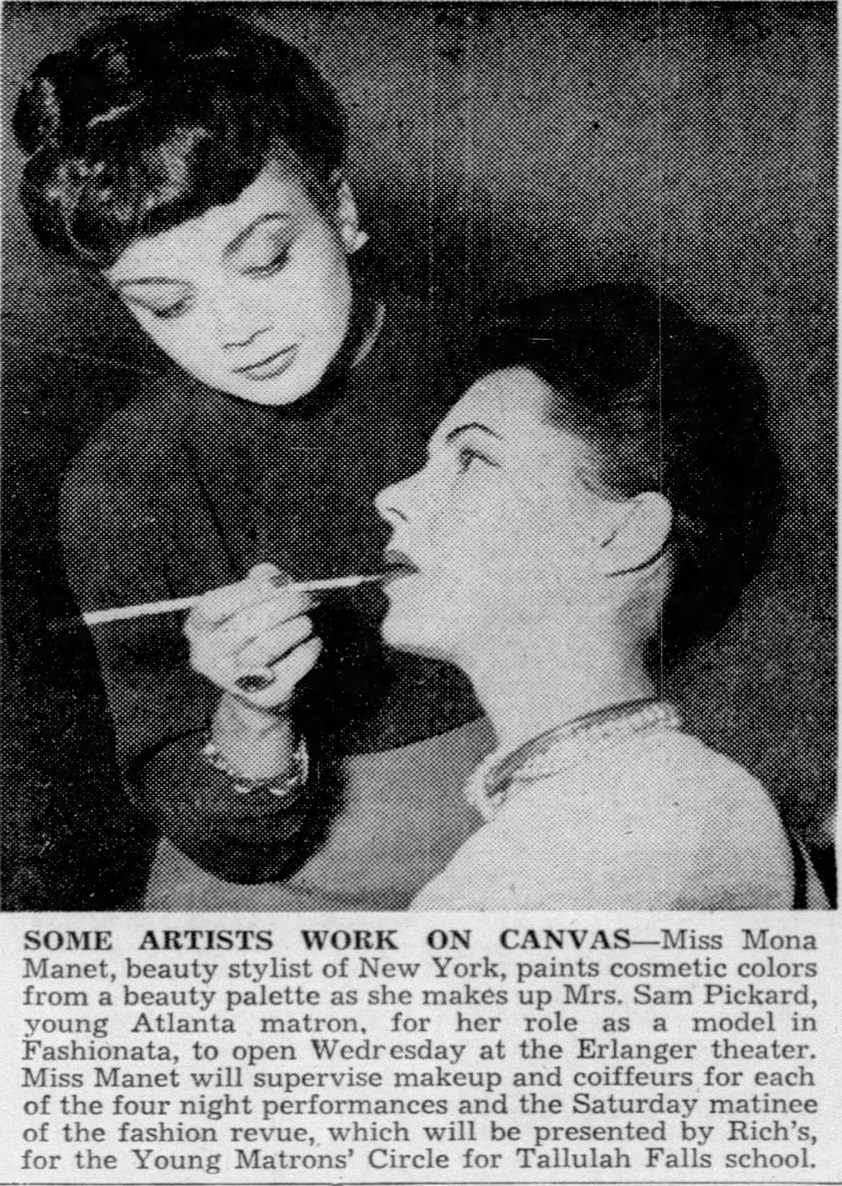
I wish I was sharing something uplifting instead of tragic, but I wanted to discuss a very talented writer who contributed much to the beauty industry during her short life. Mona Manet debuted her eponymous line of cosmetics in 1941 in her New York City salon. Soon the brand rolled out nationwide, and Manet enjoyed a brief career as a salon owner, makeup artist and beauty columnist. However, she was harboring a big secret: while Mona Manet presented herself as white, she was in fact a Black woman who had adopted a new identity and a new name to go with it.
Mona Manet was born as Elsie Roxborough in Detroit, MI, in 1914 into a prominent Black family. Her father Charles was a Detroit College of Law graduate who owned a weekly paper, the Detroit Guardian, and also served as a state senator. Her biracial mother, Cassandra, sadly died while delivering Elsie’s younger sister, Virginia, in 1917. Roxborough was the first Black woman to live in the dorms at the University of Michigan, largely due to her father’s efforts to fight discrimination on campus. However, it was not without struggle. Roxborough was alienated by most of her fellow Black students, who perceived her cultured upbringing as snobbish. But she was not fully accepted by whites either. Says Kathleen Hauke, who wrote a thorough profile of Roxborough in 1984 for the Michigan Quarterly Review: “Her [wealth] produced a tension between Roxborough and other blacks on campus who had not enjoyed her privileges. To white students she was an exotic, not like other Negroes yet not like themselves either.” Being rejected by both races was perhaps one of many reasons for Roxborough’s decision to live as a white woman.
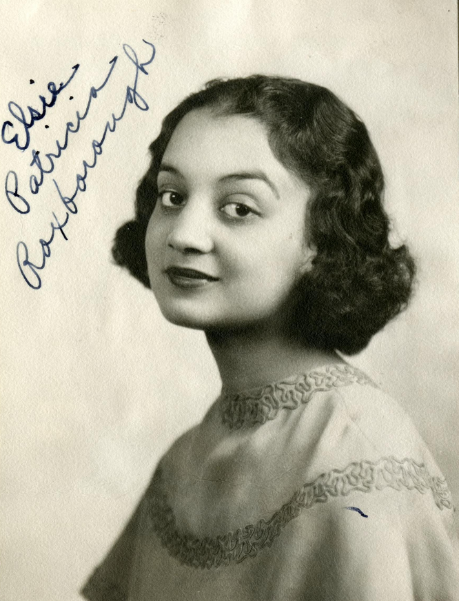
(image from the Bentley Historical Library, University of Michigan)
Despite these obstacles, Roxborough’s gift for writing flourished. She wrote for the campus paper alongside classmate Arthur Miller and established a theater troupe, the Roxane Players, for whom she wrote her own plays. In 1937 she worked with Langston Hughes to produce his play Drums of Haiti. She and Hughes began a professional relationship/friendship. In his autobiography, Hughes remembers, “Elsie would tell me about her dreams, and wonder whether or not it would be better for her to pass as white to achieve them. From what I knew of the American entertainment field and how [Blacks] were almost entirely excluded from the directorial or technical aspects of it, I agreed with her that it was difficult for any [Black] person to gain entrance except as a performer…and for a [Black] woman I think it would be even more difficult than a man. Elsie was often mistaken for white in public places, so it would be no trouble at all for her to pass as white. While I was in Spain she wrote me that she had made up her mind to do so. She intended to cease being [Black].” The meteoric rise of boxer Joe Louis, whose was managed by Roxborough’s uncle John, was perhaps the last straw for her in terms of living as a Black woman and the impetus for pursuing a career in beauty. Hauke suggests, “The rejection of her plays by critics and judges contrasted with the nearly incredible success of Uncle John’s golden boy. If making it as a Black in America demanded masculine brute strength, she would flee to the genteel white world in which a woman’s arts would be appreciated.” Roxborough dyed her hair from black to auburn and moved to California, taking the name Pat Rico and working as a model. After less than a year on the West coast she relocated again, this time to New York City. It’s not clear exactly when she adopted the Mona Manet name, but most likely it was around late 1939-early 1940.* It’s also unclear as to when she opened her salon at 48 East 52nd St, but it seems that is where she got her start in beauty. Over the next decade Roxborough would manage her salon, release a cosmetics line, write for a number of publications and serve as makeup artist to models and actresses for various fashion shows, press events and theatrical productions.
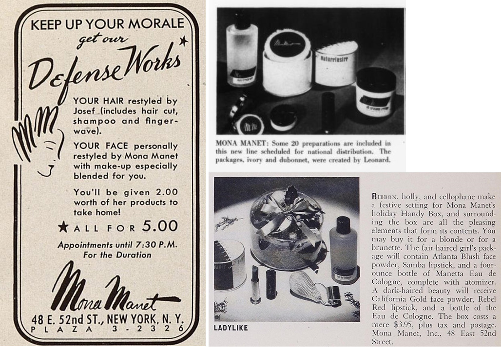
In February 1941 several trade publications reported on the Mona Manet cosmetics line, which was distributed nationwide later that year.
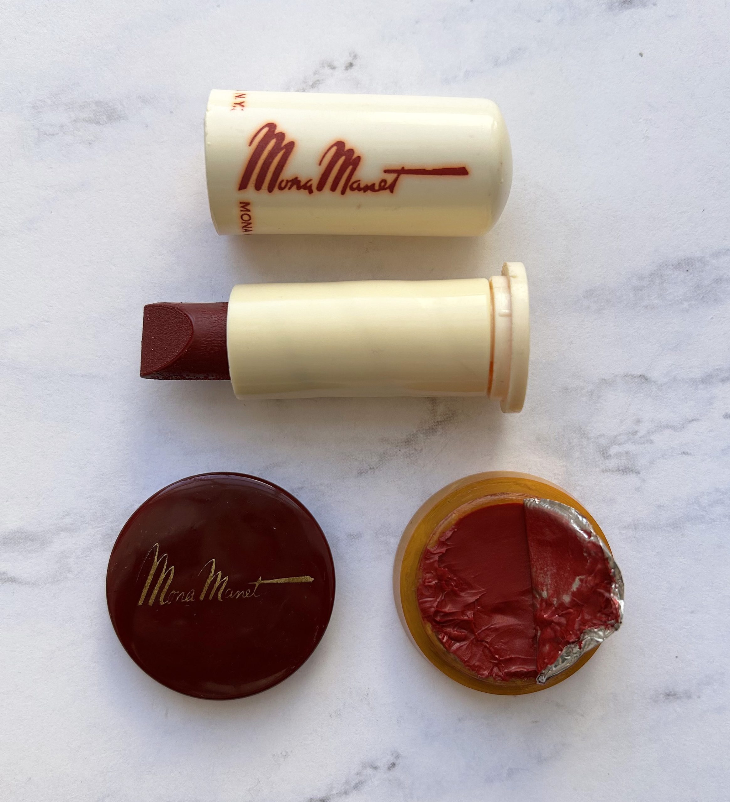
It was the packaging that caused me to purchase the lipstick and rouge on eBay. I knew absolutely nothing about Elsie Roxborough or Mona Manet, but the font of the signature was intriguing. At first glance the style appears somewhat ‘80s, but the bakelite packaging and size made me realize it had to be ‘30s or ‘40s. The lipstick is the shade Samba and the rouge is Rebel Red.
Here’s an eyeshadow which for some reason slipped by my radar. I will be forever heartbroken over not adding it to the Museum’s collection. Update, March 2025: As I was packing up the Museum’s collection to move to new headquarters, I found the eyeshadow!! Apparently I had purchased it and it somehow got separated from the rouge and lipstick.

The violet eyeshadow was part of the Mona Manet “duration” makeup collection, which she originally used on the Ziegfeld Follies girls. Meant to be a delicate, feminine contrast to “severe uniforms” of women in the military and worn for the duration of the war, the collection consisted of the following: “a new orchid-pink shade, a baby-blue eyeshadow for use over the lids with a violet shadow graduating towards the brows, along with an ethereal face powder over all.” The rouge and lipstick were appropriately named “Manet Pink”.
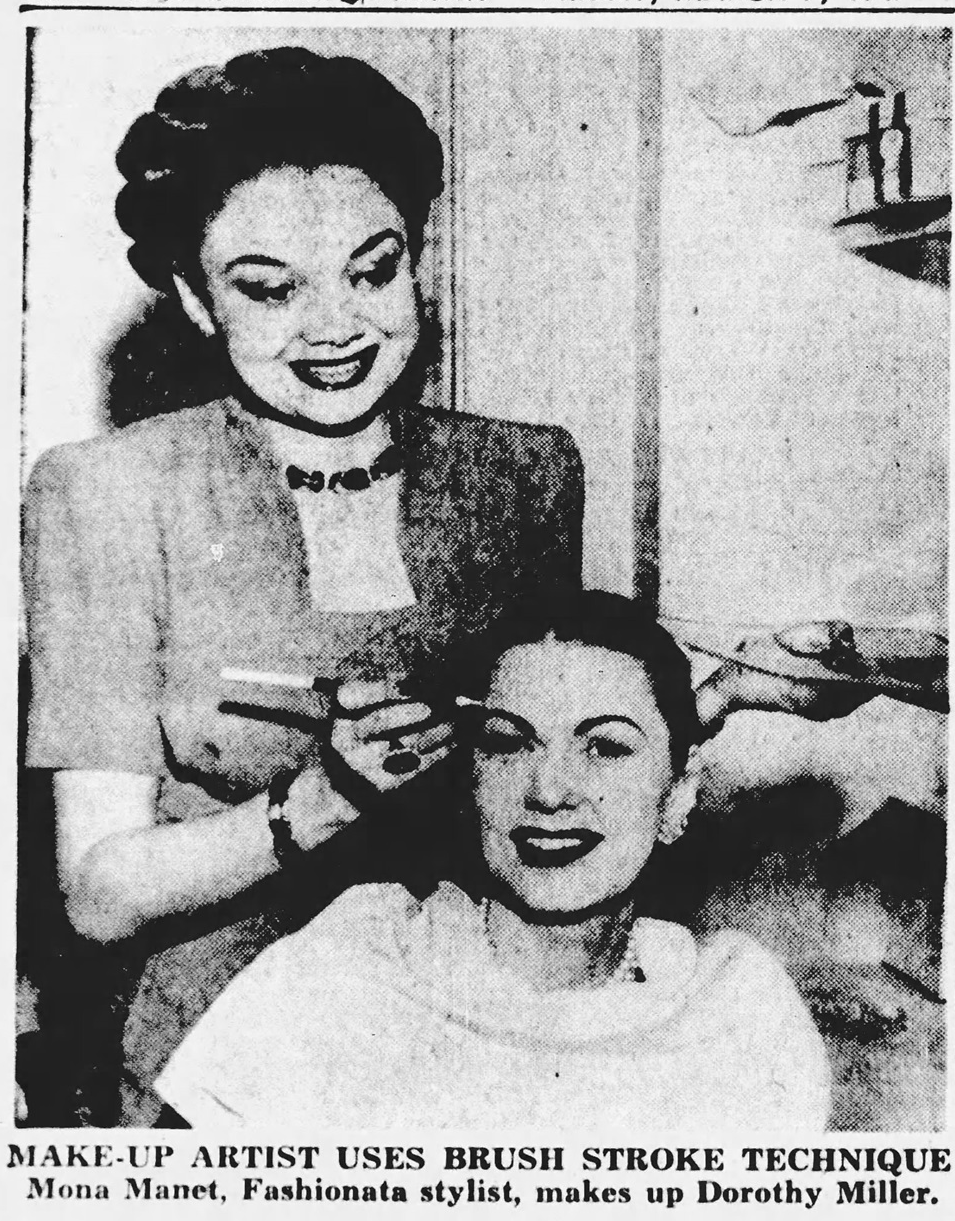
Roxborough’s advice and techniques were largely in keeping with the others of the time. She did have some unique tactics, however, including applying a very heavy face of makeup and removing most of it. According to Roxborough, this technique resembled the Chinese art of flower arranging in which a large bouquet is gathered and one flower at a time is removed until “the most piquant and satisfying effect has been accomplished.” Indeed, Roxborough seemed to have an affinity for Chinese culture, creating several hairstyles inspired by those worn by Chinese women and launching a beauty oil that she claimed was based on an ancient Chinese practice of using oil instead of a cream/lotion to moisturize both face and body. At times, she also used Chinese calligraphy brushes to apply lip and eye products. Chinese dignitaries, including a military captain, attended the opening of the new department in her salon, the Lotus Room, in September 1943. The event presented “an original kind of beauty demonstration stressing the Chinese influence in this year’s Fall styles…it is Miss Manet’s idea that Chinese make-up devices can be added to our American concept of beauty.”
She was also known for quick, streamlined beauty routines. In late 1942 the Associated Press reported on a beauty demonstration on 5 women by Roxborough and her salon workers. All of the women were serving in the military and had little time for treatments; however, as the mantra for American women during WWII was “beauty is your duty”, it was expected that all women, whether in the military or civilians, were to be perfectly coiffed and made up at all times. While the routines described in the article seem ridiculously long by today’s standards, in reality they were pretty quick: one factory worker had “a scalp treatment, shampoo and rinse, hair style, manicure, pedicure, clean-up facial and makeup which took only 64 ½ minutes.” The Lotus Room, in addition to being Chinese-inspired, offered much the same speedy, “assembly line” routine. Clients could get the “main essentials” of a shampoo, wave, manicure and makeup in 50 minutes. Interestingly, the concept of head-to-toe service would be greatly enhanced in several Black-owned salons, including the Rose Meta House of Beauty and Carmen Murphy’s House of Beauty, a few years later. This is entirely speculative, but I wonder if Rose Morgan and Roxborough were aware of each other as Roxborough occasionally socialized in Harlem, where the Rose Meta salon was located. And perhaps Carmen Murphy was aware of Roxborough’s salon as she set up shop in Roxborough’s hometown of Detroit, where she was still in touch with family there.
Finally, as Mona Manet, Roxborough was one of the earliest makeup artists who advocated for the use of a lip brush to apply lipstick. This practice would become hugely popular later in the 1940s and throughout the next decade (stay tuned for a post on Martha Lorraine lip brushes and other gadgets for a defined lip in the 1950s.)
In between operating the salon and providing makeup artistry for fashion shows and plays, Roxborough wrote ad copy and columns for a multitude of brands and publications beginning in 1945. In July of that year she was hired to be director of cosmetics for Lucien Lelong, but just two months later, she assumed the role of cosmetic editor at American Druggist, listed as “formerly” of Lucien Lelong. At American Druggist she wrote such pieces as “How to Be a Cosmetician” and “Classroom for Cosmeticians: Summer Cosmetics.” In February 1946 she began writing for Fascination magazine in addition to American Druggist, but left Fascination in March 1947, most likely because it folded. Less than a year after that, in February 1948 Women’s Wear Daily announced that Mona Manet had left American Druggist and was appointed as publicity director to Chen Yu, a company known primarily for nail polish (and rampant appropriation and stereotyping of Chinese culture, which may have aligned with Roxborough’s interest in Chinese fashion and beauty.) All of this job-switching suggests another mystery – was it simply the nature of the industry for workers to constantly be moving from one company to the next, or was Roxborough concerned about her true identity being found out and felt the need to move frequently to keep any suspicions at bay? But given how closely connected the industry was (and still is), this doesn’t seem plausible. If she was found out, word would spread quickly so there wasn’t much of a point in moving on to new positions.
All of Roxborough’s success as a beautician could not compensate for what was most likely a lonely existence. She had to be very careful about being seen in public with her Black friends in the city as well as her family when they came to visit, and mitigating public appearances meant seeing the people she was closest to infrequently. She lived with a white roommate, and all of her colleagues in the beauty world knew her as white. Her career would effectively be over and even her personal safety could be at risk if it was discovered she was Black. At the same time, while Roxborough was not estranged from her family, they were reportedly less than pleased with her decision to live as a white woman. Once again, Roxborough was unable to be fully embraced by either whites or the Black community. It could have been the inability to ever feel truly accepted that led to Roxborough’s fatal overdose of sleeping pills on October 2, 1949. Whether her death was intentional or accidental we will never know, but her family believed it was an accident, their reasoning being that she did not leave a note. They held a small, private funeral for her, and while the Michigan Chronicle ran the headline “Elsie Roxborough Dies,” her death certificate listed her as white. No one in New York City was made aware that she was Black.
The larger topic of racial “passing” and its implications are far beyond the scope of this post, especially as I’d like to focus on Roxborough’s role in cosmetics history. I personally think Roxborough could have gone to New York as a Black woman and become a hugely successful beauty entrepreneur who was able to meet the needs of Black customers as Sara Spencer Washington, Madame C.J. Walker and Annie Turnbo Malone did before her. Or she could have continued passing as white and pursued a beauty career even further than she did. She was described by her colleagues as an “up-and-coming young beautician with an important future” and “one of the most gifted writers in the cosmetic realm.” Black or white, she was quite talented at makeup and hair in addition to writing. But it seems that she did not engage in the beauty realm out of genuine interest. Instead, perhaps Roxborough saw being a white beauty expert as a way to get closer to her true passion, which was playwriting. Providing the makeup and hair styles for performers/models at fashion shows and coordinating corporate beauty presentations was getting her foot in the door – maybe she thought that if she could prove herself more than capable of managing these types of productions, she could break into writing and directing high theater more easily. Having been mostly shut out of that world as a Black woman previously, living as white and overseeing various skits and performances (which she was doing as of 1947 – her credits for most shows had changed to “written and staged by Mona Manet”) allowed her a better shot at achieving her dream of being a serious playwright.
In any case, I hope this post makes clear that Roxborough contributed significantly to makeup history, no matter how she identified racially. It also serves as a reminder of the enormity of white privilege, and that while the beauty industry afforded more opportunities for both Black and white women, the playing field was and remains uneven along race and gender lines.
*The Mona Manet name for cosmetics was patented in March 1941 with a claims use date of December 28, 1940, so Roxborough was most likely using the name throughout 1940.
Sources
Advertisement, Harper’s Bazaar, vol. 75, iss. 2765, May 1942, 18.
Erin Allen and Ken Coleman, “Passing: The Story of Elsie Roxborough.” Stateside podcast, March 24, 2022. https://www.michiganpublic.org/podcast/stateside/2022-03-24/stateside-podcast-passing-the-story-of-elsie-roxborough
American Perfumer and Essential Oil Review, October 1943, 52.
American Perfumer and Essential Oil Review, December 1945, 54-55.
American Perfumer and Essential Oil Review, January 1948, 79.
Donna Davis, “Beauty for Sale: Everything New in Beauty,” Hit Parader, December 1942, 22.
Annette Donnelly, “Beauty in a Hurry: This Speedup Era Takes Its Turn at Charm, Too,” Daily News (New York), August 23, 1943.
Drug and Cosmetic Industry, volume 57, issue 1, July 1945, 81.
Ruth Finley, “Fashion Calendar”, September 3, 1943, 3.
Helen Flynn, “Christmas Counterpoints,” Town & Country, vol. 97, iss. 4243, December 1942, 44.
Kathleen A. Hauke, “The ‘Passing’ of Elsie Roxborough,” Michigan Quarterly Review, vol. 23, no. 2, 1984, 155-170.
Langston Hughes, I Wonder as I Wander: An Autobiographical Journey. New York: Farrar, Strauss and Giroux, 2015 edition (originally published in 1956).
Jacqueline Hunt, “Make-up Keyed to Hair-do for Most Flattering Effect,” Anadarko Daily News, April 8, 1941.
Martha Parker, “Bigger Imports of Needed Tropical Oils for Lip Rouge Made Possible by Navy,” New York Times, November 16, 1943.
Gayle Wald, Crossing the Line: Racial Passing in Twentieth-Century U.S. Literature and Culture. Durham: Duke University Press, 2000, 82-84.
“Miss Manet with Chen Yu,” Women’s Wear Daily, February 20, 1948, 30.


