Love this shot of her dressing table, probably taken in the 1960s. There's a red jar on the far right that looks like it could be Leichner, but that seems unlikely. Beyond that, embarrassingly, I can't make out any of the items.
Not sure how I missed Mimi Choi's fantastic makeup optical illusions on Instagram, but I'm grateful to Jen of Coffee Sundays for introducing me a few months ago. One look in particular caught my eye: Choi's hilarious "twin", Knee-Knee.
(image from @mimles)
And with that, I decided I had to find out the history of knee makeup in modern times.1 As usual this post will be heavily reliant on newspaper archives, sigh…I wish I could find more sources, especially since, as we'll see, newspapers are not always truthful. Anyway, knee makeup been around much longer than you would think. Flappers used rouge (blush) to decorate their knees, an are that was more exposed than ever despite the fact that hemlines were just below the knee (the '20s version of a miniskirt). They'd either roll their stockings down or (gasp!) forgo stockings altogether – made it much easier to do the Charleston. Adding some blush further drew attention to the knees, emphasizing the rebellious nature of the new fashion. Side note: I'm dying to figure out the shift from the word "rouge" to "blush". I'm old and even when I was a kid I remember cheek color always being referred to as blush. I wonder how and why mainstream makeup vocabulary changed. But that's a project for another day.
Knee rouging became full-on knee painting by the mid-1920s, although it had been reported in Paris in 1920. Unlike knee rouge, it doesn't seem as though makeup was actually used – at least one article discusses regular oil paints and another mentions watercolor – but the average woman as well as traditional artists engaged in the practice. The designs ranged from incredibly detailed portraits and landscapes to simple flowers and butterflies.
(image from livingly.com)
One could argue that knee painting was a good way to pique the interest of boys. Teenage girls would paint the initials of their boyfriends or desired boyfriends, while one woman, who wasn't keen on the idea of carrying a portrait of her fiance in a locket, had his likeness painted on her knee instead.
But like regular knee rouging, it was also a demonstration of creativity, provocation and rebellion, which led to either encouraging men to further sexualize women's bodies or a total backlash against the practice. "And, my, here comes a beauty; I watch as it walks by – a painting like that always seems to catch my eye. As one sees a comely miss with both knee-caps ablaze, studying art becomes a treat to all of us these days," a 1925 poem reads. One housewife by the name of Clarice Wilson, well aware of her husband's hatred for the new dogs she recently acquired, painted them on her knees for a passive-aggressive dig. Her husband, Arthur X. Wilson, retaliated by painting the likenesses of two of the most attractive women in town on his own knees. While adult women may have been mildly shamed for knee art, teenagers were soundly punished. Seventeen-year-old Mary Bell was spanked by both of her parents for painting Clarence Darrow and a portrait of a monkey on her kneecaps and a high school basketball team (from Baltimore!) was nearly expelled for showing school spirit via knee painting. (Click to enlarge.)
Between the 1920s and 1960s there was scant mention of knee makeup. Besides a couple of 1939 articles and a nostalgic look back in 1957, knee makeup simply wasn't on the radar.
Yes, I shamelessly stole the title of my post from this article.
But the craze for knee painting returned with a vengeance in the '60s, albeit with a slightly different flavor. Makeup artists were now finally starting to be considered "real" artists on par with traditional painters, which is reflected in their leading the way for knee makeup and the use of cosmetics rather than oil paint or watercolor applied by a regular artist. Possibly the first documented instance of knee makeup from an actual makeup artist came from William Loew, makeup director for Charles of the Ritz. In late February 1965 he painted a pair of eyes on a model's knees for a party. Touted as the "latest in pop-op beauty" and inspired by the emerging pop and optical illusion art of the time, Loew declared the pop-op movement in fashion and beauty as a step forward for women's freedom from relying solely on her looks for success. I can't help but wonder if Loew had somehow stumbled across the knee art displayed during the 1920s. In any case, I'd kill to see his work in color!
By the summer of 1965 the fad had trickled down to the masses. A suburban Pittsburgh housewife and representative for Vivianne Woodard cosmetics, Mary Metzler, took responsibility for creating the look in May 1965, admitting that she devised the idea mostly to sell more cosmetics. Over the next year the trend grew, despite Loew himself claiming it was over by late 1966. Prior to his statement, by the summer of 1966 the big makeup brands were releasing leg and knee makeup kits, with the notable exception of Elizabeth Arden, whose "face designer" Pablo "refused to have anything to do with [knee makeup]".3 Estée Lauder introduced a fairly regular line with makeup, contouring powder and highlighter, but also offered an art kit complete with stick-on jeweled beauty spots (mouches).
(images from archive.org)
Fabergé had their makeup director, Evan Richardson, create their "Kneesies" kit, which contained red, blue and yellow paints.
Revlon Ultima II's cleverly named Stemwear collection included both a "leg complexion" kit for those who desired basic coverage (hiding bruises and other imperfections) as well as a Leg Art kit with four colors that could be mixed: Chalk White, Chrome Yellow, Chinese Red, and Marine Blue, that came packaged in an artist's palette.
The company also enlisted fashion illustrator Joe Eula to create custom designs, which were featured in the May 20, 1966 issue of Life magazine along with the July 1966 issue of Harper's Bazaar.
(image from books.google.com)
While Revlon's kit was reported to be the first leg makeup kit on the market, in July 1967 one reader of the Mercury newspaper remarked that Mary Quant, widely considered the inventor of the miniskirt, had come up with the concept of body paint first, and an indelible one at that (along with "freckle paint," which reminds me that my article on faux freckles is in dire need of updating). While I couldn't find any proof whatsoever, I have a very strong feeling that Mary Quant probably offered a fun leg makeup kit.
Anyway, as it had the previous year, knee makeup soon made its way from fashion magazines to your garden-variety middle-class teens.
Glad to see these girls were not thrown out of school or spanked by their parents.
Knee makeup art morphed into painting the entire leg by the summer of 1967, with Coty and Givenchy both releasing leg paint kits in shades meant to mimic colorful stockings.
(image from amazon)
And everyone remembers the body painting popularized by hippies and mainstream shows like Laugh-In. In 1968 Tussy released a Hieroglyphics paint kit meant to be used all over the body. However, this is getting a bit off track and an entire book could be written about body paint, so I'm not going to go further with the concept now. Suffice it to say that knee makeup hit its peak in 1966 and had mostly fallen out of favor in the '70s through, well, now, partially due to the fact that pants were becoming more acceptable for women's wear. Maxi skirts and bell-bottoms took over around 1970 and lasted through the decade, while trousers became equally popular to skirts and dresses in the '80s and '90s. If body makeup were to be used artistically, all-over body paint took the place of knee makeup over time. And that's the reason Mimi Choi's art got my attention – it's rare nowadays to see only one specific part of the body adorned with makeup.
While most of the knee makeup was predicated on the ideas of creativity and self-expression, the notion of attracting boys or painting a boyfriend's name or initials was frequently noted. Girls painted "available" and "need a date?" onto their kneecaps, while Metzler, self-proclaimed inventor of the trend, "It gives [girls] something to do at the beach, but most important it's the kind of gimmick that helps them attract boys. That, after all, is the primary purpose of most cosmetics." Yikes.
Then as in the 1920s, one of the reasons for knee makeup was presumably to attract guys or express one's affection for their beau, although I don't believe it was the main reason. I tend to think it was more about having fun and allow oneself to be a bit more daring than with face makeup, since the knees, despite being on display, are not as immediately noticeable as the face. As Harper's Bazaar noted, "Never before in the history of makeup has the personal creative impulse been given such wild, free and wonderful reign."
So why did knee makeup trend in the 1920s and 1960s? Some factors for these two very different decades overlap. First, knee makeup in both eras was primarily fashion-driven.2 Leg makeup were ostensibly the result of new, seemingly shocking clothing styles for women, an example of the direct influence of fashion on makeup. Freed from the burden of stockings, either by rolling them down or skipping them entirely, 1920s women realized there was room to decorate this newly acquired space. And the latest miniskirt styles in the mid-1960s placed a bigger spotlight than ever on legs, with Harper's Bazaar declaring 1966 to be "the year of the leg".
I acknowledge makeup doesn't exist in a vacuum and that there is a definitive link between cosmetics and clothing, but generally I don't think fashion affects makeup trends as much as we think. Having said that, knee makeup seems to be a clear case of fashion dictating makeup.
The other factor at play for the knee makeup fad peaking in the 1920s and 1960s besides leg exposure in and of itself was a celebration of freedom from both an expectation of modesty and clothing that restricted movement. Not coincidentally, (White) women's rights gained significant ground in both eras, and perhaps knee painting was a byproduct of women's social advancement. As fashion historian and writer Marlen Komar points out, "Whether it was the '20s or '60s, women turned to knee painting to not only flex their creativity and have a bit of fun, but also to assert their autonomy, own their sexuality, and label themselves as a new generation of modern women. Makeup bags are often more political than we give them credit for." I'm inclined to agree for the most part. Miniskirts may not have been as liberating as history makes them out to be as they were originally intended only for the younger crowd and women today continue to get blamed for sexual assault for wearing too short a skirt, but by and large shorter silhouettes were revolutionary. Knee makeup, along with shorter hems, could be viewed as another way women were enjoying their newfound freedom.
Of course, precisely because of the rebellious and assertive nature of knee art, there were detractors in both decades as well. The loudest were those who harped on the ugliness of the knee. While fashion designers hiked up hems in the name of emancipation during the '60s, others simultaneously (and hypocritically) discussed the need to make knees less offensive via makeup rather than demanding skirts and dresses get back to a lower length. Or, you know, making pants acceptable or just letting women show their legs without feeling pressured to prettify them with makeup. Knees were apparently hideous, which is exactly why any woman donning a miniskirt was automatically declared brave. (Sort of like how we talk about celebrities going bare-faced in public now.) As Gil, makeup director for Max Factor noted in 1966, "Exposing the knee is the most daring thing a woman can do. After all, let's be clear about it. The knob is terribly ugly." Says one columnist: "One cannot help wondering why this usually rather ugly thing must at all costs be displayed. But it is never worthwhile to try to figure out fashion." Another article's headline sums it up thusly: "Glorifying the Ugly: Knees Take on Decorative Look". And going back to 1925, critics claimed that not even painting could help offset the visual offensiveness of the knee. In their view, knee art was a dubious endeavor or an entirely lost cause. "Must be quite a task to make the old joints look attractive…I don't believe that painting the knees will help them any. It would take more than paint to make the average knee worth looking at."
(image from livingly.com)
Naturally, random men had to make their opposition heard too. One Charles Denton wrote in a 1966 opinion column for the San Francisco Examiner, "Having discerned that the knee has all the esthetic charm of a pickled pig's foot, did the style setters lower the skirt back over it? (With a thigh?) They did not! Instead they started concocting cosmetics to glamorize it. Which is about as logical as shaving your beard and then putting on a phony beard…I hardly need to tell you guys where this trend is leading. Because aside from adding to the upkeep on your favorite dame, not to mention your wife, this places yet another strain on the male psyche…the next time you're pacing the floor waiting for her to get ready to go out and you holler, 'What's taking you so long?' she'll chirp back, 'Just a few more minutes, I'm doing my knees.'" Oh, poor delicate Charles with your already fragile "male psyche"! He was not concerned about the expectation that women must attempt to make their legs look more attractive given the new short styles in addition to their normal beauty regimen, but that the extra time required for them to complete their makeup routine may inconvenience him. STFU, Charles. No one asked you.
The other thing the trend had in common in 1920s and 1960s was that it's unclear how many women actually adopted it. As the very wise author of Cosmetics and Skin told me, "One swallow does not make a spring." Despite the wealth of magazine articles in the '60s and the newspaper articles in both decades, I have a feeling it was akin to Instagram (or Tiktok, shudder) "trends" where one makeup artist or influencer does something crazy and it goes viral. All the news outlets latch onto it and declare it a trend, when it fact only a handful of people tried it or even just the one person who started it. I suspect the same thing happened with knee makeup. It may have been fun at the occasional teenage party, but by and large I doubt many women were actually wearing it, at least not regularly. "This so-called painted knee fad seems to be one of those things everybody knows all about but nobody's ever seen," was a common quip in 1925. Dovetailing on the idea of backlash, one columnist by the name of Cynthia Grey stated that it was actually men who were trying to popularize knee makeup by putting it on every front page in order to make women look stupid. "It's funny how seriously men take freak styles and how ready they are to believe that women are morons…apparently for women to paint their knee is as important as a revolution in China or a monkey trial. The implication is, of course, what fools we women are!" Additionally, the spat between the Wilsons in the article shown earlier apparently never happened, because no one by the name of Arthur X. Wilson near Carlisle, PA existed.
It was a work of total fiction that also demonstrates the hostility towards the trend and men's need to keep women in their place. The feature included two somewhat true accounts4 of girls being punished for knee makeup (although now I have my doubts about the basketball team from Baltimore) but also felt it necessary to come up with a third example that was a complete fantasy, just to "prove" how idiotic women were for adopting the trend. As for the how widespread it was in the '60s, I asked my mom, who was 21 at the peak of knee makeup in 1966 and she had absolutely no recollection of seeing it in the news, let alone in real life. I understand that's purely anecdotal, but it goes to show that even young, stylish and progressive women – the key demographic – weren't necessarily adopting knee makeup. I'm also thinking some of the newspaper coverage of the trend in the '60s may have been the suggestion of editors who needed a fun story for a slow summer news day rather than teens picking it up of their own accord. (Click to enlarge.)
Finally, the fact that I've never seen any of these kits for sale or even an actual photo, only illustrations, suggests that knee makeup was not widely used.
Anyway, while knee makeup may have had a moment in the '20s and '60s, there were differences between two decades. In the 1920s, knee rouge and painting was associated primarily with flappers and other rebellious young women. In the 1960s, knee makeup did express freedom and was intended for youngsters, but it was less about mimicking or assimilating a particular group. While some fashion observers claimed that knee makeup was mostly the domain of mods, its appeal seemed to be more widespread, reaching those who simply saw it as a fun activity rather than allegiance to a certain style or outlook. Swim parties, summer camps, 4th of July were all occasions where friends could paint each other's knees – again, at least according to the local newspapers.
Plus, while most are accustomed to applying makeup on their face, painting one's knees is trickier as you have to paint upside down. Many articles noted that it was best to use the buddy system to ensure the design came out right. In this way knee makeup helped build camaraderie in a slightly different way than regular makeup play dates. In the 1920s it seemed that a lot of knee painting was done by traditional artists. Some salons were flooded for knee painting requests and felt as though the only option was to hire an outside artist on to meet the demand, so girls like Mary Bell and salon employee Mrs. Richards may have been exceptions. The shift during the '60s from hiring a painter to either a makeup artist, DIY or having a friend do the painting switched up the dynamic, as evidenced in these photos.
(image from marymiley.wordpress.com)
Another difference was that there more emphasis on fashion in addition to art. Besides Revlon's use of a fashion illustrator to sell their kit and the trend being spotted primarily on local fashion runways and department stores, some proponents recommending matching or coordinating one's knee makeup with clothing. Helena Rubinstein recommended making your own stencils to coordinate with any outfit. (Click to enlarge.)
A third difference is that there was more acceptance for the fad in the 1960s. The average person in the 1920s generally disapproved of knee rouge or paint; not even fashion editors and other trend-setters could sway the public's opinion. But 40 years later, as long as you were young, you could get away with miniskirts and knee makeup. I guess one could argue that's progress as compared to the 1920s stance that no woman no matter her age should have painted knees, but is it really?
As the Vogue article above notes, "[Women] need [leg makeup] to make their legs look as smooth as a pair of flying silk ribbons; as unmarred by time as those of a 10-year old girl." Another fashion editor writing for the Salt Lake Tribune in May of 1966 states that knee makeup is "FUN – if one happens to be a teen or sub-teen. BAD – if one is a minute past teen. So knack your knees only according to how many years old they are. Age is one secret they can't keep." The obsession with youth might also be a function of pandering to young people in general as the baby boomer generation became front and center.
Finally, while I have my doubts that many women actually wore knee makeup art in the 1960s, the trend – or at least the idea of it – seemed slightly more widespread than in the '20s thanks to the marketing efforts of cosmetic companies and the makeup professionals employed by them, along with distribution of these ideas to a bigger audience via the ubiquity of fashion magazines. In the 1920s there was no such thing as an artistic director for a makeup brand, and companies hadn't yet grown into multi-million dollar businesses pumping out hundreds of products. Roughly forty years had passed since makeup became regularly worn; by that point there were many more products on the market than in the '20s, so companies had to go beyond the face and invent new types of makeup. It was only a matter of time before they shifted attention away from the face to the body in the hopes of generating more revenue, and short skirts gave them the perfect opportunity. Revlon, Fabergé, et al were not going to miss their chance to capitalize on and create a false need for leg makeup kits (see also: earlobe makeup). As one journalist noted in May 1966, "Cosmetics firms are about to spring a whole raft of brand new knee makeup products and ideas. The paints and brushes, powders and creams are ready and fetchingly packaged. The ad men are set to spread the word." As for the media, yes, Harper's and Vogue existed in the 1920s, but I'm guessing their circulation was much smaller than in the '60s, not to mention the slightly newer publications that been established by that point (Mademoiselle, Glamour, Seventeen, Co-Ed, etc.) People are more susceptible to buy certain products or try new trends the more coverage they receive, especially with a makeup artist leading the way and the availability of pre-made kits. Lastly, makeup technology was allegedly improved in terms of longevity. Nearly all of the advertising for leg makeup emphasizes its long-wearing nature, a sharp contrast to the messiness of the 1940s5 and prior years.
My thoughts: this was a pretty wild trend that I would love to see again. Given the sad state of my own baggy, misshapen knees I go back and forth as to whether I'd emphasize them with makeup designs, but it would be great to see on other people. It's also one of the few trends that could work on every skin tone. Of course, so-called "flesh tone" makeup for covering varicose veins or bruises probably was not available for Black or brown skin in the '60s and certainly not prior, but the bright primary colors contained in some of the kits would suit everyone. And while short skirts on women may not be as scandalous as they were decades ago, knee makeup remains an unexpected mode of cosmetic styling and body art.
What do you think? Would you ever wear knee makeup and if so, what design would you choose? You know I'd paint portraits of Museum staff members! Or maybe a mermaid on one and a shell on the other.
1Obviously there are entire books that could be written about body paint in various cultures throughout history, so I'm focusing specifically on knee painting during the 20th century in the U.S.
2While knee painting was mostly an offshoot of fashion, there was some influence from art movements in both eras. One 1925 article notes that knee painting was taking on "Cubist lines", and another in 1966 describes one young lady who painted on a Mondrian-inspired design. Knee makeup and body painting in the '60s more generally may have also been influenced by Yves Klein's Anthropométries of 1961.
3Richard Corson, Fashions in Makeup from Ancient to Modern Times, p. 569.
4Some articles indicated that Mary Bell painted Clarence Darrow on one knee and William Jennings Bryan on the other, but the article with an actual picture shows Clarence Darrow and a monkey…so who knows what's really going on there? The photo might not have been Ms. Bell at all. In any case, multiple accounts reveal that she did paint her knees and was spanked, so at least that those parts of the story seem to be true.
5The '40s saw a spike in leg makeup due to the war. Shortages in materials meant nylon stockings weren't readily available so women painted them on, seams and all. There were entire leg makeup kits and salons had the service readily available. And while the focus wasn't the knees but the entire leg, tips for contouring those pesky knee bulges still made it into various beauty advice columns. However, there was really no fun or creativity with the leg makeup of the '40s. By most accounts it was purely to mimic the average nylon stocking – no crazy colors or designs.
I'm still a bit wiped out from the spring exhibition and it's been ages since I've shared some inquiries that made their way in the ol' Makeup Museum Mailbag, so here's a quick review of some questions that have been sent my way.
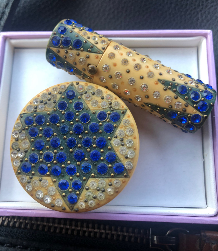
First up is this lovely compact with a six-pointed star in blue rhinestones – perhaps a Star of David? – and matching lipstick, submitted from a reader in Australia. Her grandmother's brother had brought it back to her grandmother during the second World War. Without any logo or brand markings I can't pinpoint the company that made it, and after looking online and through all my collector's guides I can say I've never seen a vintage compact with this design. Obviously it was made in France, but I'm not quite as familiar with objects across the pond, as it were. It's a beautiful set and I wonder whether it has any wartime or Holocaust significance.
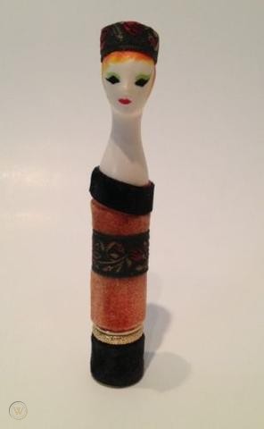
The second inquiry I have to share today was another head-scratcher. Someone had messaged me on Facebook (which I set up earlier this year but rarely use) asking about this little lady. It's a Revlon Couturine lipstick, but her identity remains a mystery.
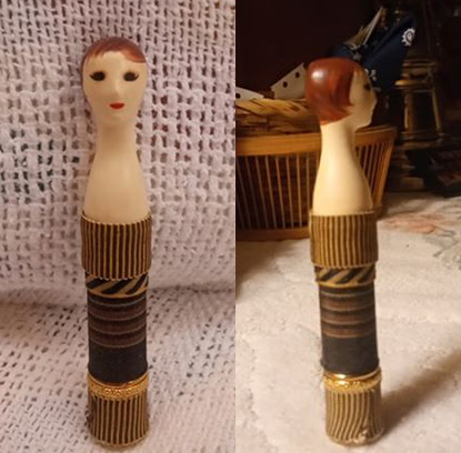
As I've noted previously, allegedly the Couturines were supposed to be modeled after actresses and other purveyors of style. But this one doesn't seem to match any of the ones that have been identified. The only other actress whose name I've seen mentioned is Shirley MacLaine but it's not her either, according to this photo.
(image from worthpoint.com)
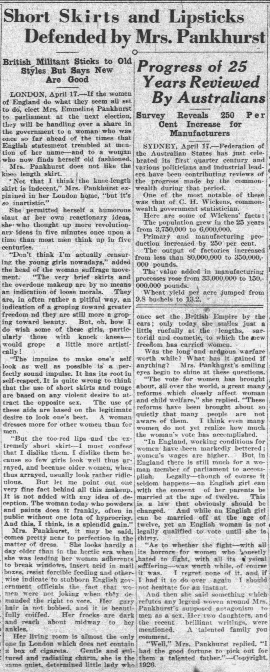
Finally, I received an inquiry from someone asking for proof that suffragettes wore lipstick as a symbol of emancipation. I swiftly directed this person Lucy Jane Santos's excellent article outlining how there really is no solid evidence that the ladies fighting for equality in the early 1900s regularly wore lipstick to rallies, or at least, to the big one in 1912. As she outlines in her article, it appears to be a persistent myth that most likely began circulating in the '90s both in Jessica Pallingston's book and Kate de Castelbajac's The Face of the Century: 100 Years of Makeup and Style (1995). Just for kicks and giggles I took a peek at newspaper archives (I'm finding they're just as fun and informative as magazines) and dug up a couple of interviews with British suffrage leader Emmeline Pankhurst and a profile of her daughter Sylvia. Their views on makeup are positively fascinating! As it turns out, Emmeline had no moral issue with cosmetics, she just didn't find a made-up face aesthetically pleasing: "Don’t think I am actually censoring the young girls nowadays…the very brief skirts and the overdone makeup are by no means an indication of loose morals. They are, in often rather a pitiful way, an indication of groping toward greater freedom and they are still more a groping towards beauty…the impulse to make one's self look as well as possible is a perfectly sound impulse. It has its root in self-respect. It is quite wrong to think that the use of short skirts and rouge are based on any violent desire to attract the opposite sex. The use of these aids [is] based on the legitimate desire to look one’s best. A woman dresses more for other women than for men. But the too-red lips and the extremely short skirt – I must confess that I dislike them. I dislike them because so few girls look well thus arrayed, and because older women, when thus arrayed, usually look rather ridiculous. But let me point out one fine fact behind all this makeup. It is not added with any idea of deception. The woman today who powders and paints does it frankly, often in public without one iota of hypocrisy. And this, I think, is a splendid gain.” (emphasis mine)
Her daughter, Sylvia, on the other hand, did not approve of makeup at all. "I still don't approve of lipstick and makeup. It's horribly ugly, destroys the value of the face. I've never used it, never shall." Her obituary also states that she thought makeup and lipstick were "tomfooleries".
I did also see this 1910 ad from Selfridge's. This is what I believe to be the only reference to suffragettes wearing lipstick. I'm wondering if this is part of how the myth was generated, since even with this ad there doesn't seem to be any concrete proof that suffragettes wore lipstick. Selfridge's advertised and sold it; whether it was widely worn by suffragettes is still up for debate in my very humble opinion.
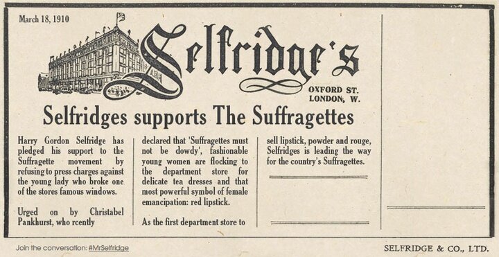
(image from @selfridges)
If you have any additional information about the things I've shared today, please let me know! Which one do you find most interesting?
Introduction
Welcome the Makeup Museum's spring 2020 exhibition! "Soaring Beauty: The Butterfly in Modern Cosmetics" explores the many ways butterfly imagery is used across all aspects of beauty culture. For 100 years the butterfly has been an endless source of inspiration for makeup artists and collections, ad campaigns and packaging. As the butterfly is perhaps the ultimate symbol of transformation, there is no motif more appropriate to embody the metamorphosis that makeup can provide. Like flowers, various butterfly species are a favorite reference for makeup colors, textures and finishes. More broadly, butterflies represent springtime, rebirth, hope, and freedom. With "Soaring Beauty", the Makeup Museum seeks to embrace this optimistic spirit and provide a peaceful oasis in the midst of a very uncertain and trying time.
The exhibition focuses on 5 main elements of butterfly makeup, which I will examine briefly before getting to the main show. Hover over the image for information, and additional details (when available) are listed in some of the captions.
I. Color
The vibrancy of butterflies' coloring and their wings' gossamer texture figure prominently in the beauty sphere. Makeup shades and artist creations include every tone from earthy moth browns and greens to bold blue and orange hues to slightly softer pastels.
(image from blanckdigital.com)
(image from designscene.net)
(image from sheriterry.com)
(image from pinterest)
As butterflies are largely synonymous with spring, rebirth and rejuvenation, the vast majority of butterfly-themed collections are released then and feature bright, fresh colors.
(image from magi-mania.de)
However, some color stories reflect different seasons via butterflies' natural habitats. Chanel's summer 2013 collection featured rich greens and blues reminiscent of the tropical morpho butterfly, while Anastasia Beverly Hills and Colourpop's fall releases opted for warmer tones inspired by monarch butterflies and their migration in the cooler months.
(images from popsugar.com)
(images from anastasiabeverlyhills.com and ulta.com)
II. Texture and Finish
The delicate, lightweight nature of butterflies and the softness of their wings is repeatedly referenced in early 20th century advertisements for face powder.
(image from maudelynn.tumblr.com)
(image from lesanneesfolles.ocnk.net)
(image from hprints.com)
(image from wikimedia.org)
For Australian brand Lournay, the "butterfly touch" was an integral part of their marketing for two decades.
As for finishes, butterfly-themed makeup excels at imparting an iridescent, pearlescent or metallic sheen that reflects light similarly to that of a butterfly's wing. New technology is being developed to artificially yet seamlessly recreate the iridescent butterfly wing effect in cosmetics, among other areas.
(images from vogue and stylecaster)
(image from pinterest)
(image from lookfantastic.com)
(image from pinterest)
The fascination with butterflies' iridescent quality is also expressed in "morpho" compacts of the 1920s and '30s. These were made with real morpho butterfly wings or foil and commonly depicted tropical locales. Popularized by jeweler Thomas Mott at the 1924 British Empire Exhibition, morpho designs were also used in jewelry and other accessories.
(images from etsy and pinterest)
III. Movement
Butterfly beauty products embraced the notion of flight and the insects' graceful motion, at times linking them to dance or music to more fully capture the joyous, free-spirited movement of a butterfly soaring through the air. K-beauty brand Holika Holika simply titles their butterfly embossed blushes "Fly", while jeweler Monica Rich Kosann named the compact she created for Estée Lauder "Butterfly Dance". Pat McGrath's "techno butterflies" look at Dior's spring 2013 combines pastel "wings" with rhinestone details to impart a rave-like vibe.
(image from neimanmarcus.com)
(images from beautyfw.com)
But the fluttering movement of a butterfly is best captured in makeup via the eyelashes.
(image from paperself.com)
(image from pinterest)
(image from buro247.sg)
IV. Design
Butterflies proved to be a popular design element in general. As far back as the 1900s, jewelers created exquisitely detailed butterfly compacts made with fine glass and sterling silver, and many compact manufacturers incorporated the motif in their offerings. The butterfly's more whimisical side is expressed in Max Factor's acrylic "Butterfly Kiss" set and more recently, in a Jill Stuart Beauty lip gloss filled with iridescent butterfly-shaped glitter.
(image from pinterest)
V. Mood and Metamorphosis
Whether it's subdued or taking a more literal approach, butterfly inspired makeup is a universally recognized symbol for spring and transformation. Many companies release items embossed with butterflies or incorporate them in the advertising for their spring campaigns to express the larger ideas of hope, joy, freedom and rejuvenation.
(image from worthpoint.com)
(image from hprints)
Shown here are Pop Beauty, Mark and Paul & Joe blushes/bronzers/highlighters from spring 2012 and a spring 2016 Clinique GWP bag with a Vera Neumann butterfly print.
The theme of metamorphosis is reinforced through the fusing of faces and butterflies. By adhering butterflies to the cheeks, lips and even eyes, the effect is a physical transformation intended to turn the mundane into the magical and capture the essence of the butterfly as it emerges from its cocoon.
(image from fashionista.com)
(image from trendhunter.com)
(image from vogue.com)
An outstanding example of this concept is the spring 2020 runway show by Manish Arora. Makeup artist Kabuki was responsible for the dazzling, otherworldly looks. Some of the models were drag queens, emphasizing the transformational nature of both makeup and butterflies.
(images from buro247.sg)
As noted in part 1 of the introduction, butterfly-inspired makeup usually features an array of colors found on various butterfly species. However, when combined with butterfly application directly to facial features, barely-visible makeup speaks to butterflies' undomesticated environment and conveys the human bond with nature.
(images from fashiongonerogue.com)
Exhibition
All of the above elements are well represented throughout the objects in the exhibition. So let's get to it!
Top row, left to right.
Let me just say that the story of Lucretia Vanderbilt makes Tiger King look tame by comparison. I tried to summarize it the best I could, but for the full story head over to Collecting Vintage Compacts.
Possibly my favorite pieces in the exhibition and one of my all-time favorites: Chantecaille Les Papillons eyeshadows and Garden in Kyoto palette.
I had to do several labels to cover the Mamechiyo and Chinese New Year collections for this shelf. I was also going to include the Lisa Kohno collaboration, but given the lack of space and the fact that there's another Shu collection in the exhibition I left it out.
I'm hoping to dig up more information on the artist behind the design on this Stratton palette, which may be tricky as his archives are located in the UK.
Second row, left to right.
I couldn't find much information on the inspiration behind Marcel Wanders' compact for Cosme Decorte. I'd love to know how he came up with the design. All I know is that the model in this video is wearing a dress made with the same pattern.
Slightly better shot of the powder so you can see the lovely little butterfly details.
(promo images from cosmedecorte.com)
(runway images from vogue.com)
I wish I could have found a little more info on the Hampden brand and DuBarry's Vanessa face powder. I remember adoring the 3D butterfly in my brief history of DuBarry but could not find any reference specifically to Vanessa.
Third row, left to right.
You might remember I featured the La Jaynees powder box in the spring 2016 exhibition. I managed to scrounge up a rouge box. No rouge, but the box is lovely on its own. Once again Collecting Vintage Compacts did an amazing brand history.
Recent acquisition, which you can read more about here.
I wish I could have cleaned up this Avon palette a little better, but I was afraid of damaging it. However, one in better condition and with the original box popped up on ebay, so get ready for new photos!
I wonder if Sears has archives that I could look at to find out anything about their cosmetic line.
Bottom row, left to right.
I have the lipstick somewhere but am unable to locate it at the moment. What I really regret is not buying the accompanying Météorites powder or pressed powder compact, but they were so pricey and at the time I just couldn't afford them.
More Shu!
I was unable to find any information at all on this powder box, but yet again Collecting Vintage Compacts had everything on the Jaciel brand.
(Advertisement image from Collecting Vintage Compacts)
Some more items that were included in the spring 2016 exhibition.
For the life of me I couldn't get decent pictures of them on the shelves so here are the images from my original post on them.
There was one more item I wanted to include, but couldn't fit it so I'm using a photo from when I wrote about it.
Exhibition Notes
I had been wanting to cover the butterfly theme for about 8 years now. An article on butterfly compacts called "High Fliers" in the February 2017 issue of the BCCS newsletter also inspired me. I wish I could have written a deep think piece on the idea of makeup as metamorphosis or was able to do more research besides what's online, but given the current situation I kept it simple and decided to save my energy for different topics that I can tackle when the libraries reopen, which will hopefully happen in the summer. (I discovered some local university libraries may have the resources I'm looking for, but I cannot access them remotely as I'm not a student or faculty member.) But access to certain archives might have allowed some examples of runway/editorial butterfly makeup that's older than 2012 and more images featuring models of color. And I know it seems like I included every instance of butterflies in makeup that is at my disposal, but I promise it was thoughtfully edited (curated, if you will.) There were actually even more looks that I wanted to include but got frustrated at the lack of basic information about them like the makeup artist or year. As for the objects themselves, I don't think any of them are vegan or cruelty-free, even though some of the companies that made them are now cruelty-free/vegan, such as Chantecaille.
Decor Notes
The husband did an amazing job of "butterflying" the Museum's logo for the exhibition poster and labels. I was going to buy a paper butterfly garland or use the mini paper butterflies I had gotten for Instagram props in the exhibition, but in the end decided it was too gimmicky (and the garland reminded me too much of a baby shower for some reason.) I figured given the current space the focus should be more on the ads and objects. But if the Makeup Museum occupied a physical space, here is some art I would include as decor. It would be like stepping into a very artsy butterfly garden!
(image from rebeccajcoles.co.uk)
(image from mymodernmet.com)
(image from eden-gallery.com)
(image from axelradart.com)
(images from @omsi)
And that wraps it up! Remember you can participate in the exhibition – find out how here. In the meantime, one easy way to weigh in is to tell me what your favorite objects, looks or ads were (either in the intro or main exhibition or both) and why. 🙂
As you know, from time to time I receive email inquiries from people with cosmetics objects they've stumbled across and would like to know more about. I'm always flattered that people think that I know what I'm talking about and can help them, especially since most of the time I have no idea about the item in question, but sometimes I get irritated when the inquirer's sole objective is to determine how much money they can make off an object they found. At first it seemed this way when the original owner of this very rare compact approached me, asking for more information and how much it might be worth. As we'll see, he turned out to actually have an interest in the compact's history and wasn't after profit.
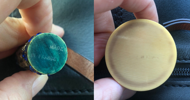
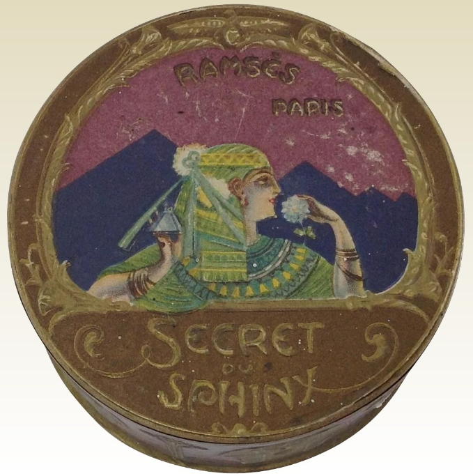
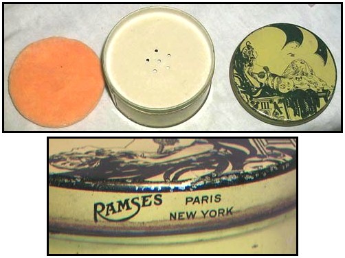
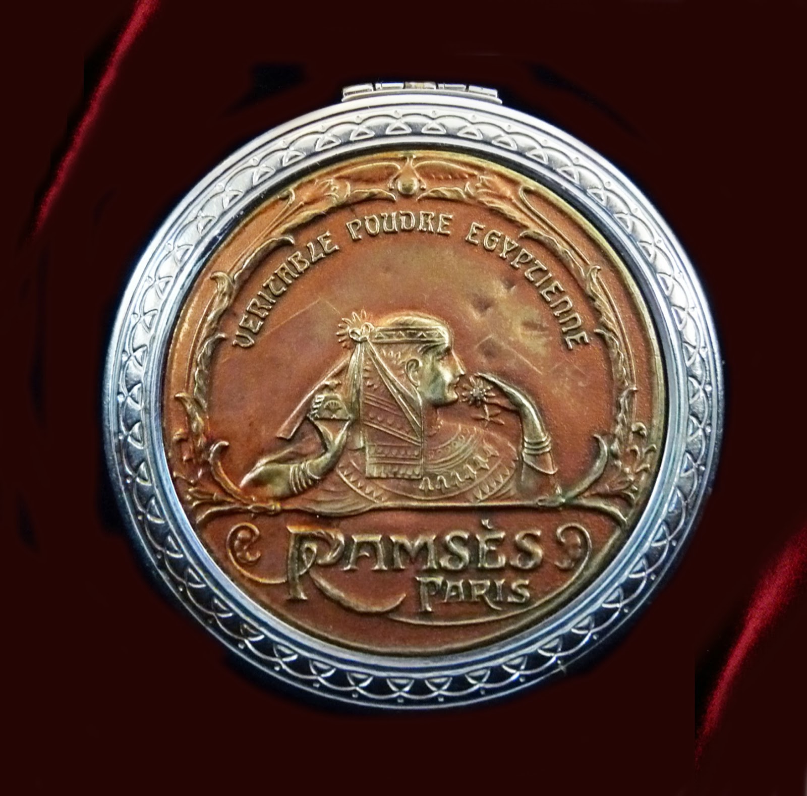
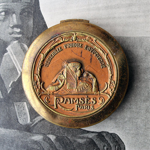
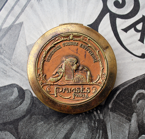
This was an epic find indeed, easily one of the rarest and most valuable in the Museum's collection. I now present the Ramses powder compact, which debuted in 1923. The design shows an Egyptian woman in profile, holding a perfume bottle in one hand and a flower in the other, which she brings to her nose to enjoy its scent. The pyramids of Giza are just barely visible in the background, while lotus flowers on each side towards the lower third of the compact bloom into an arc of leaves.
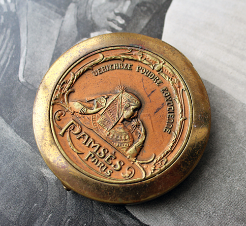
I'm not sure if the woman is supposed to be anyone in particular – perhaps Cleopatra – but given that the design is most likely not historically accurate, I'm not going to dwell on it too much.
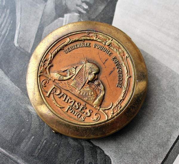
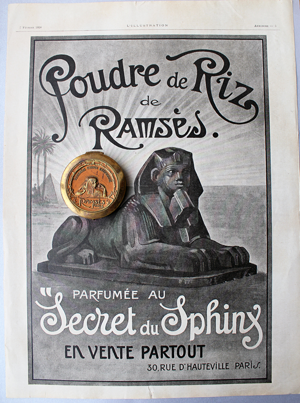
While there are other ads for the powder that show the compact, which we'll see in a second, I wasn't able to locate any originals. I did, however, find this ad in a French publication from February 1920.
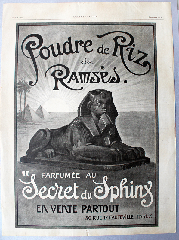
I was hoping to find some good information about the compact for the person who contacted me, and of course, the ever-thorough Collecting Vintage Compacts blog had an excellent post on the history of the Ramses perfume company so I directed the inquirer over there. I don't wish to regurgitate all of the author's hard work on Ramses' backstory – I highly encourage you to check out the post for yourself – but I will provide the abridged version. The Ramses brand was founded in 1919 in Paris and selected Le Blume Import Company to distribute the line in the U.S. in 1921. By 1923 ads for the powder boxes and compacts were appearing in Vogue magazine. As Collecting Vintage Compacts points out, the ad copy is pure nonsense: neither the perfumes nor the powders were produced in Egypt and their formulas certainly did not date back to 1683. How the company even arrived at that arbitrary date is beyond me. However, with the discovery of King Tutankhamun's tomb in November 1922, the Ramses moniker turned out to be quite fortuitous given the ensuing craze for anything Egyptian – clearly the ads wanted to milk the fad for all it was worth. The world was now swept up in the latest wave of Egyptian Revival, a style that incorporated various elements of Egyptian art and culture and encompassed design, fashion and beauty (see this compact depicting Theda Bara as Cleopatra and this ad as examples).
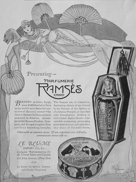
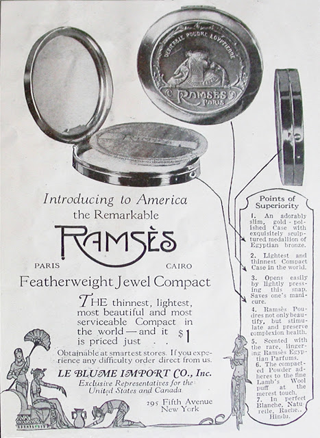
Egypt's influence on Western beauty from the Renaissance to today is a subject I'm looking to cover more thoroughly this year, either in a blog series or an exhibition (or both!) so stay tuned. As viewed through 21st century eyes, it was clearly unabashed cultural appropriation, a white person's fantasy of "exotic", far-off lands and artifacts. However, Egyptian inspired-beauty is such a rich topic that I can't bear not to fully explore it…especially now that I have this gorgeous piece in my hot little hands. Anyway, Collecting Vintage Compacts notes that the Ramses powder case was made by the Bristol, CT-based Zinn Corporation, a company that produced some of the earliest and most memorable compacts in the U.S. I find it interesting that while the powder was scented with the "Secret du Sphinx" fragrance, the compact itself shows a woman rather than the mythical creature. Collecting Vintage Compacts speculates, as I did, that the woman could be Cleopatra, but offered the additional option of Ramses' wife Nefertari. I agree with his conclusion that it really doesn't matter who she is – just a vague Egyptian theme was more than enough to get the point across.
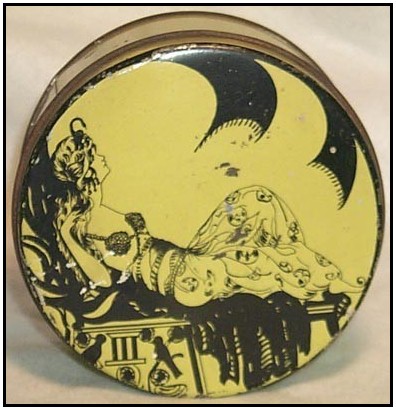
Another version of the compact sported silver edging, a beautiful contrast to the warmth of the brass.
(images from Collecting Vintage Compacts and Ruby Lane)
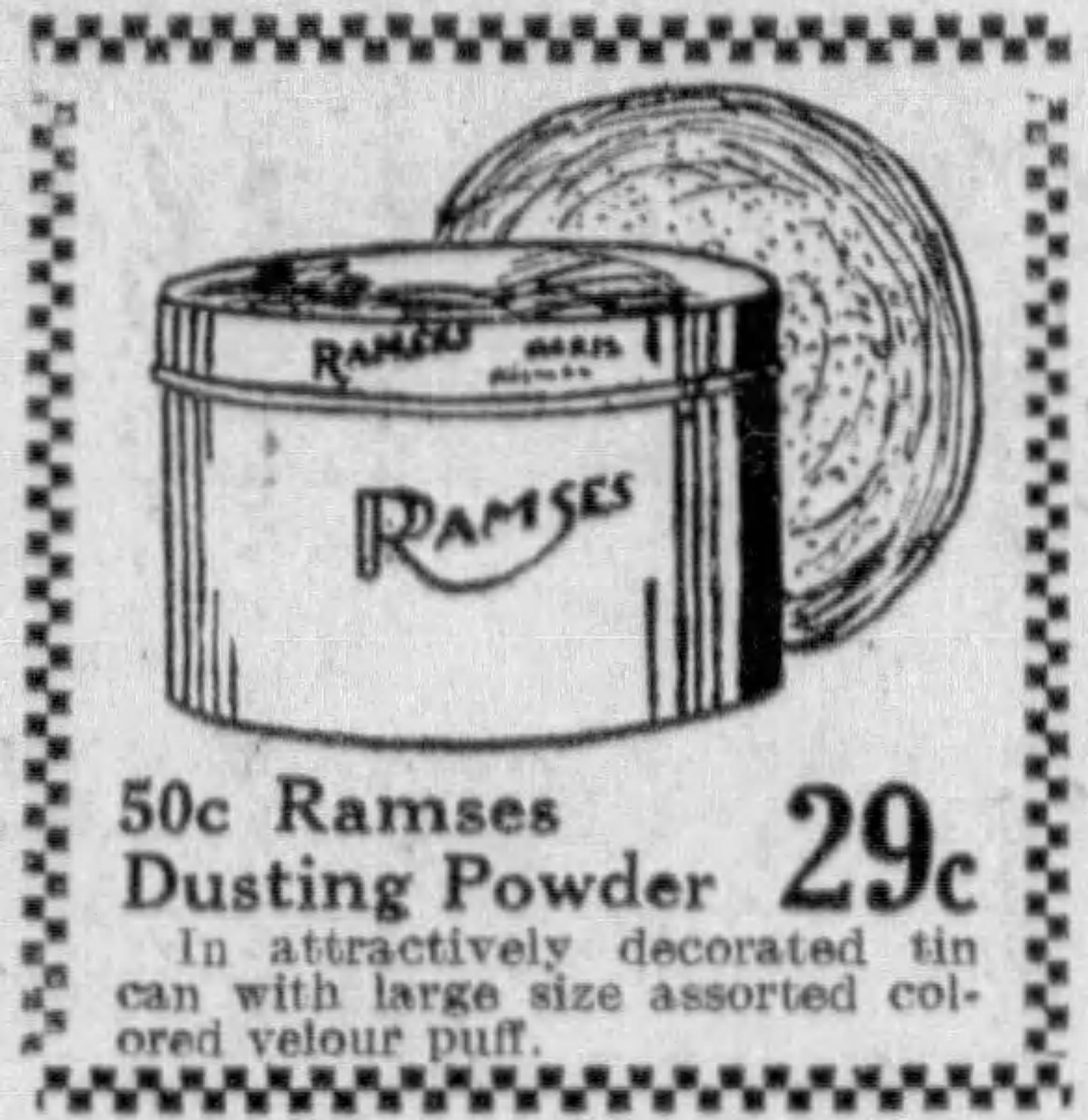
I also spotted some ads in newspapers. They're not as visually striking as the Vogue ads so I'm not including them here, but they did come in handy for indicating the original retail price of the compact, which was $1.00. The latest ads I could find were from 1925 and both the perfumes and powder were heavily discounted, which indicates Ramses was a flash in the pan.
But why? You would think given the era's craze for Egyptian-inspired design, combined with the slight French flavor (another huge selling point – this was a time when companies actively tried to give their lines and products authentic French or at least French-sounding names) the Ramses company would be able to get more a little more mileage out of their products. Collecting Vintage Compacts unraveled the mystery. As it turns out, the perfumer behind the Ramses brand, one Léon de Bertalot, had begun quite a shady scheme to sell another one of his fragrances. In 1914, 5 years before he launched Ramses, de Bertalot named one of his fragrances Origan. As we know, Coty's L'Origan (launched in 1909) was wildly popular, pulling in roughly $3 million in sales in 1921 alone. De Bertalot decided to capitalize on the company's success and began using the Coty name to sell his own Origan, essentially passing it off as a real Coty product. Coty, rightfully so, cracked down on this very quickly. On May 15th, 1923 a French court found de Bertalot guilty of "unfair competition", and a few days later the U.S. Treasury mandated that any inauthentic products bearing the Coty name were unable to be imported unless they specifically spelled out that they were not affiliated with Coty in any way. Since the Ramses brand had nothing to do with Coty I don't know if the Treasury's mandate applied to Ramses as well, but I'm sure the 6-month jail sentence and fine of 100,000 Francs handed to de Bertolot essentially meant the Ramses brand was out of business. Hence the price markdown of their products by 1925 – I'm guessing stores in the U.S. were trying to offload any leftover stock that was originally imported two years prior. The Le Blume Import Company, in turn, was no longer allowed to distribute any perfumes from any company whatsoever. However, it did import dusting powder tins and glass jars using the Ramses name in the late 1920s.
(images from Vanity Treasures and Etsy)
Getting back to the original inquiry that was the impetus for this post, here's the story of how the compact got into my hands from the person who emailed me originally (we'll call him C.) He had found it for $10 in a thrift store (!) but given the unique design, figured it was worth more. After looking through all my collector's guides and not turning up anything, I directed C. to Collecting Vintage Compacts and asked him to please let me know when/if he decided to put it on the market. Obviously I also indicated my great interest in obtaining the compact, but lamented that it was most likely out of my price range. Well, don't you know C. actually wrote back telling me that he was going to put it up for sale on Ebay, but said that while he'd like to get a good price for it (that's only fair, who wouldn't?), he believed that the Museum was the rightful place for the compact, given its rarity and my passion for lovingly researching and preserving these sorts of items. Thus he kindly offered to sell it to me directly and negotiate on price. In the end I think we both got a great deal – he got way more than what he had originally purchased it for and roughly the amount he would have gotten for it if he had put it up for public sale, and I got an amazing find at a fair price for which I was able to avoid an ugly bidding war.
After reading the Ramses history at Collecting Vintage Compacts and browsing the Museum's site, C. seemed genuinely interested in the compact and in the Museum's mission, so I was very happy to see he wasn't just in it for profit and was willing to work with me to ensure the compact went to a great home instead of merely to the highest bidder. :) I really appreciated it, as so many people who ask about value just want to know how much they can get for an item and have absolutely no consideration for the object's history or the Museum, which, as a reminder, is funded entirely out of my own pocket. Not that anyone is obligated to donate rare and valuable items, of course, but they could follow C.'s example and be open to selling their item to me at a price that works for both of us. I know if I came across an object I have no interest in but that other collectors might – say, a rare Barbie Doll – I'd seek out someone who would truly treasure it and give them first dibs.
What do you think? And yay or nay on a series/exhibition on Egyptian-inspired beauty?
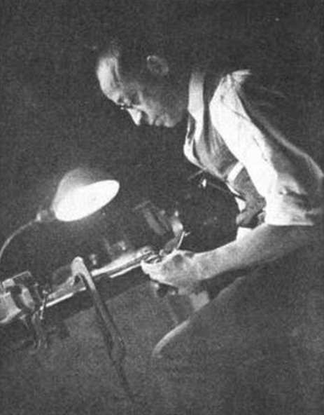
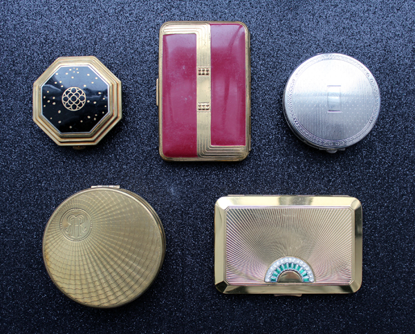
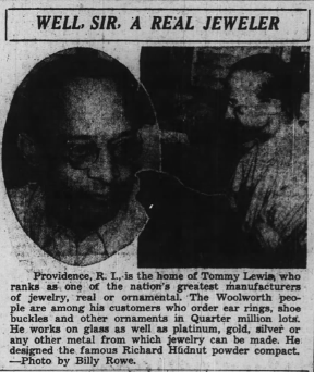
As usual, I forget exactly what I was searching for at newspapers.com when, about a month ago, I stumbled across a very interesting article from 1938. I know the search term must have included Richard Hudnut’s name, but beyond that I can’t remember. In any case I was delighted to uncover a profile of a rather remarkable man. Thomas R. “Tommy” Lewis apparently designed many of the compact cases for perfumer Richard Hudnut from possibly the mid-1920s through at least the ’30s. Both Collecting Vintage Compacts and Cosmetics and Skin have excellent histories of the brand, so you can check them out there. I, however, will be focusing on Lewis and some of the compacts he may have created. The reason why I felt such a compelling need to share his story is a matter of race: Lewis was one of very few American Black jewelers in his day, and one who overcame both racism and poverty to establish his own very successful jewelry firm. In honor of Black History Month I thought it would be appropriate to share as much information as I was able to find on Lewis, and hopefully I can do it without whitesplaining or tokenizing. I offer my sincere apologies in advance if I offend! (Constructive criticism is welcome; mean comments are not).
According to another article written in 1935 that I found online, Lewis was born into an impoverished family in Providence, Rhode Island. Undaunted by his circumstances and without the support of his parents or siblings, he attended RISD with the hopes of becoming a jeweler, earning a scholarship in the process. After graduating he worked for a leading jewelry manufacturer in Providence for several years, then struck out on his own.
I was unable to find the date he started his company or much other information besides what was in these two articles. The 1935 online article says that he started his business 27 years prior, so I’m assuming he established it in 1908; however, the 1938 article says that he had been in business for 26 years, so maybe it was 1912. And there’s no information on his relationship with Hudnut other than what was in that article, so when he started making compacts for them is unclear. The only (rather patronizing) mention is as follows:1 “Visit the cosmetics department in any first class store, ask the clerk to show you a Richard Hudnut powder compact and then surprise him by telling him that he is looking at the work of a [Black] man. Everyone of those compacts was designed and produced here in a plant at 19 Calendar Street, the home of the Lewis Jewelry Manufacturing Firm. The same is true of their perfume bottles, for Mr. Lewis works on glass as well as platinum, gold, silver or any other metal from which jewelry or ornaments can be made. The Richard Hudnut people are among his biggest customers, but not his most consistent. That honor is reserved for other jewelry manufacturers who regularly send in their commissions for original designs in bracelets, watch chains and other novelty jewelry.” So it seems that while Hudnut was not the biggest source of business for Lewis’s company, we know that he was designing all of their compacts by 1938, and presumably earlier. When I purchased these compacts for the Museum I made sure to select ones that I could get specific dates for, i.e. compacts that were plausibly produced by Lewis given the approximate timeline, and also ones that seemed to be the most jewelry-inspired.
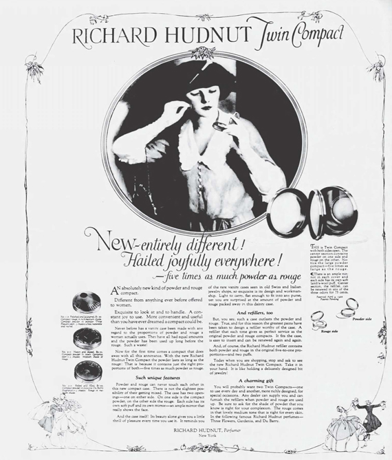
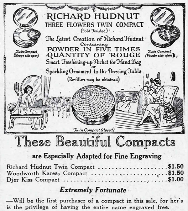
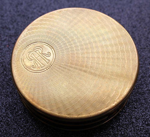
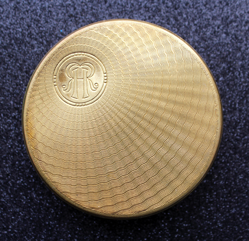
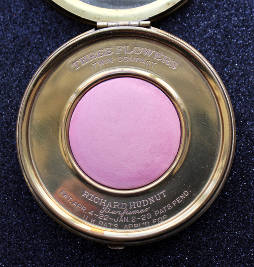
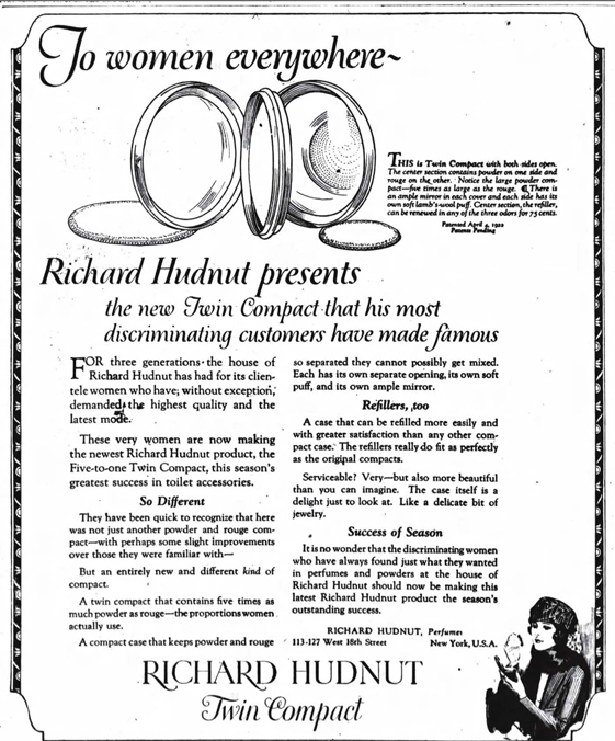
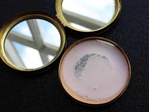
First up is the original “twin” compact, which was introduced in late 1922. I didn’t realize this until after I bought it, but this double case was designed by a man named Ralph Wilson in 1921 and patented in early 1922. Wilson was the New York representative for Theodore W. Foster and Bro. Company, a prominent compact and jewelry manufacturer. Foster, like Lewis, was also based in Providence, so maybe there might be some connection between this company and Lewis’s – perhaps this is the company Lewis worked for after graduating from RISD? In any case, we have proof that the twin compact was created by a company other than Lewis’s, so this is not his work. I still like to think, though, that Lewis may have apprenticed with Foster, grew familiar with Hudnut’s aesthetic and went on to earn the company’s favor over Foster.
How cool is this? You flip over the blush and there’s powder on the other side. Genius.
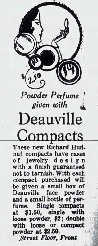
Hudnut’s Deauville fragrance was introduced in 1924. Again, no telling whether this was done by Lewis, but probably not given that it’s basically the same interior mechanism as the earlier twin compact.
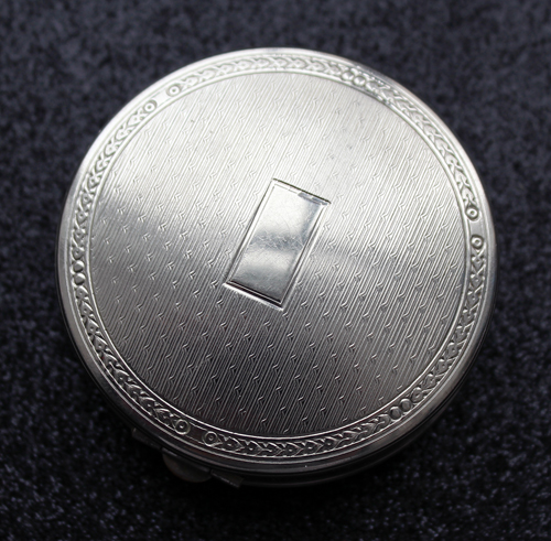
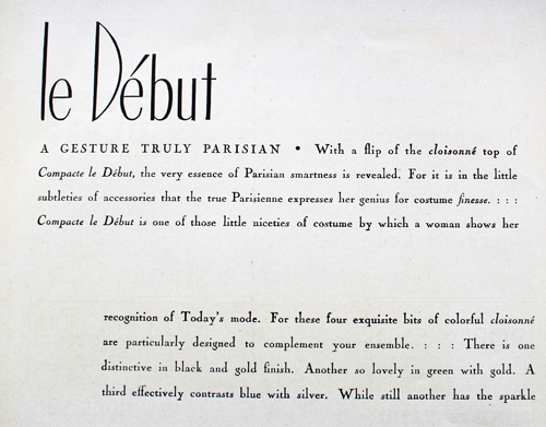
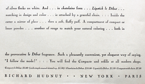
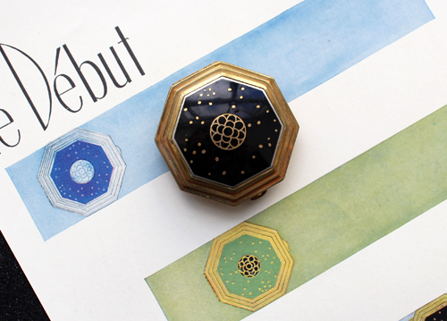
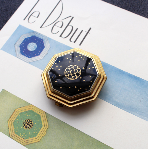
Le Début, a fragrance available in 5 different variants that were color-coordinated to their bottles and powder compacts, well, debuted in 1927. I was fortunate enough to track down an original ad for these beauties. They’re actually pretty common – I was able to find all the colors shown in the ad – but in the end I thought the black one was the most elegant. (Okay, I really love the silver one too!)
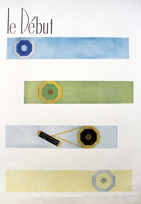
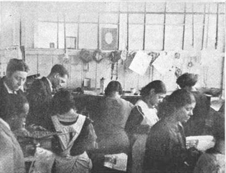
In the 1938 photo below it states that Lewis designed the “famous Richard Hudnut compact”, but I really have no idea which one they’re referring to. It could be Le Début, or it could be the “triple vanity” compacts designed in the mid ’30s.
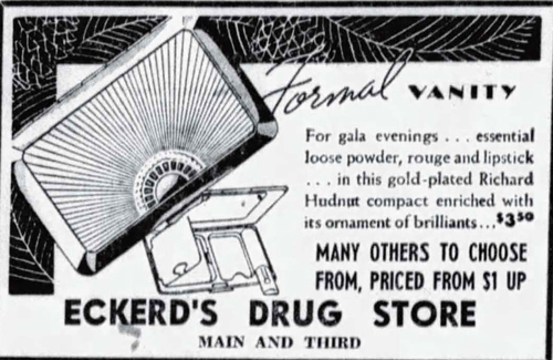
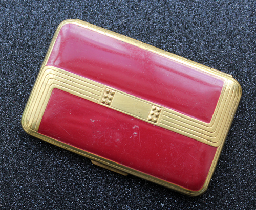
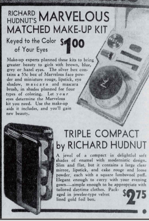
This enameled, oh-so-Deco case came out in 1936, according to the newspaper ads I found, and the last mention of it was in 1938. Again, it’s funny how certain objects call to you. This one was also available in a variety of colors, but I just knew the red belonged in the Museum.
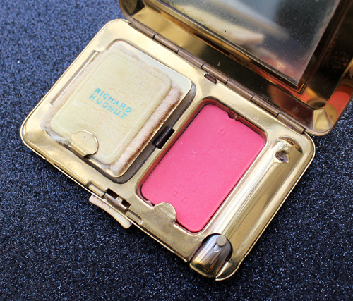
The triple vanities had three compartments for powder, blush and lipstick.
The ad also mentions jewelry several times, so I’m hopeful it was made by Lewis’s hand.
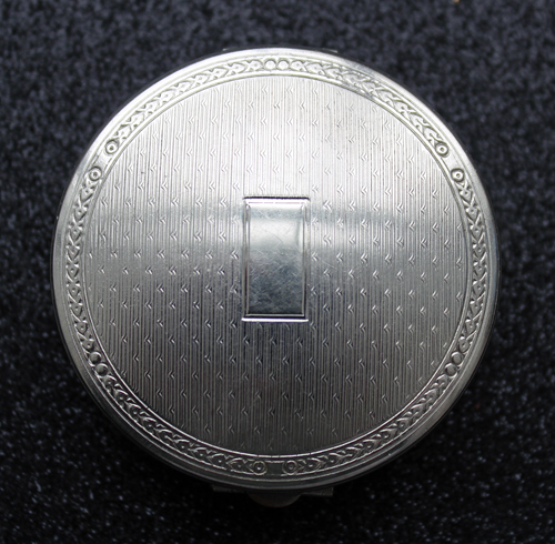
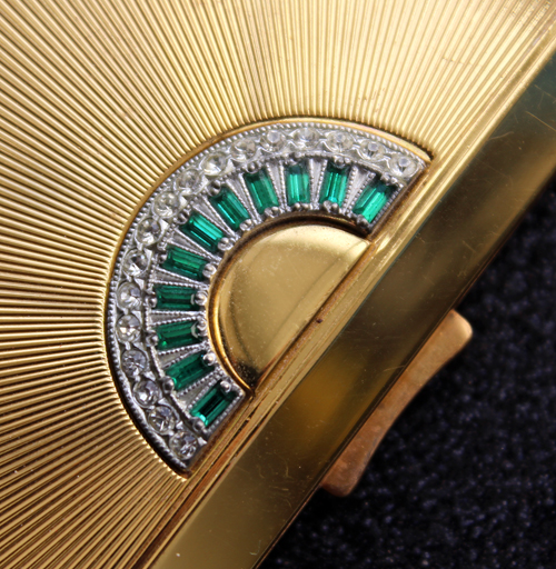
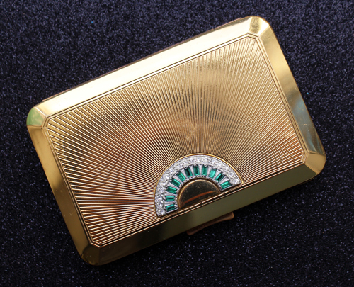
Lastly, I picked up this stunner, which dates to about 1939. Evidently between this one, the Three Flowers compact and the silver Evans compacts I have a thing for sunburst patterns, probably because they remind me of glorious sunny days.
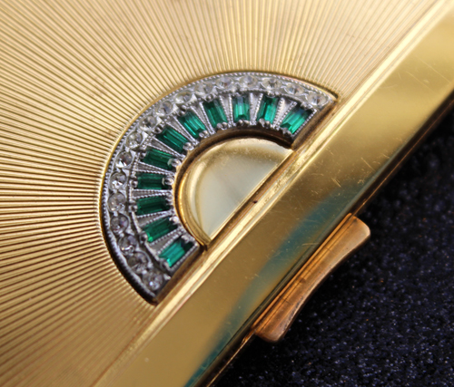
How exquisite is this jewel detail? And in such impeccable shape for a nearly 80 year-old compact – it’s mind-boggling that none of the stones are missing.
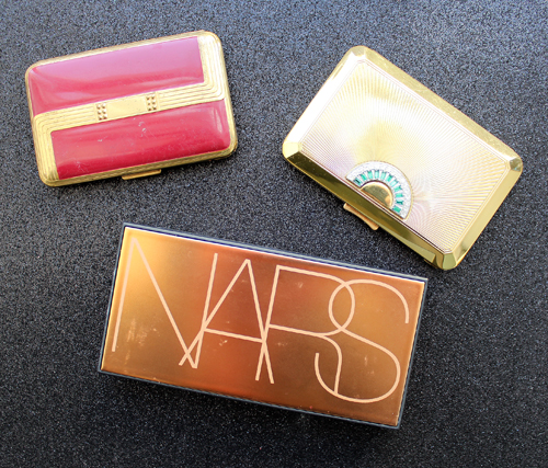
To give you a sense of how dainty and small these triple vanities are, here they are with one of NARS’ highlighting trios.
Getting back to Lewis, I can’t say for sure whether his company was responsible for any of these compacts; I can only hope at least some of these jewelry-inspired designs were his. The fact that the 1935 article doesn’t specifically mention Richard Hudnut makes me think that perhaps Lewis wasn’t designing compacts for Hudnut until somewhere between 1936-1938. But it’s also entirely possible he had been producing compacts for them for years. In any case, I want to highlight just how difficult it was for a Black man in the 1900s to not only get out of poverty, but graduate from one of the top design schools in the country AND start his own business that eventually employed up to 60 workers in the busy seasons. As the 1935 profile states: “But jeweler, designer, silversmith? What chance would he have? Where could he work? Who ever heard of a [Black] man, a designer, a master craftsman in the jewelry trade of all trades! One can imagine what would have been Lewis’s fate if his ambitions had been left in the hands of some of the so-called vocational guidance counselors who are at the present time shaping the lifework of many [Black] students in the public schools of our large cities. According to the formula which they use, there are no [Black] jewelers now in existence, hence no future; it would be impossible for a [Black] silversmith to get a job since he cannot belong to the union, and the white jewelers would not employ him anyhow.” Through incredibly hard work and innate talent, Lewis persevered, not only becoming a success himself but also helping others do the same. Most of his employees were Black, and Lewis provided them with better wages than other jewelry firms in Providence as well as training.
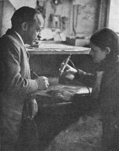
I just wish I could have found more information and photos to make for a somewhat complete biography. Searching online for Lewis’s company yielded nothing, as did basic searches for Lewis himself. I ended up contacting the Rhode Island Historical Society and they kindly provided census records indicating his year of birth (1880), but said they didn’t have any business records related to Lewis’s company, which I think is bizarre. If it was as prolific as the articles claim it was, and if it really did provide hundreds of thousands of pieces of costume jewelry to the likes of Saks and Woolworth’s and compacts for Hudnut, I find it very strange that there are absolutely zero traces of his company left save for these two profiles. Especially since the 1938 article even gives the address of his workshop – with that specific type of information there should be historic maps or architectural records listing it. He also apparently had over 200 patents to his name, none of which I was able to find. I guess the saddest part is that there are tons of other stories like Lewis’s, and we simply don’t hear about them. So many histories for non-white people are erased or buried, and I really wanted to bring Lewis’s story to the surface because it was truly outstanding (and not only because it’s Black History Month…I just so happened to find the newspaper article around a month ago and thought the timing worked out nicely). I really hope this post didn’t come across as patronizing or me highlighting a “token” Black person.2 I find Lewis’s story impressive not because I can’t believe a Black man could ever be creative and intelligent enough to start a jewelry firm, but because of all he had to overcome to achieve his goals. “Perhaps it is the memory of a [Black] boy with a dream to become a jeweler, a silversmith, a designer, a [Black] boy who kept his dream despite the doubts of his family from within and racial prejudice from without. For Thomas Lewis is an artist and so he believes in young men and young women with dreams.”
Thoughts?
Update, 11/24/2022: One of the Museum’s Instagram followers alerted me to a video made by a vintage compact collector who mentioned Tommy Lewis while showing some of her Hudnut collection. It got me thinking whether anything else on Lewis had been discovered and lo and behold, two students from Rhode Island College were able to unearth some more information, including a map showing where his store and factory were! While it didn’t shed any light on Lewis’s relationship with the Hudnut company, their article surely adds more to this important piece of history. Lewis was born on April 5, 1880 and graduated from RISD in 1902. In 1925 a lacquer explosion caused a fire at Lewis’s shop located at 171 Eddy Street, which damaged much of the building. I’m wondering if some of the early business records were lost in that fire. Throughout his life, in addition to providing training and employment for Black workers, he was a philanthropist and active in the YMCA and other community organizations. Lewis passed away in 1958. I can only hope someone writes a full biography of this exceptionally talented man, but in the meantime sure to check out the article at rhodetour.org. Oh, and they even included the Makeup Museum’s original article as a “related resource”. I’m so honored!
1 I spent several hours googling whether it was acceptable to type the word “c*lored” if I was quoting from an old newspaper article. In the end I realized I personally didn’t feel comfortable using it even if it was a quote, so I replaced it with “black”.
2 I rarely, if ever, highlight makeup histories featuring people of color, i.e. Madam C.J. Walker, Annie Turnbo Malone, etc. because I’m not sure whether it’s okay for a white person to do that – while I think their stories absolutely need to be heard and recorded, once again I fear that it would come off as whitesplaining or tokenizing if I attempted to write about them. In the case of Tommy Lewis, there was such scant information available I’d figure I’d make an exception in order to at least introduce him and his work.
It's the most wonderful time of the year…to look at vintage Christmas makeup ads, that is! You know I can't get enough of these, so here's a quick roundup (in no particular order) of some I added to the Museum's collection this year. 🙂
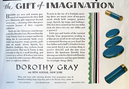
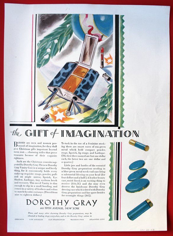
I have many Dorothy Gray ads, but not any from the '20s. Their early packaging was so sleek.
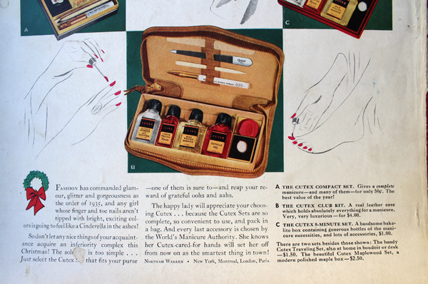
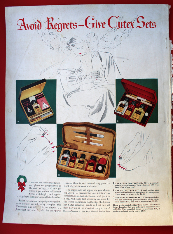
Apparently you can avoid an inferiority complex with a manicure set. LOL.
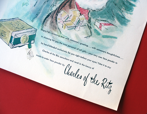
Santa, you jerk! Why did you give me an empty box? Now I have to go to the store and have it filled?! That's not a good present!
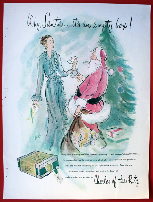
I understand custom powder was Charles of the Ritz's bread and butter and you had to actually go to a counter to get your own personal blend, but I'd still be pissed if someone gave me this. Get me a nice compact!
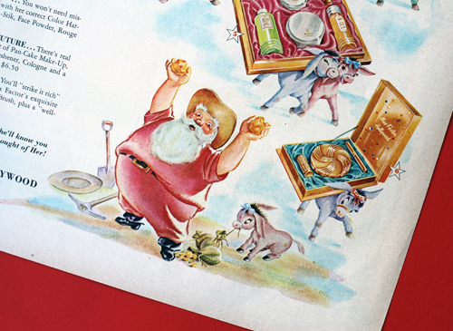
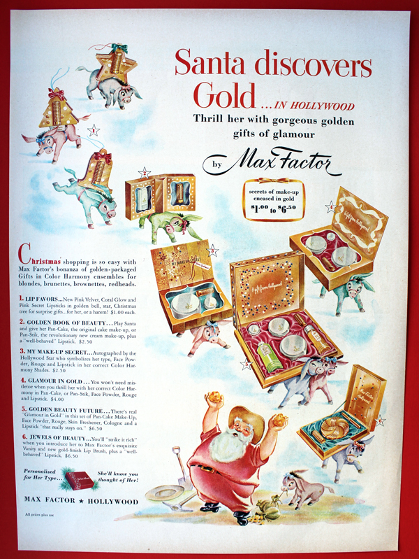
Santa gave considerably better gifts in this ad. I'm a bit confused about the presence of donkeys (shouldn't it be reindeer?), but I do love the overall cartoon-y look of this one.
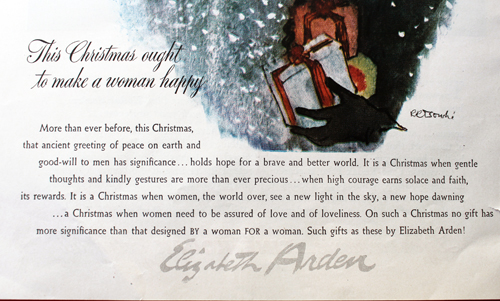
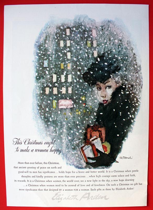
René Bouché (1905-1963) was Elizabeth Arden's head advertising illustrator in addition to working for Vogue. If you see an illustrated ad for Elizabeth Arden from the 40s or 50s most likely it was done by Bouché's hand. I believe this is the first ad by this artist to join the Museum's collection. 🙂
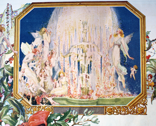
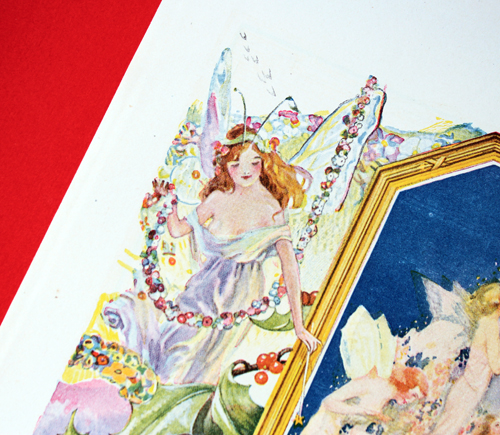
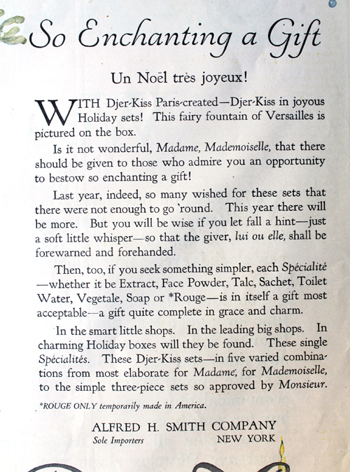
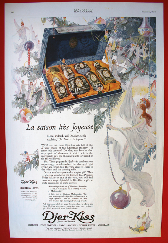
I can't recall how I stumbled across these Djer-Kiss ads, but I'm so pleased I found them! Djer-Kiss "Kissing Fairies" compact has been on my wishlist for a long time, but the ads are just as gorgeous as the compacts. I'm hell-bent on collecting all of them, as they're simply beautiful and feature a variety of illustrators. Collecting Vintage Compacts has an amazingly thorough history of the company, which makes me want them all the more. I believe the illustrator for this one was Willy Pogany, although I couldn't find a signature anywhere so I can't be sure.
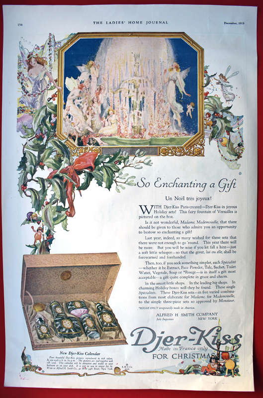
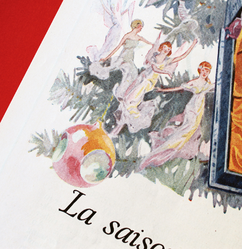
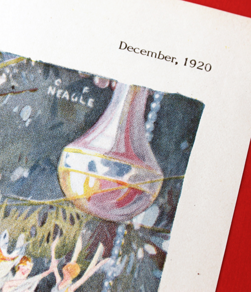
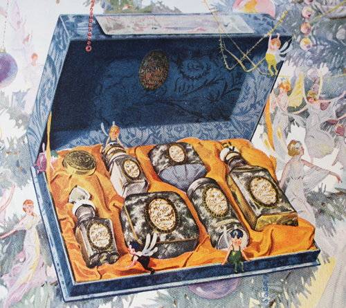
This one is by C.F. Neagle, who does a breathtaking job of capturing iridescence – from fairy wings to Christmas baubles, there's a multi-colored sheen that seems to pop off the page.
I love all the little sprites flitting about the gift box, particularly the ones hanging off the top and sitting on the edge. Incredibly charming, no?
So that concludes 2017's vintage Christmas ad roundup! Which one was your favorite? I love all of these, of course, but I'm partial to the very silly Max Factor ad and the beautiful Djer-Kiss ads.
I much prefer email for inquiries but am always excited to receive them in any format, so when someone Tweeted at me last year to request any information on the vintage item below I eagerly began searching. The person who sent the Tweet thought it might be Rimmel, but the name Po-Go was not a Rimmel product as far as I could tell.
Online searched proved fruitless – I couldn't find any reference to Po-Go rouge whatsoever…until a few months ago when I was researching lipstick tissues at newspapers.com and spotted an ad for Po-Go Rouge in the very bottom corner of an article. I was so excited to have found something even though it was roughly a year since the poor person had originally Tweeted at me. I found some basic information, but let me just say up front that definitively dating the various Po-Go Rouge pots I came across in ads and elsewhere proved rather difficult, if not impossible. Still, I was able to get some clues and can narrow them down to the span of a few years. Come with me on my research adventure!
I forget what I typed in to Google, but miraculously I came across another specimen at the Museu del Perfum. Fortunately this item has the back label displayed.
(image from museudelperfum.net)
So from there I typed in all sorts of phrases, but the one that got the results I was looking for was "vintage Guy T. Gibson, inc. New York". Via several perfume blogs I discovered that Guy T. Gibson was established in 1921 by a perfume importer, J.S. Wiedhopf. The Vintage Perfume Vault explains: "As a young man, Wiedhopf worked for the Alfred H. Smith Company, who were the only stateside importers of Djerkiss perfume. After he learned the business and perhaps sensing there were more lucrative opportunities, Wiedhopf struck out on his own. In 1921 he started his own business, Guy T Gibson Inc. There he began to import the exclusive Parisian brand Parfums Caron, which he sold to American customers in his New York retail shop. Soon Wiedhopf began offering perfumes under his own label, although the scents were actually being manufactured and bottled by Gamilla in France." Wiedhopf's perfume brand was known as Ciro, and rarely came up when advertising Po-Go Rouge. Why Wiedhopf chose a totally different name for the company and why he decided to sell imported rouge along with perfumes I don't know, but as of April 1922 he had set up shop at 565 Fifth Avenue, as shown on the Po-Go label above and this office space ad below.
The earliest mention of the product that I found was October 1923.
Here are some from 1924.
This one is notable for being one of two ads I could find that actually mentions that Po-Go and Parfums Ciro are both imported by Guy T. Gibson, Inc.
The shade name listed on the one from the perfume museum is Vif, the first mention of which I found was in 1927. However, what leaves me scratching my head is that the packaging also seems to be different starting in 1927. The full Paris address is listed on the perfume museum's item, which is consistent with the labels we saw in the 1924 ads, but there was no mention of the Vif shade until 1927…and you'll notice the label below has changed to simply "Paris, France". So how did a container that is presumably dated 1924-25 hold a shade that wasn't introduced until 1927?
Anyway, the earliest mention of two more new shades (Saumon and Cardinal) was in February 1930. I just had to include an ad from June 1930 as well even though the text is the same. How cute is that girl with her little paint palette?! I'm always looking for ads and packaging that take the "makeup as art" literally, since I think it would make a great exhibition and/or book. 😉
By March 1932 Po-Go had expanded to include lipstick. I don't know what a "Frenchy" case is but it sounds very fancy.
I suppose the reason Wiedhopf branched out into blush and lipstick in addition to perfumes was to capitalize on the already entrenched obsession with French beauty, judging from the ads. (That would make a fantastic paper or even a whole book, no? While I was browsing these old newspapers I stumbled across a great news article from February 1923 that talks all about how the fashionable Parisian women are wearing their blush and lipstick and how Americans are so uncouth by comparison…proof that our obsession with "French girl beauty" goes back way longer than we would assume!)
Now you know I was on the hunt for a Po-Go Rouge of my very own. I've been having excellent beauty luck lately (knock wood it sticks around) and this was just another incredibly fortuitous find. It's in pretty darn good shape too – a little wear on the outside but the product itself is totally intact and the puff is unused.
Speaking of the puff…OMG. So. Cute.
You can see how tiny it is – our blush nowadays are supersized in comparison.
For this lovely addition to the Museum's collection, I was actually able to date it within a few years. First, you'll notice that the shade name on the back is Saumon, which, as we saw previously, wasn't introduced until 1930. Additionally, the early Po-Go packages (ca. 1923-25) had the shade listed on the side.
Next, the label on the front has done away with the "Paris, France" and replaced it with "Parfums Ciro, Distributor, New York", while the one on the back also lists Parfums Ciro instead of Guy T. Gibson, which was what the Museu del Perfum rouge label listed. The Vintage Perfume Vault notes that Wiedhopf officially changed his company's name from Guy T. Gibson to Parfums Ciro in 1936. This would explain an ad from the same year which notes that Po-Go Rouge is from Ciro.
Finally, while Parfums Ciro lasted until the mid-60s, the last mention of Po-Go Rouge I could find in newspapers was from September 1942. So basically, the Po-Go Rouge I have must date between 1936 and 1942 or thereabouts. I will say that the puff in the one I have looks markedly different than the one in the 1936 ad, but consistent with the one that was Tweeted and in other previous ads, so I'm not really sure what that means. In any case, after all this I was dismayed that I couldn't give an exact date for the Po-Go Rouge that was brought to my attention via Twitter, since the biggest clues are the sides and back of the container and the top is too blurry to read. The text does seem too long to be "Paris, France", so my best guess that it's either very early (with the original Paris address), or after 1936 with the Parfums Ciro label like the one I have, since the text for both of those extend further on each side. Another clue is the indentation on the front, which is consistent with the one from Museu del Perfum – this may mean it's on the earlier side since the later one I have doesn't have a pronounced indentation. The color is also a little strange, as both mine and the one from Museu del Perfum are reddish, while the one that was shared with me online is pink. I'm not sure whether the color has faded significantly or if the container was damaged, but perhaps it was yet another hallmark of a very early version of Po-Go. This 1929 ads highlights "the gay red box", so it wasn't pink at that point, and the ad copy also implies that there was one colored box for all shades, i.e. different shades weren't packaged in different colored boxes. (Still love this Parisian artiste!)
So that's really the best I can do without seeing the back label or making out the print on the lid. Alas. While I didn't get exact answers for the request, at least I had a ton of fun poking around newspaper archives and comparing packaging, two of my favorite things! I did reply excitedly to the the submitter on Twitter and it doesn't seem she's online very much now, but hopefully she'll see this post eventually if she goes back on social media.
Do you agree with my assessment?
I was originally going to write a meatier post about the history of tanning that included sunless tanning, but there's actually been plenty of research already. Rather than essentially re-writing what's already out there I decided to go the more visual route and show ads for products promising to give you that sun-kissed glow for both face and body. I will include some history and links throughout, but mostly this is a way for me to share my never-ending obsession with vintage beauty ads. :)
Prior to the early 1920s, having tawny, sun-drenched skin simply wasn't desirable – at least for women. Fair complexions were associated with the leisure class, while tan skin indicated a lower social status (i.e. people who had to work outdoors). While the beauty industry was in its infancy, there were still plenty of products, such as this Tan No More powder, that promoted the pale skin ideal.
(image from library.duke.edu)
Just five short years later, however, the tan tide had turned. Coco Chanel is credited by many historians as the one responsible for making the bronzed look stylish following a cruise she took in 1923, essentially reversing the significance of pale vs. tan complexions (i.e., tans were now associated with having the time and money for a luxury vacation in a sunny paradise, as well as good health.) By 1929 products were on the market to achieve the glowing effect on the skin without the need to travel to some far-flung destination, such as this Marie Earle "Sunburn" line of makeup. (Cosmetics and Skin has an excellent history of this company. While not much is known about the founders, the Marie Earle line had some fairly innovative, if ineffective products, like breast-firming cream and eye masks.)
(image from library.duke.edu)
Interestingly, in 1928 Marie Earle was bought by Coty, so it's probably not a coincidence that Coty released their Coty Tan bronzing powder and body makeup a year later.
(images from cosmeticsandskin.com and library.duke.edu)
The 1940s saw an increase in the number of bronzers and tanning body makeup, the latter influenced partially by the shortage of nylon stockings during World War II – women resorted to painting their legs with makeup or staining them with a tea-based concoction to create the illusion of stockings. Always looking to sell more products, companies soon began offering tinted body makeup to mimic a natural tan.
(image from pinterest.com)
(image from ebay.com)
Um…would you like a side of racism with your liquid body bronzer?
(image from library.duke.edu)
(image from Found in Mom's Basement)
(image from ebay.com)
By the late '40s cosmetics companies made sure women could also artificially tan their faces, as a slew of bronzing powders entered the market. I couldn't resist purchasing a few of these ads.
(image from pinterest.com)
Here's a detailed shot so you can see the ad copy…and gratuitous cleavage. LOL.
(image from pinterest.com)
And more casual racism from Germaine Monteil.
(image from ebay.com)
Once again, I fell victim to the idea that a beauty product has only been around for a few decades. But it looks like spray tans have been around since at least the mid-50s!
(image from fashion.telegraph.co.uk)
(image from Found in Mom's Basement)
In the late 1950s Man Tan sunless tanning lotion – or what we call self-tanner more commonly these days – debuted, featuring a new way of getting tan without the sun. Instead of traditional tinted makeup that merely covered the skin, Man Tan used an ingredient known as dihydroxyacetone (DHA), which works on the amino acids on the skin's surface to gradually darken its color. It sounds like a harmful, scary process that relies on synthetic chemicals, but DHA is actually derived from sugar cane and is still used in most self-tanners today.*
(images from twitter and pinterest)
In 1960 Coppertone introduced QT, short for Quick Tan, and many others followed. The poor models in these ads already look orange – I shudder to think of how carrot-like you'd be in person.
(image from ebay.com)
(image from pinterest.com)
You MUST watch these commercials, they're a hoot!
In addition to bronzers, around this time companies were also launching color campaigns specifically for tanned skin. These shades aren't so different from the ones we see in today's summer makeup collections – warm, beige and bronze tones abound. Both Max Factor's Breezy Peach and 3 Little Bares (get it?!) were seemingly created to complement a tawny complexion, while Clairol's powder duos and Corn Silk's Tan Fans line offered bronzer and blush together to artificially prolong and enhance a natural tan.
(image from pinterest.com)
Meanwhile, Dorothy Gray had tan-flattering lip colors covered. This was not new territory for them, as this 1936 ad referenced a new "smart lipstick to accent sun-tan". In any case, the 1965 ad is also notable for the yellow lipstick all the way on right, which was meant to brighten another lip color when layered underneath…over 50 years before Estée Edit's Lip Flip and YSL's Undercoat.
(image from mid-centurylove.tumblr.com)
The tanning craze wasn't going anywhere soon, as various self-tanning and bronzer formulas for body and face continued to be produced from the '70s onward. As skin cancer rates rose, there was also an uptick in the number of ads that emphasized protection from the sun over the convenience angle (i.e., the ability to get a tan in just a few hours and no matter the climate) – self-tanners started to be marketed more heavily as a healthy alternative to a real tan.
When it launched around 2004, I thought Stila's Sun Gel was such an innovative product. Little did I know Almay had done it roughly 30 years prior.
(image from flickr.com)
Tried though I did, I was unable to find a vintage ad for Guerlain's legendary Terracotta bronzer, which debuted in 1984. So I had to settle for these Revlon ads from the same year.
(images from pinterest and adsausage.com)
(image from Found in Mom's Basement)
(image from pinterest.com)
(image from fuckyeahnostalgicbeauty)
I searched all the '90s magazines in the Museum's archives, but realized almost all of them were March, September or October issues, so I couldn't unearth any fake tan ads for most of the decade. I did have better luck with finding ads online and in the Museum's archives for the 2000's, however. It makes sense as I had started collecting by then, not to mention that the early-mid aughts were the Gisele Bundchen/Paris Hilton era so fake tanning was at its peak. I just remembered that I neglected to check my old Sephora catalogs…I'll have to see if I can locate any photos of Scott Barnes' Body Bling, another hugely popular product in the 2000's.
(images from reed.edu)
Here are the ones from the Museum's collection. Thanks to the husband for scanning them!
Love this Armani ad, which coincidentally came out the same year Mystic Tan spray booths were launched.
As the decade came to a close, there was some discussion as to whether tanned skin, real or fake, was passé. But the continuing growth of the self-tanning market (as well as the influence of the bronzed Jersey Shore cast) showed that the infatuation with tanning wasn't slowing down. The Paris Hilton era segued seamlessly into the Kardashian age, which also contributed to the popularity of the bronzed look. Companies are still trying to keep up with the demand for bronzers and self-tanners. For the past 5 years or so, Estée Lauder, Lancome, Clarins, Guerlain and Givenchy have released new bronzing compacts at the start of the summer, and just this past year Hourglass and Becca released a range of new bronzing powders. Meanwhile, established products like Benefit's Hoola bronzer and St. Tropez's self-tanning line are being tweaked and expanded.
In terms of advertising bronzers and self-tanners, I think cosmetics companies do a damn good job. The products themselves certainly look tempting, but one also can't deny the sex appeal of the glowy, bronzey look of the models (not to mention that a tan makes everyone look like they lost 10 lbs). Who doesn't want to resemble a sunkissed goddess lounging about in a tropical paradise? It's largely this reason, I think, that the tan aesthetic persists. As usual, Autumn Whitefield-Madrano offers an insightful exploration of why tawny skin continues to be in vogue so rather than me rambling further I highly encourage you to read it in full. As for me, well, I've largely given up on self-tanning. It was messy, came out uneven no matter how much I exfoliated and how carefully I applied it, and still didn't look quite like the real deal. I do, however, still use bronzer once in a while (mostly as blush, but occasionally in the summer I'll dust it all over my face) and have been tinkering with temporary wash-off body bronzers. I don't consider bronzer a staple by any means – most days I fully embrace my pasty self – but the fact that I own 6 of them is proof of the long-standing allure of the tan and how effectively the products required to achieve it are marketed.
What do you think? Which of these ads are your favorite? And are you down with the tanned look or no?
*Recent research has shown DHA to be safe for topical use; however, inhaling it, say, from a spray tan booth, is less safe.
It was love at first sight with this precious doll-shaped powder box that Les Merveilleuses Ladurée released in honor of their 5th anniversary. I mean, even the outer packaging is gorgeous. As a collector, I was also overjoyed to receive a free tote bag from the seller, which I used as a background for these photos – isn't it pretty? There is also a beautiful rose shaped blush with the same outer packaging that I have on its way to me, but the star of the show is clearly the powder.
Both whimsical and sophisticated, this delicate doll figurine is outfitted in a sumptuous blue velvet dress with a purple satin ribbon.
It looks like it might be heavy in the photos, but it's actually very lightweight and seems quite fragile – I was so afraid it would shatter if I dropped it.
I wonder how many people bought this to actually use it and not collect. While the velvet dress is lovely, you'd have to be really careful to make sure the powder doesn't get all over it.
When I first laid eyes on this my makeup historian sense was immediately tingling; somehow I just knew this design wasn't new. Upon searching for vintage doll powder boxes I came across many different kinds, most made of porcelain or ceramic, but the ones made of papier mache stood out to me. That particular material jogged something in my brain and I suddenly remembered where I had seen them before.
Yup, at the 2014 Makeup in New York exhibition! How could I forget? I guess I wasn't paying attention to the labels on these even though I took photos of them, LOL.
Terre de Retz was a line of doll-shaped powder boxes introduced by famed French department store Galeries Lafayette sometime around 1920. This blog post had the full scoop on them and led me to buy this book. Yes, I bought an entire book on perfumes just to get the tiny morsel of additional information it had on these powder boxes, and also because I had totally forgotten they were in this book as well. Anyway, they were designed by Georges Duchesne (most of them are signed G. Duchesne) and came in a wide variety of styles ranging from Marie Antoinette-era fashions to 1920s flappers. I suspect Terre de Retz was the inspiration for Ladurée's anniversary item, as both are constructed from a paper-based material and the general design for some of the Terre de Retz figurines is the same (i.e. the way in which the powder box is hidden and fits into the top part of the doll).
(image from cleopatrasboudoir.blogspot.com)
The ones that appear to be the most common are these masked figurines and ones dressed in a mid-19th century style (at least, they resemble that period to my eye).
Some other ones I liked:
My favorites though were the ones that most resembled the Ladurée figurine. While these ladies flaunt a more French Revolution-era style in terms of hair and makeup, they have voluminous blue skirts, fans and necklaces.
This one also has a bow. I really wanted to buy it but it's missing the bottom part of the box, plus, as I sadly discovered, Terre de Retz figurines are not cheap. This one is going for $695 on ebay and the lowest price I've seen for one so far is $299. Maybe someday I will have one for my very own but not right now!
(images from rubylane, ebay and pinterest)
While I have no proof that Ladurée drew on Terre de Retz for their 5th anniversary powder box, it would be quite a nice nod to their French heritage. In terms of a more modern, artsy take on figural powder boxes, I'd dearly love for a company to collaborate with this contemporary artist – while she doesn't make powder boxes to my knowledge (only figurines), I think she'd come up with some amazingly imaginative designs given her style.
Thoughts?