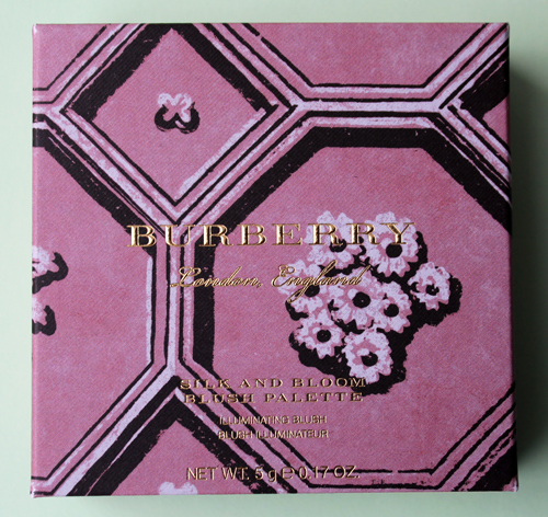
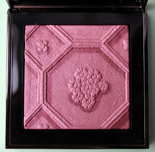
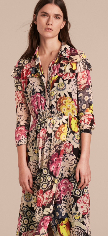
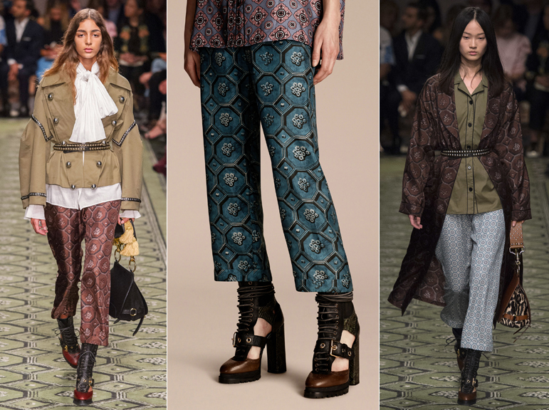
I hope Burberry doesn't stop releasing their runway-inspired palettes, as I've become quite fond of them. While their most recent offering isn't my favorite, I will certainly take it over nothing. For their spring 2017 blush palette, Burberry chose a hexagonal floral pattern that appeared on several items in the fashion collection (and, interestingly, on the runway floor).
(images from us.burberry.com and vogue.com)
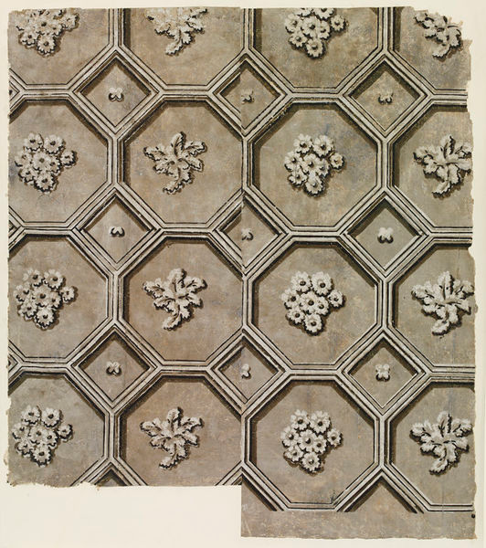
One significant item of note that I somehow missed when discussing the fall palette was that the wallpapers Burberry borrowed for patterns to use in their spring 2017 collections are housed in the Victoria and Albert Museum, so off I went to see if I could find the originals. To my astonishment and great delight they were available to view online! Here's the one that inspired the spring 2017 pattern.
(image from collections.vam.ac.uk)
According to the V & A, this was made around 1830: "This wallpaper was designed to imitate moulded plasterwork. Moulded plaster was a fashionable method of wall and ceiling decoration in the 17th and 18th centuries, but it was expensive. Wallpaper printed in shades of grey and buff was a cheaper way of achieving a similar decorative effect."
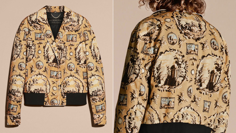
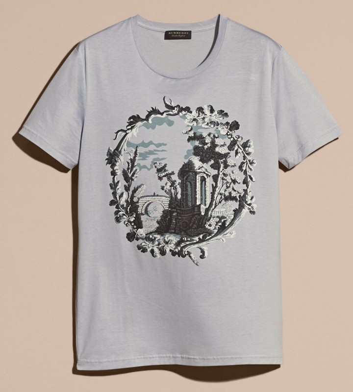
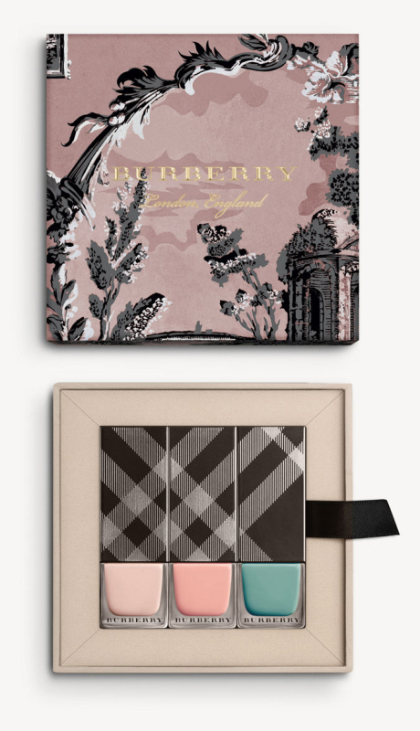
Just for my own gratification here are some of the other items that I mentioned in my previous post and the nail polish set, along with the original wallpaper. These were available for purchase back in the fall, but considered part of spring 2017…sort of. It's all very confusing to me, but Burberry was testing out the see-now, buy-now approach back in September 2016, hence why I thought the wallpaper-based items at the website were part of the fall 2016 collection. Apparently Burberry CEO Christopher Bailey is doing away with formal spring/fall collections (in name, anyway) and showing one collection in September and February, with styles that are meant to be "seasonless". I don't know about that so I'm continuing to refer to the Silk and Bloom palette, as well as the other wallpaper pieces, as part of spring 2017.
(images from us.burberry.com)
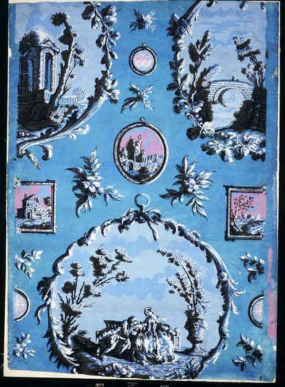
This paper is from the mid-18th century and used to imitate "print rooms". "This was a room decorated with prints that had been pasted on to the walls, with the addition of printed paper frames and borders. It was intended to give the impression of a room hung with framed pictures. Designing and installing a print room was a fashionable hobby for the wealthy in the 1760s and 1770s. Using a wallpaper with a 'print room' design was a cheaper way of achieving the same effect. This is one of several print room papers from Doddington Hall, Lincolnshire; it was hung as part of the major redecoration of the house undertaken by Sir John Hussey Delaval around 1760."
(image from collections.vam.ac.uk)
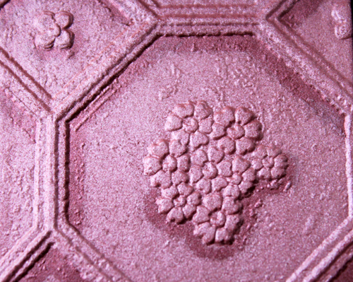
Anyway, back to the Silk and Bloom palette. Overall it's pretty and the vibrant rose color is to die for, but there are a couple details I'm not loving. First, there's this odd rough texture surrounding the flowers. I'm guessing it was a deliberate attempt to replicate the textural variations of silk fabric, which would make sense given that the pattern comes from silk garments, but I feel like it should be smooth – it almost looks like the palette is defective. On silk clothing obviously this texture is to be expected, but I don't think it works on a powder surface.
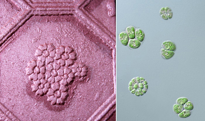
The second detail I'm not crazy about is the closeup view of the pattern. While in other palettes I adore the zoomed-in effect – it allows you to see more detail – in this case the closeup of the flower cluster sort of reminds me of cells under a microscope (in this case, algae cells).
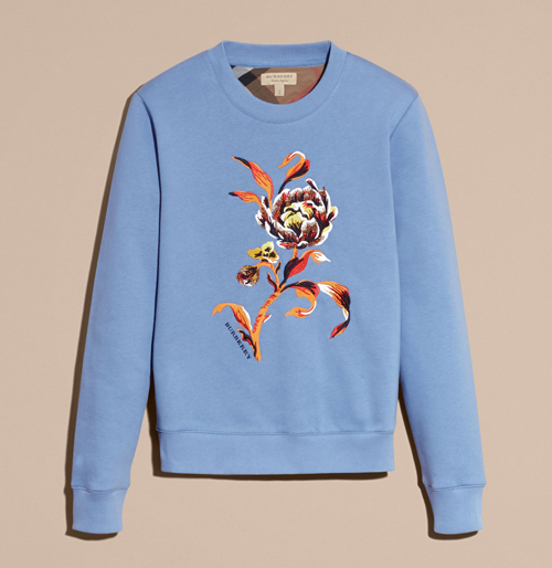
I think the pattern works well on the clothing (and on wallpaper, for that matter), but this is one of the few that, in my humble opinion, did not translate well to makeup form. (Or maybe I'm still cranky over not being able to snag the adorable heart-adorned First Love palette, grrr.) Whatever it is, I vastly prefer the spring and fall 2016 palette designs over this one. It's especially disappointing given that they could have modified the pattern to make it work for makeup – I would have gladly sacrificed a closeup view to have more of the whole pattern, since maybe then it wouldn't remind me of a biology class. :P Or Burberry could have chosen a different pattern entirely, like this one.
This single flower would be gorgeous – with a design like that, I'm envisioning the level of intricacy and color variety on par with Chantecaille's Butterfly eye shadows, and it could have with lots of shimmer on the petals like Sisley's Orchidée palette.
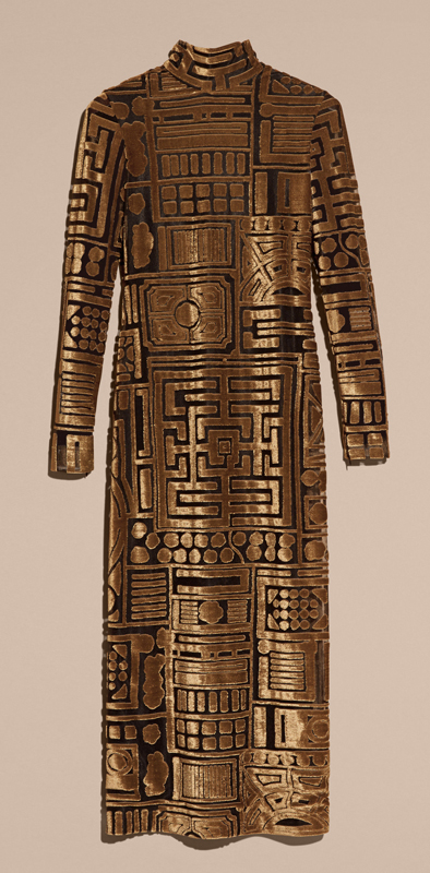
Or maybe eschew flowers entirely and do something totally unexpected, like the graphic pattern on this bodycon dress? I bet it would make a great bronzer.
(images from us.burberry.com)
What do you think? Check out the Museum's Burberry category for glimpses of previous runway palettes and let me know how the spring 2017 one stacks up in your opinion. 🙂
