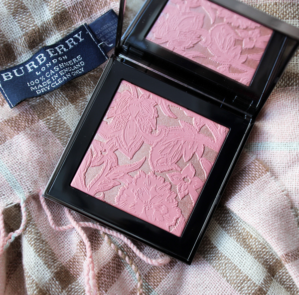
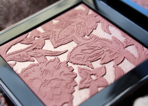
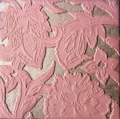
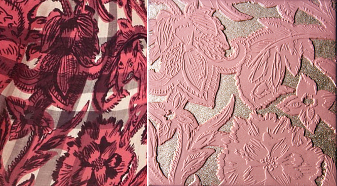
Apologies in advance for this short and rather sloppy post on Burberry's latest palette…the Curator is both generally exhausted and busy as a little bee working on more exciting things like the fall exhibition and some truly amazing holiday collections. This is not to say that Burberry's fall blush is subpar; as a matter of fact, I think it may be the most intricate one they've released to date. The detail on the leaves is beautiful, but I think my favorite part is that they're raised slightly above the background – it really allows the interplay of matte and shimmer textures to shine.
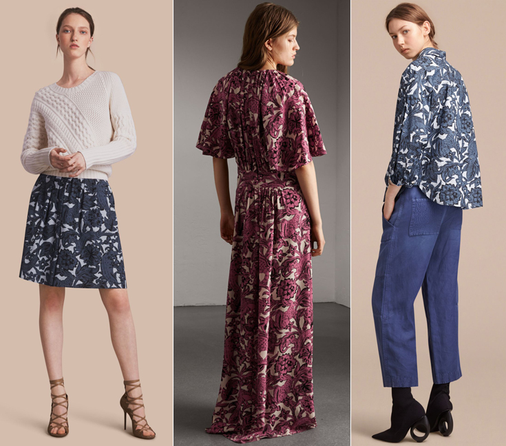
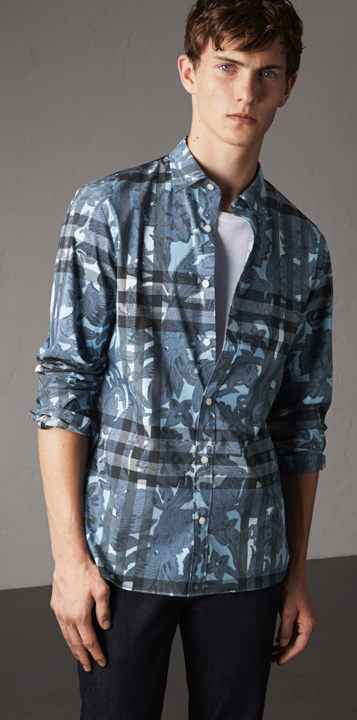
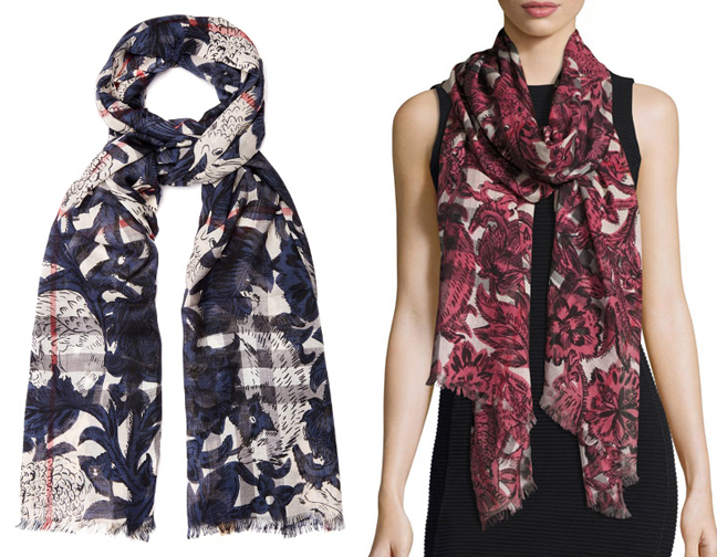
As with previous seasonal palettes, the print is a reproduction of one that appeared on some of the pieces from the fall 2017 fashion collection. In particular, the fall palette borrows one of Burberry's "beasts" prints, which were inspired by the fanciful mythical creatures lining the pages of medieval English manuscripts. This particular print surfaced on much of Burberry's line: womenswear, menswear, accessories and kids' clothes. (There was another beast print that was used on this lovely beauty box but I skipped it as I didn't think it was that special, plus I need to budget for many holiday items!)
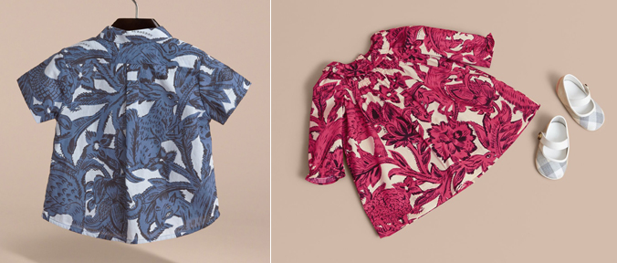
(images from us.burberry.com)
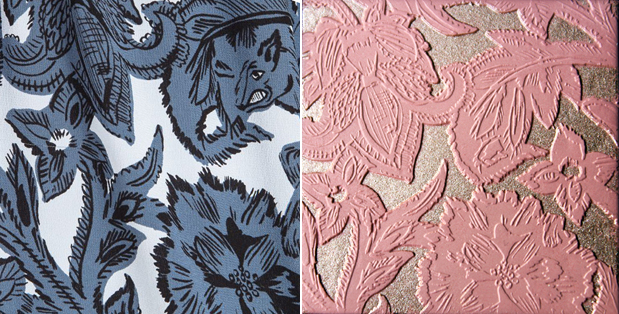
For the life of me though, I couldn't find an exact match for the pattern on the palette, so I think it may have been modified slightly to fit better. More specifically, I'm noticing two key differences on the right side of the palette. It looks like the beast's profile has been erased and replaced with some leaves, and another four-petaled flower has been added in place of his paws/hooves.
I also went slightly insane trying to distort the print in Photoshop so that it matched the exact angle of the palette's print. In the end I couldn't figure it out and gave up before I threw my computer out the window. I can rotate images just fine but couldn't seem to do any fancy stuff (distort, warp, skew, perspective, etc.)
It would have been great if Burberry had kept the print exactly as it was – wouldn't you have liked to see a little medieval beast peeking out from your blush? I also would have appreciated it if they would have been a little more specific in their references so I could have found the original images. For example, even though the spring 2017 blush's design wasn't my favorite, I was overjoyed when I found the exact wallpaper print they used, and all they needed to divulge was that the wallpaper was at the V & A. This time it would have been useful to know the specific medieval manuscripts they were looking at so I could have done some digging. (I did do a cursory search for medieval manuscript illustrations but didn't see anything strikingly similar).
Anyway, despite these slight missteps this was one of Burberry's prettiest offerings and certainly Museum-worthy. What do you think? Oh, and if you crave a daily dose of medieval manuscript illustrations chock full of mythical creatures and other assorted weirdness found in the margins of these tomes, this is the Tumblr for you. 😉
