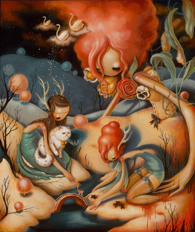
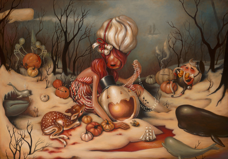
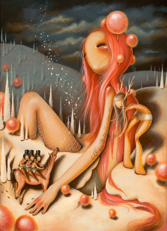
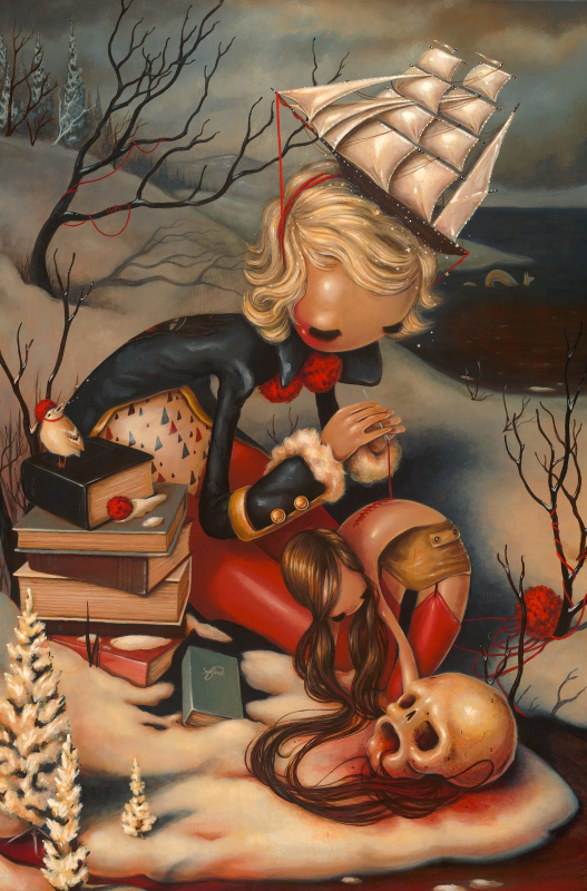
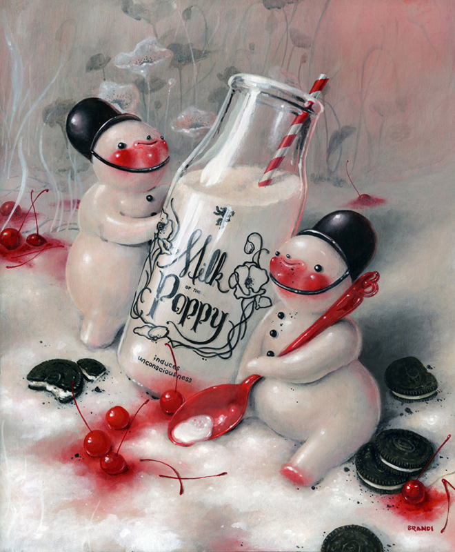
She notes that this feature came naturally: "I enjoy bending scale in my work…it wasn’t as important to bend the scale as it was to make the characters feel as if they were at home in their environment. These things are not intentional – they come [instinctively]…Maybe the exaggerated limbs represent a feeling of being larger than life. A feeling of being able to reach and grow beyond what one might feel their capabilities limit. " So not only do these long arms and legs make for a more cohesive composition, they also represent the emotional "stretching" required to handle life's challenges.
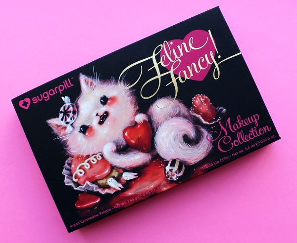
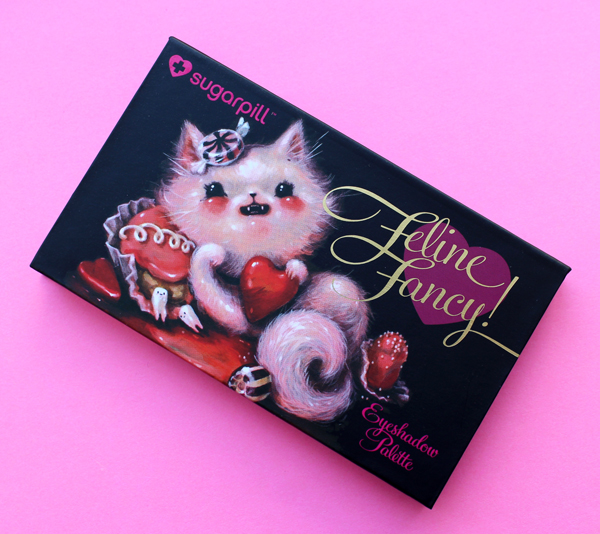
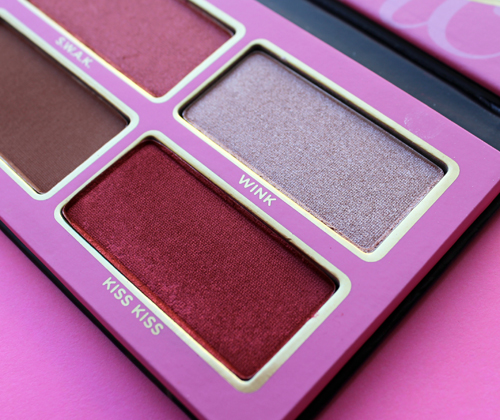
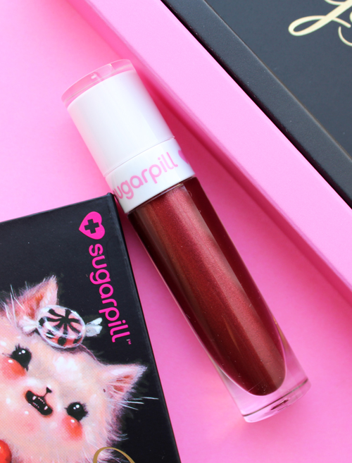
I blinked a few times when I first laid eyes on this set by indie brand Sugarpill, thinking it was odd that Mark Ryden had collaborated with them. But then I saw that the company had teamed up with Brandi Milne, another Pop Surrealist whose work, upon closer inspection, is markedly different than Ryden's.
I won't make any excuses as to why I didn't get to posting about this before now even though it was originally released for Valentine's Day; the reason is that I'm simply disorganized. The set got buried under a bunch of other makeup items in the office, and it wasn't until I recently started seeing mentions on various art blogs of Milne's new solo exhibition, which opened last week, that I remembered I had it.
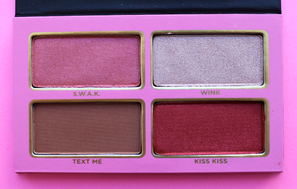
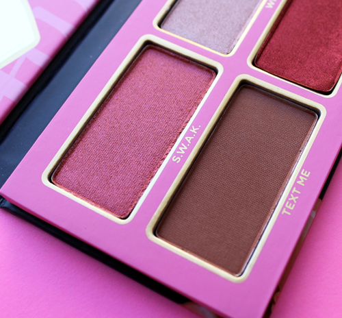
I love that one of the little teeth from the outside of the palette made its way to the interior of the box.
There was a truly overwhelming amount of information and interviews with Milne, so I hope by whittling it down somewhat I can still do her art justice. Get ready for a lot of quotes since I believe the artist's own words are the most useful in understanding their work.
Milne, a self-taught artist, drew and colored throughout her childhood in Anaheim, California (and in a strict Christian household) and began showing her work in various galleries in the early aughts. By January 2008 she was able to make painting her full-time career. Let's explore the various themes in her work and how her style has evolved over the years, shall we?
Early on, Milne's style was more illustrative, most likely due to the fact that she hadn't been exposed to much contemporary art. She explains, "I grew up completely unaware of contemporary artists. In the 90s when I was drawing in my room ('developing my style' at that time), I didn’t know of Mark Ryden and Camille Rose Garcia, or anyone painting wild things the way they were. So I had only my own world of things that influenced me – the children’s books I had as a kid, Bugs Bunny cartoons, coloring books, Woody Woodpecker and Heckle and Jeckle, Disney’s Alice in Wonderland and Pinocchio, vintage Halloween and Christmas decorations, music that had inspired me – and the way my imagination interpreted all of it."
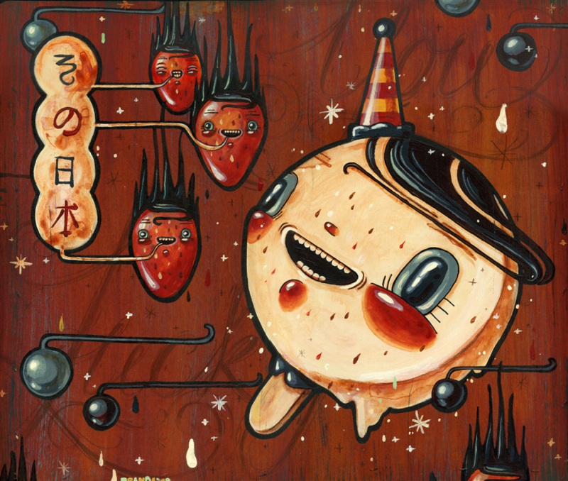
(image from thinkspacegallery.com)
Her passion for art grew, and now Milne cites Mucha, Erte, Maxfield Parrish, Norman Rockwell, along with the aforementioned Garcia, as her chief influences. She gradually switched to painting, which allowed her to be a little less precise than drawing neat, contained lines. "I used to work on paper/illustration board with watercolors, pencil and ink in order to keep things REAL tight and clean. I used to hold my breath whenever I worked, and my poor hand would cramp up because I was so pressed for perfection. Over time, I couldn’t stand feeling like a mistake would set me back the entire piece – I wanted to be free. Painting on wood was my ticket out of that stress filled bind I was putting myself in, and I took the leap a few years back, scared as hell! But since then, that freedom is the rabbit I’ve been chasing!" Interestingly, Milne's husband custom makes all of the wood panels she uses as her canvas. I always love a supportive spouse. :)
Other stylistic shifts include Milne's choice of colors. Earlier work presents a fairly neutral palette, but more recently Milne has favored a brighter, arguably more feminine palette that's heavy on red, pink and white. In reference to her latest exhibition, she says, "In this new body of work, my palette went from really bright brights—fluorescents paired with really dark contrasts. I wanted to illustrate life blossoming from darkness. That so much beauty and life can spark from or grow from a place that seems frightening or lifeless…I love red and hyper pinks and whites. There was a year within the process of making this body of work where all I wanted to paint was reds and pinks and whites." This is most likely the influence of a new florescent shade of red she stumbled across at an art supplies store a few years ago. In any case, red, pink and white is the dominant color scheme for Milne these days, and this is reflected in the Sugarpill palette as well.
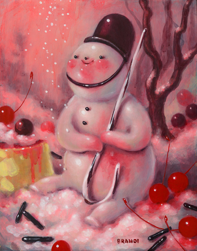 (image from coreyhelfordgallery.com)
One aspect of Milne's style that's more or less remained consistent is the oddly extended limbs of the girls in her paintings.
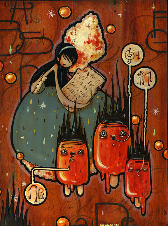 (image from thinkspacegallery.com)
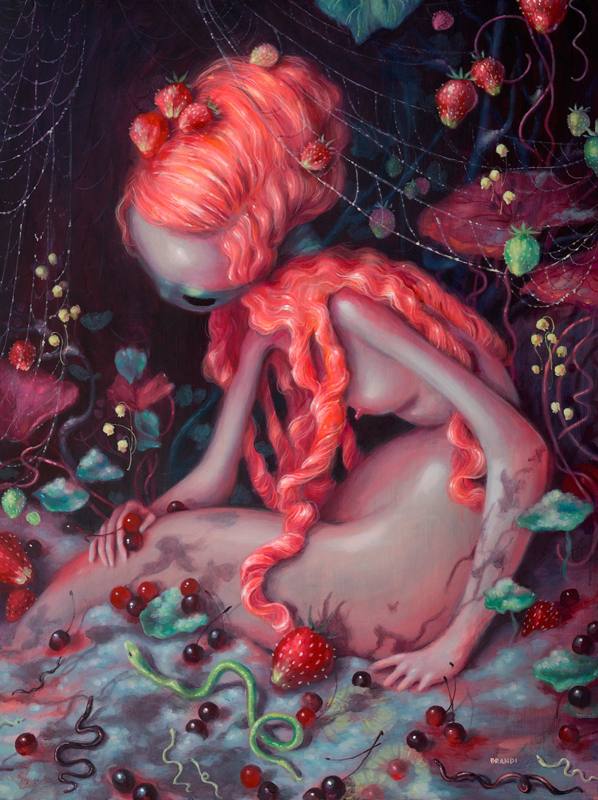 (images from coreyhelfordgallery.com)
Thematically speaking, Milne's portrayals of female characters are highly autobiographical. The title work from her 2009 show "Run Rabbit, Run", for example, represents the emotional strife faced by Milne after the passing of her mother. "The idea and feeling behind this body of work is strongly related to my mother’s passing in March ’08. My work is emotionally narrative (not by choice), and because I’m struggling through this huge loss, it’s reflected in my new works. I’ve tied in the show’s theme ‘Run Rabbit, Run’ – a lyric from Pink Floyd that hit hard for me one day while I was listening to Dark Side of the Moon, and really feeling my mom’s absence. It struck a note with me, and opened up this idea in my mind. This was the inspiration for my new show, and in turn, extremely helpful in my heart…My girls are an endless narrative for me. She’s my way of voicing an emotion in a piece, sad, innocent, scared."
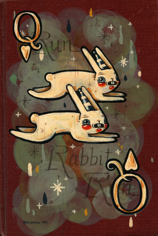 (image from thinkspacegallery.com)
This painting depicts Milne trying to stay close to a dear friend who moved away.
And for I Never Dreamed of Such a Place, she explains, "She's kind of broken. Her body is broken, she’s giving up and hitting bottom. And then myself – I feel like the way that I grew up was in kind of a religious bubble. So in that aspect, I feel like I’m really innocent, you know? As a lamb, being slaughtered. That’s me…It looks cheery, but it’s bloody. She’s broken and I’ve been going through a lot – trying to help myself. So it’s all coming out in the work.”
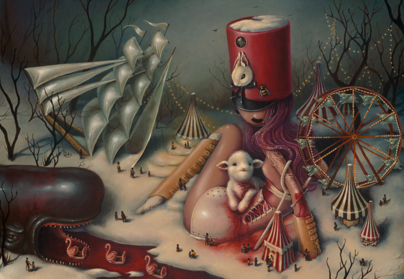 (images from coreyhelfordgallery.com)
These works show Milne's vulnerability but also her resilience. Take, for example, Hold Fast, in which a girl receives stitches administered by a fairy godmother-like being, who's an embodiment of the artist herself "mending" her own psychological wounds. It may seem a tad gruesome at first, but it's actually a message of healing and renewal.
As for other themes, Milne's work weaves together the many influences from her childhood mentioned previously: Fisher Price toys, holiday decorations, and, of course, proximity to Disneyland. "Pinocchio, Alice in Wonderland, Peter Pan, Dumbo, etc. Having loved all those cartoons, going to Disneyland was surreal. The Tea Cup ride with all the lanterns in the shady trees and twinkly lights above. Flying over that lit-up city in the Peter Pan ride, Frog and Toad, the Matterhorn? Being at Disneyland as a kid, is really unparalleled to anything else. It was hugely influential," she says. Additionally, her mother's religious outlook, coupled with the darker side of fairy tales and Disney movies, inspired the concept of duality that permeates so many of her paintings. While they seem to be cheerful and innocent upon first glance, something sinister lurks beneath the candy-coated surface. One example is Be Good for Goodness Sake, in which two happy snowmen naively enjoy some frosty cold milk…that's actually laced with opium, given the labels on the bottle. (Yes, "milk of the poppy" is indeed a Game of Thrones reference.)
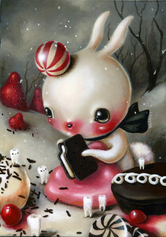
Or Soothe Yourself, which shows an innocent little bunny surrounded by brightly colored sweets munching on a gingerbread man. It's an adorable scene until you notice the gingerbread man is (understandably) frowning, while equally sad-looking teeth look on. A piece of taffy (?) on the left cradles what appears to be a dead tooth, and the cherry cordial on the lower right has broken and spilled onto the snow.
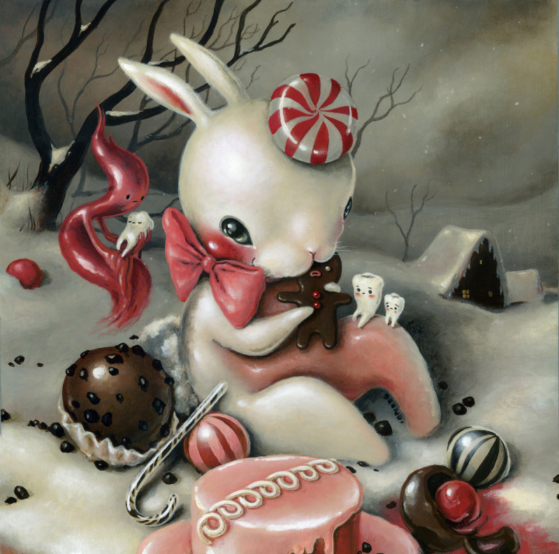 (images from coreyhelfordgallery.com)
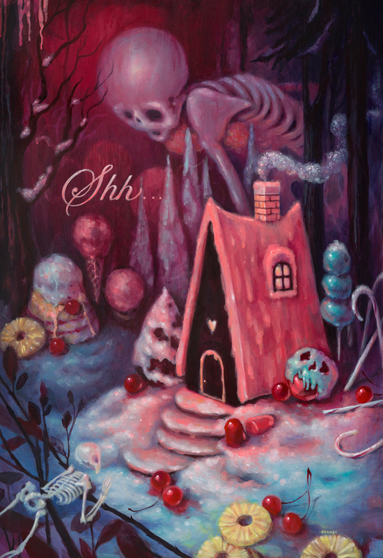
Milne says, "I love duality. It was so confusing to me growing up, I really couldn’t wrap my head around it and I fought it for so long. I believed that things should be black or white; that you were either a good person or a bad person. You were either happy or you were sad. In Disney movies, particularly, I was absolutely astonished to see that Disney chose to include such horrifically sad moments in his storytelling. We were watching a CARTOON and suddenly there was death and heartbreak and I was FEELING it!! I wanted to reject it, fast forward to the fun cute happy parts. I was disturbed by it. But as I was exploring my own work as an adult, I realized that it was that duality I was feeling and that I wanted to talk about. I love beauty and I love happiness, but I wouldn’t have either if I didn’t have the opposites and everything in between…This new body of work was inspired by the notion of good vs. evil, and the fairytale-like memories of being a kid. I painted what it felt like to be happy and innocent and naive and then to discover certain truths about the world and reality." This idea of yin/yang forces is expressed in several paintings from her latest exhibition. Lynrose depicts a bright pink gingerbread house set among a forest filled with candy canes and ice cream. While it looks positively charming at first, several ominous-looking skeletons are creeping up onto the house, and a closer look reveals that even the tree and shrub next to it have skull-like faces.
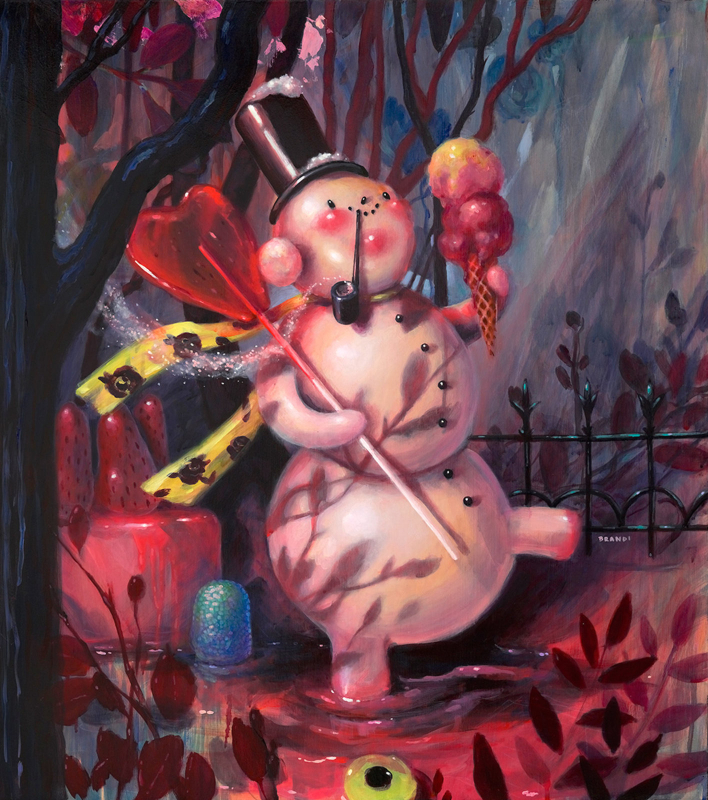
The title piece also seems utterly harmless initially: it shows a group of jolly, red-cheeked snowmen enjoying some frozen treats. But then you notice the trees in the background are dead, and the ice cream container has a faded skull and crossbones.
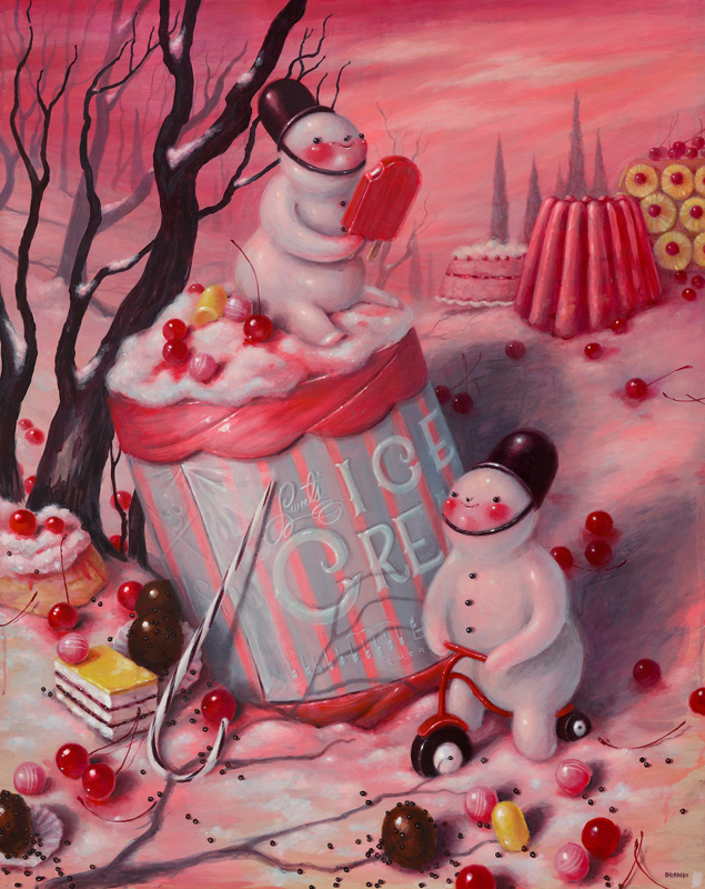 (images from coreyhelfordgallery.com)
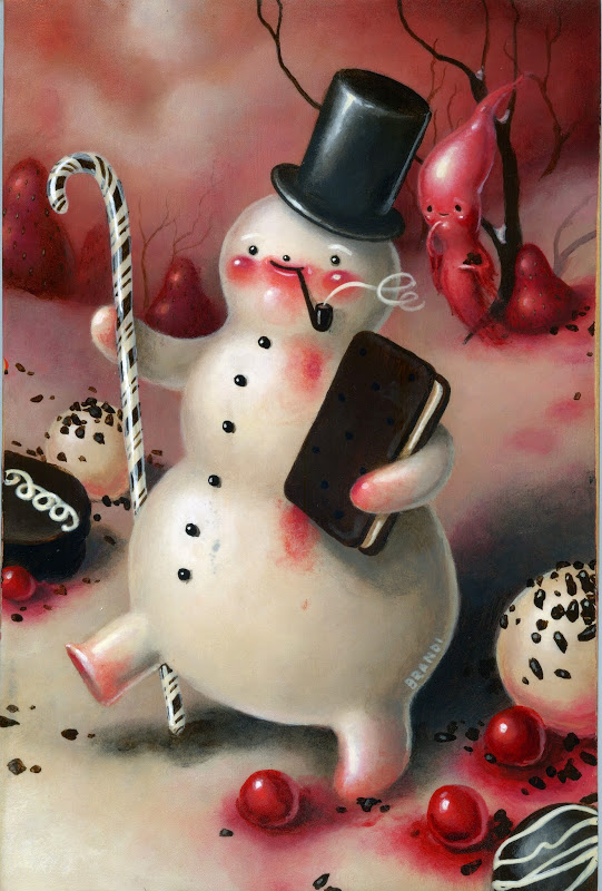
Despite the darker imagery in these paintings and others, by and large snowmen represent feelings of happy nostalgia for Milne. She explains, "The snowman is the jolliest fellow! My mom LOVED Christmas – she would transform the house with tinsel and knick knacks and vintage decor, Christmas music would be playing on the big family stereo and it was such happiness for me as a kid. It was a wonderland!! All these years later, I find myself trying to illustrate that feeling – trying to recreate it in my work. The snowman tchotchke was a rare find in the house (there were plenty or reindeer and angels and Santa’s to be found), but I remember specifically adoring what snowmen figures we had, and probably hoarding them from my siblings. The snowman best represents that spirit for me...I wanted that Christmas wonderland to last all year round!" (Interesting side note: Milne also enjoys drawing snowmen since she her favorite shape is a circle – "it has no harsh corners". I suspect this is also the reason for so many paintings featuring Humpty Dumpty, her love/hate relationship with his character notwithstanding.)
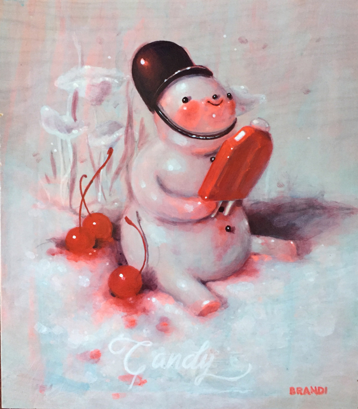 (images from coreyhelfordgallery.com)
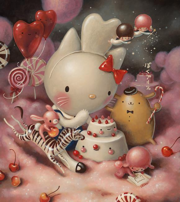
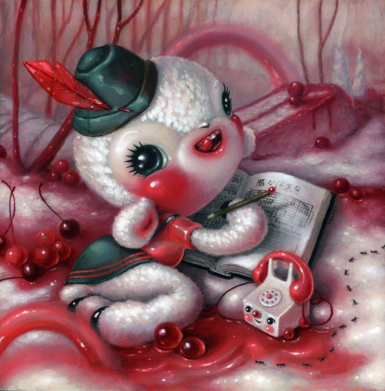
While many of Milne's paintings represent the concept of duality, sometimes they're simply whimsical and joyful, with nary a menacing skeleton or dead tree to be found – just unbridled sweetness. "Wide-eyed and maniacal, I try to capture the feeling of pure happiness and bliss as a kid." I couldn't find anything dark or upsetting in the Sugarpill palette or in these paintings.
I'm particularly struck by the maraschino cherries scattered about in this one. They just look so succulent and juicy. Milne greatly enjoys painting these too: "I can't stop painting cherries and all I want is for everything to be translucent!"
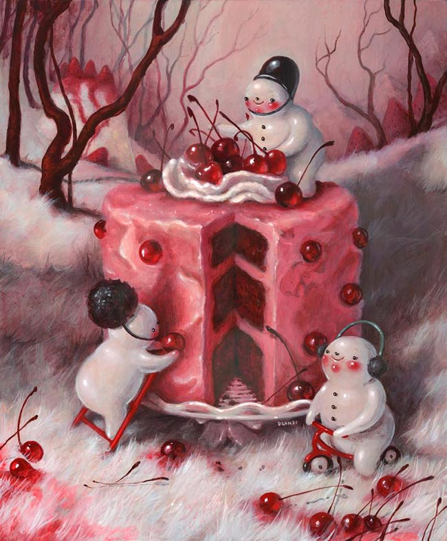 (images from brandimilne.blogspot.com)
I love these since they remind me of characters from children's books, which makes sense given that Milne has illustrated one, not to mention all the delicious treats. You know I'm all about sweets as well as childhood nostalgia since my own was so happy. Milne's reminiscing about her mother's holiday decorations, coupled with the imagery in the paintings, instantly transport me back to celebrating various holidays with my family. (In particular I'm remembering this adorable ceramic ghost with a red face my mom put out for Halloween, and a beautiful ceramic Christmas tree with multi-colored lights…if it wasn't out of my price range I'd commission Milne to paint a couple pieces featuring these items).
Anyway, while there was an enormous amount of information online, I still have a couple unsolved mysteries surrounding Milne's work. First, I'm curious to know about the German references.
This little lamb seems to be wearing a traditional Alpine hat.
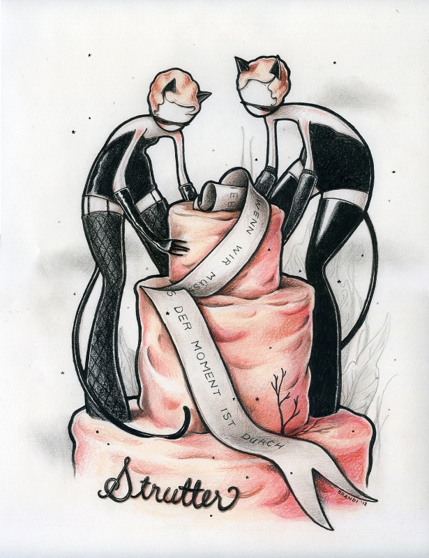
There are German words on the script in Strutter.
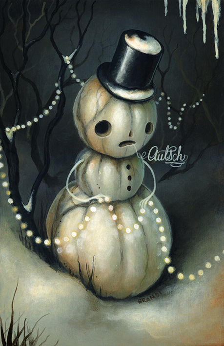
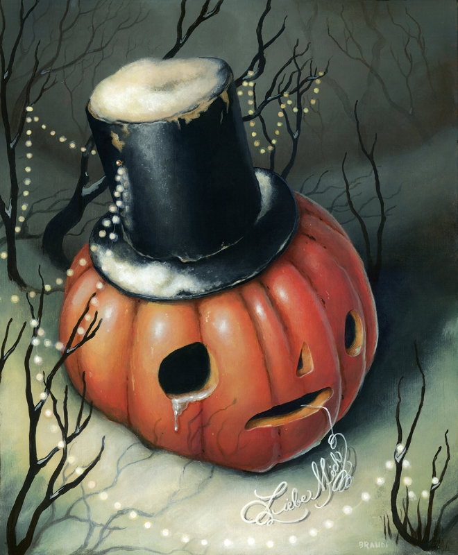
And this poor little snowman is saying "ouch" in German, while in Long After This a sad pumpkin begs "love me".
Milne herself was also recently photographed wearing what appears to be a dirndl.
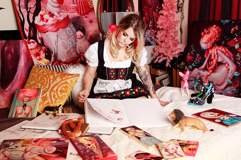 (images from brandimilne.com)
I suppose it could be related to fairy tales, since the most famous ones in the Western world come from the Brothers Grimm. Or perhaps Milne has a German background or just appreciates German culture. Whatever it is, I'm surprised I didn't come across any explanations for it.
The second item that left me scratching my head was how the collaboration with Sugarpill came about. I'm assuming Sugarpill reached out to Milne first and they went from there, but it would have been nice to hear more about the process, the inspiration for the palette (who thought of a cat theme?) and how the artwork was created to reflect it. I watched this video of a studio visit and read about Milne's artistic process, so I know a bit about how she operates, but I imagine things might be a little different when a commission for a makeup company is involved. At least we know the artwork was an original piece made just for Sugarpill.
That was pretty long despite my best effort to condense everything I found while also trying not to leave out any major points regarding Milne's work. So if you're still reading, thank you! Overall, the Sugarpill palette is a wonderful addition to the Museum's artist collaboration collection and also helps make up for the fact that I failed to nab the Trinket lip gloss from 2016. I enjoy Milne's work so much I may have to ask Santa for a book of her work. ;) I feel as though I gravitate towards it since we're about the same age – we grew up with the same toys, Disney movies, cartoons (and even had similar holiday decorations!) and also because we had happy childhoods. And obviously I love any artwork featuring delectable-looking sweets.
What do you think?


