Today I invite you check out what goes on behind the scenes of the Makeup Museum's exhibition installation (see part 1 for the more general blogging aspects.) I provided a brief glimpse into exhibition setup with Sweet Tooth, but that was for a one-of-a-kind show. This post will cover the process of setting up the basic seasonal exhibitions using the summer 2014 exhibition as an example.
In terms of "curation" I generally start thinking about the seasonal exhibitions months in advance. I don't just go pulling objects out of museum storage willy-nilly the day I install and photograph the exhibition – it's planned over months. I draft a blog post and list newly released items I want to include. Based on those, I work in items from previous years, and if it seems like I need to add more (I need to have enough for 16 shelves, after all), I start poking around for vintage items that would make good additions. I usually have no idea what objects will go on which shelves, but I always know the items and any additional materials (ads, pictures, etc.) that need to get installed prior to the actual installation. I also have to get the label text ready in advance, which is trickier than it sounds since most of the time when I write a post about an object I don't use the formal name of the product, so I have to go hunting it down. And sometimes for older items for which I can't remember the release date I have to look that up too. I put everything in a Word document and the husband lays out the labels in InDesign with the Museum's logo – how sweet is that?
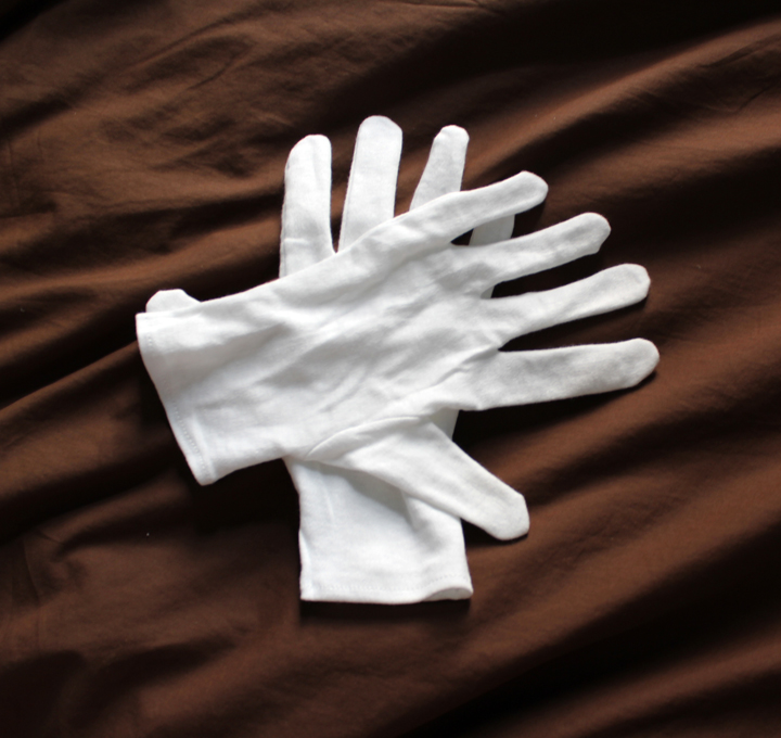
Now let's look at how I physically install the seasonal exhibitions. First things first: I need to remove the items from the previous exhibition that are still on the shelves, and for that I employ some good old white cotton gloves for handling the objects. This way they don't get all fingerprint-y. Down with spring 2014, up with summer!
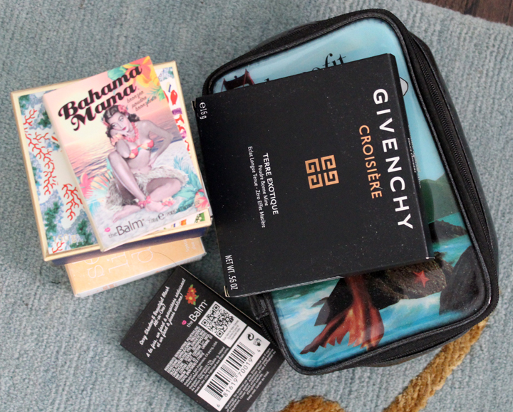
I arrange the objects into various piles either on the shelves or on the floor according to where they're stored. For example, all brands from A through G get stored in the top drawer in the master closet so I group them together.
All other brands except for Paul & Joe and Stila go in the hall closet, so here's that pile.
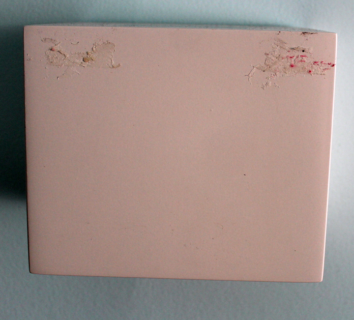
Then I take the labels off the shelves. As you can see, years of using double-sided tape to secure the labels have left a ton of residue which I can't seem to remove. (Any suggestions that won't take off the finish?)
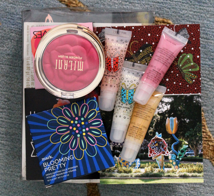
Then I start gathering the objects I plan to use in the upcoming exhibition.
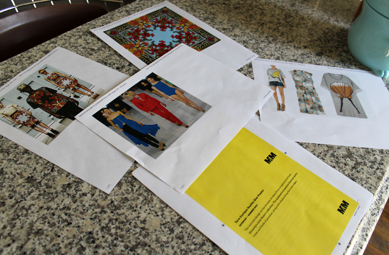
I print out any collateral materials and the labels in color.
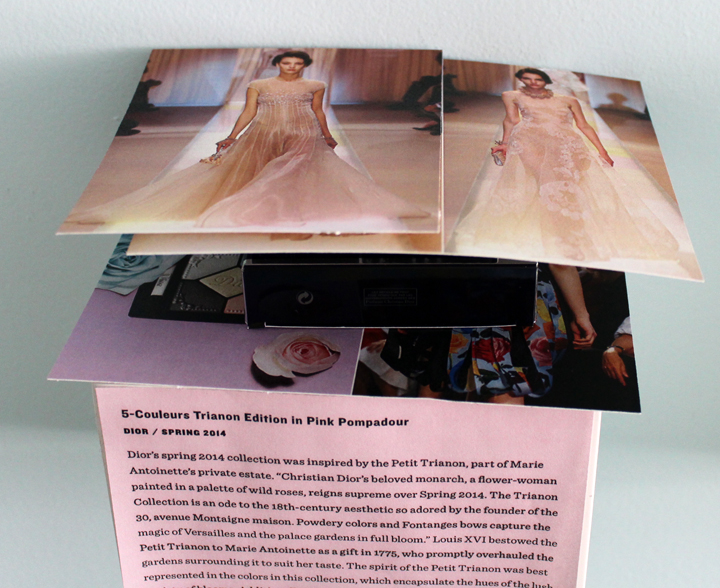
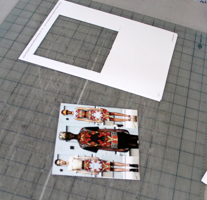
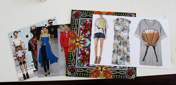
Any pictures that are included in the exhibition are printed out on regular paper and then spray mounted to a sturdier cardstock.
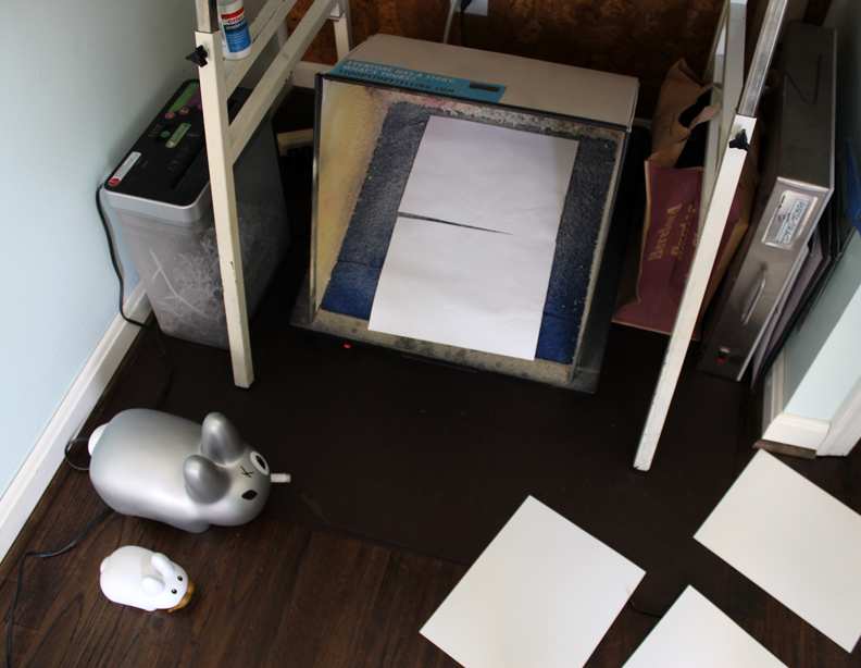
And this is where the husband comes in (again). He's amazingly crafty – I'm not sure whether it's because he's a designer and has a lot of experience or because he's just naturally skilled, but he's very good at assembling the collateral materials. Here's the spray booth (and our little labbits!) located beneath the cork board in the office:
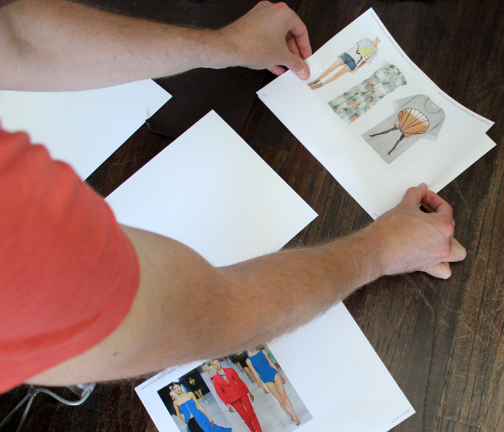
He sprays the picture backs with glue and then affixes them to the cardstock. When I try to do this it's always crooked or lumpy, and it takes me forever. He can do it perfectly in a matter of seconds.
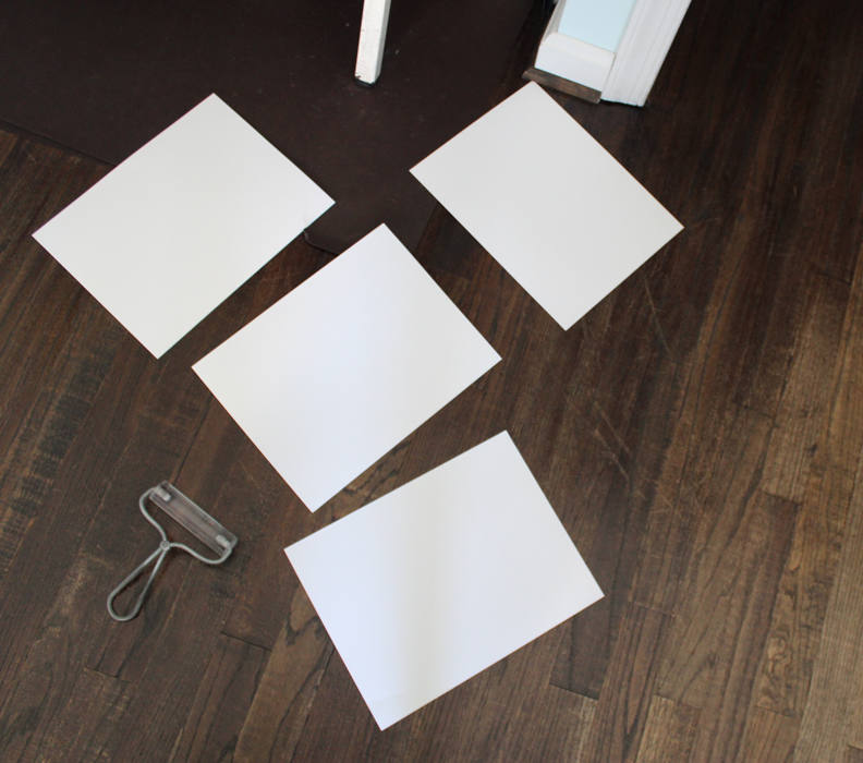
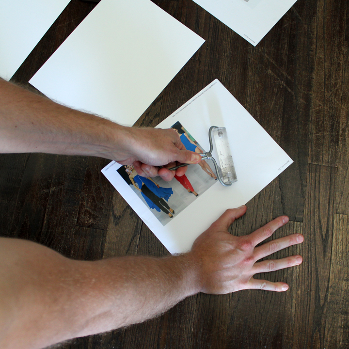
Going over it with the roller gets it nice and smooth.
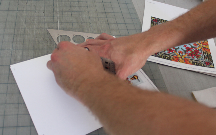
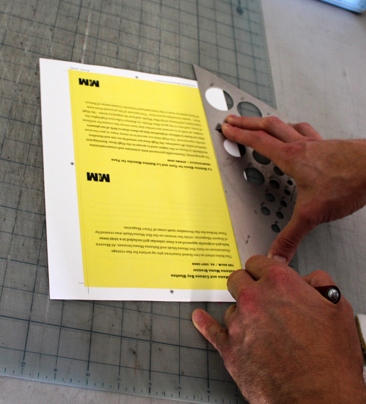
He then cuts out the pictures very straight with an Exacto knife. Again, when I tried to do this myself it was a disaster. Not only did I cut everything crooked despite using the ruler, I nearly chopped off a finger or two.
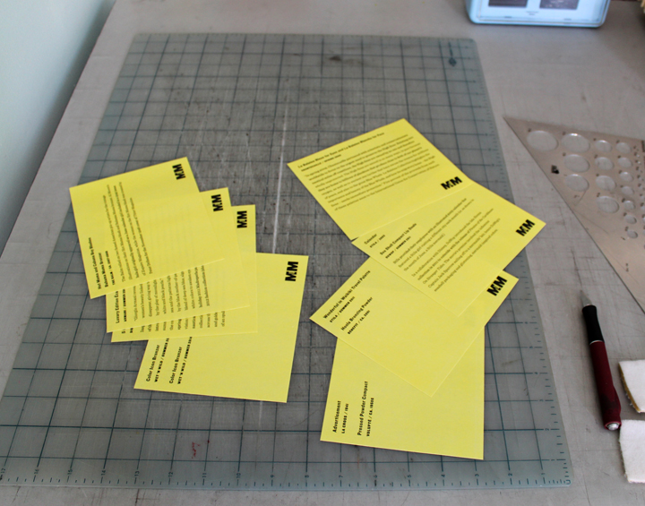
The labels don't get spray mounted since they will be attached to the shelves, so they just get cut out.
Et voilà!
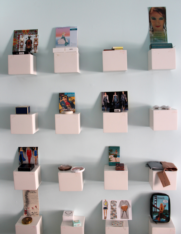
So once I have everything – items, labels and pictures – I start putting stuff on the shelves. Some of them I know will have to be on the highest shelves due to the height of the pictures or ads. There was no way I could cram that Max Factor ad on a lower shelf!
This is the hard part. I generally spend about a half hour to 45 minutes rearranging the objects so that the format is both visually appealing and not repetitive in shape, theme or brand. For this exhibition, I wouldn't want the Armani and Dior next to each other (too much couture), and I wouldn't want the DuWop shell compacts and the Benefit shell compacts next to each other because they're too similar. And I didn't want mermaids sitting next to each other, and I don't like two items from the same brand next to each other. I make an exception for Shu cleansing oils, however – I don't mind having two on one shelf and two on the shelf next to it if they're from the same collection, as you can see from the spring exhibition. Anyway, I play around and sometimes I don't even have a reason as to why I want the items arranged a certain way. I just know when it looks "right".
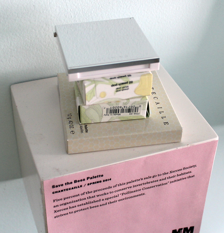
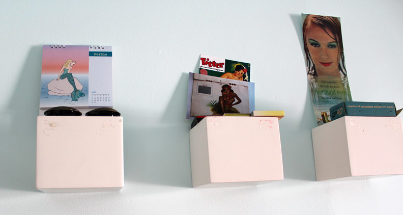
Once I get everything in place, I start setting it up to be photographed, i.e., taking everything out of their boxes and attaching additional pictures to the wall. Depending on the height of the objects I can lean the picture against the wall behind it, but if it's an open palette that will block it, I have to tape the picture above it.
Generally speaking I prefer to hang up the vintage ads with metal clips. However, for the vintage ads used in the summer 2014 exhibition, those were cut and spray mounted because they were included in much larger magazine pages, and they looked better by themselves than being surrounded by text.
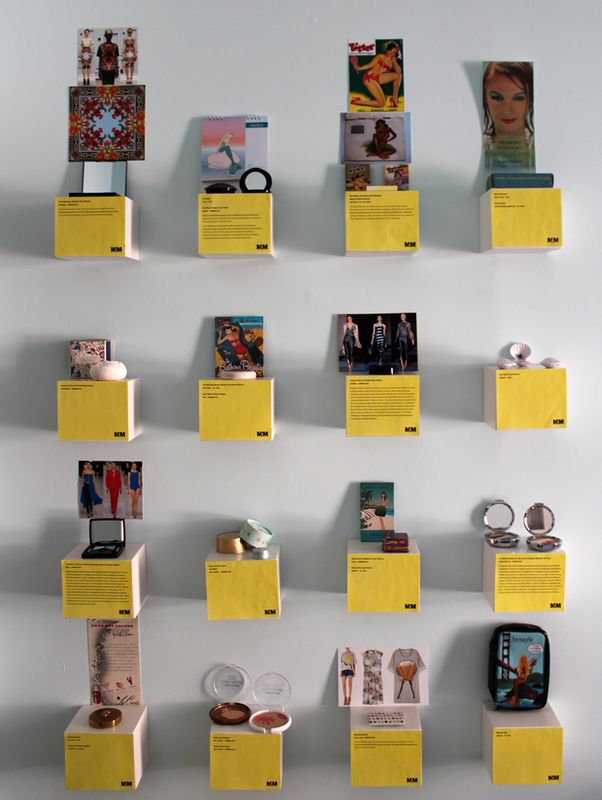
I make any final tweaks and once I've decided I'm satisfied with the placement, only then do the labels go up. Then I open any palettes that need to be opened and start shooting. The top row is difficult to photograph since I have to get on a ladder.
Here's the finished product. If you'll notice I switched the Wet 'n' Wild palettes and the Laduree items…the shapes (open round compacts) of the Wet 'n' Wild ones were too similar to the Chantecaille palettes to have in the same row. At least, that's how it seemed to me.
After I photograph everything I don't put it away. I close any open palettes and put them back in their boxes so they don't get dusty, but I just leave all the items on the shelves instead of putting them back into storage. The labels stay up until the next exhibition as well.
And that's how it's done! Questions? Comments?
