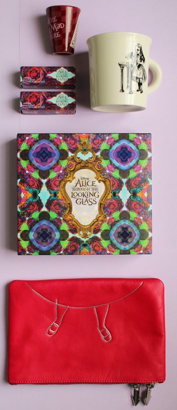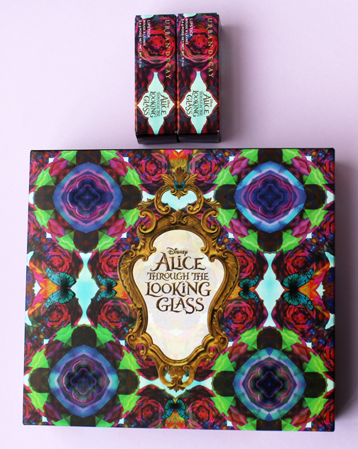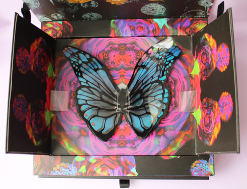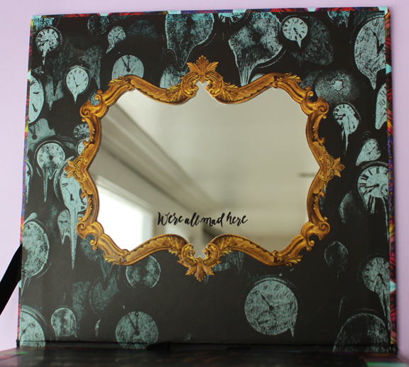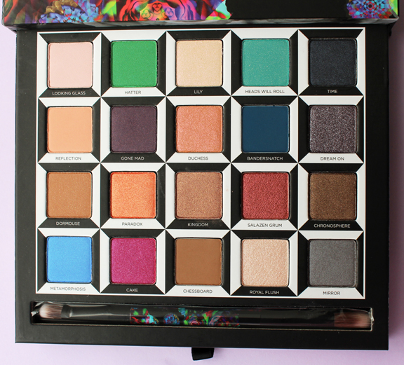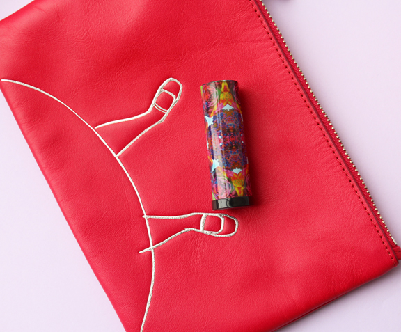
As a follow-up to their palette released as a tie-in to the 2010 Alice in Wonderland movie, Urban Decay has launched their Through the Looking Glass collection to go with this year's sequel, which will hit theaters May 27. Like the previous palette, this one features a pop-up design and a vast array of colors. There are also 5 lipsticks sporting the same crazy kaleidoscope design as on the palette's outer case.

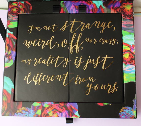
Love this quote on the inside.

As for the outer packaging, Urban Decay founder and Chief Creative Officer Wende Zomnir explains, “This was made to look like an acid trip. We took a different approach and decided, ‘Let’s make it really colorful and bright because the shades are like that'…even if you aren’t attached to the film, the butterfly tells the story of what the makeup is all about, which is transformation."

The quote on the side of the palette is also a nod to the transformation theme.


There are 20 colors total (4 more than the previous palette), and 4 are dedicated to each of the 5 main characters from the film: Alice, Mad Hatter, Time, the White Queen and the Red Queen. “We loved the original construction and keeping it in the same vein, but we wanted to tell a different story with the shades and really bring a focus to the shades,” says Zomnir.

How fun are the lipstick caps? (You might remember that I bought the Alice bag for my trip to Disney.)

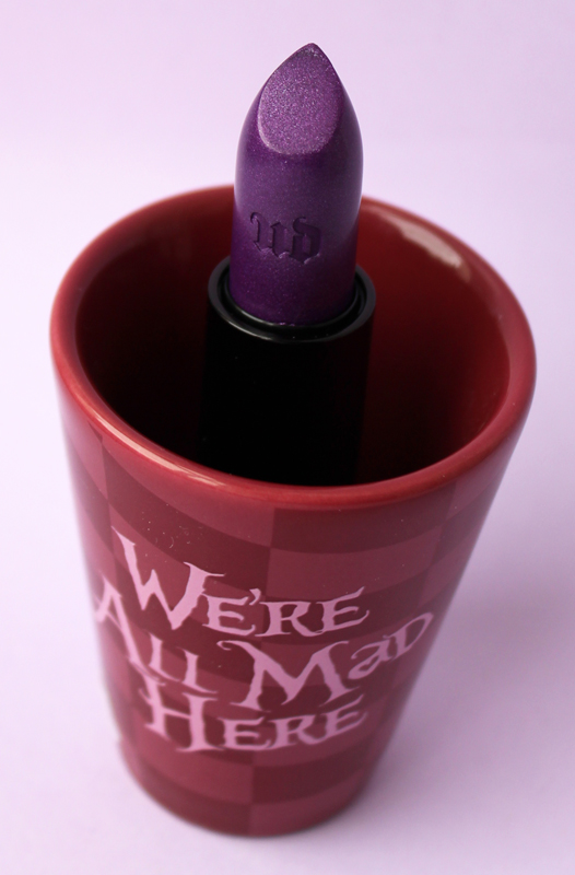
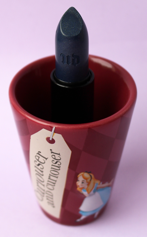
Naturally I selected the two boldest colors from the lipstick lineup. The blue lipstick was not an accidental creation – it represents both Alice's coat and also shows that Urban Decay is paying attention to the mainstreaming of what used to be considered outlandish colors. Says Zomnir, “My customer is a very independent thinker. She’s really into self-expression. She loves makeup. While Alice is a very plain character, she’s associated with the blue dress — in this case, it’s a coat — and we were able to pull in that interesting blue with her, and the makeup is rad for all the other characters…Six years ago, Anne Hathaway’s White Queen makeup was a little extreme, but now you see it on the street.”
The little cup I put the lipsticks in here is a souvenir from my Disney trip. 🙂


Objectively speaking I thought this collection was well done. But personally, I'm a bigger fan of the first Alice in Wonderland book/movie so anything to do with that I'm going to like more than items related to Through the Looking Glass. This palette is great but I so enjoyed seeing all the characters in the previous palette (my favorite, if you remember, was the caterpillar).
What do you think? How does this collection compare to Urban Decay's previous Alice-themed palette, and for that matter, other Alice in Wonderland makeup? (See here and here.)
When I was re-organizing the Museum's collection storage I realized I had never featured these Stila Look of the Month palettes. Plus I figured it would be a good follow-up to my vintage zodiac compact post from last week.
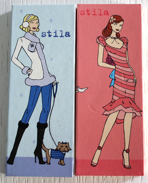
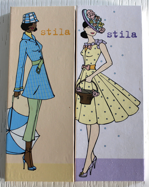
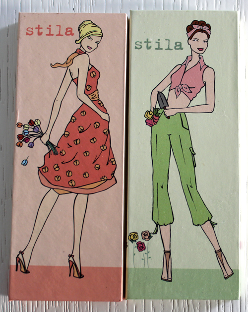
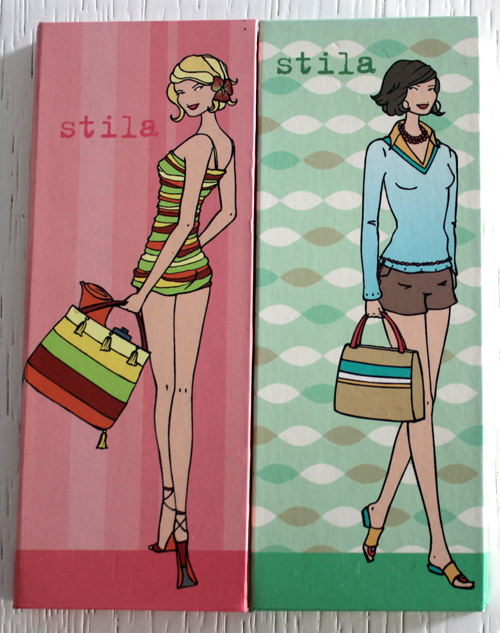
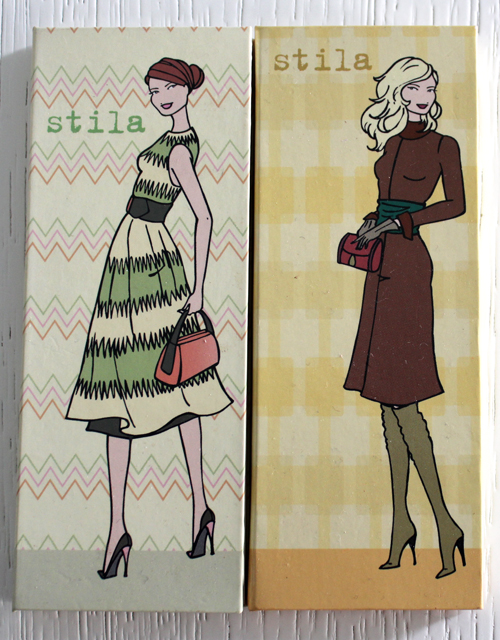
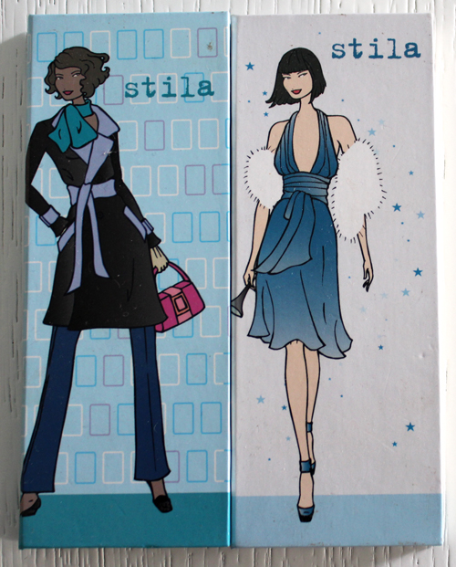
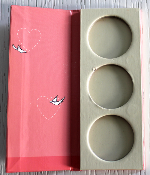
In early 2004 Stila released the first of 12 adorable 3-pan palettes sold exclusively at Nordstrom. They sold for $8 each empty, and for every month Stila recommended specific eye shadows and blush pans from their line to go in the palettes along with other products that would complement the palette items. While mine are not in mint condition, they're in pretty good shape considering that 1. they're over 10 years old at this point; 2. they're made of laminated cardboard, which isn't the sturdiest material; and 3. I (stupidly) actually used them to house eye shadows for a period of time before moving them to metal palettes. I totally couldn't remember the suggested shades for each one, but fortunately a very helpful reviewer at MUA listed them all. Many things are long discontinued, which I've marked with an asterisk.
Here are January and February. January's suggested shades: Shore* and Pewter eye shadows, Bloom blush*. Other items to go with the colors in the palette: Grapefruit Lip Glaze, and All Over Shimmer #7 (All Over Shimmers were pressed highlighting powders.)
February's shades: Cassia*, Shell and Poise eye shadows. Other items: Lillium Convertible Color and Demi Pink Twinset* (the Twinsets were double-ended products with a matte lip shade on one end and a high-shine gloss on the other that could be layered together or worn separately.)

March's shades: Wheat, Sage* and Espresso eye shadows. Other items: Nude Flash*, Praline Lip Glaze
April: Charm* and Cassis eye shadows, Cozy blush*. Other items: Fig Lip Glaze*, All Over Shimmer #1*

May: Launey*, Sun and Twig eye shadows. Other items: Gerbera Convertible Color, Spangle Lip Polish*
June: Chinois and Jade eye shadows, Tint blush*. Other items: Twinkle Lip Polish*

July: Ray*, Sun and Twig eye shadows
August: Nude* and Puppy eye shadows, Soar* blush

September: Wheat, Golightly and Java eye shadows. Other items: Teak Convertible Eye Color*, Water Lily Rouge Pot*, Gleam Lip Polish*
October: Oasis, Jezebel* and Mood* eye shadows. Other items: Clove Convertible Eye Color*, Amaryllis Rouge Pot*, Praline Lip Glaze, Illuminating Powder Foundation

November: Heather*, Viola* and Pigalle* eye shadows. Other items: Berry Convertible Eye Color*, Rose Convertible Color, Fraise Lip Pot*, Illuminating Liquid Foundation
December: Twilight* and Storm* eye shadows, Cozy blush*. Other items: Pomegranate Lip Glaze*, Illuminating Liquid Foundation, All Over Shimmer #8*

I simply adore how each illustration perfectly corresponds to its respective month. The names of the months aren't listed but you can easily tell which is which, or at the very least, which of the four seasons it belongs to. I like to think of them as a modern, fun version of medieval Labors of the Months – but no work, only play for these stylish Stila ladies. I also love that the patterns continue on the inside of the palettes.

I would greatly enjoy telling you more about the artist responsible for these particular Stila girls, but that's a special exhibition story for another time. 😉
What do you think? I know I am seriously pining for Stila's glory days, when they were chock full of these incredibly cute illustrations. Also, if you're curious about any of the discontinued eye shadow shades, I can tell you about those as I own nearly all of them – they still apply flawlessly.
Click to enlarge.


Top row, left to right: Ai Yamaguchi (2005), Ai Yamaguchi (2004), Lisa Kohno, Aya Takano
Second row, left to right: Genius Party, Tokyo Kamon Girls, Ai Yamaguchi (2005), Mon Shu
Third row, left to right: Mamechiyo, John Tremblay, Advanced Formula, Wong Kar Wai, Jiro Konami

4th row, left to right: OB, Maison Kitsuné, Murakami, Tsuyoshi Hirano, Shupette, Qiang
Bottom row, left to right: Unmask, Yazbukey, Mika Ninagawa


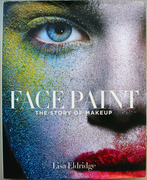
I had been salivating over this book since I found out the release date way back in the spring, and it did not disappoint. Celebrity makeup artist Lisa Eldridge published a broad yet fairly in-depth summary of cosmetic products and usage from ancient times to today.
Section 1 is divided into three sections detailing the history of the base colors historically used for cosmetics: red, white and black. Eldridge covers not only the ingredients used to make these pigments but also traces exactly how they were used in various eras, i.e. how rouged cheeks and lips, fair complexions and black eye liner were trending (or not) throughout history. Equally impressive is that these first two categories weren't simply a parroting of the information in Lips of Luxury, or the powder history in Ode to the Complexion (which I will get around to reviewing eventually.)
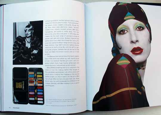
Section 2 focuses on all aspects of how the beauty industry developed into the one we know today, beginning with the evolution of cosmetics marketing and advertising. I know what you're thinking – this section probably started with the late 1800s/early 1900s, but you'd be wrong. Eldridge traces beauty marketing all the way back to the Renaissance, dissecting how the messages contained in beauty advertising changed over time. The second part of this section discusses the big beauty company founders like Max Factor, Helena Rubinstein, and Elizabeth Arden. But there were some unexpected bios of the women who began more indie lines, like Mary Quant and Barbara Hulanicki, who started Biba.

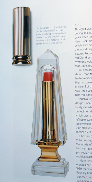
The third part of Section 2 deals with the rise of our basic products – mascara, lipstick, eye shadow, blush, foundation/powder, bronzer and nail polish – along with the companies that pioneered these items. I liked how Eldridge came up with a logical arrangement of these brands into overarching categories: couture houses, perfume companies, drugstore mainstays and makeup artists.

Could you imagine having this on your vanity?
Section 2 ends with what lies ahead for makeup in terms of technological advances, while the afterword is a brief but meaningful analysis of the significance of wearing (or not wearing) makeup nowadays. I like the last line: "Ultimately, nothing empowers a woman more than the right to a good education, and the freedom to choose whether to wear a red lip and smoky eye…or not."
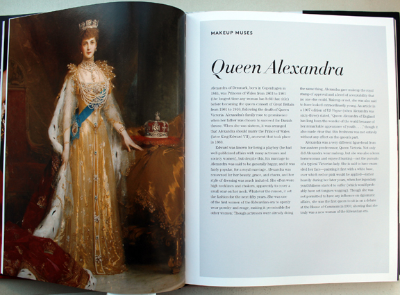
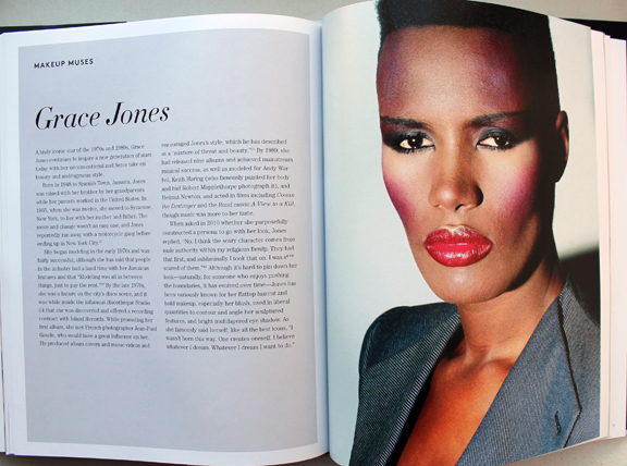
The whole book is sprinkled with profiles of Eldridge's "makeup muses," women who are associated with particular beauty looks that continue to inspire makeup artists today.


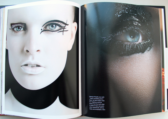
There are also some really cool avant-garde looks throughout…I just wish I knew whether Eldridge herself created them. I'm assuming she did.

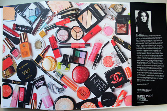
I loved the back cover too – doesn't this picture just make you want to dive into a pile of makeup?!

Relating a global history of makeup is a daunting task, and Eldridge did it well. This is not your standard makeup history book as it provides an in-depth look at not just the industry and cosmetic products but also their applications throughout history. Now, I love me some coffee table books with pretty pictures of beautiful makeup and hope to publish my own someday. I adore books that are basically eye candy and provide scant information on the objects. And obviously one of the main goals of the Makeup Museum is to show that beauty objects themselves can be art or cultural artifacts and that their meaning goes beyond their basic utilitarian purpose. But what I liked about Face Paint is that it got me out of my usual way of thinking about makeup mostly as art/cultural object. That's all well and good, but it's important to also reflect on makeup's roots, i.e. why it was invented in the first place. Face Paint was a great reminder for me to consider not just the design or cultural significance of a makeup object but how it's used, and hopefully I will keep this in mind going forward with various books and exhibitions. This aspect of Face Paint has the added bonus of appealing to a wide market - it's a gem for makeup collectors and non-collectors alike. Also, if anyone is going to discuss makeup application throughout the years, it's Eldridge. She has the same appreciation I do for package design, but also the perspective of a world-famous makeup artist who has spent countless hours actually applying it on thousands of people.
Will you be buying Face Paint, either for yourself or for that special makeup aficionado in your life? If you do treat yourself, be sure to check out the sources at the end. I know I've added several books to my wishlist!
I’m still here…just been pretty sad and work’s been kicking my ass. The snow we had yesterday on the first day of spring was particularly cruel and depressing. So today I’m hoping to perk myself up a bit by posting about more spring goodies.
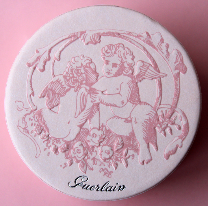
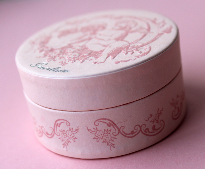
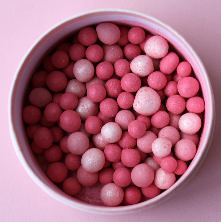
I thought this past holiday season was the peak of angel-themed items, but Guerlain’s Angelic Radiance Météorites proved me wrong. The design is a departure from previous Météorites as they’ve got a delicate paper lid, and instead of a pattern there’s a scene of two cherubs frolicking among some foliage. Usually I like a sturdier lid since paper is more prone to damage long-term, but in this case I think it works well combined with the illustration and the soft pink tones. It also makes me a little hungry – I think a larger version of the box would be perfect for macaron packaging. 🙂


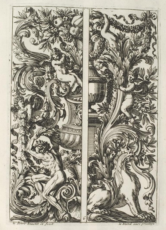
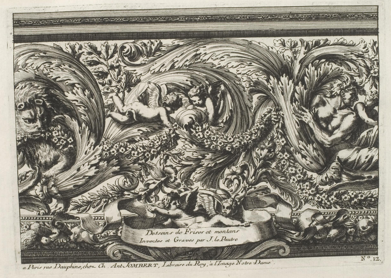
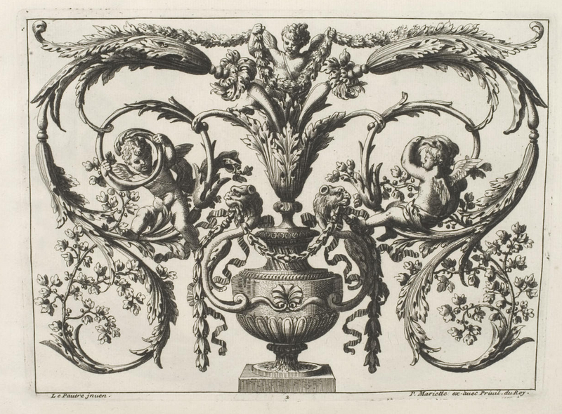
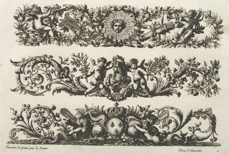
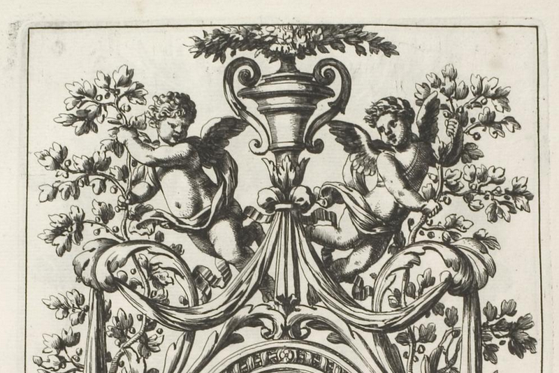
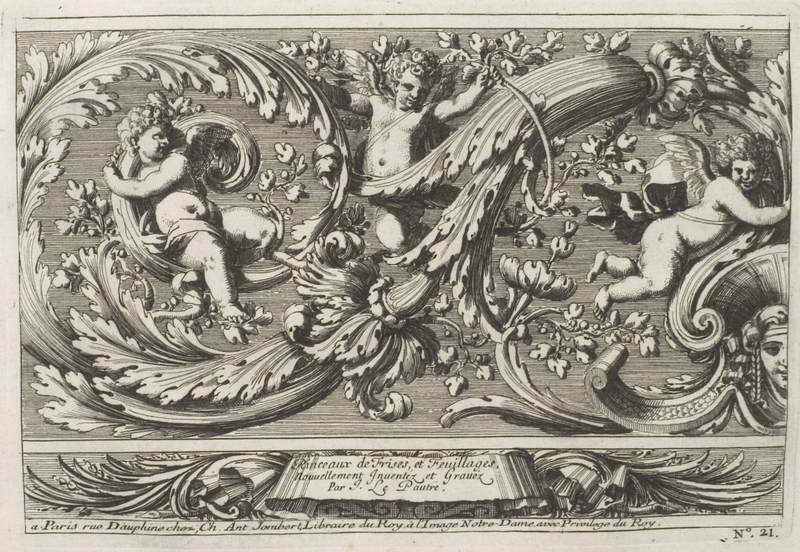
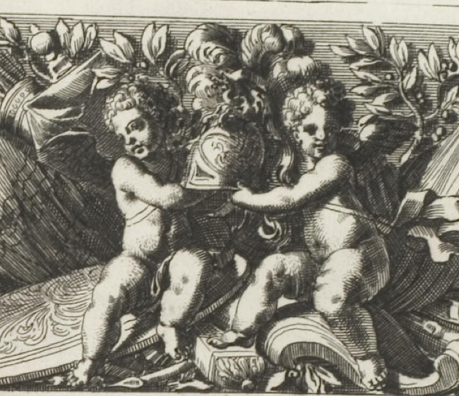
I’ve written about cherubs before and gave some examples of them in Renaissance art, but the ornate decorations on the Guerlain box look more like they were inspired by 17th century art rather than the Renaissance. I poked around online to see if I could find anything similar and came across the work of engraver Jean Lepautre (1618-1682), whose work, I think, is reminiscent of the Guerlain container. This site has a concise description of Lepautre: “[He] has been described as the most important ornament engraver of the 17th century. His prodigious output extended to more than 2000 prints, mostly from his own original designs. He was not only the originator of the grandiose Louis XIV style but was also responsible for disseminating and popularizing its full lavish repertoire throughout Europe. Le Pautre’s often over-elaborate and flamboyant designs frequently included arabesques, grotesques and cartouches, together with elements from classical mythology. His diverse range of subject matter, influenced by his carpentry/joinery architectural background, included: friezes, wallpaper, alcoves, fireplaces, furniture, murals, ceiling mouldings, fountains and grottoes.”
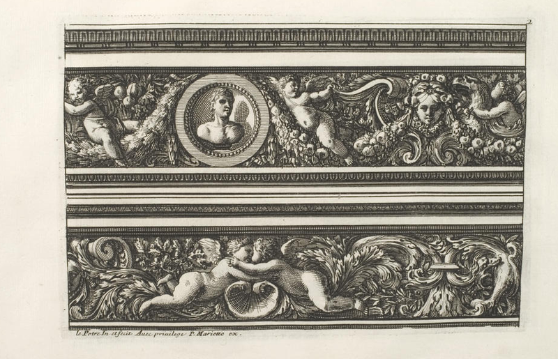
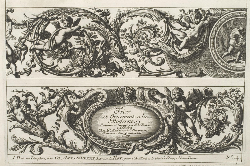
In 1751 Charles-Antoine Jombert produced a 3-volume series of Lepautre’s work, and astonishingly enough, the University of Heidelberg digitized the entire thing and made it available to the public. I went through each image and picked out what I thought most resembled the Météorites case.


Admittedly I chose this one not just because of the angels but because there seems to be mermaid angels in the bottom panel!

I tried to get some more close-up images so you could see the similarities between these engravings and the Guerlain box – the etch marks, the lines of the foliage, even the cherubs’ hair are nearly the same.


(images from digi.ub.uni-heidelberg.de); https://doi.org/10.11588/diglit.1638; images are in the public domain
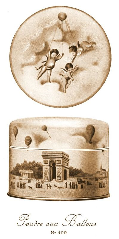
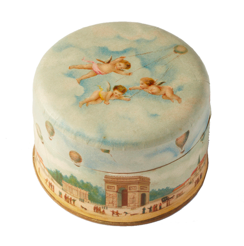
I wonder whether this is just a coincidence or if the design team at Guerlain had been looking at Lepautre. I’m also curious as to why they decided to do a scene featuring angels as I didn’t think cherubs were a Guerlain motif. As it turns out, angels appeared on a Guerlain powder container from 1918. The Poudre aux Ballons were scented with various Guerlain fragrances. (For the record, this is officially on my wishlist – I hope I can track one down! I also just remembered that I’ve come across the Poudre aux Ballons before.)


(images from guerlainperfumes.blogspot.com)
You may recall that balloons were used in last year’s spring promo image (more about that in a future post.)
Anyway, while I can’t say definitively that Guerlain’s latest release is in any way inspired by 17th century ornament engravings, it at least caused me to discover an artist that I wouldn’t have known about otherwise. And I really like the Météorites packaging – so feminine and springy and French. It may not be as sleek and sophisticated, as, say, the Impériale Météorites (holiday 2009) or the 2012 Pucci collection, but I think it’s a refreshing change from what they normally do.
What do you think?
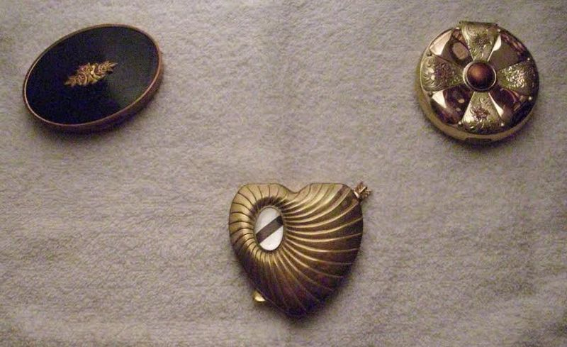
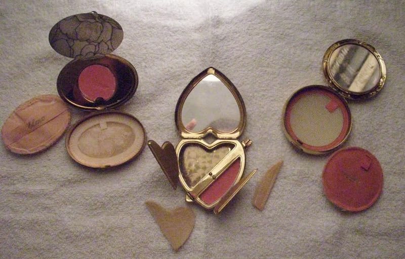
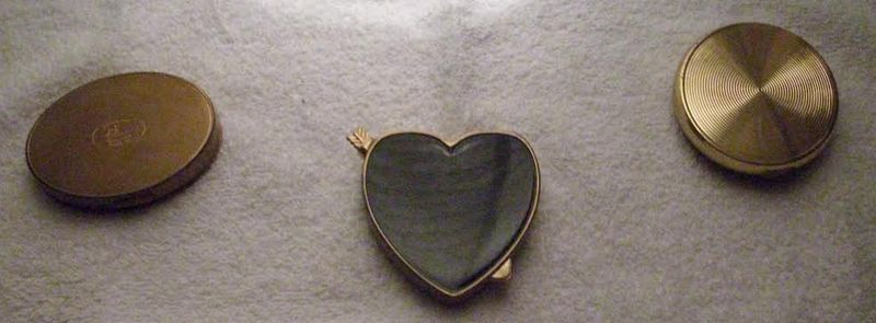
As you may know I occasionally receive emails from folks needing help identifying vintage makeup items. Today's post highlights several lovely vintage compacts, pictures of which were sent to me by a woman whose grandmother had passed away and left the compacts to her. As she would like to hold on to the compacts as keepsakes, she was curious to know more about them.

Fortunately this inquirer also sent pictures of the compacts open and their reverse side, so for two of the three I was able to identify the company that made them based on the puff that was included. On the left is a compact by Elmo (no, not the Sesame Street character), the middle one I wasn't sure about, and the compact on the right is by Evans.


At the time I received the inquiry, there was virtually no information available on Elmo Sales Corp., a Philadelphia-based company founded in the early 1900s, and I really had no idea what decade the compact might be from. So you can imagine I was overjoyed to see that a comprehensive history of the company surfaced at the ever-thorough Collecting Vintage Compacts blog back in May of 2014. The blog author included a picture of an identical compact in ivory enamel that was dated to 1941, so I'm guessing the black enameled compact is from around the same time.

(image from flickr.com)
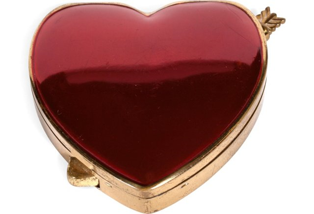
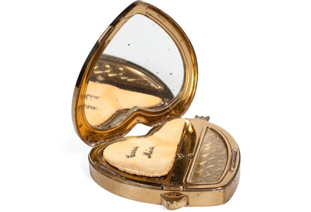
The middle one was a bit trickier. By sheer luck I stumbled across a similar-looking compact for sale at One King's Lane by a company called Cara Mia. The site listed it as being from the '30s.

Based on the interior of the compact, with its two compartments and diamond pattern, I have reason to believe the one in the pictures I was sent is also a Cara Mia. However, I think it might be a little bit later, circa 1940s.

(images from onekingslane.com)
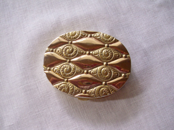
As for the remaining compact, there's a wealth of information on Evans thanks again to Collecting Vintage Compacts. However, I couldn't find any that looked identical to the one in the picture I was sent, so I had a difficult time dating it. I found one that was sort of similar in that it had a combination of rosy copper and gold metal tones, and that one, according to the seller, is from the 1940s.

(image from etsy.com)
The person who emailed me with her inquiry, bless her, was quite grateful to get the meager information I had provided. I wish I could have given exact dates for all and been able to say with 100% certainty that the heart-shaped compact was by Cara Mia, but even after over 6 years of running the Makeup Museum I'm still getting my feet wet in terms of vintage makeup. 🙂
What do you think of these? And do you agree with my assessments?
Save
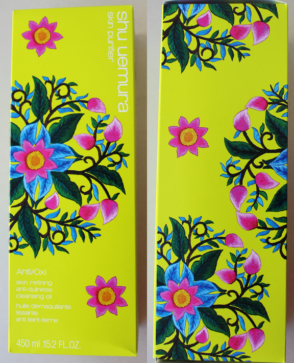
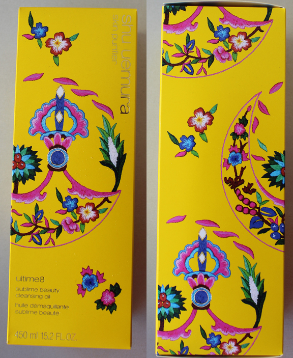
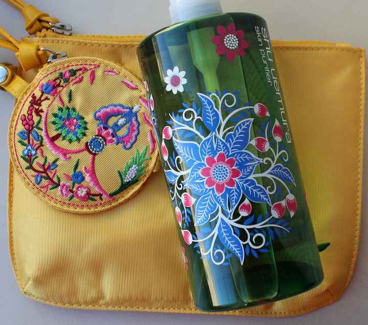
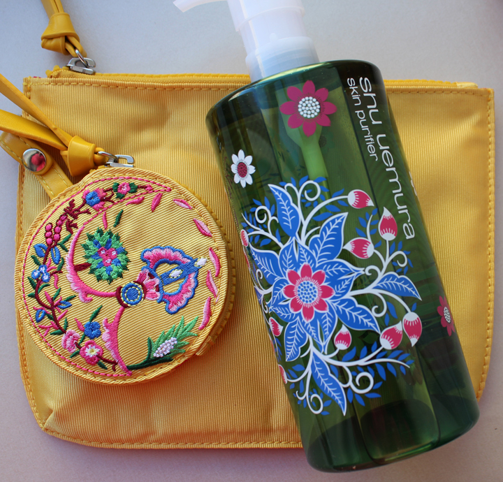
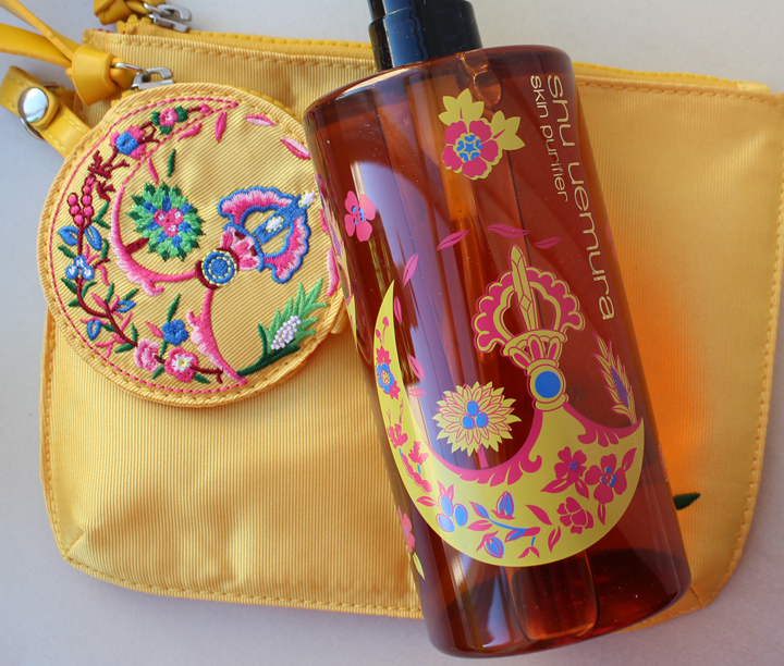
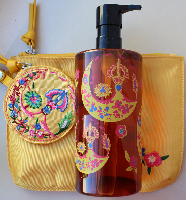
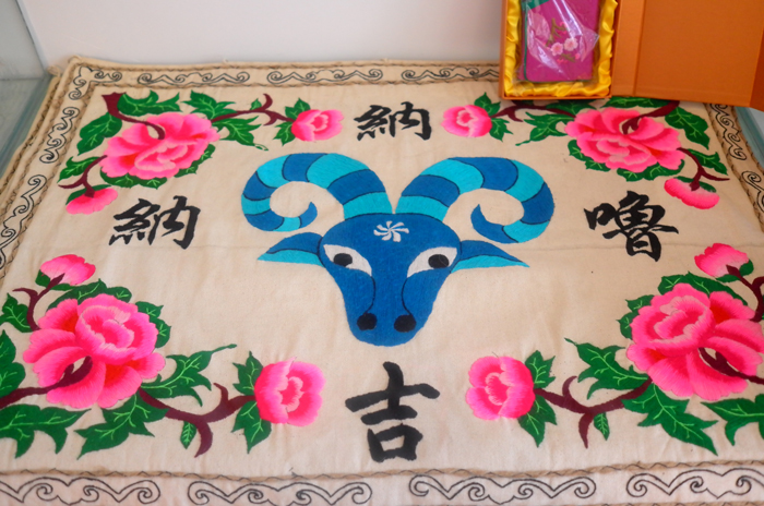
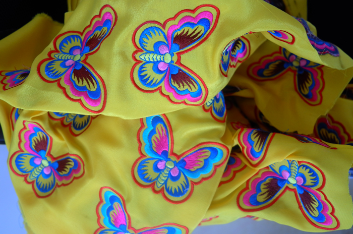
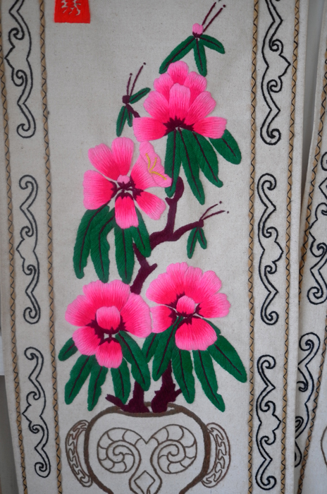
This was quite a delightful Chinese New Year surprise from Shu. In honor of the holiday, the company chose to feature the work of the Qiang people of the Sichuan province of China. Consisting of a population numbering around 310,000, this group has been producing complex, brightly colored embroidered patterns for over 1,000 years. Efforts to uphold the Qiang embroidery tradition were strengthened in the aftermath of a massive earthquake that devastated the area in May 2008. Today, Shu continues this effort by collaborating with Yang Huazhen, a fourth-generation Qiang embroiderer and official country representative of Qiang embroidery, to design two patterns related to Shu's Anti/Oxi and Ultime8 cleansing oils. The company is also working with Chinese nonprofit Xihan Action to start a fund that will allow Qiang women to take an advanced, 6 months-long embroidery class to ensure that Qiang cultural traditions will be promoted and sustained for future generations.
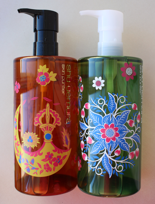
So let's get to it, shall we? I loved the way the pattern extends all the way around on both the boxes and bottles.


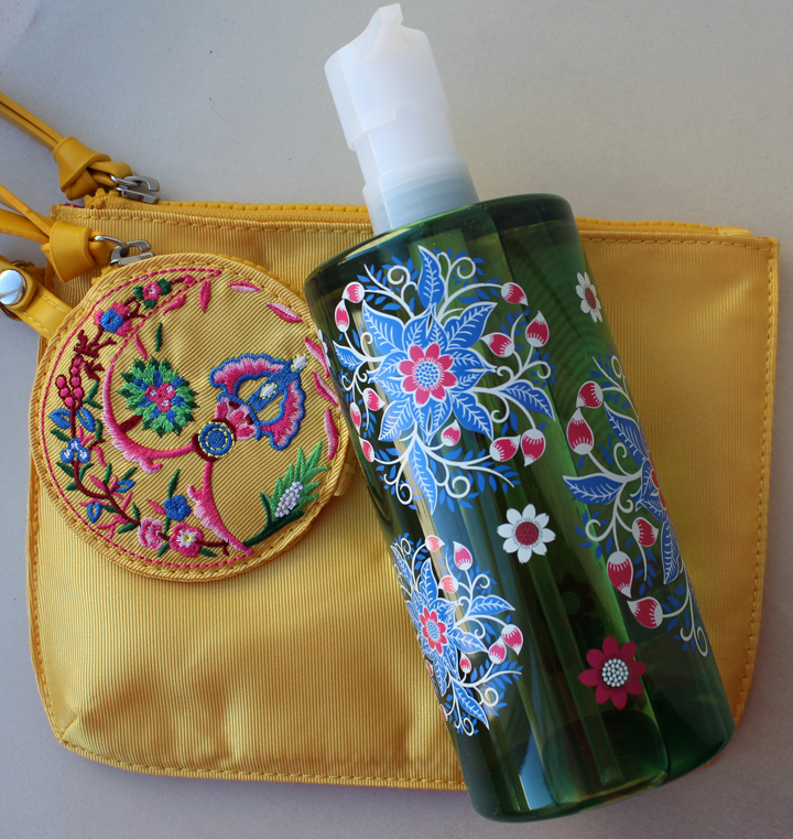
Shu had a code to get a free embroidered bag with purchase. Obviously it's mass-produced, but it would have been to cool for them to offer an embroidered bag for sale that was actually made by the Qiang, in addition to the oils. Then the proceeds could go to the nonprofit they're working with.
The design on the Anti/Oxi oil "represents eternal youth" since it contains green tea extract. At least that's what I gathered from Shu's unintelligible product description: "The traditional embroidery patterns are reinterpreted and meet the symbol of youth green tea." Mmmkay.


As for the Ultime8 oil, the meaning behind the pattern was equally befuddling. "A combination of ultimate motives into one embroidery. Vajra – a mystical symbol for power associated with ultime8 botanicals – promises vitality for life." Well, that at least allowed me to look up the word "Vajra", a Buddhist symbol.


I did a little investigating to come up with examples of Qiang embroidery to see if the ones from the cleansing oils resembled them at all. The Smithsonian had images of some wonderful textiles created by Qiang women at the 2014 Folklife Festival. They show that the patterns on the oils really are quite authentic both in color and design.


(images from festival.si.edu)
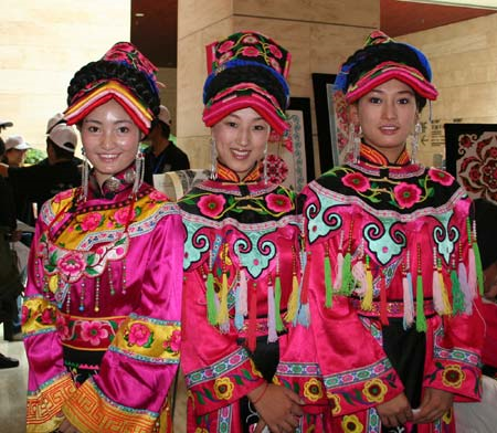
Here is the embroidery in dress form. I love how bright it is. This picture is from a showcase of Qiang embroidery at the Jinsha Relics Museum in July 2008. The event was the official start of the effort to promote and protect the Qiang embroidery tradition following the earthquake that took place a few months prior.

(images from news.xinhuanet.com)
Once again, Shu has brought attention to art/culture I never would have known about otherwise. And it's gorgeous! The colors are the perfect antidote to the winter blues. I just wish the description of the patterns and the meaning behind them were made a little more clear, and I'd like to hear more about Shu's involvement in helping the Qiang people – any kind of charitable action on the part of a cosmetics company should be emphasized.
What do you think?
(Click to enlarge)

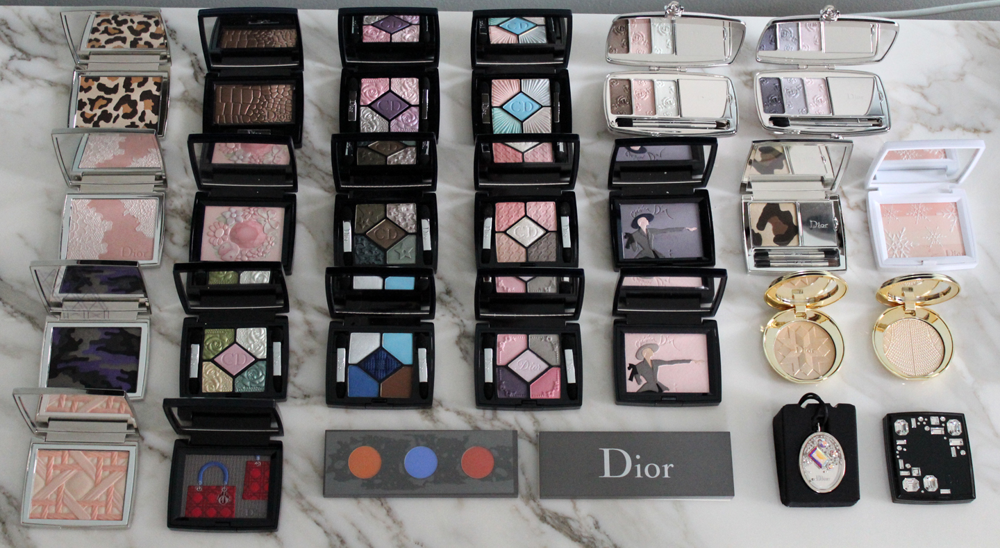
Top row, left to right: Mitzah, Impression Cuir, Garden Roses, Swimming Pool, Granville and Milly Garden clutches
Second row, left to right: Poudrier Dentelle, Flower Blossom, Bonne Etoile, Rose Ballerine, Tailleur Bar, Golden Jungle, Voile de Neige
Third row, left to right: Anselm Reyle, Garden Pastels, Atlantique, Pink Pompadour, Tailleur Bar (2012 edition), Gold Shock, Perle d'Or powder
Bottom row, left to right: My Lady, Lady Dior, Les Tablettes de Bastet (Vincent Beaurin), Cristal Boreal pendant, Night Diamond
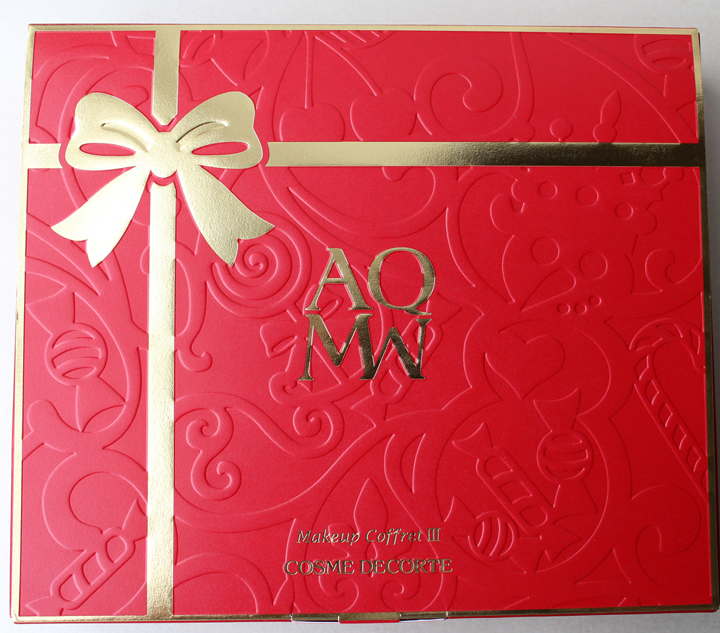
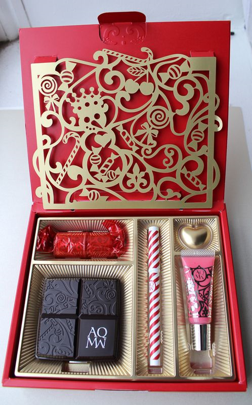
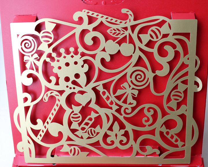
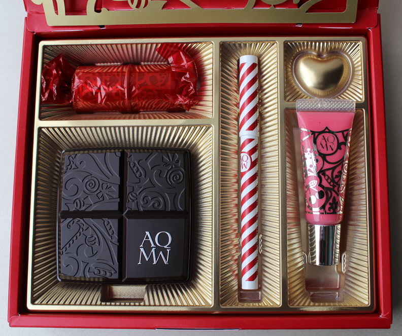
I loved last year’s holiday coffret from Cosme Decorte so it’s no surprise I’m pleased with this year’s version. King of Sweets features the same basic design as the 2013 coffret – a red outer box with a laser-cut scene on the interior of the lid – but with a different theme. The box has been outfitted with a golden bow to resemble a box of candy, while the inside cutout depicts a magical candyland.


The design is really precious, with a jolly crowned snowman as the”king of sweets” holding court amidst a delectable landscape of candy.

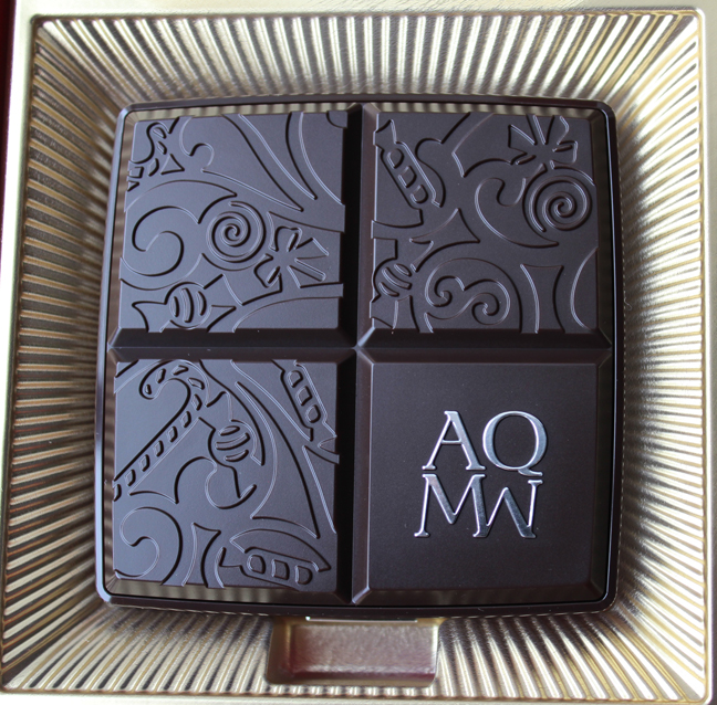
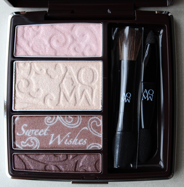
The set includes a stick blush (upper left, wrapped in red), an eye shadow palette (lower left, meant to look like chocolate), a candy cane-packaged gel liner and pink lip balm.


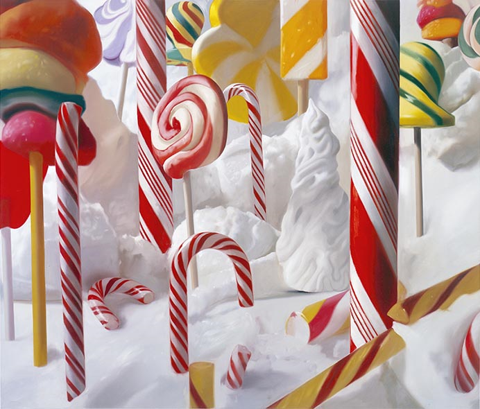
When the coffret first arrived I spent a few minutes daydreaming about a forest made of candy (sort of like when Homer visits the land of chocolate). Imagine my great delight a few weeks later when one of my favorite blogs featured the art of Will Cotton, who specializes in painting truly amazing dessert-filled landscapes. They were exactly what I was envisioning when looking at the coffret! While Cotton’s work sometimes represents the darker themes of excess and greed, I personally like to interpret it as a purely happy fantasy, where one can escape to a wondrous world overflowing with an abundance of sweet treats. The bright colors and perfectly rendered textures of all the sweets make these imaginary scenes appear real. That accuracy is not accidental either: Cotton has a professional pastry oven in his studio so that he prepare desserts and re-create them flawlessly on canvas. He also sometimes builds other props and life-size sets, because, as he says, “this way I can really lose myself in the surprises and unexpected details of the subject, and in a very real way, I’m no longer painting something imaginary, because in fact, it’s right there in front of me.”


(images from willcotton.com)
They’re just all so crazily decadent.
Getting back to the coffret, I think it would be a perfect addition to a revamped Sweet Tooth exhibition (and maybe I could have some of Mr. Cotton’s work hanging as a backdrop!)
What do you think of the coffret and of Will Cotton’s work?
 I can't even remember what I was researching when I stumbled across this site chock full of vintage compacts, but I'm so glad I did. I was dazzled by both the quantity and quality of this person's collection, and then I saw that it formed an exhibition that took place a decade ago. "The Art of Allure: Powder Compacts and Vanities of the 19th, 20th and 21st Centuries" was on display at the University of Arizona Museum of Art in April and May of 2004, so at this point it's a vintage exhibition of vintage compacts.
The collector behind this wonderful compilation is Noelle Soren, whose bio I pored over and have decided it's movie-worthy. She and her husband both hold advanced degrees in archaeology and art history (ahem) and have traveled the world digging up various artifacts. Eventually she found her way to collecting vintage compacts, and she also wrote and photographed the catalogue for the exhibition. The catalogue is available online and is incredibly informative. She also mentioned that hard copies of the catalogue do appear on Ebay from time to time, so I'm going to keep my eyes peeled in the hopes of snagging one. Definitely check it out (but only if you have plenty of time – you can easily spend an hour looking at everything!)
