I was hoping to do a history of Day of the Dead makeup in addition to Curator's Corner, but as usual I wanted to tackle a very in-depth topic that I lacked the time to cover, so here are some links instead.
– Just gonna toot my own horn, again – I was interviewed for not one but two publications, both of which happened to be in German. I hope nothing was lost in translation! Here's a link to an article on medieval makeup in the Swiss edition of Fokus magazine, and photos are below for the October 2020 issue of Madame magazine. The journalist never made good on her promise to send a copy (as a matter of fact, never followed up at all) and it's not available online, so I had to enlist the help of a very kind Instagram follower in Germany to send it to me.
I got a whole big quote!
– Bobbi Brown in 1993, two years after starting her original brand: "I don't like women to look like they're wearing makeup." Bobbi Brown on her new line, Jones Road: "I honestly think people look better with less makeup…[Jones Road] is the ultimate no-makeup makeup." I mean, it's great she's sticking to her minimal aesthetic, I just find it funny that she's essentially starting the same line she did the first time around, despite her claims that it's completely different. (Also, everyone needs to stop with the "clean" jargon already!)
– We're all in the throes of Election Day anxiety (I guess Election Week at this point), so here's a timely article on how beauty brands were pushing voting more than ever.
– Beauty Matter had an interesting piece on the rise of the anti-haul. Believe it or not, there are some things I actively choose not to buy…would you like to see a Museum anti-haul?
– In '90s nostalgia, here's a look back at 1994's Priscilla, Queen of the Desert. Meanwhile, Oasis's What's the Story Morning Glory and Smashing Pumpkins' Mellon Collie and the Infinite Sadness turned 25 on October 2 and October 23, respectively.
– I need to watch the mermaid episode of Hulu's Monsterland ASAP.
Finally, here are some of the Museum's staff in their Halloween finery. And candy, of course!
How are you? Did you have a nice Halloween despite the pandemic?
I had the great fortune of getting in touch with Andra Behrendt, curator of the Perfume Passage museum. She's a member of the International Perfume Bottle Association and sends out a quarterly eNews for their Compacts & Vanity Items Specialty group. The eNews focuses on compacts and related vanity items that are a part of the IPBA. She also runs Lady A Antiques, a shop she established in 1993. Andra kindly agreed to an interview, which I am extremely grateful for since not only has it been ages since I've interviewed anyone but more importantly, she has over 35 years worth of beauty history knowledge and experience to share. Enjoy!
Makeup Museum: How long have you been in the antique business?
Andra: I have been an antique dealer since 1993 as Lady A Antiques. As a dealer I specialize in celluloid covered boxes and albums from the 1900s, jewelry from Victorian through Deco, German bathing beauties from the 1920s and ladies accessory items such as compacts, purses, perfumes, hatpins, powders and puffs. I've had a website since 1997 and display at antique shows throughout the Midwest. I admit I don't update the website as often as I used to as I try to save the more unusual items for the shows. I have been a collector since I was a teenager, my aunt collected jewelry and she introduced me to antiques and collecting.
MM: How and why did you end up focusing on perfume and vanity items?
A: I gravitated toward enamel items and starting finding compacts and purses for my inventory. Then as my inventory of these items grew, I started meeting more collectors of these items at the antique shows. Now I specialize in the ladies vanity items!
MM: How did you get involved with the IPBA?
A: In the mid 1990s, before the internet, if you were interested in a special category of collecting, you joined a collectors club! I think at one time I belonged to a collector club for hatpins, combs, jewelry, purses, plastics, compacts and of course perfumes. That's how people met other collectors and shared their knowledge. I love to learn about the items that interest me and collectors are very generous in sharing their knowledge. The International Perfume Bottle Association has always been one of the more professional collectors club with a board of directors, annual convention, newsletters, etc. They believe in educating collectors about the history of the items we love so much. And many perfume collectors also collect related vintage vanity items such as compacts, purses, powders and lipsticks. The IPBA has always included compacts and related vanity items in addition to perfumes.
MM: Tell me about your experience as curator at Perfume Passage. What exactly do you do in your curatorial role?
A: I met the founders of Perfume Passage at one of the IPBA conventions about 10 years ago. When the museum started gathering information about compacts and vanity items to eventually display at the museum, I began evaluating the items they accumulated, providing information on their history, etc. When the museum was ready to begin installing displays, I started assisting with the showcases in the galleries and drugstore displays, focusing on the compacts, vintage makeup items and vanity items. I've been documenting the museum's collections as we are developing an online database for public use. I also assist with writing articles for the museum's website and eNews. As we just opened in May 2019, there are a lot of projects in the works!
MM: What are some of your favorite compacts/lipsticks/other makeup items and why?
A: I've always loved enameled items and the Art Deco time period. So my favorite compacts are the detailed enameled compacts from the 1920s and 1930s. I also like the whimsical figural compacts as they tell such an interesting story.
MM: What is your favorite era for makeup and why?
A: I'm drawn to the 1920s as it was an era of growth and change for women. There was a reason for compacts and makeup for women during this time and it was evident in the products that were produced. Looking back at some of the makeup items, it's almost humorous to think that "ladies really used" some of these products!
MM: Why do you think makeup history is important and worthy of preservation and museum display?
A: Compacts, purses, perfumes, powders and all vanity items were significant of their time periods and their manufacture was influenced by cultural and social trends. Just like most items that we collect today, there was a reason for their use and need. And these initial reasons don't always exist today, but are part of our history. With makeup, compacts and perfumes, people still use them and the reasons for using these products are mostly the same, but the products are different. But it's those early products that evolved into what is being used today and I don't think that should be forgotten. And it's a fascinating history if people take the time to learn about it. Perfume Passage and other related museums, such as yours, provide people with the opportunity to learn about this history as well as view wonderful items that didn't start out as collectible, but certainly are now!
MM: Any thoughts on current makeup/beauty culture? The Makeup Museum focuses on contemporary cosmetics, artist collaborations, etc. in addition to vintage objects, so I'd love to have your insight on what makeup and trends are out there now!
A: That's a very interesting question. I admit that I've really never worn makeup, I use just a little blush as my skin is so pale! I don't wear perfumes either. So it is kind of funny that I'm so in love with the history and products that are vanity related. And I honestly don't follow the contemporary cosmetic industry at all, just what I see on TV or read in magazines.
MM: Do you have any tips for compact collectors?
A: As with any item that we collect, buy what interests you. And while condition is usually the top priority for me, I also like the unusual. And before the internet, when many collectibles could only be found at shops, shows or auctions, collectors seem to buy for quantity. The internet has opened a whole new world for collectors, allowing us to see and purchase items that we would often never have a chance to find. So items that were considered "rare" or "one of a kind" can be found online. So I think collectors have more choices on what to collect or perhaps what to focus their collections on. While many compact collectors have a little bit of everything in their collections, you'd be surprised how many collectors focus on just Deco, or enamels, or figurals.
A 1930s Evans mesh purse with an ornate beaded/pearl/enamel compact lid:
A 1930s green floral enamel double compact with tango lipstick:
A 1958 Chicago White Sox compact. Back then, Tuesday's was ladies day at the ballpark and the owner of the team had a give-a-way of this compact! The other teams that I know of that had a similar promotion with compacts were the Los Angeles Dodgers, Baltimore Orioles and New York Giants.
Finally, a 1920s celluloid lady compact, the top "dress" slides and there's a mirror and powder puff inside.
(all images provided by Andra Behrendt)
Andra, thank you so much for taking the time to answer the Makeup Museum's questions and for your incredibly valuable insight! I encourage everyone to check out the Perfume Passage website and sign up for their newsletter. If you're in the Chicago area and can visit in person, so much the better. And if you're a collector, be sure to add Lady A Antiques to your shopping list!
I have so many other books I'd like to review but so little time, and this tome had been sadly collecting dust on my nightstand for ages, so here's a quick review for a quick read.* Lipstick: A Celebration of the World's Favorite Cosmetic by Jessica Pallingston was released in 1998, just a few months prior to Meg Cohen's Read My Lips: A Cultural History of Lipstick which I reviewed in 2015 and vowed to compare it to Pallingston's book shortly thereafter (in other words, I'm a mere 5 years overdue for that task. Sigh.) Anyway, I found the two books to be more or less the same in terms of content. This isn't necessarily a bad thing, but I think if you were looking for a basic history of lipstick you could choose one or the other and not feel like you're missing out.
The introduction left a bit to be desired, as it placed emphasis on lipstick as a tool to either "empower" women or lure men; there was no mention of playing with color as a means of self-expression. I also think, as I did with Cohen's intro, that the fetishization of lipstick and the overblown description of its alleged power were a bit much. Lipstick can be life-changing, yes, but proclamations like "Lipstick is a primal need" made me roll my eyes.
Like Cohen's book, the first chapter is a brief overview of the cultural significance of lipstick throughout history, starting with ancient times and ending with the 1990s. Not a bad summary, but since I've been doing this a long time there was little earth-shattering news. This isn't the author's fault, however, as the book was released over 20 years ago so this sort of information wasn't as ubiquitous as it is now. Containing the standard tidbits about ancient Greek prostitutes and the patriotic duty lipstick served during World War II, the chapter is a tidy summation of how lipstick was worn through the ages. But the section on the '90s penchant for brown lipstick nearly made my eyes pop out of my head, as I had never come across theories about why brown lipstick (and brown in general) was so popular. This will definitely inform my research for my '90s beauty history book!
Chapter 2 presents no fewer than 14 theories outlining why lipstick wields more impact than other cosmetics. I found them to be slightly lacking, as I believe the "lipstick as phallic object" or "painted lips mimicking sexual arousal" theories rather tired at this point, not to mention sexist. Ditto for the idea that children feel more protected if their mother leaves a lipstick print as they kiss them goodbye before school, lipstick application as oral fixation, or as a rite of passage for teenage girls. There was some truth to the theory about lipstick as a sort of armor or camouflage, but seeing no mention of how lipstick fits into the larger notion of makeup as a means of self-expression was disappointing. And I would have liked to see more about makeup's transformational power, but the only theory about lipstick as metamorphosis came in the form of fairy tales, i.e. one's wildest dreams come true through makeup and one will magically become "pretty" if they wear it: "When I put on lipstick I am as pretty as Cinderella" was one of the quotes included. (Why is the author quoting a literal 5 year-old?)
Chapter 3, appropriately titled Lipstick Freud, delves into pop psychology as Pallingston takes us through the various lipstick shapes that are the result of one's unique wear pattern (which obviously also depends on the shape of one's lips), along with what various application methods say about the user and something called lip reading. Much like astrology and palm reading, they're fun but not necessarily accurate or based on hard scientific data.
Chapter 4 was my favorite, as it provided a list of bite-sized anecdotes about lipstick as well as a lipstick-by-the-numbers section. I miss Allure's by-the-numbers feature tremendously and am dying to include something similar in exhibitions.
Chapter 5 gets into the nitty gritty of lipstick – the complete process of how it's produced and a lengthy list of ingredients, which is good information to have on hand. This chapter also includes sections on colors and names, both of which I believe warrant their own books. (There is actually an entire book on red lipstick, which I hope to review sometime this year.) You can definitely see how times have changed, since black and grey aren't mentioned at all and blue and green are discussed as having solely negative connotations of illness or death. These can be accurate, mind you, but as someone who has now fully embraced non-traditional lipstick colors (especially grey – I own no fewer than 9 shades), I found myself chuckling at the idea that blue or green lip colors used to be mostly associated with bad health. There are incredibly vibrant blue and green shades on the market these days – what could possibly be more a reminder of rebirth and growth than something like Menagerie's Juniper lipstick, for example, or capture the vitality of a hot summer day like MAC's Blue Bang? Anyway, while it was a nice read, it may have been good to include a section on different lipstick finishes and textures. But once again, this is really just part and parcel of this book being released in 1998, when liquid and glitter lipsticks weren't absolutely everywhere.
The naming section was notable for its inclusion of shade names from Renaissance England: apparently Beggar's Grey, Rat and Horseflesh were all listed as lipstick colors.
Chapter 6 gives some tips on how to navigate choosing and buying a lipstick in-store. With the advent of online shopping and swatches, this is largely obsolete and the advice itself was pretty basic. One unusual tip was to try swatching a lipstick on the inner wrist. I'm personally a fan of trying colors on fingertips since they are allegedly closer to your natural lip color, but if you want to find out how the color will look next to your overall facial skintone, the wrist is the place to swatch. Chapter 7 was more of the same, a list of lipstick application and color-coordination techniques that aren't anything you couldn't find online or in any beauty magazine.
Chapter 8 is probably the only chapter that is not in need of a major update, as it provides recipes for making your own lipstick that are still totally doable today. Even as technology and customization options evolve, there will always be a subset of the population who like to DIY their lipstick for various reasons – ingredient preferences, cost, or just because they like experimenting. Chapter 9 continued with recipes, but they were really intended more as a joke to show what people did throughout history to make lipstick. "From the medieval glamour guides, here's a recipe for making lipstick at home: Go outside. Get a root. Dry it. Pulverize it. Add some sheep fat and whiteners to get desired color. If you are upper class, go for a bright pink. If lower class, use a cheaper earth red. If you are having trouble being pale, and have the money to pay for it, get yourself bled. If you're alive during the Crusades, wait for the Crusaders to come back, as they'll bring some glamorous and exotic dyes, ointments and spices, and you'll be able to experience the makeup golden age of the Middle Ages." LOL.
Chapter 10 was a mishmash of suggestions for alternative uses of lipstick and a list of famous art history and pop culture lipstick moments. Most of the suggestions were good ideas, but some, like no. 21, made me cringe. Yikes.
But I did love all the artist references, for they included two I plan on writing about for Makeup as Muse (Rachel Lachowitz and Sylvie Fleury) and Claes Oldenburg's Lipstick (Ascending) on Caterpillar Tracks which I covered back in October. The final chapter (if you can even call it that, as it's only a page and a half) sings the praises of lipstick yet again, and honestly, probably wasn't necessary.
Overall, Lipstick is a nice book for those in need of a primer on lipstick, but if you're in the mood for something more academic or a thorough feminist analysis of lipstick, this is not it. As noted previously, if you're looking to purchase a book on lipstick history I would go with either this or Read My Lips, but I don't think both are necessary for a beauty library (unless you're like me, who obsessively hoards makeup books in addition to makeup itself). Lipstick has sound sources, although by now they are a bit dated and I believe are mostly the same as Cohen's. I will say that the advantage of Cohen's book over Pallington's is the inclusion of photos, which were non-existent in Lipstick. So it just depends on whether you want a glossier tome with more eye candy or one with less visual frills and more anecdotes, as the information in both is basically identical.
Have you read this one? I'm really hoping someone will write an updated cultural history of lipstick, as after reading this I think one is sorely needed.
*Another reason I chose to review this book first instead of the others I have planned is that I was recently interviewed by a journalist who is writing a brand spankin' new cultural history of lipstick, so hopefully in the next year or so we will have an updated version (and hopefully I will be quoted!) Stay tuned. 😉
Normally I’d wait a whole year and do a Ghosts of Christmas Makeup Past post to be more seasonally appropriate, but I simply couldn’t in the case of the amazing (mer-mazing?) Mikimoto holiday collection. As with the 2018 collection, the historic Japanese pearl and jewelry purveyor teamed up with an artist to create some incredibly whimsical underwater-themed packaging. Belgian artist and illustrator Brecht Evens had the honor of being Mikimoto’s second artist collaboration. I must admit I think I like his concept even more than the one by Emmanuel Pierre in 2018. If imagery of celebratory mermaids and assorted mer-critters having the ultimate holiday party doesn’t do anything for you, I question your humanity.
We’ll start with the palettes. The details on everything are staggeringly clever. And while the mishmash of characters and objects may initially seem haphazard, Evens’ messiness is actually entirely intentional. “When I draw the jumble of the city or I draw nature…errors, spots and little incongruities make it more realistic. Because when you’re in a space and you start to look around, you don’t take in the whole. You can’t. You don’t see the world around you like you see a postcard; it’s not organized that way. We’re moving, others are moving, and the eye makes constant choices, it decides what to interpret and what to identify. So at any given moment, there’s a lot of mess in there and, for me, this kind of mess has to stay in. It’s controlled; it’s never like I’m creating randomness. It’s just that incongruities seem to catch the eye better. They’re more natural and they latch onto the eye more realistically. Maybe I do play with a lot of stuff. But I only do it when it serves my narrative. It’s all part of calibrating things. When I use a lot of detail, it’s very calculated – I’m making sure it doesn’t obstruct anything essential.” The dozens of scenes may still be overwhelming for some, but I personally enjoyed picking apart all the individual vignettes and then seeing how they came together as a whole.
This is a particularly amusing exchange between two mer-folk and a nosy little fish. The addition of text is representative of Evens’ background in illustrated books and comics. The humor reminds me a little bit of Danny Sangra, the artist who designed Burberry’s spring 2018 palette.
I’m obsessed with this mer-kitty.
The scenes for the eyeshadow palette are equally spectacular. Sting rays take mer-children for a ride, while a sea elf peeks out from some seaweed to admire a blue-haired mermaid.
On the outer box a school of fish help another mermaid primp for a holiday party. She checks out her reflection in a seashell mirror held by two crabs.
I think the imagery on the sides of the skincare set was my favorite.
The set includes what appears to be a very fancy moisturizer (I didn’t want to open the sealed plastic) and what I believe are packets of face serum. Each one tells a snippet of the “First Snow of Pearls” tale. Unfortunately I couldn’t seem to locate the story at the Mikimoto website as I did last year, so I’m not really sure what it’s supposed to be about.
I love that the images are totally bizarre but also make perfect sense. The concept of a sea-dwelling Santa is absurd, but if one exists, of course his sleigh team would be seahorses instead of reindeer and his bag of presents shaped like a seashell. Ditto for the mermaid taking a ride on the jellyfish “bus”, pulling on its tentacles to signal her stop. While the underwater realm Evens created for Mikimoto is entirely imaginary, the usual rules still apply. As he puts it: “I do think I use visuals that might be dreamlike, or psychedelic, but I don’t think I use dream logic…you have to believe in the world you’re creating.”
There was also a lip gloss, the box for which shared the same illustrations as the skincare set.
Some lovely extras were included as gifts, like this silver toned box topped with a manta ray, a gold seashell cardholder and two cosmetic pouches. I noticed the powder brush was a bit scratchy, but 1. it was free and 2. I don’t intend on using it anyway.
Let’s learn a little more about the artist behind these fantastical scenes. The Belgian-born, Paris-based Brecht Evens (b.1986) studied illustration at Sint-Lucas Gent in Ghent, Belgium. Building on his country’s tradition and notoriety for comics, he focuses on these and illustrated books, but has also completed murals in Brussels and Antwerp, created fabrics for Cotélac, and collaborated with Louis Vuitton on a Paris travel book.
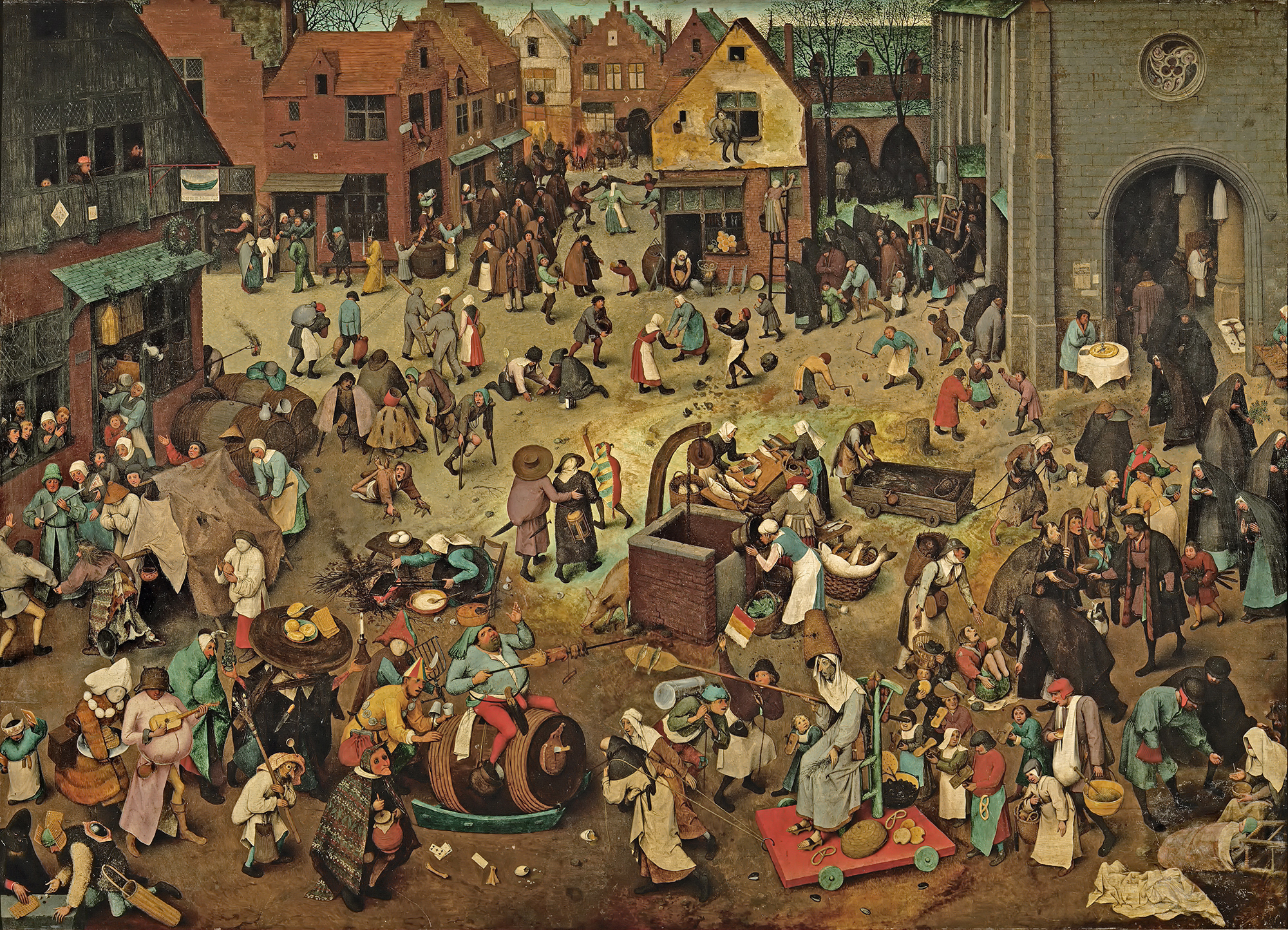
Stylistically, Evens is influenced by his mentors, illustrator Goele Dewanckel and cartoonist Randall Casaer. You can also see glimpses of Pieter Bruegel the Elder, M.C. Escher and Picasso. Take, for example, the resemblance between the artwork Evens created for French publisher Actes Sud and Bruegel’s Fight Between Carnival and Lent (1559). Both utilize a bird’s eye perspective and include dozens of different vignettes.
While Evens published several award-winning books early in his career, he is best known for more recent works Panther (2014) and The City of Belgium (Dutch and French versions released 2018; forthcoming editions in English in 2020). In terms of content, most of Evens’ narratives tend to be a little dark. Panther is about a young girl named Christine whose cat dies. Her mother also threatens suicide, drives away and never comes back. Panther arrives seemingly to be Christine’s friend and help her cope, but ends up being far more malicious than he appears. One reader called it a “apologism of pedophilia, zoophilia and incest”. Yikes.
The City of Belgium (titled Les Rigoles for its French audience and Het Amusement for Belgium) is actually part of the same universe as Evens’s 2009 work The Wrong Place, and the various versions of the book are meant to be connected. “I wanted something like a paperback copy of Balzac, a whole world that would be portable. But, instead of just one city, I wanted to make it a kind of European amalgam…the fun result would be for everyone to think it’s their city.”
The City of Belgium also reflects Evens’ struggle with bi-polar disorder and gradual recovery from a particularly bad episode. While not as unsettling as Panther, the book follows three characters having parallel urban adventures throughout a single evening, one of whom suffers from depression. Evens discusses how the book came to be and acknowledges the “heavy” themes alongside the humor. “The germ was just me coming back to life. A state of depression never carries any potential or interest. Then, once the interest starts returning – bit by bit – it’s like you’re back at zero. At that point, it’s just lines in old sketchbooks, dreams you have, something you happen to see sitting on a terrace. Because it’s so surprising to have ideas again, you notice every little thought and you get them down in a sketchbook…[in 2013 and 2014] things were so messed up; I couldn’t ever have considered such a massive project. The book is a product of peace having descended…the themes may be heavy, but I hope the treatment is light. Don’t forget to mention it’s full of gags and jokes!”
Evens appropriately chose a more lighthearted story for the Mikimoto collection while maintaining the concept of connected times and spaces. The characters and scenes appear disparate at first, but as you look more closely you can see that they’re all part of the same underwater universe – preparing for the holiday season and the First Snow of Pearls. If anyone is going to create a fanciful mermaid-laden paracosm or “expanded reality” as one reviewer put it, Evens is the perfect choice, as he had been making these sorts of “imaginary worlds” since he was a child. “Practically all I did was try to make imaginary worlds come to life, which meant: visible to other people, in comics, designs for buildings, fantasy world maps, board and card games, cassette tapes… No teaching, no explaining, no argument, just a portable world, bound together, with maybe a dust jacket around it or even some leather,” he says. He also did a fantastic job incorporating the pearls, which appear throughout all the scenes. My favorites are the fish helping construct a pearl garland and telling the lazy sea dog to wake up because it’s snowing pearls.
The illustrations were incredibly fun on their own, but the addition of Evens’ signature text provided another layer of humor.
“A lot of people, when they write dialogue, just go ‘A, B’, ‘A, B’, ‘A, B.’ They’ll have the characters neatly wait their turn. Whereas I don’t think our brains really work that way. In reality, it’s more of a constant traffic jam – even when we like each other and we’re interacting well. When we’re interacting less well, it’s more extreme,” he says. You can see the more realistic dialogue (at least, as “realistic” as this mermaid world can be) Evens was aiming for in this scene depicting crabs and fish wrapping holiday presents.
I have no information on how the Mikimoto collaboration came about. I summoned my courage and emailed Evens to see if he could shed any light. He politely declined to be interviewed, but I’m guessing that Mikimoto approached him as he indicated he does not know much about cosmetics. I believe these are new illustrations Evens created especially for the brand, but I find it odd he hasn’t included the collab on his website or IG page. I’m also assuming they were done using his usual handmade techniques. For The City of Belgium, he explains: “All the drawings were done on paper and I write by hand. So the creative parts are all computer-less. Where the computer comes in is for research; when I want things to be ‘right’ or inspired by actual stuff, then I’ll look something up… Ecoline [ink] dominates, but I use a mix. Now I have some different inks and, with the same brush, I’ll also pick up gouache to make it what I want. Or, I’ll mix it with real aquarelle. It all depends on what I’m searching for, what opacity or transparency I need to have. There will also be some pastels and, often, markers.” In looking closely at the lines and the way the colors overlap, it appears Evens did indeed draw everything by hand using a mix of markers and pastels on white paper.
So that about wraps it up. What do you think about this collection? What’s your favorite scene or character? I’d party any time with these mer-folks!
I love when I get an inquiry to which I can actually give a solid response. A gentleman sent in this picture he had of an old lipstick and asked if I could identify it and provide any sense of its monetary value.
I recognized it immediately as one of the Revlon Couturines doll lipsticks released between 1961 and 1963. But which one? The only one I recognize off the top of my head is Liz Taylor as Cleopatra, since it's pretty obvious.
Fortunately the Revlon Couturines appear in Lips of Luxury (which I highly recommend for any beauty aficionado – check out my review here and in-person pics here.) According to the photos in the book it's not Marilyn Monroe.
Or Ava Gardner.
So it must be one of these ladies.
Aha! Looks like it's Jackie Kennedy (last one on the right.)
What's fascinating to me about the submitter's photo is that his doll appears to be wearing a little fur stole around her neck, whereas in the photo from the book she doesn't have one. As for the value, Revlon Couturines can fetch a pretty hefty price. Even though the photo is blurry, the one submitted to me looks to be in excellent condition. And given that she has a stole, which I'm assuming is original (the original Marilyn Monroe figurine has neckwear as well, which isn't shown in the picture in Lips of Luxury), that would probably increase the value. I think a fair asking price would be $150-$250. At the moment I don't even see any Jackie figurines for sale.
What do you think of these? This post reminds me that I really need to track down at least one for the Museum – I can't believe I don't own any. Another one (or 8) to add to the old wishlist.
Update, 2/6/2020: It only took 5.5 years, but I finally procured a few of these lovely ladies for the Museum!
I am sorry to say that I can confirm these are not cruelty-free. As a matter of fact, Revlon made it a point to highlight the "genuine" mink, fox and chinchilla used. How times have changed. I'm also wondering whether all the ones listed for sale over the years as having brown mink are actually fox fur, as indicated in the ad below. Then again, this was the only ad I saw that referenced fox fur, so maybe the brown ones are mink as well.
The white mink one is not in the best shape – there's a little bit of wear on the paint on her lips and discoloration around her "waist" – but she does have the original box. I'm suspecting the black mark is remnants of a belt, as shown here. (Apologies for changing the background in these photos but I was shooting across several days and was too lazy to retrieve the paper I had used originally.)
The chinchilla-clad lady, however, is basically new in the box. One hundred percent museum quality!
From what I was able to piece together from newspaper ads, the ones without animal fur were advertised as "mannequins" and originally released in 1961, while the chinchilla, fox and mink ones were referred to as "girls" and debuted during the holiday season of 1962. Both series fell under the Couturine name.
There were originally 12 designs, according to this ad. Of course, you paid a little more for the Mannequins with hats and jewelry.
Most of them were similar but had a few details switched up. This is especially true for the Girls series. For example, the brown mink/fox one I procured has the same color velvet at the bottom and one pair of rhinestones, but the one in Lips of Luxury has pink velvet and 4 rhinestones. The colors of the velvet and type of fur were also mixed and matched.
But one question remains. I'm wondering where Jean-Marie Martin Hattemberg, whose book Lips of Luxury I referenced earlier, retrieved his information. Obviously I don't think he just made up the idea that each Couturine was intended to be a replica of an actress or other famous woman. But I'm so curious to know how he came to that conclusion since I've never seen them advertised or referred to that way anywhere other than his book. Perhaps he knew someone at Revlon who designed them? Or maybe they were marketed differently outside of the U.S.? In any case, there's no mention of the chinchilla Couturine and several other of the original 12 dolls in Lips of Luxury, so I'm not sure who they're supposed to be. Hopefully one of these days I'll solve another makeup mystery. 😉
Save
I'm so very excited to announce the Makeup Museum's special exhibition in honor of Stila's 25th anniversary! I was too overwhelmed to do a full history of the brand, so I decided to just focus on the famous Stila girl illustrations. If you've been following me for a while you know that the Stila girls were sort of the gateway drug for my interest in collecting makeup and seeing cosmetics packaging as art. For such a milestone anniversary I knew I wanted to pay tribute to them, even though the year is almost over (thankfully – it's been miserable for a number of reasons), especially given that I've been itching to put together a special exhibition for them since at least 2016. I also wanted to try something totally new for the Museum in terms of exhibitions. Technically all of them are online, but instead of putting things on shelves and taking photos, I wanted it to have a more "real" online exhibition feel. I've been doing a lot of thinking the past year or so about how to improve the exhibitions even though I'm so limited in what I can do, and I was really inspired by the Kanebo Compact Museum website, and once the husband showed me Squarespace I was sold. Well that, and the fact that he kindly offered to design the entire exhibition site for me. ;) So I set up a domain there which, if this exhibition is well-received, will serve as the space for the Museum's special exhibitions going forward. The seasonal ones will remain here if I decide to keep going with them. Looking ahead, I think I'd rather focus on more specific topics than general seasonal trends. Not that I can delve too deeply into particular themes given the never-ending lack of resources, but I still want to at least try to do slightly more in-depth exhibitions even though they won't be exactly how I want them. I'm looking at them as a starting point for bigger things.
Enough of my blabbing about the basic stuff, I want to give some more details about the exhibition itself. It came together nicely, or at least, it was the one I worked most on with the possible exception of Sweet Tooth (still want to revisit that one!) I really wanted to get interviews with the key people behind the illustrations, so I put my crippling fear of rejection aside and boldly contacted Jeffrey Fulvimari (Stila's original illustrator), Caitlin Dinkins (illustrator during Stila's early aughts heyday) and Naoko Matsunaga (who took over for Dinkins in 2009). While I was disappointed at not hearing back from two of the three, if only one responded, I was glad it was Jeffrey since I've been following him for a while on Instagram and I love his approach to art and his personality. He is quite the character! It ended up giving me so much confidence I reached out to the grand poobah herself and my curatorship namesake, Jeanine Lobell. Yes, I actually DM'ed the founder of Stila on Instagram and asked if she'd be up for an interview. And…and…are you sitting down?? You really need to. Okay, now that you're sitting and won't have far to fall in case you faint, I can tell you that she agreed to do it!!
Not only that, she actually answered all of my interview questions!! You have no idea how ecstatic I was to finally be heard by a major industry figure. Took over a decade but I finally made contact with a big name! So that was most exciting, easily one of the most exciting things to happen in the Museum's 11-year history. And her answers were really good too, I've incorporated them throughout the exhibition so make sure to read through.
As for the items, I didn't take photos of everything in my collection because again, too overwhelming. The Museum has over 130 Stila items, nearly all of which feature the girls. I mean…
The photos I did take have purposely plain backgrounds because I wanted the emphasis to be on the illustrations. I tried to have a good mix of memorabilia and the makeup itself. I even had to iron a few items.
I also included a couple photos of things that I don't actually own but are important in getting a full picture (haha) of the illustrations. I'm pleased with how the sections are arranged, and I must thank my husband for organizing them so perfectly in addition to designing the whole site. I'm thinking of adding a section called Soundbites, a repository of quotes from the both the beauty community and general public telling me why they like the Stila girls or really anything related to the brand, so be sure to email me or comment here. I really wish I could have an app that would "Stila girl-ize" the user, i.e. you upload a picture of yourself and it would automatically generate a Stila girl style illustration of you, just like this. And of course, if the Museum occupied a physical space I'd definitely hire an artist to do live drawings at the exhibition opening – how fun would that be?
So that about wraps it up! Please take a look and tell me what you think of the new exhibition format!
Apologies for the back to back artist collaboration posts. I was hoping to have a February recap in between but work has been sapping my spirit even more so than usual, so I ended up abandoning Curator's Corner last month. I don't think you'll mind too much though, once you see the positively amazing porcine-themed brush from Chikuhodo, who teamed up with illustrator/graphic designer Mochichito (a.k.a. Steph Fung) to celebrate the Chinese New Year. You might remember how smitten I was with Chikuhodo's Moon Rabbit brush, so as soon as I saw this one I knew I had to add it to the menagerie. If I remember I'll try to update this post with comparison shots to that brush so that those of you who actually intend on using it can see how the size and shape compare. I will say that as with the Moon Rabbit brush, the quality of the bristles of the Mochichito one appears impeccable – super soft and fluffy.
The detailing and craftsmanship are simply stunning. The handle has a scene depicting two piglets resting on fluffy silver clouds and a gold crescent moon, while silver and pink cherry blossoms bloom behind them.
Naturally I had to take tons of close-up shots so you can appreciate the beauty, but I'm not sure if they do it justice…it's much more charming than my pictures were able to capture.
As with the Moon Rabbit brush, there's a touch of iridescence on the silver portion.
Just when you think they couldn't possibly get any cuter, Mochichito ratchets up the adorable factor by giving the piggies tiny silver dimples.
So who is the woman behind all this preciousness? Fortunately I didn't have to do much digging, as Beautylish has a brief but informative interview with the artist posted online. Mochichito is the brainchild of Steph Fung, a graphic designer who began focusing more on her illustrative pursuits several years ago. Fung earned her BFA in Digital Media from Otis College of Art and Design in 2011. While she is an accomplished designer, the Mochichito project allows her to indulge her love of anything kawaii and handmade crafts. A lifetime doodler – "I loved drawing in notebooks when I should have been taking notes," she says – the Mochichito brand is a natural progression of Fung's passion for illustration. Interestingly, Fung is primarily a digital artist, i.e. what you see is not made by hand on paper and then translated into a digital format – her illustrations are originally drawn on a screen. Adobe Illustrator is her favorite tool, as she claims she's "never been very good at traditional mediums." I find this fascinating since I believed it would actually be much more difficult to be creative with digital illustration techniques given their limitations, but the ingenuity displayed in Mochichito shows that if you're a true artist, the medium doesn't matter – you'll find a way to uniquely express your vision.
Fung's subject matter consists largely of animals and flowers, with some playful critters that don't actually exist in nature. Yes, there are mermaids! She explains: "I would probably describe my style as kawaii cute! I always try to have fun with word play or convey a fun idea or concept in my art. I love bright colors (but also pastel), animals, and cute faces (is that weird?)". Nope, not at all!
Fung finds inspiration in a variety of places. "I’m very much influenced by anime, stationery and lovely packaging, fashion, music, and other people’s art—there is so much to see at your fingertips these days." Indeed, Fung is mindful of what her fellow artists are up to, and seems to enjoy participating in 100 day Instagram challenges with them. My favorite are these cheeky illustrations she completed for #100daysoflittledudes, which also show her aforementioned love of word play.
The Mochichito store offers an array of stickers, pins, and more recently, acrylic toys based on the illustrations Fung created for the "100 days of tiny terrariums" Instagram challenge. I hope to see stationery or even stuffed animals some day!
Speaking of which, I think another reason Mochichito's work resonates with me so much is the fact that she has a stuffed teddy named Little Bear that accompanies her on her travels.
As for the Beautylish collab, previously Mochichito was responsible for designing the store's Lucky Bags, which are essentially Japanese fukubukuro – a custom for the new year where bags are filled with mystery contents offered at a much lower price than if you purchased them individually. For example, a $75 Beautylish Lucky Bag typically has full size items worth $150 or or more. In 2018 Fung took inspiration from the Japanese legend of the Seven Lucky Gods who are said to grant good luck (shown top to bottom, left to right in the illustration below): Bishamonten, Daikokoten, Hotei, Benzaiten, Ebisu, Jurojin, and Fukurokuju.
This year, Beautylish tapped Fung again to come up with an illustration for a Chikuhodo brush to celebrate the lunar new year. Fung shares the creative process behind the adorable end result: "Since the design was for the Lunar New Year, I knew I wanted to include a moon. 2019 is the Year of the Pig, so I thought making a large, gleaming moon as the pigs' playground would be so cute. Incorporating some floral elements into the design would add some soft, delicate touches to frame the scene. The story behind the design is really up to the viewer! I wanted to keep it kind of open-ended. You could think of the pigs as two lovers, a mama or papa pig and their piglet, or just two frolicking friends."
It was Fung's first time designing a brush handle, and I think she translated the design to suit the handle beautifully. "It was definitely different from anything I’ve worked on in the past. I had to keep in mind the shape and curvature of the brush and make sure all of the important parts of the artwork would be seen from the front of the brush, but also how I might continue the artwork around the sides and back of the brush, while also keeping in mind how it would photograph." I agree that you have to think differently about how an illustration would work in 3D versus on a flat surface, and Fung executed it perfectly.
Overall, obviously I'm in love with this brush and all of Mochichito's work. Art with a more serious style or message is great, but sometimes your eyes and brain just need cute things. And it could be because I've just discovered it and have been watching it nonstop, but Mochichito's characters remind me so much of those from Adventure Time, a truly whimsical kids' cartoon that I can't seem to get enough of lately. There's just something so comforting about cuteness! As for Chikuhodo, the designs on their brush handles tend to be more elegant and sophisticated, so going the kawaii route was a refreshing change of pace.
What do you think of this brush and Mochichito?
Before I get to my review of Susan Stewart's Painted Faces, I must disclose that I received a copy for free from the author. In no way, shape or form did getting it for free influence my review, nor was it intended as a bribe for a positive one – I believe I was given a copy in exchange for me lending photos of some of the Museum's collection to be included in the book. Not only did Dr. Stewart provide an autograph, she also included me in the acknowledgements, which was incredibly kind.
Again though, I'd like to reiterate that this did not sway my opinion of the book at all. Now that that's out of the way, I can dive into the review.
The goal of Painted Faces is much the same as Lisa Eldridge's Face Paint in that it strives to provide a history of makeup from ancient times to the present day. However, a trained scholar/historian approaches this vast topic in a markedly different way than a makeup artist such as Eldridge. Neither perspective is better or worse than the other; ways to tell the story of makeup are nearly as varied as the people who wear it. Nor do I believe one has to have a set of particular credentials to write accurately and compellingly about makeup history, as I believe it comes down to a matter of preference for a certain writing style. As we saw with her first book, Painted Faces is more academic than Face Paint and relies on highlighting the economic and sociological aspects behind various beauty practices, whereas Eldridge adopts a more artistic tone, choosing instead to communicate makeup's history by focusing on application and styles as they evolved.
Stewart begins with an introduction (which also serves as the first chapter) summarizing the need to study makeup and beauty practices as it gives valuable insight into history that we may not have considered before. "Because of its wider significance, researching makeup, its uses, ingredients, its context and application, can provide clues not only to the nature and circumstance of the individual but can also help us to interpret the social, economic and political condition of society as a whole in any given period. That is to say, studying cosmetics can further our understanding of history…they are a window into the past and can encapsulate the hopes and ideas of the future. In short, makeup matters" (p. 8 and 10). Can I get an amen?! Stewart also carefully sets the parameters for the book, outlining the sources used and why she is primarily writing about cosmetics in the Western world.
Chapter 2 is essentially a condensed version of Stewart's previous tome on cosmetics in the ancient world, which doesn't need to be rehashed here (you can check out my review of that one to peruse the content). That's no small feat, considering how thorough it was. The next chapter covers the Middle Ages, which is interesting in and of itself since so little information about makeup and beauty exist from this era. As Stewart points out, the rise of Christianity meant people were no longer being interred with their possessions as they were in ancient Greece and Rome – these artifacts provided a wealth of knowledge about beauty practices then. Thus, any time after the spread of Christianity and before the modern age historians must rely primarily on texts, such as surviving beauty recipes and classic literature, rather than objects to infer any information about the use of makeup and other beauty items. The dominance of this religion also meant even more impossible beauty standards for women and more shame for daring to participate in beauty rituals. "According to medieval religious ideology, wearing makeup was not only the deceitful and immoral – it was a crime against God" (p. 60). The other interesting, albeit twisted way Christianity affected beauty is the relentless belief that unblemished skin = moral person. Something as innocuous as freckles were the mark of the devil, and most women went to great lengths to get rid of them or cover them so as not be accused of being a witch. I shudder thinking about those who were affected by acne.
Chapter 4, which discusses beauty in the late 15th and early 16th centuries (i.e., approximately the Renaissance) presents the continuation of certain beauty standards – pale, unblemished skin on both the face and hands, a high forehead, barely there blush and a hint of natural color on the lips- as well as judgement of those who wore cosmetics. As we saw previously, it's the old "look perfect but don't use makeup to achieve said perfection" deal – women who wore makeup were viewed as dishonest, vain sinners. But one's looks mattered greatly in the acquisition of a husband, so many women didn't have a choice. "Clearly a woman had to get her makeup just right not simply for maximum effect but to avoid getting it wrong and spoiling the illusion of youth and beauty entirely, a fault that could cost her dearly in terms of wealth, status and security" (p. 94).
However, there were some notable differences between the Renaissance and medieval periods. For starters, due to inventions such as the printing press, beauty recipes were able to be much more widely disseminated than they were previously. Increased trade meant more people could get their hands on ingredients for these recipes. Both of these developments led to women below the higher rungs of society (i.e. the middle class) to start wearing cosmetics. So widespread was cosmetics usage at this point, Stewart notes, that the question became what kind of makeup to wear instead of whether to wear it at all.
This chapter was probably the most similar to those on Renaissance beauty in Sarah Jane Downing's book, Beauty and Cosmetics: 1550-1950. Given the lack of information regarding cosmetics during this time period, both authors had to draw on the same sources to describe beauty habits. However, as with Eldridge, the approaches Downing and Stewart take are slightly different. Once again, Stewart opts for a straighter historical approach whereas Downing looks more to paintings and literature of the time, and doesn't take quite as deep a dive into the larger social and economic forces at work. There's also not much overlap between the descriptions of recipes and techniques, as you'll find different ones in each book. For example, one that was mentioned only in passing in Downing's book was using egg white to set makeup. I'm thinking of it as a early version of an illuminating setting spray (although obviously it was brushed on, not sprayed in a bottle) as it lent a slightly luminous, glazed sheen. Stewart points out that it also caused one's face to crack, thereby eliminating the wearer's ability to make any sort of facial expression. It seems certain beauty treatments, whether egg white or Botox, occasionally come with the side effect of suppressing women's expression of emotion. Coincidence? I think not.
Chapters 5 and 6 are tidily sequential, discussing beauty during the the 17th and 18th centuries, respectively. As in the Renaissance, both eras witnessed significant growth in the number of women who wore makeup due to technological advances and increased trade. Growing literacy rates drove demand for the new medium of ladies' magazines. Pharmacies selling raw materials to make beauty treatments had started to crop up in the 17th century and their numbers increased dramatically by the beginning of the 18th century. Not only that, pharmacies and chemists started offering their own pre-made formulas, and these goods became commercially exported to other countries. The widespread sale of these products came with several undesirable effects: counterfeit cosmetics and downright false claims about the product's efficacy.
The 1700s also saw the rise of excessive, decidedly unnatural makeup being worn by members of the aristocracy in both France and England, followed by a post-French Revolution return to more subtle makeup in the early 1800s. This brings us to Chapter 7, which outlines the myriad changes leading to what would become the modern beauty industry, including department stores, industrialization and the new commercial market of the U.S. As for beauty standards, a natural look was still strongly preferred by both men and women, with the emphasis in terms of products on skincare rather than color cosmetics. Here's a literal lightbulb moment: despite my research on Shiseido's color-correcting powders, in which I learned some were meant to counterbalance the effects of harsh lighting, I had completely overlooked the influence of artificial light on the skyrocketing production of face powders. "Suffice it to say that in the early years of the twentieth century, the use of artificial light in homes of the wealthy as well as in public places such as theatres and concert halls would become more widespread, in the latter years of the nineteenth century there was already an understanding that to make the best impression, makeup needed adjusting to suit the light, whether it be natural or artificial" (p.198).
Chapter 8 leads us into the 20th century. While there are more detailed accounts of makeup during this time, Stewart does an excellent job describing the major cultural and technological influences that shaped modern beauty trends and the industry as a whole. I was very impressed with how she was able to narrow down the key points about 20th century beauty without regurgitating or simply summarizing other people's work. Some of the information presented is familiar, of course, but the manner in which it's arranged and categorized sets it apart. It just goes to show that everyone's individual background equals an infinite number of ways to tell the story of makeup.
I'm partial to this chapter since the items I took photos of for the book are all from the 20th century. :)
Here are some powder boxes on the dust jacket.
While I was deliriously happy to see some of the Museum's items in a real published book and get credited for them, I was also pleased to see photos of other pieces as well. Their inclusion in addition to illustrations was a bit of an upgrade to Stewart's previous book. This is a minor issue to be sure, as I believe solid writing more than makes up for a lack of photos, but they are a nice touch if available.
The last chapter serves as an addendum in which Stewart reflects on how the past, present and future of beauty are linked, noting that while some things have stayed the same – the use of ancient ingredients in modern formulas, the connection between health and beauty – 21st century attitudes towards cosmetics represent a significant change from earlier times.
Overall, this is a more scholarly history of makeup than we've seen before, but by no means dry and boring. Stewart's gift for wading through hundreds of historical documents and neatly consolidating the major social, economic and cultural forces that shaped makeup's history, all while sharing fascinating snippets such as ancient beauty recipes and anecdotes from people who lived during the various eras she covered, makes for a thoroughly engaging read.
Will you be picking this one up?
Save
Save
Save
Save
Save
This will not be a full review of MoMA's Items: Is Fashion Modern? since, as we know, my reviews are less than stellar. But since the exhibition showcases several makeup items, I thought I'd share my perspective on their inclusion. As the "curator" of an online cosmetics museum I imagine I looked at these objects differently than someone who has an extensive background in fashion or design would. There have been tons of reviewsfor the show – some good, somenot as positive – and honestly, I've done my best to tune out most of them since I wanted to form my own opinions. I thought this art magazine had the best summary of the show's theme. "On 1 October, The Museum of Modern Art (MoMA) in New York will host its first exhibition dedicated to fashion since 1944. Items: Is Fashion Modern? will consist of 111 garments and accessories that have had a profound effect on the world over the last century. Filling the entire sixth floor of the museum, the exhibition explores fashion thematically through items which are all powerful and enduring manifestations of the ways in which fashion – a crucial field of design – touches everyone, everywhere. Items is organised by Paola Antonelli, senior curator alongside curatorial assistant Michelle Fisher. The exhibition is something Paola Antonelli has wanted to do for over six years. Historically, fashion has not been part of the Museum’s remit, in great part because of previous curators in the architecture and design department explains Antonelli '[they] perceived the seasonality of fashion as antithetical to a history of modern design that, traditionally, is based on a set of principles that also include timelessness.' The impetus for the exhibition essentially comes from Antonelli’s belief that, in reality, it is quite the opposite: 'there is not a complete history of design without fashion, a very important subset of the design field as a whole. This exhibition is long overdue!'"
I was pretty excited to see the show based on this description, but my interest goes back way further: in December 2016 the curatorial assistant mentioned above emailed me asking for resources on the history of red lipstick. My eyes almost popped out of my head when I got the email as I was so flattered, but of course I was my usual useless self – I gave her everything I knew, but there was nothing I could provide that she couldn't have found on her own. Nevertheless she was very nice and followed up with some questions about the particular lipstick that would be on display and also sent me an invitation to the exhibition preview (which I couldn't attend due to stupid work).
Now that we understand the exhibition's general premise and an explanation of my own selfish interest, I can discuss the two makeup objects that were included*: YSL's Touche Éclat highlighting/concealing pen, and an original tube of Revlon's Fire and Ice lipstick with the 582 Futurama case. I didn't know that the Touche Éclat would be on display, so I was happy to see another beauty item had made the cut. Finally I got to see makeup in a real museum, and one that's accessible to me geographically!
But when I got to the actual display for the Touche Éclat, which was in the first room upon entering the exhibition, my heart dropped. Well, first I noticed the other items – the Touche Éclat was placed so far away from them I didn't even see it. Then when I did notice a small thin strip of gold on the wall I thought it was a handle of some kind…then realized it was the precious Touche Éclat.
It was possibly the saddest installation of a makeup item I've ever seen, and this is coming from someone who displays makeup on crooked shelves with leftover tape still clinging to them in her bedroom. It had barely any light on it and the label was on the floor. No accompanying ad, no covering to protect it, nothing.
Touche Éclat deserved much better, yes? And while initially I was pleased to see another makeup item as part of the illustrious 111, the display left me scratching my head as to why it was included. Red lipstick I get – arguably that could be considered a pretty big part of modern fashion – but Touche Éclat, as famous as it is, just seemed like an odd choice. Fashionista explains that it was part of the exhibition's "Body and Silhouette" section, which focused on "size and image". The Touche Éclat was displayed next to a Wonderbra, Spanx and nylon stockings so I guess it was fitting the concept of underthings or "next to nothing" attire as well as the idea of using artificial, easily concealed aids to appear "naturally" beautiful, but I still saw no reason to include it, especially given its shabby treatment.
I walked around the rest of the exhibition, brushing off the disappointing installation and focusing on enjoying the garments. It did serve the purpose of bringing together various modern fashion archetypes, most of which were immediately recognizable as ones you have in your own closet. The New York Times and the Cut explain the appeal better than I can: "With a Chanel gown here; two saris there; espadrilles and two beautiful Chinese cheongsam dresses elsewhere, Items mediates between high and low, East and West, couture and common. But it stays fairly low, creating an air of familiarity that is then enriched by the labels and catalog, which pinpoint origins, regional variations and technological advances…As a whole, the exhibit reads as a listicle for a senseless world; a catalogue of the things we carry. It helps us understand why we are the way we are and buy the things we buy; and then what those choices can mean."
Finally, I got to the Revlon Fire and Ice display. How MoMA found this lipstick I don't know, as I've been searching for a vintage tube of Fire and Ice for years. I'm assuming the magazine was borrowed from an archive. (Funny side note: The staff wanted to confirm the shade was an authentic vintage Fire and Ice and not a contemporary refill, but to see the label on the bottom of the tube they'd have to "click out" the lipstick from the Futurama case, a mechanism with which they were unfamiliar. They expressed their concern to me that it might break, but I assured them they'd be fine taking the lipstick out and encouraged them to watch the vintagecommercials demonstrating how the case works. I also mentioned that to my knowledge, Revlon hasn't manufactured refills for the Futurama cases for decades, so whatever they had was most certainly from the 1950s-60s.)
Unfortunately this installation, for me, was only marginally better than the Touche Éclat. The vitrine was far too big for the lipstick and ad, making them look rather lonesome. Fire and Ice is probably the most iconic red lipstick and the most representative of everything associated with red lips in modern times, so they chose wisely; however, showing a couple other versions, such as MAC Ruby Woo or Chanel Pirate may not have hurt. After all, there was a whole case of platform shoes instead of just one pair. Even the Swatch got 3 different versions on display.
Placement was an issue once again, as the case was shoved unceremoniously in the corner by an emergency exit. I understand not everything can be front and center – that's just the nature of gallery space and lord knows I have my frustrations setting things up at home – but I think there were any number of items that could have gone there instead. Or perhaps leave that space empty, as they had the entire 6th floor of the museum to spread out everything.
The unfortunate display of both of these items made me question why they were included in the first place, as their placement made them seem more of an afterthought. I'm wondering if it made more sense to stick to actual clothing and shoes rather than try to include beauty items. I'm assuming this is just my makeup-obsessed brain talking here, but as someone who firmly believes makeup is a rich enough field to have its own museum and exhibitions separate from fashion items, I think it might have been better to leave it out in this case. I mean, I can absolutely see a fashion or design museum housing a gallery/exhibition devoted to cosmetics - if there can't be a fully separate cosmetics museum I think it makes sense for makeup to fall under those umbrellas since there are such close connections between makeup and fashion and makeup and design – but for this particular exhibition, I feel as though beauty items should have been excluded since they encompass so much history and cultural significance on their own. If you're not going to do a full exploration of red lipstick or, heck, even a group of iconic makeup items like Fire and Ice and Touche Éclat, don't bother having them tag along in a fashion/design exhibition. One could argue that I shouldn't think this way, since every other item there is so important that it could easily have had its own exhibition (indeed, some pieces already have), not just the makeup. Plus the whole point of the show was to bring together the most influential fashion items in modern history rather than focus exclusively on any one item. And I'm not a fashion or design curator so clearly they had their reasons for including beauty items, and obviously, they are professionals and know exactly what they're doing. But even though I don't have their credentials, I still feel entitled to my very humble opinion that sticking to clothing, bags and shoes might have made a more powerful statement about modern fashion. I'm also wondering how perfume aficionados feel about the inclusion of Chanel No. 5. I believe that fragrance, like makeup, is owed separate attention (and this museum and exhibition demonstrate that at least some people agree with me).
Did any of this stop me from buying the exhibition catalogue? Of course not, as catalogues are my favorite museum souvenirs. Plus I figured any sliver of cosmetics history would be helpful in terms of building the Museum's library, and the catalogue does feature several nicely researched pages on red lipstick and Touche Éclat. Even after I read the section on the latter object, I still couldn't figure out why it was included, but…it's something.
Overall, Items was a thoughtful and inspired show, and I enjoyed the democratic nature of it, i.e. how most of the pieces were everyday ones owned by average folks. The fact that it wasn't focused on couture or historic items made it approachable and relatable. Mind you, I love seeing rare historical clothing and high fashion garments, but this was a nice change of pace that looked at fashion in a more universal way and made viewers ponder the items they wear (a white t-shirt) or covet (in the case of the Birkin bag) on a deeper level. I also was impressed by how cohesively the curators were able to select and organize over 100 greatly significant fashion items from across all cultures and classes without getting them jumbled in a haphazard mess. Having said that, I maintain that beauty products should have been left out. What's funny about this is that MoMA offers the opportunity for us non-curators to pretend we're in charge and weigh in on what should have been included that wasn't. Looks like I went in the opposite direction and thought about what should have been excluded. Oh, and in terms of "networking", I've long lost hope that anyone at MoMA will contact me again or inquire about my possible involvement in a makeup exhibition should they ever do one, given that I kinda blew it in terms of providing useful information about red lipstick's history, but I guess it's good they at least contacted me in the first place. I suppose I could always reach out with a really good pitch for an exhibition if I could get it together somehow, as I still have all their contact info! *evil laugh*
Thoughts? Did you see the show? It's only open till January 28th so if you're thinking about it, hop to it!
*There was also a case featuring different nail art designs. I didn't even know where to start with that so I left it out of this post entirely.
Save
Save
Save
Save
Save
Save
Save
Save
Save
Save
Save
Save
Save
Save
Save
Save
Save
Save
Save
Save
Save
Save
Save
Save
Save
Save
Save
Save
I was positively giddy when I heard the news that artist Kathe Fraga had been selected to collaborate with Clé de Peau for their holiday 2017 collection. Kathe (yes, we’re on a first-name basis!) is very talented in her own right, of course, and I knew she’d create a beautiful collection, but the other reason I was ecstatic was that she has kindly been following my ramblings for a few years, so I was very pleased to see a Museum supporter nab such a high-profile beauty collaboration. Fortunately there was an abundance of information on how the collaboration came to be and Kathe also very nicely answered some other questions I had, so let’s get to it!
A detailed entry at Kathe’s blog explains the concept and process for the collection as envisioned by Clé de Peau’s Creative Director Lucia Pieroni. Pieroni wanted to do a love story/narrative entitled “Nuit de Chine” inspired by the Metropolitan Museum of Art’s 2015 China: Through The Looking Glass exhibition. Via email I asked Kathe for a few more details about the collection’s theme and her role in helping it come to life. She said: “I believe that CPB Creative Director, Lucia Pieroni, discovered my work via social media. As you know, she was very inspired by the New York Metropolitan Museum of Art exhibition, China: Through the Looking Glass. If you scroll through Lucia’s Insta account, you’ll see her ‘wall’ with a variety of different images that she used to guide and create the Nuit De Chine collection and love story-a number of my paintings and cards are on this mood board. I discovered through Facebook, and a number of the designers that I’m FB friends with, that the NY exhibit was offering a catalog of the event. I ordered it and found out much later that Lucia had the same catalog-so we were on the same ‘wavelength’ even before we met!” The collection took a year and a half (!) to produce. Clé de Peau selected six original paintings for the collection, 4 of which appeared on the items (the others, I believe, were used for store displays/backdrops and PR materials.)
The skincare set features Kathe’s painting “Premonition”.
“Distance” was chosen for the nail polish set.
I couldn’t seem to find a larger version of this.
The eye pencil set shows “Encounter”.
“Passion” is the name of the painting that appears on the coffret. Kathe also did pencil sketches of the embossing on the colors inside.
Here’s “Nuit de Chine”, which appeared on Clé de Peau store banners in Japan.
Kathe also painted some beautiful makeup pouches with 18kt gold at several launch events at Neiman Marcus in San Francisco and Dallas. Sadly these were available for in-store customers only, so obviously I wasn’t able to get my hands on one…but I would have loved to meet Kathe and have my initials hand-painted in gold!
Let’s learn a little more about Kathe and her style.1 She explains how her frequent childhood moves due to her father’s Navy career influenced her signature fusion of art forms from all over the globe: “Growing up, I had the opportunity to live in a variety of places that have influenced my inspiration and the direction of my art. From a young age, I have lived in South America, both coasts of the U.S. and in Europe. The stained glass and gilded interiors of old world Quito, the pinks and golds and pastels of Paris, the bright reds of Copenhagen, the easygoing style of beach towns in California and the buttoned up vibe of New York have all been a part of my direction. But there was one moment that had an enormous impact – when my father returned from an overseas trip to Japan. He surprised my mother with the most beautiful dark green silk kimono jacket with the most exquisite Chinoiserie patterns in bright orange, red, pink, blue – an unexpected pairing of hues and motifs and I was in love! It opened the door to the joy of combining lovely dense patterns and blocks of colors, which you’ll see in many of my paintings.”
Another point to consider is how modern and fresh these look. Let’s face it, florals can look stuffy and frumpy real fast which is one of the reasons I’m not usually drawn to them. But these are totally updated and contemporary – there’s no mistaking them for some hideous floral pattern you’d find on a cheap sofa. While their styles and mediums are completely different, Kathe’s work reminds me a little bit of Olympia Le-Tan‘s in that they’re both able to modernize things we normally associate with being outdated (in Le-Tan’s case, embroidery).
One of the reasons I believe Clé de Peau tapped Kathe for this collection is their shared passion for bold hues and unexpected color pairings. Pieroni wanted very rich shades suited for the holidays, and Kathe’s unique color schemes fit the bill perfectly. Her childhood travels as well as the abundance of nature surrounding her island home in the Pacific Northwest contribute to her love of color. “Color reacting to color is a big influence for me. It’s exciting, for example, to paint a bold wide swath of red and then layer it with bright orange and then add a subdued branch of soft little pink blossoms to create a surprising mix of modern and sweet small detail. Nature inspires me. From the overwhelming beauty of the blooming Yoshino cherry trees at the University of Washington, to the multi-colored little forest mushrooms that spring up along our wooded trails in the fall, the colors of the Pacific Northwest are wonderful inspirations. (That green moss in our Island forests is the most spectacular green ever!) Our Island beaches, rich with oyster and clam and mussel shells, also hold hidden treasures.” I love the colors in all of her paintings, but I’m really struck by the orange, green, and red combined with the soft pink and purples in this one.
Another aspect of Kathe’s work I adore is the slightly faded, worn look of some of her pieces, a quality that was inspired by her time in France. “Living in France and experiencing Europe and its beauty—old, decaying, historic—this memory guides me every day in my color choices and how I like my paintings to appear worn and with a story—like they were plastered panels in an old French mansion and had been cut away and preserved just before the wrecking ball hit…My ‘French Wallpaper Series’ is all about color, texture, the love of old, the whispers from generations that came before, of relationships…I paint over some parts of my paintings to give a suggestion of a story that was being told but interrupted by another. Have you ever lived in an old house that you’ve fixed up…perhaps a bedroom or the kitchen? You take down a cabinet or pull down a window molding and then there, like treasure, like a voice from the past, you see a lovely old patterned wallpaper that’s been hiding till now. It’s just magical. Who put it there? What was their life all about in this home? What was their story? I see my paintings as parts of a larger frescoed wall, taken from a place from long ago. That’s why flowers will run off the edges, or patterns will continue beyond the canvas.” The idea of archeological treasure being rediscovered and rescued for preservation is very appealing to the art historian in me. What can I say? I just appreciate old things and believe they need to be cared for somehow, even if they’re worn and faded. I believe the wear tells their history.
Combined with the modern style and rich colors, it’s this storytelling ability that clinched the Clé de Peau collection. Lucia Pieroni wanted to share the journey of a couple in love, and fortunately most of the stories Kathe tells via her paintings center on themes of love. As she says in the video below, “Everywhere I look, I see love stories…when I think about love, you’ll see in a lot of my paintings, I never use a single animal. I use deer and birds and butterflies, and typically they’re always in a pair, because I think that tells a story of love and relationship and trust and color. I don’t think true love can ever fade, and I also believe it lasts over generations. I think when two people fall in love, maybe their story continues and they fall in love again and again and again.”
As you might have guessed, I love this collection and was so happy to see Kathe’s work on Clé de Peau’s packaging. While I’ve been impressed with Pieroni’s careful selection of artists for previous Clé de Peau holiday collections, I think this one was the most inspired and most appropriate for both the brand and Pieroni’s vision – there was really no better artist to make her ideas come to life. For example, I enjoyed last year’s collaboration with Ashley Longshore and admired how she shifted her style ever so slightly to fit the Clé de Peau aesthetic, but with this year’s there was no modifying necessary. Kathe’s work was just a natural fit all around. And on a personal level, Kathe genuinely seems like a nice person who has not only been supporting the Museum but has also been incredibly friendly and humble even though she’s hugely successful – I so appreciate that she’s not too “important” to follow me on social media and answer my inane questions. She is one artist I’m not afraid to approach and for that I am grateful.
What do you think? Oh, and if you’d like more of Kathe’s lovely work, she has note cards and pillows available…but I’m still dreaming of owning this painting for my living room (despite the title, haha!).2
1 Kathe frequently refers to her work as “Chinoiserie-inspired”. While I don’t think her work is culturally appropriative – I maintain that it’s more of a mix of various artistic styles she’s observed during her travels – I want to briefly note that the jury is still out as to whether Chinoiserie is a type of cultural appropriation, particularly as it applies to the decorative arts. The aforementioned Met show that both Kathe and Lucia Pieroni were so inspired by had its share of critics. And Chinoiserie’s roots in the 17th century are certainly based on colonialism and “otherness”, i.e. Westerners fetishizing so-called “exotic” cultures. However, I believe in Kathe’s case, her use of “Chinoiserie-inspired” is merely a descriptive phrase to help people understand her style and not actual Chinoiserie. Obviously cultural appropriation is something I’m sensitive to and if I thought Kathe’s work was appropriation I’d discuss it in full, but when I look at her paintings I see a unique take on the global art styles she appreciates, not a bland rip-off of various cultures that’s oblivious to the actual history and meaning of their art or some idealized fantasy of places she’s never been.
2 If I was going to buy any of Kathe’s work it would obviously be one of the paintings she did for this collaboration, but Clé de Peau has purchased all the pieces for their headquarters in Japan. 🙁